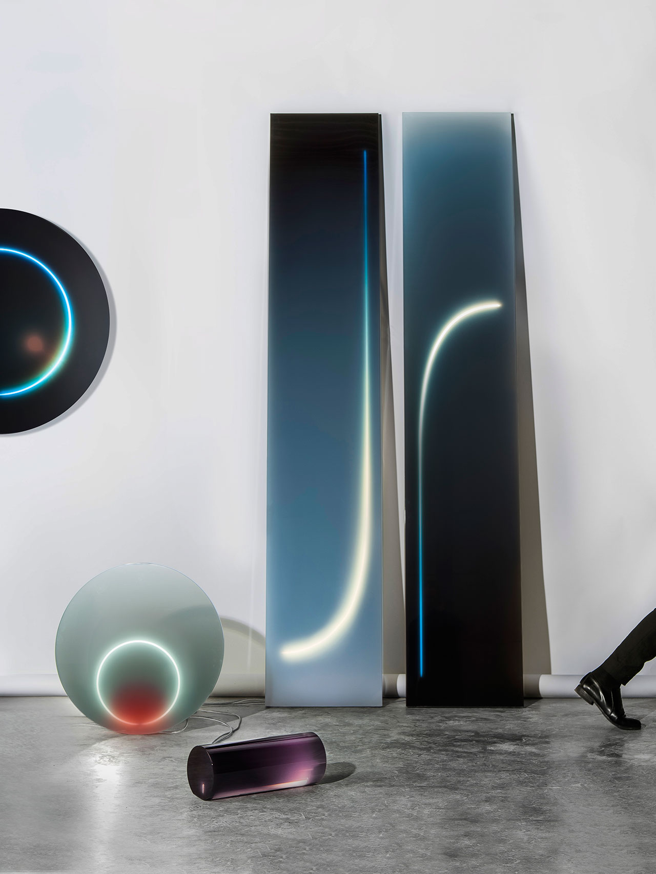
Sabine Marcelis, Dawn Lights, 2015. Photo © Lee Wei Swee.
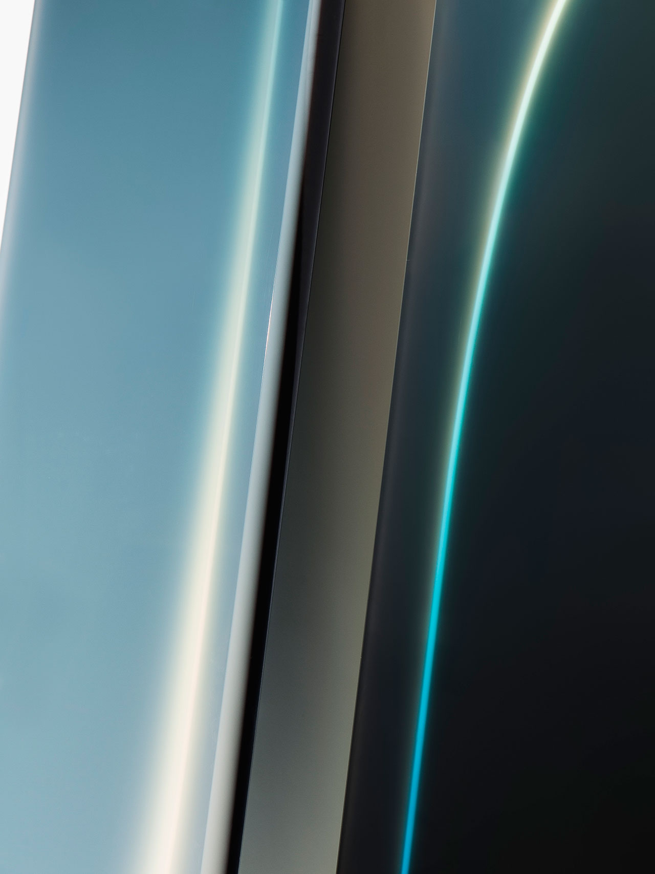
Sabine Marcelis, Dawn Lights, 2015. Photo © Lee Wei Swee.
Marcelis’ commercial work ranges from creating candy-coloured cubed displays for fashion houses such as Céline and Isabel Marant, to designing interiors for the OMA/AMO-designed Paris flagship store of jewelry house Repossi, and transforming the main entrance of Berlin’s KaDeWe department store into a golden archway. More recently, she has designed an iridescent, totem-like installation for the launch of A. Lange & Söhne’s DATOGRAPH UP/DOWN “Lumen” chronograph. Organized by Openhouse, the event, which our own Costas Voyatzis had the pleasure of attending, took place in October of 2018 at Solo Office—an experimental ring-shaped house by Belgian practice OFFICE Kersten Geers David Van Severen, located in the pine-covered hills of Matarraña, Spain. Installed in the centre of the house’s circular patio, Marcelis’ gleaming sculpture effectively became a sun dial, humanity’s earliest method for telling the time, evocatively complemented by a figurative bezel formed by the encircling building. Yatzer recently caught up with Marcelis for a chat about her bourgeoning practice, her fascination with light, and her recent projects.
(Answers have been condensed and edited for clarity.)
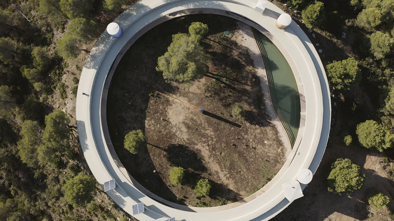
Solo Sundial, 2018, installation by Sabine Marcelis for luxury watch label A. Lange & Söhne at SOLO OFFICE by Office GDVS in Spain. Photo © Mari Luz Vidal.
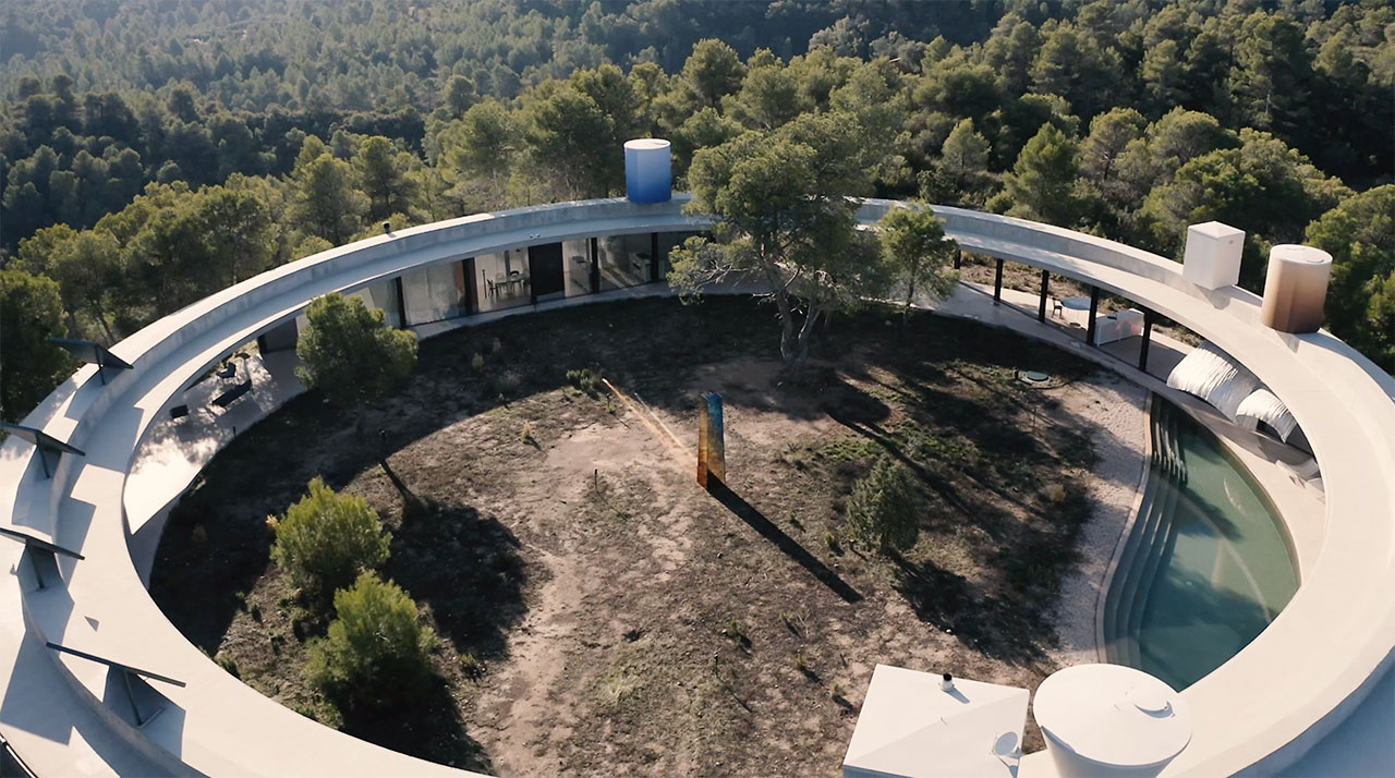
Solo Sundial, 2018, installation by Sabine Marcelis for luxury watch label A. Lange & Söhne at SOLO OFFICE by Office GDVS in Spain. Photo © Mari Luz Vidal.
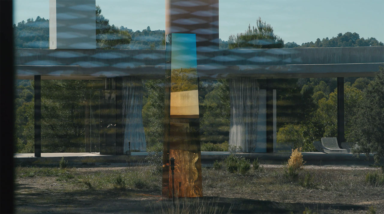
Solo Sundial, 2018, installation by Sabine Marcelis for luxury watch label A. Lange & Söhne at SOLO OFFICE by Office GDVS in Spain. Photo © Mari Luz Vidal.
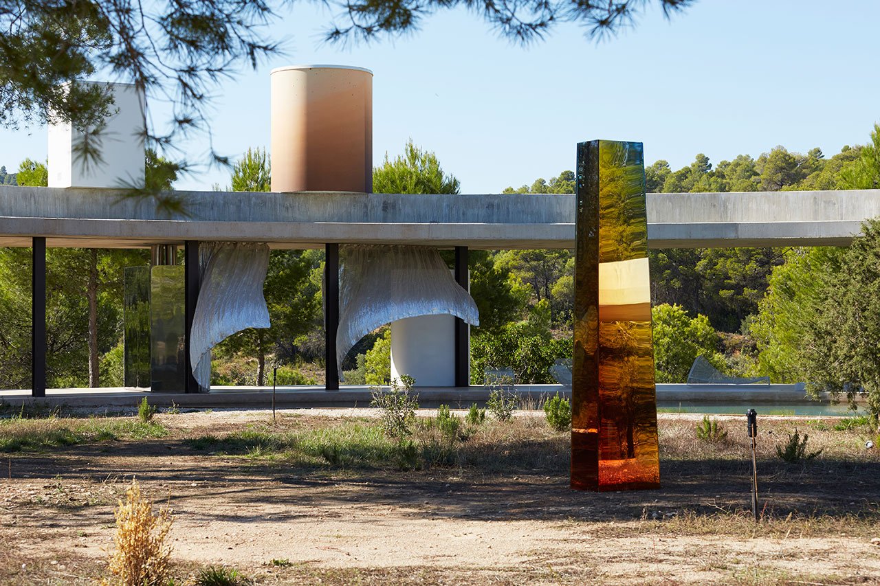
Solo Sundial, 2018, installation by Sabine Marcelis for luxury watch label A. Lange & Söhne at SOLO OFFICE by Office GDVS in Spain. Photo © Mari Luz Vidal.
What inspired you to become a designer? Was is something you always wanted or did you evolve into it?
I wasn’t one of those people that knew from an early age that I wanted to be a designer. I’m very black and white in my ways and when something grabs my interest I’m all in. I only started studying design when I was 21 after taking a long break after high school to travel. From the start, I realised I absolutely loved designing, but from a different angle than what we were taught at school. I’m a total nerd and very curious about production techniques and materiality, still working very closely with factories as I did when I was studying.
I have to be super enthusiastic about something to be able to do good work so I only work on projects that fascinate me from the very beginning. I have been lucky in that in the last few years there has been more interest in my work and I have had the chance to work alongside great architects and fashion designers whilst also being completely freely to work on projects presented in museums and galleries. I love the fact that I can jump between these different scales and situations and that I’m not boxed into one category as a designer.
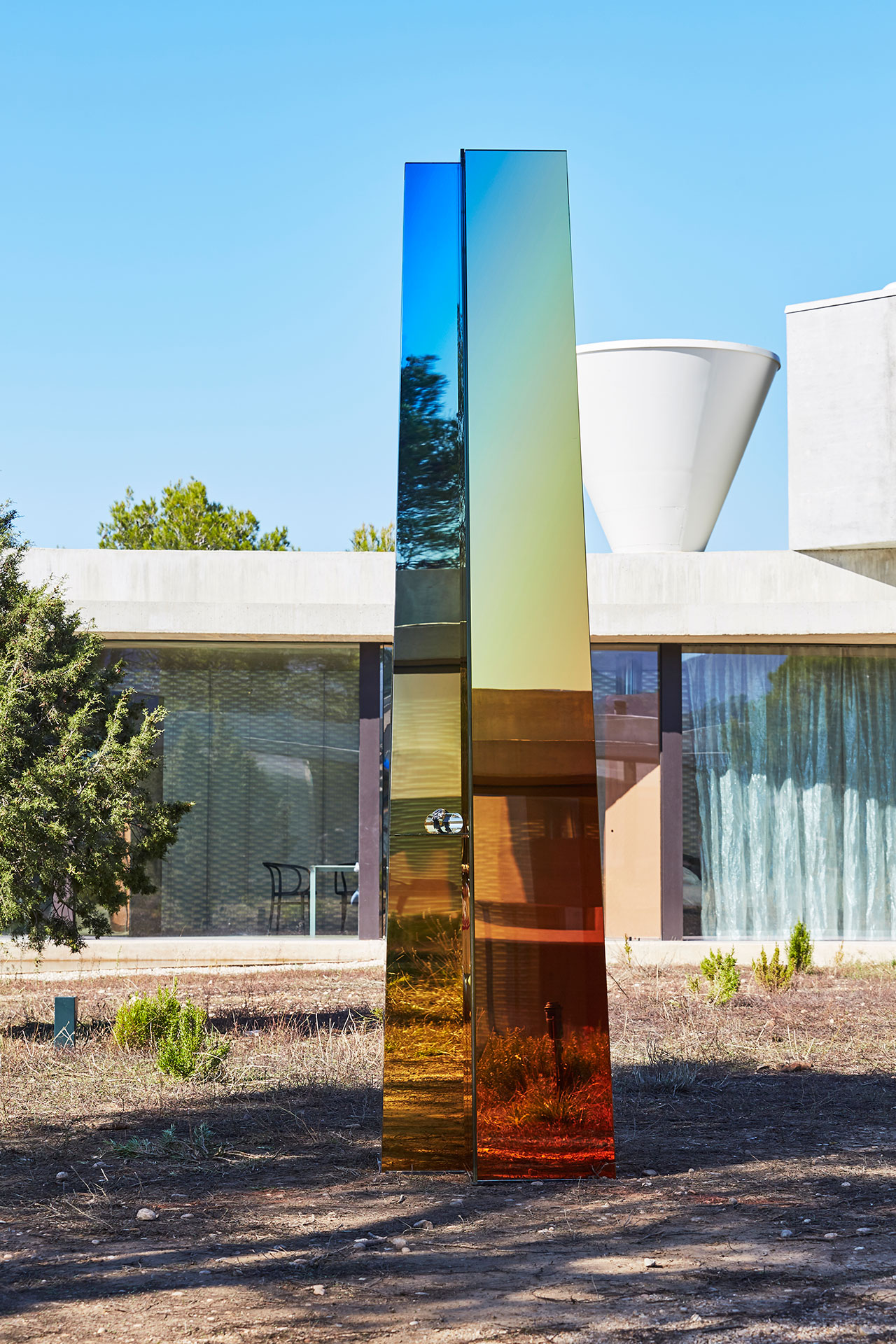
Solo Sundial, 2018, installation by Sabine Marcelis for luxury watch label A. Lange & Söhne at SOLO OFFICE by Office GDVS in Spain. Photo © Mari Luz Vidal.
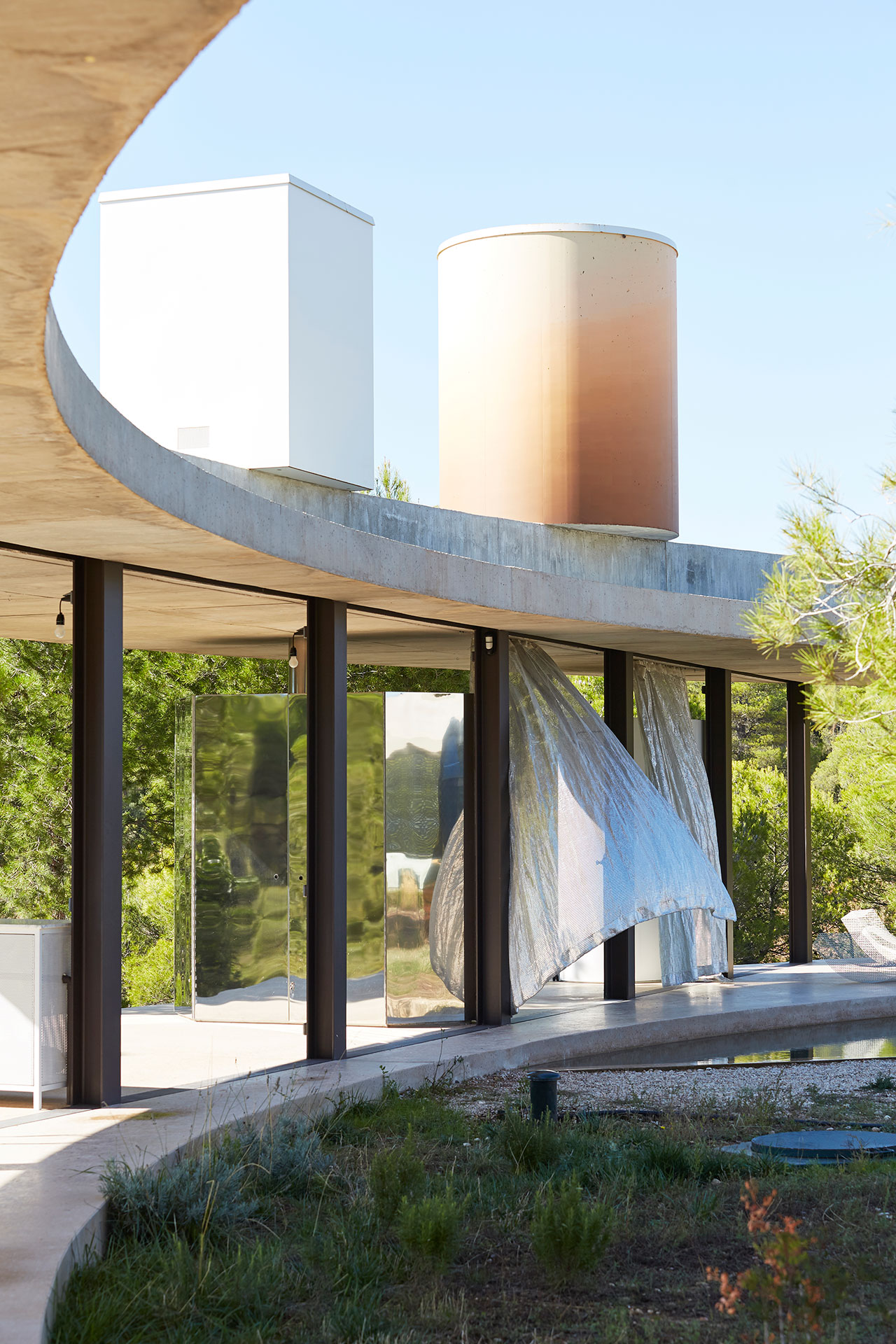
Solo Sundial, 2018, installation by Sabine Marcelis for luxury watch label A. Lange & Söhne at SOLO OFFICE by Office GDVS in Spain. Photo © Mari Luz Vidal.

Solo Sundial, 2018, installation by Sabine Marcelis for luxury watch label A. Lange & Söhne at SOLO OFFICE by Office GDVS in Spain. Photo © Mari Luz Vidal.
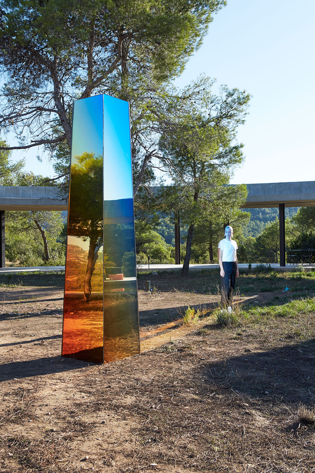
Solo Sundial, 2018, installation by Sabine Marcelis for luxury watch label A. Lange & Söhne at SOLO OFFICE by Office GDVS in Spain. Photo © Mari Luz Vidal.
Your design language is centred on elemental geometric forms such as circles and cubes. How did this design language come about and what is its significance?
I’m not a fan of decorative elements. For me, everything needs a purpose to be there. The shape of an object or installation allows for the effects or feeling that I’m after to be optimised. Normally this means paring it down to elemental geometry so as to not distract from the materiality or lighting effects. Simple shapes are calming to me and get down to the core.
You recently designed an iridescent, totem-like installation for the launch of A. Lange & Söhne’s new chronograph. What role did Solo Office’s unique architecture play in your design and how did the chronograph’s technical characteristics inspire you?
This was another example of a commercial project opening up opportunities. I had actually wanted to do a sundial for a very long time but had never got around to it. When Openhouse magazine invited me to think of an installation for the launch event of the chronograph, they had already picked the site. It was almost a no-brainer to create a huge watch. Using the circular shape of the house and the fact that the product was a watch that was ever changing with the time of the day. It just all came together.
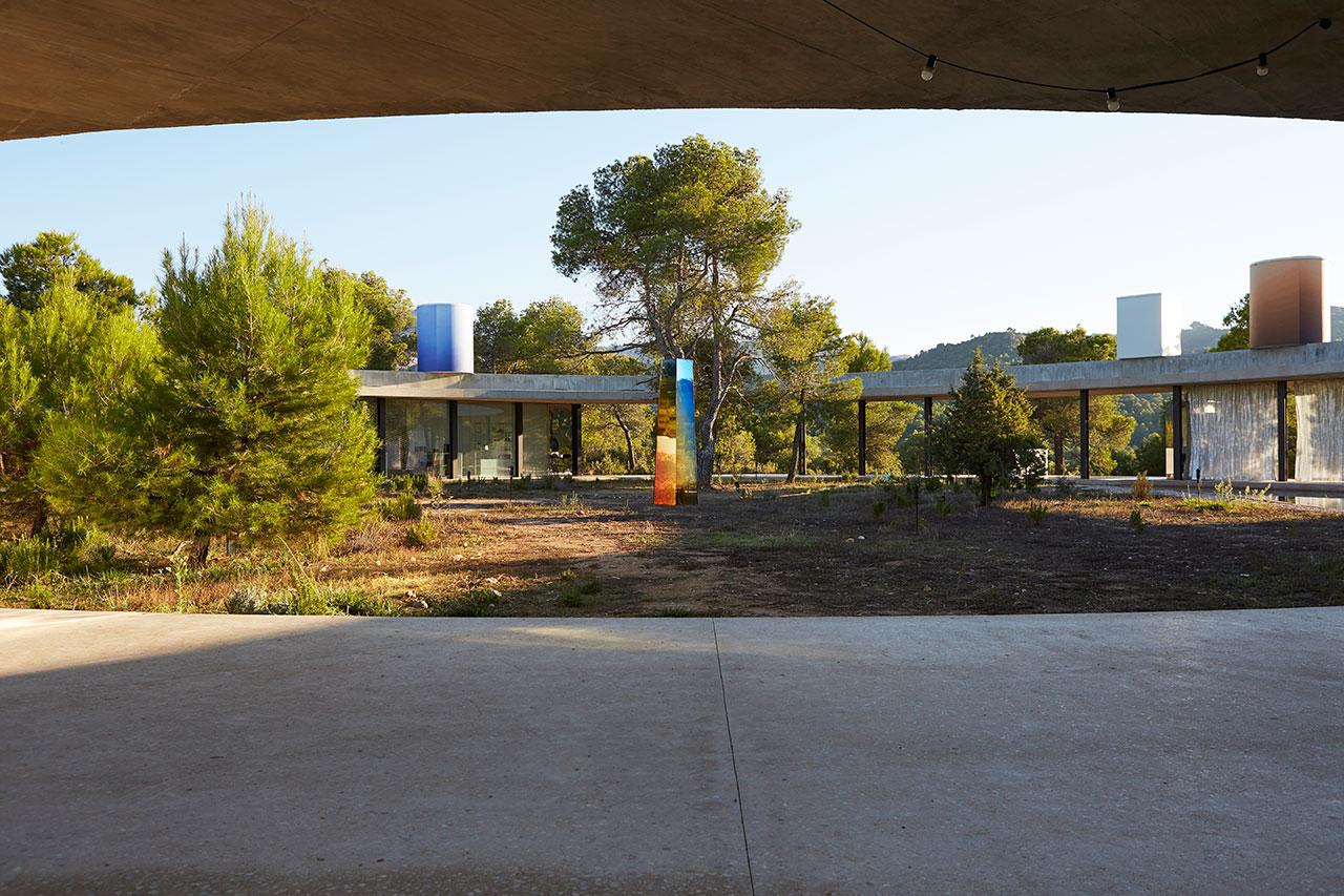
Solo Sundial, 2018, installation by Sabine Marcelis for luxury watch label A. Lange & Söhne at SOLO OFFICE by Office GDVS in Spain. Photo © Mari Luz Vidal.

Solo Sundial, 2018, installation by Sabine Marcelis for luxury watch label A. Lange & Söhne at SOLO OFFICE by Office GDVS in Spain. Photo © Mari Luz Vidal.
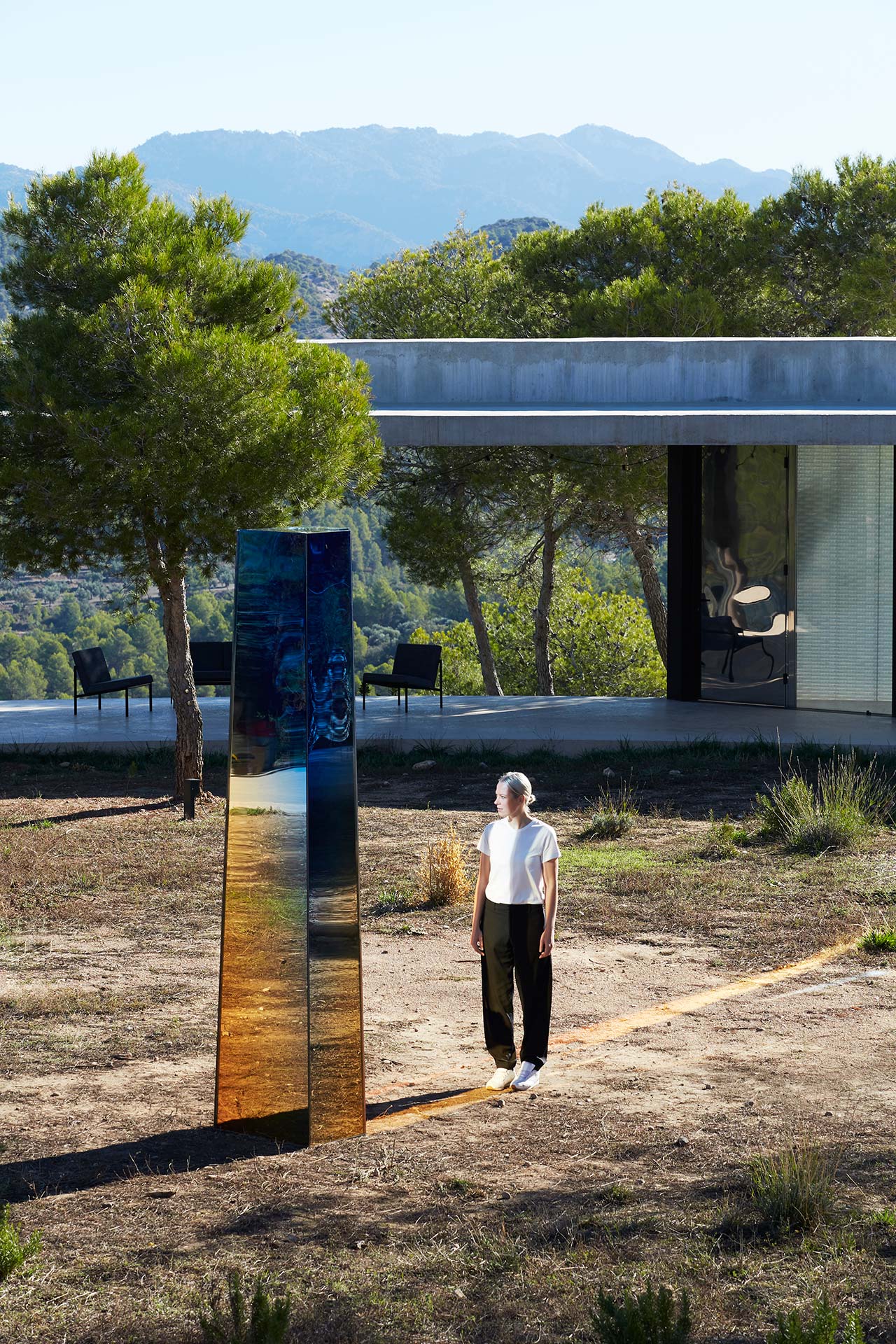
Solo Sundial, 2018, installation by Sabine Marcelis for luxury watch label A. Lange & Söhne at SOLO OFFICE by Office GDVS in Spain. Photo © Mari Luz Vidal.
Take us through your work process. Do you spend more time in the design, or in the manufacturing phase? Is experimentation an integral part of the process for every project?
I’m not a sketcher. I get my ideas on the road, from living a life with my eyes wide open and absorbing everything I experience as a potential source of inspiration. I experiment a lot and spend a lot of time in factories. It’s only when I find something of interest that the design process begins to take shape.
How different is it working on commercial than personal projects? Do aesthetics and functionality play the same role in both cases?
I used to believe that when a designer or artist does a collaboration with a brand or something more commercial the outcome would always be a compromise. Or a watered down version of a pure idea. But I now believe that it can actually be more creative than a project done autonomously. I am very careful and picky with the commercial projects I do, making sure from day one that the client’s creative vision is flexible enough for me to be free to design. I do believe that when researching a brand’s story and history that opportunities and ideas present themselves which I would normally not have come across when doing a purely autonomous project. With FENDI, for example, the idea of working and designing with water presented itself when I realised that the brand had this strong reoccurring theme of water in their history.
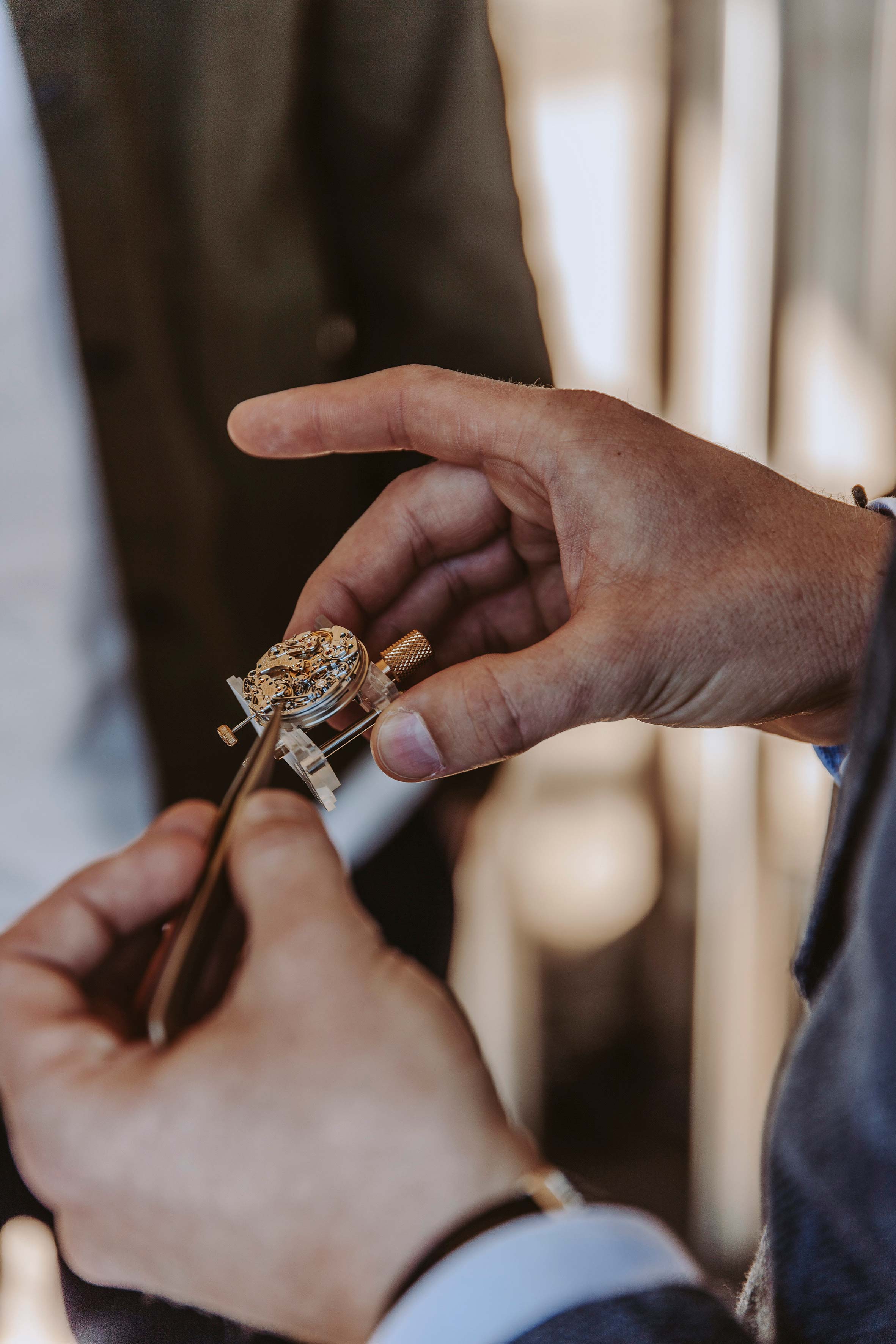
Launch event for DATOGRAPH UP/DOWN “Lumen” by A. Lange & Söhne at Solo Office, Spain, in October 2018, in collaboration with Openhouse magazine and designer Sabine Marcelis. Photo by Yosigo.
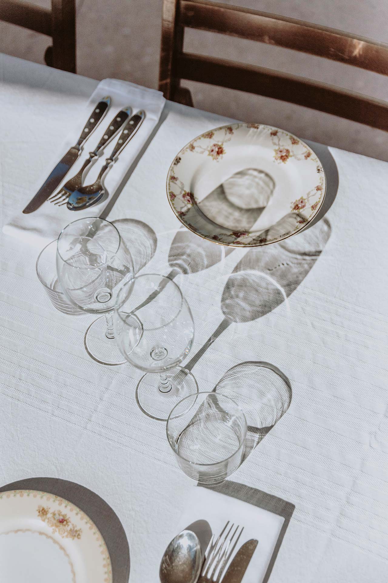
Launch event for DATOGRAPH UP/DOWN “Lumen” by A. Lange & Söhne at Solo Office, Spain, in October 2018, in collaboration with Openhouse magazine and designer Sabine Marcelis. Photo by Yosigo.
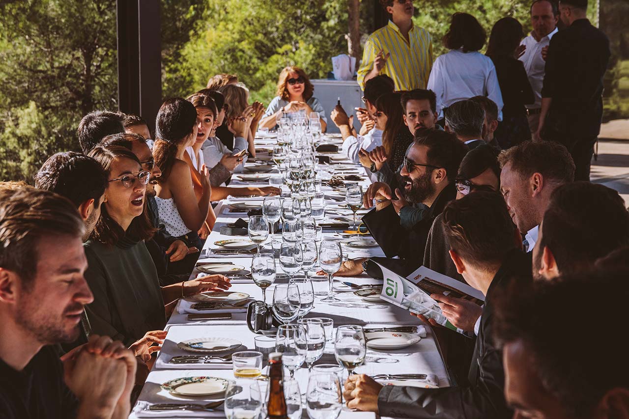
Launch event for DATOGRAPH UP/DOWN “Lumen” by A. Lange & Söhne at Solo Office, Spain, in October 2018, in collaboration with Openhouse magazine and designer Sabine Marcelis. Photo by Yosigo.
Your projects can be read as a paean to light and its properties—reflection, refraction and colour. Where did this fascination originate from?
I’m always searching for moments of wonder and I think light is the single catalyst of this. Without light there is nothing. It creates the ability for me to play with materials. To work with diffusion, refraction, transparency and shadow. I don’t think if it’s possible to run out of inspiration when working with light.
Neon features predominantly in your work. Why are you so attracted to this element? Has the advent of newer LED technologies added to neon’s allure?
For me, neon is very special. It is light that has its own shape. It’s not a light source that needs to be hidden, but something that can be displayed and shown off as its own beautiful entity. Of course I am also very interested in modern developments in LED technologies, but for the moment no alternative exists that can compete with the beauty of real glass neon tubes as a light source.
The pieces in the Voie Lights and Dawn Light series can be classified both as light fittings and light sculptures. Do you approach them primarily as functional objects or art pieces?
The experience is the function. They are aesthetic objects with a function that create a moment of wonder.

Sabine Marcelis, Voie Lights, Edition #1, 2015. Comissionned by Etage Projects Gallery, Copenhagen, DK. Photo © Lee Wei Swee.
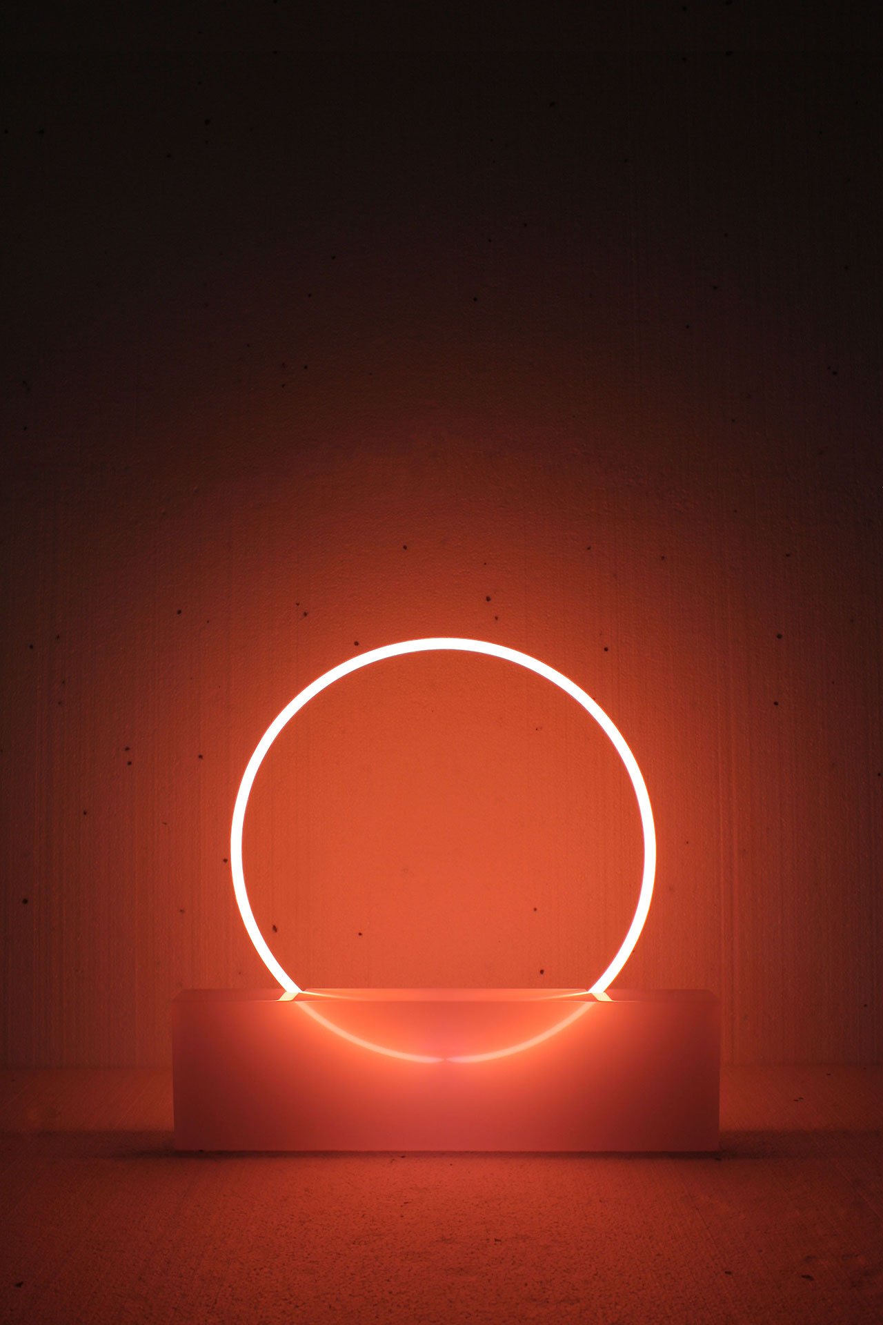
Sabine Marcelis, Voie Lights, Edition #2, 2016. Comissionned by Etage Projects Gallery, Copenhagen, DK. Photo courtesy of Sabine Marcelis.
Your work brings to mind the minimalist compositions of Dan Flavin’s fluorescent light installations and the perceptual uncertainty of James Turrell’s work. Which artists or movements have inspired you?
Obviously the light and space movement very much. They were pioneers of not only playing with light and space, but also the use of industrial materials. Helen Pashgian, Dewain Valentine, they pioneered the use of resins from industry in an aesthetic way. I am also very inspired by Op Art, the Zero movement and De Stijl. They all use very minimal shapes in an extremely impactful way. Strong gestures and pure ideas.
You recently participated at Design Miami with The Shapes of Water. Tell us a bit about the project and the inspiration behind it.
I was asked by FENDI to design their ten-year anniversary booth at Design Miami. 10 water sculptures were created, each one interpreting a different Fendi icon in an abstracted way while using the strong reoccurring theme of water in their history.
I am so excited to have worked with water as a material in this project. As with resin and glass, water provides the opportunity to play with transparency and interaction with light. I also had the element of movement to design with which opened up a whole new world of possibilities for me. I cannot wait to do more!
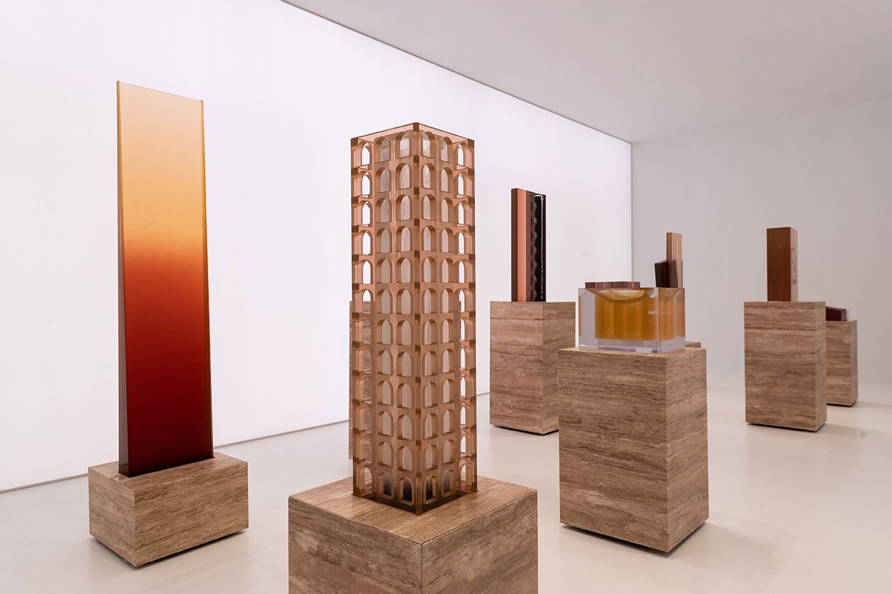
Sabine Marcelis, The Shapes of Water, 2018. Installation view at Design Miami 2018. Commissioned by FENDI for the 10th year anniversary of its participation in Design Miami. Photo © FENDI, courtesy of Design Miami.
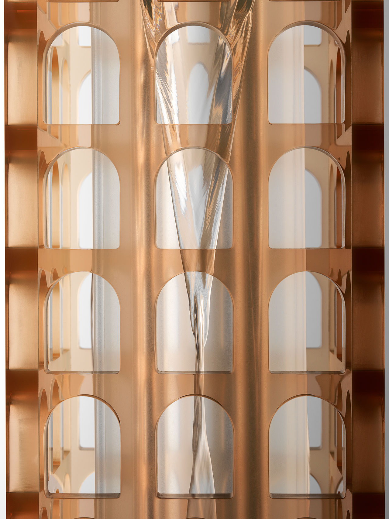
Sabine Marcelis, Palazzo della Civiltà Italiana (detail), 2018. From the series The Shapes of Water, commissioned by FENDI for the 10th year anniversary of its participation in Design Miami. Photo by Carl Kleiner, courtesy of FENDI.
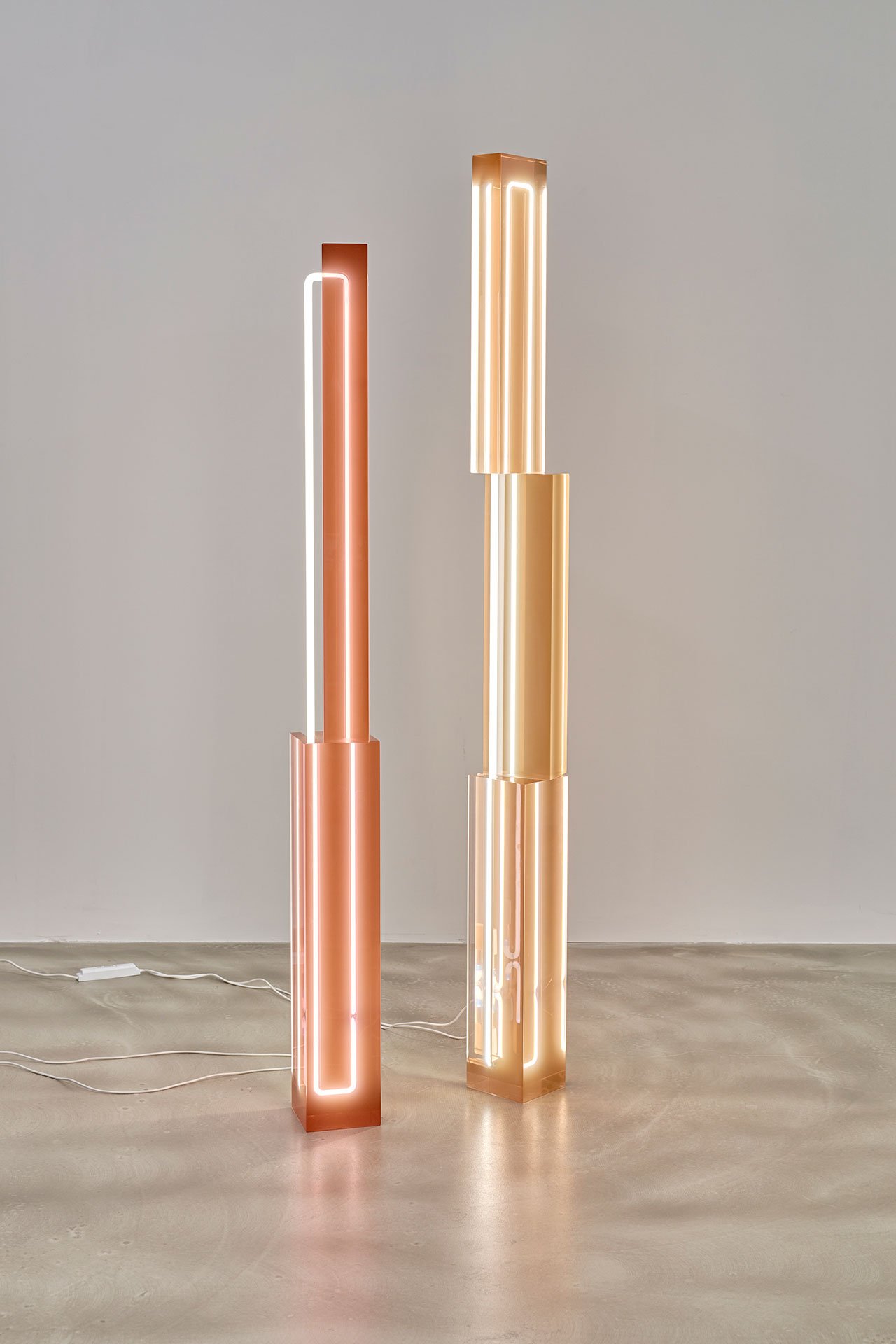
Sabine Marcelis, Totem lights, 2018. Photo by Pim Top.
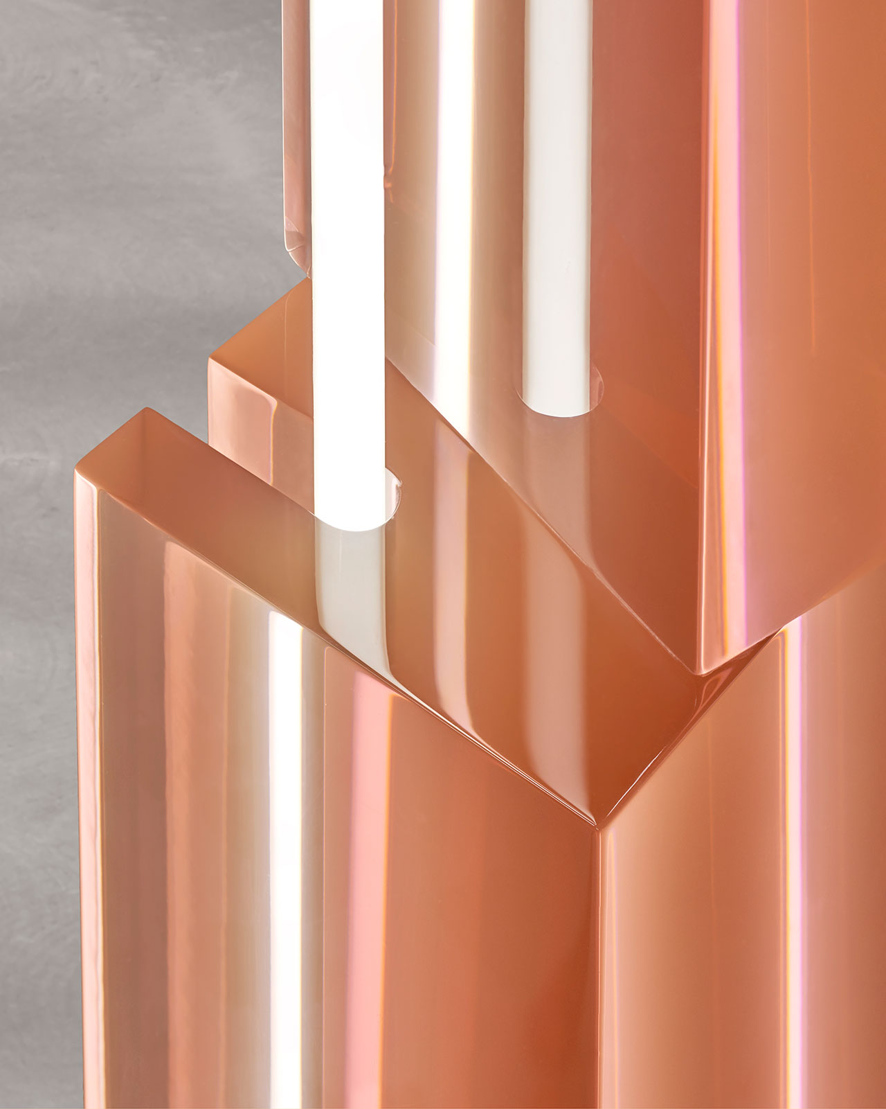
Sabine Marcelis, Totem lights, 2018. Photo by Pim Top.


