The Conceptual Boldness of IMMI's Shanghai Flagship Store
Words by Yatzer
Location
Shanghai, China
The Conceptual Boldness of IMMI's Shanghai Flagship Store
Words by Yatzer
Shanghai, China
Shanghai, China
Location
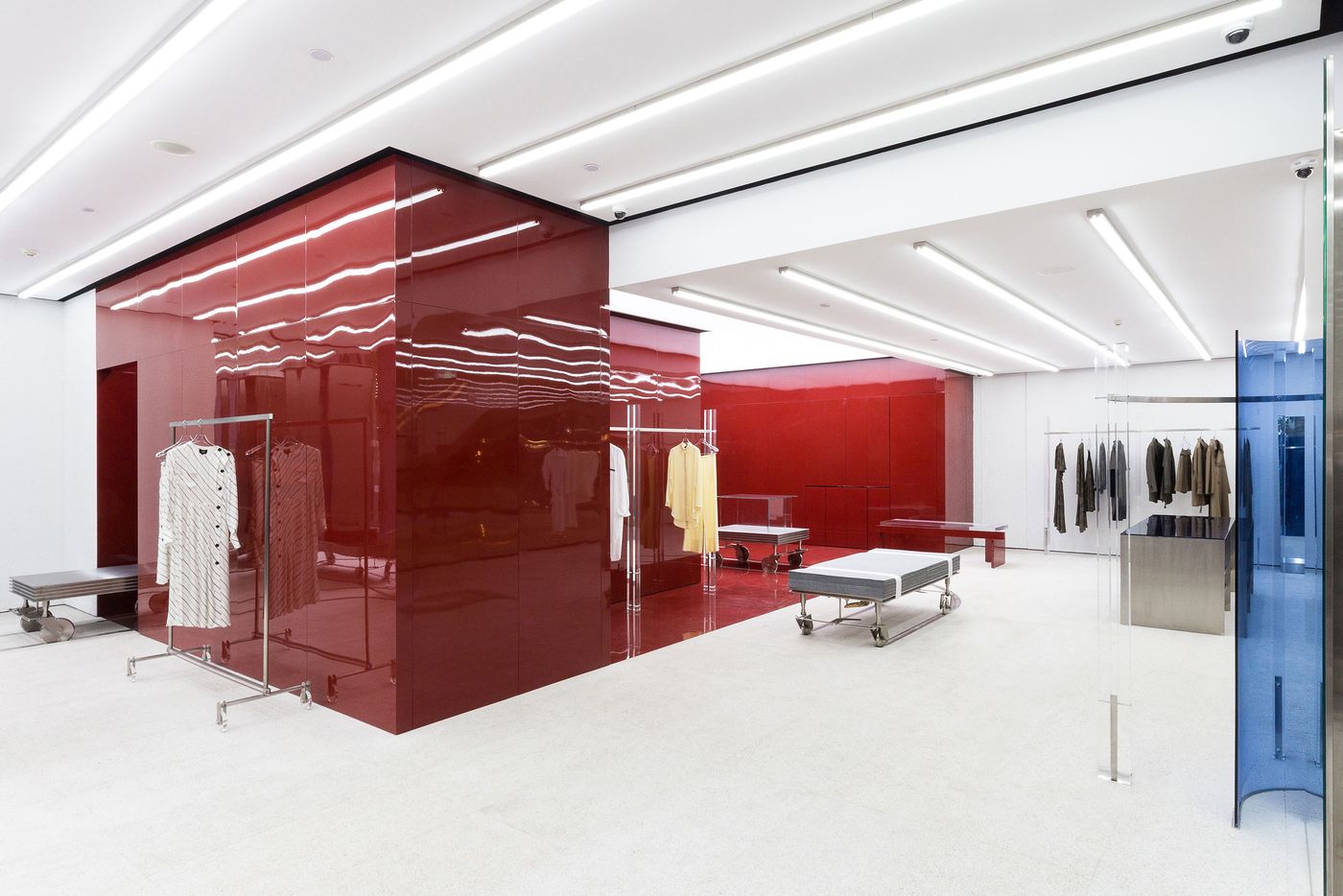
Located in Xintiandi, a vibrant, upscale commercial district in Shanghai, China, that combines modern architecture with cobbled lanes and century-old stone buildings, this new flagship store for high-end apparel brand IMMI dazzles with its ethereal elegance and its conceptual boldness. Launched by Chinese designers Joyce and Wu Xiaomin in 2015, the brand has gained a reputation for its ascetic refinement, exquisite tailoring and environmentally friendly fabrics. Seoul-based design studio Creative Studio Unravel (CSU) drew inspiration from the brand’s distinctive aesthetic to create a retail interior that architecturally reflects the clothes’ minimalist sophistication, subdued colour palette, and high level of craftsmanship, while celebrating the creative process by conceptualizing the brand’s birth.
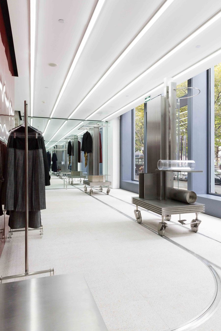
Photo by Han Sunghoon.
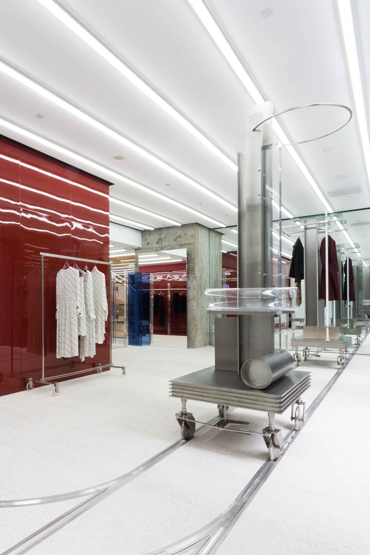
Photo by Han Sunghoon.
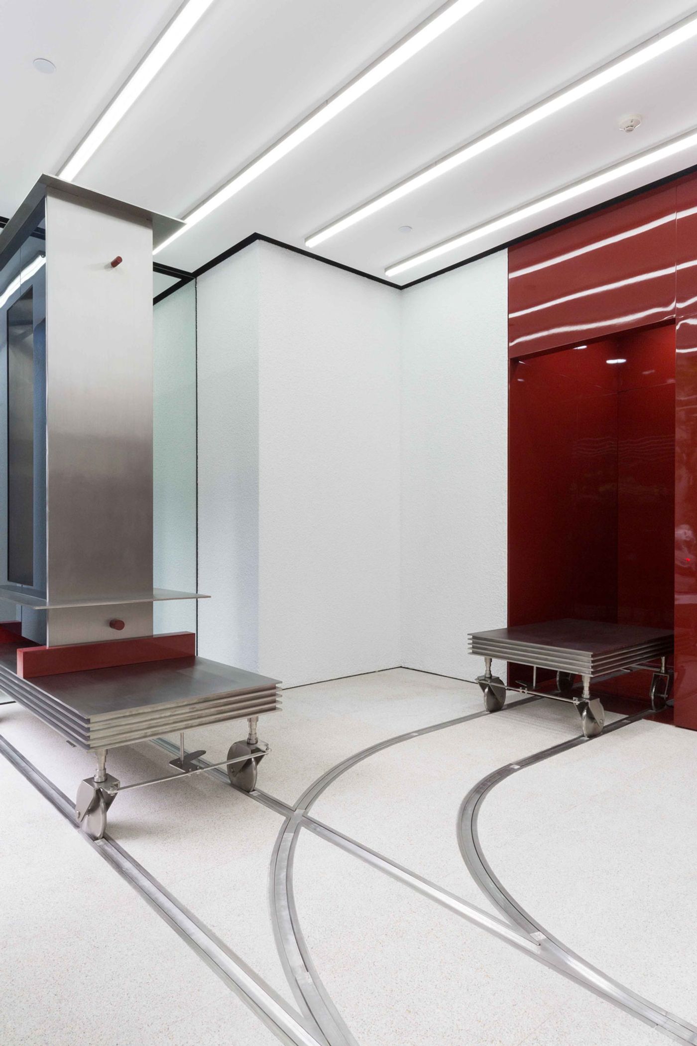
Photo by Han Sunghoon.
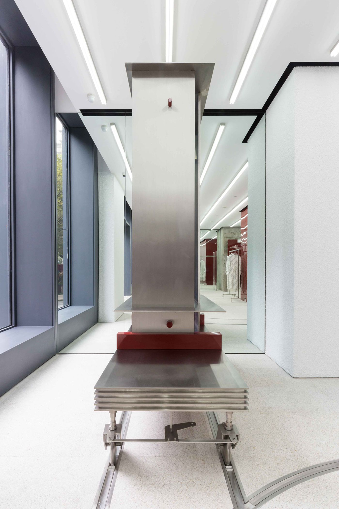
Photo by Han Sunghoon.
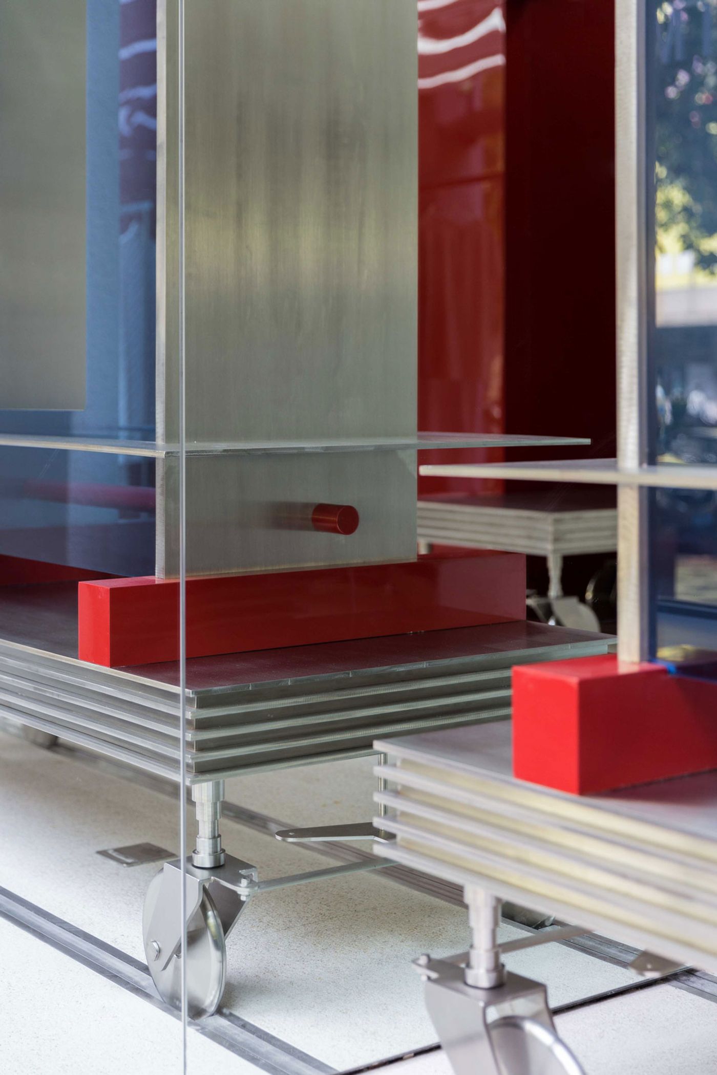
Photo by Han Sunghoon.
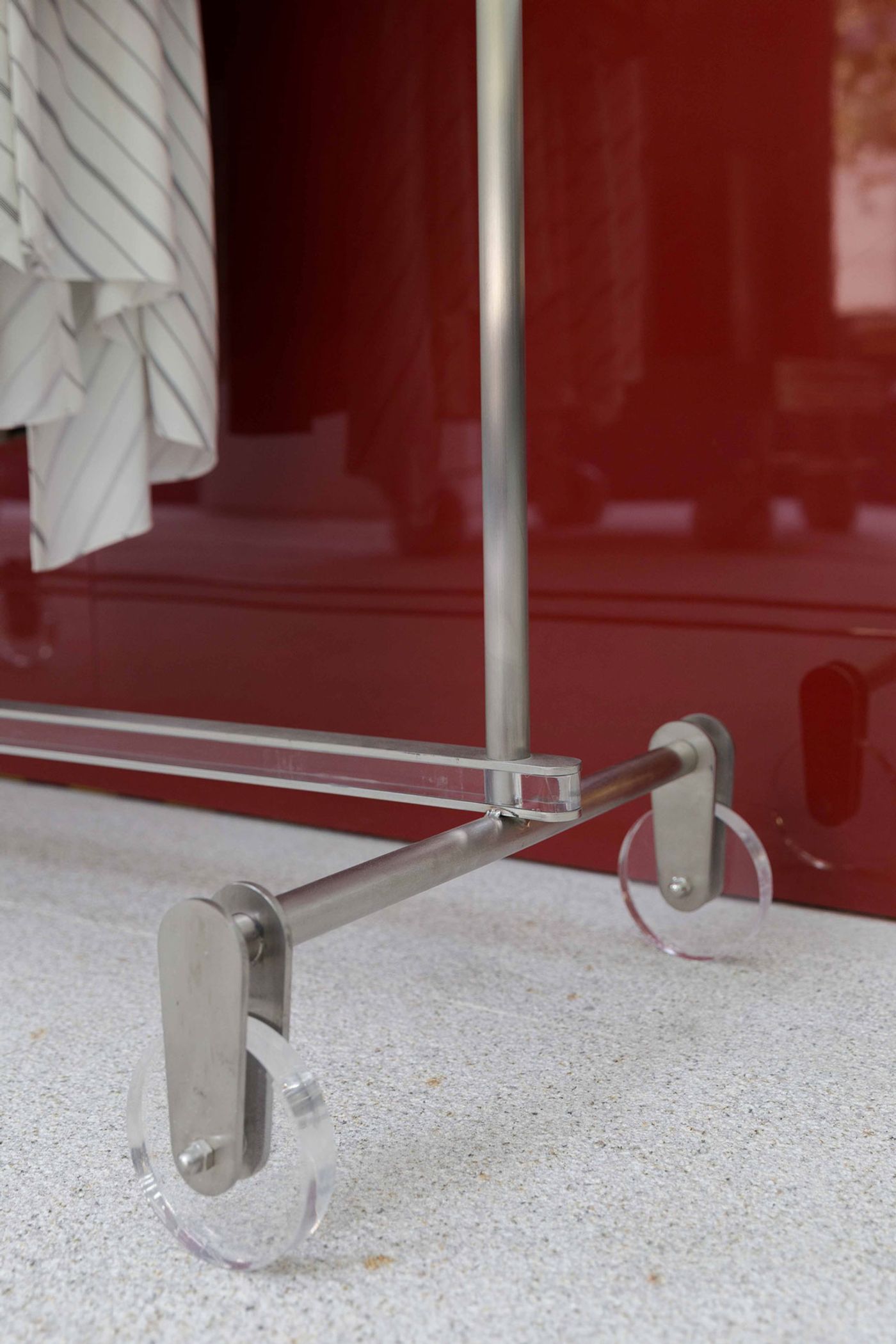
Photo by Han Sunghoon.
Conceived as a figurative womb that forms the heart of the store, a sumptuously glossy, red-coloured area boldly pops out of the all-white interiors. The womb-like enclosure is a symbol of the brand’s long incubation period before it was introduced to the world as well as Joyce and Xiaomin’s ‘maternal instincts’. It is also a tribute to the creative process: like giving birth to a child, hatching an idea and forging it into an actual, physical design is an intense process, detached from everyday reality and the rigid rules that govern it. And it is this is that is the ultimate significance of the gleaming red zone: to present a fluid view of reality through a profusion of distorted, coloured reflections and refractions, made all the more intense by the illuminated ceiling.
If the store’s cherry-red zone is the notional womb where fashion is incubated, then the metallic carts that roll out of it are the delivery system that brings the clothes into the world. Embedded into the floor, the rails that crisscross the retail area have both a practical and a conceptual raison d'être. The rolling carts are equipped with shelving, hooks or garment racks which make them in effect movable displays, allowing infinite configurations and merchandizing options.
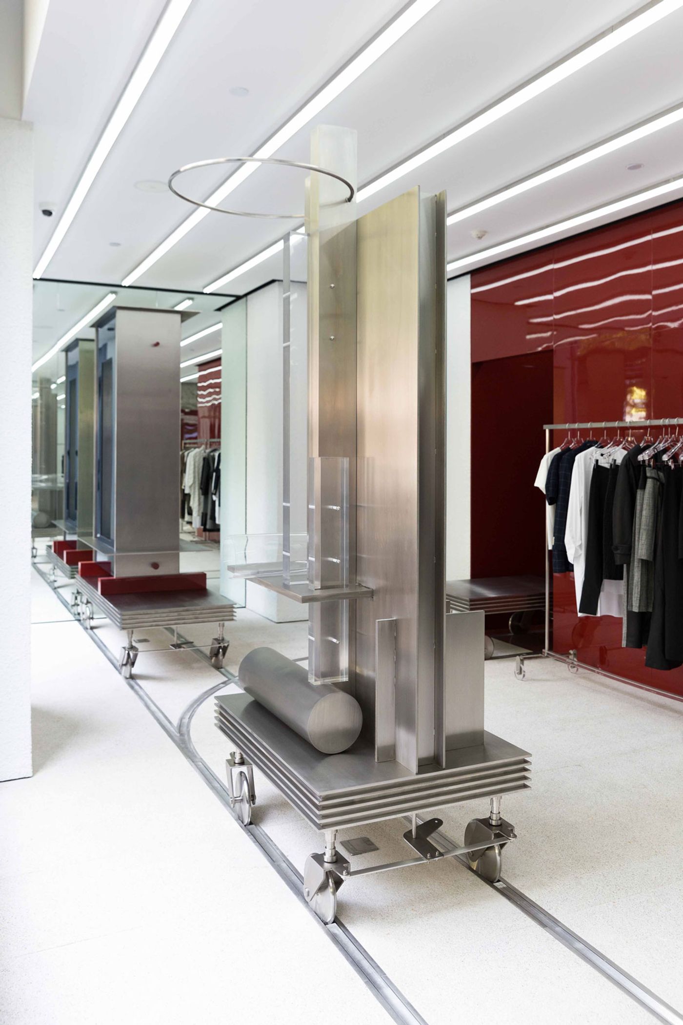
Photo by Han Sunghoon.
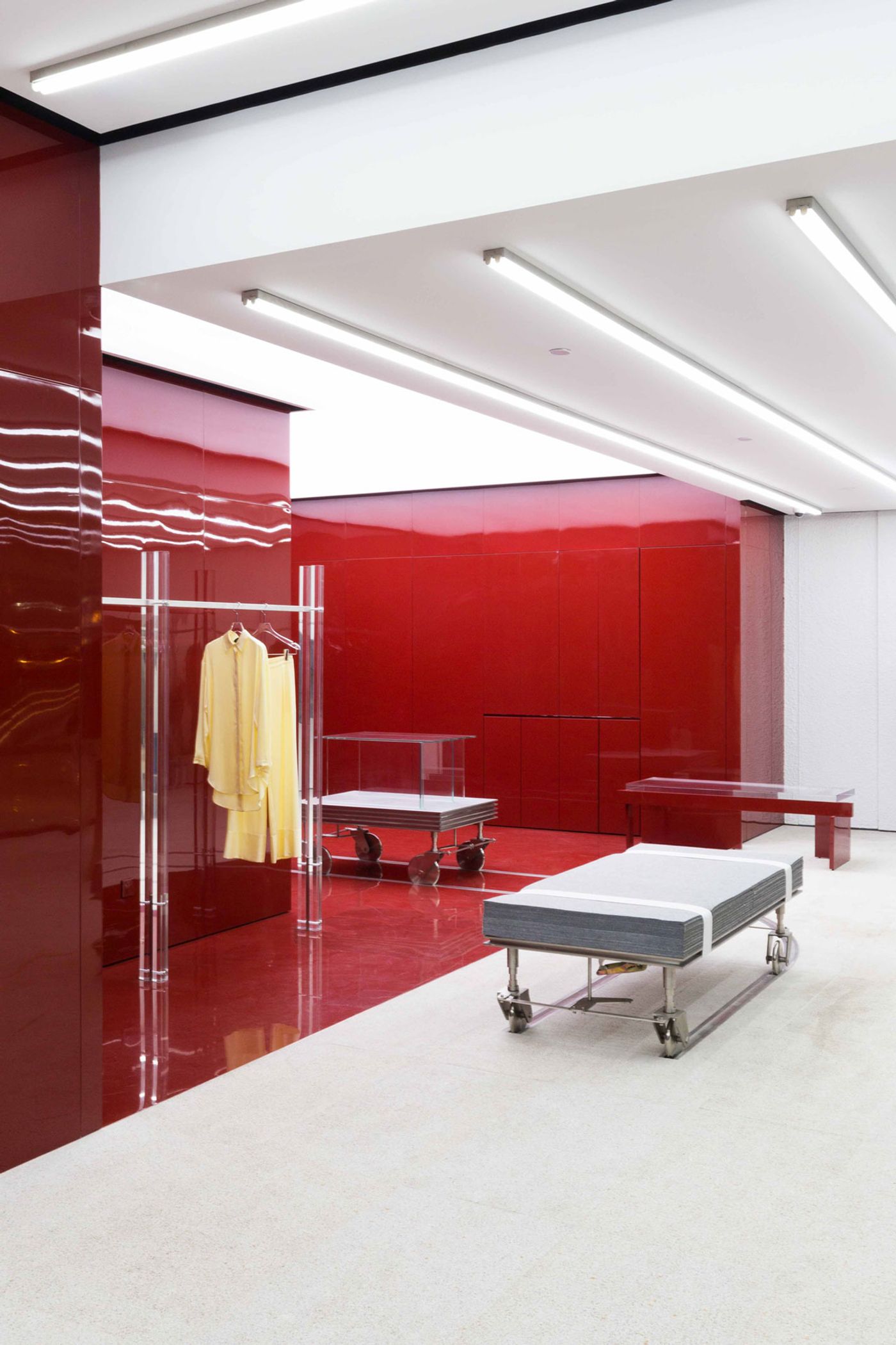
Photo by Han Sunghoon.
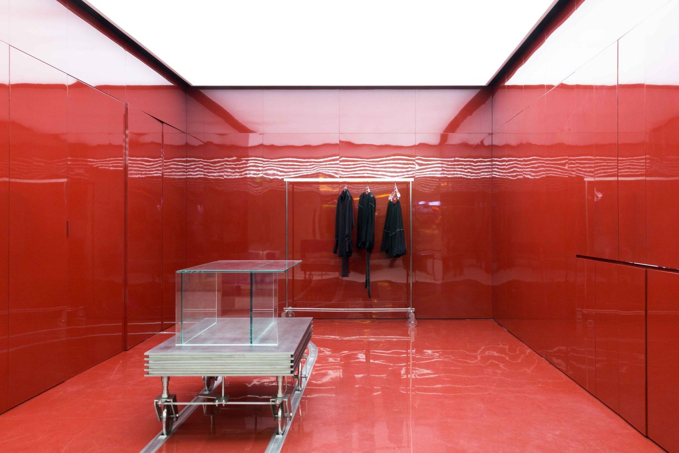
Photo by Han Sunghoon.
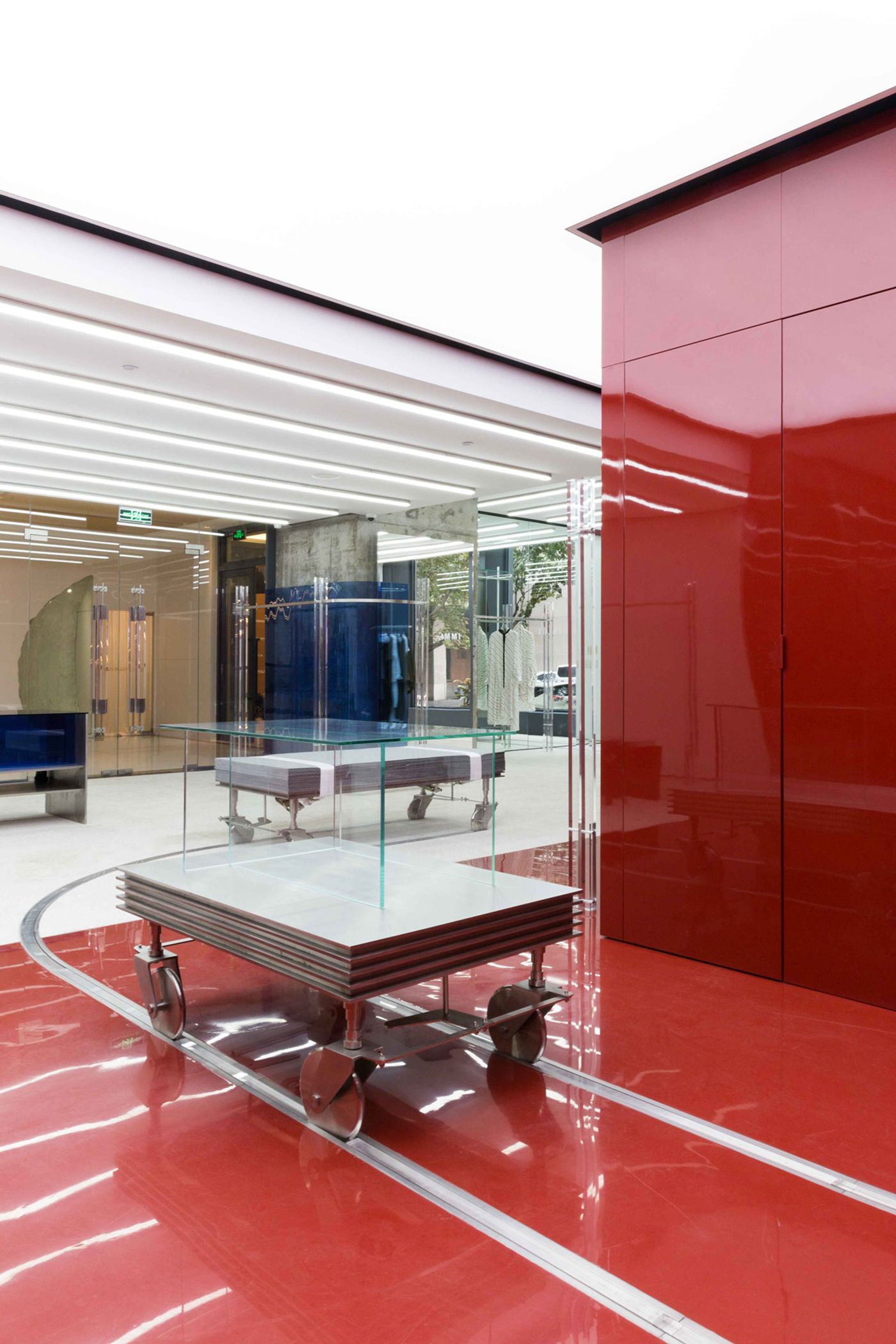
Photo by Han Sunghoon.
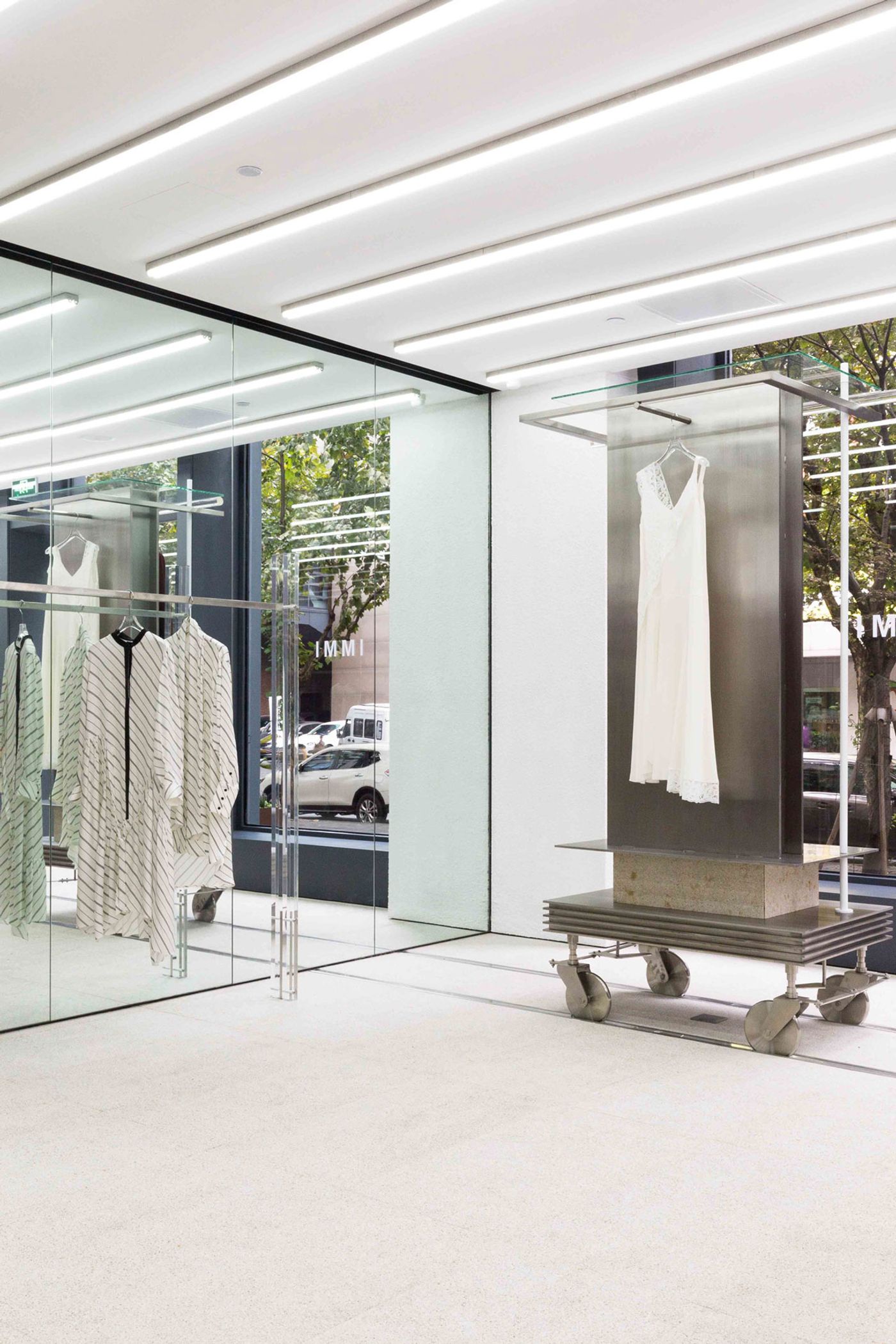
Photo by Han Sunghoon.
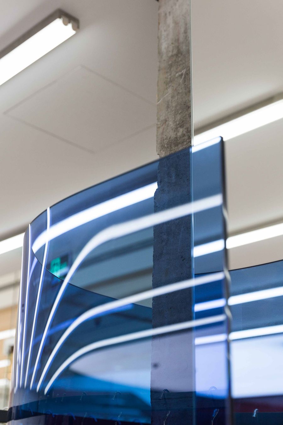
Photo by Han Sunghoon.
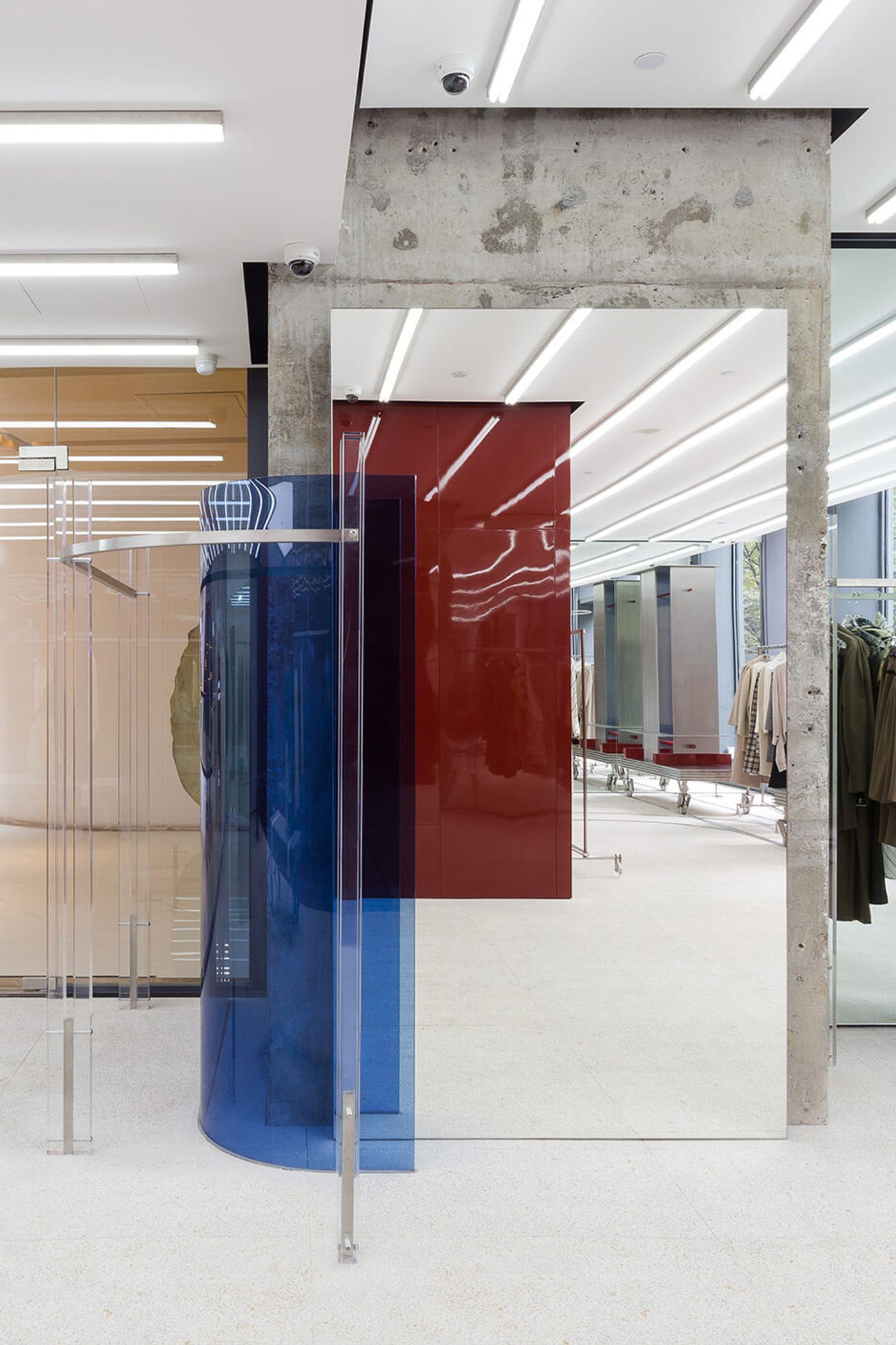
Photo by Han Sunghoon.
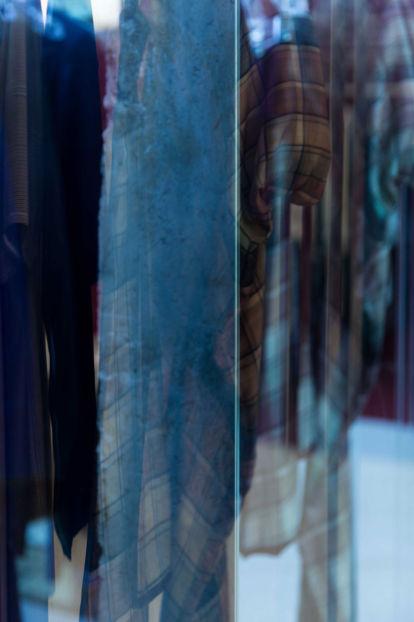
Photo by Han Sunghoon.
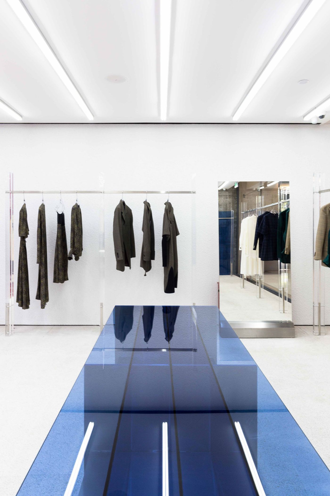
Photo by Han Sunghoon.
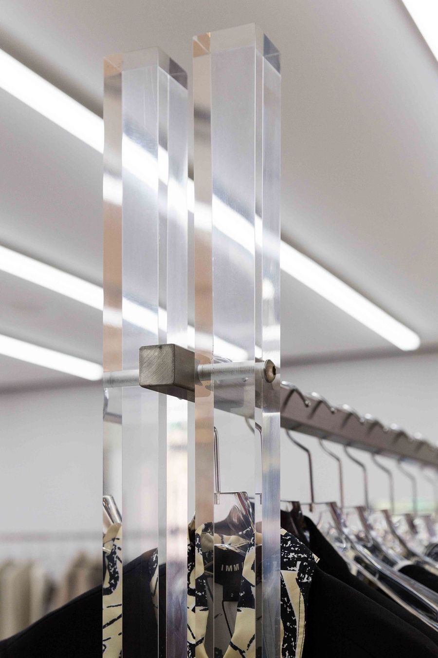
Photo by Han Sunghoon.
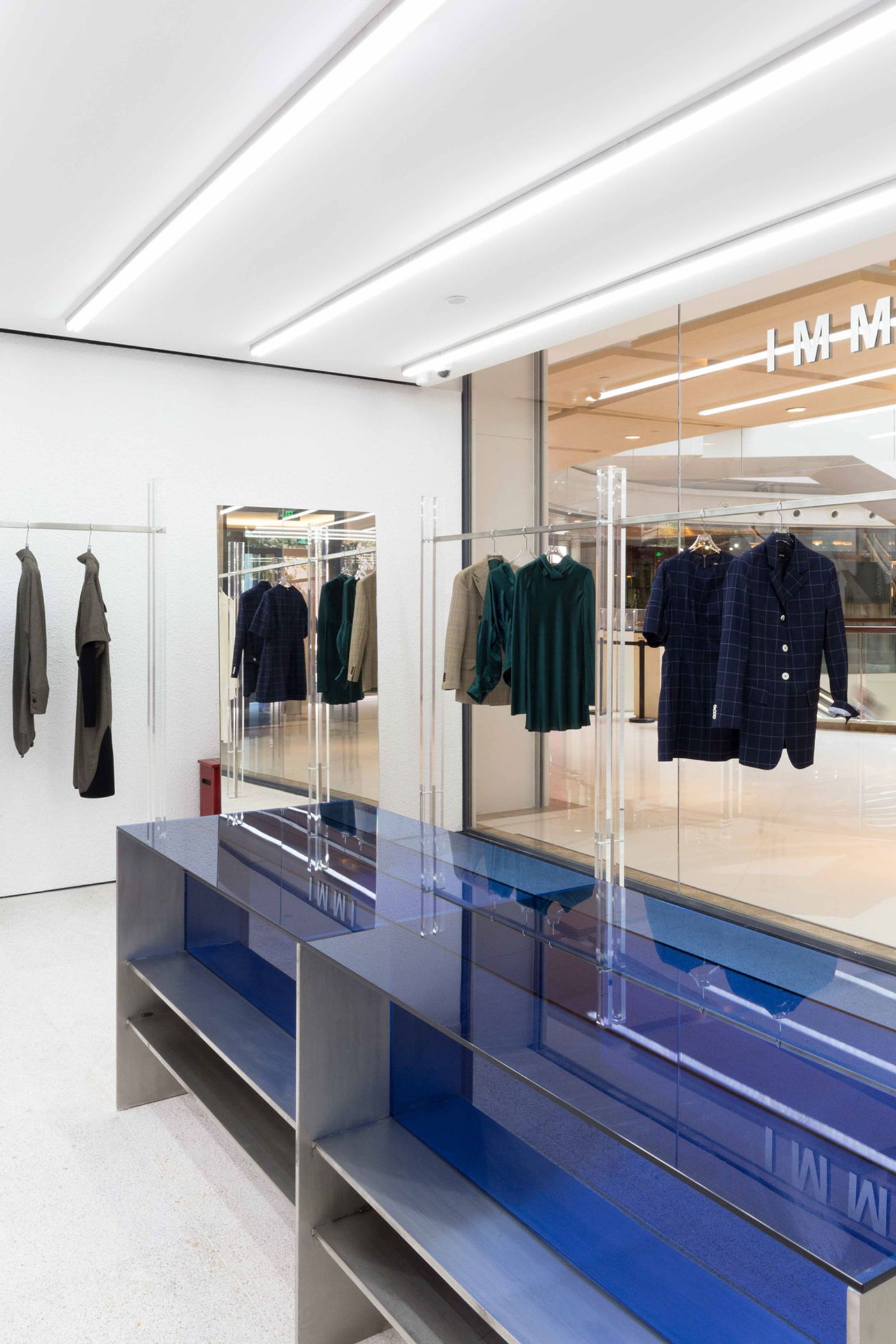
Photo by Han Sunghoon.
But these are not ordinary display carts; many of them feature a clutter of metallic and Plexiglas industrial looking solids that seem, to use CSU’s terminology, “obtuse and irregular, even ugly”. Drawing from Theodor W. Adorno’s Aesthetic Theory, the designers have conceived these “seemingly useless and ugly objects” as an antidote to the repressing aesthetics of conventional beauty. As they gracefully move around the space, these unconventional carts, not all of which are used for clothing displays, force shoppers to re-calibrate their preconceived ideas of beauty as well as what essentially a commercial space should be like.
Besides the throbbing red ‘womb’, the subdued interior design is also punctured by blue Plexiglas surfaces that provide a cool counterweight to the store’s crimson core. United by a design language of basic geometric forms, the red, blue, metallic and transparent elements that furnish the white-washed interiors fittingly resemble a three-dimensional Suprematist painting. And as such, the store seems to extol the supremacy of pure feeling in the creative process, very much like the fashion designers behind the IMMI brand.

Photo by Han Sunghoon.

Photo by Han Sunghoon.
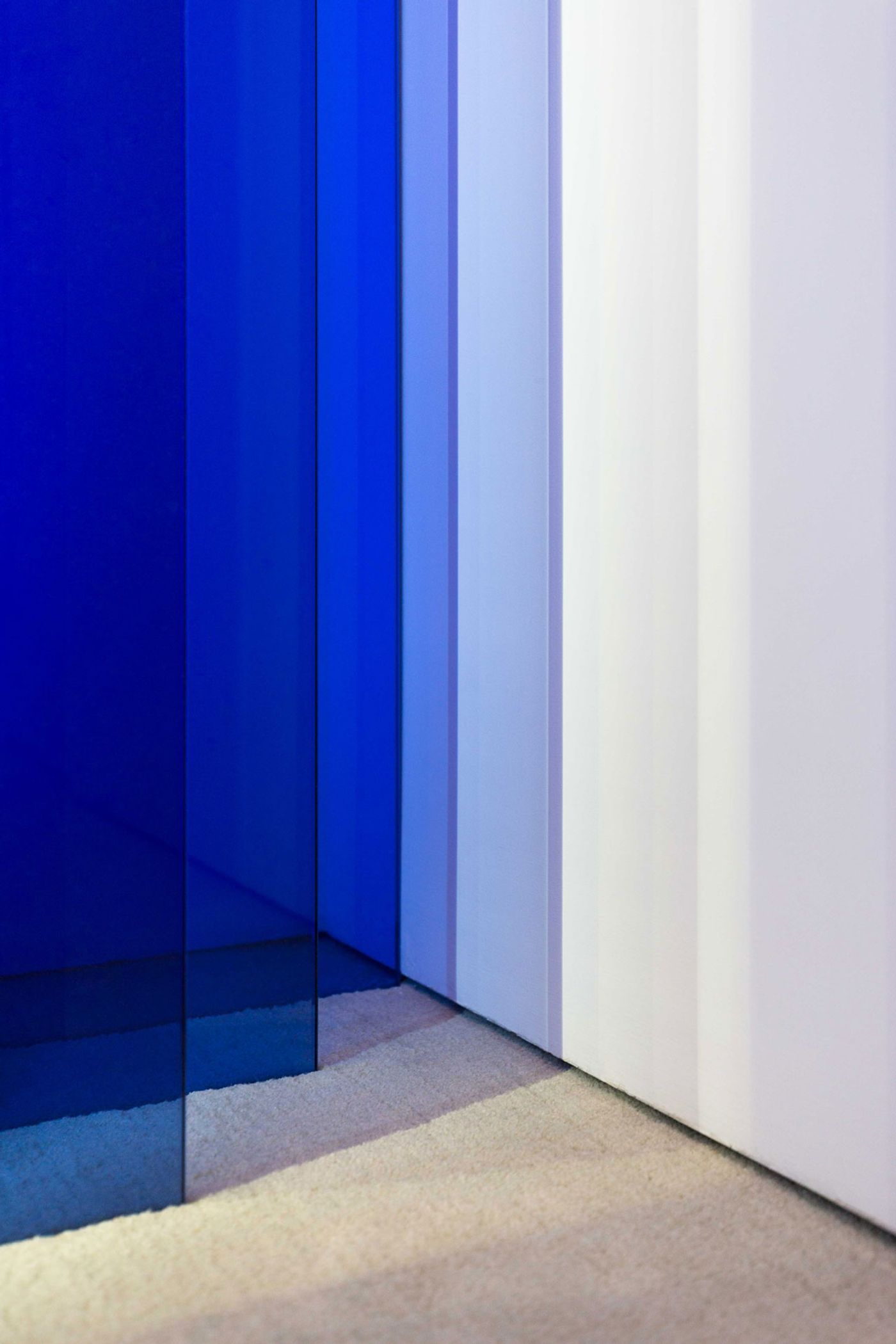
Photo by Han Sunghoon.
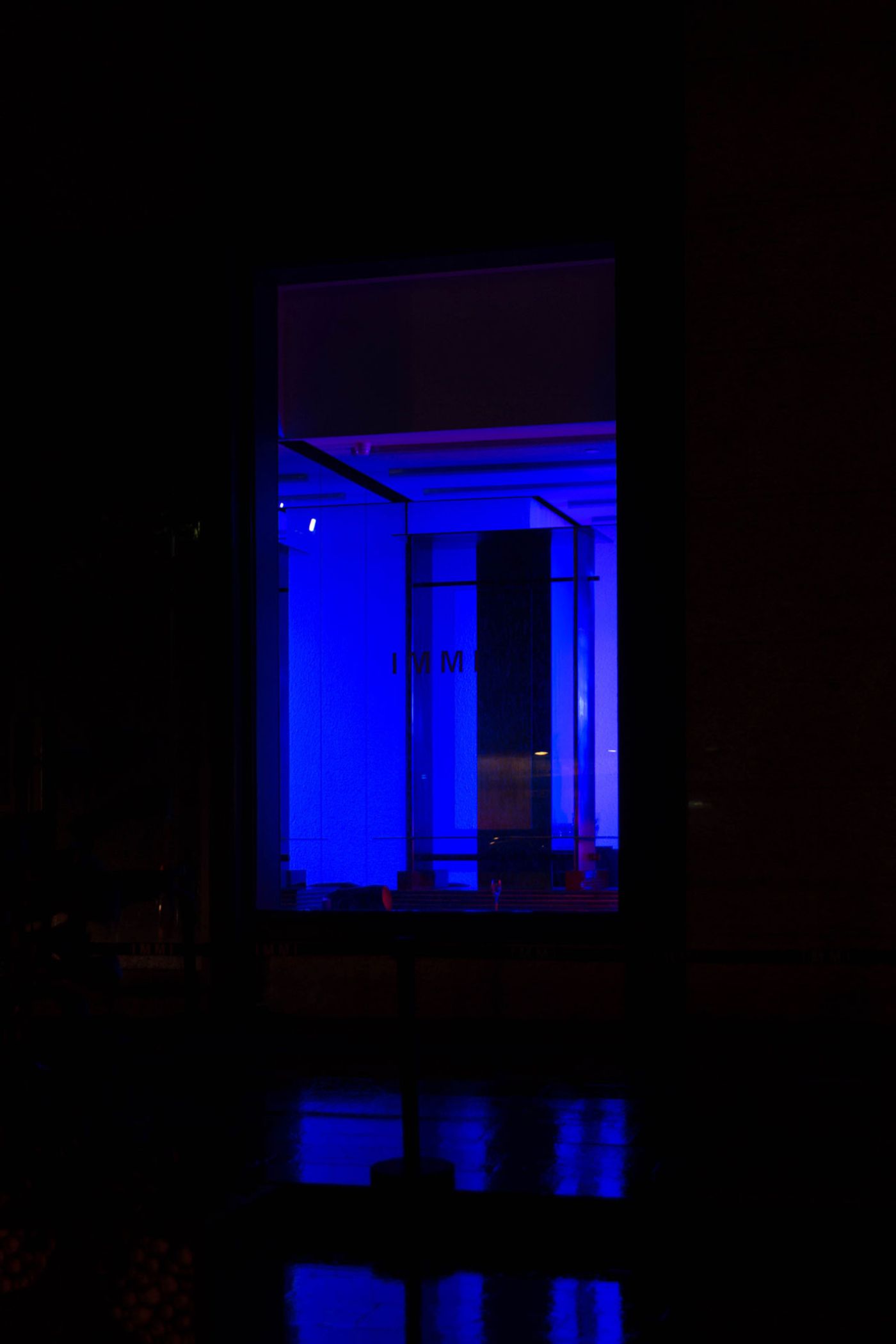
Photo by Han Sunghoon.