Project Name
Williams Burton Leopardi StudioPosted in
Interior DesignLocation
Area (sqm)
300Completed
2017| Detailed Information | |||||
|---|---|---|---|---|---|
| Project Name | Williams Burton Leopardi Studio | Posted in | Interior Design | Location |
Darling Building, 3/28 Franklin Street Adelaide SA SA 5000
Australia |
| Area (sqm) | 300 | Completed | 2017 | ||
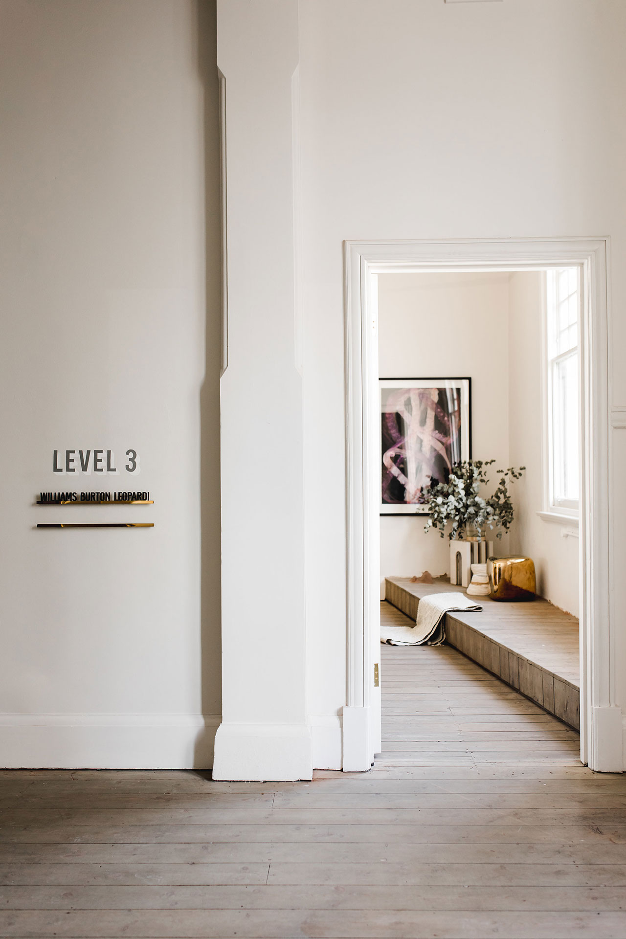
Photo by Christopher Morrison.
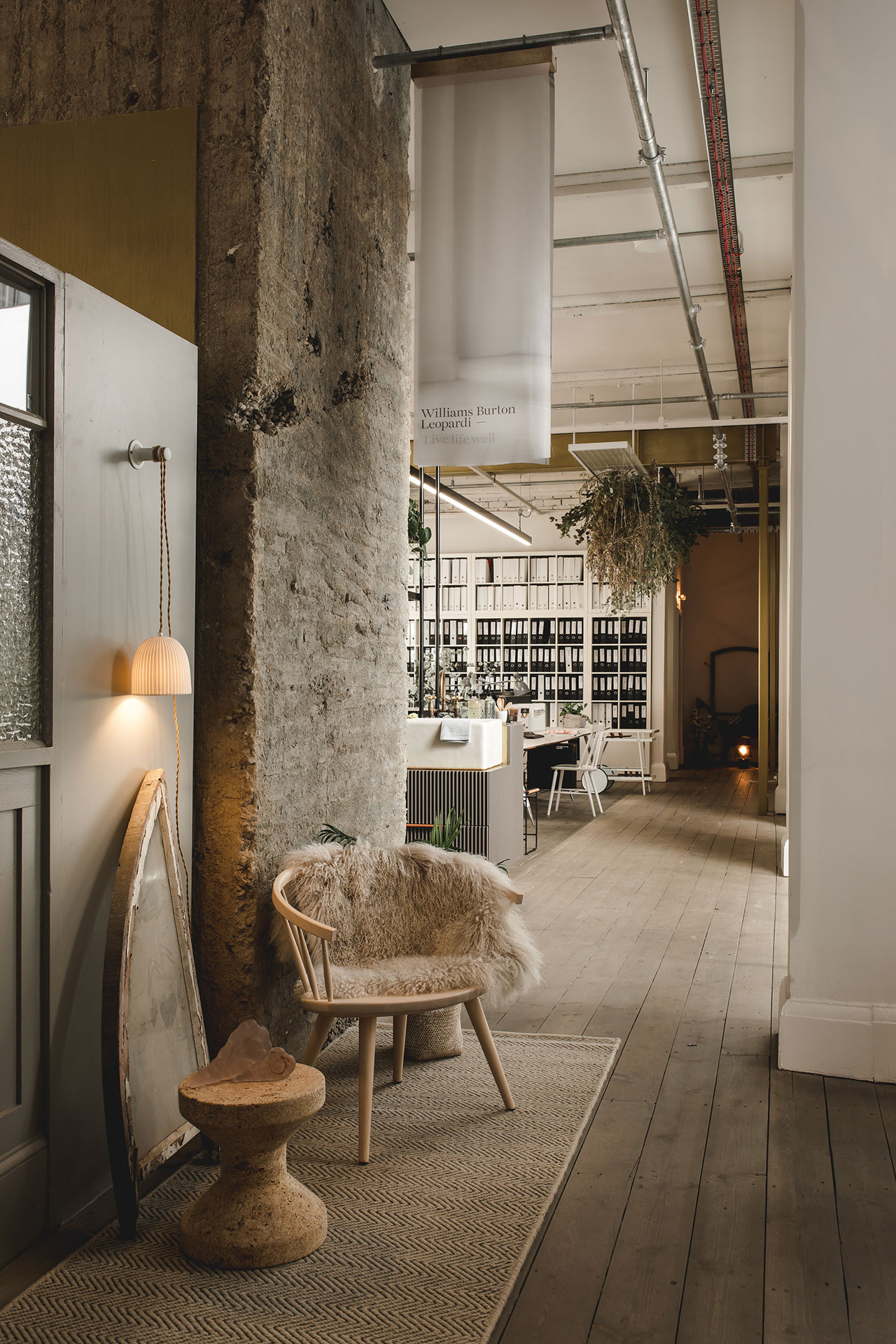
Photo by Christopher Morrison.
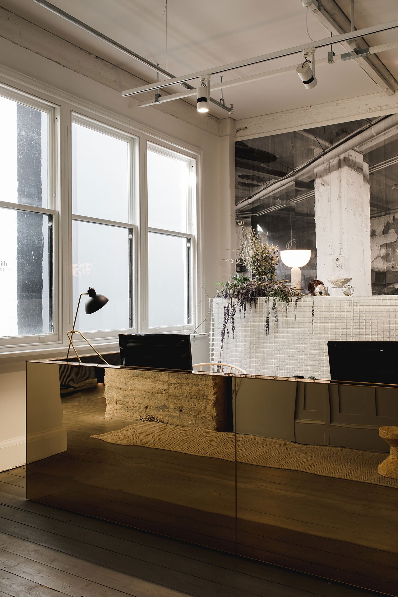
Photo by Christopher Morrison.
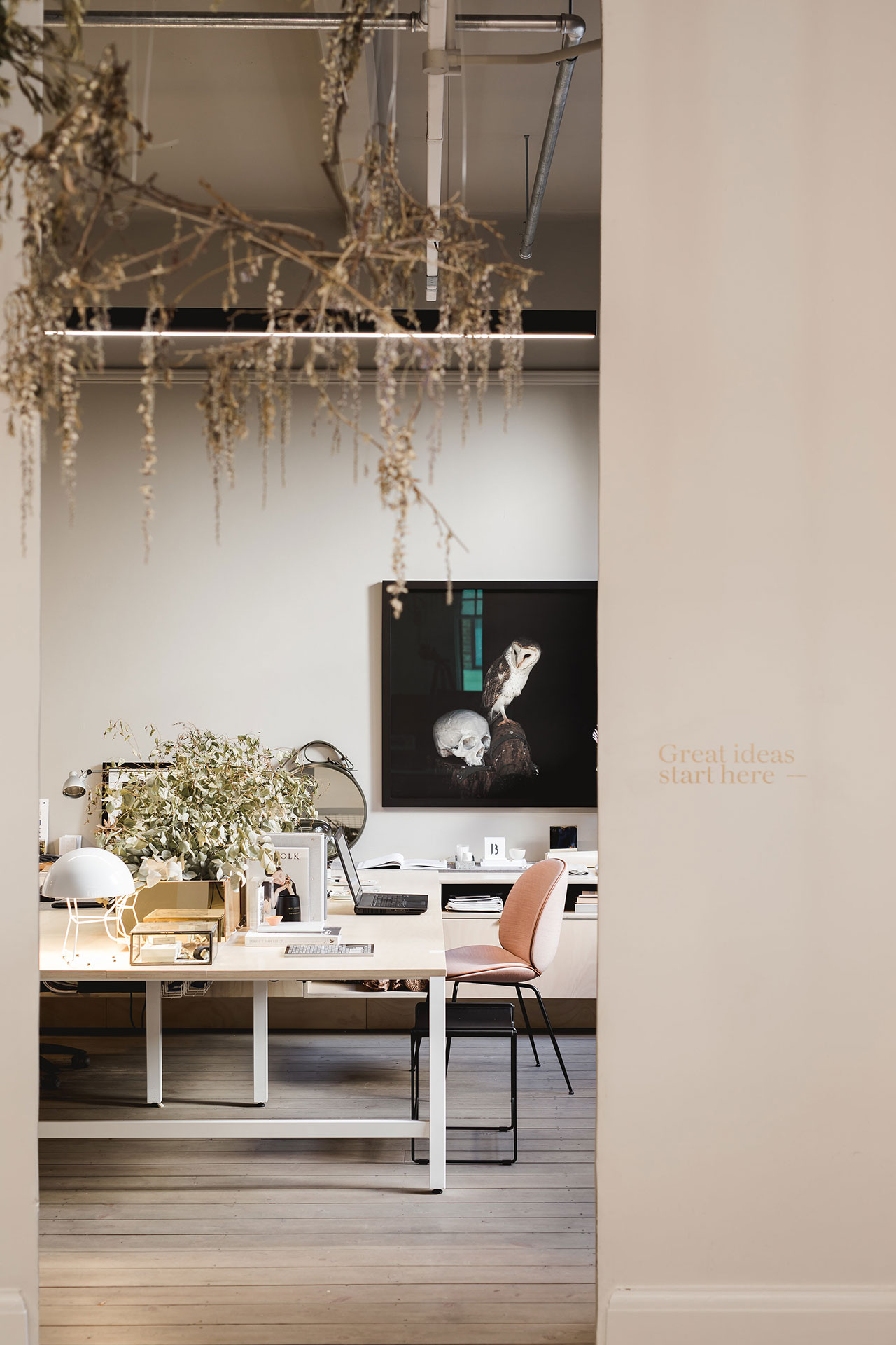
Photo by Christopher Morrison.
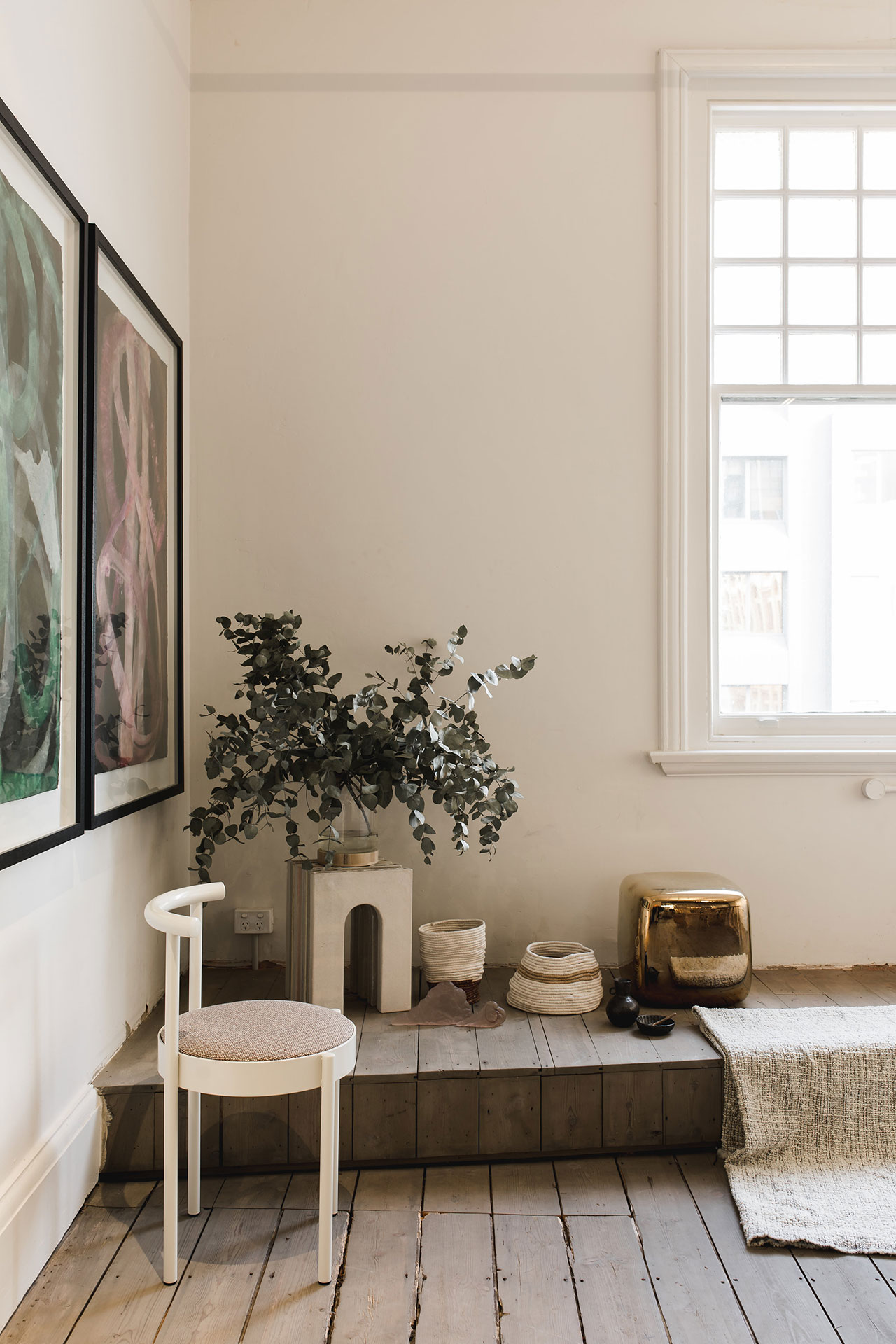
Photo by Christopher Morrison.
Instead of treating the building’s age and patina as residual elements to be effaced, the architects hailed them as signs of virtue. “The strategy”, as they explain, “was to touch as little as possible and as much as necessary”, a thoughtful approach reflected in the hardwood floors that were left unpolished, the concrete columns and beams left exposed, and the original brickwork which sometimes peeks through the freshly painted walls. These meticulously repaired elements not only tell the building’s story but also prove that an object or space can be more beautiful for having been broken.
The salvaged building fabric evinces a rough, masculine sensibility that the architects have evocatively paired with a number of smoother, more feminine details. Among these, polished brass cladding sumptuously envelops work stations, plants on suspended trellises provide texture, and rugs and hanging textiles evince warmth. These contrasting aesthetics are harmoniously brought together by modest insertions of steel framed glazing, recycled 1920’s partitions and found objects, while a selection of mid-century modernist furniture and light fixtures combined with contemporary pieces further enrich the eclectic décor.
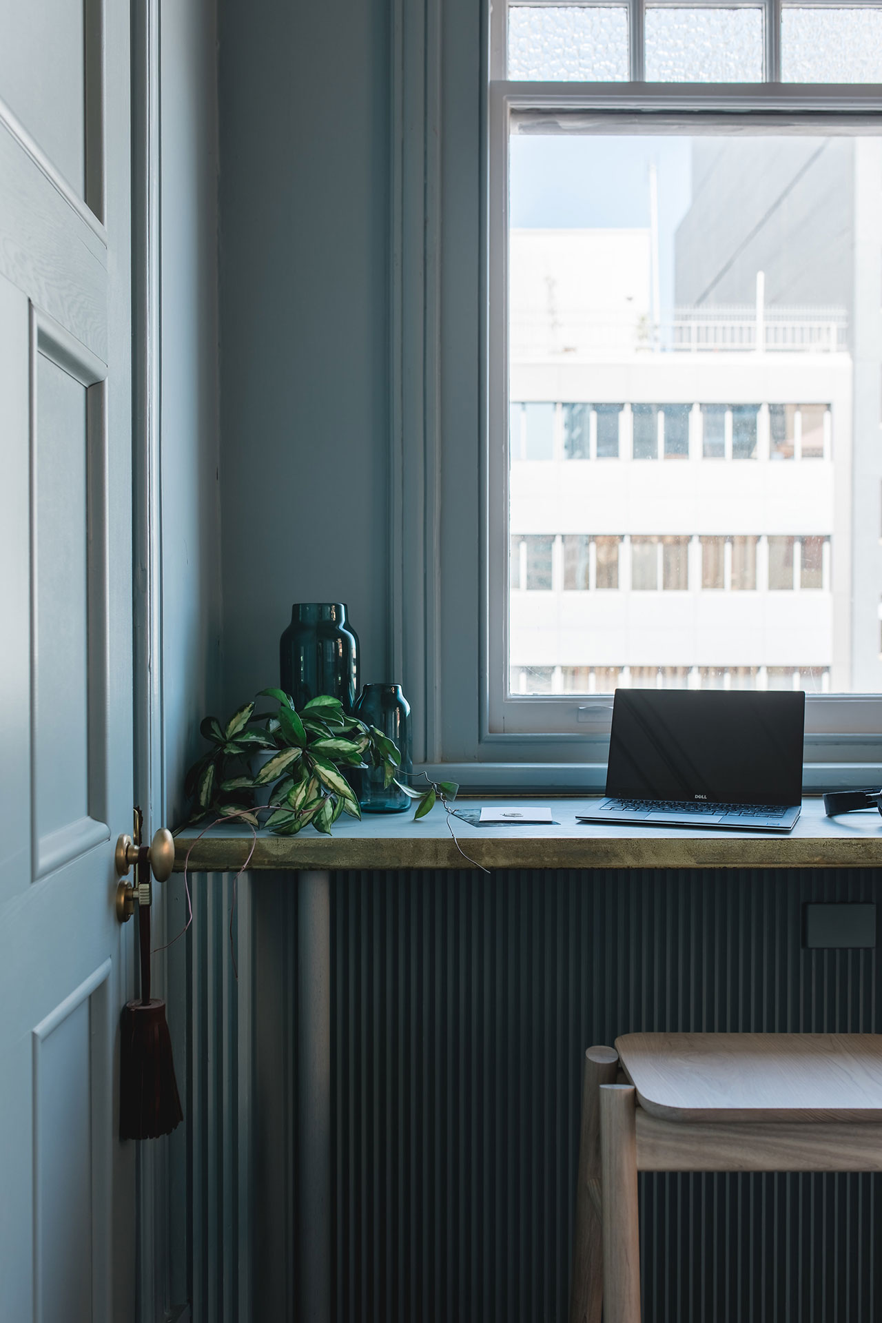
Photo by Christopher Morrison.
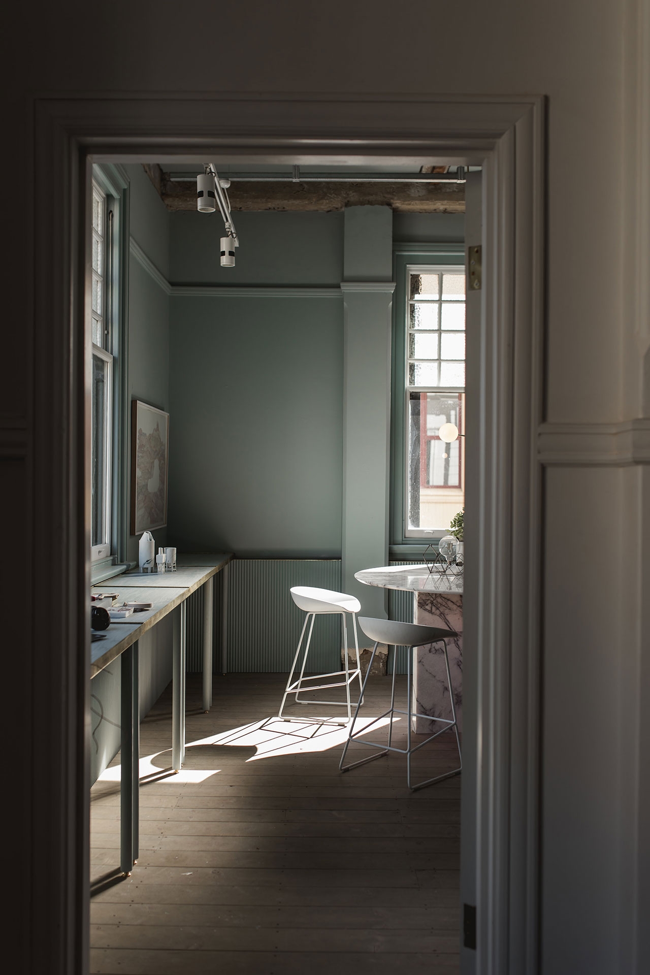
Photo by Christopher Morrison.
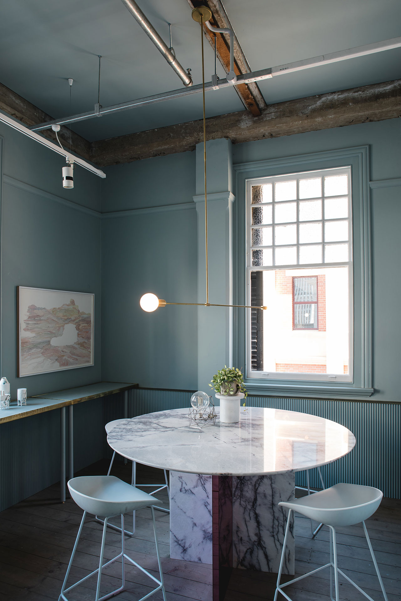
Photo by Christopher Morrison.
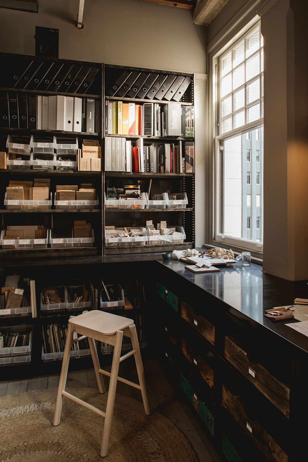
Photo by Christopher Morrison.
The heart of the studio is undoubtedly the coffee bar counter-cum-kitchen at the centre of the open-plan workroom, a relaxed space, abundantly daylit by both the street-facing windows and a light-well on the back, where employees can gather around to sip a cup of coffee, chat or just unwind. For some alone time or contemplation there are the more austere library and old school materials room, whereas the baby blue meeting room is the place to go to brainstorm or refresh your visual palette. Underpinning all these spaces is the architects’ plan to remove “silos”, to encourage interaction by establishing visual connections between them and thus encourage both the flow of people and ideas. It is a noble aspiration than WBL has immaculately accomplished in their elegant studio by transforming it into a place that is both interactive and reclusive.
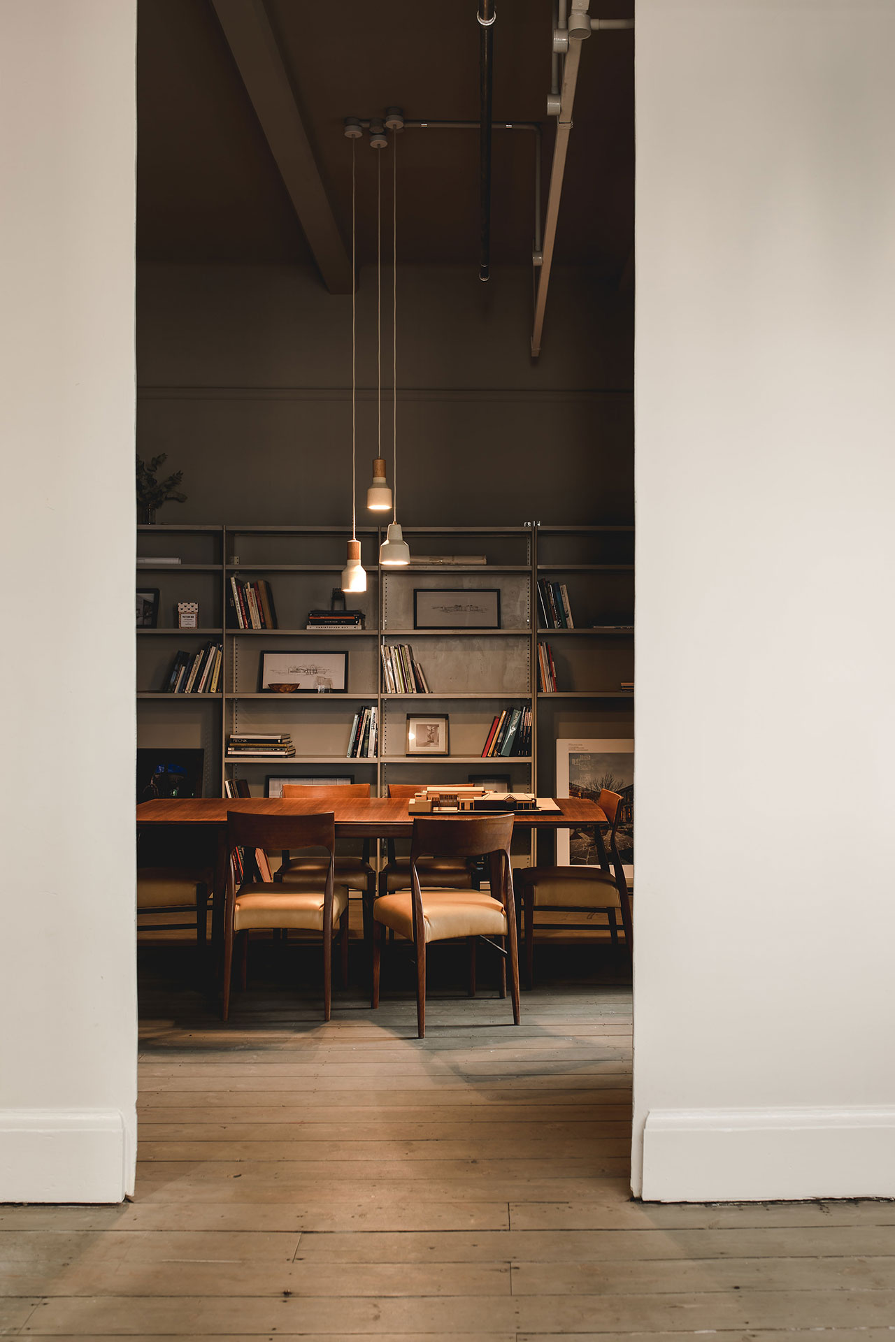
Photo by Christopher Morrison.
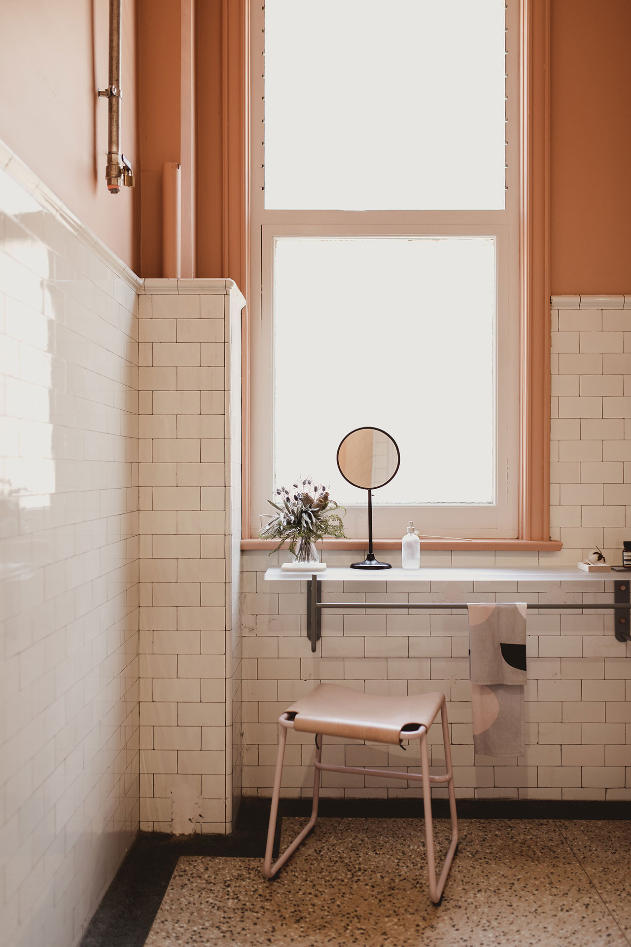
Photo by Christopher Morrison.

Photo by Christopher Morrison.
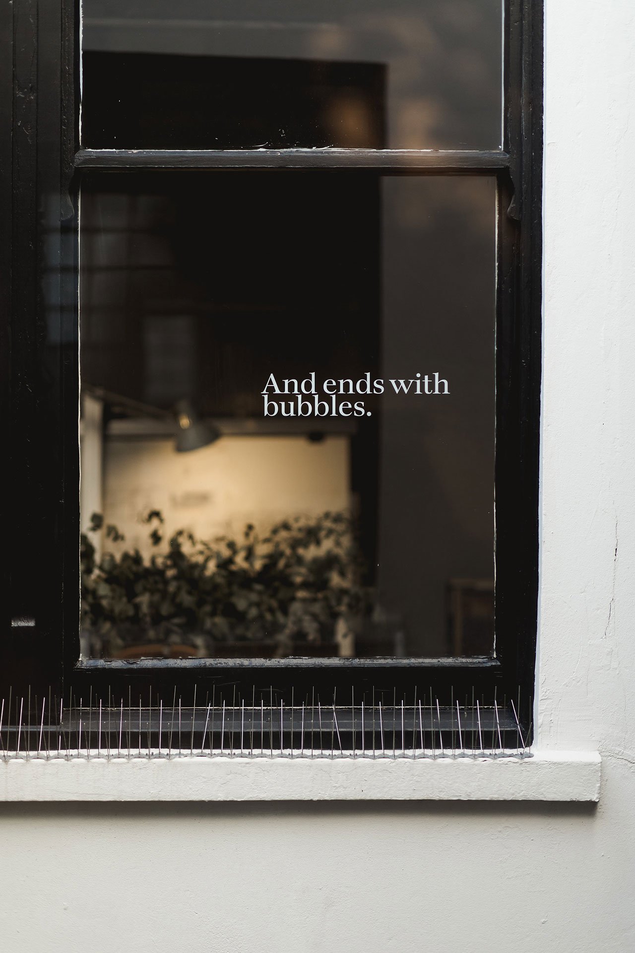
Photo by Christopher Morrison.
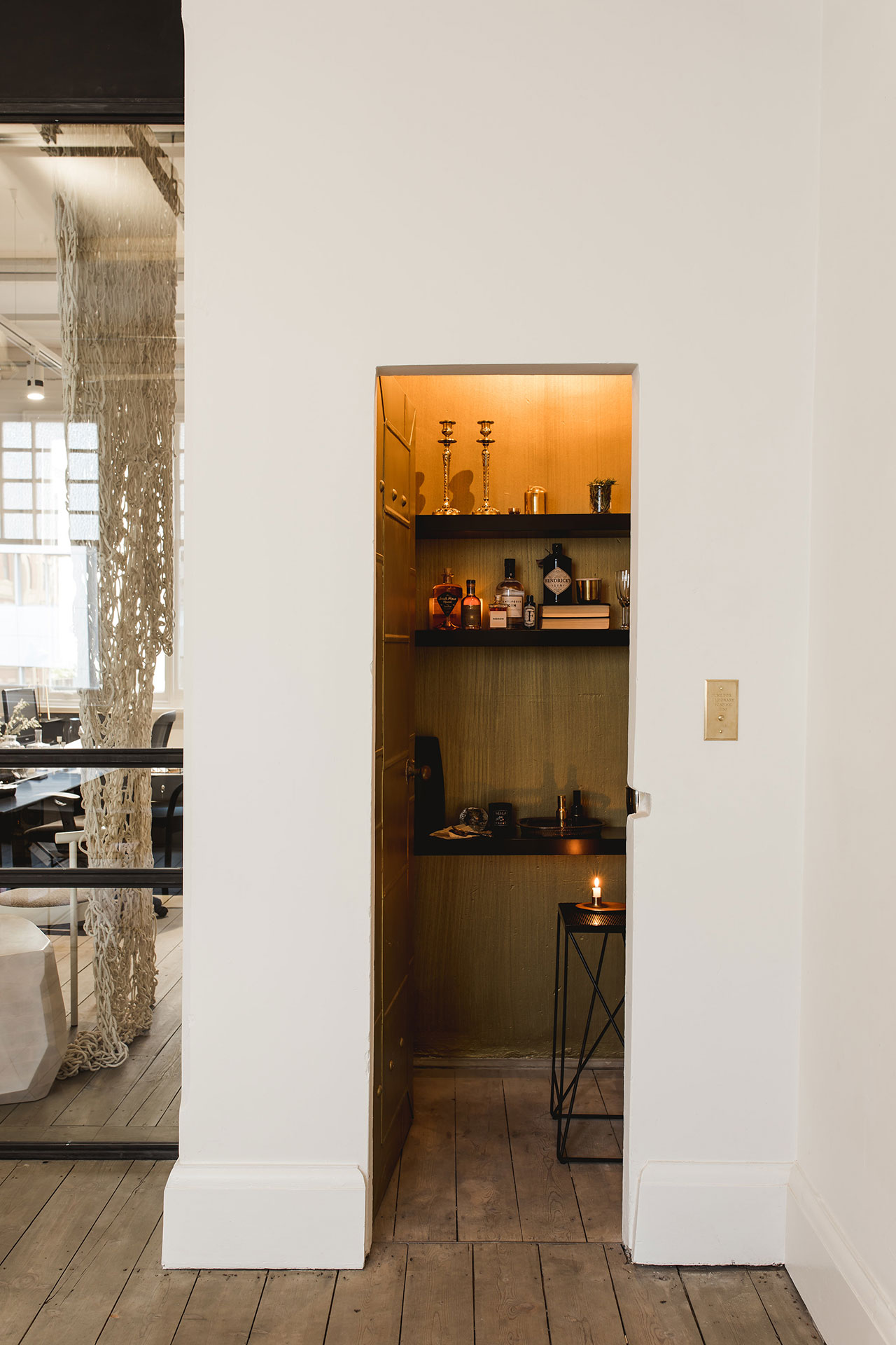
Photo by Christopher Morrison.
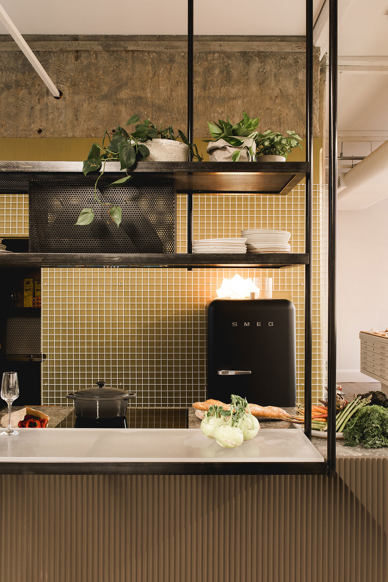
Photo by Christopher Morrison.
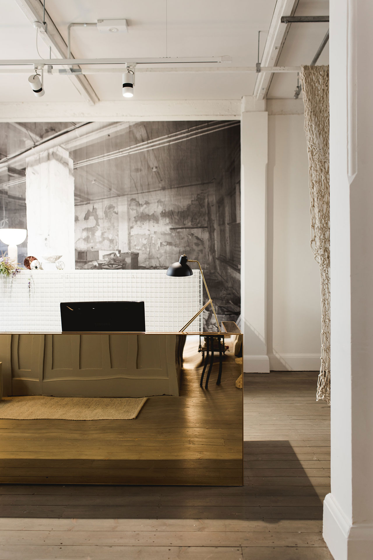
Photo by Christopher Morrison.
Photo by Christopher Morrison.
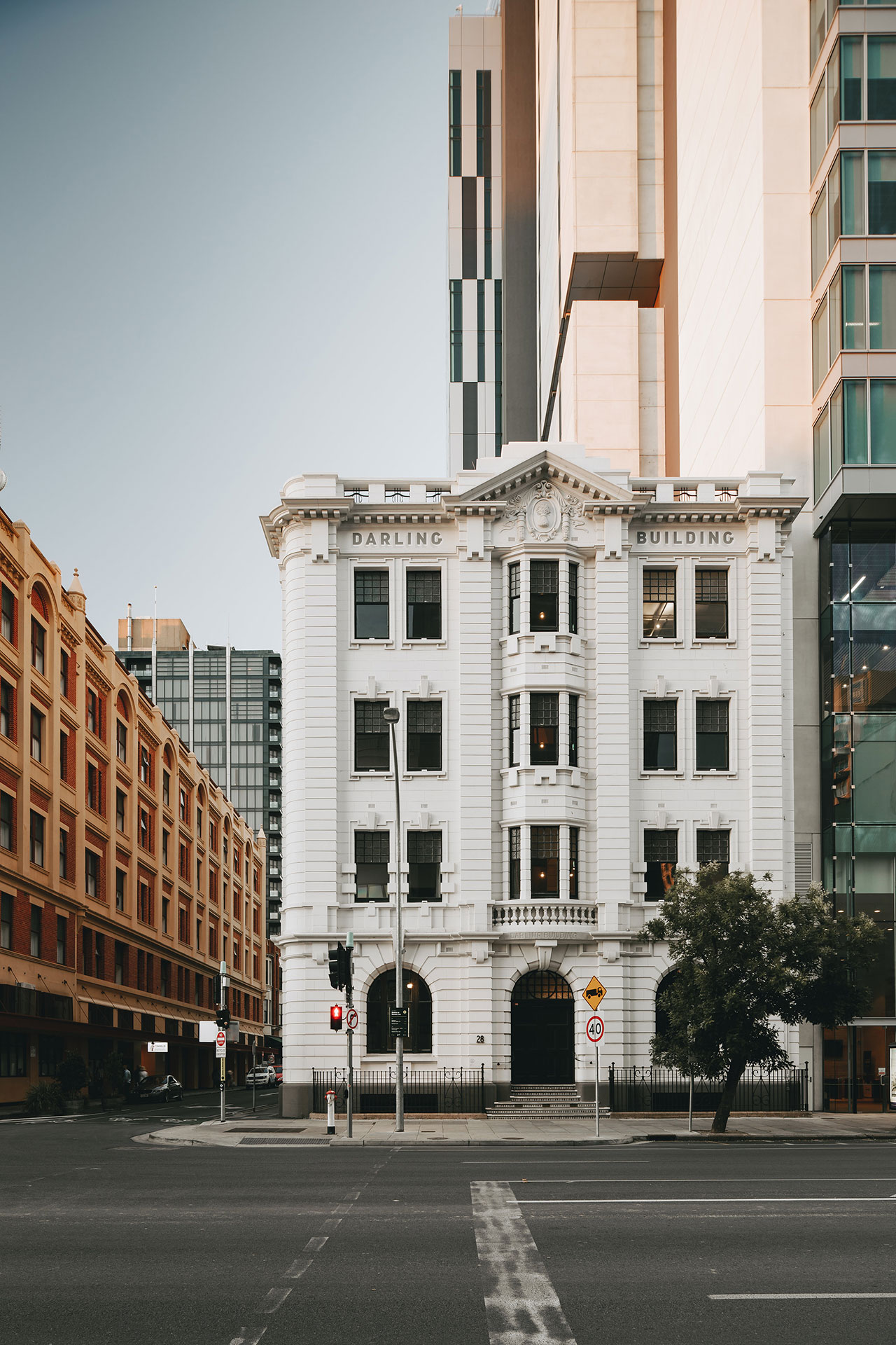
Photo by Christopher Morrison.


