Past & Present Effortlessly Merge in Yusuke Seki's Minimalist Coffee Shop in Japan
Words by Yatzer
Location
Kobe, Japan
Past & Present Effortlessly Merge in Yusuke Seki's Minimalist Coffee Shop in Japan
Words by Yatzer
Kobe, Japan
Kobe, Japan
Location
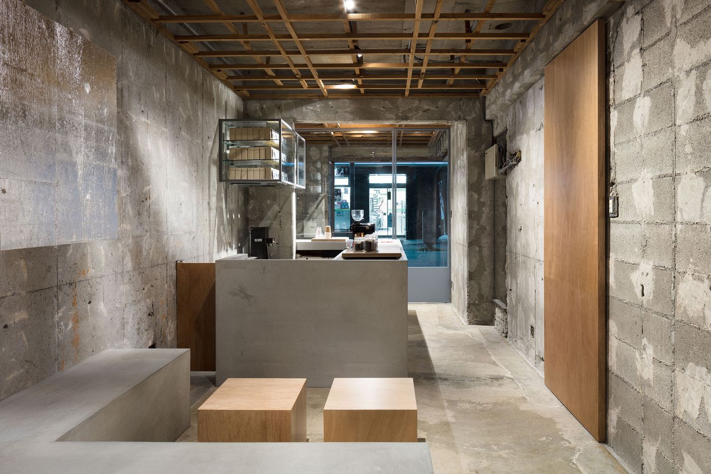
New customers passing by Voice of Coffee, a new coffee roaster and café in Kobe-shi, Hyogo, Japan, would be excused if they were reluctant to venture inside considering that at first glance the shop looks like it’s under construction. Untreated concrete walls, exposed air ducts, and an unfinished drop ceiling momentarily makes you think that the barista working behind the counter should be plastering walls or installing ceiling tiles instead. Look closer though and you will observe the immaculate detailing of the minimalist interventions of Japanese design team Yusuke Seki who have masterfully integrated the site’s history into their design in order to convey the passing of time. And if you still have any doubts, the gleaming, retro-futuristic looking roaster machine at the back will reassure you.
One of the main interventions that the designers came up with was to set the storefront back from the street, creating an engawa, a threshold space that in traditional Japanese architecture functions as a sort of porch or sunroom outside a house’s shutters. This spatial arrangement, which divides the oblong shop into two zones, creates a sheltered exterior space where customers can enjoy their coffee. But as importantly, by safeguarding the visual connection between the two spaces, it makes the store feel deeper and thus more spacious than it would otherwise appear to be.
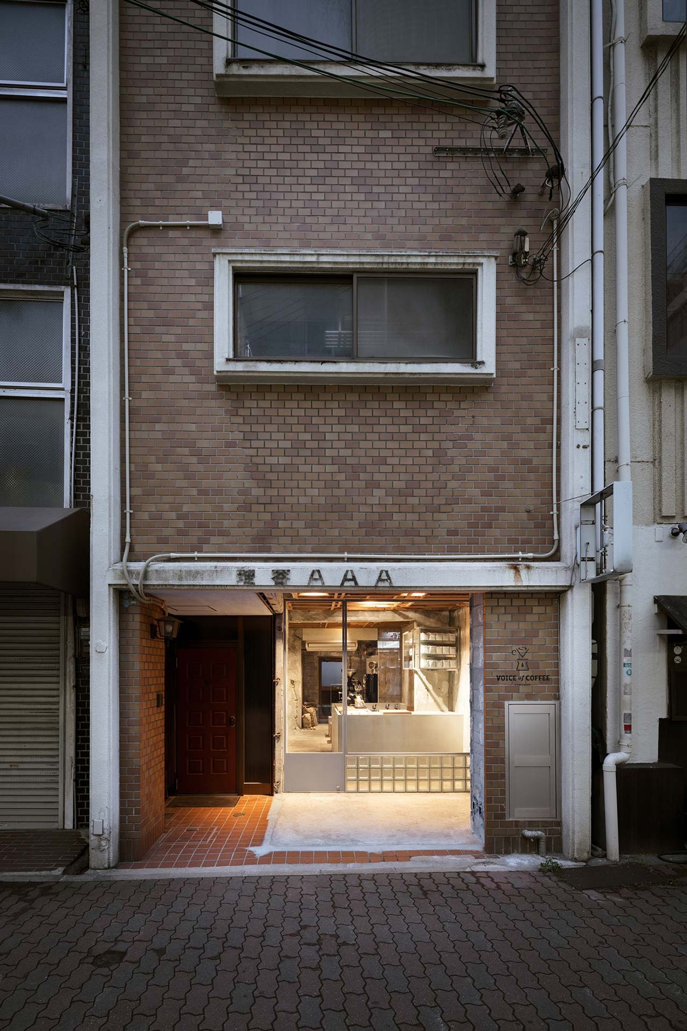
Photo by Takumi Ota.
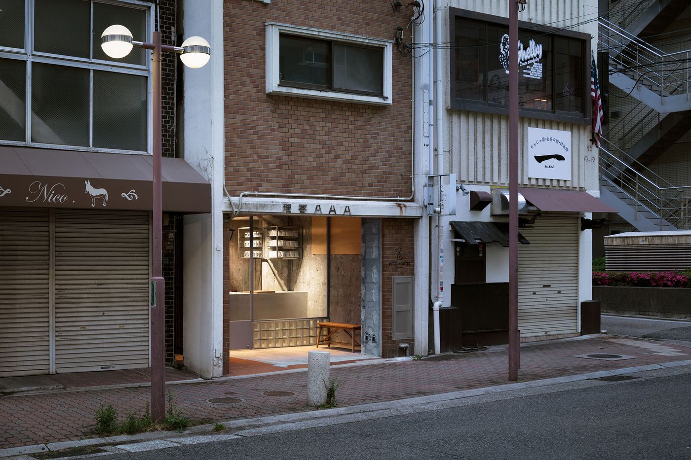
Photo by Takumi Ota.
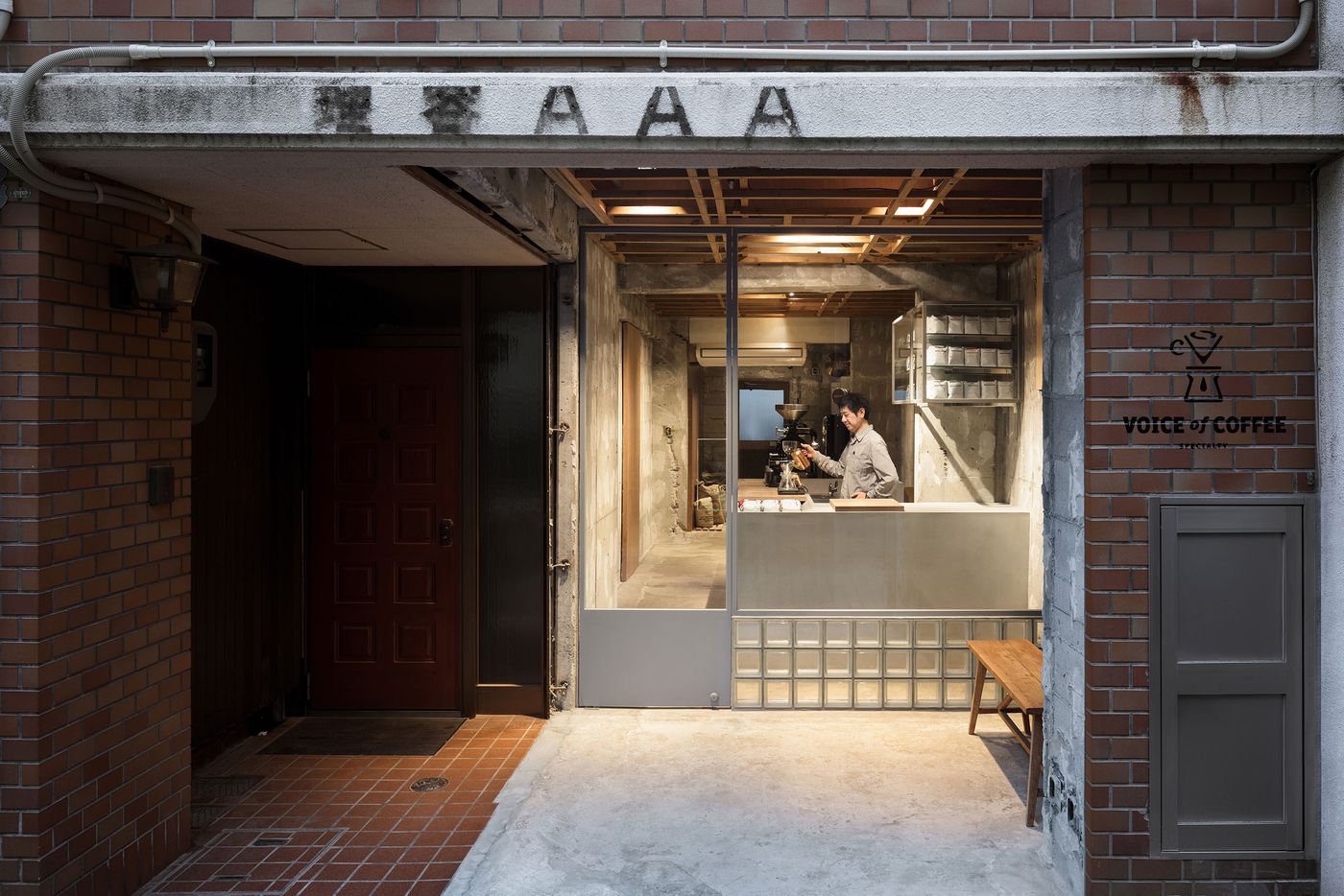
Photo by Takumi Ota.
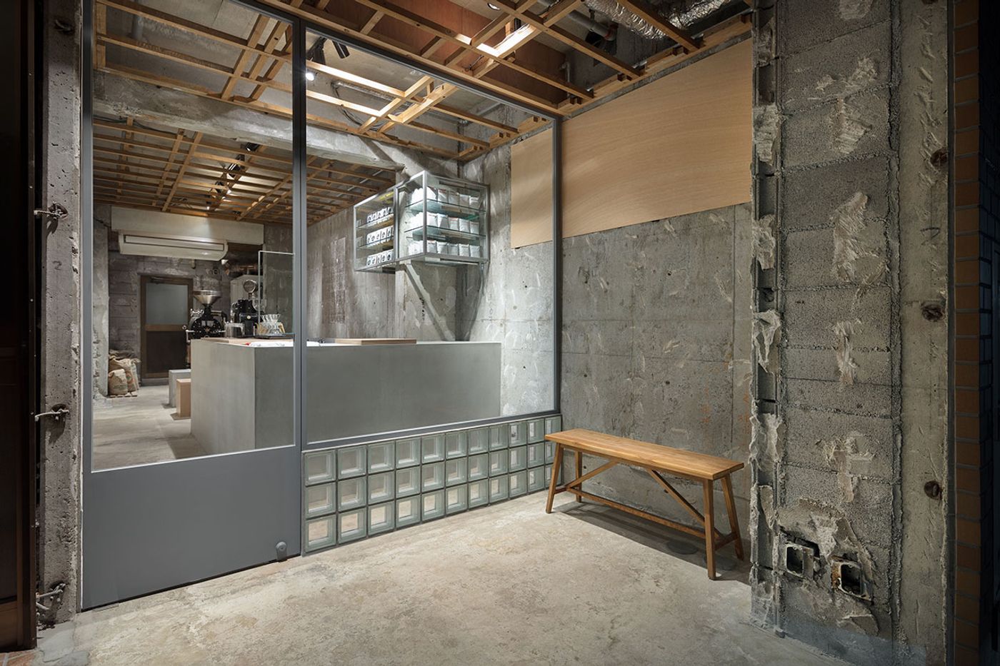
Photo by Takumi Ota.
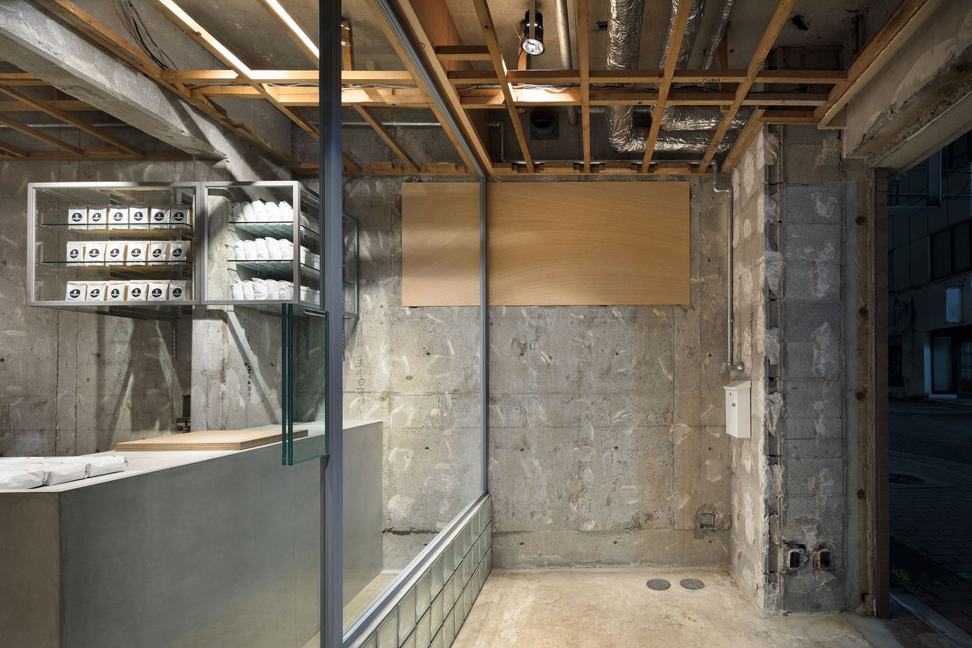
Photo by Takumi Ota.
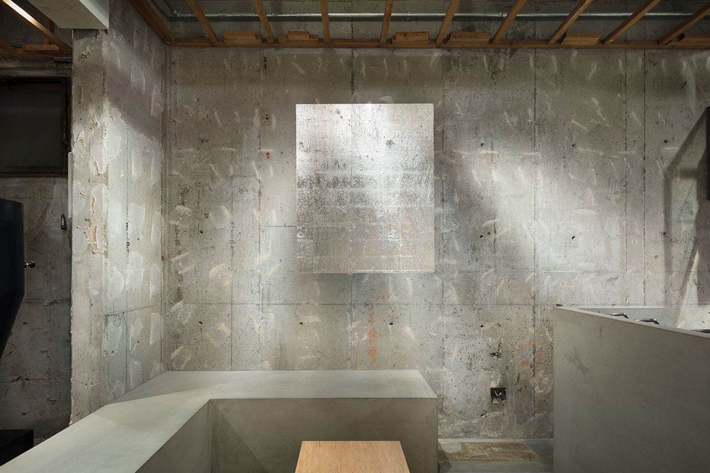
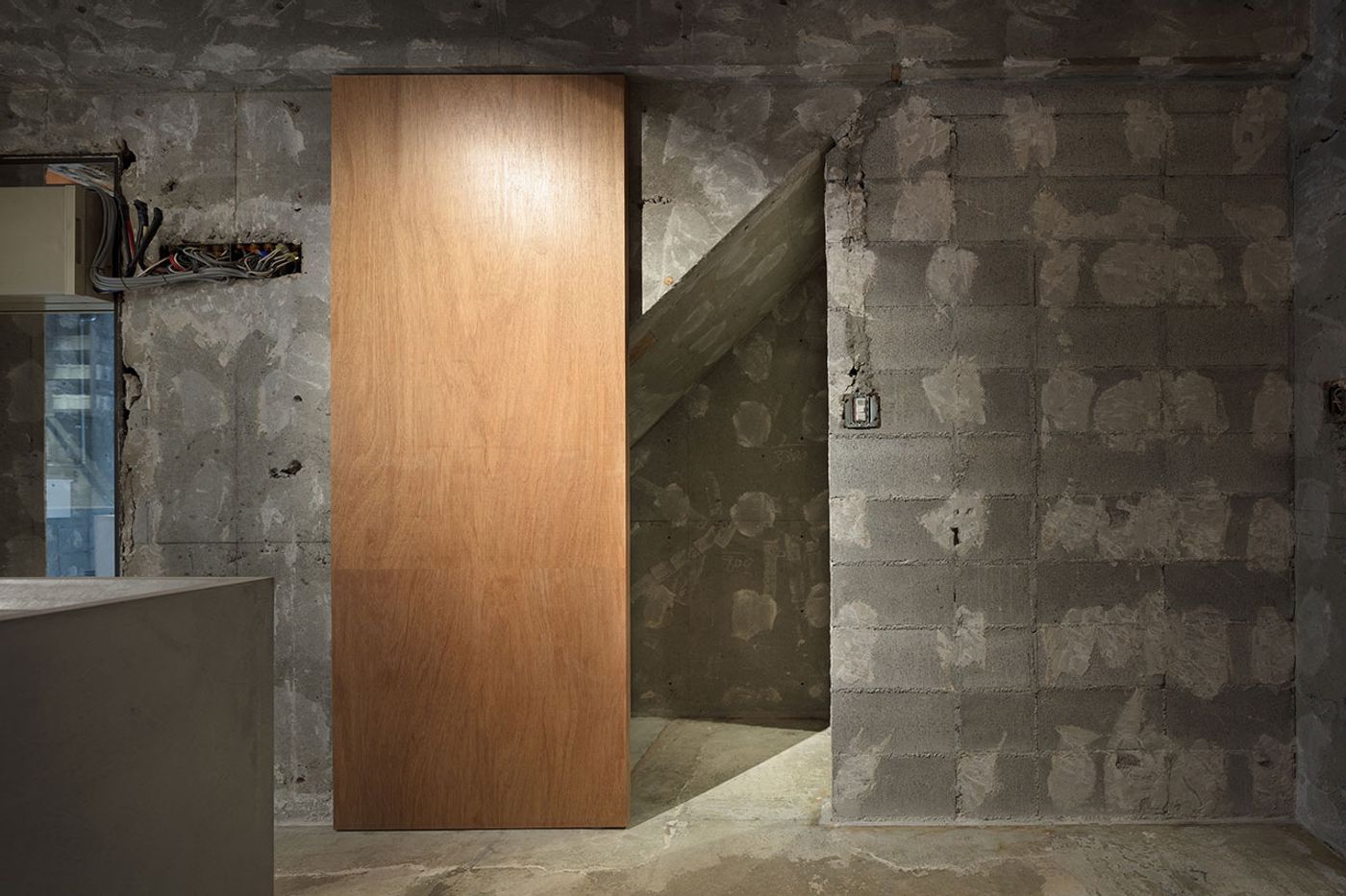
The rough aesthetic of the interiors, far from being a stylized attempt at urban hipness, is a gesture of truthfulness that exposes the building’s core fabric by leaving almost all of the structural elements as found during the demolition process. The timber grid that once supported the ceiling tiles, hidden for a long time behind layers of plaster, has now been revealed; decades-old inscriptions by workers, material imperfections and construction blemishes that used to be covered up have been brought to the light while the screed flooring that lingered below floor tiles and boards can now be stepped upon. This subtractive strategy has paradoxically accomplished the opposite of what you would expect: the addition of a plethora of elements into the design of the space.
The exposed building fabric is harmoniously complemented by Yusuke Seki’s minimalist interventions which create enticing textural juxtapositions without monopolizing the space. The new concrete counter and sitting bench, for example, perfectly blend in with the exposed concrete walls but at the same time their smooth surface pops out against the roughness of the existing building fabric. Likewise, the glossy shine of new timber doors and panels both tease and appease the coarseness of the drop ceiling frame. This textural playfulness culminates in a layer of a silver leaf applied on the wall at the sitting area at the back of the store. Barely visible at the moment, it will gradually turn gold as it oxidizes; another reminder of the passing of time.
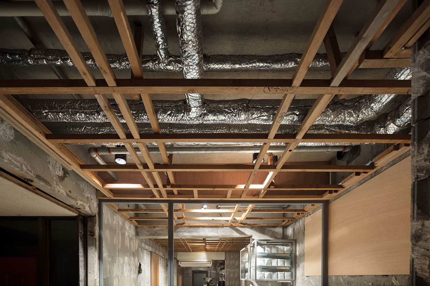
Photo by Takumi Ota.
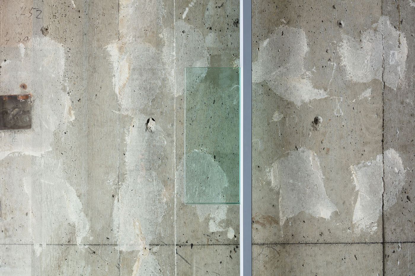
Photo by Takumi Ota.
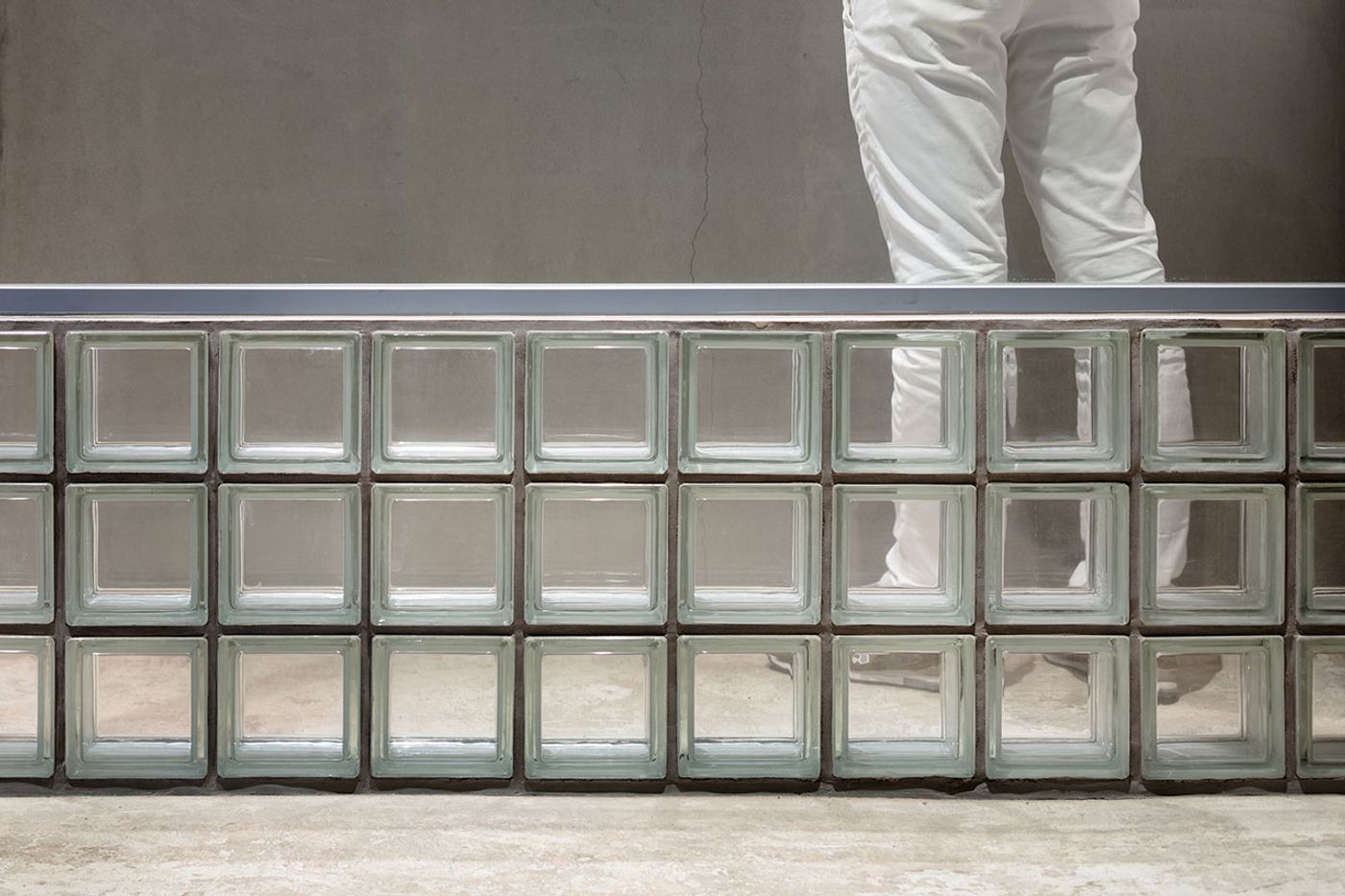
Photo by Takumi Ota.
Meanwhile, the simplicity of the glazed storefront hides a very detailed and innovative design that includes the delicate construction of a glass brick skirting held together by binding concrete alone, and a transparent door handle made of made of two panes of glass, glued on both sides of the glass door. The result is a transparent threshold that effaces the boundary between the interior and the exterior. Similarly intricate is the bespoke cupboard of glass and steel, which features a gull-wing mechanism specifically developed for the store by Yusuke Seki.
Although the site’s former incarnation as a barbershop is not specifically conjured, the only cryptic reminder being the “AAA” lettering above the entrance, the design of this extraordinary coffee shop nevertheless manages to bring the past to the fore, crucially without nostalgia, but as a natural continuum that connects it to the present.
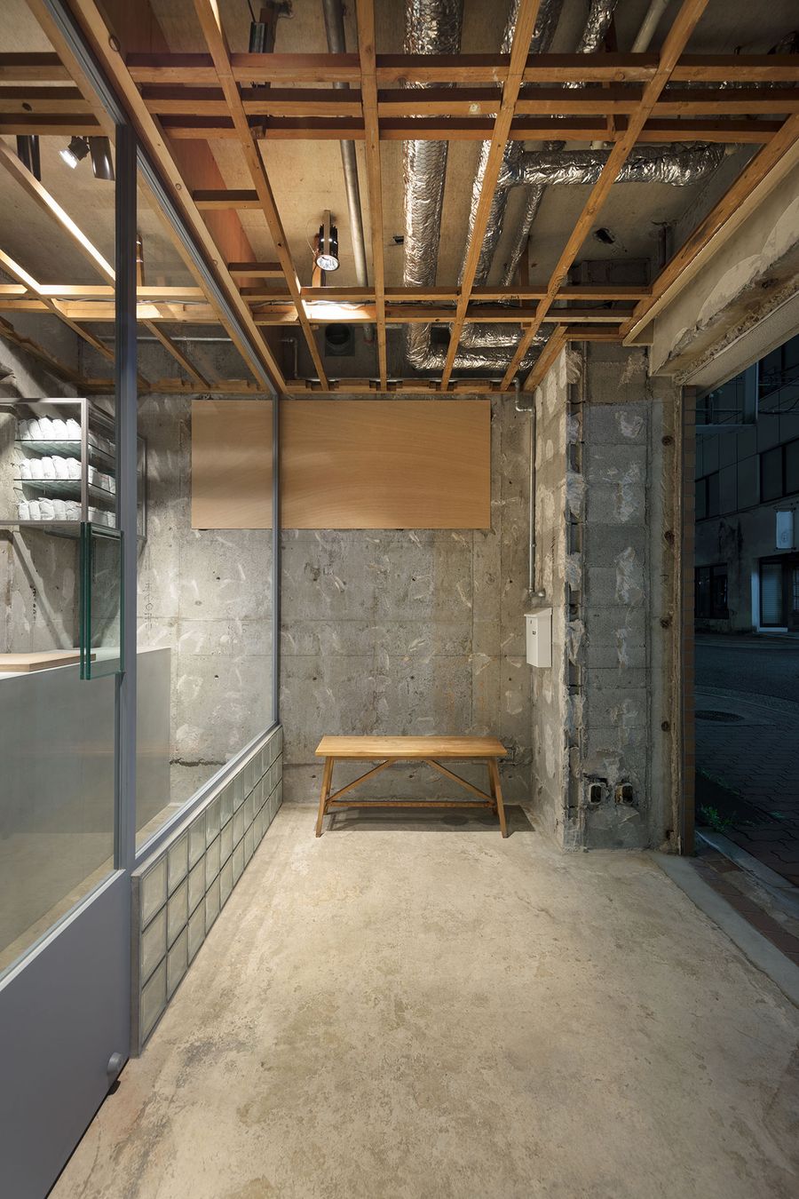
Photo by Takumi Ota.
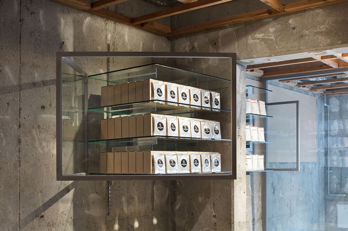
Photo by Takumi Ota.
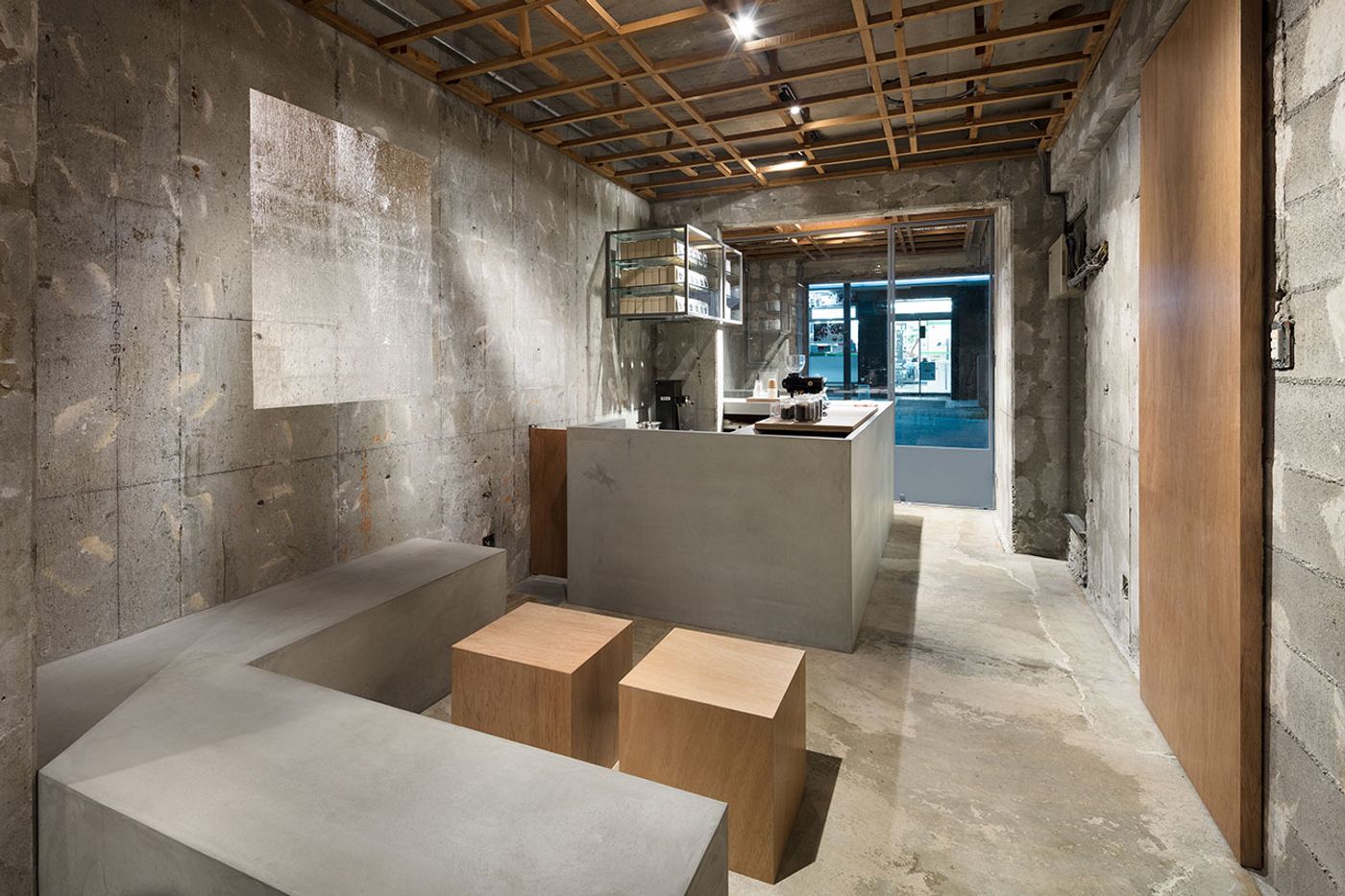
Photo by Takumi Ota.
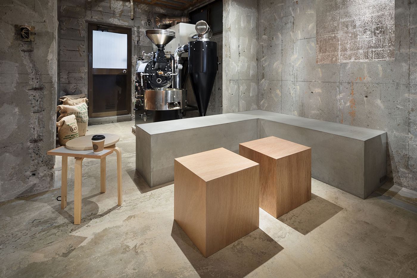
Photo by Takumi Ota.
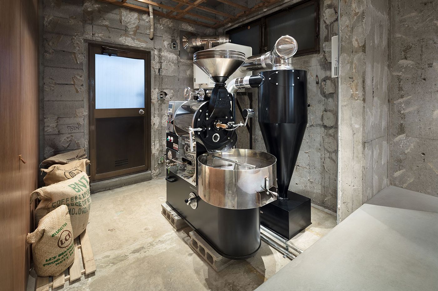
Photo by Takumi Ota.
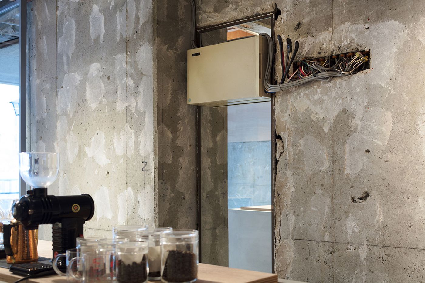
Photo by Takumi Ota.
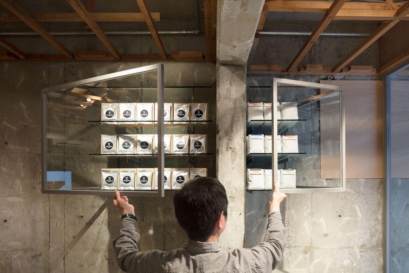
Photo by Takumi Ota.
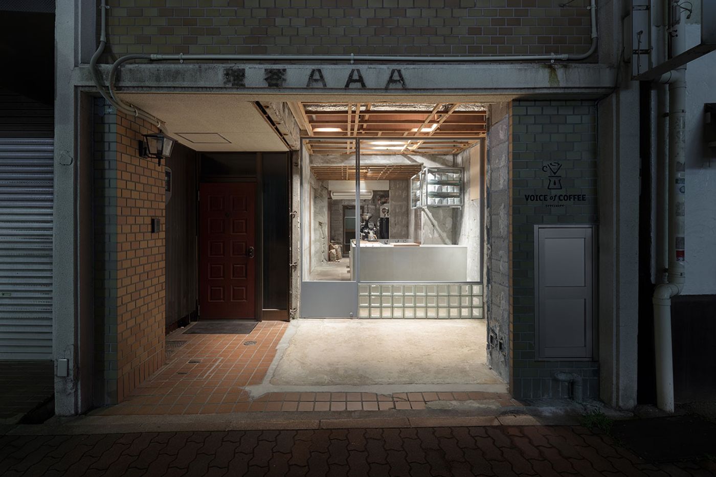
Photo by Takumi Ota.
