Project Name
TreeHugger (Tourist Information Office)Location
Official Website
MoDus Architects (Sandy Attia, Matteo Scagnol)Project Team
Irene Braito, Filippo Pesavento | Structural engineer: Luca BragagnaArea (sqm)
430Client
Bressanone Tourist AssociationCompleted
September 2019| Detailed Information | |||||
|---|---|---|---|---|---|
| Project Name | TreeHugger (Tourist Information Office) | Location |
Bressanone
Italy | Official Website | MoDus Architects (Sandy Attia, Matteo Scagnol) |
| Project Team | Irene Braito, Filippo Pesavento | Structural engineer: Luca Bragagna | Area (sqm) | 430 | Client | Bressanone Tourist Association |
| Completed | September 2019 | ||||
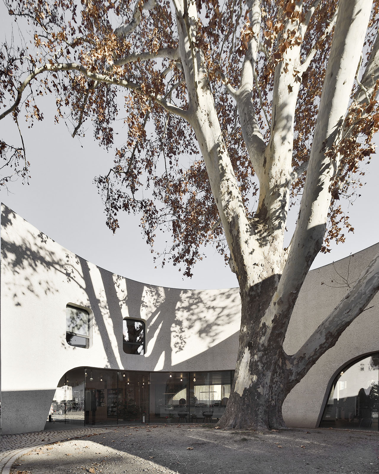
TreeHugger by MoDusArchitects in Bressanone (Bolzano, Italy). Photo © Oskar Da Riz.
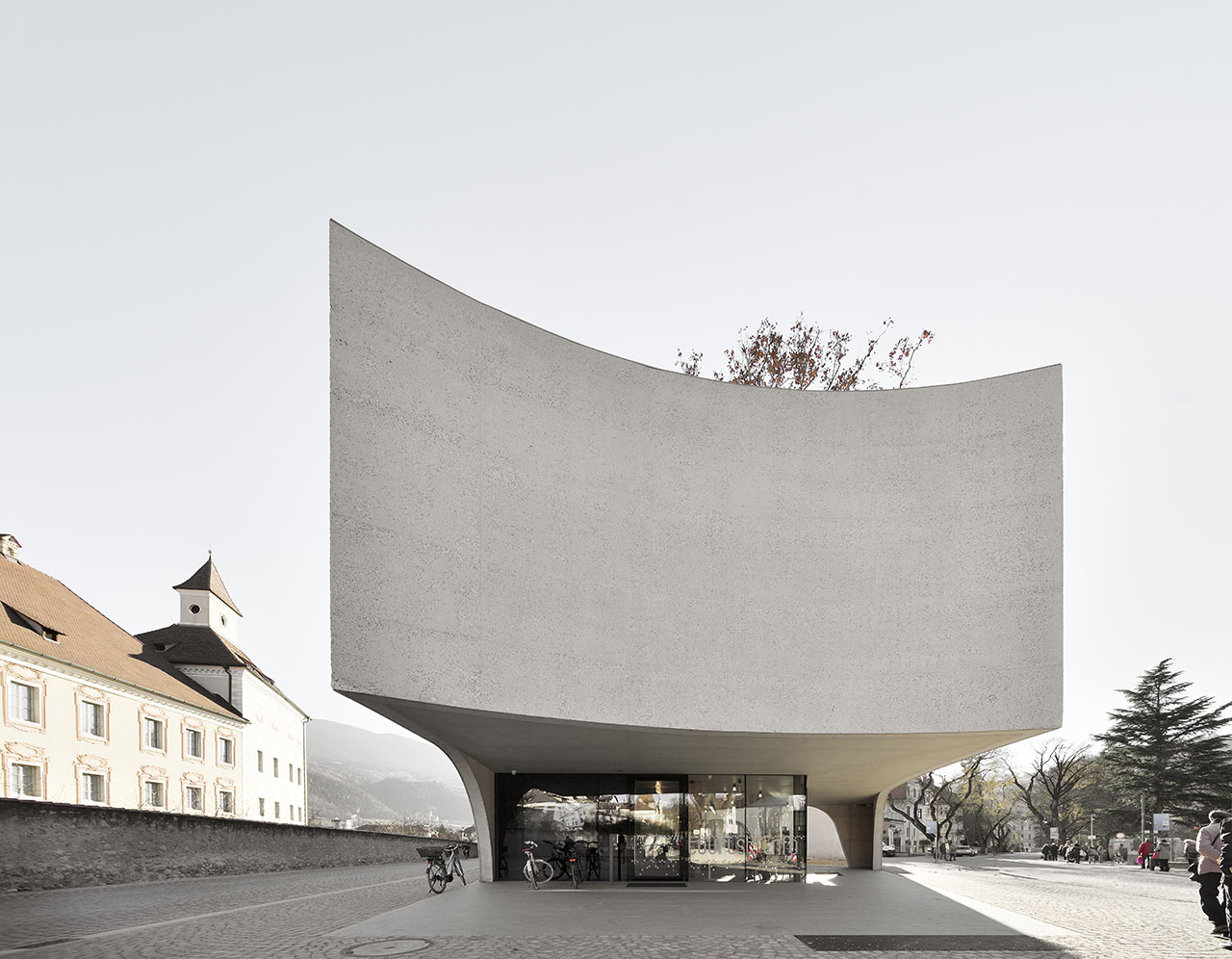
TreeHugger by MoDusArchitects in Bressanone (Bolzano, Italy). Photo © Oskar Da Riz.
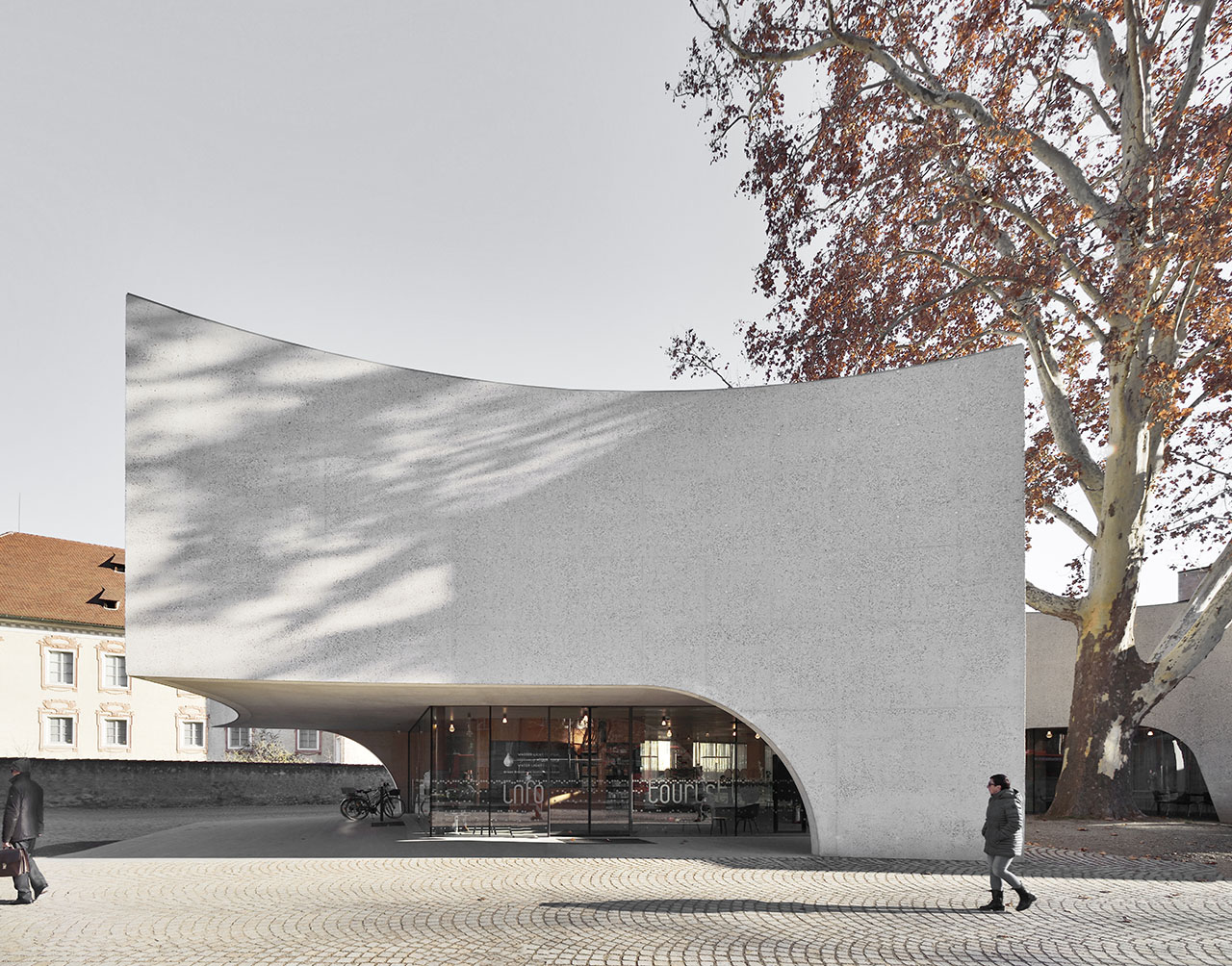
TreeHugger by MoDusArchitects in Bressanone (Bolzano, Italy). Photo © Oskar Da Riz.
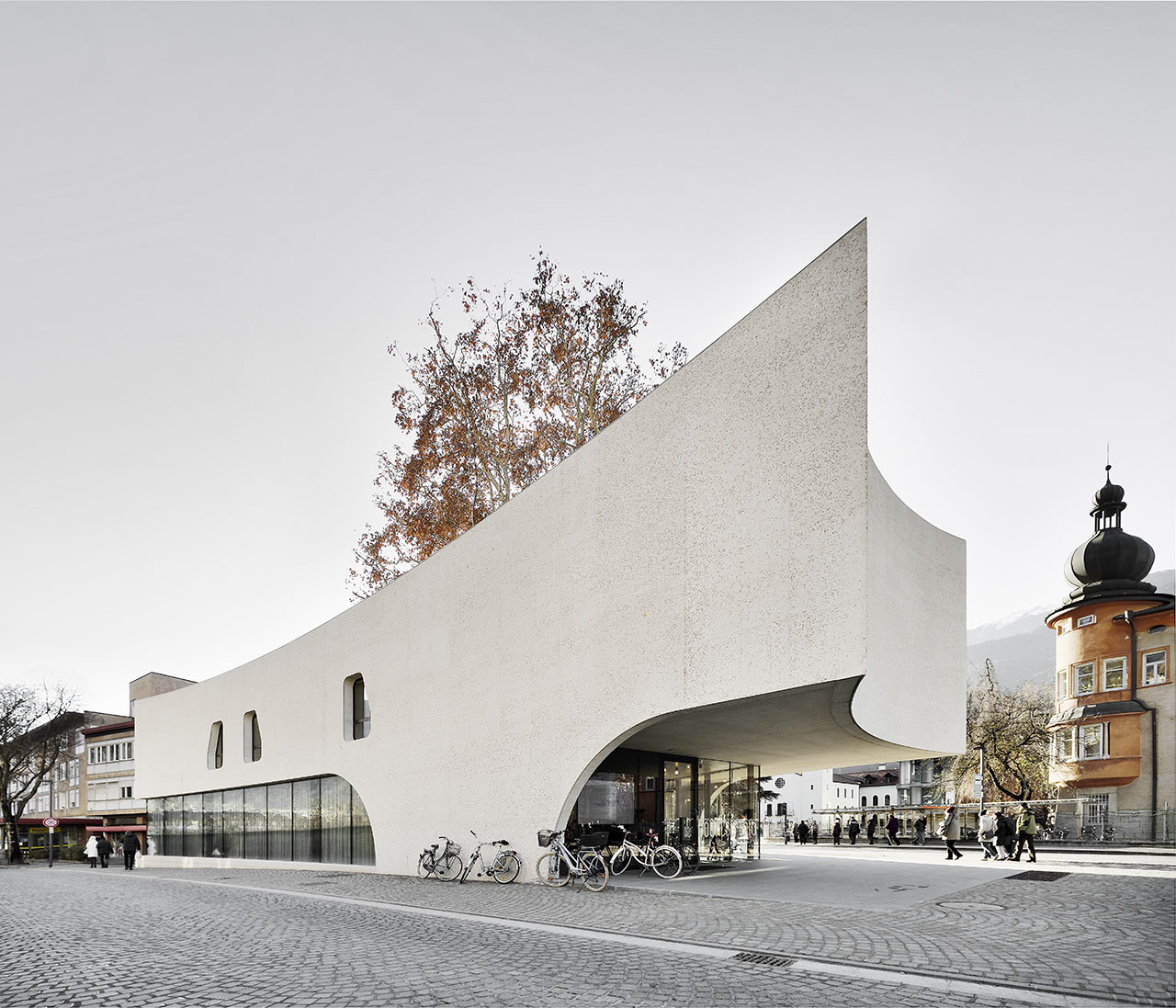
TreeHugger by MoDusArchitects in Bressanone (Bolzano, Italy). Photo © Oskar Da Riz.
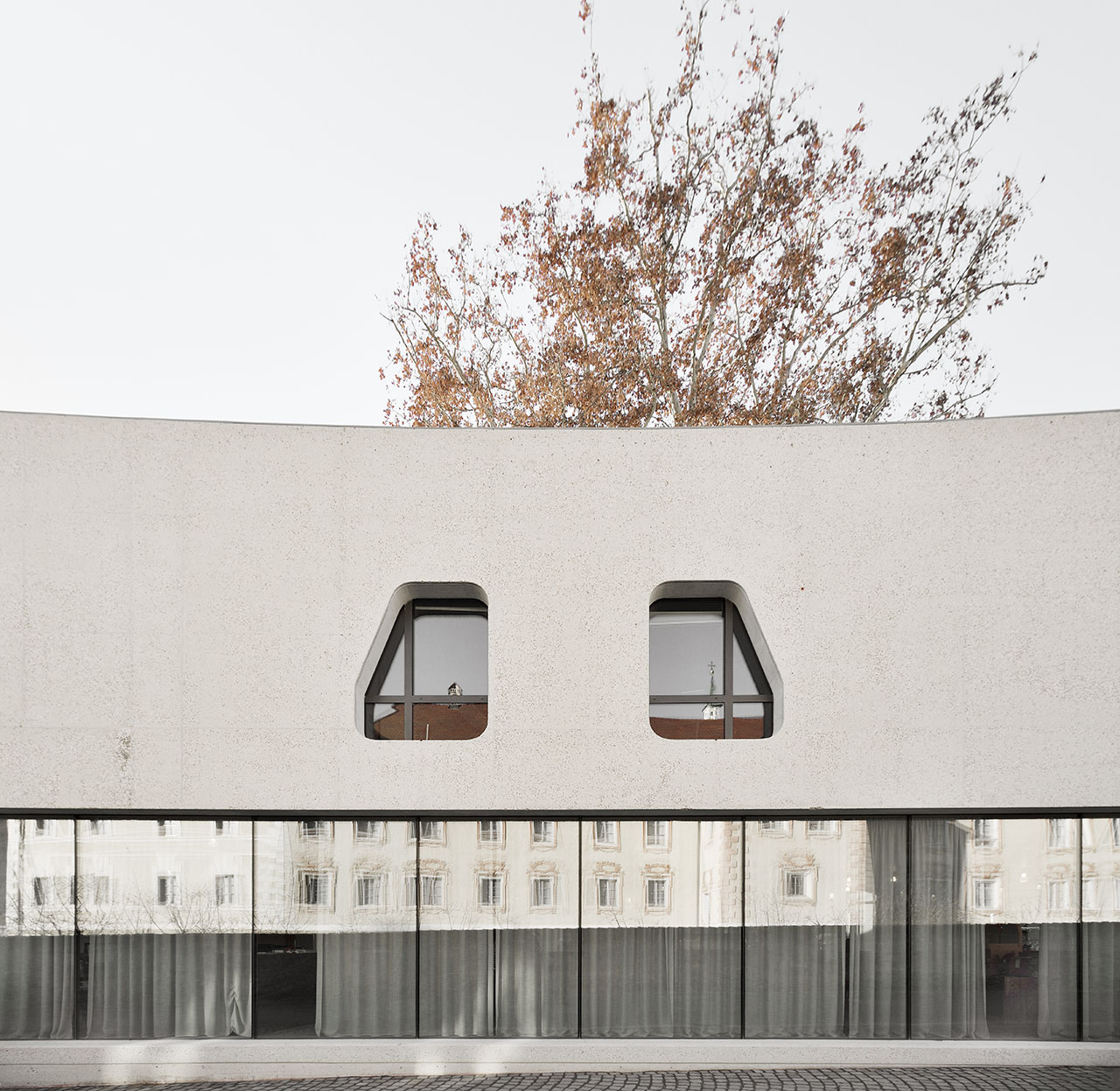
TreeHugger by MoDusArchitects in Bressanone (Bolzano, Italy). Photo © Oskar Da Riz.
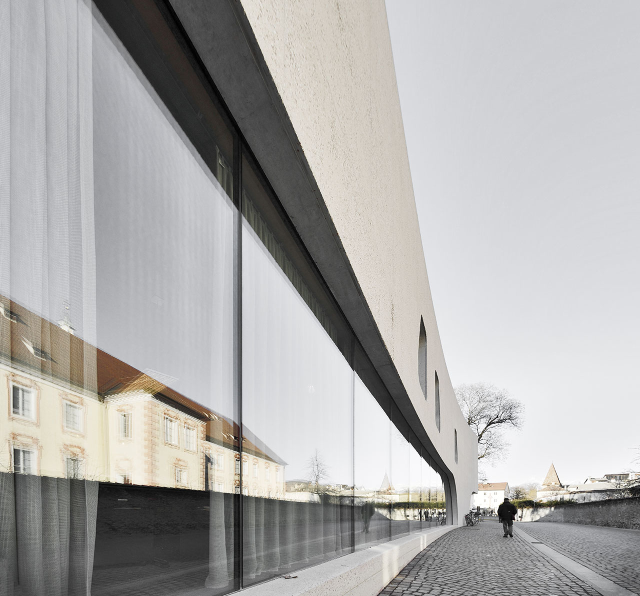
TreeHugger by MoDusArchitects in Bressanone (Bolzano, Italy). Photo © Oskar Da Riz.
Sitting next to the 13th century-built Bishop’s Palace of Bressanone, one of the town's main tourist attractions that features a renaissance-style interior courtyard and lavish Baroque interiors, the building’s shape was informed by the triangular plot that it occupies and a pair of prominent trees within it. While a concave wall subtly marks the one at the tip of the site in the north, a circular courtyard puncturing the building accommodates the larger tree on the south of the piazza, its textured bark playfully reflected by the roughhewn concrete building mass. In addition, the pavilion’s arched supports echo the arcades that line the town’s cobbled streets, while the concave forms are inspired by the sinuous curves of the Chinese and Japanese pavilions that mark the corners of the adjacent Palace gardens.
The result of these bold gestures, in conjunction with the use of concrete, makes for a highly sculpted form that transforms the building into an architectural folly. In fact, the tourist pavilion is the latest in an eclectic list of structures from the 19th century to the 1970s that stood on the site to welcome the town’s visitors. “Historical documentation reveals a lineage of eccentric and remarkable pavilions at the service of visitors”, the architects explain, “which have met their unfortunate demise through demolition, making way for the next victim".
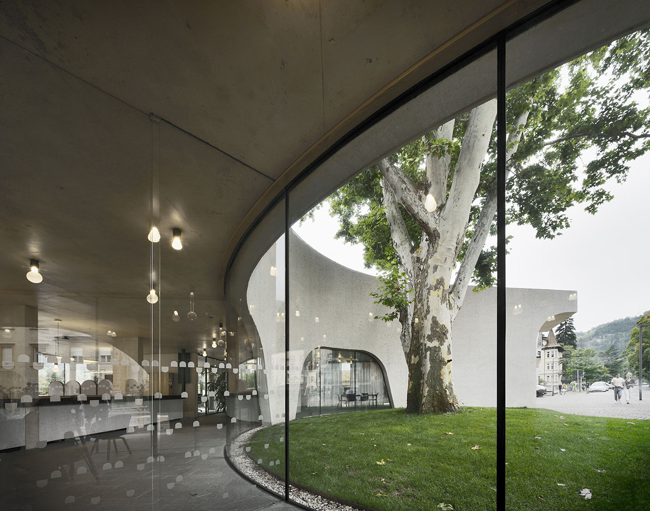
TreeHugger by MoDusArchitects in Bressanone (Bolzano, Italy). Photo © Oskar Da Riz.
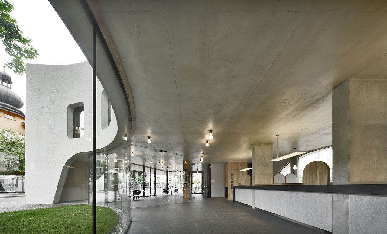
TreeHugger by MoDusArchitects in Bressanone (Bolzano, Italy). Photo © Oskar Da Riz.
TreeHugger by MoDusArchitects in Bressanone (Bolzano, Italy). Photo © Oskar Da Riz.
TreeHugger by MoDusArchitects in Bressanone (Bolzano, Italy). Photo © Oskar Da Riz.
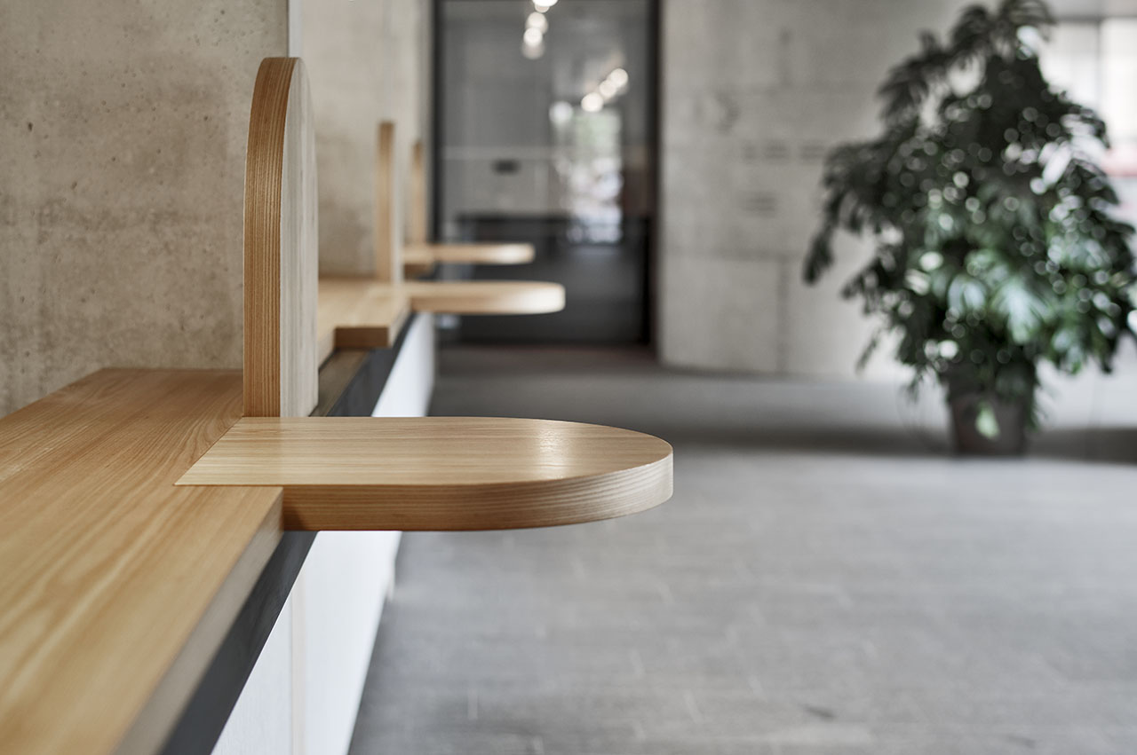
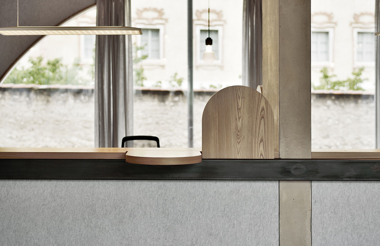
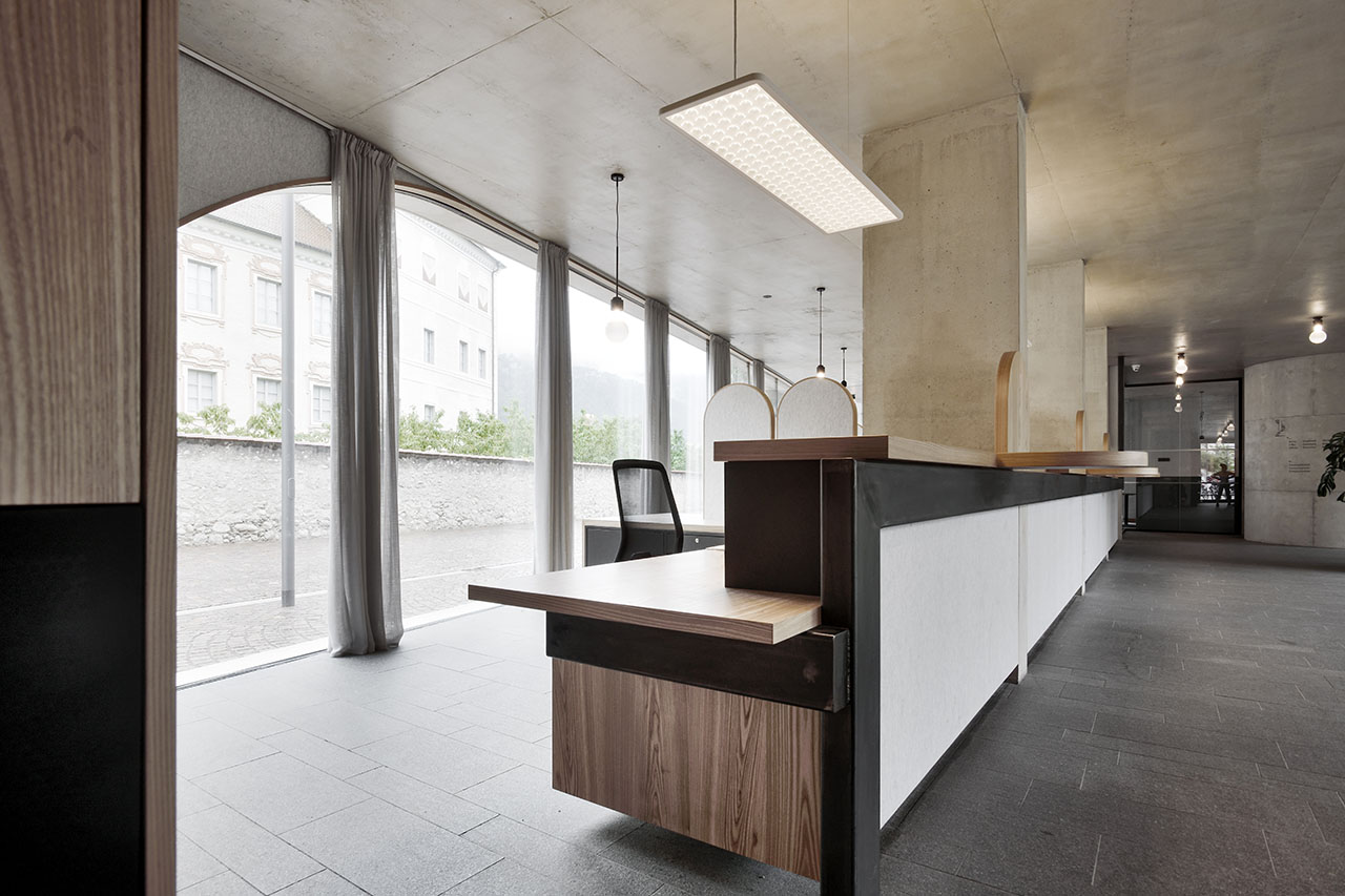
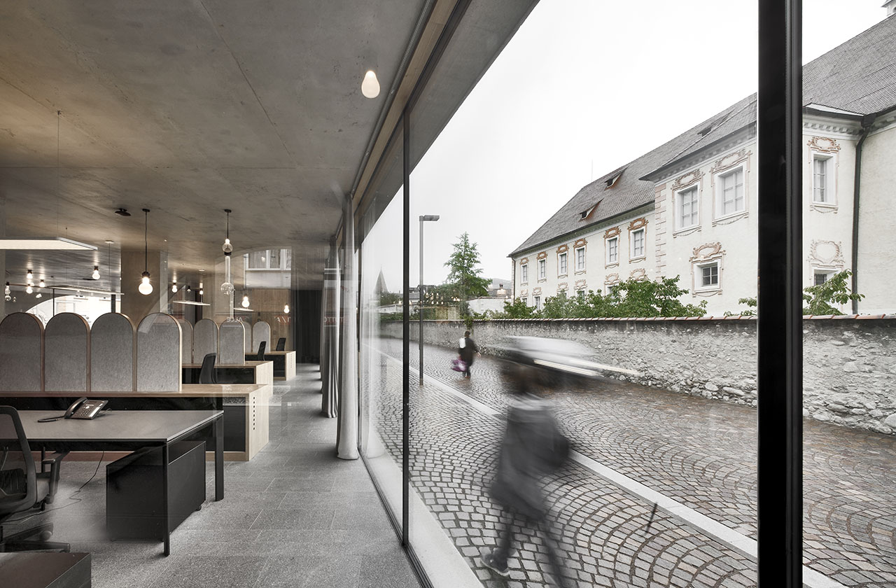
The building’s structural design allows the ground floor to be almost completely glazed, ushering visitors inside while reinforcing the site’s role as a public piazza. Entering under a large overhang that cantilevers out towards the new square, a bright and airy open plan space houses a series of information booths and media screens. Minimalist in sensibility, the simple, clean-cut aesthetic counterbalances the building’s formidable exterior while the smooth surfaces are designed in juxtaposition to the roughhewn concrete facades, with timber counters and wall panels adding warmer accents amid the exposed concrete. With administrative offices out of sight on the upper floor and auxiliary spaces within the basement level, the concrete and glass pavilion carries on the site’s history both as a gateway to the town’s cultural sights and a testbed for architectural creativity.
TreeHugger by MoDusArchitects in Bressanone (Bolzano, Italy). Photo © Oskar Da Riz.
TreeHugger by MoDusArchitects in Bressanone (Bolzano, Italy). Photo © Oskar Da Riz.

TreeHugger by MoDusArchitects in Bressanone (Bolzano, Italy). Photo © Oskar Da Riz.
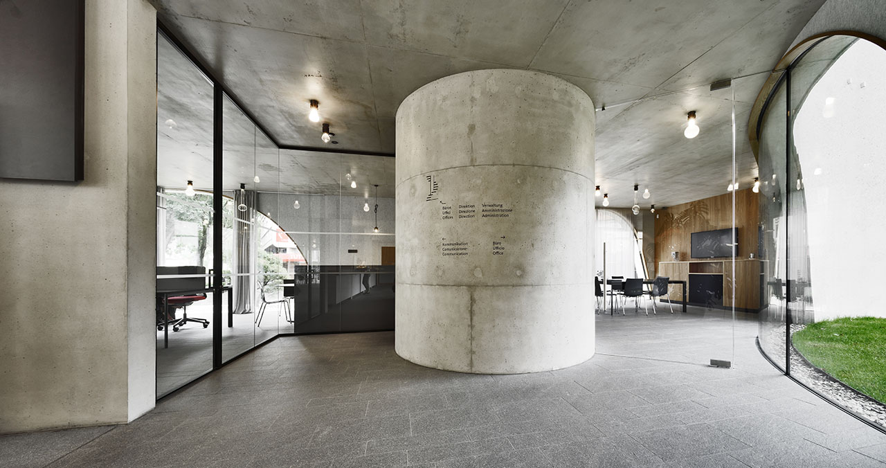
TreeHugger by MoDusArchitects in Bressanone (Bolzano, Italy). Photo © Oskar Da Riz.
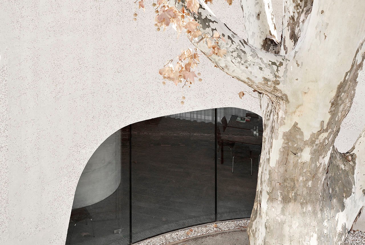
TreeHugger by MoDusArchitects in Bressanone (Bolzano, Italy). Photo © Oskar Da Riz.
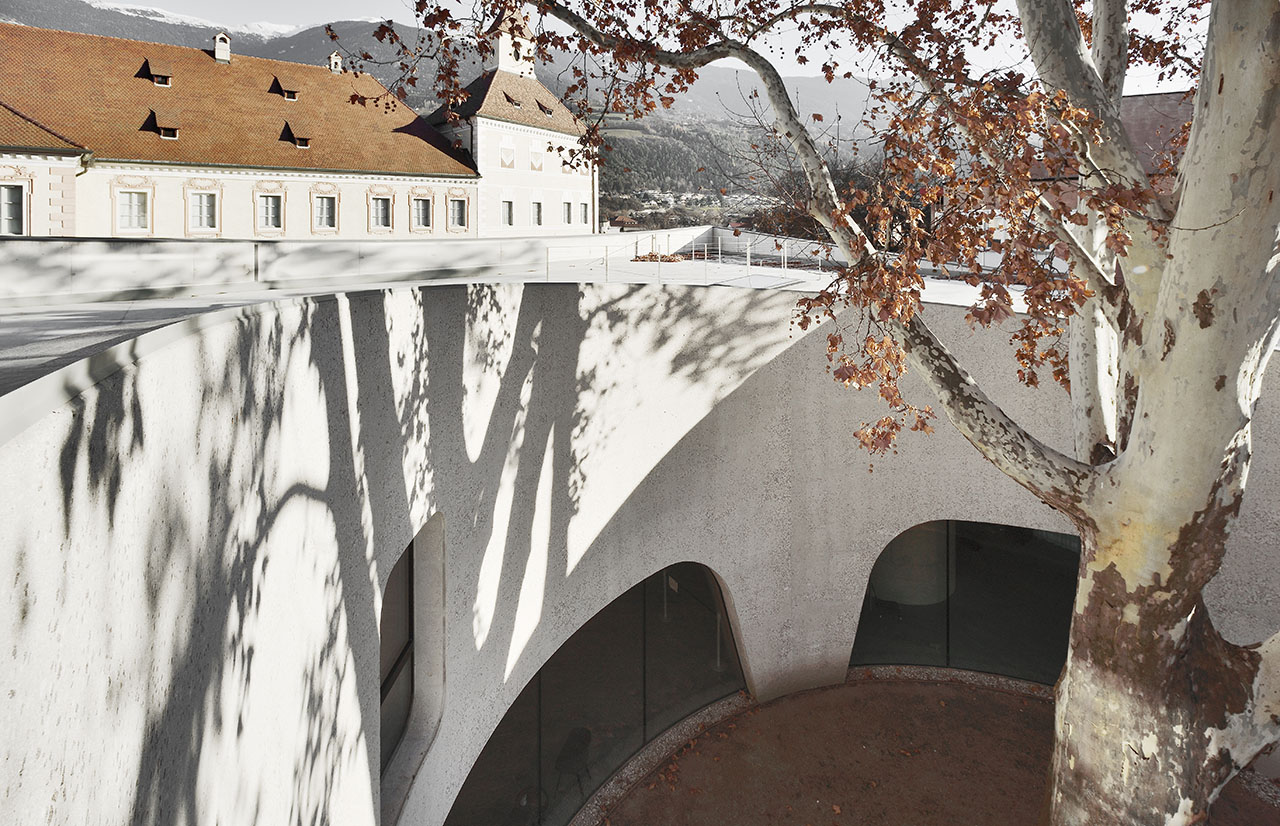
TreeHugger by MoDusArchitects in Bressanone (Bolzano, Italy). Photo © Oskar Da Riz.
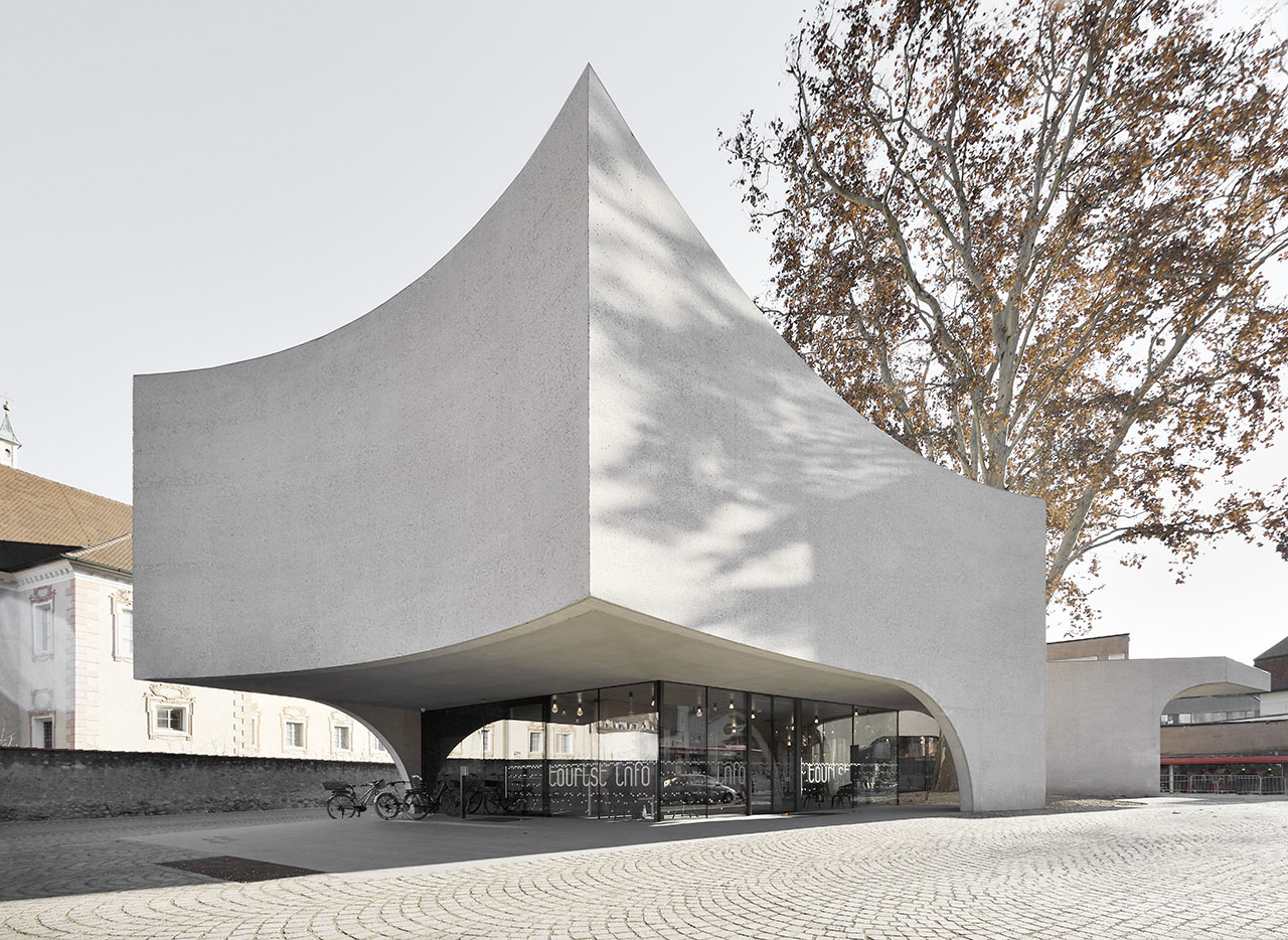
TreeHugger by MoDusArchitects in Bressanone (Bolzano, Italy). Photo © Oskar Da Riz.


