Project Name
Sought AfterPosted in
Residential, Interior DesignLocation
Design Studio
AIM studioArea (sqm)
50Client
PrivateCompleted
2015More Info
Styling by FEDERICA BIASI
Main Contractor: EMMEVI EDIL SERVICE
| Detailed Information | |||||
|---|---|---|---|---|---|
| Project Name | Sought After | Posted in | Residential, Interior Design | Location |
Porta Genova, Milano
Italy |
| Design Studio | AIM studio | Area (sqm) | 50 | Client | Private |
| Completed | 2015 | More Info | Styling by FEDERICA BIASI Main Contractor: EMMEVI EDIL SERVICE | ||
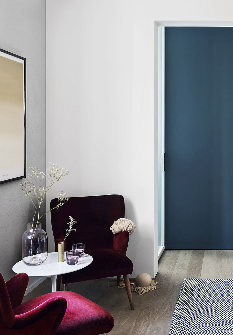
Photo by Simone Furiosi.
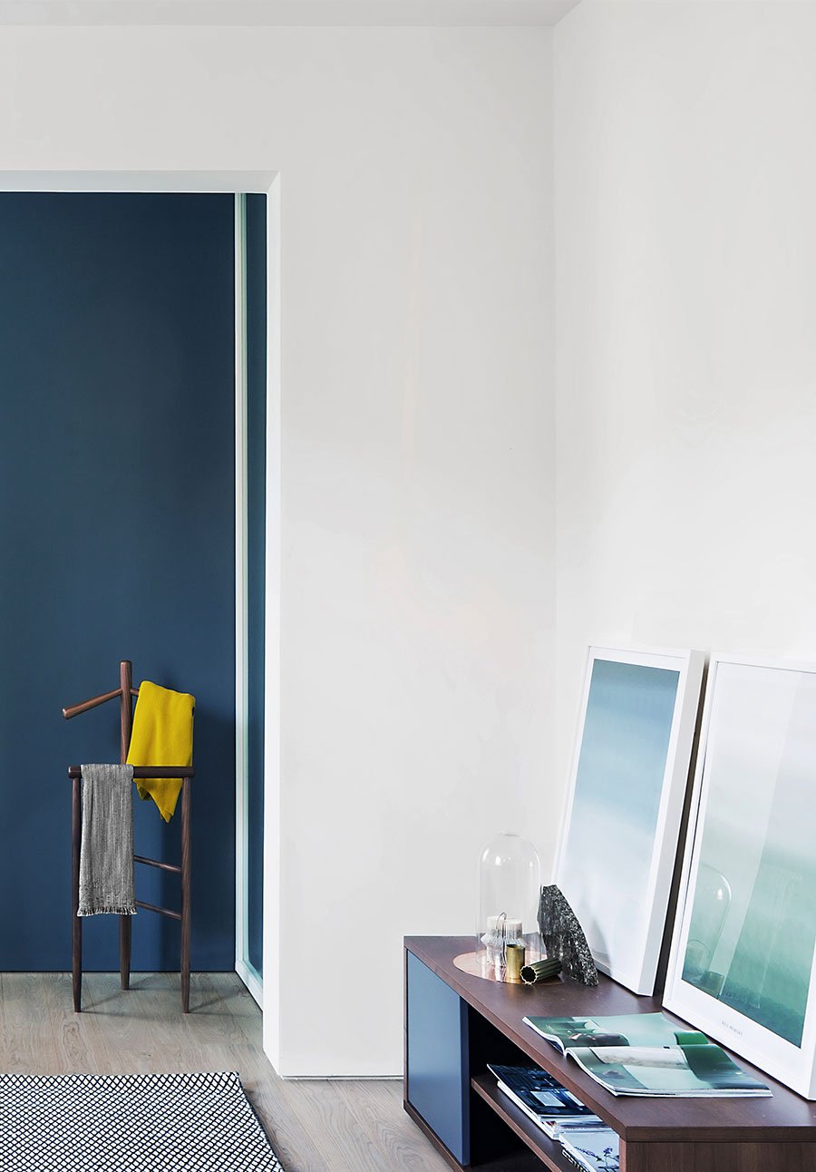
Photo by Simone Furiosi.
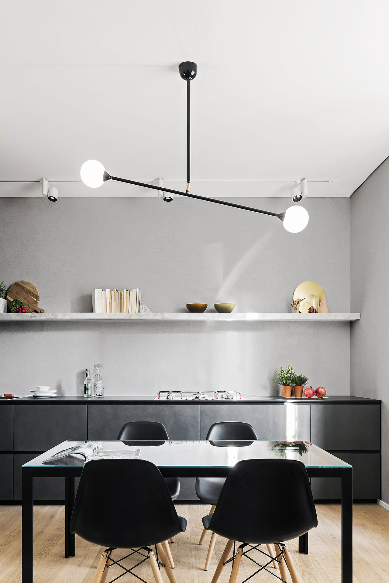
Photo by Simone Furiosi.
As the entire layout had to be redesigned in order to incorporate more functionality, according to the new prerequisites, a need for great attention to details emerged. This need led to lengthy research being conducted in regard to materials, finishes and furnishings, so much so that the design team named the project “Sought After”. The result however more than justifies the name: a burnished steel-plated kitchen stands as a unique monolithic volume, dominating the one end of the open-plan living area, while a Carrara marble shelf was installed in place of conventional kitchen cabinets, giving the room a modern, elegant touch. Meanwhile, the Eames plastic seats and the 1955 Medea vintage chair enhance the flat’s contemporary style, also highlighted by the cement finish that covers the walls of the corridor, kitchen and living room. All in all, this clever choice of materials creates a sense of unity in the living area and aids in visually separating it from the apartment’s more private area.
Photo by Simone Furiosi.
The development of the bathroom where the feeling of a luxurious wellness area has been created has been decorated with such precious finishes that its presence no longer needs to be hidden; it now interacts with the living room via an opaline glass door set on one side of the blue divider wall like a theatre wing. In the same vein, the bedroom is separated from the rest of the apartment by means of an invisible door, with a pivot hinge shifted 25 cm to the centre; “This way, when the door is closed it seems like it is part of the wall” say the designers. Inside the bedroom, the owner’s wardrobe is housed in a wide, walk-in-closet, hidden behind rotating panels that can move freely at 360 degrees and also carry containers for shoes and other items. Lastly, the design team used one of the favourite tricks they have come to be known for: by placing a large mirror at the end of the flat’s hallway, natural light coming in from the living room is now multiplied, creating the illusion of more space in this compact but quite complete house.
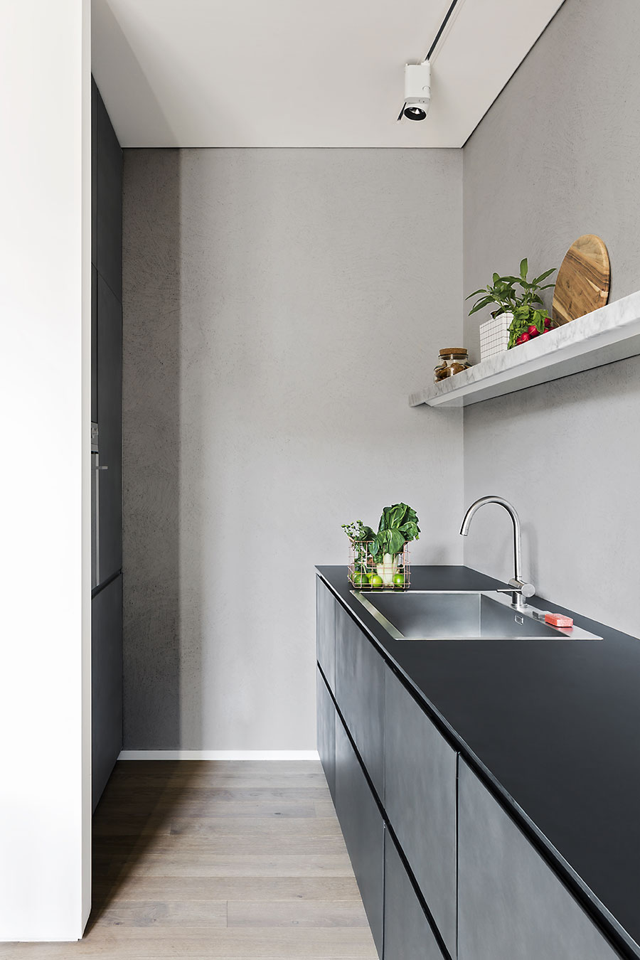
Photo by Simone Furiosi.
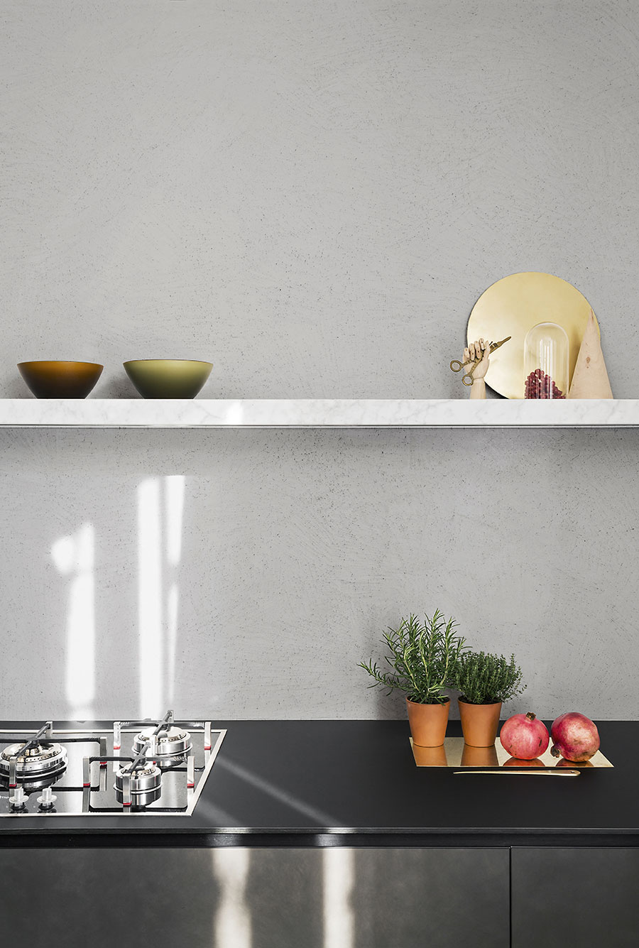
Photo by Simone Furiosi.
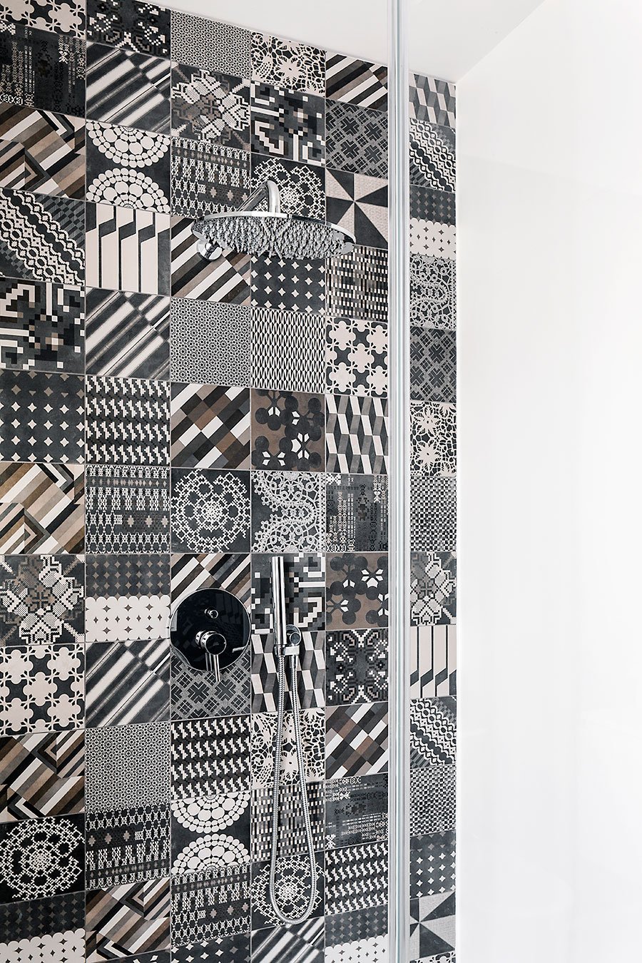
Photo by Simone Furiosi.
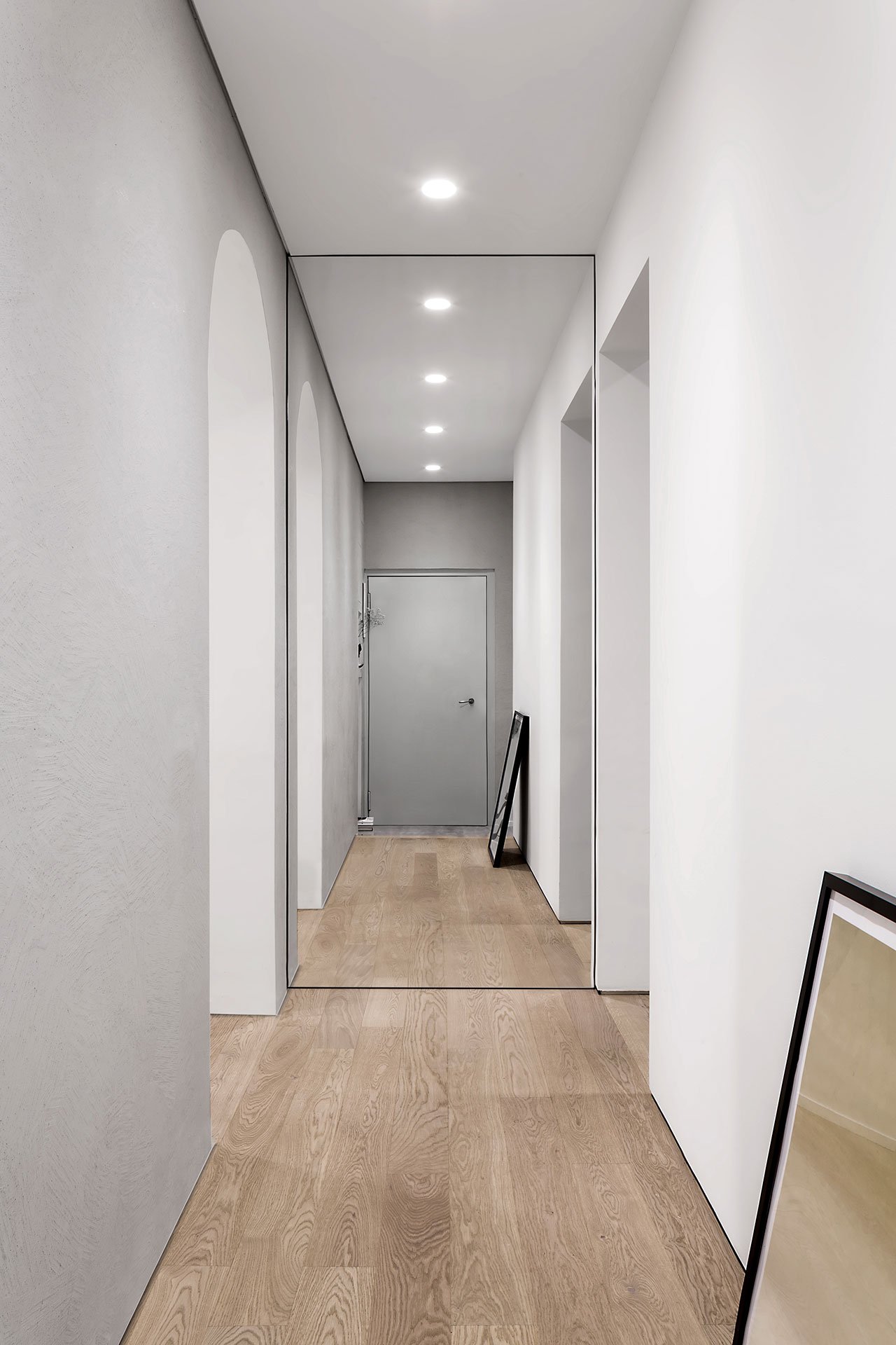
Photo by Simone Furiosi.
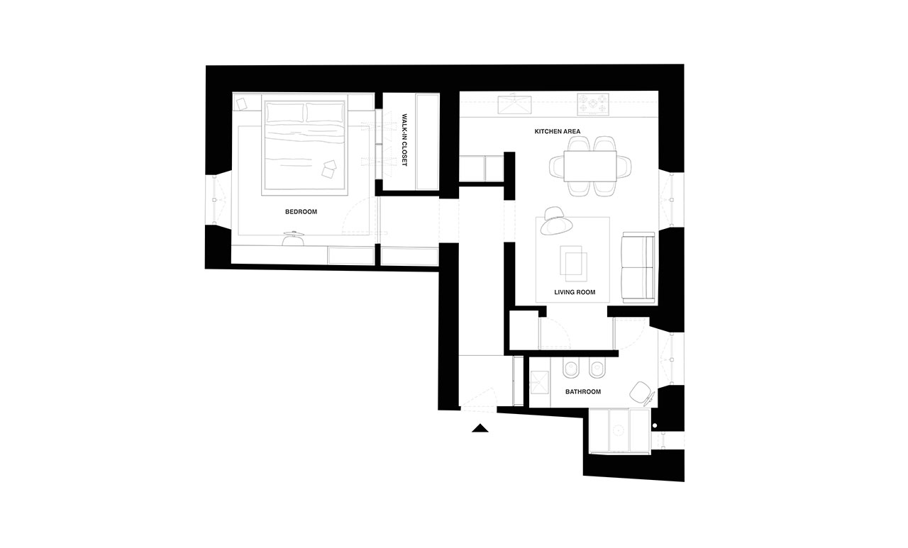
Apartment plan © AIM studio.
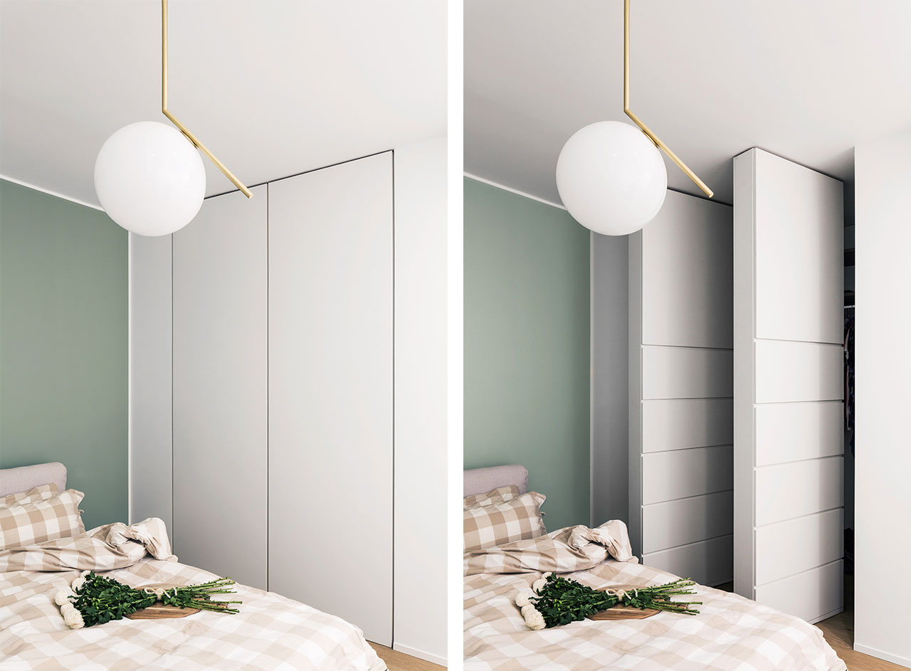
Photo by Simone Furiosi.
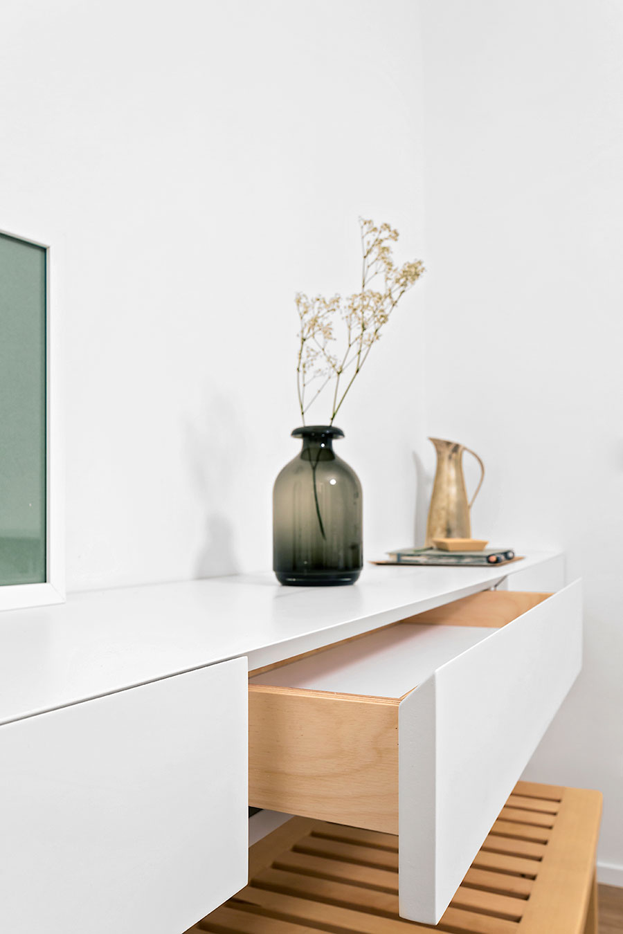
Photo by Simone Furiosi.
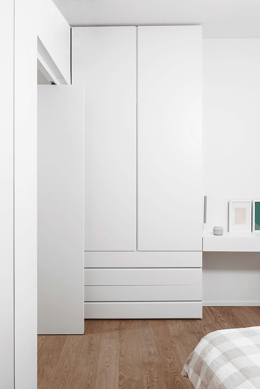
Photo by Simone Furiosi.
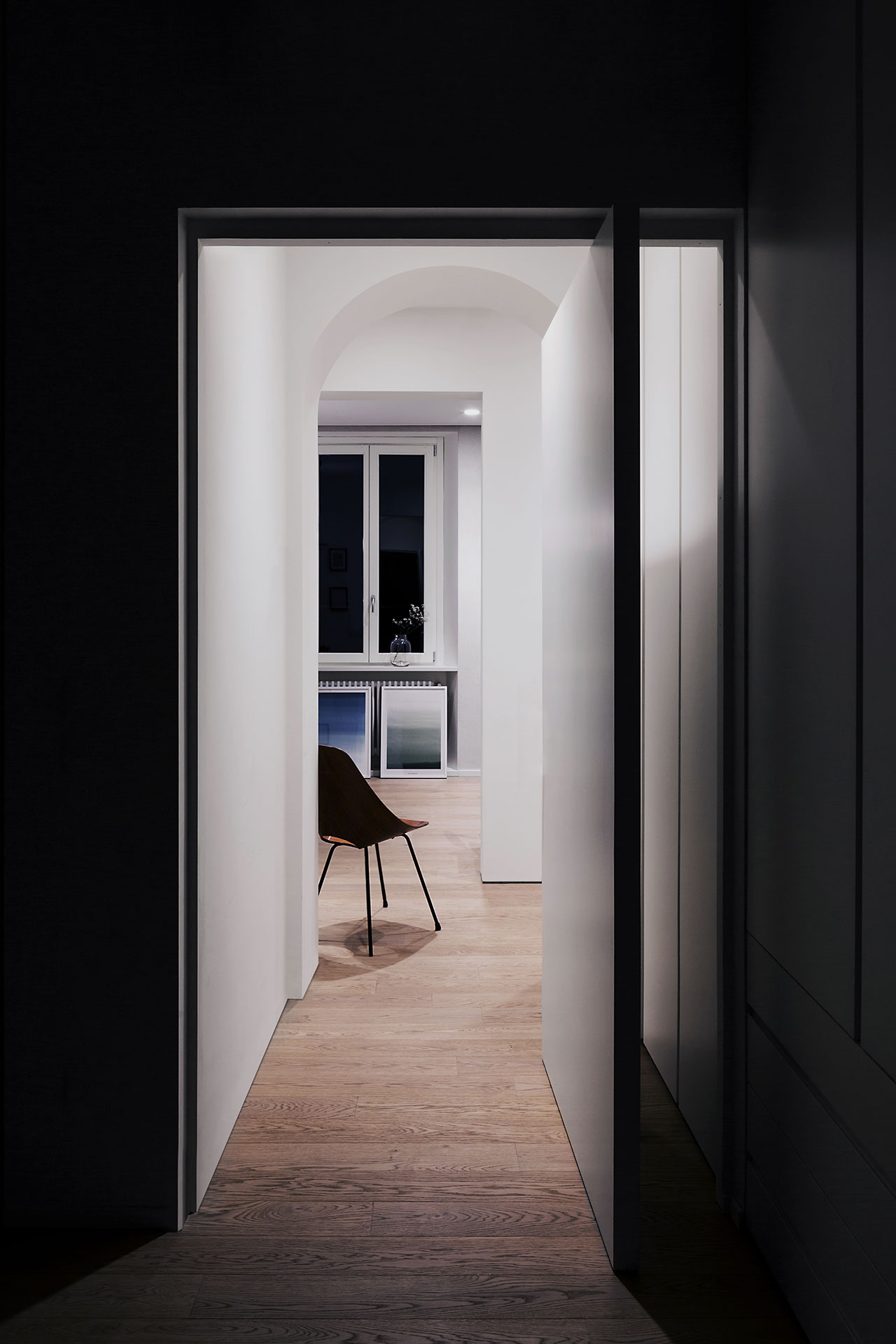
Photo by Simone Furiosi.


