A Minimalist-Designed Bakery & Bistro in Milan Subtly Channels Japanese Culture
Words by Yatzer
Location
Milan, Italy
A Minimalist-Designed Bakery & Bistro in Milan Subtly Channels Japanese Culture
Words by Yatzer
Milan, Italy
Milan, Italy
Location
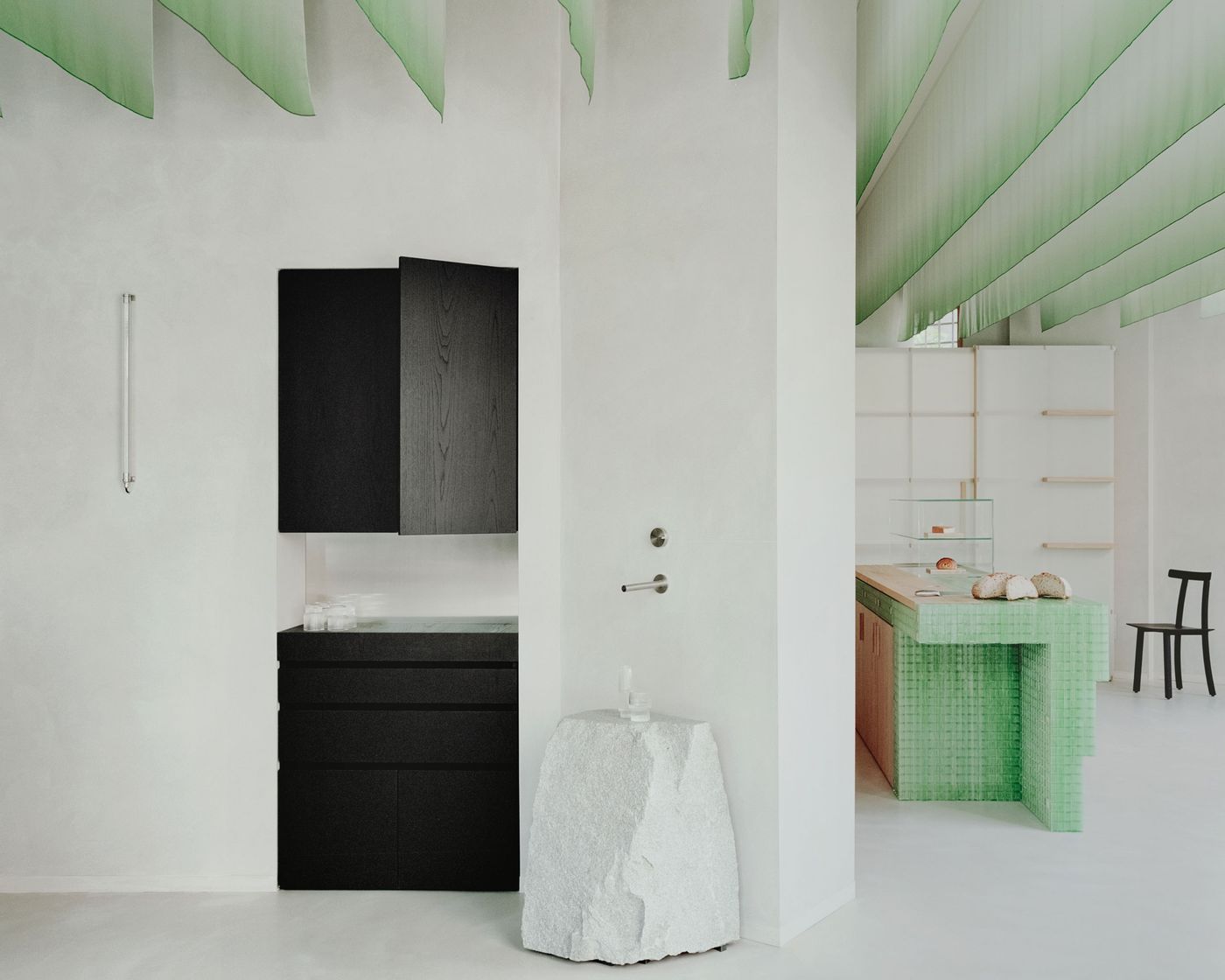
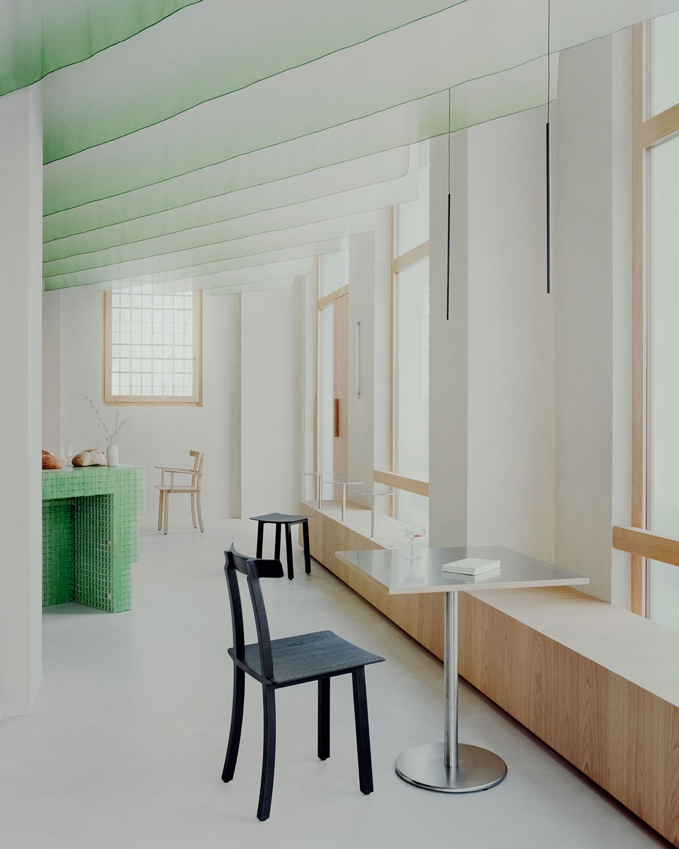
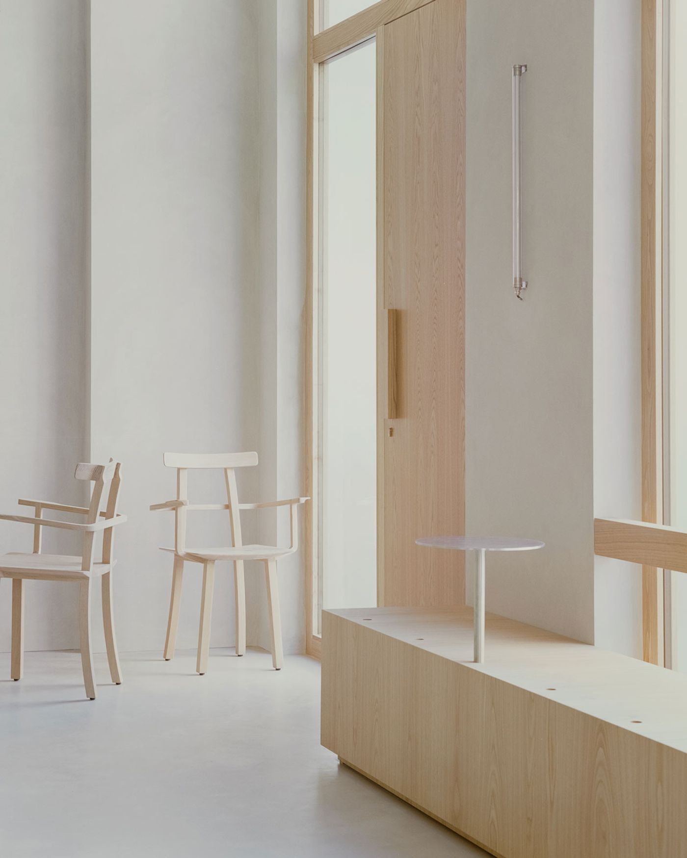
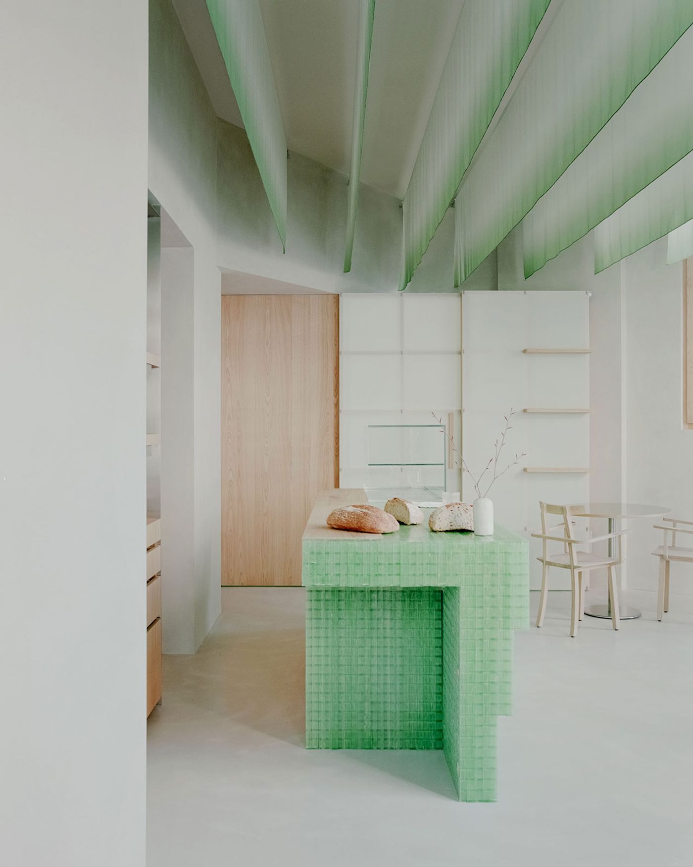
Commissioned to design a Japanese bakery and bistro in Milan named PAN, interior architects Studio Wok applied a wabi-sabi-inspired aesthetic subtly rooted in Japanese culture. The minimalist venue is a light-filled, pared-down space cast in grey tones divided into two distinct zones by two sculptural counters – one fashioned from green fiberglass and the other from black-stained chestnut – each reflecting the unique offerings of the venue. The integration of natural wood and stainless-steel furnishings, alongside a draped ceiling, harmonizes the space, echoing Japanese chef Yoji Tokuyoshi and Alice Yamada's vision of creating a meeting point between Japan and Milan.
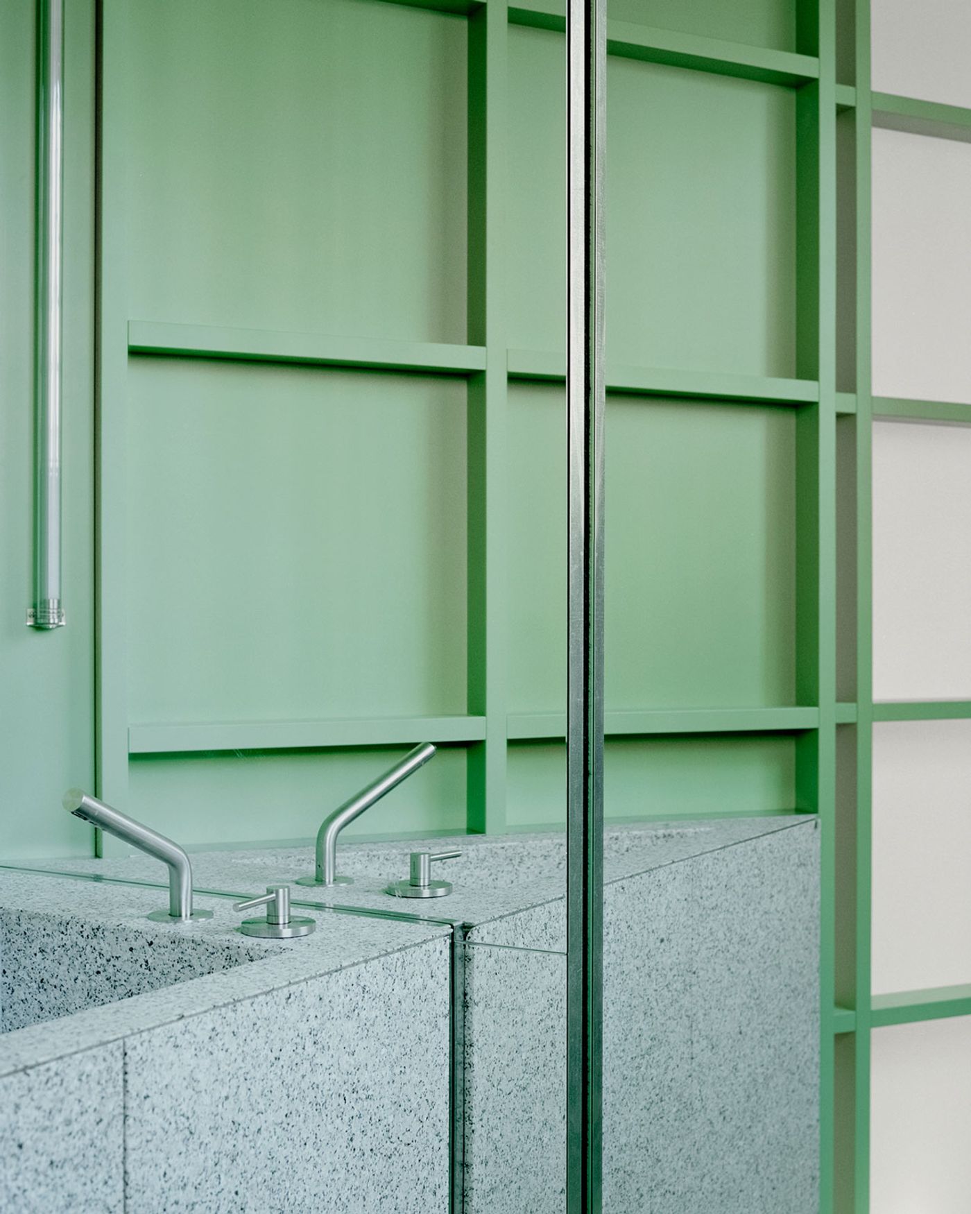
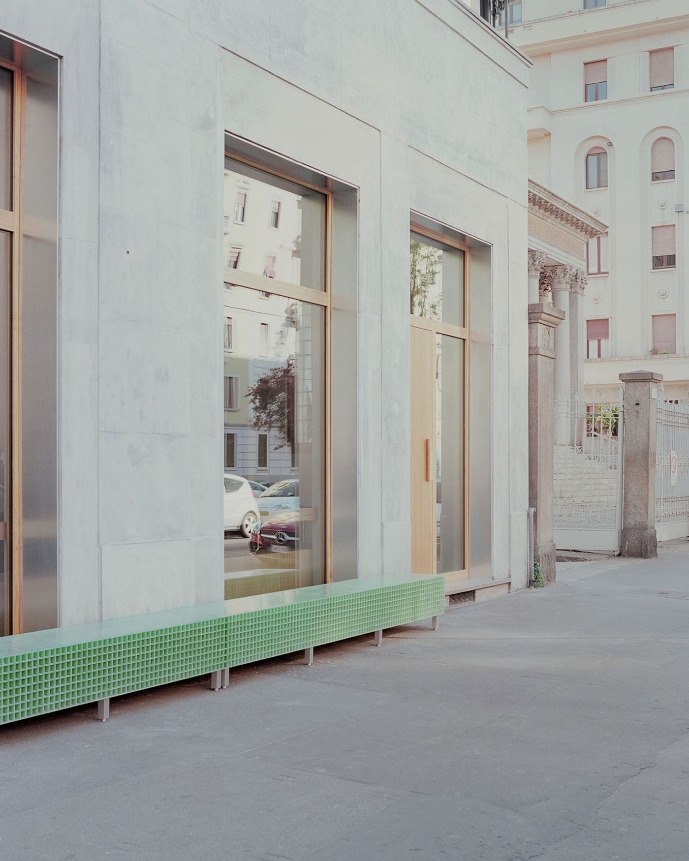
Strategically placed large windows foster a robust connection with the local neighbourhoods, generating a seamless 'threshold space' that blurs the distinction between the venue's interior and the external urban environment. These expansive windows, featuring slender chestnut wood frames and external jambs of galvanized metal sheets, are not only functional but also showcase Studio Wok’s meticulous attention to materials and detail.
Photography © Simone Bossi
Photography © Simone Bossi
Photography © Simone Bossi
Photography © Simone Bossi
Photography © Simone Bossi
Photography © Simone Bossi
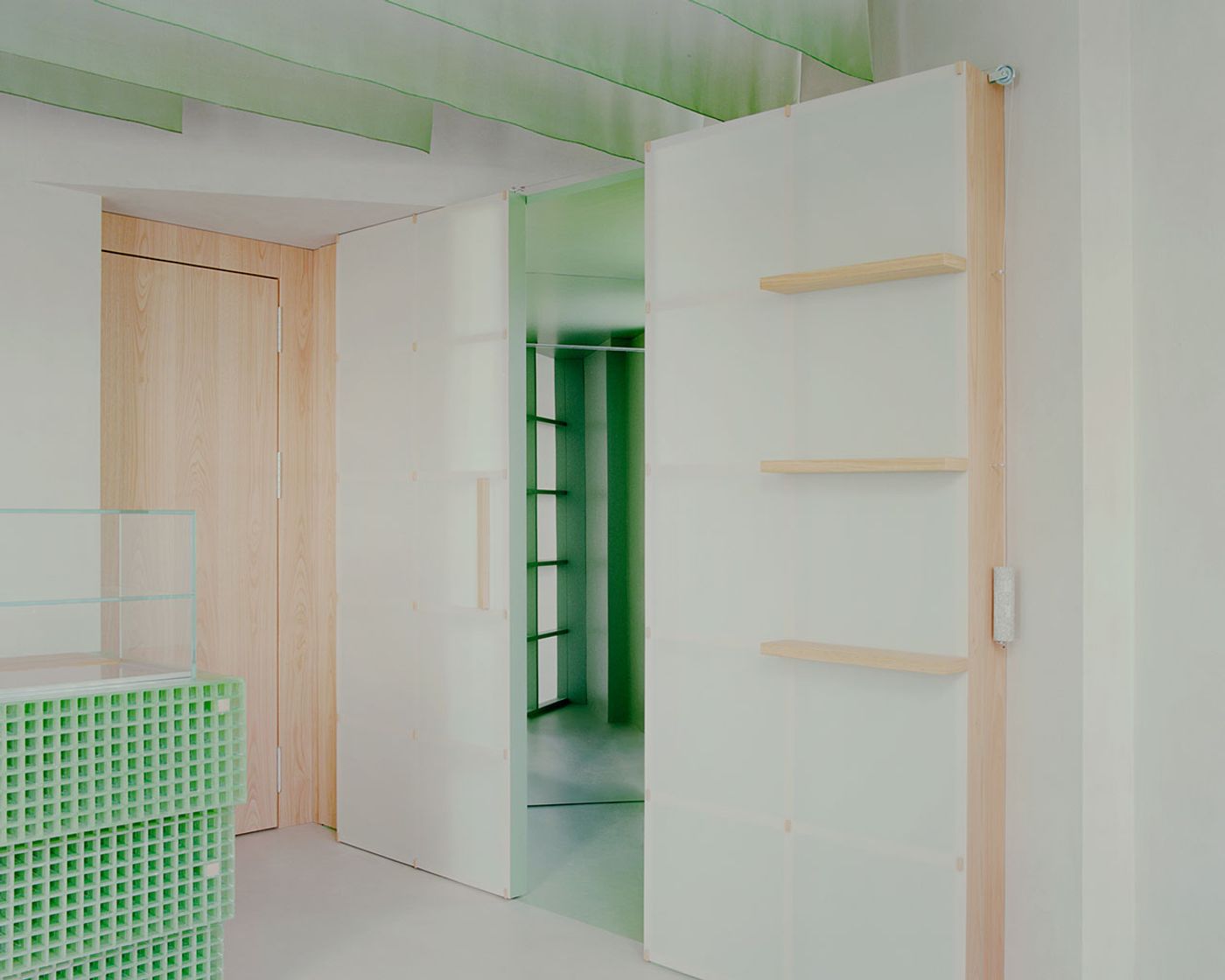
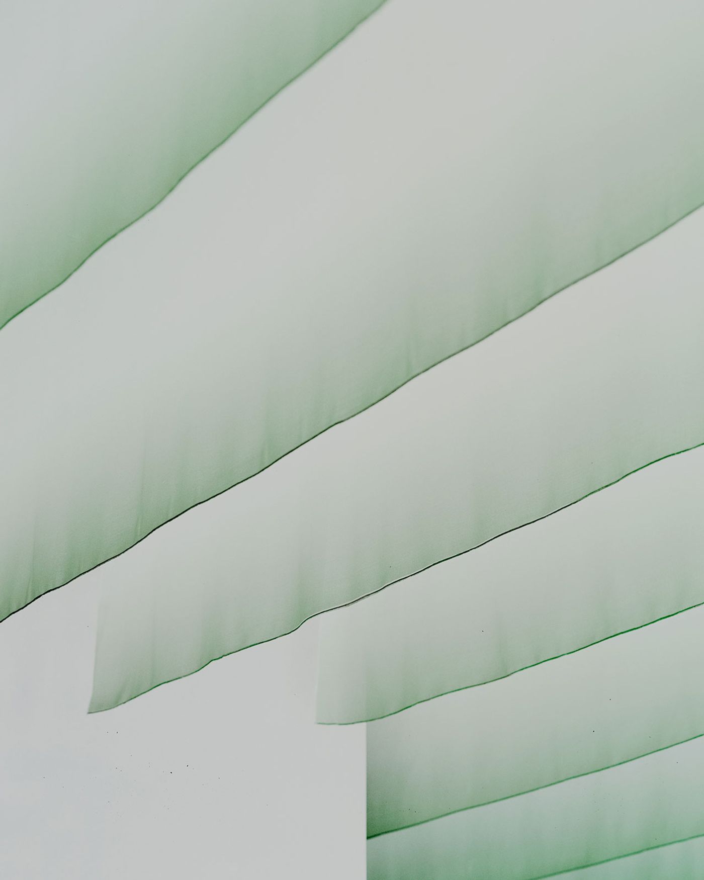
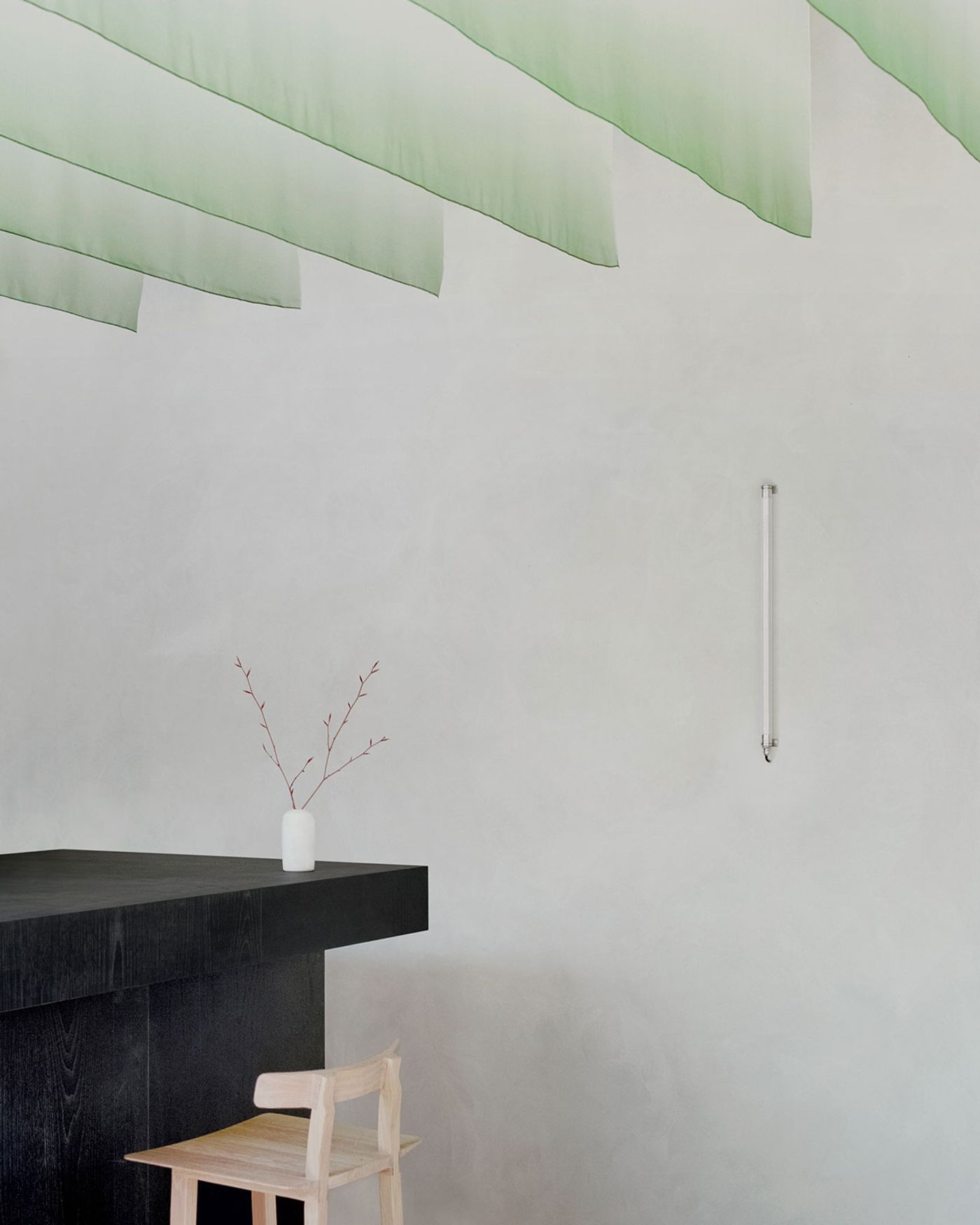
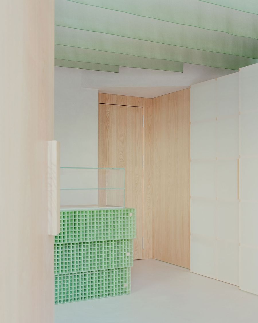
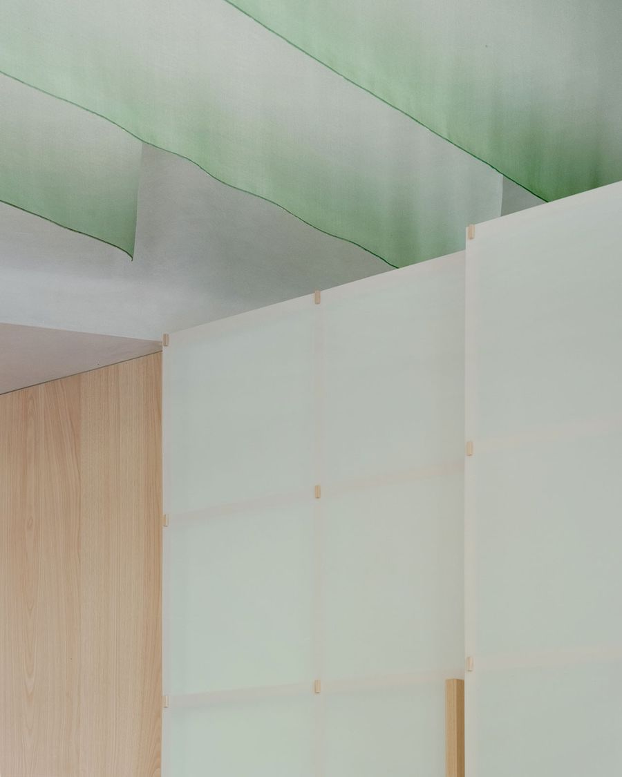
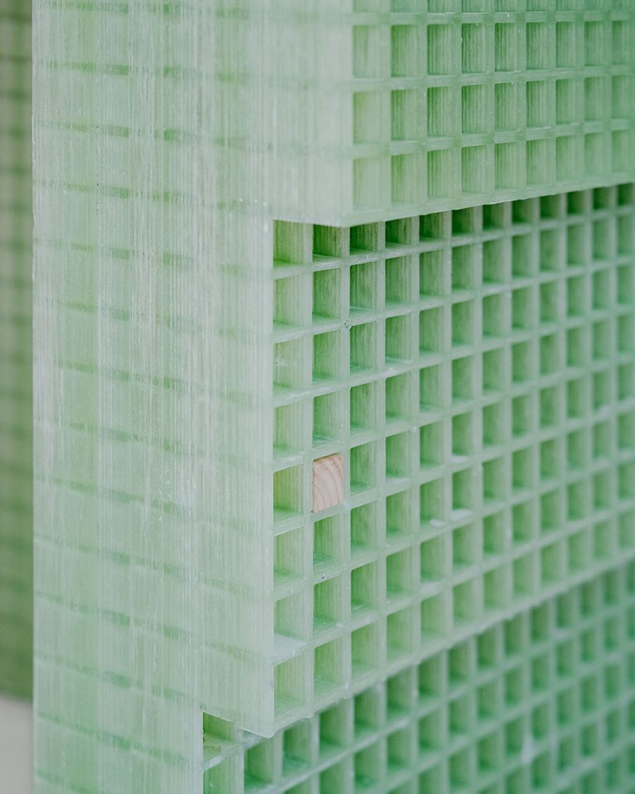
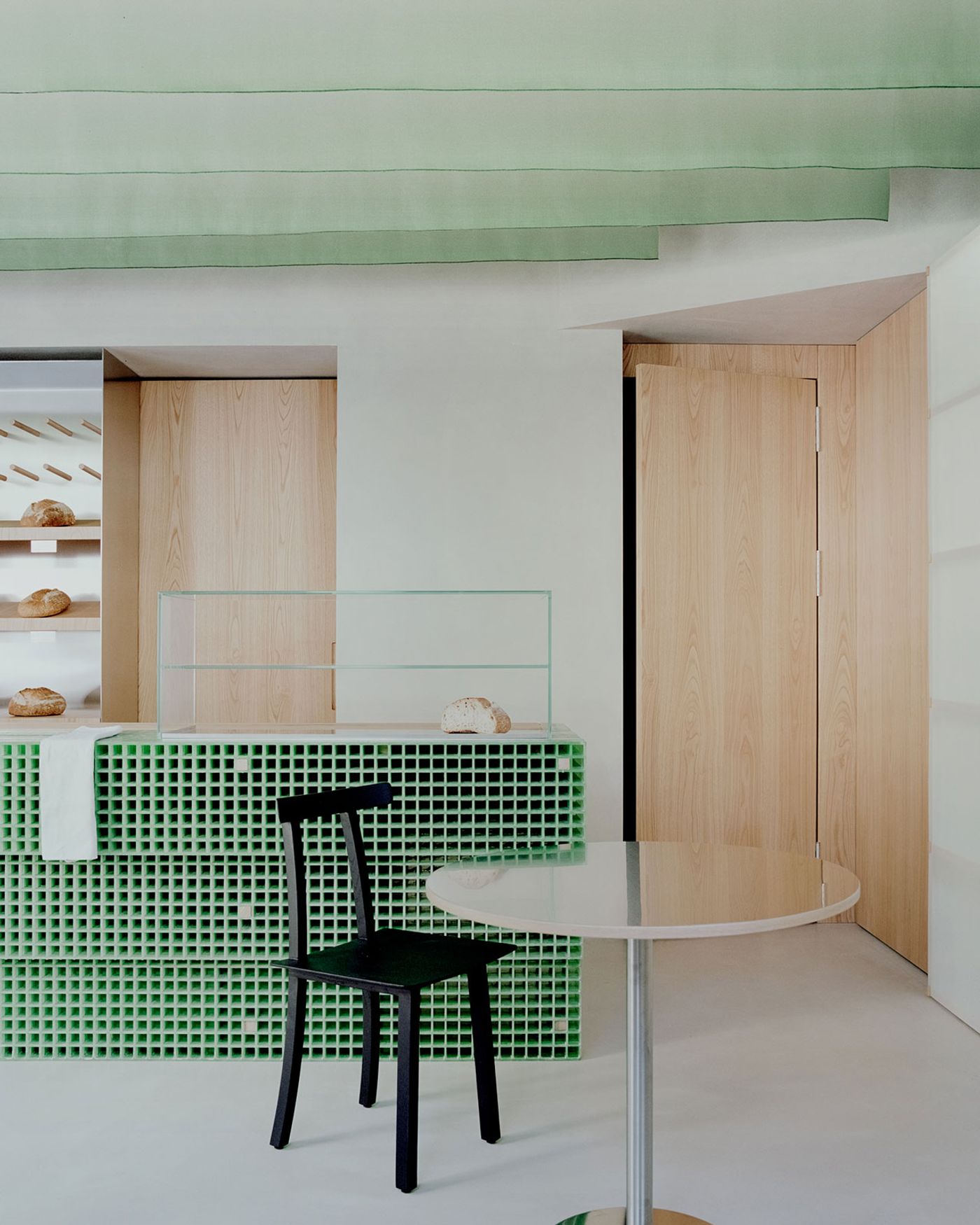
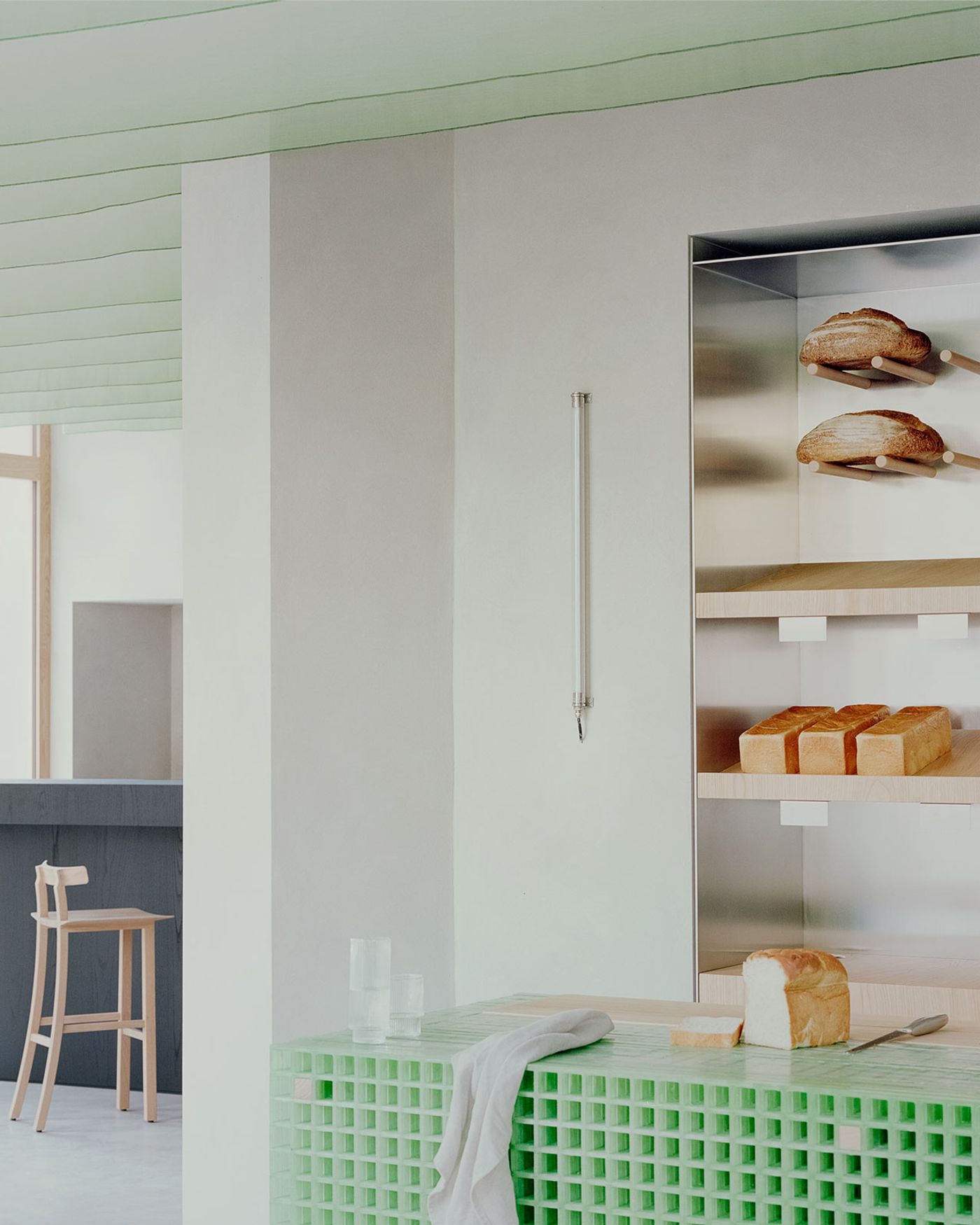
Upon entering, guests are greeted by the bakery's striking counter, a sculptural masterpiece crafted from green fiberglass in a honeycomb design. This vibrant element contrasts sharply with the light grey backdrop of walls and flooring, creating an eye-catching focal point. The green hue of the counter subtly reappears in the bathroom's antechamber, visible behind Japanese-style, wood-framed, translucent sliding doors, and is echoed in a textile installation that sweeps across the ceiling. This installation, inspired by 'noren' – traditional Japanese fabric dividers – imparts a gentle sense of movement and cohesively links the bakery and bar areas, just like the wooden bench that lines the street-facing wall.
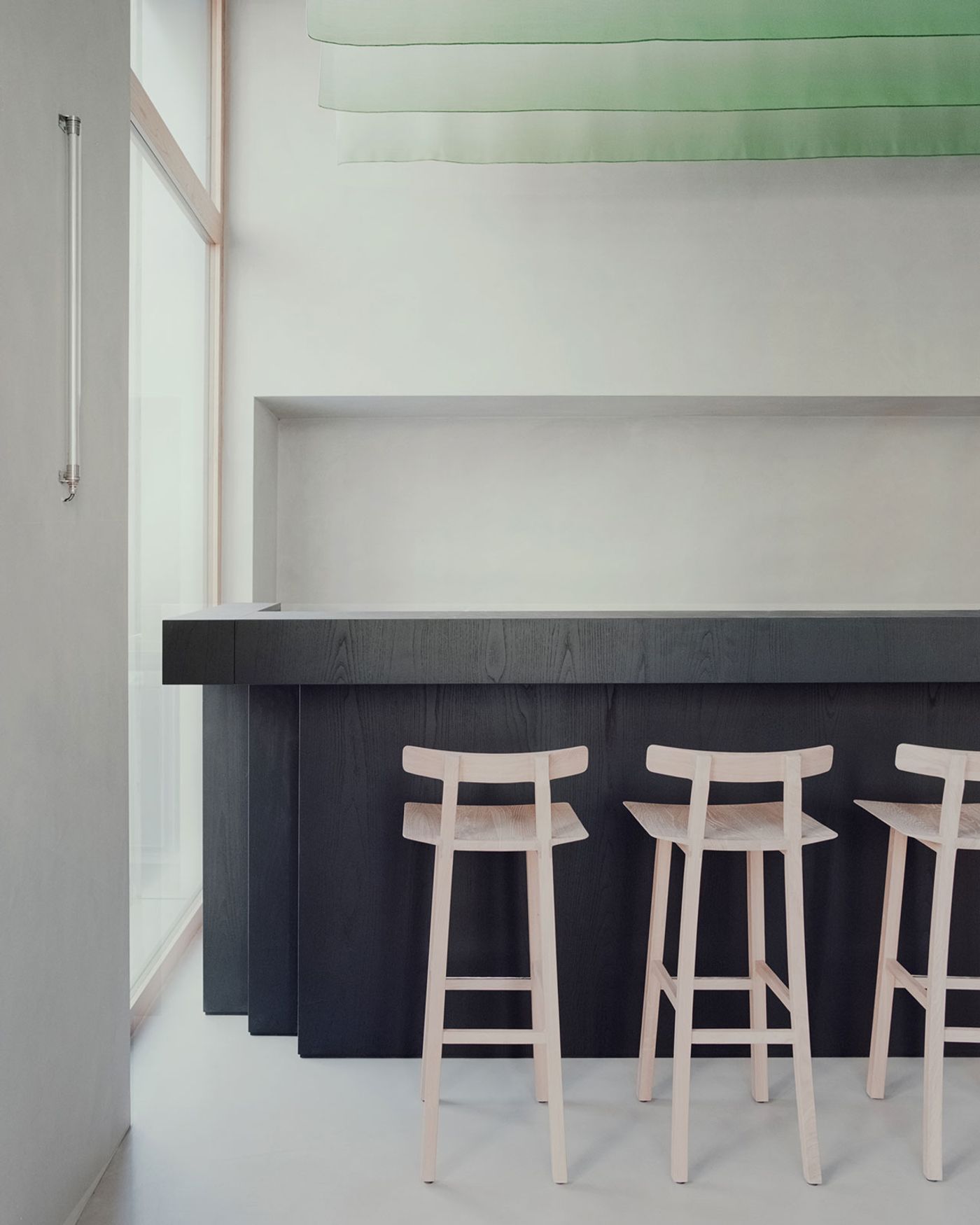
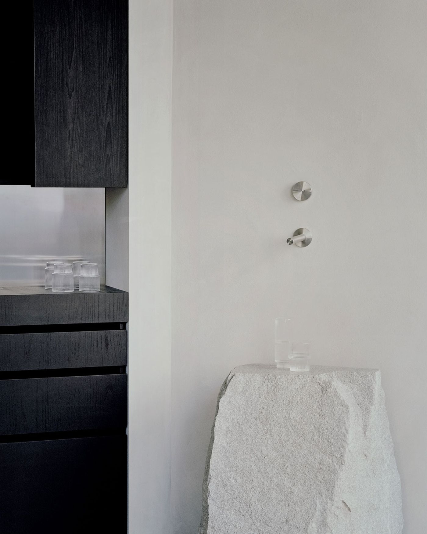
In stark contrast to the bakery's airy, green-hued counter, the bar area features a counter crafted from black-stained chestnut. This choice of material pays homage to Shou Sugi Ban, a traditional Japanese method of charring wood to enhance its durability. Complementing this dark, substantial counter are a cupboard unit of black-stained chestnut and stainless steel, and a stone console. The console's rugged, unrefined appearance stands out in the minimalist setting, serving as a nod to wabi-sabi, the Japanese art of finding beauty in imperfection and transience.
Photography © Simone Bossi
Photography © Simone Bossi
Photography © Simone Bossi
