| Detailed Information | |||||
|---|---|---|---|---|---|
| Project Name | AFL Praga | Posted in | Interior Design | Location |
Praga Warsaw
Poland |
| Interior Designer | Mistovia | ||||
Photography © ONI Studio.
Photography © ONI Studio.
Photography © ONI Studio.
Photography © ONI Studio.
Photography © ONI Studio.
Photography © ONI Studio.
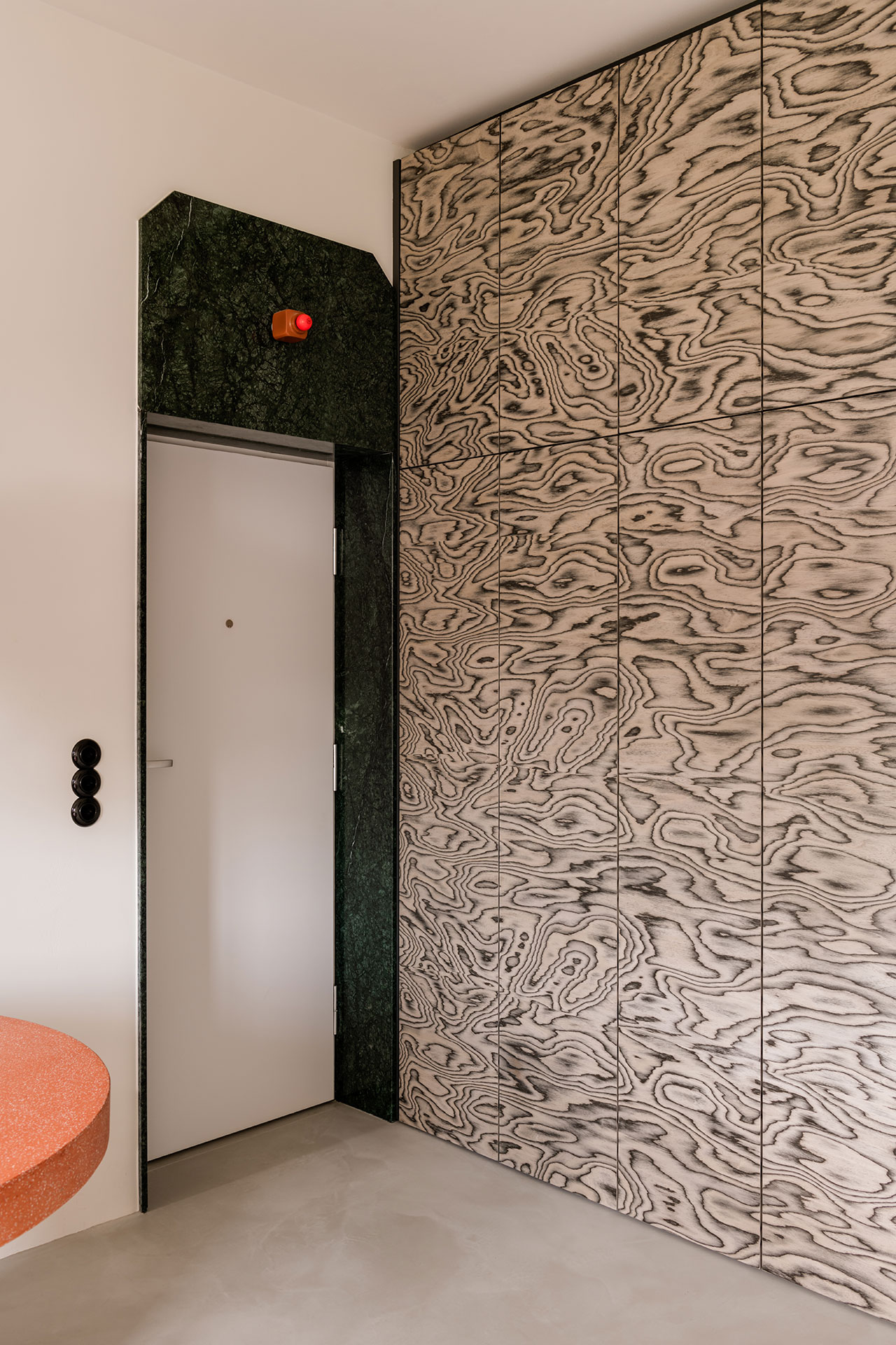
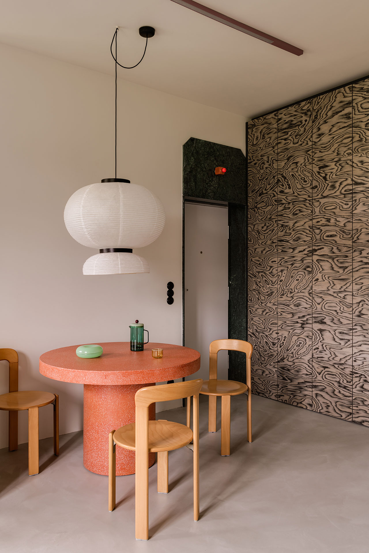
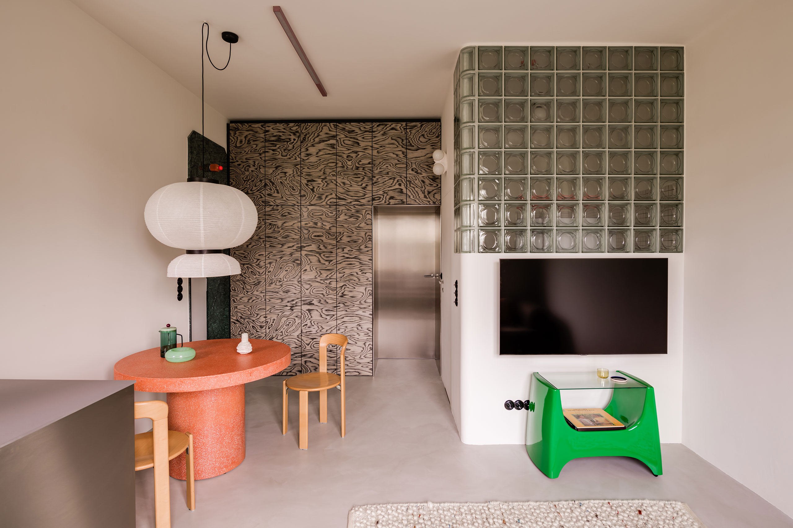
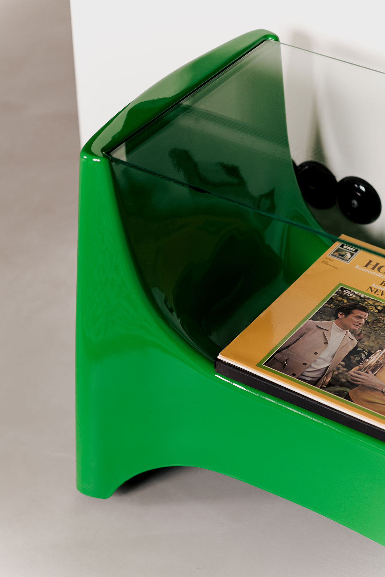
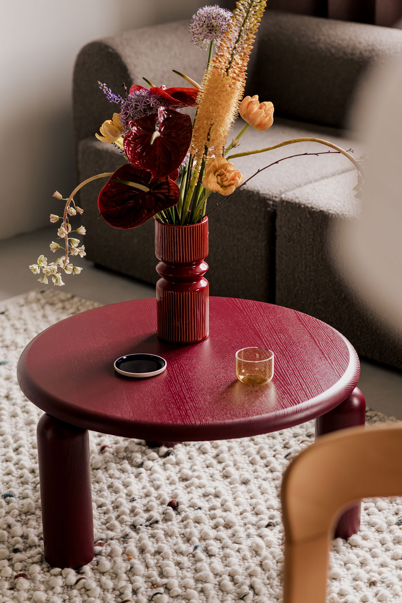
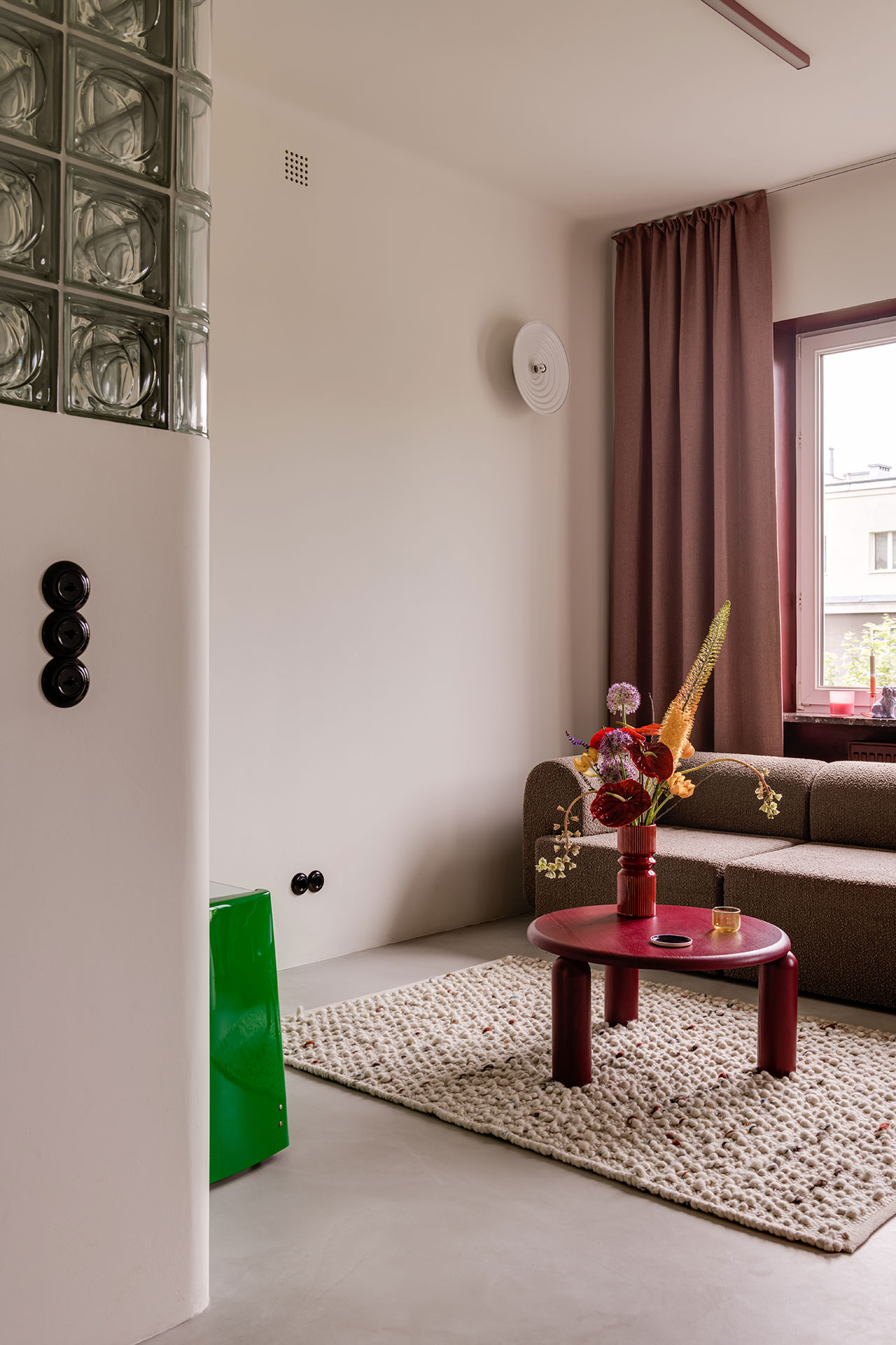
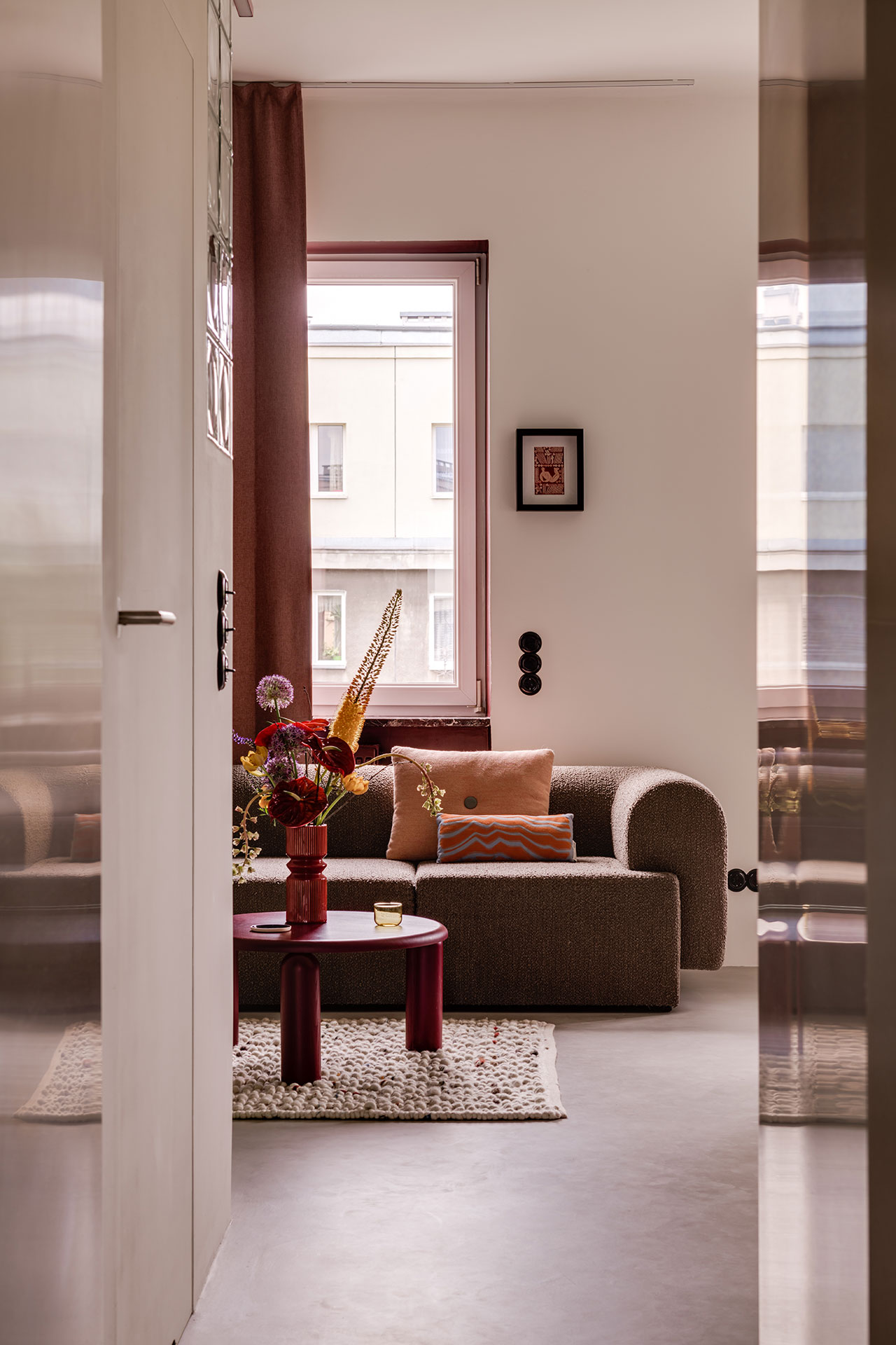
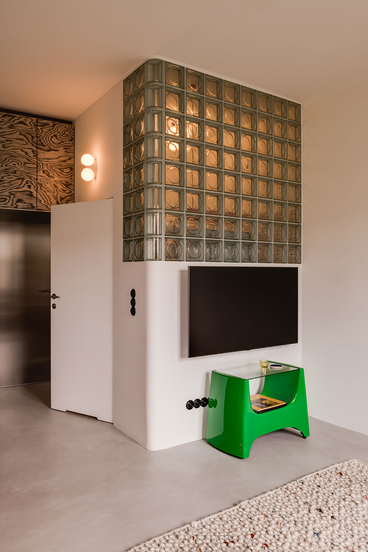
Featuring three-metre ceilings and views of the estate’s gardens, the property had a lot going for it to begin with. In order to enhance the sense of spaciousness and brightness, the designers merged the kitchen and living room into an open-plan social area, and applied a muted colour palette of light grey and white for the floors, walls and ceiling. The muted backdrop is punctuated by a series of chunky geometric forms sporting kooky patterns and vibrant pops of colours, from green marble and orange terrazzo, to walnut burl veneer, to stainless steel and glass blocks. In the hands of another designer, this excess of textures and finishes may have visually overloaded the space; in this case however they neatly come together, a testament to Mistovia’s spatial deftness and an eye for colour and pattern.
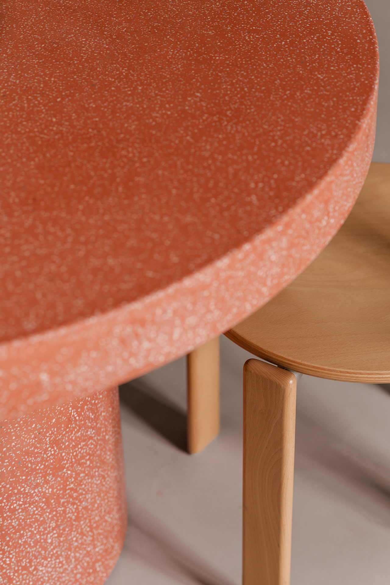
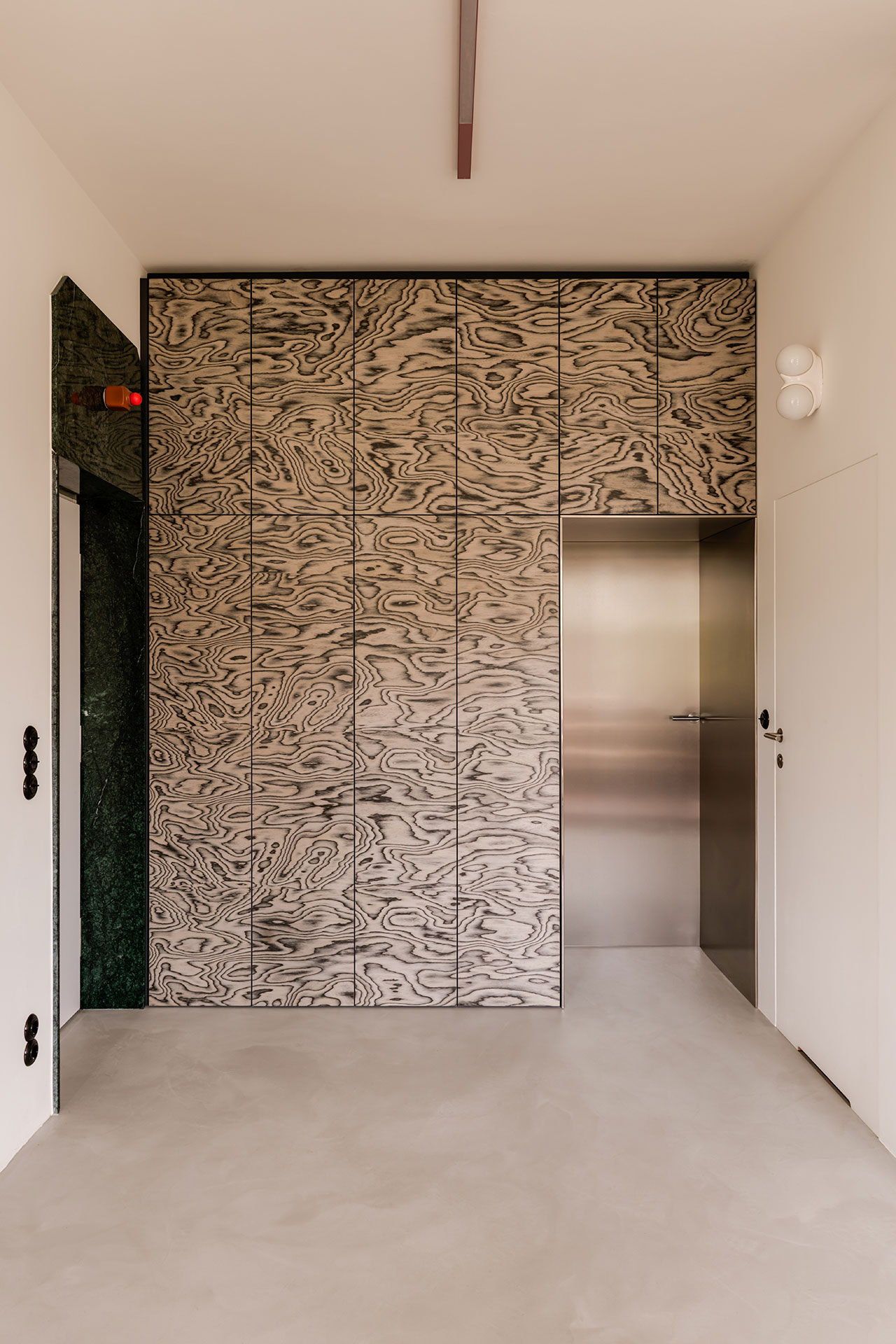
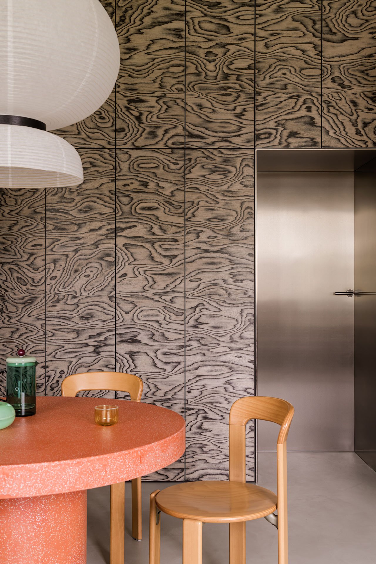
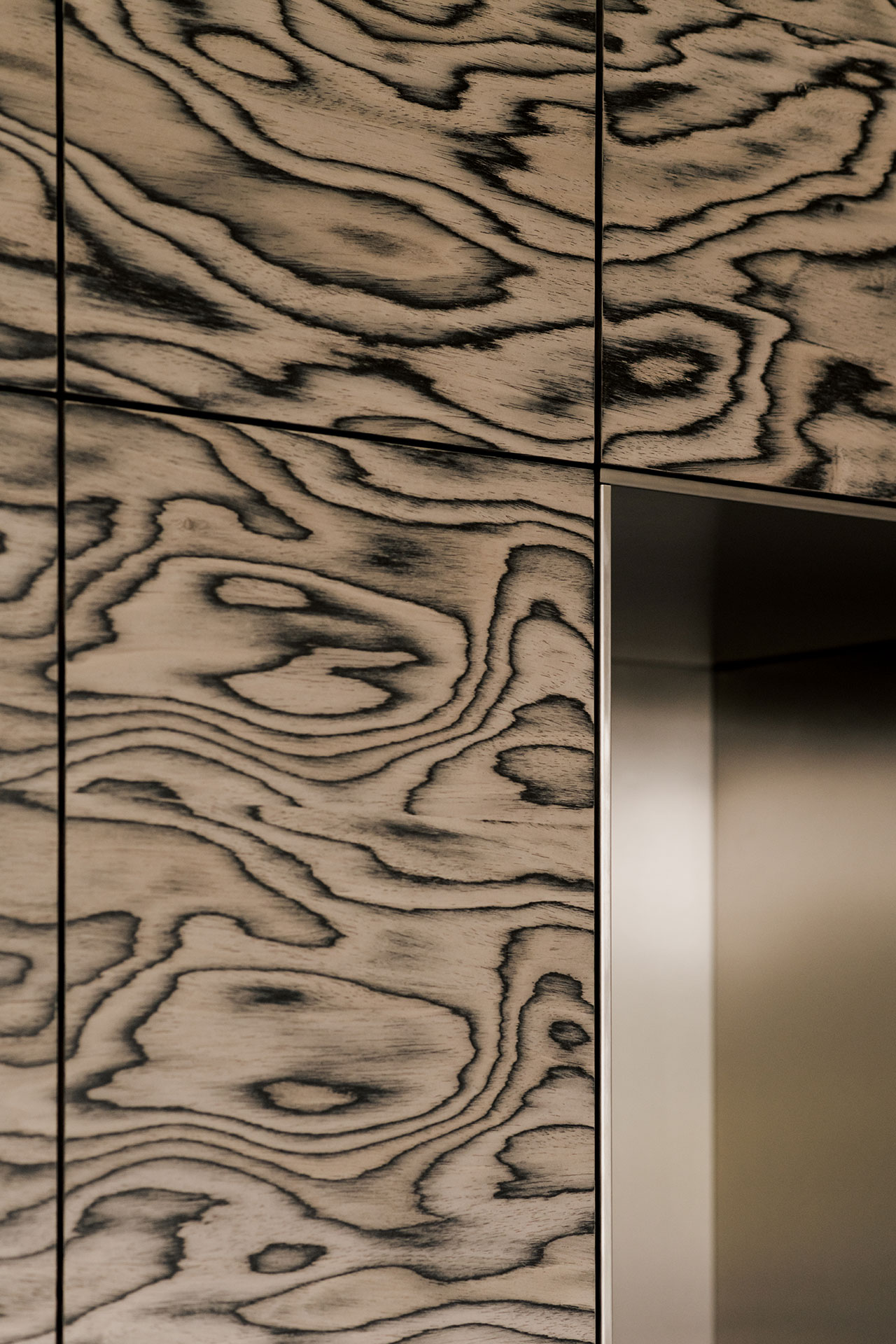
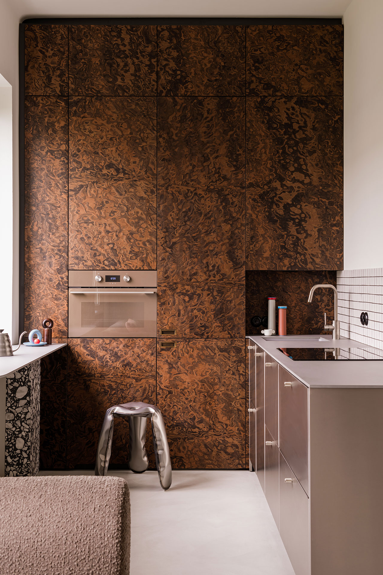
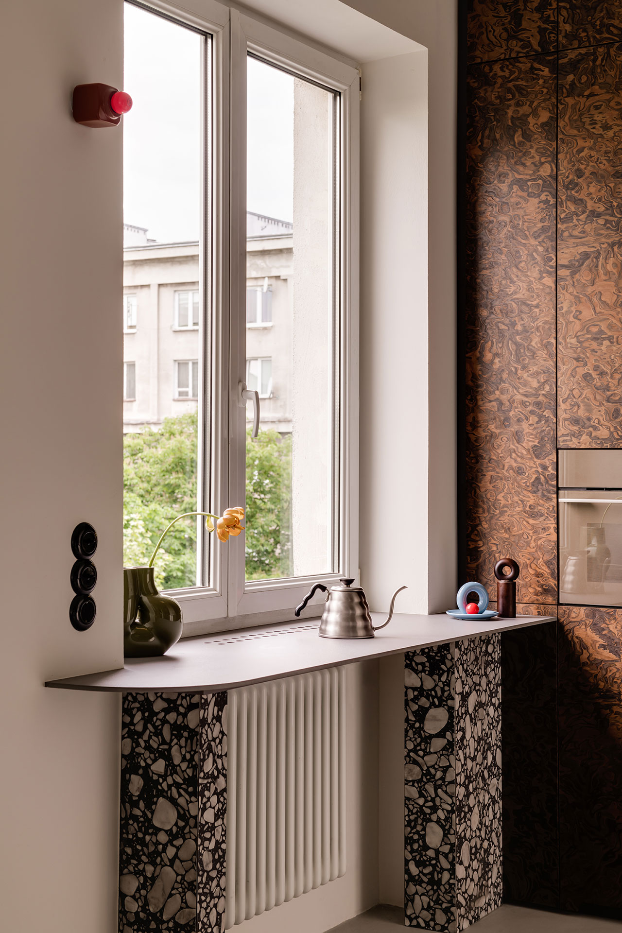
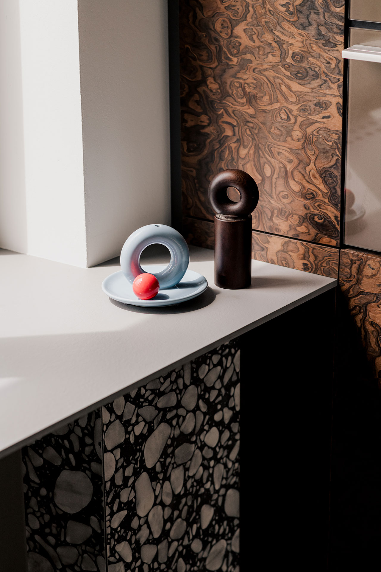
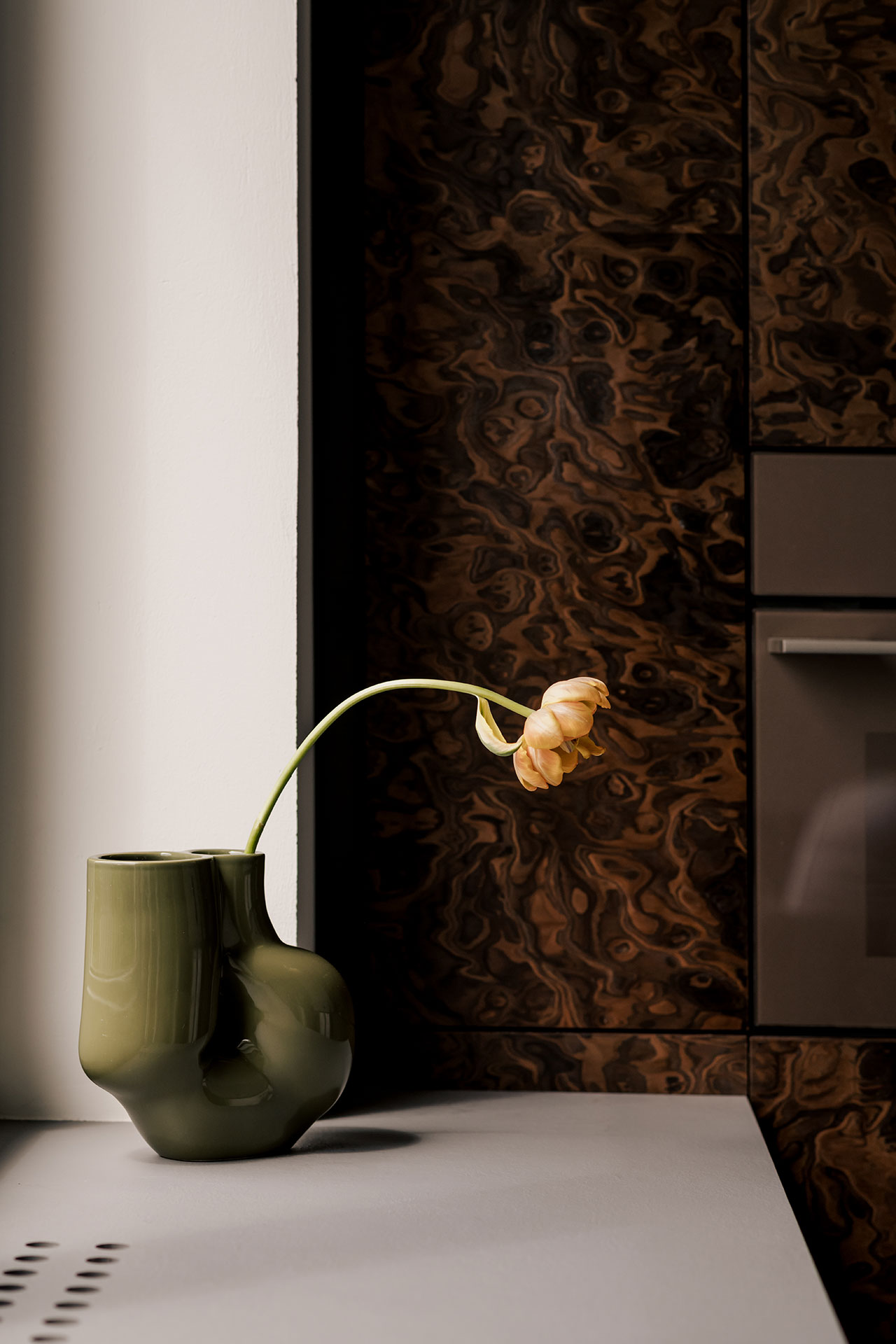
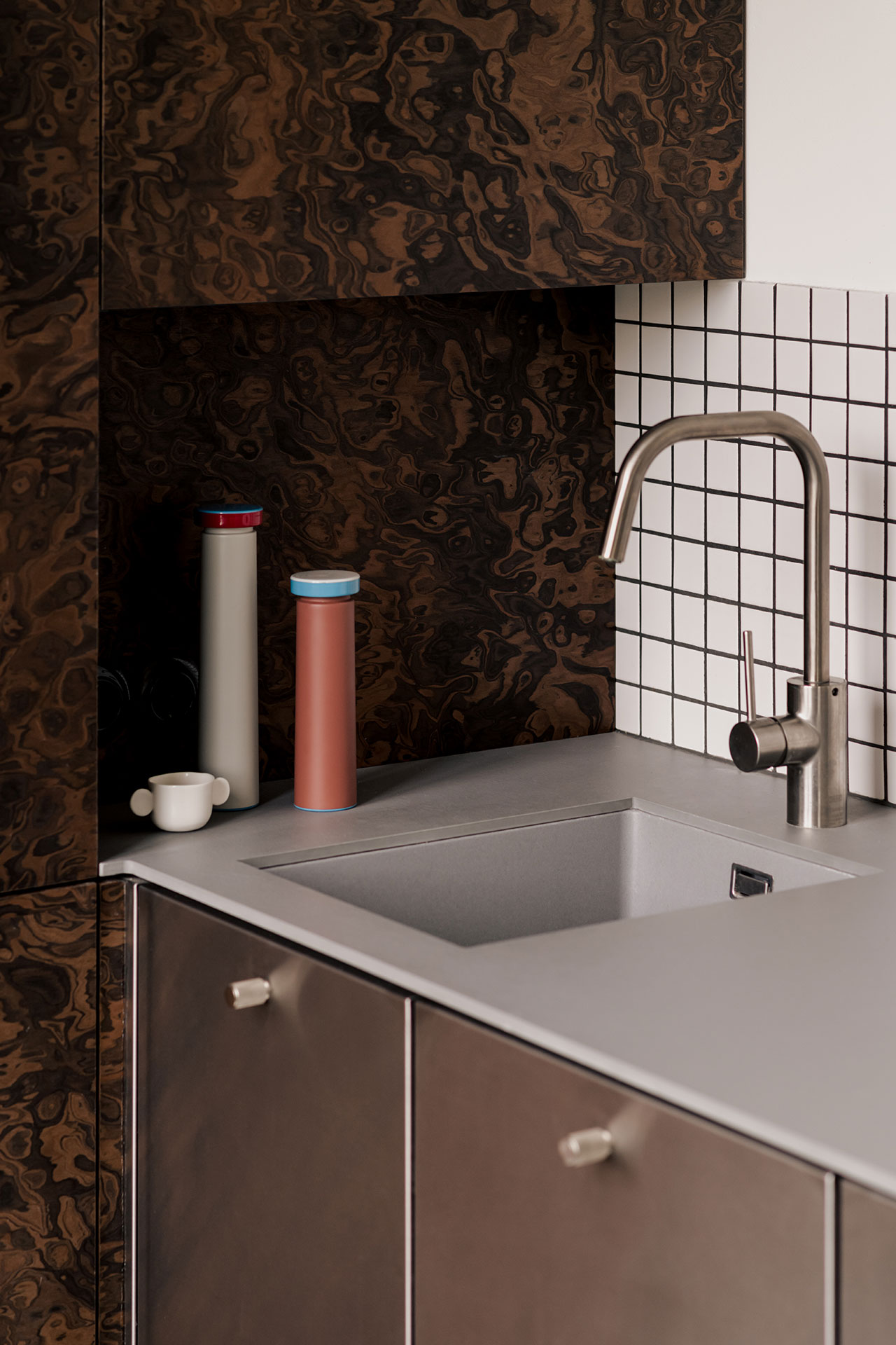
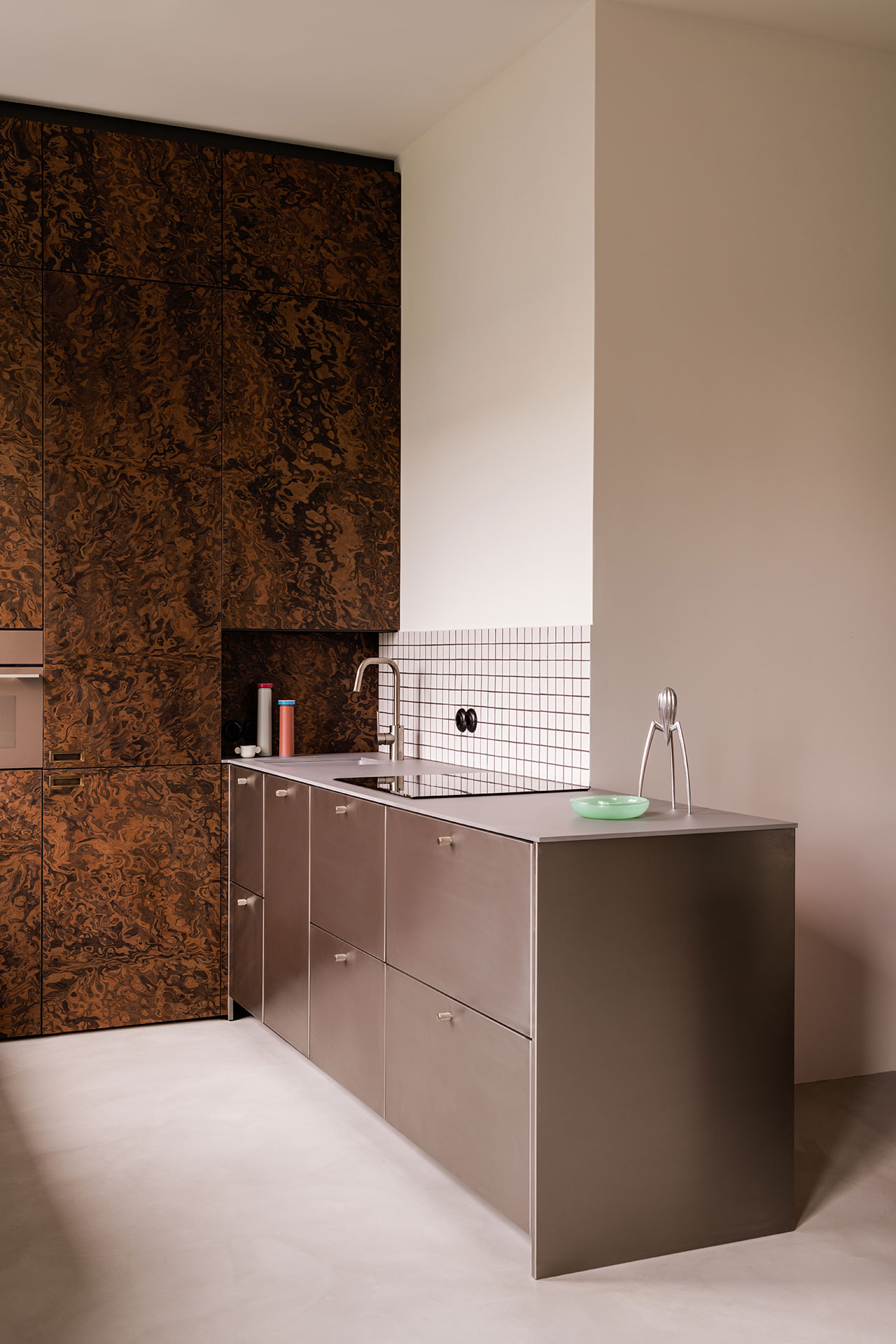
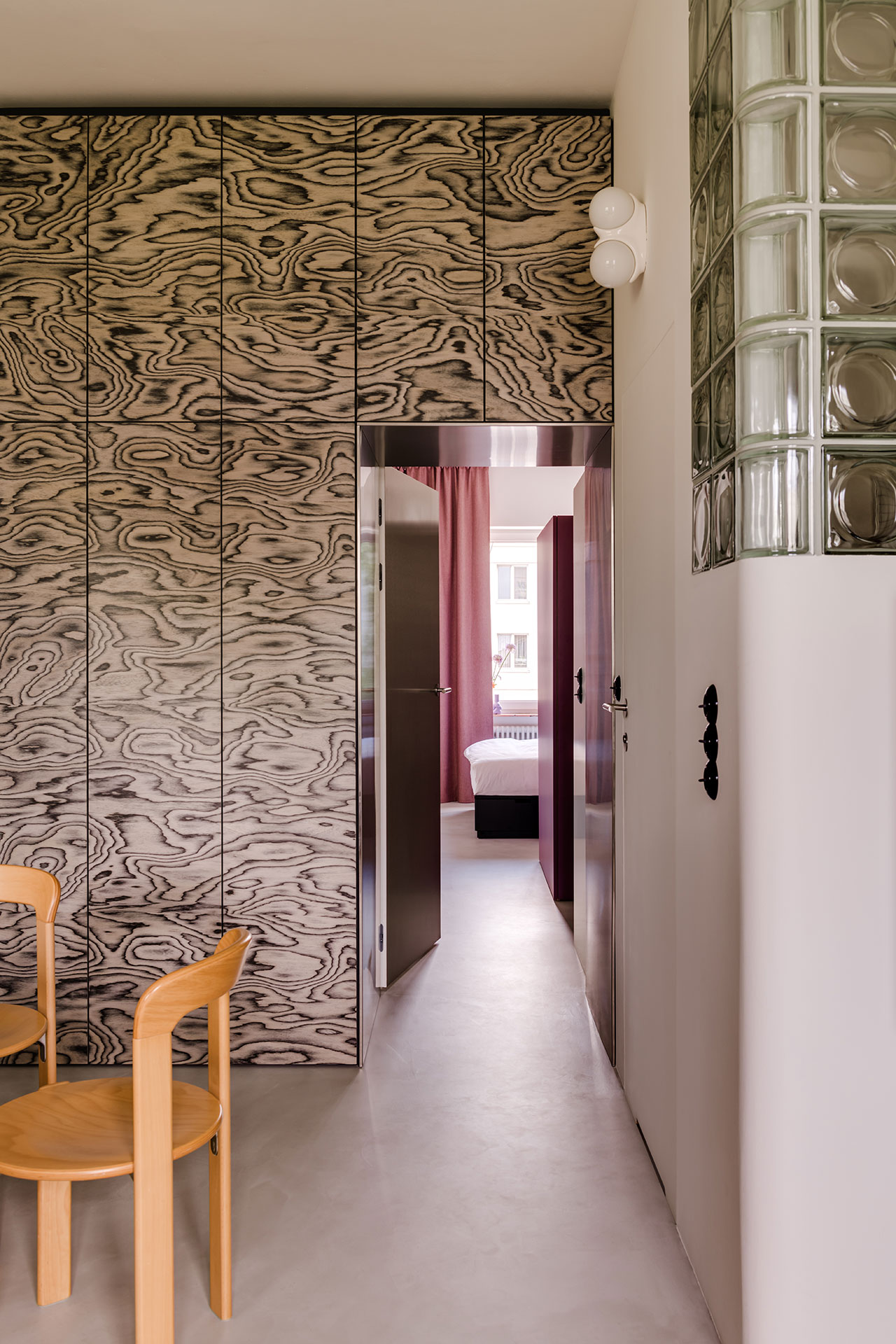
The designers have used a number of cubic forms to mark each functional area. Dominating the entrance, a wall-to-wall built-in wardrobe is clad in a swirly grey wood veneer originally designed by Italian designer Ettore Sottsass for Alpi in the 1980s. A pink terrazzo round table paired with HAY’s Rey lacquered wood chairs, originally designed by Swiss designer Bruno Rey in 1971, conjures the playful aesthetic of the Memphis Group, the design collective that Sottsass founded. Clad in walnut burl veneer, the organic patterns of the floor-to-ceiling cabinetry in the kitchen area are juxtaposed with the brushed steel counter and the black and white terrazzo supports of the breakfast bar by the window.
Photography © ONI Studio.
Photography © ONI Studio.
Photography © ONI Studio.
Photography © ONI Studio.
Photography © ONI Studio.
Photography © ONI Studio.
Photography © ONI Studio.
Photography © ONI Studio.
Photography © ONI Studio.
Photography © ONI Studio.
Photography © ONI Studio.
Photography © ONI Studio.
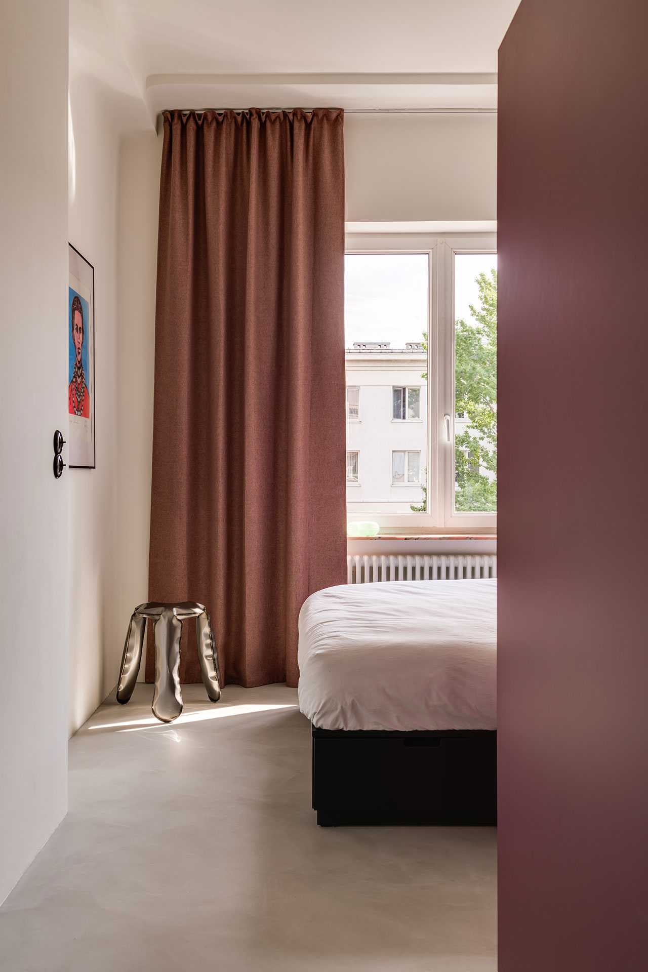
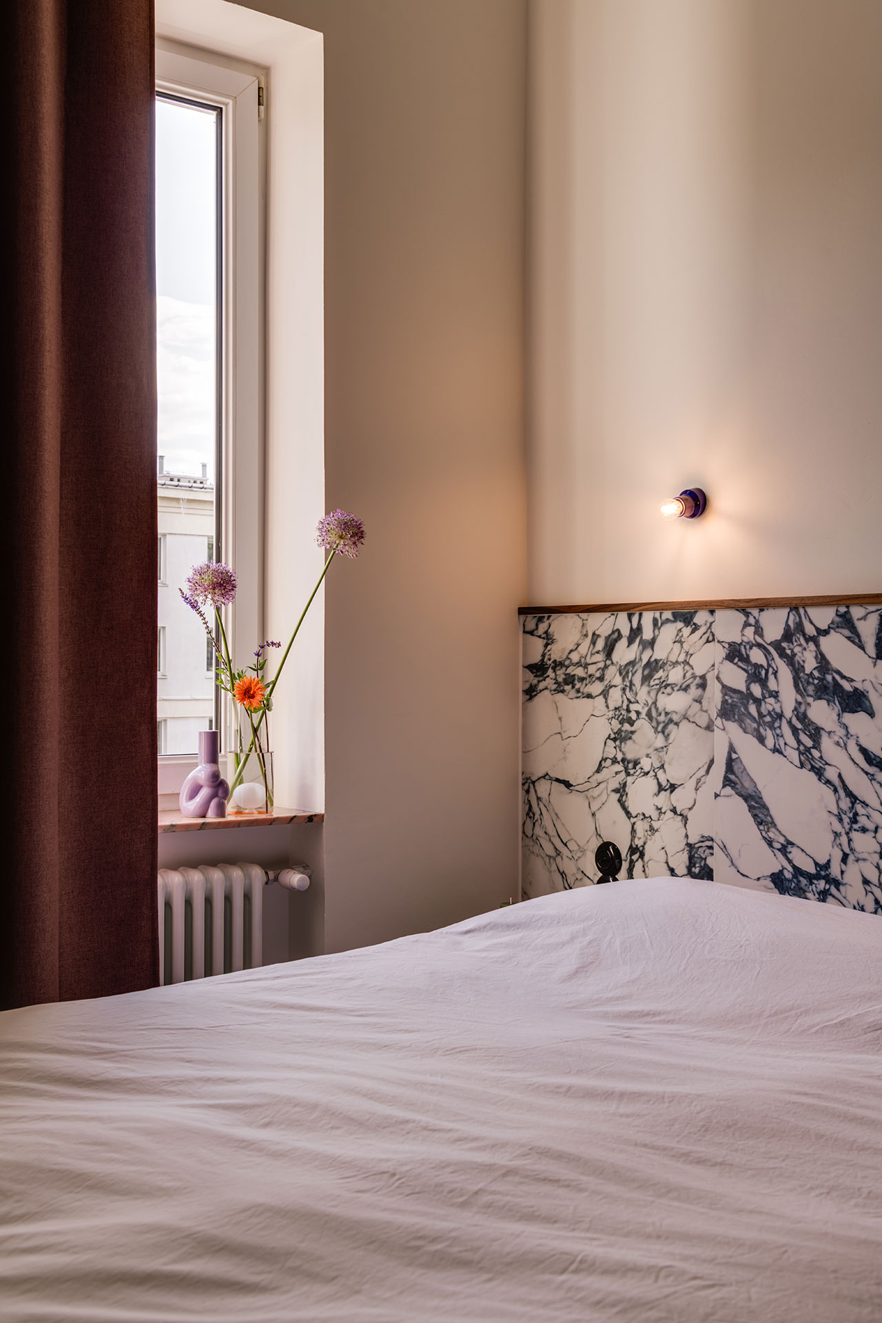
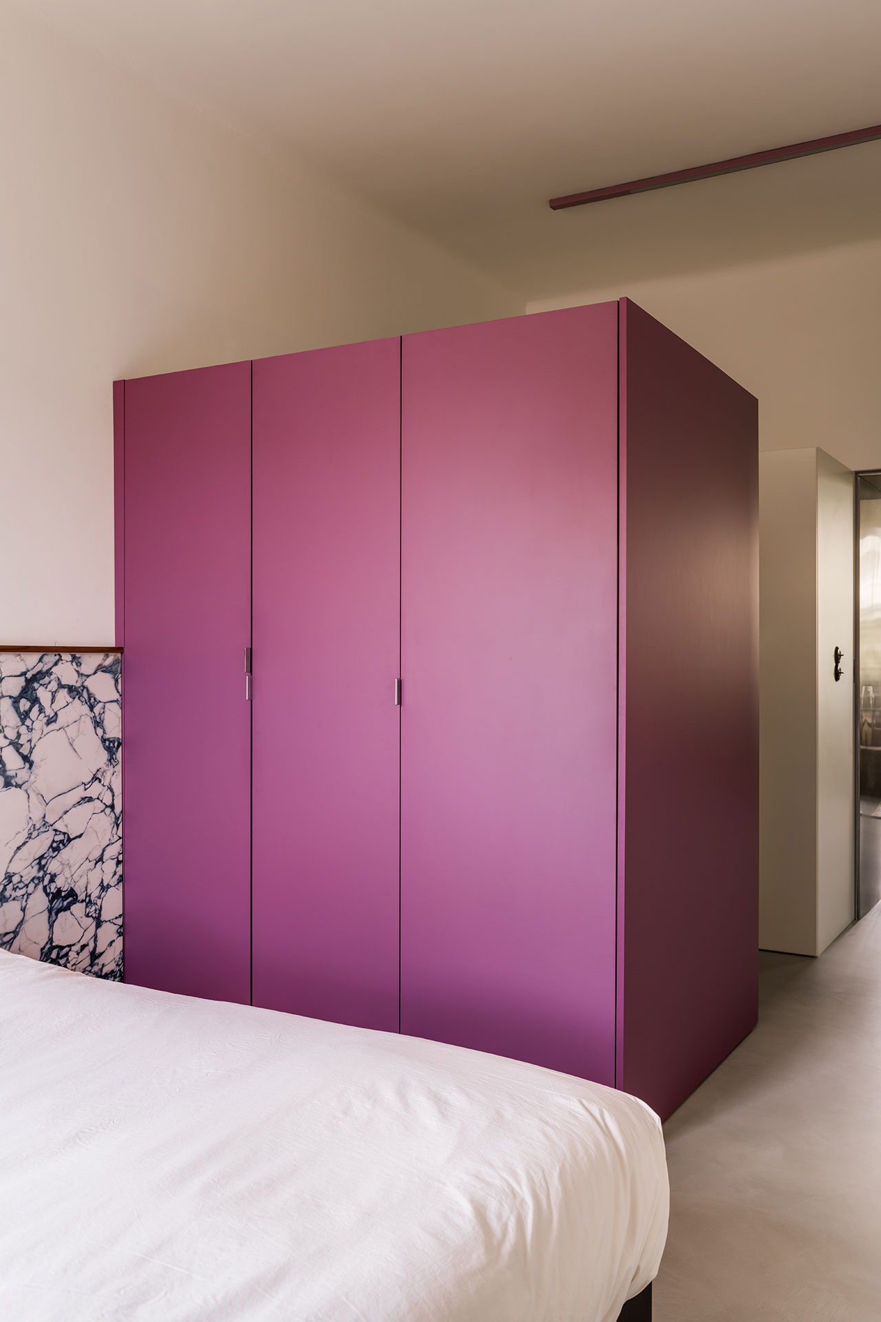
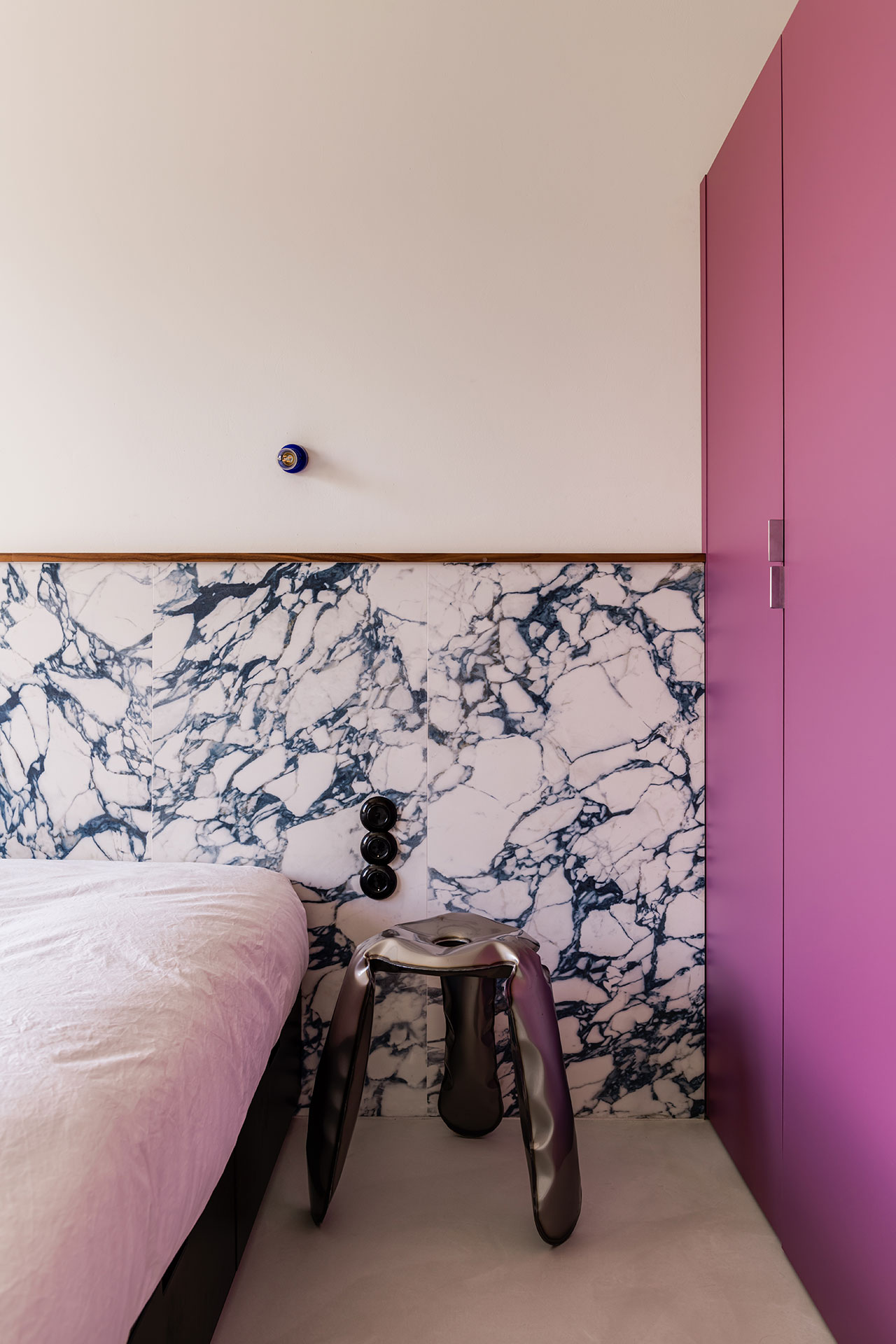
Separated by a stainless-steel door, the private quarters are divided by a large, purple-hued wardrobe into a bedroom and utility room. The wardrobe’s boxy geometry is contrasted by the fluid form of Polish designer Oskar Zieta’s Plopp stool, here used as a nightstand, while a marble headboard adds white and blue accents.
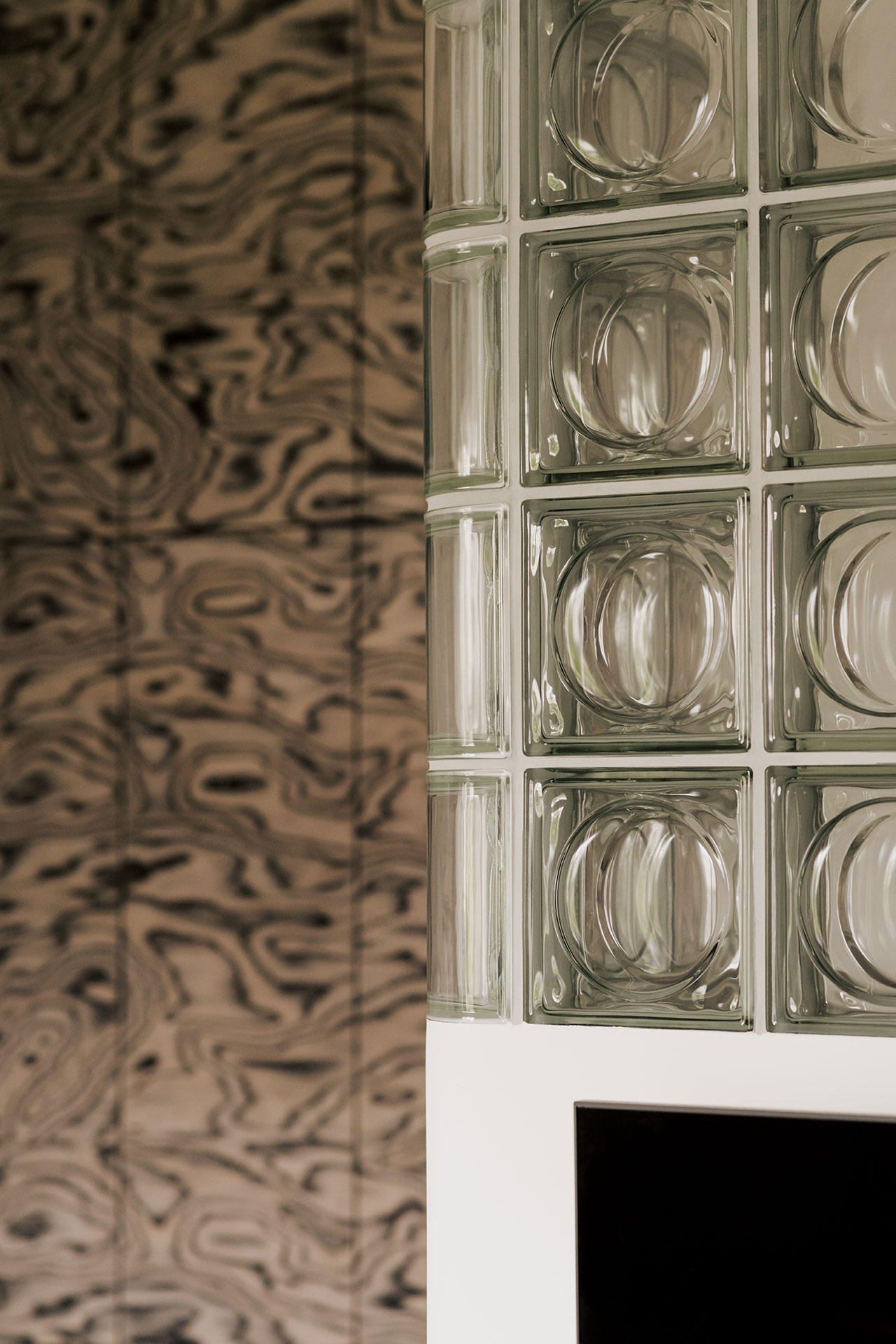
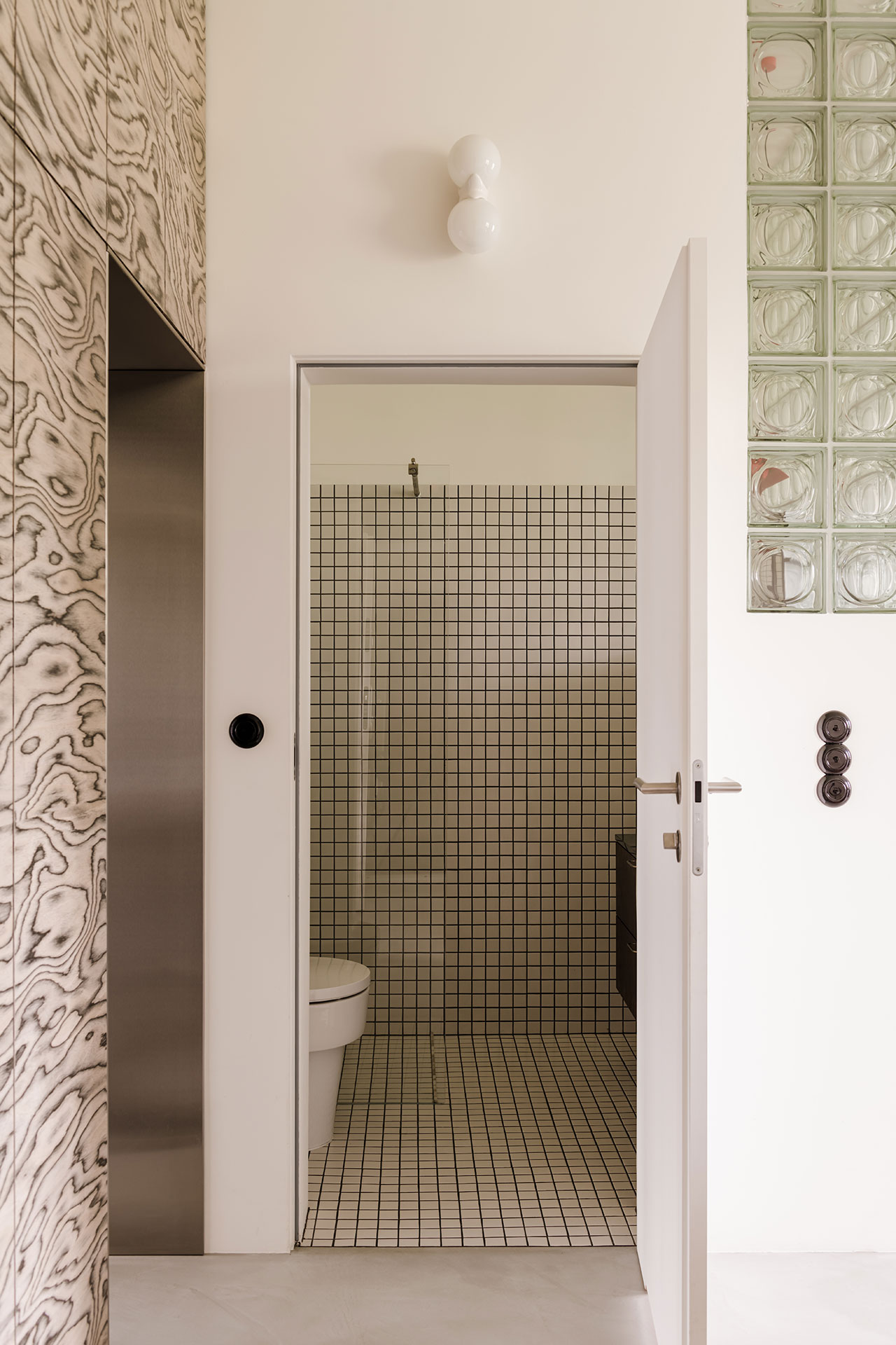
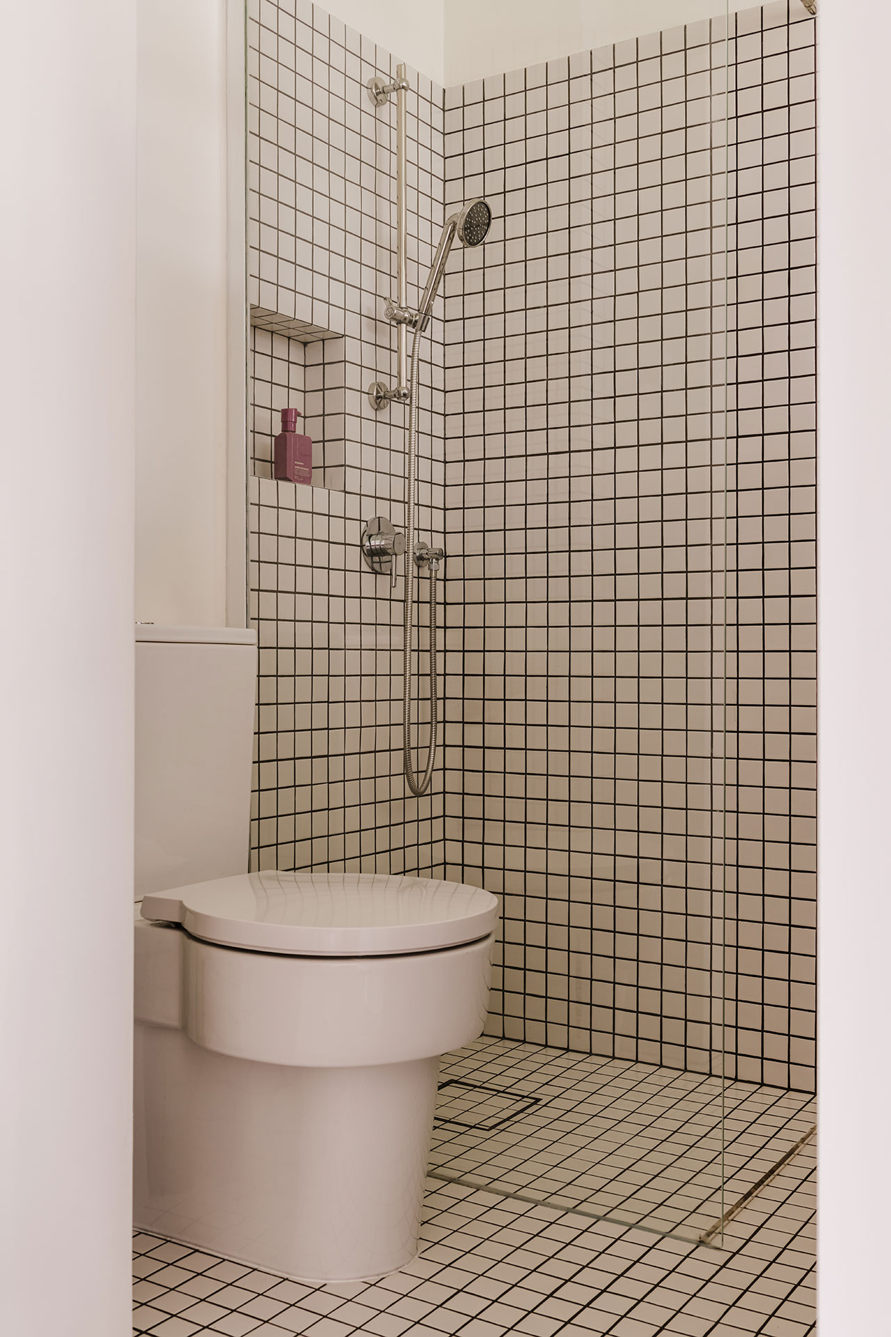
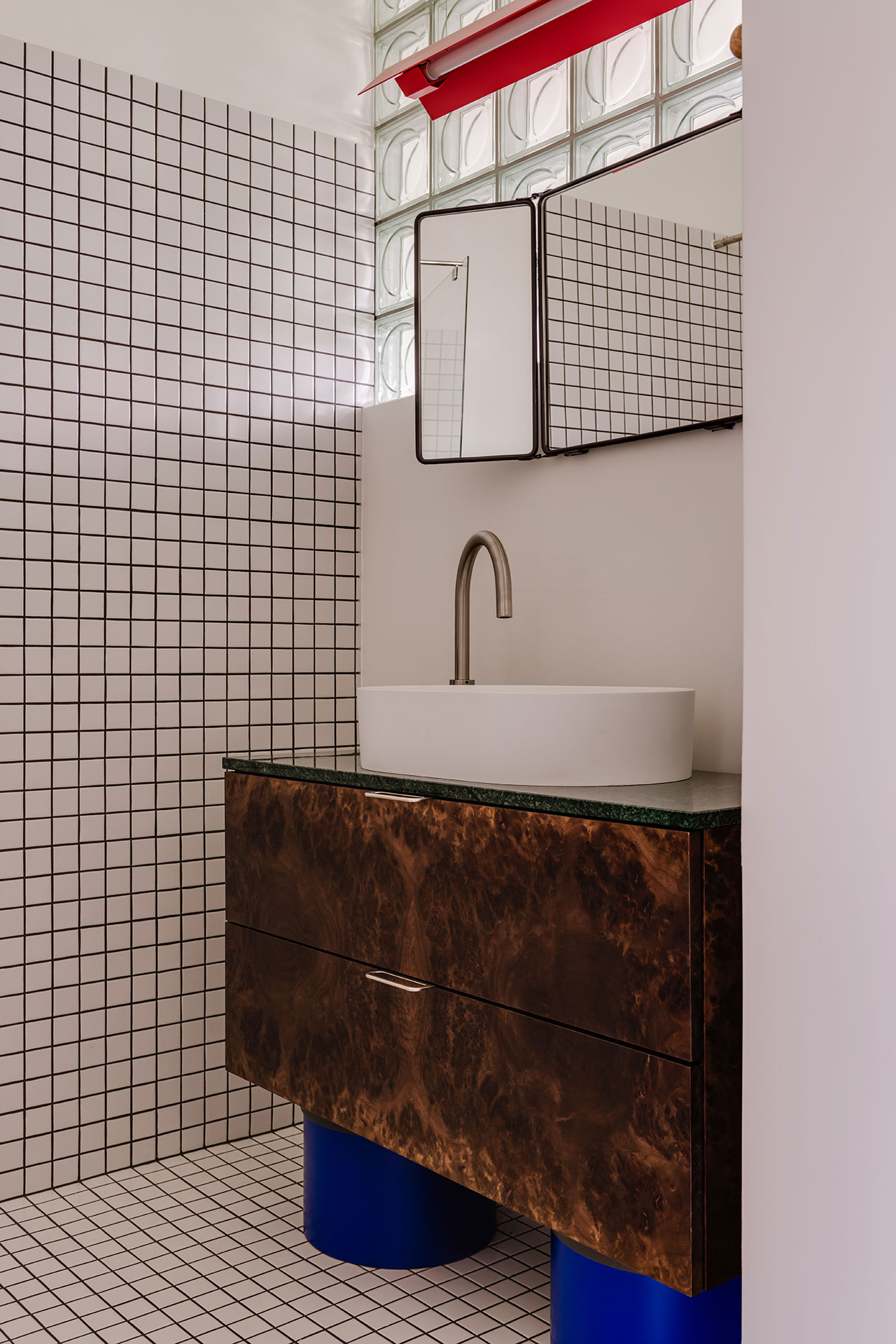
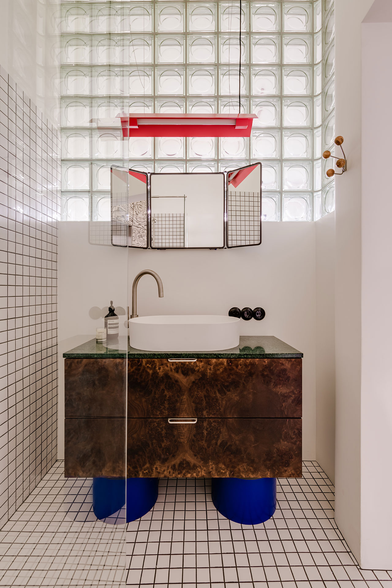
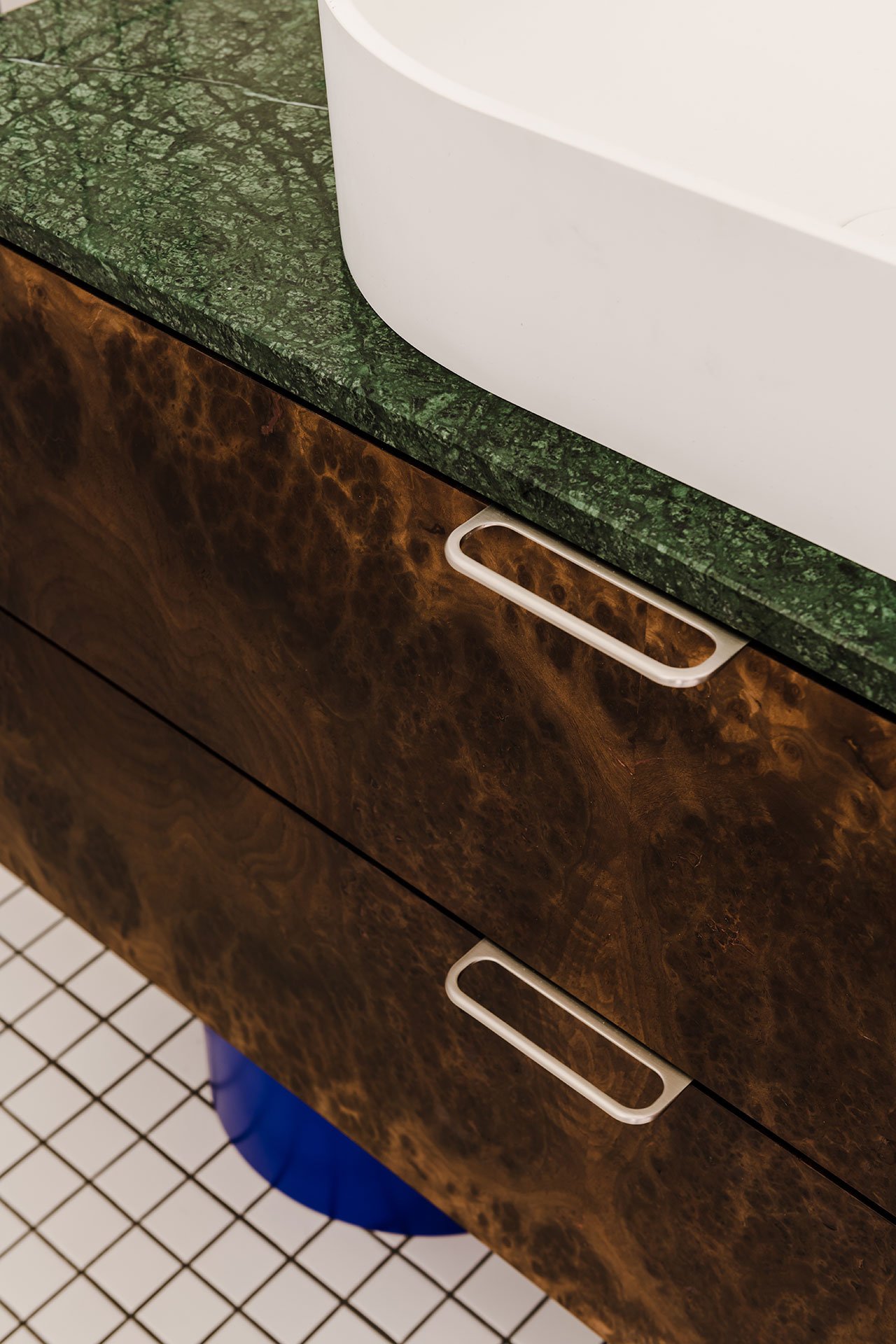
Finally, in the bathroom, a windowless space that is nevertheless softly illuminated with natural lighting thanks to a rounded glass-brick wall section, a custom-designed vanity makes for a bold design statement amid the grid-patterned monochrome wall tiling. Clad in the same walnut burl veneer as the kitchen cabinetry, and supported on cobalt-blue legs, the elegantly quirky piece is one more illustration of Mistovia’s creative flair.
Photography © ONI Studio.
Photography © ONI Studio.
Photography © ONI Studio.
Photography © ONI Studio.
Photography © ONI Studio.
Photography © ONI Studio.
Photography © ONI Studio.
Photography © ONI Studio.
Photography © ONI Studio.
Photography © ONI Studio.
Photography © ONI Studio.


