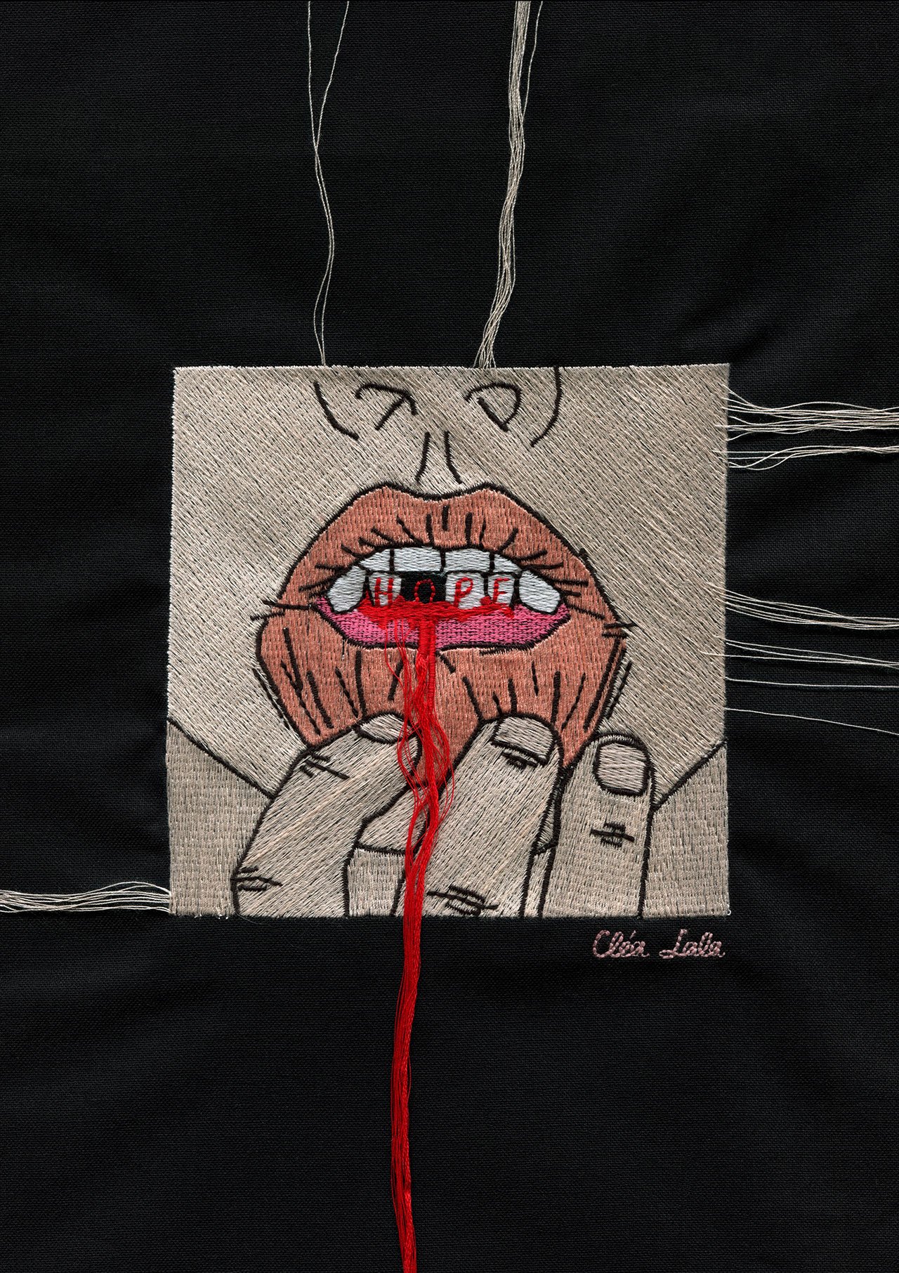
Cléa Lala, Hope, 2020. From the series Le rouge et le noir.
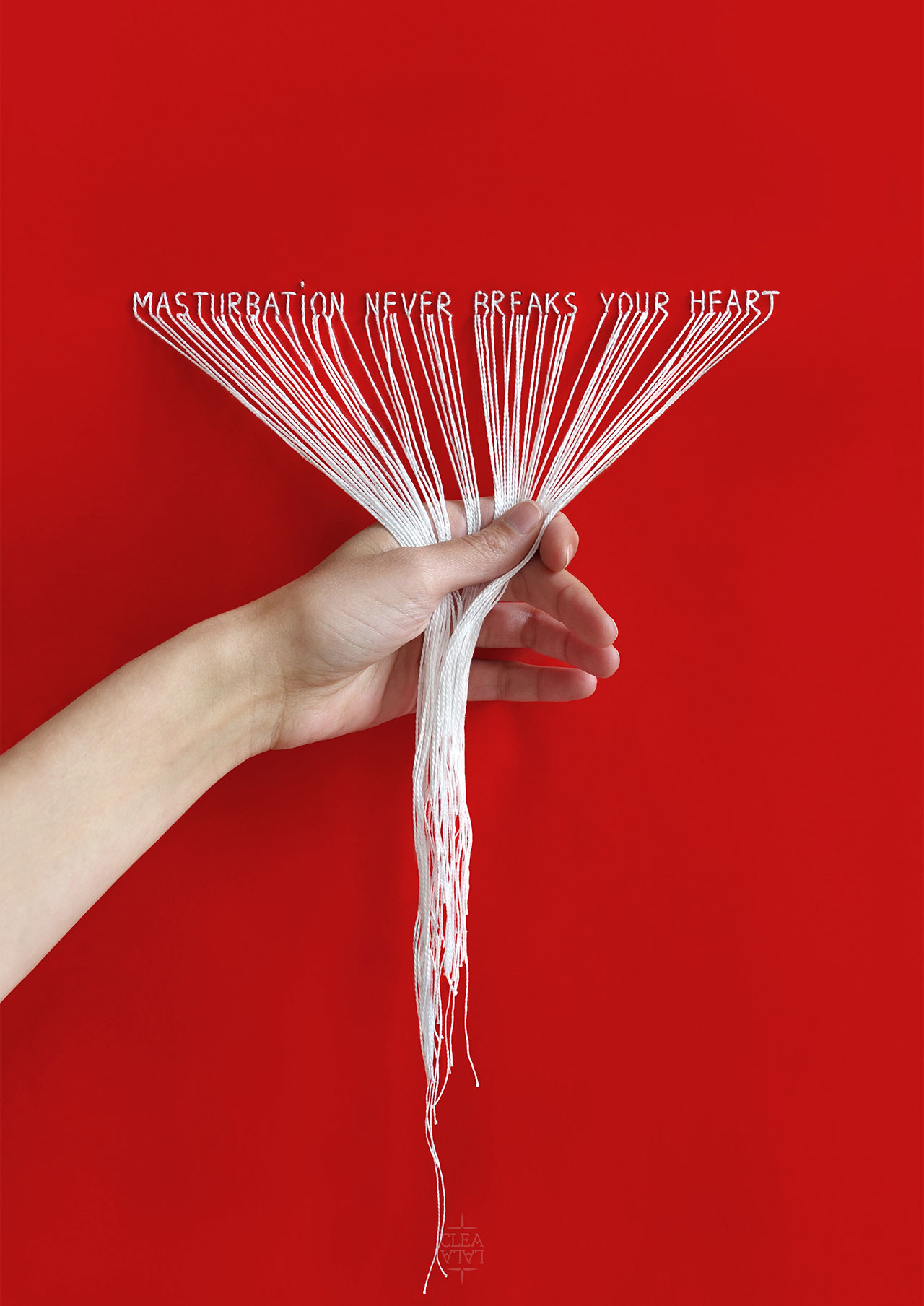
Cléa Lala, DO IT YOURSELF, 2018. From the series Humeurs.

Cléa Lala, PEACE PLEASE, 2017. From the series Humeurs.
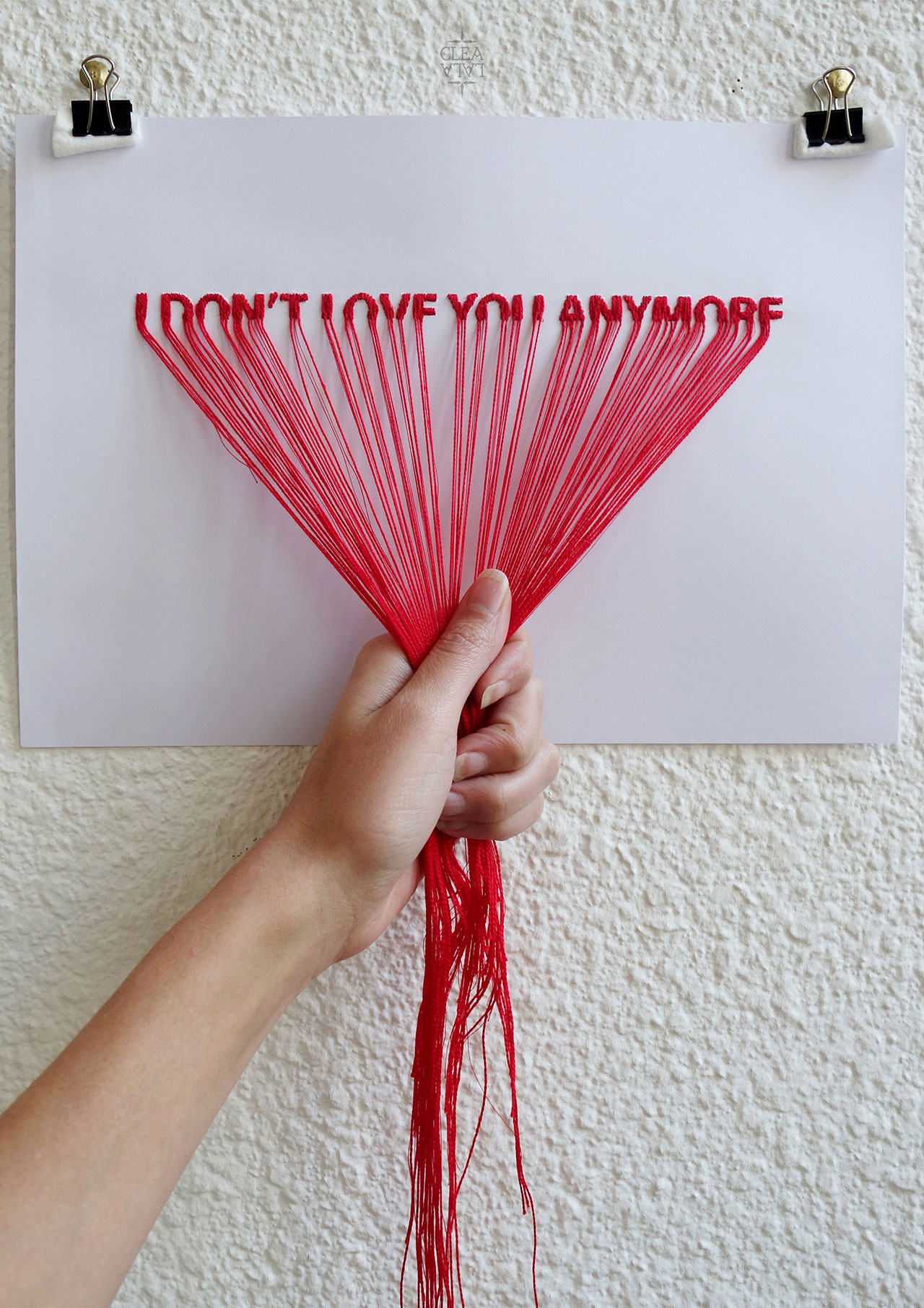
Cléa Lala, I DON'T LOVE YOU ANYMORE, 2016. From the series Humeurs.
How did your interest in embroidery emerge? What led you to combine it with your graphic design practice?
When I was a child, I liked to customize objects and clothes with yarn and fabrics. When I grew up, I considered a career in fashion before opting for visual communication, so after four years glued to a computer screen studying graphic design [at École Estienne and École Olivier-de-Serres in Paris], I was eager to work with tangible materials like yarn and textiles. I guess I was probably trying to ‘thread’ my way through the thousands of graphic designers.
Yarn, and embroidery in general, has been a source of inspiration ever since, both for their many formal qualities (line, texture, volume, movement) and conceptual qualities (the link, the knot, the connection). Used in tension or loosely, static or moving, threads and lines are a way for me to create metaphors to communicate my emotions, mood, state of mind, to draw connections between people, to ask questions about life. Our lives hang by a thread after all…
Where do you draw inspiration from?
I’m motivated by emotions. When I feel something strongly - it can be sadness, courage, anger, a question about life - I look for a material way to express it, to give it shape, often taking inspiration from images and quotes that I’ve been collecting for over 10 years, from photography and fashion shoots, to extracts from books and phrases that I read online.
For example, I did Cry Me a River the night I saw Black Swan by Darren Aronofsky. I was in a really bad mood for days; this story about the mental cost of pursuing perfection moved me so deeply. The drawing I did captures Portman’s expression when she sees the glass shards on her body. Another example is when I decided to break up with my boyfriend, and created I Don’t Love You Anymore while listening to NAO’s “In the morning” on repeat. Her song is like a musical version of the emotion I felt, especially when she sings “I don’t love him anymore”. It helped me to create my own visual version of this emotion.
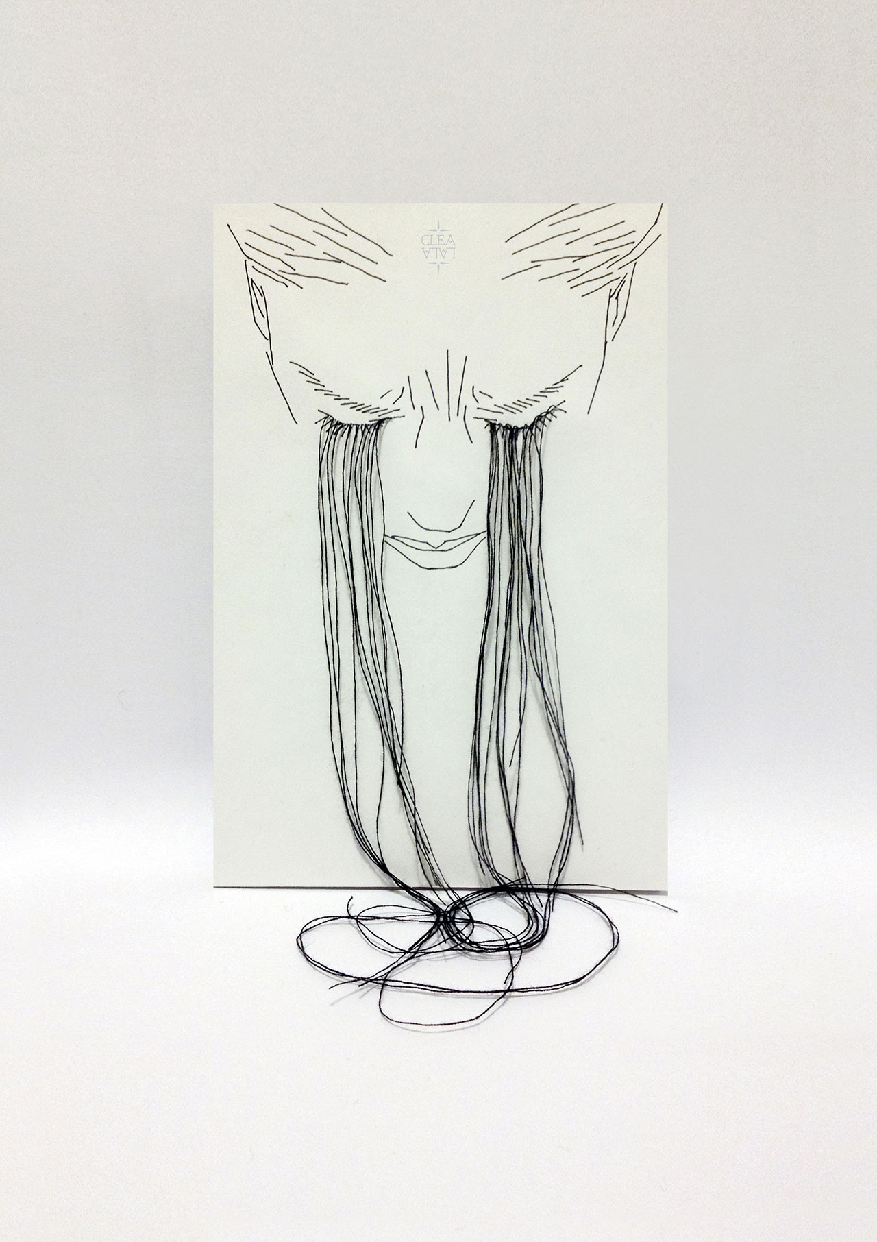
Cléa Lala, Cry me a river. From the series LPTTF.
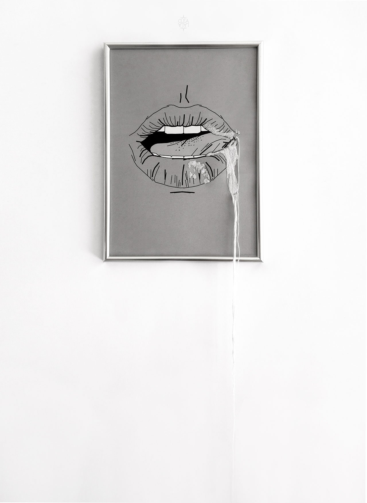
Cléa Lala, The spiteful tongues speak, the good ones give orgasms, 2016. From the series Humeurs.
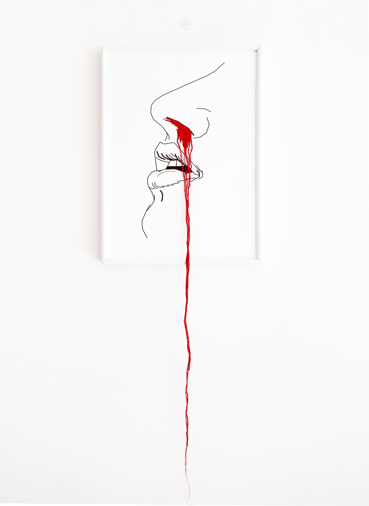
Cléa Lala, Hurt me with the truth, but never comfort me with a lie, 2016. From the series Humeurs.
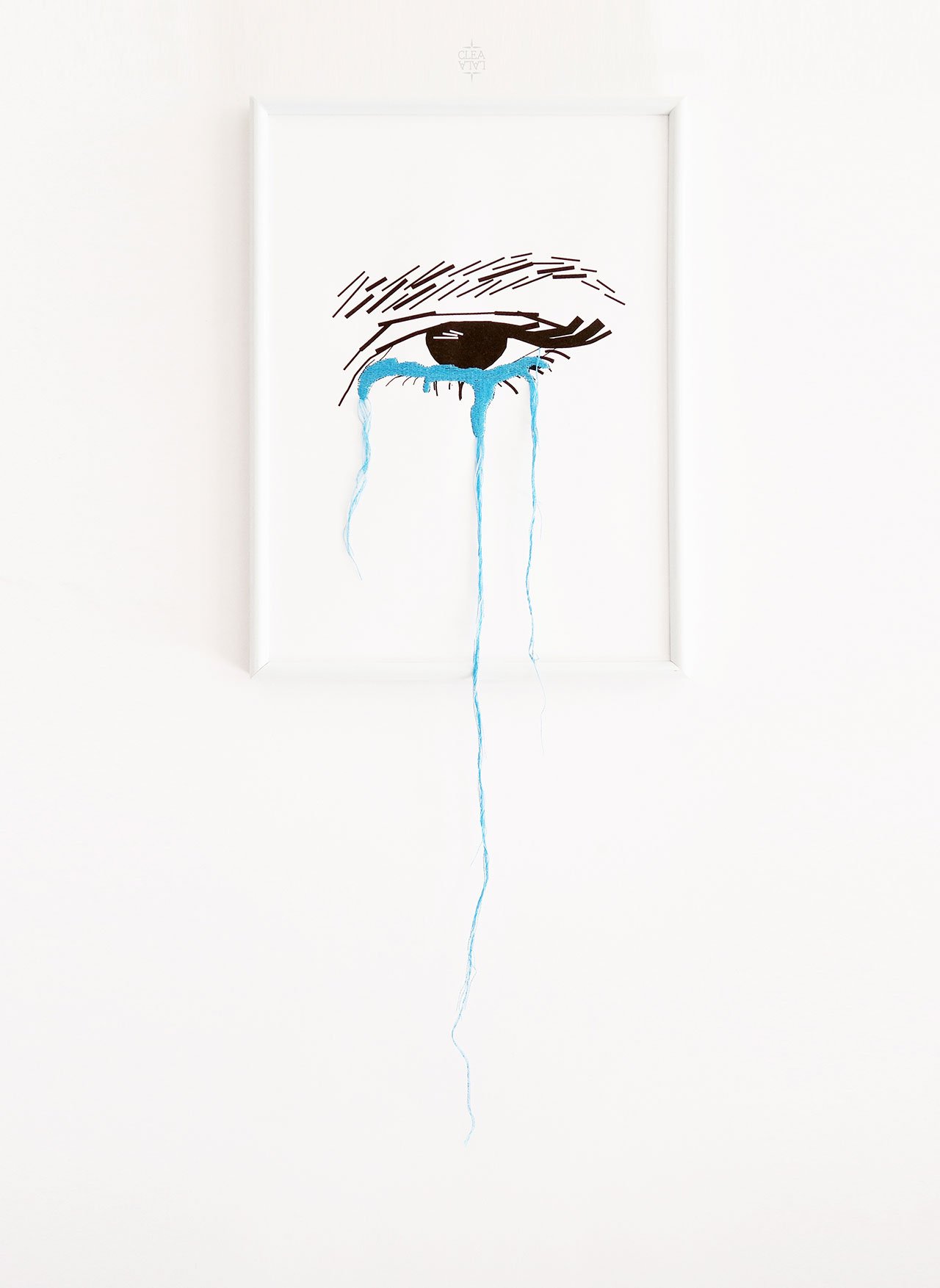
Cléa Lala, But real men make my panties wet not my eyes, 2016. From the series Humeurs.
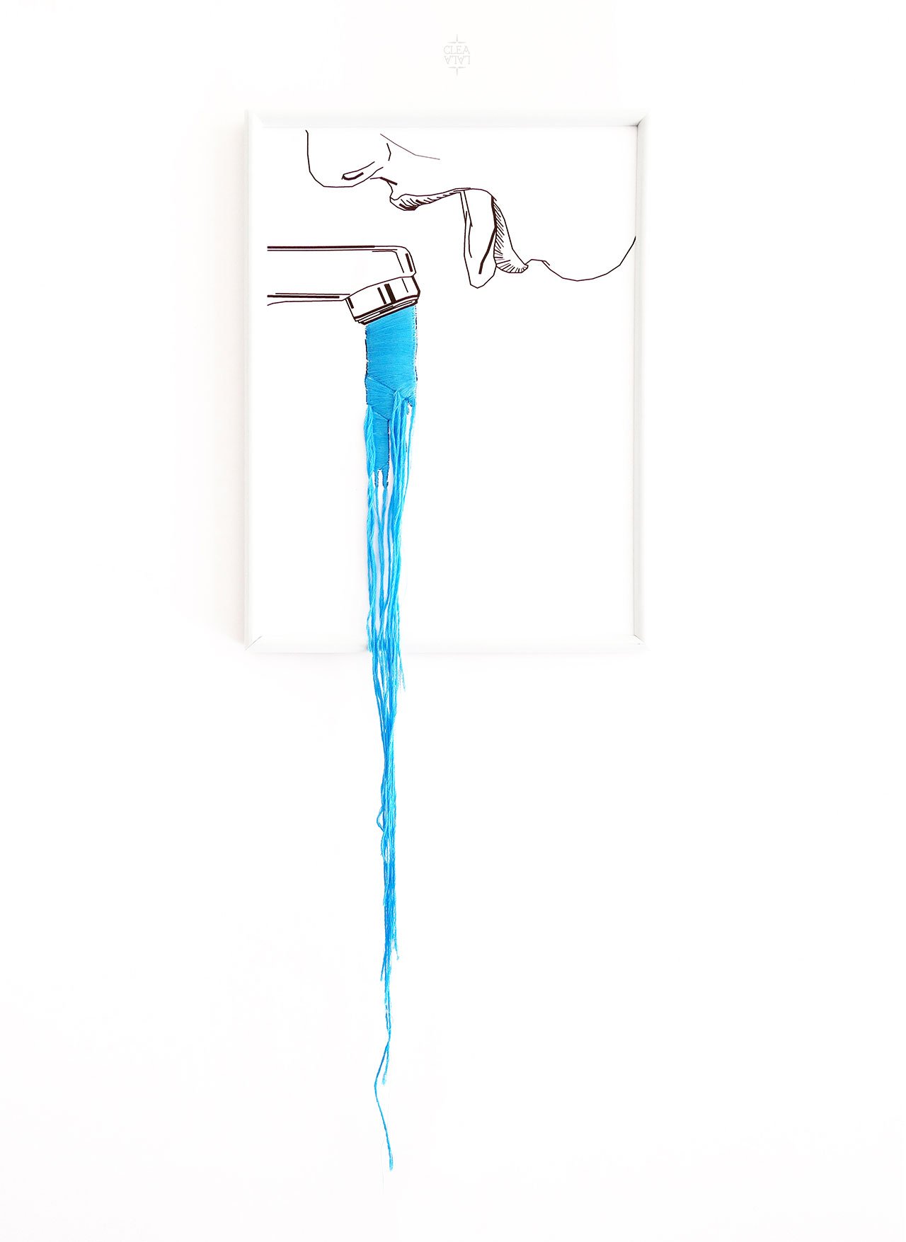
Cléa Lala, CHALEUUUUR, 2016. From the series Humeurs.
How would you describe your style?
I’m not sure. I think it takes different forms. My goal is to create effective “visual punchlines”, so minimalist? Conceptual?
A lot of your work is text based. What significance do words have for you as a designer? How easy is it to navigate between French and English?
Words are really important in my personal life. It has beeb important for me to defend myself with words when I couldn’t do it with physical strength. So, when I was introduced to typography in my graphic design studies, I loved the idea that I could learn techniques and codes to give words a concrete shape. By playing on the formal parameters of letters (size, thickness, spacing, kerning etc.) I can make a word express much more than what it means. This is priceless! It’s similar to oral speech or music: depending on the intonation, if you shout or whisper, the words can express much more than their actual meaning. In this sense, my visual work is similar to sound design. I would love people looking at my artworks to feel the same emotion as if they were listening to music.
What are your favourite fonts and why?
I like the Rockwell typeface, which is a Geometric Slab Serif, because of its straight lines, perfectly squared serifs, sharp angles and perfect circles. It’s quite rigid and industrial which makes it a great font to combine with the flexibility of thread/yarn. By cutting the rectangular serifs and replacing them with flowing threads, I create strong visual contrasts as you can see in the Relax or Peace Please artworks. I like this duality (rigid vs. flexible), which I also explore when I embroider rough texture yarn on smooth surface paper, or when I combine digital lines with tactile embroidery. Duality is important in my work practice as well as my personal life – it’s all about balance between control versus letting go, random versus organization. Also, I really enjoy combining hand embroidery with calligraphy as you can see in my Real Love or Courage projects.
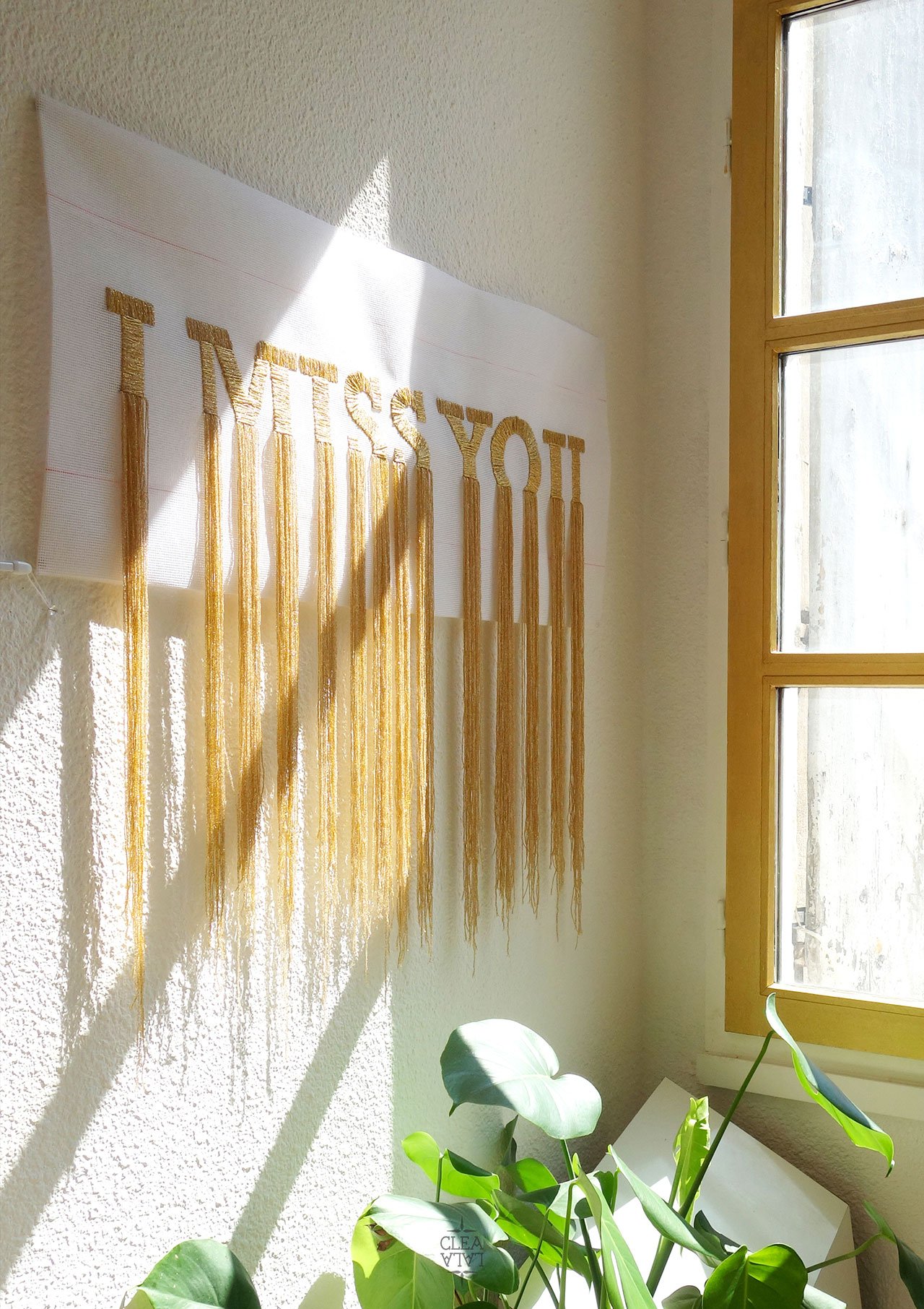
Cléa Lala, I Miss You, 2017. Commissioned by ORANGE.
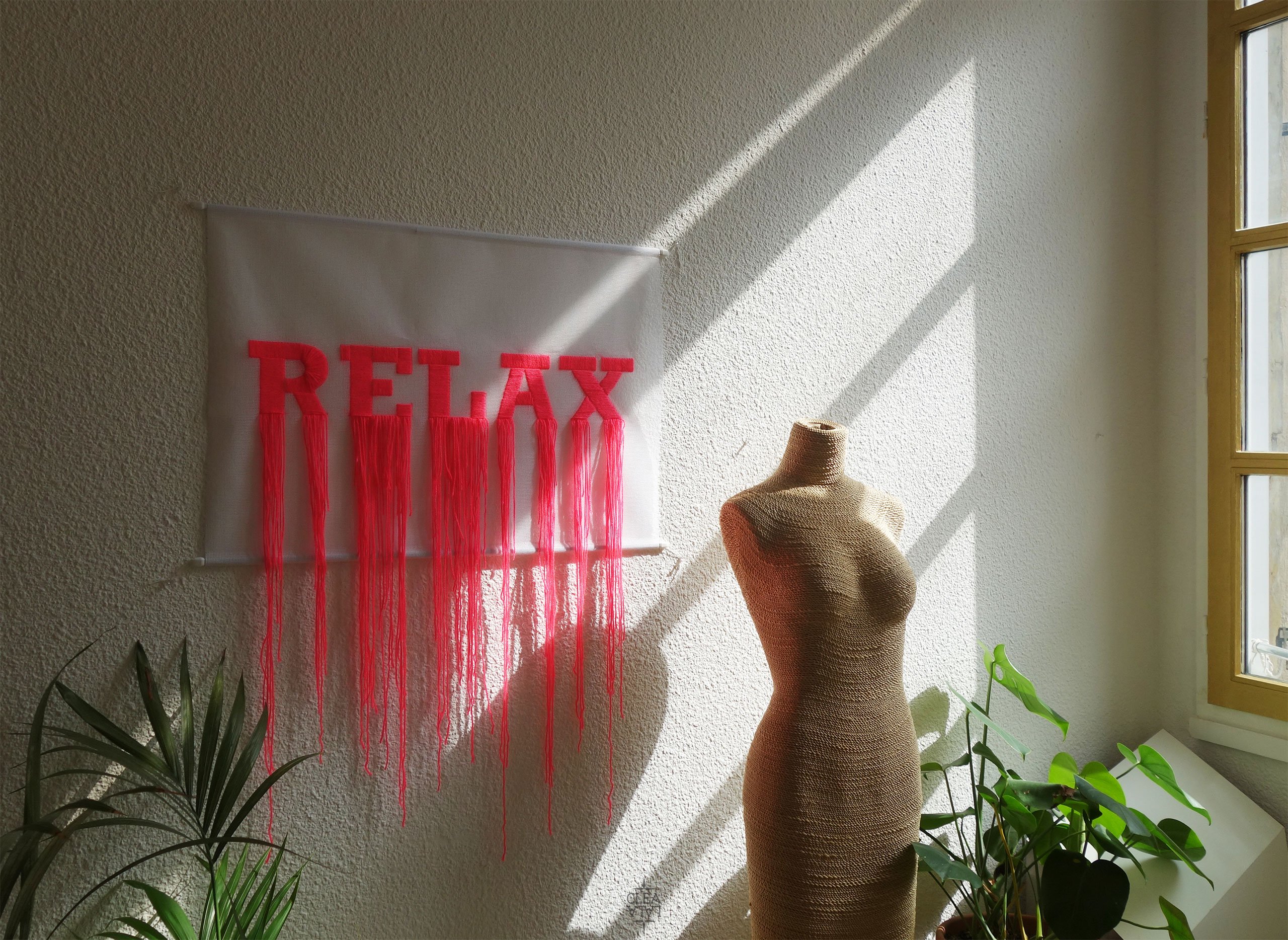
Cléa Lala, Relax, 2015-2017. From the series Humeurs.
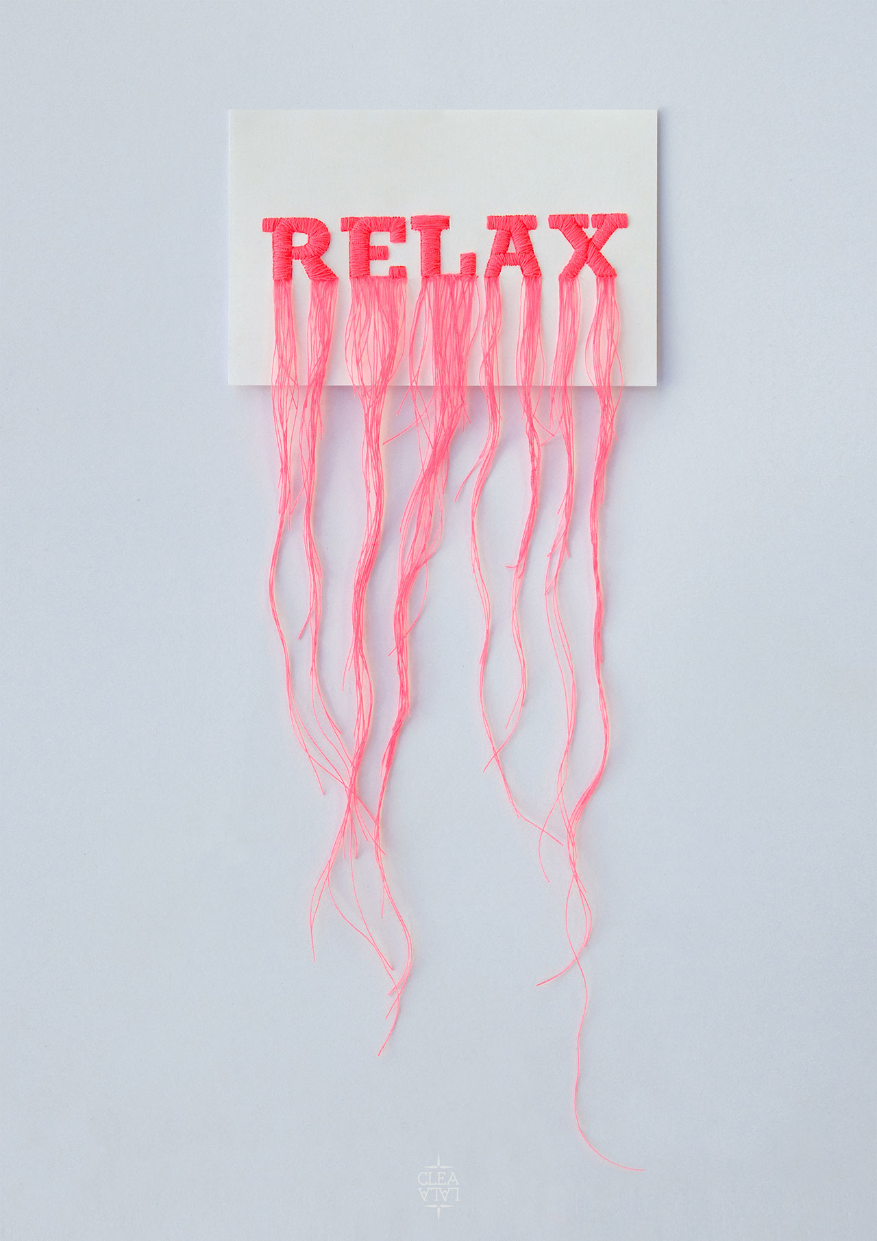
Cléa Lala, Relax, 2015-2017. From the series Humeurs.
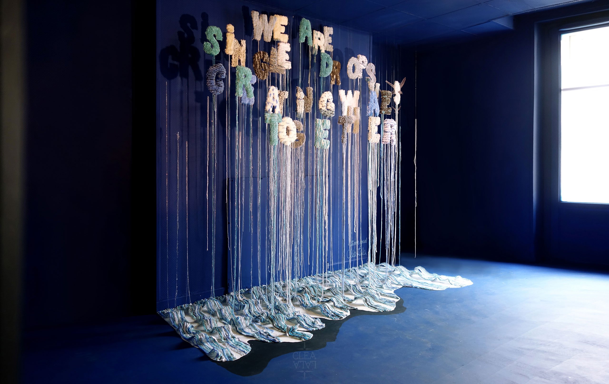
Cléa Lala. Project commissioned by COLORAMA.
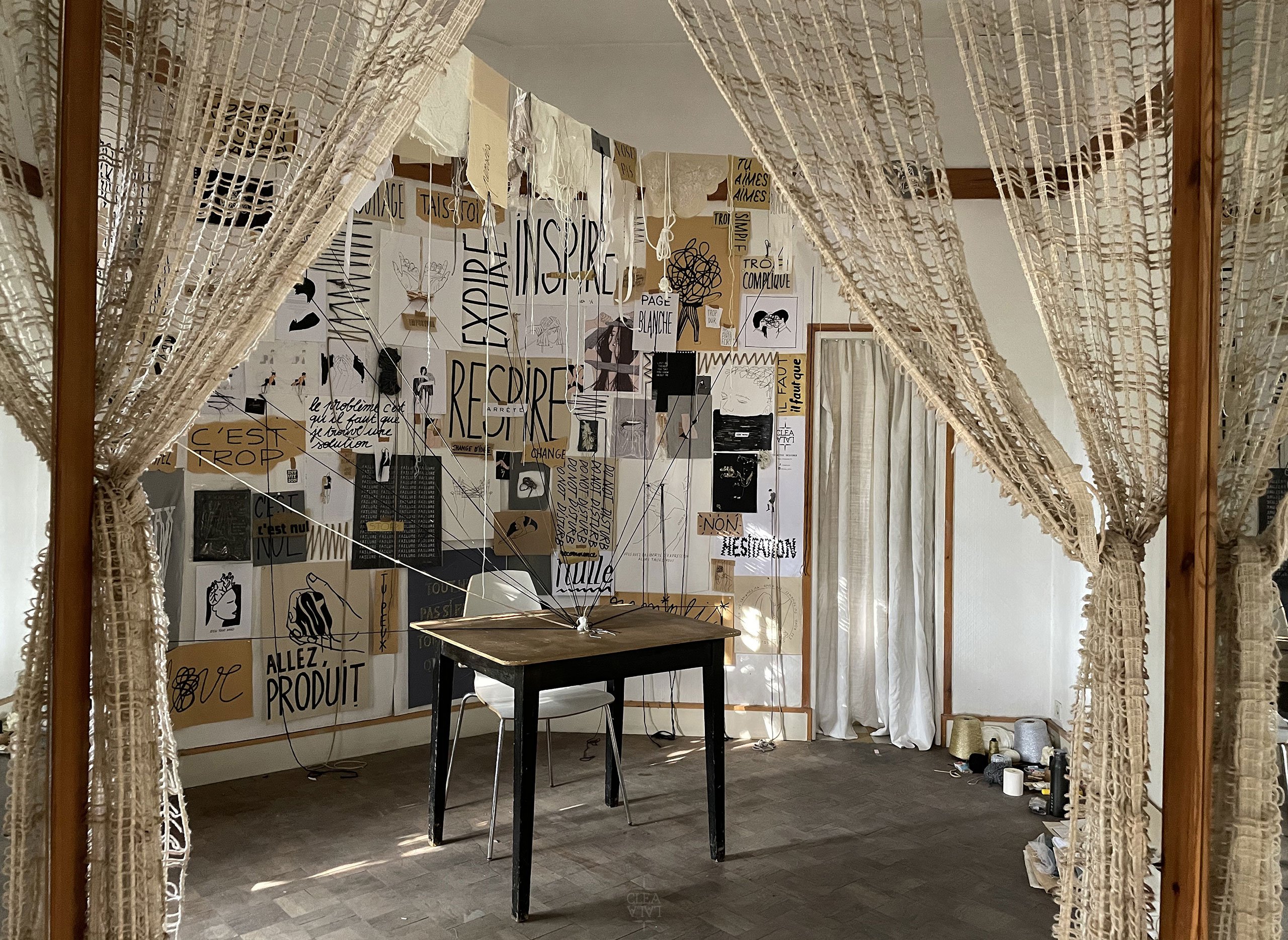
Cléa Lala, Bureau des Pensées, 2021.
Your work is characterized by a whimsical sensibility, often combined with serious subjects. How important is humour for you and why?
Again it comes down to duality! For me, humour provides an opportunity to highlight the comic, ridiculous, or absurd aspect of life’s difficulties. Humour allows me to go through and share difficult situations and to process dark emotions (fear, sadness, anger, etc). It can make me laugh when I feel overwhelmed, so it seems to me that humour is a great way to manage your emotions – instead of ignoring or burying them. There is a saying, "anything that is not expressed is impressed", which I think is very accurate.
There is a Pop Art aesthetic in your work. Is that intentional?
It’s not at all intentional! But since you asked, yes, Pop Art has caught my attention, especially the stylized universe of Tom Wesselman and Roy Lichtenstein’s illustrations. I’m fascinated by their appropriation of comic book typographic iconography like the “BANG!”, “BOOM!”, “BAM!” sound effects. I’m also drawn to the universe of [Italian comic book creator] Hugo Pratt’s Corto Maltes—Tango [one of the twelve original Corto Maltese novels] was the inspiration for my LE ROUGE ET LE NOIR series.
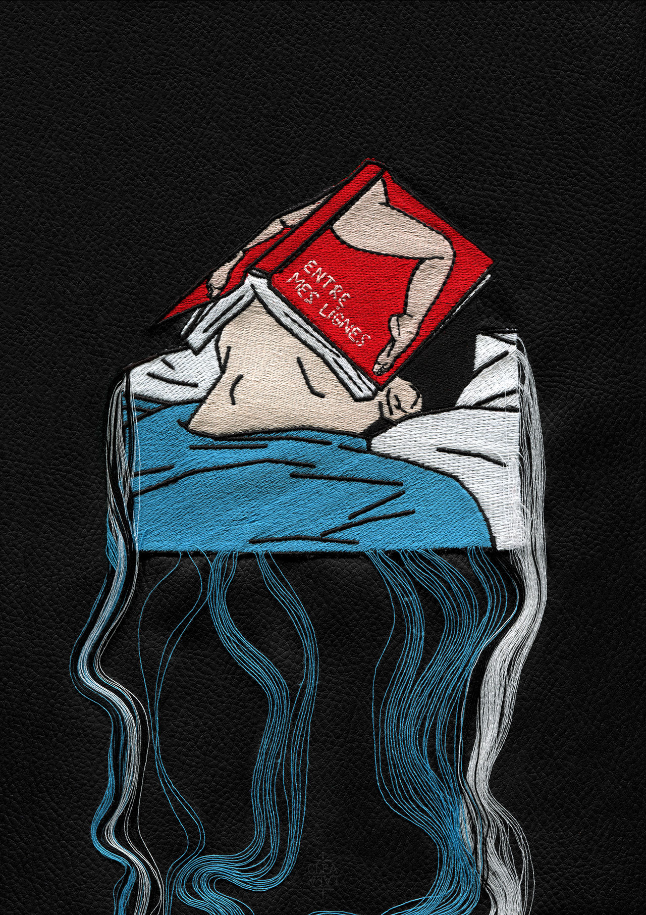
Cléa Lala, Entre Mes Lignes, 2020. From the series Le rouge et le noir.
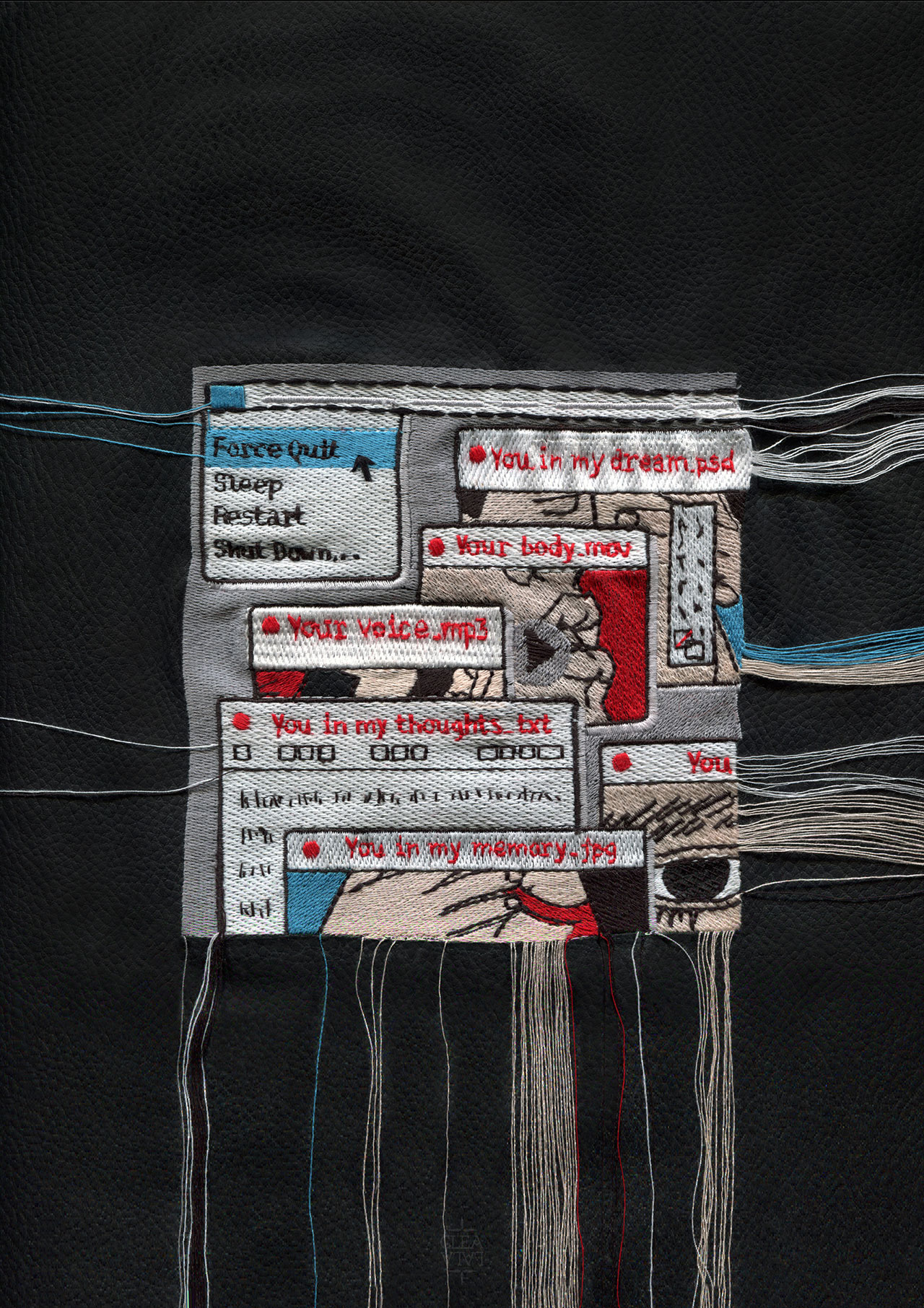
Cléa Lala, Forcer à quitter?...But I an not a Robot, 2020. From the series Le rouge et le noir.
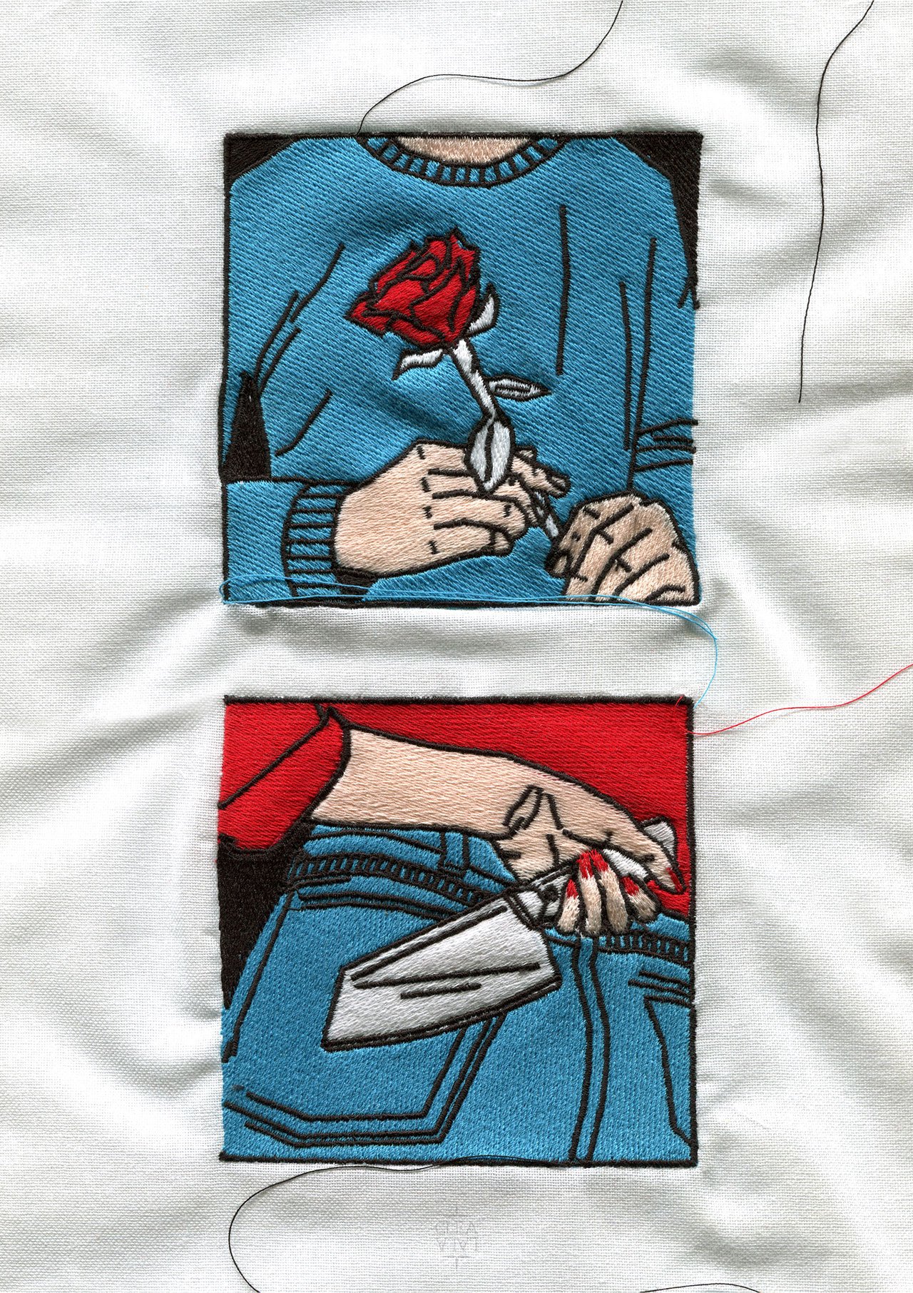
Cléa Lala, Premier rendez-vous, 2020. From the series Le rouge et le noir.
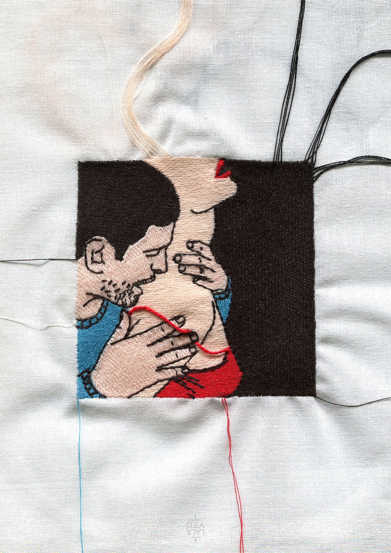
Cléa Lala, Tendre Violence, 2020. From the series Le rouge et le noir.
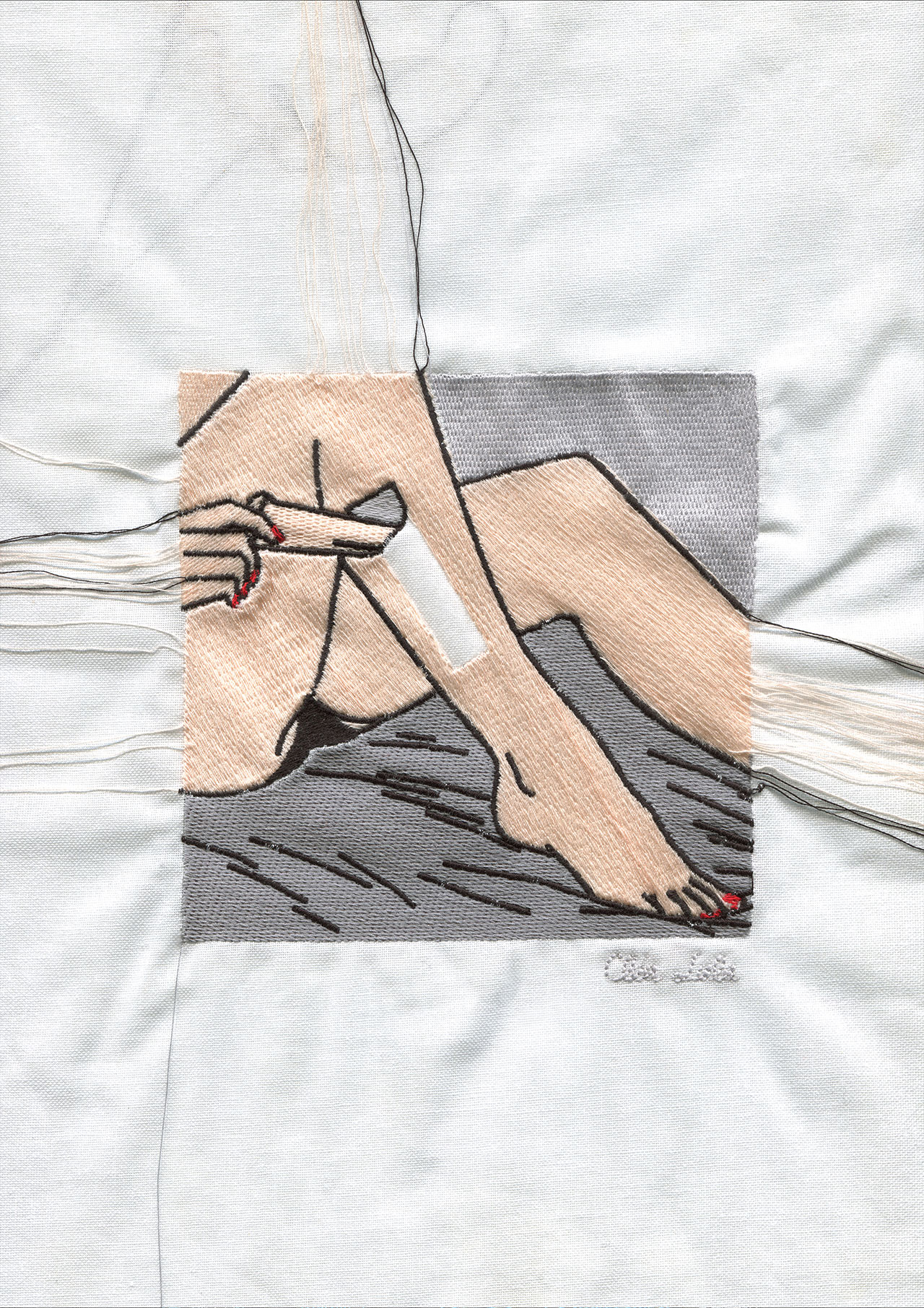
Cléa Lala, Epilation, 2020.
You’re a multidisciplinary designer working with both physical and digital mediums. What do you like best in each medium? Do you feel more creative working across different mediums?
I think the more languages you speak, the more you push the boundaries of your world, so I always experiment with “new languages” to express myself which is why I started creating objects and stop-motion animations as static embroideries weren’t enough anymore.
The thing I like best in working with a physical medium like embroidery is that I don’t have full control as threads have a life of their own. When it comes to digital projects, I love creating stop-motion animations, frame by frame, and seeing the illusion of motion for the first time. In both cases, I think it is the same thing I’m drawn to: the surprise! It’s the same thing in real life, I need to give more space to unexpected moments in my otherwise very organized life.
How do you approach commercial projects in comparison to your personal work?
Good question. I guess I don’t approach them differently. Clients usually give me “carte blanche” so I work as I would do for a personal project. For the past 10 years I have been developing my universe through working for a large and diverse list of clients such as Levi’s, Fashion Revolution, Nordstrom, Nylon Mag, Orange and Colorama.
Do you consider yourself a visual poet?
The more time that passes, the less I want or need to define myself, much less by what I do, or what my profession is. But if you want to call me a visual poet, it’s perfectly fine by me.
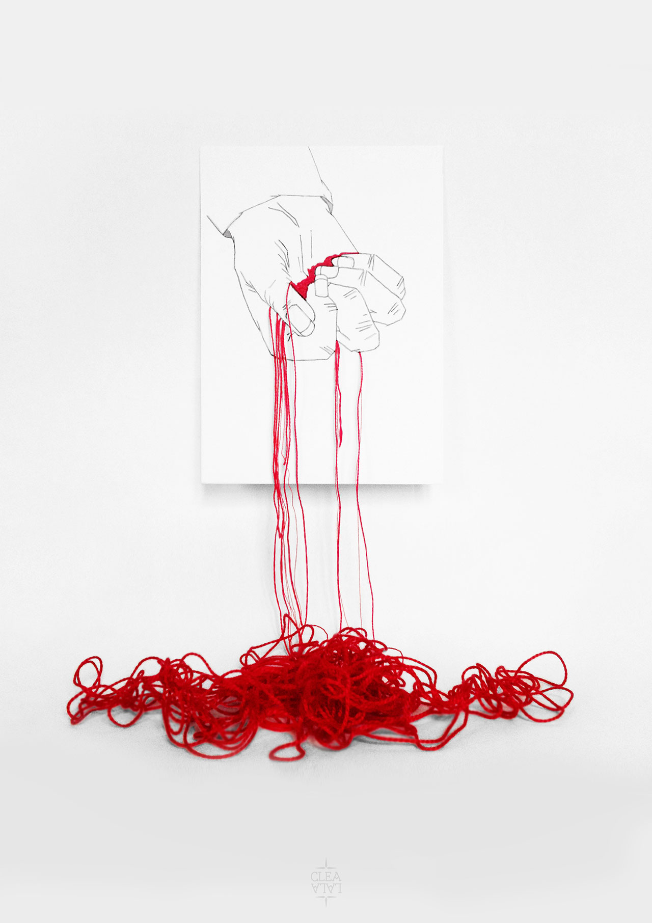
Cléa Lala, Violence. From the series LPTTF.
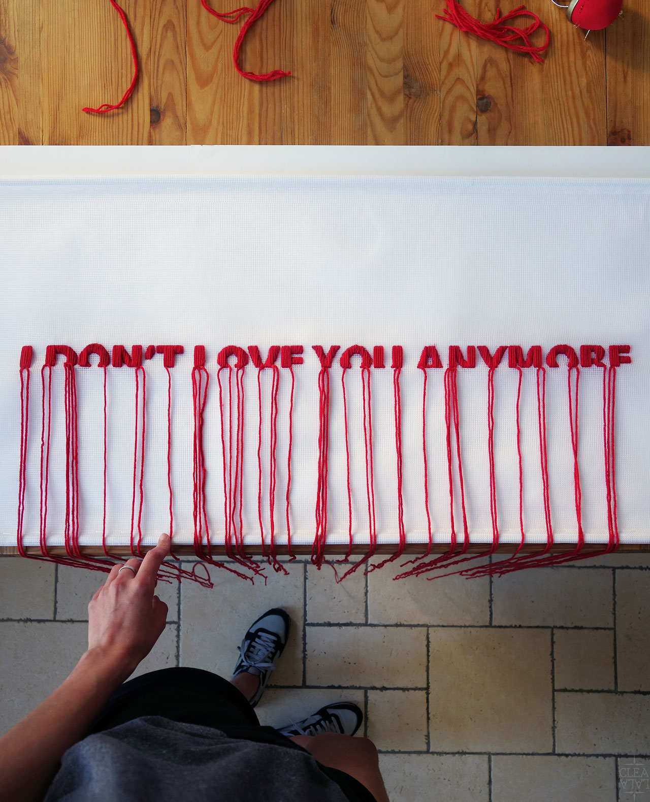
Cléa Lala, I DON'T LOVE YOU ANYMORE, 2016. From the series Humeurs.
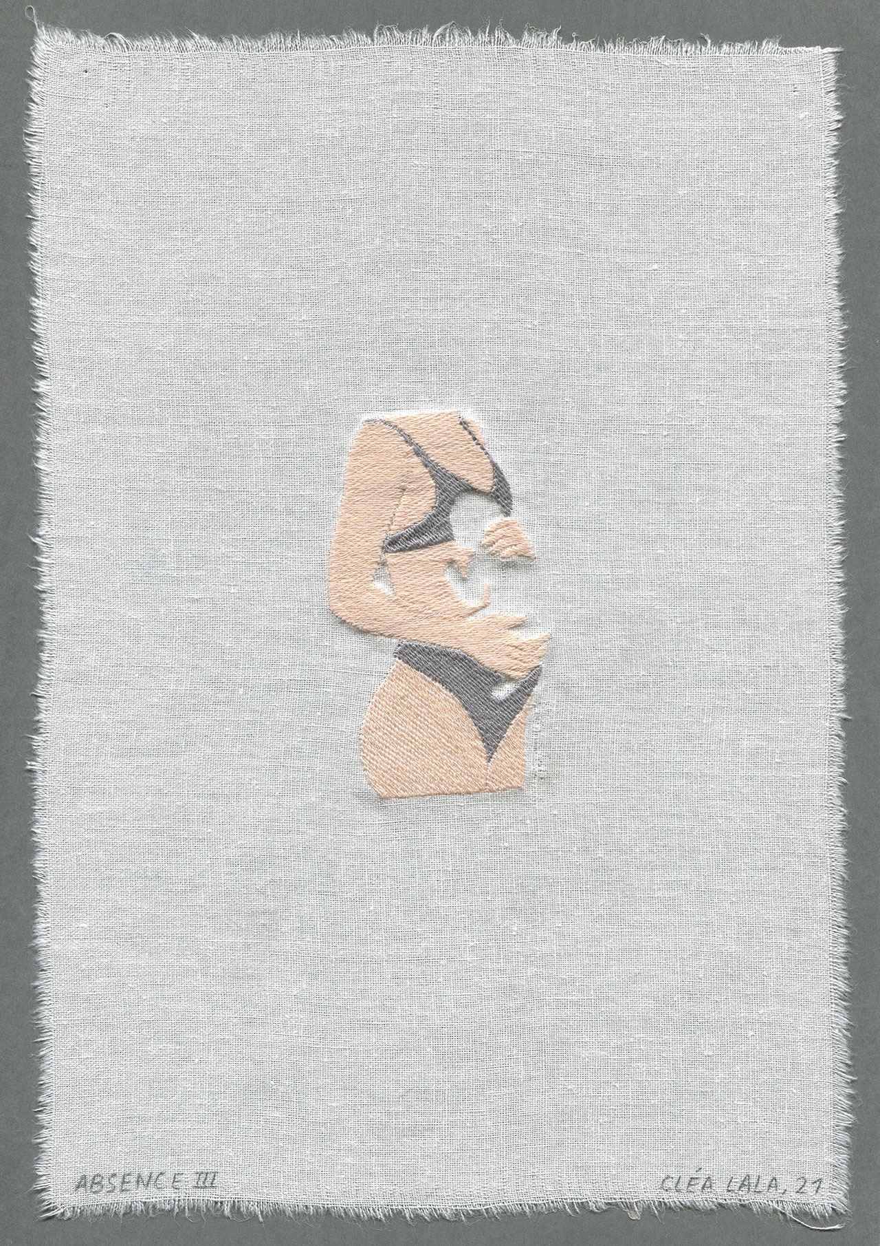
Cléa Lala, ABSENCE III, 2012. From the series Leur absence est très présente.
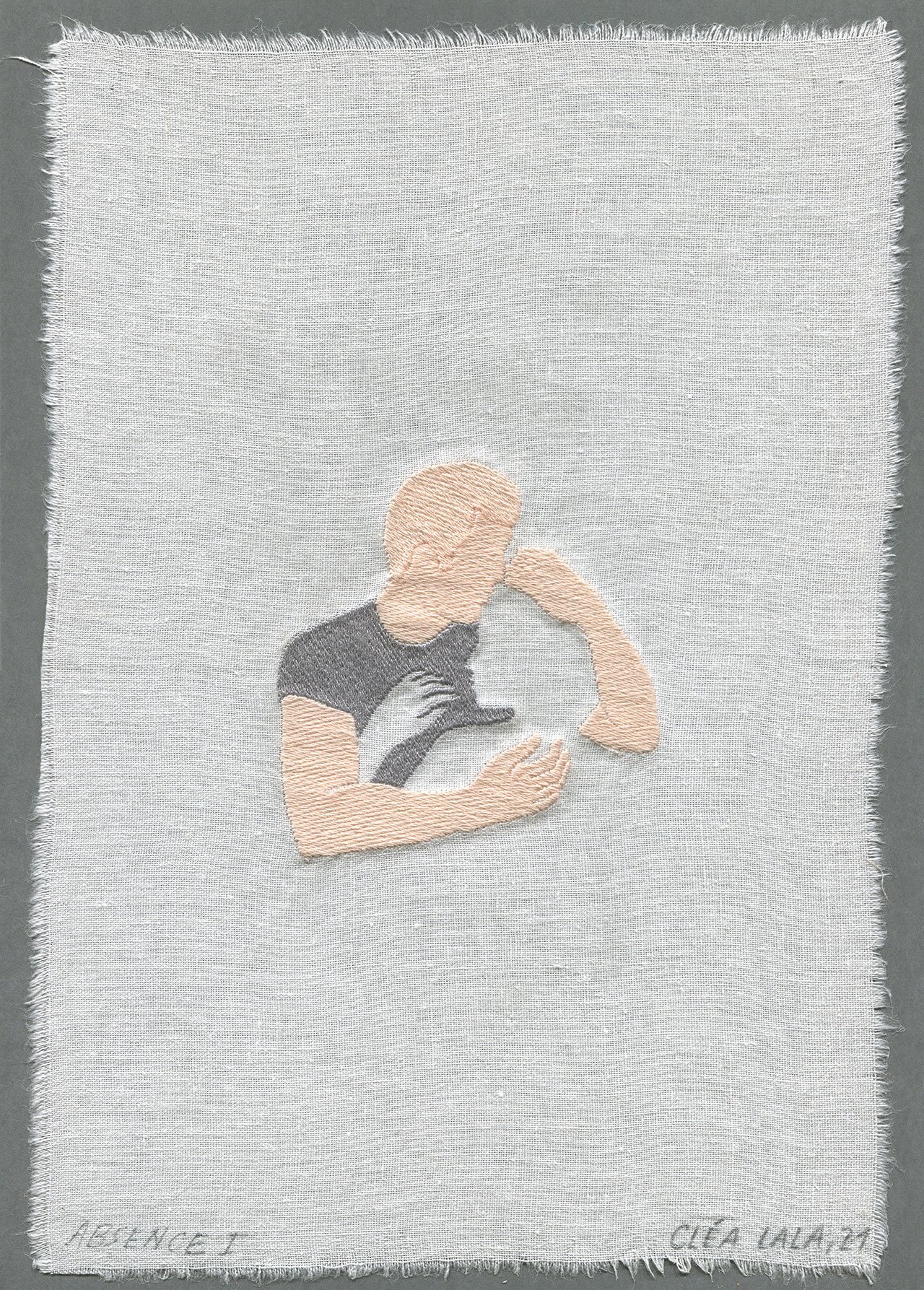
Cléa Lala, ABSENCE I, 2012. From the series Leur absence est très présente.
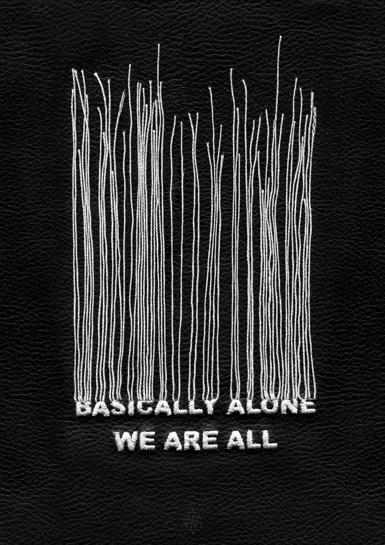
Cléa Lala, We Are All Basically Alone, 2015.


