Project Name
Casa MPosted in
ResidentialLocation
Architect
Felipe HessArea (sqm)
780Completed
2018| Detailed Information | |||||
|---|---|---|---|---|---|
| Project Name | Casa M | Posted in | Residential | Location |
São Paulo -
Brazil |
| Architect | Felipe Hess | Area (sqm) | 780 | Completed | 2018 |
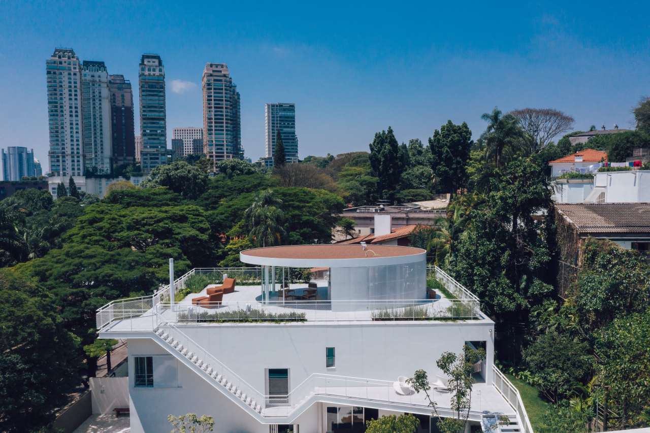
Photo by Fran Parente and Gabriel Cabral.
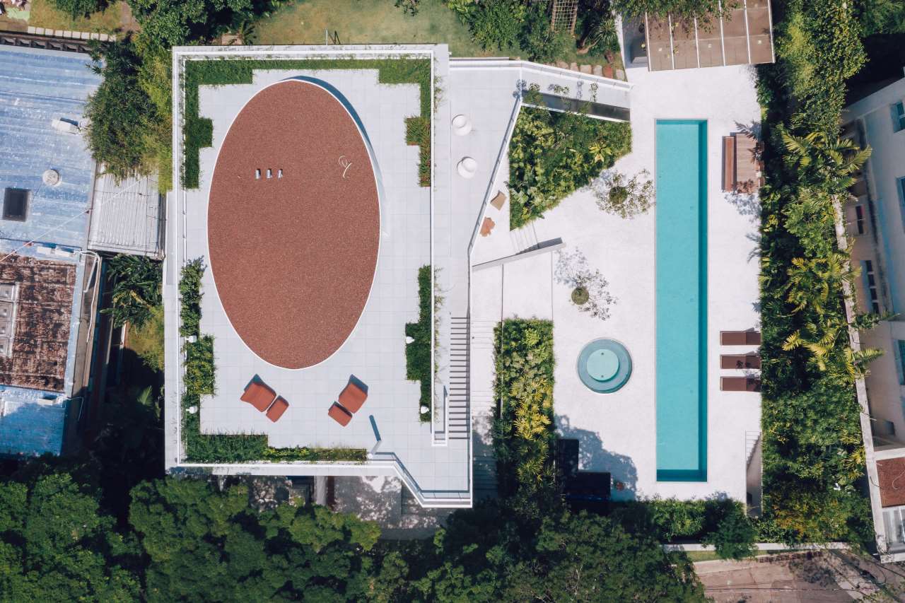
Photo by Fran Parente and Gabriel Cabral.
Photo by Fran Parente and Gabriel Cabral.

Photo by Fran Parente and Gabriel Cabral.
One of the boldest architectural additions is a metal staircase that externally connects the house to the new pool deck. From the new rooftop, where a glass-fronted pavilion offers expansive views of the neighbourhood, the staircase ceremoniosuly descends and ascends across the façade in order to reach all levels, growing into a balcony on the first floor before stepping off the building to reach down to the pool terrace. This idiosyncratic, sculptural design makes for a whimsical composition, enhanced by the introduction of a children-friendly slide and a fireman’s pole, both of which connect the first floor to the pool level. Meanwhile, the polygonal geometry is echoed throughout the exterior, from the shapes of the flower beds to steps and landings, while the circular jacuzzi and the elliptical rooftop lounge provide a welcome relief of softer lines.

Photo by Fran Parente and Gabriel Cabral.
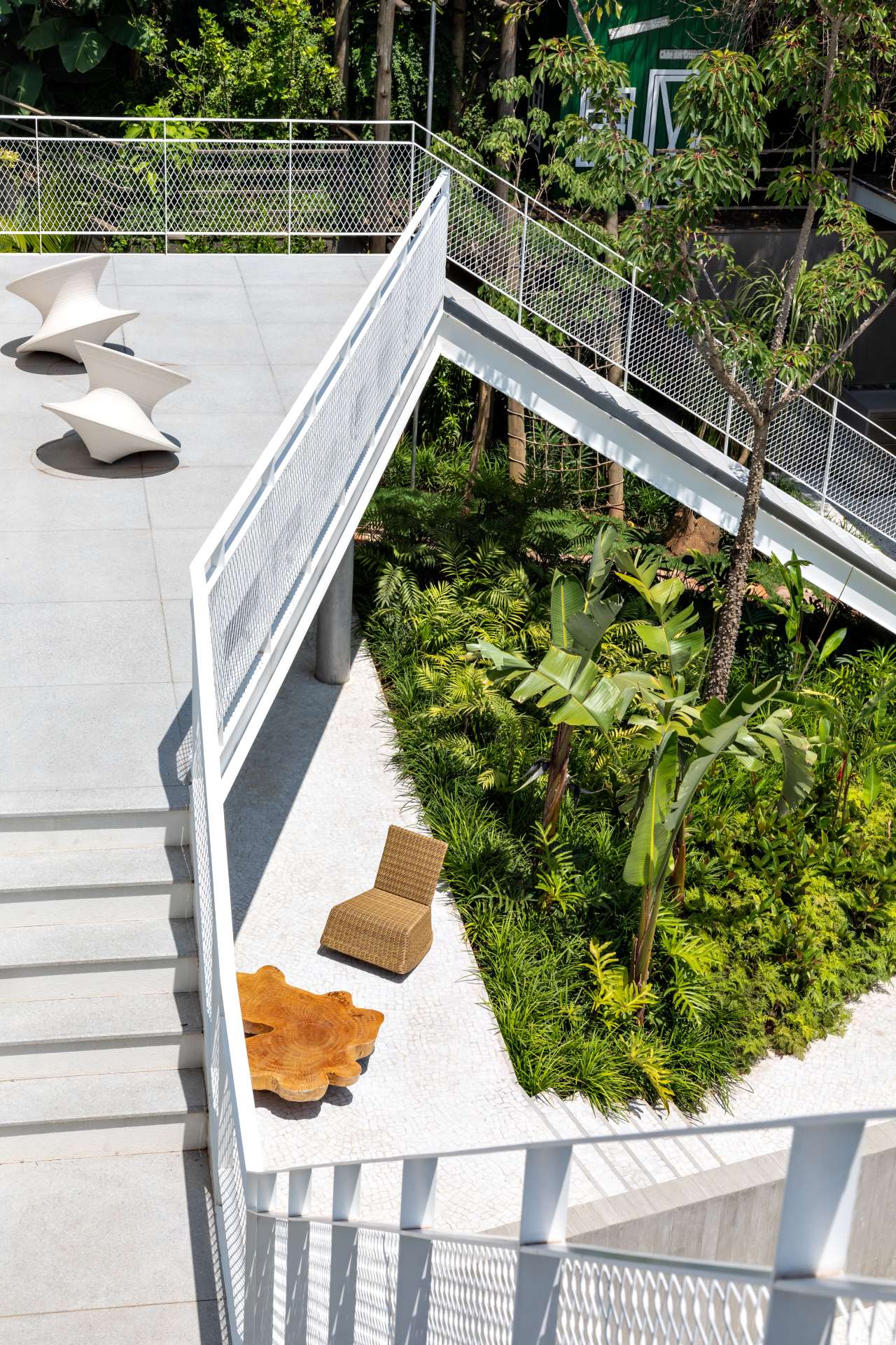
Photo by Fran Parente and Gabriel Cabral.
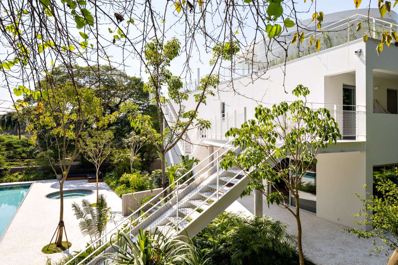
Photo by Fran Parente and Gabriel Cabral.
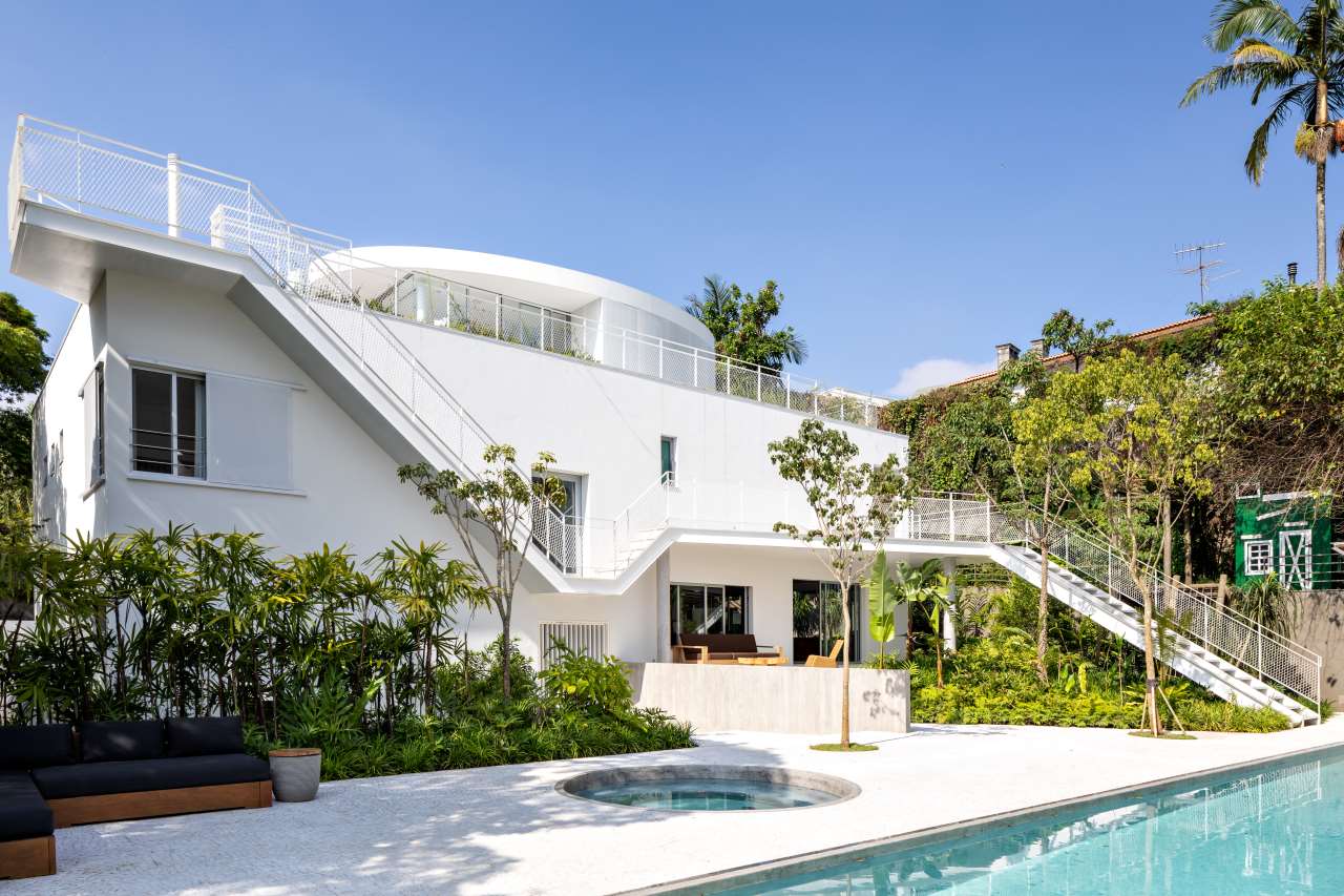
Photo by Fran Parente and Gabriel Cabral.
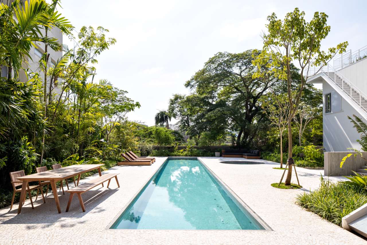
Photo by Fran Parente and Gabriel Cabral.
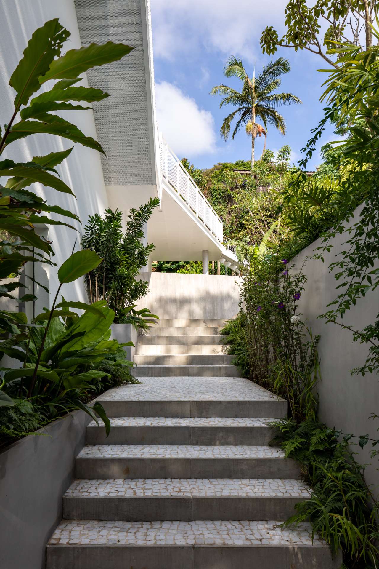
Photo by Fran Parente and Gabriel Cabral.
With a brand-new leisure area, sauna and garage located beneath the pool terrace, which occupies what was once the neighbouring lot, the architects had a lot on their plate but that didn’t stop them from reconsidering the spaces of the existing building. Although the split-levels were retained, the individual floor layouts were redrawn as was the interior staircase connecting them. The result: larger, open-plan rooms that flow into each other.
White is the predominant colour for both indoors and outdoors. Outside, white Portuguese mosaic paving, coupled with the white-washed facades and white-painted metal staircase, unite all the different geometrical elements into a sculptural composition as well as create a subdued background where the lush vegetation takes centre stage. A similar approach has been applied inside, only here, instead of the green hues of the vegetation, the white walls are complemented by the dark grey cement flooring, which the architects introduced in order to visually connect all the levels, and the coffered ceiling slabs, which were exposed during the renovation. The latter not only echo the playful geometries of the exterior but also exemplify the architects’ critical approach in renovating this residence.
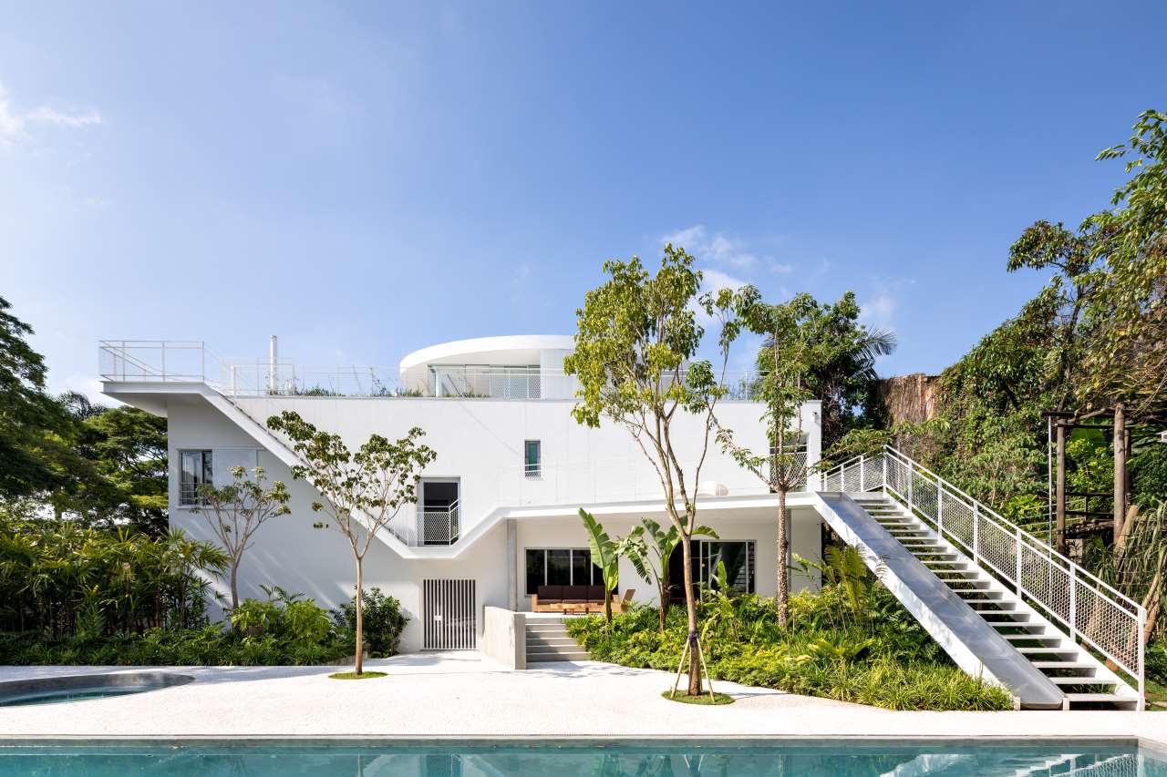
Photo by Fran Parente and Gabriel Cabral.
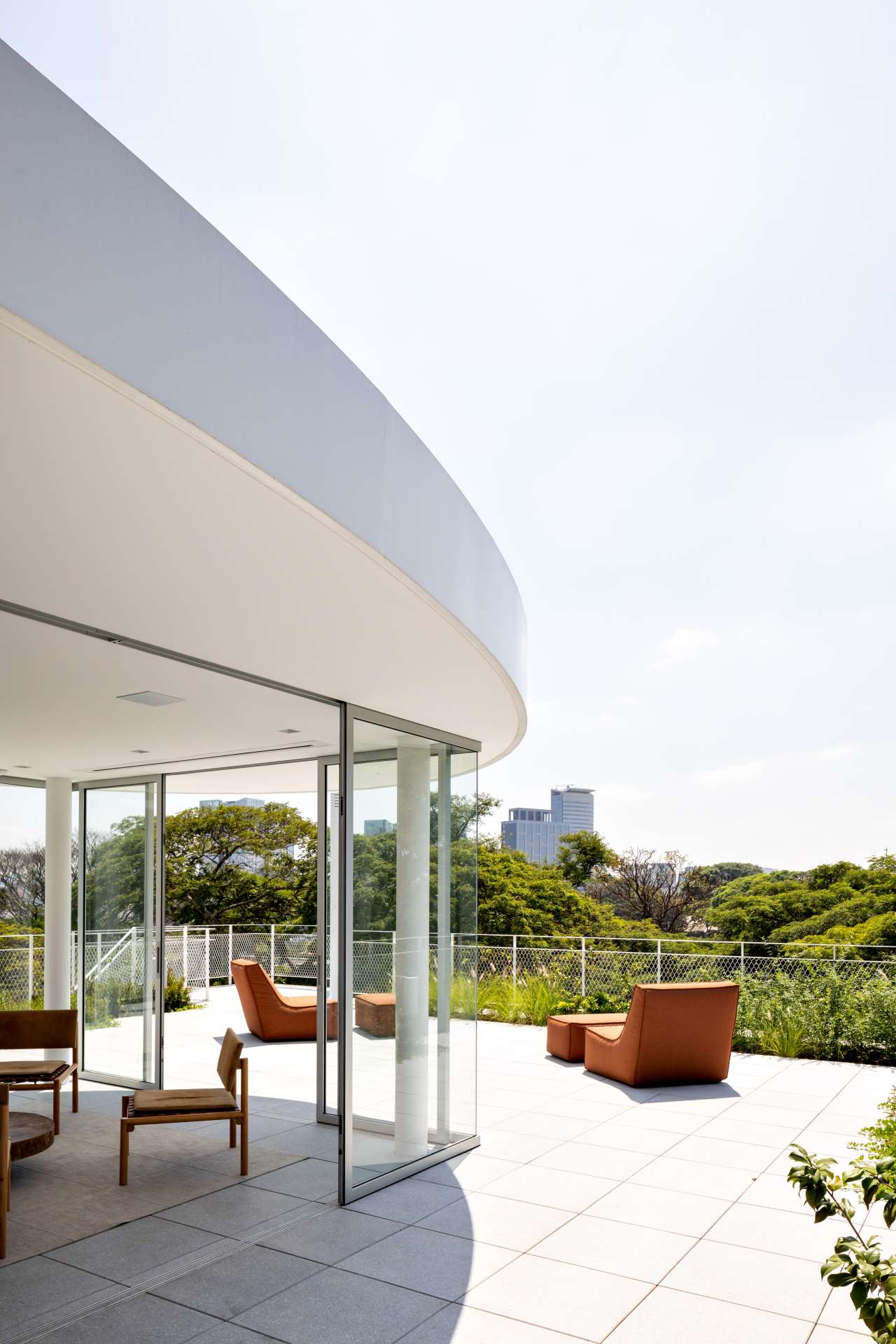
Photo by Fran Parente and Gabriel Cabral.
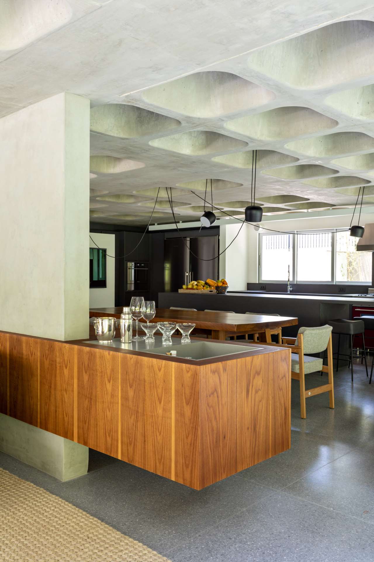
Photo by Fran Parente and Gabriel Cabral.
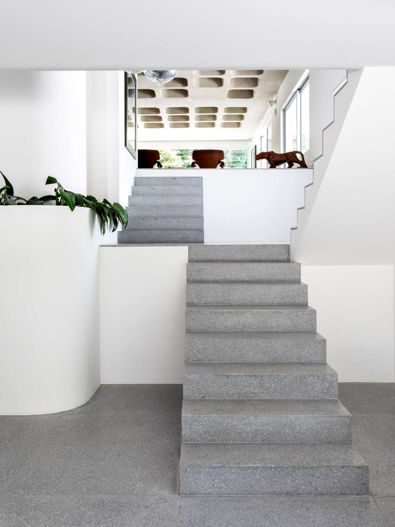
Photo by Fran Parente and Gabriel Cabral.
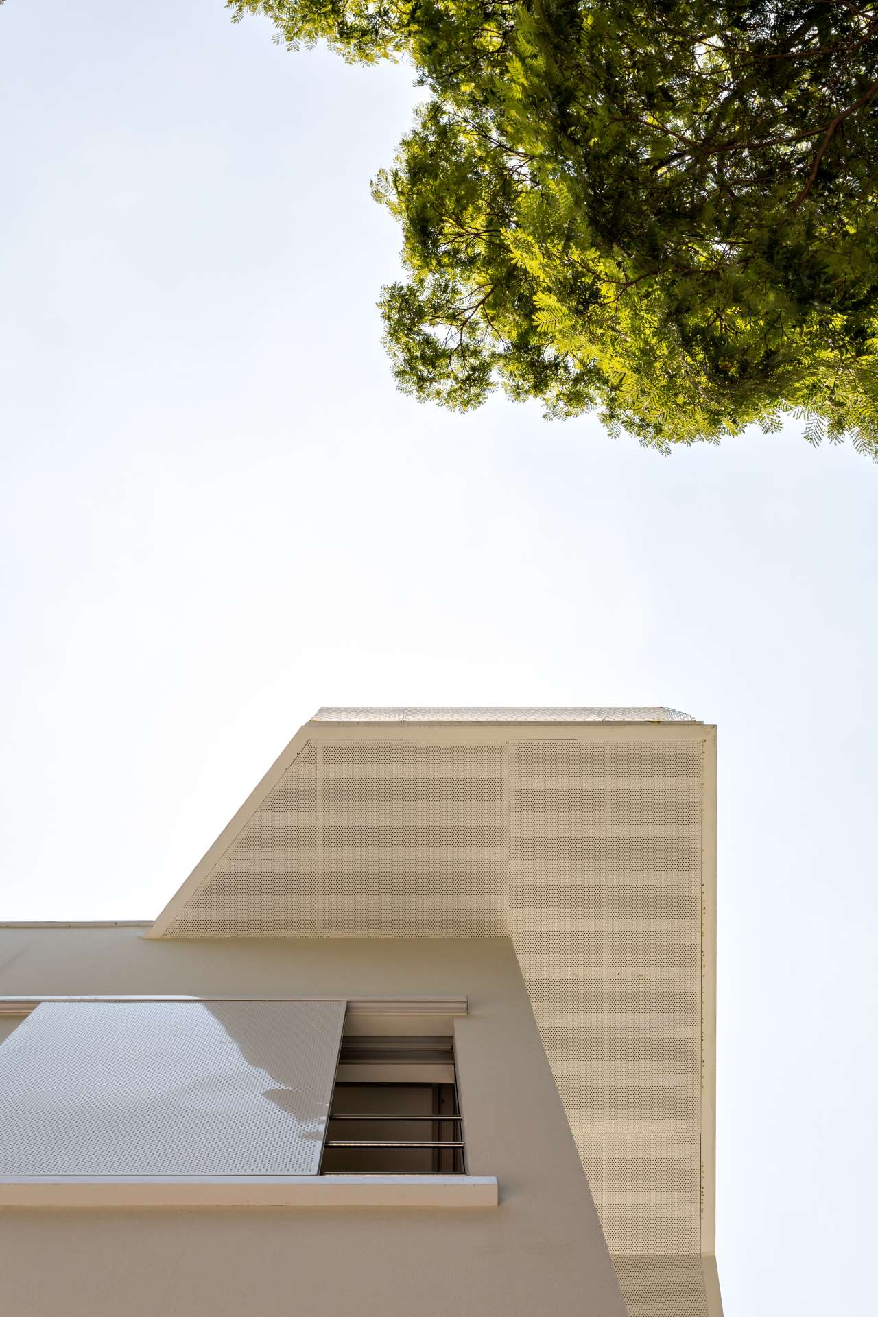
Photo by Fran Parente and Gabriel Cabral.


