Project Name
Weng's HousePosted in
Interior DesignLocation
Interior Designer
2BOOKS designArea (sqm)
83Completed
2018| Detailed Information | |||||
|---|---|---|---|---|---|
| Project Name | Weng's House | Posted in | Interior Design | Location |
Taipei city
Taiwan |
| Interior Designer | 2BOOKS design | Area (sqm) | 83 | Completed | 2018 |
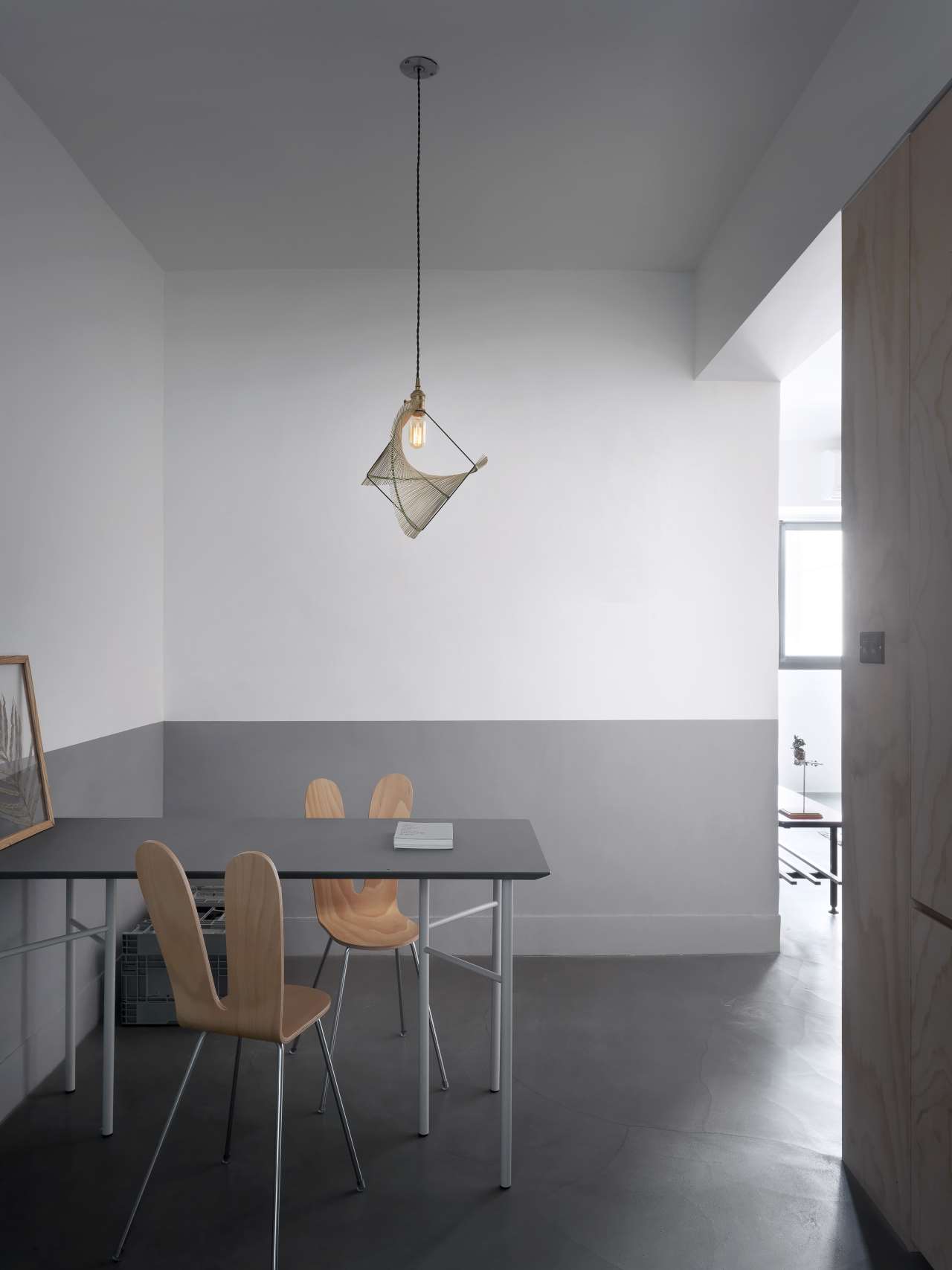
Photo by moooten studio.
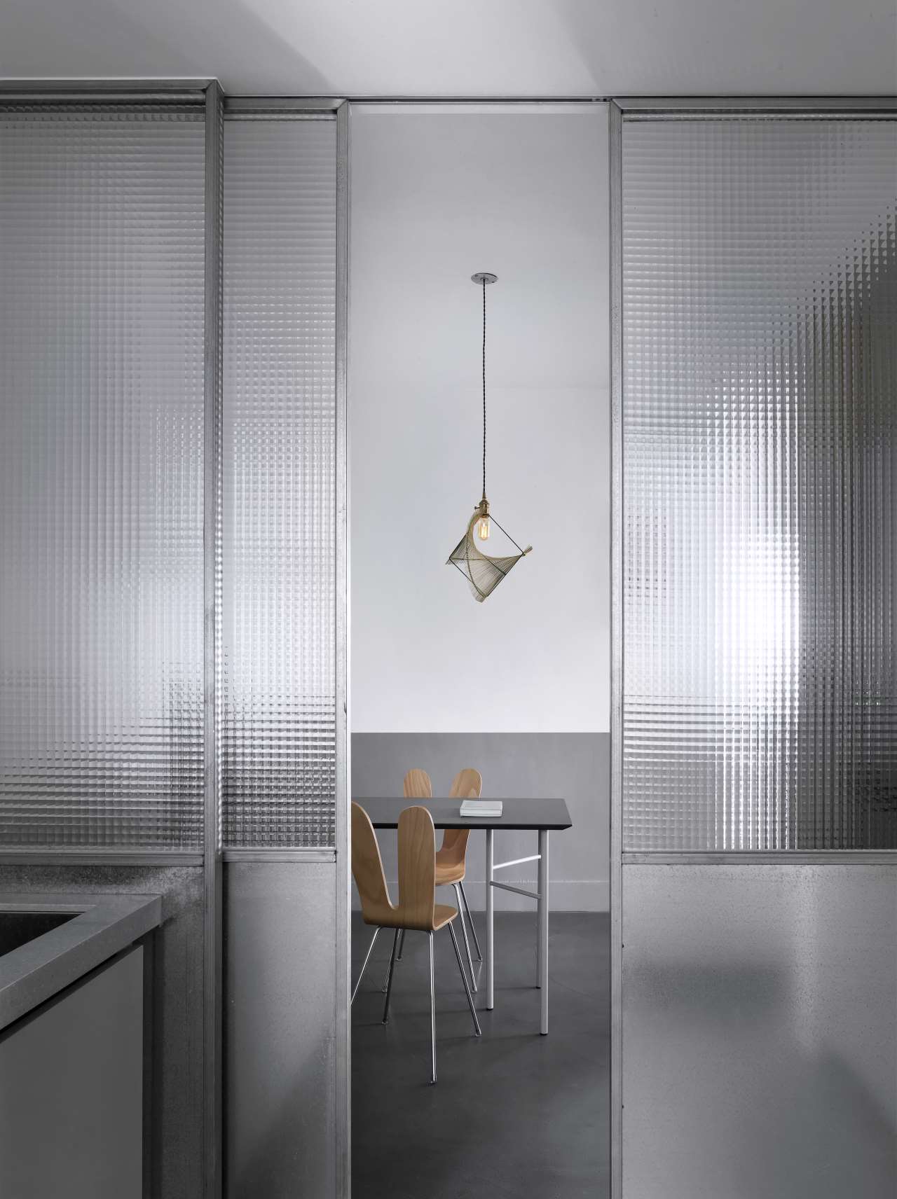
Photo by moooten studio.
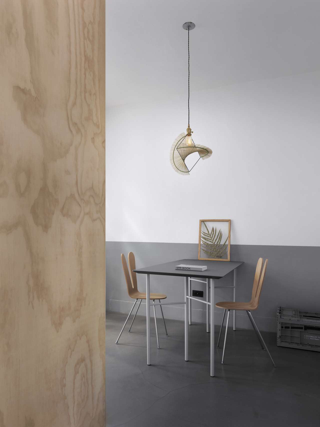
Photo by moooten studio.
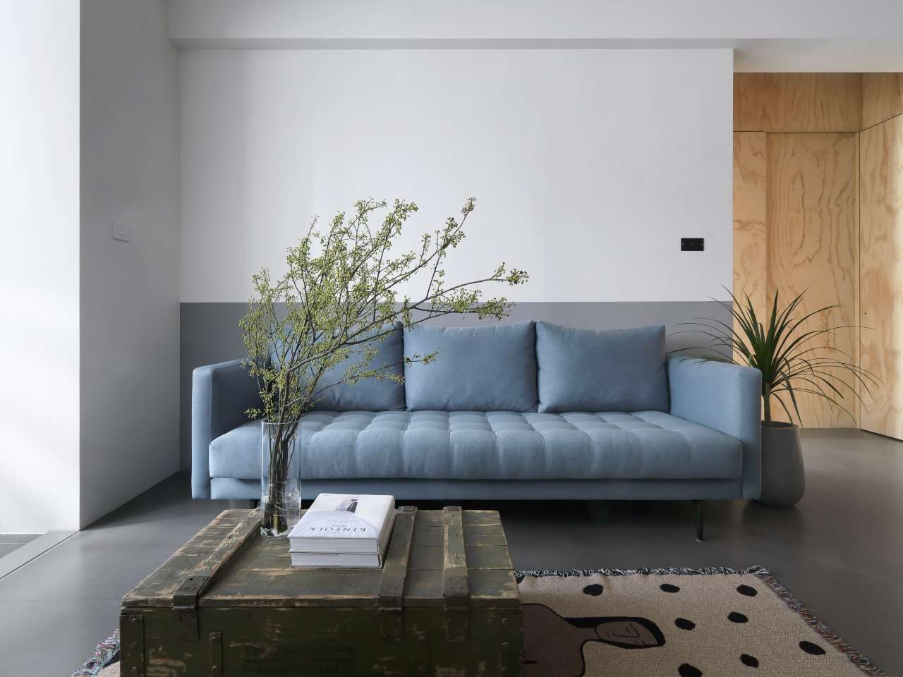
Photo by moooten studio.
In order to enhance the sense of spaciousness, an essential attribute for such a small-sized apartment, the designers have eschewed decorations and superfluous furnishings in favour of a minimalist aesthetic of simple lines and uncluttered spaces. For the same reason, sliding panels separate the kitchen from the open-plan dining living area allowing the two areas to be perceived as one when opened. Meanwhile, the use of translucent glass allows natural light from the kitchen windows to illuminate the dining area even when the doors are slid shut.
In consultation with the new owner the selected materials reference the environment he grew up in thus bestowing upon the renovated flat a sense of familiarity. White and grey two-toned walls and cement flooring brandish the design’s simplicity, pine plywood conveys a familiar residential atmosphere, while exposed brickwork delineates the study area. The small selection of furniture that has been chosen, such as the light blue sofa, the minimalist red console and the distressed wooden crate used as a coffee table, further accentuate the apartment’s personality without undermining the décor’s subdued ambience, proving that simplicity and character are not contradictory concepts in interior design.
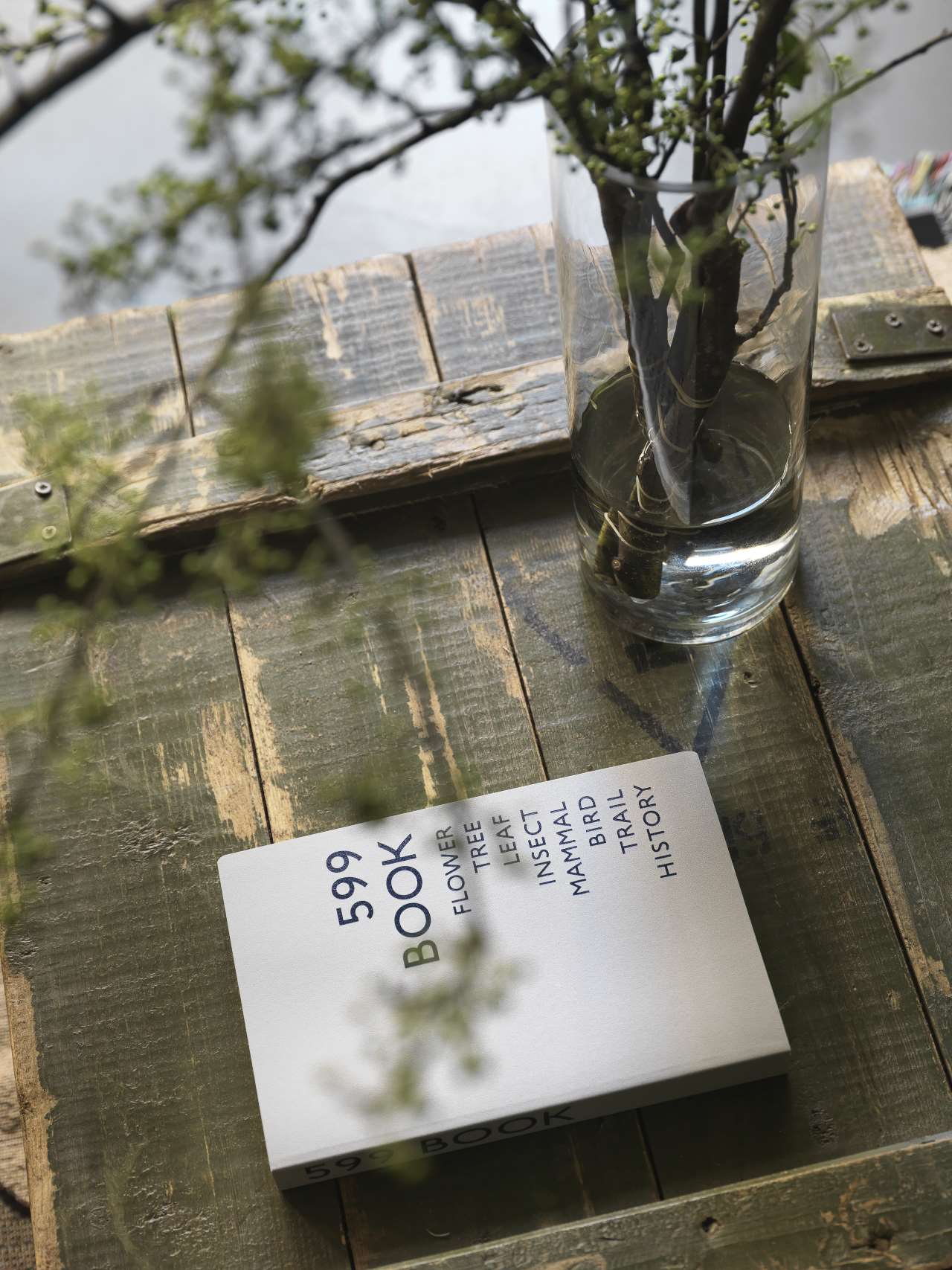
Photo by moooten studio.
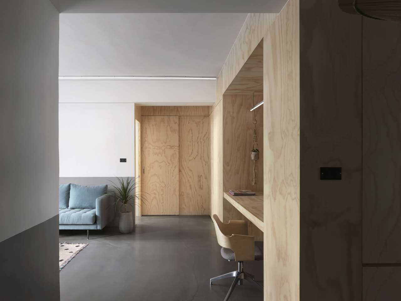
Photo by moooten studio.
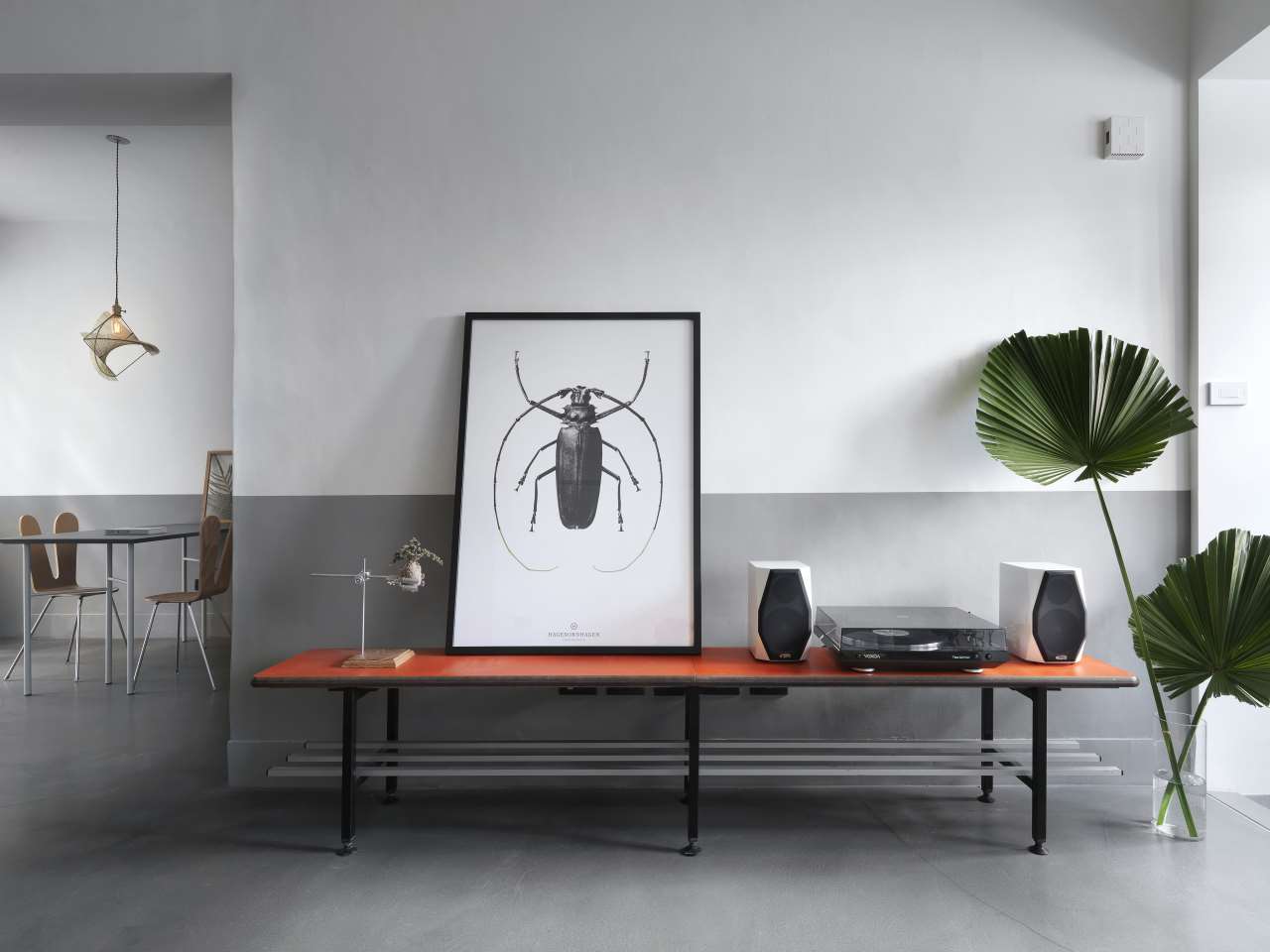
Photo by moooten studio.
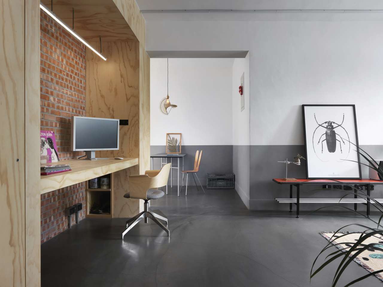
Photo by moooten studio.

Photo by moooten studio.
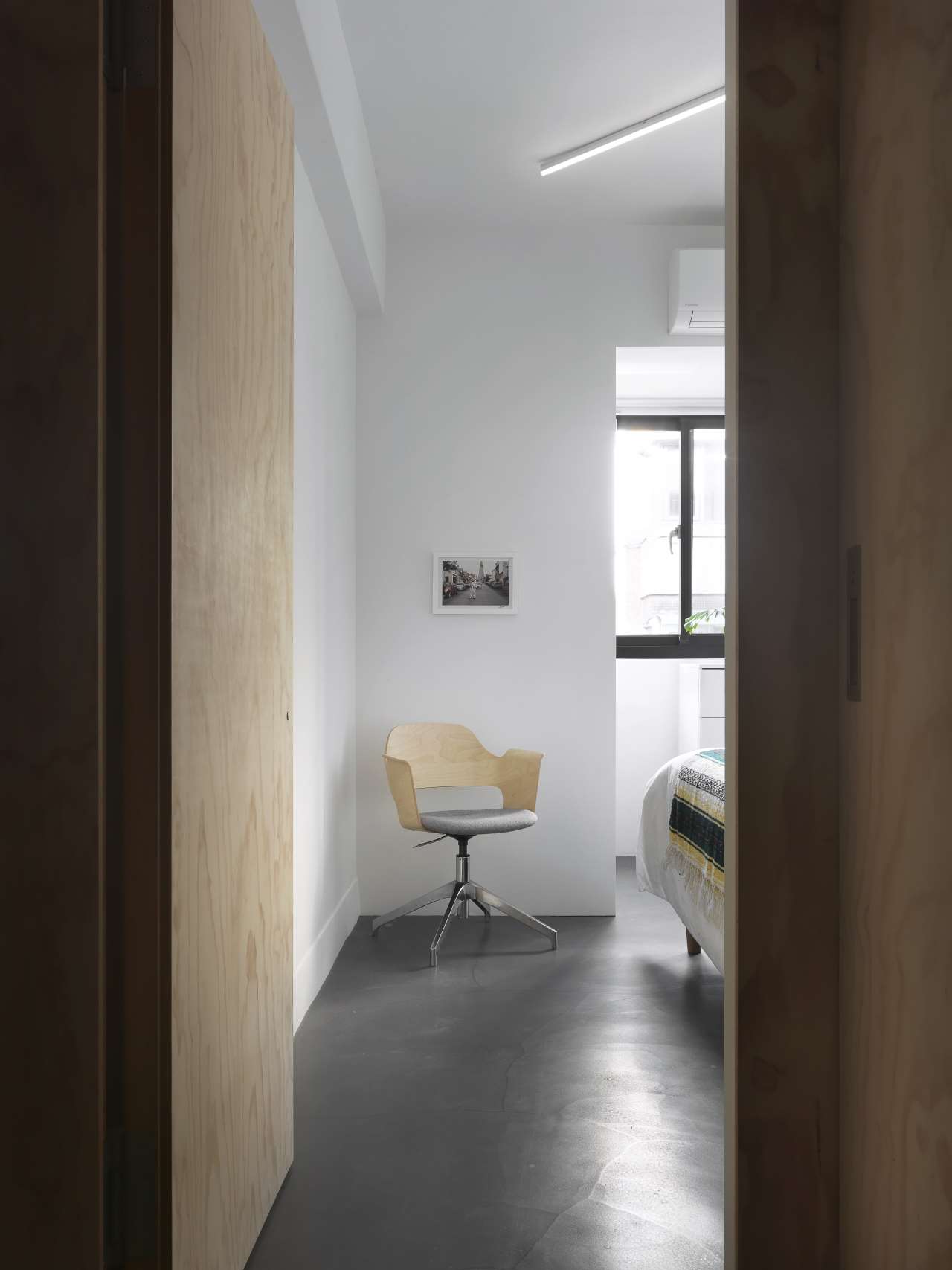
Photo by moooten studio.

Photo by moooten studio.
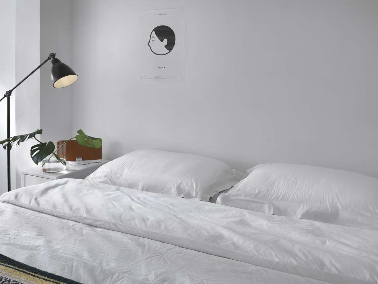
Photo by moooten studio.
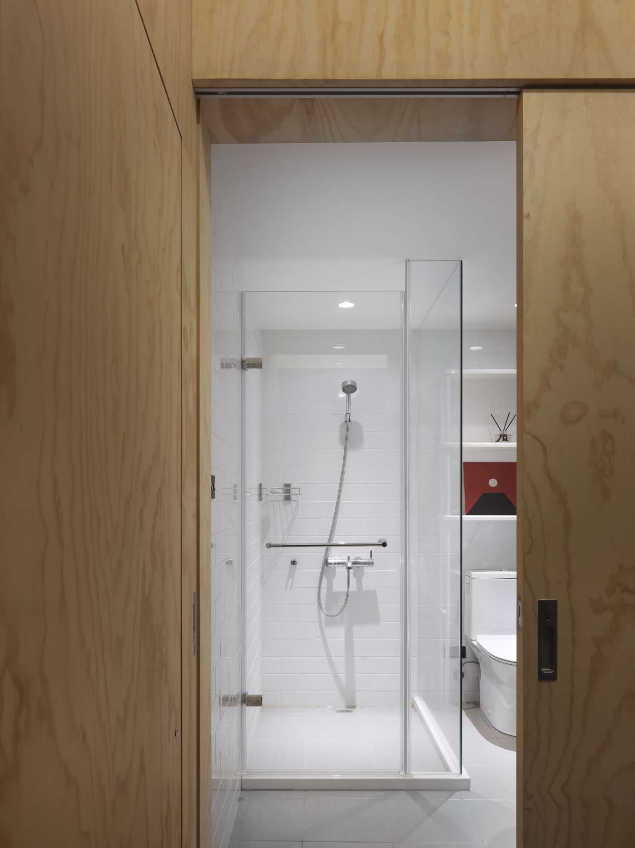
Photo by moooten studio.


