Photo by Dirk Weiblen.
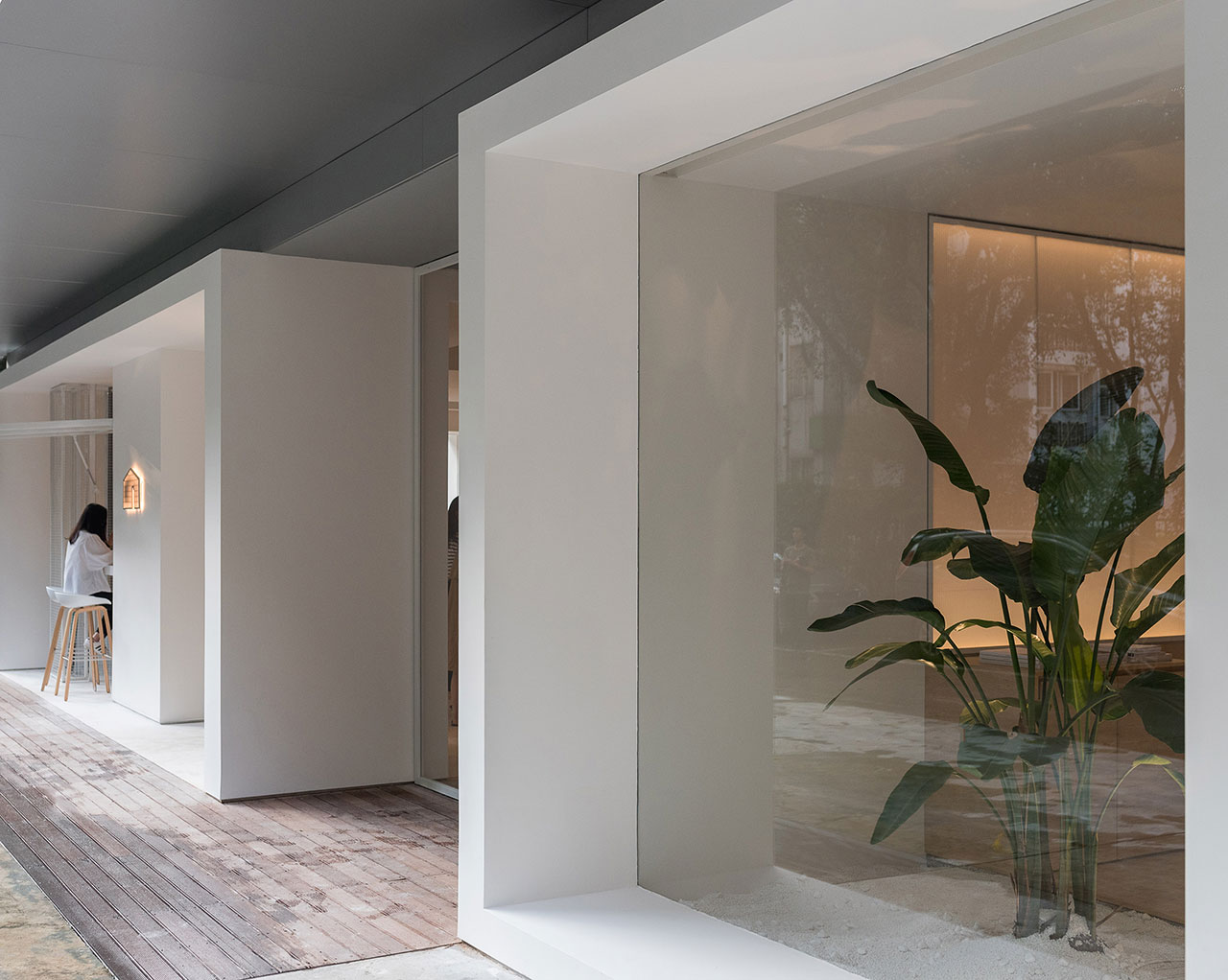
Photo by Dirk Weiblen.
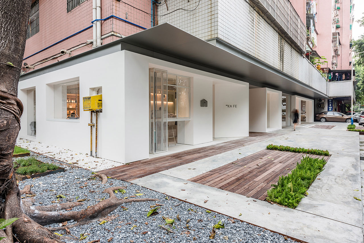
Photo by Dirk Weiblen.
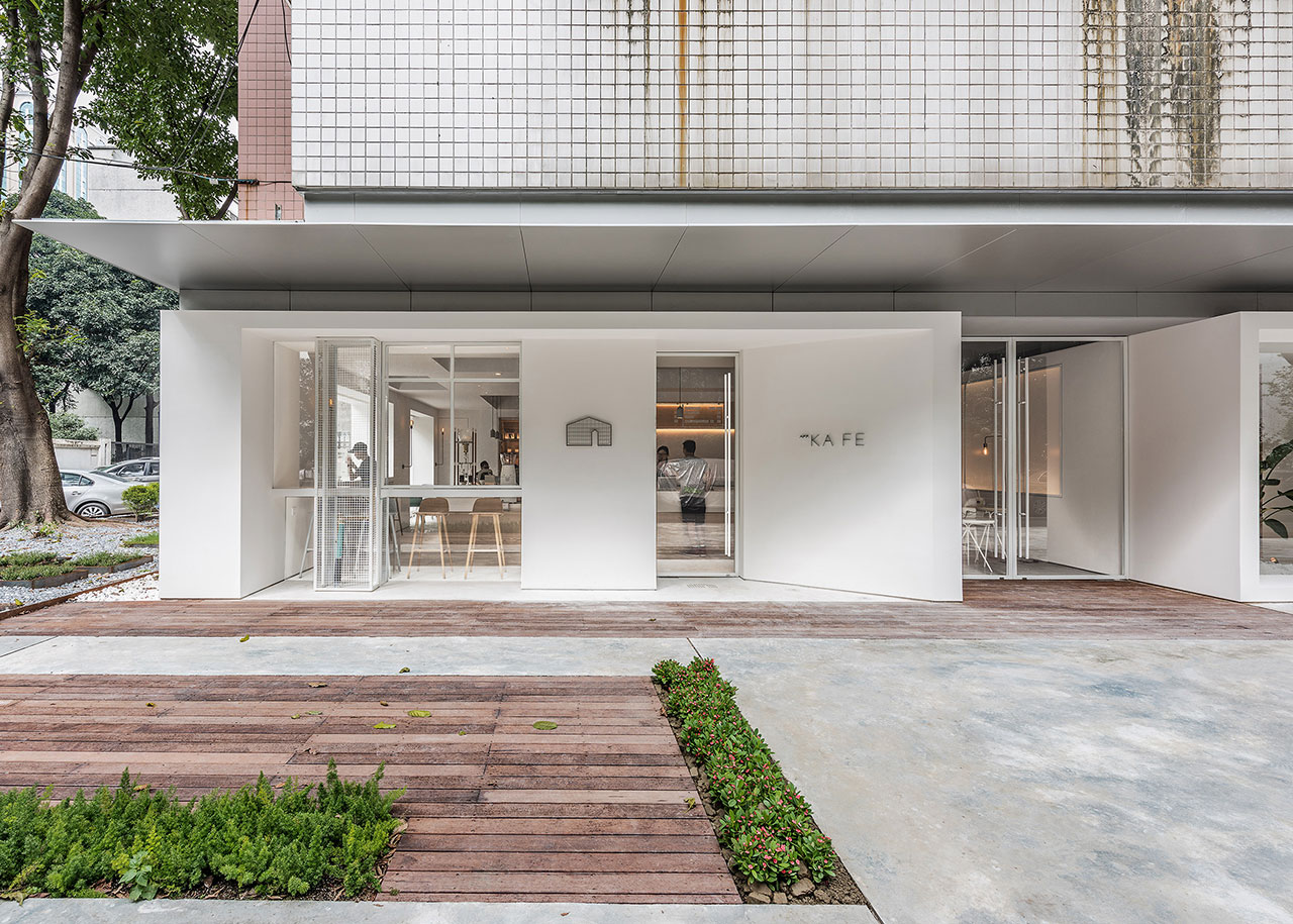
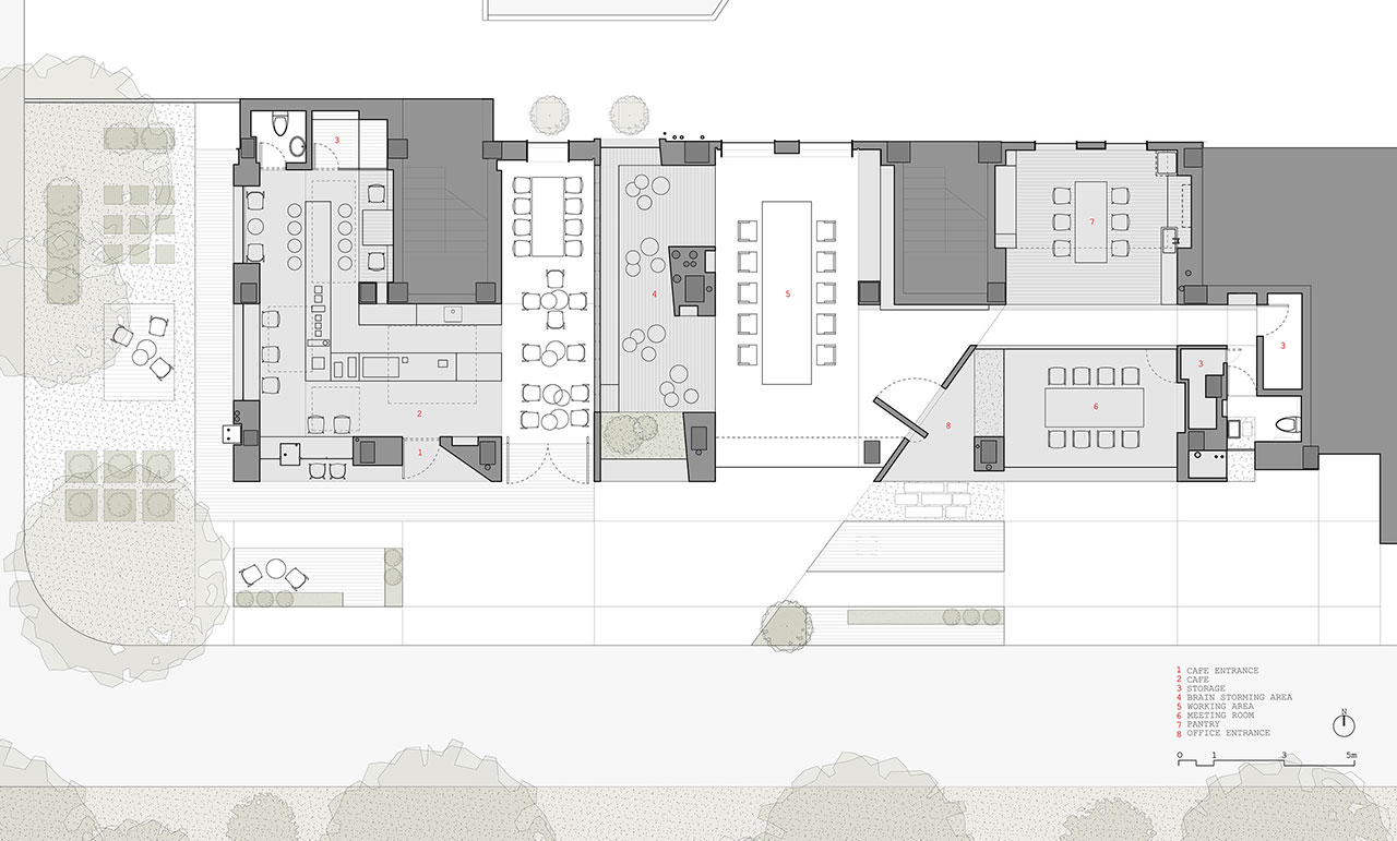
This cohesiveness is enhanced by the clean, lean lines and light white color utilized throughout, as well as by the transparency between not only the individual spaces themselves, but also between them as a whole and the world outside, as viewed from the road through the glass windows and walls, from where the different boxes sit beneath the "floating aluminum canopy" that shelters them.
To start, the Café is a space full of hidden niches and cut-outs; elements that create sparse texture forms, provide simple seating spots and become windows which frame the outside Zen gardens surrounding the Atelier, as seem for example, in the café's white walls and pale wood elements - in the chairs, paneled walls and central bar - that all conspire in the creation of a calm and relaxed environment.
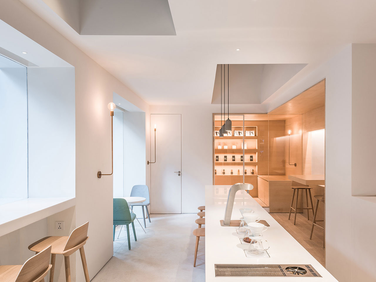
Photo by Dirk Weiblen.
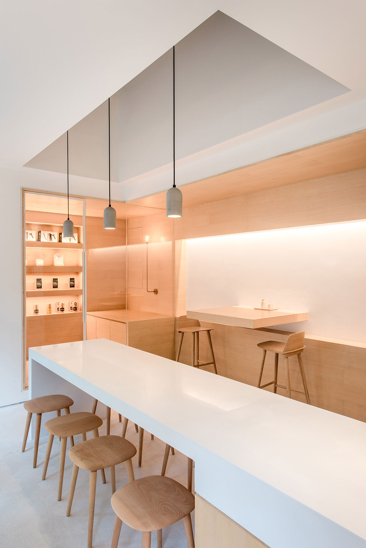
Photo by Dirk Weiblen.
Beside the café, another in "between spaces" beckons, which is all gray walls and structural ceiling, and acts as an extension of the café, featuring seating which connects it to the outside (also leading to the brainstorming/meeting room box next to it). While white walls, terrazzo floors and simple, light wood furnishings and timber panels are repeated in here, there are no hidden nooks, just straightforward design elements such as a large white table and gray office chairs with the pizzazz in the space arising out of the wide window wall which embraces the facing street.
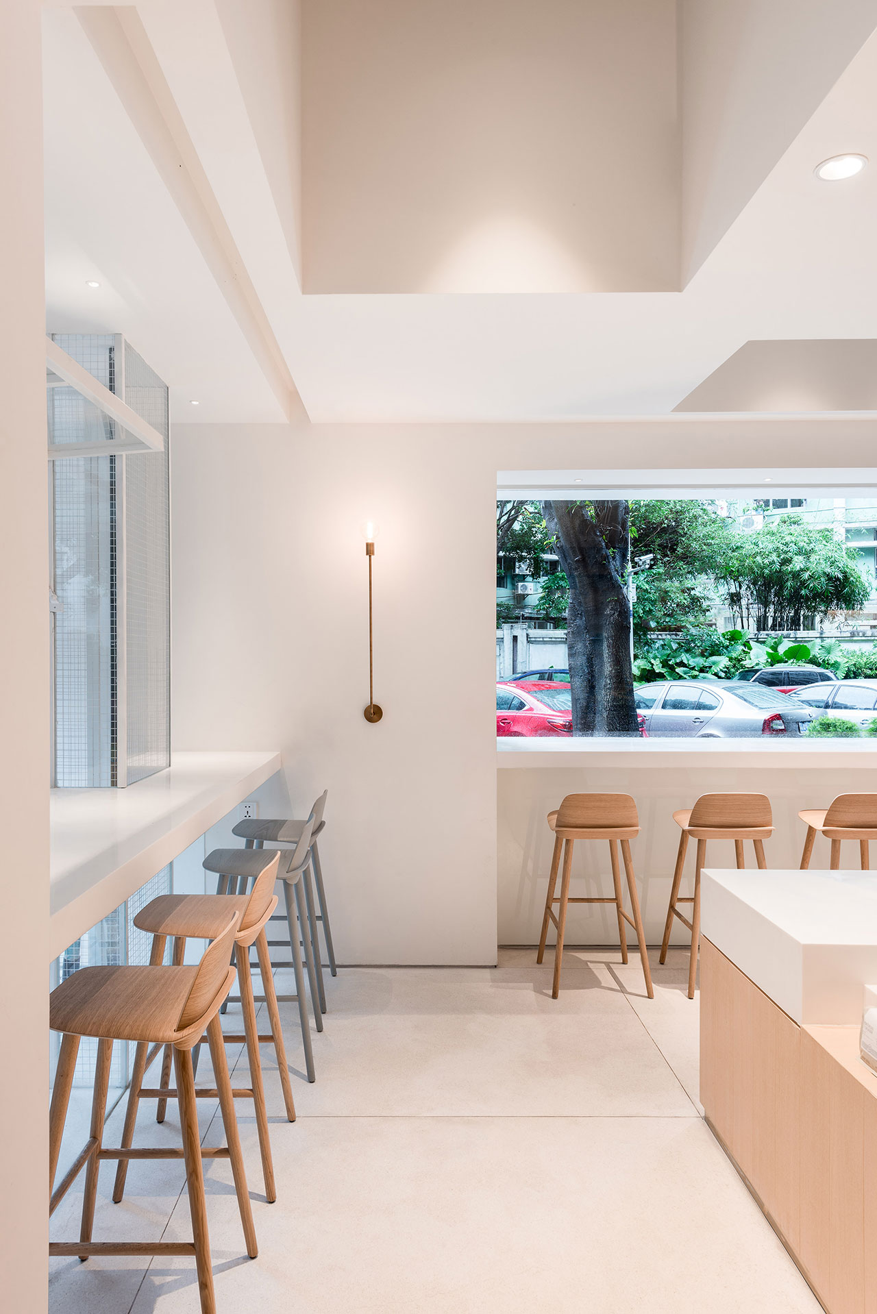
Photo by Dirk Weiblen.
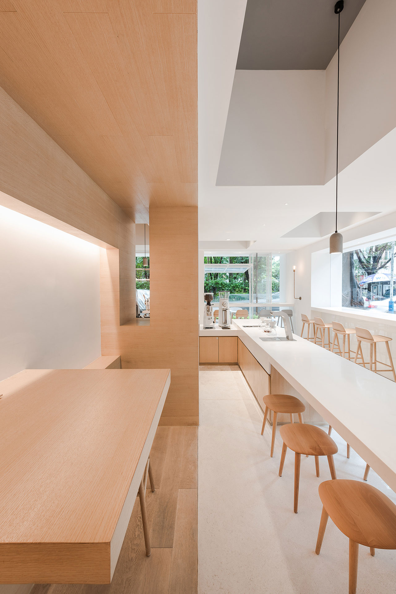
Photo by Dirk Weiblen.
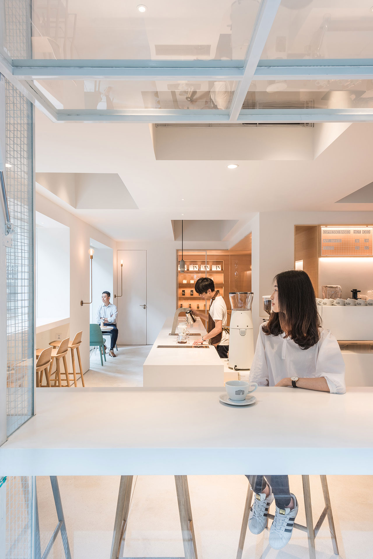
Photo by Dirk Weiblen.
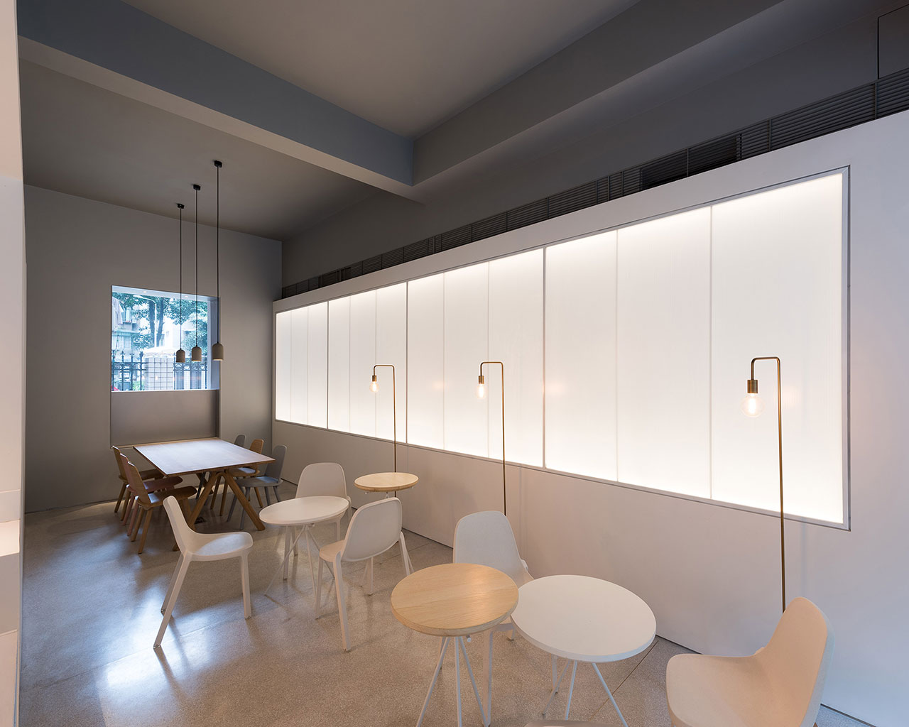
Photo by Dirk Weiblen.
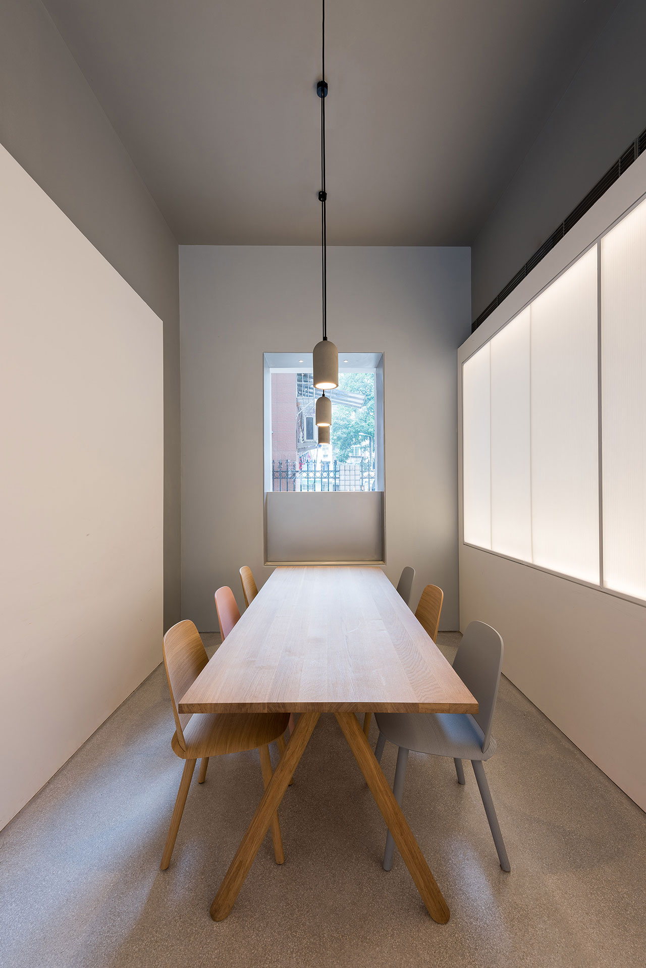
Photo by Dirk Weiblen.
The same level of casual minimalism exists in the office meeting room/lounge box beside the brainstorming/workroom box, but with a twist, in the shape of a triangular cut-out entrance carved into this 3rd space which is, essentially a focal point, not only visually thanks to the rock Zen garden which can be seen through to the meeting room, also in a practical sense, as this entryway leads to both the meeting room as well as the lounge which is across the glass-walled hallway behind it.
Ultimately, Atelier Peter Fong’s straightforward and unifying design elements seem built to elicit the desired responsiveness of the people working within them and prove that innovativeness doesn't have to be complicated in order to make a strong point.
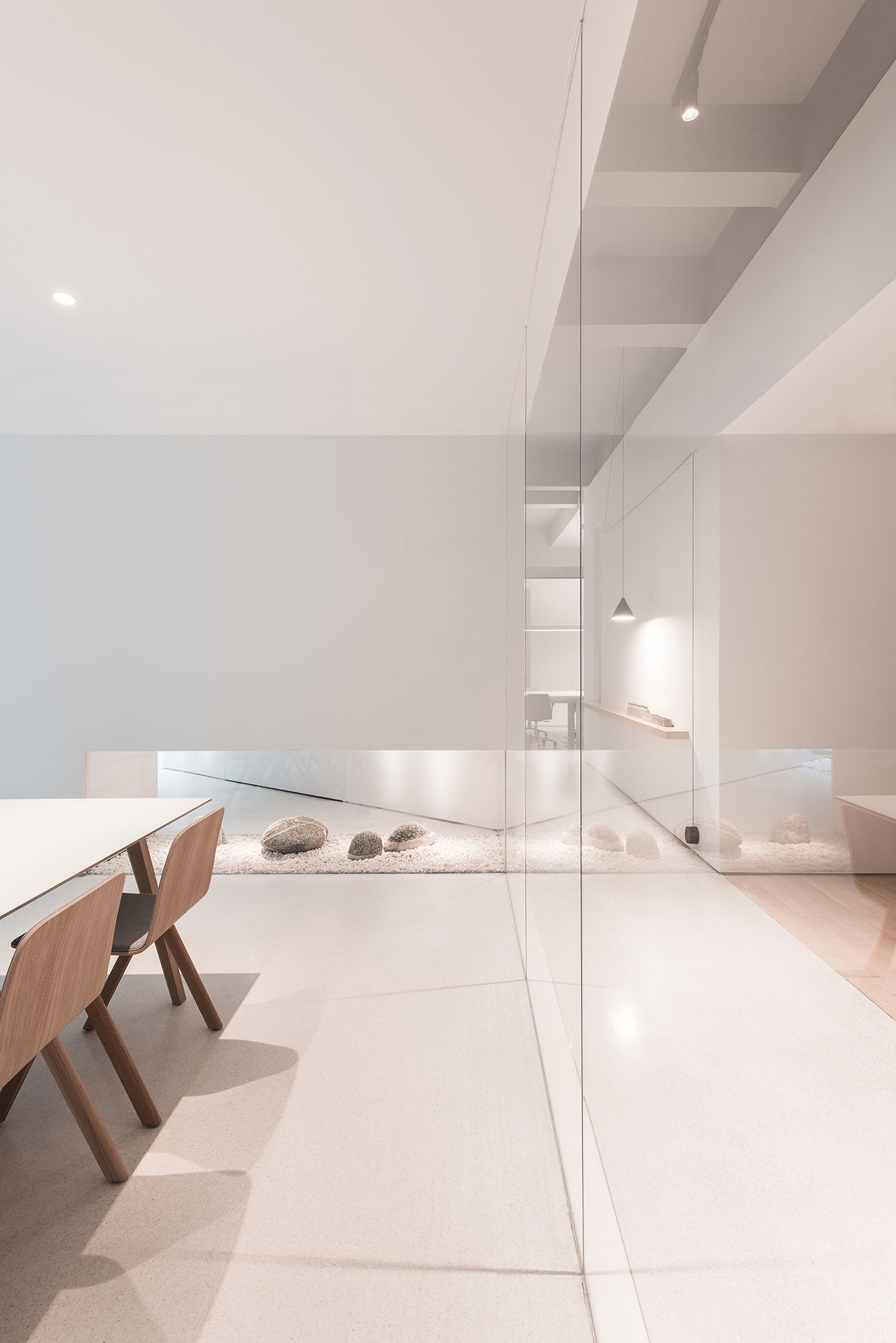
Photo by Dirk Weiblen.
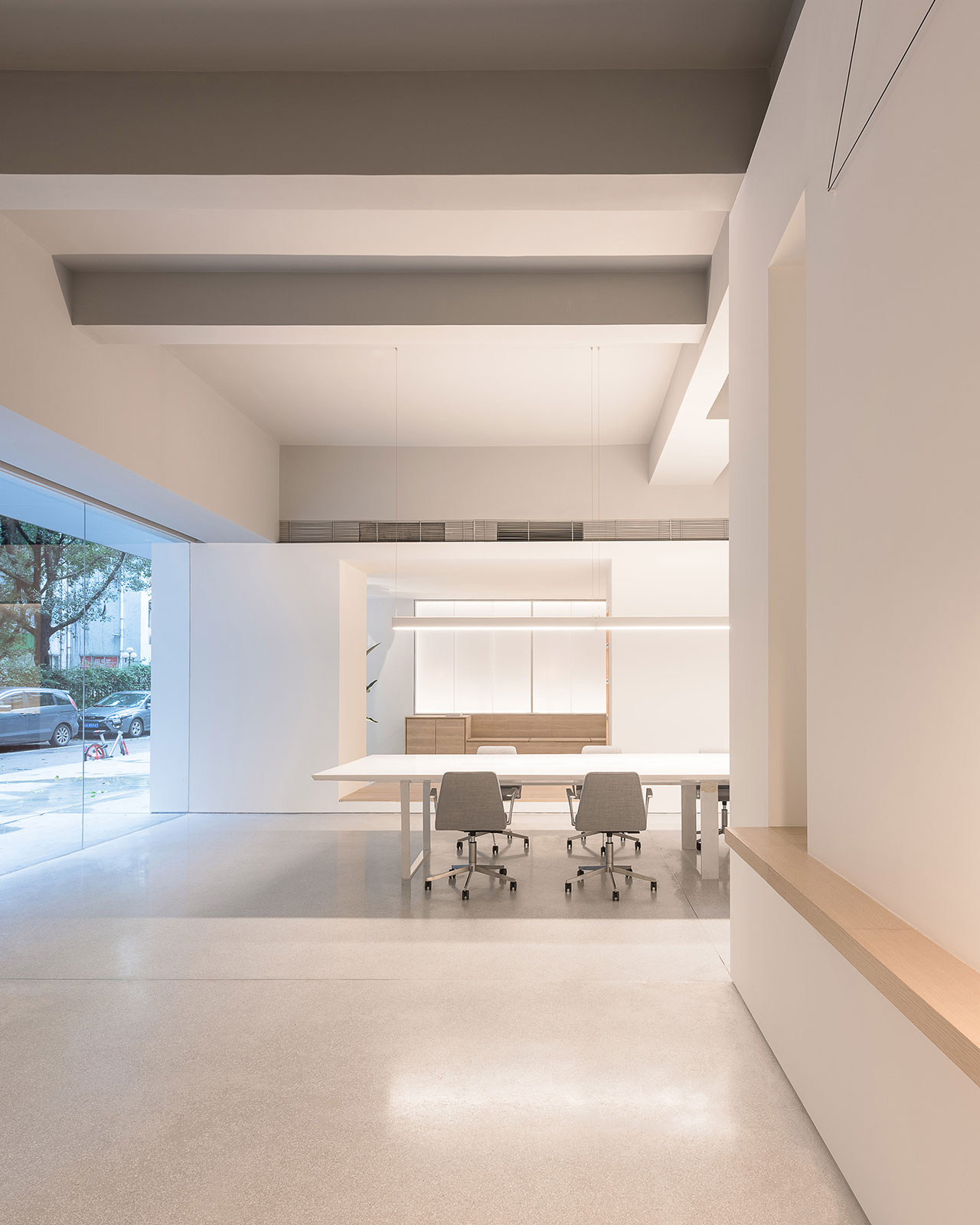
Photo by Dirk Weiblen.
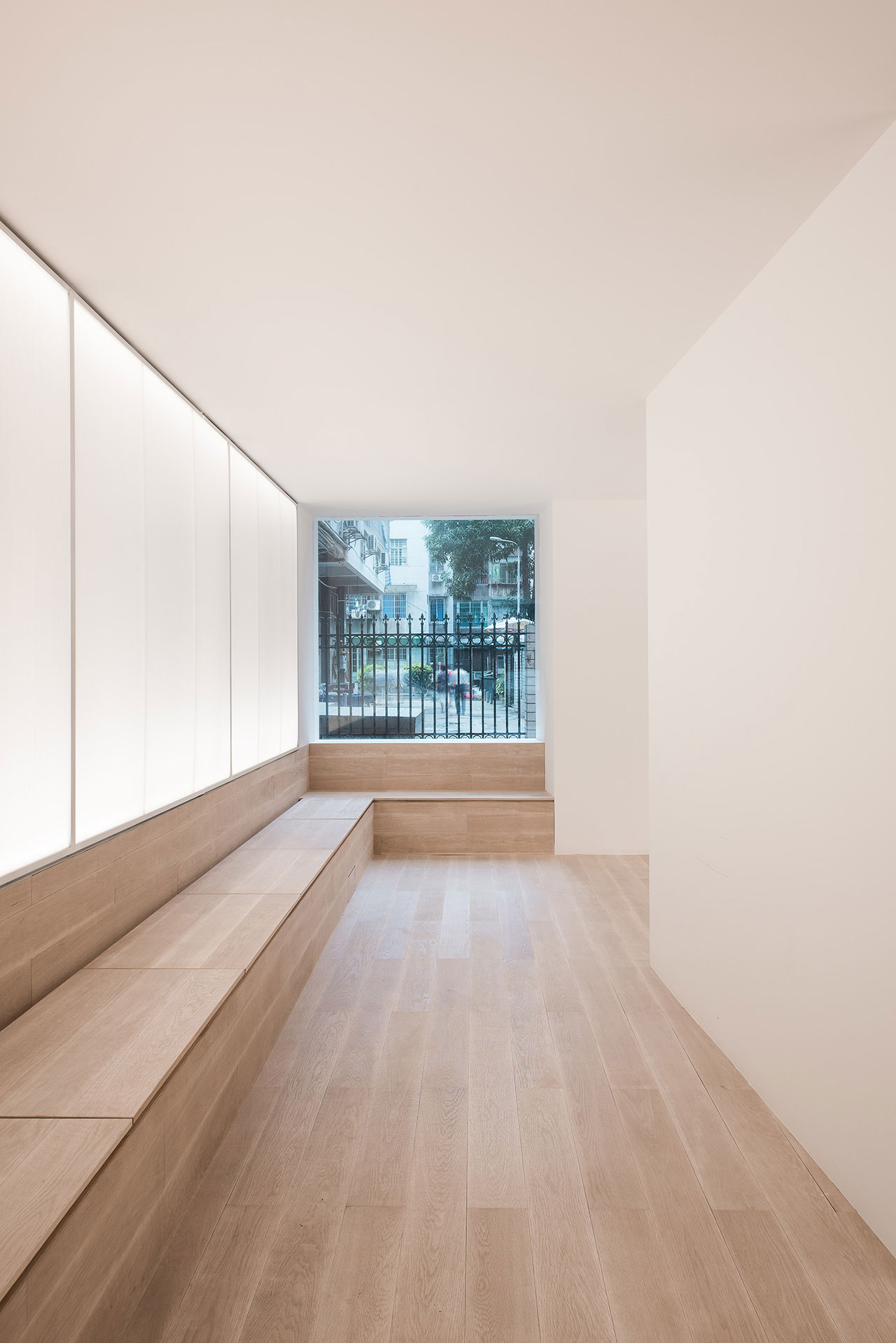
Photo by Dirk Weiblen.
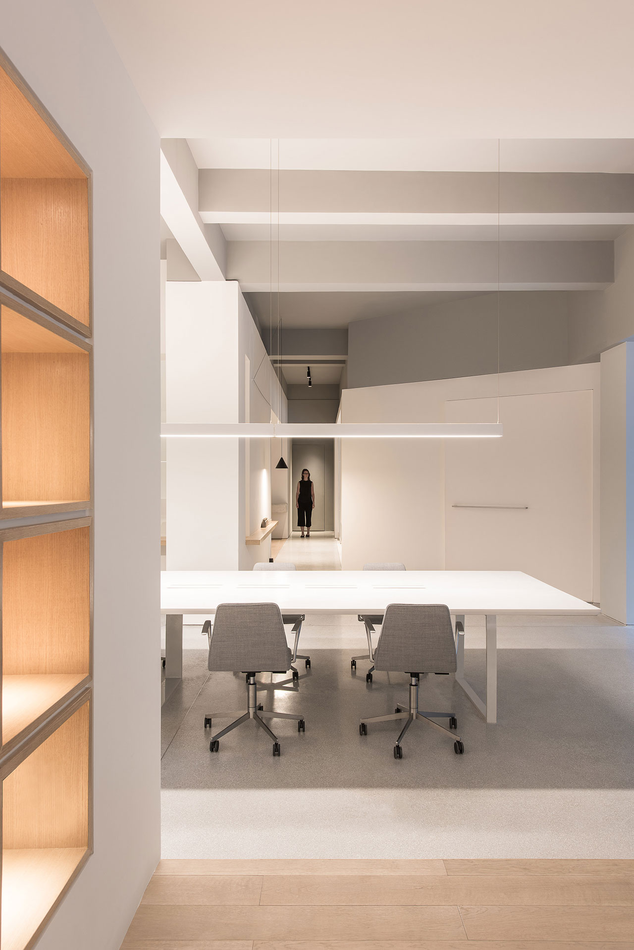
Photo by Dirk Weiblen.
Plan © Lukstudio.
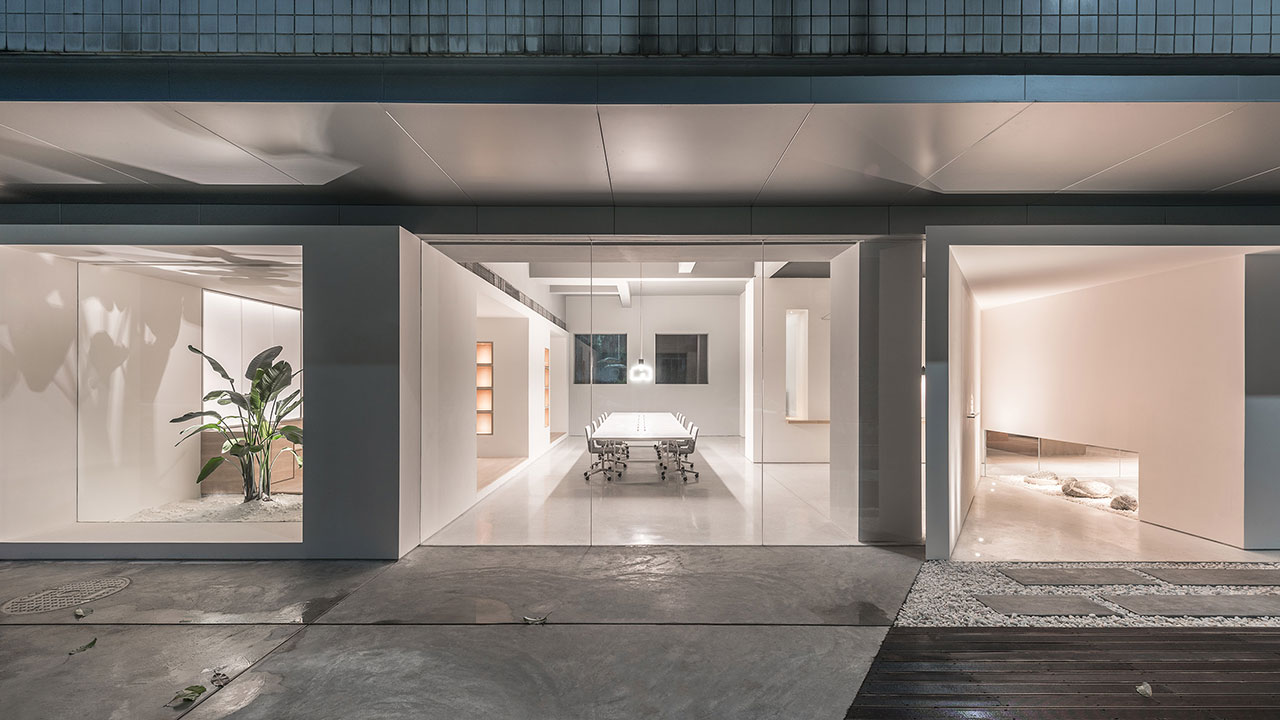
Photo by Dirk Weiblen.
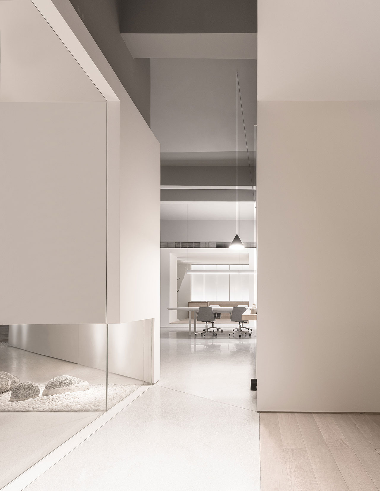
Photo by Dirk Weiblen.
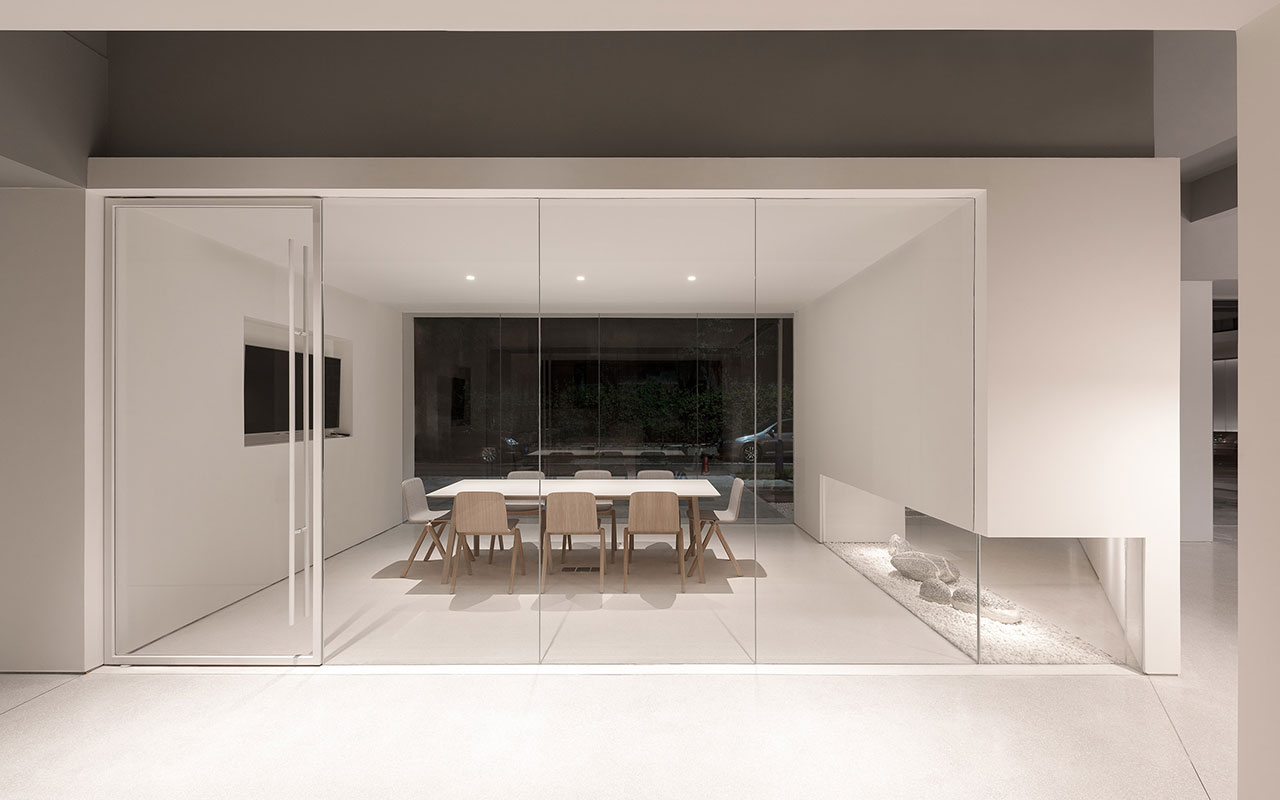
Photo by Dirk Weiblen.
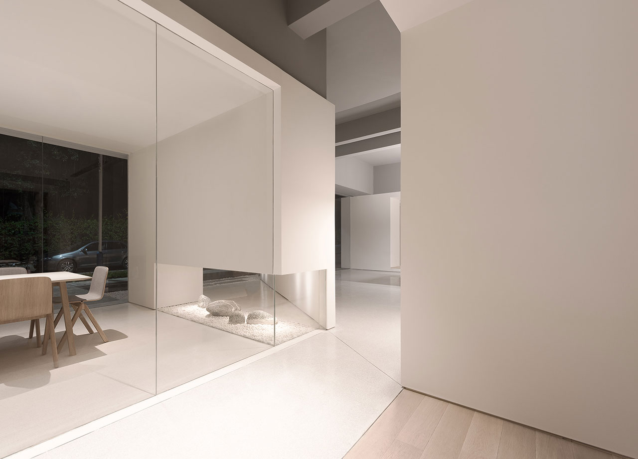
Photo by Dirk Weiblen.
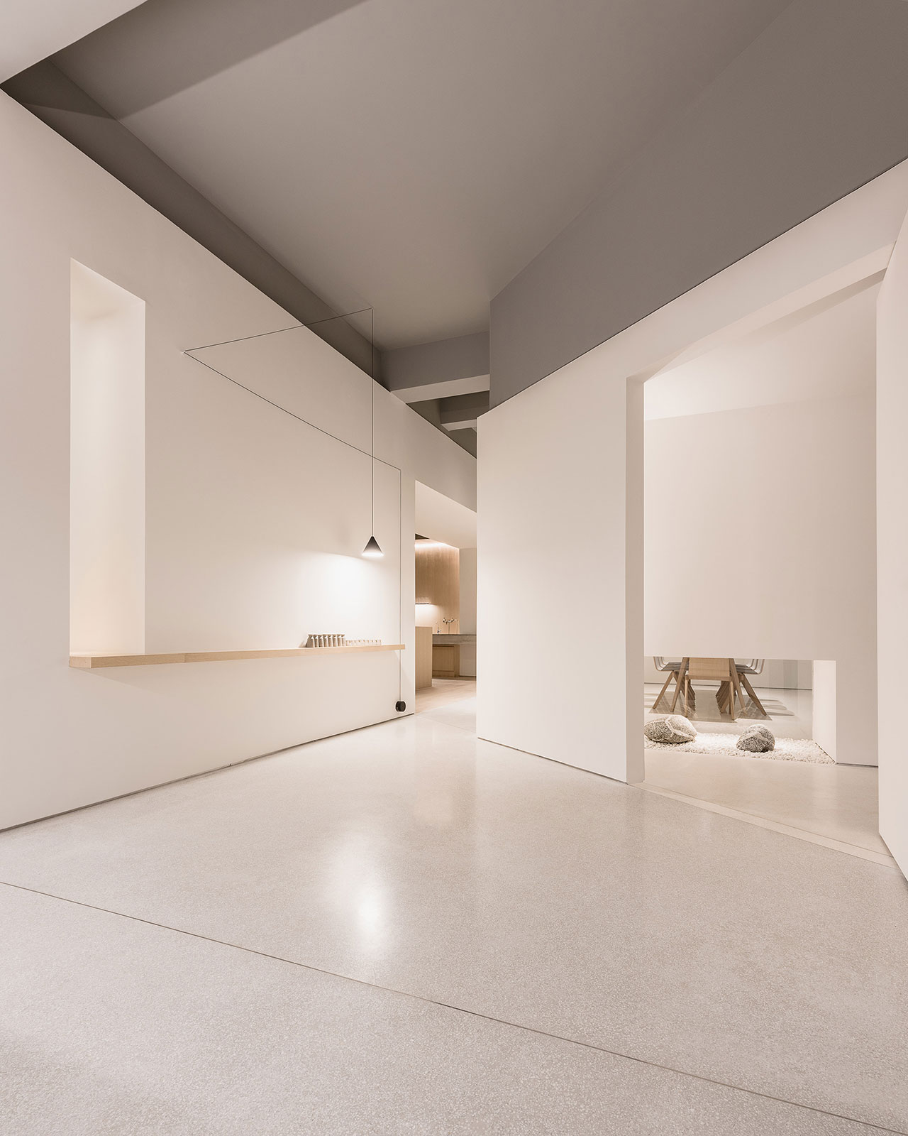
Photo by Dirk Weiblen.
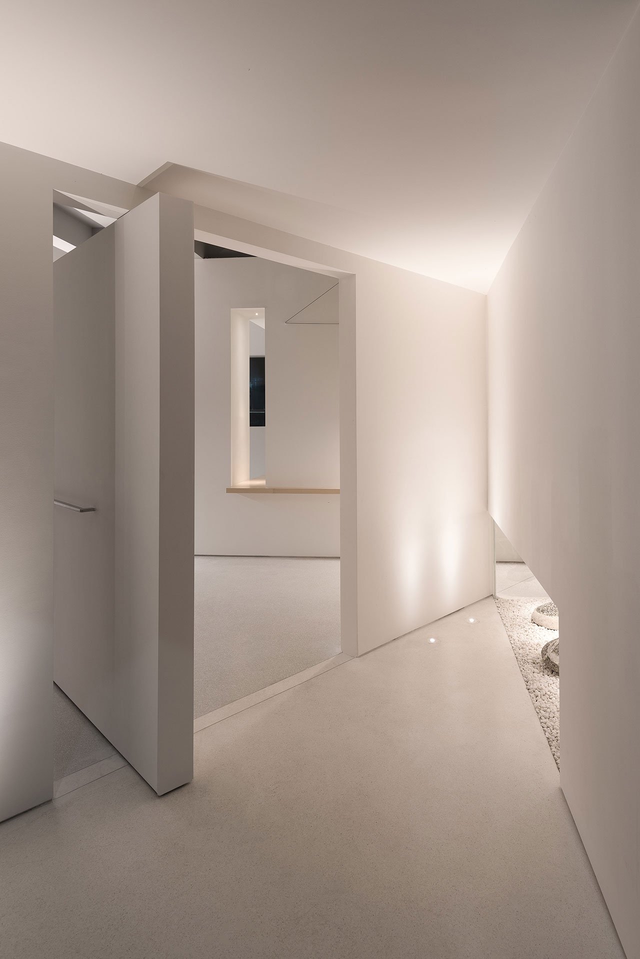
Photo by Dirk Weiblen.
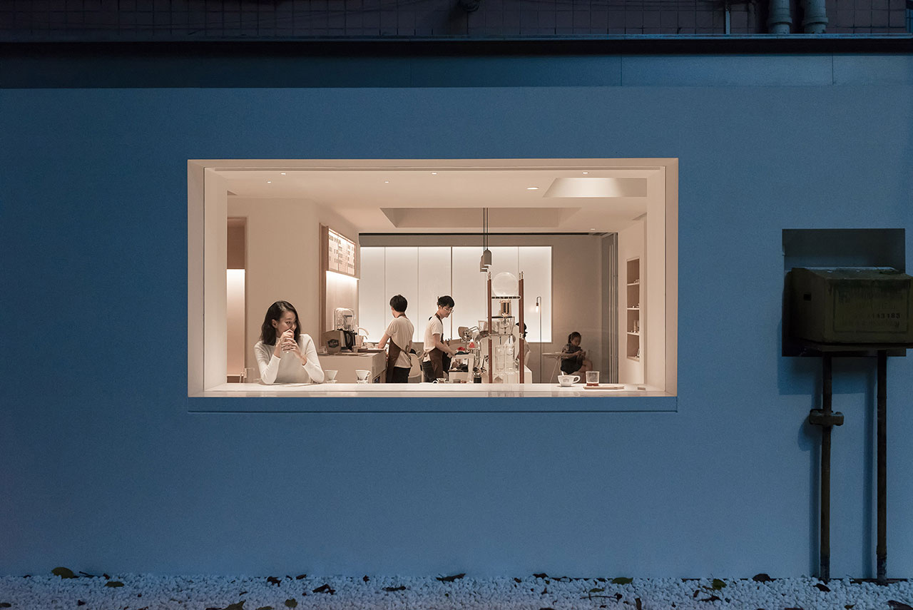
Photo by Dirk Weiblen.


