Project Name
The Library Of BirminghamPosted in
Cultural, Public facilitiesArchitecture Practice
Mecanoo Architects| Detailed Information | |||||
|---|---|---|---|---|---|
| Project Name | The Library Of Birmingham | Posted in | Cultural, Public facilities | Architecture Practice | Mecanoo Architects |
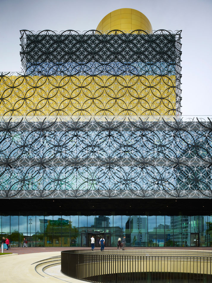
photo © Christian Richters.
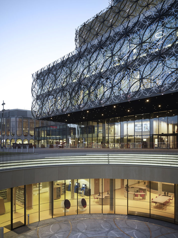
photo © Christian Richters.
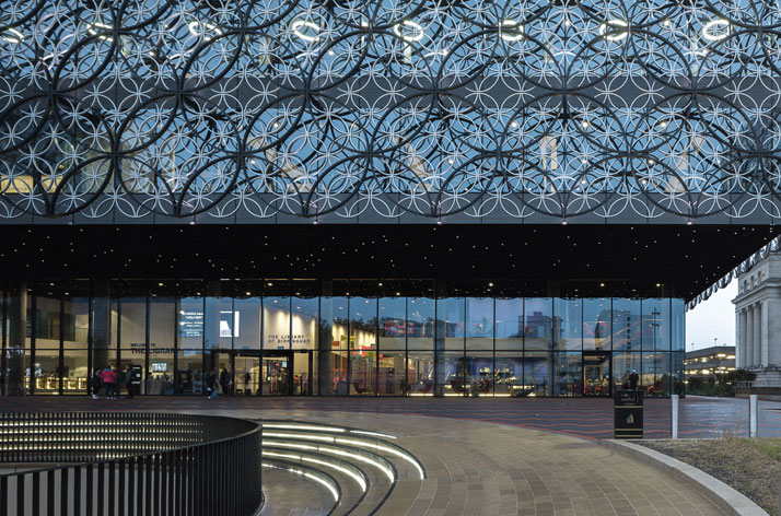
photo © George Messaritakis.
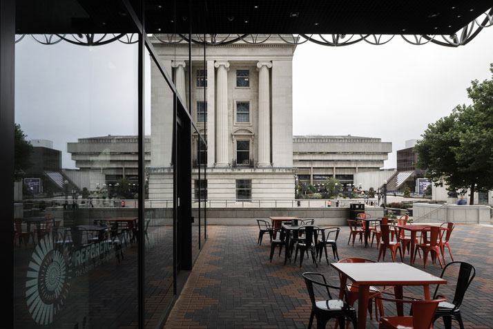
photo © George Messaritakis.
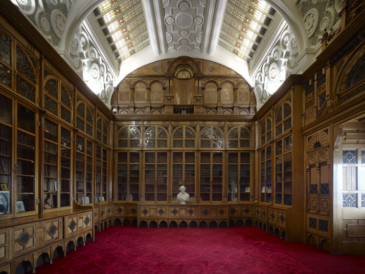
photo © Christian Richters.
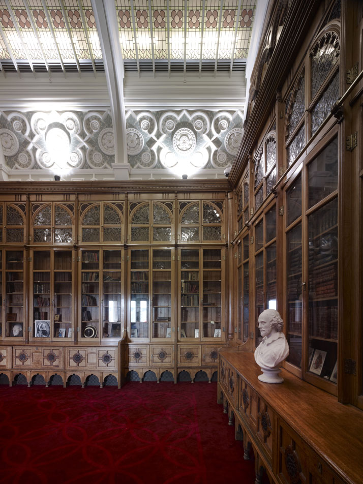
photo © Christian Richters.
The 35,000sqm library is located at the heart of the city on Centenary Square. Mecanoo Architects transformed the square itself into three realms: monumental, cultural and entertainment. The library consists of an adult and children’s library, study centre, music library, community health centre, multimedia, archives, Shakespeare Memorial Room, offices, exhibition halls, cafes and lounge space, new shared auditorium (300 seats), neighbouring Repertory Theatre and urban plan for Centenary Square. It is understandable that with the inclusion of this building, the whole city now has a complete new ideology on how it is perceived throughout the world and is an example of what architecture can really do.
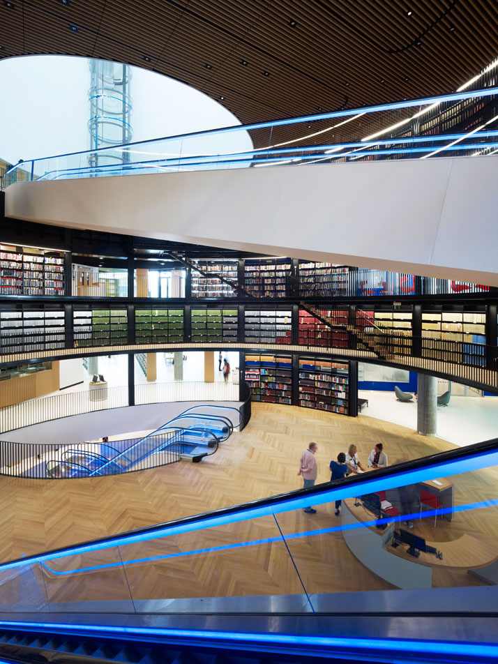
photo © Christian Richters.
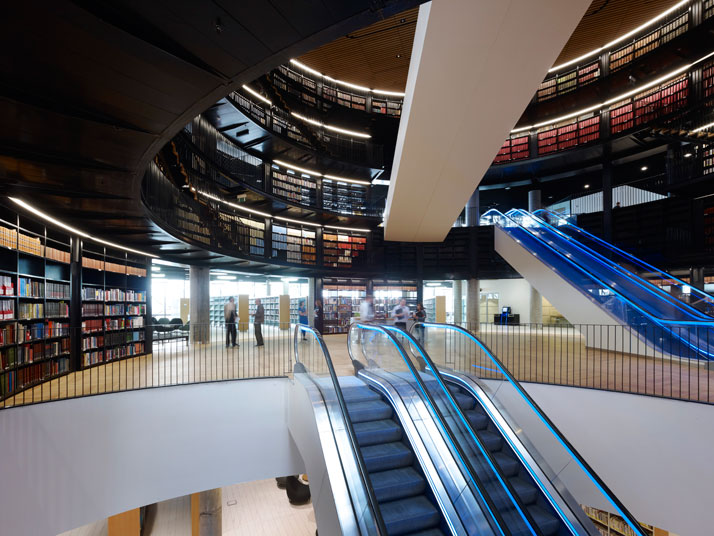
photo © Christian Richters.
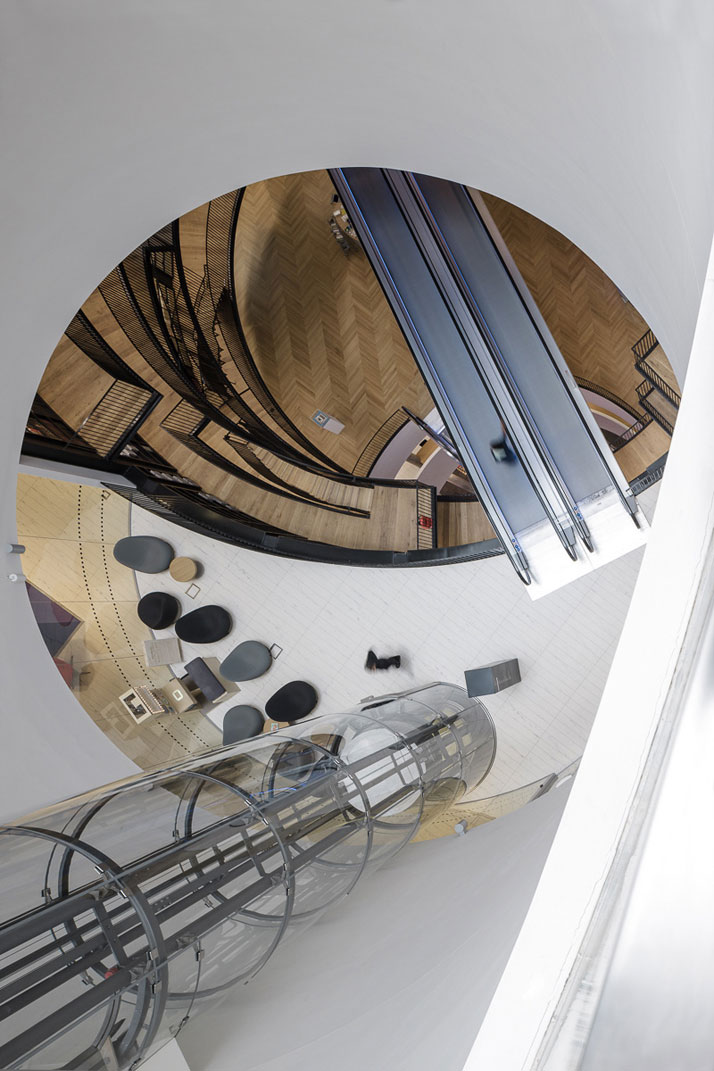
photo © George Messaritakis.
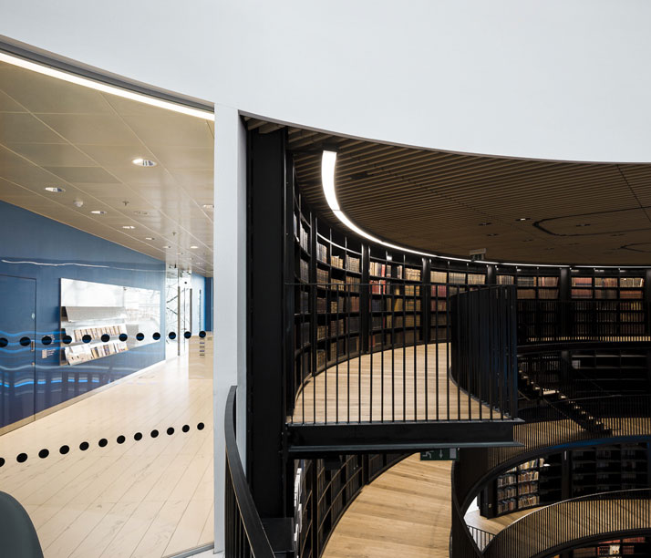
photo © George Messaritakis.
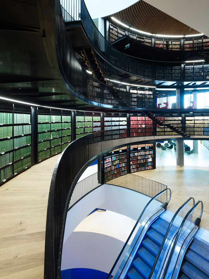
photo © Christian Richters.
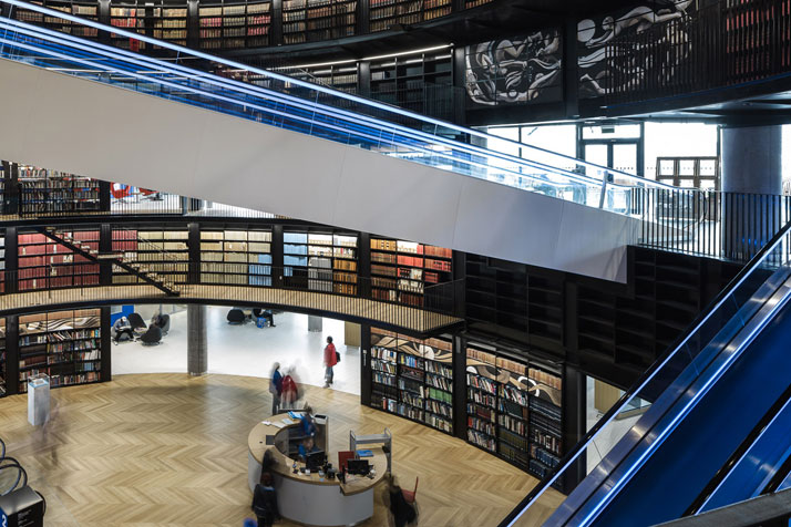
photo © George Messaritakis.
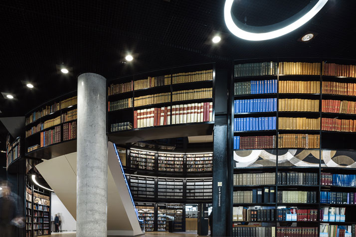
photo © George Messaritakis.
The building itself consists of transparent glass with a delicate filigree skin inspired by the artisan tradition of this once industrial city. The south (front), east and north elevations of the ground level are fully transparent to allow the public to see the facilities and draw them into the building. The much talked about and admired aluminum frieze above is one of the main reasons that draw us to this structure. It is made up of two sizes of circles: 5.4m-diameter, powder-coated black discs provide the frieze’s structure whilst attached to 1.8m-diameter powder-coated silver circles. Constructed in Germany, these elements were assembled in two parts and joined on site. 900mm behind these motives is the black powder coated aluminium curtain wall system where the positioned louvres allow for fresh ventilation to enter inside. At this point it’s also worth mentioning that The Library of Birmingham is a BREEAM excellent rated building; cold water is pumped up from within the earth and then flows back into the ground lowering the structure’s carbon dioxide emission as a result.
The interior is just as impressive and equally draws you to it. With ample natural day light and its main circular black library shelving structure, there is a great rhythm of modernity to it. Simplistic finishes and dynamic linear lines are the main focus around the structure. Providing a great sense of open space and privacy at the same time, all the areas have also been designed accordingly to fit within their uses’ requirements where colour has been controlled and specified accordingly. The grandest interior project was however the remaking of the Rotunda. Located at the top of the library, the rose coloured rotunda is an 8.5m high and 17m wide (in diameter) space. Designed by John Henry Chamberlain, this wood-panelled room was originally built in 1882 to house the Birmingham Shakespeare Library and was dismantled and relocated in the new rotunda now named the Shakespeare Memorial Room. With an indoor terrace with grand, panoramic views of Birmingham and a character true to its tribute, this room is a glorious interpretation of another era.
The erection of The Library of Birmingham is definitely all that the architectural & design world can talk about. The great buzz around this structure has dominated the city’s centre forever and is here to take charge.
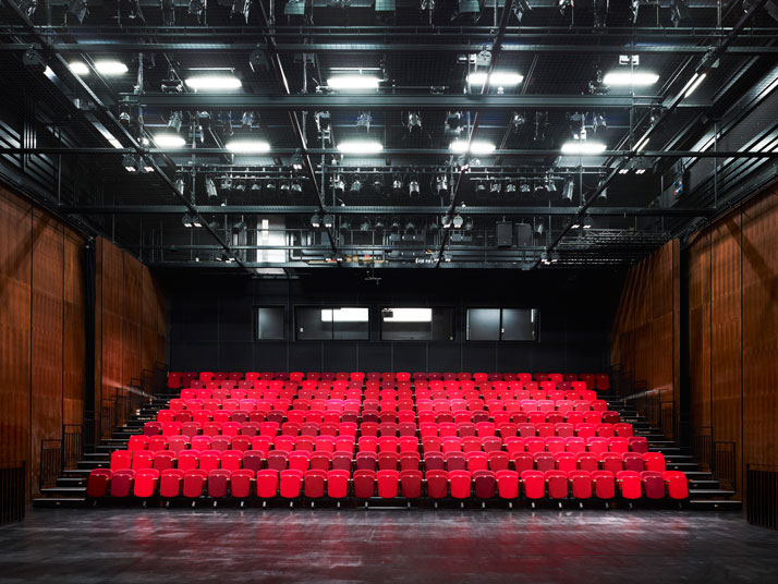
photo © Christian Richters.
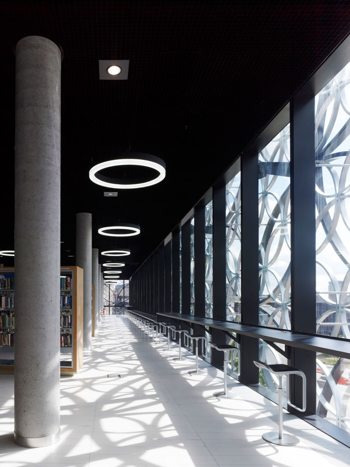
photo © Christian Richters.
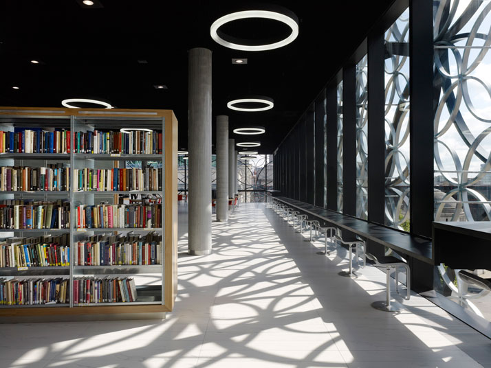
photo © Christian Richters.
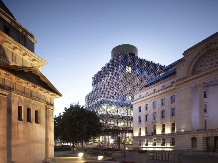
photo © Christian Richters.
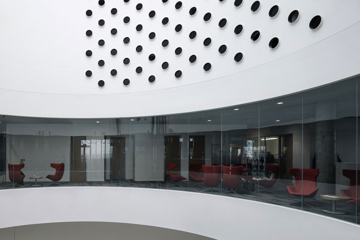
photo © George Messaritakis.
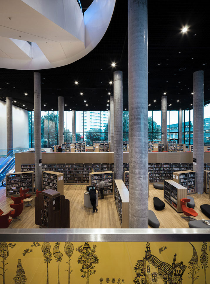
photo © George Messaritakis.
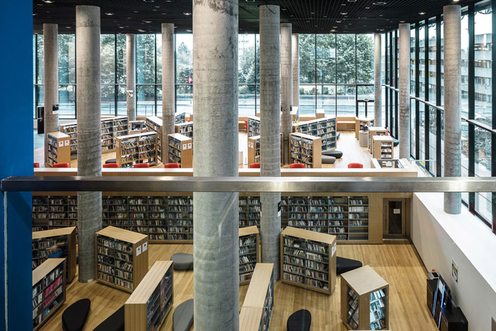
photo © George Messaritakis.
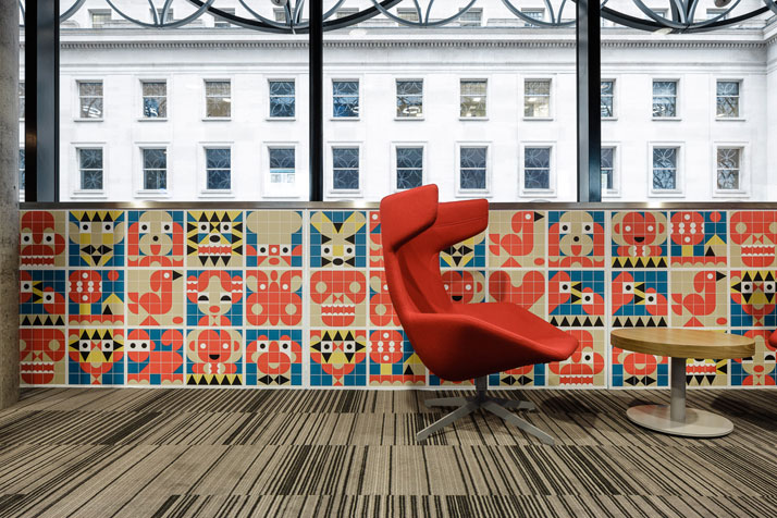
photo © George Messaritakis.
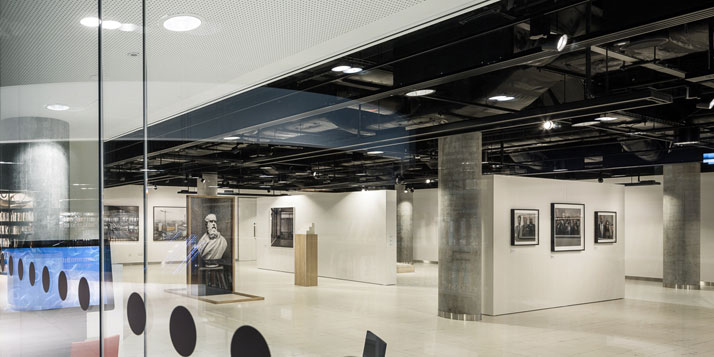
photo © George Messaritakis.
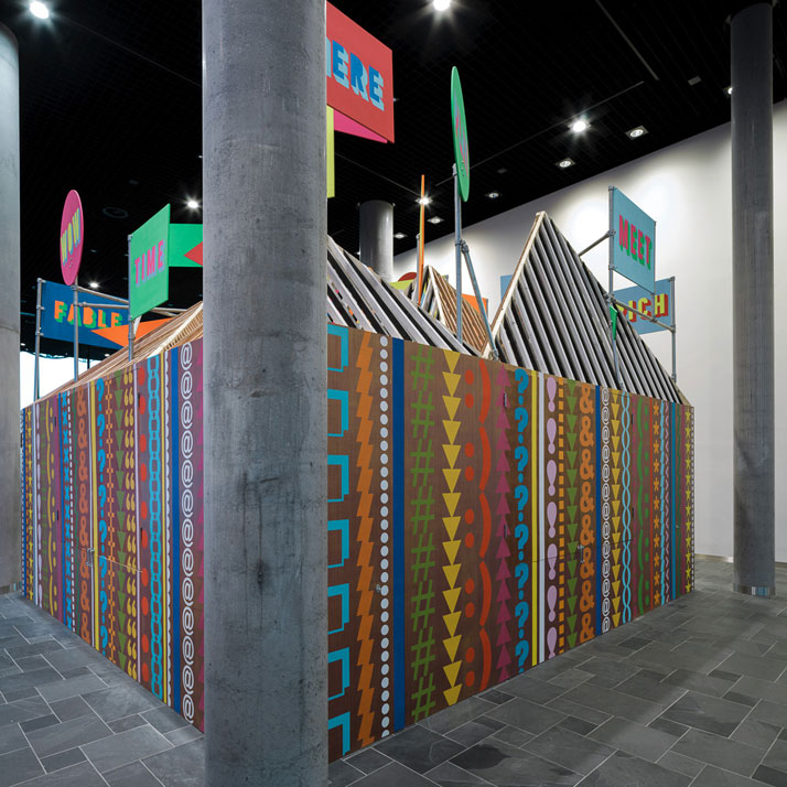
The temporary pavilion by Morag Myerscough and Luke Morgan / Studio Myerscough, photo © George Messaritakis.


