
The British company, Established & Sons, presented 14 new designs for 2008 at milan's ex-sports arena - la pelota.

general view of the show (photo by designboom)
Established & Sons is a design and manufacturing company at the vanguard of the furniture industry. From its inception in 2005, Established & Sons has been dedicated to raising design and manufacturing awareness globally and is clearly committed and effective in the pursuit and nurturing of design excellence. Some of the pieces in the collection push material technology as well as the laws of physics, others contain elegance and humour whilst all have a very clearly defined and recognisable character. As always, design integrity is clearly evident and very much in keeping with the Established & Sons’ philosophy and design dynamic. A unique method of collaboration and commissioning has come to characterise Established & Sons’ work: the company’s mission is to harness the energy and originality of emerging design talents as well as to produce work by established contemporary designers
.
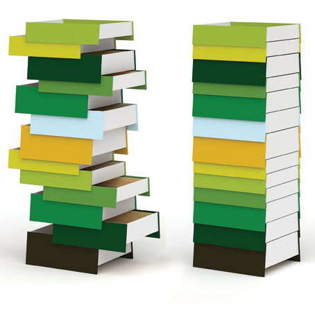

Chest of drawers by Shay Alkalay Usually a chest of drawers consists of an exterior frame, back panel and runners on each drawer. The height is limited to the size of the frame and the drawer can only be opened in one direction. With ‘Stack’ Shay Alkalay has questioned these elements and challenged our perception of what a drawer unit can be.These individual, multi-coloured, ‘floating’ drawer units are built up to different heights, creating a tower of drawers that can be pushed and pulled in both directions. This will often result in a random and irregular formality that is both fascinating and unusual to the eye. Positioned against a wall or in the centre of a room ‘Stack’ creates a rich and wonderful spectacle of colour and form. It can be appreciated from all angles as a sculptural object as well as an entirely functional, practical item of furniture. ‘Stack’ is offered in two standard sizes (8 drawer unit and 13 drawer unit) together with two multi-colour variants. “I think chests of drawers look more intriguing when the drawers are left partly open.” Shay Alkalay


DELTA by BarberOsgerby (Edward Barber & Jay Osgerby) The design of this versatile side table derives from the observation that a triangular shape fits effectively in many arrangements within an interior: free-standing, against a wall, between or next to other pieces of furniture. The tables are cast from a single material: a resin that has a hollow core and provides a high-gloss finish with an unusual depth. Offered in two sizes, the low height table functions as a coffee table or bedside table, whilst the higher version can be used as an occasional table or plinth.
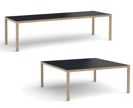

TABLE 1800x1800, TABLE 2750x900 by Caruso St John Architects (Adam Caruso & Peter St John) This table, like much of Caruso St John’s work, refers to a familiar type. It looks like a table. It is rectilinear, it has a top, four legs, and it’s made of wood. By making it out of lumber board, an engineered timber product used for construction site hoardings, the duo presents an everyday material resembling giant plywood that is strong, stable, referential yet unfamiliar within the context of furniture design. Table 1800x1800 and Table 2750x900 are available in white Corian and black linoleum table surface options. “I like the idea of wood for a table. I also like the similarity between the legs and the top, and how the muteness of the joints make the table look abstract. It is not builderly. It looks like a picture of a table, a bit like a sculpture by Richard Artschwager.” Adam Caruso


POLE LIGHT by Paul Cocksedge This elegant table and floor light challenges the common perception that light travels in a straight line. It provides ambient light as well as a dimmable, focussed, directional beam. Using a minimum of materials and components, it is surprisingly simple but provides a spectacle rarely found in such an everyday domestic lighting product. Light travels from a light source embedded deep within a concrete base and up through an optical grade, precisely curved, transparent acrylic rod and eventually culminates in a bright beam appearing at more than a metre from its source. “I wanted to create the illusion of bending light on an everyday scale. In order to achieve this I needed to send rays of light on a journey of internal reflection.” Paul Cocksedge
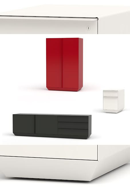

SIGNAL STORAGE by Frank (Pam West & Matt Edmonds) Inspired by rail-side metal boxes, the Signal range of cabinets and credenzas is the latest design from Matt Edmonds and Pam West to cleverly reference familiar, infrastructural aspects of the city and our environment. Through the use of sensitive detailing and beautiful finishing the usual preconceptions and associations with metal storage are removed and the design is elevated to something beyond just the functional. This treatment allows Signal the capacity to sit in a domestic environment as well as office locations more commonly associated with the genre. Signal is available in a number of shapes and sizes, including side and low cabinets and is offered in a variety of painted finishes with flat steel or solid wood handles. “The boxes had a certain lightness and presence of scale that we wanted to translate along with the industrial qualities of these enclosures into storage designs.” Frank
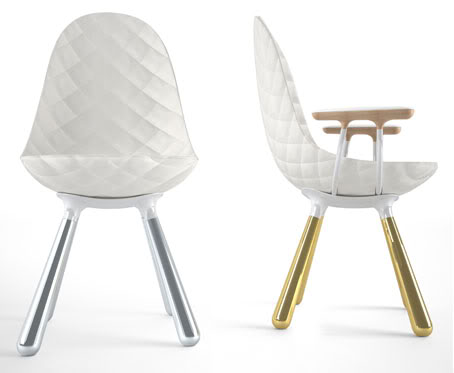

TUDOR CHAIRS by Jaime Hayon This series of six dining chairs was inspired by the six wives of Henry VIII. They are all formally linked but each with its own individual upholstery, finishing and personality. The designs are a clever reference to a rich part of British history, but particularly fascinating and relevant as they emanate from the arrival and objective perception of Spanish designer Jaime Hayon. “Ever since I moved to the United Kingdom I have been fascinated by the story of Henry VIII. What a great story! One large man and six unlucky ladies. Despotic, hedonistic, passionate, headstrong and indomitable, he would be governed by neither church nor state. As a king, Henry was known to be a man of great culture who loved opulence as well as being one of the most feared monarchs of all time. When I was asked to design something for the British company Established & Sons, I decided to base my design on the most influential King of England. It is an English story for an English company.” Jaime Hayon
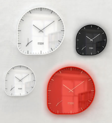

TWO-TIMER by Industrial Facility (Sam Hecht) Many cities, with London no exception, continue to experience the mass movement of people. It’s as if everyone these days has come from somewhere else. The Two Timer clock acknowledges this modern condition with two clocks sharing the same dial. How curious an idea - it’s as if a finger has stretched a round clock to form a little corner – an offspring, if you like. Two quartz movements, with a carefully devised dial, are housed in a steel frame. Designed in two sizes, it will sit happily in the home, the office, the hospital, the hotel, the airline lounge, or the foyer of a financial building. It illustrates that even with different time zones we are of one-world. “It’s as if everyone these days has come from or is going to, somewhere else... Two-Timer is a useful expression to this modern condition, merging two different time zones into one clock.” Sam Hecht
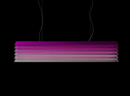

LOUVRE LIGHT by Klauser & Carpenter (André Klauser & Ed Carpenter) References to window blinds, Scandinavian lighting and the rear windows of 1980s ‘muscle’ cars are all apparent in this family of suspension lights designed by André Klauser and Ed Carpenter. Seamless pressed aluminium louvres with compound-curved corners are repeated layer upon layer. This creates a multifaceted shade that provides glare-free, directional and ambient light. It’s both a practical light source and a fascinating and formally enticing object in its own right. The long proportions and scale of Louvre make it ideal for hanging over a dining table. It is available in two sizes and offered in a variety of metal finishes which include powder-coated and coloured anodised aluminium or patinated brass. “Our aim was to illuminate the space as well as the light itself. Above that we think Louvre is like a canvas that can change character depending on the colour and finish.” Klauser & Carpenter


CRATE SERIES by Jasper Morrison The elementary properties of a found wine crate continue to inspire Jasper Morrison and they are apparent again in these three latest additions to his Crate Series. The multifunctional characteristics of series 1-5 are now complemented by the more defined typology of Crate Series 6, 7 and 8 in the form of Bookshelf, Wardrobe and Low Chair. All are constructed from the same solid pine whilst the familiar fabric hinge is also used on the wardrobe doors and ingeniously on the chair - linking multiple wooden slats to form a seat and back which then rests on a generous tubular steel frame. The emphasis on honest materials, proportion and usability is the thread that links this whole series and its evolution is a fascinating insight into how the most basic of found, functional objects can inspire a focussed and cohesive collection of furniture.
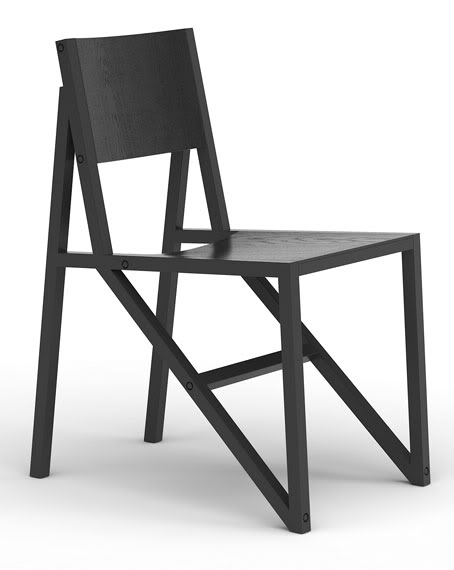

FRAME CHAIR by Wouter Scheublin Wouter Scheublin liaises functionality with the beauty of construction and shows a refined eye for detail in his design of the Frame Chair. Blessed with good proportions and seating comfort, the chair is full of cleverly engineered, reasoned character and achieves a unique formality that is rare within the competitive, overcrowded realms of chair design. Beech laths are covered with a seat and backrest of ply with oak veneer thus providing a subtle texture that shows through a lacquer finish. Frame chair is offered in painted or shown wood finishes and is also produced in aluminium. “I like the way a construction of simple laths, when assembled, suddenly transforms into a form with character.” Wouter Scheublin
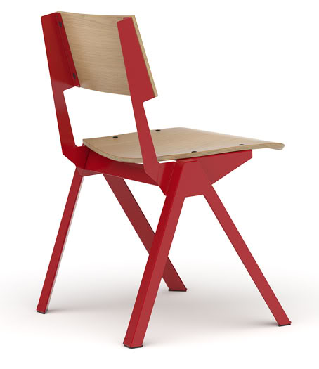

UNIFORM CHAIR by Alexander Taylor Following on from designs such as Fold, Tank and Twin, Uniform chair continues Alex Taylor’s exploration into the process of manipulating sheet metal. Intelligent, sophisticated folds within the legs and frame define its form, whilst a classic combination of materials and finishing further enhance the character of this versatile occasional, dining chair. Plywood seat pads provide comfort and structure and also reference the chair’s inspiration from old wooden classroom chairs. “Whilst searching through a flea market I found some familiar old school, children’s wooden chairs and bought a couple for home. These have become the inspiration for the Uniform Chairs.” Alexander Taylor
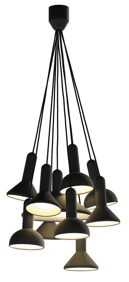

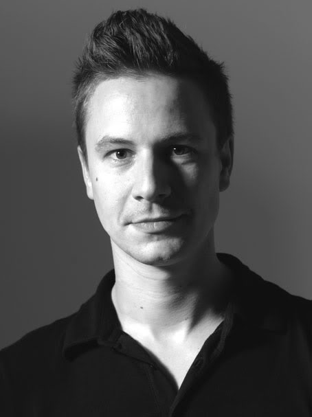
TORCH LIGHT by Sylvain Willenz Made from a moulded textured plastic, the ‘Torch Light’ comes in three versions: the small cone, the small rounded and the large cone. All sizes can be suspended from the ceiling in single units, arranged in bunches of 10 or 20, or used singularly on a tabletop or in the corner of a room. ‘Torch Light’, like much of Sylvain’s work, is inspired by archetypal objects - in this case, the simple silhouette of a typical hand-held torch or car headlight. ‘Torch Light’ is offered in three different colours, including black. “This is how I like to think of objects. What would they be like as shadows? How can they be normal and recognisable, yet slightly sophisticated and elegant? It’s playful, graphic… like an icon.” Sylvain Willenz


HEIDI by Sebastian Wrong This stool design is about basic simplicity of form and function; combining a classic tractor seat, for its shape and comfort, with a nostalgic, rustic, three leg, timber milking stool. Made from pigmented polyurethane resin and oiled European Oak the stool cleverly combines the clunky mass of a solid coloured seat with an elegant tapered, geometric timber leg construction. Heidi stool is available in two heights with the option of a red, ivory or black seat. “The experience of sitting on these stools should be reassuring, tactile and aesthetic, like the sun setting in the Alps!” Sebastian Wrong

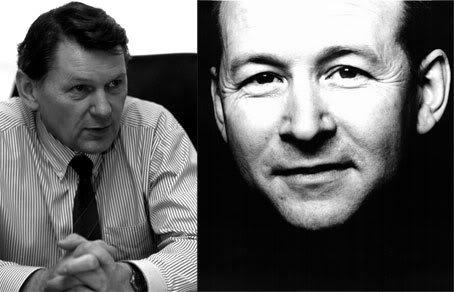
SURFACE TABLE John Barnard & Terence Woodgate COLLABORATION 2008 Two Royal Designers for Industry, one from the world of furniture design and one from the world of Formula One racing car design, have collaborated on this super slim composite table. By using state-of-the-art autosport / aerospace technology, and exploiting the inherent rigidity of layered carbon fibre, Terence Woodgate and John Barnard have created an astonishing table that spans 3metres and has a thickness of just 2mm at the edge (five times thinner than its nearest equivalent). ‘Surface Table’ is available in a walnut veneer or unidirectional natural carbon fibre finish. “We were interested in taking the form of a normal table, one with legs at each corner, as far as we possibly could. It became a search for perfection. Radius corners, round legs, domed feet and rounded edges all accentuate the slimness of the design making the entire form a seamless, blended geometric surface.” Terence Woodgate
Recent Articles

Palazzo Citterio: A New Chapter in Milan’s Cultural Landscape


