Project Name
Chic & Basic Ramblas HotelPosted in
Hotels, Design, Interior Design| Detailed Information | |||||
|---|---|---|---|---|---|
| Project Name | Chic & Basic Ramblas Hotel | Posted in | Hotels, Design, Interior Design | ||
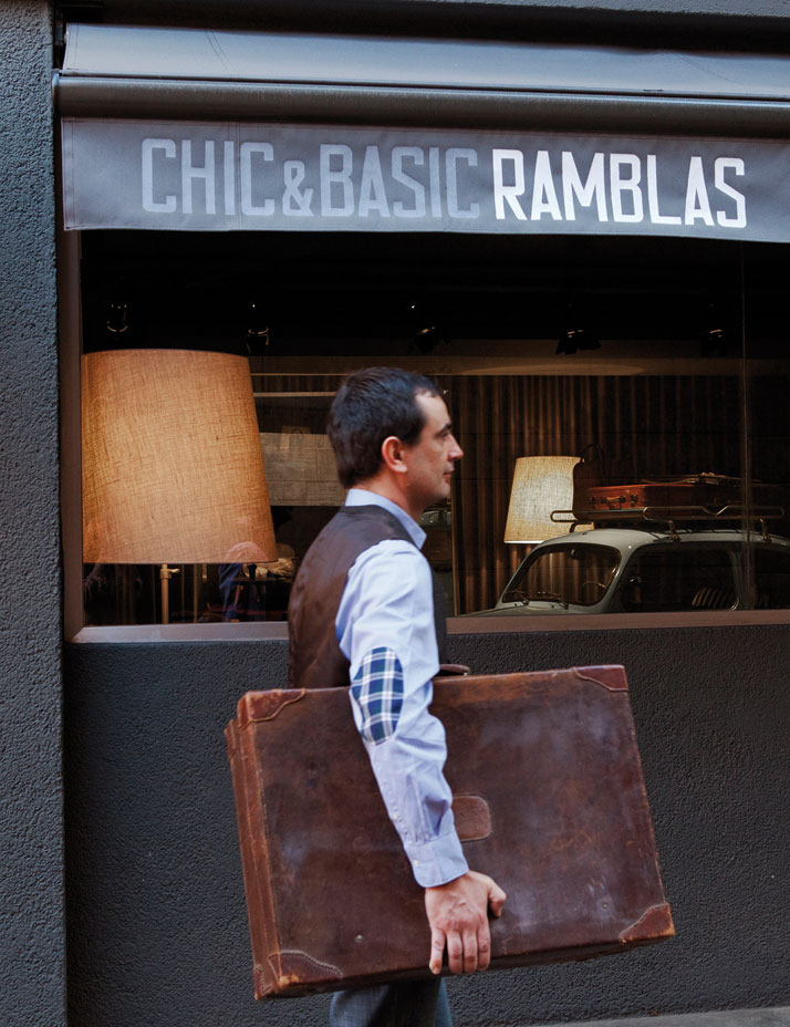
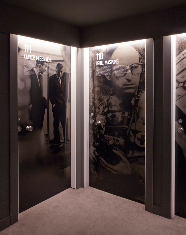
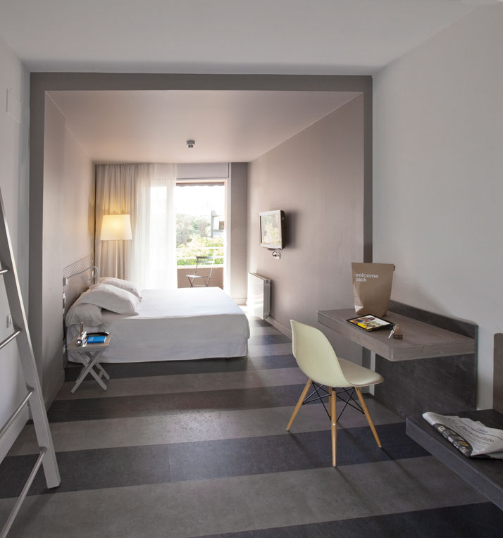
The Chic & Basic Ramblas Hotel was yet another challenge for the Lagranja Design team who has managed to transform this somewhat repulsive building into an attractive place to stay for its visitors. Almost four years after the initial planning phase, the project was completed successfully in September 2012. The fact that the building was constructed during the 60’s inspired the designers to recreate that era once again. The idea was simple and consistent throughout and with the help of the Maneko and Espluga graphic design studios, the execution of the initial concept became rather impressive. All guest rooms, including a gym, are located on the first to the sixth floors whilst all other public areas can be found on the ground floor. Within the building, from the first to the sixth floor, each corridor was used as a canvas exhibiting different issues over the decade whilst the doors of the rooms were used to showcase design icons, tourist hotspots, folklore as well as the lifestyle of the period.
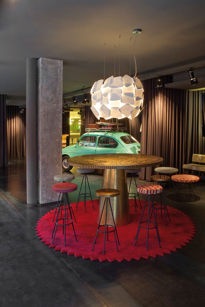
photo © Albert Font
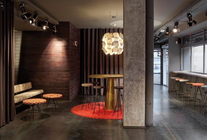
photo © Albert Font
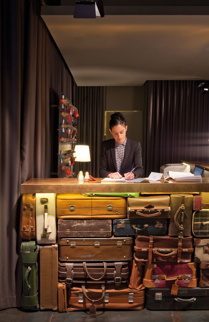
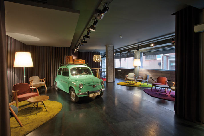
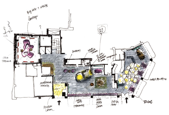
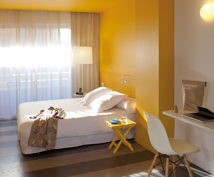
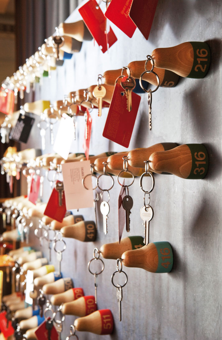
The common areas, i.e. the reception, games room, offices and restaurant all follow the same concept and definitely impress with a range of carefully selected objects, which further strengthen the ‘travel through time’ experience.More specifically, the reception desk is made out of leather bags, the tables are tailor made in the form of the 'peseta' - former Spanish currency - and, last but not least, there is a light green ‘Seat 600’ located in the middle of the lobby that uniquely emphasises the Spanish 60’s concept. The main materials used throughout the hotel are monochromatic wool carpets for the corridors, distinguishing each floor theme, black and grey laminated floorings, porcelain stoneware and ceramic tiles for the bathrooms and iron sheet flooring for the ground floor areas. The playroom is intentionally the only room that has a slightly different approach from the rest of the spaces with white painted pine wood flooring and discreet lighting. The walls are mainly covered with painted drywall while the use of curtains and mirrors creates a warmer atmosphere and helps to improve the acoustics. Furthermore, each level is defined by a different colour - red, light blue, dark blue, orange, grey and green - and different topics feature which can be seen through the rooms themselves, i.e. the Julio Iglesias room or the Eurovision Contest room.
Although the Chic & Basic Ramblas Hotel may not follow mainstream design rules, it is definitely stylish, chic and above all, welcoming to its guests.
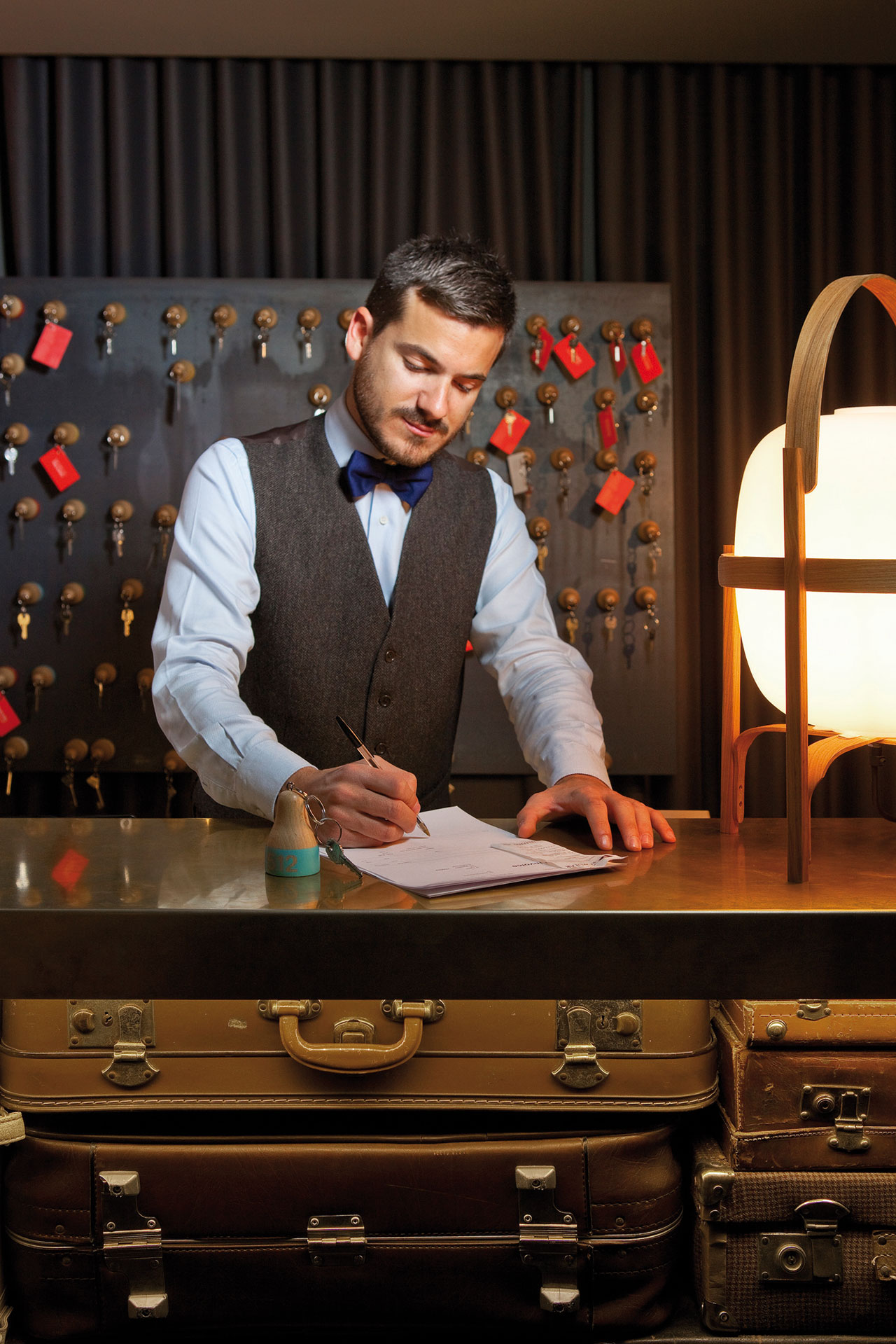
photo © Albert Font


