Glacier #01 (2008)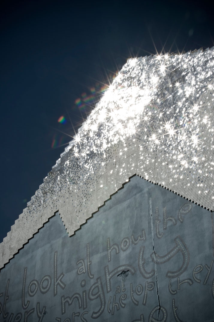
Sequins, plastic and plywood
Maximum dimensions: 11,0 x 5.4 m
20.9 m2
Part of the Sirkus Grounds project, curated by The Lost Horse Gallery
Reykjavik, Iceland 2008
Photo © Gunnar Þór Nilsen
Don’t you like this feeling when you discover a new artist or music group or something that inspires you that it almost seems it was made especially for you? That’s the way we feel at Yatzer about Theresa Himmer, a young Danish/Czech artist that made our recent trip to Iceland really worth it. Theresa was born in Denmark where she studied, lived in Iceland from 2005 – 2009 and is currently working in New York. She combines art and architecture in a personal way and her creations, mostly site specific, interact perfectly with the big city life. Theresa Himmer is constantly experimenting with her art and her latest works are closer to video art installations, without ever losing their ability to communicate with the surrounding space. After all, as she reveals, she is more inspired by the physical and cultural environment that is surrounding her rather than inner imagination. We love the way she understands art as an open dialogue and the fact that her works, despite being the result of extended research, with multiple layers of meaning, speak straight to the heart of the viewer. We met Theresa and took the opportunity to ask her all the things we wanted to know about her art and the way she lives and creates. Discover her! The Mountain Series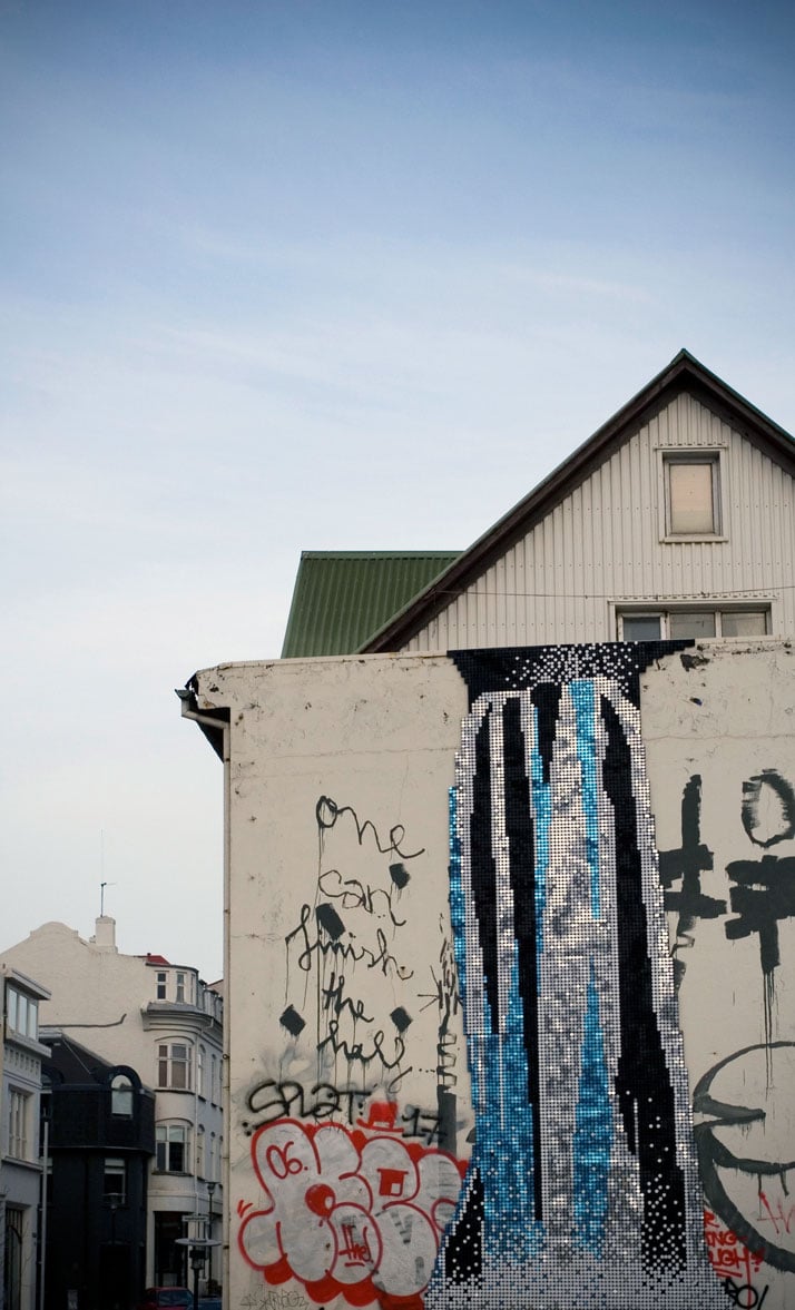
Waterfall #01 (2006)
Sequins, plastic and plywood
Maximum dimensions: 2,6 x 6 m
11.4 m2
Part of SEQUENCES REAL-TIME ART FESTIVAL
Reykjavík, Iceland 2006
Photo © Gunnar Þór Nilsen
Theresa, one of the first things somebody notices about your art is the way that it stands between art and architecture. In which way these two disciplines are present in your work? The Mountain Series (DETAIL)
I come to art through architecture and my practice is grounded in notions of place, site specificity and locational identity. I am interested in how these concepts shift and operate in response to an increasingly globalized society and how they affect the artist’s role, especially within public art. I completed my architectural studies at Aarhus School of Architecture in Denmark at an interdisciplinary and experimental department concerned with urban planning, building and landscape design. My main interest was a conceptual and programmatic interrogation of the urban public, often conducted through diagrammatic analyses that I developed into proposals for urban landscapes and installations. Last week, I finished my MFA studies in Fine Arts at School of Visual Arts in New York. That my practice is situated in a space between art and architecture gives me the freedom to work within disciplinary overlap where definitions become murky and open, and I can draw on experience and education within both fields. If traditional architecture to some extend is concerned with creating solutions, I am interested in addressing issues and raising questions. 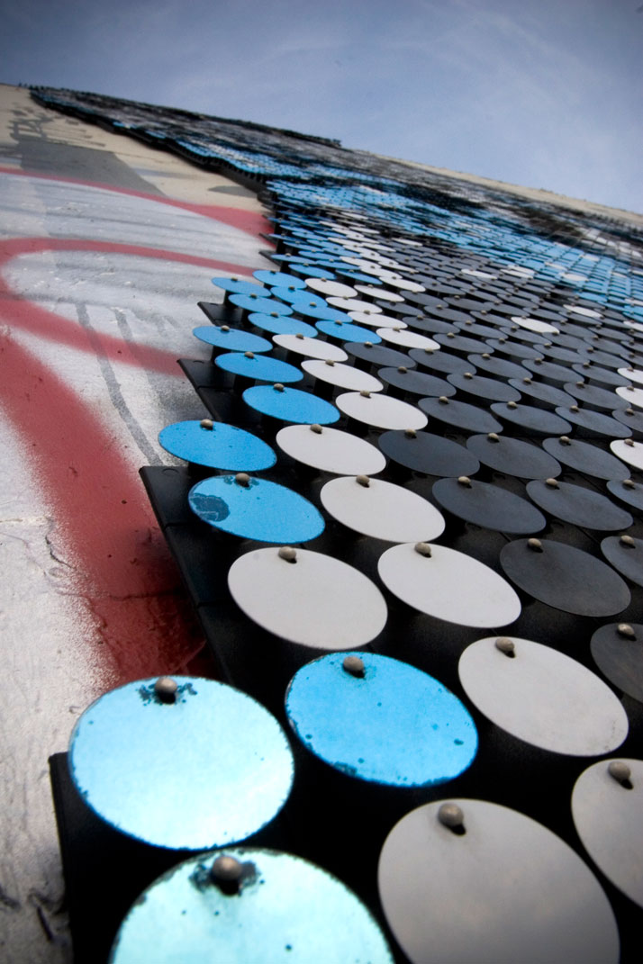
Waterfall #01 (2006)
Sequins, plastic and plywood
Maximum dimensions: 2,6 x 6 m
11.4 m2
Part of SEQUENCES REAL-TIME ART FESTIVAL
Reykjavík, Iceland 2006
Photo © Gunnar Þór Nilsen
How would you describe your work?
Most of my work is site specific in one sense or the other. So entering into a dialogue with a specific context is at the basis of my practice. The context can be a physical location, as well as a sociopolitical, cultural or historical reality. Usually it is a mixture of these aspects that I am responding to and my projects often question this multi-layered reality or function as its negation. I generally don’t create work from pure imagination, or from a kind of internal world, rather I look outward.
Are modern cities the perfect display option for contemporary art?
In my public art projects I have mostly been working within an urban context. I am attracted to the city as a public space. Art within this context is, at least potentially, democratically accessible, and becomes part of everyday life. I value the city as a manifestation of culture and civilization for better or worse.
Glacier #01 (2008)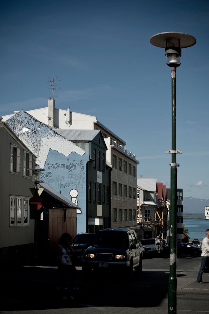
Sequins, plastic and plywood
Maximum dimensions: 11,0 x 5.4 m
20.9 m2
Part of the Sirkus Grounds project, curated by The Lost Horse Gallery
Reykjavik, Iceland 2008
Photo © Gunnar Þór Nilsen
What about your latest video experimentations?
During the last two years, I have expanded my practice into video and video installation. I am interested in video’s critical potential, and its ability as a medium to extract, overlap and displace space. Similar to my urban installations, my video works operate as responses to given circumstances, which I use as models for investigating broader currents within society. This practical extension also adds directly the element of time to my preoccupation with space. I am interested in transience and movement, which may be reactionary to architecture that tends to be relatively more concerned with an idea of permanence.
What differentiates your studio practice from your public space works? Volcano #01 (2008) (DETAIL)
My studio practice and my projects within public space mutually inform each other and are equally satisfying to me. Within both fields, I aspire to create projects that have a conceptual and research based foundation, while simultaneously functioning at an immediate visual and phenomenological level.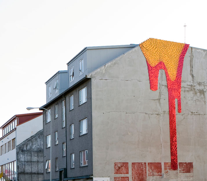
Sequins, plastic and plywood
Maximum dimensions: 4,7 x 11,2 m
18,2 m2
Commissioned by SEQUENCES REAL-TIME ART FESTIVAL
Reykjavík, Iceland 2008
Photo © Kristinn Magnusson
Volcano #01 (2008)
Sequins, plastic and plywood
Maximum dimensions: 4,7 x 11,2 m
18,2 m2
Commissioned by SEQUENCES REAL-TIME ART FESTIVAL
Reykjavík, Iceland 2008
Photo © Kristinn Magnusson
The Mountain Series, according to my opinion, is the most accessible and immediate work you have presented so far, with really dazzling effects on the viewer. What’s the story behind it?
Prior to starting The Mountain Series in Reykjavik, I had developed a fascination with the material. The Sequin system is a hyper commercial product that comes from the world of advertising and display. Within this context, the sequin’s constant movement and flickering is desirable as a means of catching the consumer’s eye. Meanwhile I was interested in how these visual qualities also recall how landscapes respond to changes in wind and light. I moved from Denmark to Reykjavik in 2005 and the Series came as a response to my encounter with Icelandic nature and culture. In this context the sequins operate on dual levels. As they scintillate like water, ice or lava, they have an immediate visual and formal quality, which, in this framework, addresses the relationship between the natural and the artificial. Meanwhile, extracted from the commercial world, they serve as a critique of the increasing and disturbing commodification of Icelandic nature.
How does the Mountain Series interact with the city landscape?
In terms of the series’ relationship with the city’s buildings, especially in the case of the waterfall, I was interested in the specific wall because I found it interesting. It used to be covered in graffiti and tags – like on the photo. Part of my reason for placing the waterfall there was to point to the quality in these urban layers of conversations and uttering. I did not want to make a monumental piece, simply add another layer to all those already existing. Later, the wall was painted white. Similarly, the Volcano wall used to be bare concrete, and was subsequently painted green. In both cases, I much prefer the concrete walls. Meanwhile I like the idea of letting go of my control over the pieces. Once they are a part of public space, they also become part of the changes that happen within the city.
Do you always work with sequins? Entrance (2010)
As a result of The Mountain Series, there seems to exist the impression that I work with sequins as a material in general. It is understandable, but not the case. In The Mountain Series the sequins operate specifically as part of the projects content. I work with sequins when their application can become part of a wider subject matter.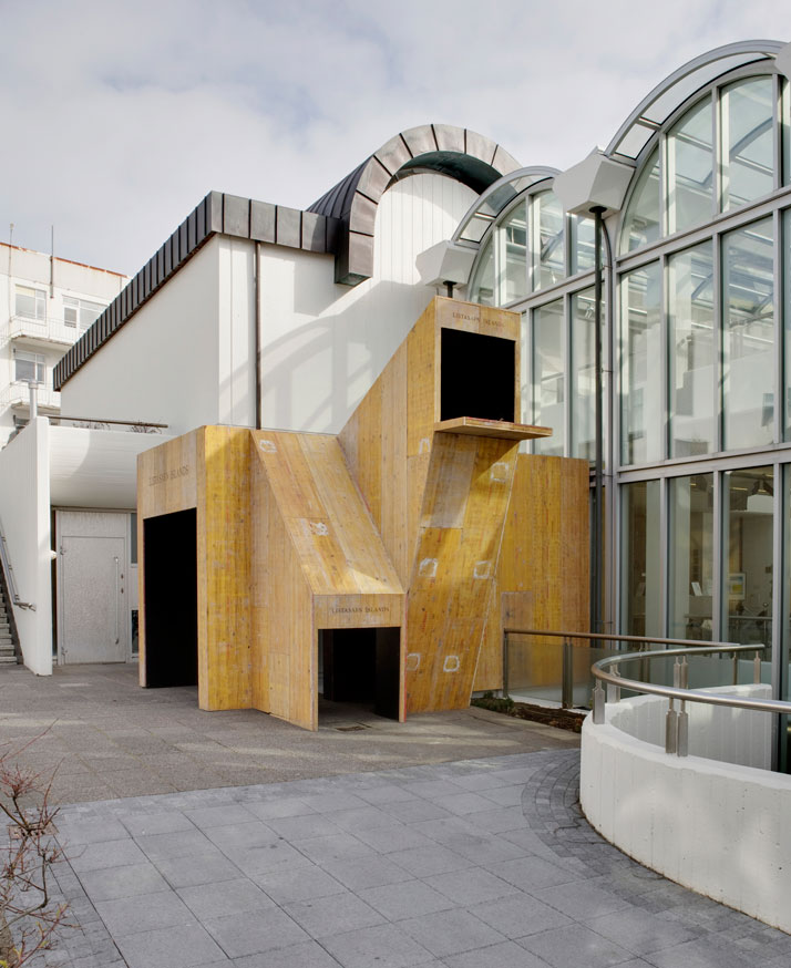
In collaboration with Kristjan Eggertsson
Reclaimed shuttering boards and wood.
Dimensions: ca. 15 m2, max. height ca. 4,5 meters
The National Galery of Iceland, Reykjavík, Iceland
part of the group show Dyndilyndi.
Photo © Kristinn Magnusson
Entrance (2010) (DETAIL) 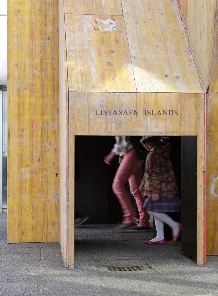
In collaboration with Kristjan Eggertsson
Reclaimed shuttering boards and wood.
Dimensions: ca. 15 m2, max. height ca. 4,5 meters
The National Galery of Iceland, Reykjavík, Iceland
part of the group show Dyndilyndi.
Photo © Kristinn Magnusson
Your latest work, Entrance (2010), was presented at The National Gallery of Iceland as a part of the group show Dyndilyndi, in collaboration with Kristjan Eggertsson. Can you give us some details about this adventure?
Entrance is working site-specifically with The National Gallery of Iceland as both physical structure and institution, as a playful investigation of the relationship between the rational and the absurd. The basis for the project was an architectural workshop for children, where the kids imagined houses for different animals through small paper marquettes. Inspired by the children’s richness of ideas, a diverse group of artists were invited to create works for a group show at the Gallery. As a response to this brief, we perceived The National Gallery as being already a house for animals, in life size scale. Through the construction of a new entrance, we invited the Icelandic Fauna into the museum on equal terms with humans. The structure was generated in the absurd meeting between the fictious and the real visitor’s needs, in dialogue with the existing architecture. The shuttering boards that were the main material used in the construction were borrowed from a construction company. After the show they were returned for continuous use.
Recently you finished your MFA studies in Fine Arts at School of Visual Arts in New York and as a part of your Thesis you presented a very interesting installation, Untitled (2011), which is closer to video art. Can you tell us a few more things about it?
A split screen life-size projection of two glass doors next to the same real door, the installation spoke to the relationship between real and cinematic space. Simultaneously, it was a critique of the spaces produced by a corporate creative culture, through the multiplication and extension of its architecture. The gallery is placed inside the Starrett-Lehigh building in Chelsea. A beacon of international style architecture and a prime example of curtain wall modernism, the mountain like structure occupies a full Manhattan block. While formerly housing industrial functions, the vast interiors today, unsurprisingly, accommodate a tightly defined segment of creative businesses: arts, fashion, media. Disrupting the perceived spatial continuum and order, the projected glass doors shift from offering a view out to an illusionistic interior hallway to functioning as a cinematic editing device of the split screen. The slowed pace of the actors’ movements add an impression of resistance within the otherwise physically and culturally glossy space.
Photo © Theresa Himmer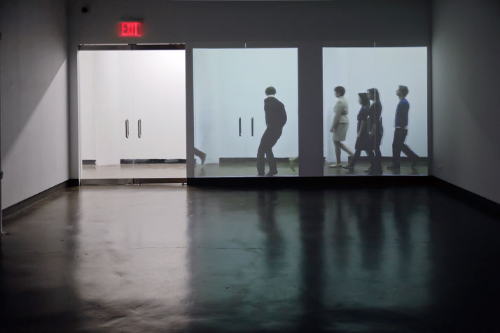
Photo © Theresa Himmer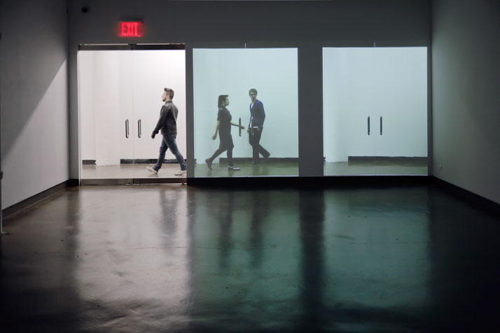
Photo © Theresa Himmer
Thesis project (SVA)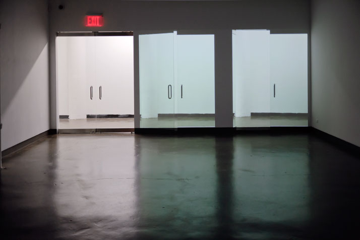
Untitled (2011)
Existing glass door, single channel HD video, 5.32 min. loop
Thesis Show, SVA Visual Arts Gallery
Stills form documentation video
Photo © Theresa Himmer
What are you currently working on? Photo © Theresa Himmer
Currently, I am very happy to be working on two commissions for public art projects. The first is for an art festival in Mexico City, which will take place in October this year. I am in the beginning of the project phase, - doing research, sketching and contemplating possible sites, in collaboration with one of the curators, so there is not so much more I can share at this point. The other project is at a similar state, and is commissioned by the Public Art Program in the city of Perm in Russia. I was invited to travel there on a research trip in November last year, which was an immense experience. In this context art and culture is being as a leverage to rethink the identity of the city. It is a very interesting and complicated development to be part of. The Public Art Program is part of the newly established Contemporary Art Museum PERMM. It is definitely a place to keep an eye on.
