MONOARCHI's New Shanghai Office Pays Tribute to its Historic Location
Words by Yatzer
Location
Shanghai, China
MONOARCHI's New Shanghai Office Pays Tribute to its Historic Location
Words by Yatzer
Shanghai, China
Shanghai, China
Location
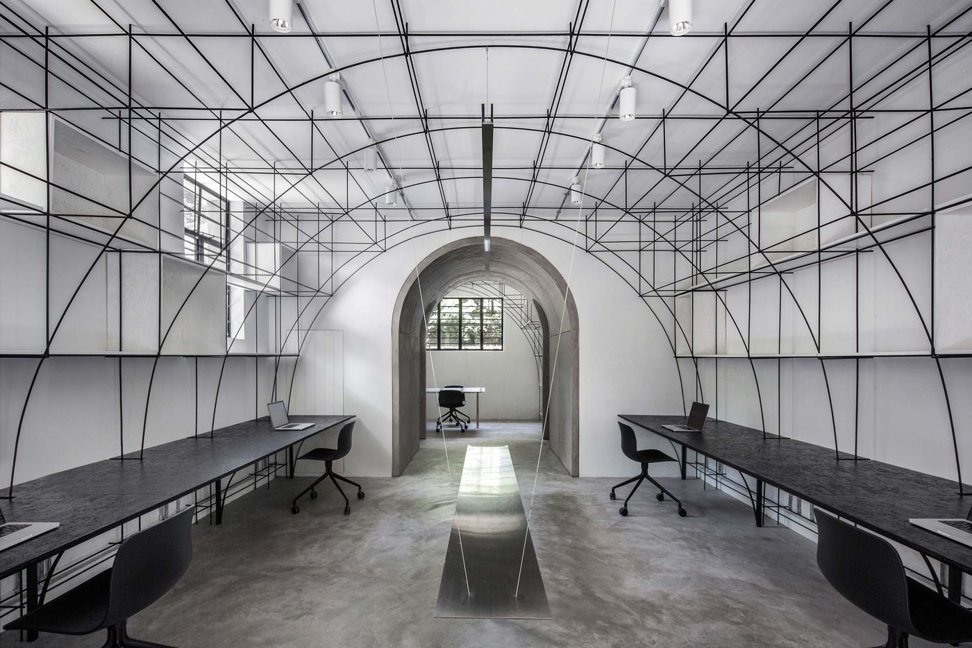
For their new Shanghai office, architecture studio MONOARCHI eschewed the city’s commercial and business districts choosing instead to take over the ground floor of a stately 1940s villa in the city’s French Concession, a mostly residential, historic quarter that was under French control for about a century until WWII. Inspired by the quarter’s distinctive arch corridors and doors, the architects have crafted an office of sculptural minimalism that pays tribute to the area’s history whilst embodying their design philosophy.
Shanghai is a booming metropolis but the breakneck growth has had a grim toll on the city’s small number of historic buildings many of which have been demolished to make way for gleaming new developments. As architects, MONOARCHI understand the importance of both preservation and revitalization which makes their decision to imbed their new office space into a hundred-year-old residential neighbourhood all the more relevant. “Our responsibility to choose this old house”, as they explain, “is to defend its past and enrich its story”.

The yard after renovation. Photo by Qiu Ripei.
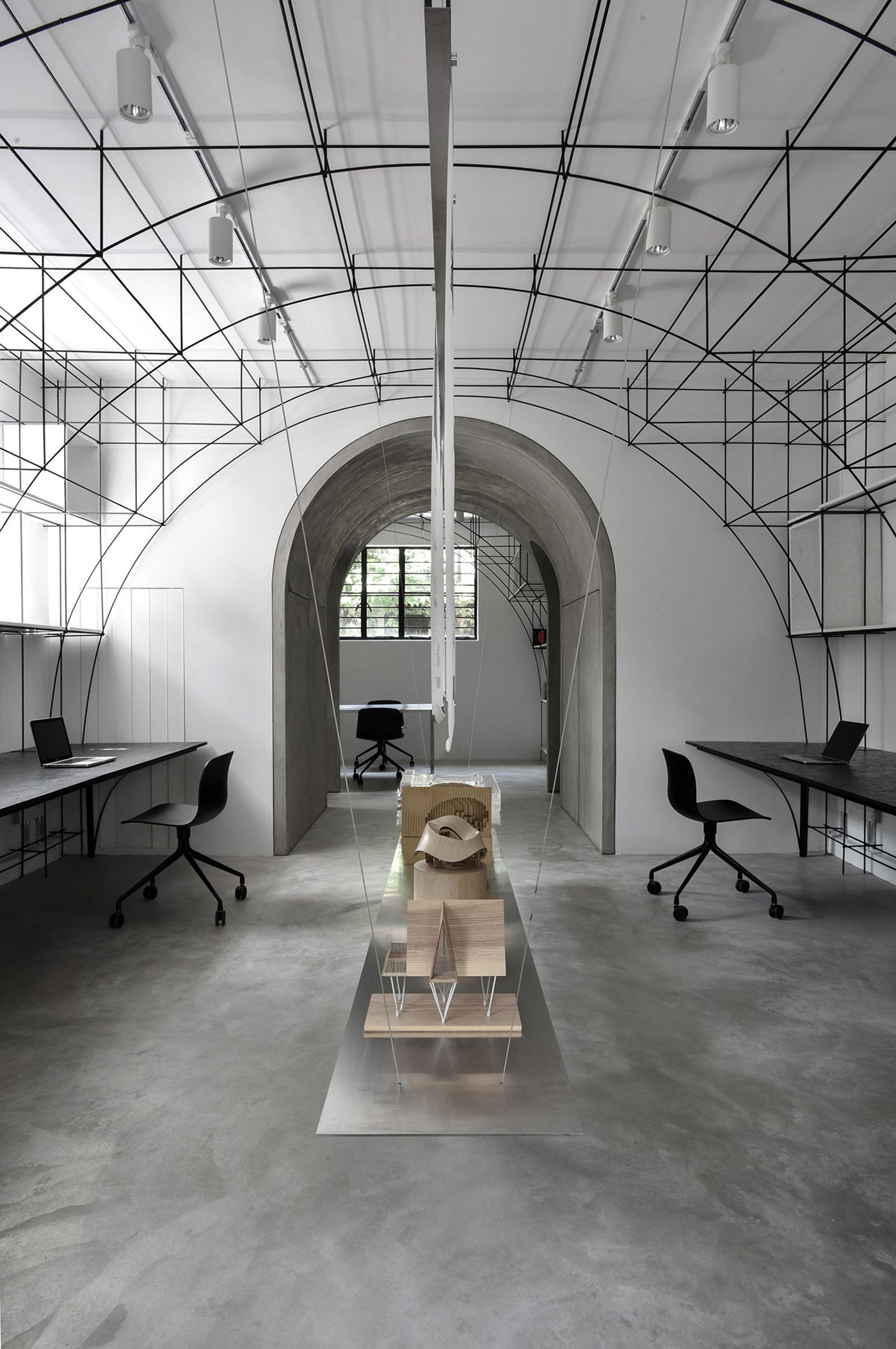
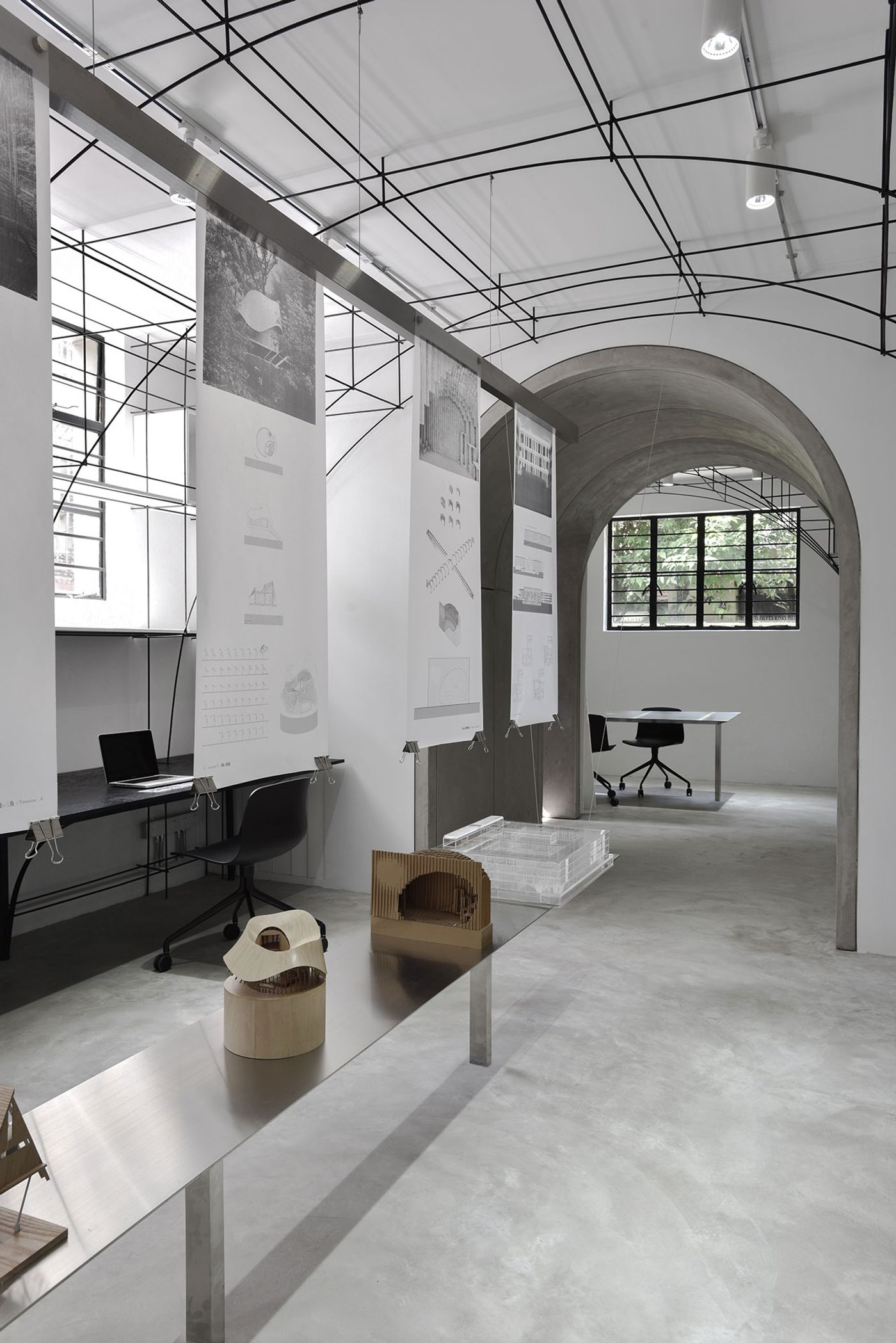
The main office area and the exhibition table. Photo by Song Xiaodan.
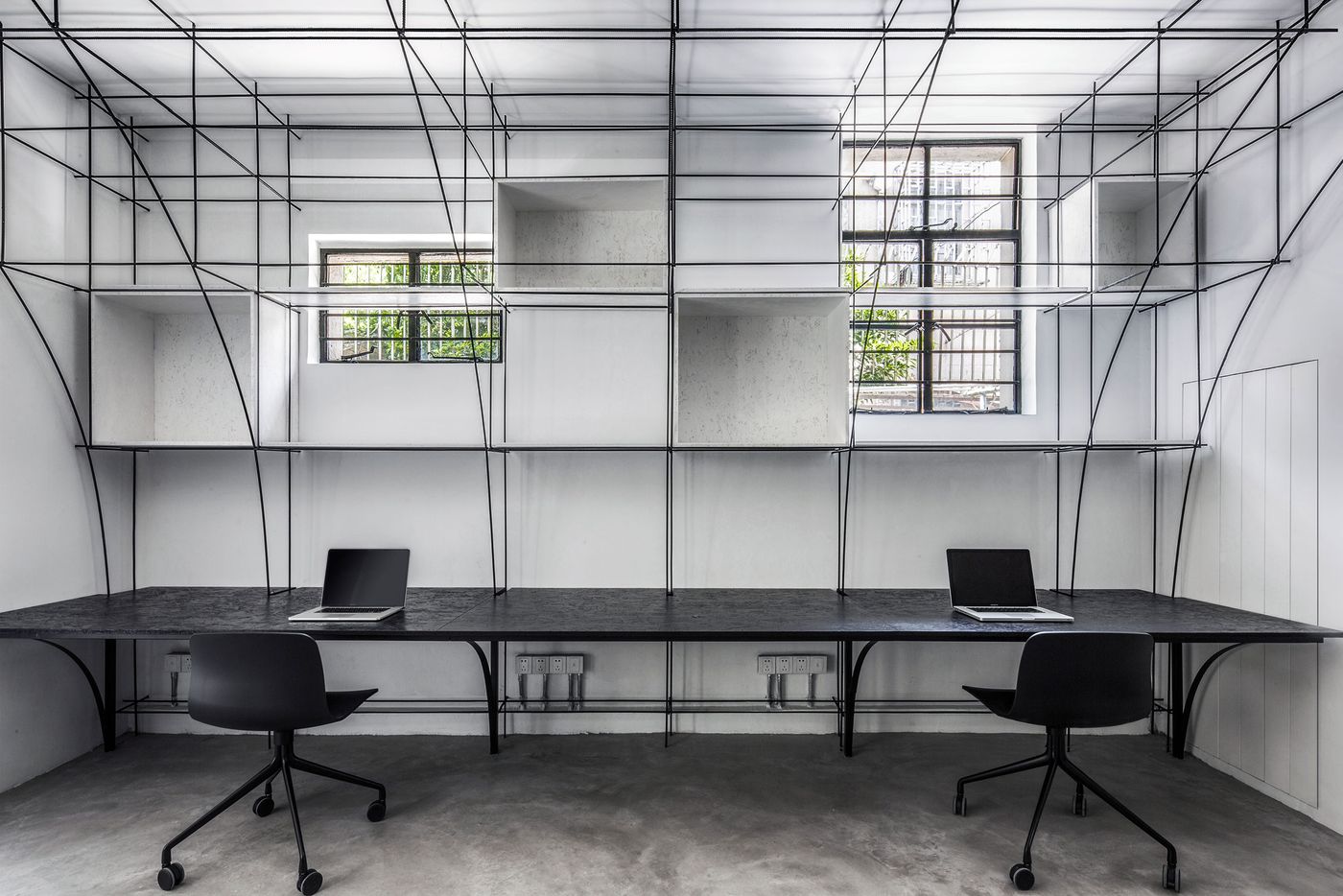
Main office area. Photo by Qiu Ripei.
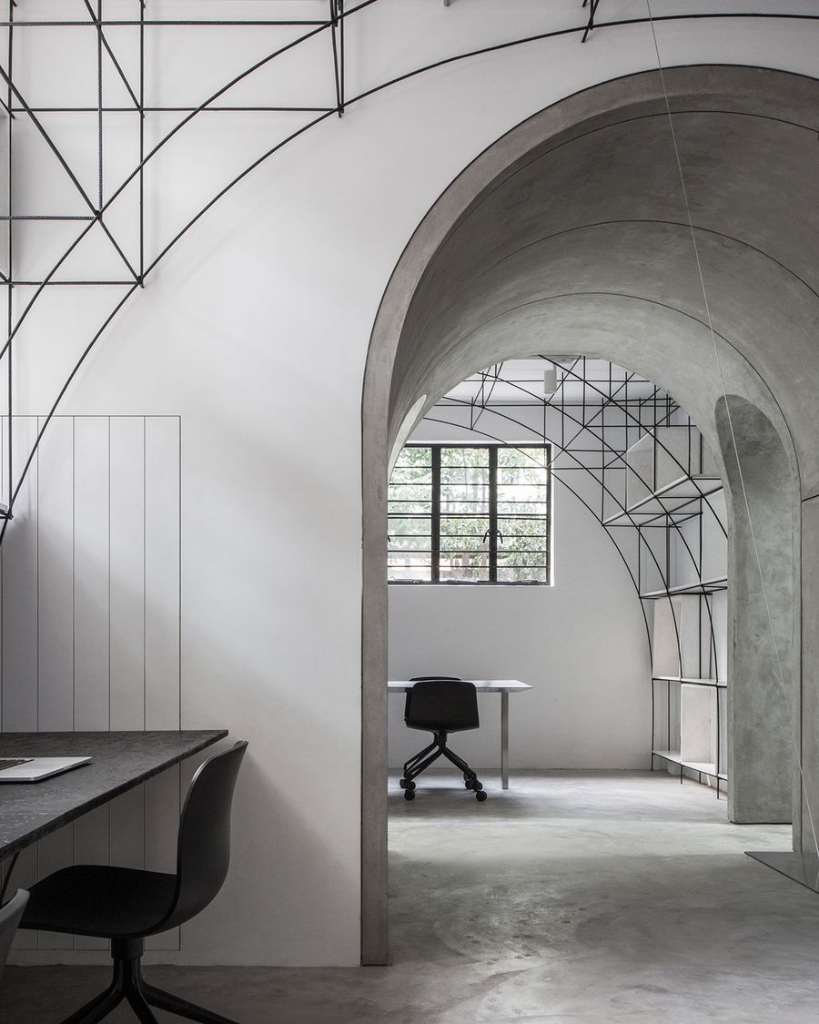
Photo by Qiu Ripei.
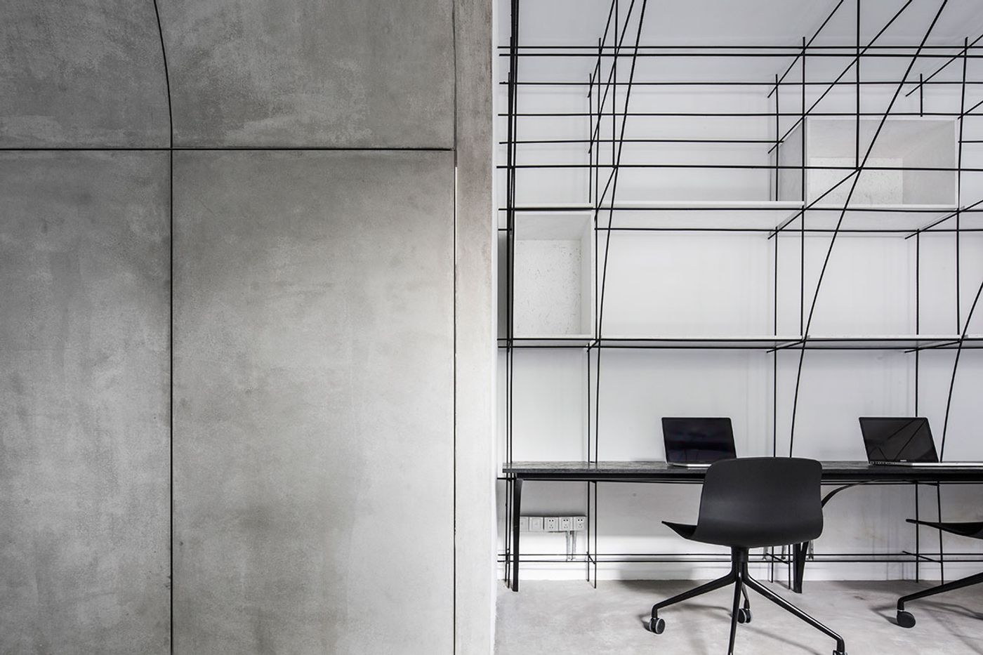
Critique archway. Photo by Qiu Ripei.
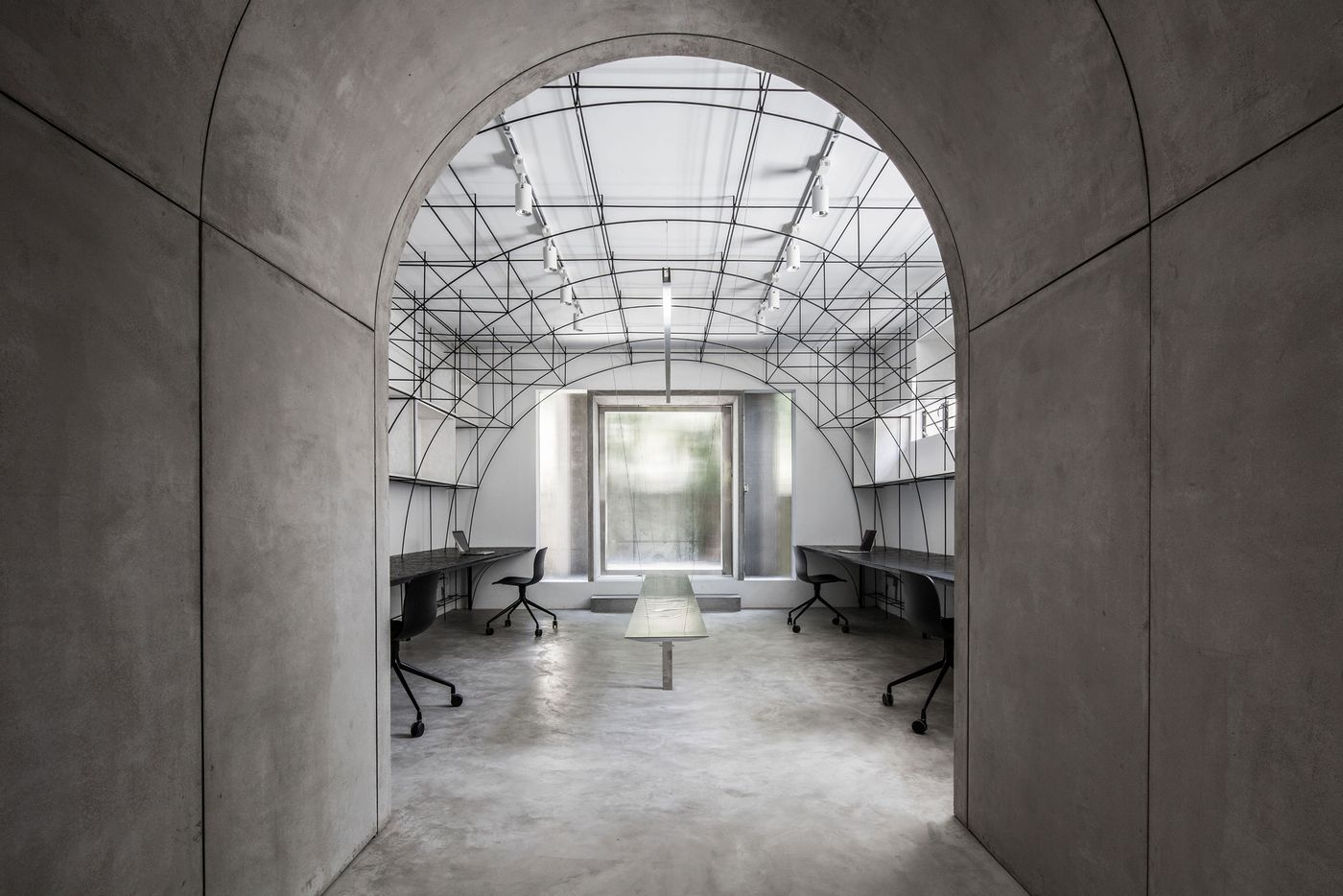
Axis through the the archway and the main office. Photo by Qiu Ripei.
Faced with a limited area of 100 square metres which had to accommodate 8 employees along with the desire not to alter the existing layout of the three rooms out of respect for the building’s history, the architects came up with a compact layout of hybrid functions: the main working space doubles as an exhibition space, the meeting room also houses a small library, and the third space functions as a model workshop, a material room and a printing room. Meanwhile, a connecting passageway is used as critique gallery.
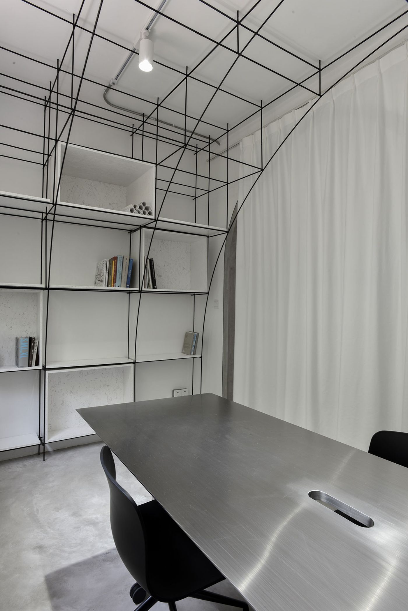
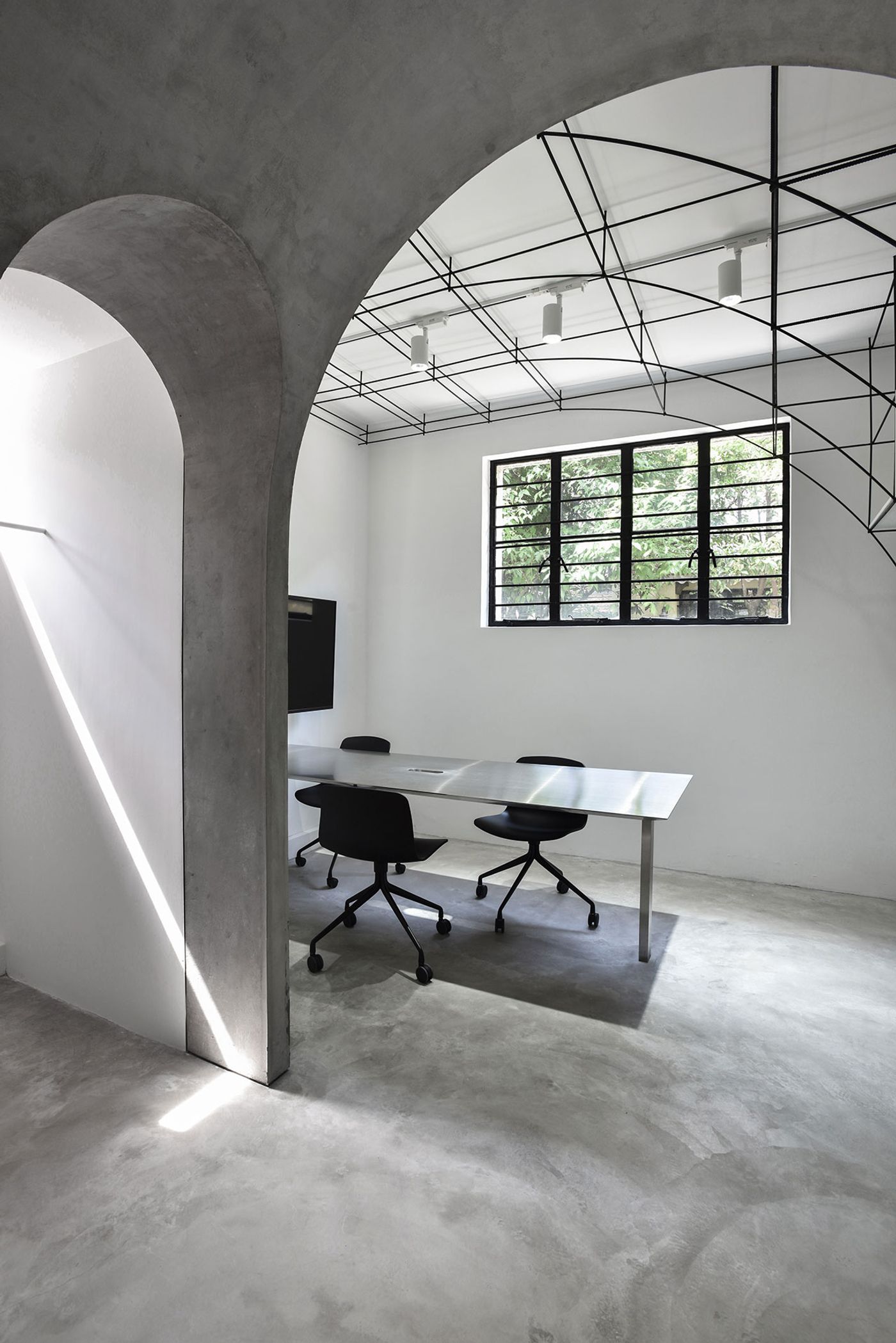
In order to maximize the available space and enhance a sense of spaciousness, the house was stripped of all residential functions and inbuilt furniture, while the use of the arch motif in larger and smaller scales, and in solid and diagrammatic configurations, elegantly creates a sense of sculptural cohesion. In the main office room an intangible vault made from steel bars seems to have been drawn in-situ. The vault accentuates the main longitudinal axis of the office, as well as serves as storage space, and leads, via a vaulted corridor, to the meeting room which also features an arched steel structure.
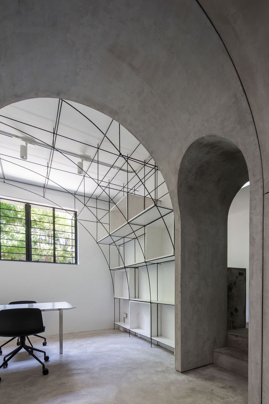
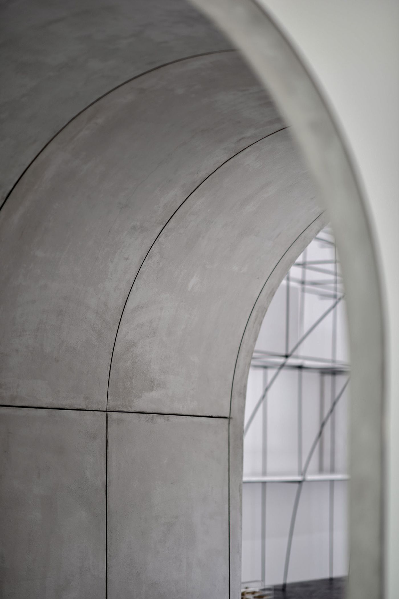
Arched door between the meeting room and the model room. Photo by Qiu Ripei.
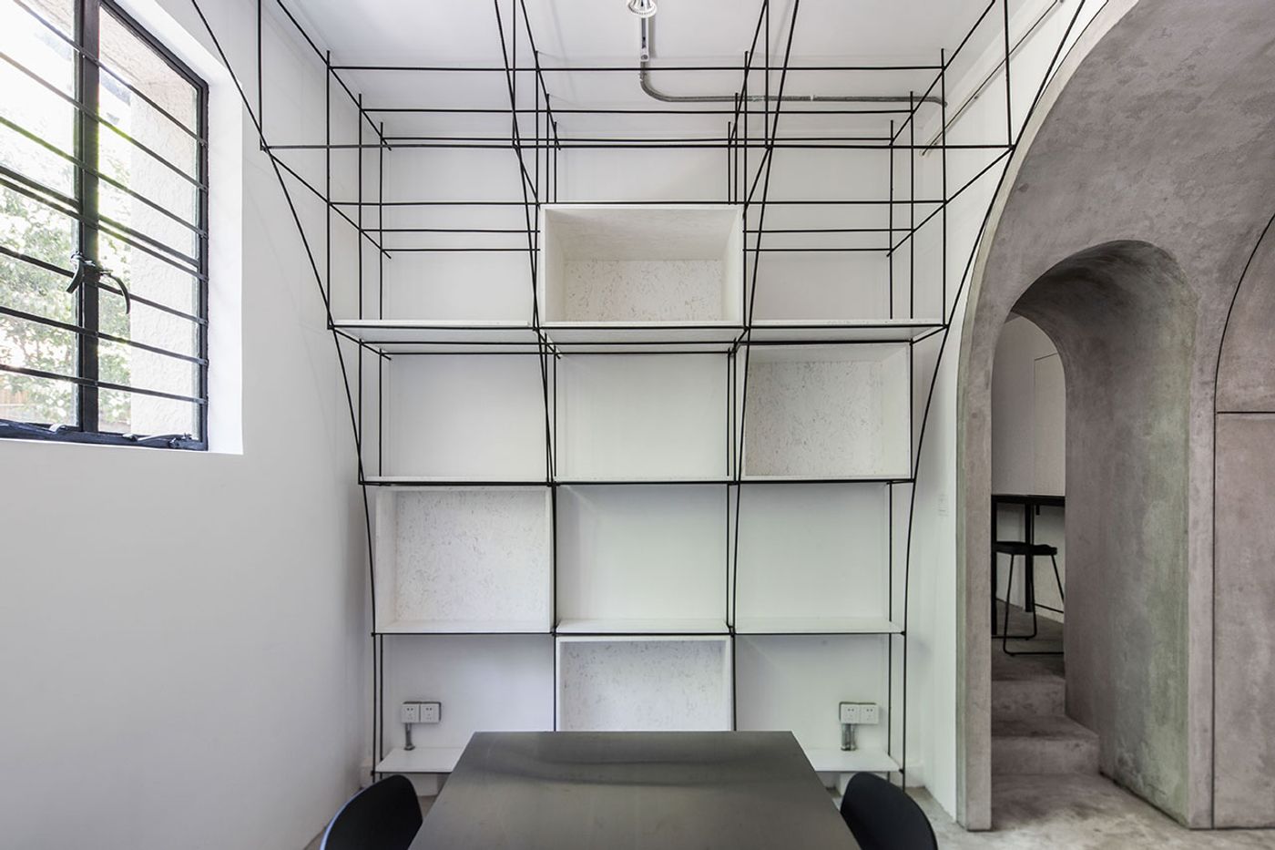
Arched door between the meeting room and the model room. Photo by Qiu Ripei.
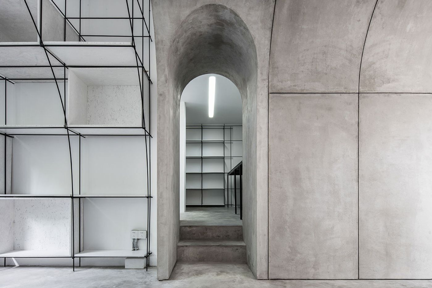
The arched door towards the model room. Photo by Qiu Ripei.
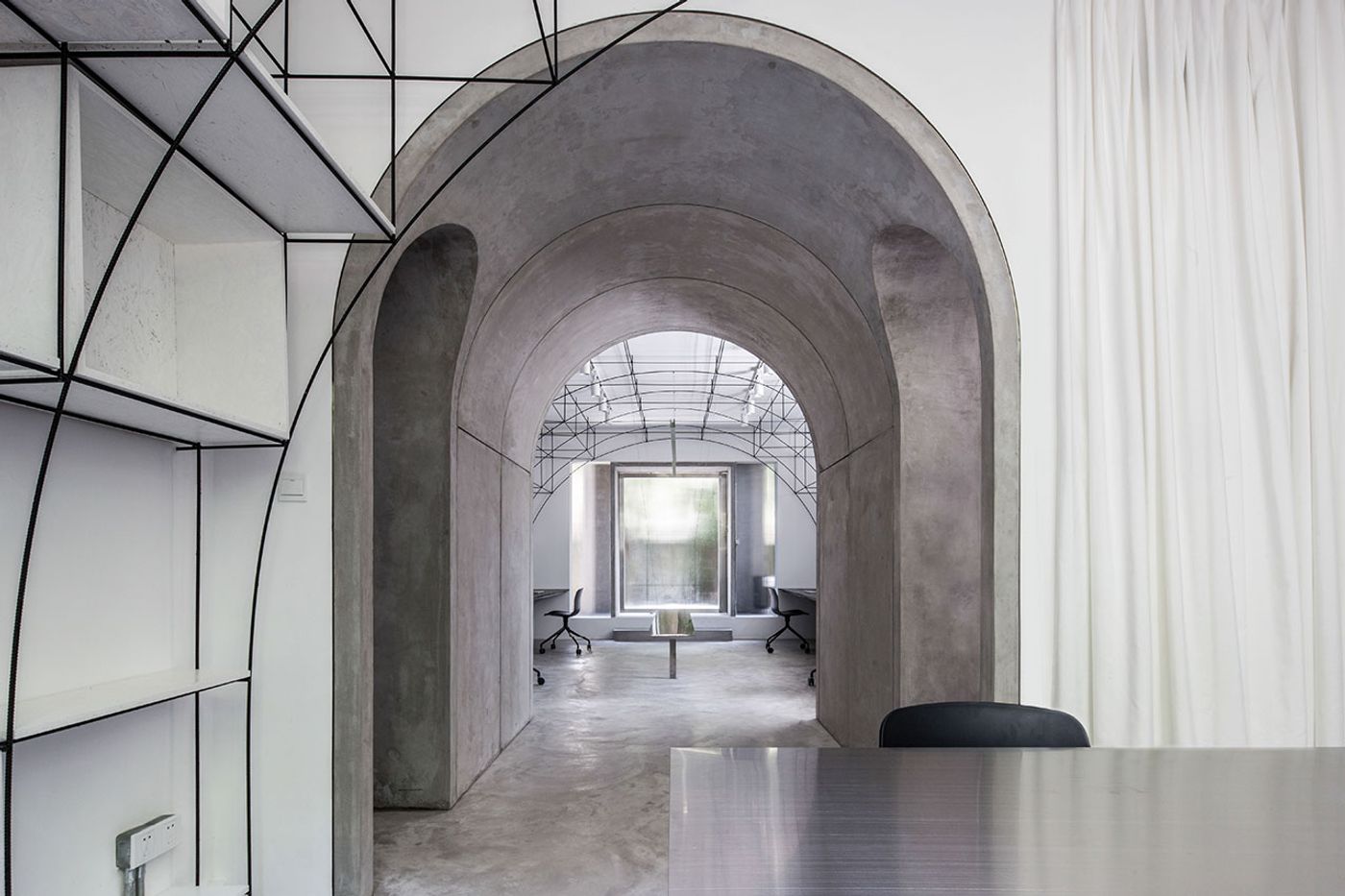
Axis through the meeting room, the archway and the main office. Photo by Qiu Ripei.
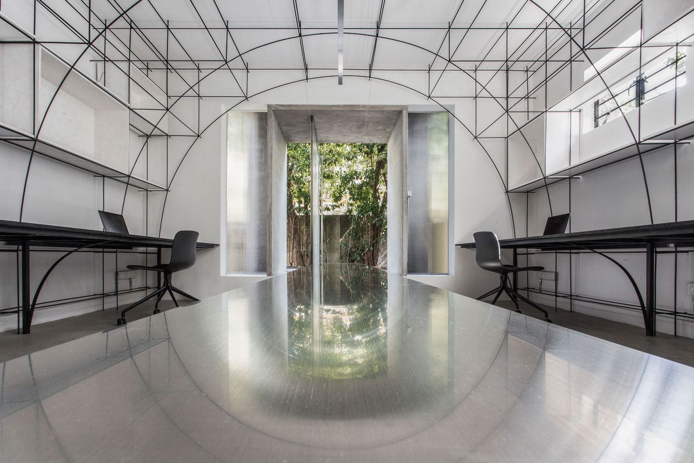
The axis of the exhibition table and the main office area. Photo by Qiu Ripei.
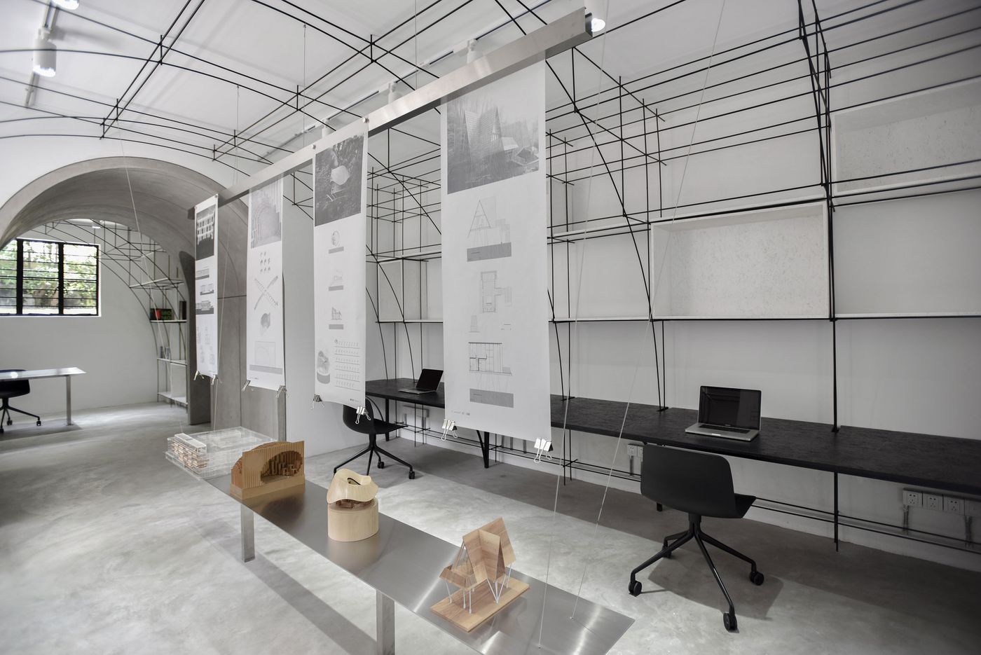
The main office area and the exhibition table. Photo by Song Xiaodan.
The use of steel rods, which traditionally function as reinforcement for concrete structures, poetically complements the cement floors and vaulted corridor-cum-gallery, creating a spatial dialogue between tangible and intangible volumes. Meanwhile, a floating tabletop of brushed stainless steel in the middle of the main workspace serves as a compact exhibition area in conjunction with a suspended stainless steel strip that drawings can hang from with the help of magnets.
At the front of the building, the introduction of a raised metal mesh platform preserves the courtyard’s original grassed paving and creates a communal space where residents from the first and second floor apartments are welcome to hang out. The use of frosted glass for the office’s elegant revolving front door, ensures privacy but also draws a fine line between interior and exterior, further reflecting how MONOARCHI’s design gracefully tiptoes between the contemporary and the historic.
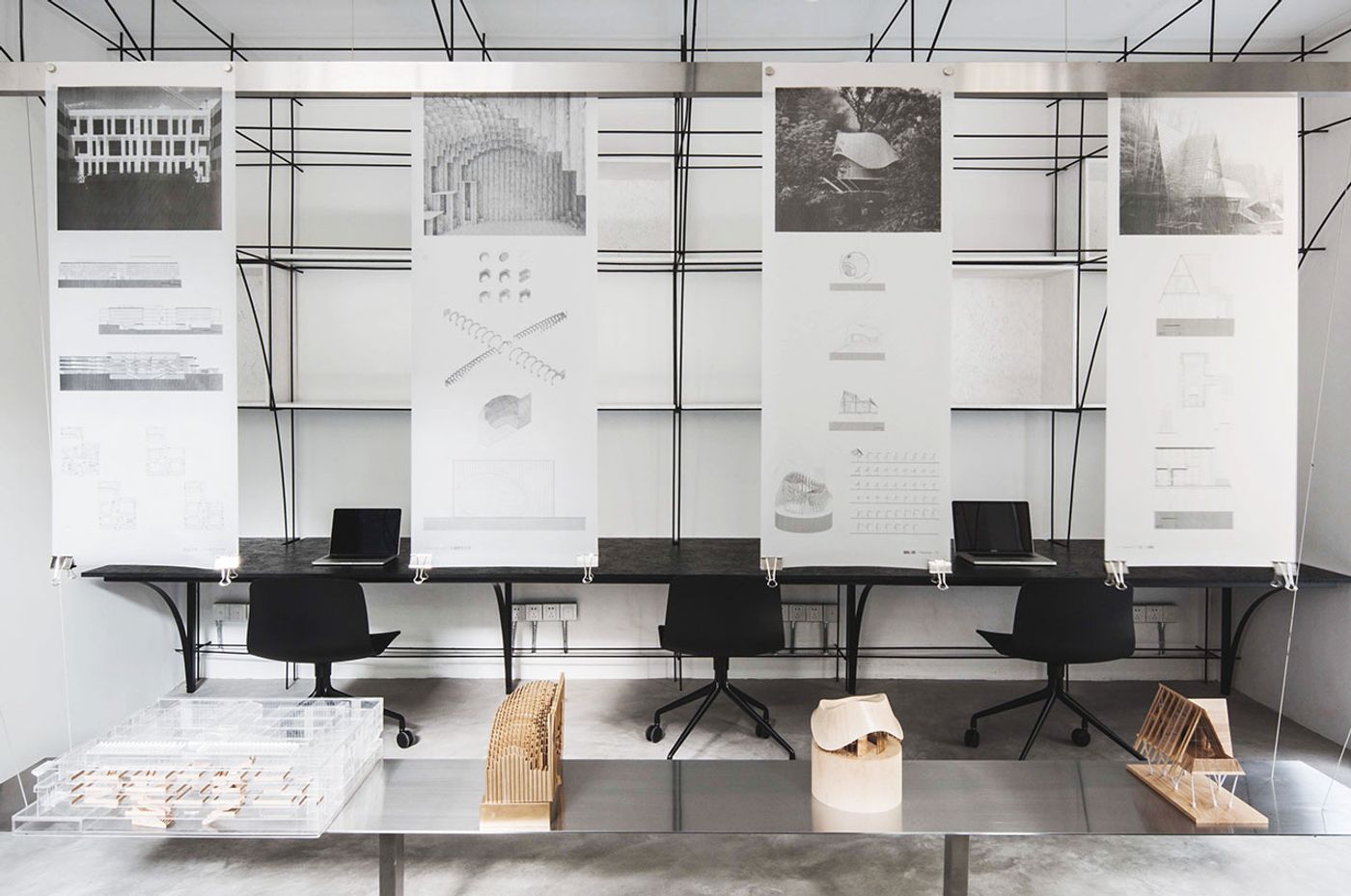
The main office area and the exhibition table. Photo by Song Xiaodan.
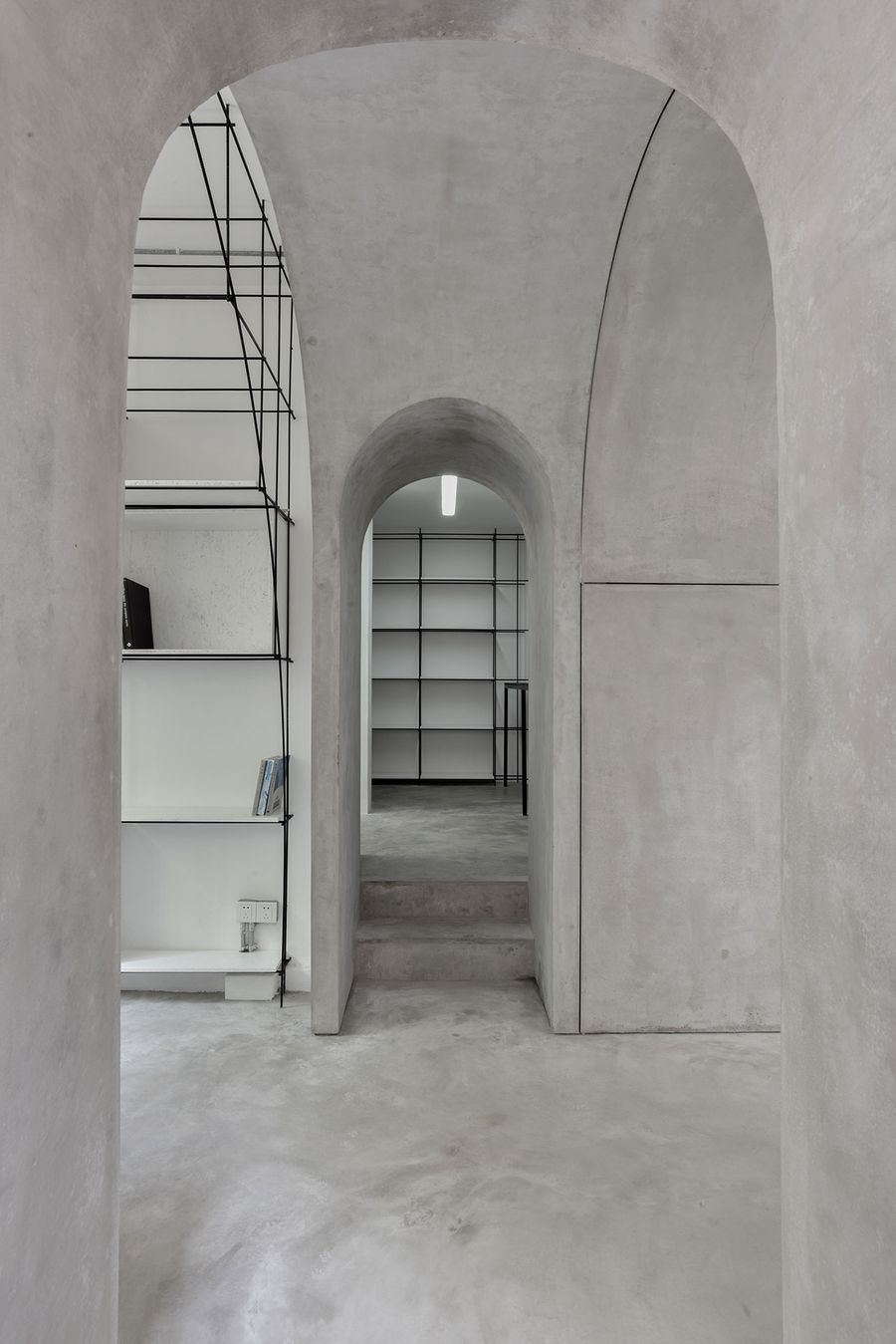
The axis of the arched door. Photo by Song Xiaodan.
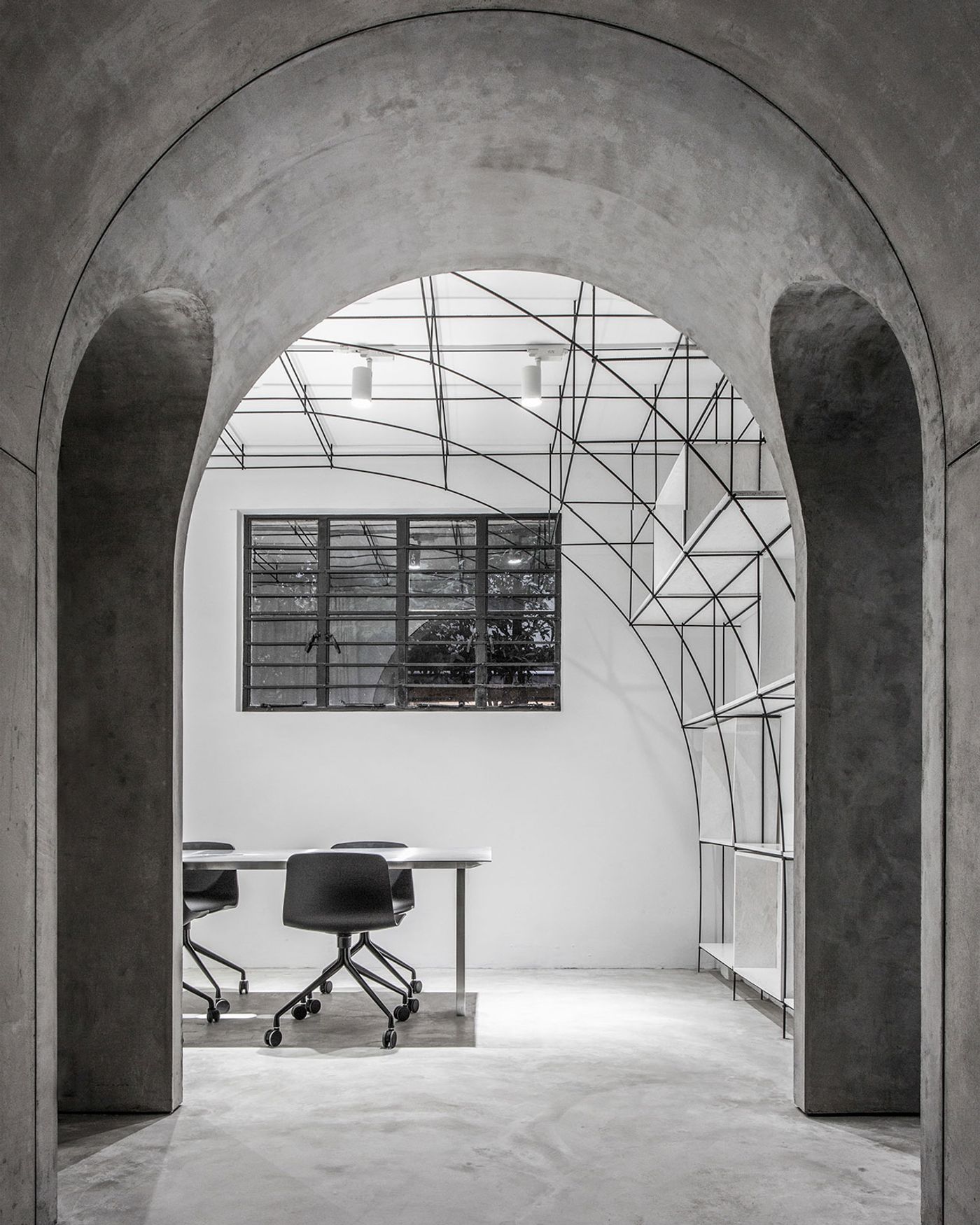
The office at night. Photo by Qiu Ripei.
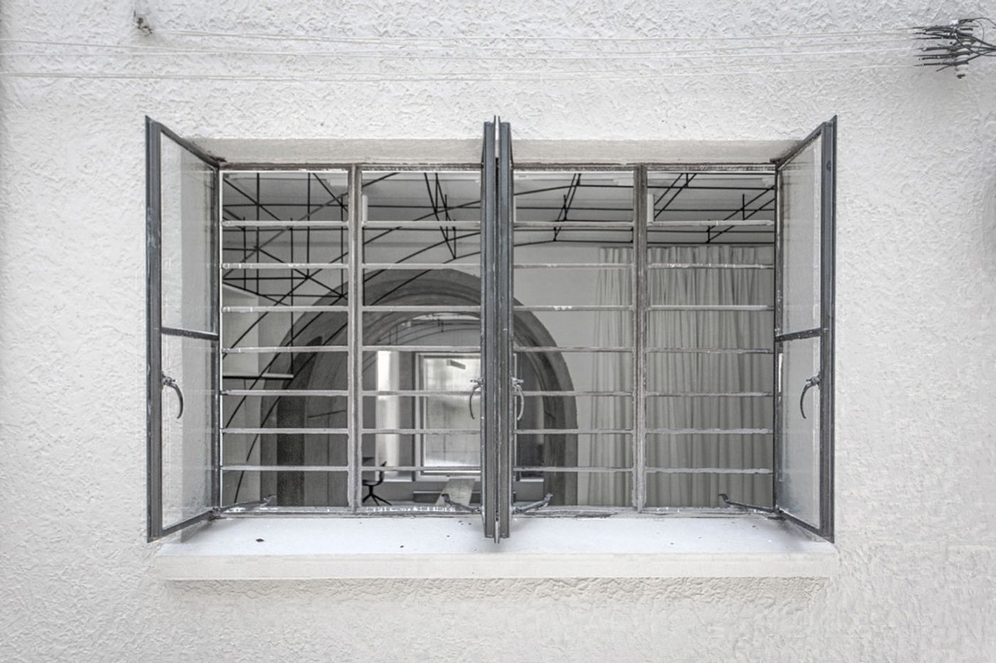
Rear window. Photo by Qiu Ripei.
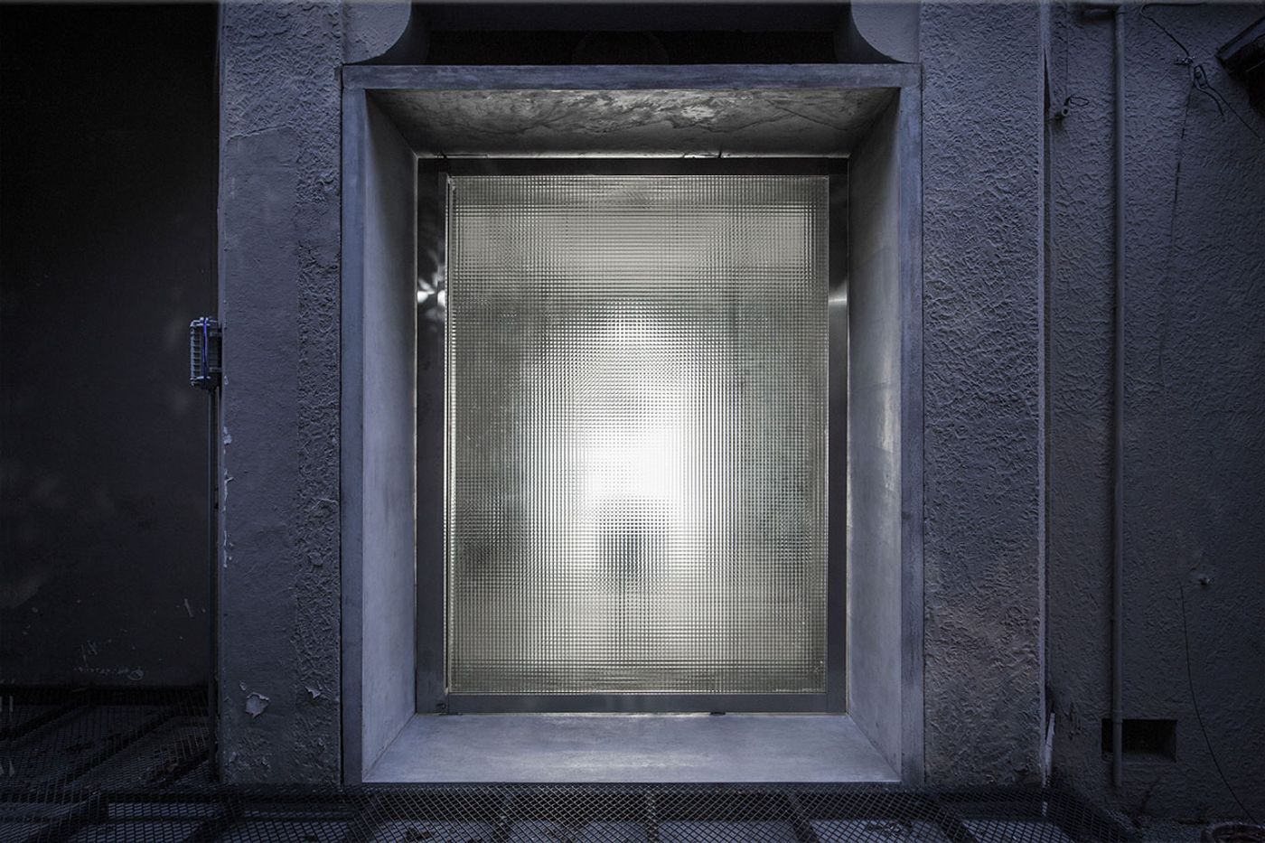
Revolving glass door at night. Photo by Qiu Ripei.
