The matter of Martin Thirteen graduating students at Beckmans College of Design have created the concept The Matter of Things. The starting point of the project has been to let ideas, research and process be in focus. Care has been the key word from which the students have created thirteen statements, expressed in an individual visual language that carries stories about solutions to everyday problems and ideas of how innovation in design can be portrayed.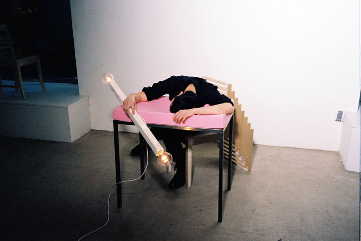
photo © Beckmans College of Design
Directed, produced, filmed and edited by Henrik Eriksen and Carl Rapp
Still photography: Erik Wåhlström
Music: johnny_ripper
Sound Design: Marius Stedjan
The students have, for example made furniture in which the intention is to influence social patterns and the way we see things, imitate motion and body, as well as increase the sentimental value and interaction with the furniture. Since research has been such a crucial part of the project, it has been of great importance to let the communication around the exhibition give the products a wider dimension. The Matter of Things stands for content, substance, question, significance – with which things are charged. The students at the Advertising and Graphic Design programme have developed the concept of communication, print, exhibition design, digital communication and a documentary.
The Matter of Things will be on view during from 8-12 february 2011 @ GREENHOUSE V04:30 during Stockholm Furniture Fair 2011.
Table by Nathalie Adenling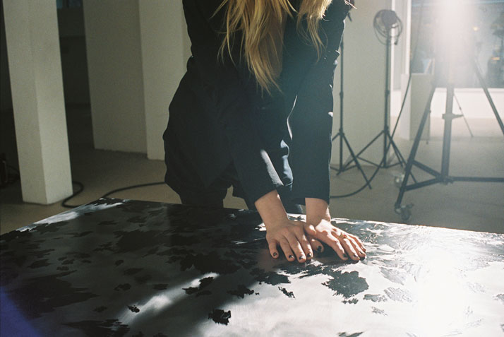
The matter of wear and tear
Measurements // l 2000 × w 900 × h 730 mm
photo © Beckmans College of Design
Table by Nathalie Adenling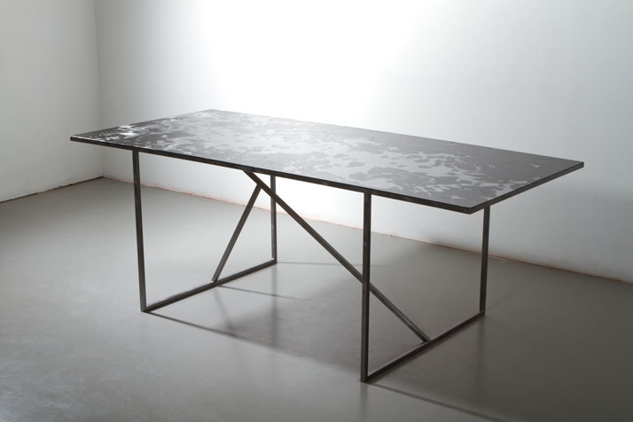
The matter of wear and tear
Measurements // l 2000 × w 900 × h 730 mm
photo © Beckmans College of Design
Nathalie Adenling
The matter of wear and tear
Looking at her nails Nathalie Adenling saw the faded, worn-down polish. The colour, once a complete monochrome, now a ragged edged island. Here somewhere, the idea of a table came into existence. Happily the wear and tear, the gradual fading and ageing of nails and polish and, well, all things, isn’t always something to regret. On the contrary, an aesthetic that allows for natural changes and the irregularities of living things is, in Nathalie Adenling’s view, a beautiful thing. The table, that by now fully exists, is the result of letting the gradual changes in the colour of her nails guide the appearance of the tabletop. She repeatedly polished and sanded the surface to mimic the changing look of the nails. Soon the layers formed a collage of new and old lacquer: a frozen image of change. The transient nature of the polish is contrasted with the permanence and stability of the steel construction supporting the tabletop like an easel holding a canvas.
Table by Anni Arnefjord (prototypes)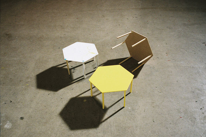
The matter of making room
Measurements // l 1200 × w 1400 × h 750 mm
photo © Beckmans College of Design
Table by Anni Arnefjord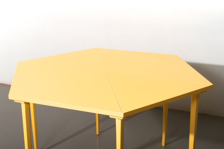
The matter of making room
Measurements // l 1200 × w 1400 × h 750 mm
photo © Beckmans College of Design
Anni Arnefjord
The matter of making room
If the bed is the most private or intimate of furniture, the table is the most social. It is the obvious place to gather, eat, talk and socialize. Its level surface is no doubt suitable for putting casseroles on, but there is another equally simple and important reason for the table’s success in social life; seated around it we see each other’s faces. Tables thus establish a kind of public sphere. This points to another aspect of the table: its significance as a political prop. From the mythical round table of King Arthur to the shiny white conference tables of today – tables seem to be a prerequisite for any meeting, decision-making and negotiation. An object of such social and political significance is, unsurprisingly, embedded with rules of etiquette, »table manners« as it were. All this makes Anni Arnefjord’s project both understandable and urgent. Inspired by human behavior she has attempted to create a table without hierarchies or places of honour, where everybody is given equal room. A democratic piece of furniture if you like. A furniture that has an impact on both interior design and people. The result is a hexagonal symmetrically shaped table. It is yellow in colour, which is said to be positive and to improve communication. When seated at the table the shape itself helps you to understand what part of the tabletop belongs to you and when you are interfering with your neighbour. A design that makes us aware of the fact that we share a limited space.
Stool by Hanna Billqvist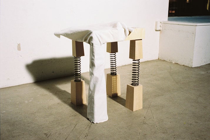
The matter of human impression
Measurements // l 320 × w 320 × h 470 mm
photo © Beckmans College of Design
Stool by Hanna Billqvist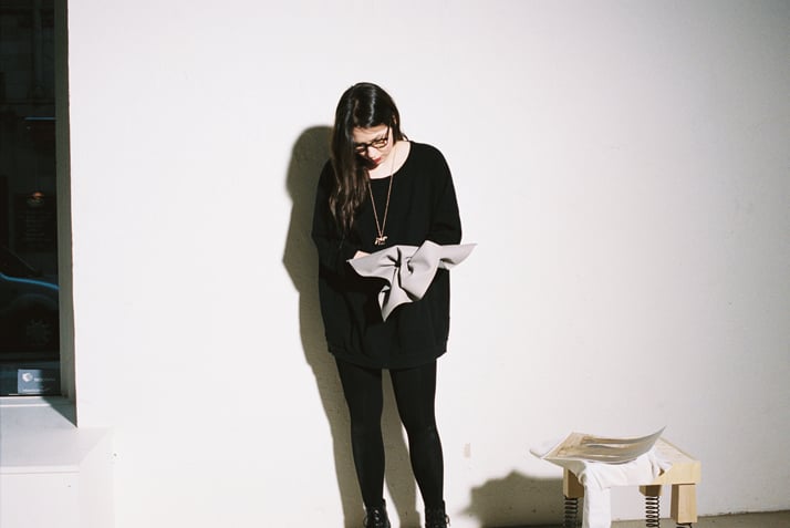
The matter of human impression
Measurements // l 320 × w 320 × h 470 mm
photo © Beckmans College of Design
Stool by Hanna Billqvist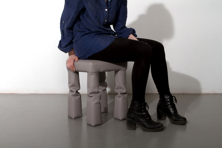
The matter of human impression
Measurements // l 320 × w 320 × h 470 mm
photo © Beckmans College of Design
Hanna Billqvist
The matter of human impression
Furniture is made by people for people. This truism implies that any designer of furniture must take the human body into account: its anatomy, measures and weight. A kitchen table too low will hurt our backs; a chair too fragile will break under our weight; and so on. The body as model, inspiration and constraint has thus always been there. Hanna Billqvist’s work makes no exception. It too deals with the interactions between body and material. Only she takes it a step further. »Why,« she asks, »do we adjust our flexible and soft bodies to rigid furniture and not the other way around?«Hanna Billqvist takes this alternative approach. She has created a stool that mimics the features of the human body. The legs of the stool come equipped with metal springs that contract when under pressure, so the stool bends to accommodate the weight of the person sitting on it. The knees (an innovative amendment to the otherwise sparse physiognomy of the stool) like the rest of the object is coated with leather, and looking at the stool in this bent position, you see the suede fold and wrinkle as on a human knee. Not until this moment, when we actually see the stool being used, do we realize the radical nature of its design. What will this gentle responsive creature do to us? For instance, who would have the heart to neglect the care or maintenance of such a corporeal piece of furniture? Imagine stroking oil or conditioner on the little leather knees to prevent it from drying-out and the wrinkles from deepening. Seldom an associate of radicalism. Small and forever armless. But sometimes, apparently, with wrinkled knees.
Chair by Gustav Carlberg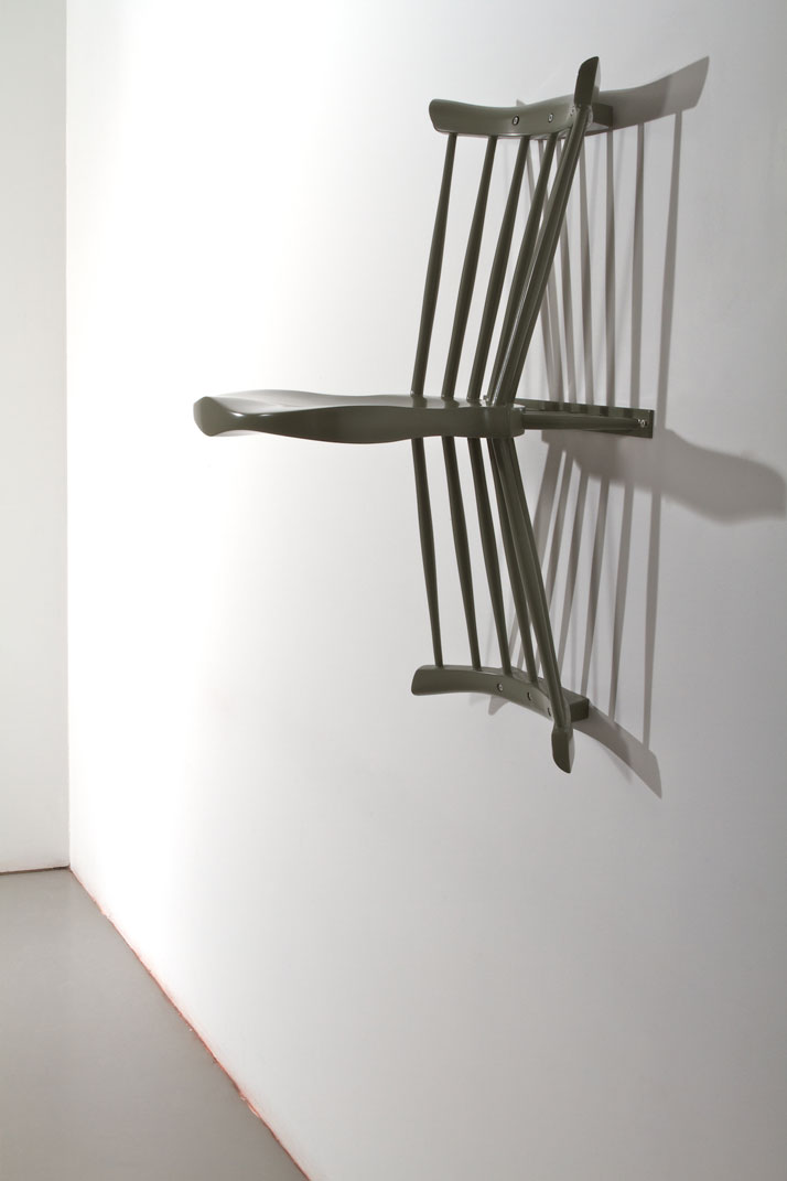
The matter of perspective
Measurements // l 540 × w 450 × h 800 mm
photo © Beckmans College of Design
Gustav Carlberg, photo © Beckmans College of Design
Gustav Carlberg
The matter of perspective
To see the world from a different perspective is often pleasurable and surprising. From a lookout position we get an overview of things we otherwise wouldn’t see at the often cramped eye-level. Up in a tree, lying on the grass or on top of the strong shoulders of a parent are all familiar devises in experiencing this shift of perspective. Thanks to Gustav Carlberg’s ingenious chair, we now have new opportunities in our own homes to explore the overlooked vertical dimensions of indoor life. But are we getting ahead of ourselves here? Is it even a chair in the first place? Surely, if you manage to climb up on the wall you could sit on it, but maybe it is actually a chair turned coat-hanger we are talking about? Glaring up with amused puzzlement at the wooden ribs hinged onto the wall, it is hard to tell. What is clear is that Gustav Carlberg, in an equally surreal yet matter-of-fact style, is engaged in a playful questioning of some of the basic assumptions about what a piece of furniture is supposed to be. On the more everyday problem of home decorating it opens up startling possibilities. Suddenly you find yourself looking up along the walls and in the ceiling of your home, finding hidden perspectives and new angles that create more layers of the reality you thought you knew.
Lamp by Anna Glansén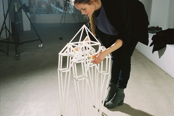
The matter of bonding
Measurements // l 370 × w 310 × h 920 mm
photo © Beckmans College of Design
Lamp by Anna Glansén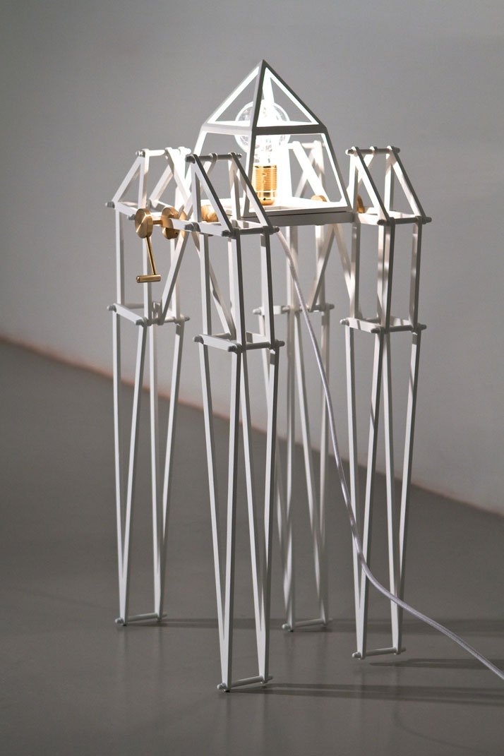
The matter of bonding
Measurements // l 370 × w 310 × h 920 mm
photo © Beckmans College of Design
Lamp by Anna Glansén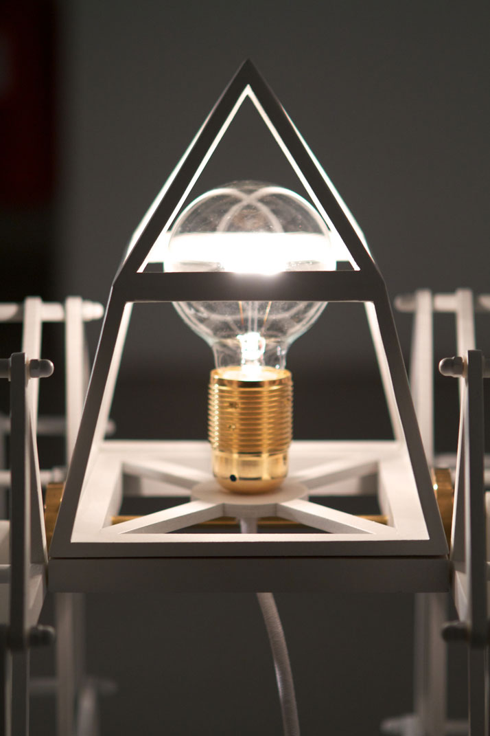
The matter of bonding
Measurements // l 370 × w 310 × h 920 mm
photo © Beckmans College of Design
Anna Glansén
The matter of bonding
Calling Anna Glansén’s walking floor lamp a robot is tempting, but it might give the wrong impression. Actually, the robotic or toy-like features of this invention are deliberately toned down, and the machinery, though cleverly built, is in fact low-tech. The subject, then, is not artificial intelligence and robot housemaids; this ambling little fellow is first and foremost a lamp, albeit with a special ability. No doubt, a walking piece of furniture is fun. You simply can’t resist watching it wandering about. It is an object to play with, and soon enough you will feel the impulse to talk to it (the way we talk to dogs, cats and the like). And this is exactly what Anna Glansén wants us to do. Not necessarily engage in conversations with lamps and sofas, but to connect, or bond with the objects we own. To bond with products may sound like cynical advertising talk that amounts to a »commodity fetishism « as it were. But as a matter of fact, the agenda is anti-consumerism, since bonding is a process that takes time and is an achievement; the objects that are really going to mean something to us will be few but precious. By limiting our collections of objects to the really meaningful, a more responsible consumption is achieved. For example: instead of buying yet another lamp, let your favourite and illuminative friend follow you around.
Lamp by Anna Glansén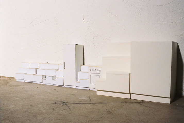
The matter of bonding
Measurements // l 370 × w 310 × h 920 mm
photo © Beckmans College of Design
Kitchen unit by Elin Hedlund
The matter of everyday moments
Measurements // l 600 × w 600 × h 900 mm
photo © Beckmans College of Design
Lamp by Anna Glansén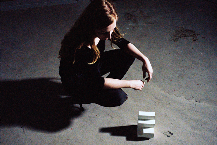
The matter of bonding
Measurements // l 370 × w 310 × h 920 mm
photo © Beckmans College of Design
Kitchen unit by Elin Hedlund
The matter of everyday moments
Measurements // l 600 × w 600 × h 900 mm
photo © Beckmans College of Design
Elin Hedlund
The matter of everyday moments
Sometimes the perfectly planned apartment has a bit of a claustrophobic feel. As if its architectural plan has already decided where to put your sofa and where to hang your flat-screen tv. Your »job« is to not mess up the clever plan of the experts on how to best live in your home. Still, it is difficult to deny the benefits of a smart person actually thinking long and hard on how to make our homes comfortable and functional. Elin Hedlund is smart. Studying the heart of the home – the kitchen – she has made a piece of furniture that is a workspace, a step stool, drawer unit or something to sit on. Thus, it enhances its importance as a meeting point for socialising and sharing moments. It is a multi-purpose problem solver and organizer. It is functional design without a pre-specified function. And thanks to the open character of her piece of furniture, she manages to avoid that patronising view of users and the normative rhetoric about the wants and needs of the average person. So instead of telling people what to do, Elin Hedlund wants to create opportunities for care. This could mean simply being at hand and taking part in whatever goes on in the kitchen. Or just reaching the top drawer.
Lamp by Anna Glansén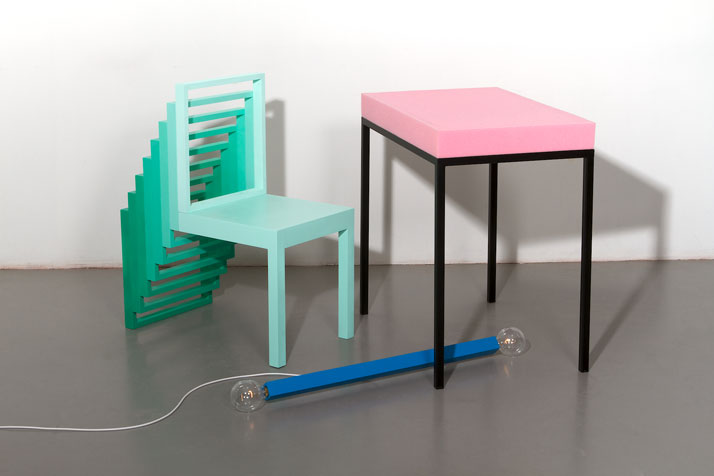
The matter of bonding
Measurements // l 370 × w 310 × h 920 mm
photo © Beckmans College of Design
Table, Chair and Lamp by Martin Ku
The matter of Martin
Measurements //
Table / Chair / Lamp
l 800 × w 500 × h 790 mm // l 700 × w 400 × h 867 mm // l 95 × w 95 × h 1040 mm
photo © Beckmans College of Design
Lamp by Anna Glansén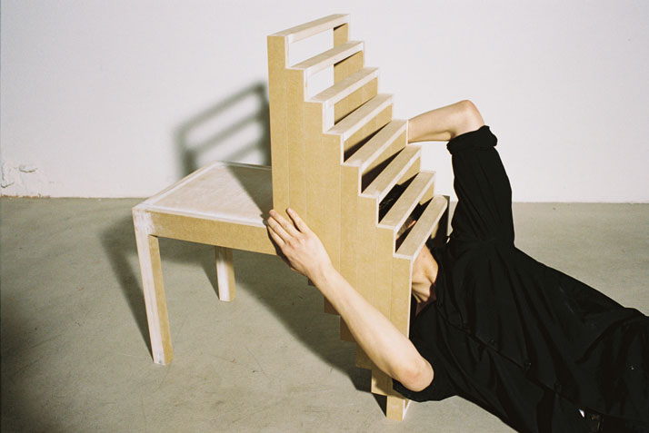
The matter of bonding
Measurements // l 370 × w 310 × h 920 mm
photo © Beckmans College of Design
Chair prototype by Martin Ku
photo © Beckmans College of Design
Lamp by Anna Glansén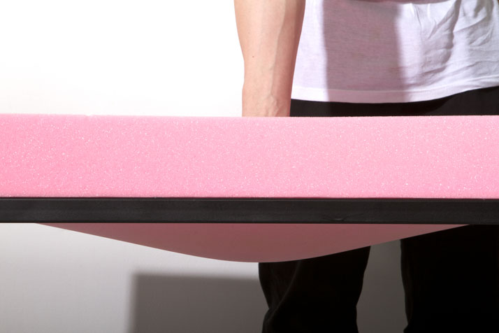
The matter of bonding
Measurements // l 370 × w 310 × h 920 mm
photo © Beckmans College of Design
Table detail by Martin Ku
The matter of Martin
Measurements // l 800 × w 500 × h 790 mm
photo © Beckmans College of Design
Martin Ku Chair and Stool by Hannes Lennartsson
The matter of Martin
When we learn that Martin Ku calls the chair, table and lamp he has built, a self-portrait, he sure has puzzled some of us. On the face of it, there is nothing in the design that gives you an impression of a portrait of any kind. But the title and the intriguing appearance of the individual pieces prompts us to step back and look again. The table has a soft mattress-like pink surface, and the chair has been given not one, but a series of backs, like descending stairs. The lamp fixture consists of one long rectangular shape, with a bulb coming out of each end. According to Martin Ku each piece represent a position on a time line. The chair represents the past. The repeated layers of back-rests that carry the construction stand for fragments of memories and stories. We can’t escape our past, it’s there, always, just behind us, and our stability depends on it. The table with its cushioned surface on which everything rests softly is an image of future. It is suppose to create a feeling of lightness, meditation, curiosity, and have an expression of self-confidence quizzed in between past and future is now, symbolised in the lamp fixture that rests on the thin glass bulbs, either on the floor or against the wall. What is now, is frail and vulnerable. The past must be accepted, although there is a measure of potential change in the future. In the context of a furniture fair, someone might want to ask: Is this really proper furniture design? Hasn’t Martin Ku, in his seemingly indifferent attitude towards functionality, left the confines of design and gone off into the world of art? What if?, someone else might want to answer.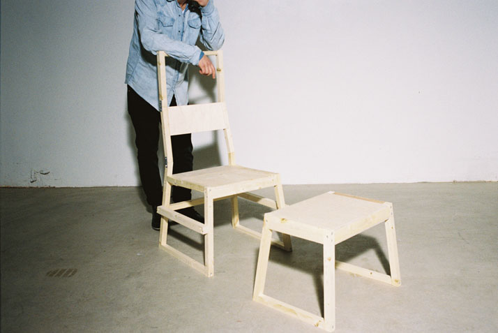
The matter of the unintended
Measurements //
Chair / Stool
l 540 × w 530 × h 1400 mm // l 460 × w 420 × h 400 mm
photo © Beckmans College of Design
Chair and Stool by Hannes Lennartsson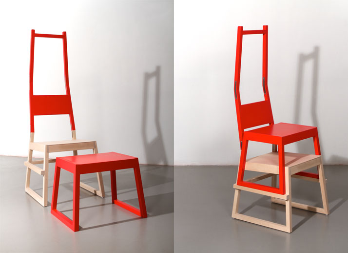
The matter of the unintended
Measurements //
Chair / Stool
l 540 × w 530 × h 1400 mm // l 460 × w 420 × h 400 mm
photo © Beckmans College of Design
Hannes Lennartsson
The matter of the unintended
Design is sometimes expressed in a way that assumes it will only be seen from one perspective. People often view an object as if it has a limited function, a single reason for being. But, every object has great potential for versatility and alternative uses. This is a fact that may worry the designer. What if the product will not be used in the intended way? Hours and hours of perfecting the function of an object. For no good. Hannes Lennartsson isn’t worried. He accepts and embraces the fact that sometimes it is the unintended uses of things, discovered over time, which makes them dear to us. Your favourite table may be your favourite purely because of the nice sound it makes when you drum your fingers on it. And a chair might do a fine part-time job as a coat hanger. With his playfully coloured chair and matching stool, Hannes Lennartsson wants to expose the versatility of objects and encourage alternative ways of using them, thereby making us aware of the unintended. Deliberately, he has chosen a type of furniture that has a purpose everybody can agree on; it’s something to sit on. The question is, what will people do with the chair that Hannes Lennartsson didn’t think of?
Display cast by Sofie Samuelson (prototypes)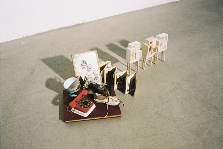
The matter of treasuring memories
Measurements // l 380 × w 750 × h 1800 mm
photo © Beckmans College of Design
Display cast by Sofie Samuelson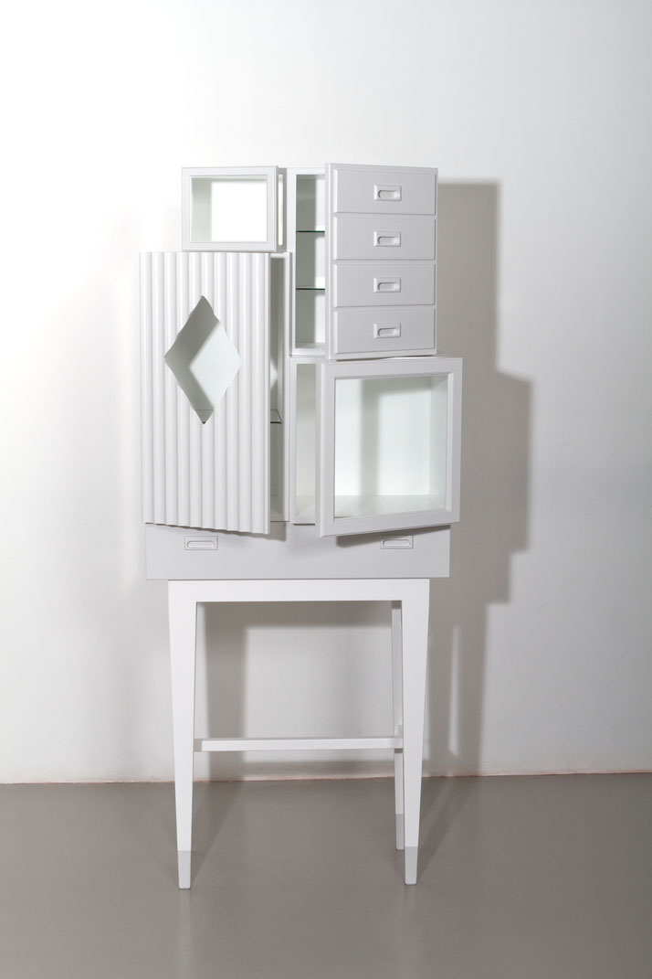
The matter of treasuring memories
Measurements // l 380 × w 750 × h 1800 mm
photo © Beckmans College of Design
Sofie Samuelson
The matter of treasuring memories
It is natural to think of memory as a kind of storage room. When everything pans out as it should, there is order in the drawers of our mind. But sometimes, we seem to misplace things, the memories appear to have been put away in the wrong place and we can’t find them – we forget. A natural, but no less irritating fact about human psychology. Now, there are cases of forgetting that are more than irritating. For a person with Alzheimer’s disease the loss of memory can occur on such a level and at such magnitude that it is better described as a catastrophe and a tragedy. Sofie Samuelson has witnessed the erosion of both memory and personality of a close relative suffering from Alzheimer’s. Parts of the »memory-cabinet« Sofie Samuelson has built for her grandmother is inspired by elements of furniture from her grandparent’s home. The cabinet is intended to aid and comfort, but it is also a metaphor for (the wounded) memory: »I’d like to be able to stand with her in front of the cabinet and listen to her speaking with confidence about the things in it and about her life. It felt natural to make a piece of furniture that can keep, show and frame memories. I wanted to do it in a style that recalls the ›funny‹ situations that can occur, like when the glasses end up in the drawer. Memory isn’t always logical and some memories are harder to get than others, something that guided me when creating the cabinet.«
Cabinet by Julia Schollin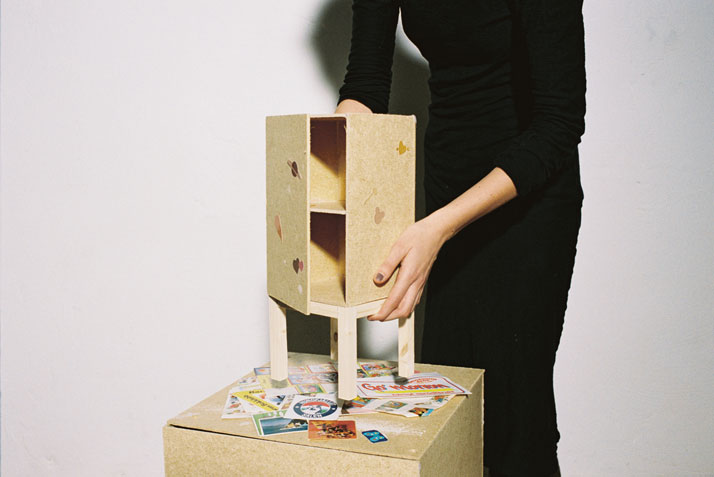
The matter of adding affection
Measurements // l 350 × w 350 × h 900 mm
photo © Beckmans College of Design
Julia Schollin
The matter of adding affection
As a child Julia Schollin used to put stickers on her furniture, decorations chosen sometimes at random, but often with great consideration. From the adult point of view, with ideals of clean and spotless surfaces, most people think this childish habit makes the furniture ugly and decreases its value. But as Julia Schollin’s work reminds us of, there are more than one kind of value and there are different ways of showing that you care about your belongings. The subjectively chosen stickers, the motley additions of marks and signs, words and images to the wooden surfaces is a playful and imaginative way of making the furniture your own and it is a way of expressing your individuality. This is obviously not a careless way of treating the things around you. From it emotional and sentimental value emerges. It creates affection. A generic piece of furniture (in a Swedish context, with great probability manufactured by Ikea), impossible to distinguish from millions of other identical furniture, the colourful stickers is the only thing that differentiates. But now, it has become a site of meanings, stories and eventually, memories. The decorations are signs and traces of a person’s life. Julia Schollin has created a cabinet that re-evaluates a discredited childhood practice. The main parts of the cabinet is made of cheap chip-board, which usually is the material inside standard, children’s and low cost furniture. This makes the decorations the most valuable and important part of the furniture, delicate wood and bone veneer inlays imitating the plastic stickers from the childhood of the 80s. No less than a grown up tribute to the aesthetics of sticker ornamentation.
Handrail by Kaja Solgaard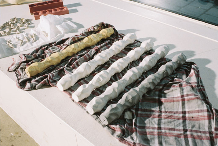
The matter of physical contact
Measurements //
Module 1/2/3
l 500 mm ∅ 39–60 mm / l 220 mm ∅ 39–60 mm / l 100 mm ∅ 100 mm
photo © Beckmans College of Design
Handrail by Kaja Solgaard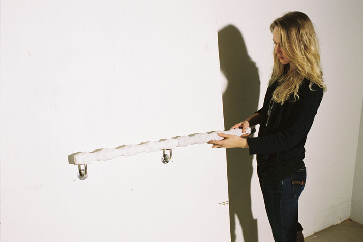
The matter of physical contact
Measurements //
Module 1/2/3
l 500 mm ∅ 39–60 mm / l 220 mm ∅ 39–60 mm / l 100 mm ∅ 100 mm
photo © Beckmans College of Design
Kaja Solgaard Chair and Lamp by Eddi Törnberg (inspiration)
The matter of physical contact
The starting point for Kaja Solgaard’s casted handrail has been an interest in the significance of physical touch. Touching is not only a way of expressing care for someone or something. It is also through touching, holding and feeling, we learn about things: their texture, weight, material and temperature. A handrail is a piece of furniture that will be touched. Hands will grab and slide, bodies will lean. Kaja Solgaard’s choice of design is therefore congenial. The piece is a module that can be put together in various ways. The shapes have been created with respect to the hand – what it can do and what it wants to grip, i.e. shapes that feel good to touch. The outcome is an appealing visual appearance with the benefit of sculptural and tactile moulding. To support, both in the case of a handrail supporting somebody leaning on it and a friend supporting a friend, at the bottom of it, is a matter of physicality.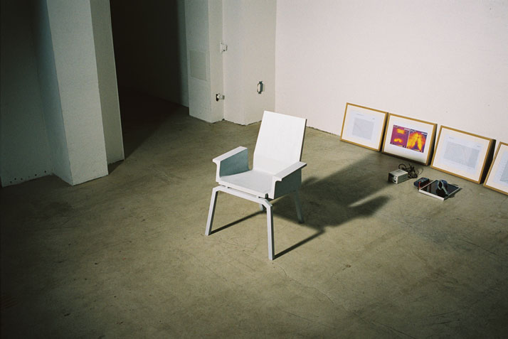
The matter of symbiosis
Measurements // l 500 × w 700 × h 1000 mm
photo © Beckmans College of Design
Chair and Lamp by Eddi Törnberg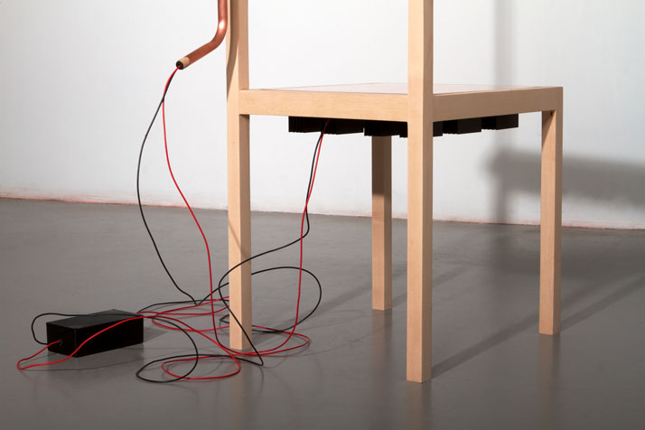
The matter of symbiosis
Measurements // l 500 × w 700 × h 1000 mm
photo © Beckmans College of Design
Chair and Lamp by Eddi Törnberg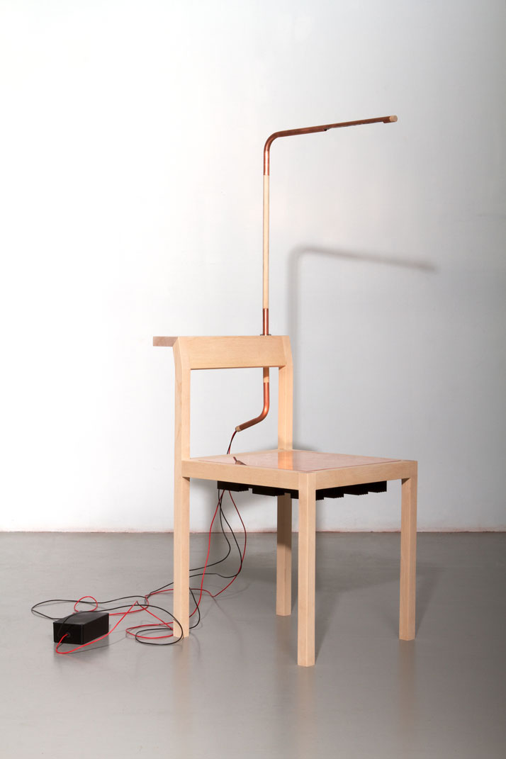
The matter of symbiosis
Measurements // l 500 × w 700 × h 1000 mm
photo © Beckmans College of Design
Eddi Törnberg
The matter of symbiosis
The exploitation of energy resources has played a decisive part in the development of human kind, often at the cost of our natural environment. Inspired by self-sufficient societies, Eddi Törnberg has investigated new, unexpected and eco-friendly ways to produce energy. Instead of finding out the most effective way to derive electricity from for example hydropower, Eddi Törnberg focuses on situations in our daily life where energy is generated as a by-product of some activity. The guiding principle seems to be, »Don’t waste anything useful«. He has generated electricity from the heat created when sitting in a chair and used it to power a lamp. Also, he has worked on the possibilities of deriving energy from the radio waves of cell phones. The result is a mix of different techniques – as harmless to humans as to the environment – enough to power all the lighting in a household.
Chair and Lamp by Eddi Törnberg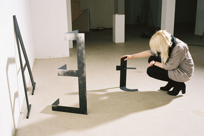
The matter of symbiosis
Measurements // l 500 × w 700 × h 1000 mm
photo © Beckmans College of Design
Sideboard, Lamp and Coat hanger by Iina Vuorivirta
The matter of small things
Measurements //
Sideboard / Lamp / Coat hanger
l 1060 × w 540 × h 1010 mm / l 270 × w 170 × h 440 mm / l 400 × w 390 × h 830 mm
photo © Beckmans College of Design
Chair and Lamp by Eddi Törnberg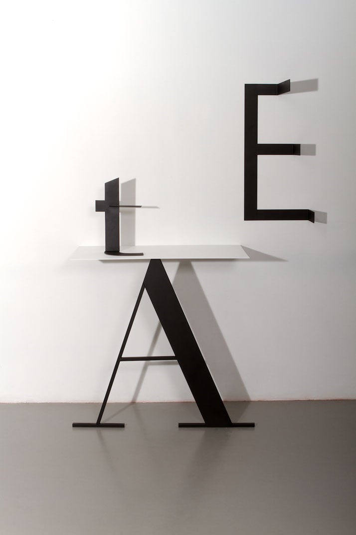
The matter of symbiosis
Measurements // l 500 × w 700 × h 1000 mm
photo © Beckmans College of Design
Sideboard, Lamp and Coat hanger by Iina Vuorivirta
The matter of small things
Measurements //
Sideboard / Lamp / Coat hanger
l 1060 × w 540 × h 1010 mm / l 270 × w 170 × h 440 mm / l 400 × w 390 × h 830 mm
photo © Beckmans College of Design
Iina Vuorivirta
The matter of small things
Not until pointed out to you, were you aware of the individual characters of this sentence. The attention was – hopefully – directed at the content; the meaning the sentence conveys. Not so for the illiterate. For someone who doesn’t know how to read, the marks on the paper or screen are mere shapes, sculptures, scrabble, scrawl. Iina Vuorivirta isn’t illiterate. But somewhat paradoxically, thanks to a seeing device, she has adopted the vision of the illiterate. The device Iina Vuorivirta sometimes carries with her is a magnifying glass. Not because she has problems with her eyes, but because she is in love with details. In a magnifying glass the dullest of objects reveal aspects hidden to the ordinary, blunt vision of humans. Lying on the floor with the magnifying glass in hand, the smooth floorboards show up as a vast rugged landscape. Now Iina Vuorivirta is showing us what she saw. Her work consists of up-scaled three-dimensional metallic single letters. The formerly invisible letters stand on their own, with no need to justify their existence by reference to words. After a while the objects may even cease to be letters all together and assume abstract sculptural form. Iina Vuorivirta, on the hunt for overlooked beauty, invites us to look closer to see »the beautiful curve in ›T‹, or the sturdy legs of an ›A‹, or the confident lines in ›E‹«. A way to restore the dignity of things forgotten or taken for granted.


