Project Name
El Moro ChurreríaPosted in
Restaurants, Design, Interior DesignLocation
Design Studio
Cadena+Asociados Concept DesignVisit Website
elmoro.mx| Detailed Information | |||||
|---|---|---|---|---|---|
| Project Name | El Moro Churrería | Posted in | Restaurants, Design, Interior Design | Location |
Río Lerma 167 Cuauhtémoc
Mexico City MEX 06500 |
| [email protected] | Design Studio | Cadena+Asociados Concept Design | Visit Website | elmoro.mx | |
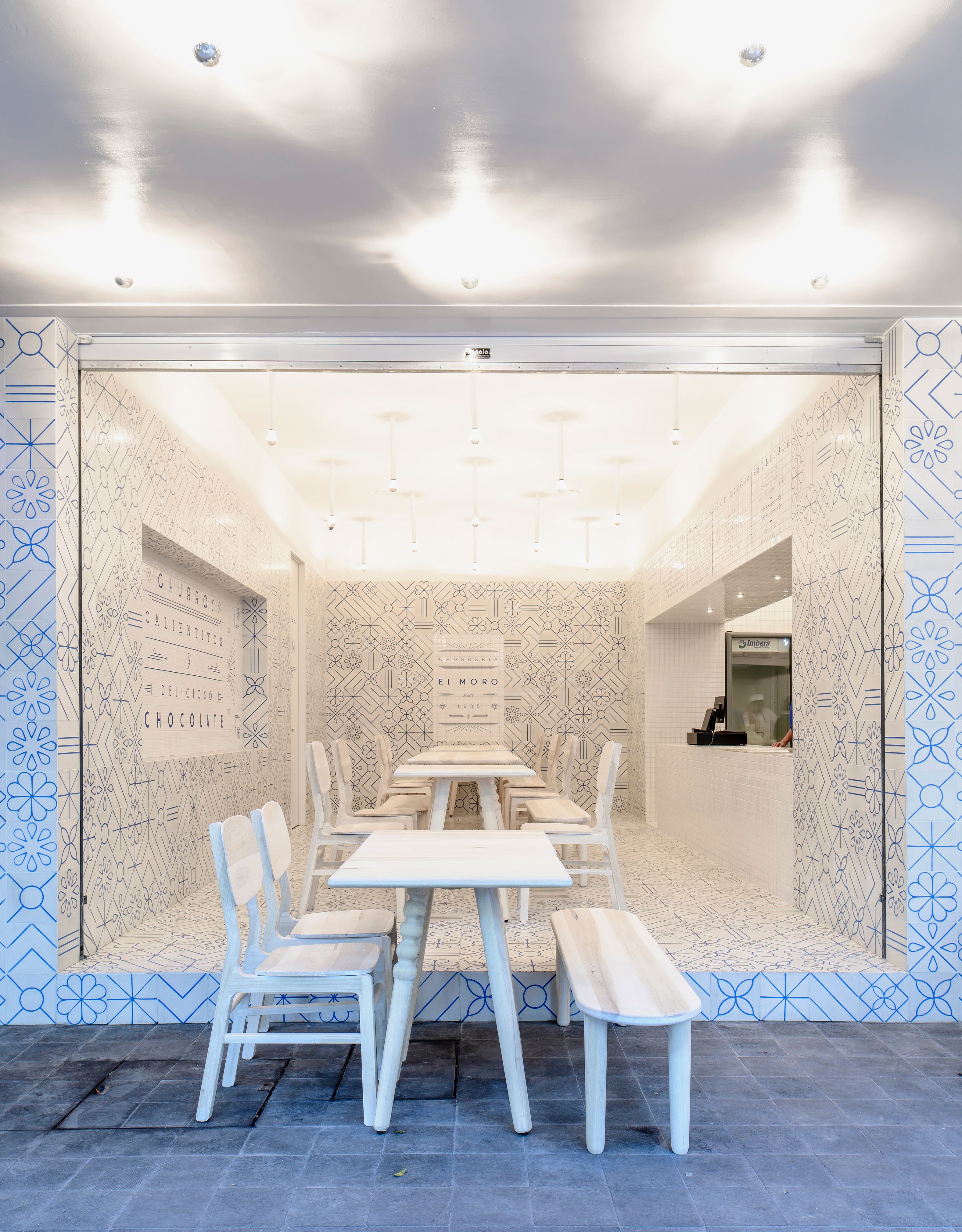
Photo by Moritz Bernoully.
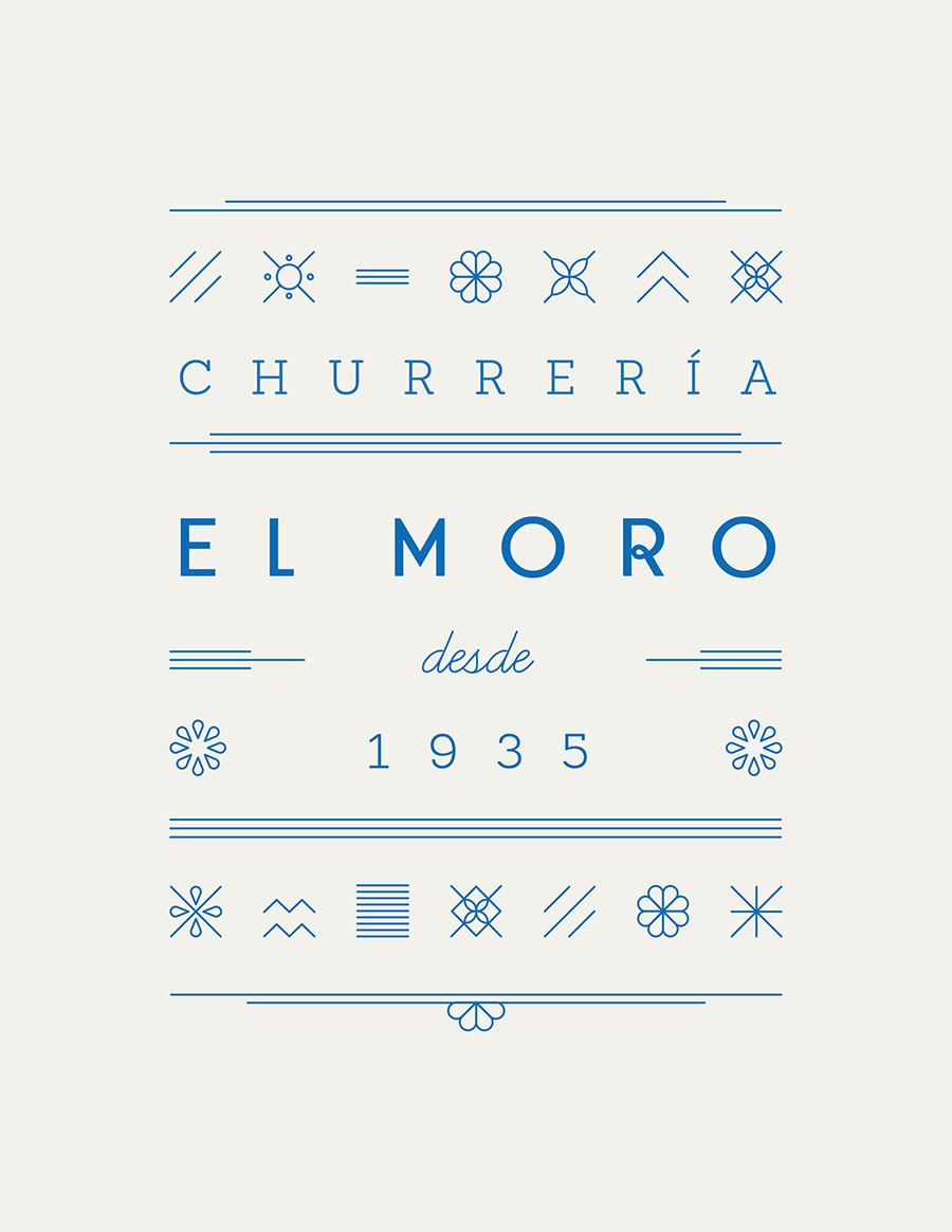
According to the designers, “this new take on the graphic design translates into endless compositional possibilities that apply significantly to the brand’s identity, communication, architecture and interior design”. Indeed, the new graphic language of El Moro has found many creative applications in the new store, where walls, floors and the building’s façade are fully tiled in the custom-designed, art deco-inspired tessellated blue pattern, creating a simple, minimal monochromatic spatial envelope. Inside, the open-style service counter is clad in plain white mosaic tiles and allows a glimpse through to the kitchen, while overhead, the menu graphics are applied directly onto the tiles, thus seamlessly integrating the overall branding graphics and design concept.
Aiming for a minimal unobtrusive lighting strategy, simple silver reflective globes project from the ceiling to compliment rather than compete with the graphic pattern of the tiles. The dining space is also filled with charmingly detailed tables and chairs in lime-washed and blonde timbers, while white bentwood rocking chairs spill out on to the street creating an al fresco sidewalk lounge. Adding to El Moro’s street presence, the up-lit individual letters of the external signage in a classic Art Deco font provide a sleek touch to an already vibrant and crisp design that reinterprets the Mexican aesthetic with a modern twist.
{YatzerTip} The studio of Cadena + Asociados is behind another visually stunning project: the bone-decorated Hueso restaurant in Guadalajara, Mexico!
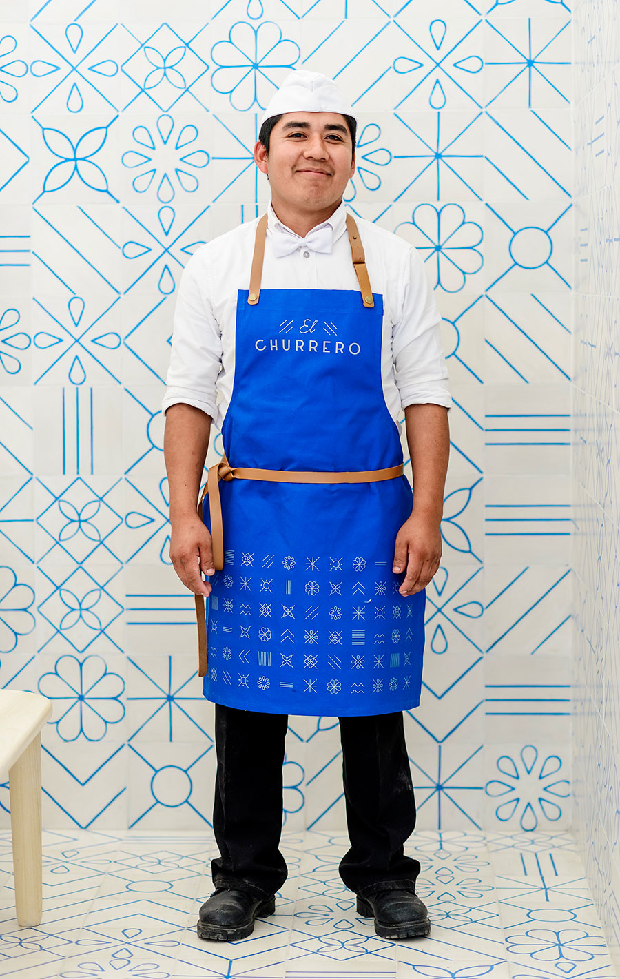
Photo by Moritz Bernoully.
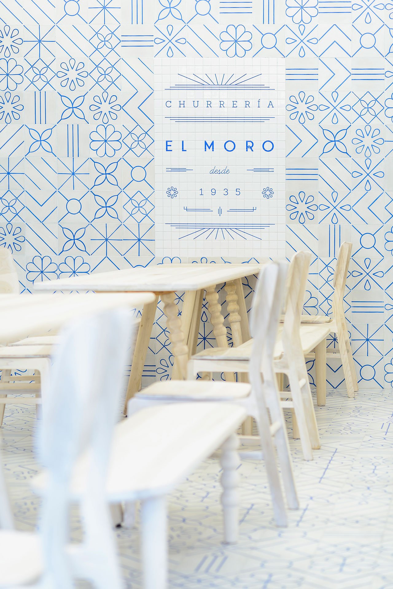
Photo by Moritz Bernoully.
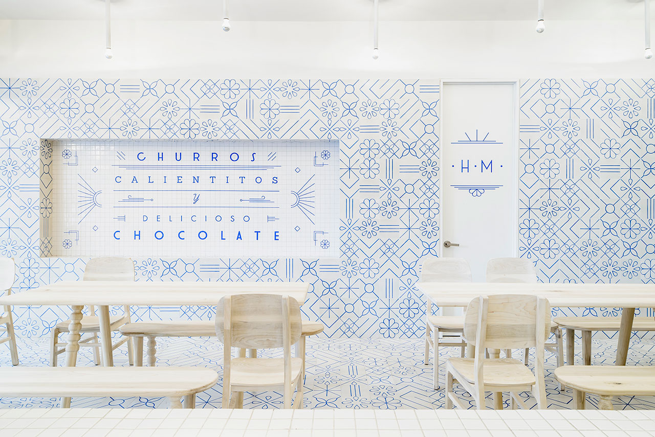
Photo by Moritz Bernoully.
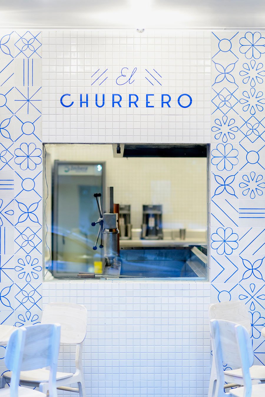
Photo by Moritz Bernoully.
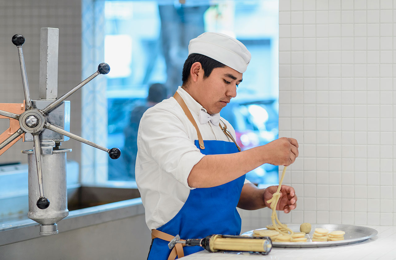
Photo by Moritz Bernoully.
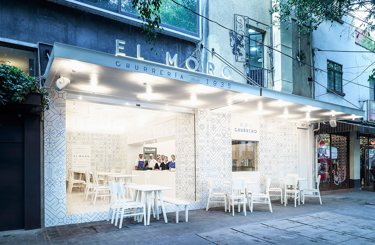
Photo by Moritz Bernoully.
© Cadena + Asociados Concept Design.


