photo © Morten Schjolin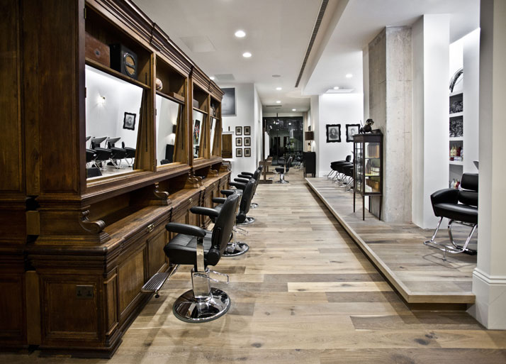
You don’t have really to try too hard when you are inspired. You don’t have to deliver what others except you to, but neither do you have to try too hard to surprise them. You can remain true to yourself, but at the same time, be bold and innovative. You can avoid being literal to your references, but at the same time, be genuine and functional. When there is talent and inspiration, there is a high probability that good things will eventually happen. But when a little touch of fortunate teaming is added to the recipe, then there is magic! Such is the case of the new salon that Ryan Mc Elhinney created for celebrity hairdresser Adee Phelan. This is a true blissful example of the right ingredients at the right time and a genuine mix of design elegance and intuitive risk taking. photo © Morten Schjolin
Many of you may already be familiar with Ryan Mc Elhinney’s work as we are already totally in love with his toy sculptures and particular personal style. Ryan is a truly gifted designer who doesn’t take himself too seriously and is always willing to try new things in order to achieve the design aesthetics he has in his mind. When celebrity hairdresser Adee Phelan asked him to design his new salon, located in one of the most talked about mixed use developments in Birmingham called The Cube, Ryan didn’t think twice. Of course, there was the previous collaboration on Adee’s salon in Covent Garden with its enormous success which set the standards for the new project. Adee gave Ryan absolute artistic liberty and in turn Ryan gave Adee a mind blowing salon, full of pop references, amazing art, vintage furniture and a strangely familiar charm; much more than a cliché salon, the 4000 square foot space leaves you totally breathless. You cannot but simply admire the way everything has been put together, transmitting a sort of unexpected coziness, full of small details and not so small surprises! 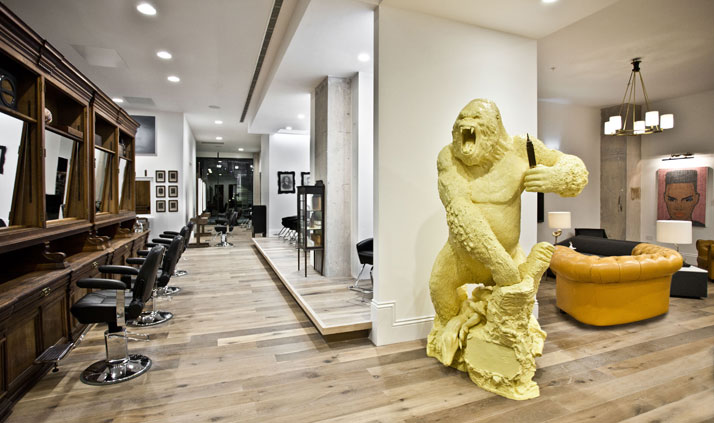
Upon viewing the space, many questions come to mind. What is this giant King Kong doing in the middle of a hairdresser salon? Why do I have the impression that I am sitting inside an artist’s painting? Why is the reception so inspiring that it could fit perfectly in any hip bar or museum in the city? Are those mirrors really placed inside vintage bookcases? Don’t panic. Although Yatzer has an array of questions, we also have the answers! Discover Ryan Mc Elhinney’s universe through his exclusive interview with yatzer and find out about all the small stories that make a place really unique.
Ryan we are totally amazed by the particular universe you created for Adee Phelan’s salon. What was the main idea behind it? Was it clear from the outset or was it more based on intuition?
This is the second salon that I have created for Adee. I know him both as a friend and a client so that creates a lot of trust between us both. I think the main idea behind anything I design is that I look at what I need to achieve in a practical sense, then I have as much fun as I can creating, alternating and sometimes placing amusing twists in between all that is expected. All I knew was that I needed to create a space where people felt comfortable and could get the best treatments possible. Adee said that as long as there are 24 hair stations I can do whatever I like. Most salons you see are very generic and safe in their design which is perfectly acceptable. I think a visit to the salon is about more than just a hair cut. It's an experience. I want people to leave Adee’s place with a fantastic hair but to also say: wow I had my hair styled sitting at an artist’s easel where I felt like a living painting. Or my hair station was a beautiful 100 year French oak dresser that was formerly part of the library at the Coal Exchange in Wales. I want them to say they saw an eight foot yellow King Kong in reception. This makes the experience so much more personable. Mix this with great service and the best hair cut you have ever had and you have a recipe for success.
Besides designing, I also owned and still do own four bars with my family so I understand the crossover between design and what a customer expects from his or her experience. I had an idea of the shape and feel of the space before I started but each piece is a found object so my shopping trips dictated the end result. I try not to plan what I do as I feel that it restricts me. I know when a piece or object talks to me and tells me that I should buy it and make it a part of my interior.
I used a great guy called Mark Doohan from FCH Architects. We worked very closely and he took my vision and translated it onto paper. It's amazing how much architectural planning and work goes on behind the scene.
photo © Morten Schjolin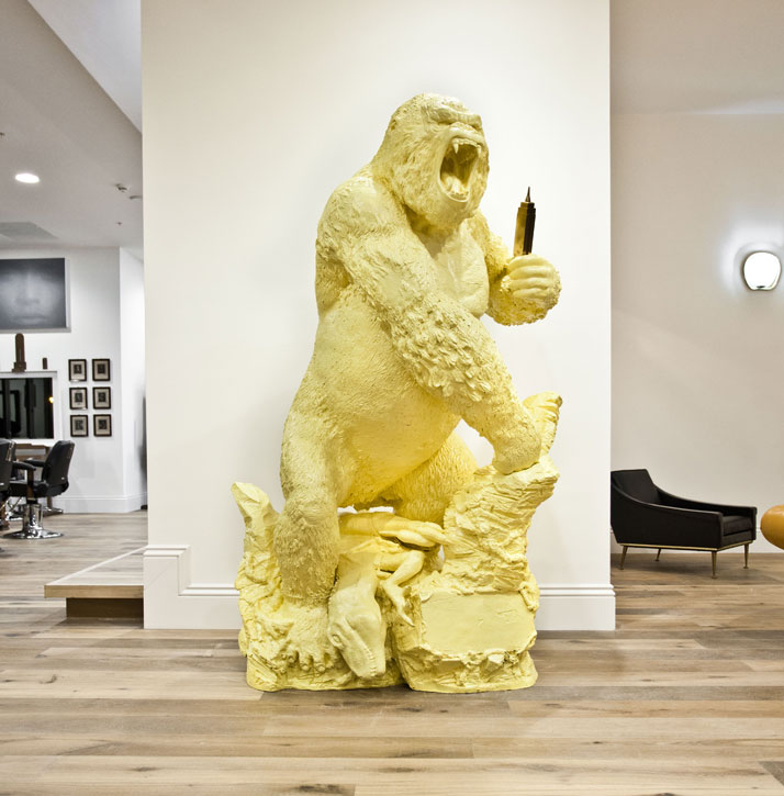
photo © Morten Schjolin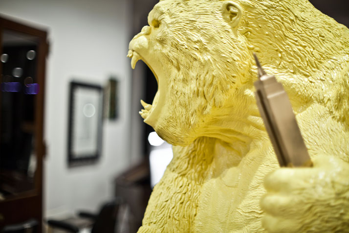
Adee Phelan’s salon clients must consider themselves to be very lucky that, apart from the cutting edge space and the different kind of treatments that they can receive, they can also enjoy some very interesting art. I already spotted some Warhol references that I found very interesting. Can you tell us in a few words about the art that you chose for the Salon? photo © Morten Schjolin
Adee has partnered up with Terence McDermott, a local Gallery owner who has kindly donated work from his various artists. McDermott galleries has been based in Birmingham for 18 months now and formerly operated from the prestigious Mailbox. It has represented some high profile names, including leather artist Mark Evans, The Killers’ artist Paul Normansell and the internationally renowned Dave White. They have also held major exhibitions with the likes of Peroni and John Lydon. The artwork chosen for the salon includes works by Alicia Dubnyckyj, Ryan Hadley (He's Caught a Rabbit!) and Dinah Dufton. Among the artwork, there is a piece from Terence's personal collection which is an artist’s proof of Andy Warhol. The original was created with freehand aerosol on canvas by ‘Temper’, the sensational Graffiti artist. Each month the salon will become a living gallery space and the easels and walls will be used to showcase up and coming artists. 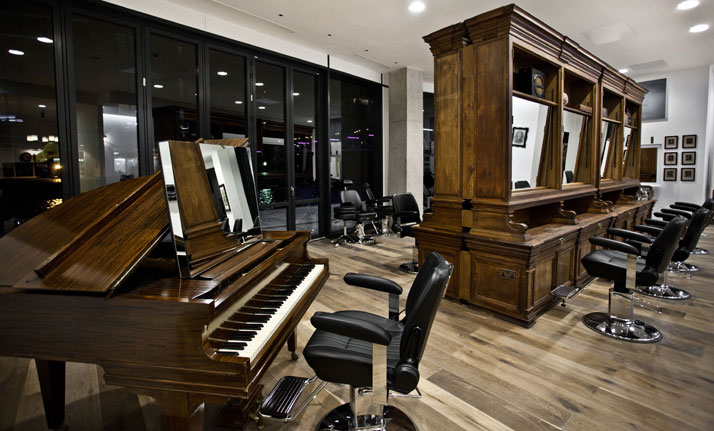
photo © Morten Schjolin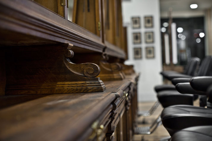
A baby grand piano, a pop yellow King Kong, old bookcases, brass wall lights from old ships and art, all form part of the salon. How do you manage to make elements that one would not normally expect to find in a hair salon, look so natural and fit together so perfectly? Let’s talk about the Ryan Mc Elhinney effect. photo © Morten Schjolin
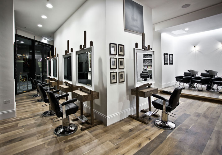
I never look at a door and think that's for walking in and out of. I see a form that can have many functions. In the case of Adee, I scoured all of London's best salvage yards and antique shops to find furniture and shapes that I could transform into hair stations. I found two amazing 18th century mahogany doors that had great proportions and I immediately knew that by swapping out the glass for mirror they would make great hair stations. I also used four brass wall lights from an old ship that are on the back wall in the backwash area and a great original 19th century original barber’s chair that I found at Lassco, a great antique and salvage yard in London.
The bookcases were a steal. What a great find! I got them at an architectural salvage yard in Swansea in Wales. They were in storage for over 25 years (they were formerly housed in The Coal Exchange on Mount Stuart square in Cardiff) and it was deemed as too expensive to continue storing them there. I was at the right place at the right time and I bought 5 of them. When I bought them they were filthy, covered in dust and just needed a little bit of TLC to bring them back to their former glory. I removed the doors, restored any blemishes, cleaned and waxed them. Then I had large mirrors set back into the recesses to create work stations, with nice mood lighting hidden fitted behind.
Even though each element feels like it fits perfectly together for each piece I choose, I look at hundreds so a lot of time is spent visiting shops and salvage yards. I have to get a really strong feeling to make me choose each piece.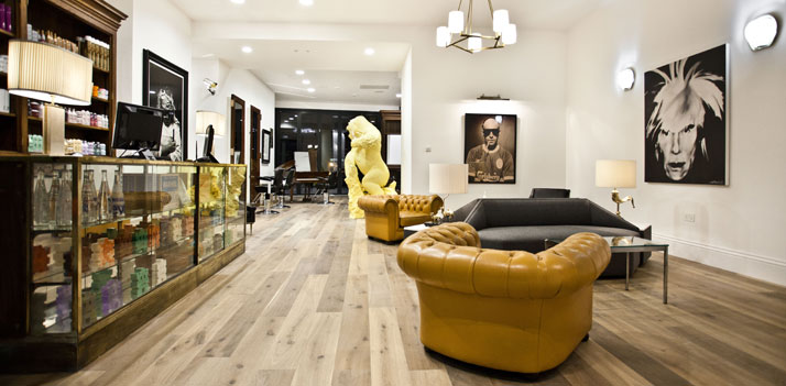
photo © Morten Schjolin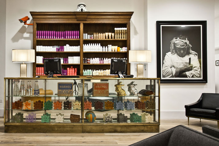
photo © Morten Schjolin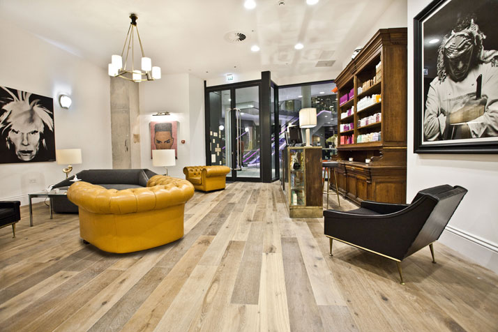
photo © Morten Schjolin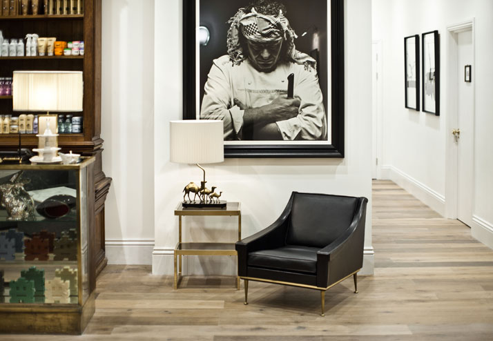
photo © Morten Schjolin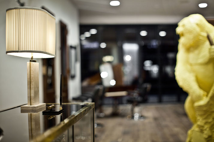
Both the reception and the VIP room are quite impressive, they are like the opening act and the core drama of the salon’s universe. Can you reveal their secrets to us? photo © Morten Schjolin
The VIP room stands in the center of the salon. This room was inspired by the white paneled room in a Space Odyssey. The walls are detailed with beautiful molding and the ceiling is hung with a shadow light running all the way around. There are also two beautiful 1920's Mahogany framed mirrors with built in drawers facing each other on either end of the room. A black ash 1950's chest of drawers stands between the mirrors, with an original Maison Charles black lamp standing on it.â¨â¨ The external walls of the VIP room are lined with artists’ easels that I designed and had custom built. Each easel is made of French oak that has been stained a dark oak colour. The mirrors are made of white lacquered MDF and inside sits a beveled mirror. I wanted to make each client a piece of art or subject and the stylist an artist. Clients love the concept and they say it makes them feel special.â¨â¨The reception area has a great vintage brass and glass reception desk that I found in a great store called Caravan in east London. I was lucky enough to walk into the store the day Emily, the owner, had signed a lease on a new store and decided to sell it. I knew it would be a perfect piece for the salon. The back bar behind the reception is one of the dressers from the Coal Exchange. Other great finds were sourced at Alfie’s market in London.â¨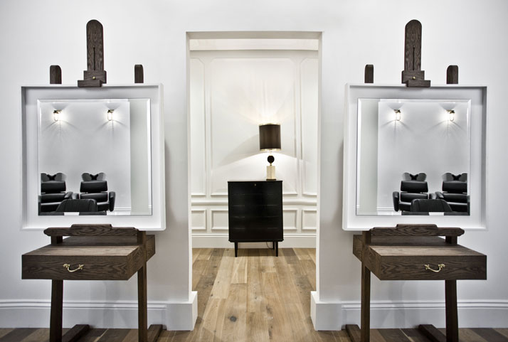
photo © Morten Schjolin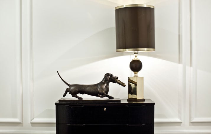
Designing a space for a place like the Cube for a famous hairdresser like Adee Phelan must be quite a challenge. In which way have both things affected the way you designed the salon?
The Cube is an amazing building and in itself is very out there in its design. Adee wanted to make sure that if he was opening a salon it had to be the best and most talked about venue in the Midlands, let alone Birmingham. We had to work to very high standards and only use the best materials and tradesmen to keep the owners of The Cube happy. This is where FCH architects worked their magic. I could not have handled the build without them. In the end I was delighted there were such strict guide lines as it allowed me to create a high end Salon.
Tell us something about your future plans. What is left for you to explore?
Future plans. I have a lot in the pipeline. For the past year I have been working on a collection of toy sculptures depicting war and street crime. It's something I'm really passionate about and I feel it's my best work to date. I'm creating soldiers completely out of toys and hoping it highlights the terrible waste of young lives we see in wars and on our streets today. I also have a series of very quirky functional furniture that I'm in the process of turning into reality. It’s something I would like to collaborate with a gallery on. I'm also turning two of my bars into mini hotels. This is something I cannot wait to do. The rest I don't plan. I don't keep a diary; I actually like to see what life has in store for me.
photo © Morten Schjolin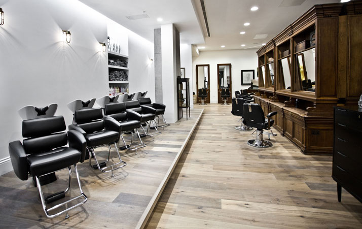
photo © Morten Schjolin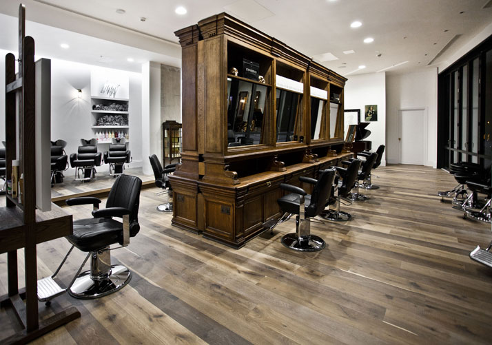
photo © Morten Schjolin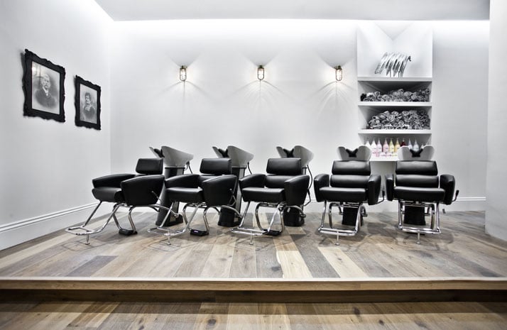
photo © Morten Schjolin
photo © Morten Schjolin