Stefan Diez’s (Germany) “Looking Forward”, a rearview mirror with text that reads “Looking Forward” –a fitting piece for a 25th anniversary celebration. 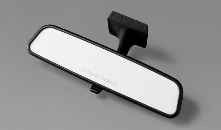
Photo © Tom Powel Imaging.
Yatzer was graciously invited by DuPont Corian to discover DesignPhiladelphia, an eleven-day event in celebration of design, innovation and artistry in the City of Brotherly Love. This year being its sixth, DesignPhiladelphia aims to bring exhibitions, lectures, multimedia presentations, and events to showcase architecture, interior design, graphic design, and craftsmanship.
On Day One, we met Todd Bracher. Considered by the NY Daily News to be “America’s Next Great Designer”, he spent ten years in a sort of real-world-training while he lived abroad in Copenhagen, Milan, and finally in London where he worked with Tom Dixon. Now back in the States, Bracher has collected nominations in 2008 and 2009 for Designer of the Year. He has worked with companies the likes of Jaguar designing their furniture collection, he was Professor of Design at ESAD in Reims, France, and presently holds the title of Creative Director for Georg Jensen. Bracher lives and works in New York City but made the short trip to Philadelphia to participate and lend his perspective in interviews and a special seminar hosted by DuPont called Dialogues on Design.
Upon first sitting down with Bracher it was clear that he was enthused to be a part of an event that is meant to educate and showcase design. Quite gracious with his time, Bracher introduced himself and his work over a friendly lunch. It’s always a treat when one has an opportunity to speak with any creative on their inspirations and processes, and the messages they hope to send. This was especially interesting considering Bracher revealed himself to be more like a philosopher, encompassing so much more in the time we spent together than what he alone has accomplished or created. Yatzer had a chance to sit down one on one with Bracher before he was scheduled to deliver his lecture later on that evening.
Stefan Diez’s (Germany) “Looking Forward”, a rearview mirror with text that reads “Looking Forward” –a fitting piece for a 25th anniversary celebration. 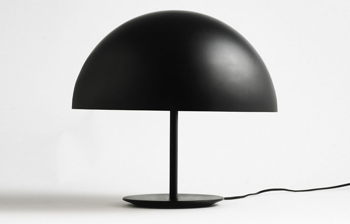
Photo © Tom Powel Imaging.
Dome by Todd Bracher for Mater 2009
INTERVIEW WITH TODD BRACHER Q&A
Where do you see American design today and what frustrates you about their approach to design? How would you educate younger generations –even if they don’t want to be designers, just to appreciate it and the role it plays in their lives?
Well, that’s a good question. I think it’s … when I think of the sort of work that I do and what does it mean to me, it’s not about American design or European design or any of that, it’s really to me exploring literally the world around us. It’s literally me exploring the world around us and trying to interpret it, and translate it, package it, communicate however you want to say it, and that’s universal. It’s really about design for people, for humans. And the form language is the same its not about a style or a culture. Universal solution is a phrase I keep using for my own work. And as I relate it to America well, we can have the same conversation about Europe but I think the difference there is there is more of a process behind the work that is probably in my interpretation more human than I tend to see here in America. Not that it’s better or worse it’s just a different process. Here I don’t see the approach typically about “what does the subject mean?” It’s usually about “how much can it be sold for” or “how can we make it” or what does it look like, it’s not about “what does it mean?” And take like, Scandinavia for an example, take Arne Jacobsen, take the Swan Chair he did for Hansen; design is meant to be used, design is in someone’s home.
Flora vase by Todd Bracher for George Jensen
When you take the context, it’s raining a lot in Denmark, gray, and so it’s cold you spend a lot of time indoors create an object which is comfortable, that’s warm, inviting, tactile, it’s wool, and it’s bright colored to contrast everything that’s going on outside. It was a solution for the way people lived and not just a cool looking chair. I think that’s where design in Europe for me, is born from. From an actual need and also passion and desire. Here, I don’t see that often. Actually, anywhere I don’t see that often. It’s easy to chase a design solution and not start with it as being core human value and not trying to actually bring something of meaning. It’s just a different process. It’s not that one is better. I mean, I have my preference because my work tends to be more human “related”. At the end of the day for an American designer to sit down and think what is American and what is uniquely me, uniquely the situation or the environment I can bring something from and not say that’s a great looking chair I can do something better or different… it’s more about what is uniquely you. And that’s what’s going to be something new. Whereas Arne Jacobsen for example, it was his unique situation that created a universal solution. Everyone in the world could understand it. So it has to come from something truthful. It’s gotta be something that we all care about. Filmmakers do it all the time… it’s about the human experience. We can relate to it. Physical Illusion by Todd Bracher
Photo © Tom Powel Imaging
Do you think humans inherently have the ability within them whether it’s nurtured and brought to fruition or not, do you think we can all design? Are we designers? We know what makes us comfortable, we know what crave at that moment..
I’ll put it this way. I don’t even see myself as a designer. I see it being all about the environment. The environment dictates what it should be. I don’t care what it looks like, it HAS to look this way. Sort of like nature and evolution; objects look the way they do in our life because they evolve. Trees have a certain color, texture, pattern and set scale, all of this was decided by the environment it is not someone’s opinion. So for me, design needs to be created like that. Within the context that’s universal. Why is it made of this material and this color and this size? Because it needs to be for these human reasons, and that’s how it works. My job is to help filter through that. It’s not about… I don’t care ever what it looks like at the end. And when you actually follow that process, that mentality, you can’t argue it! You can’t say the trees are really ugly you know? They are the way they are. We somehow tend to think they are beautiful because that truth is there. That’s that singularity, that truth, that genuineness. That’s why I pare down my designs so much and make them simple, to try to achieve that, to come as close as you can to that truth. So all people have that ability, to filter down. I guess you could say I’m an editor. If you want to call it design that’s cool, to me design is knowing how to make a drawing for a factory and that’s an important part too but editing what’s around us and understanding how to interpret it and communicate it… that’s, to me, where it’s at… I use the shark as an example, or the crocodile; you have this millions of years old creature that is so efficient, so refined by evolution. To me it is fascinating. I get frustrated as a quote unquote designer, that I could never get to that level. It’s impossible! Nature … I’ll never even get close. And that frustrates me a lot.
Stick by Todd Bracher for Designer 2009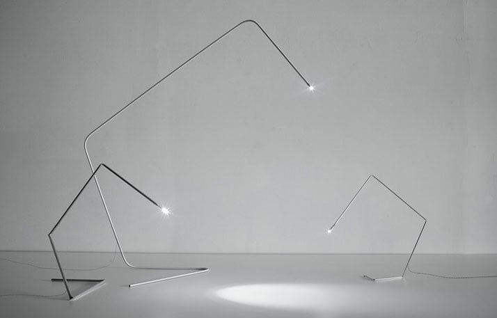
The Internet is a powerful force. It’s spreading information, ideas, art, so fast. There is just so much information out there. As an artist, a creative person… do you find you have to force yourself into a bubble? Do you actively edit what you look at on the Internet? Does it influence you in any way, bad or good? Is this an active effort in 2010… to edit out the noise of the Internet in order to create from an honest place?
I think so but the good news for me is that my work starts from some sort of value, some mathematical value or human value, and from there it goes. So I could look at your new chair design and not be at all influenced because mine starts from somewhere really uniquely specific. In that regard it’s cool, and I don’t mind looking at as much as I can. It’s fun to look at, see what’s going on, enjoy it. Art, for me, is more interesting than design. I look at design all the time but mainly more to know what’s going on for market reasons. But beyond that, the more I can look at, the more I can listen to, the more types of foods I can eat the better. The more experiences I can take in the better. And somehow it sticks in your membrane and you use it to share with people and to enrich your own life. I try to bring it all in.
Stick by Todd Bracher for Designer 2009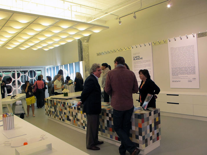
Later on it was on to the Carte Blanche Event, a celebration of the 25th Anniversary of the famous French design magazine Intramuros. The event was centered on an exhibition curated specifically for the 25th anniversary celebration in which 25 designers who have been featured on the cover of Intramuros were invited to submit an original design using DuPont’s featured product, Corian.
Designers Todd Bracher, Patricia Urquiola, Alberto Zontone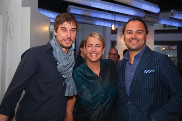
Photo (c) Laurie Lambrecht, 2010
Image Courtesy of DuPont Surfaces
Designers Noe Duchafour Lawrance, Sebastian Bergne and Gabriele Pezzini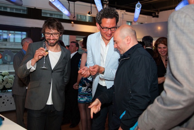
Photo (c) Laurie Lambrecht, 2010
Image Courtesy of DuPont Surfaces
Each designer had only the same single A4 sheet of Corian White (approximately the size of a standard letter, 6mm in width) to work with. The collection of the 25 original works was more like a fun experiment; each piece of Corian manipulated in a new and interesting way by world famous designers from around the globe. You can tell so much about each designer’s aesthetic by what each one has created with the modest piece of material they were given to work with. The exhibition venue itself was designed by Philippe Boisselier as an example of what can be done with Corian, a versatile solid surface material with “virtually limitless possibilities.”
Fast vs. Furious. Mathieu Lehanneur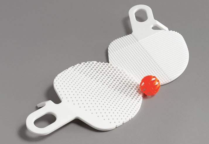
Photo © Tom Powel Imaging
Carte Blanche by Patricia Urquiola, (right) Constellation by Arik Levy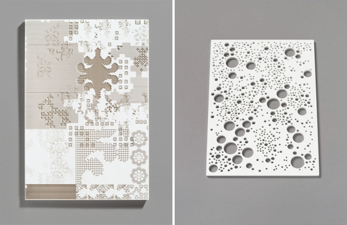
Photos © Tom Powel Imaging.
In the celebratory spirit, designer Constantin Boym (USA) offers “Happy Birthday to You”, a birthday cake with colorful candle holders.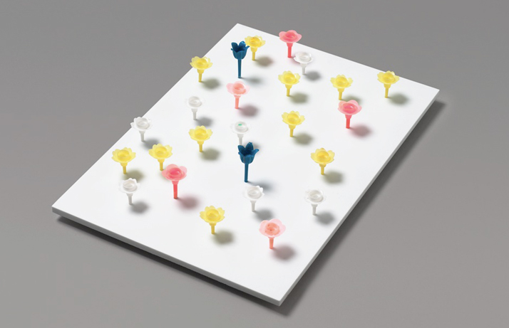
Photo © Tom Powel Imaging.
Jonathan Olivares’ (USA) concept for his piece “Something of the Process” was super original, “I decided to mail the piece of material without any protective packaging. A self-addressed test run revealed other interesting constraints; the material costs about $5.00 to be mailed Priority to anywhere in the US., the material acquires a wonderful patina as is labeled, stamped, and delivered, and its sharp edges suffer several small fractures in transit… we wonder if the postal workers shook it to see if anything was inside!” (right) “The Blank Pages” designed by Philippe Nigro (France) is the creation that I found myself visiting numerous times out of all 25 designs. And the concept behind it… just wow… “On seeing this immaculate white pad whose proportions are so familiar, a tribute to what is a required stage in carrying out any project seemed natural. A tribute to this such particular moment of enthusiasm and uncertainty brought about by a pad of blank paper. Thanks to its malleability and ability to be handled in a multitude of ways, Corian -a homogenous, dense, and pure material, which sometimes looks like mineral, porcelain or even paper depending on its thickness –lends itself to the game of illusion.”
Photo © Tom Powel Imaging
Photo © Tom Powel Imaging
(left) Gabriele Pezzini’s (France) “Under Control Fruit Basket” was the single “bowl” shape in the exhibition. “All of this following the main idea of the project, that was to redcue the material waste and to transform a flat sheet into tridimensional shape.”
Photo © Tom Powel Imaging
Recycling by Patrick Norguet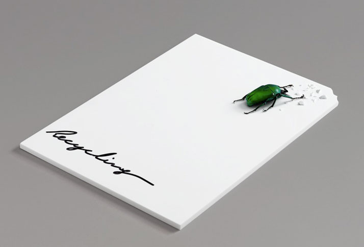
Photo © Tom Powel Imaging
Face by Marcel Wanders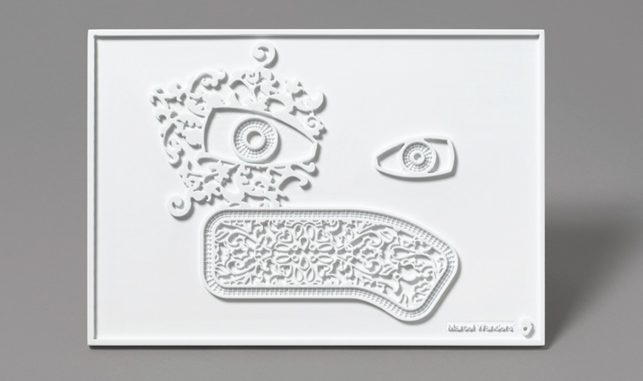
Photo © Tom Powel Imaging
Normograph by Jean-Francois Dingjian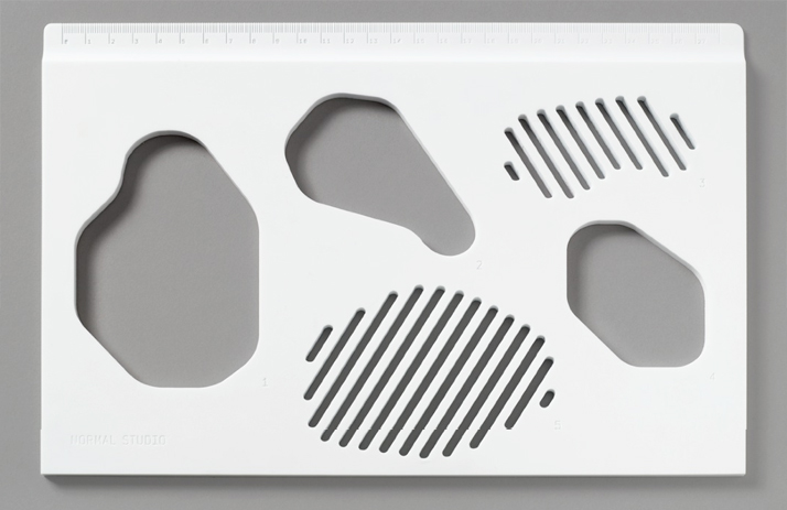
Photo © Tom Powel Imaging
Behind the shades by Christophe Pillet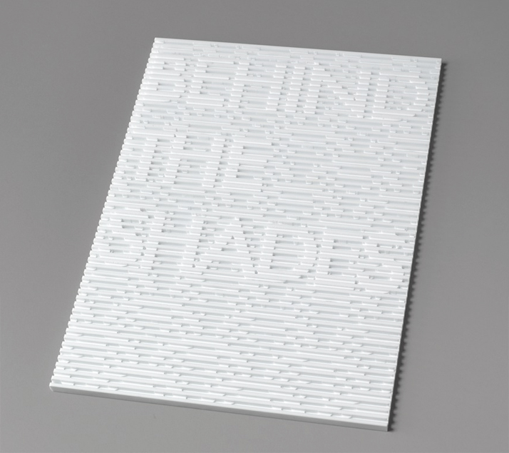
Photo © Tom Powel Imaging
Behind the shades by Christophe Pillet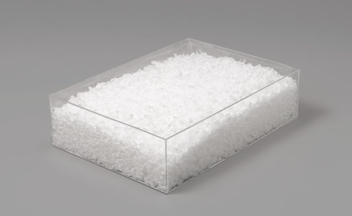
Photo © Tom Powel Imaging
And finally, Todd Bracher’s (USA) design “Physical Illusion”, defying the constraints of a single flat sheet by creating a piece in the spirit of changing perspectives “Same mass, same weight, different beauty.”
Photo © Tom Powel Imaging
On the final day Yatzer had the opportunity to speak with artists Ann Conte and Jeanne Wiley, creators of the life size Woven Car with a selection of colors from the DuPont™ Corian® Terra Collection. The collaborative team took a vintage MG Midget and decided to give it a facelift of sorts. Perhaps the most striking details are the faded gold seatbelts that were woven in a “checkerboard pattern” to create the body of the mini sized vehicle. An unexpected take on the restoration of a vintage car… delightfully different!
Woven Car by Ann Conte and Jeanne Wiley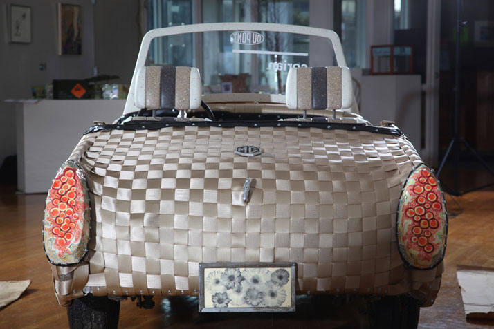
Photos (c) Gary Higgins Photography for DuPont
Woven Car by Ann Conte and Jeanne Wiley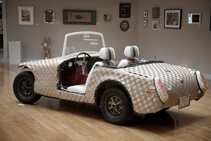
Photos (c) Gary Higgins Photography for DuPont
Recent Articles

Palazzo Citterio: A New Chapter in Milan’s Cultural Landscape


