Project Name
DezeenPosted in
Interior Design, Fashion| Detailed Information | |||||
|---|---|---|---|---|---|
| Project Name | Dezeen | Posted in | Interior Design, Fashion | ||
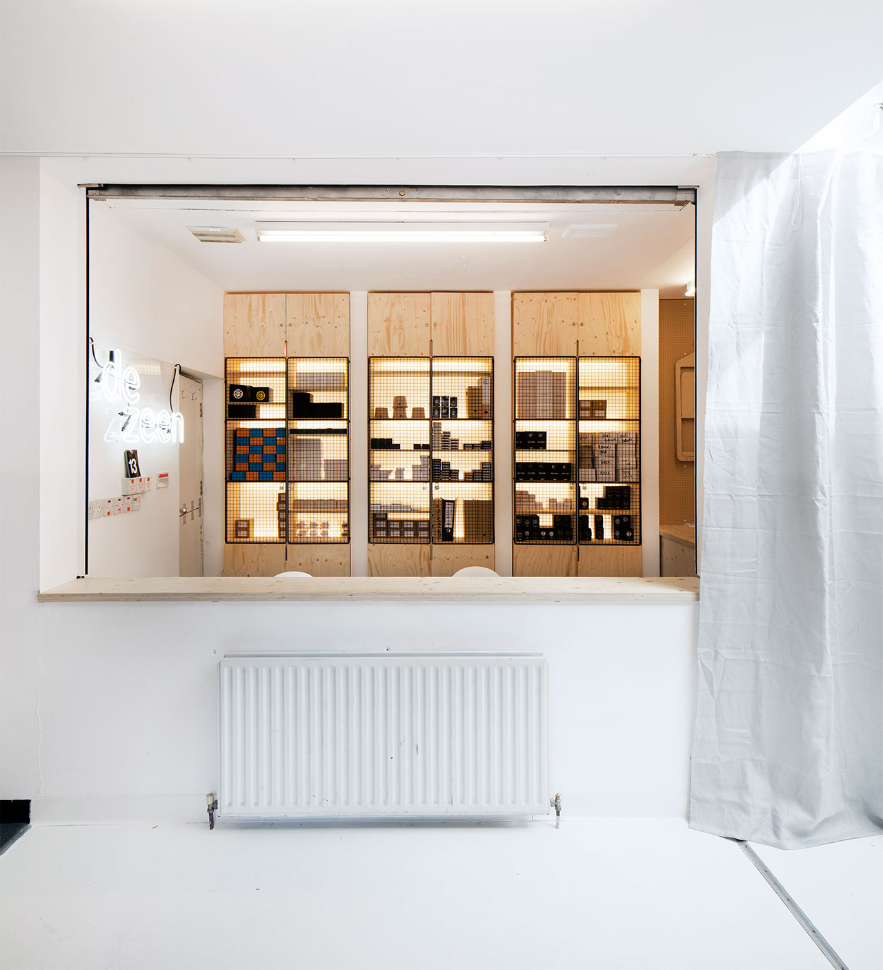
Photo © Luke Hayes.
It was only a year ago when leading online design and architecture magazine Dezeen called in the big guns to transform a former Stoke Newington doctors' surgery into their north London office. And so Philippe Malouin, head of local interiors studio Post-Office, was called upon as the man for the job who would execute the inspired renovation. But time can weigh heavily on your shoulders if you’re in the business of selling watches and 12 months later, the Dezeen crew was craving something new. Adapting to the demands of their online timepiece emporium, Dezeen’s founder Marcus Fairs and his wristwatch partner Rupinder Bhogal decided it was time their shop manifested itself in real life. ''The office space became a display and storage area before mutating into a shop …'' says designer Philippe Malouin, so turning the reception area into a brick-and-mortar tick tock boutique was something of a no-brainer. For those of you scratching your heads in wonder, Dezeen is a multi-purpose destination: they don’t just peddle in design and architecture news; they also sell a keenly-edited selection of wristwatches to keep you from wasting your time on anything less than the best.

Photo © Luke Hayes.
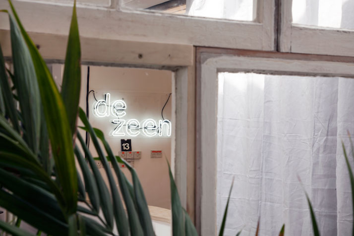
Photo © Luke Hayes.
The Surgery’s commercial transformation was something of a reverse Hercule’s Labor, as a real-life boutique successfully grew out of their online watch store – instead of the other way around. Situated on the ground floor of the Dezeen’s headquarters, it was the perfect excuse to renovate the entire first floor and Yatzer is more than happy to give you the grand tour:
Making a statement from the inside out is the first step to a concise identity and a recognizable brand, which comes in particularly handy when you’re looking to embrace walk-in clientele. Dezeen has given their HQ a new lick of paint and has made sure they beckon prospective customers from afar with a visible logo relief suspended over the letter box. The first thing that hits you as you walk through the door is the utilitarian feel of a hardware store, offering over-the-counter service and face-to-face courtesy, an old shop keeping tradition that’s sadly about to go extinct. This old-school approach to customer service is reinforced by Malouin’s industrial shelving, custom-made by a no-frills supplier who specializes in wire shopping trolleys and gymnasium changing-room furniture. Malouin commissioned a grid of welded-wire, back-lit lockers to display the Dezeen watch collection, offering the customer a sneak peek into wristwatch heaven as they approach the counter.
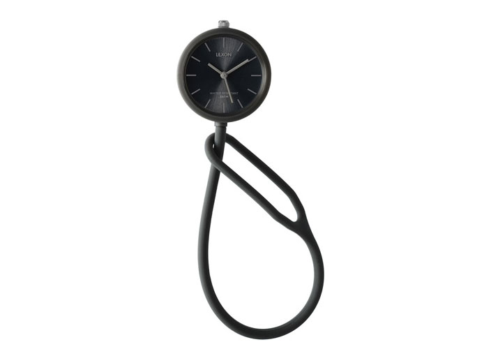
Take Time by French designer Mathieu Lehanneur. Produced by LEXON. Photo © Dezeen Watch store.

Rupinder Bhogal and Philippe Malouin. Photo Daniel Stier for Wallpaper*Magazine.
Taking advantage of ''The Surgery’s'' limited square footage, the waiting room has been divided into part-workspace part-meeting room with the addition of an inspired partition where Malouin and his partners have built a barely-there-wall out of reclaimed windows they hunted down on the web and painstakingly pieced by hand. ''It made immediate sense to create a wall of glass as a barrier ….. We sourced most of the Victorian windows from eBay, but had to do a lot of research to find windows the right size, that could be cut and pasted into the space.'' Although his self-designed Market Table and Hanger Chairs originally dominating the work area are no longer in evidence, his favorite material, plywood, still is. A bespoke table is surrounded by the all-time classic Eames chairs, while Dezeen’s ownMarcus Fairs winks in the background. OK, so it’s not exactly him, it’s his 3D scanned likeness, printed on plaster powder, a great way of replacing your run-of-the-mill contributor photographs if you just happen to work in publishing. Plus you get to keep it afterwards as an added bonus!
A hop, skip, and a jump away you’ll find yourself in the meeting room-cum-greenhouse, where plants take over the floor, ceiling and walls. A Berber rug instantly adds a lived-in appeal, instantly eliminating the uniform whiteness that has made so many magazine HQs feel like design asylums. The lipstick-red sofa - obtained at a local market - is the pulsating heart of the office, while the entire ground floor is beautifully lit by Malouin's LED lamps, emanating light through shutter-like slats. Antoni Arola’s "Blanco White" for Santa & Cole rests on the workspace table.
We couldn’t possibly leave without taking a gander through the Dezeen watch store, where Michael Young's MY03 Hacker definitely stands out, although you can find plenty of budget options, like Mathieu Lehanneur’s brilliant ''Take Time'', inspired by a traditional pocket watch where a silicone rubber strap replaces the more traditional chain. AsPhilippe Malouin himself eloquently puts it, ''Dezeen buyers are design-conscious but not super-rich residents with flash gold watches. This isn't Mayfair.'' Enough said!
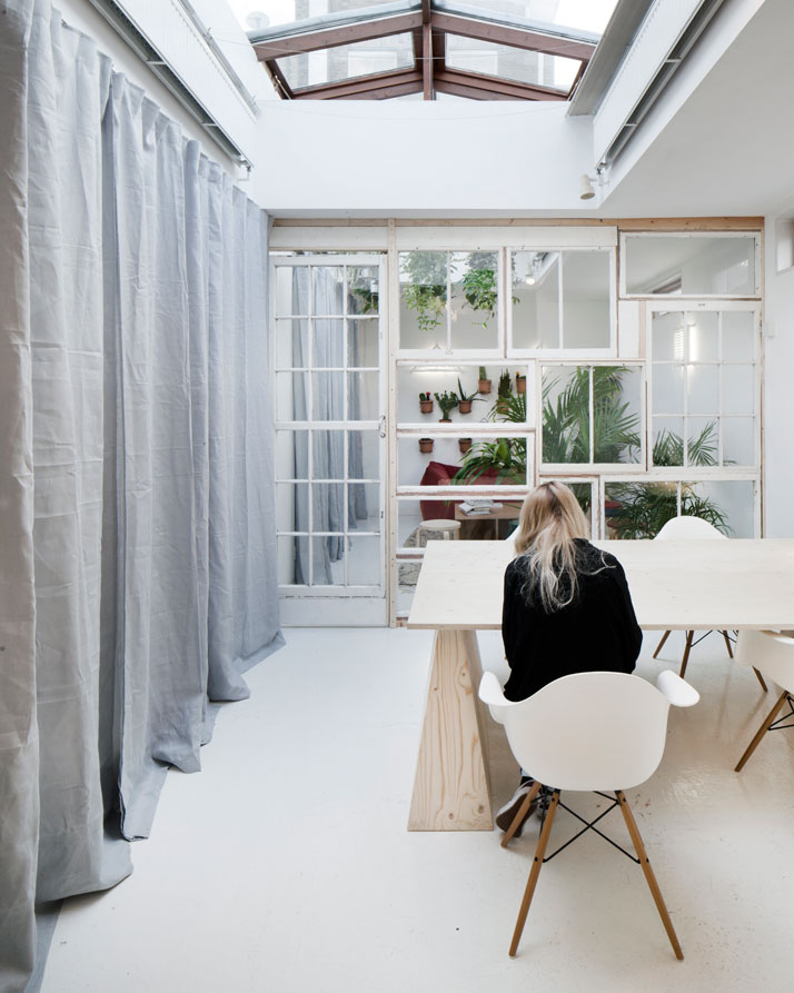
Photo © Luke Hayes.

Photo © Luke Hayes.
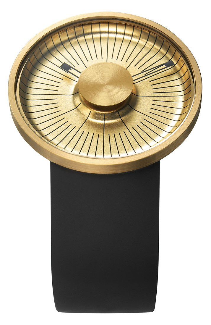
MY03 Hacker by British industrial designer Michael Young. Produced by O.D.M. Photo © Dezeen Watch store.
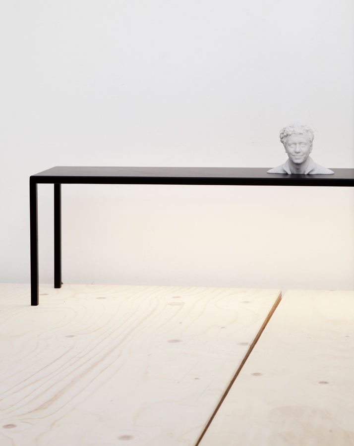
Blanco White by Antoni Arola for Santa & Cole. Photo © Luke Hayes.
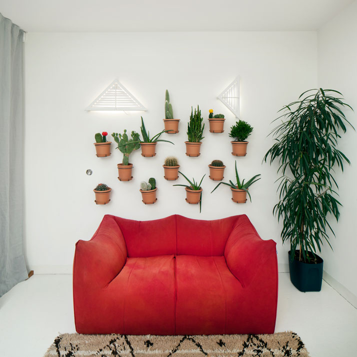
Photo © Luke Hayes.
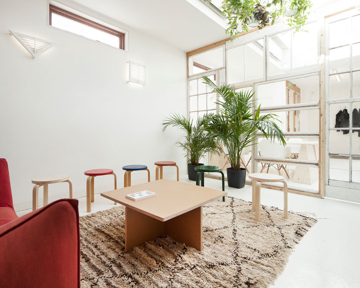
Stool 60s by Alvar Aalto for Artek. Photo © Luke Hayes.
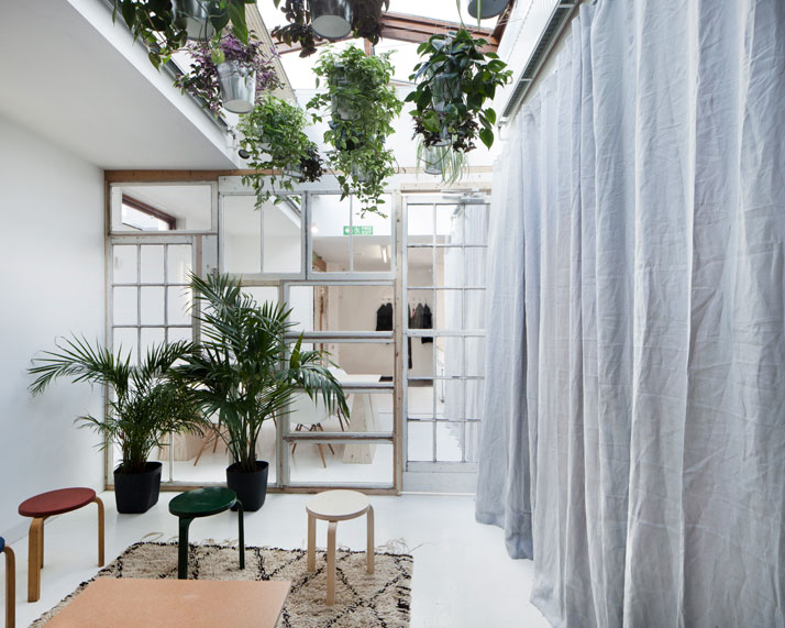
Photo © Luke Hayes.

Ora Lattea by young Italian designer Denis Guidone and manufactured by Italian brand Nava. Photo © Dezeen Watch store.


