Japanese Order and Chaos are Served at Tetsujin, by Architects EAT
Words by Sara Panagiotopoulou
Location
295 Lonsdale St, Melbourne, Australia
Japanese Order and Chaos are Served at Tetsujin, by Architects EAT
Words by Sara Panagiotopoulou
295 Lonsdale St, Melbourne, Australia
295 Lonsdale St, Melbourne, Australia
Location
In the heart of Melbourne, Australia, Architects EAT have created, Tetsujin, a dining experience which is inspired by the two opposing sides of a bustling Japanese metropolis: order and chaos. Tetsujin, which was completed in December 2015 and is located on level 4 of the Emporium Shopping Centre, promises to entice patrons’ taste buds by delivering something to suit the two spectrums of their fancy.
Created in a narrow, seven meter wide space that was intended to be used as a store, the original challenge faced by the project team made up of Eid Goh, Lachlan Cooper and Janice Teh, concerned how to best organize the restaurant's flow so that customers would feel as if they were entering an experience from the moment they stepped foot in the door.
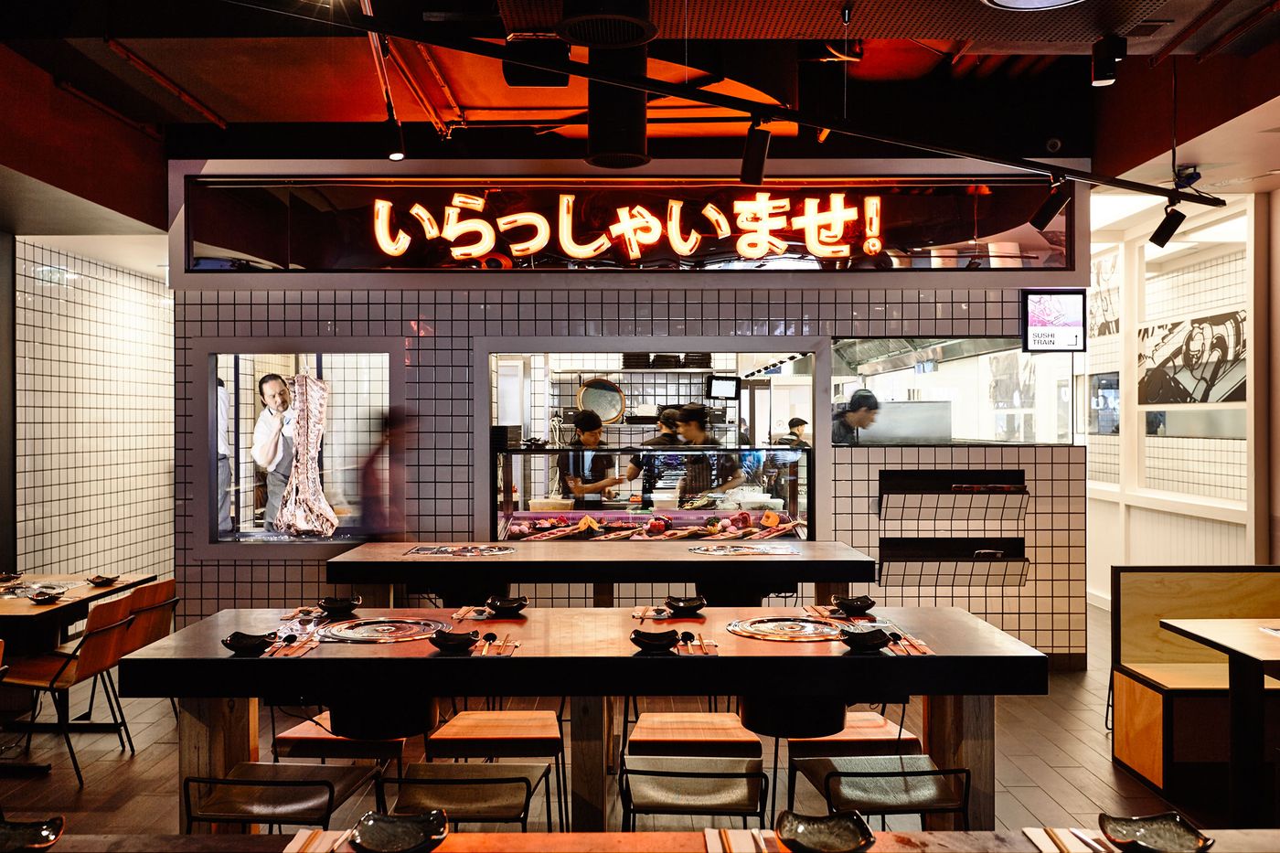
The answer? To separate Tetsujin into two dedicated dining spaces, a Sushi Train (reminiscent of "order") and a Japanese BBQ (reminiscent of "chaos") through the use of inventively altering the height of the floor level via a series of ramps and steps, creating individual units within the single space. Each of the two dining spaces was then bestowed with its very own, unique fingerprint the collective result of which is a highly energetic dining experience wherein the décor prepares customers for the distinctive flavours on offer.
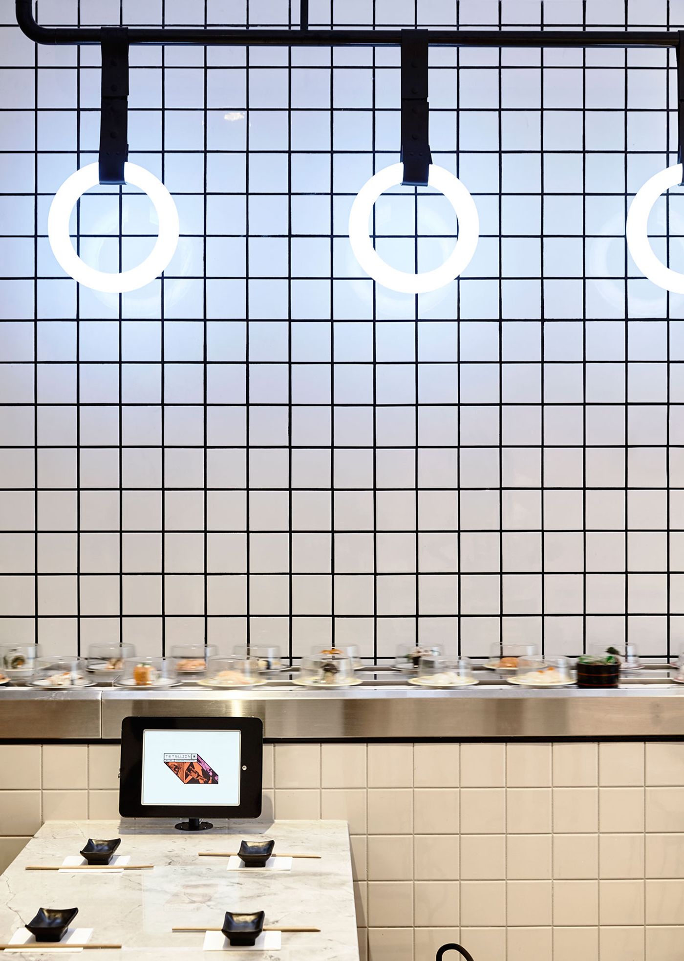
Photo by Derek Swalwell.
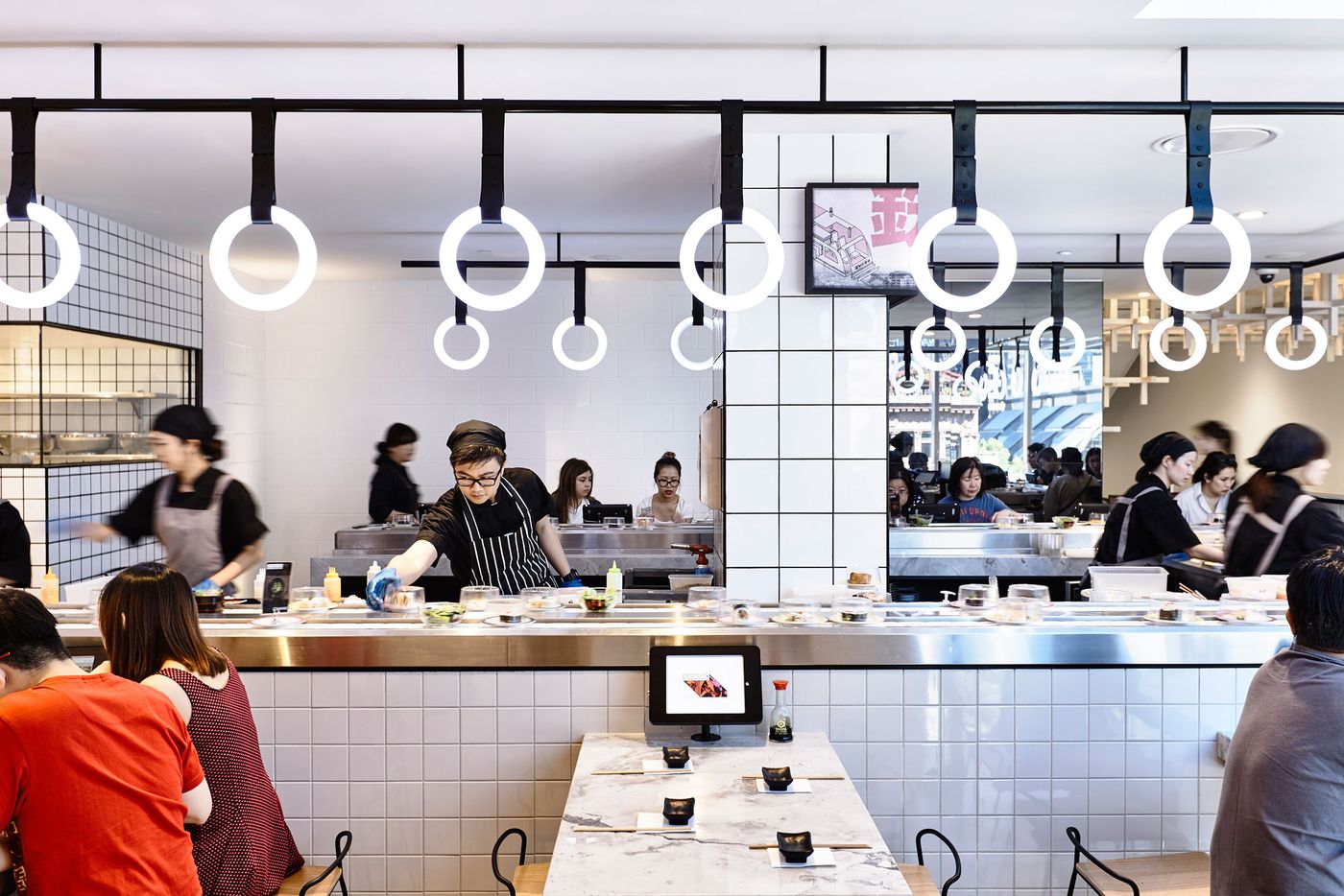
Photo by Derek Swalwell.
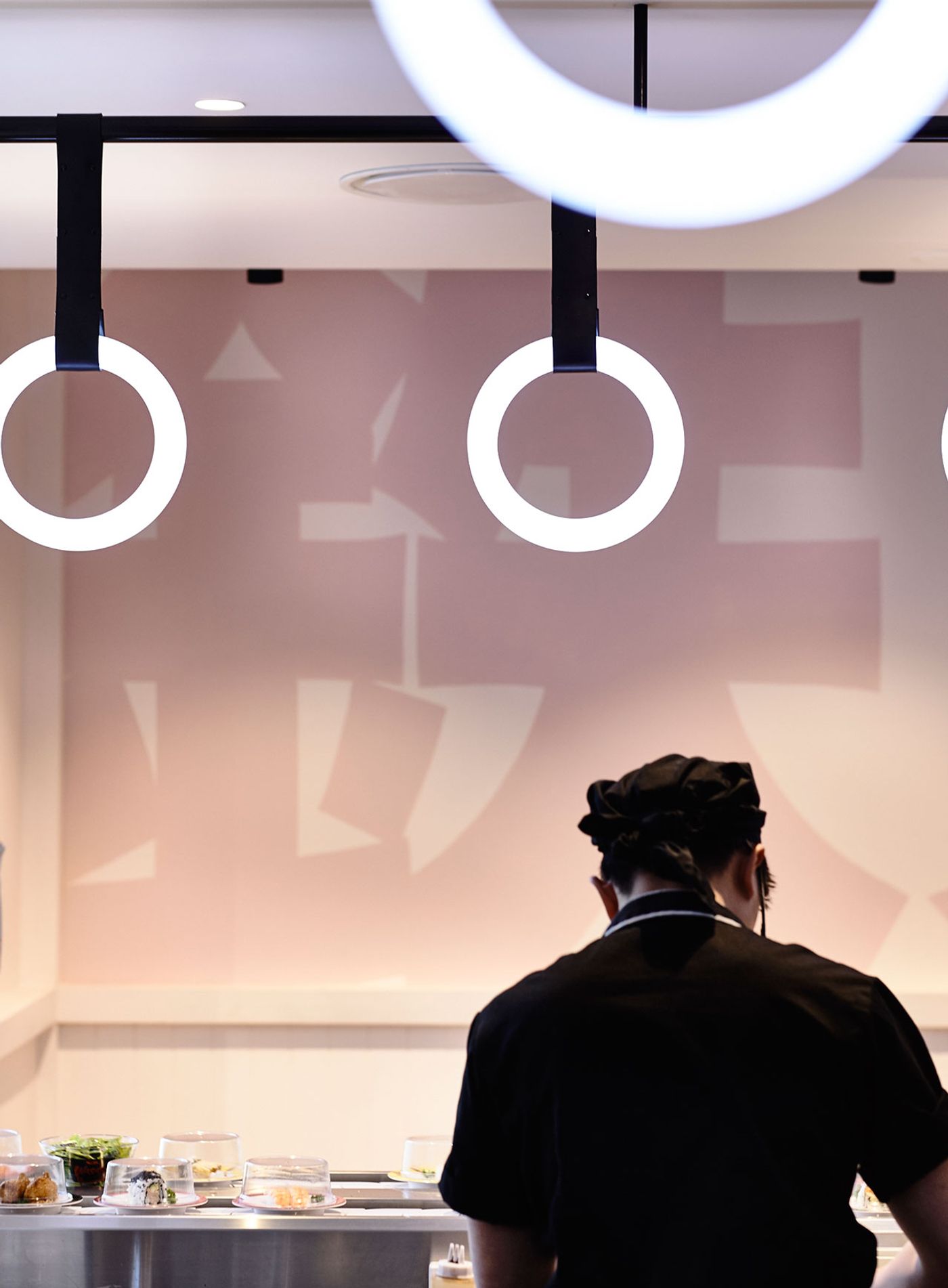
On that note, patrons are first welcomed by the cool, light colours (such as the hand-painted, pale pink Japanese lettering on the walls), European oak wood flooring, ample natural light (thanks to the floor to ceiling windows looking out over Melbourne's cityscape) and linear design elements of the Sushi Train dining space. These mirror the clean-cut sensibilities inherent to the art of sushi, which is openly prepared by the chefs behind the sushi train. We can't help but notice the bold geometric shapes of the custom-made, hanging LED and acrylic ring lights which were designed by A Better Sign Pty Ltd., as well as the pine, grid latticework modules hanging from the ceiling. The ring lights and latticework modules artfully offset each other in both material and shape while the latter is reminiscent of the inventive ceiling grid that Japanese architect, Kengo Kuma, created at the Beijing Tea House using translucent hollow blocks of polyethylene.
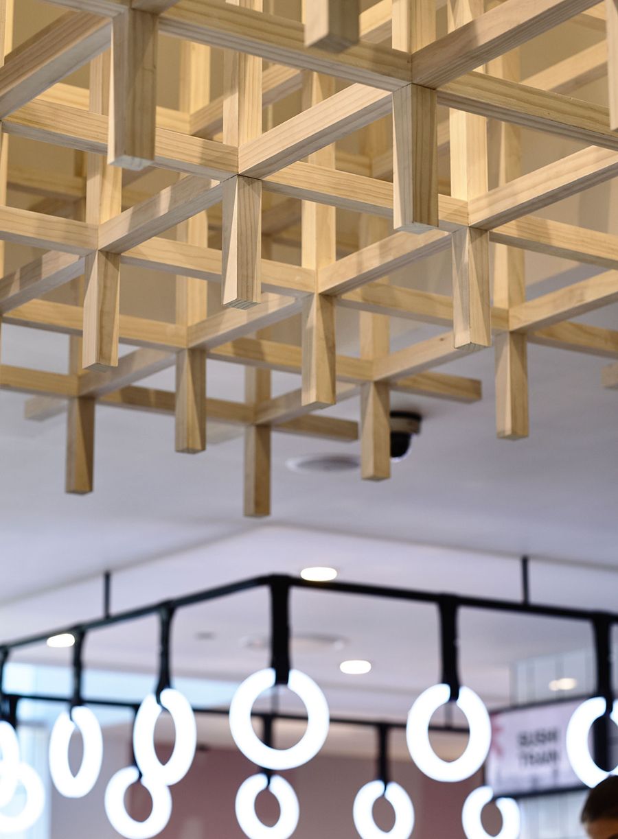
Photo by Derek Swalwell.

Photo by Derek Swalwell.
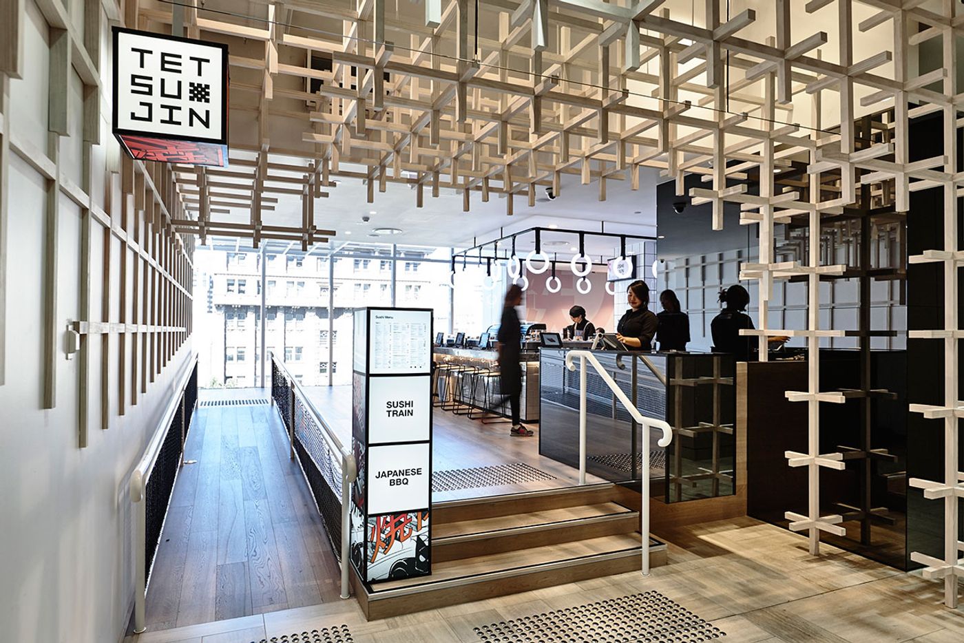
Photo by Derek Swalwell.
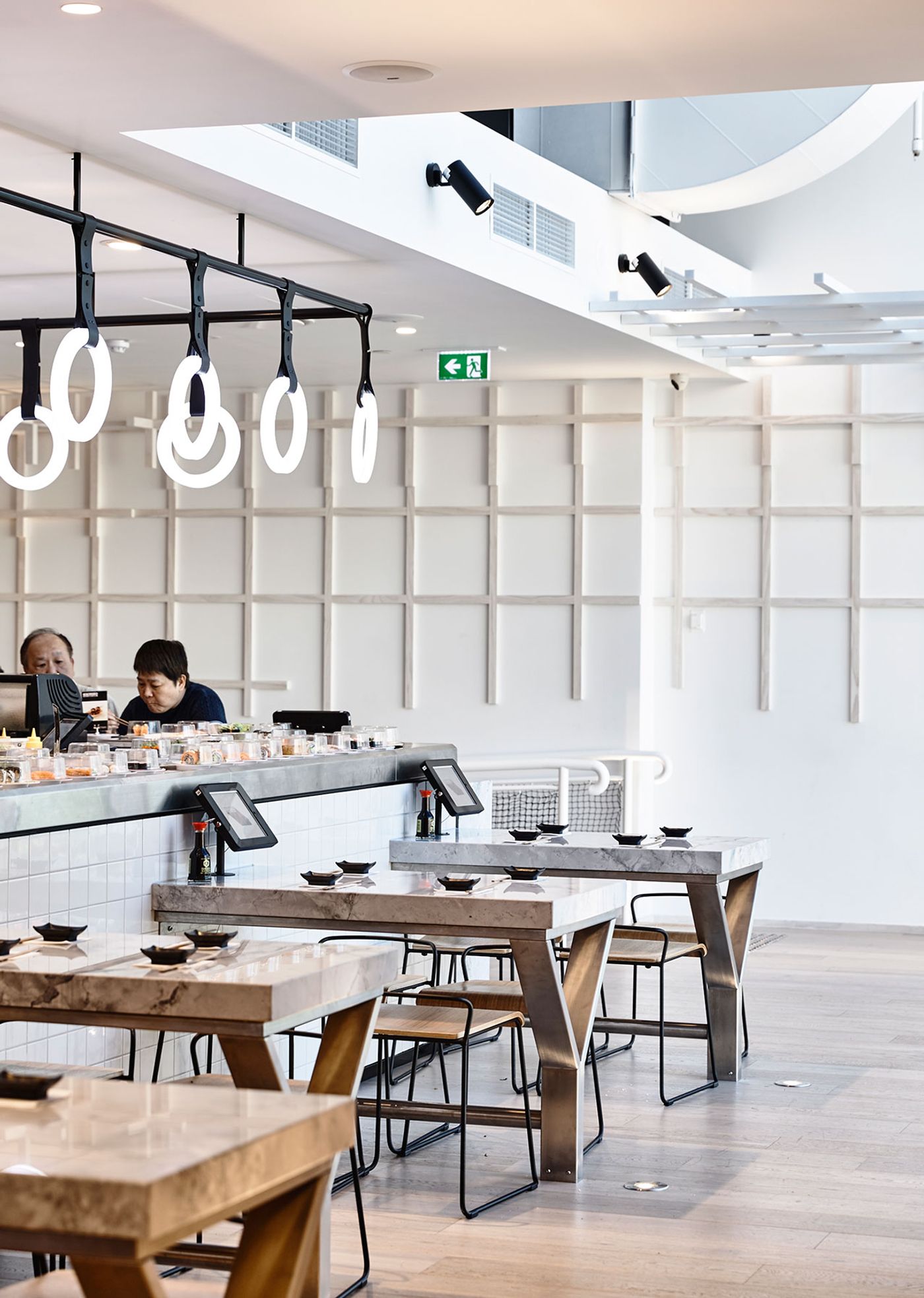
Photo by Derek Swalwell.
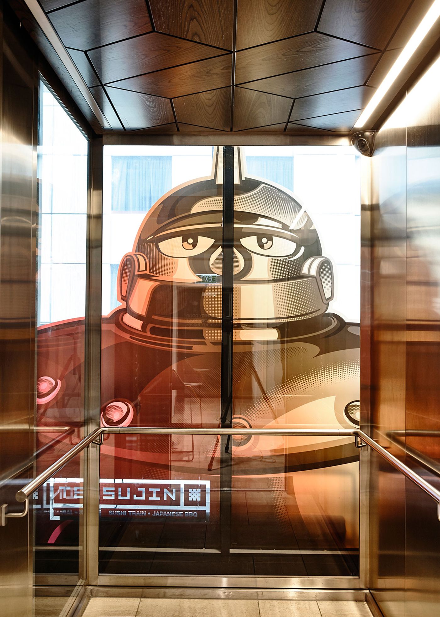
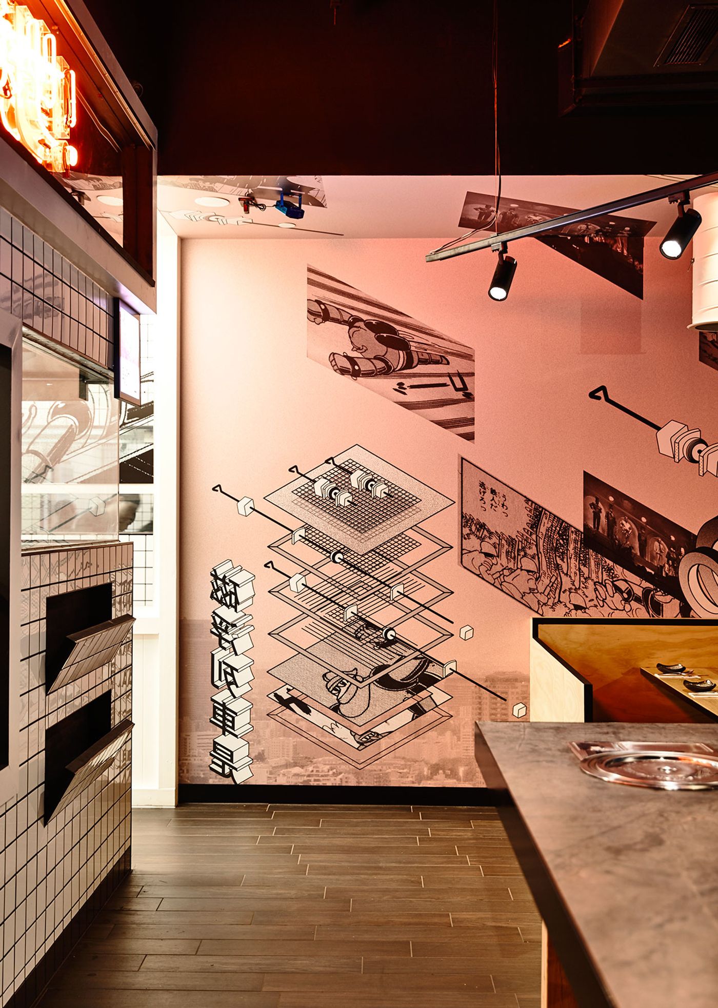
Meanwhile, the simple, square, white subway tiles on the walls create the perfect quietly geometric background and lead towards the Japanese BBQ dining space. Once there, the intense, bold colour scheme with black painted ceiling, suspended track lighting in moody red tones and the graphic, comic character printed wallpaper (featuring the namesake of the restaurant: the fictitious Japanese cult robot, Iron Man) all mirror the flavour rush and appearance of the BBQ dishes being prepared behind the glass-walled kitchen. The designers say that they wanted to reference, "the culture of iconic Japanese machinery" through the design elements, a visual identity which is more than prevalent in this part of the restaurant.
Despite the notable differences between the two spaces, what unifies them is the prevalent feeling of Japanese culture. It's this interplay of order and chaos that ultimately makes sense, opening the way for Tetsujin to make its mark as a feast for the eyes and the palates of Melbournites.
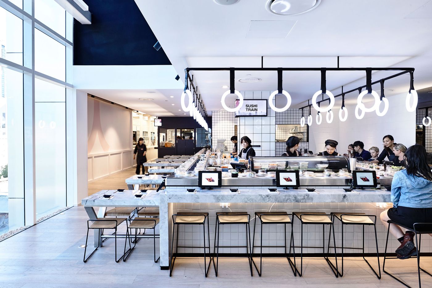
Photo by Derek Swalwell.
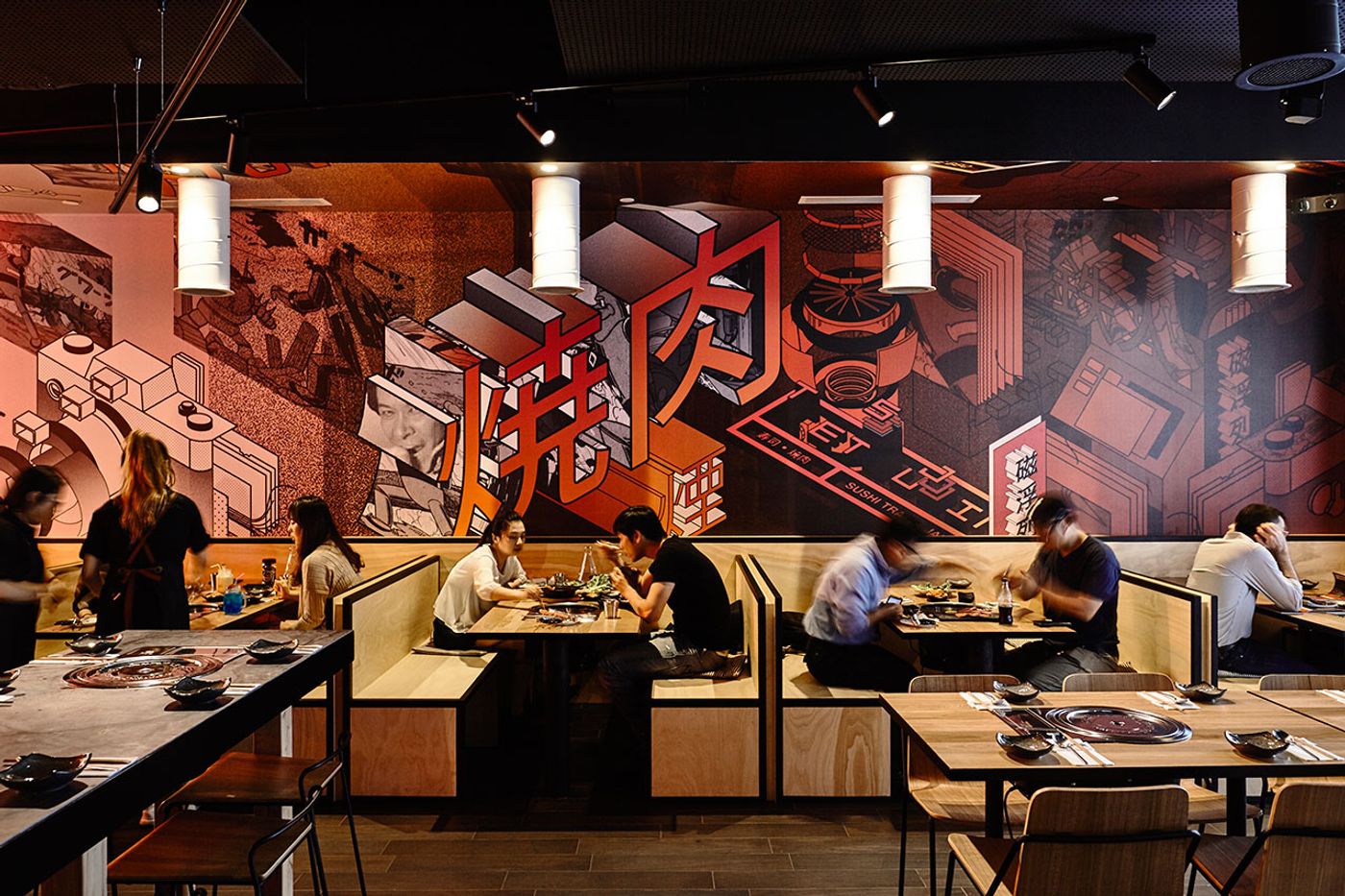
Photo by Derek Swalwell.
The designers say that they wanted to reference, "the culture of iconic Japanese machinery" through the design elements.
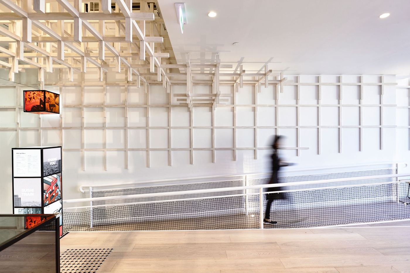
Photo by Derek Swalwell.
