The Rhythmic Abstraction of a New Office Space in Hainan, China
Words by Yatzer
Location
Hainan, China
The Rhythmic Abstraction of a New Office Space in Hainan, China
Words by Yatzer
Hainan, China
Hainan, China
Location
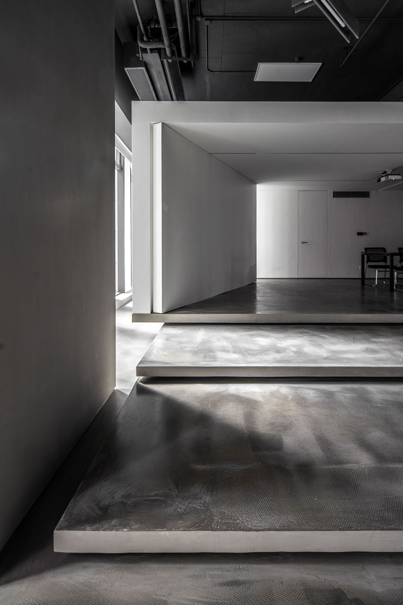
Taking over the entire floor of a commercial tower in Hainan, China, these new headquarters for a company in the fashion business eschew conventional workplace configurations for a more fluid solution that combines functionality with efficiency. Conceived by Taipei and Shanghai-based Wei Yi International Design Associates as an abstract, geometrical composition of solids and voids, the office is a rhythmic sequence of interlaced spaces, whose boundaries are insinuated or suggested rather than obviously marked, allowing the company’s employees to circumscribe their own workplace and not the other way around.
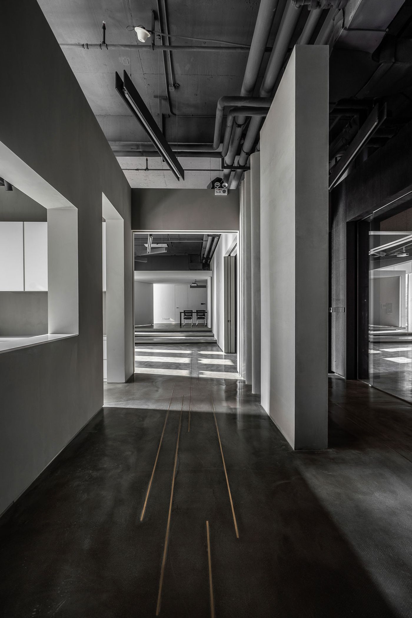
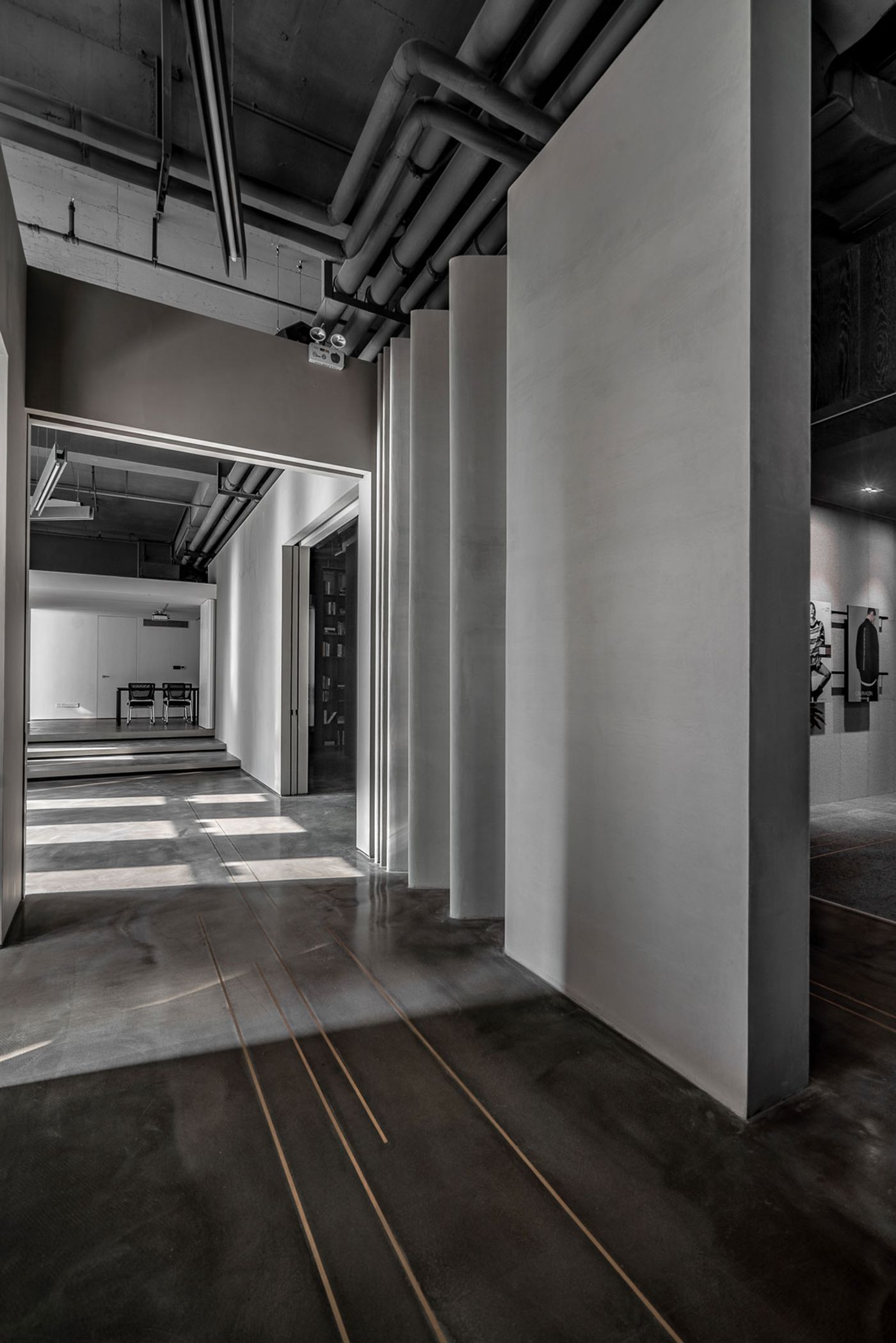
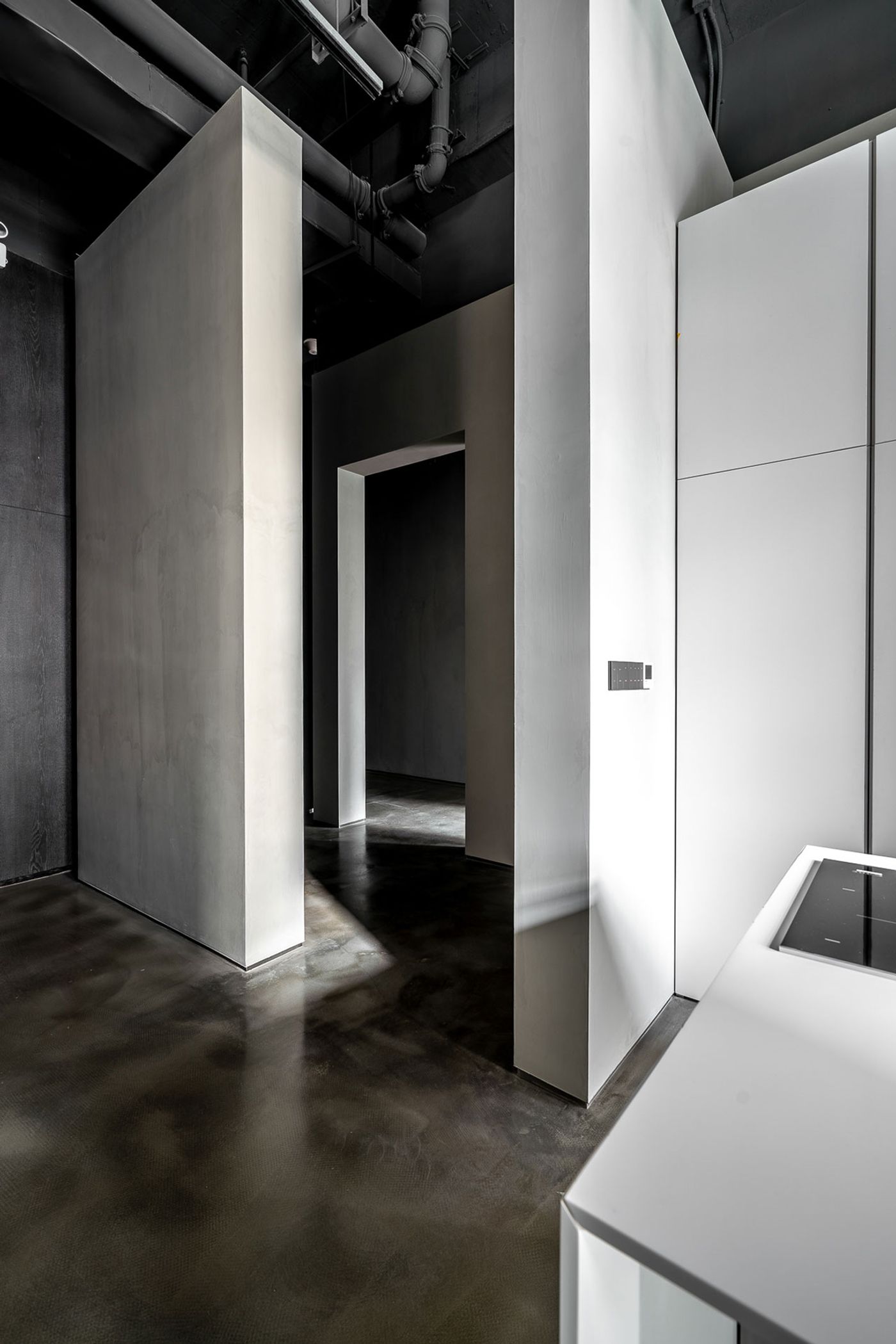
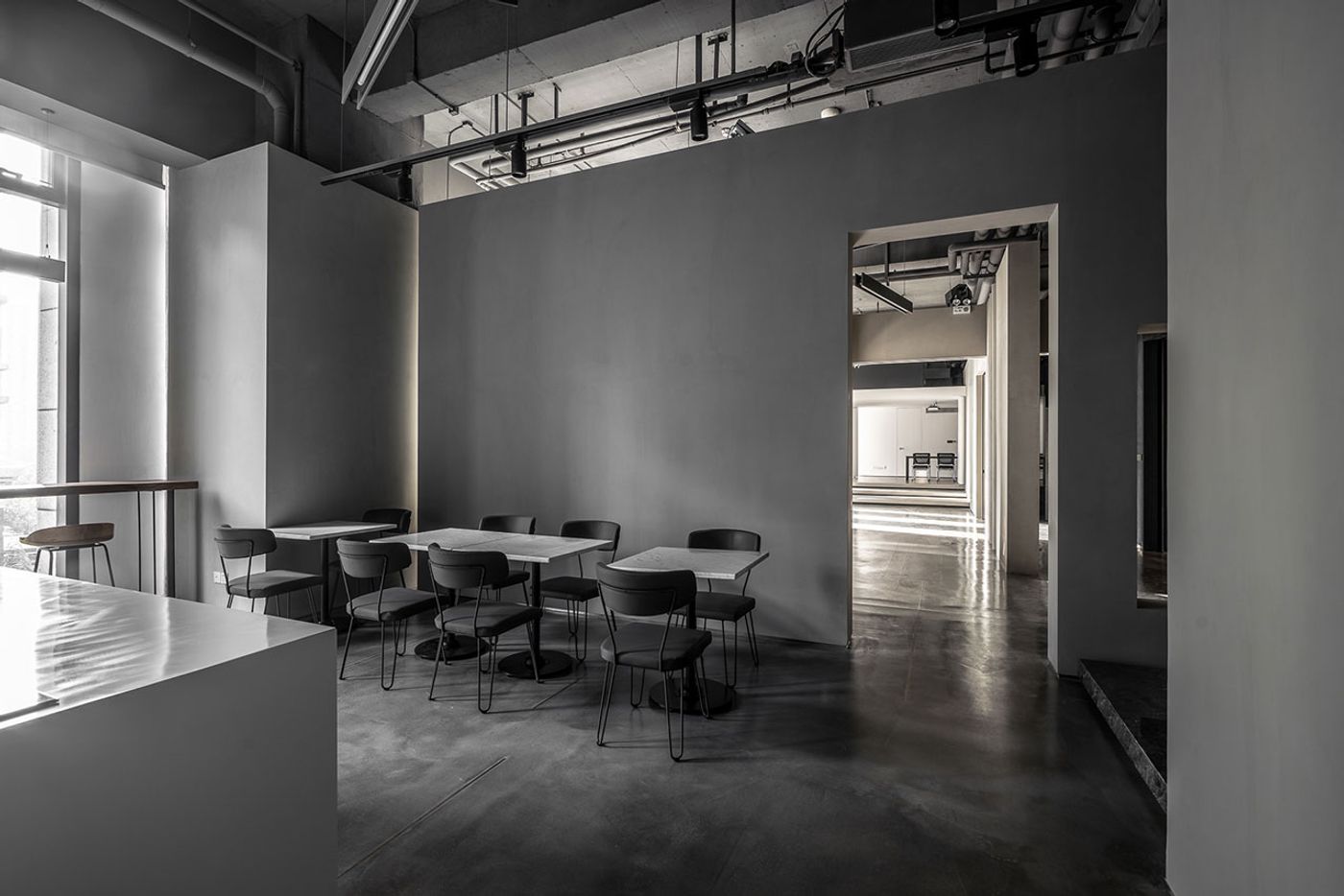
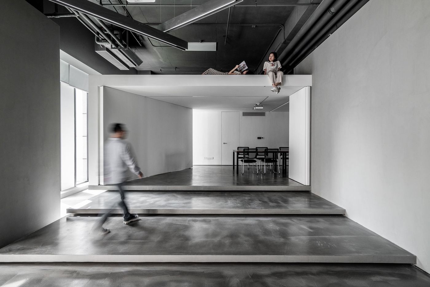
Drawing from the building’s basic layout, a square floor plan with a square circulation and service core in the middle, the designers translated the square-within-a-square floor plan into a box-within-a-box concept where boxes of various sizes are strategically stacked around the space creating a series of loosely defined rooms that flow into or grow out of each other. Multiple rectangular openings and cut-outs, swiveling facets, folding partitions, and sliding panels ensure that all rooms are spatially and visually connected as well as provide an adaptable layout.
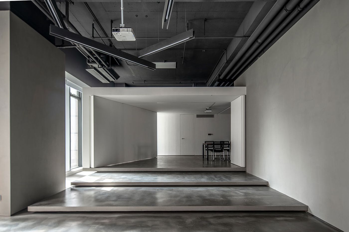
Photo © Wei Yi International Design Associates.
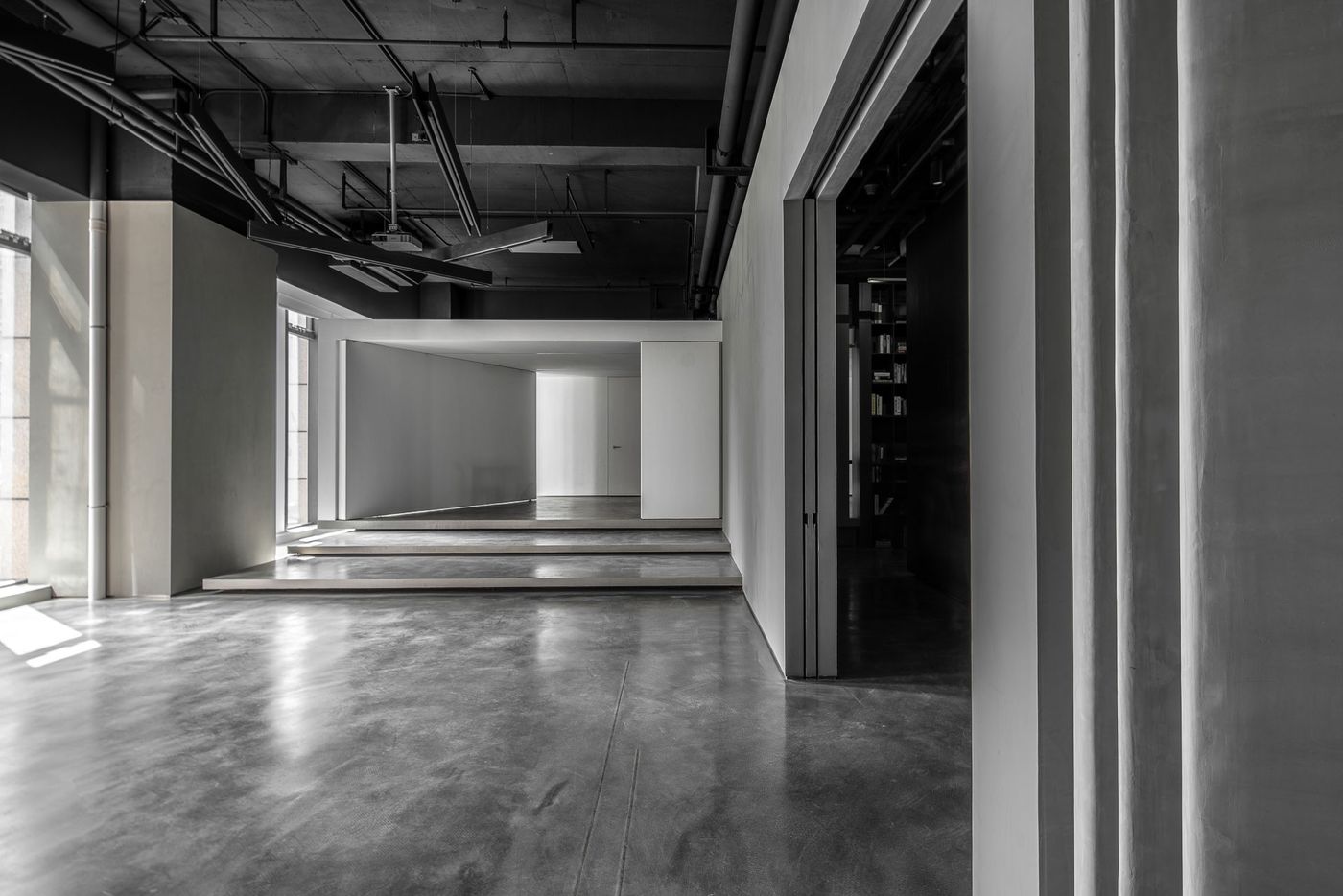
Photo © Wei Yi International Design Associates.
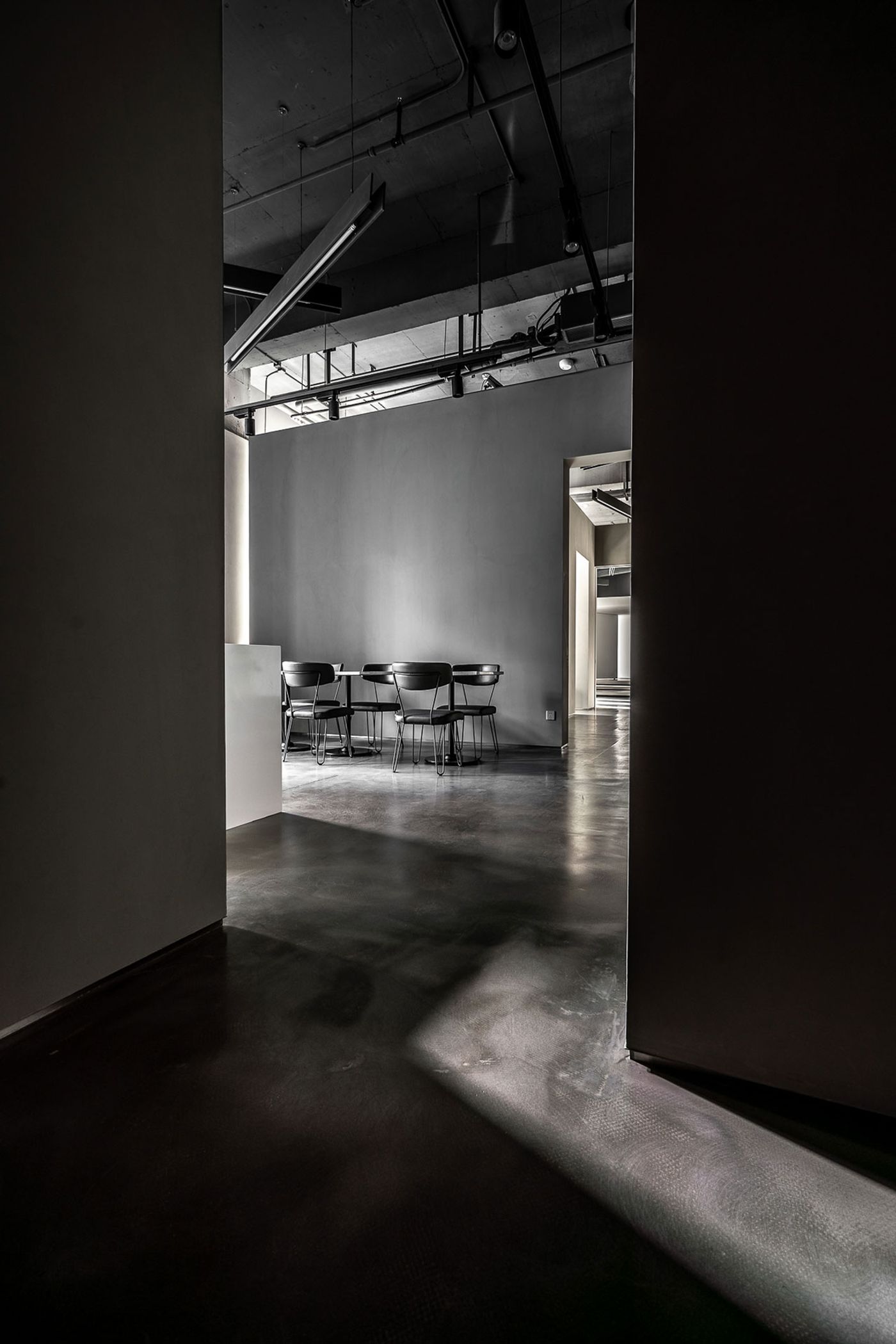
A subdued colour palette of lighter and darker grey hues dominates the pared-down interiors, providing coherence throughout the office and an understated sense of elegance. Despite their monochromatic aesthetic, the spaces are neither dull nor flat, courtesy of an eclectic selection of nuanced materials and finishes whose appearance shifts in relation to daylight, sunlight and artificial lighting. From polished cement, cast iron and brushed marble, to chalkboard paint and colour-washed veneer, the surfaces seem to be alchemically transforming as the day progresses. Moreover, with the darkest shade reserved for the building’s core—represented by black stained timber paneling delineated by low level concealed lighting—the lighter hues along the glazed perimeter seem even brighter.
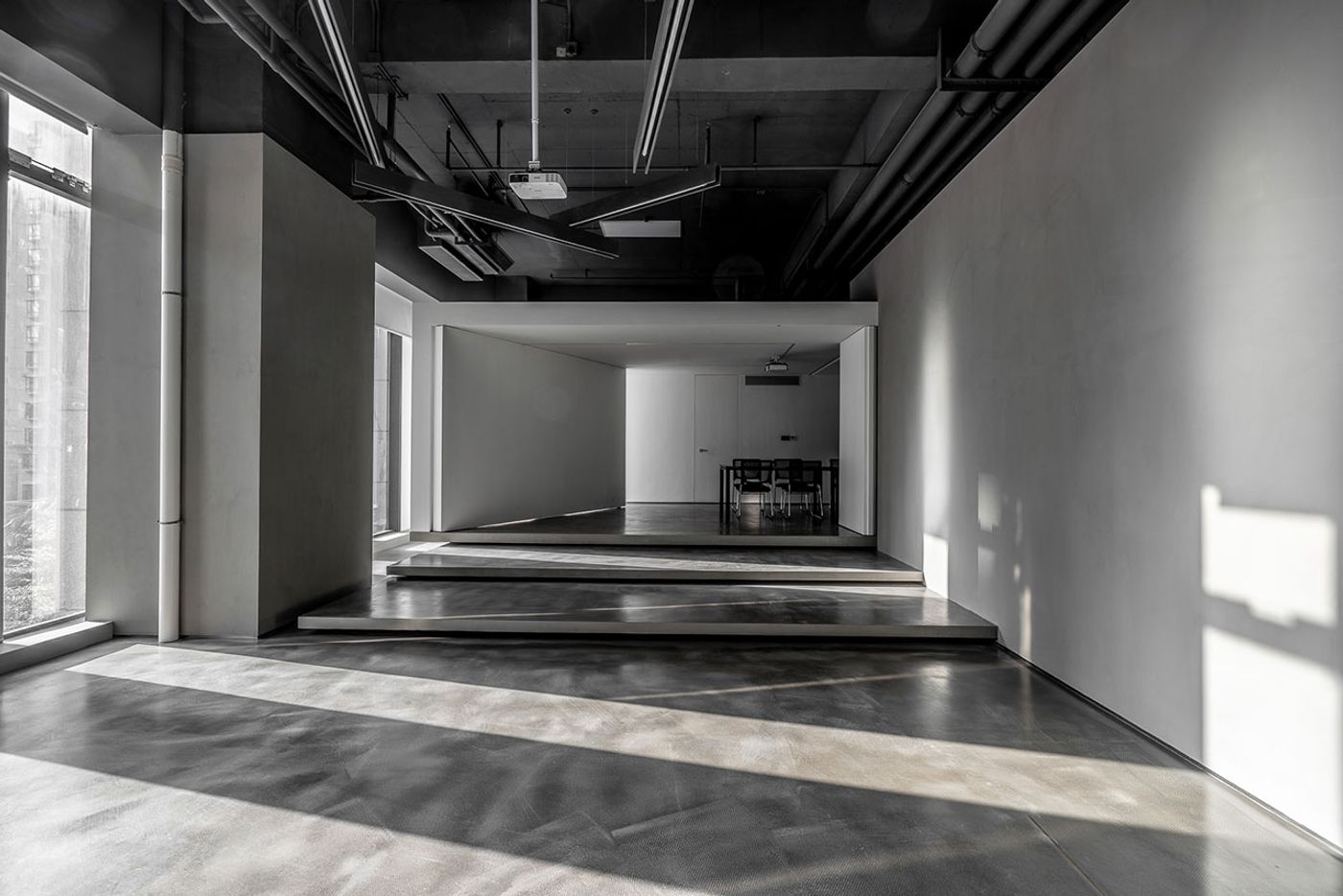
Photo © Wei Yi International Design Associates.
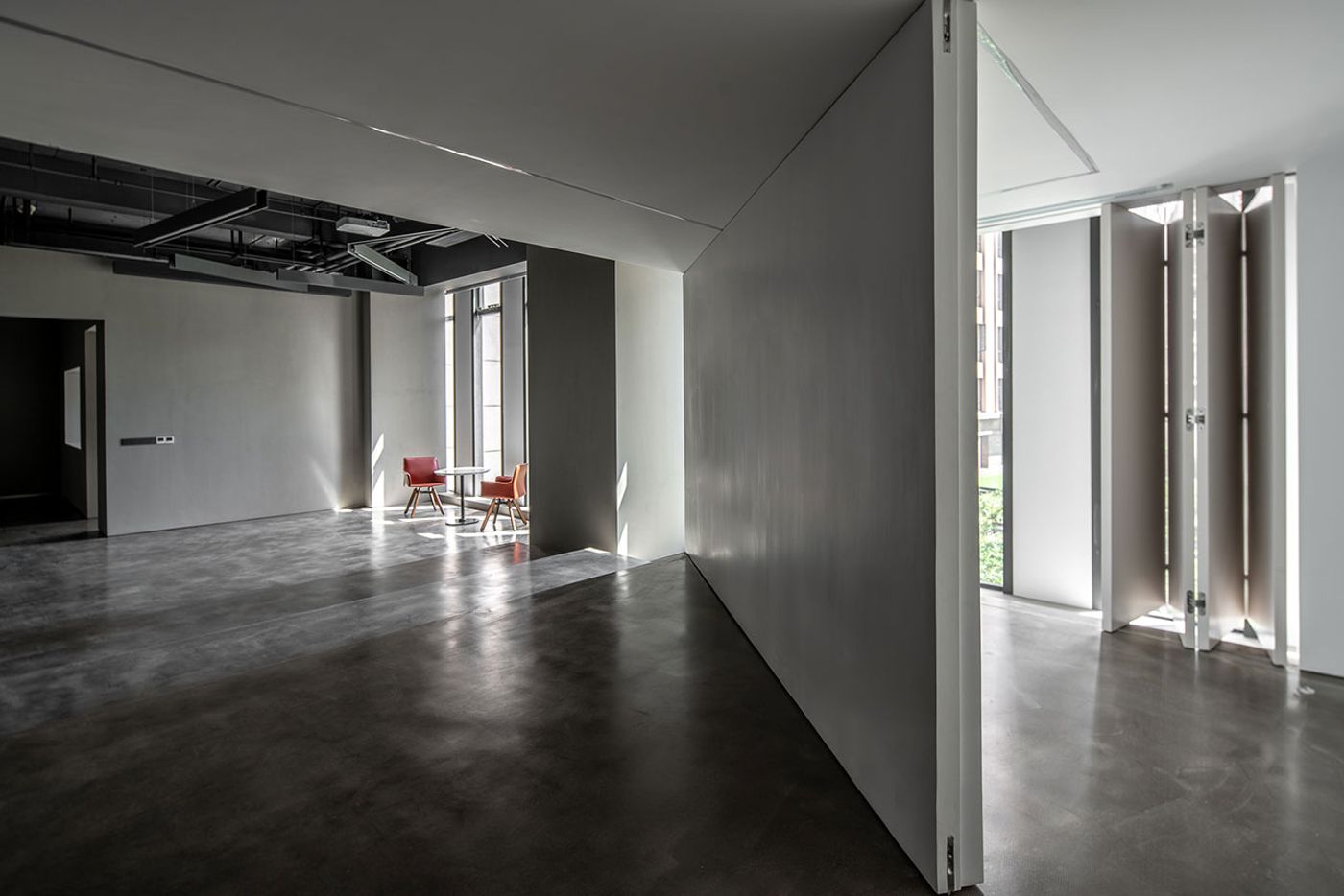
Photo © Wei Yi International Design Associates.
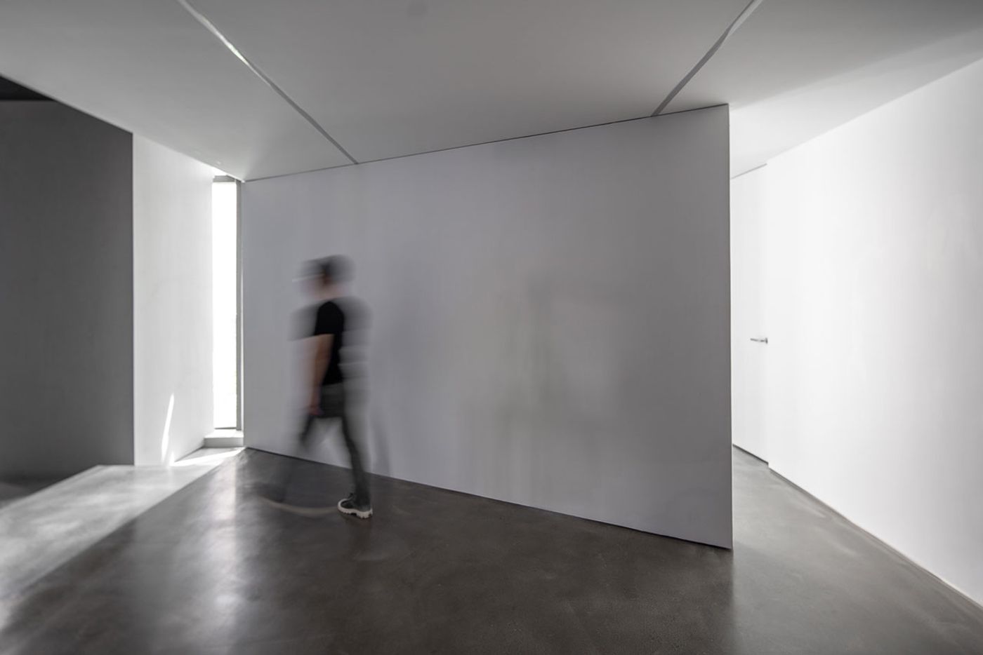
Photo © Wei Yi International Design Associates.

Photo © Wei Yi International Design Associates.
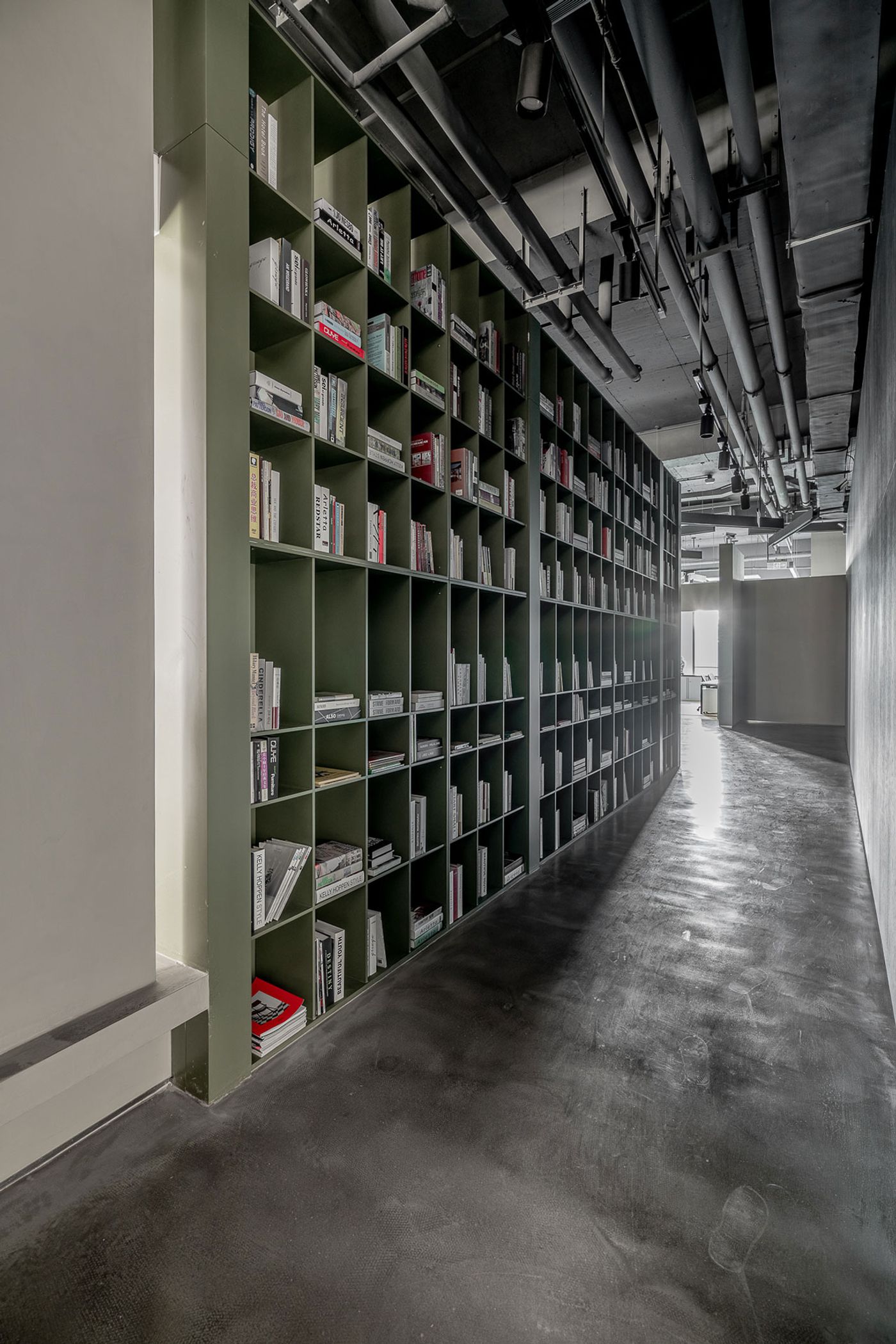
Photo © Wei Yi International Design Associates.
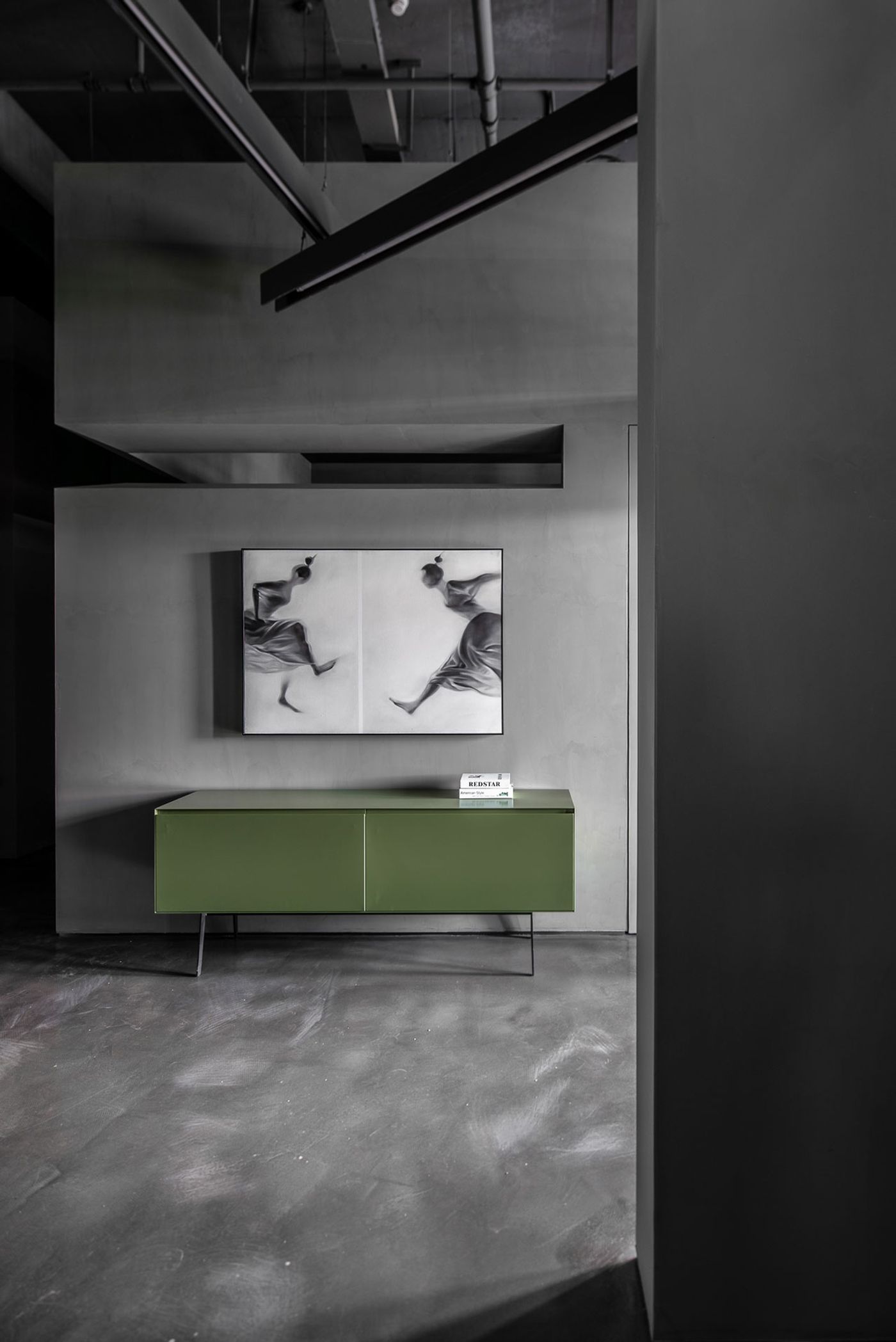
Photo © Wei Yi International Design Associates.
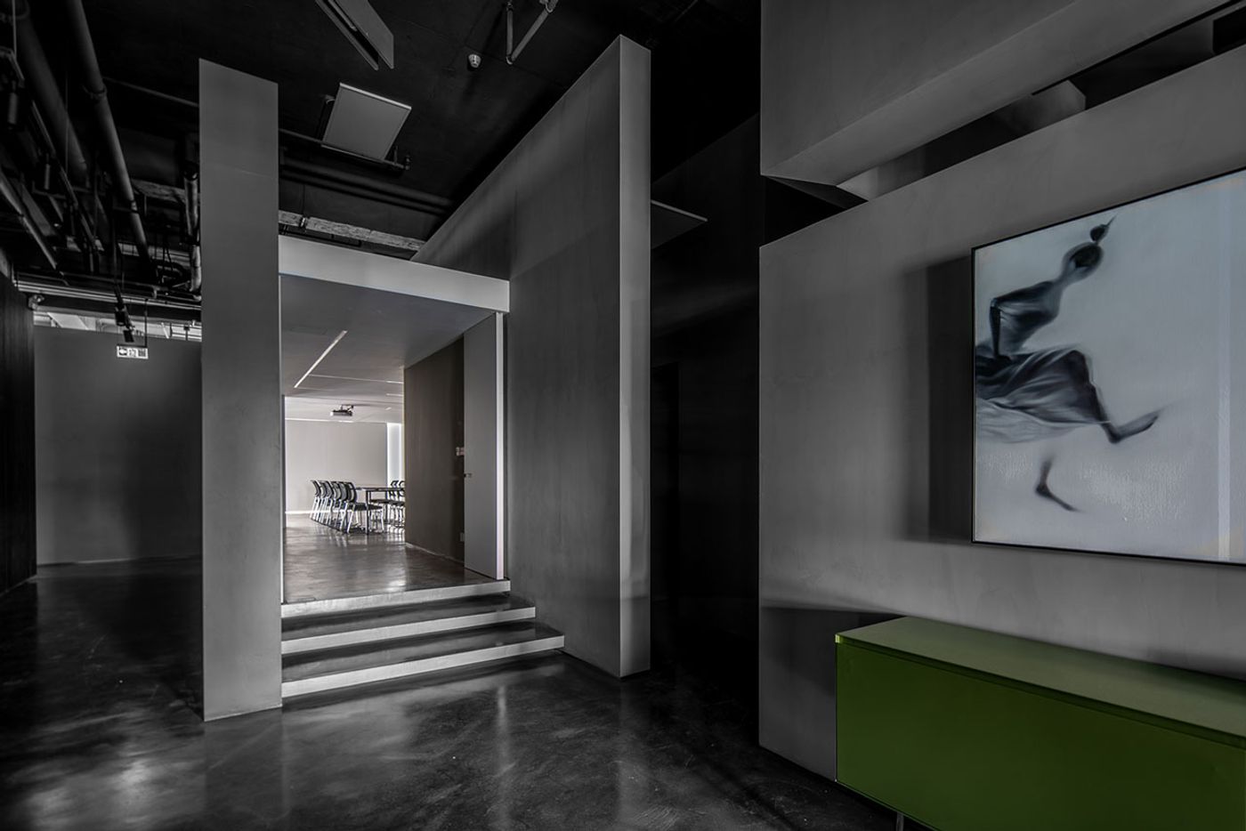
Photo © Wei Yi International Design Associates.
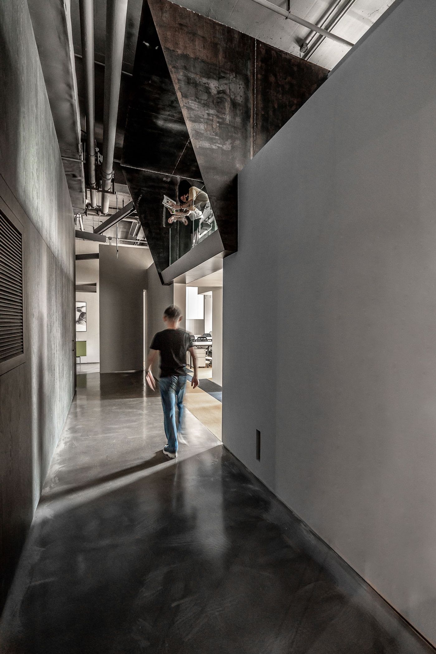
Photo © Wei Yi International Design Associates.
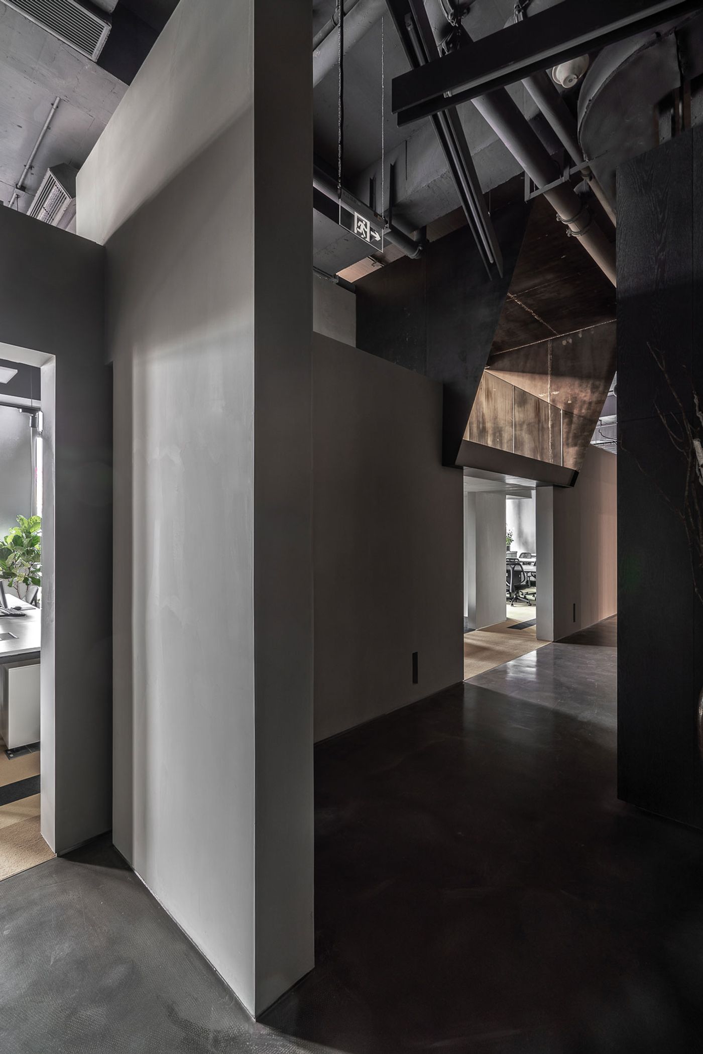
Photo © Wei Yi International Design Associates.
The austere sensibility of the nuanced colour scheme, enhanced by the black painted air ducts, cable trays, and light fittings that graphically populate the ceiling, is harmoniously complemented a minimalist design aesthetic of subtle refinement, devoid of any decorative flourishes and flashy details. The only true splashes of colour that the designers have incorporated into the project can be found in the director’s office, and even here, they are limited to a backdrop for her desk. Natural wood finishes can also be found in this office space, imbuing the room with a warmth that is surely appreciated by any employee summoned here. With a dedicated prayer/reflection room also at hand and several spots where the staff can socialize or step away from their workspace, this is an office designed as a reflection not only of the company’s fashion-conscious sensibility but as importantly its state of mind.
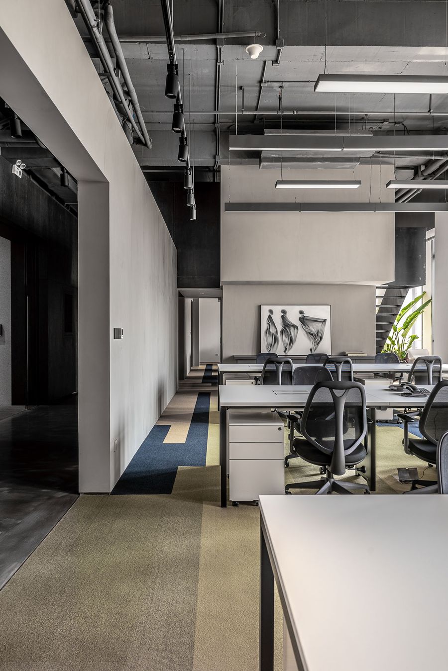
Photo © Wei Yi International Design Associates.
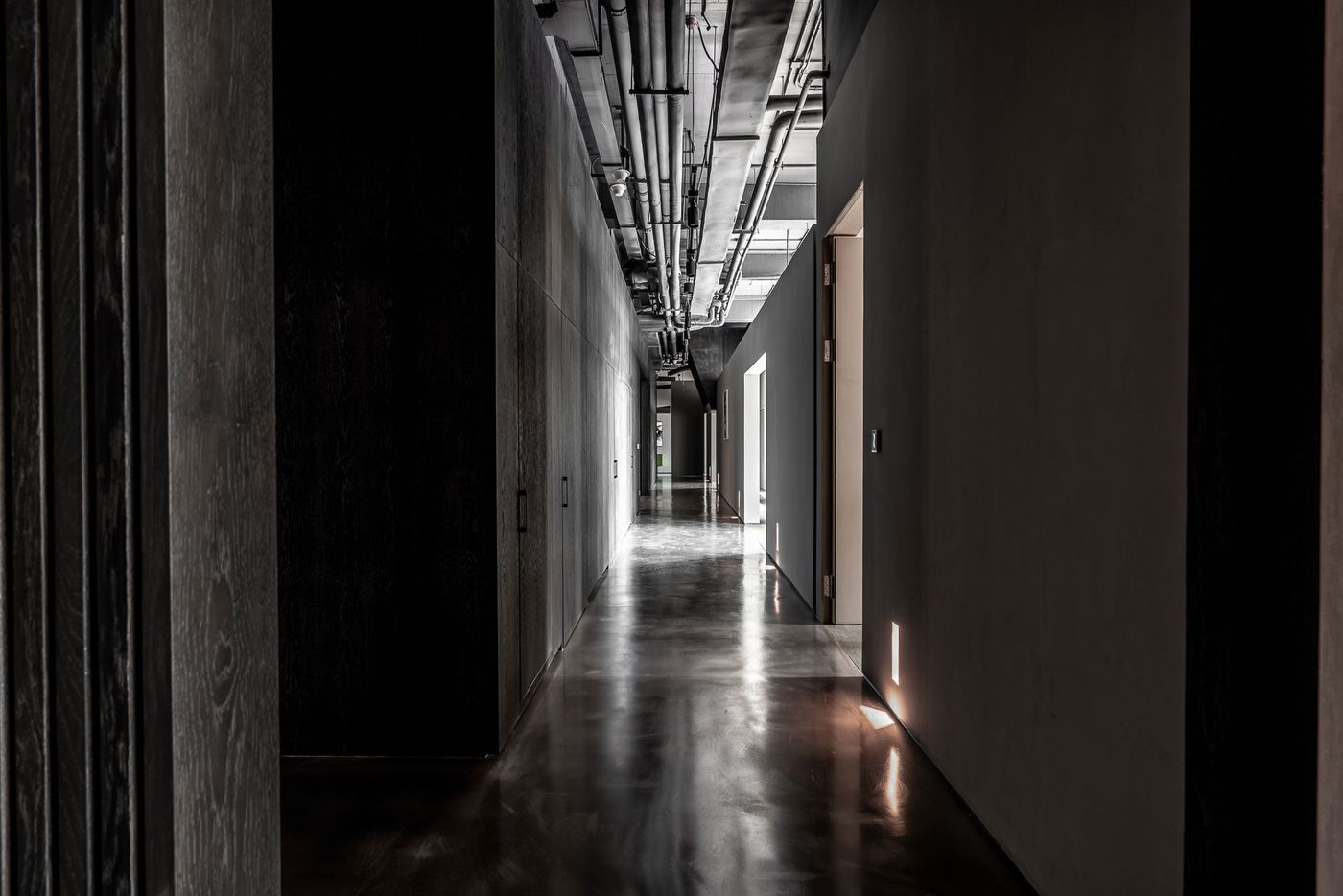
Photo © Wei Yi International Design Associates.
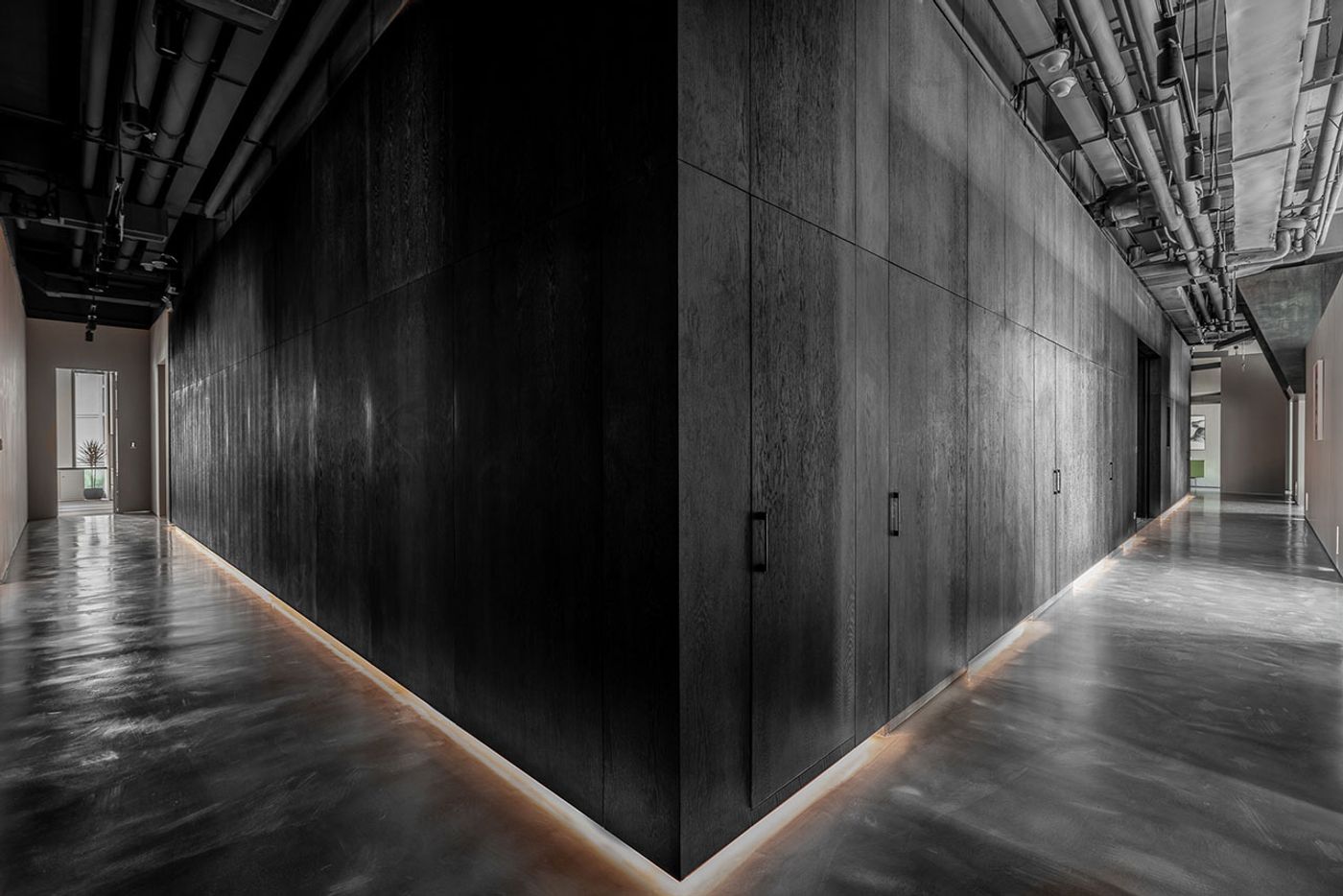
Photo © Wei Yi International Design Associates.
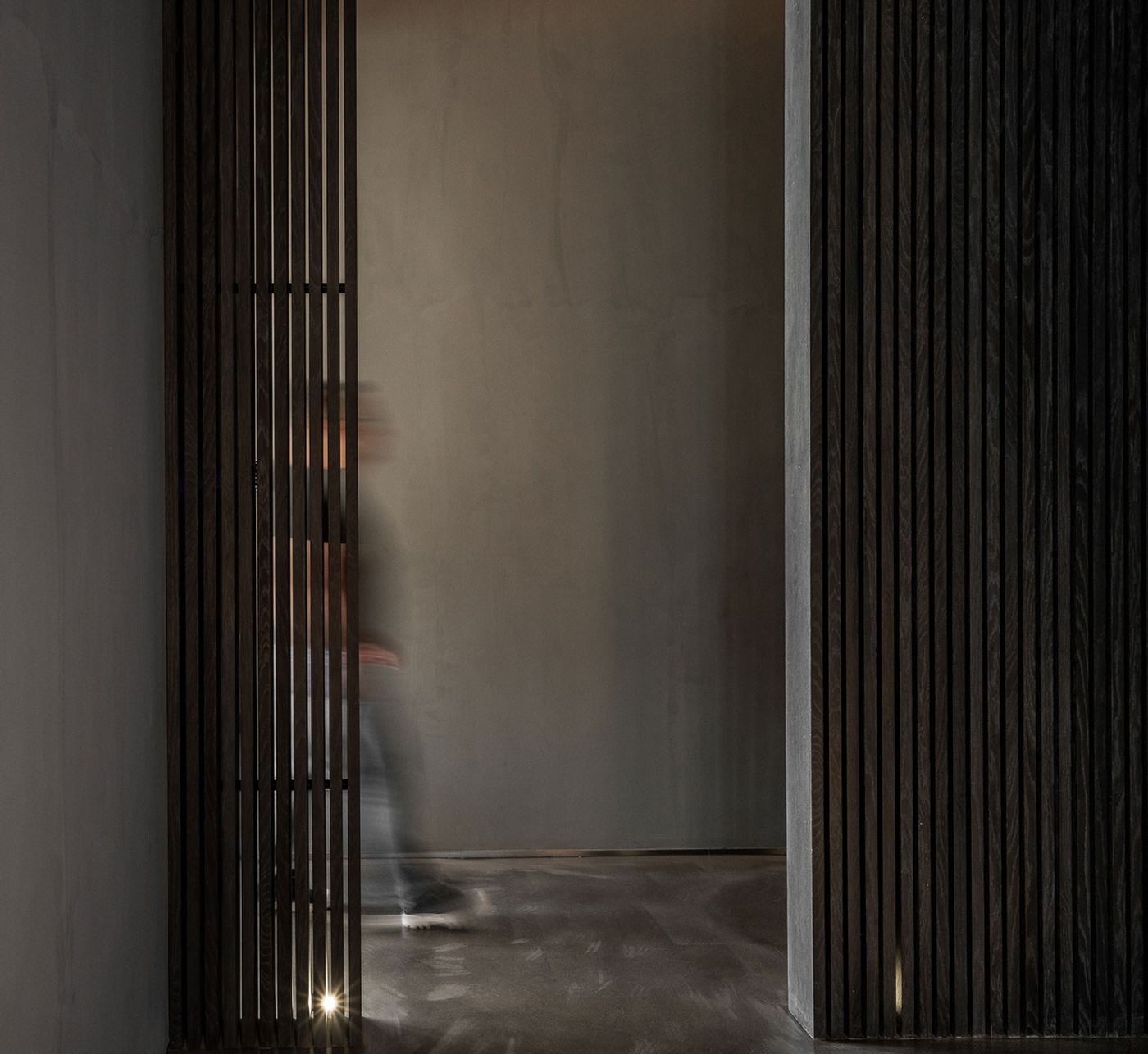
Photo © Wei Yi International Design Associates.
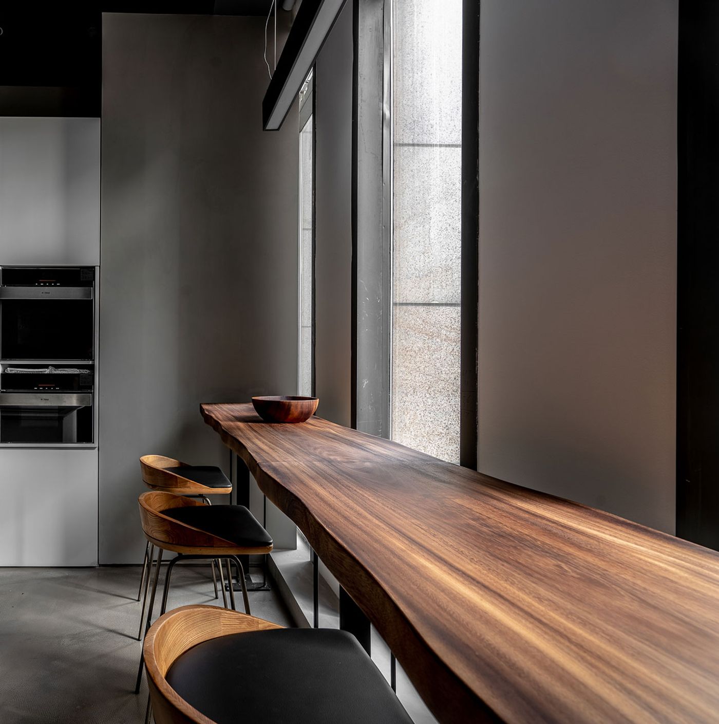
Photo © Wei Yi International Design Associates.
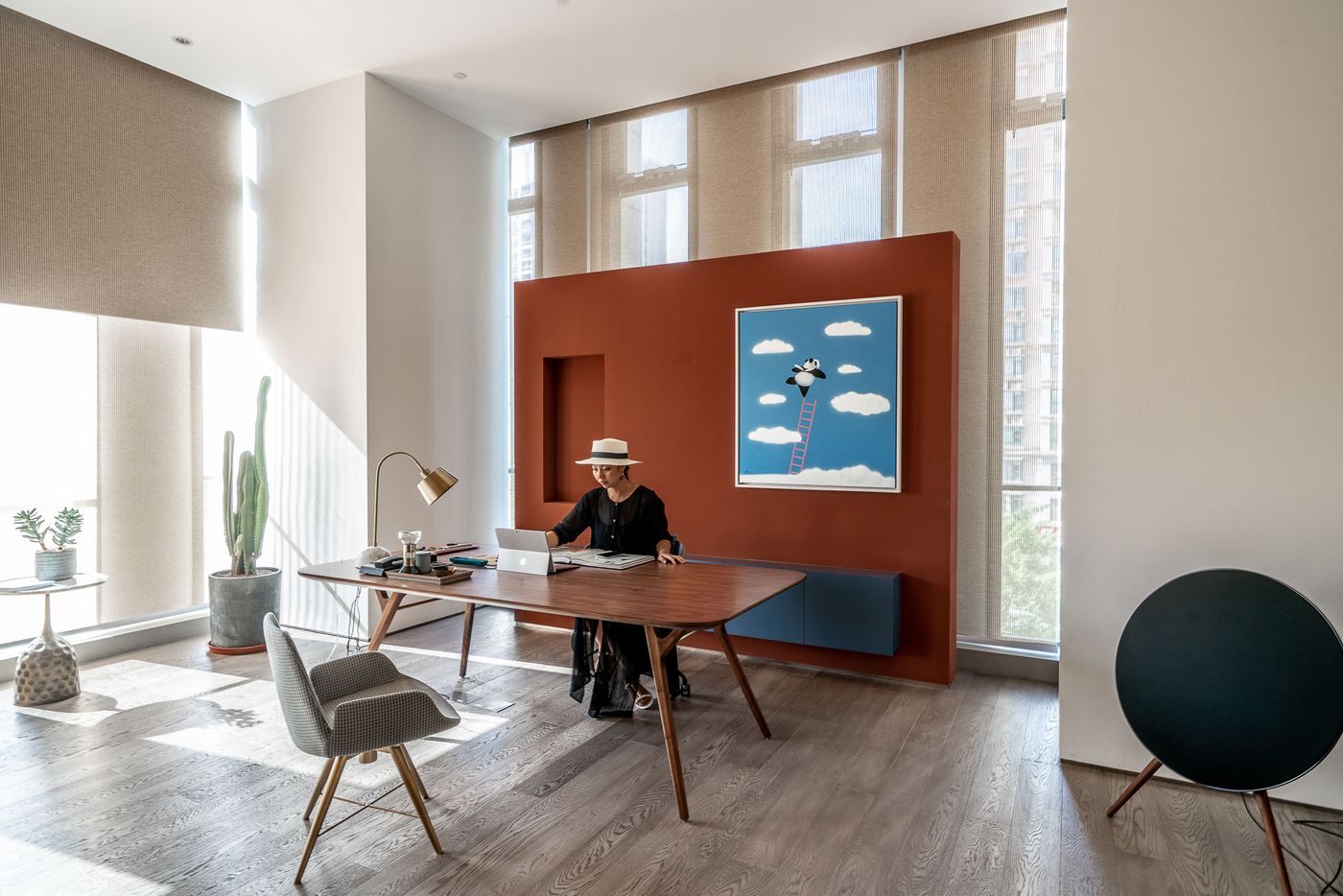
Photo © Wei Yi International Design Associates.
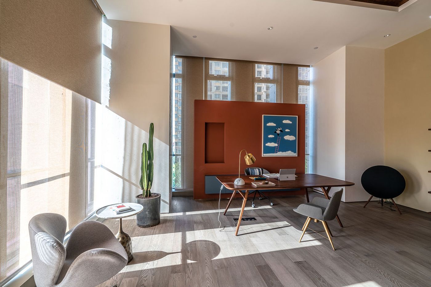
Photo © Wei Yi International Design Associates.
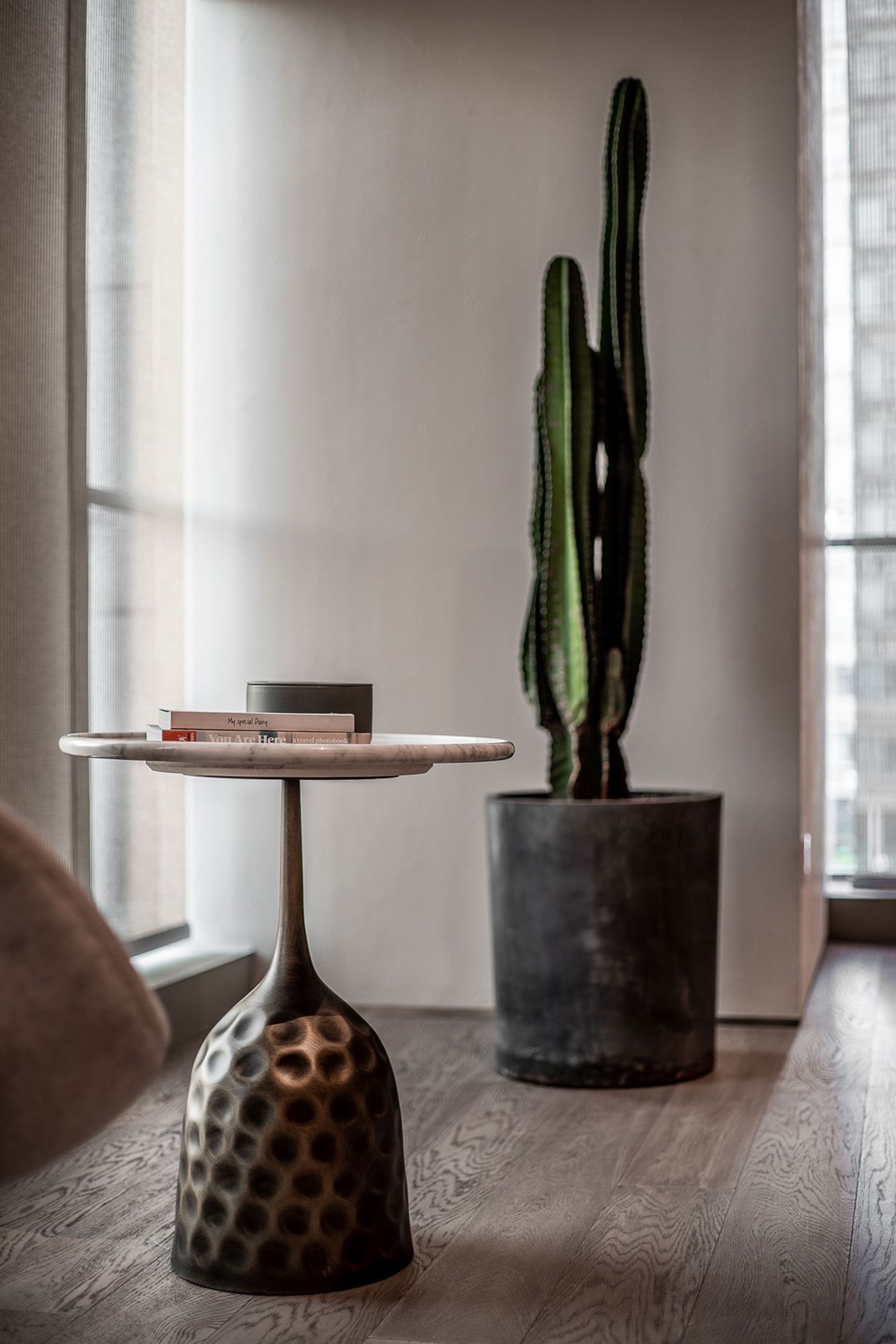
Photo © Wei Yi International Design Associates.
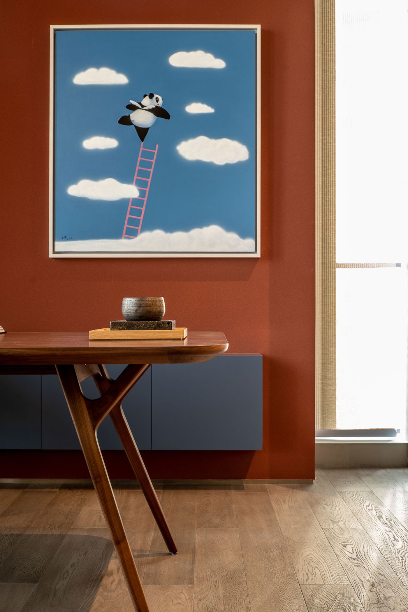
Photo © Wei Yi International Design Associates.
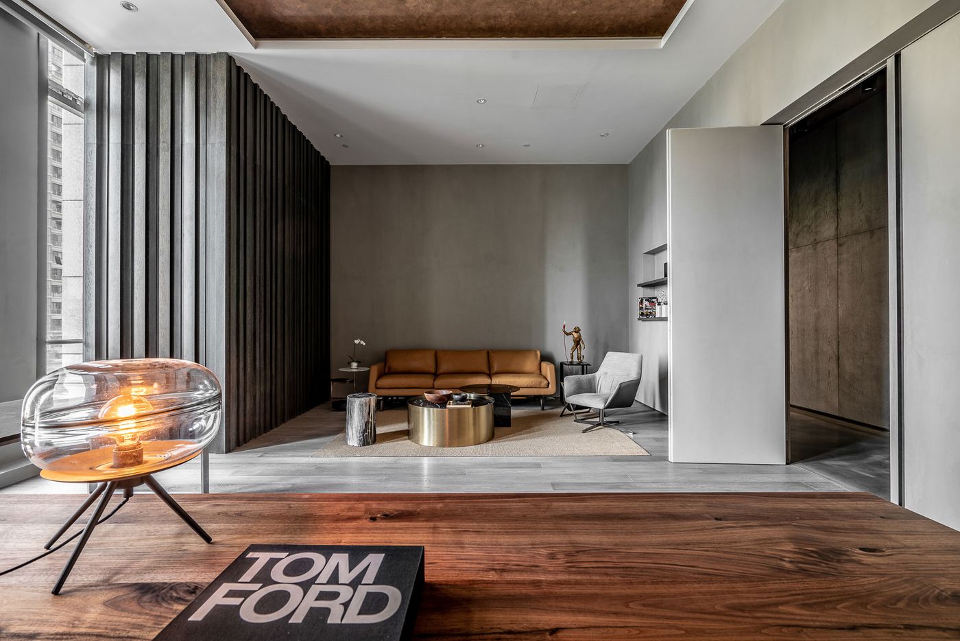
Photo © Wei Yi International Design Associates.
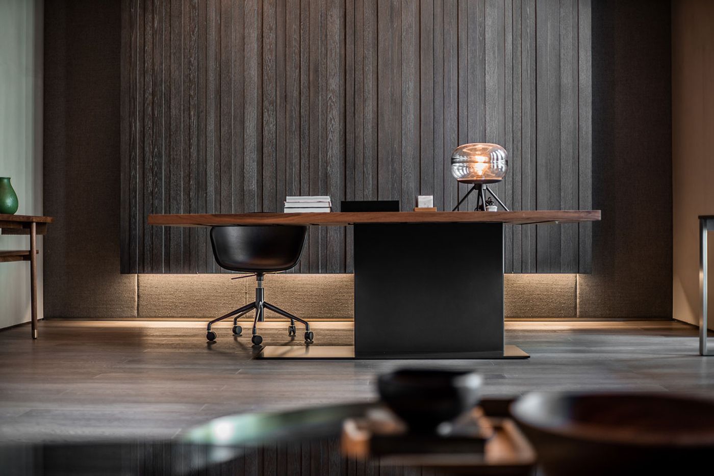
Photo © Wei Yi International Design Associates.
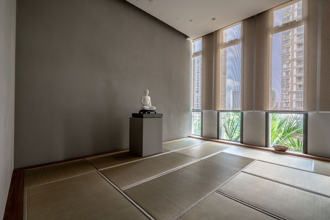
Photo © Wei Yi International Design Associates.
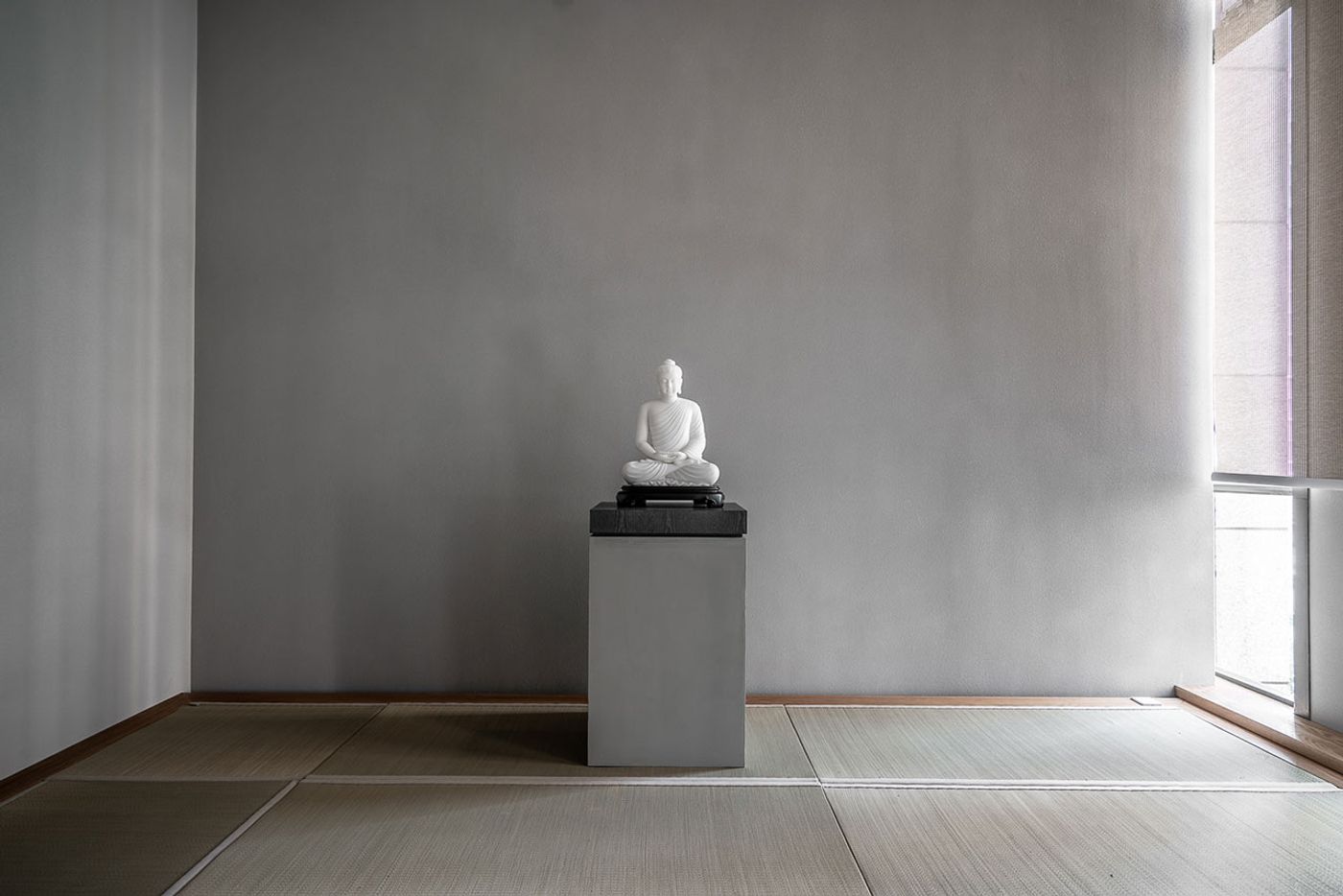
Photo © Wei Yi International Design Associates.
