Oliver Jeffers Talks to Yatzer
Words by Kiriakos Spirou
Location
A whimsical world of unrestrained imagination comes to life through the drawings, paintings, collages and other works by Brooklyn-based Oliver Jeffers, an artist perhaps best known for his award-winning and hugely popular children’s books. Captivatingly illustrated and filled with fun, heart-warming stories about friendship, love and self-discovery, it comes as no surprise that Jeffers’ books have been translated in over 30 languages. When he’s not drawing for his children’s stories, Jeffers is occupied with other, equally compelling artistic projects: his oil paintings have been exhibited several times in galleries and museums across the world (including the National Portrait Gallery in London and the Brooklyn Museum in New York) and he co-directed U2’s video “Ordinary Love” (2013) with his collaborator Mac Premo —with whom he won two NY Emmys in 2010 for their work in advertising and graphics.
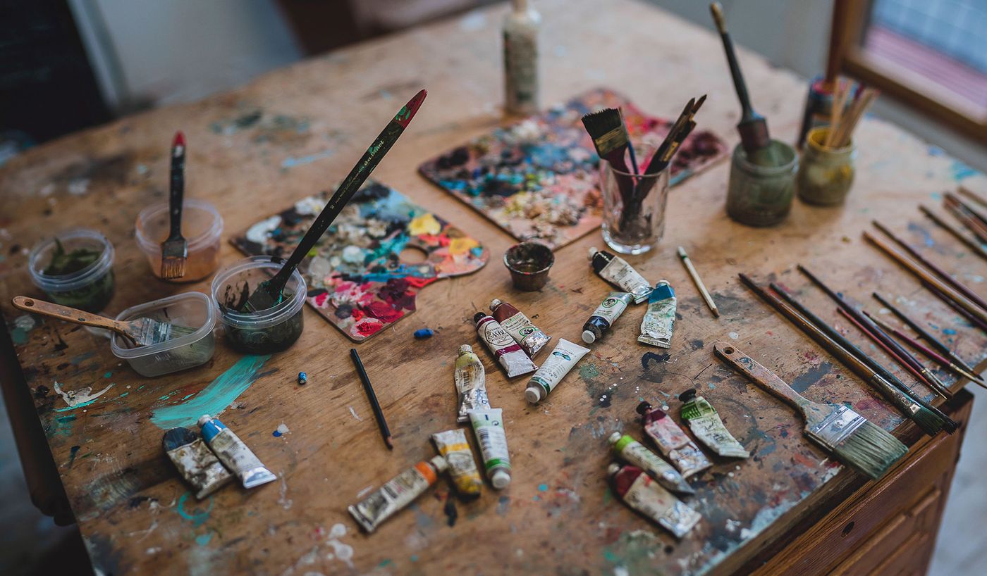
photo © Kacy Jahanbini.
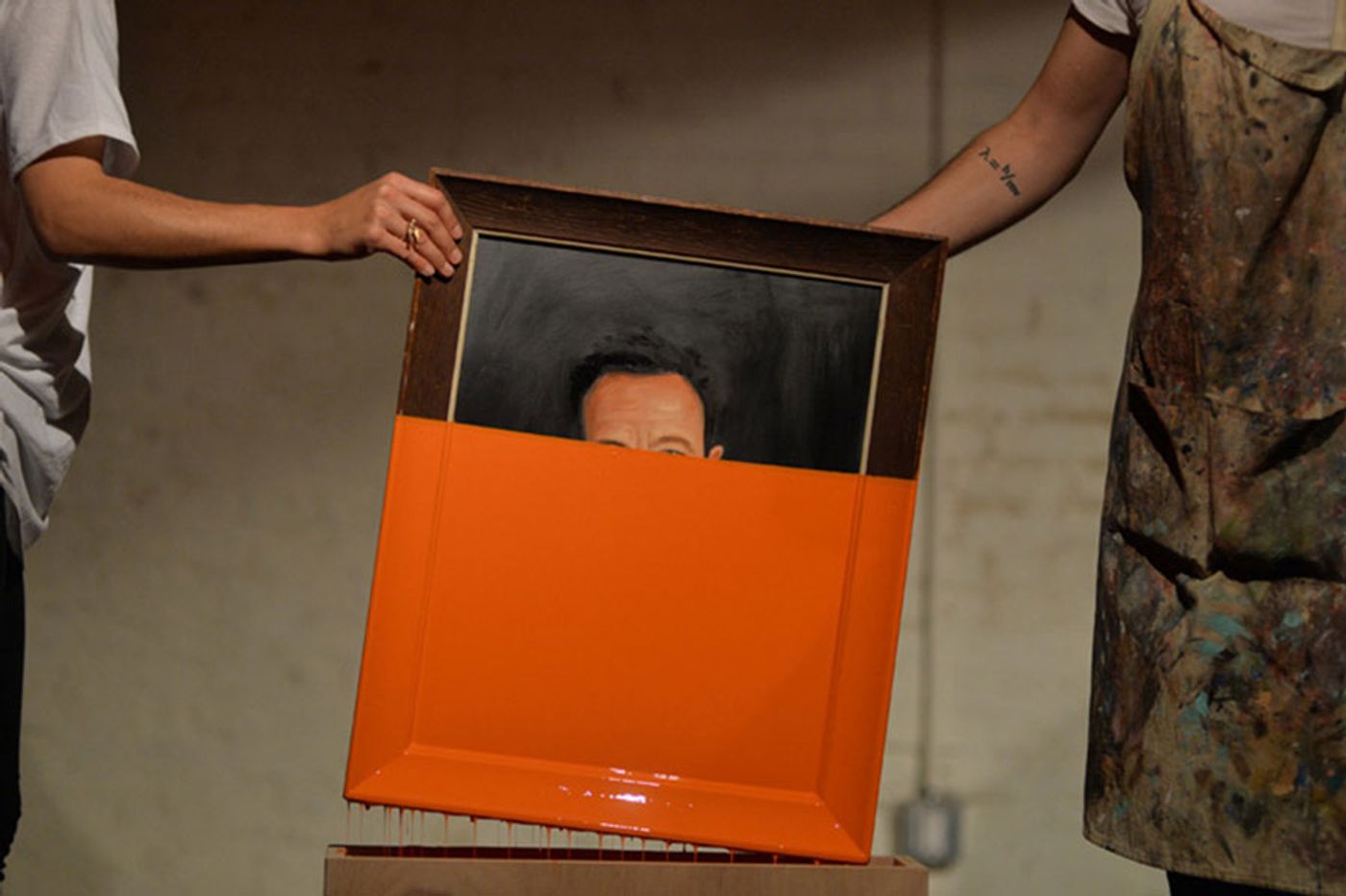
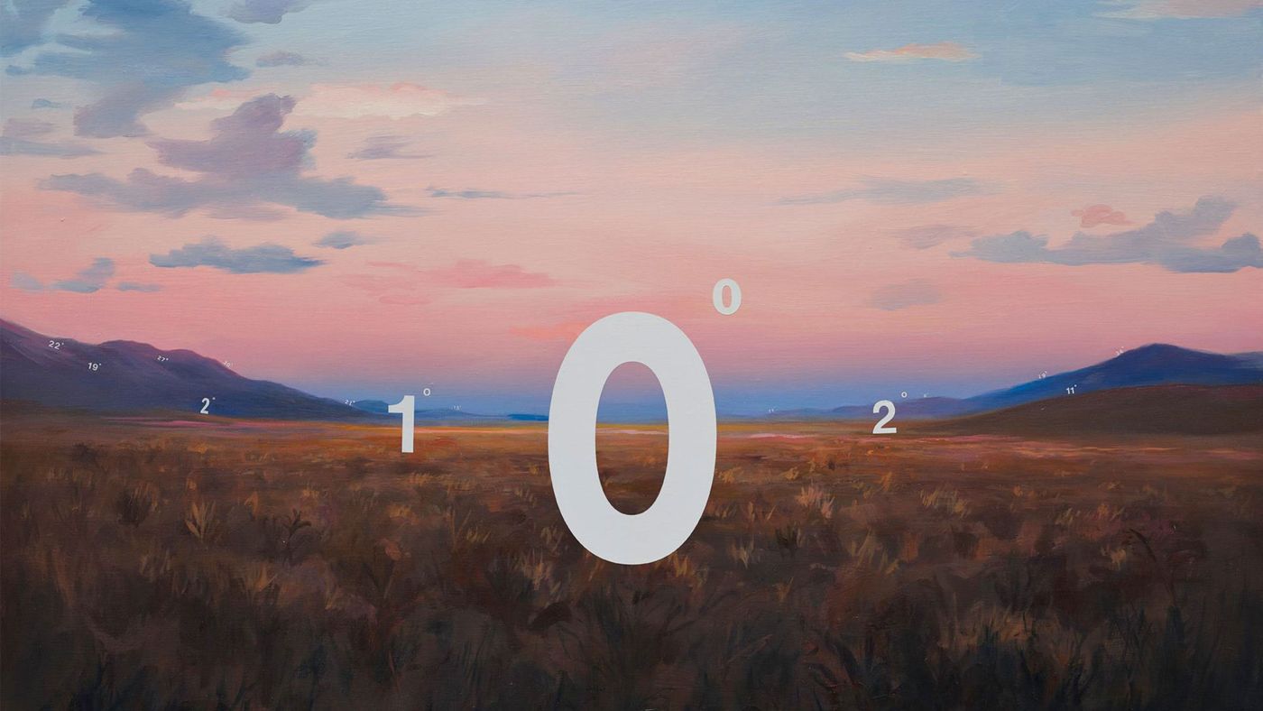
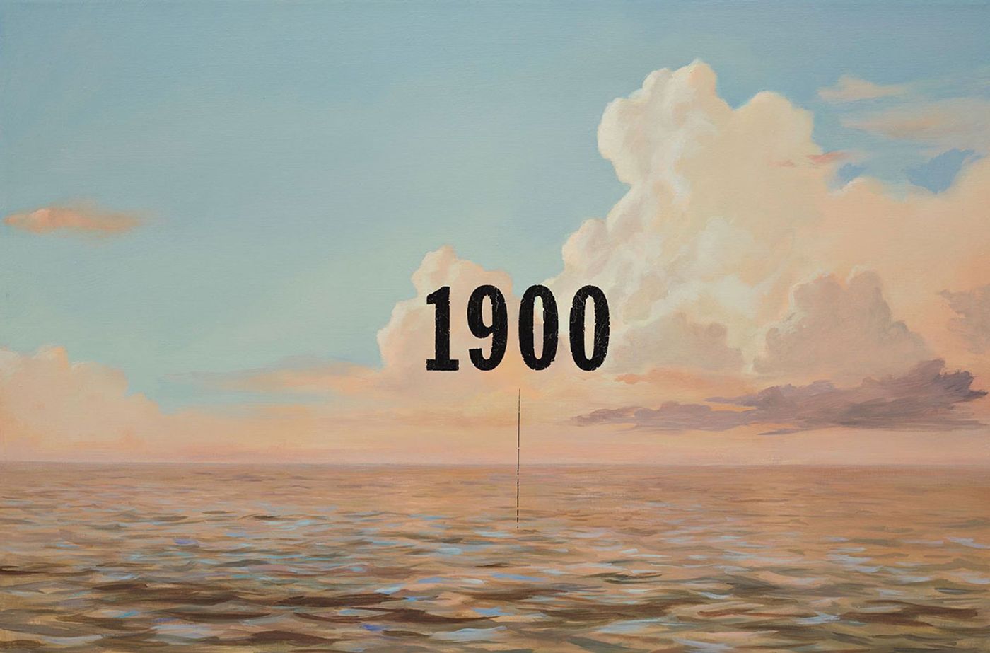
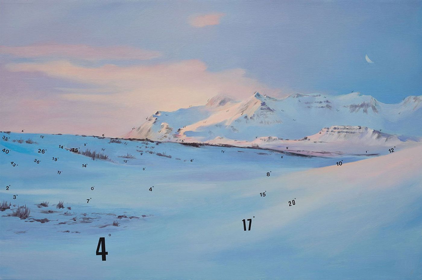
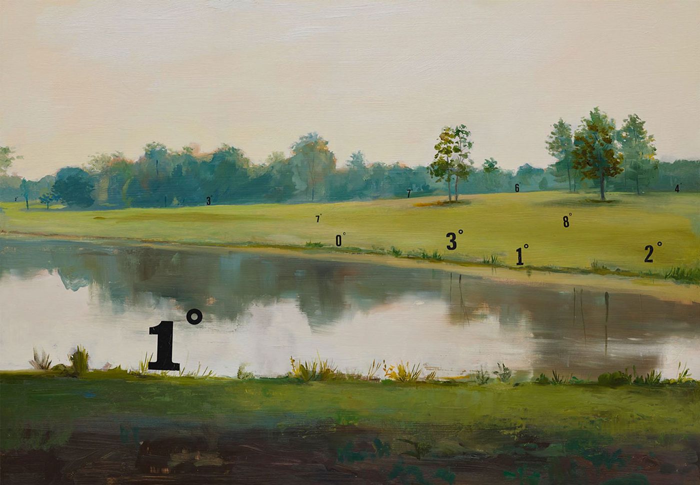
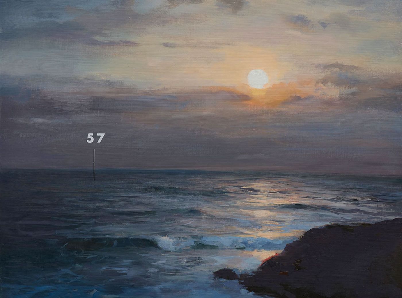
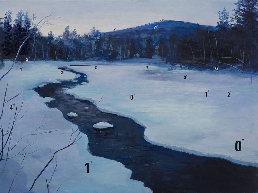
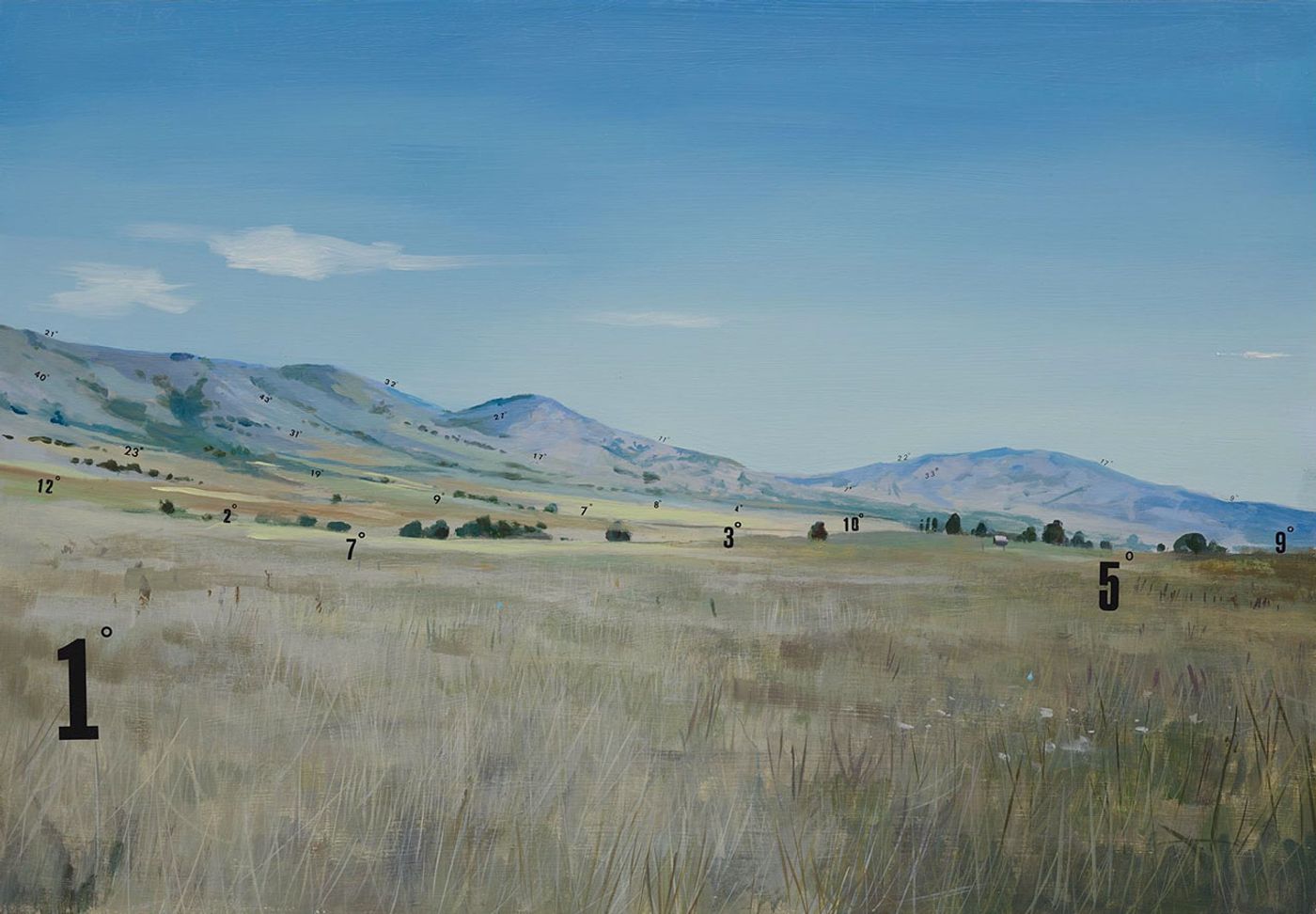
In his Nothing to See Here series (2013), Jeffers mixes painting, collage and installation to create a layered iteration of impressions and symbols that expand the notion of portraiture. Meanwhile, for his ongoing Dipped Paintings project, he paints portraits and then partially covers the whole frame with bright-coloured paint during public performances, thus playing with concealment and the notion of treating one’s own work as a found object. More recently, Jeffers has completed a series of landscape paintings called “Measuring Land and Sea”, where clean-cut Letraset numbers are pasted onto landscapes and seascapes, denoting the degrees of slopes and the depth of the sea depicted in the paintings respectively. On the occasion of the series’ presentation at Lazarides Gallery in London this month, we had the opportunity to ask the artist a few questions about Measuring Land and Sea, his Dipped Paintings and his creative process in general.
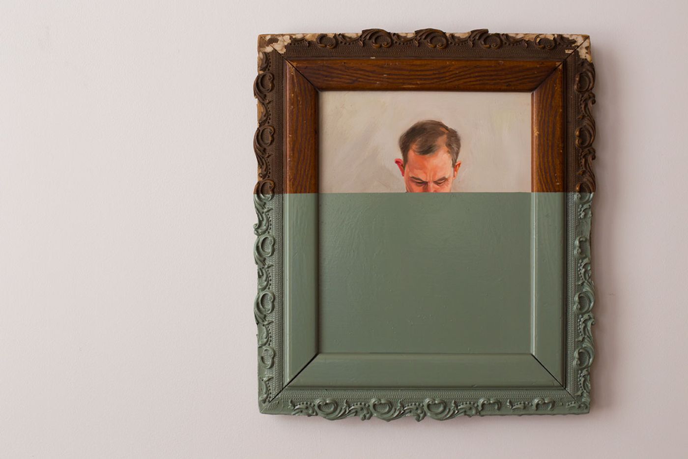
2015
oil on canvas dipped in enamel
16 7/8" x 15"© Oliver Jeffers.
Q: For your upcoming solo show in London, you return to an earlier idea of yours, where you mark painted landscapes with Letraset numbers. Can you tell us more about this exhibition and the works that will be on display at Lazarides gallery?
A: The show marks the completion of two of my earlier ideas, which I’ve been keen on returning to for quite some time. I painted my first Protracted Landscape in 2006, a year after I had a fascinating conversation with a Quantum Physicist. Over the course of our long and complex dialogue, I began to wonder about the limits of science. At points in our exchange, I sensed that simple things were maybe being over analyzed, perhaps in a Sisyphean manner towards this desire for humankind-improvement and mastery. I imagined a beautifully rendered landscape littered with numerical values representing the angles of the painting. These measurements, while factual, actually distract from our appreciation of the landscape rather than provide us with deeper understanding with the idea being that maybe additional information is not always a good thing.
The Fathom Seascapes came about a couple years later on, when I found out how little was known about the depth of the ocean. I decided to paint a seascape of a specific location, and then overlay it with corresponding depth soundings in Fathoms, a now outdated unit of measurement (and partly because of the word play of fathom also meaning ‘to understand’). As the swell in the paintings suggest, the ocean is not flat, but in constant motion, and therefore immeasurable. These works speak to the futility of man when faced with the vastness of our universe.
Although the two series have never previously been shown together, I recognized the natural fit between them almost immediately. While one signifies the tendency to overthink, the other reflects on the inability to comprehend. As they come together for the first time in Measuring Land and Sea, I hope it will highlight the gulf between the forms of human cognition that the two series of paintings represent.
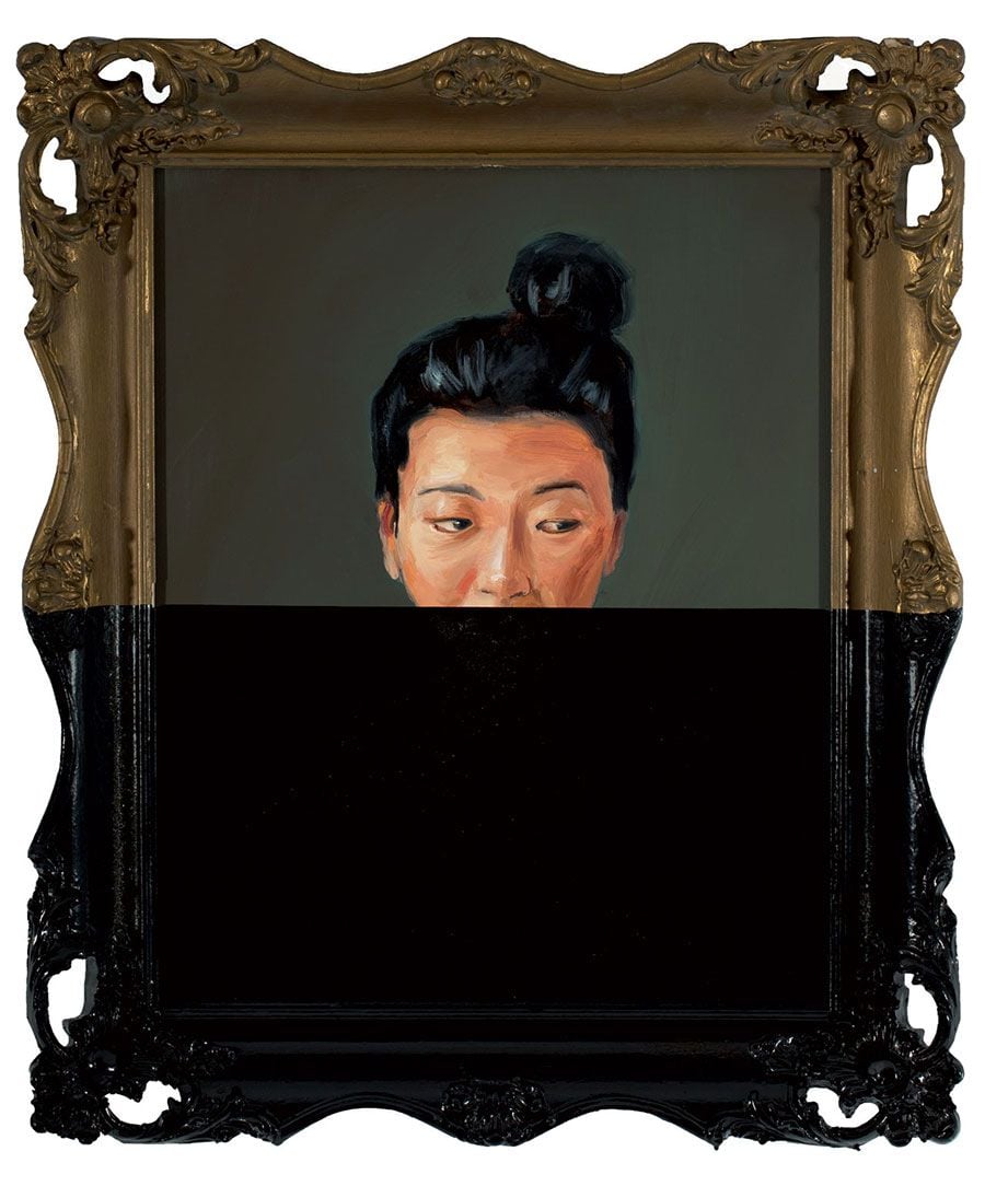
WITHOUT A DOUBT PART 12012
oil on canvas dipped in enamel
20” x 16”© Oliver Jeffers.
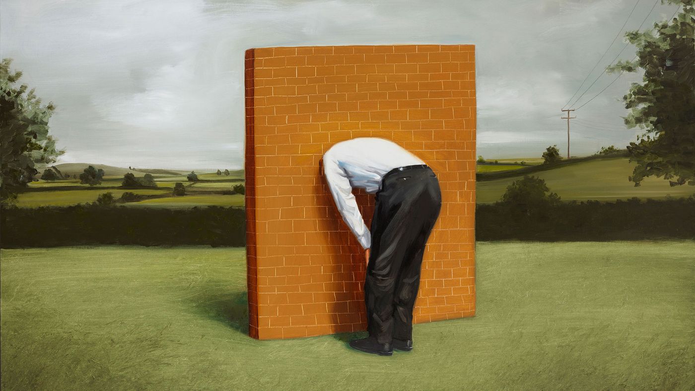
The Wall2011Oil on canvas100 x 152 cm© Oliver Jeffers.
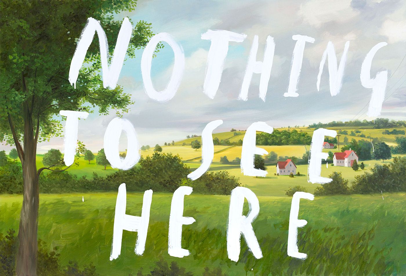
Nothing To See Here part 12013Oil and enamel on canvas86 x 127 cm© Oliver Jeffers.
Q: Earlier in your career you have engaged with objets trouves such as found oil-paintings and other materials. How does the concept of the found object continue to inform your practice? Are your Dipped Paintings and the "Measuring Land & Sea" series an evolution of this idea?
A: I’m very interested in repurposing, giving materials new lives and putting them into new relationships. In my first collage based picture book, The Incredible Book Eating Boy, I used old library books as the ground for all the art. Though the original books were destroyed, their pages took on a new existence in a work that celebrates reading itself. Much of my collage work plays in this space of adaptation and alteration. I use a lot of material from the 1950’s to 1970’s, often cutting across an image's original meaning by inserting a humorous thought or speech bubble.
In the Dipped Painting series however, I painted all the portraits myself, rather than use found painting pieces; with that said, the project does still utilize other forms of repurposing. All of the performances take place in spaces which have many histories, for example, a basement that was once a street level sidewalk, a disused post office, and a factory turned artist space. I also affix all my new paintings to reclaimed frames and even dip vintage photographs as paint testers. Repurposing these things and places fascinates me and plays a large role in the conceptual framework for the Dipped Paintings project, which hinges on the concurrence of loss and creation and its relationship to memory.
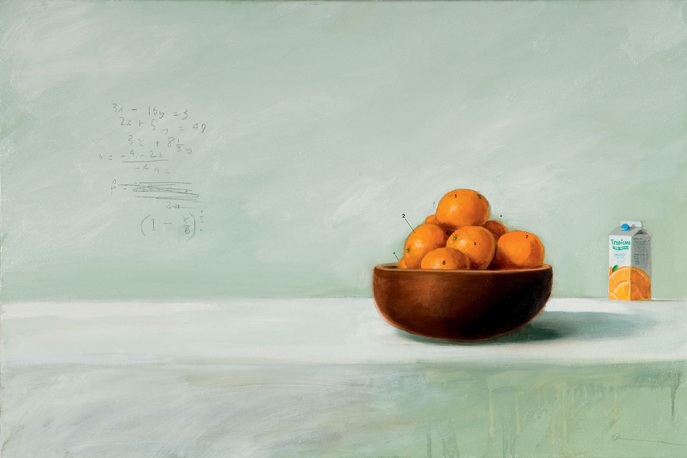
STILL LIFE WITH MATHS AND ORANGE 2006
oil, letraset and lead on canvas
23 1/2” x 35 1/2”© Oliver Jeffers.
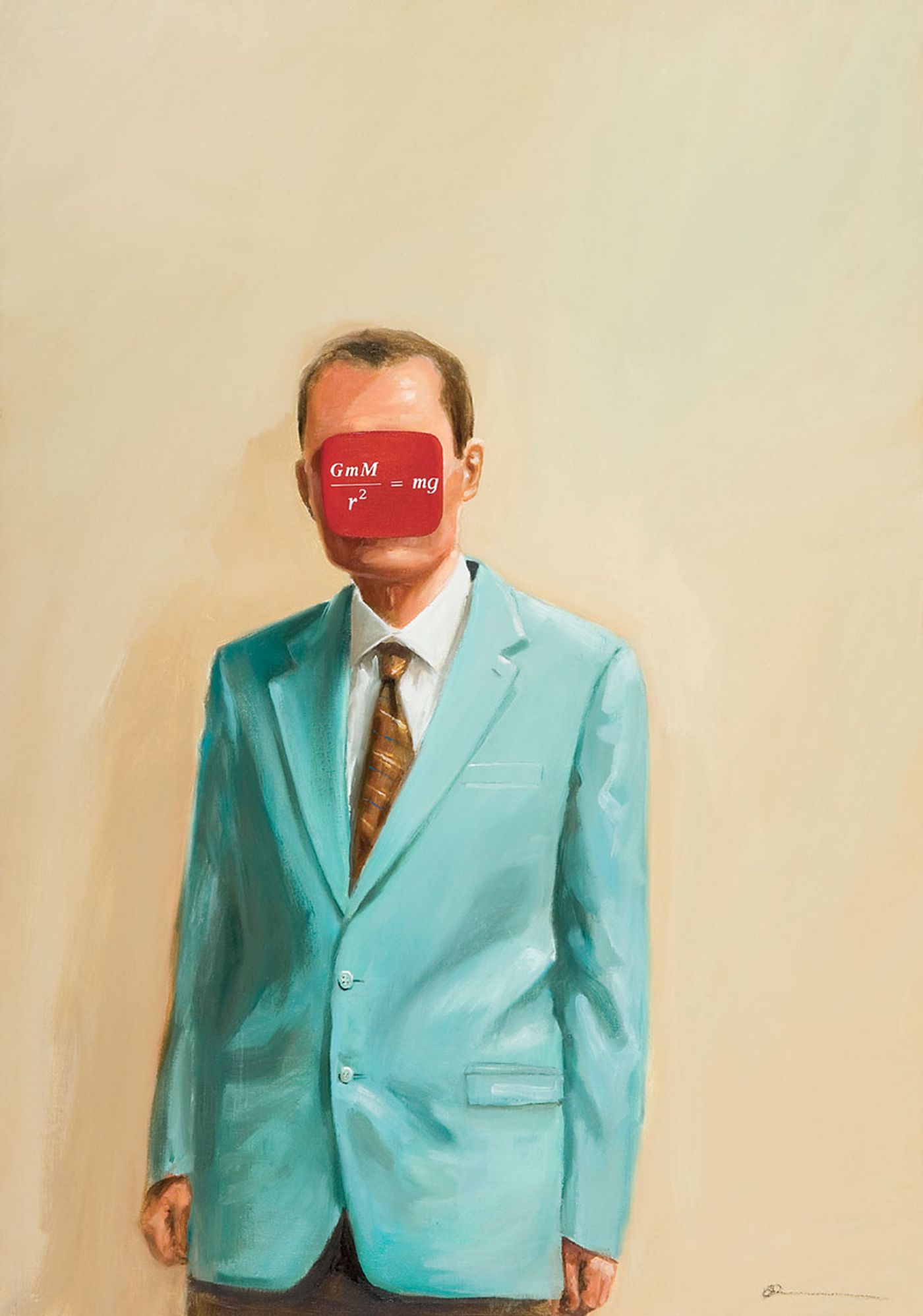
THE WEIGHT OF THE WORLD2006
oil and vinyl on canvas
39” x 27 1/2”© Oliver Jeffers.
Q: As an artist, do you have any habits or everyday strategies that help you be creative “on demand”, that help your imagination remain active?
A: Typically, I have multiple projects going on at the same time. This can make for a very demanding schedule, as well as a pressure to always ‘be on’, creatively speaking. However, I firmly believe, you can’t plan creativity. Many of my best ideas come about when I’m not trying —when I have time off and my mind is free to play. Down time can be hard to fabricate on a deadline or in a routine fashion and, I’ve found that the next best solution is to jump to a different problem. Often, when I hit a creative wall, if I go and work on something completely different, the answer will present itself to me when I’m not thinking about it, or I come back with fresh eyes and see it from a different perspective. Perhaps, the silver lining of having multiple projects is that when I’m feeling overworked on one problem I can switch to something else.

REPLACING ADRIANNA IN THREE PARTS2009
oil and letraset on canvas
23 1/2” x 71” From the book ’Neither Here Nor There'. Copyright Gestalten 2012.
Q: Nature and science, reality and fantasy, hidden and visible: tell us a bit about these dualities in your work.
A: I have often tried to play within the gap between things, the differences between two perspectives. Much of life is a contradiction, and I’m fascinated by that. Someone once asked if my love of dualities came from growing up in Belfast, Northern Ireland, where there are two very different communities with two very different perspectives, and on inspection, I admitted that yes, that might have had something to do with it.
Q: The blackboard and your handwriting in chalk or crayon are rather like your trademark. I understand you also use a blackboard to write your to-do lists in your studio. Where does this preference for blackboards and writing with chalk come from?
A: My handwriting is really just how I’ve always written, although I’ve learned how to turn it up or down, so to say, over the years. I’ve been fascinated with typography since art school, when my eyes were opened to it by a lecturer I had there named Mike Catto. I experimented with loads of different fonts, and I particularly enjoyed contrasting, say, Futura Gothic with my scribbled handwriting. Over the years I relied less and less on fonts and just began to do most things by hand. Lots of people ask me about turning my script into a font, but I never took to the idea. I love that with handwriting nothing is ever the same twice, that the nuances and subtleties are endless.
As far as chalkboards are concerned, they’re enjoyable to write on tactically, aesthetically pleasing, and supremely practical for my love of list-making. Sometimes I’ll write down a task I’ve already accomplished, just so I can cross it off!
© Oliver Jeffers.
© Oliver Jeffers.
© Oliver Jeffers.
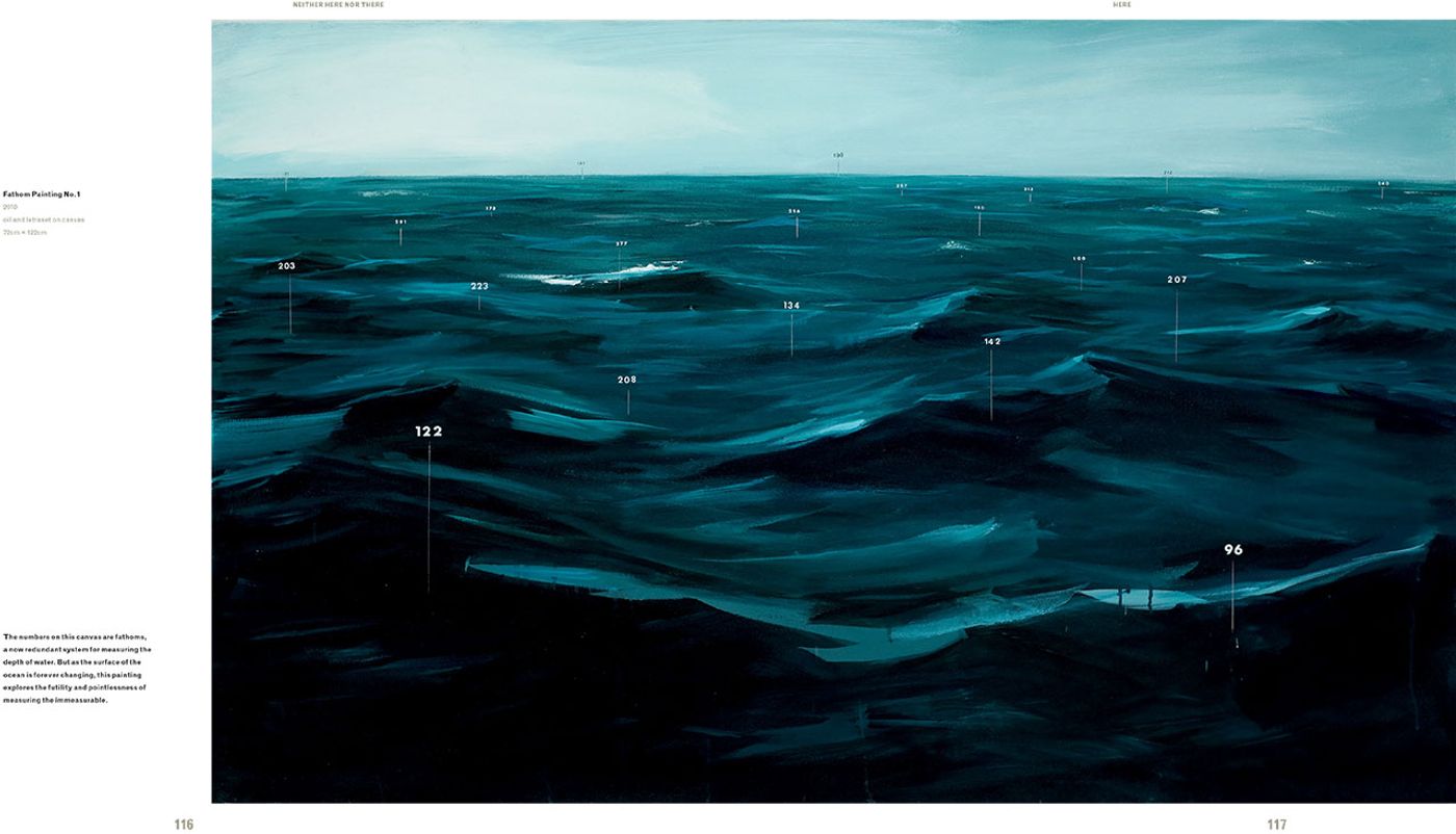
FATHOM PAINTING NO.12010
oil and letraset on canvas
28” x 48”From the book ’Neither Here Nor There'. Copyright Gestalten 2012.
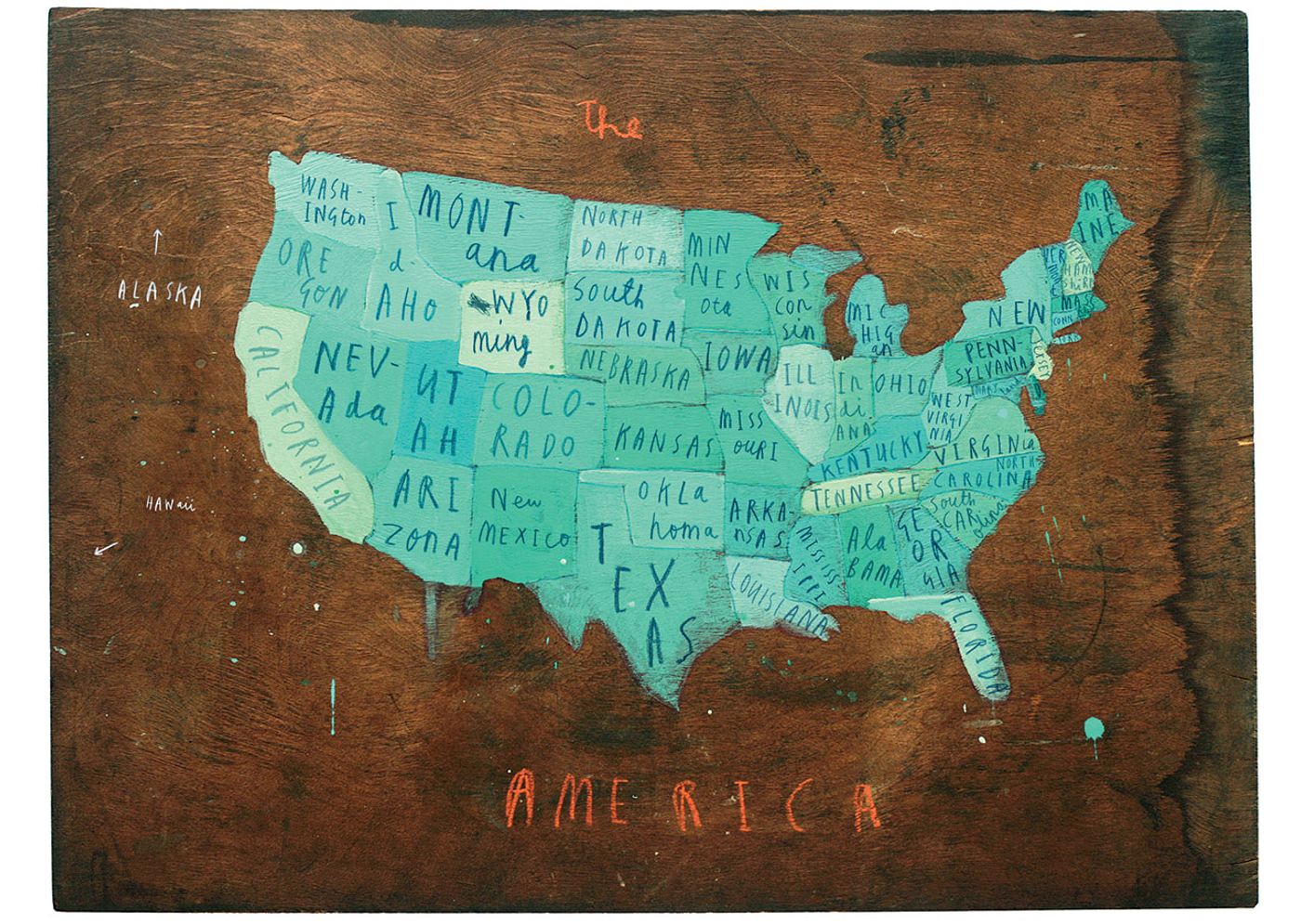
PLACES IN AMERICA2009
oil and chalk on wood
16” x 27 1/2”© Oliver Jeffers.
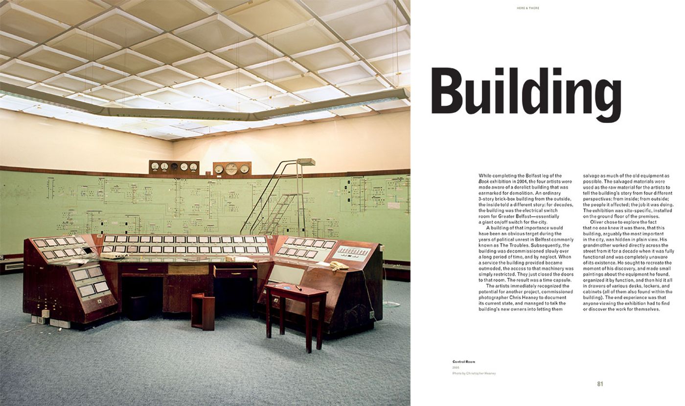
Control Room
2006
Photo by Christopher Heaney.From the book ’Neither Here Nor There'. Copyright Gestalten 2012.
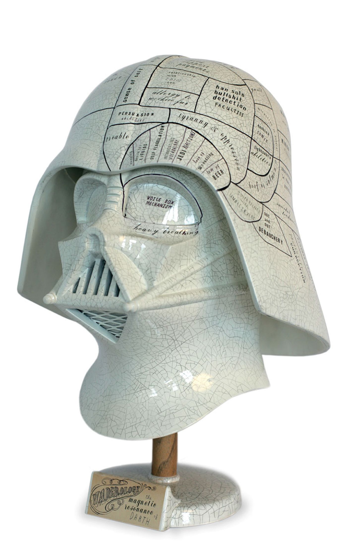
Vaderology
2007
car paint, varnish, pencil, and letraset
on replica Darth Vader helmet© Oliver Jeffers.
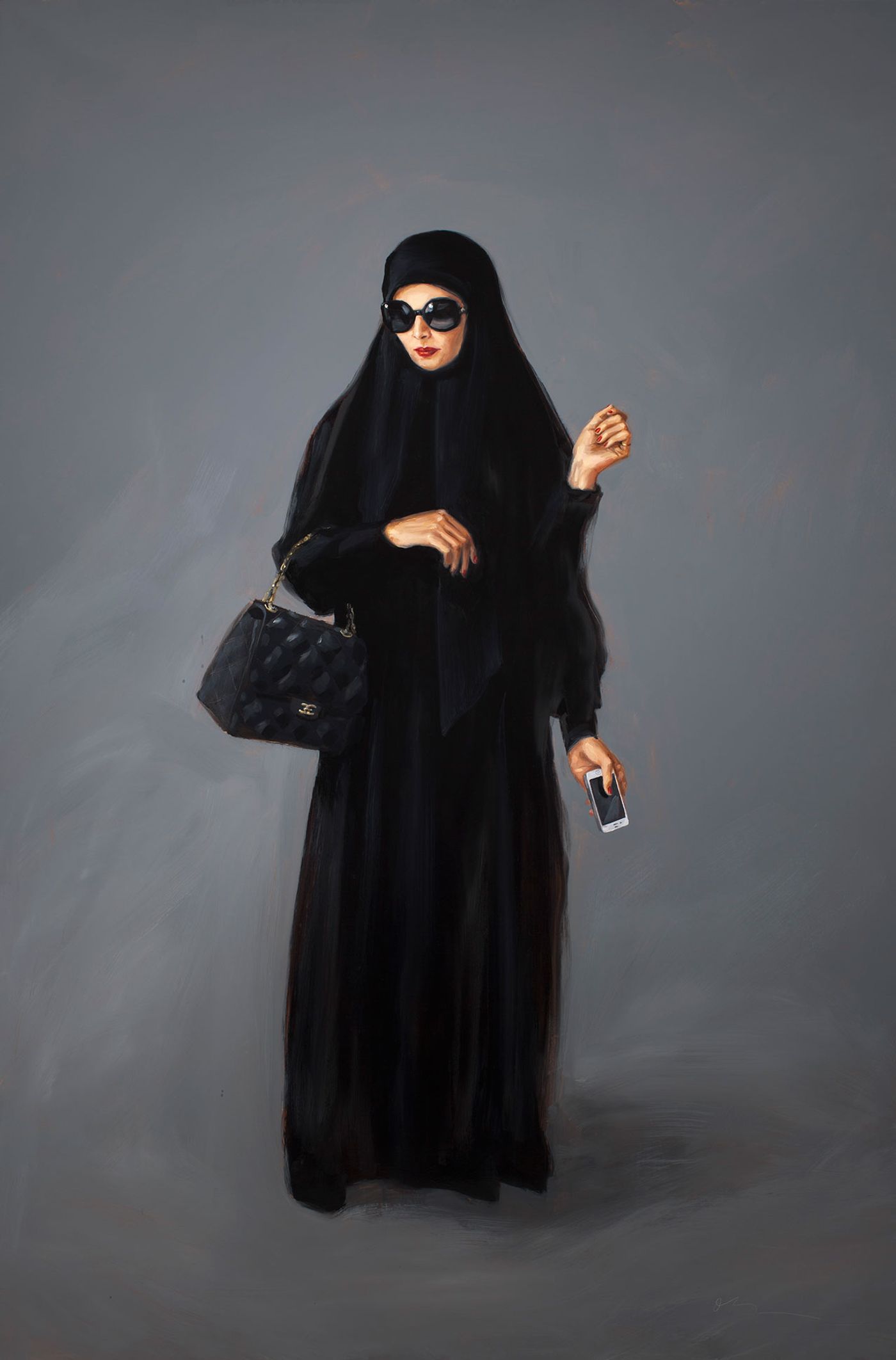
SATURDAY MORNING BY THE POOL2011
oil and enamel on canvas
72" x 48"© Oliver Jeffers.
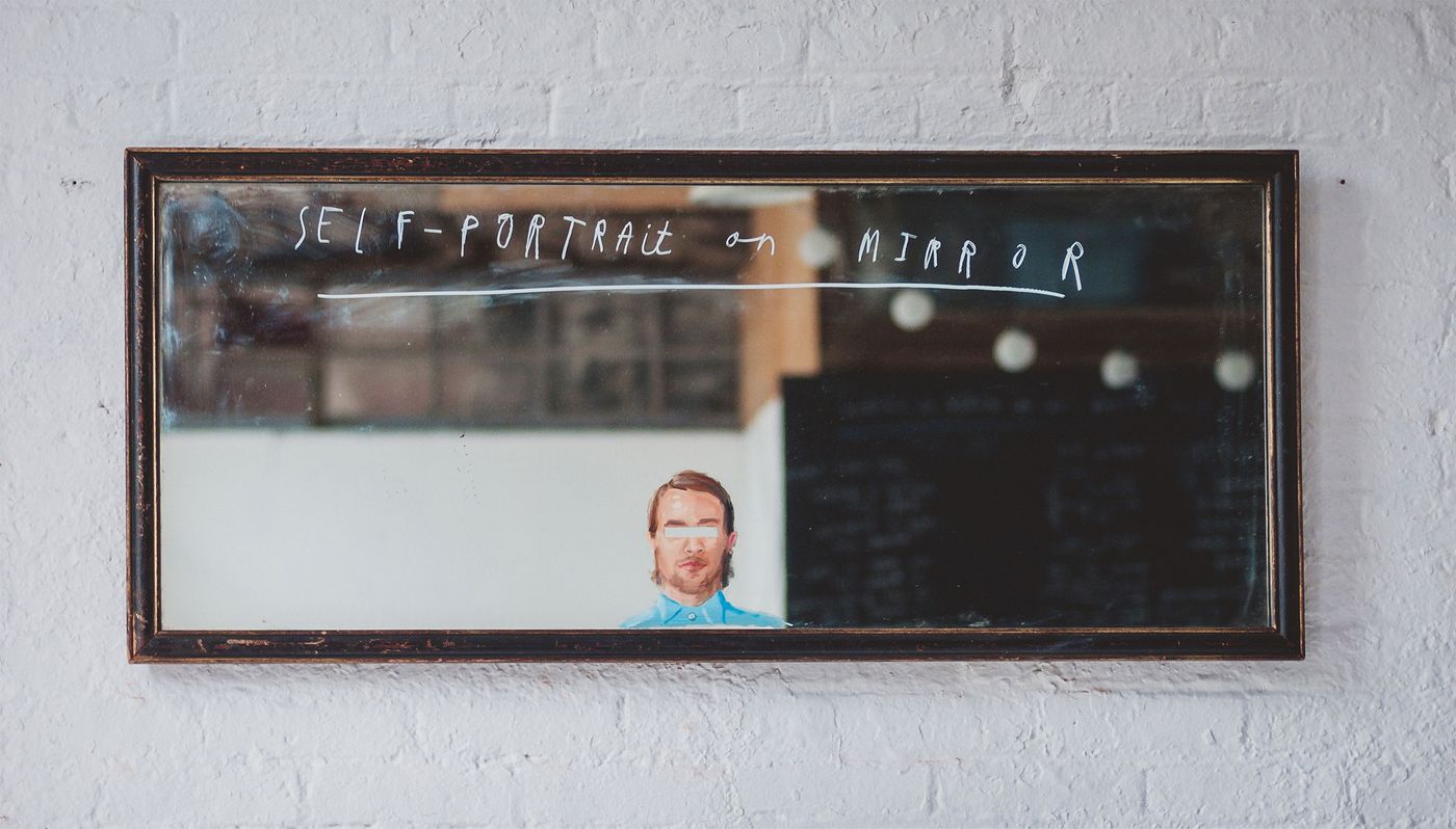
SELF PORTRAIT ON MIRROR2012
oil on mirrored glass
20” x 46”© Oliver Jeffers.
Oliver Jeffers Author Film 2013 by Mac Premo.
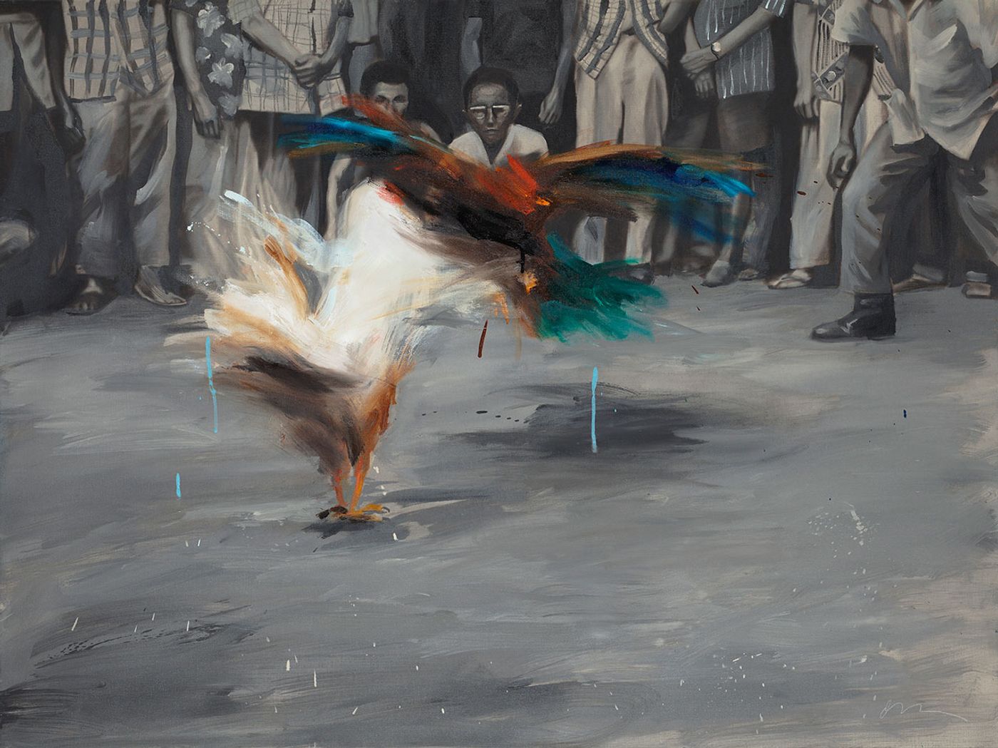
Nothing Is Forever Constant
2012
Oil on canvas
91 x 122 cm
© Oliver Jeffers.
Video for U2s song, Ordinary Love by Mac Premo and Oliver Jeffers.
Cut with the band.
Directed by Mac Premo & Oliver Jeffers
Produced by: Suzanne Mulholland, Mac Premo & Oliver Jeffers
Edited by: Ann Lupo
Typography by: Oliver Jeffers
2nd camera: Oliver Jevremov
Production assistants: Doreen Maddox, Katie Mulholland & Connie Bree
Filmed at: The Invisible Dog, Brooklyn