A live demonstration kitchen visible through floor-to-ceiling glazing transforms food production into theater. White-clad figures move through the red-accented workspace while visitors observe from sleek viewing stations, creating transparency between process and product that elevates manufacturing into cultural spectacle through architectural choreography.

A Wafer-Inspired World: Loacker’s Heinfels Flagship by MoDusArchitects

Words by Yatzer

Heinfels, Austria

Marking the 100th anniversary of its iconic hazelnut wafer, Loacker’s reimagined flagship store in Heinfels, Austria, rethinks the retail experience through a design lens, something seldom seen in the world of confectionery. Designed by MoDusArchitects, Loacker Galaxy eschews the themed theatrics and saccharine spectacle one might expect, opting instead for a design based more on nuance and tact. Through carefully calibrated material choices, volumetric clarity, and an understated nod to its star product, the space captures the spirit of the Italian confectionary brand without lapsing into overt commercialism.
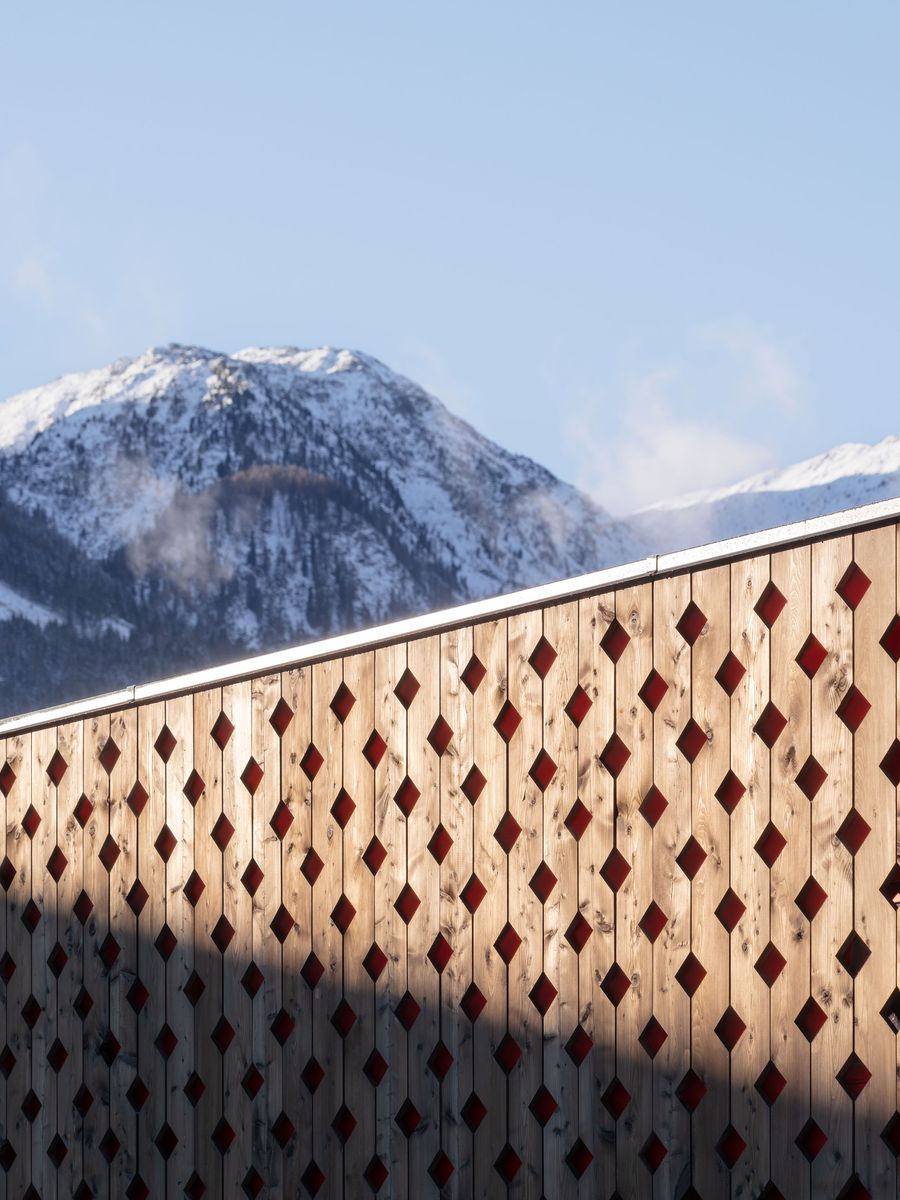
A striking perforated timber facade creates an intricate diamond pattern against snow-capped alpine peaks. The rhythmic geometric cutouts in warm wood contrast beautifully with the pristine mountain landscape, exemplifying contemporary Alpine vernacular architecture that harmonizes built environment with natural grandeur.

Photography by Marco Cappelletti.

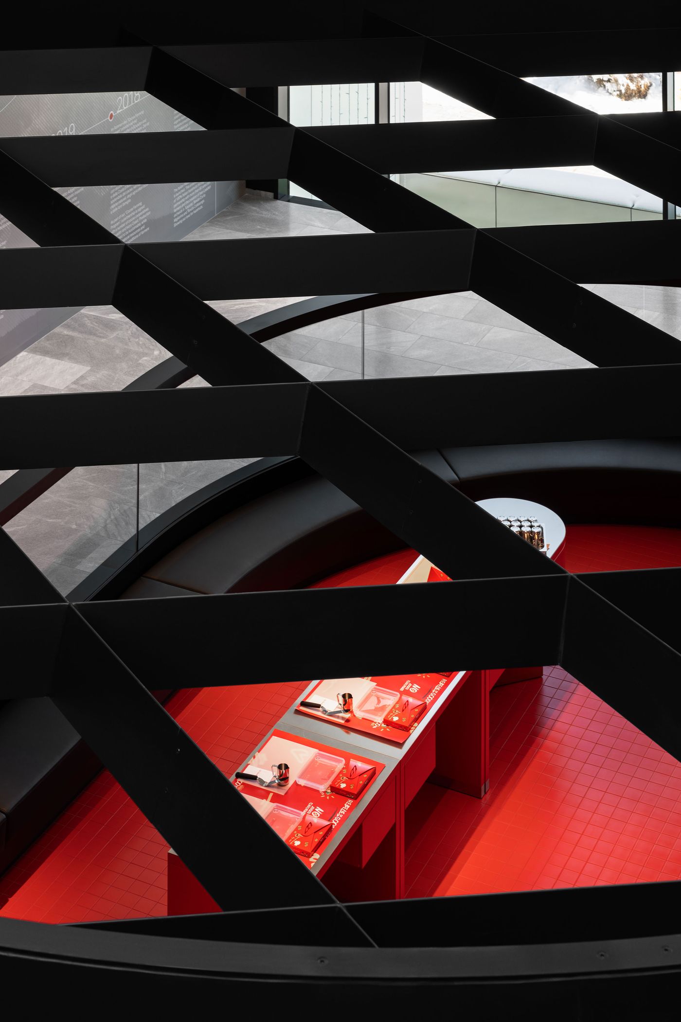
Geometric black ceiling structure creates dramatic shadows above a curved exhibition space, with glimpses of red presentation areas below. The interplay between angular overhead elements and flowing ground-level forms demonstrates sophisticated spatial layering, where architecture becomes both frame and participant in the visitor experience.

Photography by Marco Cappelletti.

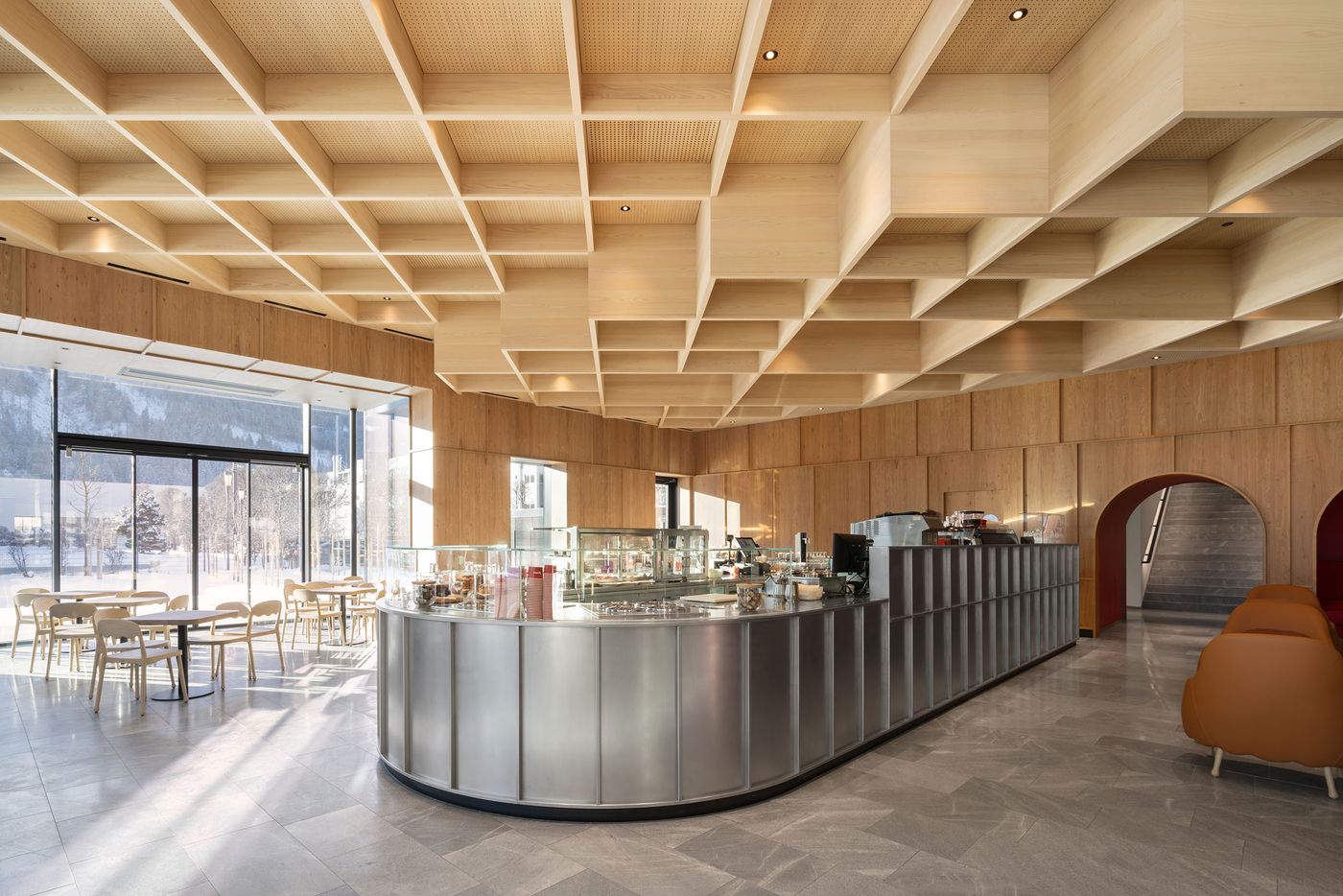
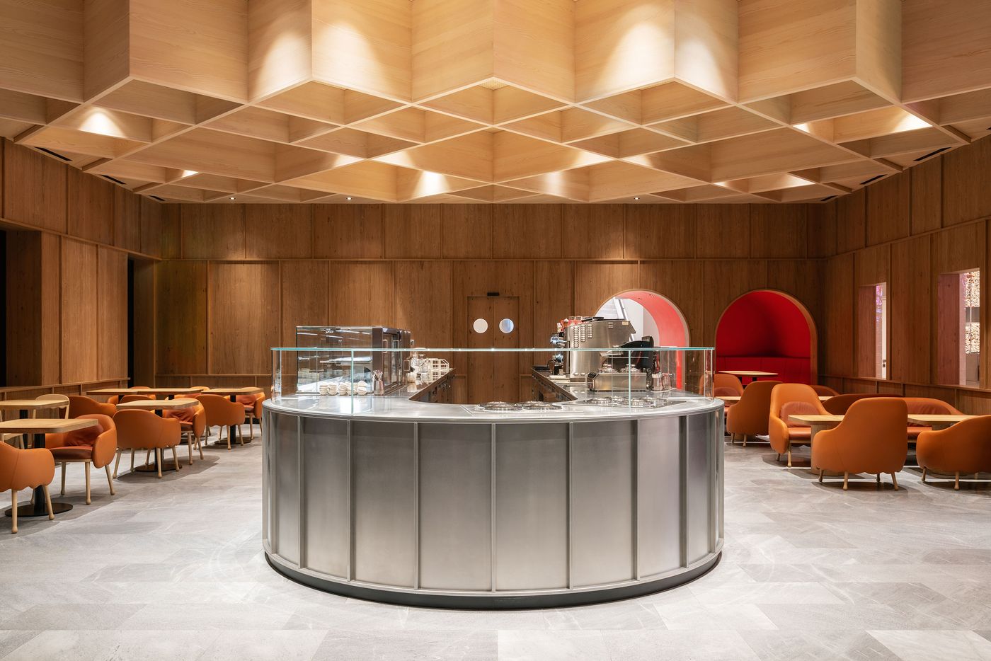
A sophisticated café interior features an undulating coffered wood ceiling with integrated lighting, creating dynamic shadows above a polished concrete floor. The central curved steel counter anchors the space, while floor-to-ceiling windows frame winter mountain vistas, blending Scandinavian minimalism with Alpine sensibility.

Photography by Marco Cappelletti.

MoDusArchitects approached the brief not as an exercise in branding, but as an opportunity to distil the company’s DNA into a spatial form. The result is a multi-layered intervention that encompasses a café, retail area, and workshop, with a new outdoor service pavilion and garden underway. Underpinned by a sophisticated interplay of forms and materials, the architects’ design language subtly echoes both the brand’s South Tyrolean roots and artisanal ethos as well as its industrial precision, elevating the visitor experience far beyond the expected.

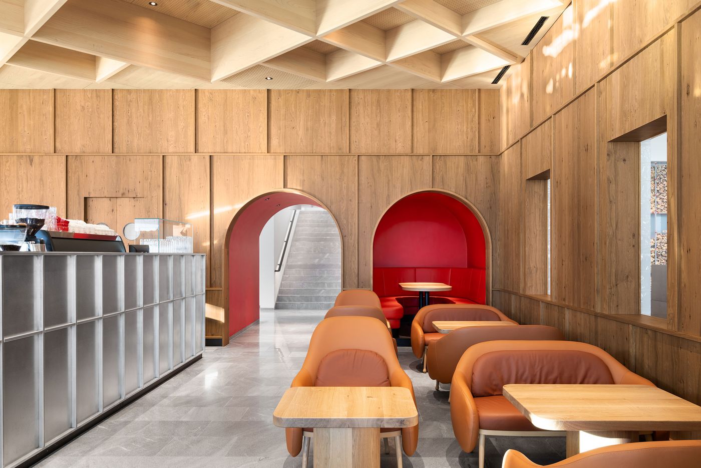
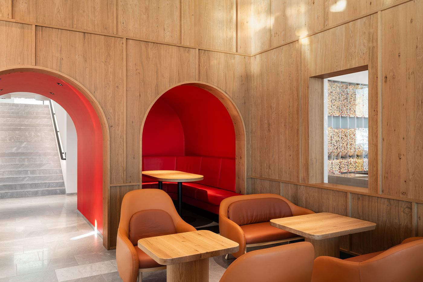
At ground level, a coffered wood ceiling, conceived as an abstracted homage to the grid-like geometry of a wafer, floats above a restrained palette of stone and steel, weaving together the café and shop areas in a warm, enveloping gesture. Welcoming visitors, a sculptural stainless-steel counter anchors the café, its rounded edges mirrored in voluptuous armchairs and sofas, arched openings and a pill-shaped booth tucked into an alcove painted in Loacker’s signature red, a hue that the architects have sparingly used for maximum effect.
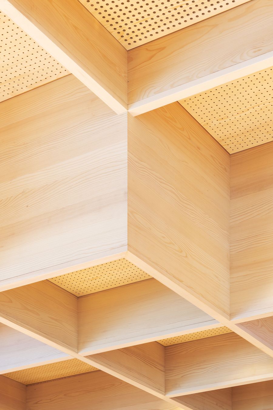
A dramatic coffered ceiling creates geometric depth through alternating light and shadow, with perforated wood panels adding textural interest. The modular ceiling system demonstrates how repetitive elements can generate visual complexity while maintaining clean architectural lines characteristic of contemporary Scandinavian design.

Photography by Marco Cappelletti.

A study in material contrast: the ribbed steel service counter meets warm timber wall cladding beneath a precisely detailed coffered ceiling. Orange leather seating adds tactile warmth to the neutral palette, while the modular ceiling system creates rhythm and visual interest overhead.

Photography by Marco Cappelletti.

Red-lined archways frame intimate seating areas within timber-clad walls, creating theatrical moments of color punctuation. The interplay between natural wood textures and bold crimson accents establishes a distinctive brand identity while maintaining architectural sophistication through precise detailing and proportions.

Photography by Marco Cappelletti.

Intimate seating pods carved into timber-lined walls create contemplative alcoves within this modern café space. The geometric coffered ceiling treatment and warm orange upholstered furniture establish a cozy counterpoint to the clean architectural lines, embodying Japandi principles of functional comfort.

Photography by Marco Cappelletti.

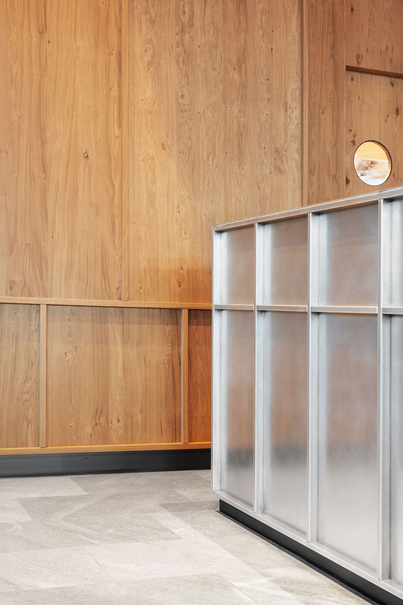
The interplay between rounded forms and crisp surfaces animates the space without overwhelming it as does the juxtaposition between the scheme’s two primary materials: wood and steel. Timber wall panelling and wooden tables speak to the company’s heritage and family-owned origins, while brushed stainless steel evokes the cutting-edge manufacturing behind every precisely layered bite. Together, they establish a visual and tactile rhythm that feels both grounded and forward-looking, reflecting Loacker’s own evolution from local bakery to global brand.

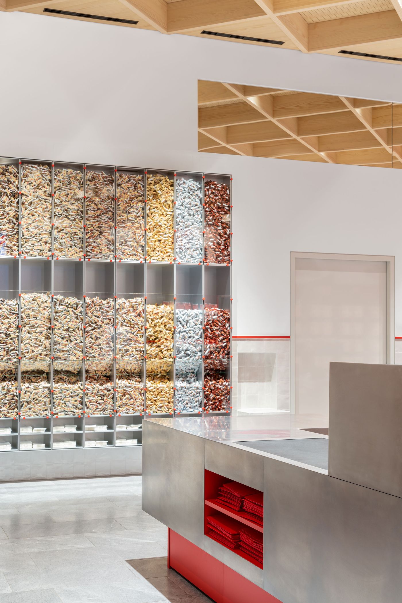
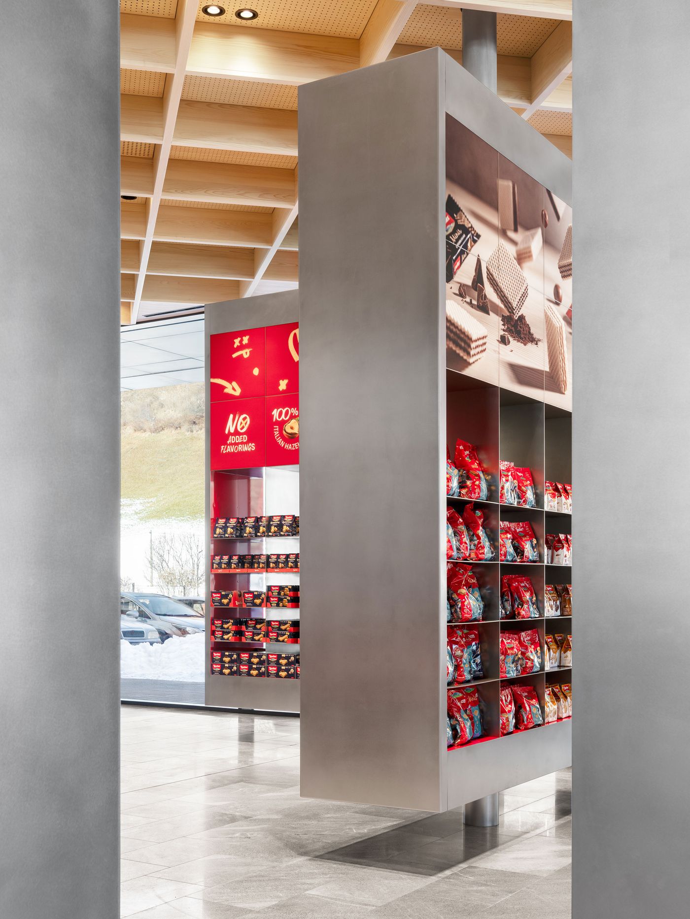
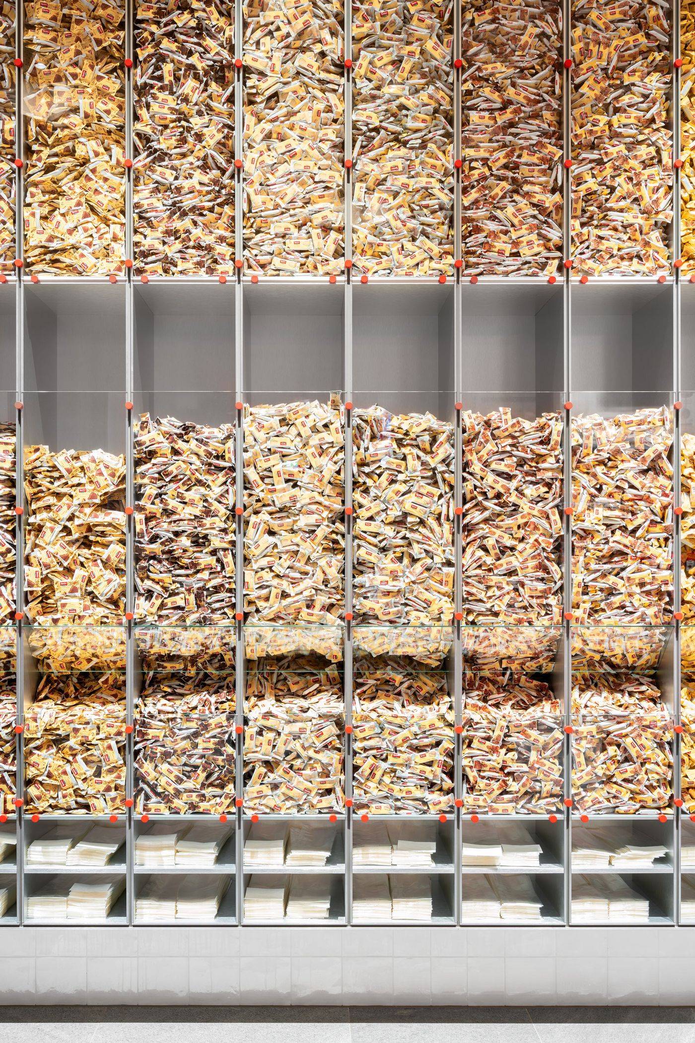
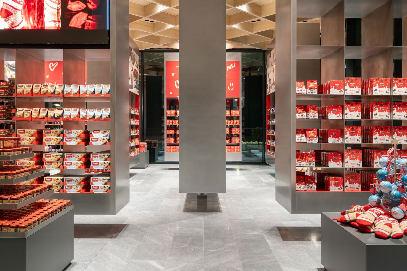
In the adjacent retail space, ten oversized, rotatable display totems in stainless-steel form a shimmering “galaxy of flavours”, their modularity and scale transforming the act of browsing into a dynamic spatial experience. Behind them, a vibrant ‘pick & mix’ wall leverages the visual appeal of Loacker’s product range, arranging the brand’s full chromatic spectrum into a kind of edible infographic.
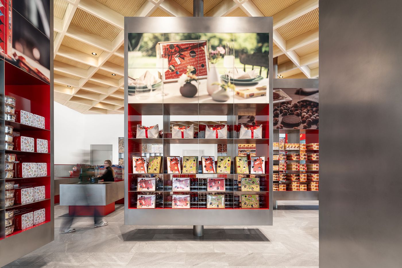
  • Floor-to-ceiling timber paneling showcases natural wood grain patterns alongside sleek steel display elements. A perfectly circular window punctuates the vertical composition, while the integrated shelving system demonstrates how functional storage can become architectural expression through careful material selection and craftsmanship.

    Photography by Marco Cappelletti.

  • A towering product wall creates retail theater through systematic organization and dramatic scale. Strategic lighting illuminates the merchandise grid while maintaining architectural sophistication through clean lines and neutral materials, demonstrating how commercial display can achieve museum-quality aesthetic impact.

    Photography by Marco Cappelletti.

Theatrical product presentation unfolds across multiple levels with dramatic lighting and giant video screens. Red branding elements punctuate the neutral palette while suspended displays create visual layering, transforming retail space into immersive brand experience through multimedia integration and spatial choreography.

Photography by Marco Cappelletti.

  • Cascading glass vessels create a kinetic wall installation, transforming product display into dynamic sculpture. Red accent dots punctuate the transparent grid system, while the geometric ceiling treatment above provides architectural counterpoint to the organic flow of contents within each vessel.

    Photography by Marco Cappelletti.

  • Monumental retail displays reach toward a geometrically coffered ceiling, creating cathedral-like proportions for product presentation. The systematic organization of colorful merchandise against neutral architecture transforms shopping into cultural experience, where commerce meets contemporary gallery aesthetic through precise spatial design.

    Photography by Marco Cappelletti.

  • A mesmerizing wall of transparent compartments reveals golden confectionery contents in systematic display. The repetitive grid transforms retail storage into installation art, where product becomes pattern and function merges with aesthetic expression through precise architectural organization and lighting.

    Photography by Marco Cappelletti.

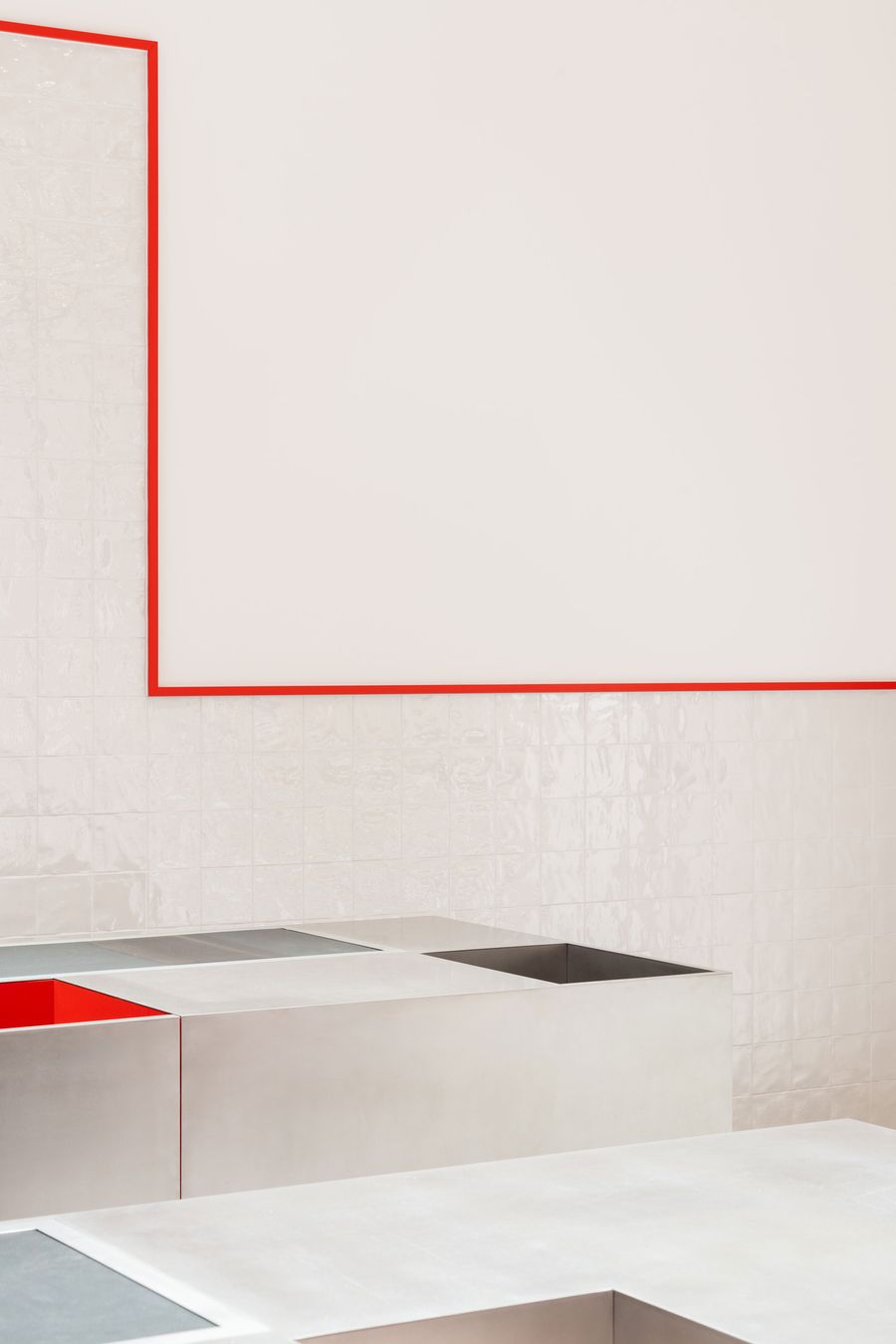
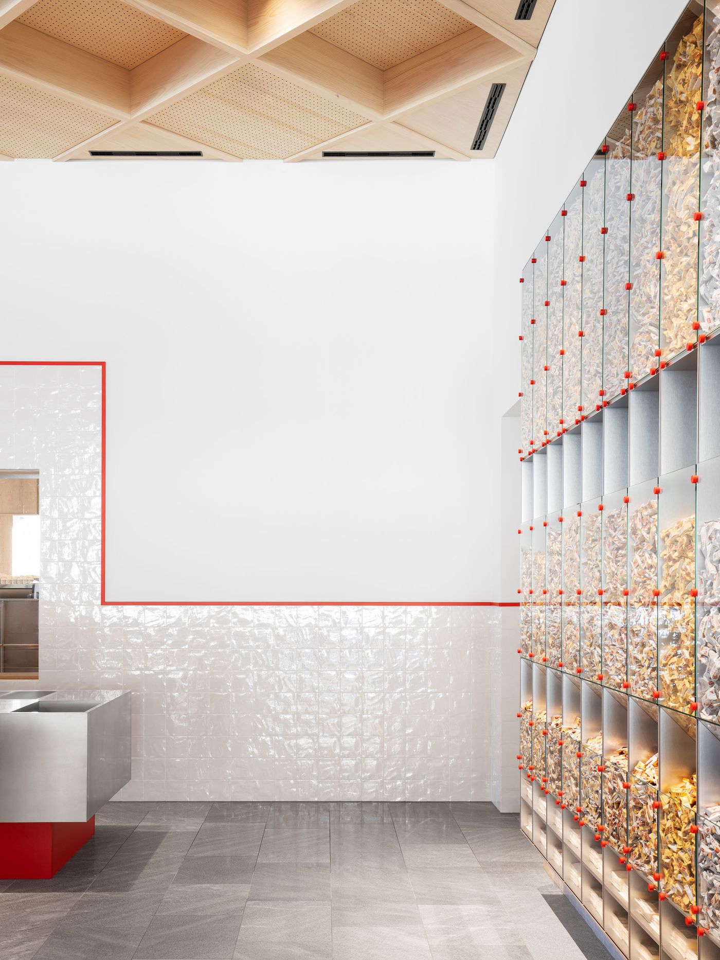
Minimalist white surfaces meet precise red linear details in this study of geometric reduction. The clean intersection of planes and the strategic use of color as wayfinding create spatial clarity while maintaining visual interest through proportional relationships and material transitions.

Photography by Marco Cappelletti.

Floor-to-ceiling glazed display units reveal colorful product contents like an edible art installation. The systematic grid organization transforms retail storage into architectural spectacle, while warm timber ceiling elements soften the clinical precision of the transparent merchandising system below

Photography by Marco Cappelletti.

A dramatic curved staircase winds upward beneath a dark geometric ceiling structure, creating sculptural circulation through the space. The interplay between the organic stair form and rigid ceiling grid establishes dynamic tension, while polished surfaces reflect mountain views visible through expansive glazing.

Photography by Marco Cappelletti.

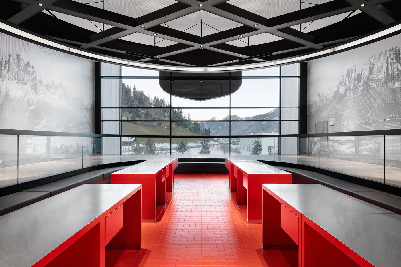
Panoramic alpine vistas stretch across curved exhibition walls beneath a sophisticated grid ceiling system. A sunken red presentation area creates theatrical focus, while the seamless integration of landscape imagery with architectural space demonstrates how interior design can extend natural environment through immersive visual storytelling.

Photography by Marco Cappelletti.

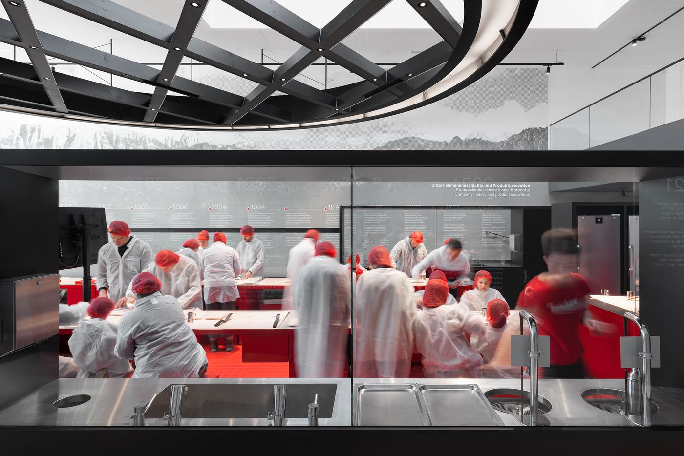
A live demonstration kitchen visible through floor-to-ceiling glazing transforms food production into theater. White-clad figures move through the red-accented workspace while visitors observe from sleek viewing stations, creating transparency between process and product that elevates manufacturing into cultural spectacle through architectural choreography.

Photography by Marco Cappelletti.

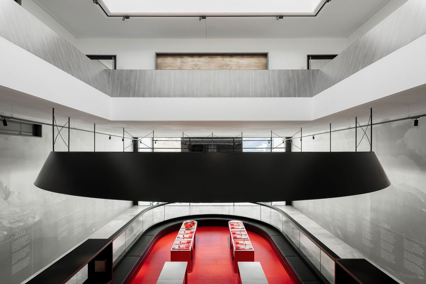
Upstairs, the wafer-making workshop invites visitors into the very heart of the process. Enclosed within a pill-shaped volume that visually ties back to the café counter and the planned service pavilion, the space features red tiled floors, gleaming workstations, and a commanding disc-shaped light fixture that alludes to a round wafer. Play meets performance in this space: guests to try their hand at crafting wafers while onlookers peer in from a raised gallery, turning confection into spectacle without losing sight of the craft it demands.

What ultimately sets Loacker Galaxy apart is the balance between delight and discipline. By distilling the brand’s identity into material logic and spatial choreography, MoDusArchitects have created something more enduring than a flagship store: a landmark that invites visitors into a world that is as considered as it is delicious.
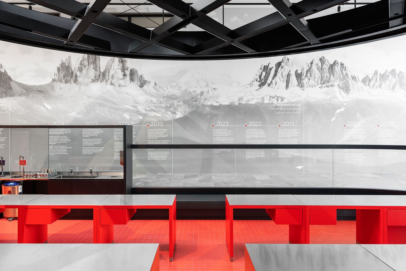
An amphitheater-style presentation space descends toward panoramic mountain imagery, with bold red seating creating dramatic focal point. The curved ceiling treatment and systematic lighting demonstrate how exhibition design can transform corporate storytelling into immersive spatial experience through careful choreography of view and movement.

Photography by Marco Cappelletti.
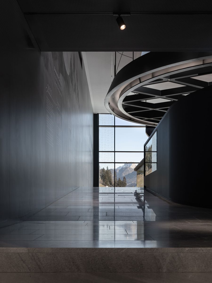
A monumental double-height space features floating black ceiling elements above curved exhibition walls displaying historical timeline. The dramatic scale and sophisticated material palette create museum-quality environment where corporate history becomes cultural narrative through precise architectural staging and lighting design.

Photography by Marco Cappelletti.