Project Name
The VillagePosted in
Interior DesignLocation
Full Name
Gisbert PöpplerArea (sqm)
160| Detailed Information | |||||
|---|---|---|---|---|---|
| Project Name | The Village | Posted in | Interior Design | Location |
Berlin
Germany |
| Full Name | Gisbert Pöppler | Area (sqm) | 160 | ||
Photography by Robert Rieger.
Photography by Robert Rieger.
Photography by Robert Rieger.
Photography by Robert Rieger.
Photography by Robert Rieger.

Photography by Robert Rieger.
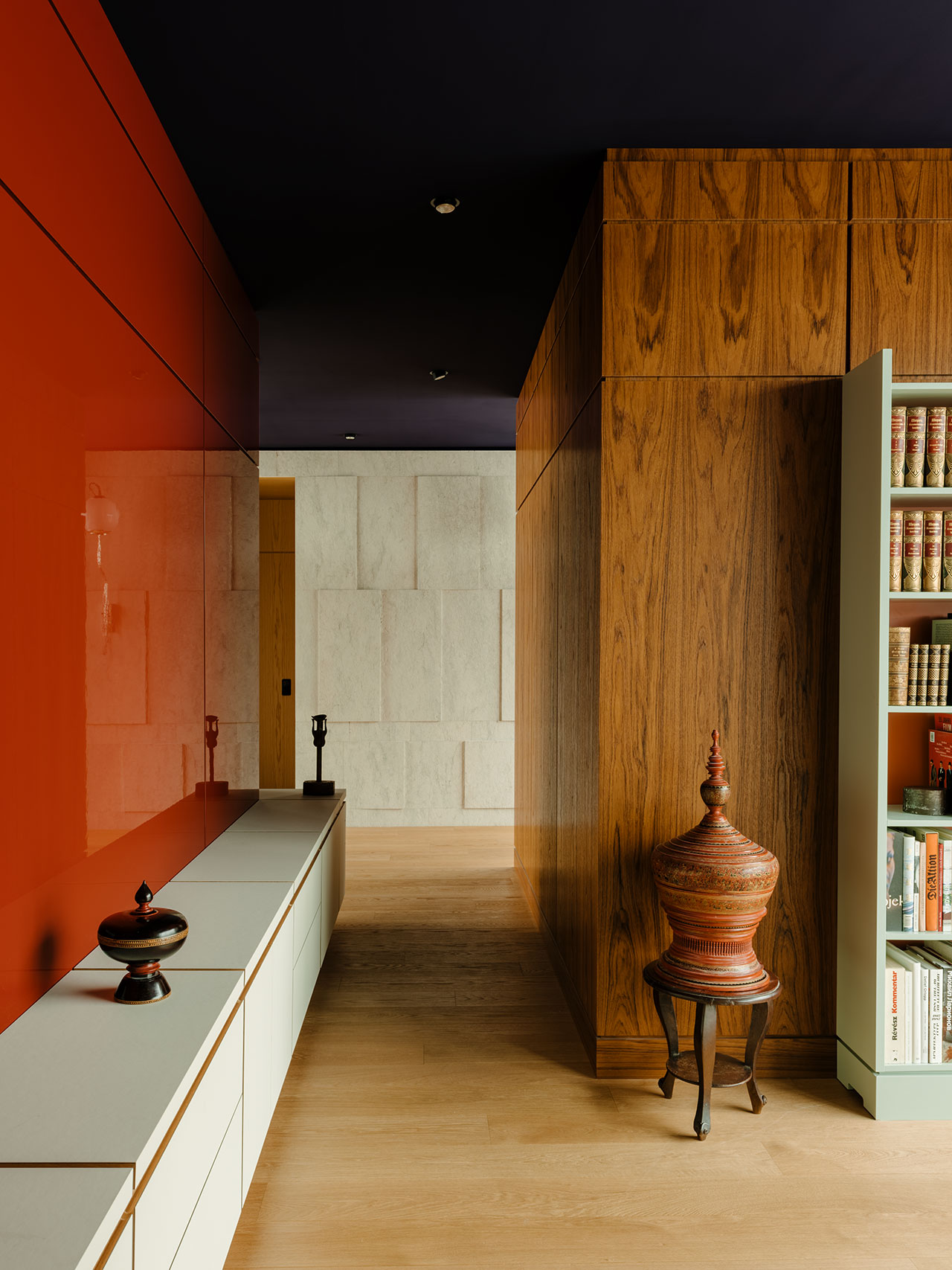
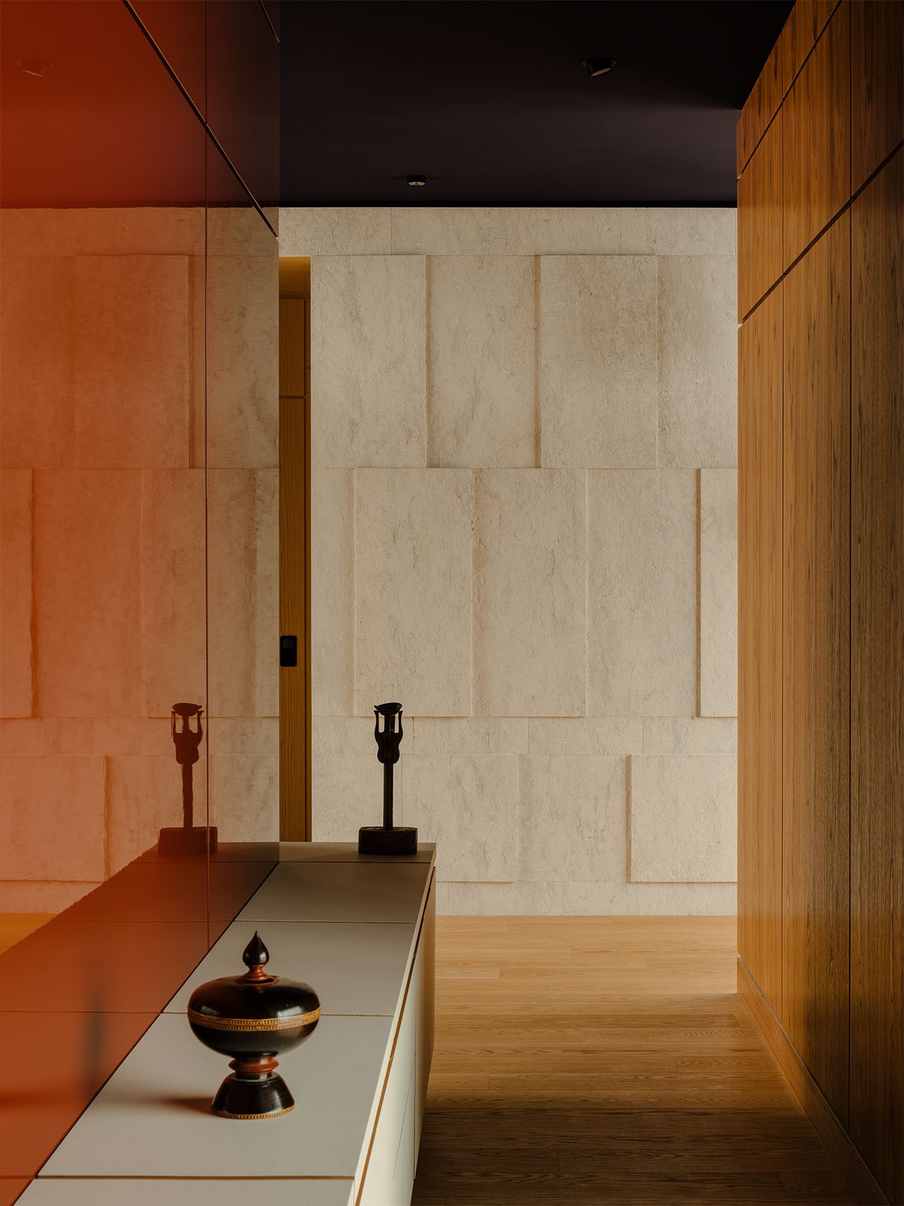
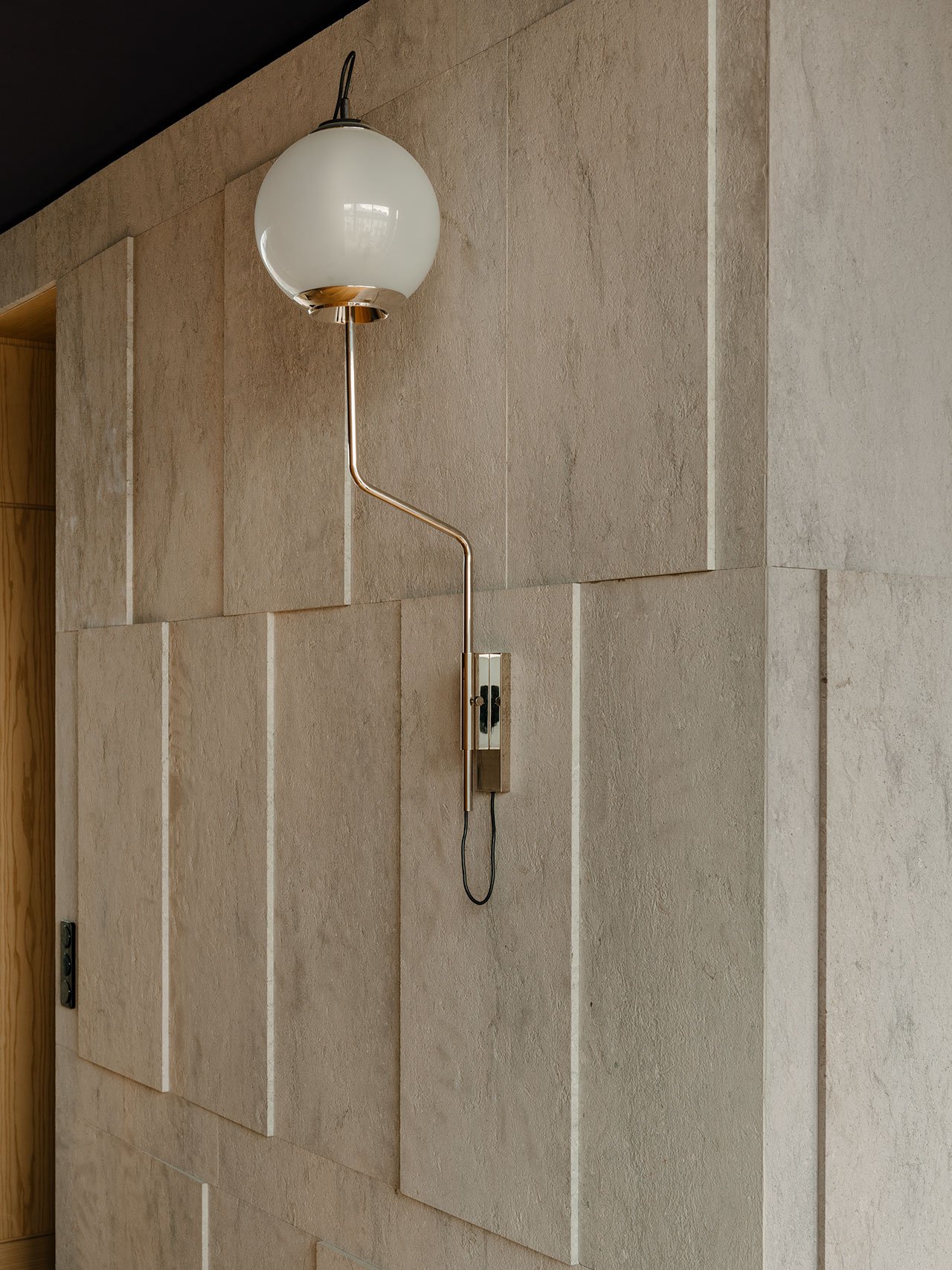
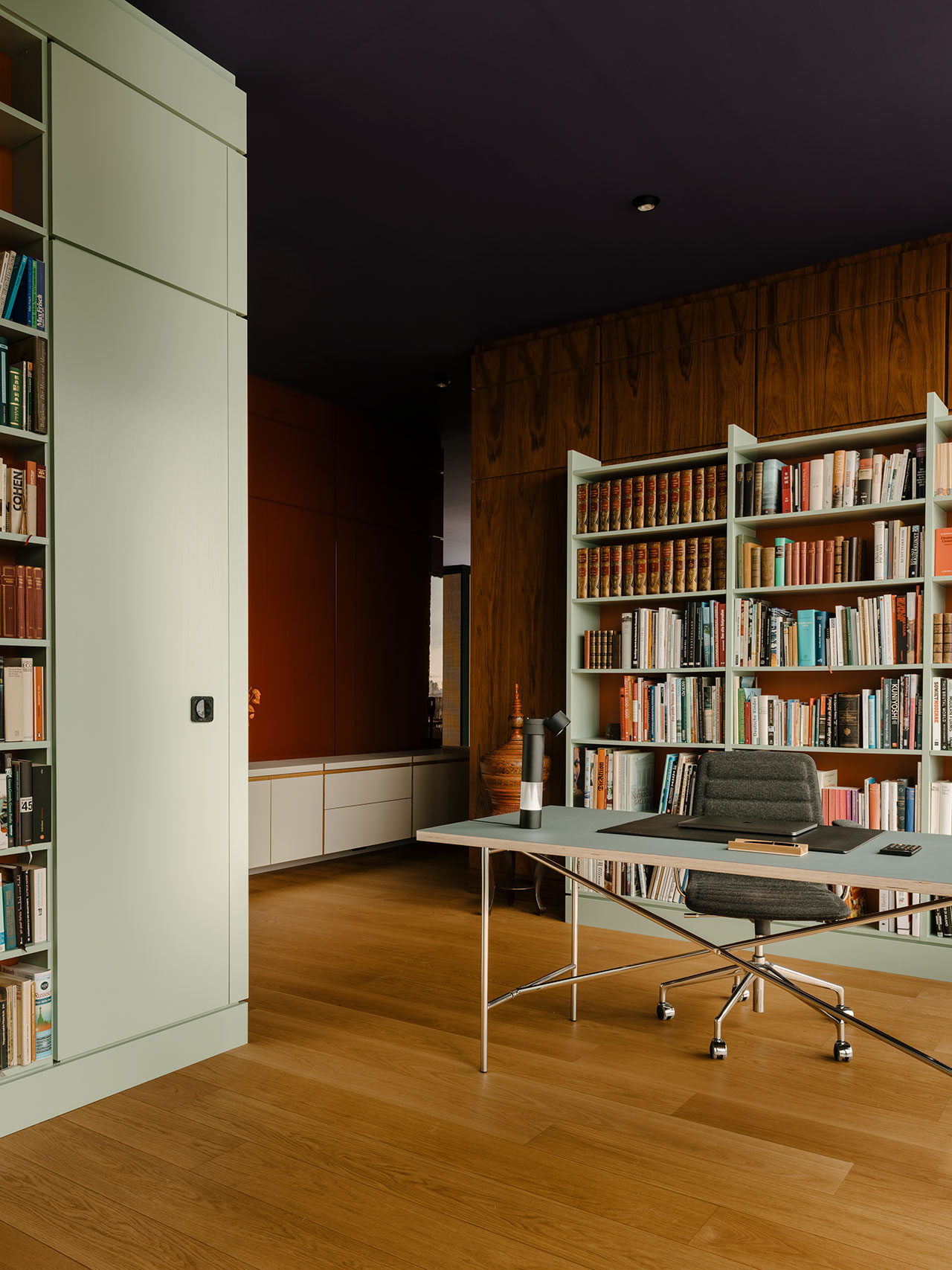
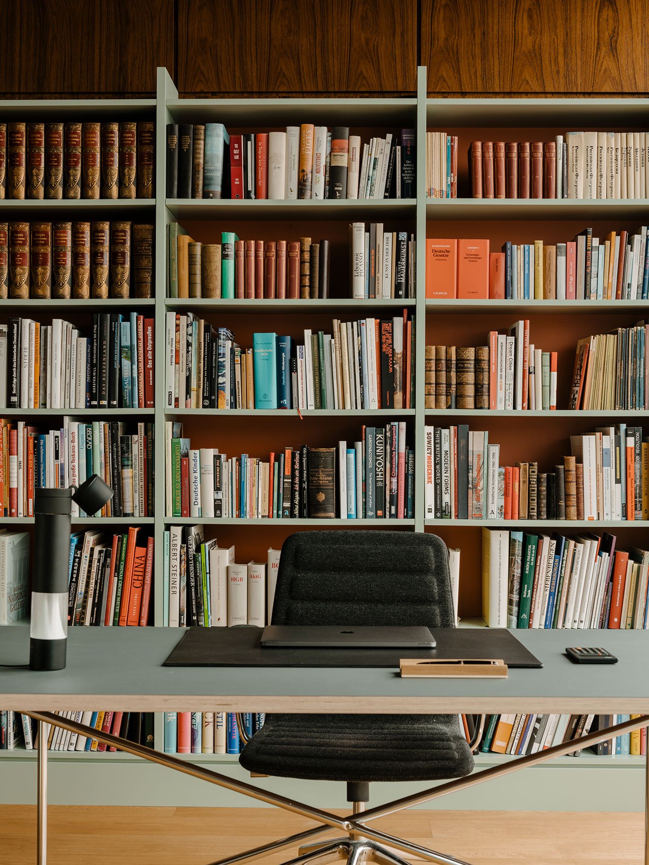
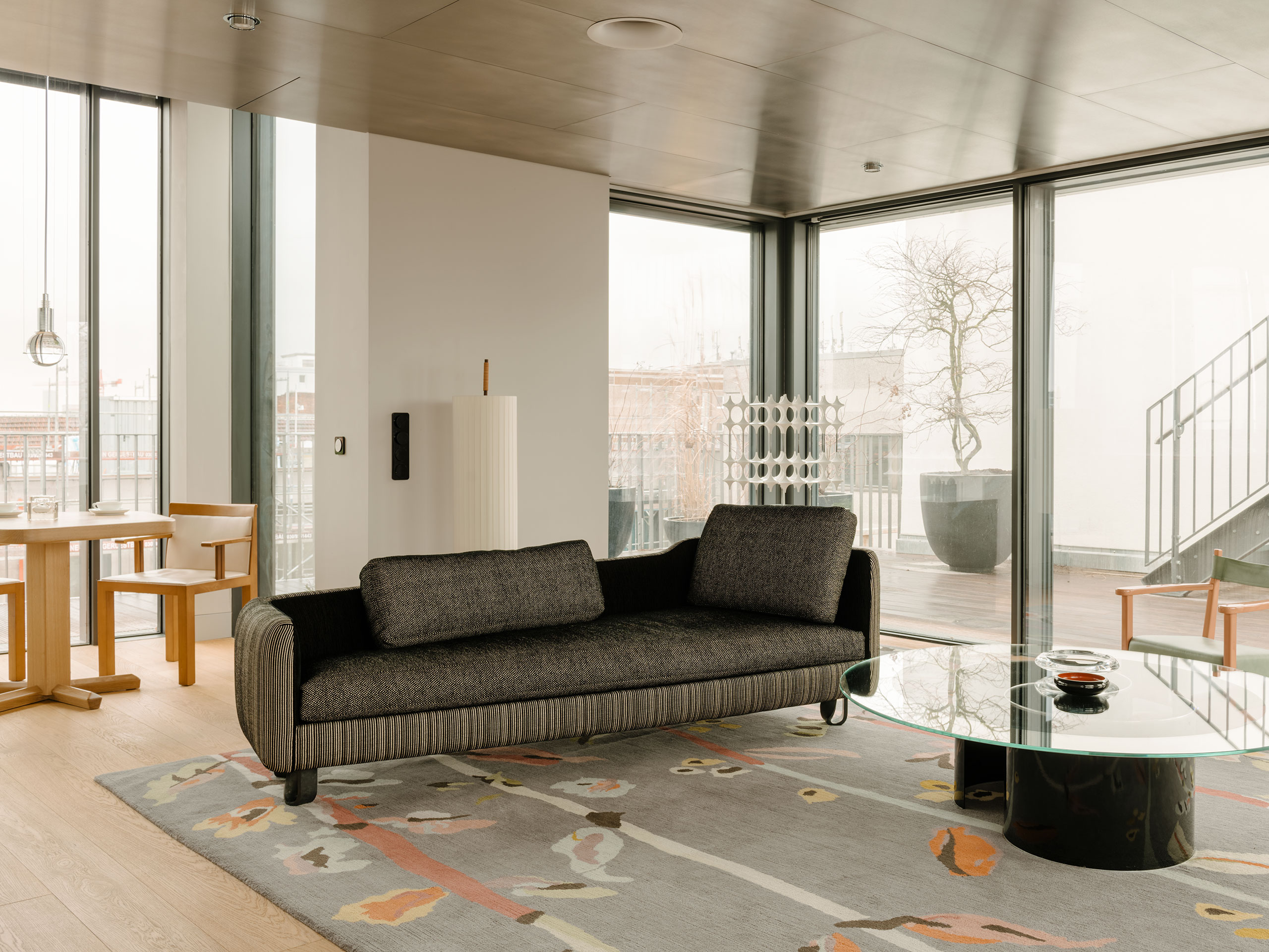
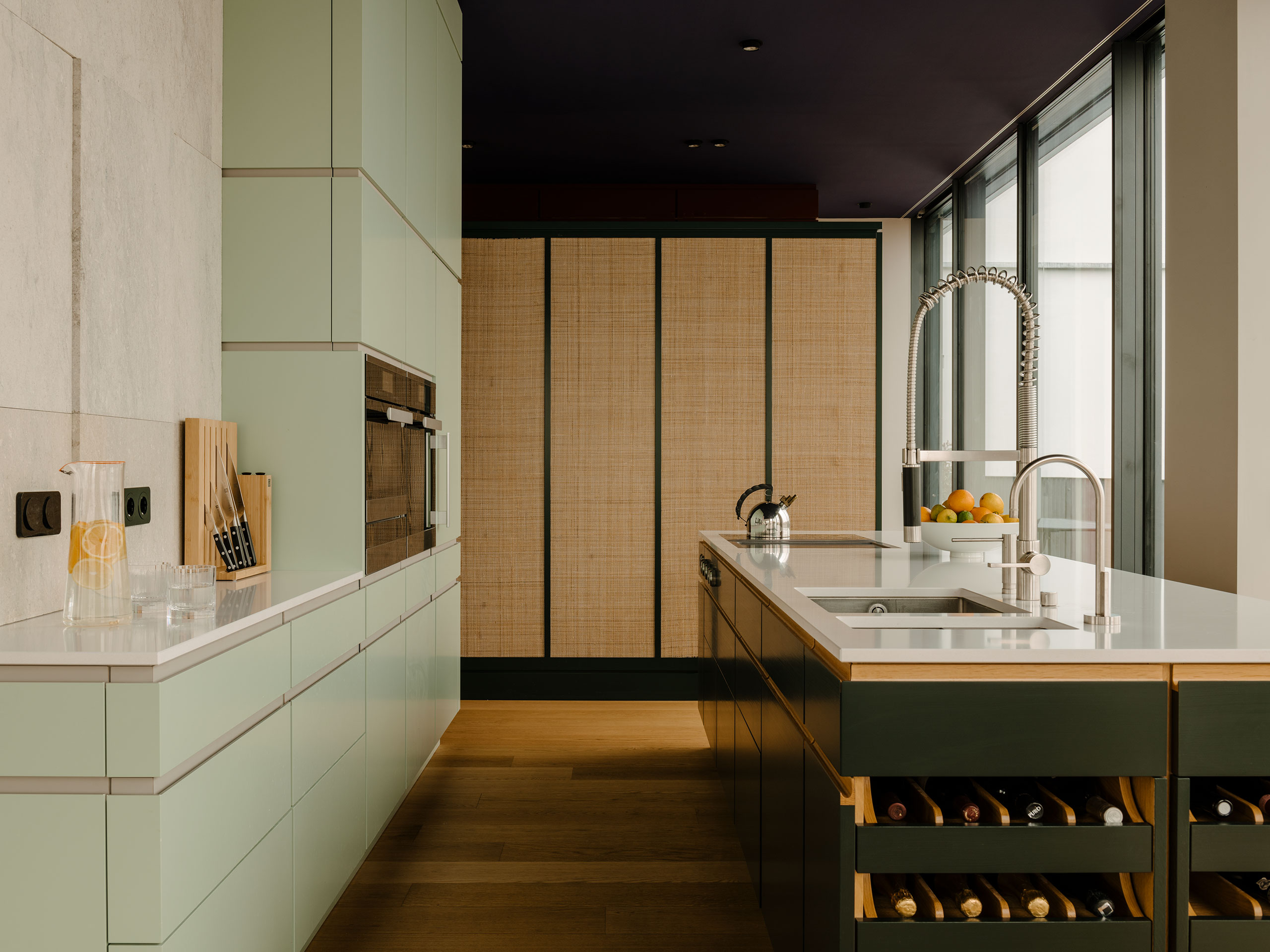
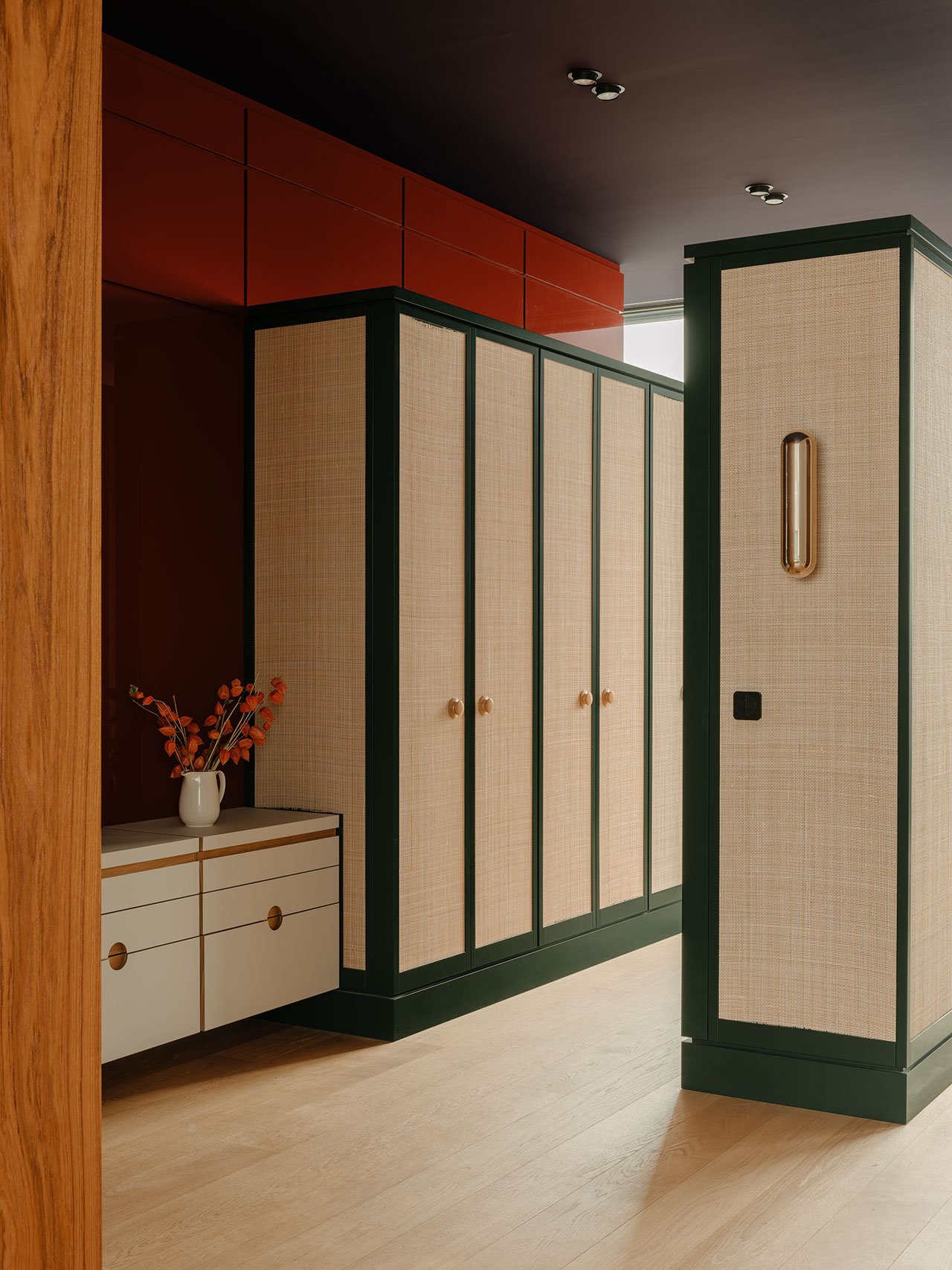
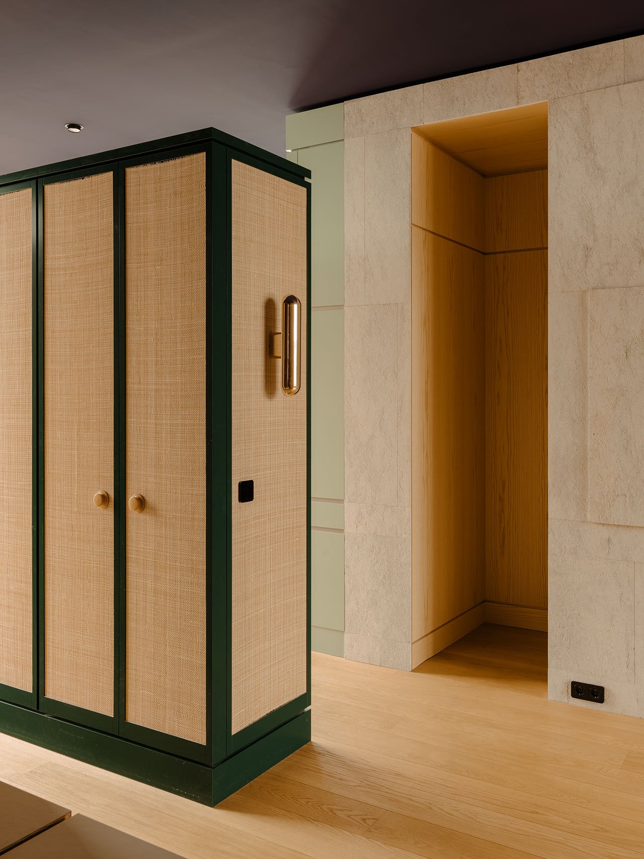
A Renaissance red lacquered wood panelling provides a welcoming warmth in the entrance. The gloss is enhanced by the mat, silk white linoleum surface of the sideboard leading to the core. The adjacent office and guest room volume are wrapped in teak, while the central walls joining the kitchen, living and dining area are clad in a light limestone relief sourced from a quarry near Verona as requested by the clients after a trip to Italy. In the living area, stainless steel is used to clad a ceiling section that had to be lowered, with the hazy reflections of the oak parquet in the steel imbuing the space with a sense of height and warmth.
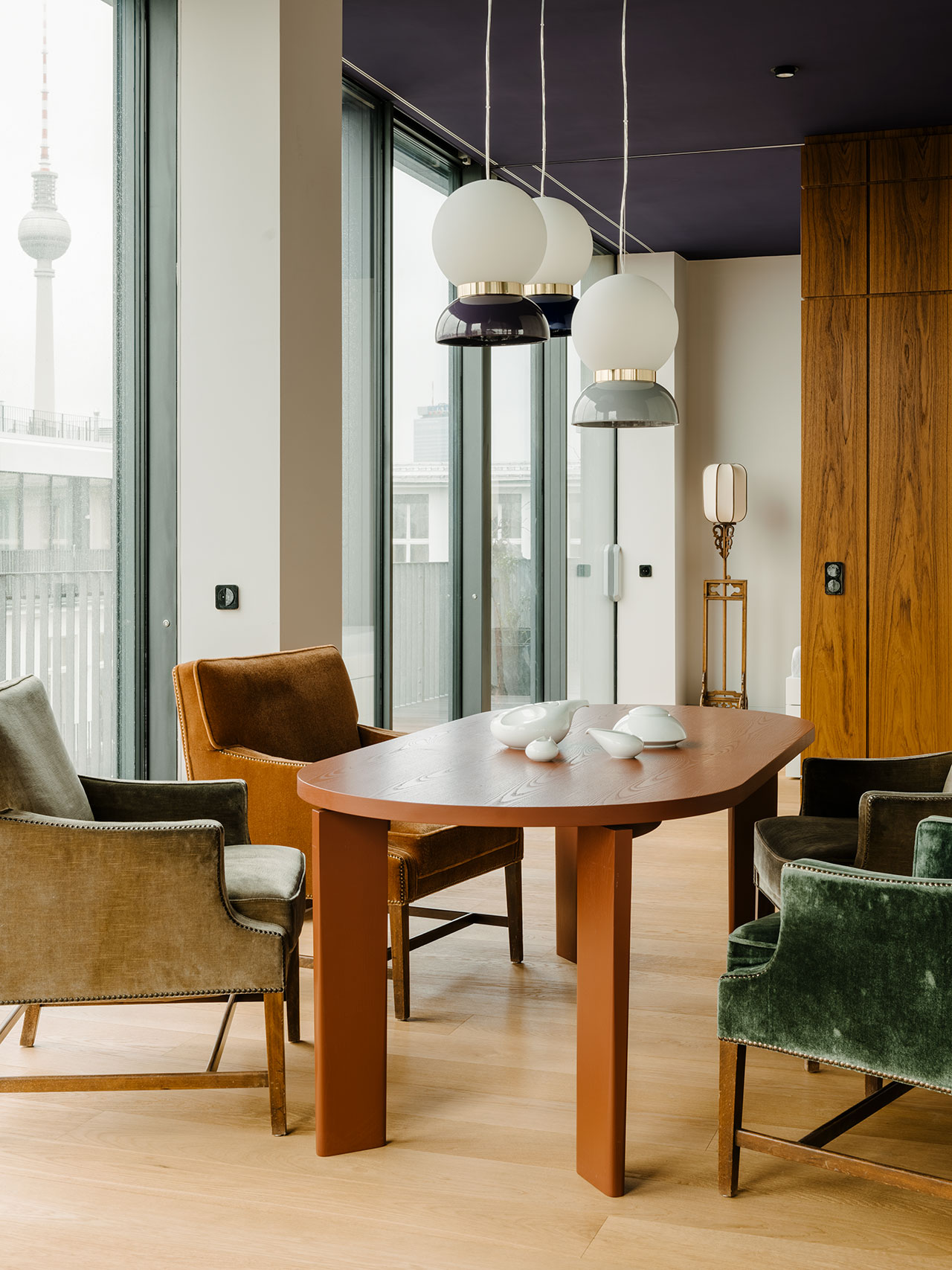
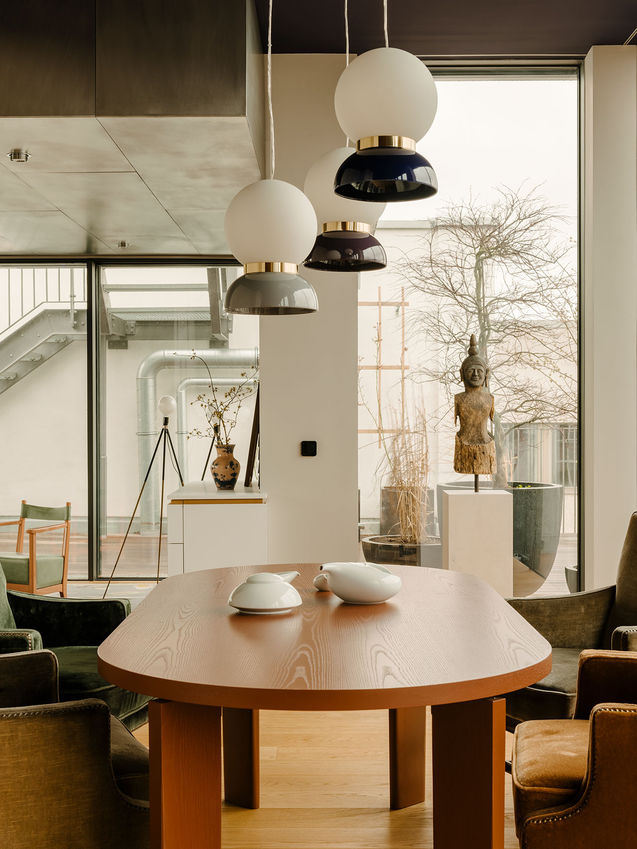
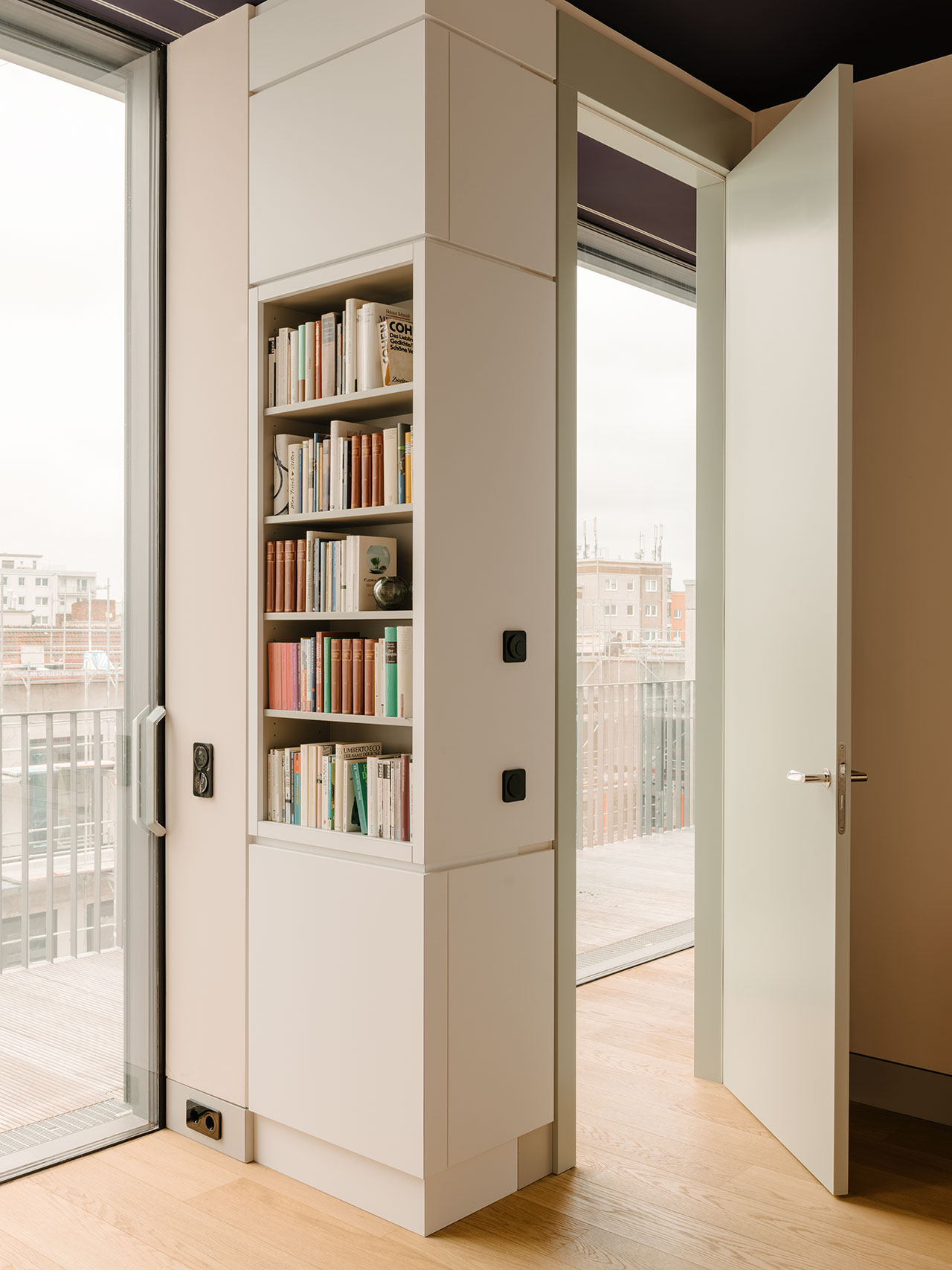
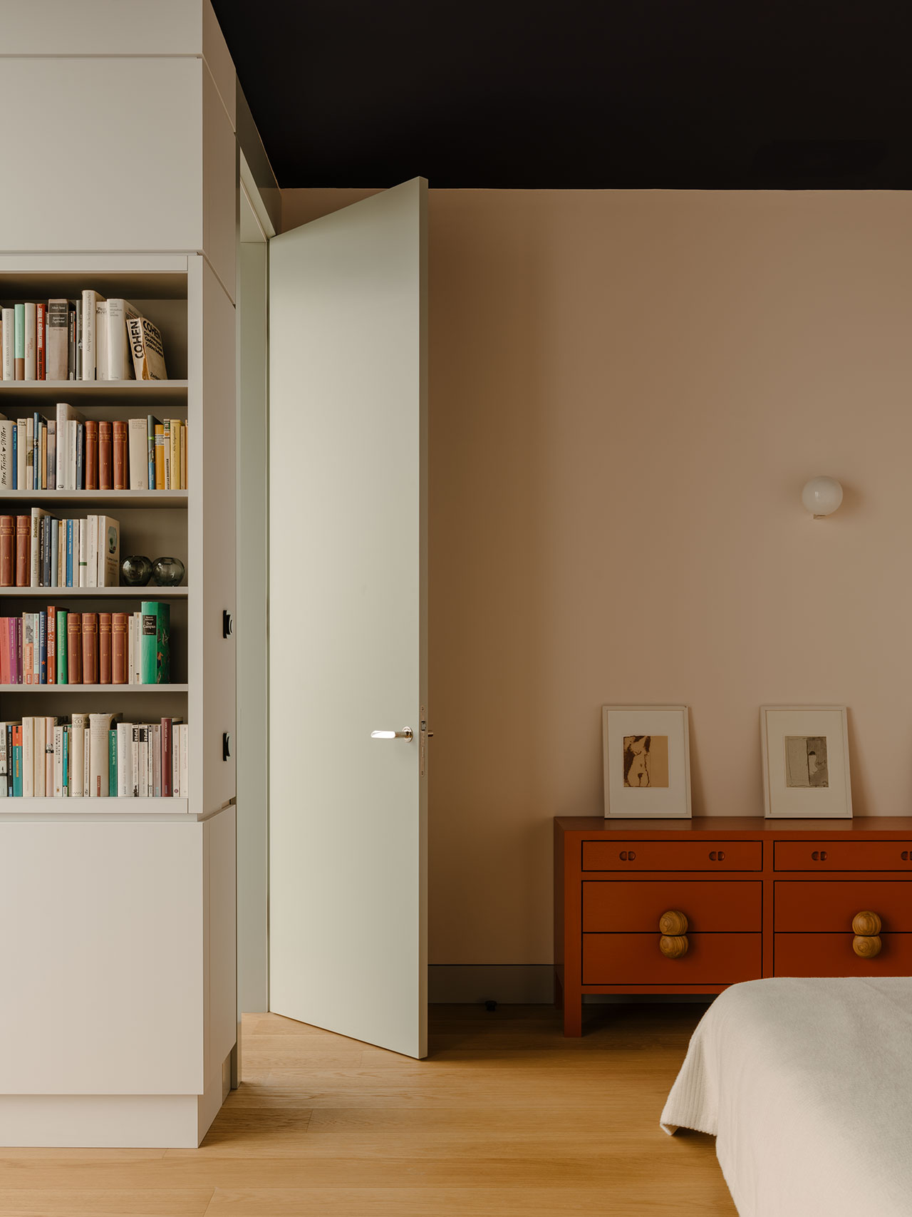
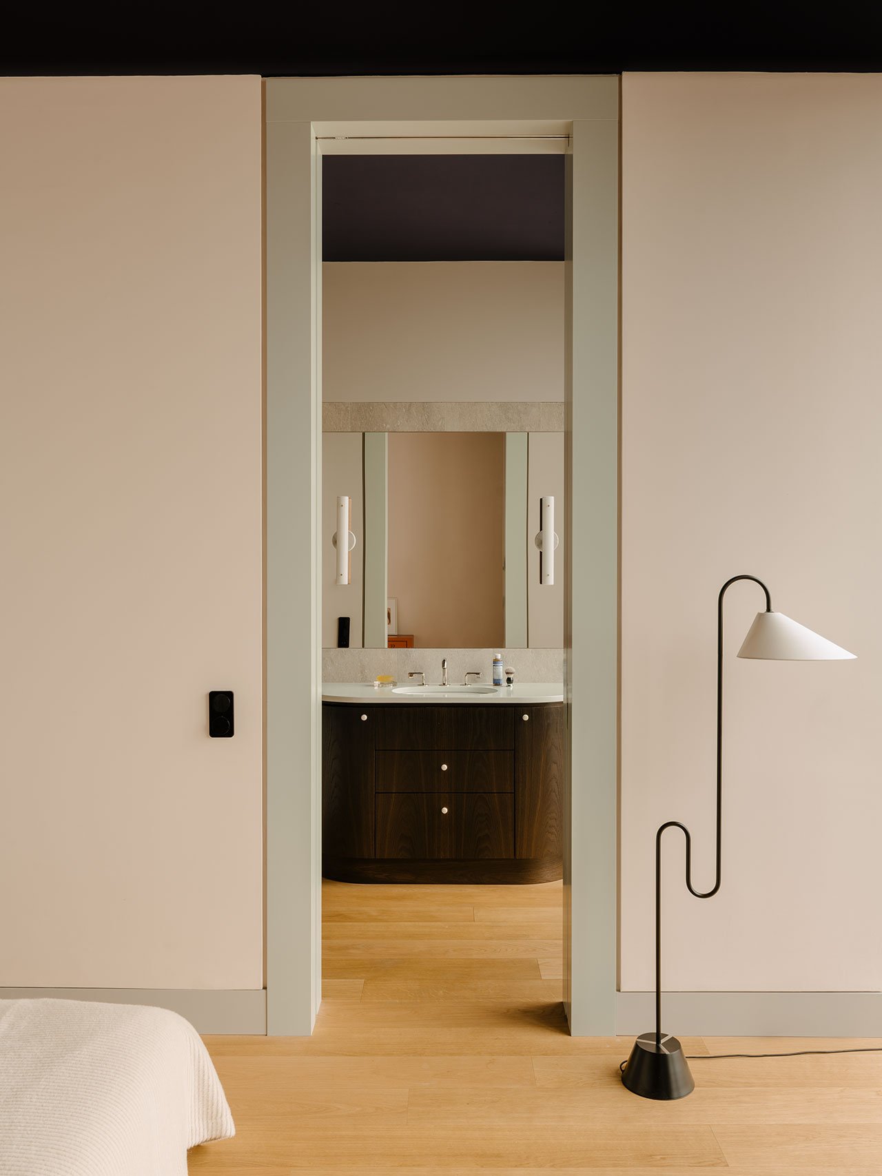
Despite the eclectic use of such diverse materials, the apartment feels cohesive thanks in large part to Pöppler’s bold decision to paint the ceiling a dark purple-blue hue. Although the clients were initially reluctant, the dark ceiling functions as a unifying backdrop that ties everything together. Also contributing to the project’s cohesive look are the oak parquet flooring and the grid-like horizontal and vertical wall seams that connect the different materials and facilitate the alignment of cabinets and doors.
Photography by Robert Rieger.
Photography by Robert Rieger.
Photography by Robert Rieger.

Photography by Robert Rieger.
Photography by Robert Rieger.

Photography by Robert Rieger.
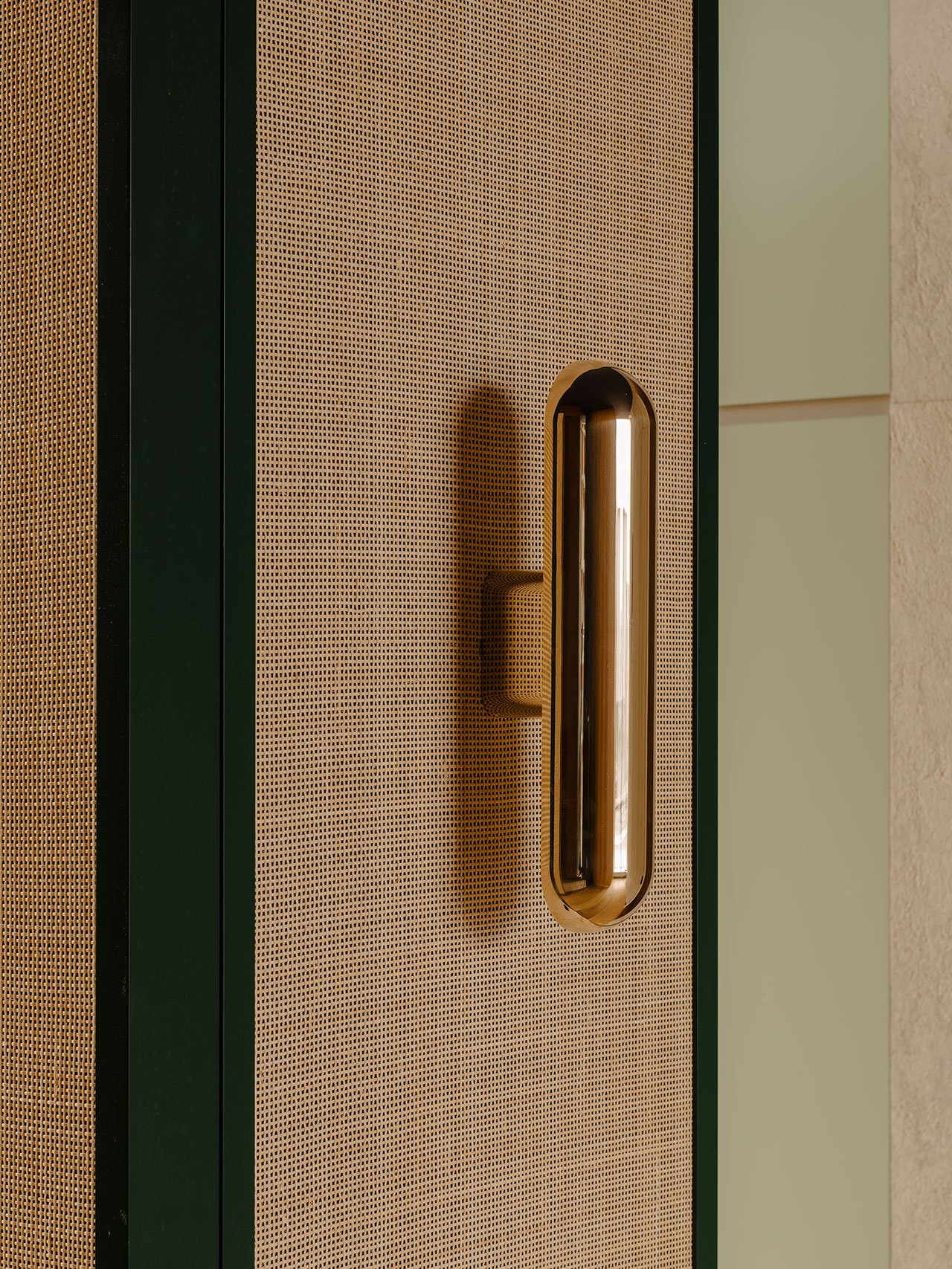
Speaking of cabinets, all storage spaces are made-to-measure in response to the owner’s lifestyle, examples being their fondness of folded shirts, leading to the wardrobes containing several shallow drawers, while the kitchen cupboards were sized to fit the household’s pots and pans. Although Pöppler hadn’t intended to create bespoke furniture for the project, the design of the wardrobes and cabinets soon led to tailor made pieces like “Louis”, a small pentagonal table made of white waxed oak that was designed specifically for the breakfast nook, and “Otto”, a pill-shaped dining table with an elaborate underside that the owner can look at when he lies on the floor listening to music as he often does. Other pieces that stand out include, the “Ambassador”, a chaise longue with a flowing shape and the “Junior” armchair which is upholstered in a hand-woven fabric by Brooklyn-based Rruka.
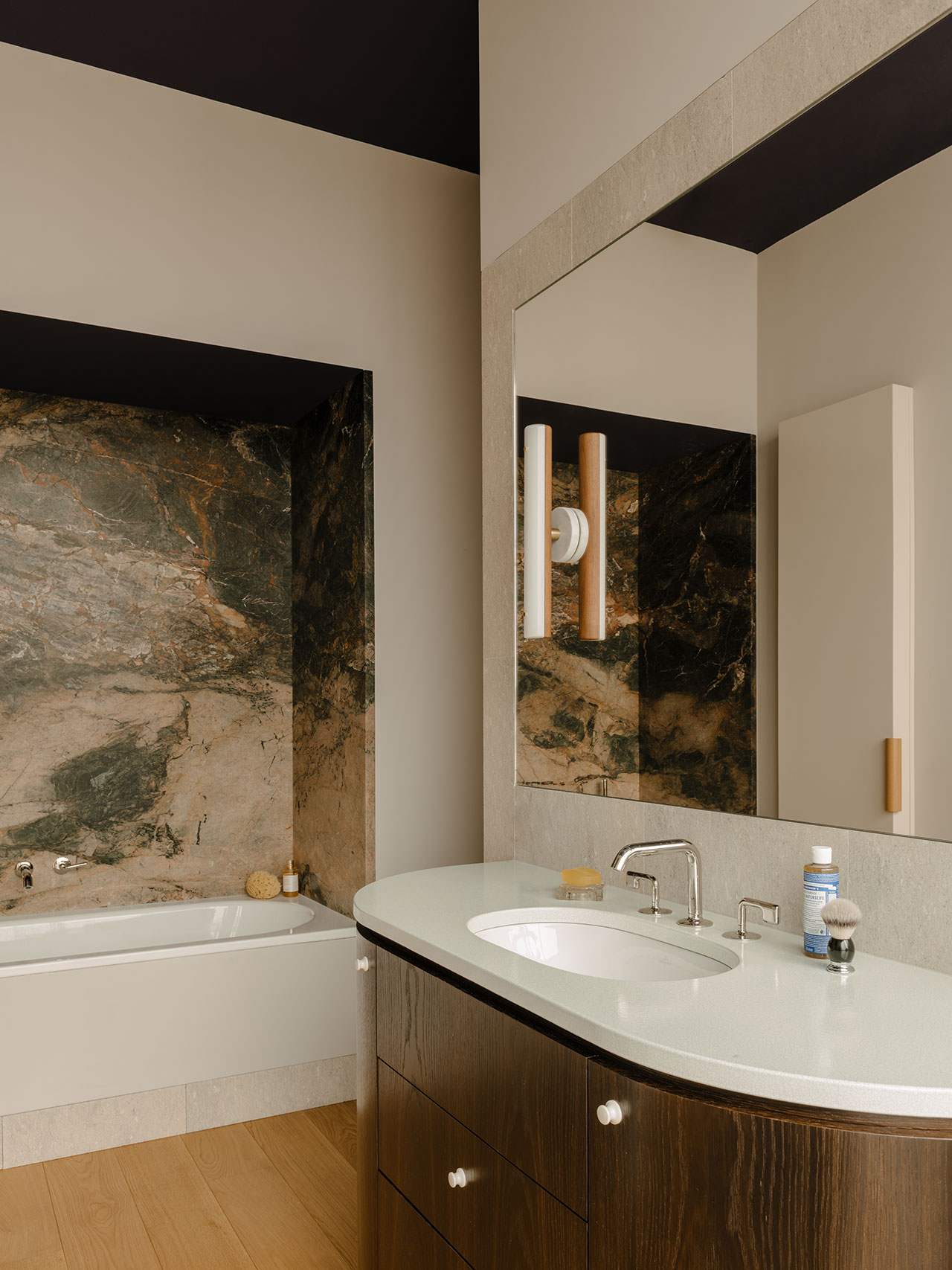
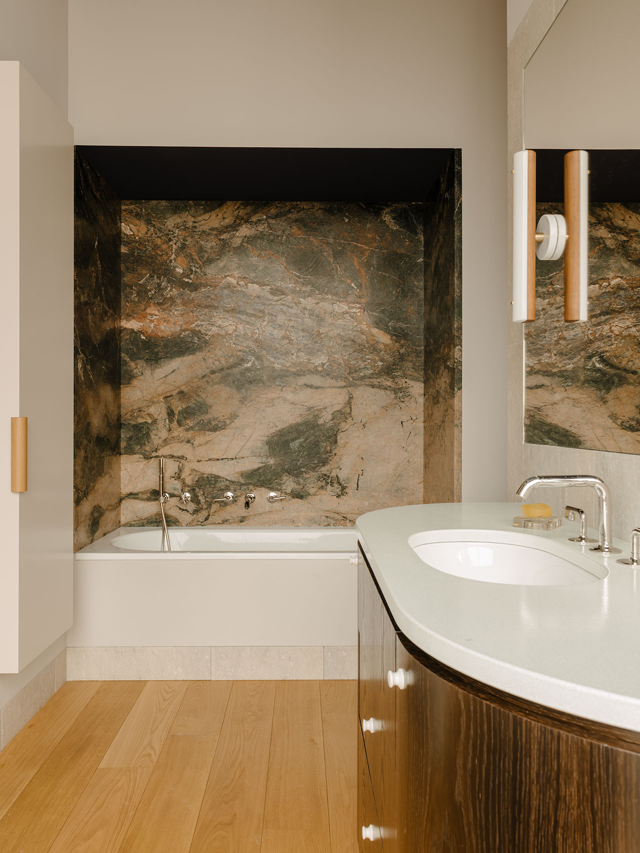
The project’s bespoke sensibility extends to the bathroom where every element is again tailor-made, from the lava stone washbasin and the curved dark moor oak cabinetry, to the bathtub niche that stands out thanks to the dramatic pattern and earthy hues of the South African marble, further attesting to Pöppler’s astutely understated design ethos. "A good design”, as he eloquently says, “is like a tailor-made suit, it should fit perfectly without being the centre of attention".
Photography by Robert Rieger.
Photography by Robert Rieger.
Photography by Robert Rieger.
Photography by Robert Rieger.
Photography by Robert Rieger.
Photography by Robert Rieger.
Photography by Robert Rieger.
Photography by Robert Rieger.


