Photography by Huang Zaohui.
Photography by Huang Zaohui.
Photography by Huang Zaohui.
Photography by Huang Zaohui.
Photography by Huang Zaohui.
Photography by Huang Zaohui.
Photography by Huang Zaohui.
Photography by Huang Zaohui.
Photography by Huang Zaohui.
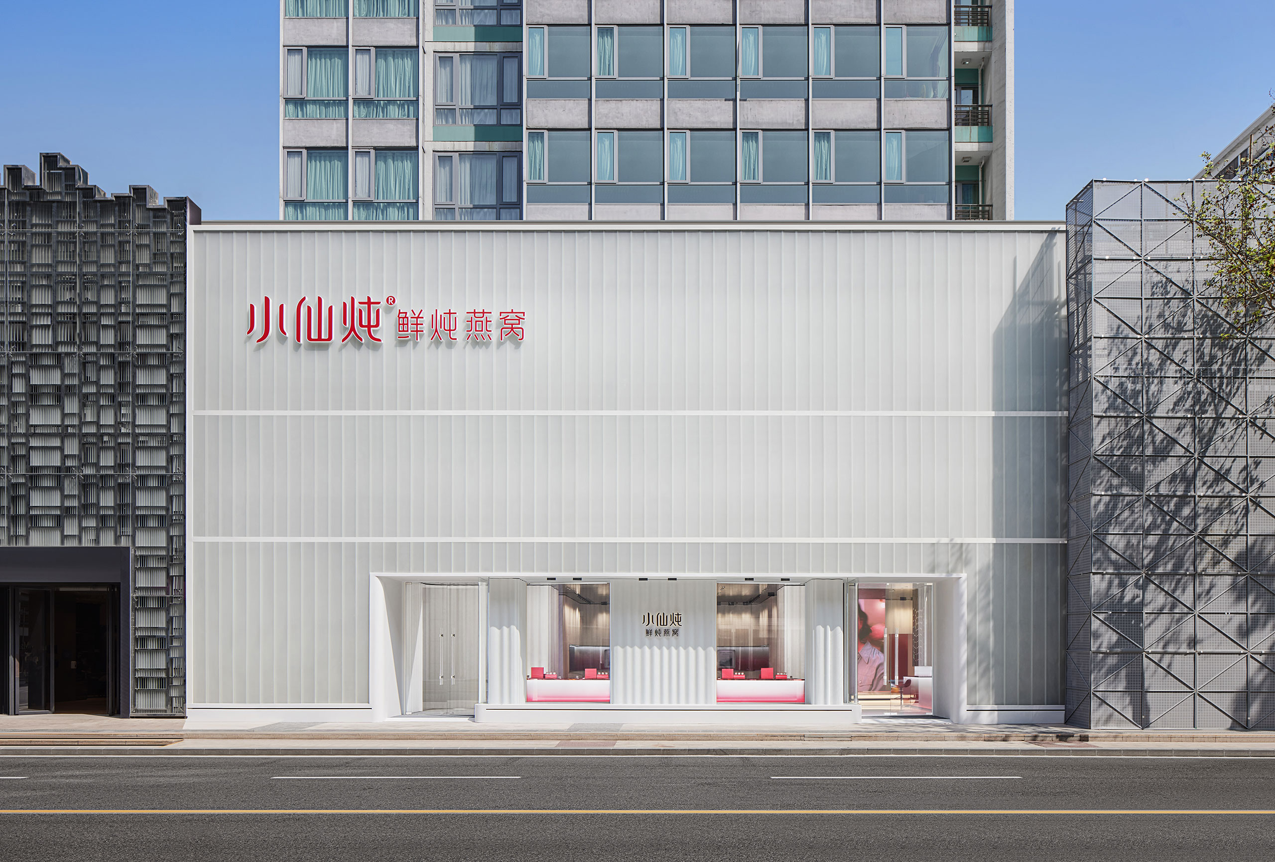
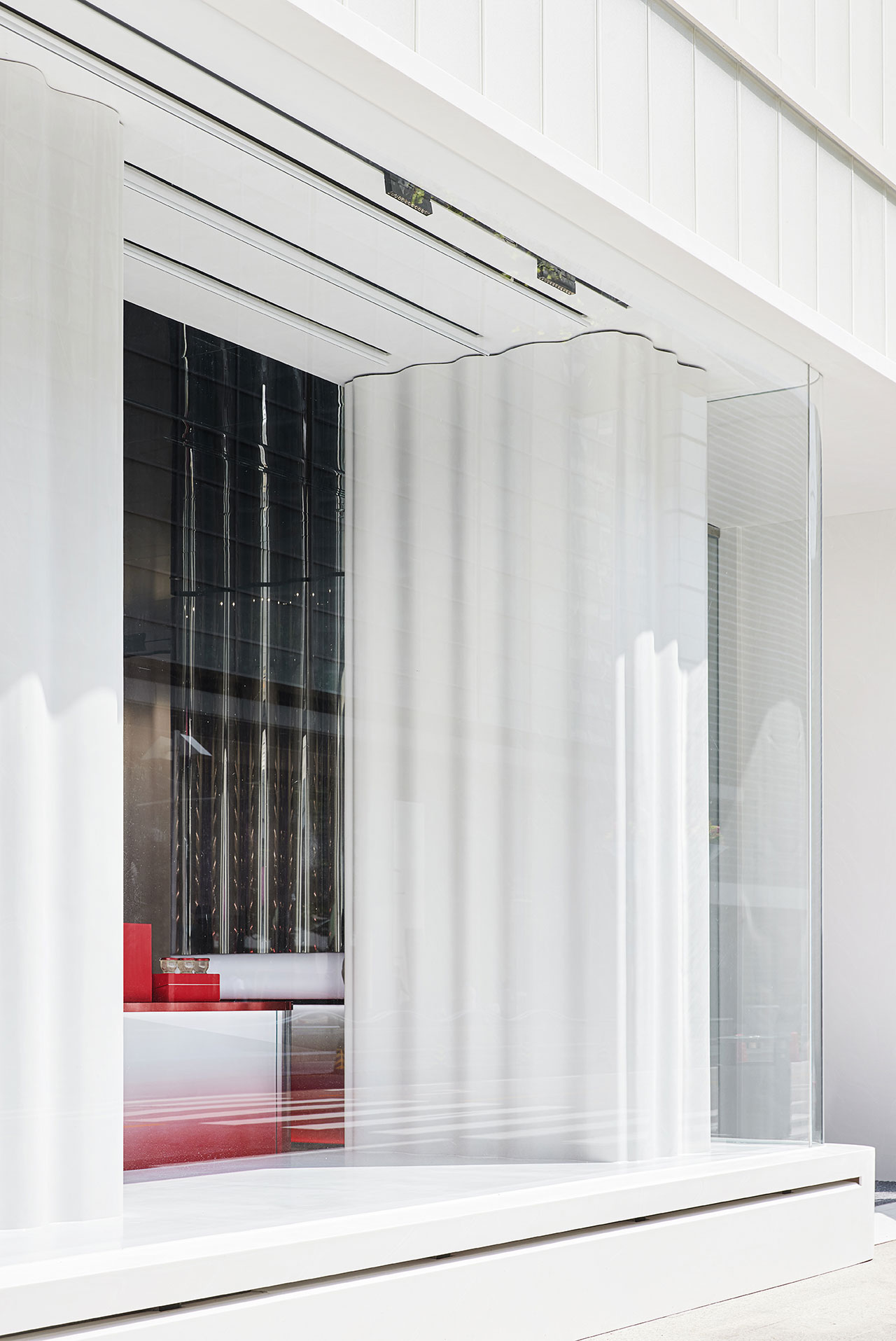
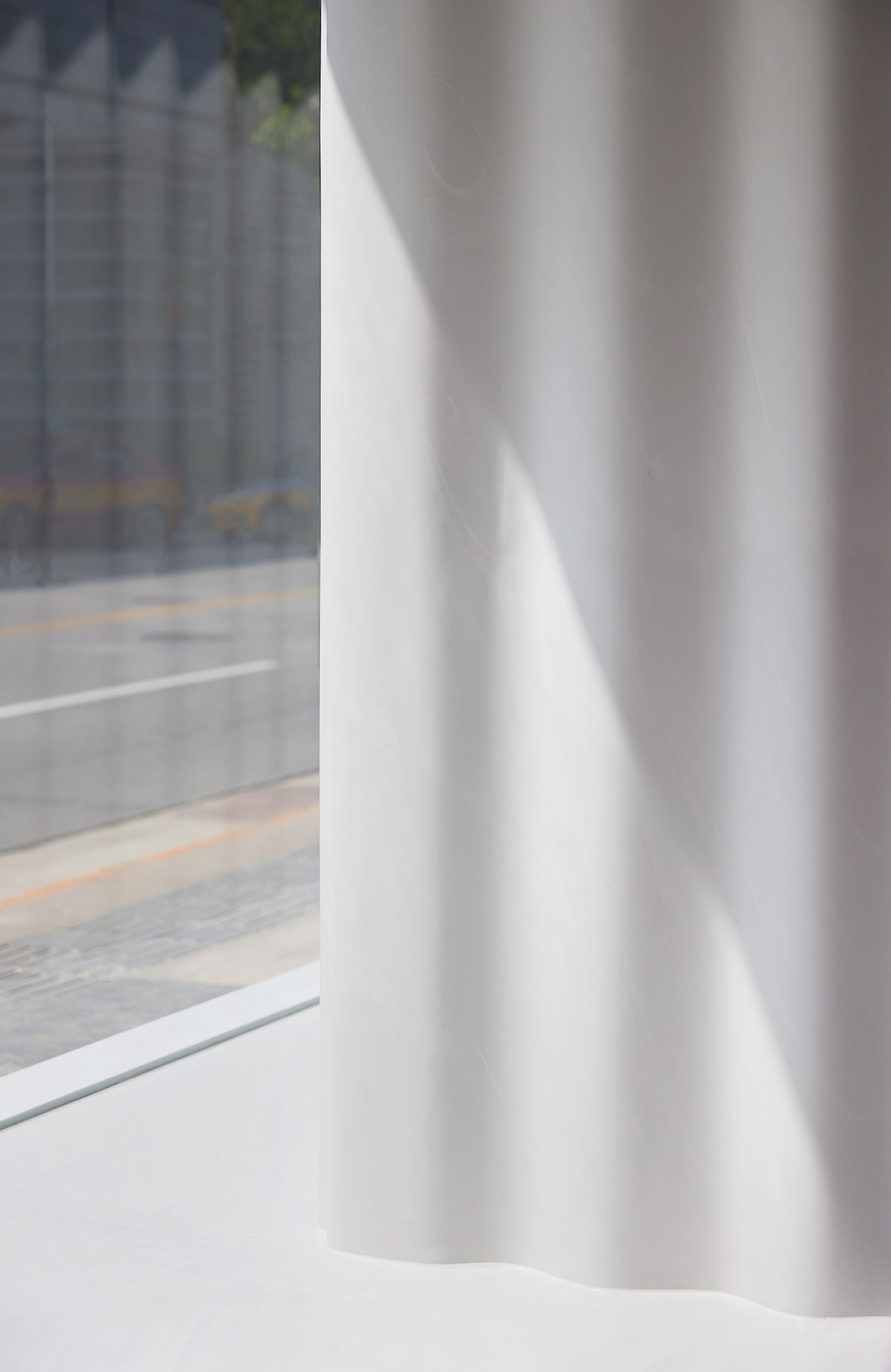
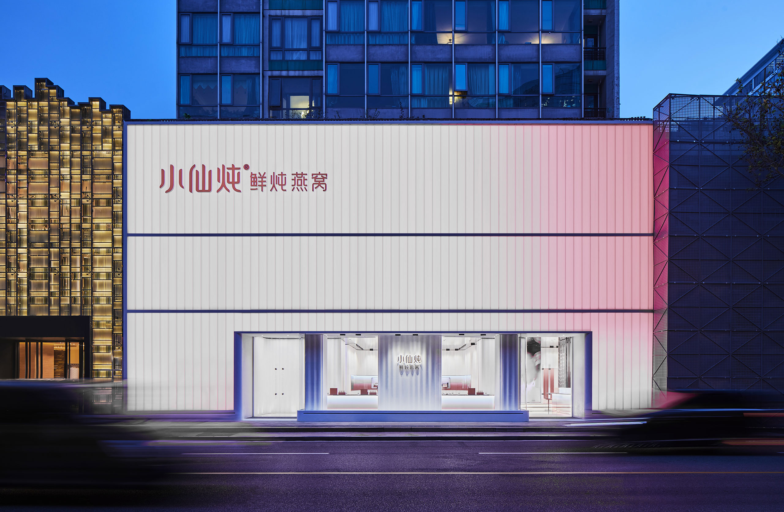
Located amid other luxury brands in Beijing’s Central Business District, XFSEBN’s three-storey flagship store is housed in an existing commercial building which the designers have clad in translucent glass vertical panels that allude to the gelatinous texture of the edible bird’s nest. Equipped with dynamic lighting that fluctuates from white to red – the nests are usually white but can also be found in red versions – the luminous façade transforms the store at night into a glowing beacon. The idea of transparency continues in the interior where it’s paired with flowing forms, ombre effects and mirrored surfaces to create a series of immersive, painterly spaces that turn the shopping experience into a meditative journey.
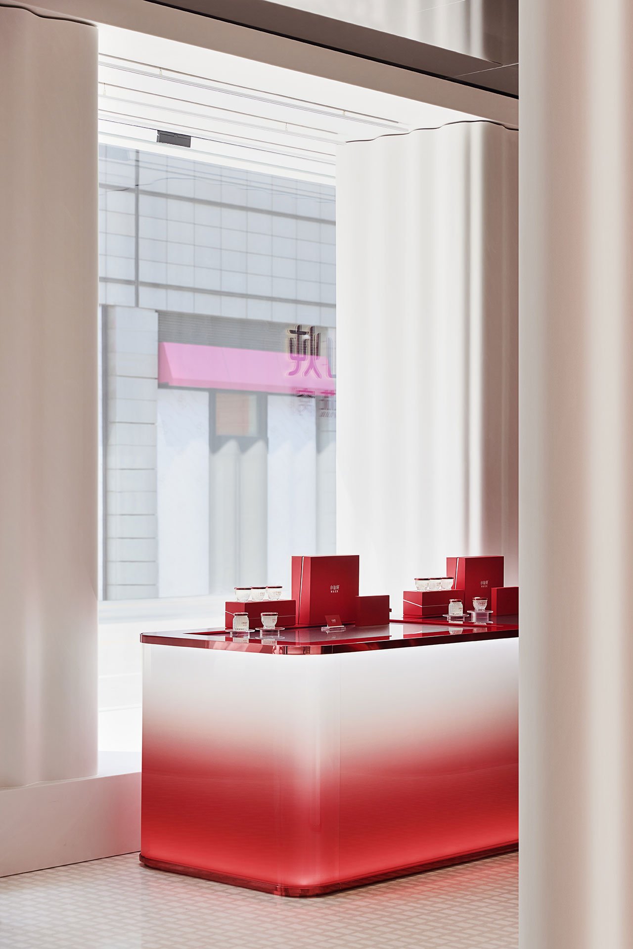
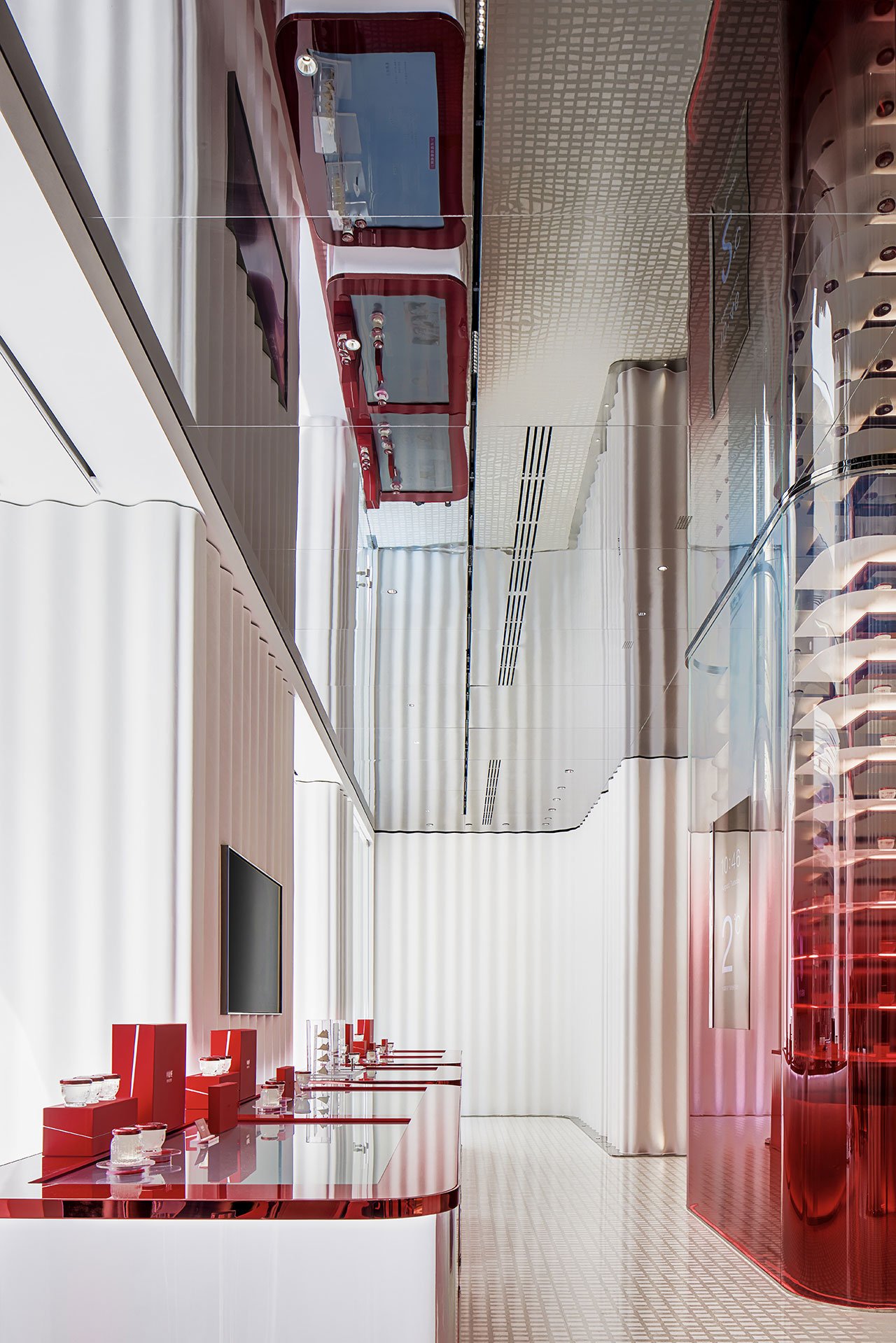
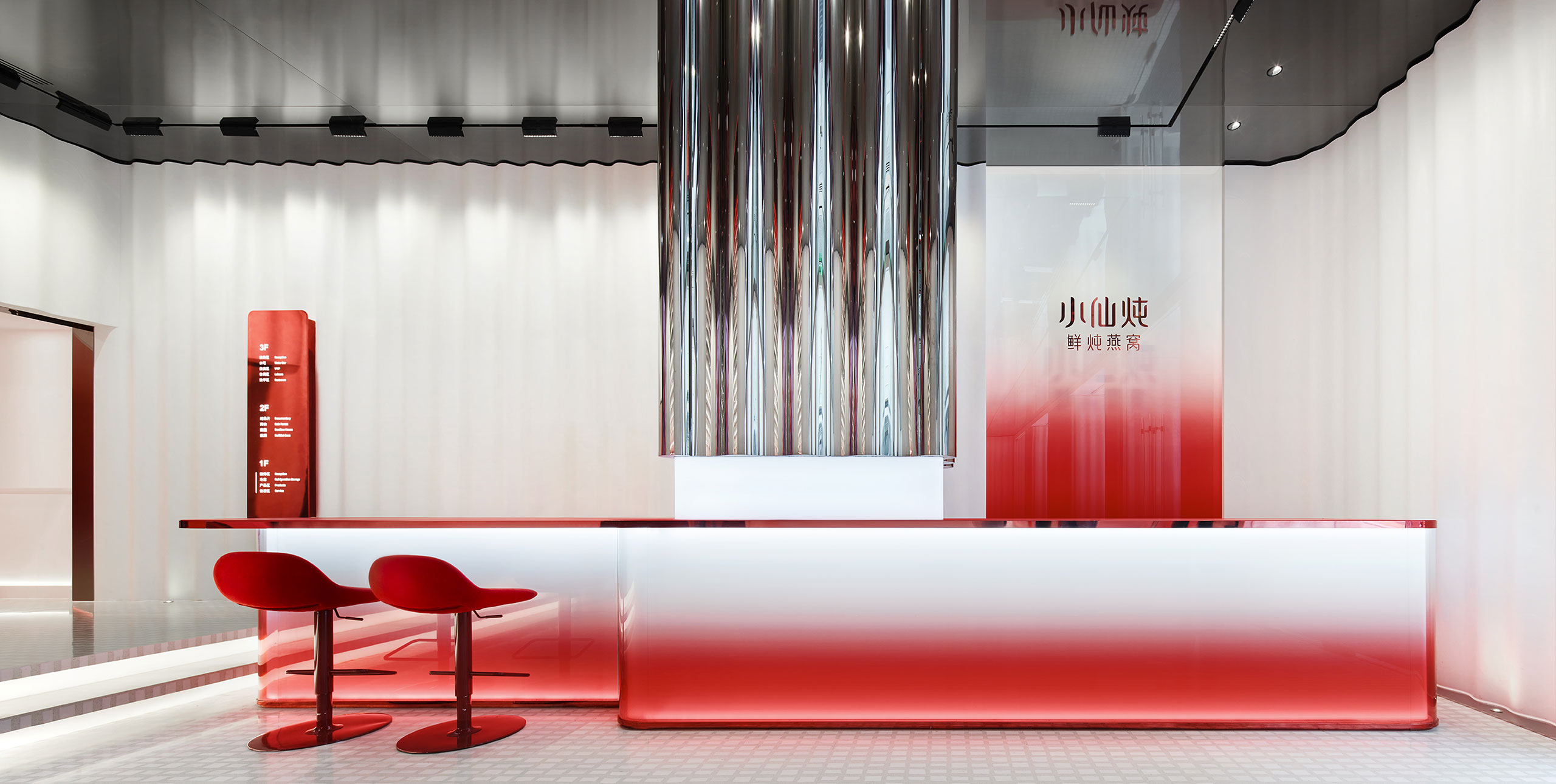
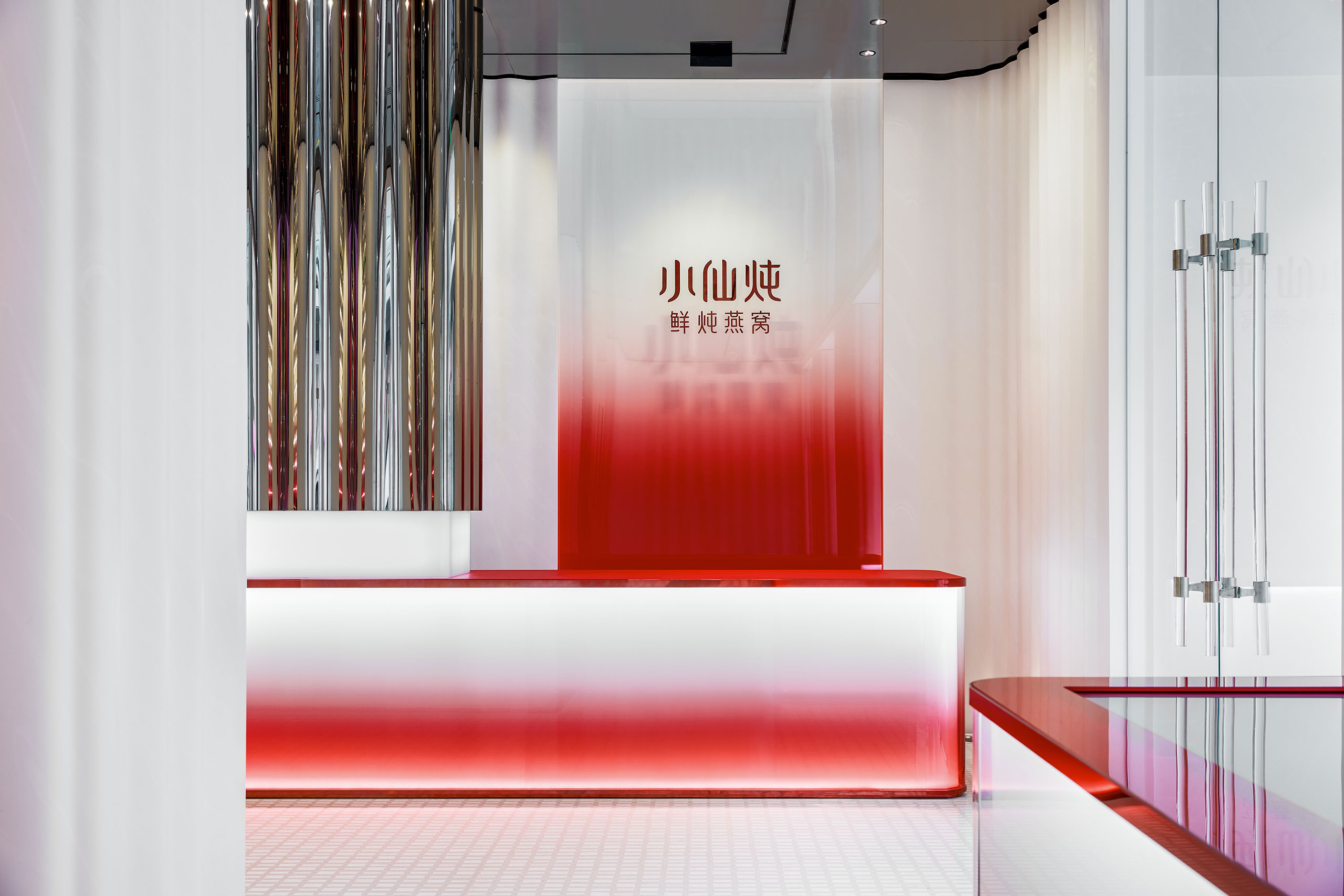
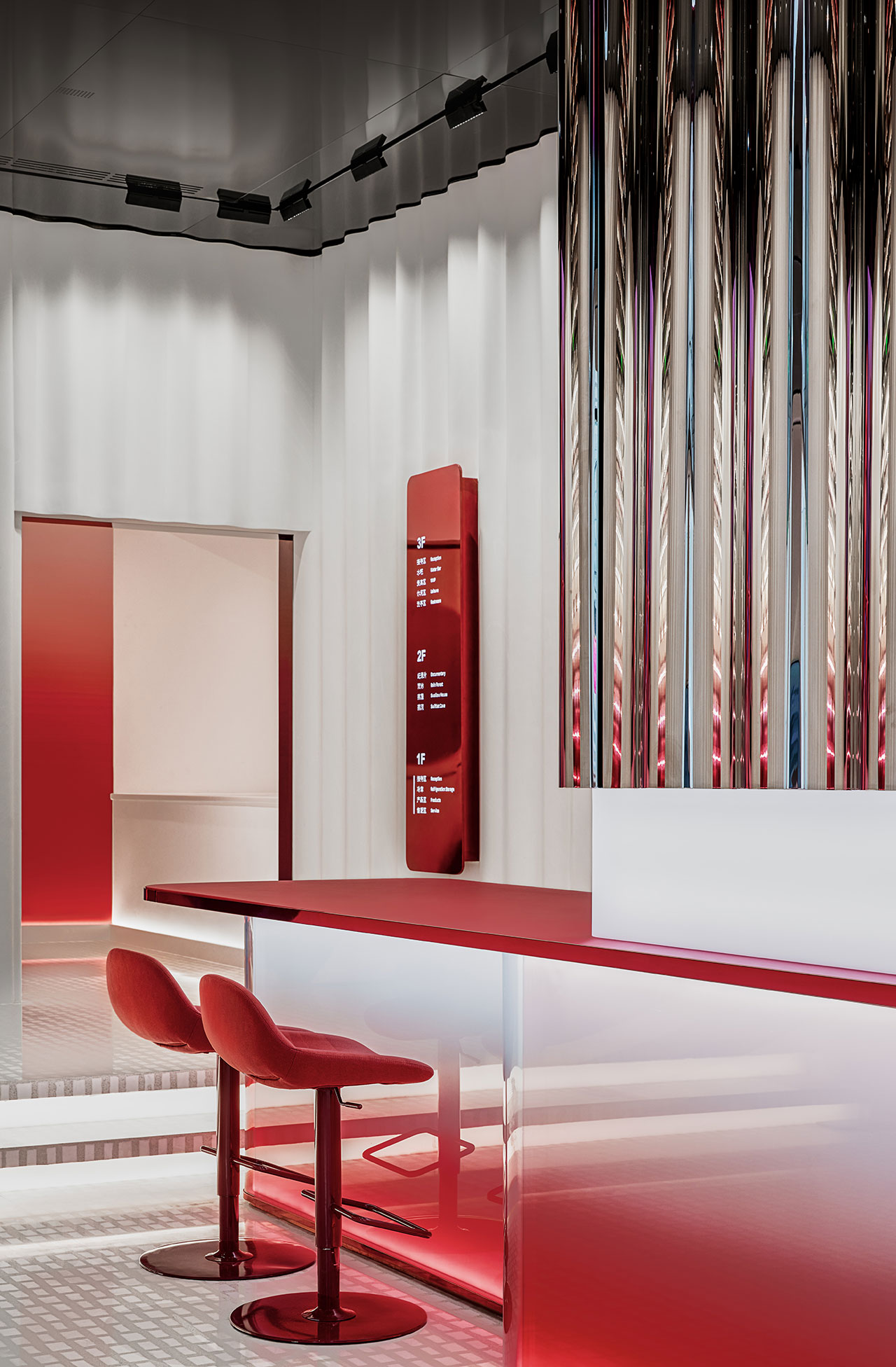
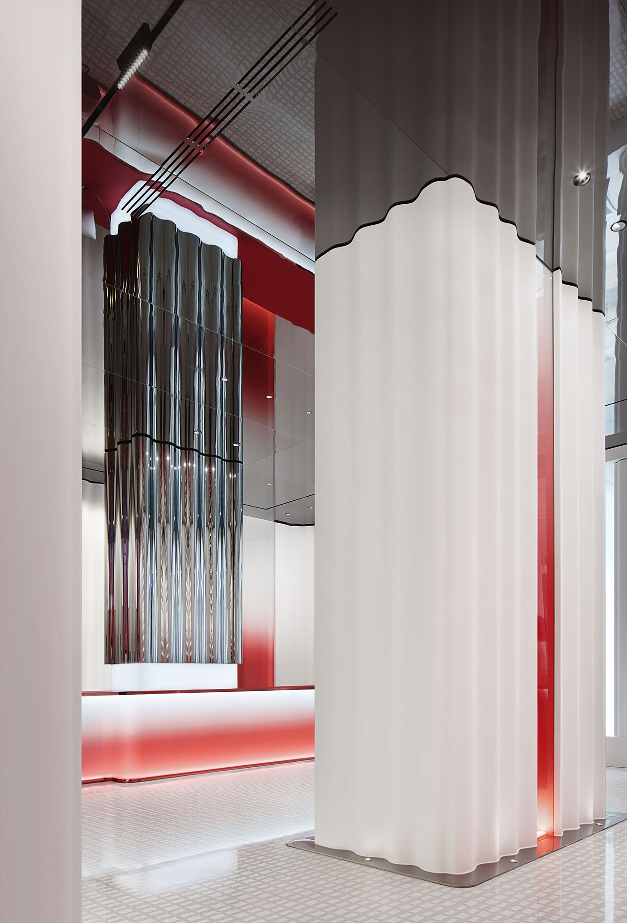
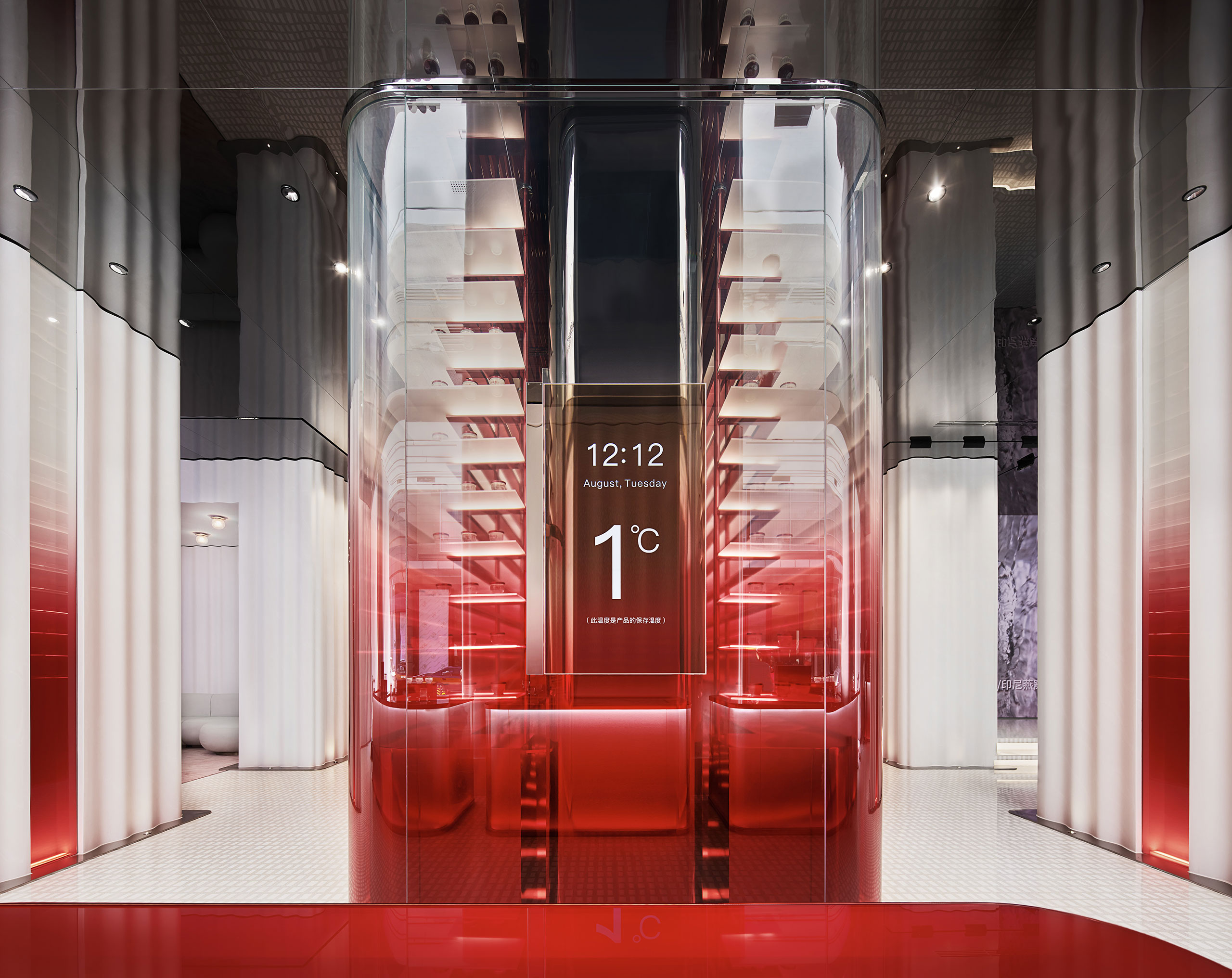
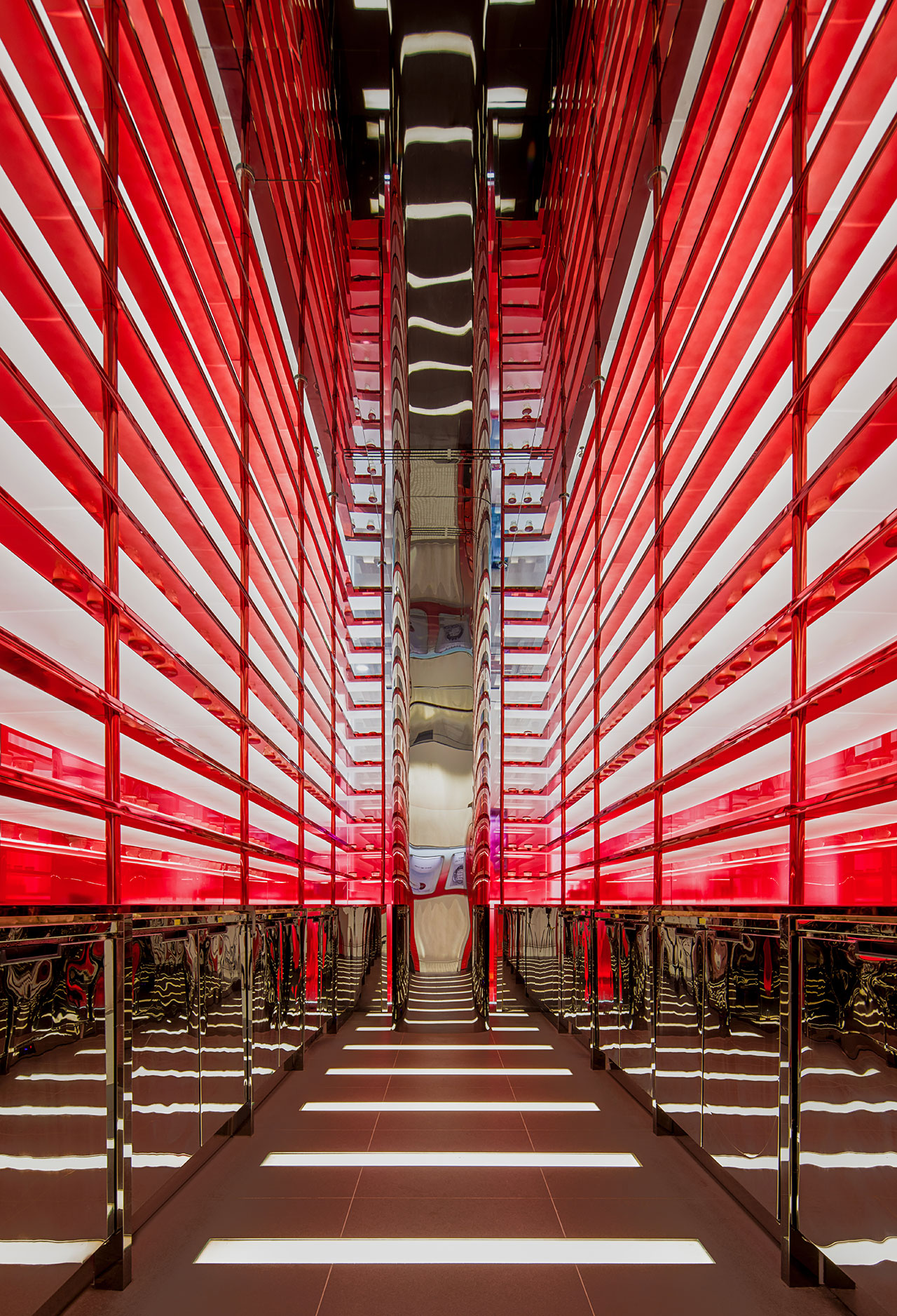
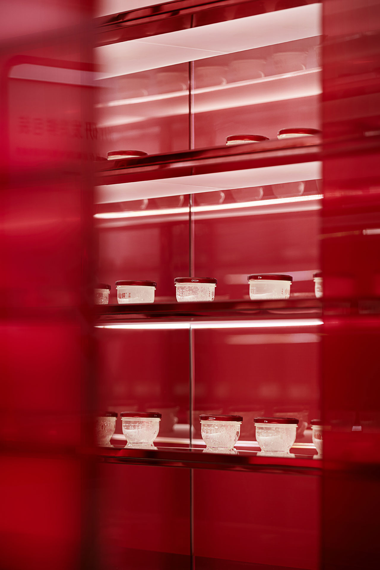
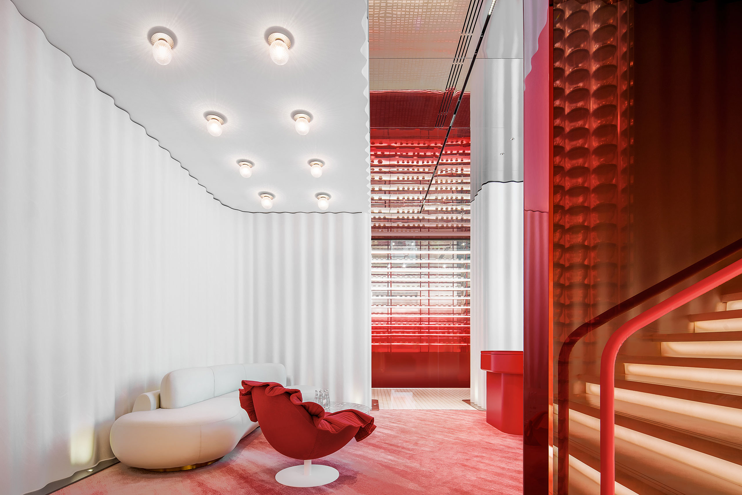
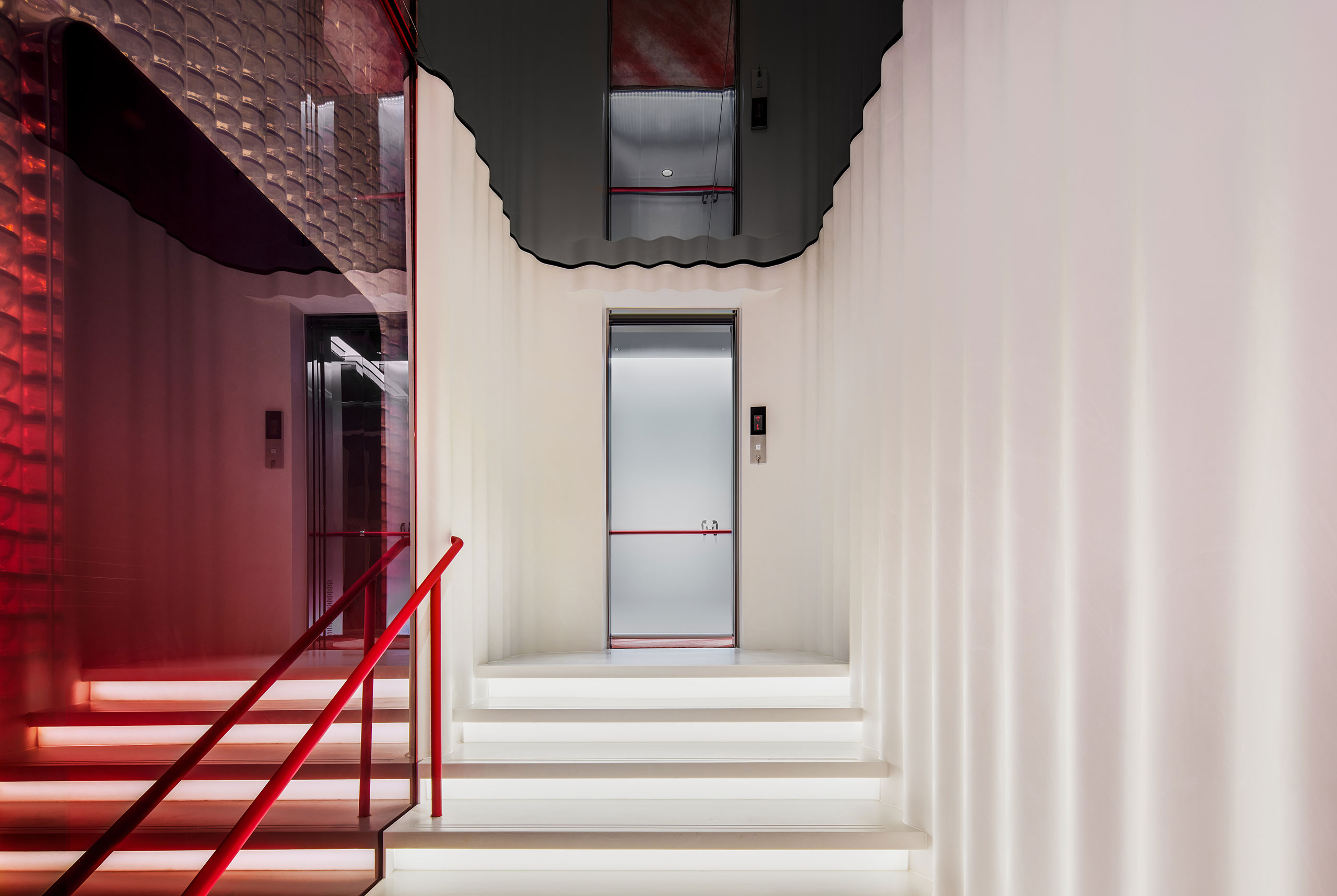
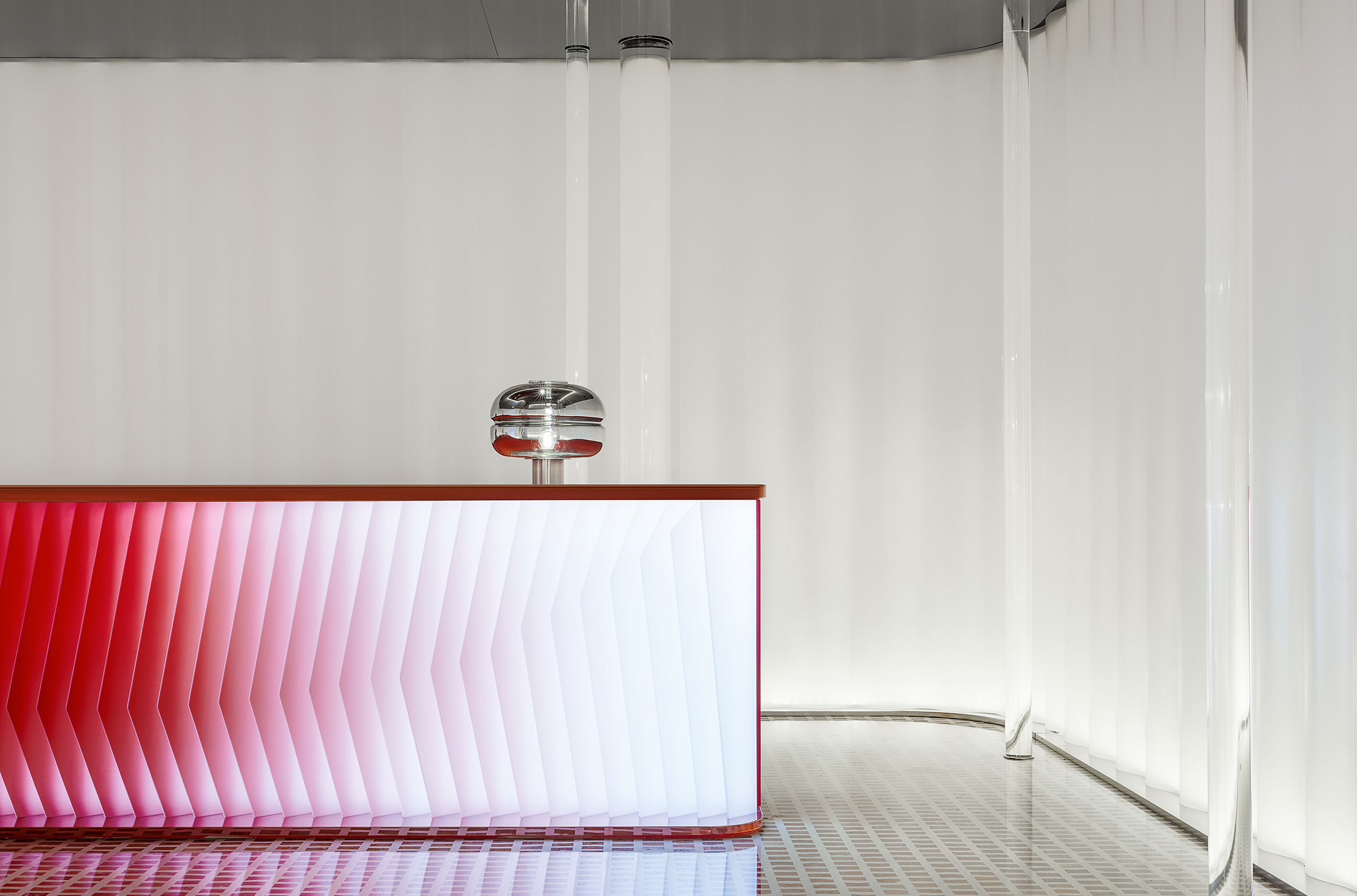
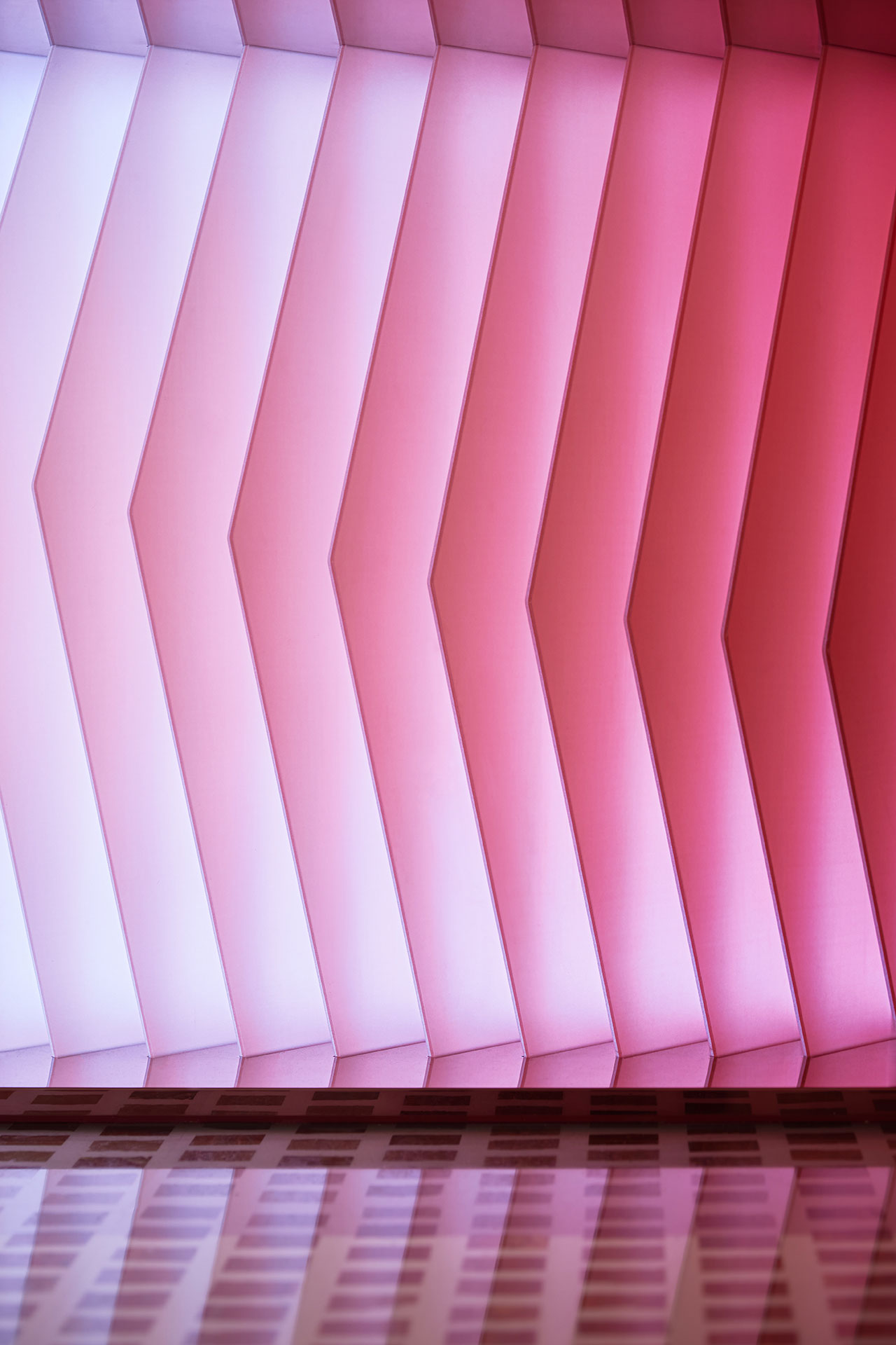
Underpinned by a soothing colour palette that gently blends white and red hues, the ground floor retail space is wrapped in undulating Corian walls that convey a sense of flowing movement, their effect enhanced by the use of mirrors on the ceiling and the rounded volumes of the counters and other furnishings. In the centre, the walk-in refrigeration zone is for all intents and purposes where the store’s heart beats. Swathed in red transparencies and marked by a digital screen stating the internal temperature, the glass-enclosed, capsule-like room feels like it houses priceless jewels - and to some extent it is as it’s where the brand’s products are displayed.
Photography by Huang Zaohui.
Photography by Huang Zaohui.
Photography by Huang Zaohui.

Photography by Huang Zaohui.
Photography by Huang Zaohui.
Photography by Huang Zaohui.
Photography by Huang Zaohui.
Photography by Huang Zaohui.
Photography by Huang Zaohui.
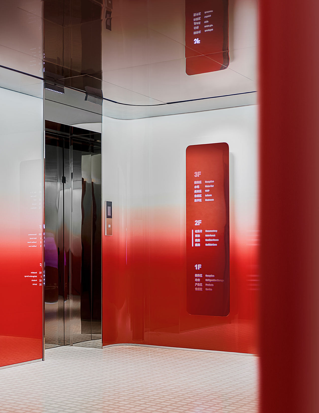
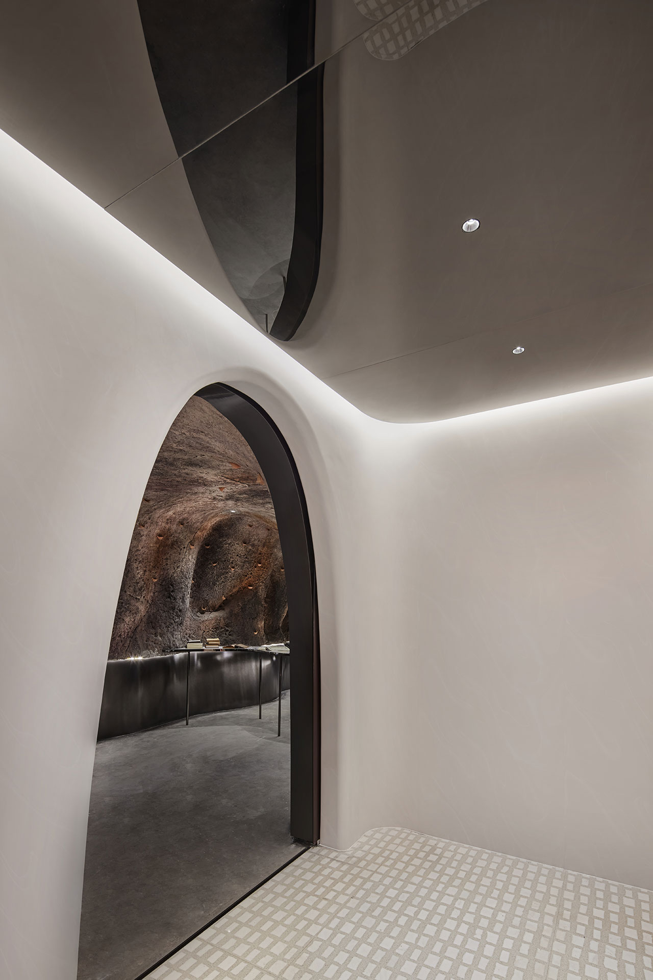
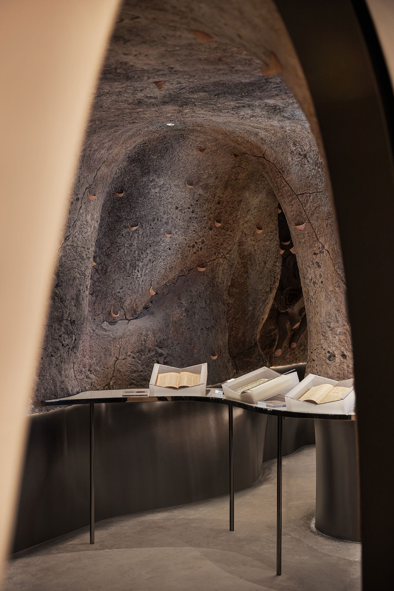
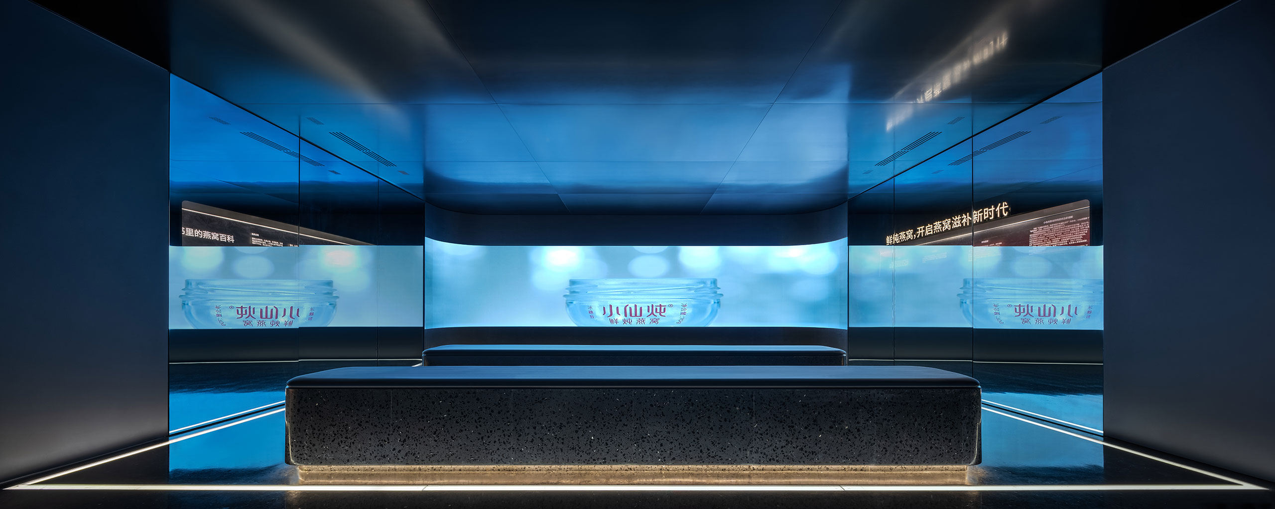
On the first floor, a series of vivarium-like spaces introduces customers to the swiftlet’s natural habitat including the caves where they construct their nests (swiftlets, like bats, use echolocation to move around in the dark) and the rainforests where they feed. While the former immerses customers into a cavernous environment where they get to see how the hammock-like nests cling precariously on the rocky surfaces, the latter is an Instagramable wonderland where flocks of birds pass you by courtesy of gossamer-like projection screens and motion detectors. On the same level, a futuristic viewing room presents a documentary film produced in collaboration with the Discovery Channel.
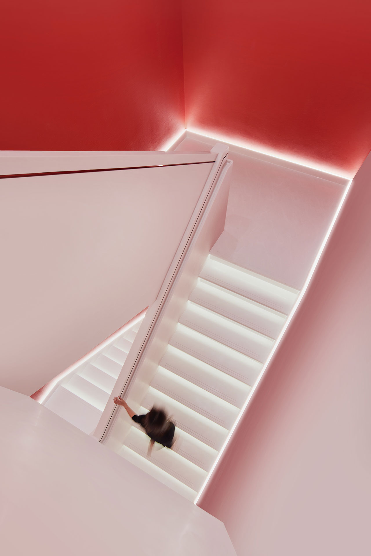
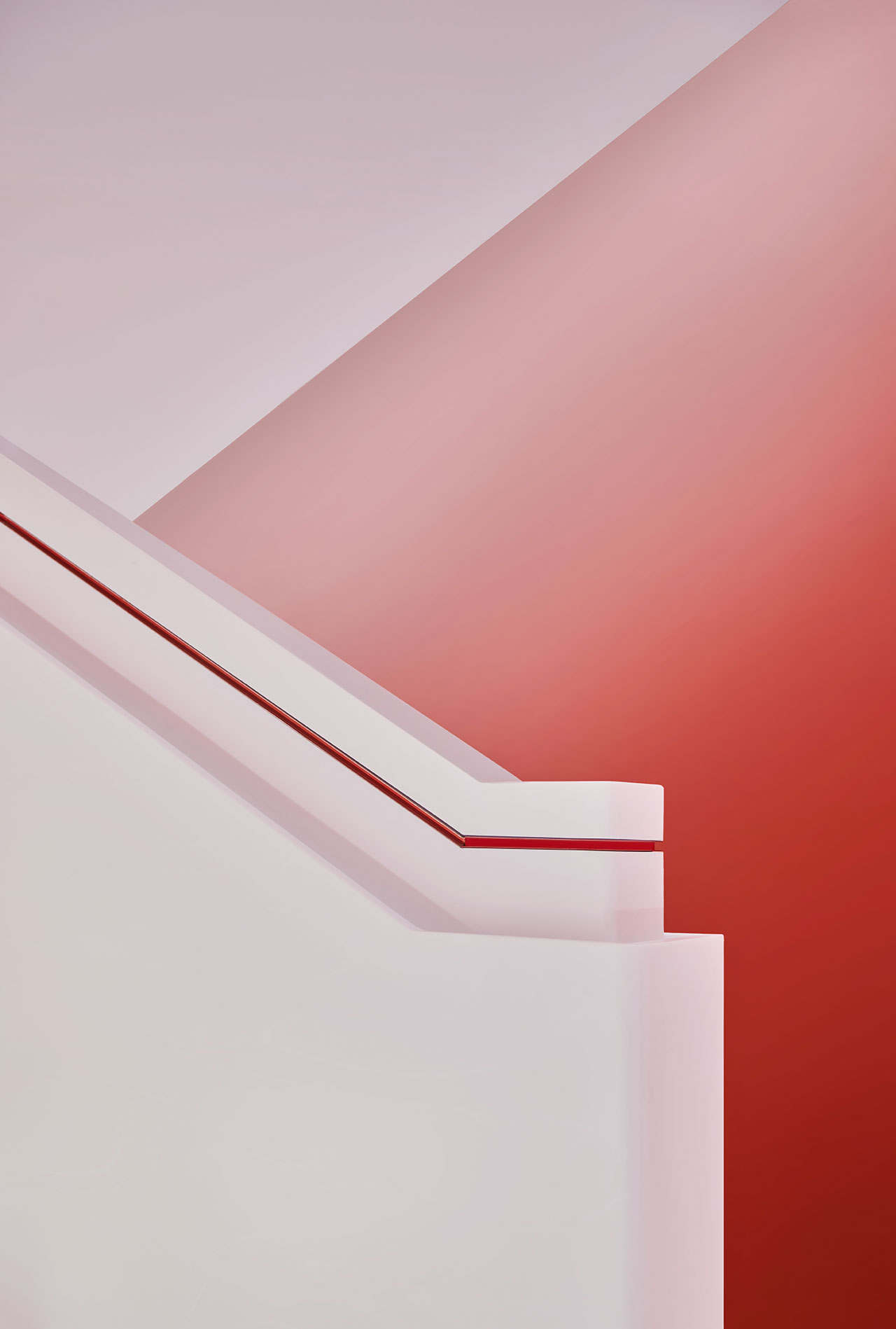
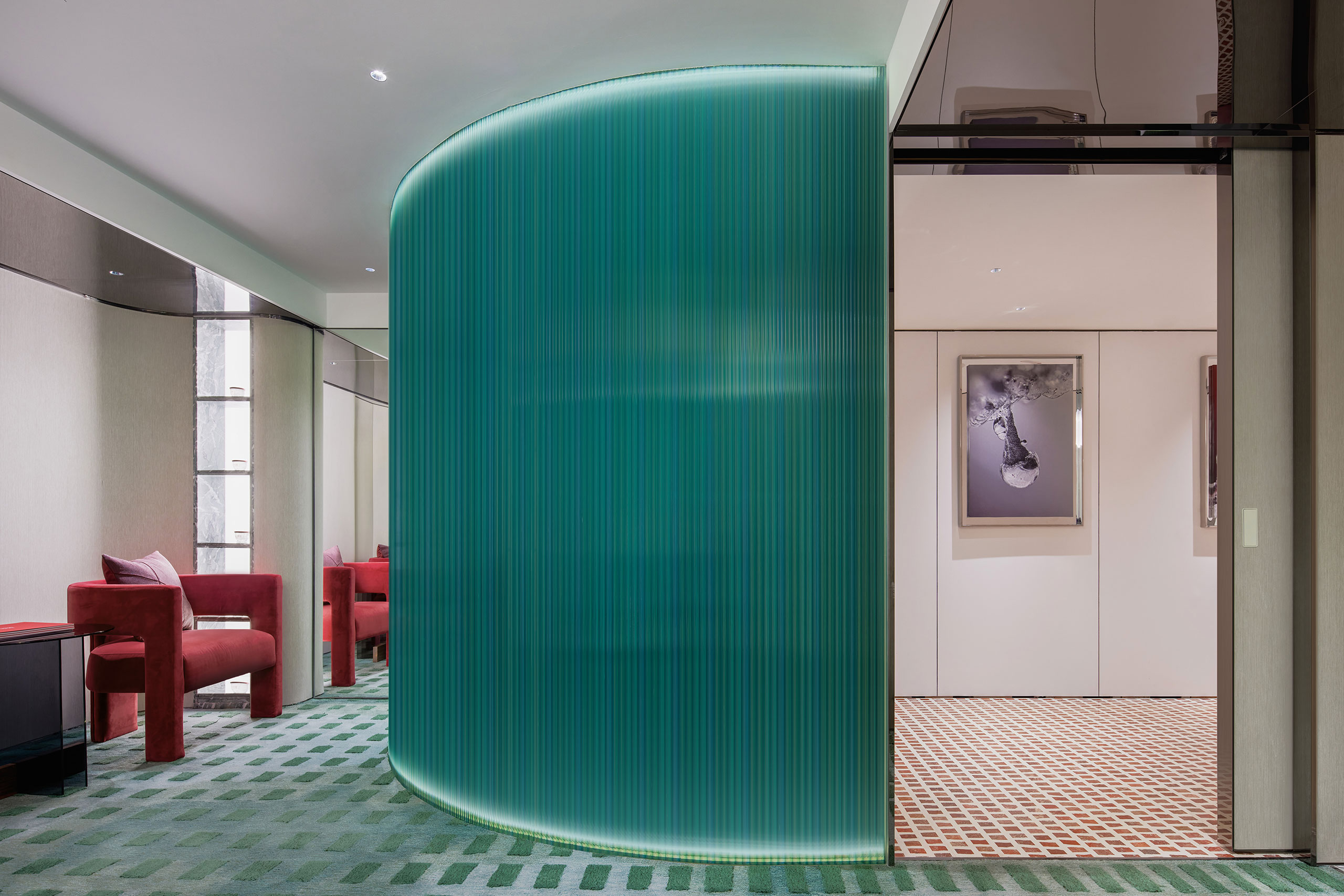
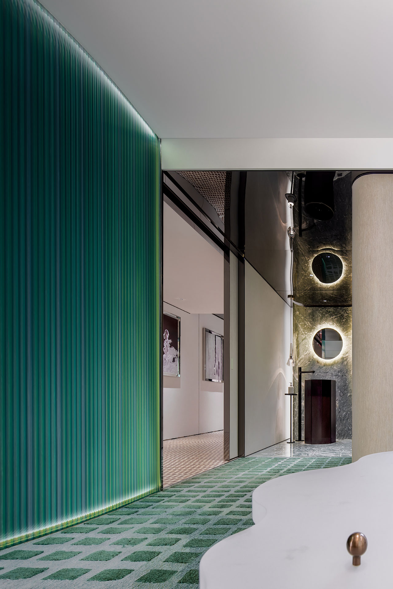
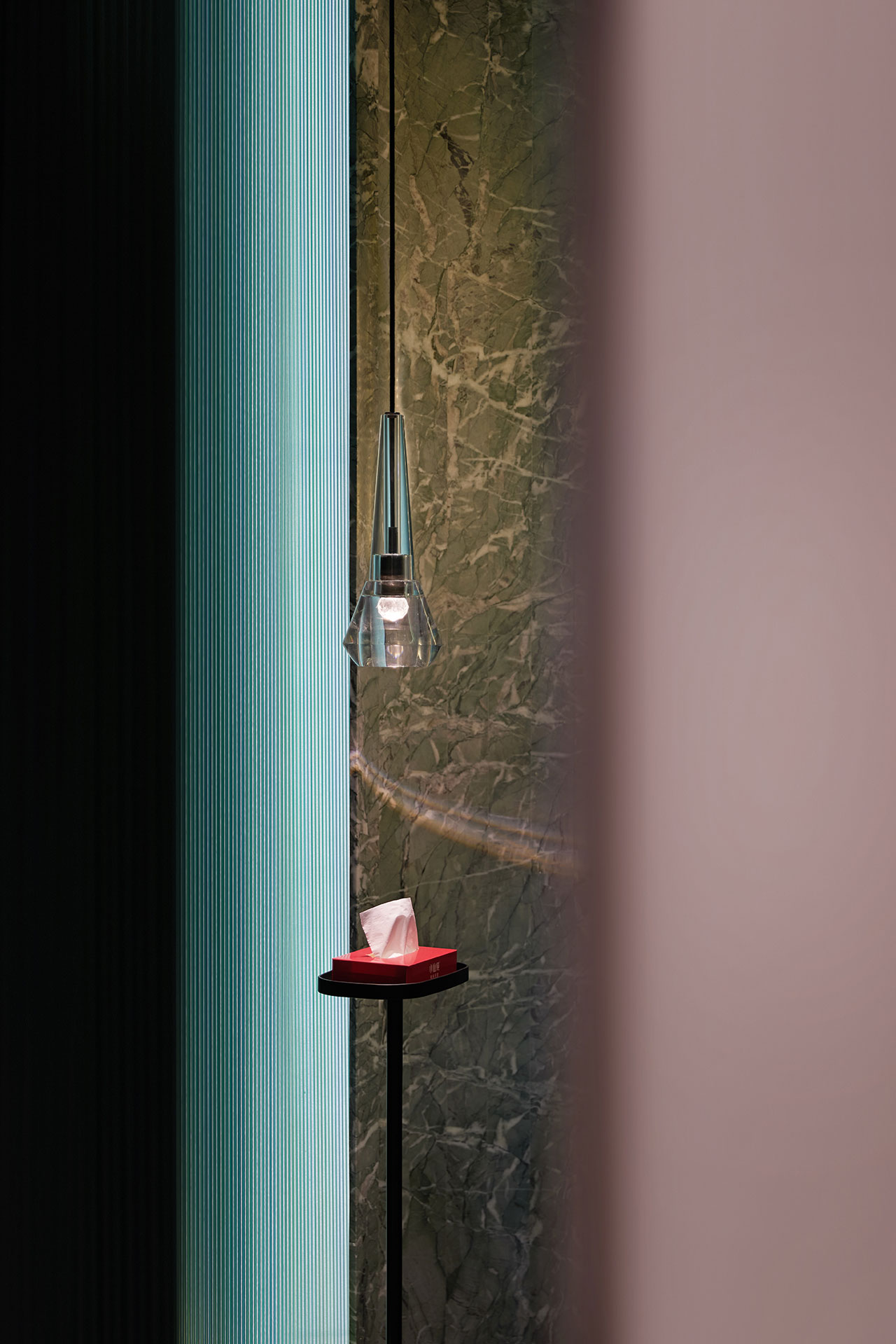
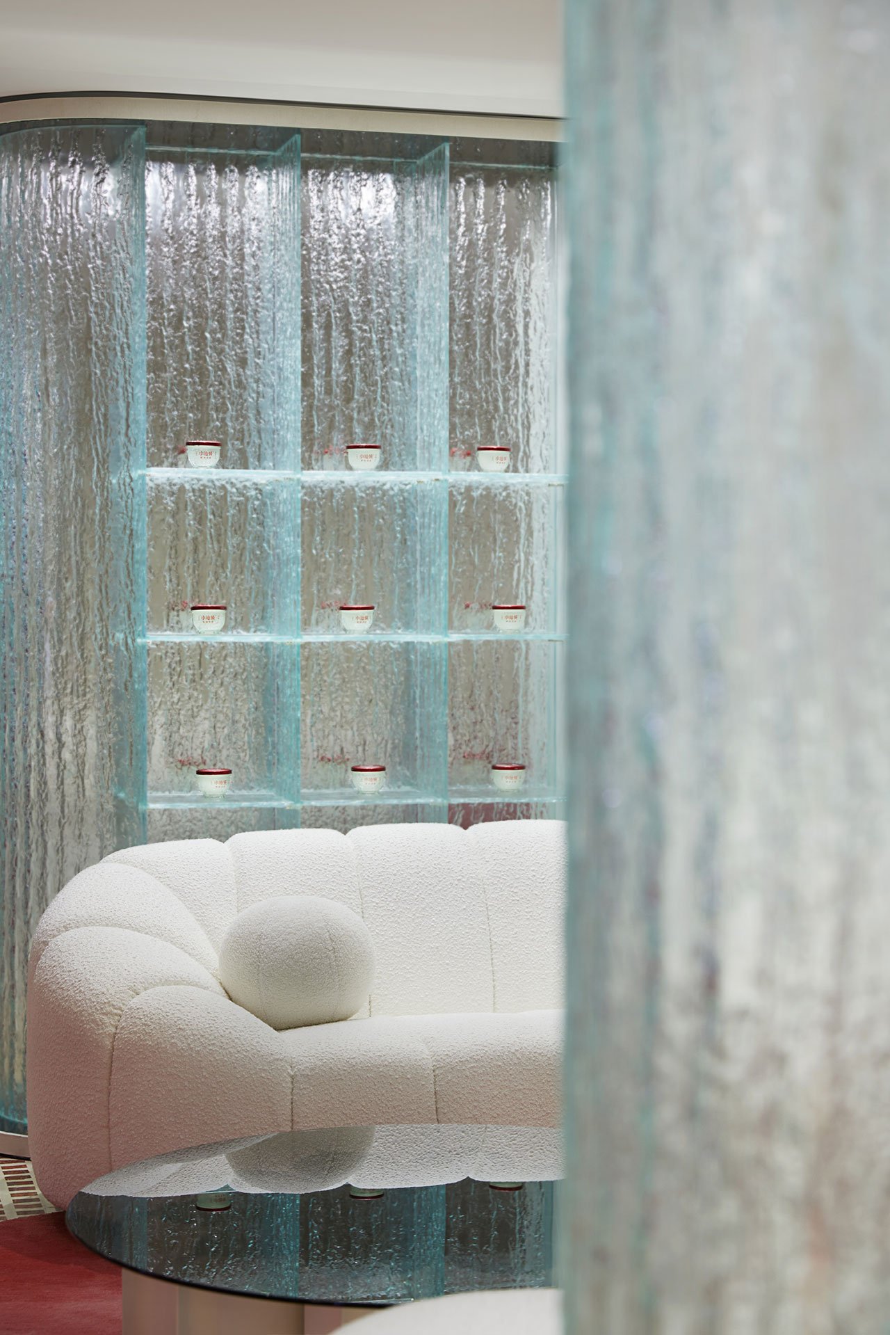
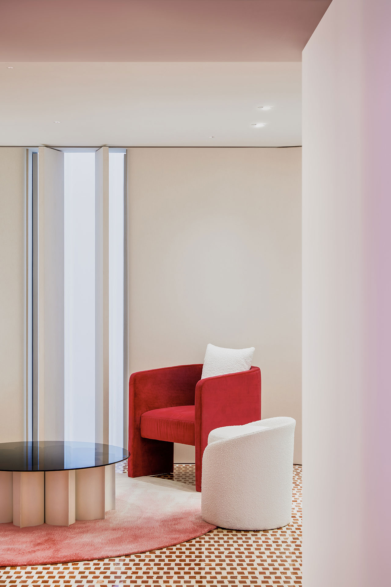
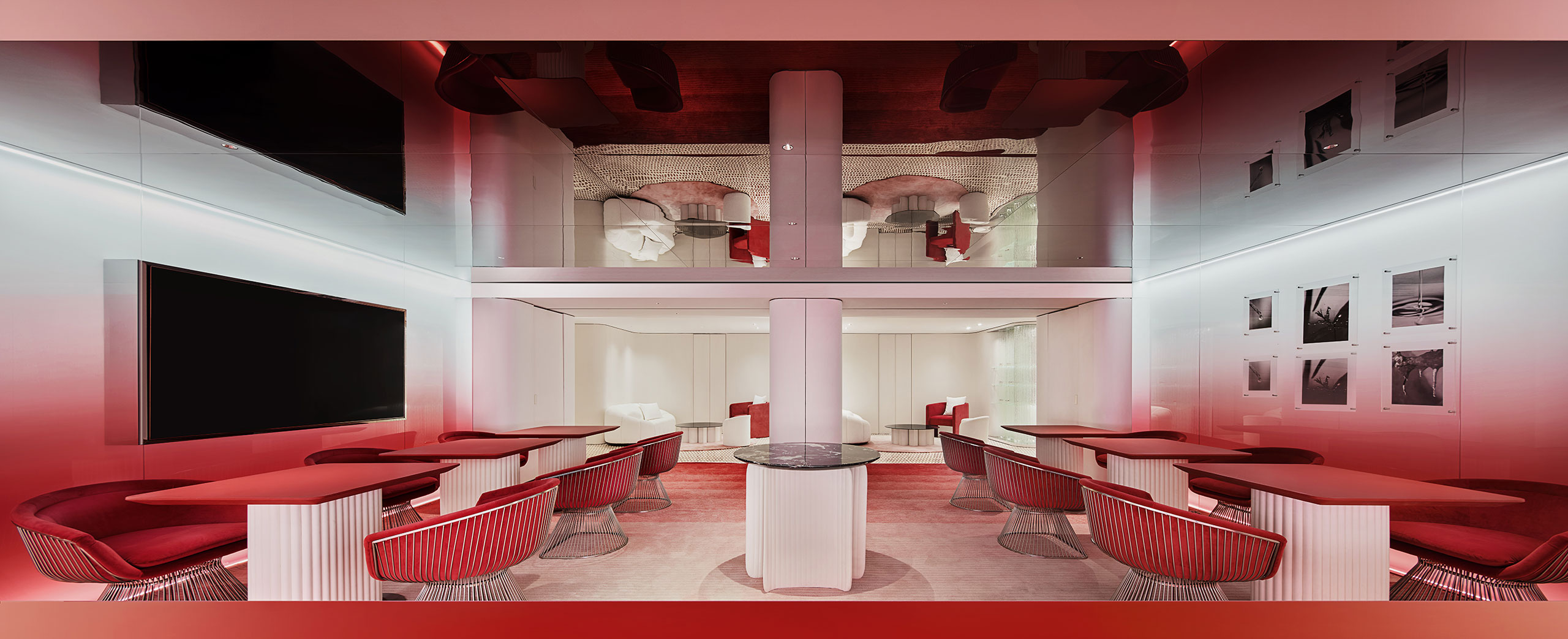
Finally, a VIP lounge and dining area on the second floor is where customers come to socialize and relax in a space of discrete elegance. Fluted, glossy surfaces, glass elements and creamy textures echo the dreamlike aesthetic of the retail space downstairs as does the white and red colour palette which here is supplemented with vibrant green hues. Glowing with the natural light filtering through the translucent façade, the space feels fresh and soothing on top of standing out for its contemporary sophistication – only further testament to Leaping Creative’s unique design approach to such a unique retail concept.
Photography by Huang Zaohui.
Photography by Huang Zaohui.
Photography by Huang Zaohui.
Photography by Huang Zaohui.
Photography by Huang Zaohui.
Photography by Huang Zaohui.
Photography by Huang Zaohui.
Photography by Huang Zaohui.
Photography by Huang Zaohui.
Photography by Huang Zaohui.
Photography by Huang Zaohui.
Photography by Huang Zaohui.


