Project Name
HokkaidonPosted in
Graphic Design, Interior DesignLocation
Telephone
+852 2577 0828Creative Agency
A Work of Substance| Detailed Information | |||||
|---|---|---|---|---|---|
| Project Name | Hokkaidon | Posted in | Graphic Design, Interior Design | Location |
Shop 313, 3/F, Cityplaza, 18 Taikoo Shing Road, Taikoo Shing Quarry Bay
Hong Kong Island |
| Telephone | +852 2577 0828 | Creative Agency | A Work of Substance | ||
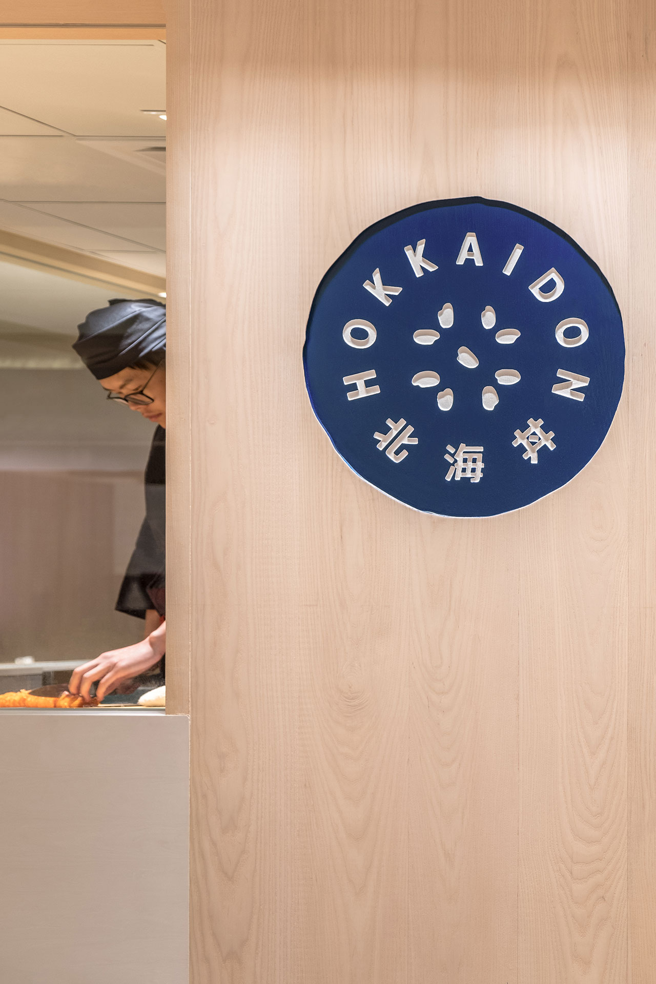
Photo by Vita Mak.
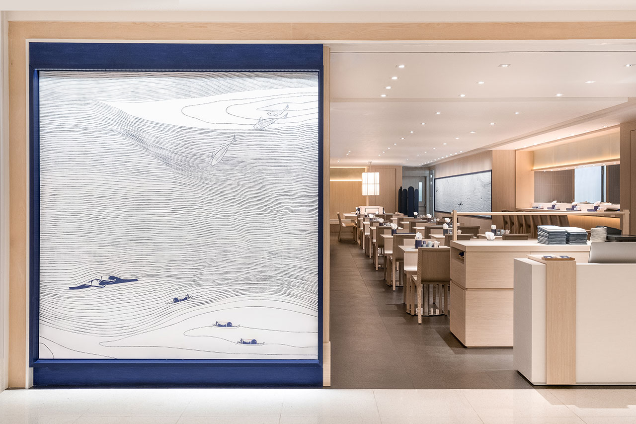
Photo by Vita Mak.
Inspired by the traditional Japanese motif of Seigaiha, which means blue wave of the sea and depicted as a pattern of layered concentric circles creating arches symbolic of waves or water, the designers of A Work of Substance have created a distinct branding aesthetic that encompasses everything from the large decorative panels on the walls to the crockery, menus and takeaway bags.
Displayed against the warm tones of cypress wood that monopolize the interiors, the bespoke decorative murals of hand-drawn, rippling lines of white against a deep blue indigo background, or the reverse, are mesmerizing seascape tableaux where lobsters, prawns, and tunas playfully jump in and out of the waves while fishing boats glide through them. These seafaring panels are not just a graphical injection of the Japanese folklore but also a figurative depiction of the fresh ingredients the restaurant serves.
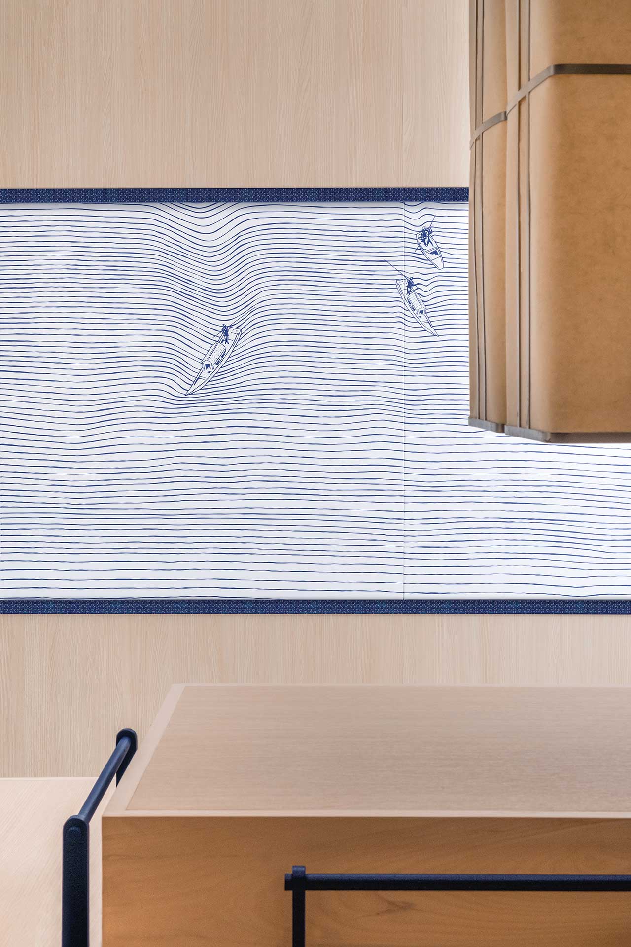
Photo by Vita Mak.
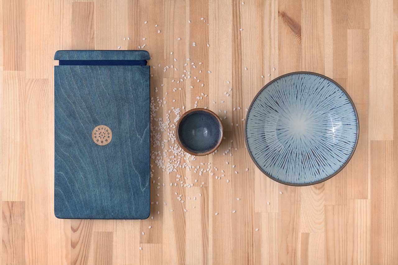
Photo by Vita Mak.
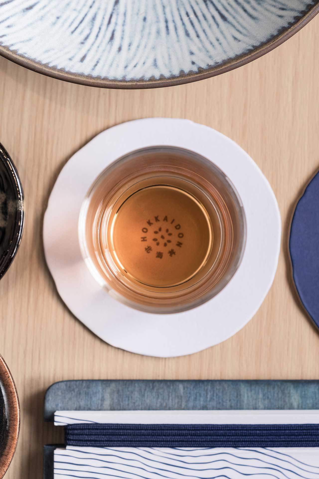
Photo by Vita Mak.
The same attention to detail is also reflected on the tableware. Indigo blue and white Seigaiha patterns - some more faithfully rendered, others more freely - can be found on plates and bowls that are mixed with other crockery featuring more abstract or stripped patterns, while the rippling lines of rolling waves, meticulously crafted on the murals, can also be found on the menus which are affixed to wooden boards dyed blue-grey. Bespoke takeaway paper bags, business cards and bill holders with similar graphics round up a design aesthetic that reflects the restaurant’s contemporary take on Chirashi, minimally exemplified by Hokkaidon’s circular logo that alludes to a bowl of rice: a refined representation of the dish at its most basic.
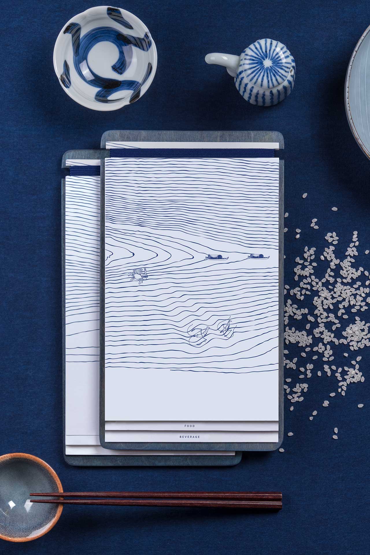
Photo by Vita Mak.
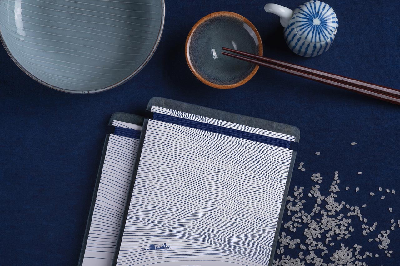
Photo by Vita Mak.
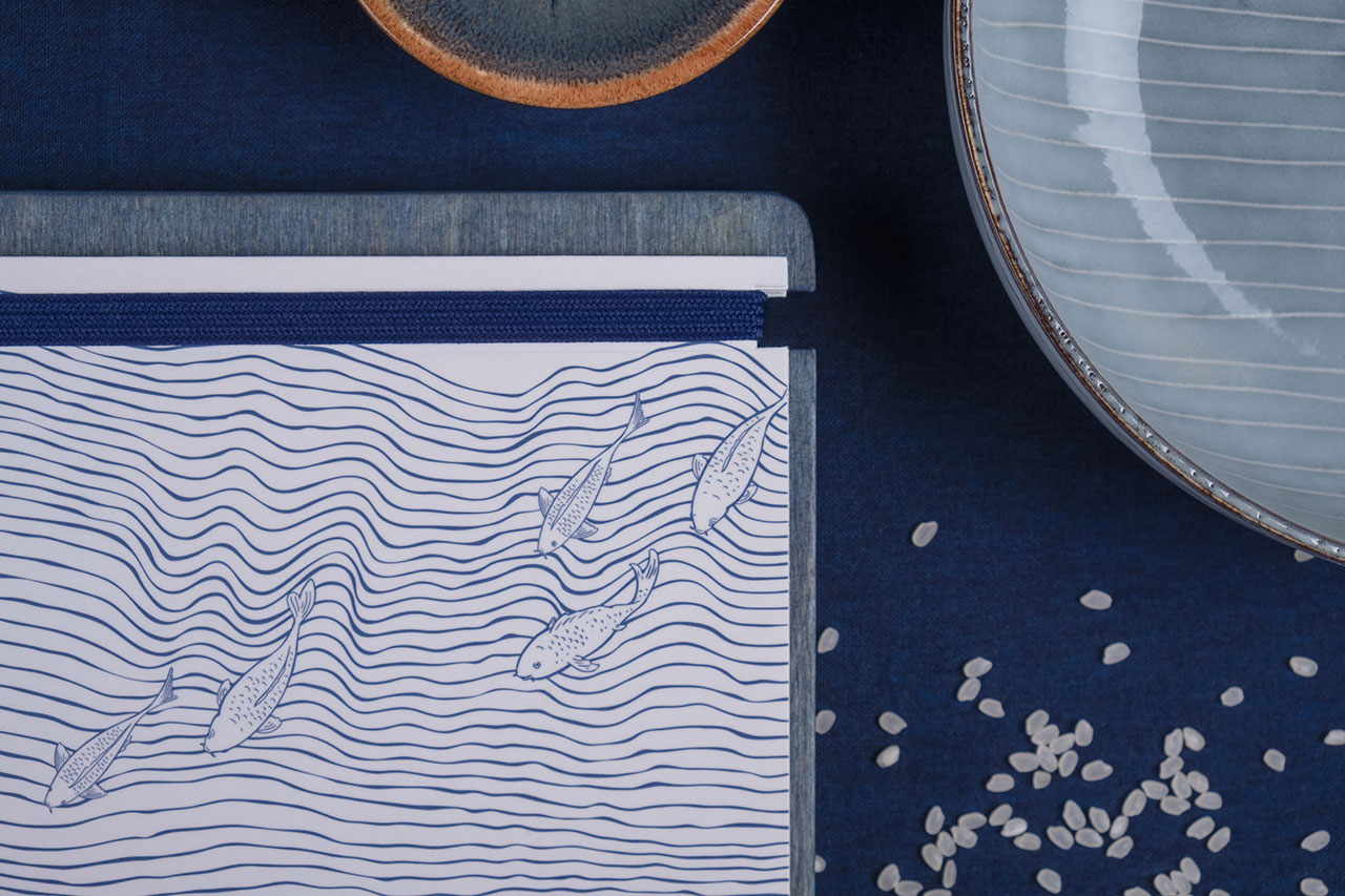
Photo by Vita Mak.
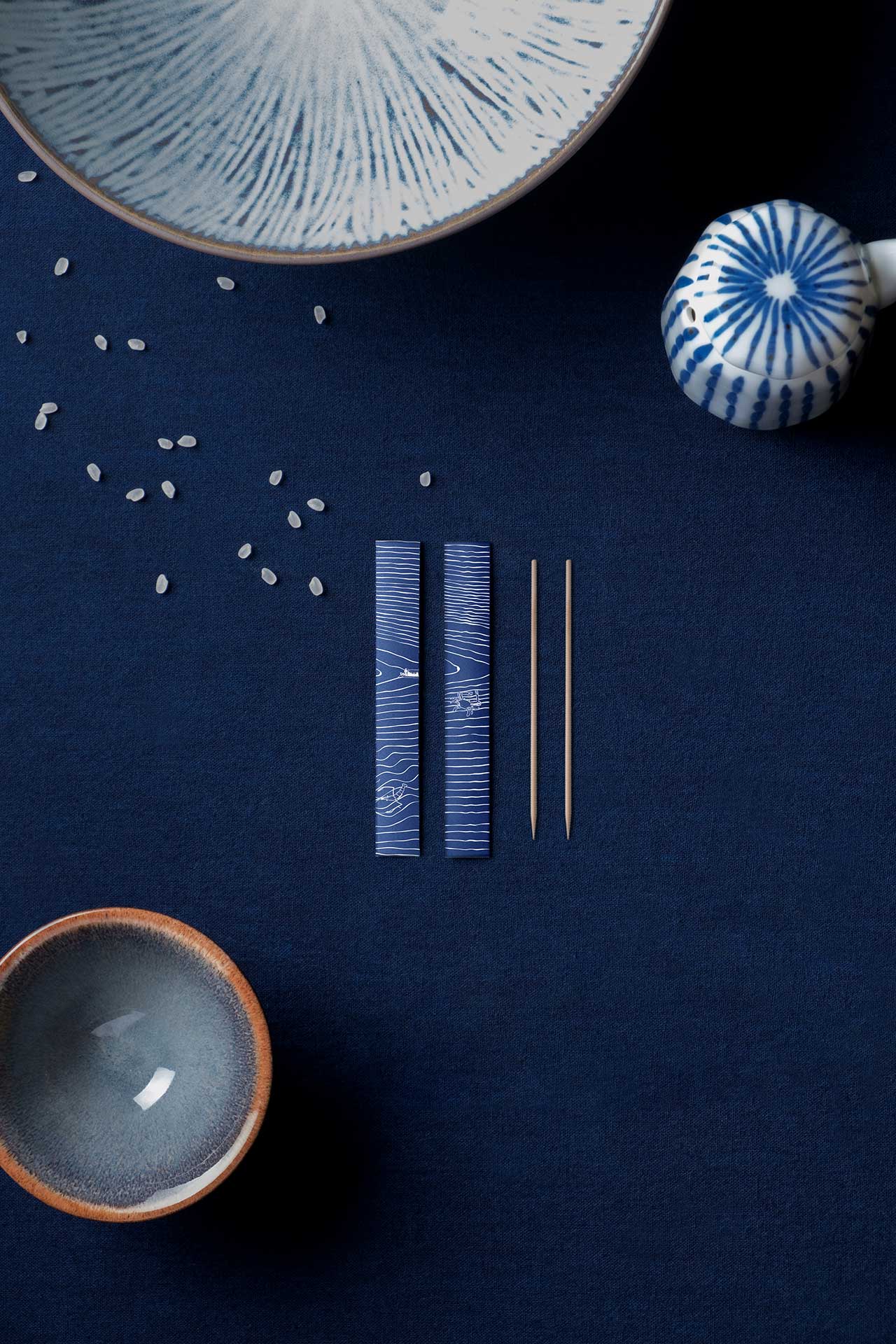
Photo by Vita Mak.
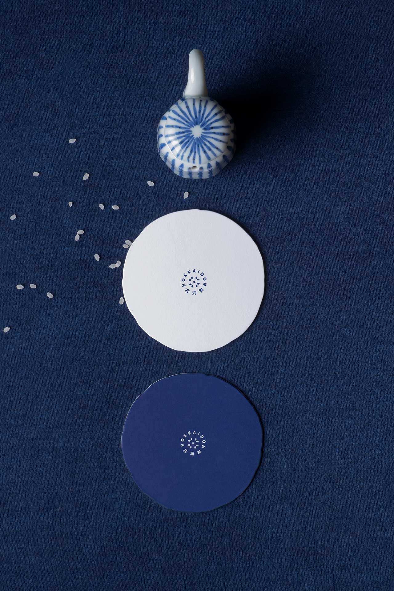
Photo by Vita Mak.
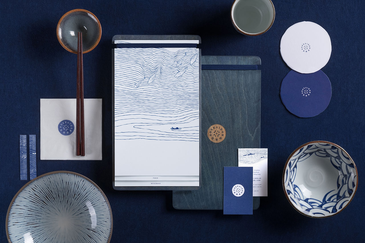
Photo by Vita Mak.

Photo by Vita Mak.
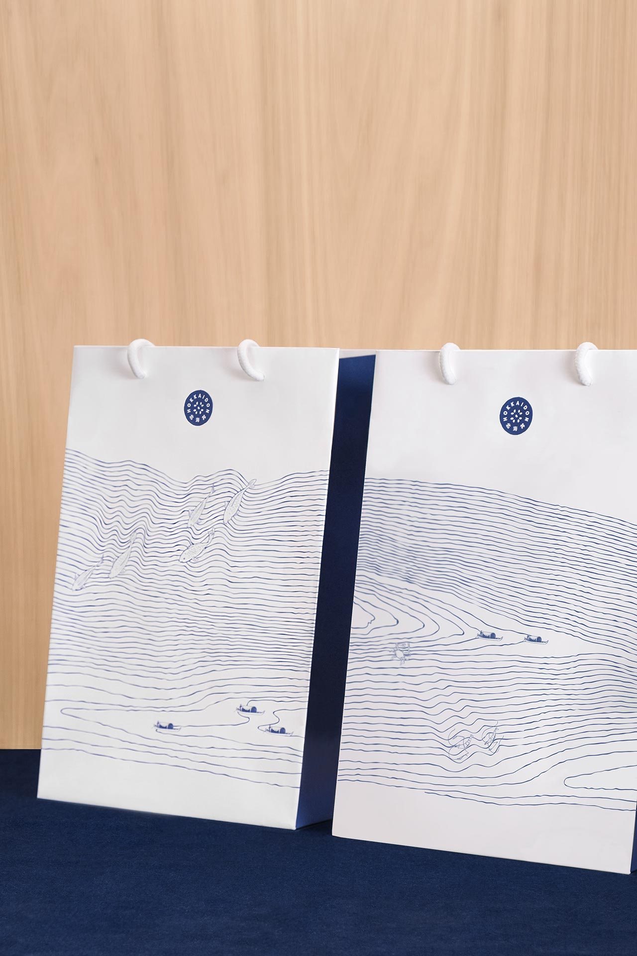
Photo by Vita Mak.
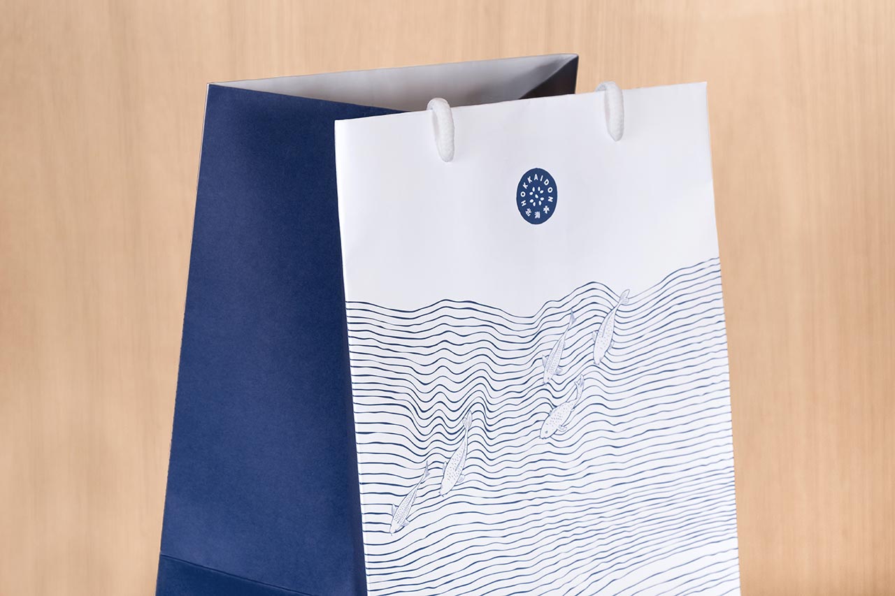
Photo by Vita Mak.


