Project Name
Molecure PharmacyPosted in
Retail, Design, Interior DesignLocation
Architecture Practice
Waterfrom DesignArea (sqm)
120Completed
November 2016| Detailed Information | |||||
|---|---|---|---|---|---|
| Project Name | Molecure Pharmacy | Posted in | Retail, Design, Interior Design | Location |
Taichung
Taiwan |
| Architecture Practice | Waterfrom Design | Area (sqm) | 120 | Completed | November 2016 |
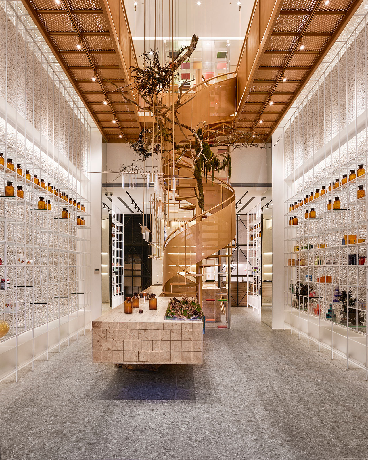
Photo by Kuomin Lee.
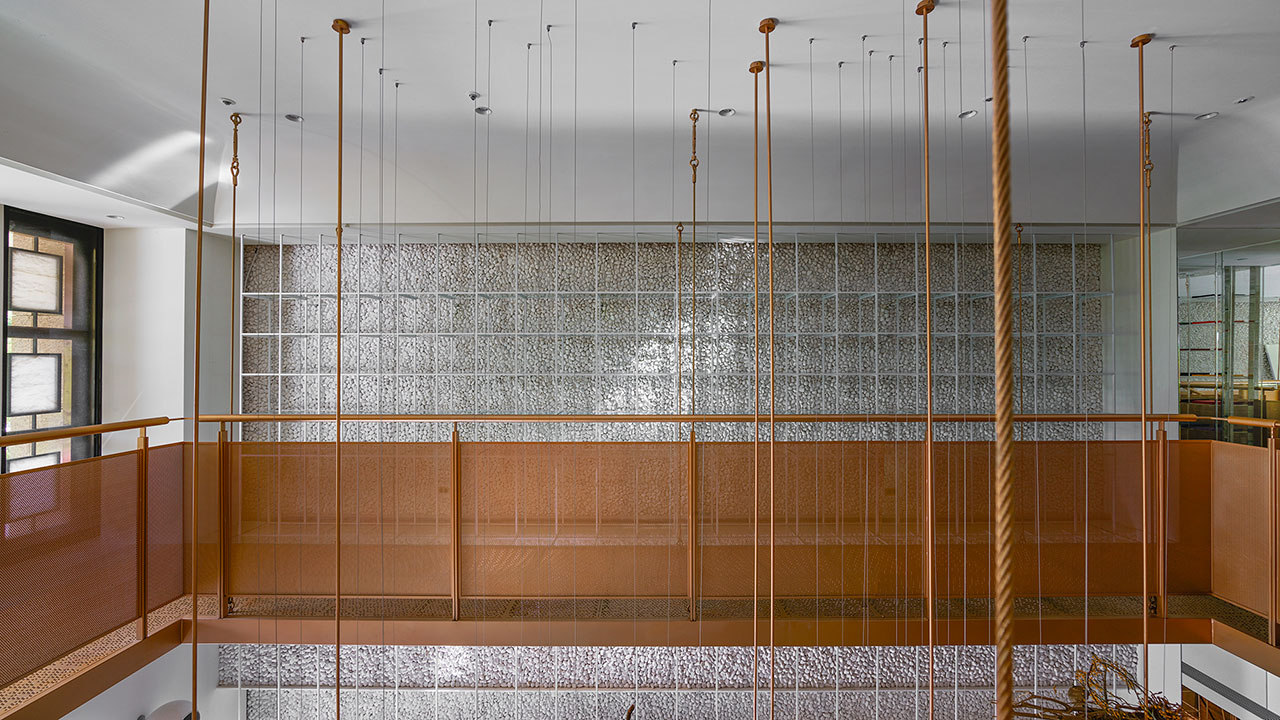
Photo by Kuomin Lee.

Photo by Kuomin Lee.
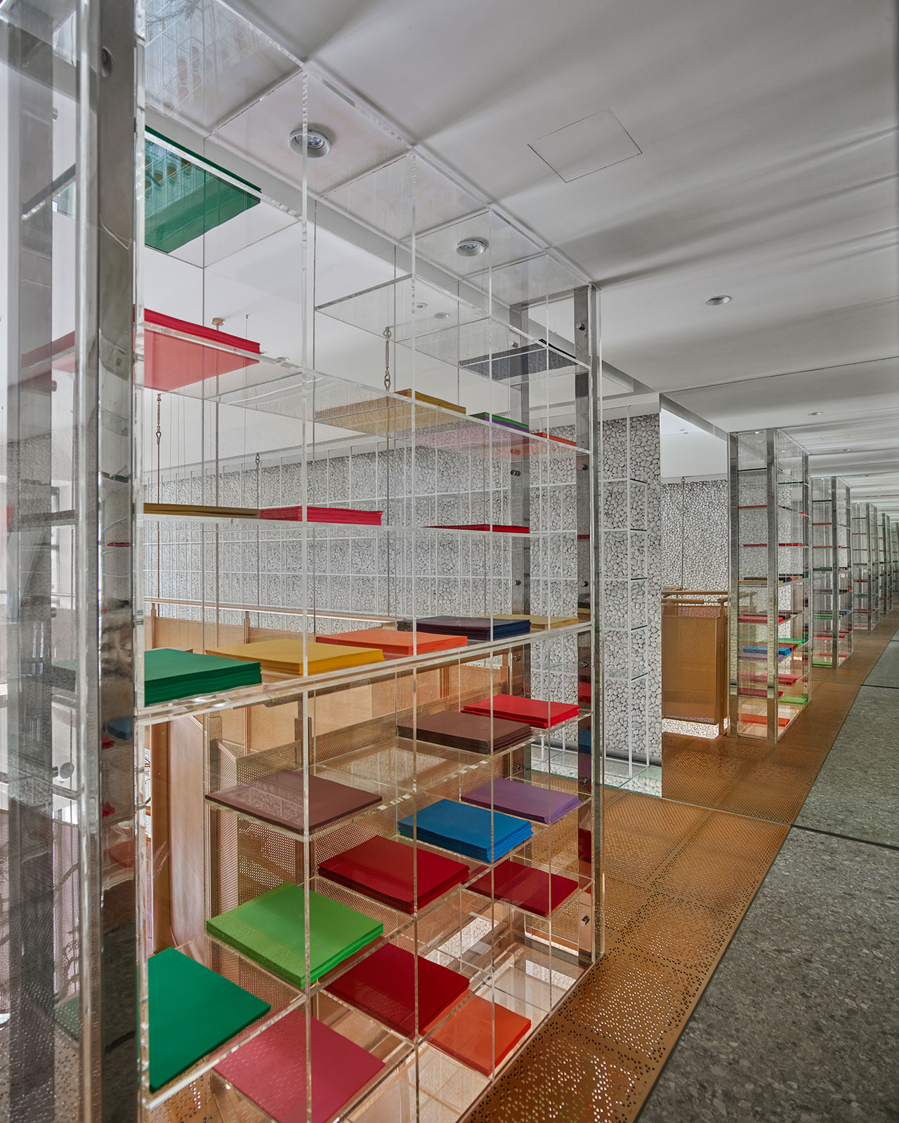
Photo by Kuomin Lee.
Upon entering, one notices the central, copper staircase that rises up in the middle of the room like a spiral; a direct reference to the double-spiral structure of a DNA strand. Countless triangular, laser-cut holes feature in the sides of the stairs, casting shapes throughout the space as they play off the plentiful light.
Below and in front of the spiral stair is another showstopper - the long, wooden laboratory table. Melding modern tech with nature, it features both an iPad-embedded consulting service system for the pharmacists to use with their customers, as well as a virtual "garden" of live green plants; to note, the table even rests on a base made from a hundred-year old tree trunk!
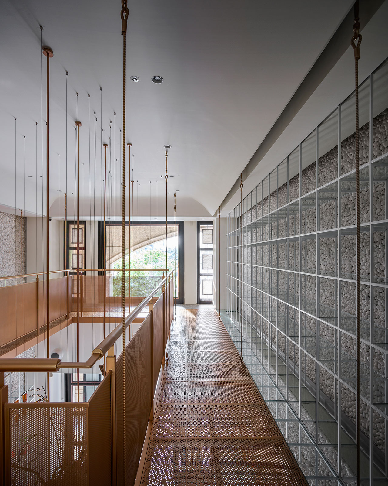
Photo by Kuomin Lee.

Photo by Kuomin Lee.
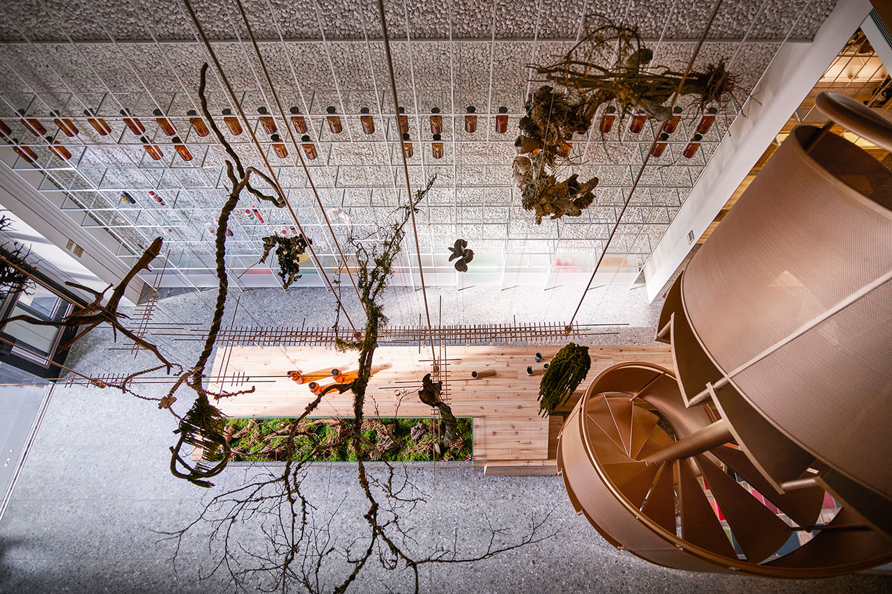
Photo by Kuomin Lee.
Framing either side of the space, the high cement walls have been sheathed with cobblestones, another textural feature which brings nature into play, as do the hanging trees looming over proceedings from the tall ceiling. Meanwhile, transparent glass and acrylic display racks line the walls and crisscross each other throughout the space, highlighting the articles that are displayed on them.
While it's easy to see how Molecure is revolutionizing pharmacy design, it’s also interesting to note that in order to do so, the designers and proprietor have reached back into the very origins of medicine with original, intuitive and welcoming results.
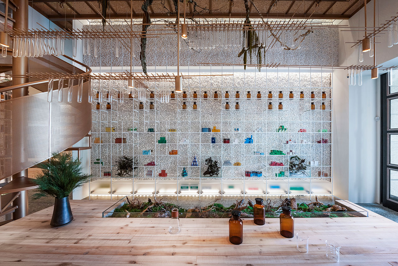
Photo by Kuomin Lee.
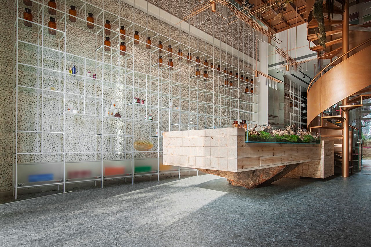
Photo by Kuomin Lee.
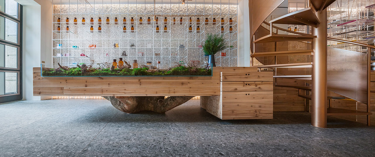
Photo by Kuomin Lee.
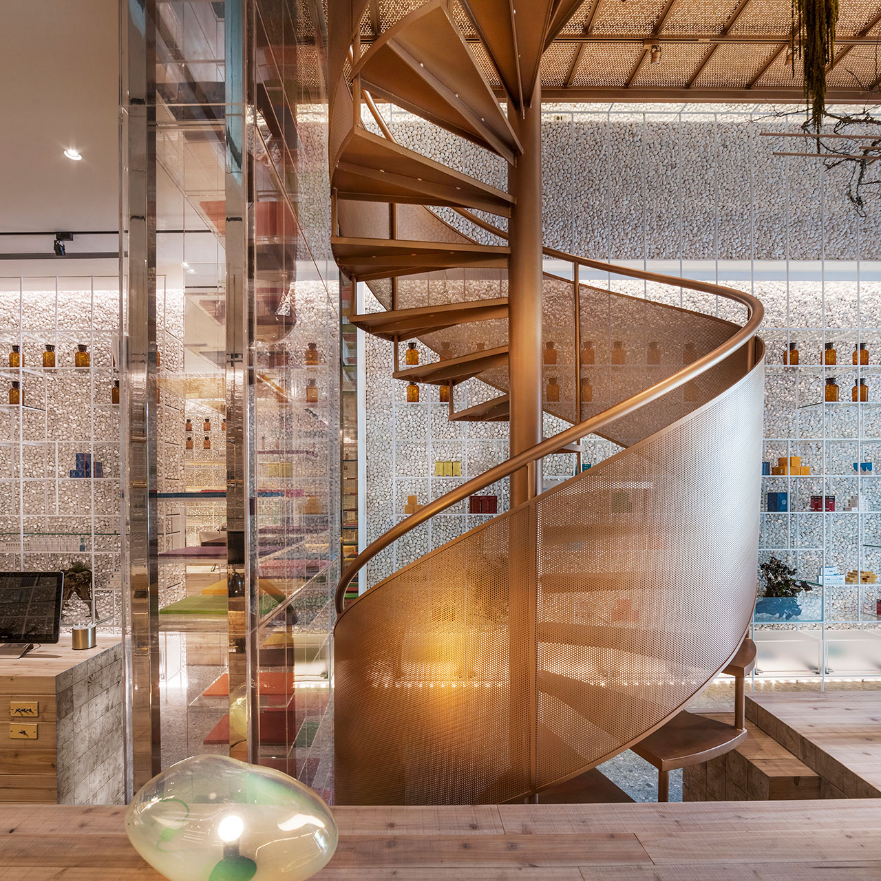
Photo by Kuomin Lee.
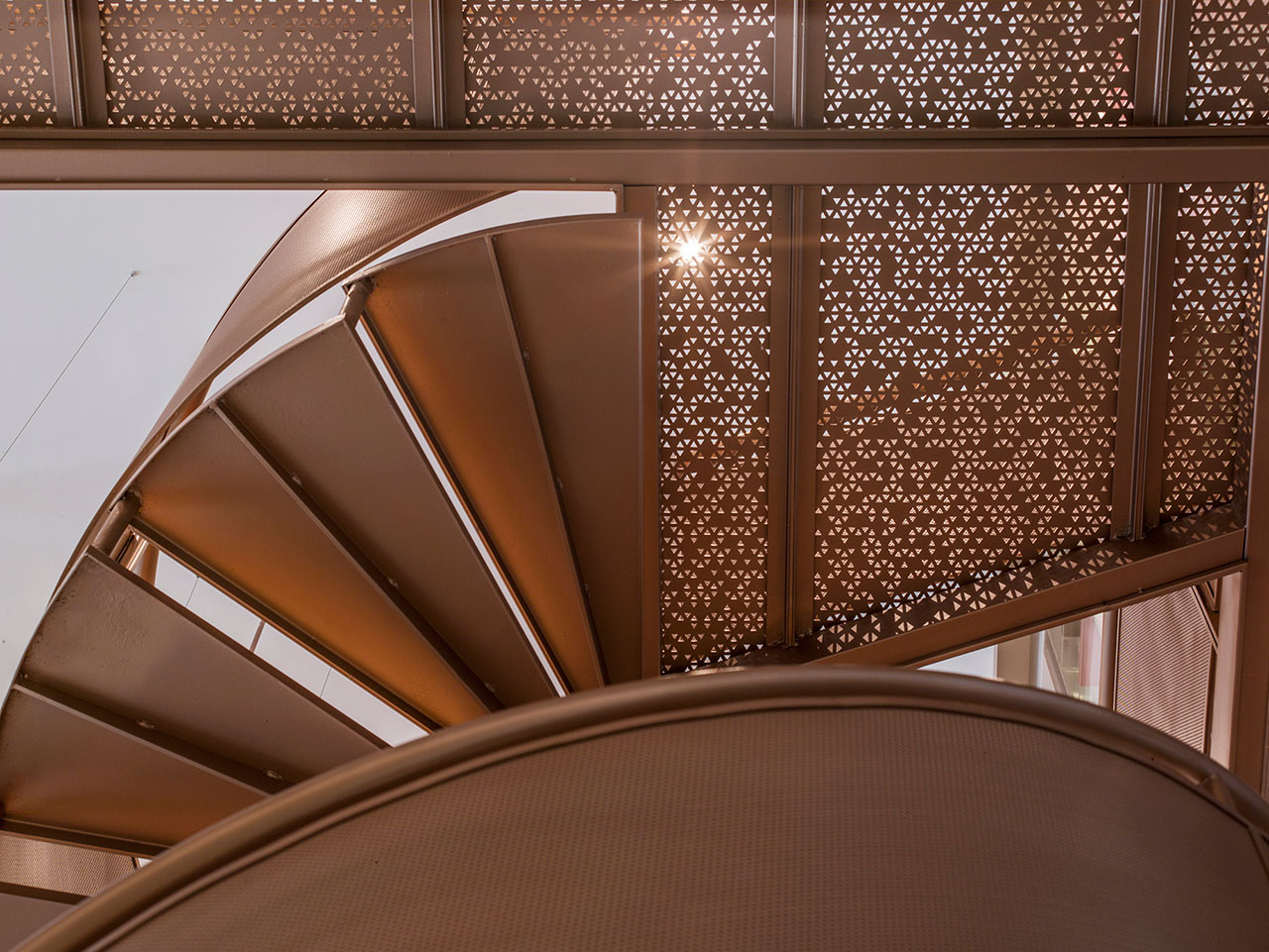
Photo by Kuomin Lee.
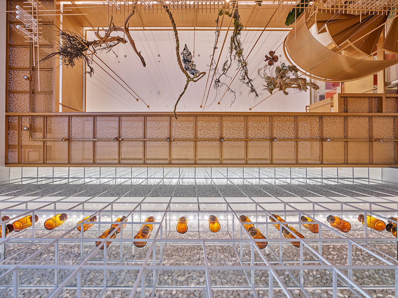
Photo by Kuomin Lee.
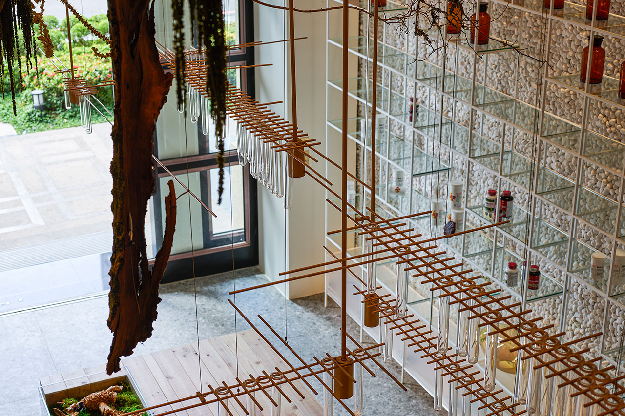
Photo by Kuomin Lee.
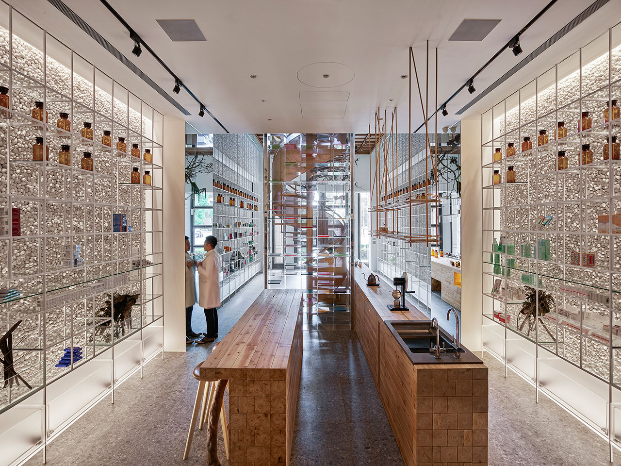
Photo by Kuomin Lee.
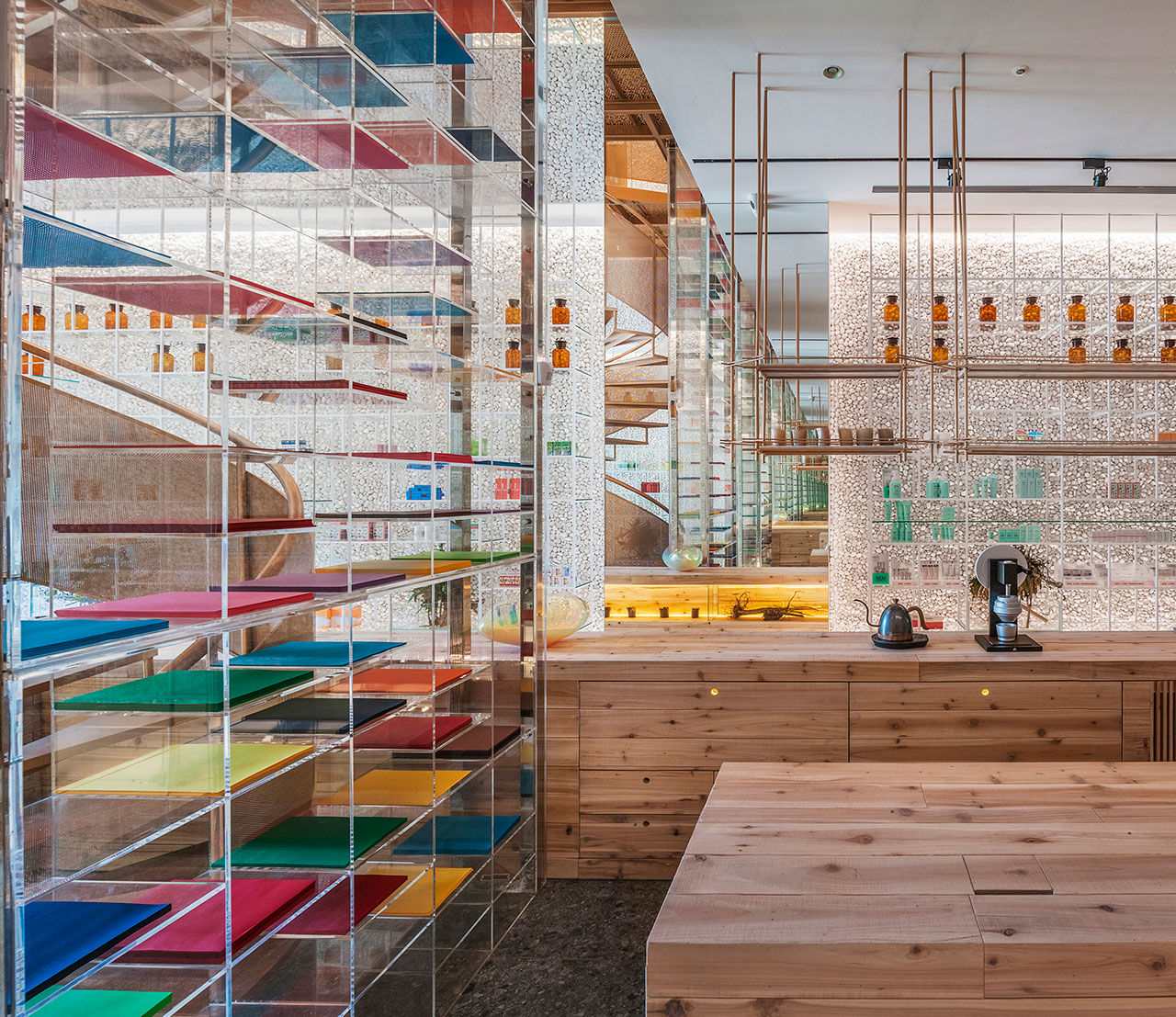
Photo by Kuomin Lee.

Photo by Kuomin Lee.


