During the international design fair Salone del Mobile, which took place in Milan from April 16 until April 21, no less than twenty-five graduates from Design Factory Brainport Eindhoven exhibited cutting-edge Dutch designs, in an old printing business centrally located in the Via Forcella, right in the heart of the Zona Tortona and in spazio Rossana Orlandi.
During the Salone del Mobile, Zona Tortona is famous for the refreshing and nonconformist design exhibitions showcasing the work of the design world’s finest top designers and promising design talents. More events from this area will be uploaded to yatzer the next days.
The Design Factory Brainport Eindhoven designers who participated are:
Maarten Baptist Hunn WAI
COEN!
Yksi Ontwerp
Myoungwon SUH
GRO design
Julien Carretero
WHATELS
Studio JSPR
Werner Neumann
Anna ter Haar
Pepe Heykoop
Ontwerpduo
Ontwerplabel Vij5
Dave Keune
KesselsGranger and Landwater& The Sky
Anouk Omlo
Studio-ePosh Lianne van Genugten
Jelte van Geest
Lara de Greef
Christoph Brach and Daniera ter Haar
EE Labels
Zlda
Willem de Ridder
Ontwerpstudio Annelies Hermsen

According to
yatzer’s aesthetics the best designs of this event ..were the following:

Marbelous ///The world of adults furniture and the world children's toys don't seem to belong together. From my childhood I remember it was always exciting to combine these two. I used the woodcarvings of furniture as a playfield for my puppets, to play in a new world. Functional woodcarvings and decoration you can play with. Applying woodcarvings in a piece of furniture that combines the world of adults with the world of the children. A marble track in a table. I've created this new type of functional woodcarving, that invites you to play with...
design: Tineke Beunders Photo: Rene van der Hulst
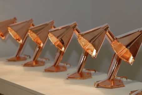
Accidentels ///Everything in our natural world is shaped by the environment it lives in. In a world where all products come rolling of the belt looking identical to the millions of others rolling of the same belt there's a break with the natural growth and evolution. For our material world I went back to the origin, the root of the product; the factory and process where it is born. To let the process itself influence and develop the product.By electro-plating on plastic the plastic gets new characteristics. Which gives it new possibilities in use, function and life. And by letting the process of the electro-plating itself run it's own course the outcome becomes unique and unpredictable.The process of electro-plating not only gives the plastic product a new function it makes it into a natural grown unique object.
design: whatels

Bastard ///The bastard is a combination of two only to become one non. It finds his roots in the production methods and the materials of a furniture company. Even though his looks on first glans don't seem to have any links with the company and seem to be derived only from me the opposite is actually true. As I developed a method to create a chair with the leftover trash leather from the factory. Factually the shapes from the leftover pieces decide the shape of the whole chair. As the technique of stitching the pieces together follows the outlines of the leftovers. The seed planted by the production methods with the nurture and care from me becomes the BASTARD.
design: whatels Myoung Won Suh | Past Tense (Vanishing Memories)


Past Tense (Vanishing Memories)///Yesterday, today, and tomorrow. Every moment is our history and even now, our past is passing by. And the only way to hold these moments is through our memories.Past Tense. But how much can we remember our past? The design shows how fast, and consistently we lose our memories. On the table, new memories are made but at the same time it starts to vanish away. People are able to see how their memory disappears.
design: Myoung Won Suh

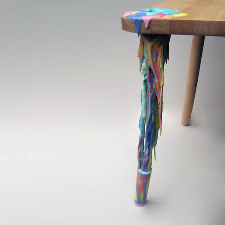

'Buitenbeentje' (Dutch for odd man out) ///'Buitenbeentje' is a result of my fascination for everything that differs the normal: the odd man out, the freaks. Certain appearances that are so ugly and disgusting that they become interesting. A photograph of a men with elastic skin inspired me to capture a moment of movement. These products with legs made of polyurethane casting resin represent that movement congealed in material. They may look fluid but in fact, they're strong enough to carry weight.
design: Anna ter Haar
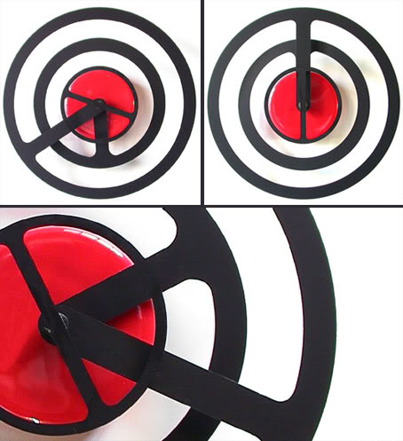
Orbit-r /// is based on exactly the same principle as the normal Orbit. However with its round hands this clock tells a different story. It still shows time dynamically but in a more minimalistic graphic way. For everyone who had difficulties telling time from Orbit, here is your solution.
design: Dave Keune

GrandChair ///Telling stories, singing songs, playing games and telling stories about their past: grandparents and grandchildren interact at different levels with each other. To bring Jeltethem even closer together, Jelte van Geest designed a rocking chair in which they can rock together. Next to each other or facing one another. Lift the children’s seat, turn it 180 degrees, and they can sit facing one another. Rocking together will enhance the interacting even more.
design: Jelte van Geest

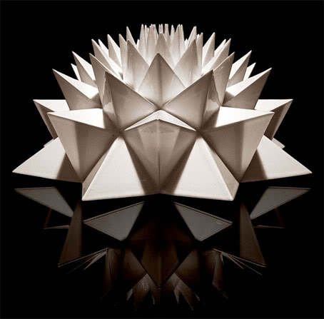
Helica 'Carnea' ///The 'Helica' series consists of ceramic objects, inspired by mathematical patterns and ratio that Mother Nature uses to create. At a distance it may seem random, but all is created in Fibonacci-spirals and Golden Ratio. Everything is perfectly logical. By zooming in on natural creations that surround us we become more aware of the complexity and at the same time clarity of life. The objects are named in Latin, the same way as plants. Helica ‘Carnea’ means ‘Light pink’ Spiral, there’s also brown (‘Brunea’) and dark pink (‘Rosea’).
design: Anouk Omlo

K´Do Ding or Pres´N Thing ///K´Do Ding, or Pres´N Thing is designed by Coen van Ham. This foldable carton can be used as a vase, bin, bowl or box. Fold one of these items, fasten it with the press buttons and discover the numerous uses for your Pres´N Thing! Use it as a flowerpot, champagne cooler, box, placemat, breadbasket, container, punchbowl, gift wrapping, vase, salad bowl, popcorn bin, fruit bowl…Before folding one of the various items from your K Do Ding, please fold the lines as indicated. Fasten the press buttons and your K Do Ding is ready for use! Pres´N Thing is waterproof. It´s available in four Dutch patterns: Brabant Red, Zeeland White, Delft blue and Amsterdam Gold. design: COEN!
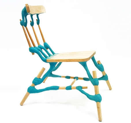
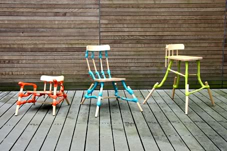
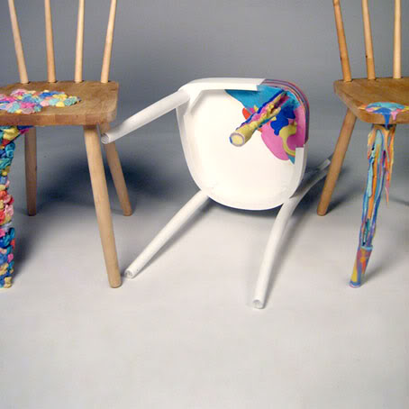
Tre di Una family of chairs ///Tre di Una (“Three from One”), family of chairs products were born from my interest in joinery, as a method of construction as well as a concept. It was reaction towards the seemingly seamlessness of products and the growingly complex systems that support that quality. Looking at pre-industrial revolution manufacturing and craft techniques, an appreciation of honest exploitation of materials to produce objects grew. Experimenting with an epoxy clay normally used for industrial purposes, I sought to exploit and represent the material by unleashing it onto the most iconic of everyday artifacts; a wooden chair. The contrast of the synthetic versus the natural, in addition to the organic interventions at the interstitial points, I broke down a rigid image and functional structure and transmuted it into hybrid creatures that suggest possibilities, new aesthetics and functions. Thus resulting in a family of Low, Dining and High chairs from the components of an iconic and normal beech chair.
design: Hunn Wai
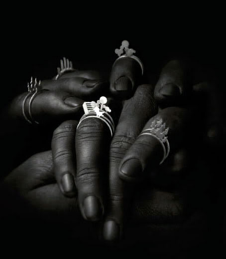

Handscape ///Handscape turns your fingers into a little landscape. Elements of our daily lives have been translated into small figures. There are six different rings which you can combine as you like. Just put them around your finger and create a personal handscape.
design: Zilda , Photo: Lisa Klappe

A Restless Chairacter /// We people are shaping products, but after all it’s these products which are shaping us (in many ways and different levels). Especially chairs. They’re often putting us in a static position, which is in conflict with the human body. A restless chairacter is about sitting. Sitting as a verb, as something dynamic. This chairacter captures the quality of an old wobbling chair. (That’s also why it looks being painted and overpainted again.) It appears to be straight, stiff and uncomfortable. It’s not, it’s flexible because it’s made for wobbling. The chairacter comes alive while touching and causes an interaction; a dynamic way of sitting on a archetype chair. The internal construction is like a sleeping beauty hiding underneath her rubber skin.
design: Pepe Heykoop
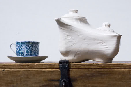
Tapepot ///The tapepot was born in a project called ‘schizophrenic skin’ which is about applying a new skin around pieces of old furniture. The original teapots come from a second-hand store (where they were standing beside each other already). I merged the teapots by giving them a taped skin. By making the tapepot out of ceramic the construction ended up in details. A new quality of pouring tea comes within the shape.
design: Pepe Heykoop

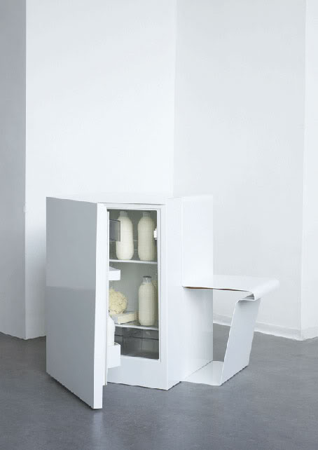
KOELKACHEL (The Warm Fridge) ///A Lost product, with lost heat, for lost time. A warm fridge-seat which belongs to the open kitchen/living area. A retrospective of the kitchen and its use. The pipe which is usaly on the back of the refrigerator, is losing warmt in order to cool the inside. The KOEL- KACHEL is using this waste-heath underneath a seat to create a traditional comfort for a new environment.
design: Michou-Nanon de Bruijn Photo: Rene van der Hulst
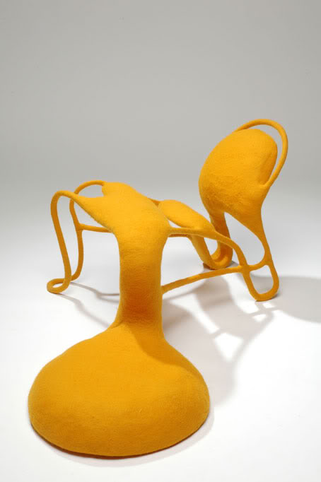
Bigfoot ///The Bigfoot is designed from a new vision on living: open up and come together. The piece of furniture redefines the definition of a chair and sitting on it. The Bigfoot is a small ‘chair’ and has one ‘big foot’ which can be use as a second seat. The open structure is honest; what you see is what you get and what you don’t need isn’t there. The ‘chair’ completely covered with felt for a soft and emotional touch.
design: Vincent Geraedts

photo : Rene van der Hulst
Karakters ///Upholstering furniture that desires to conquer the non-used spaces in our living enviroment. They find there origin in recognizable but unusual positions that we often take in on our furniture , like sitting on the armrest of a couch with you're feet not touching the ground, lean against a higher piece of furniture or rolling yourself up in the corner of your sofa. Created like a new font/character they become a family in shape, with fabric that reminds us of clothing, based on human positions. With a hard-polystyrene inside, they weight apiece 7 kilo, they are really mobile in finding a place in the livingroom
design: Leon de Lange

Ratata ///Ratata is a wooden toy chest. Until the time you start to play with it, because then it appears to be a machine gun in full size. Do you want to play a game?
design: Tomm Velthuis, Photo: Tomm Velthuis
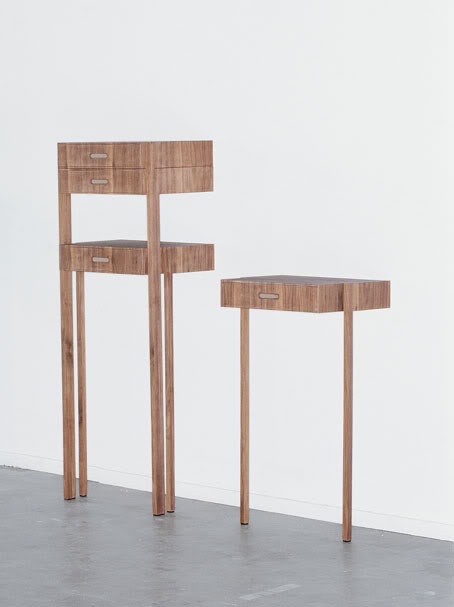
Your level ///Objects are generally put down on various heights. If it were possible to take away the supporting furniture, the objects would float. Your level, eight separate tables of various heights, creates the same effect in the living room. design: Ryohei Yoshiyuki
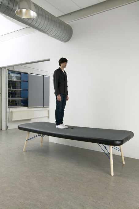
photo : Rene van der Hulst
Grace Table ///Grand furniture pieces are marvelous, although rather tricky to transport. handle or store. I admire the capacity of inflatable furniture to decrease its size to modest volumes. Inflatable furniture has many disadvantages such as stability, rigidity, the control of its shape etc. Inflatable chairs and couches have been around for a long time. I am trying to move toward this concept from a different approach: inflatable tables do not exist because of the limitations of inflatable furniture, starting with the fact that flat surfaces are difficult to achieve. After having researched many types of inflatable materials and products, I came upon a technology used within the British Navy Rescue. Inflatable rescue platforms are built in grand sizes and utilize a material called "Drop-Thread". A spin-off from the velvet manufacturing industry, Dropthread (Dropstitch) fabric first found application in the military arena. This material is composed of two layers of waterproof fabric, which are interconnected by thousands of strands, allowing one to achieve flat surfaces once inflated. I have worked in collaboration with Eurocraft, a leading manufacturer of inflatable structures in the United Kingdom. And developed a grand table, big enough to accommodate 10 guests when inflated, and small enough to fit in a duffel bag when deflated.
design: Philippe Malouin

hanger chair /// Occasional furniture. The name should be self explanatory, but it is somewhat incorrect in most cases. These pieces tend to lie around the house, stacked in a corner, or in an unused room. When space is an issue, as is the case for most European city dwellers, an object such as a folding chair will clutter up the precious available space. The Hanger Chair is a folding chair based on one of the ultimate storage systems: the modest hanger. It allows us to store clothes in an orderly fashion. Most houses or flats are equipped with a wardrobe to receive the object. By morphing the function of the hanger with that of the folding chair, a new hybrid is born: a Hanger Chair that has a function, even when not in use, to store our clothes in an orderly fashion.
design: Philippe Malouin
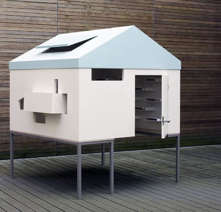
photo : Rene van der Hulst
"House on the table" /// "House on the table" is a personal office table. People have a desire to have their own room or special space. When they are children, they play with doll houses, in toy houses, or in tree houses. After they grow up, the shape is different, but they still want their own special space like an office fit for a boss. However, much too often, their space becomes as dry as dust.
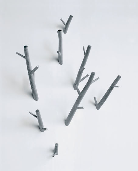
Inside > OUT /// We should try to establish a closer connection between the products we use and the outside world. The transparent clock hanging in the window offers a view of the sky. The coat rack hooks look like tree branches reaching into the room.
design: Max Lipsey
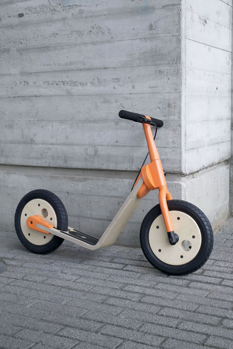
photo : Rene van der Hulst
Kid's Mobillity by Niels Smeltink


