Project Name
The Visual Identity Of The Greek Graphic Design Awards 2013Posted in
Graphic Design| Detailed Information | |||||
|---|---|---|---|---|---|
| Project Name | The Visual Identity Of The Greek Graphic Design Awards 2013 | Posted in | Graphic Design | ||
EBGE 2013 opening video
Every year the visual identity for the awards - which includes the invitations, the covers of each award section and the catalogue amongst others - is designed by the GRAND EBGE AWARD winner from the previous year. Last year's GRANDEBGE 2012 winner, aka winner of the most EBGE Awards and Merits, were the Beetroot Design Group. Since setting up in September 2000, the renowned Thessaloniki based design group has endeavoured in seeking new ways to express creativity and provide design solutions to their local and international clients.
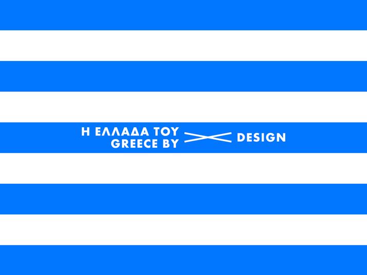
illustration by Beetroot Design Group, Courtesy of EBGE 2013 Awards
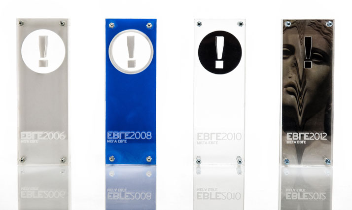
2006, 2008, 2010, 2013 EBGE Awards, Courtesy of EBGE Awards
This year, Greece and all that it stands for, marked the awards’ visual identity. Based on the awards’ official logo which is an exclamation mark inside a circle, the creative minds behind Beetroot successfully managed to remind us of the wonders that simple pleasures hold. As you can see for yourselves, each creative features the same rectangle with different visualisations of those circles that range from an umbrella to an olive and a delicious watermelon to the nipple of a somewhat ''gifted'' girl depending on the specific award. In my opinion, the visual identity for this year's EBGE Awards and its significance is twofold; Asides from its undeniable beauty and its simplicity, it could also serve as a remarkable campaign for the general visual communication of my beloved country, Greece. Now that's what I call food for thought!
The winners of the EBGE Awards 2013 will be unveiled soon at the official website: www.ebge.gr (unfortunately available only in Greek). However, I would like to congratulate Michalis Georgiou, Alexandros Gavrilakis andDimitris Stefanidis founders of G design studio for winning the GRAND EBGE AWARD 2013 and I'm looking forward to discovering their visual treatment of EBGE 2014!
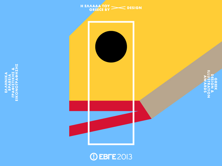
illustration by Beetroot Design Group, Courtesy of EBGE 2013 Awards

illustration by Beetroot Design Group, Courtesy of EBGE 2013 Awards

illustration by Beetroot Design Group, Courtesy of EBGE 2013 Awards

illustration by Beetroot Design Group, Courtesy of EBGE 2013 Awards

illustration by Beetroot Design Group, Courtesy of EBGE 2013 Awards

illustration by Beetroot Design Group, Courtesy of EBGE 2013 Awards
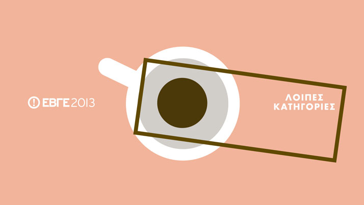
illustration by Beetroot Design Group, Courtesy of EBGE 2013 Awards
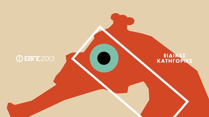
illustration by Beetroot Design Group, Courtesy of EBGE 2013 Awards
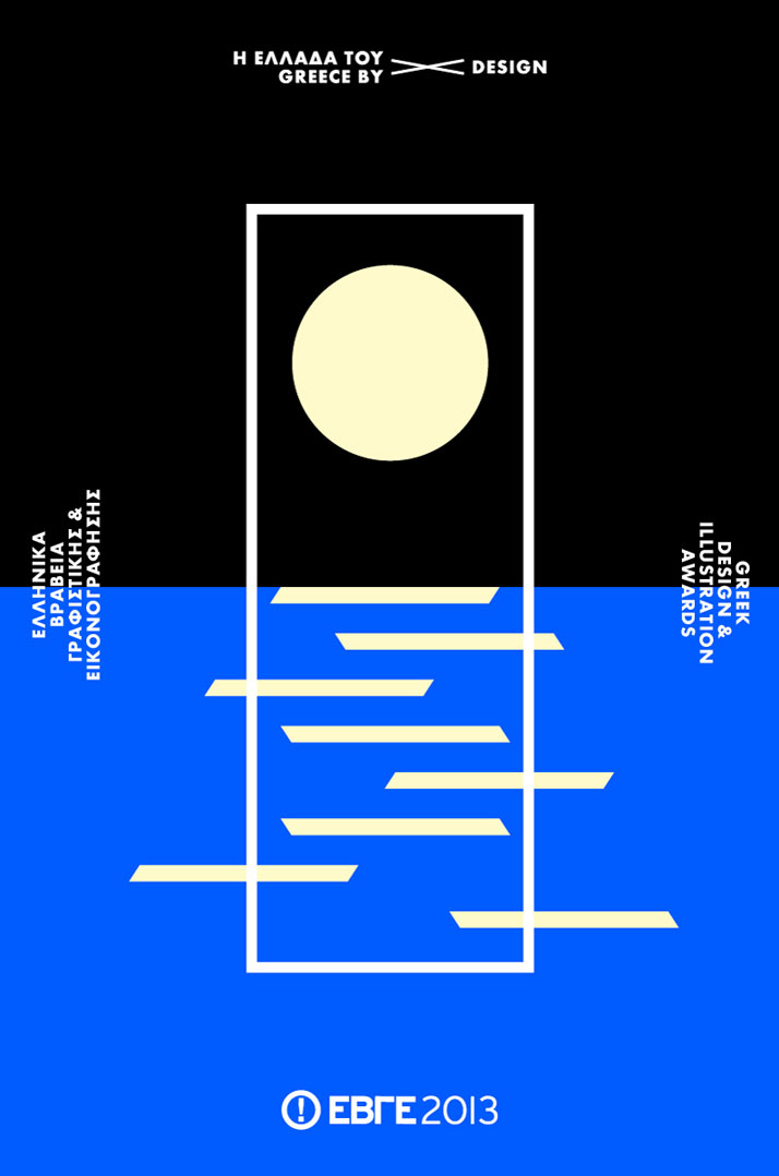
illustration by Beetroot Design Group, Courtesy of EBGE 2013 Awards


