Intelligent design: Nicolas Schuybroek’s MK House in Antwerp
Words by Alexander Mordoudack
Location
Antwerp, Belgium
Intelligent design: Nicolas Schuybroek’s MK House in Antwerp
Words by Alexander Mordoudack
Antwerp, Belgium
Antwerp, Belgium
Location
An unusually large black and white façade distinguishes the MK House from others in its Antwerp surroundings. This black and white play on external appearance, on appearances in general, signifies Nicolas Schuybroek’s minimalist work by also calling for their deconstruction. Because minimalism is not as simple as black and white, and it is definitely not just about appearances.
Not to indulge in puns, but there is a lot to minimalism. Minimalism calls for a delicate balance of well-groomed necessity to be achieved. Such balancehas to be a balance that is true to a reason going beyond what is immediately perceived through aesthetics. Minimalism can’t ever be about contending with minimal needs, nor can it ever be about contending with minimal means to meet them. In the former instance such minimalism could be seen as absolving defeatism. In the latter, it could be seen as endorsing misery. Instead, minimalism can only be about interpreting one’s needs as a consistent whole, from which a singular flow can spring to meet them.
Photos © Claessens & Deschamps/Thomas de Bruyne.
Photos © Claessens & Deschamps/Thomas de Bruyne.
Photos © Claessens & Deschamps/Thomas de Bruyne.
Though this kind of minimalism might sound extremely spiritual, it is in fact rather practical. Schuybroek’s own work interprets minimalism as an effort to highlight the interaction between its spiritual and practical aspects. Schuybroek got his early schooling in a religious setting, and it is perhaps in that experience that an aesthetic of monasticism began to resonate with him. It is also probably his own distancing from a devout religiosity that interprets such monasticism as less of a religious than a practical exercise. Schuybroek’s work looks for the singular, the flow, not in the divine spirit, but in the spirit of the everyday. It is intelligent design -without the metaphor.
Photos © Claessens & Deschamps/Thomas de Bruyne.
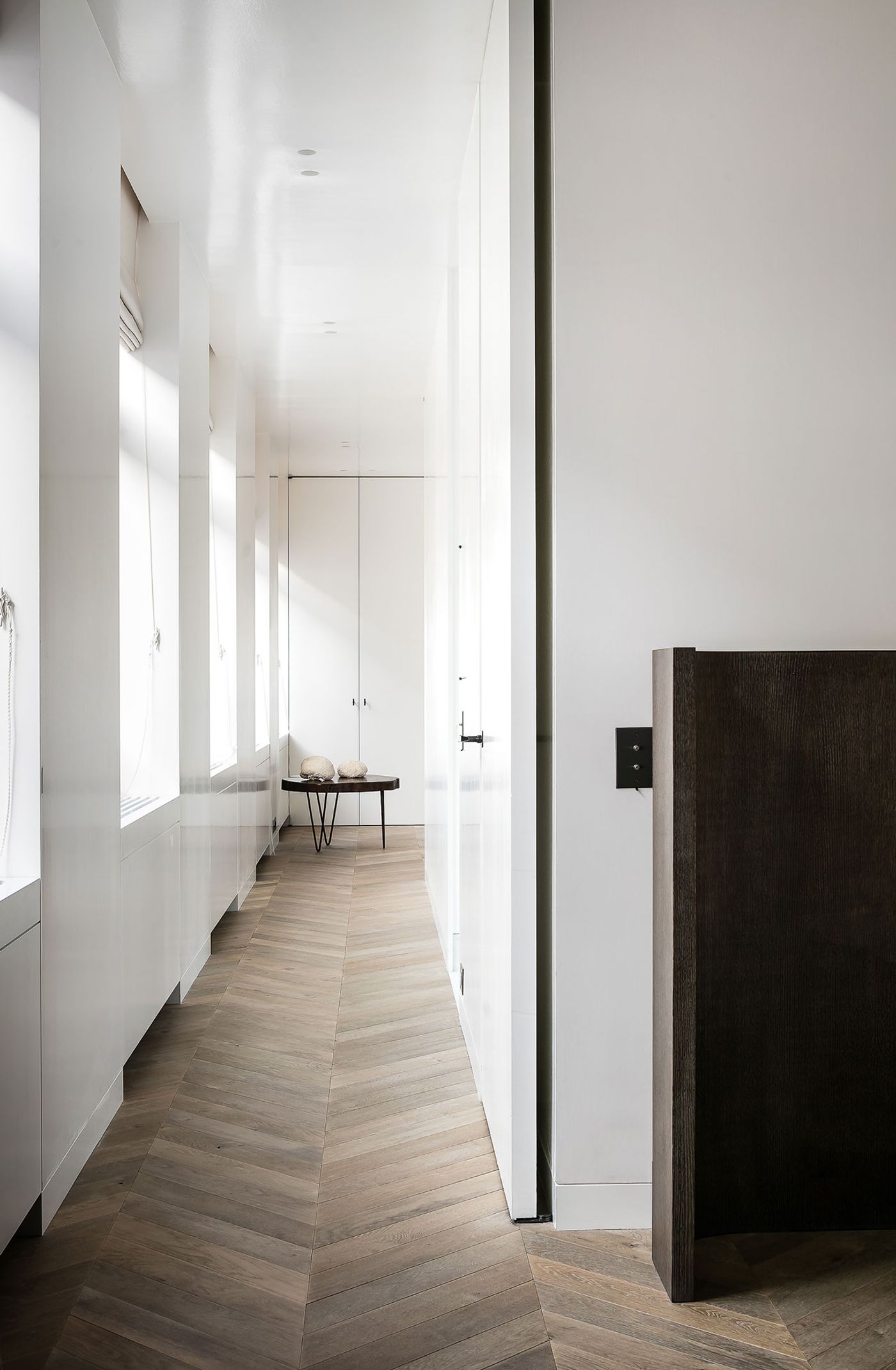
Photos © Claessens & Deschamps/Thomas de Bruyne.
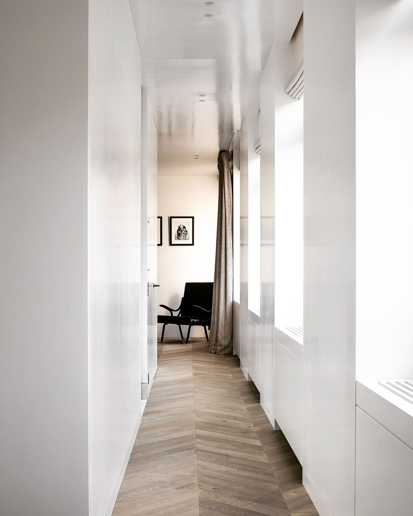
Photos © Claessens & Deschamps/Thomas de Bruyne.
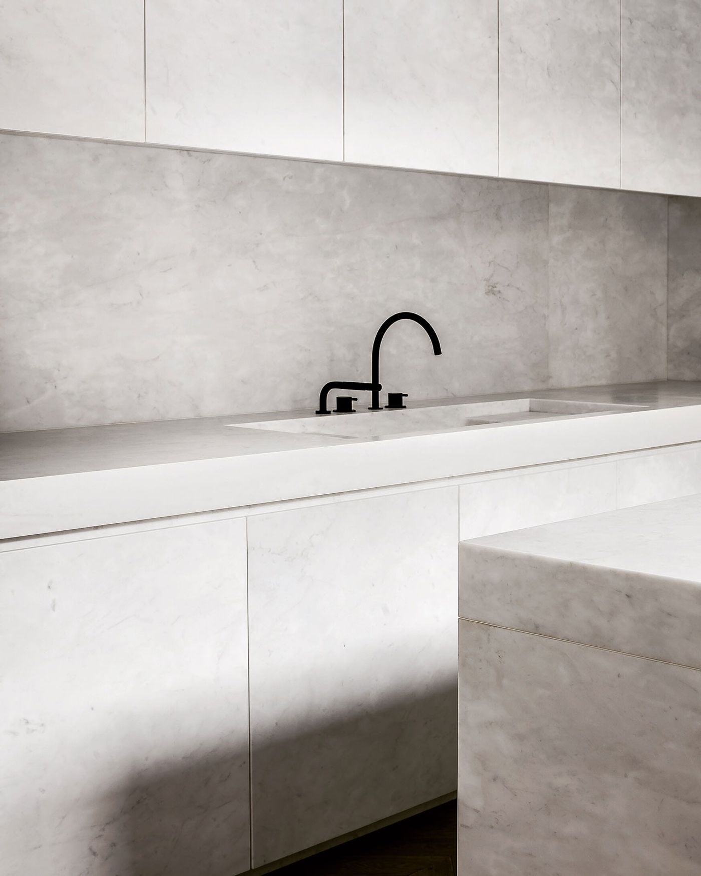
Photos © Claessens & Deschamps/Thomas de Bruyne.
Photos © Claessens & Deschamps/Thomas de Bruyne.
Photos © Claessens & Deschamps/Thomas de Bruyne.
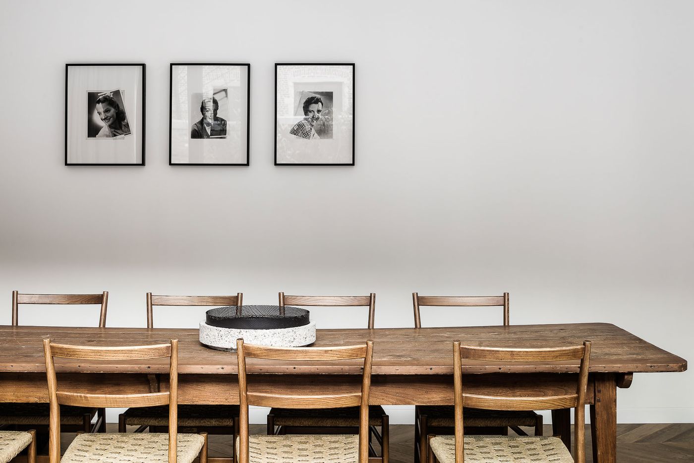
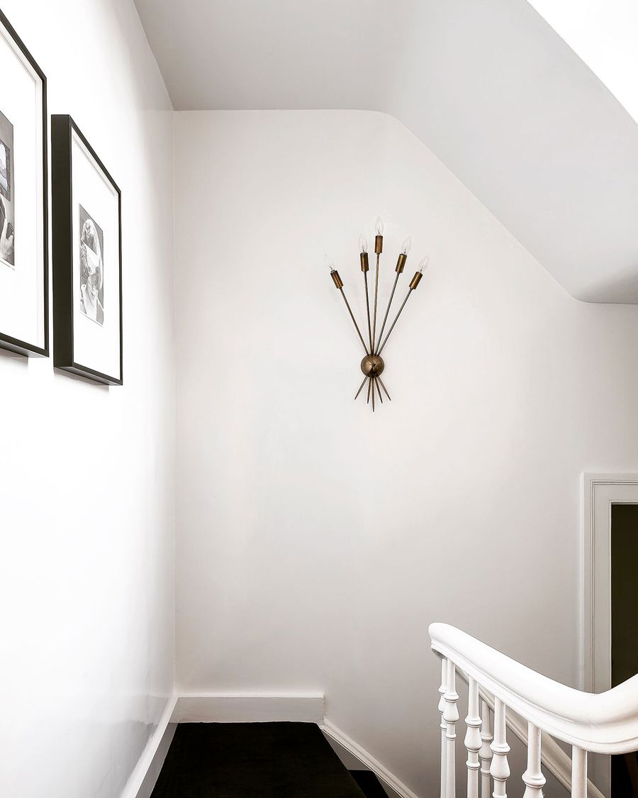
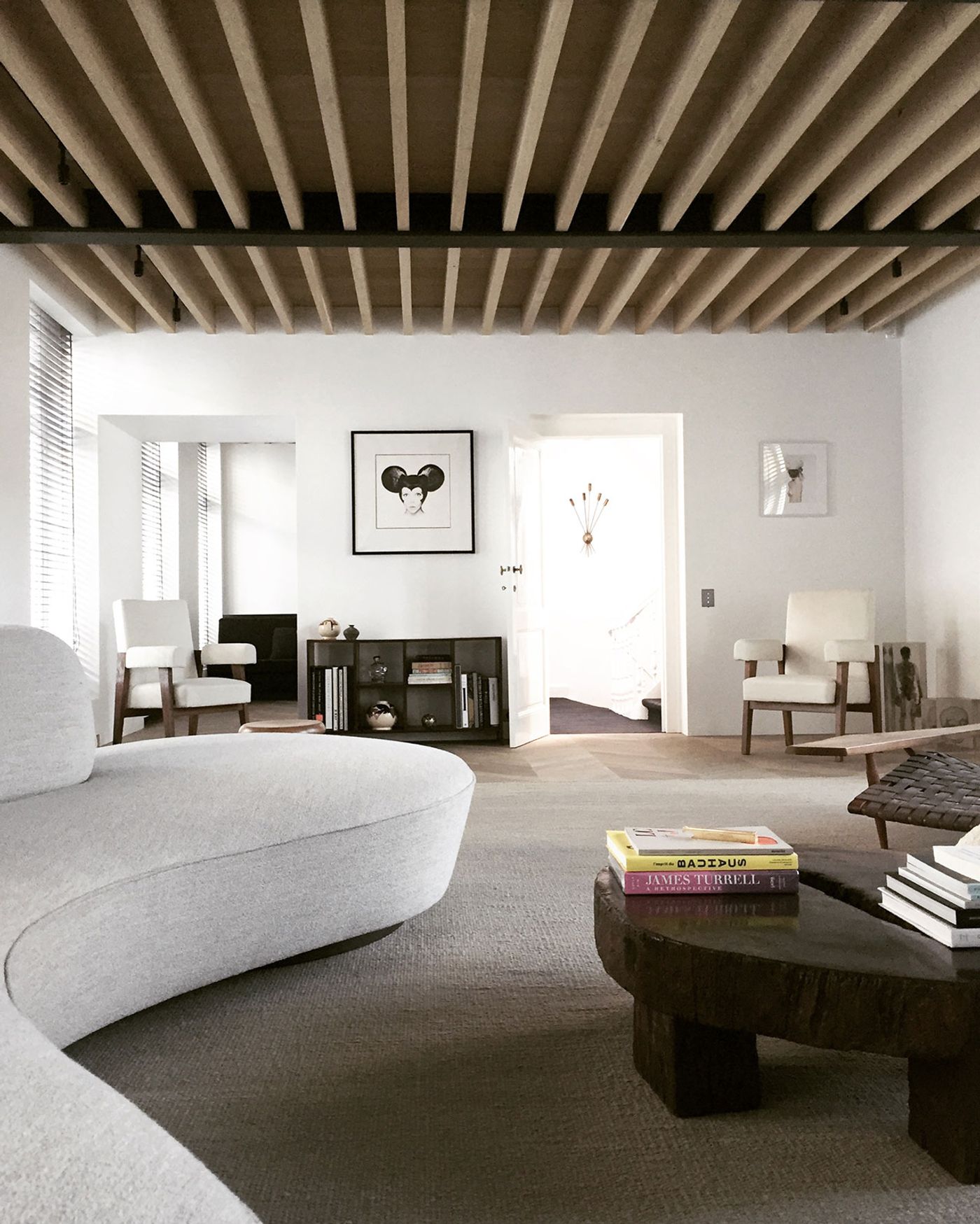
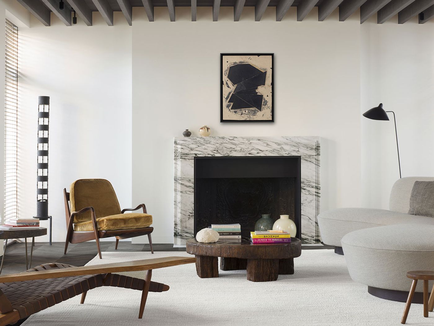
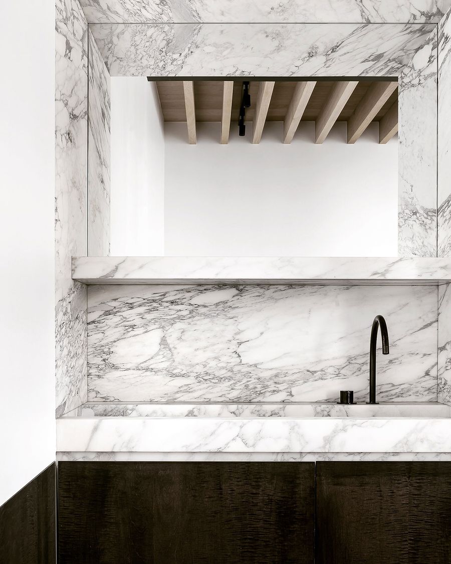
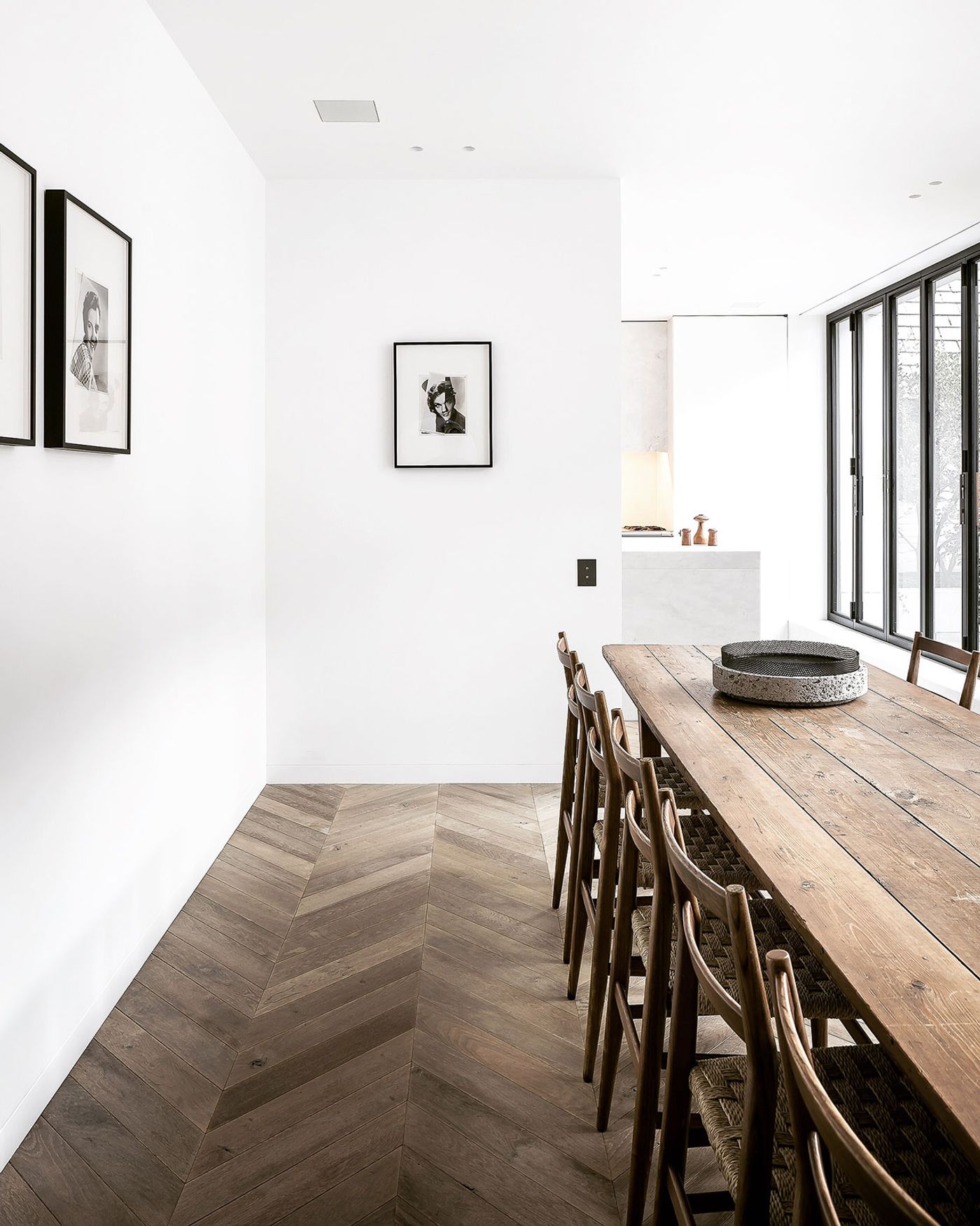
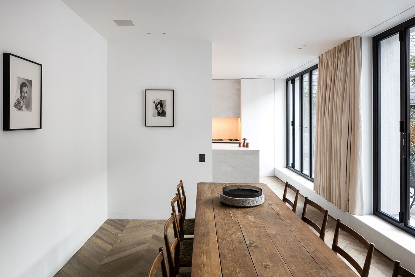
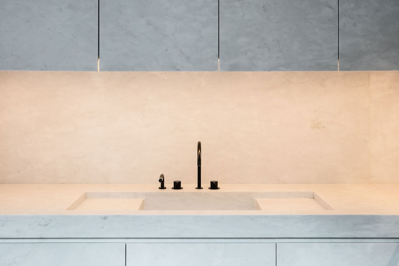
Twice named as one of the world’s top 100 interior designers by French Architectural Digest, Nicolas Schuybroek talks about looking for serenity, and this is a task on full display in the MK House. A black and white staircase connects the stories of this early 19th century structure, which has been reworked into an expression of the history it has lived through, the location that inspired it, and the unique needs of the owners and their art collection. This all had to be accommodated as one, and Schuybroek found a way to do so through a common thread which is reductionist but also fair and inclusive. It is the thread constructed through the interior’s neutral palette offset by the ceiling’s exposed beams and the herringbone floors, the correspondence of volumes and sizes, and the generous natural light that rushes in through the large windows. At the same time, it is the unique dialectic of an austere modernism in dialogue with scarce rustic accents acting as reference points for the house’s reimagined flow.
Photos © Claessens & Deschamps/Thomas de Bruyne.

Photos © Claessens & Deschamps/Thomas de Bruyne.
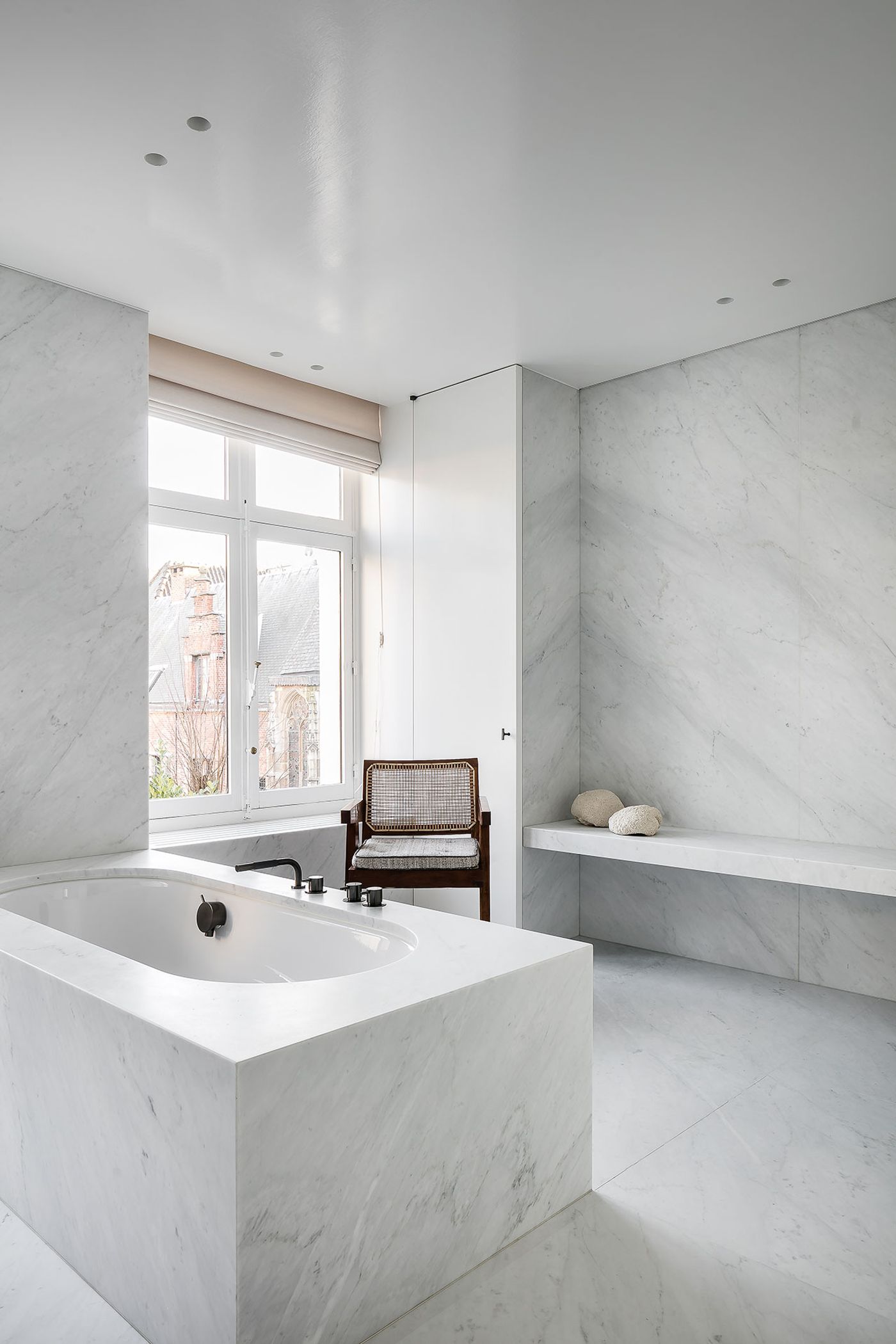
It is exactly this attention to flow that helps Schuybroek reinvent minimalism on his own terms, moving it away from its misinterpretation as uninviting or removed. In providing an elegantly functional space, Schuybroek ultimately provides a warm one. And this is the ultimate goal of minimalism: To be selective, without being forbidding.
Photos © Claessens & Deschamps/Thomas de Bruyne.
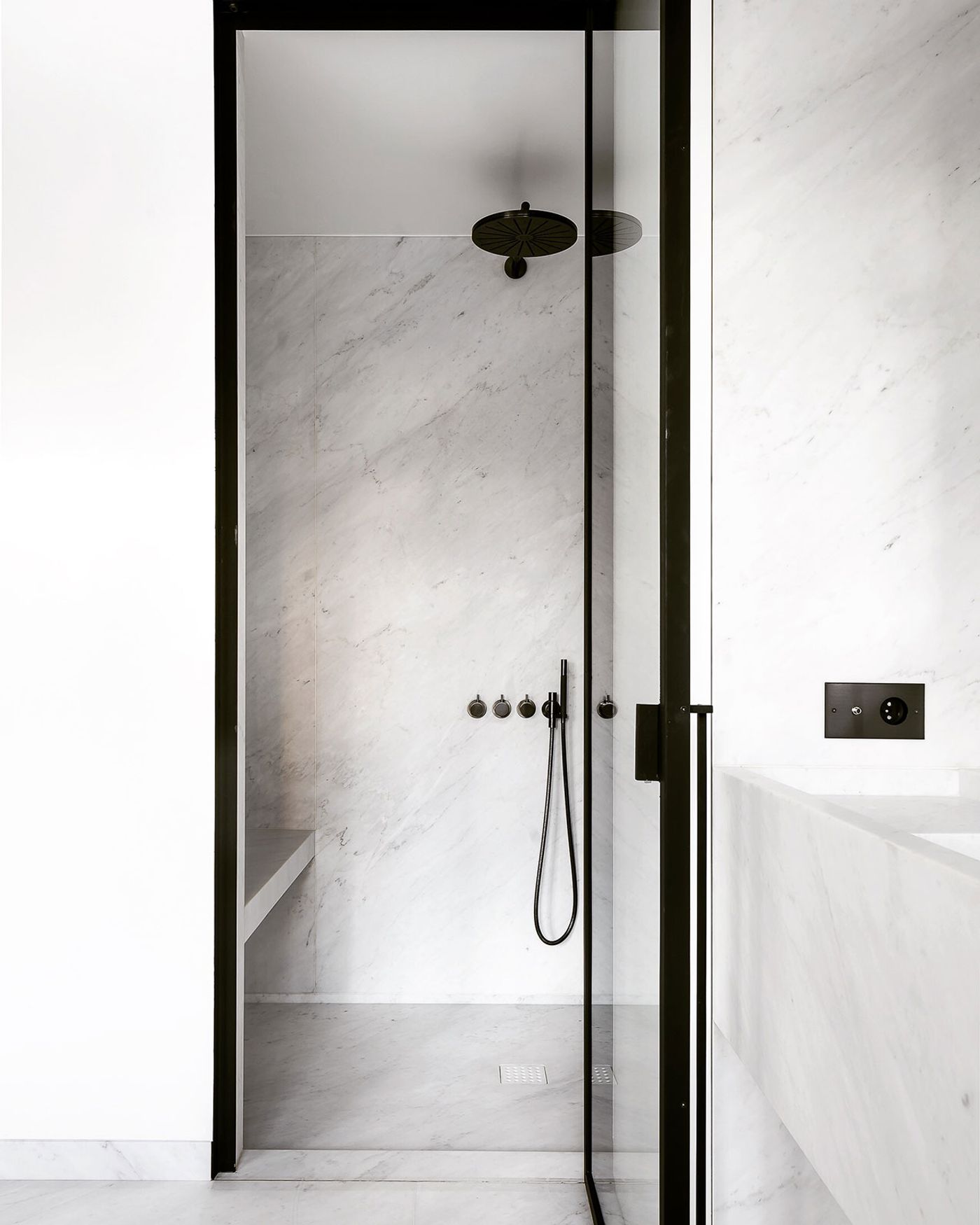
Photos © Claessens & Deschamps/Thomas de Bruyne.
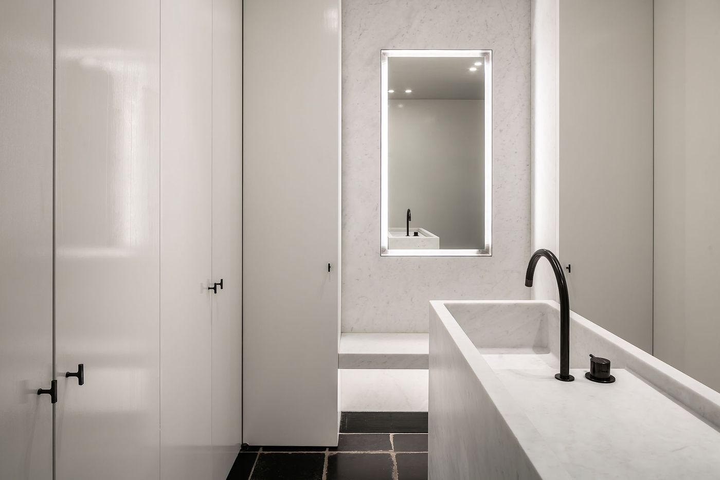
Photos © Claessens & Deschamps/Thomas de Bruyne.
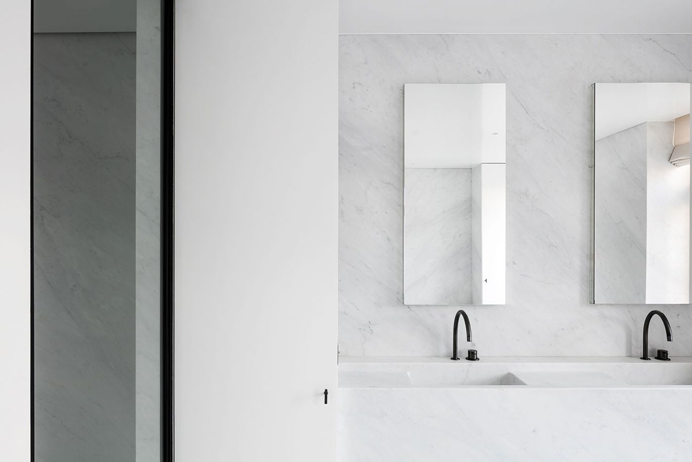
Photos © Claessens & Deschamps/Thomas de Bruyne.
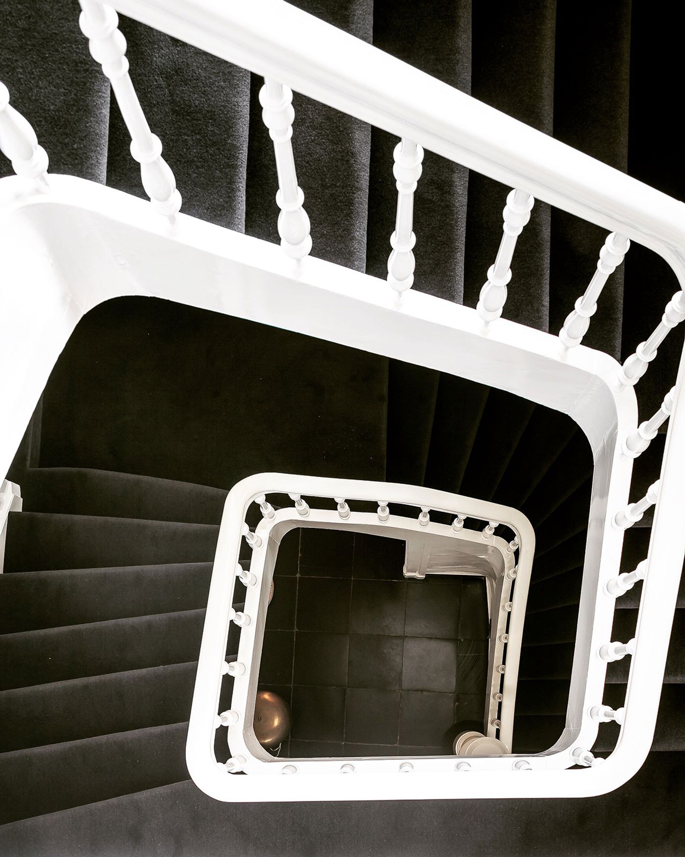
Photos © Claessens & Deschamps/Thomas de Bruyne.