Milk Train Arrives in London's Covent Garden in Art Deco Playfulness
Words by Yatzer
Location
12 Tavistock St, Covent Garden, London, United Kingdom
Milk Train Arrives in London's Covent Garden in Art Deco Playfulness
Words by Yatzer
12 Tavistock St, Covent Garden, London, United Kingdom
12 Tavistock St, Covent Garden, London, United Kingdom
Location
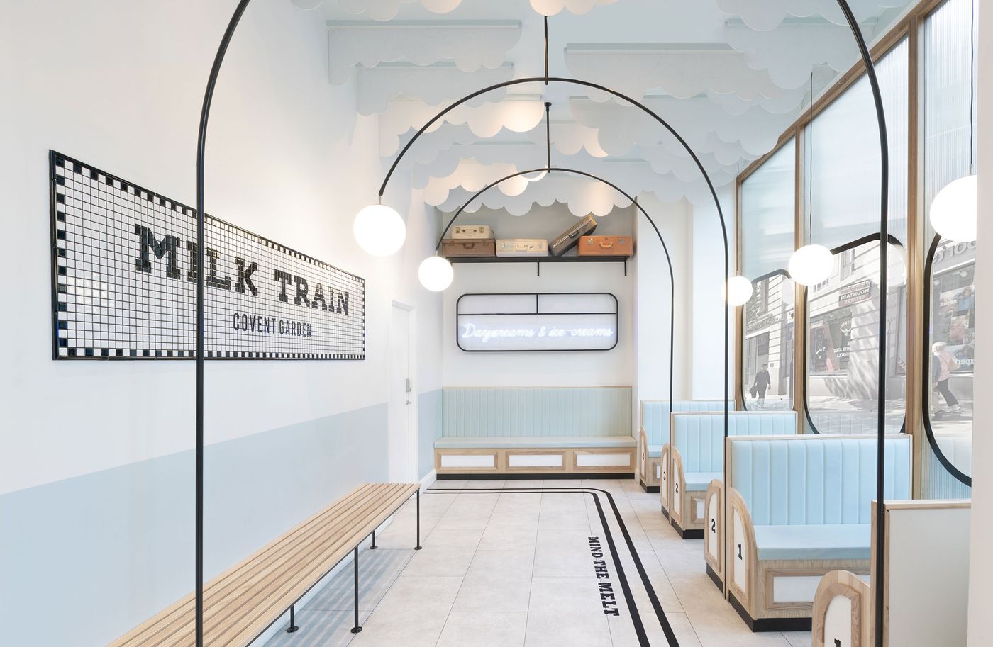
For its first permanent shop located in London’s Covent Garden, ice cream purveyor Milk Train envisioned a space that embodies its whimsical brand identity, reflects and accentuates its already popular Instagram presence, and is both immersive and adaptable: A tall order that London-based design agency FormRoom creatively tackled by deep-diving into the brand’s market, customers and competitors. The result is a dream-like venue inspired by the iconography of Art Deco train stations wherefrom visitors embark on a hedonistic journey of flavours and textures.
Serving up soft-served ice cream, fantastically bedazzled with a rich variety of toppings like mini salted pretzels, rainbow sprinkles and jam-filled biscuits, and wrapped in a sugary candy floss cloud, Milk Train’s offerings are if anything else extremely Instagrammable, which the brand has leveraged to successfully promote its social media profile. This elusive Instagramable quality has also informed FormRoom’s design who approached the store’s interior design as an integral part of the overall brand experience in order to establish a seamless experience across all of Milk Train’s touch‐points, be they online or physical spaces.
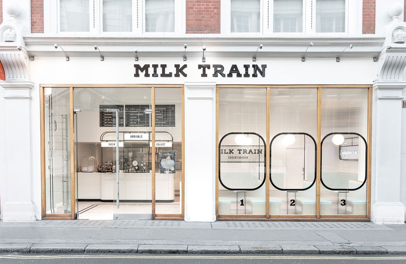
Photo by Paul Lewis © FormRoom.
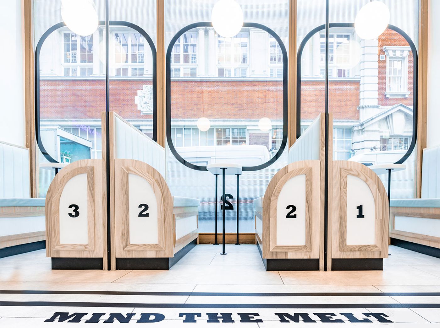
Photo by Paul Lewis © FormRoom.
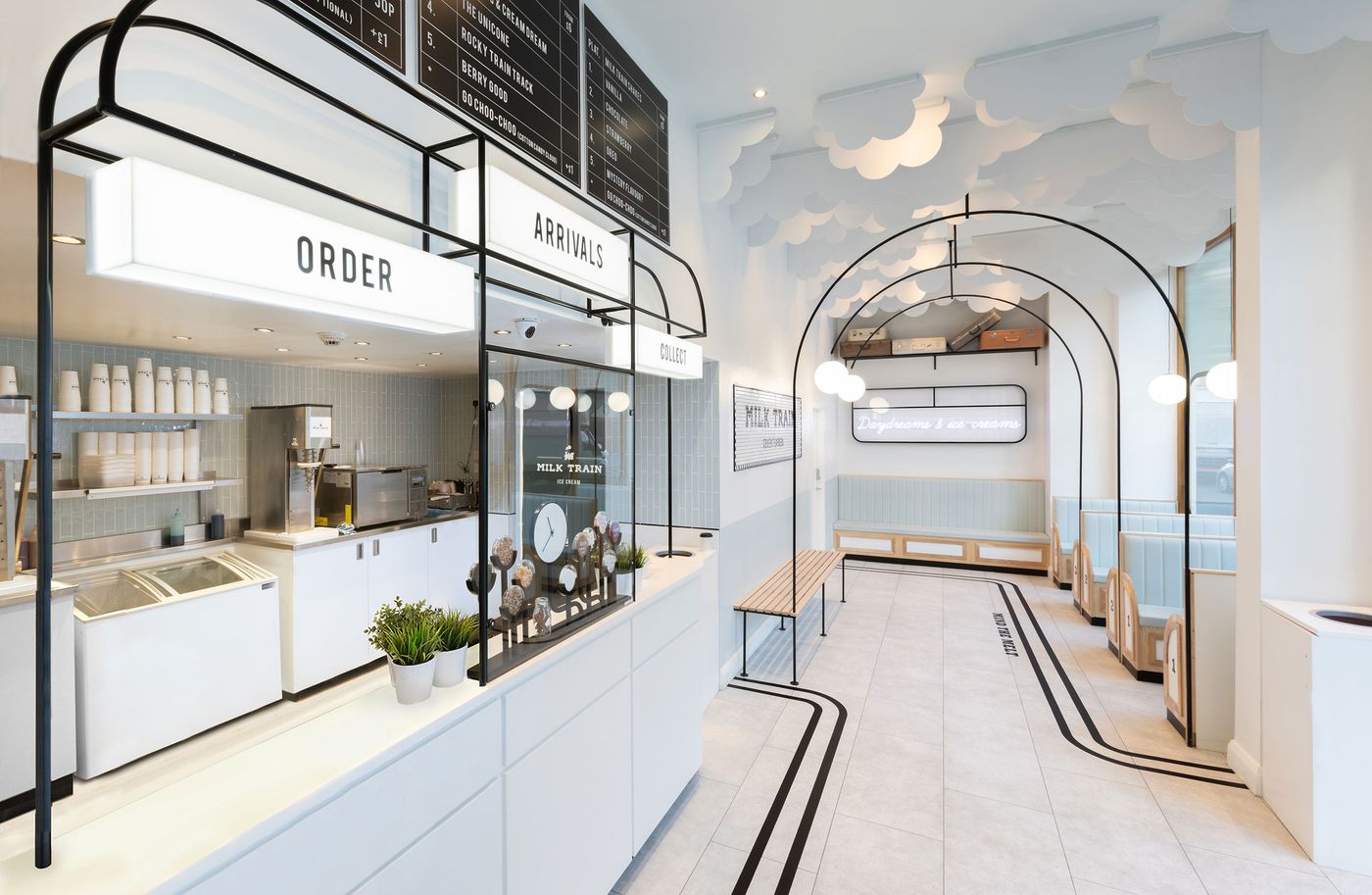
Photo by Paul Lewis © FormRoom.
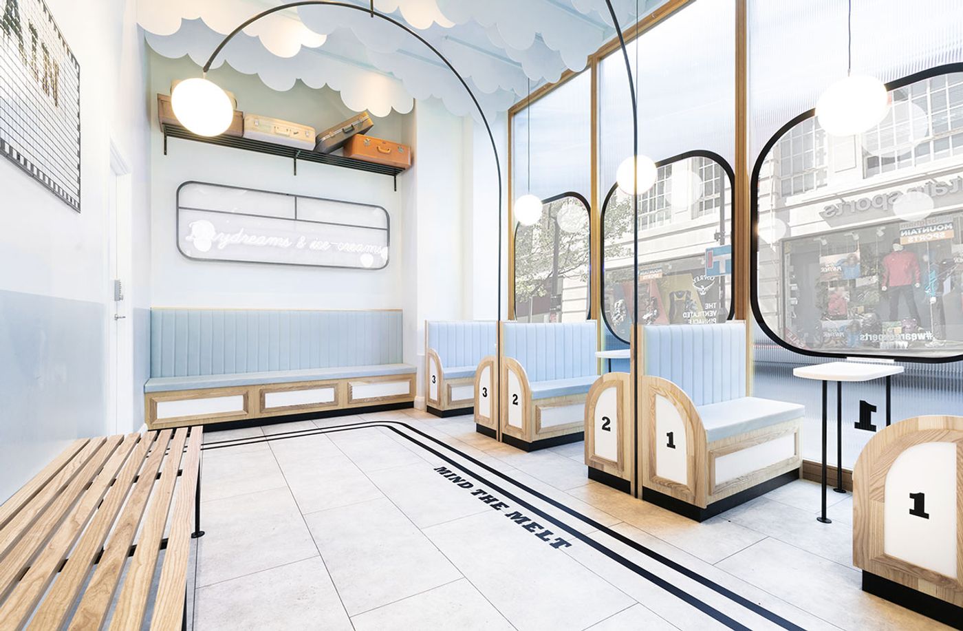
Photo by Paul Lewis © FormRoom.
A predominately monochromatic palette of white and faded baby blue hues, complemented by black geometric strokes inspired by Art Deco patterns, gives the impression that you have stepped inside a graphic illustration rather than a physical space. This sensation is enhanced by the whimsical cloud-like ceiling feature that graphically depicts the steam coming out of a steam locomotive. Coupled with the arch detailing, globe lighting, and banquette seating, the interior design inconspicuously channels the architecture of an early 20th century train and underground stations. As the designers explain, “the quickest way to establish a strong brand identity is naturally to take what consumers already know and love but subvert it to both fit your new brand purpose and provide a fresh perspective”.
The train station allusion is further enhanced by mosaic tiling and graphic signage, as well as the use of opaque and clear glass to mimic the shapes of train windows on the storefront, while the phrase “Mind the Melt” embedded into the floor is a playful take on the iconic British underground ‘Mind the Gap’ instruction. Meanwhile, the monochromatic palette and sparse interior design also makes the space highly adaptable to seasons and trends, from Valentine’s Day to Chinese New Year, allowing the interior to evolve as swiftly as the brand’s social media presence. The shop’s adaptability also encourages repeat visits, as well as extra ‘shares’, which, after all, in a hugely competitive environment is crucial for brand awareness.
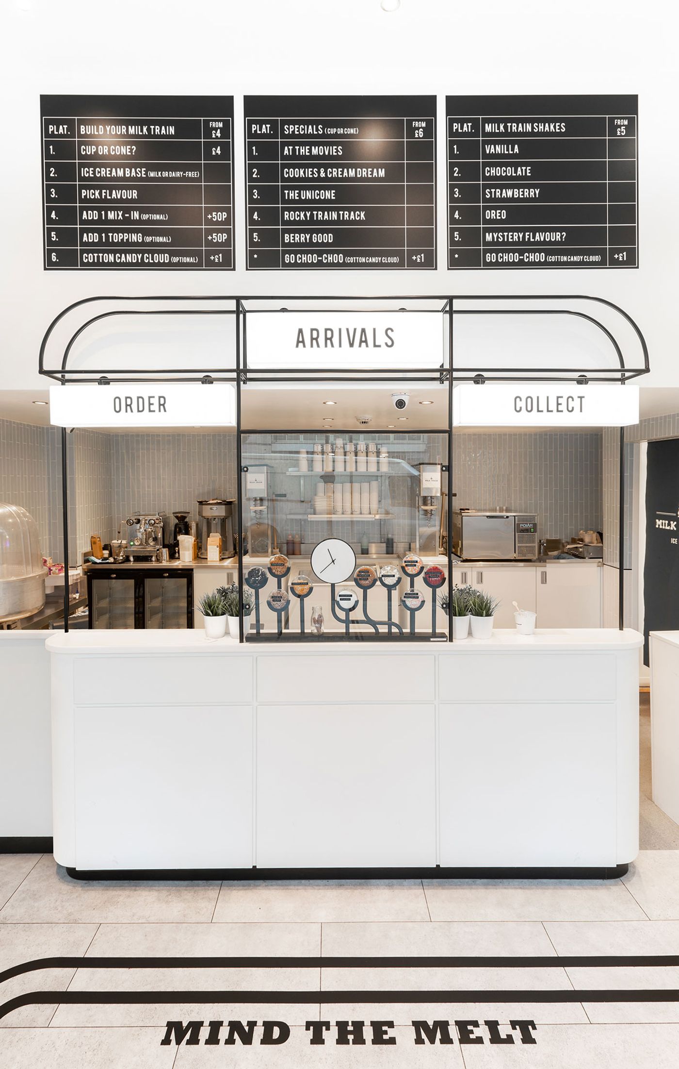
Photo by Paul Lewis © FormRoom.
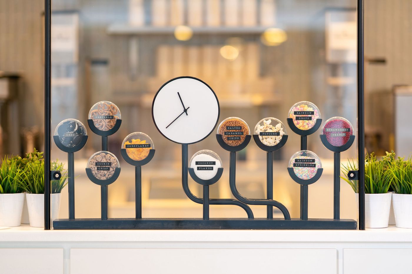
Photo by Paul Lewis © FormRoom.
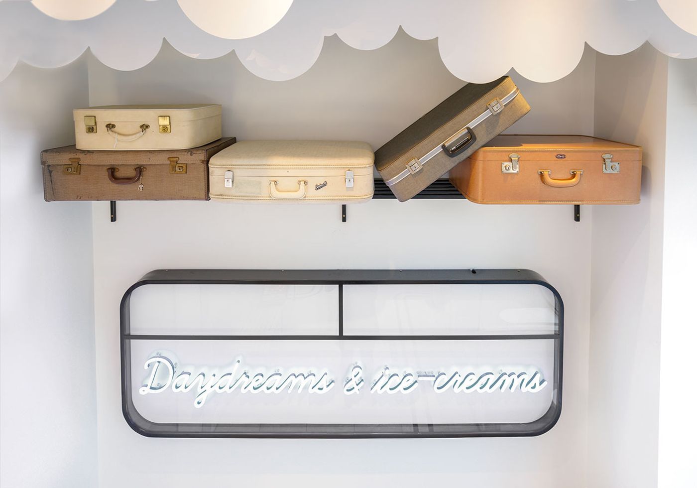
Photo by Paul Lewis © FormRoom.

Photo by Paul Lewis © FormRoom.