Haapsalu Castle in Estonia Celebrates its Medieval Heritage with Modern Intervention
Words by Yatzer
Location
Haapsalu, Estonia
Haapsalu Castle in Estonia Celebrates its Medieval Heritage with Modern Intervention
Words by Yatzer
Haapsalu, Estonia
Haapsalu, Estonia
Location
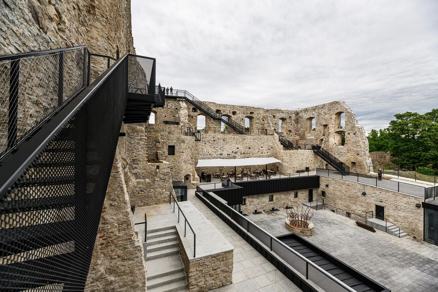
The conservation and renovation of heritage buildings is a notoriously difficult challenge for architects who have to strike a balance between preserving the historic fabric and facilitating contemporary use. Such was the challenge facing Tallinn-based practice KAOS Architects in renovating the 13th century Haapsalu Castle in the small seaside town of the same name in Estonia that has been in ruins since the 17th century. What makes this project stand out apart from the stellar preservation work is the graceful addition of an ascending pathway that leads visitors up to the top of the centuries-old masonry structure, and an entrance pavilion that ushers them down into the exhibition spaces inside the castle’s bowels. Standing out for their contemporary minimalism and geometrical vigour, the modern elements that the architects have introduced, far from distracting from the historic edifice, highlight its sprawling, majestic beauty and form a link, both literally and figuratively, between the past and present.
Comprising a collection of wooden houses dating back from the early 20th century, the town of Haapsalu possesses a fairytale charm enhanced by its long-standing history as a spa resort whose distinguished guests included the Romanovs, the Russian Royal family. Visitors to the renovated Haapsalu Castle, which used to be the residence of the medieval Prince-Bishops Ösel-Wiek and which includes the largest single-nave cathedral in the Baltic states, have a unique chance to take in the picturesque town and surrounding coastal landscape from the top of the castle’s battlements, courtesy of the new staircase-cum-pathway that leisurely climbs up the masonry structure.
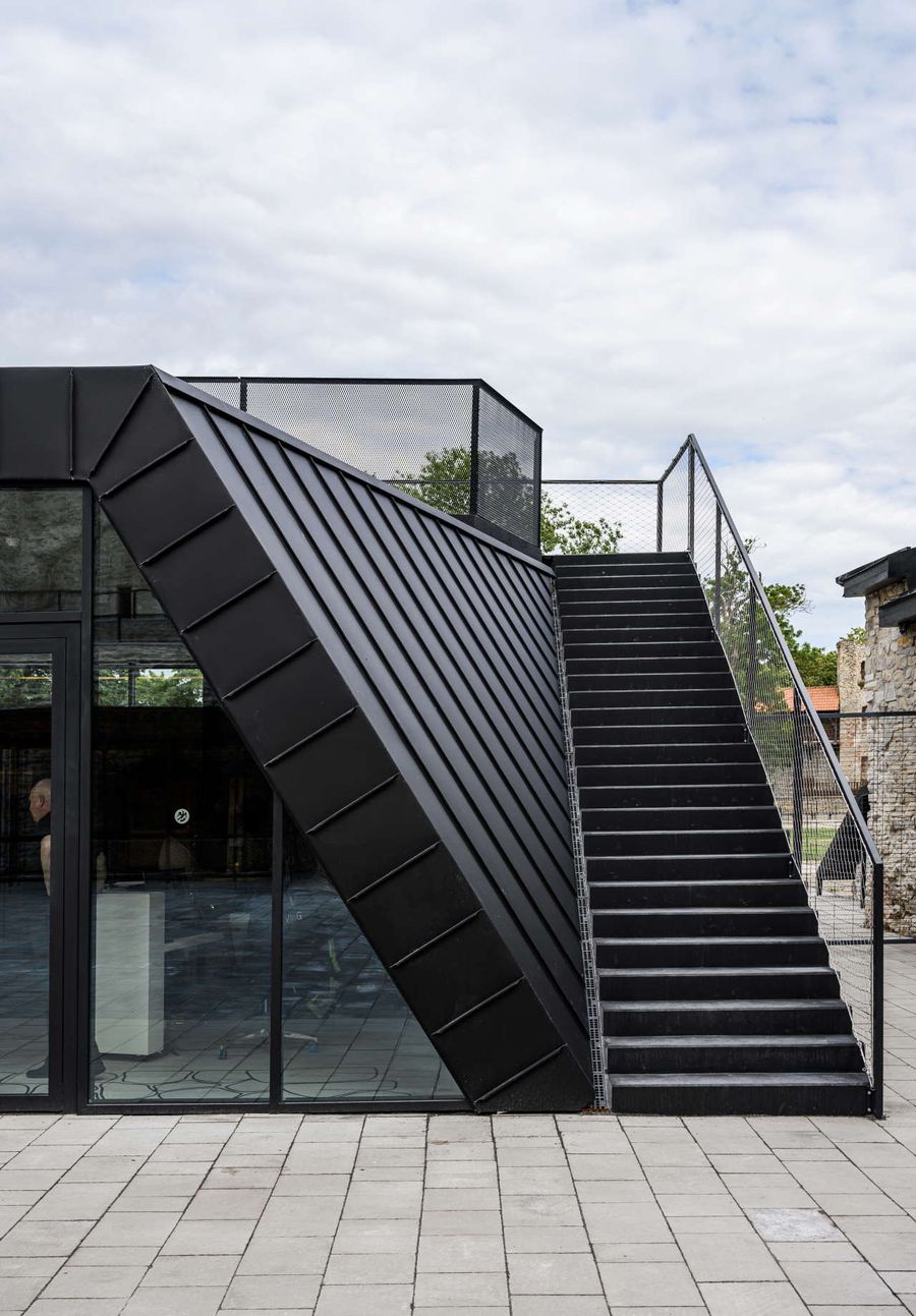
Photo by Tõnu Tunnel.
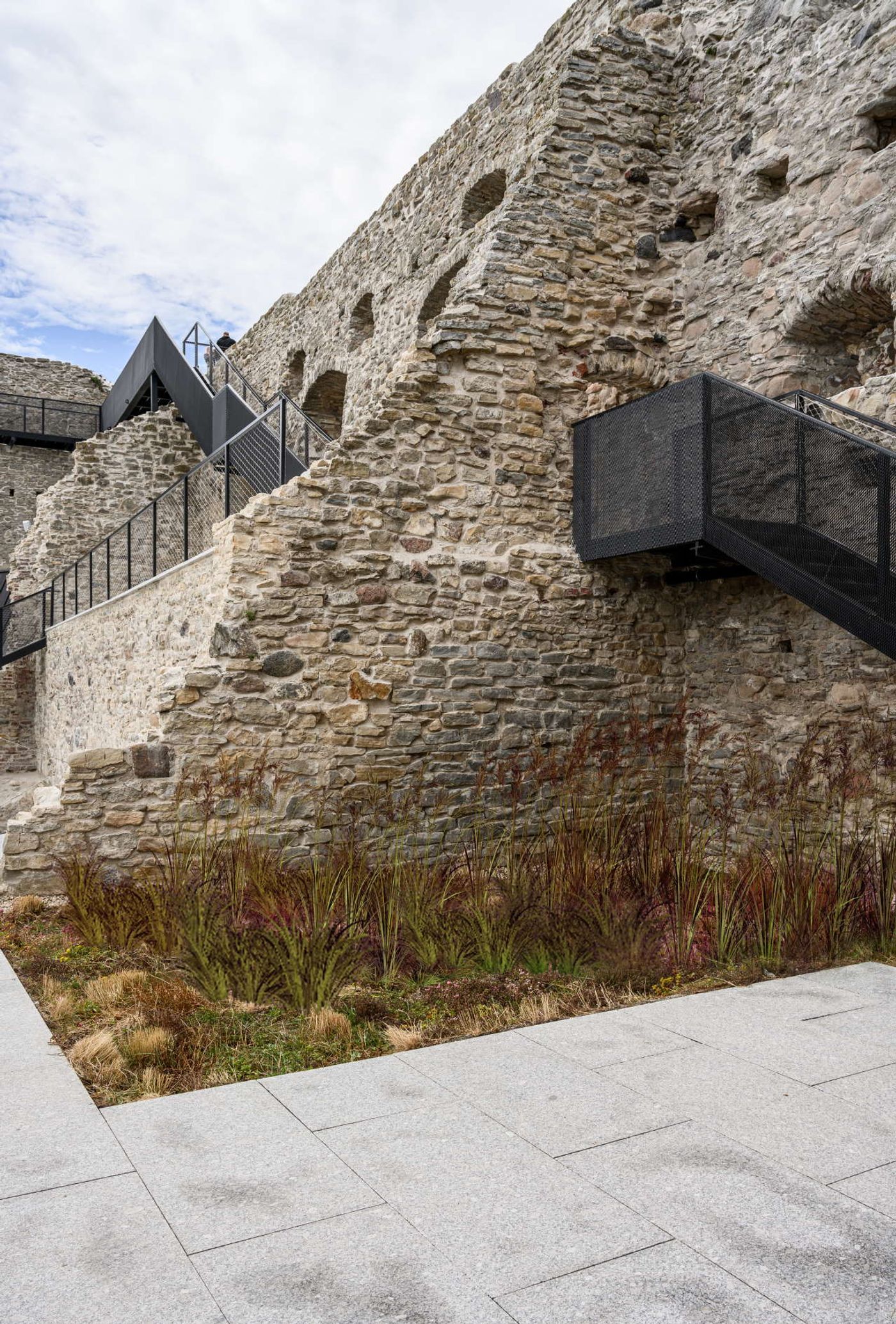
Photo by Tõnu Tunnel.
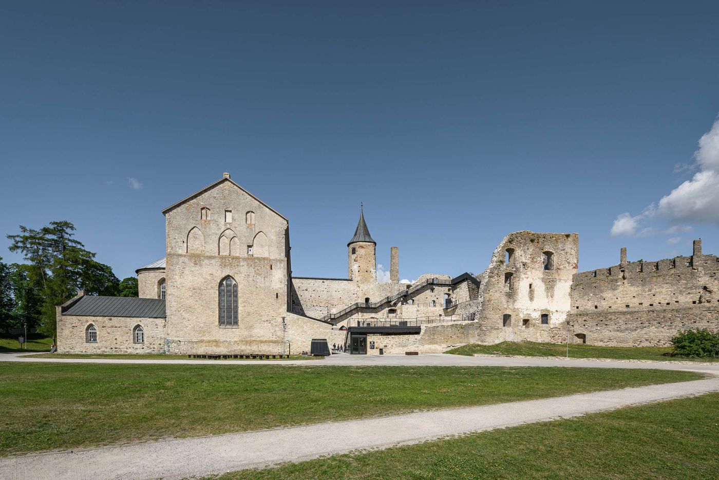
Photo by Tõnu Tunnel.
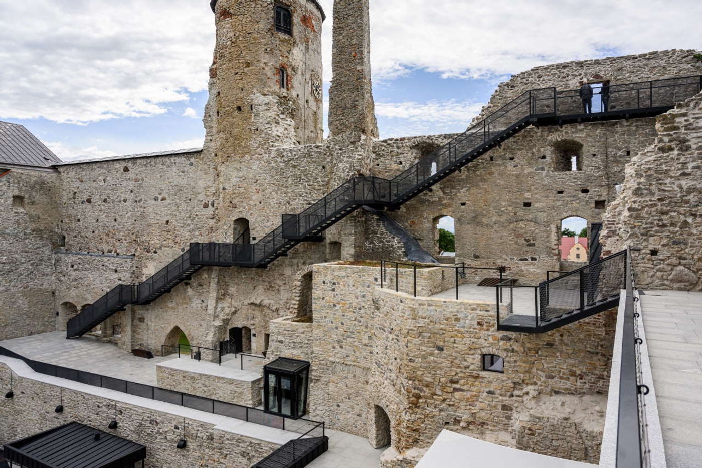
Photo by Tõnu Tunnel.
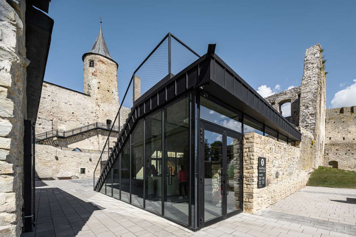
Photo by Tõnu Tunnel.
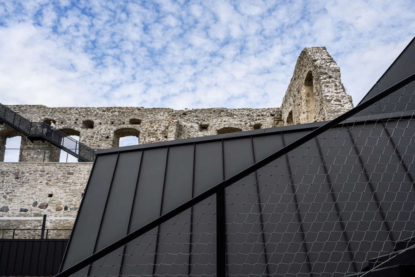
Photo by Tõnu Tunnel.
Subtle in volume, minimal in aesthetics, and stark in its black-painted steel cladding, the new entrance pavilion has been harmoniously integrated into the existing masonry sections and appears to be peeking curiously from behind the entrance wall. Set within the central courtyard the pavilion functions as a hub connecting the ground level with the exhibition spaces in the basement of the west wing and a series of terraces above.
Occupying a series of austere, barrel-vaulted, stone-built spaces, the exhibition plunges visitors into the castle’s medieval world and presents an overview of Haapsalu’s history through a rich collection of artefacts and numerous interactive exhibits. In contrast to the dimly-lit, compartmentalized exhibition spaces, the reception area above is an open-plan, light-filled space, whose minimalist concrete interiors act as a sort of decompression room between the subterranean exhibition rooms and the exterior areas.
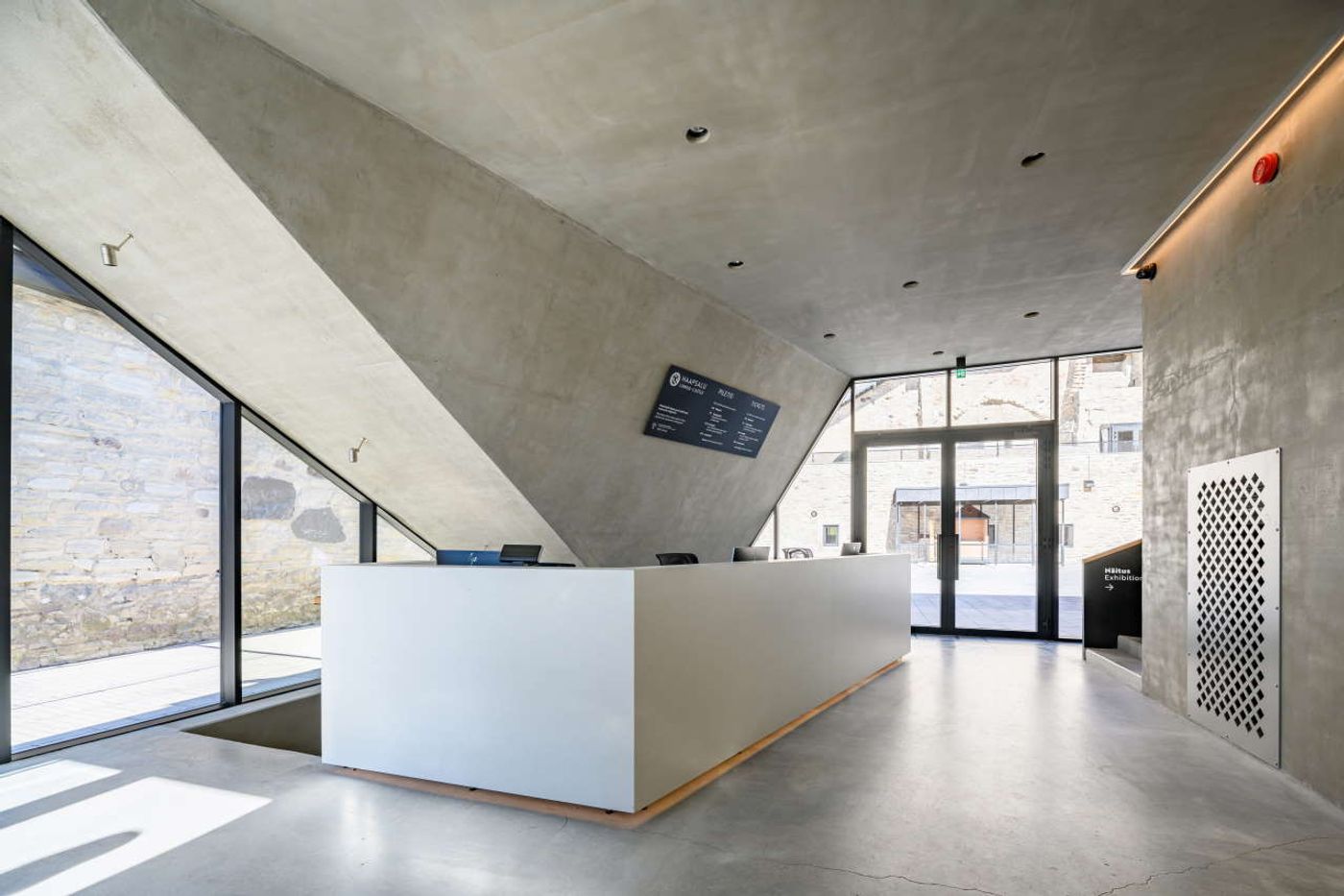
Photo by Tõnu Tunnel.
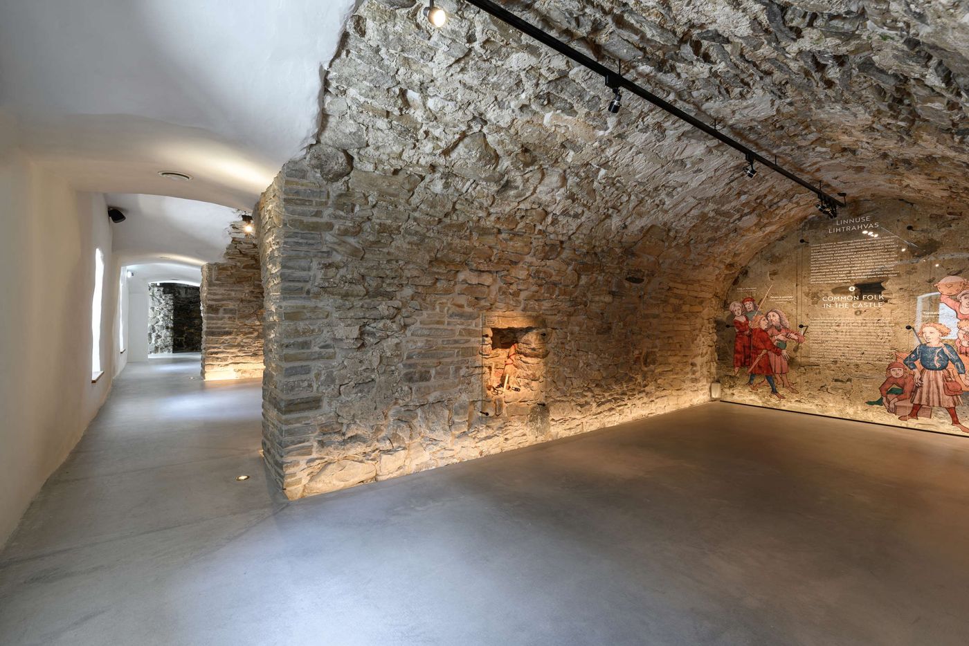
Photo by Tõnu Tunnel.
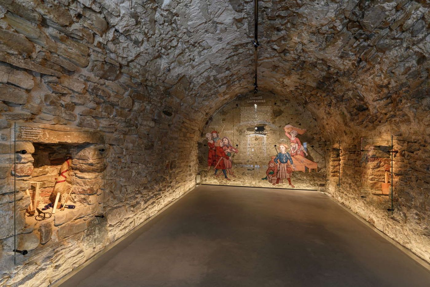
Photo by Tõnu Tunnel.
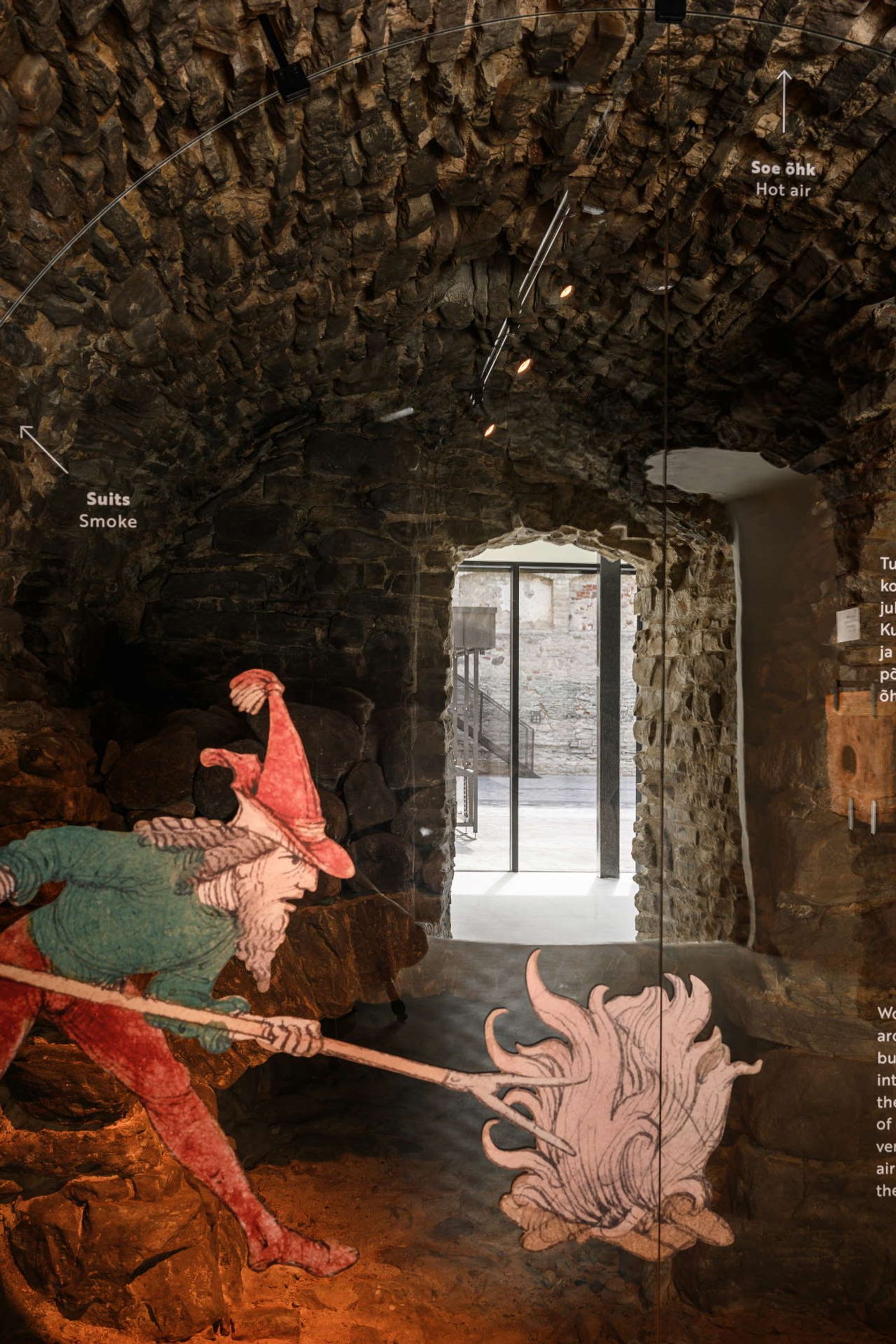
Photo by Tõnu Tunnel.
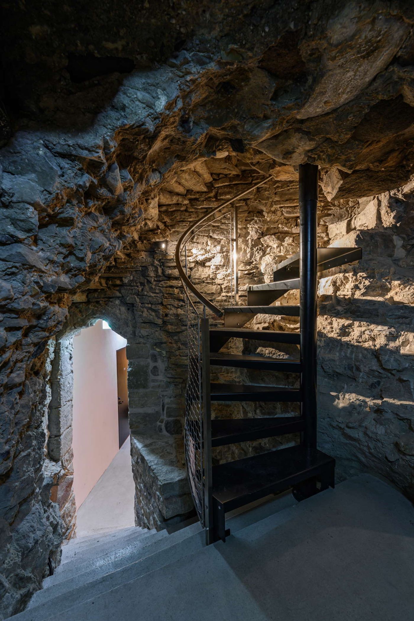
Photo by Tõnu Tunnel.
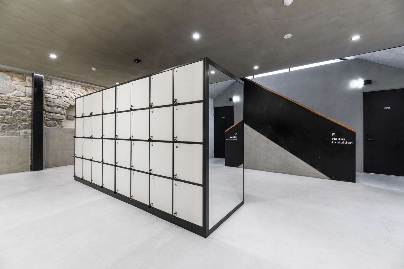
Photo by Tõnu Tunnel.
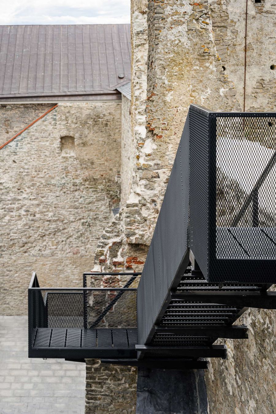
Photo by Tõnu Tunnel.
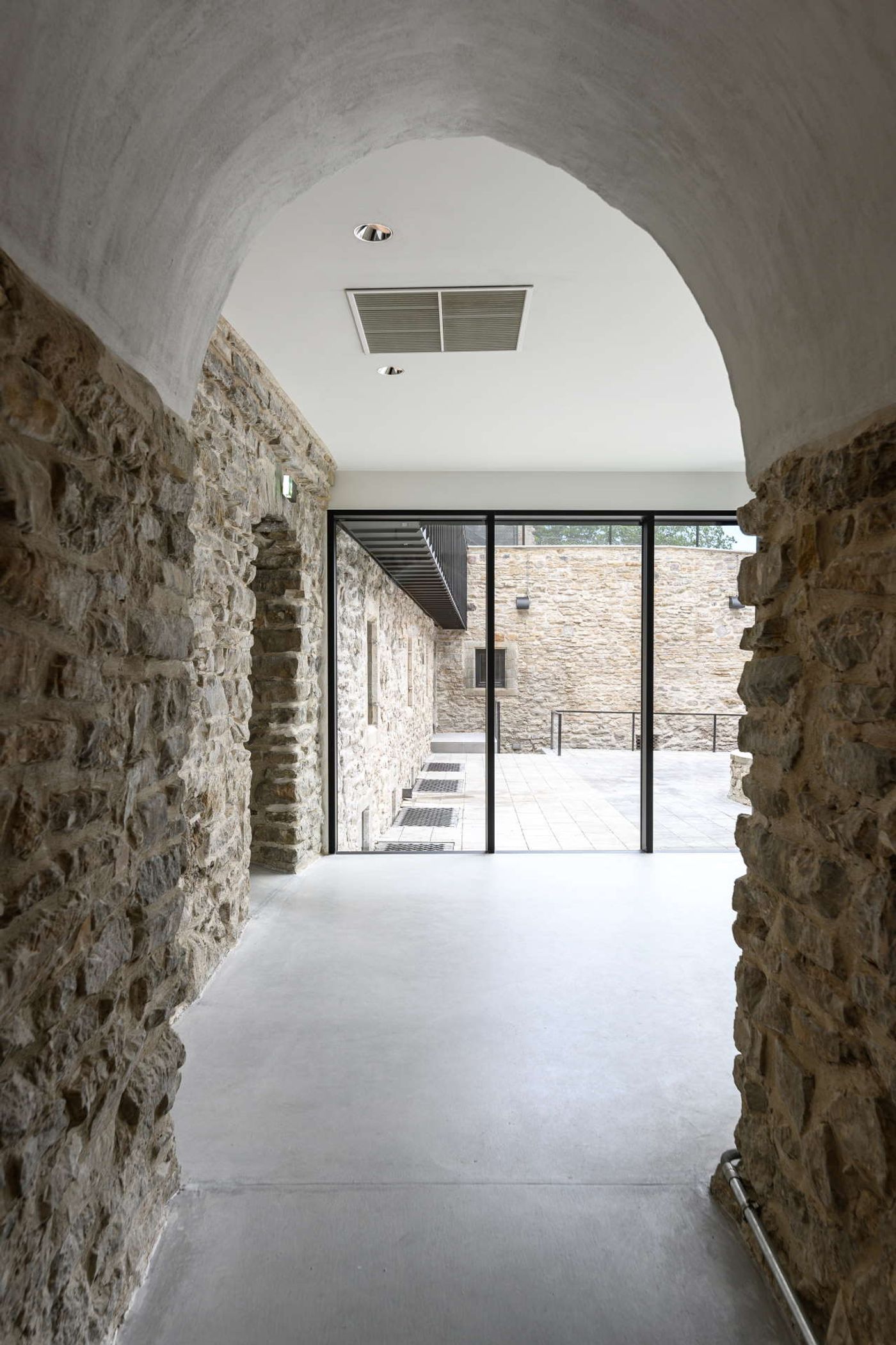
Photo by Tõnu Tunnel.
Accessed via an external staircase cleverly integrated into the pavilion’s prismatic volume, visitors walk along a series of interconnected terraces, including an outdoors café, that takes them around the courtyard and onto the cantilevered pathway that reaches the top of the battlements. The pathway, which apart from panoramic views of the surrounding landscape, also offers visitors the chance to experience the ruins from different viewing angles, is made of sheet steel to reduce its weight, and is cantilevered from the battlements in such a way as to minimize damage to the historic stonework, making use for example of existing anchorage points that were introduced in a previous renovation in the 1990s. Painted black, the stark, calligraphic geometry of the metallic pathway is a bold yet respectful architectural statement.
It’s a long way from the castle’s underground vaults to this viewing platform, but the fact that they both form part of the same exploratory route is what makes this renovation so successful.
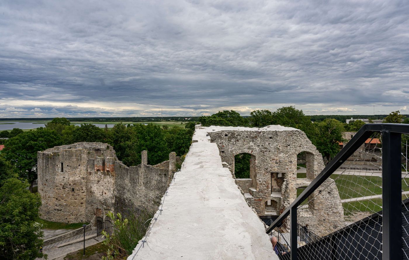
Photo by Tõnu Tunnel.
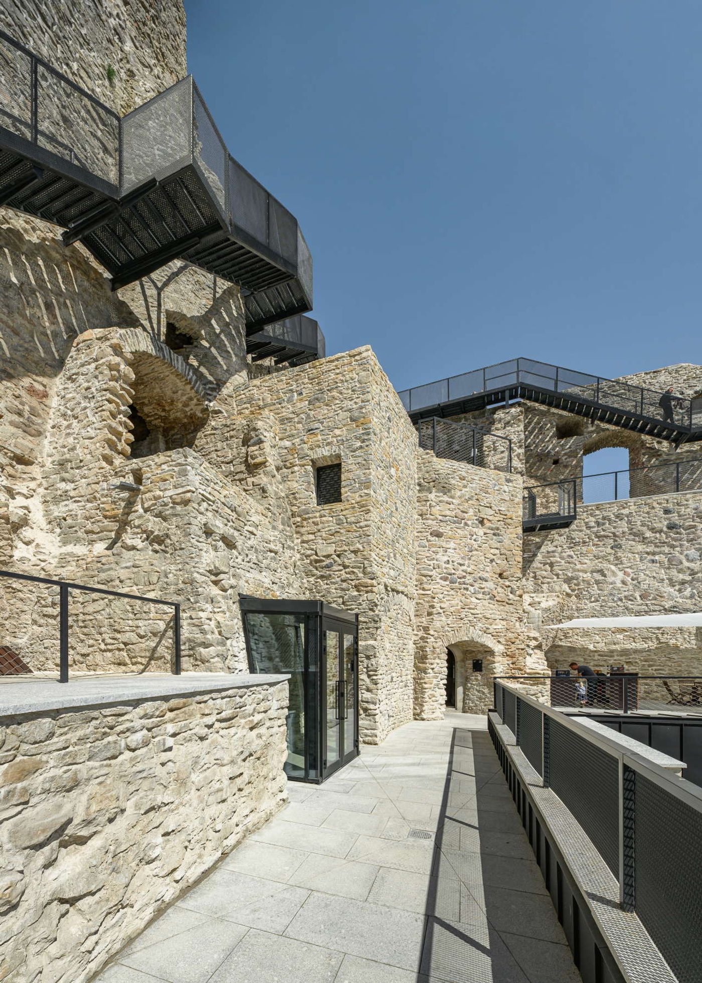
Photo by Tõnu Tunnel.
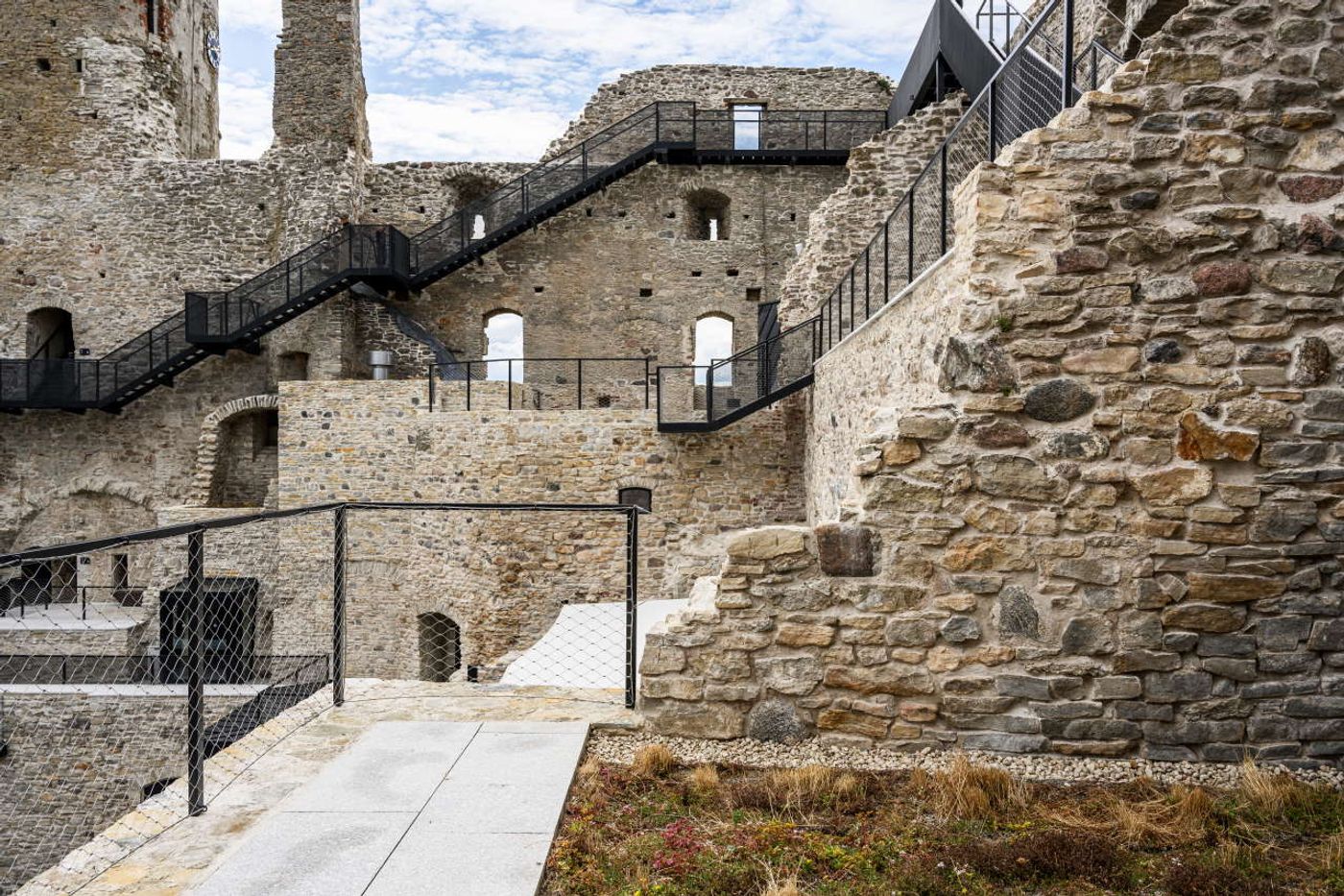
Photo by Tõnu Tunnel.
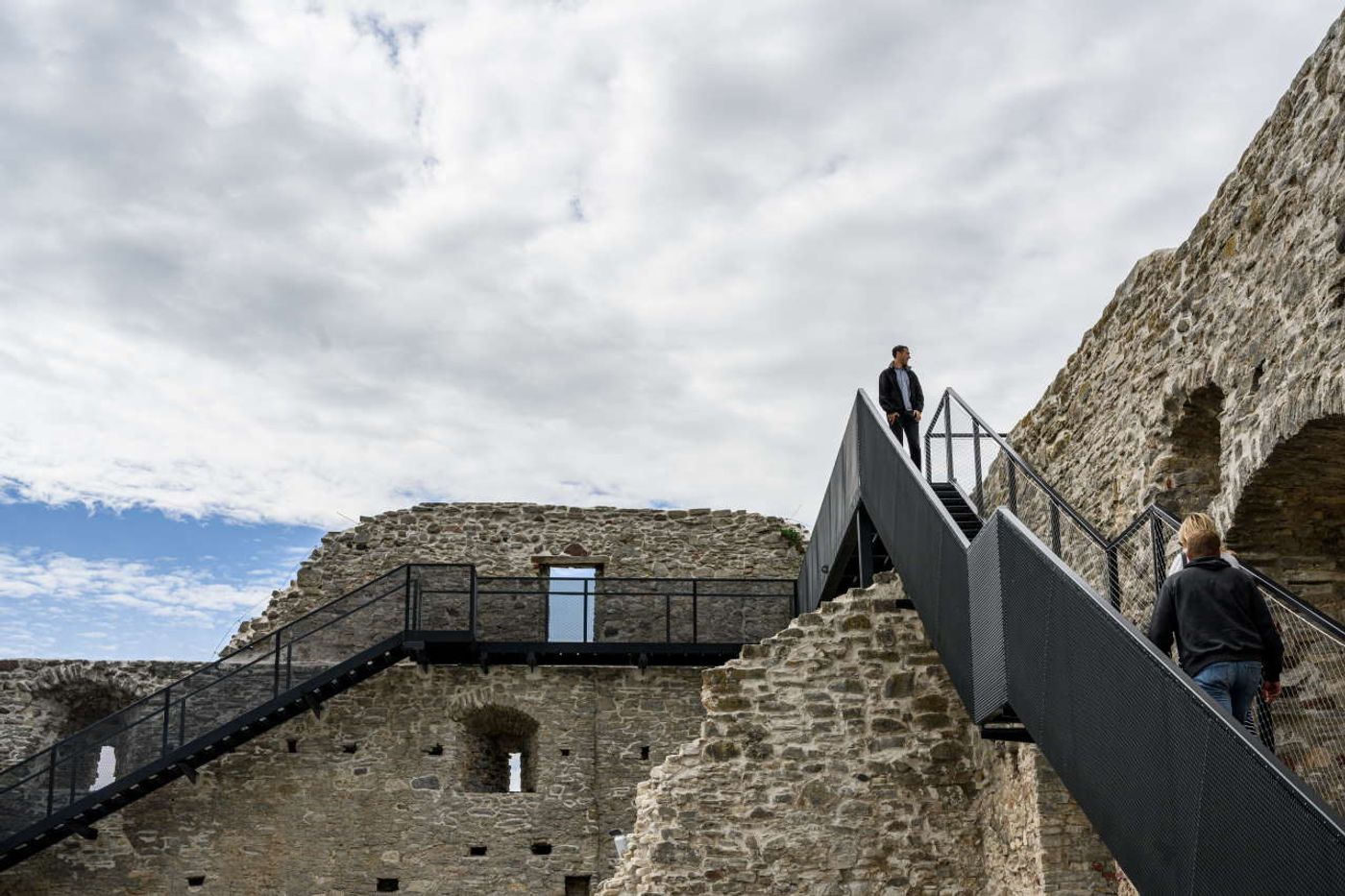
Photo by Tõnu Tunnel.
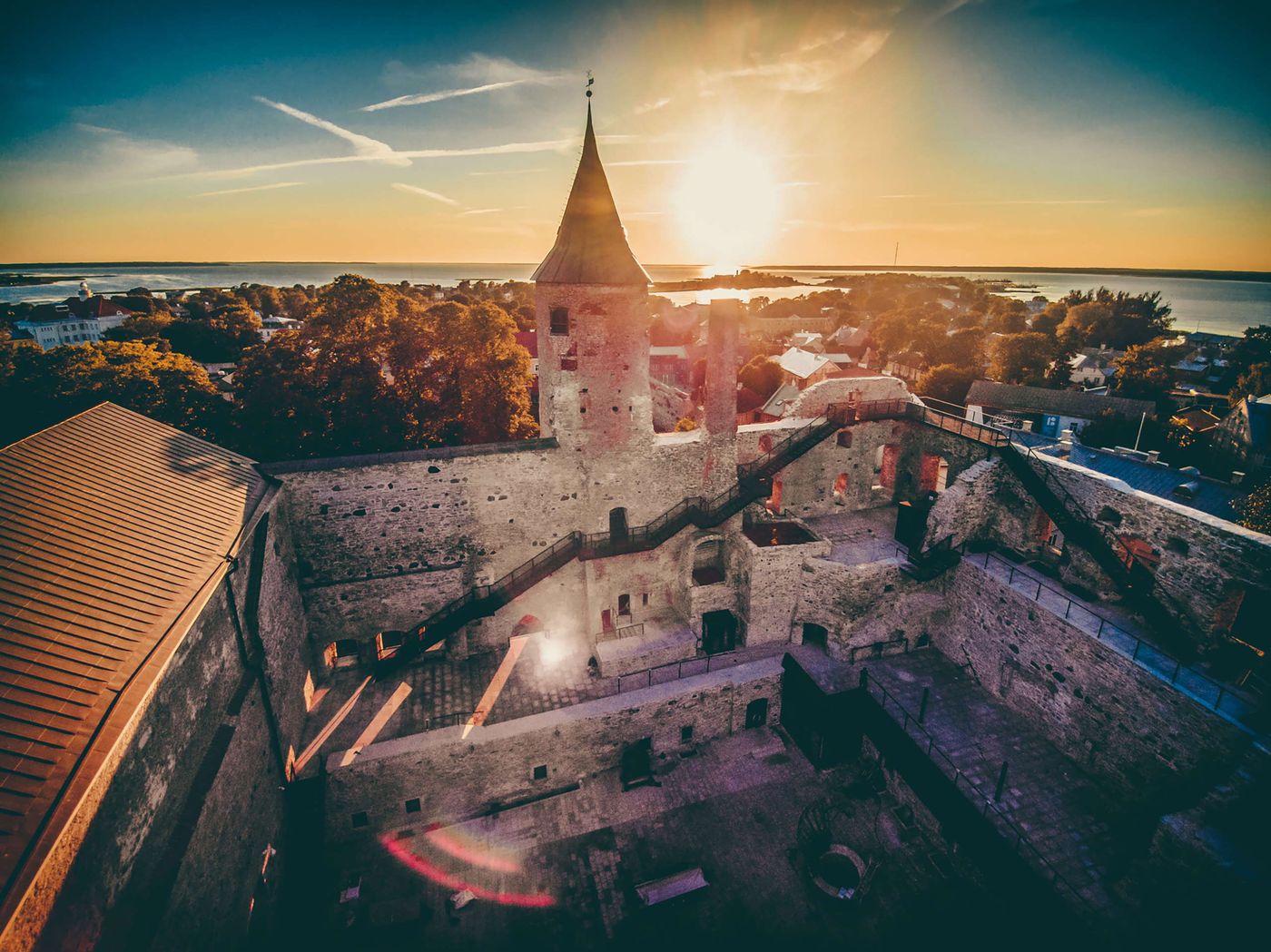
Photo by Vendo Jugapuu.