Project Name
Fosbury & SonsPosted in
Workspace, Interior DesignLocation
| Detailed Information | |||||
|---|---|---|---|---|---|
| Project Name | Fosbury & Sons | Posted in | Workspace, Interior Design | Location |
Mechelsesteenweg 271 Antwerp
Belgium |
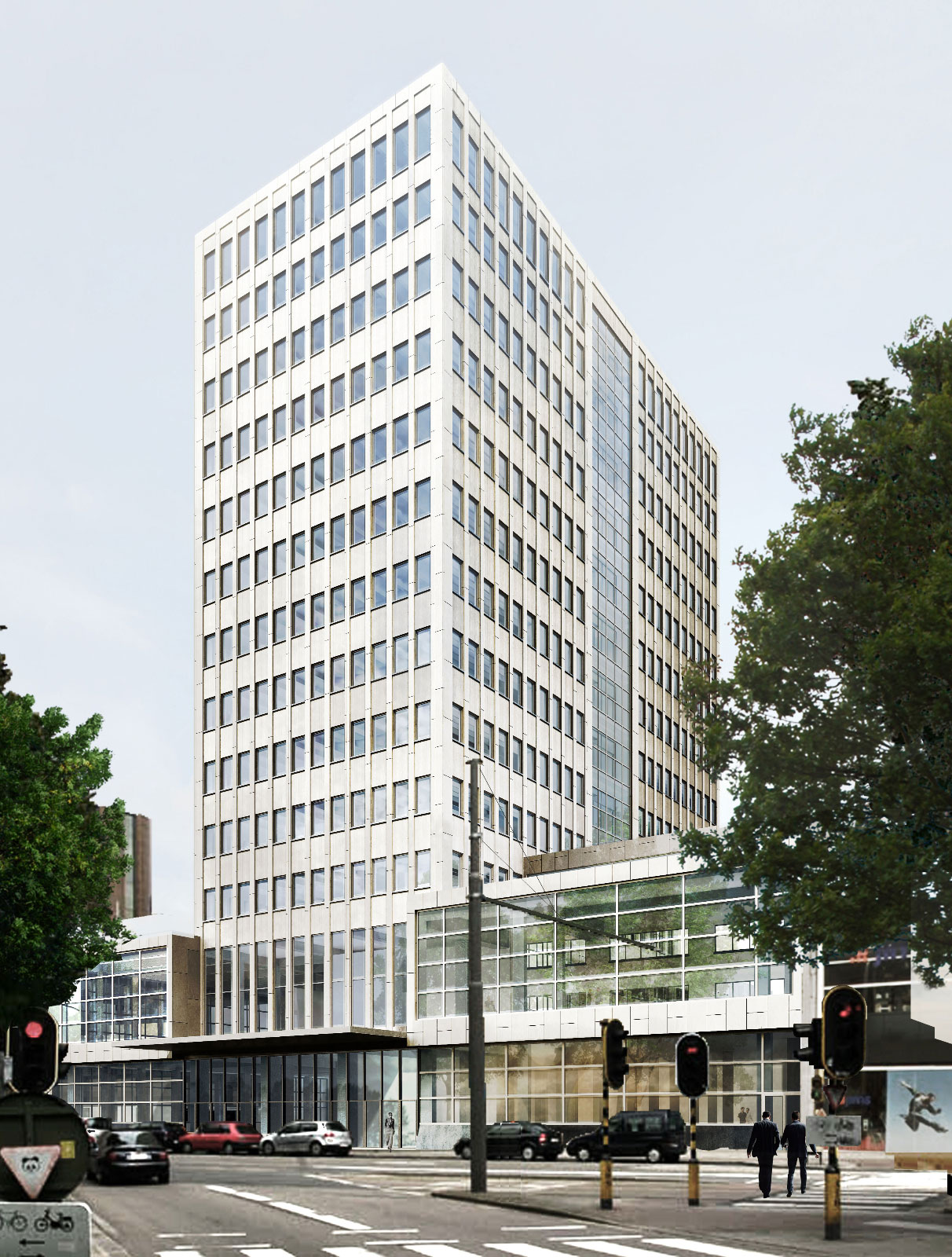
Photo by Frederik Vercruysse.
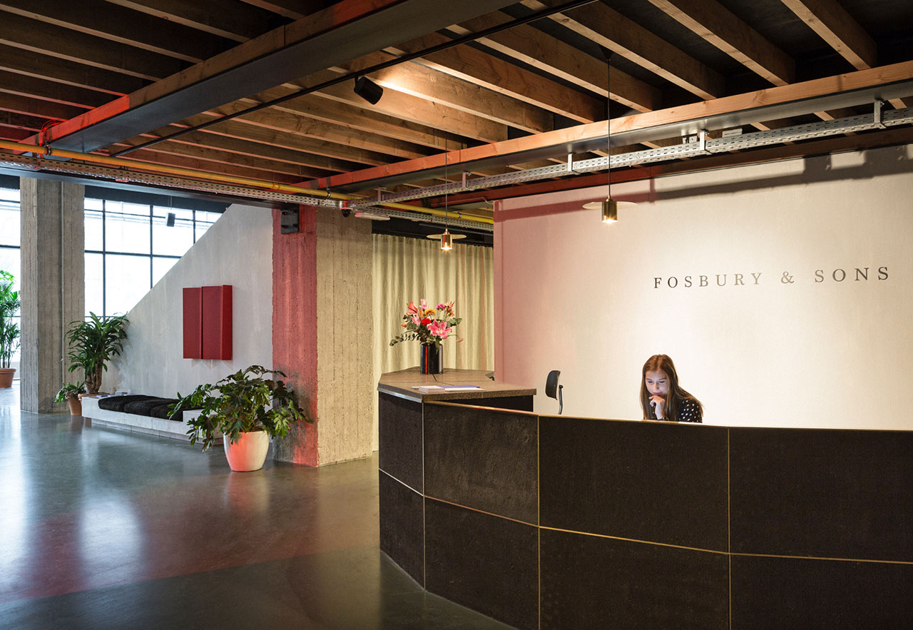
Photo by Frederik Vercruysse.
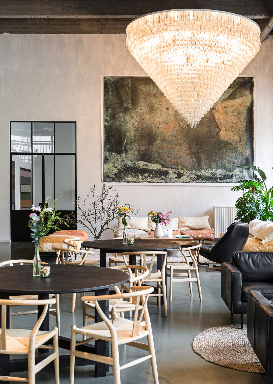
Photo by Frederik Vercruysse.
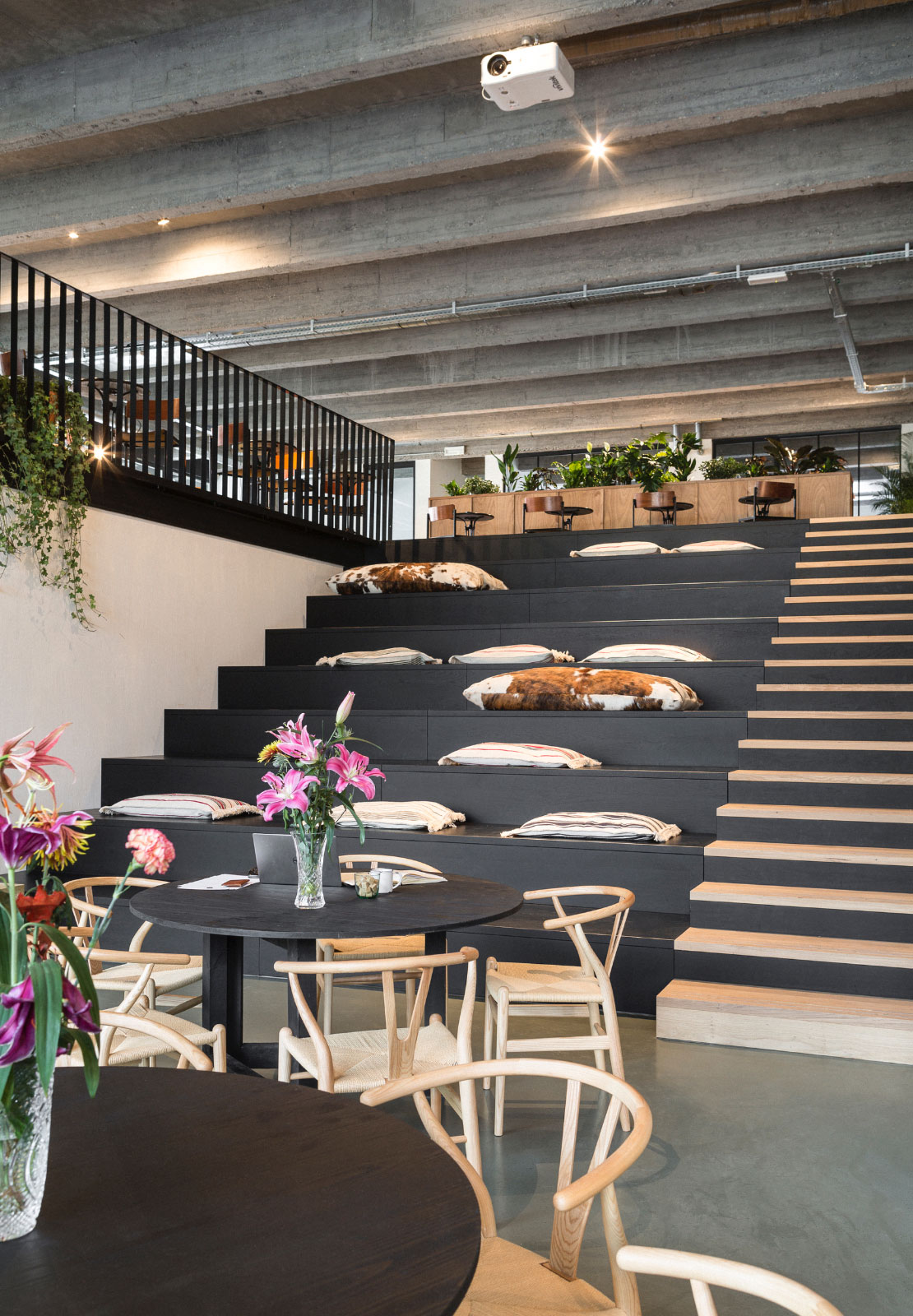
Photo by Frederik Vercruysse.
Located a stone’s throw away from the city’s magnificent Central Station, Fosbury & Sons is not only bound to become a magnet for Antwerp’s digital nomads and freelancers in need of a homely office away from home, but has also been conceived to welcome companies looking for meeting rooms as well as any freelance professional looking to work in a stimulating environment that is multi-faceted and conducive to networking.
“In 1968, Dick Fosbury revolutionized high jumping by leaping with his back towards his stick – and winning the Olympics”, Geeraets and Van Gool explain with regards to the project’s name. “Now that is exactly how everyone does it. Like Fosbury, we want to set a new bar for something as conventional as going to the office. We want to demonstrate that working can be a positive and pleasant force in life.” The Sons, in the second part of the project’s sobriquet, thus refers to all professionals adhering to this style of working.
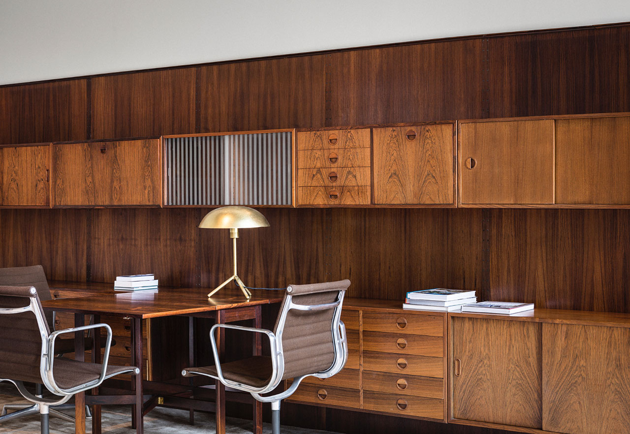
Photo by Frederik Vercruysse.
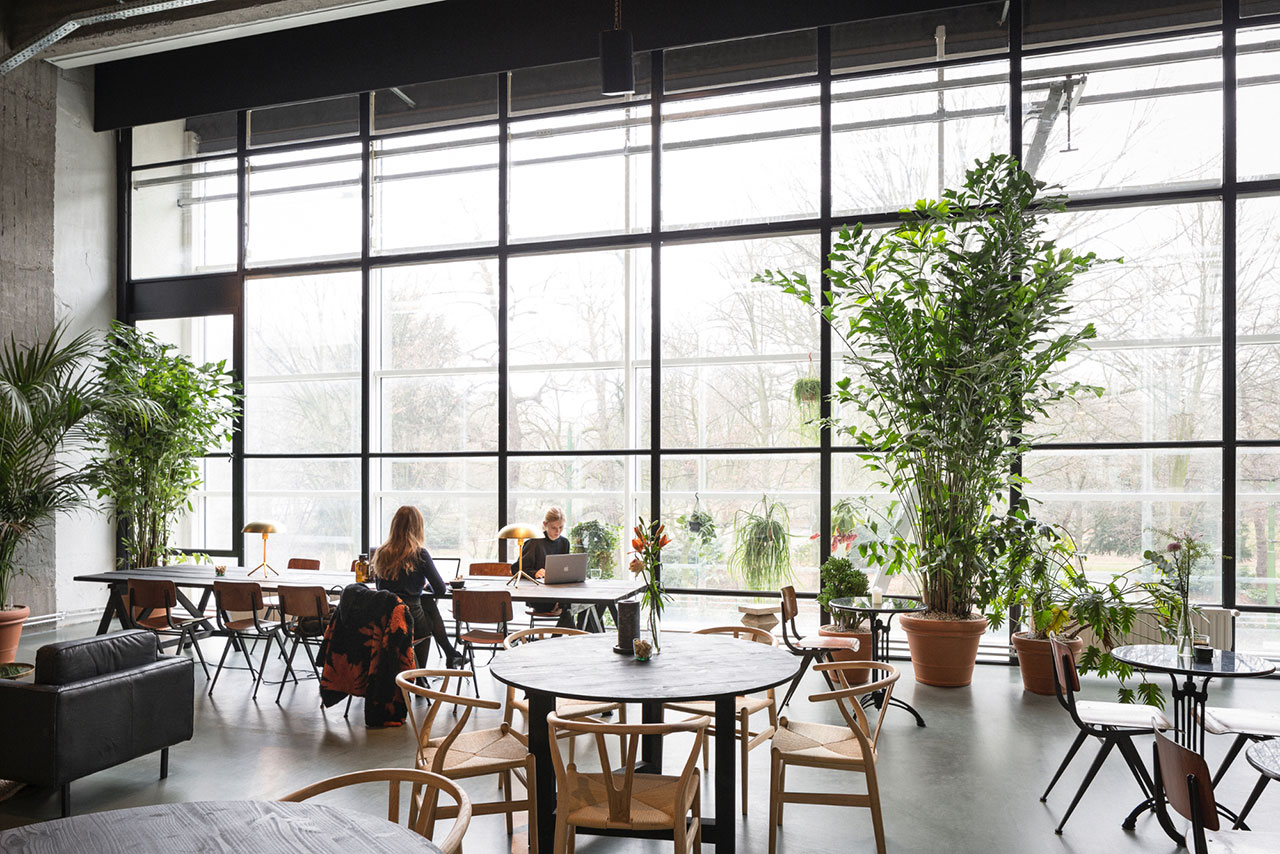
Photo by Frederik Vercruysse.
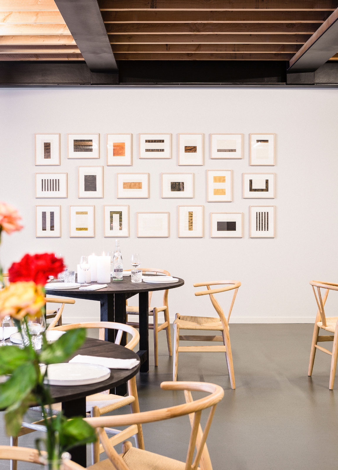
Photo by Frederik Vercruysse.
The space’s interior, designed by the Antwerp design studio Going East, is filled with relaxed seating areas and large working tables equipped with Sennheiser headphones, should you want to shield yourself off and knuckle down. Sofas are by Journuit, a new Belgian brand, as well as vintage. The rotating art selection on the walls is curated by Sofie Van De Velde and PLUS ONE gallery, both based in Antwerp, and the Brussels gallery Veerle Verbaekel.
For Anaïs Torfs and Michiel Mertens, the founders of Going East, it’s all about the variety, in work and in life. “We always imagine what it would be like to move around inside a space”, muses Torfs. ”There are various ways to walk toward any desk or working area, enabling you to see different things and meet different people.”
They were also adamant about using innovative resources, such as the bar made of100% recycled materials. Mertens notes: “Maarten and Stijn were very open to experimenting. You could call that creative freedom, but it’s actually more about trust.”
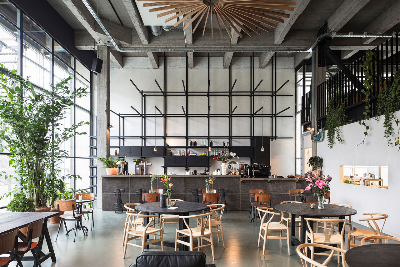
Photo by Frederik Vercruysse.
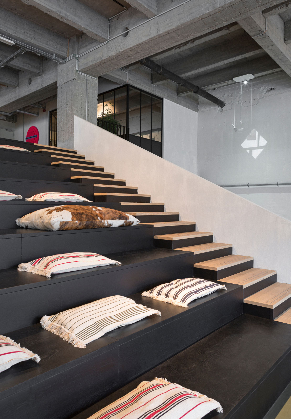
Photo by Frederik Vercruysse.
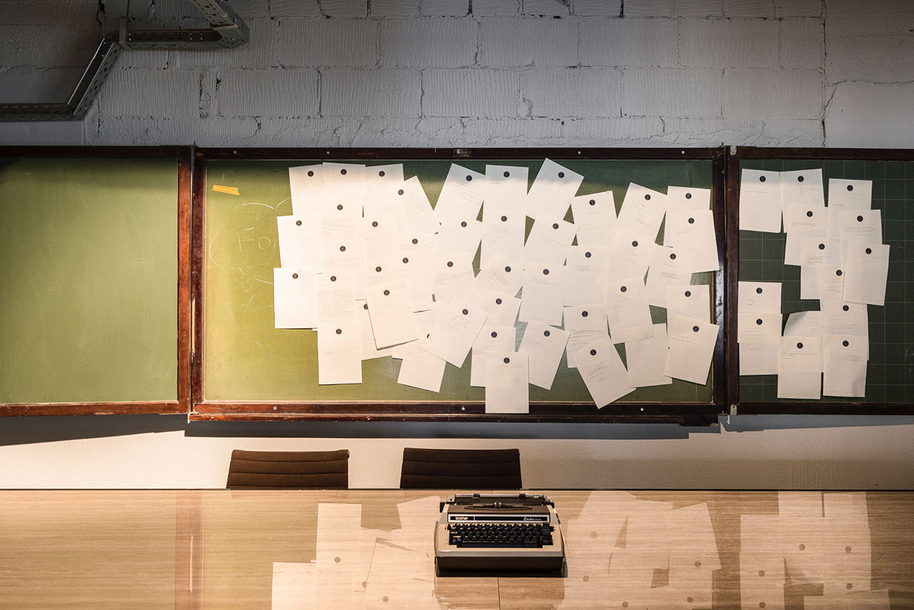
Photo by Frederik Vercruysse.
A library provides books from local publishing house Luster, who specialize in culture, design, photography and food books. Skincare from Marie-Stella-Maris, healthy food options from Antwerp-based Coffeelabs, a laundry service, gym sessions and showers complete the exhaustive service of this concept, which is open 24/7, with various formulas for various types of memberships.
Thanks to architectural interventions and material choices that differentiate between the communal spaces and the cozier work areas, Fosbury & Sons is an all-round experience spread over a single six-metre high storey that’s been divided into extra floors where each nook and cranny has been put to very good use indeed.
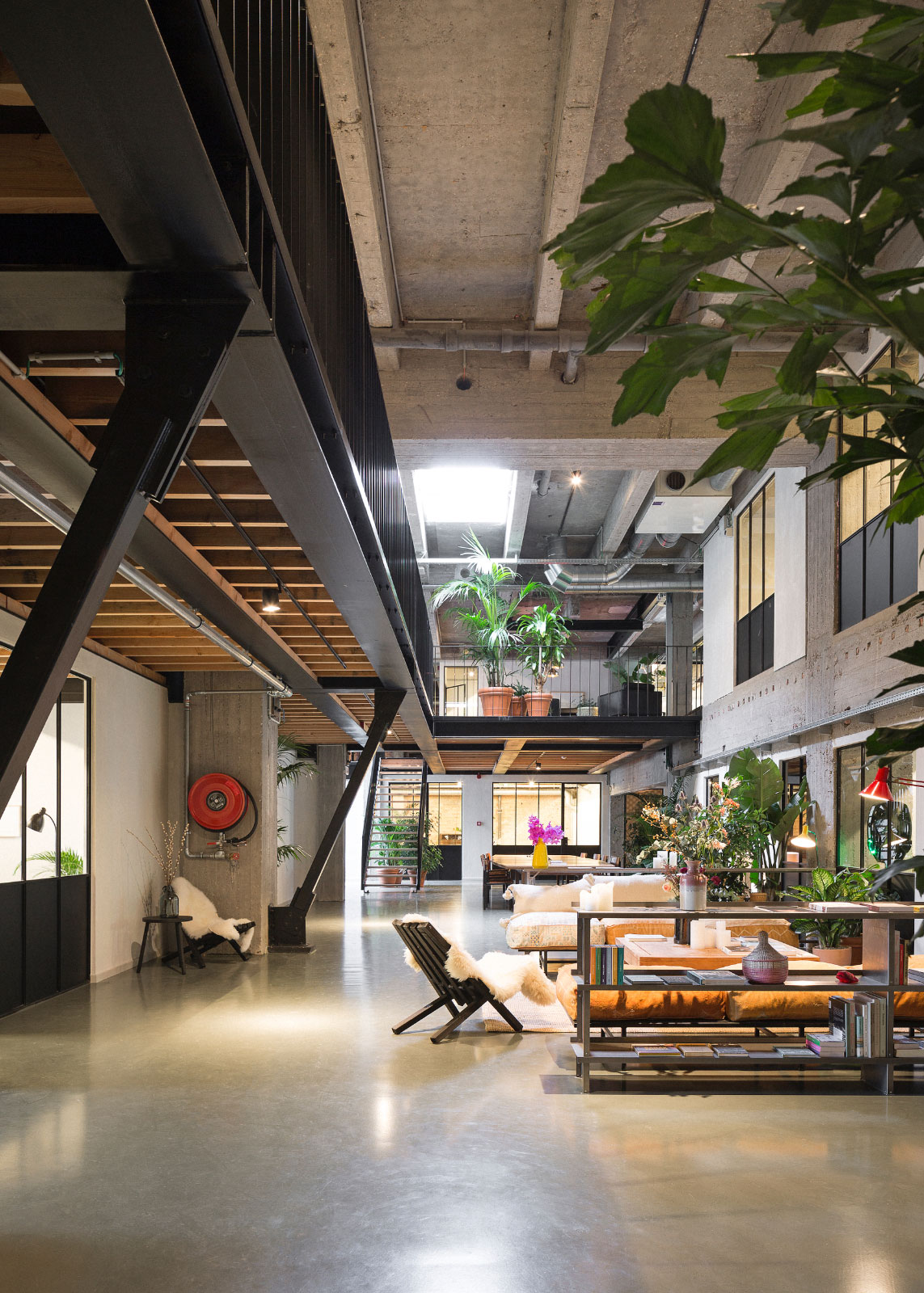
Photo by Frederik Vercruysse.
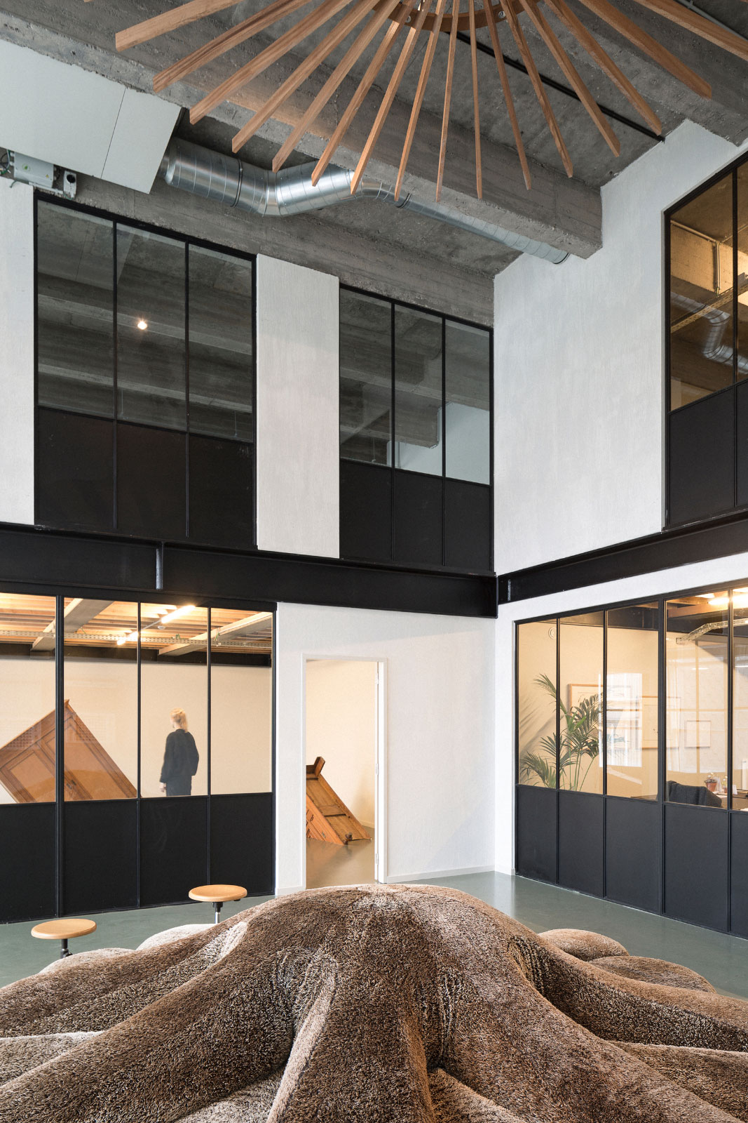
Photo by Frederik Vercruysse.
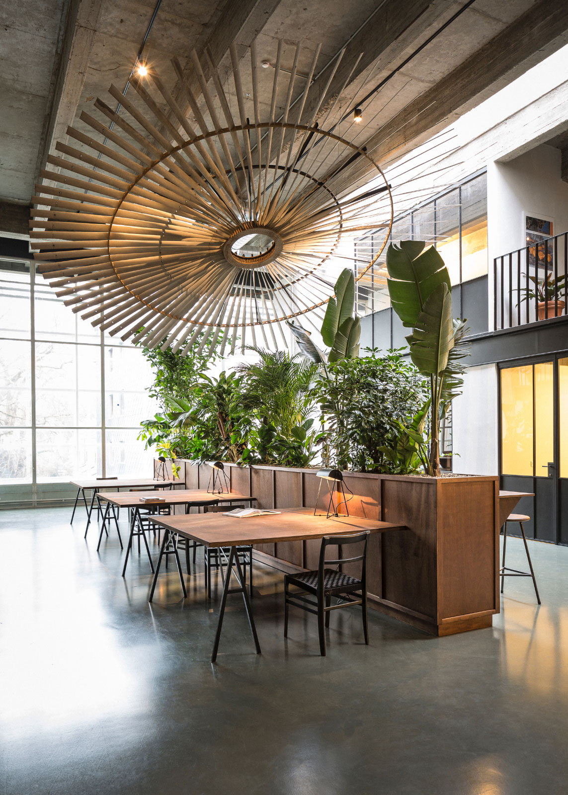
Photo by Frederik Vercruysse.
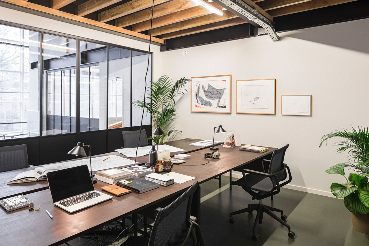
Photo by Frederik Vercruysse.
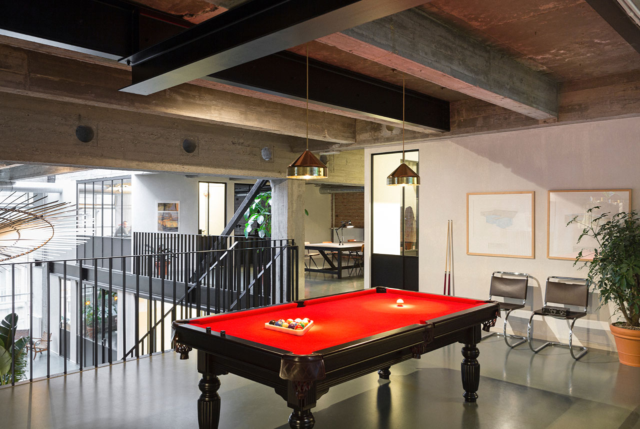
Photo by Frederik Vercruysse.
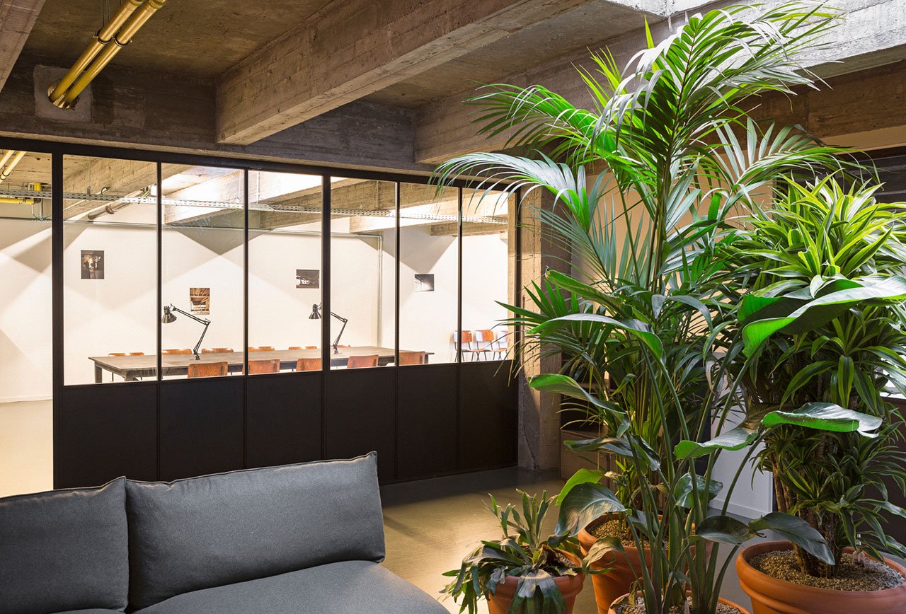
Photo by Frederik Vercruysse.
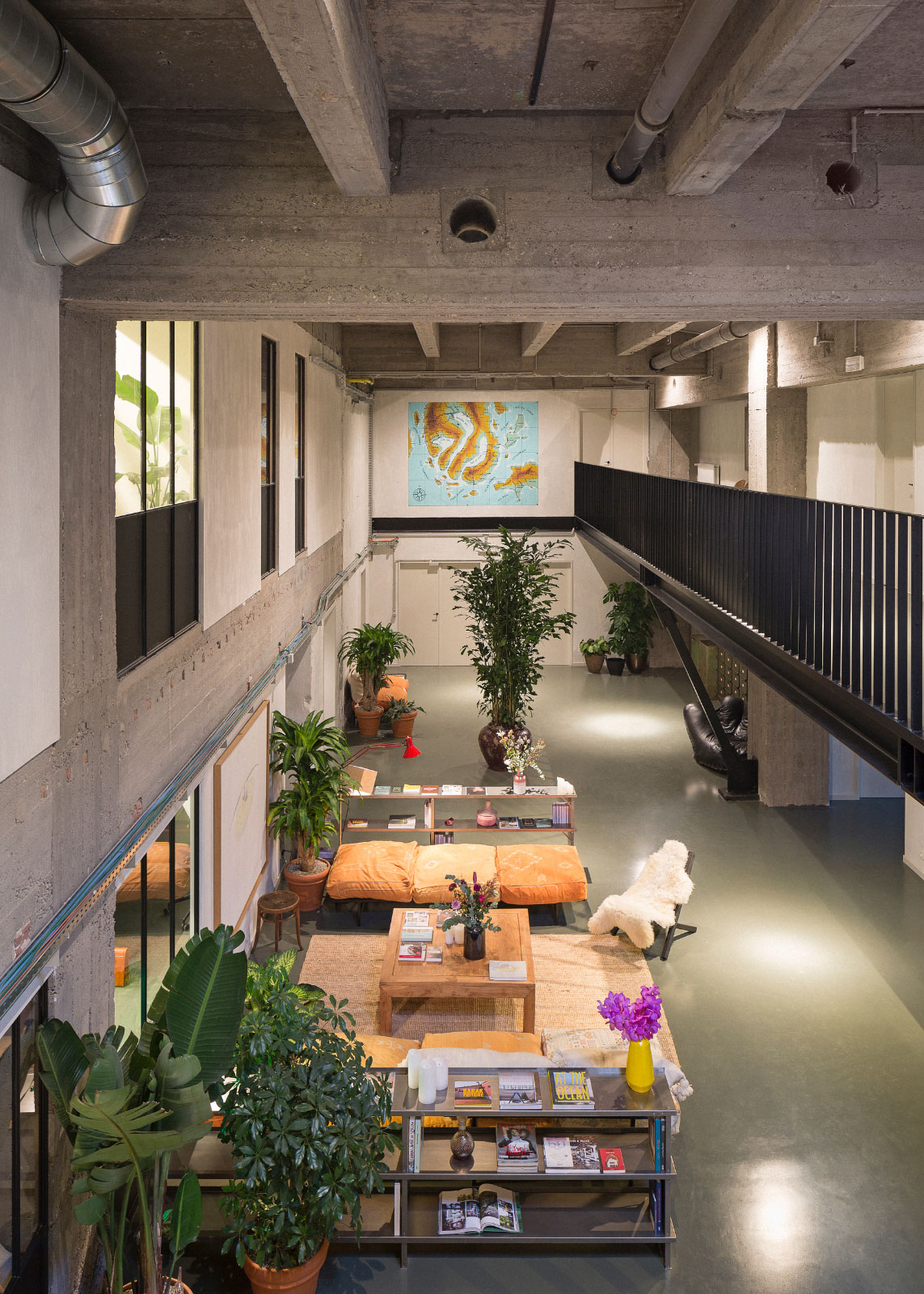
Photo by Frederik Vercruysse.
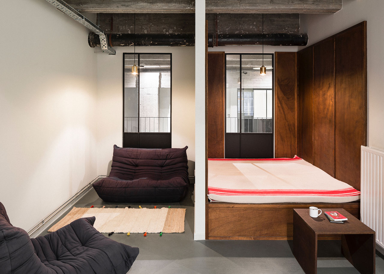
Photo by Frederik Vercruysse.
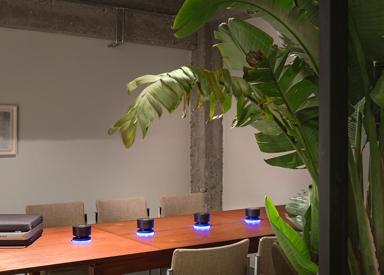
Photo by Frederik Vercruysse.
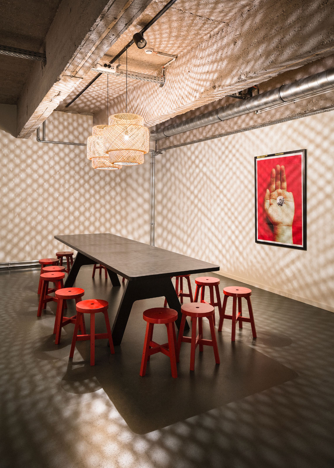
Photo by Frederik Vercruysse.
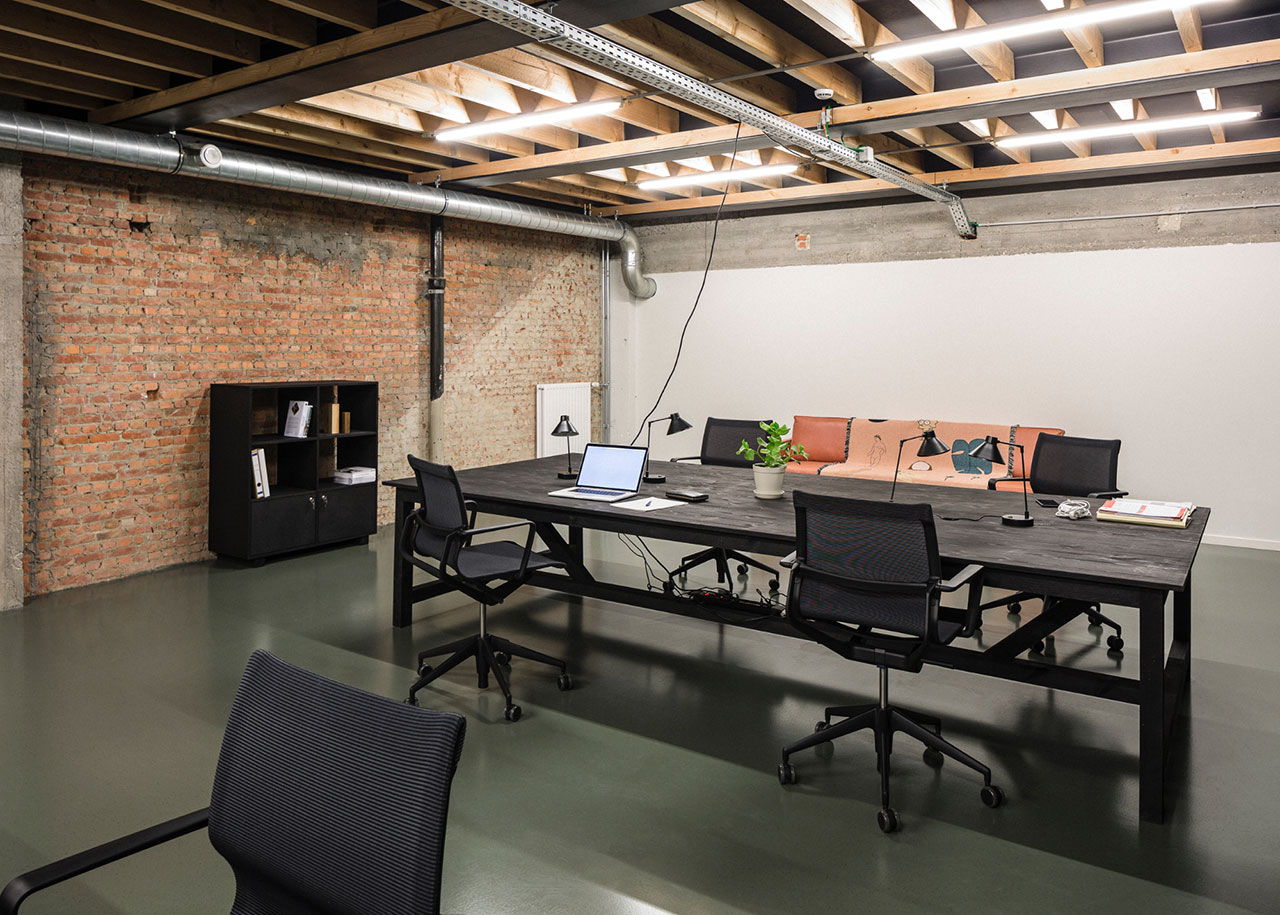
Photo by Frederik Vercruysse.
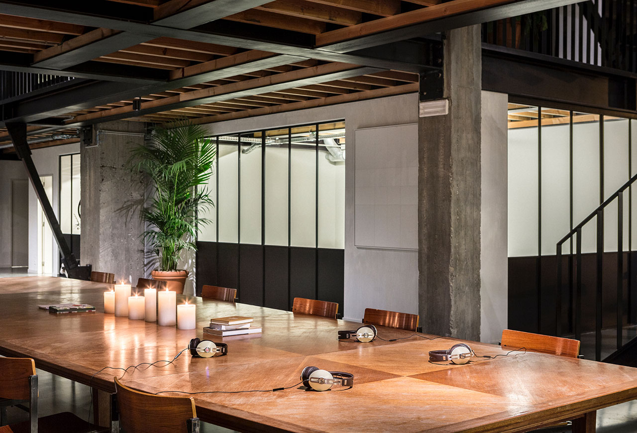
Photo by Frederik Vercruysse.
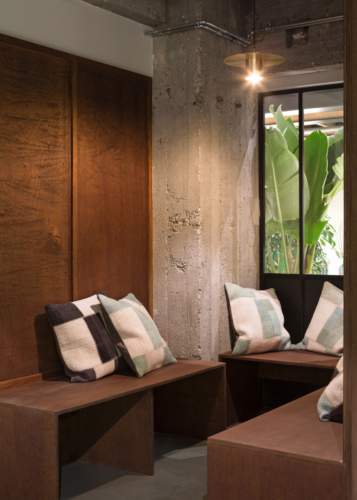
Photo by Frederik Vercruysse.
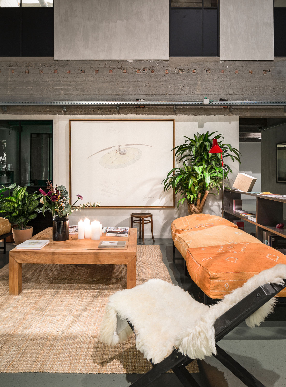
Photo by Frederik Vercruysse.
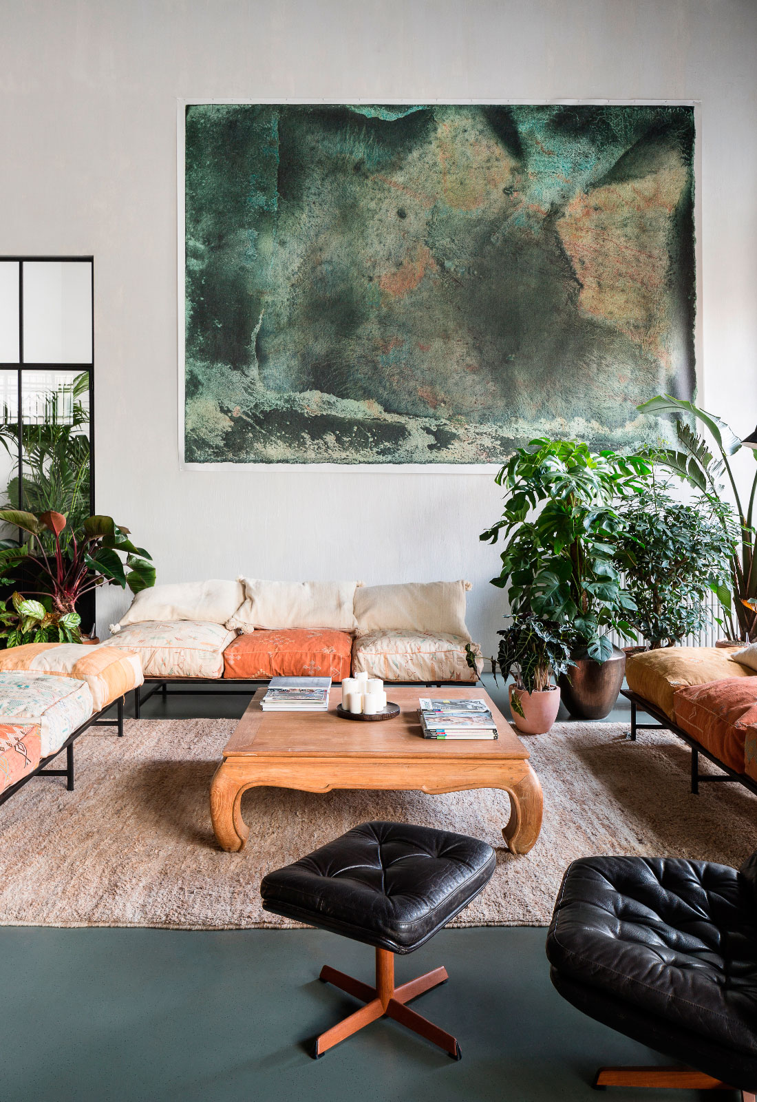
Photo by Frederik Vercruysse.
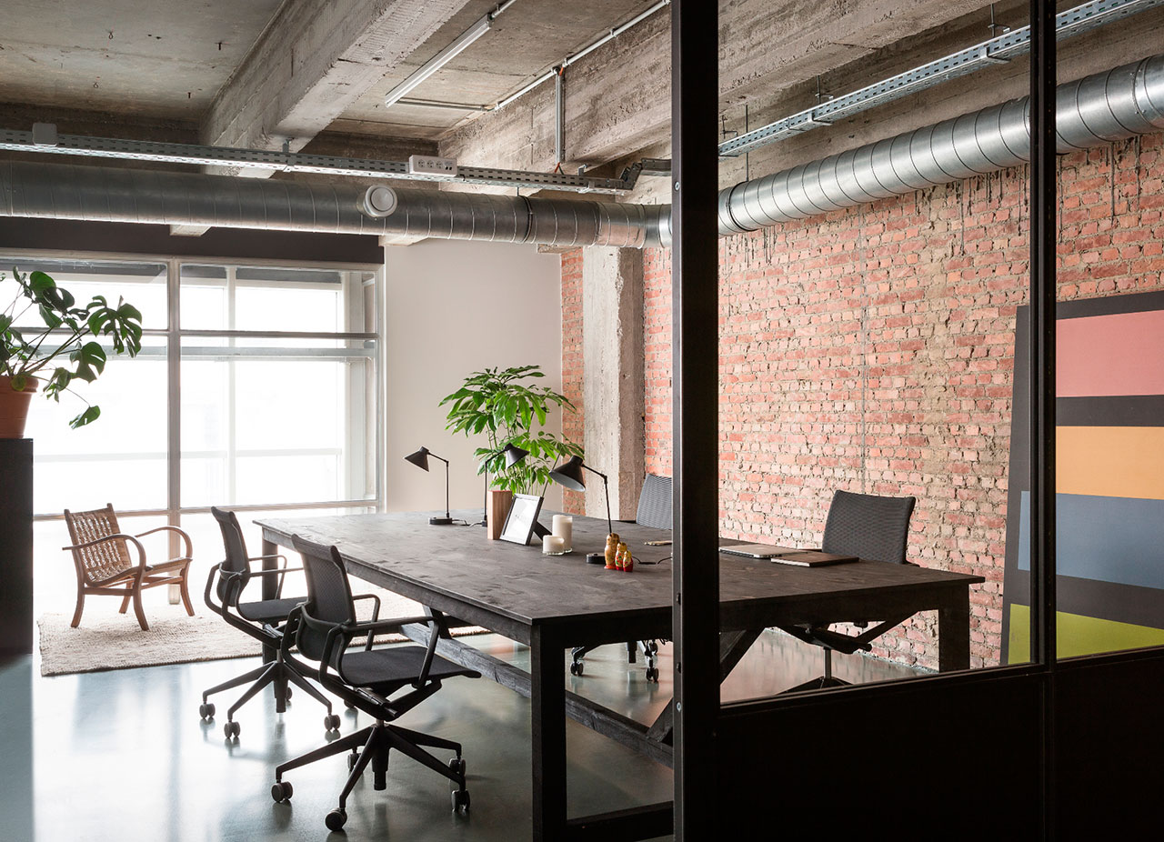
Photo by Frederik Vercruysse.


