The Fondazione Prada in Milan: OMA Architect Federico Pompignoli Talks to Yatzer
Words by Sara Panagiotopoulou
Location
Milan, Italy
The Fondazione Prada in Milan: OMA Architect Federico Pompignoli Talks to Yatzer
Words by Sara Panagiotopoulou
Milan, Italy
Milan, Italy
Location
Ever since its founding in 1993, the Fondazione Prada has examined and celebrated the way people use ideas as starting points for creativity in art, cinema, music, literature, philosophy and science. Its new headquarters in Milan, designed by Rem Koolhaas’ architecture firm, OMA, has given the Fondazione a permanent cultural complex to house its engaging list of projects and initiatives which focus on art and culture in their many varied manifestations.
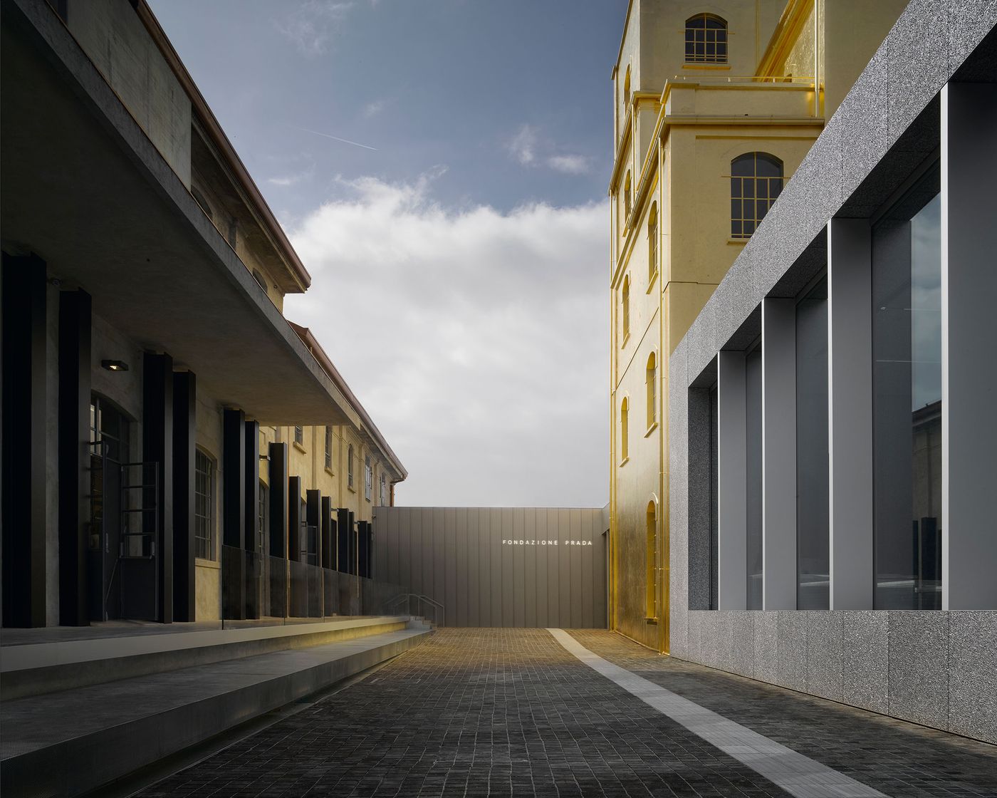
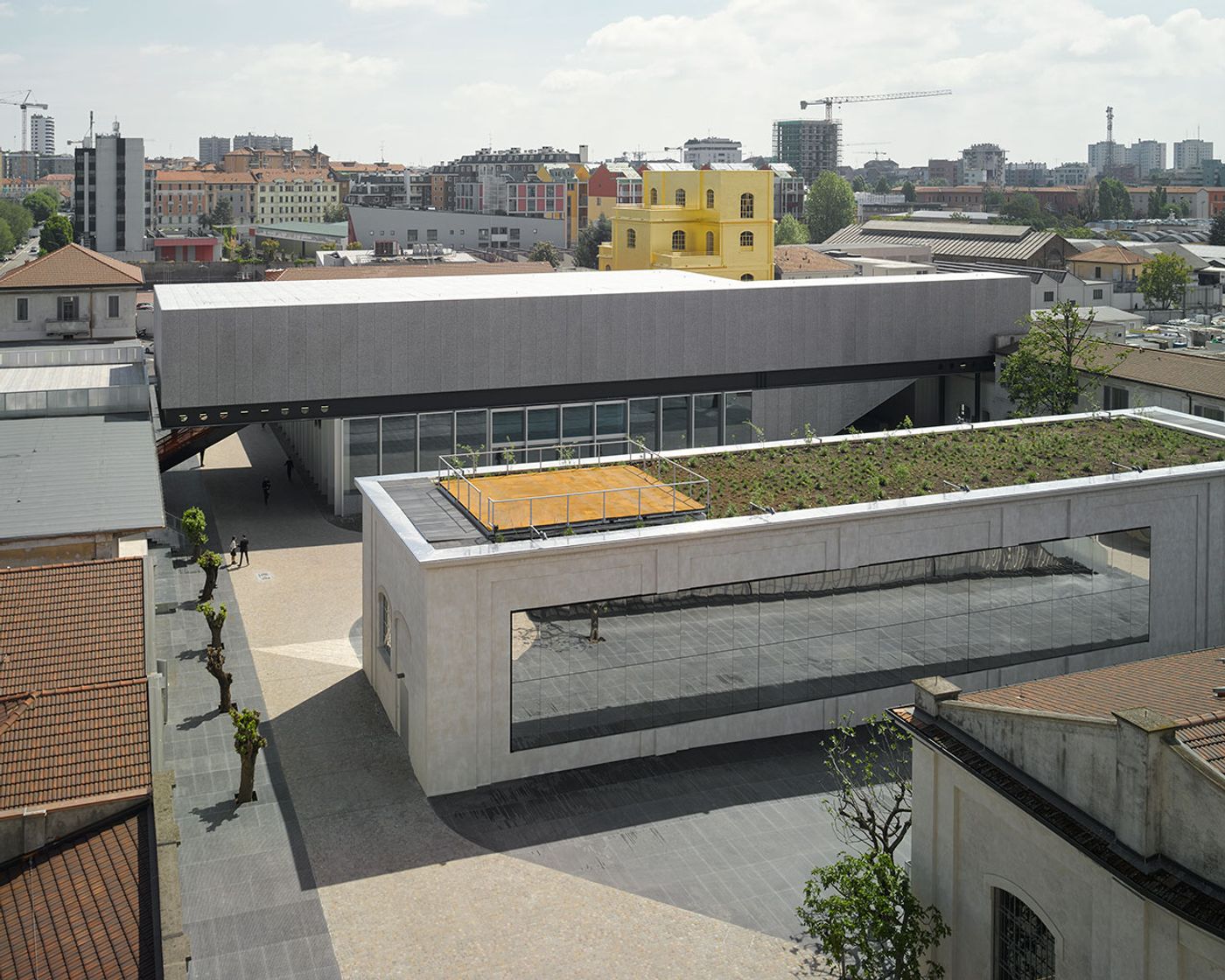
Dating back to the 1910s, this former distillery complex has been transformed—led by OMA’s partners, Rem Koolhaas and Chris Van Duijn and Project Leader, Federico Pompignoli—who expertly and inventively combined seven pre-existing buildings with three new structures: the partially sunken, mirror-clad Cinema; the Podium, a gallery for hosting temporary exhibitions which was constructed around the 24 karat gold-leafed, Haunted House; and the Tower (still under construction). Perhaps an ode to the playful theatricality that Prada is known for, one of the pre-existing buildings also houses the Bar Luce, a mid-century inspired Milanese café which was designed by celebrated film director and writer, Wes Anderson, and has been likened to a set from one of his iconic movies. The combination of the above has resulted in a reinvented campus that envelops its visitors and has taken the skill of displaying art to a whole new level.
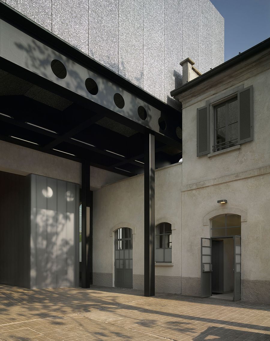
New Milan venue of Fondazione Prada
Architectural project by OMA
Photo: Bas Princen
2015
Courtesy Fondazione Prada.
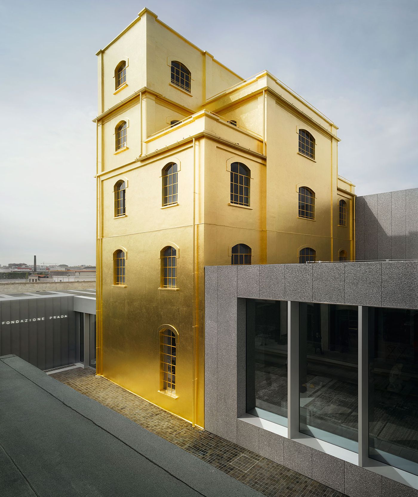
New Milan venue of Fondazione Prada
Architectural project by OMA
Photo: Bas Princen
2015
Courtesy Fondazione Prada.
To achieve this, OMA first studied the existing buildings and spatial layout in order to ascertain what exactly was missing from their vision. All the new buildings that they subsequently added were designed to effortlessly fit alongside the pre-existing structures. Hence, visitors to the Fondazione won’t notice the age difference, per se, between a new building and an old one but instead will be sure to be engaged by the non-linear layout of the architecture itself and in so doing be encouraged to curate their own path around the exhibitions. This orchestrated miscellany of spaces has resulted in the creation of a new way to exhibit art, wherein the Fondazione complex itself has become as fascinating to examine as the collections of artworks it houses.
We spoke to Federico Pompignoli, OMA’s Project Leader for the Fondazione Prada Project, for a special behind-the-scenes look at the creation of a modern masterpiece and at one of the greatest creative collaborations of our time: that between the legendary house of Prada and OMA.
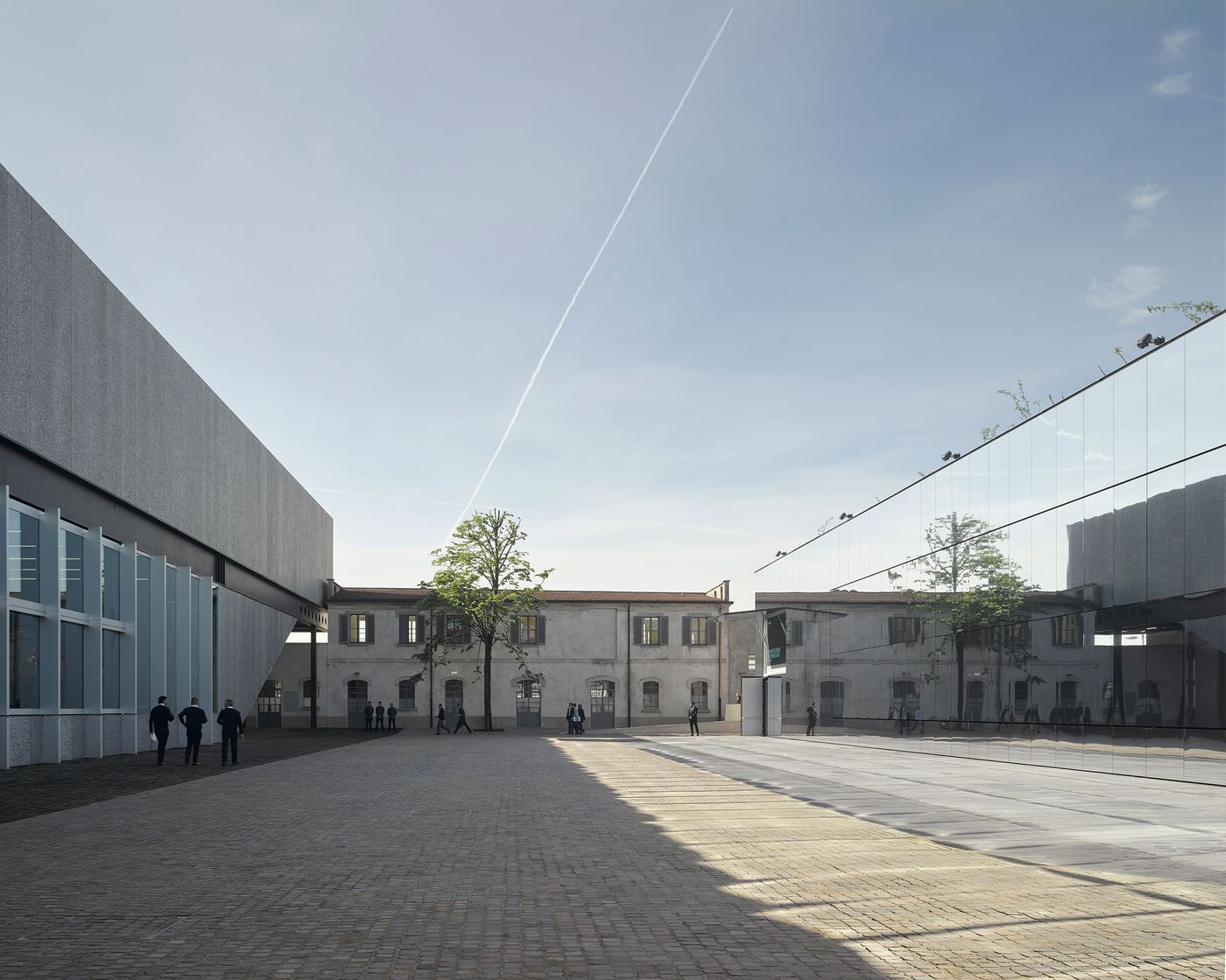
New Milan venue of Fondazione Prada
Architectural project by OMA
Photo: Bas Princen
2015
Courtesy Fondazione Prada.

New Milan venue of Fondazione Prada
Architectural project by OMA
Photo: Bas Princen
2015
Courtesy Fondazione Prada.
If we took a walk around Fondazione Prada with you, what would be the three elements that you’d make a point of highlighting?
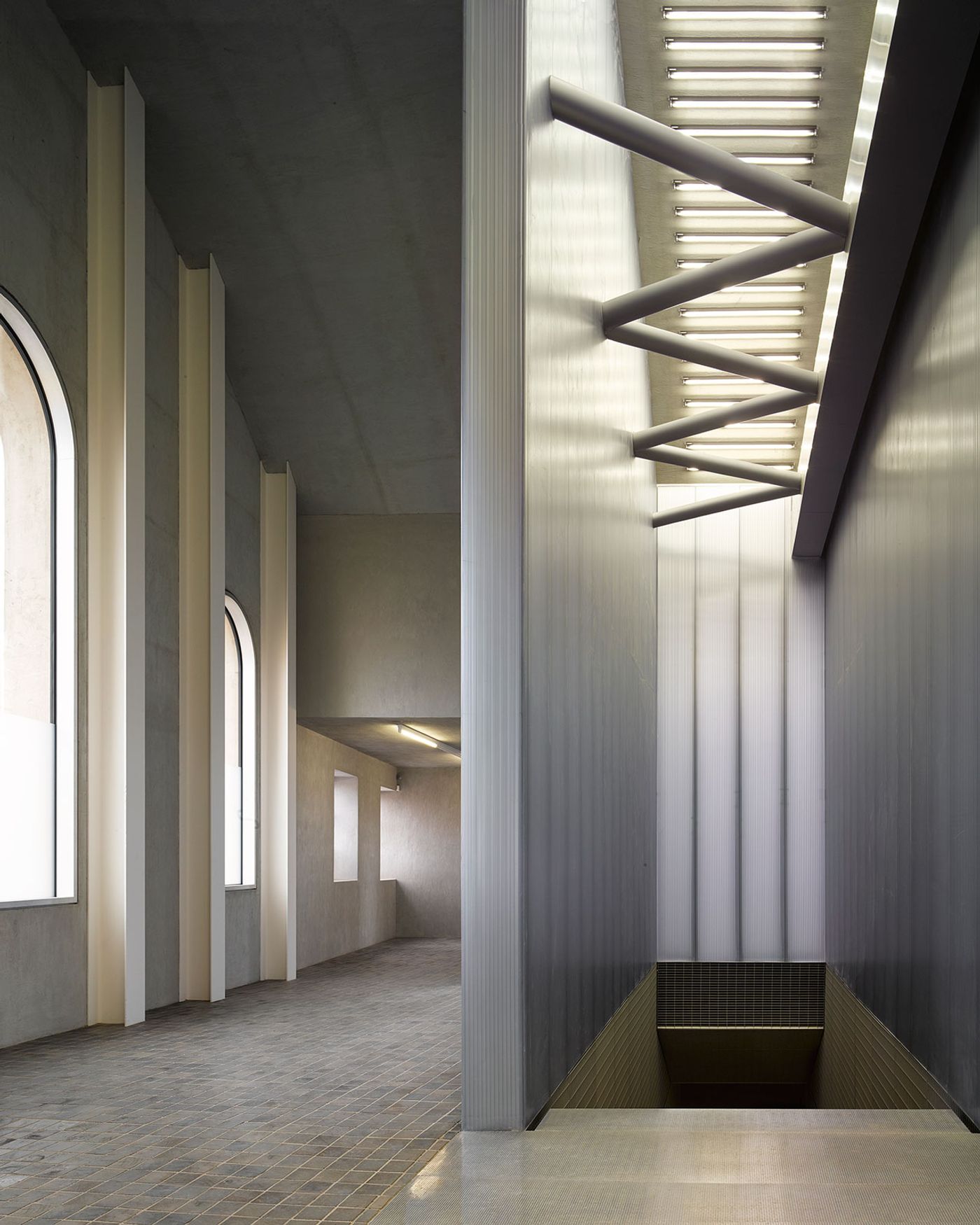
1. The space named Canopy, which is an outdoor space covered by an existing vaulted structure where many different elements clash against one another in an apparent way; this small space embodies the overall concept that is generated by the whole museum establishing it as a repertoire of different conditions which confront each other.
2. The over-scaled dimension of the Tower building, which sticks out in comparison to the other buildings. Somehow, art feels different on the ground than in the air, and what is unique about this structure is the varied effect it has on the artists’ content because of the different levels; for that reason, when it is completed, each of the Tower’s nine stories will have progressively taller floors. The Tower’s height will also establish the official interaction between the museum and Milan; with its generous glass walls, the tower will reveal the presence of the art contained in its galleries from afar, in a continuous dialogue with the city.
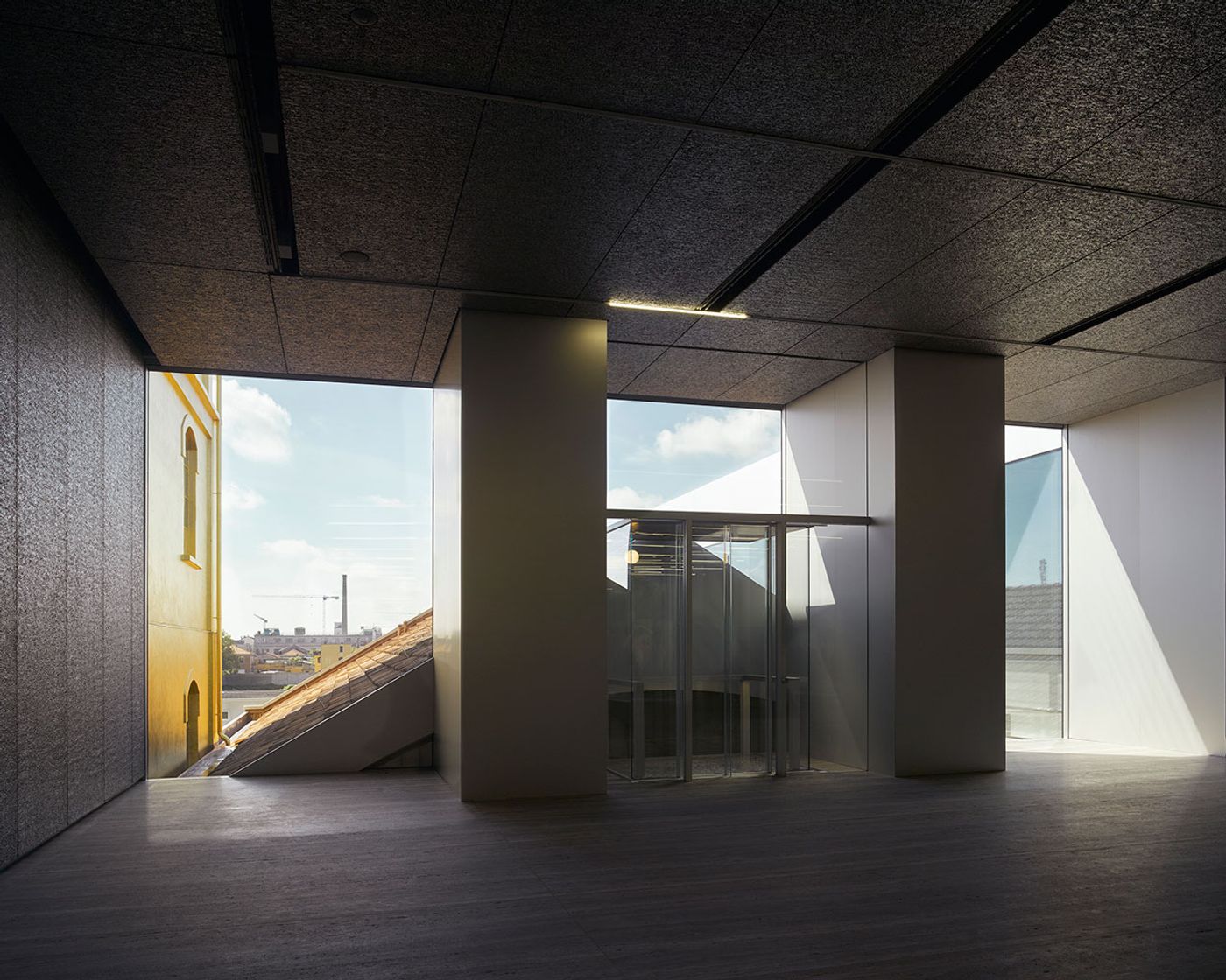
3. The ambiguity between what one can really see and the perception of what one sees while standing in the Podium’s gallery, looking outside. It’s a 3-sided glazed gallery placed next to the main gate, surrounded by existing buildings and the cinema building’s mirror façade.
By introducing so many spatial variables, the complexity of the architecture promotes an unstable condition where art and architecture benefit from each other’s challenges.
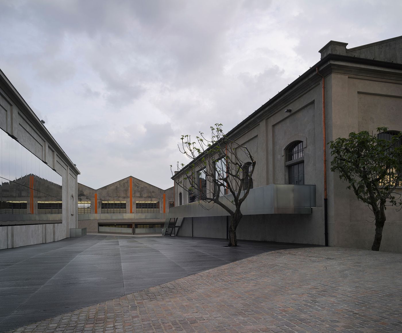
New Milan venue of Fondazione Prada
Architectural project by OMA
Photo: Bas Princen
2015
Courtesy Fondazione Prada.
New Milan venue of Fondazione Prada
Architectural project by OMA
Photo: Bas Princen
2015
Courtesy Fondazione Prada.
What did you keep at the forefront of your thoughts during the design process regarding the buildings and their relationship to the art that they house?
We thought in terms of real programs and real consequences of what functionality is/means. For us, buildings are tools and an important part of each of our tools is that it opens space for experimentation. A good tool can be used in many different ways. Our goal is not to create art works but rather intelligent projects and functional buildings, which are able to interpret or forecast future needs. We also thought that art should not be considered as a sacral entity to be admired based on a generic/pre-organized set up, but considered it as a factor which will be engaged by the architecture (existing and new).
New Milan venue of Fondazione Prada
Architectural project by OMA
Photo: Bas Princen
2015
Courtesy Fondazione Prada.
New Milan venue of Fondazione Prada
Architectural project by OMA
Photo: Bas Princen
2015
Courtesy Fondazione Prada.
Regarding the gold tower: what is the story behind it? How did that finishing idea come into being? What statement were you aiming to make, if indeed you were trying to make a statement?
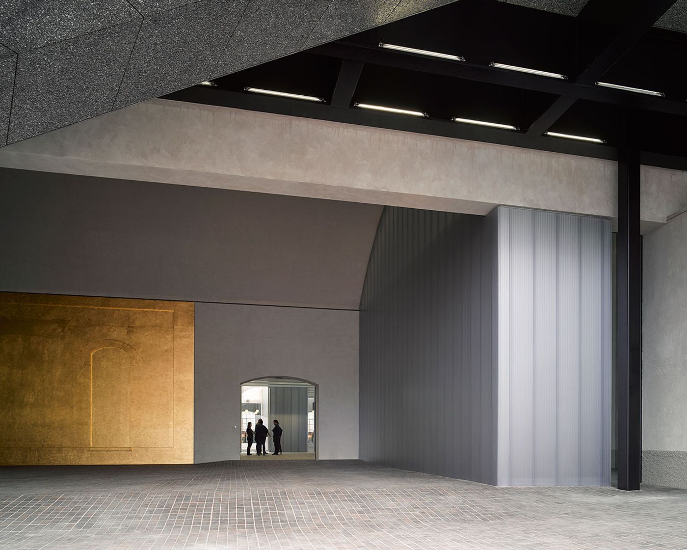
The golden tower’s story began with a nick name Ms. Prada gave to it for its mysterious and spectral charm and presence within the compound. The “haunted house” is an existing building which the client was genuinely attracted to, so much so in fact that she asked us to identify/distinguish it as a special object. Since we wanted to keep the existing buildings untouched from a volumetric point of view, we decided to work on the cladding of the facades with a material that had the ability to radically change the perception of it. We tried many options, from colour paints to mirror sheets, ending up with real 24 karat gold leaf. This solution was chosen because it is able to challenge the existing building independently from its modest architectural language, and because the gold has transformative properties too: even on an overcast day, this gilded beacon casts a warm aura over the entire site. It isn’t only the established listed buildings that deserve attention.
New Milan venue of Fondazione Prada
Architectural project by OMA
Photo: Bas Princen
2015
Courtesy Fondazione Prada.
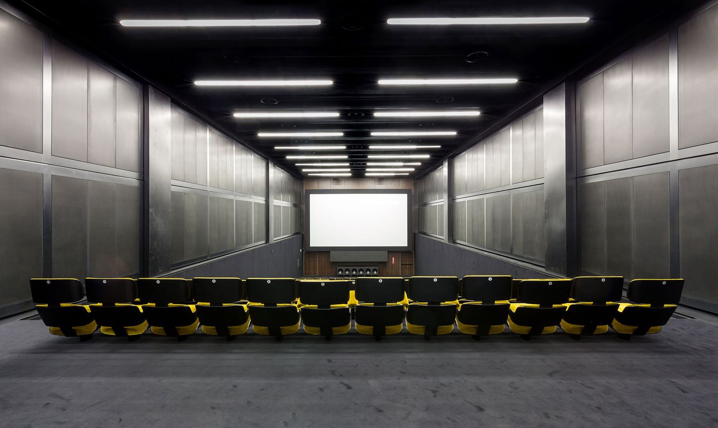
Fondazione Prada Milano
Cinema
Photo Delfino Sisto Legnani
Courtesy Fondazione Prada.
OMA and Prada have joined collaborative forces on many projects throughout the years—from flagship stores, to shows. How did this long-term collaboration occur and also, according to your estimate, is there a common thread that runs through all of Prada and OMA’s collaborations?
The collaboration between OMA and Prada dates back to the end of the 90’s, when the fashion brand, facing a moment of huge expansion, decided to promote a series of new special stores called “epicentres.” These were seen as devices through which to renew the brand by counteracting and destabilizing any preconceived notions of what Prada was, did, or would have become. The epicentre store functions as a conceptual window: a medium to broadcast future directions that positively challenges the larger mass of typical stores.
Following this concept, OMA designed the New York and the Los Angeles epicentres as starting projects; nowadays, OMA is in charge of the catwalk designs for all of the Prada and Miu Miu fashion shows, for a vast number of special projects/events like the Prada transformer in Seoul, the 24h museum in Paris, the Prada party in Valencia as well as many art exhibitions throughout the world. The Fondazione Prada however is the biggest project ever built so far by Prada.
Of course, such a prolific collaboration calls for and creates a mutual inspiration/contamination. Through Prada, OMA was in close dialogue with Italian culture, traditions and obsessions, so it has enabled a deep engagement between the two cultures. What was implicit for OMA from the beginning was to discover the efficiency of fashion; what we think is incredible is how fashion can, in eight hours, organize something sublime when for us it takes eight years.
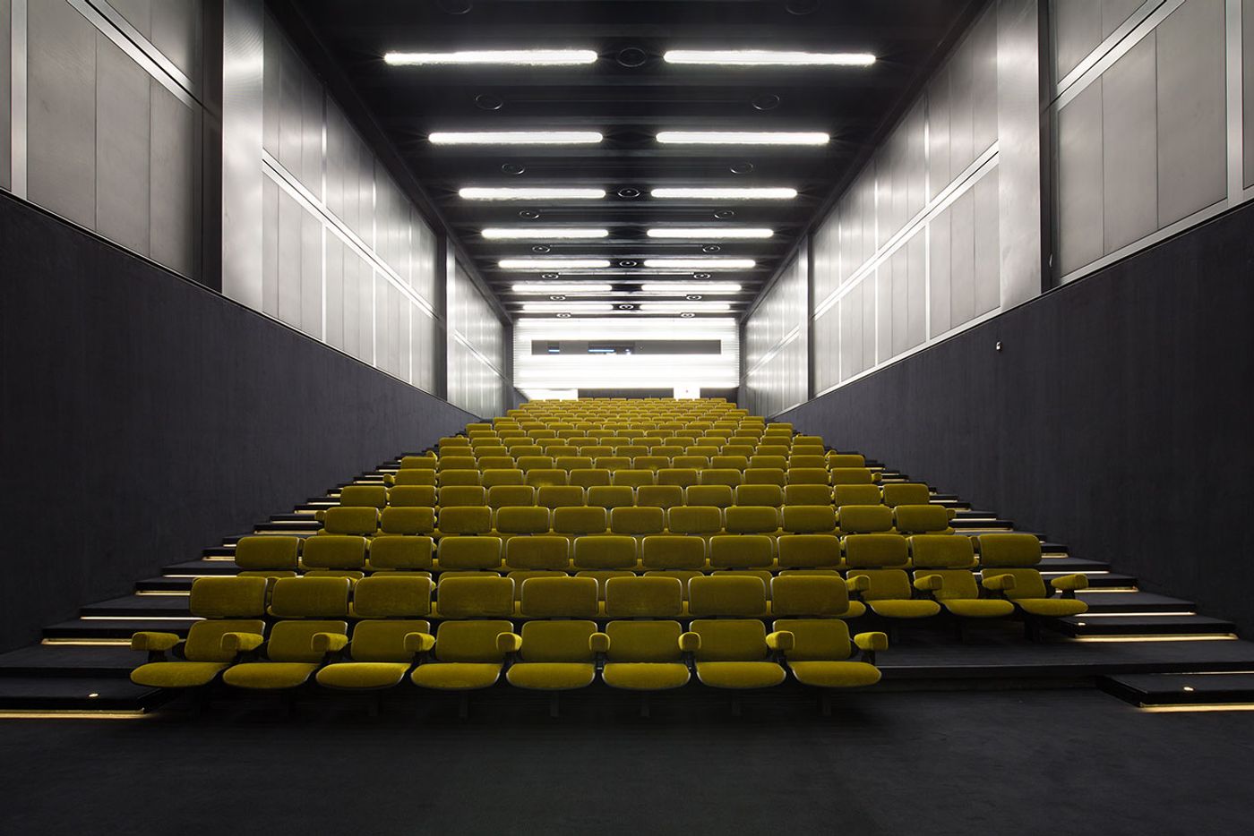
Fondazione Prada Milano
Cinema
Photo Delfino Sisto Legnani
Courtesy Fondazione Prada.
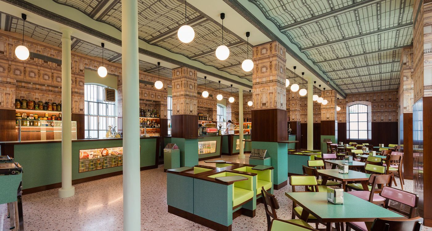
Bar Luce
Designed by Wes Anderson
Fondazione Prada Milano
2015
Photo Attilio Maranzano
Courtesy Fondazione Prada.
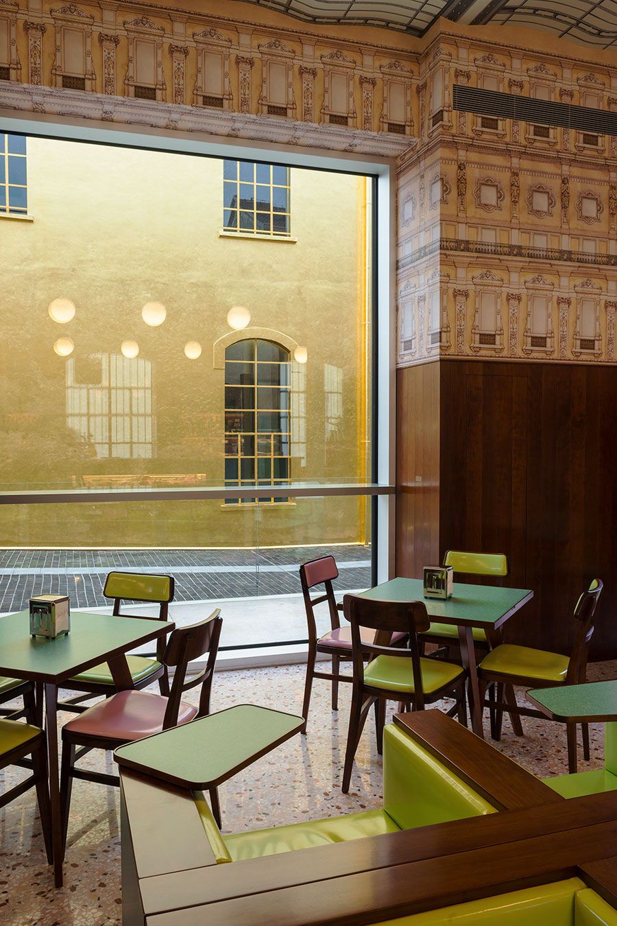
Bar Luce
Designed by Wes Anderson
Fondazione Prada Milano
2015
Photo Attilio Maranzano
Courtesy Fondazione Prada.
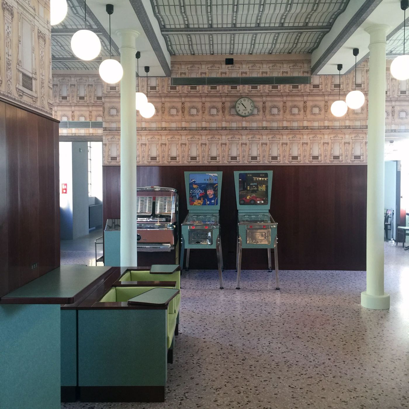
Bar Luce
Designed by Wes Anderson
Fondazione Prada Milano
2015
Photo Costas Voyatzis
Courtesy Yatzerland Ltd.
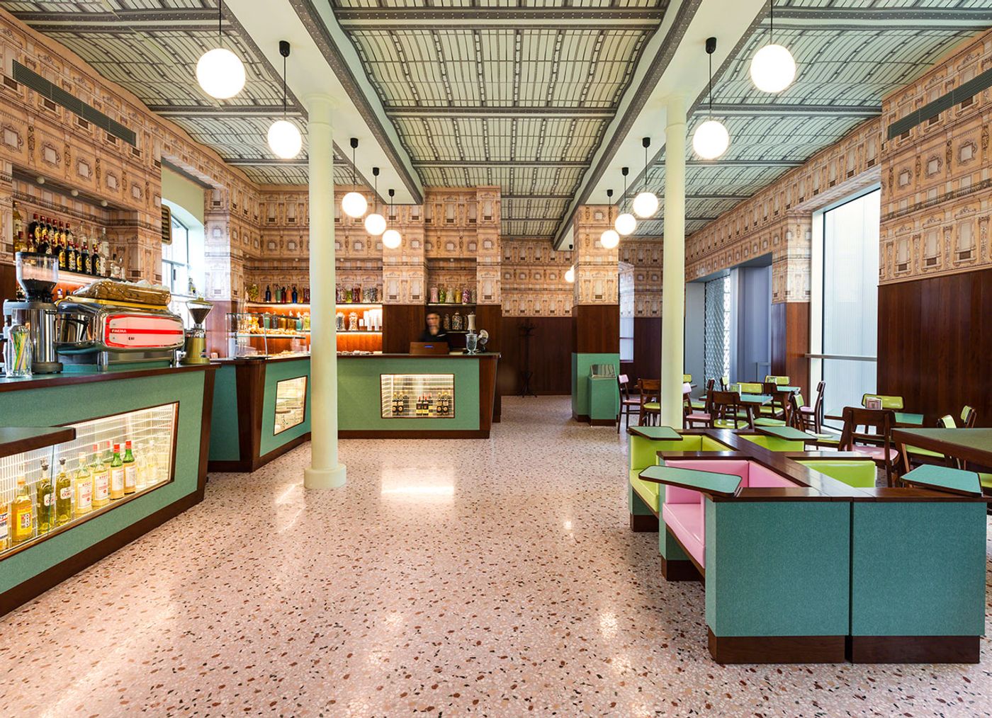
Bar Luce
Designed by Wes Anderson
Fondazione Prada Milano
2015
Photo Attilio Maranzano
Courtesy Fondazione Prada.
