110 Rooms: A Modern Spin on Barcelona's Housing Block
Words by Yatzer
Location
Barcelona, Spain
110 Rooms: A Modern Spin on Barcelona's Housing Block
Words by Yatzer
Barcelona, Spain
Barcelona, Spain
Location
Located in Eixample, a historic district in central Barcelona, Spain, which is characterized by its octagonal blocks and strict grid of wide avenues, 110 Rooms is a new housing block by local architecture practice MAIO that celebrates the area’s 19th century housing typology in the context of 21st century design.Typically, buildings in Eixample are comprised of rooms of equal size, in a rigid yet fortuitous layout that has permitted their modifications during the last century without major architectural interventions. MAIO have retained this popular characteristic in their design of 110 Rooms which consists of as many, similarly sized rooms allowing the new apartments to be expanded or reduced according to the future needs of their inhabitants.
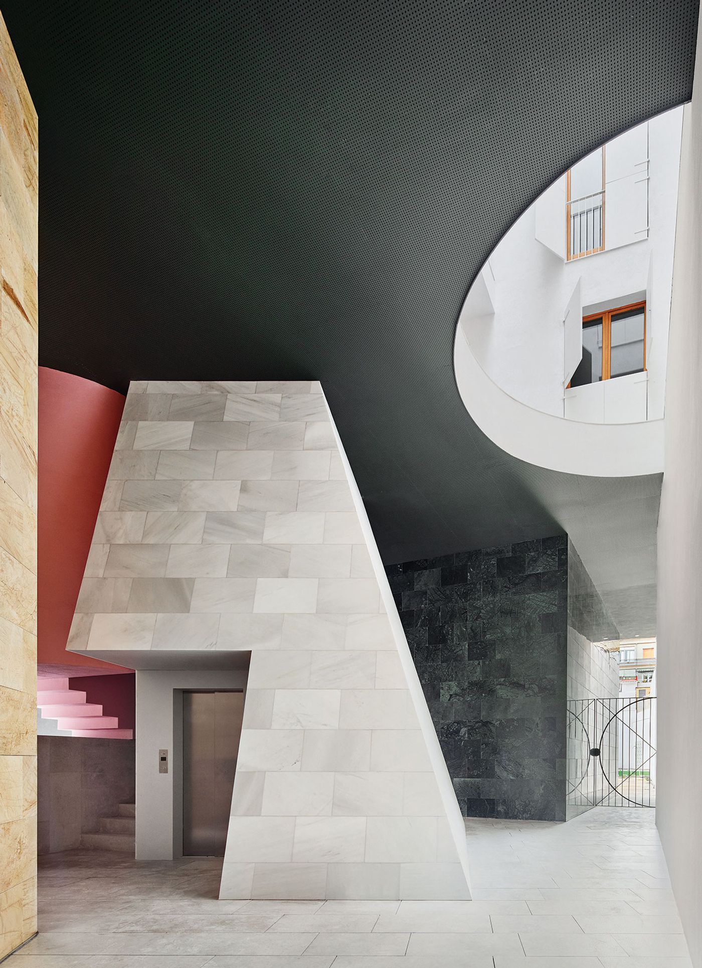
Photo by José Hevia.
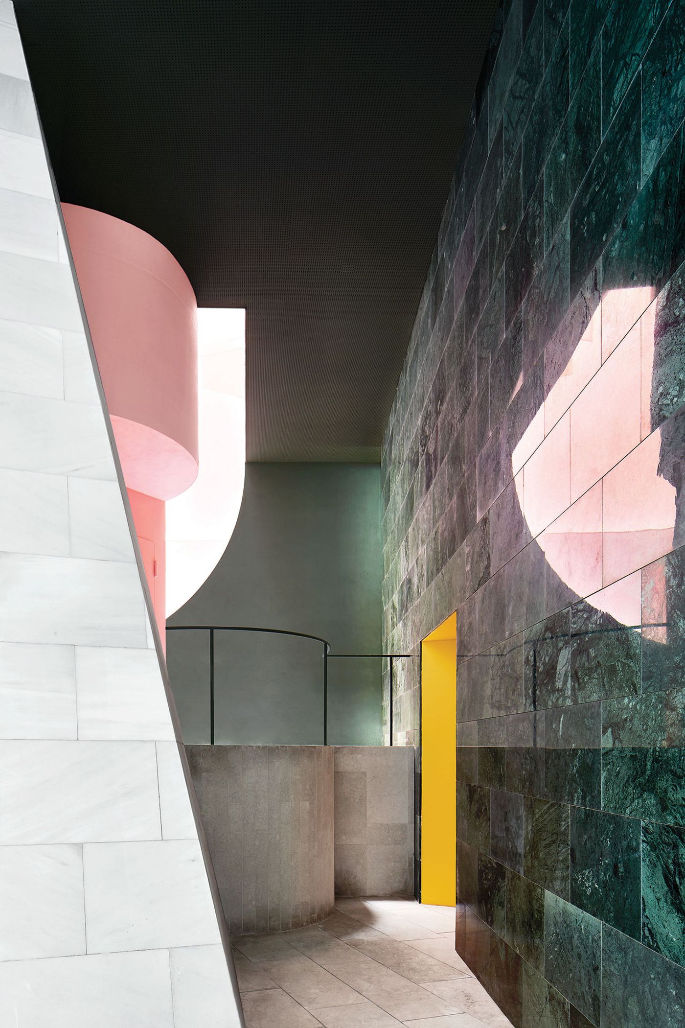
Photo by José Hevia.
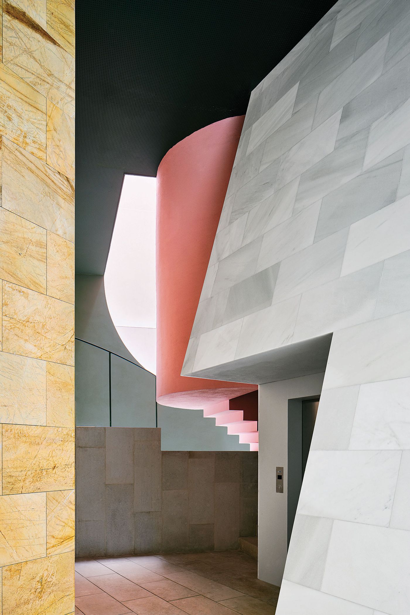
Photo by José Hevia.
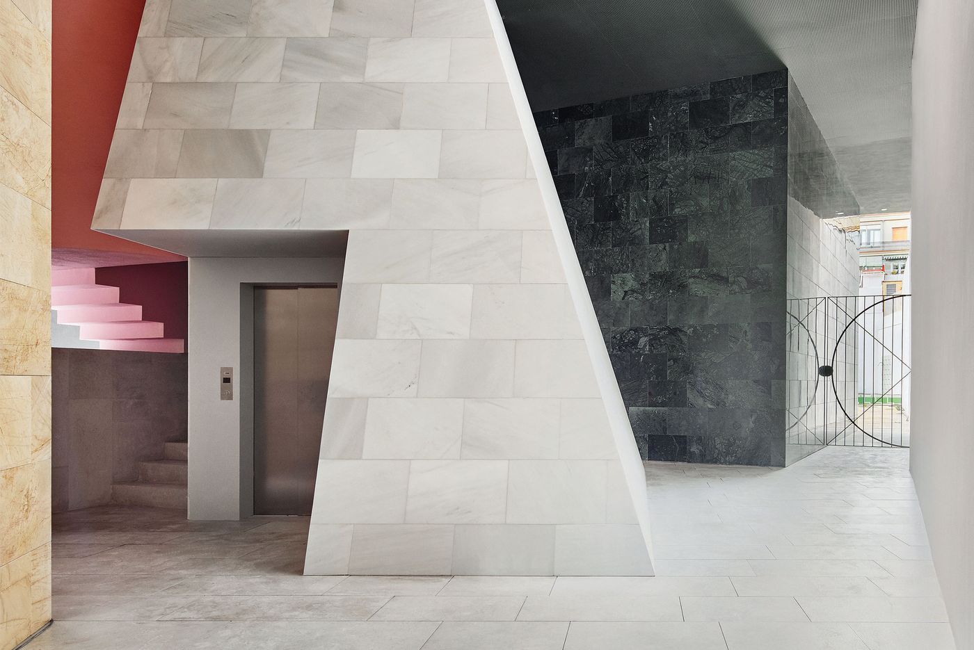
Eixample’s architectural language has also been the inspiration for the building’s ground floor entrance lobby. Designed for mixed usage, traditionally the ground floor spaces of that era were furnished with distinct furniture and large habitable objects which in MAIO’s design have been reinterpreted as oversized geometric volumes, each in its own distinct finish.
Conceived as an extension of the street, the semi-exterior space is playfully populated by a pentagonal prism of ochre stone, an imposing cube of black marble, and a grey truncated pyramid where the elevator can be found, as well as an elliptical extrusion containing the building’s stairwell that pops out in bright pink. The resulting topography is further enhanced by the geometric shadows cast by a semicircular roof cut-out flanking the circulation core at the centre of the building which allows both the rain and the sun to penetrate the hall.
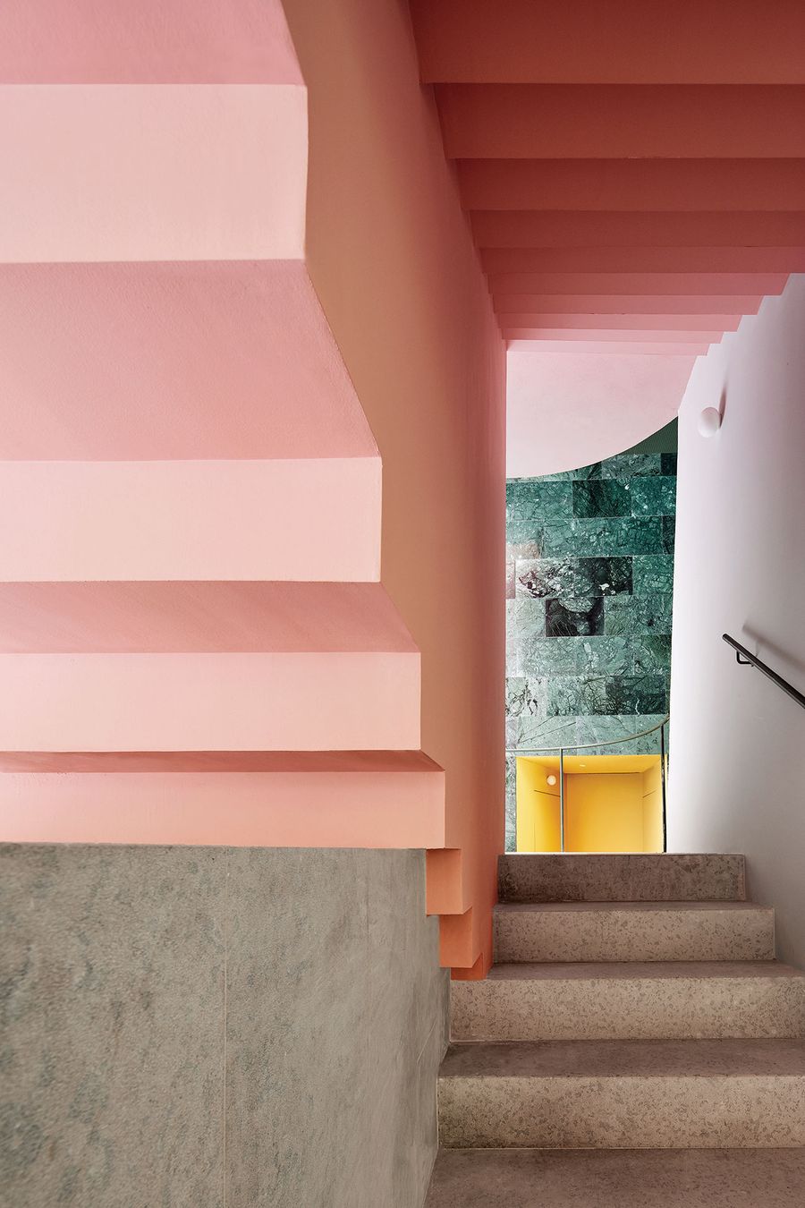
Photo by José Hevia.
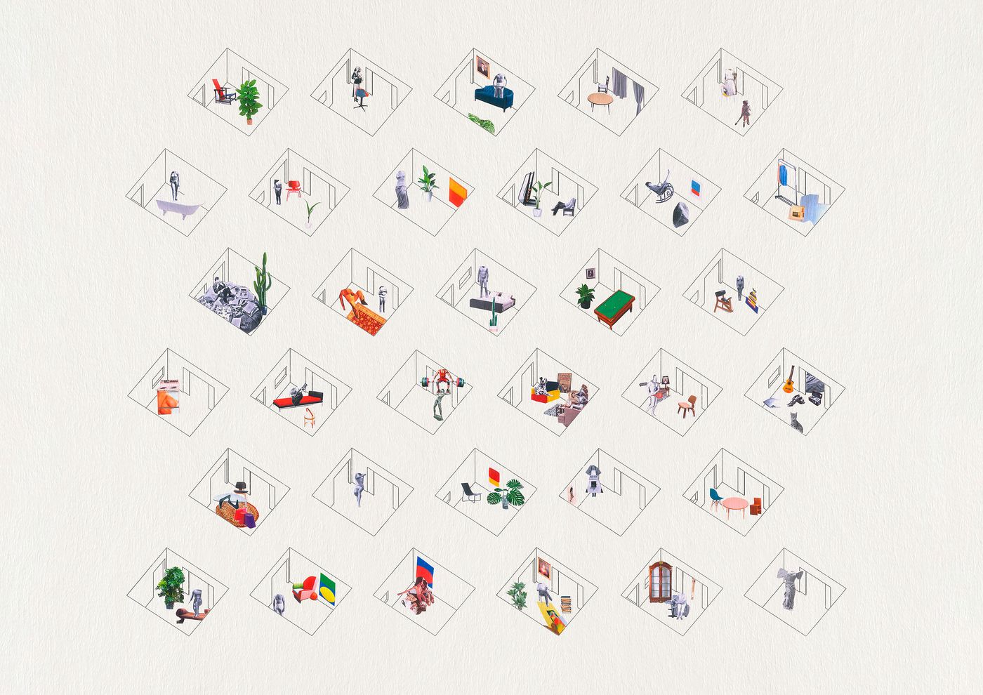
Single rooms drawing © MAIO.
Presently, there are four identical apartments of five rooms on each of the six floors, with two additional maisonettes contained in the black cube on the ground floor. Half of the apartments face the street on the front and half of them look onto the courtyard at the back of the building, with an exterior circulation zone in-between which is punctuated by the stairwell’s pink elliptical extrusion and the rectangular elevator shaft in grey marble. The apartments have no corridors and rely instead on a central room housing the kitchen—the hearth is after all the heart of the house—where the rest of the rooms are accessed from. Coupled with the central location of the bathrooms on either side of the kitchen, this layout provides great flexibility by allowing the peripheral rooms to be used as both living/dining rooms and bedrooms, as well as the ability to add rooms from the adjacent apartment.
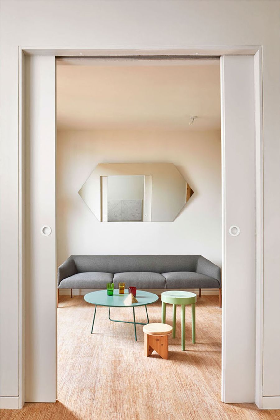
Photo by José Hevia.
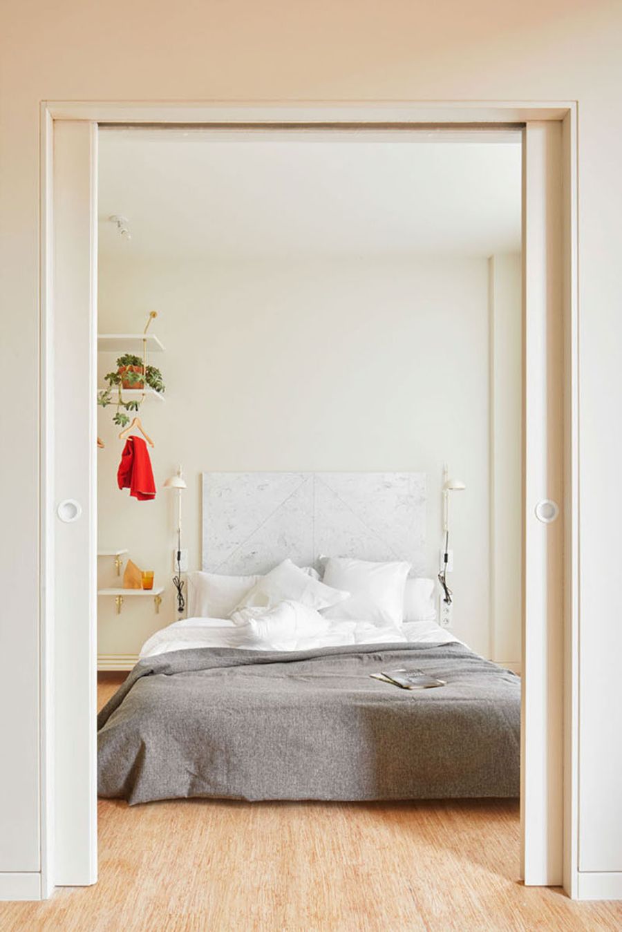
Photo by José Hevia.
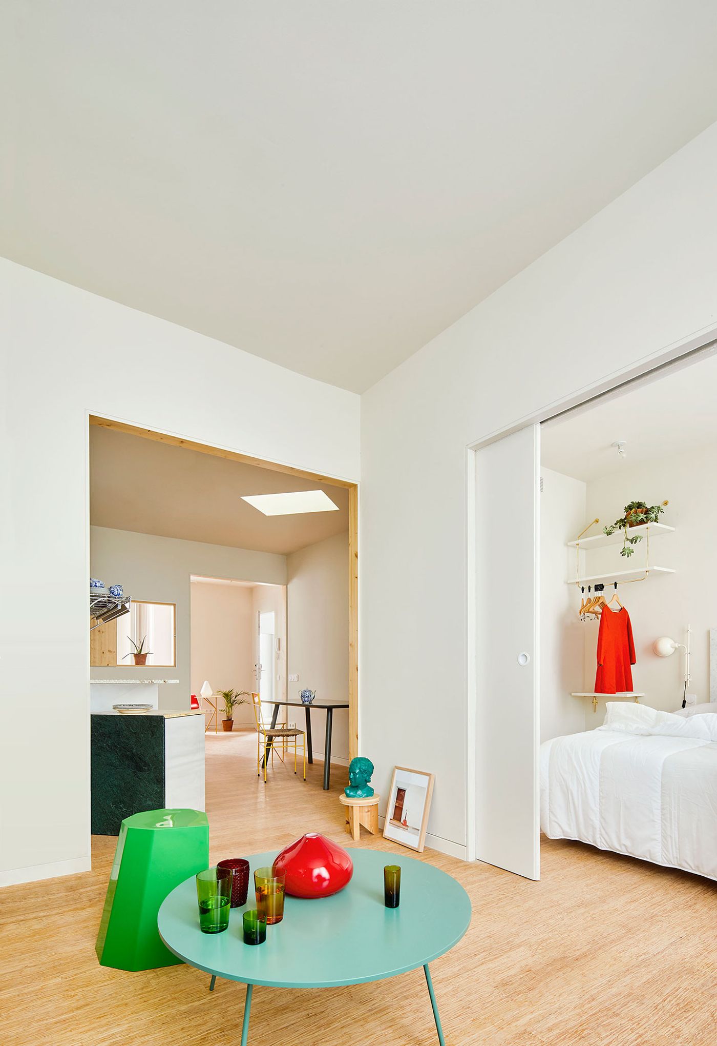
Photo by José Hevia.
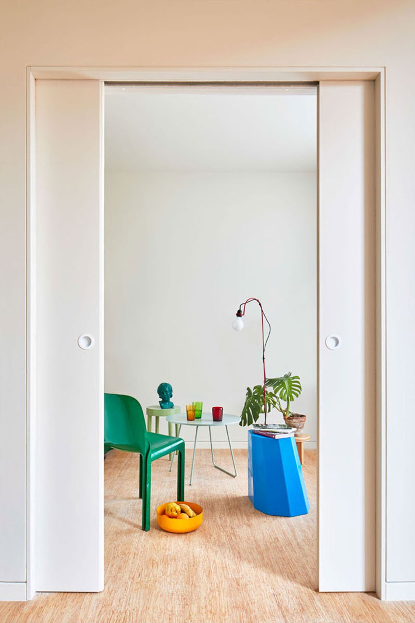
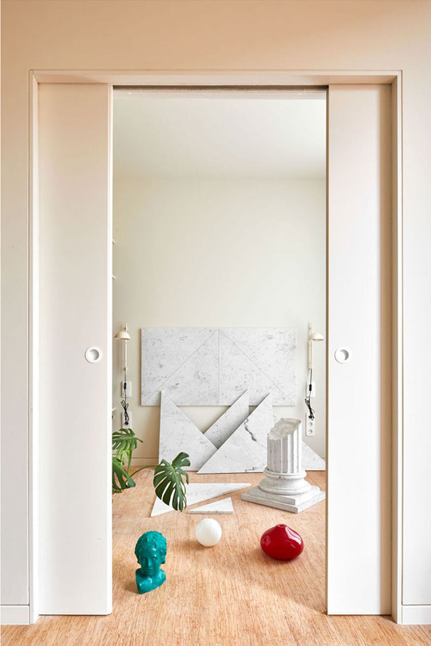
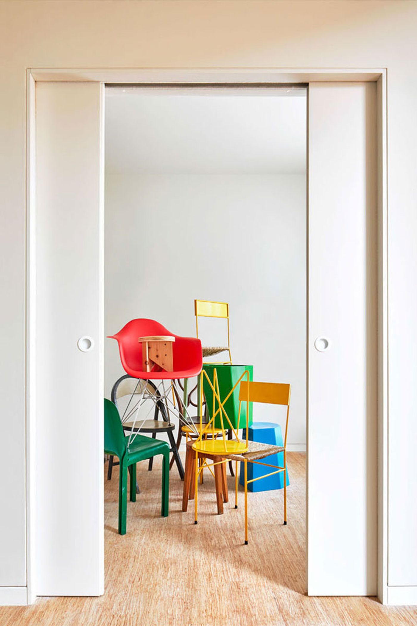
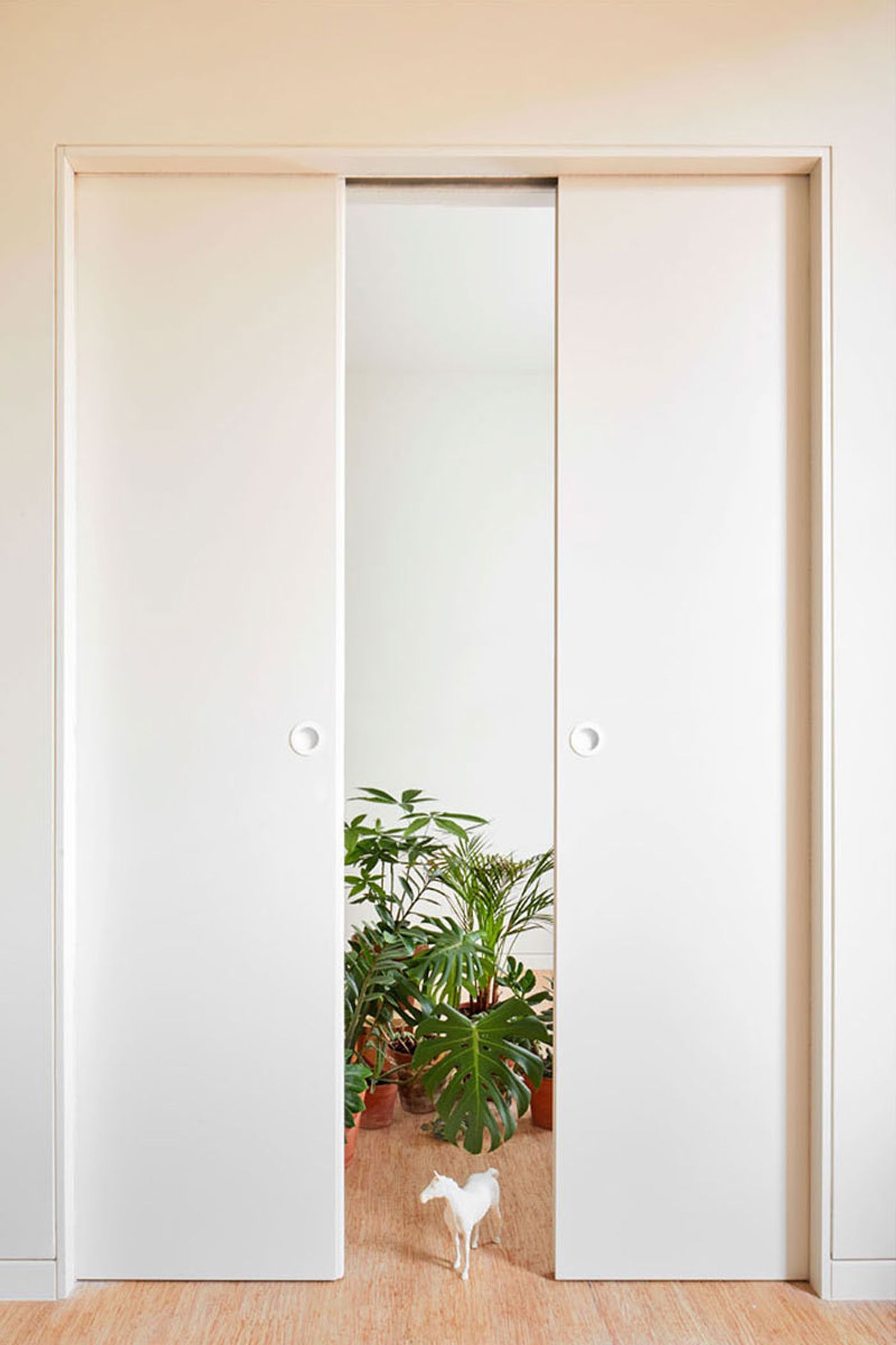
The apartments’ interior design has been designed as a blank canvas which the occupants can decorate, or not, to their taste. An almost exclusively white palette is softly complemented by the blond hues of the timber flooring whose finish is discretely picked up in the casing and shutters of selected internal doors and window openings. Meanwhile the use of double sliding doors that can disappear into the wall allow the rooms to be spatially united if desired.
Similarly to the building’s entrance lobby, the street façade has been fashioned according to the typical design of Eixample’s historic houses that features an orderly grid of tall, narrow windows with balconies and wooden shutters. This composition has been faithfully retained albeit rendered with a modernist sensibility that eschews ornamentation and excessive detailing in favour of clean-cut lines and a smooth surface of lime stucco, perfectly encapsulating the design’s thoughtful translation of the neighbourhood’s architectural heritage into a contemporary aesthetic.
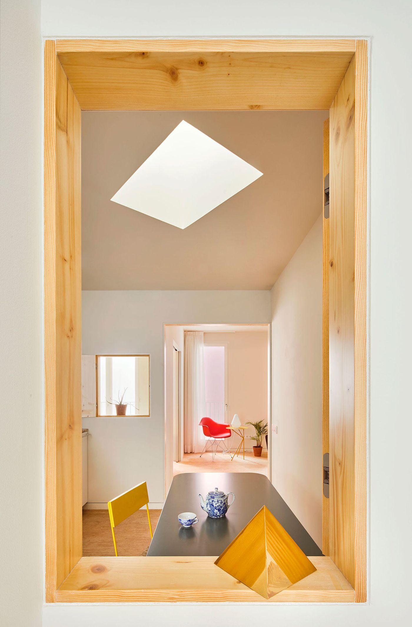
Photo by José Hevia.
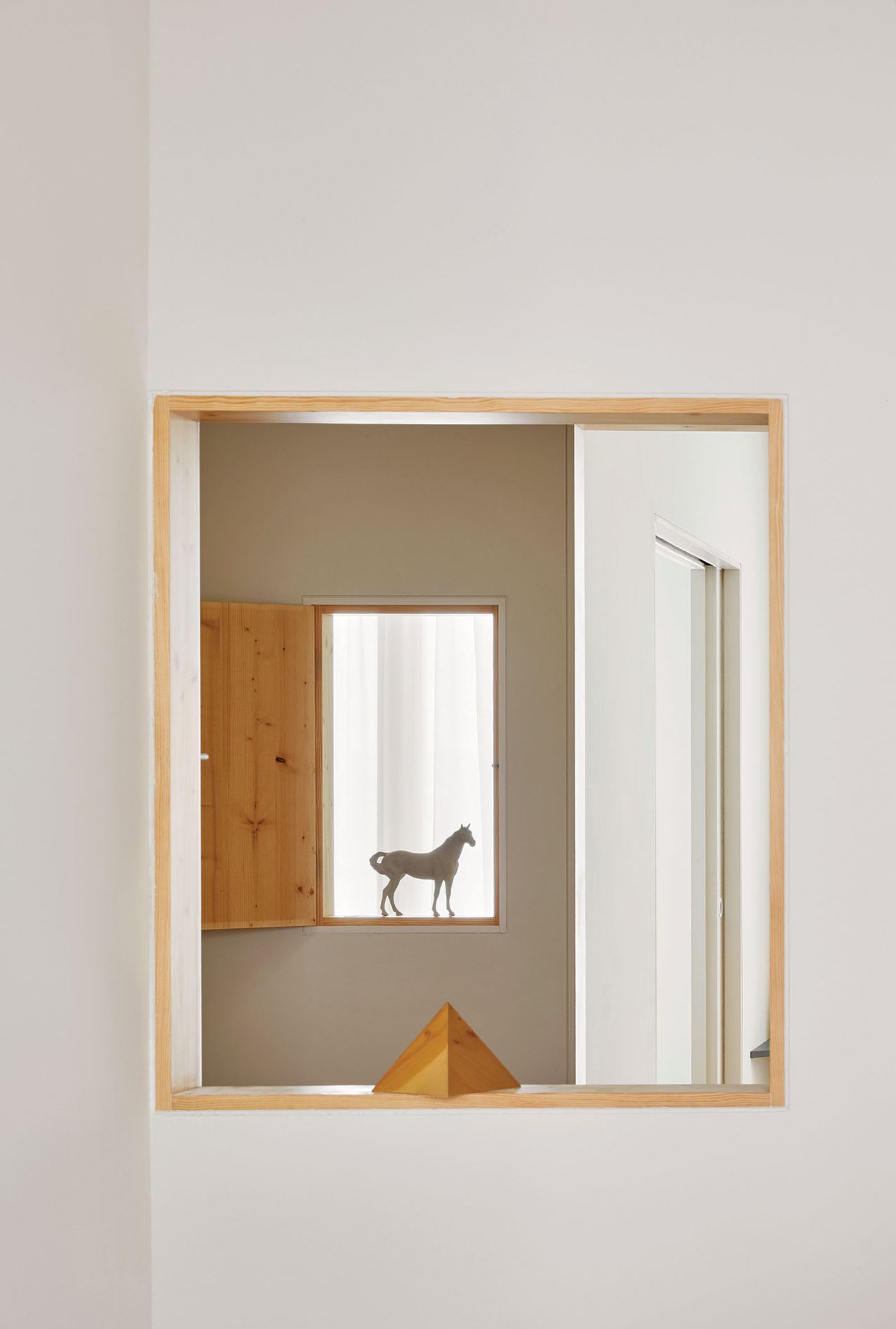
Photo by José Hevia.
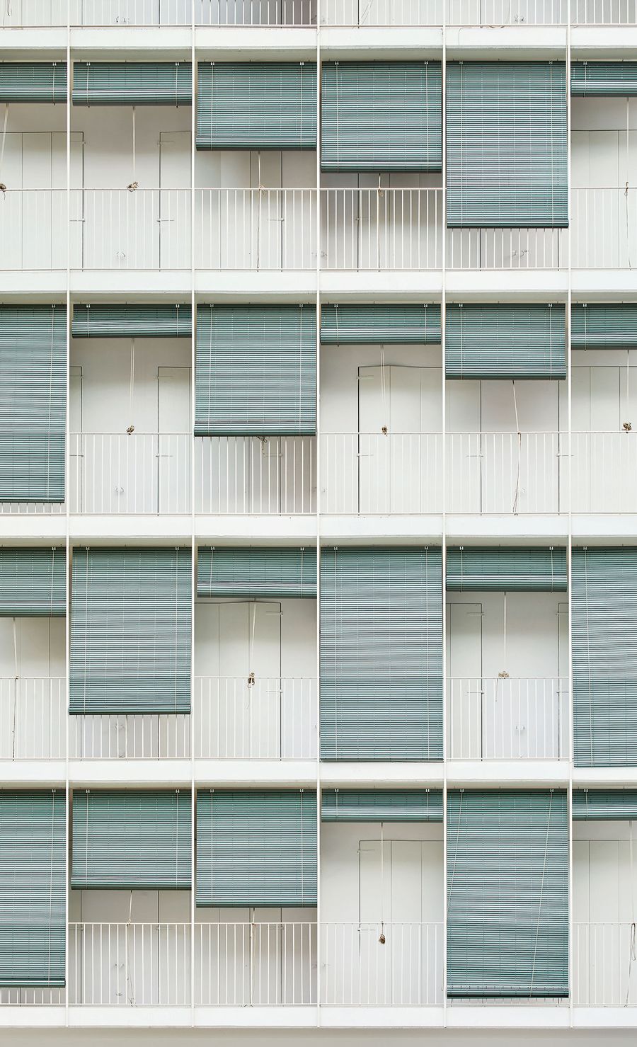
Photo by José Hevia.
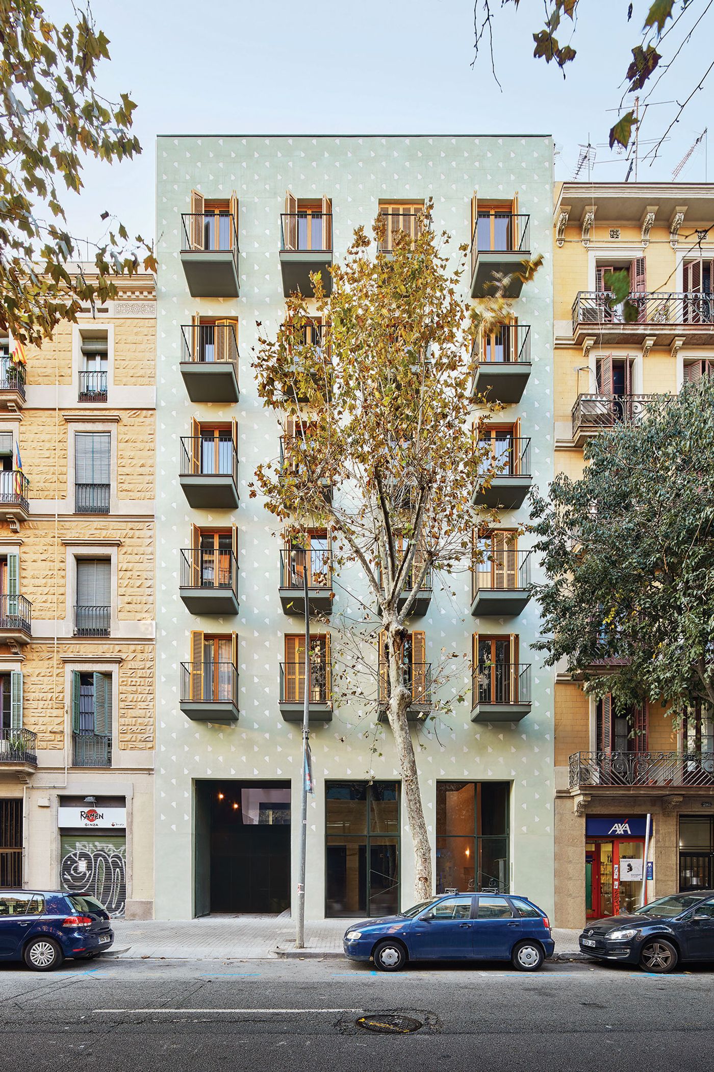
Photo by José Hevia.
