A 1960s Warehouse Turned Furniture Showroom in Beijing is a Paradigm of Adaptive Reuse
Words by Eric David
Location
Beijing, China
A 1960s Warehouse Turned Furniture Showroom in Beijing is a Paradigm of Adaptive Reuse
Words by Eric David
Beijing, China
Beijing, China
Location
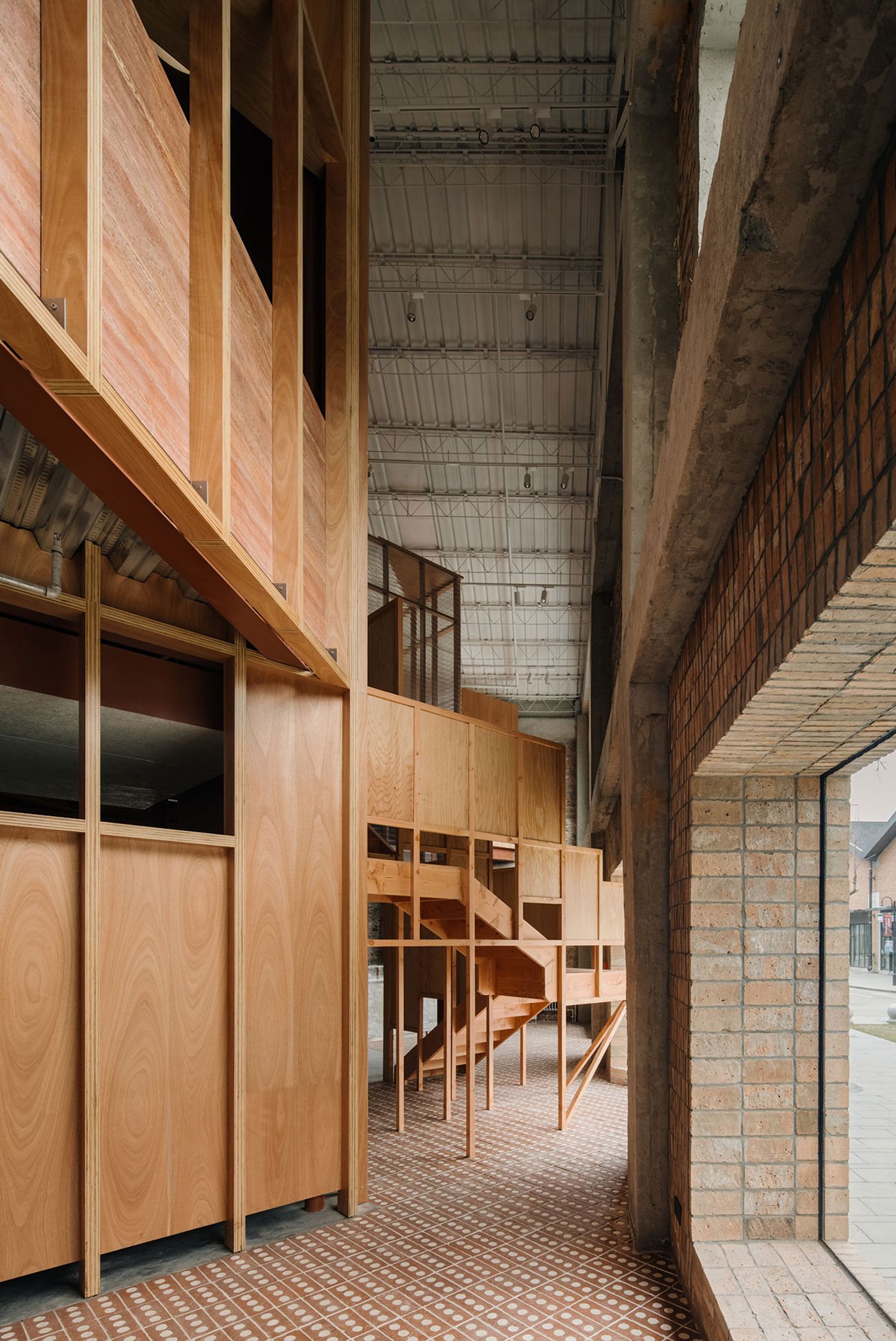
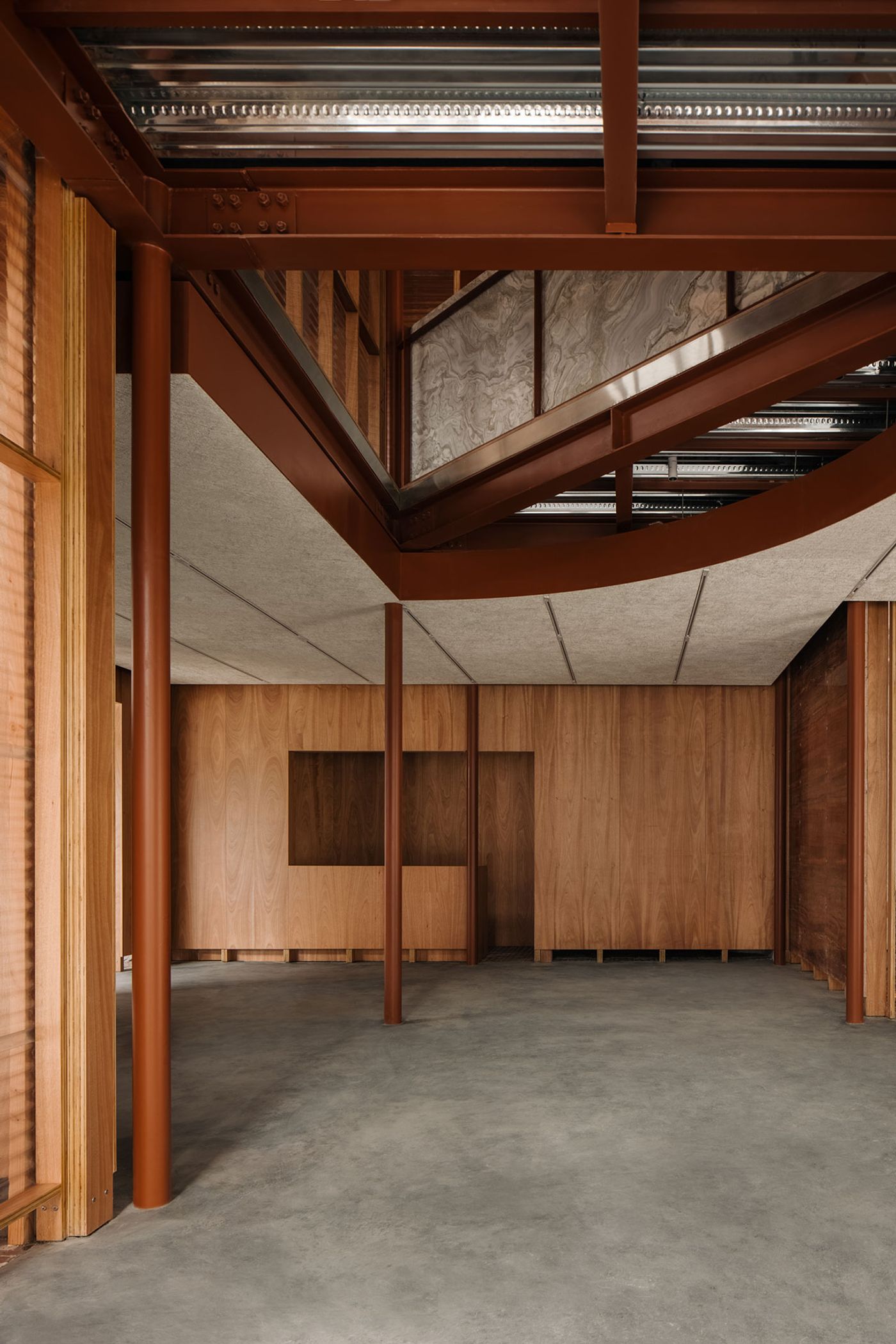
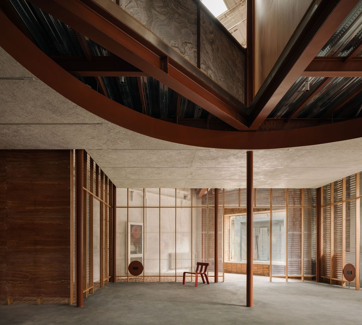
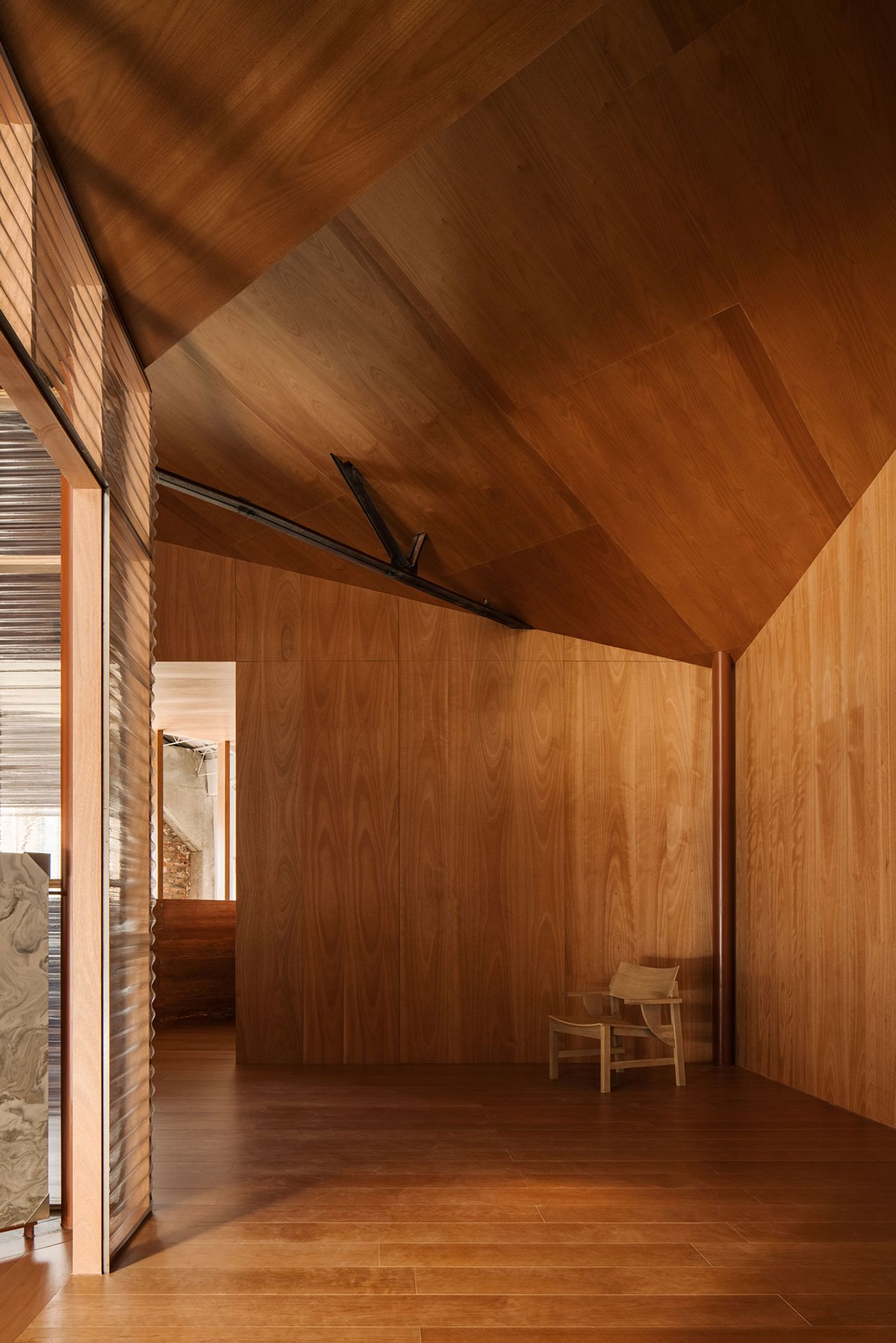
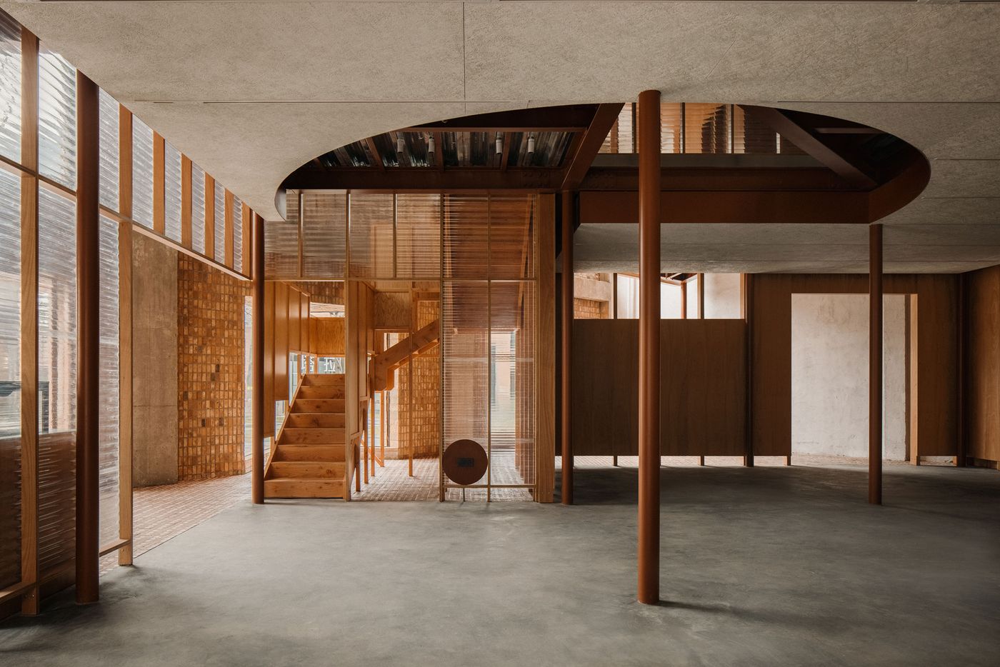
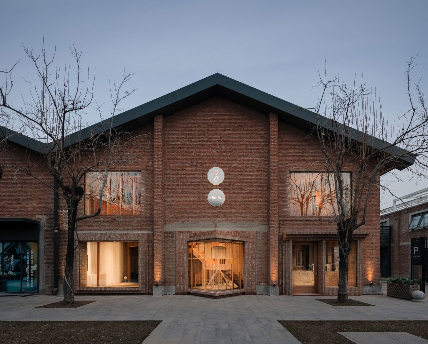
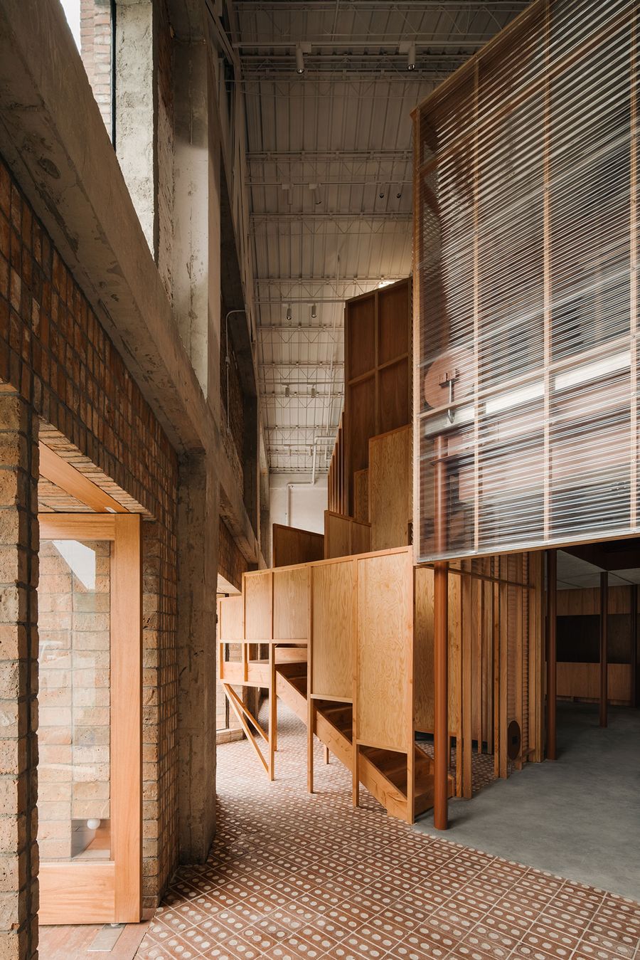
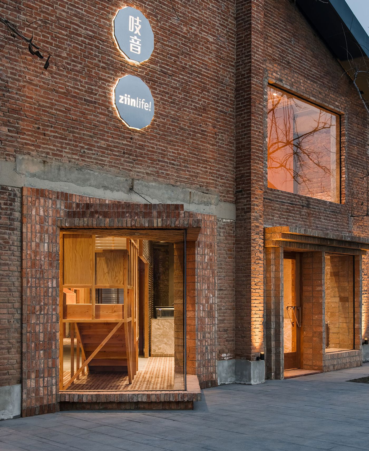
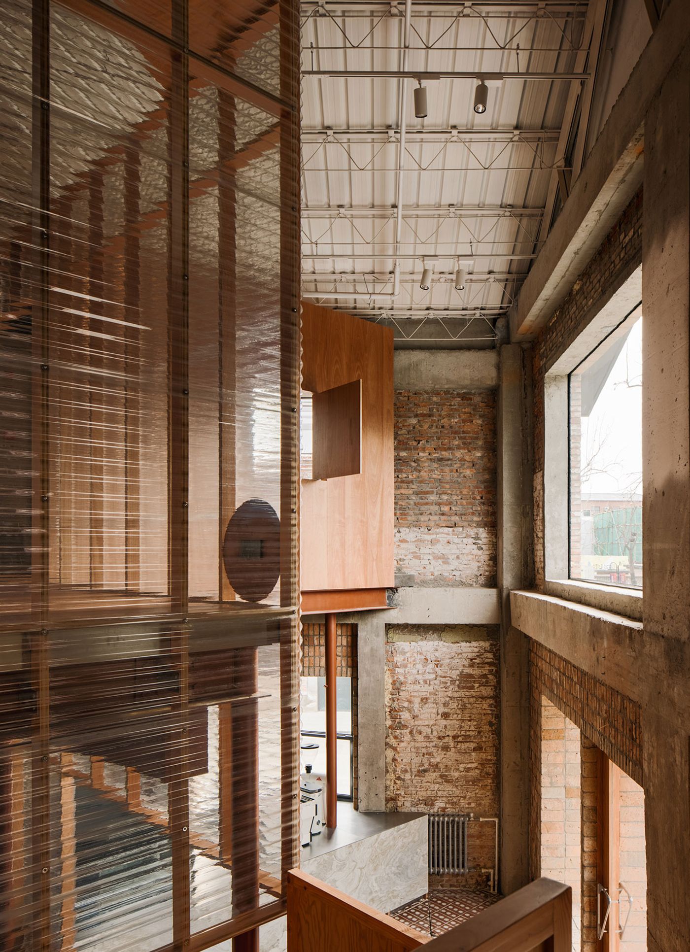
Part of Langyuan Station, a former textile warehouse turned cultural and commercial centre in Beijing, China, the new showroom for Chinese furniture brand Ziinlife offers a refreshing paradigm for the adaptive reuse of industrial buildings courtesy of Shanghai-based design practice atelier tao+c. Leaving the existing building shell intact, the team have inserted an independent structure that barely touches the outer walls thereby clearly demarcating what’s new and what’s old whilst initiating a playful dialogue between them. Consisting of two intersecting cubic volumes rotated at 45 degrees, the nested structure’s intricate geometry is complemented by an interplay of transparent and solid surfaces, making for a unique spatial experience. Minimalist in aesthetic, with a focus on the use of humble materials, simple construction techniques and well-crafted details, ZIIN’s showroom encapsulates the brand’s Bauhaus and Scandinavian-informed design ethos.
Photography © Wen Studio.
Photography © Wen Studio.
Photography © Wen Studio.
Photography © Wen Studio.
Photography © Wen Studio.
Photography © Wen Studio.
Photography © Wen Studio.
Photography © Wen Studio.
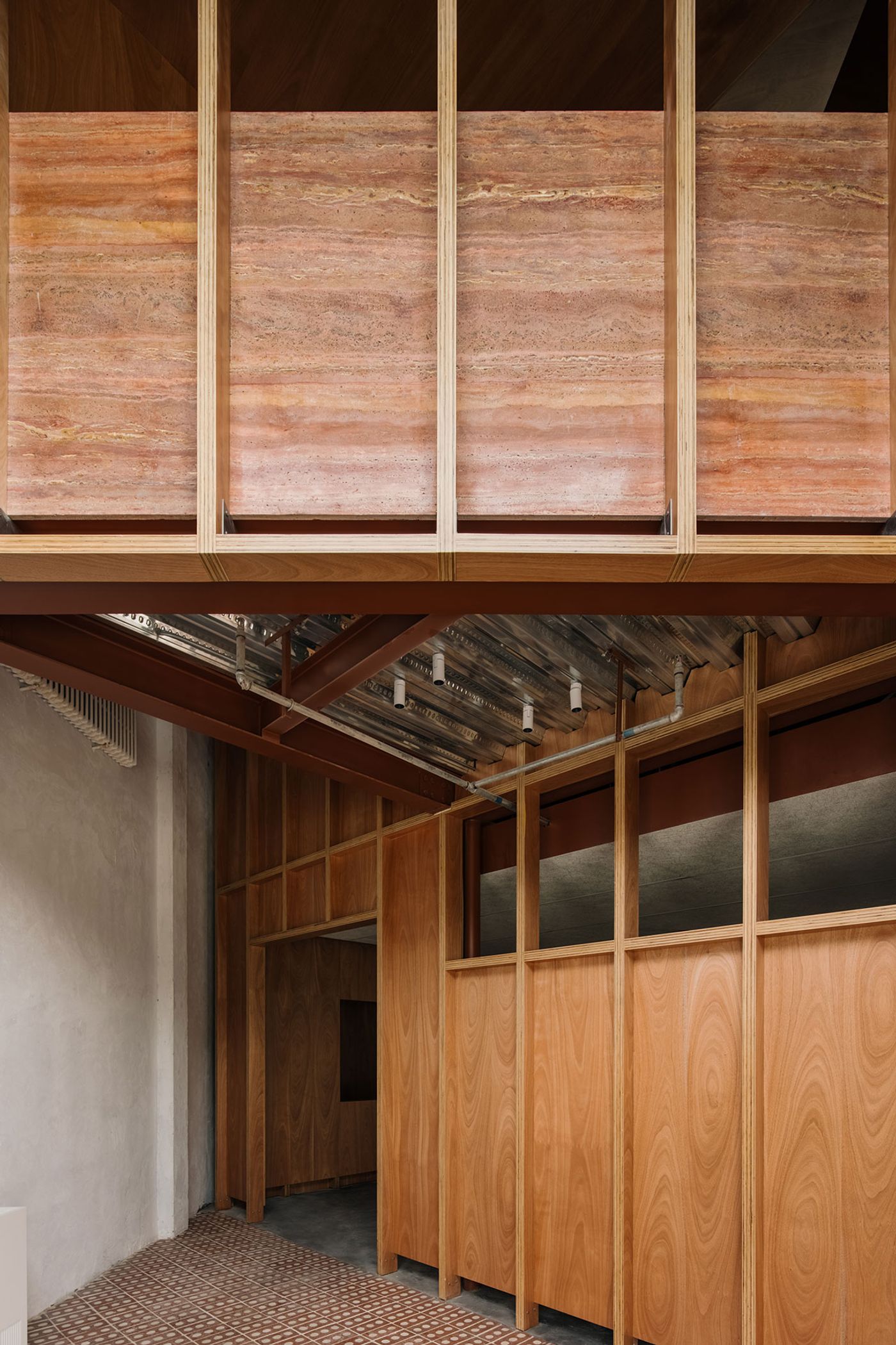
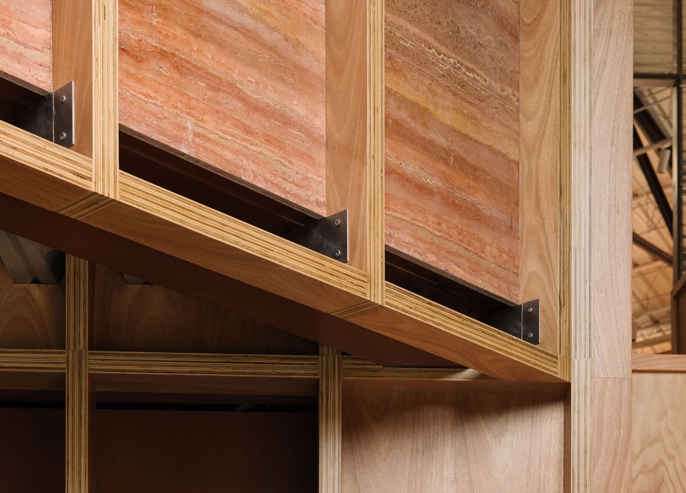
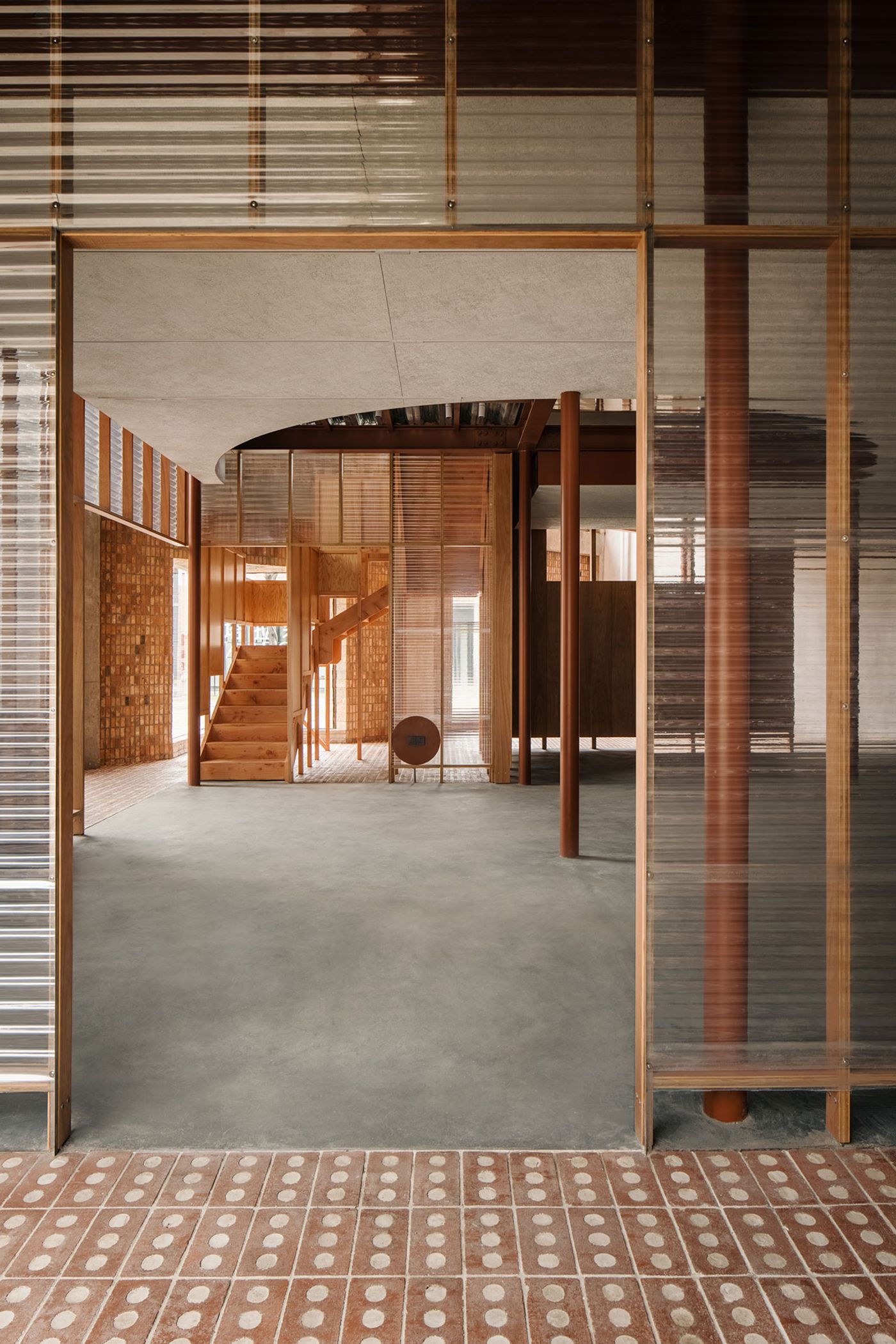
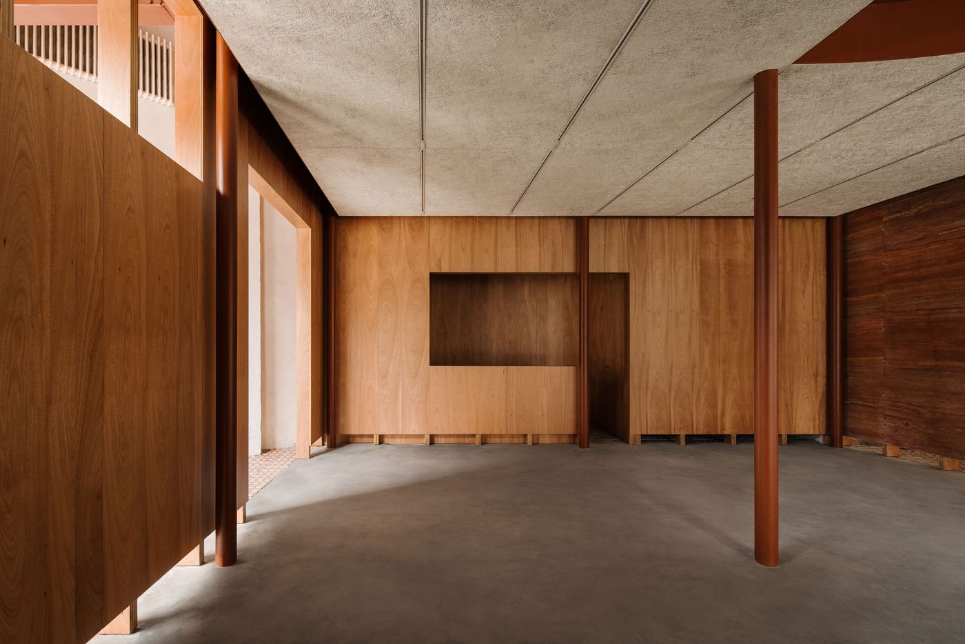
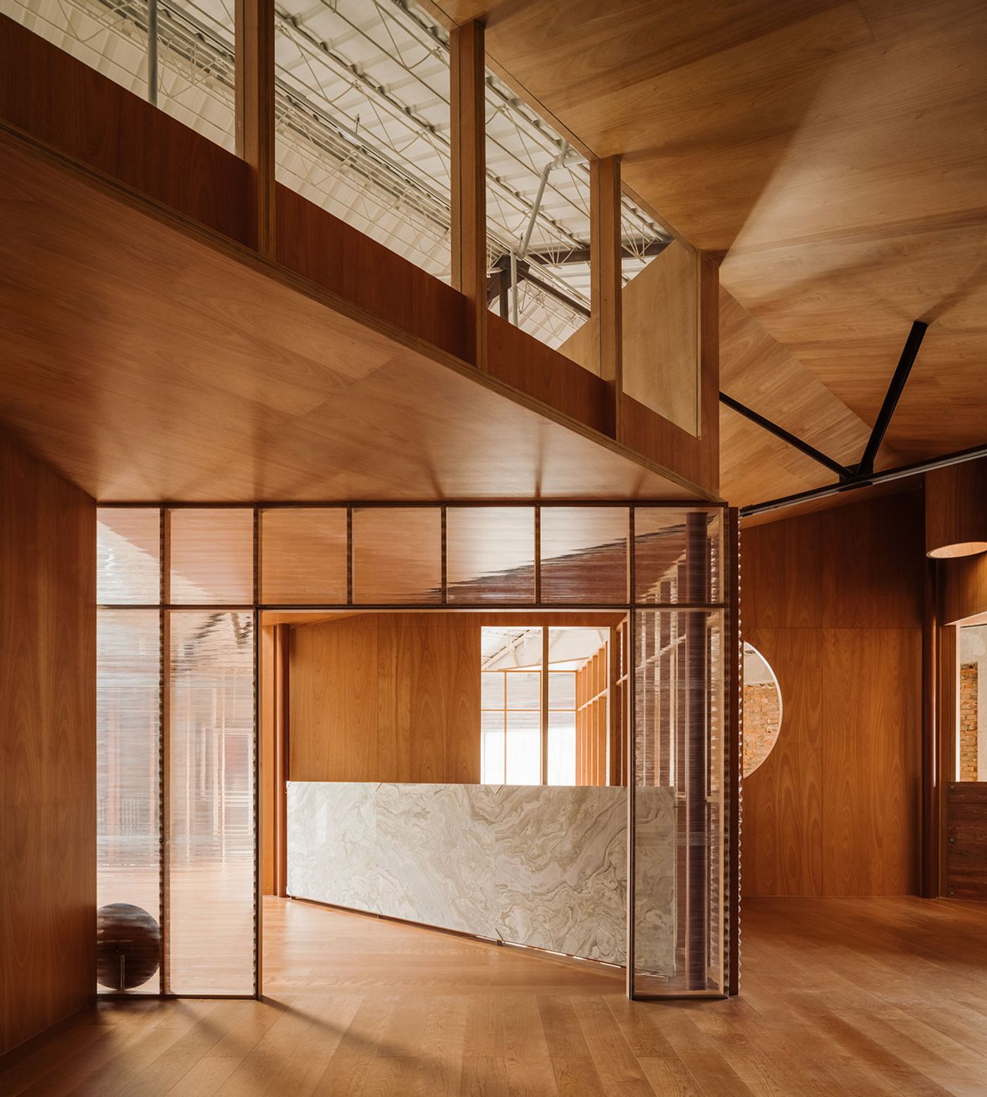
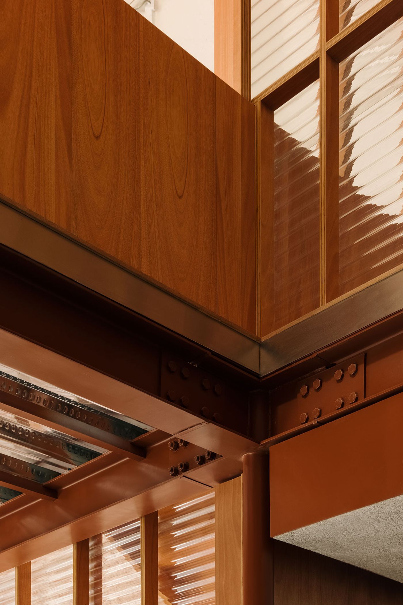
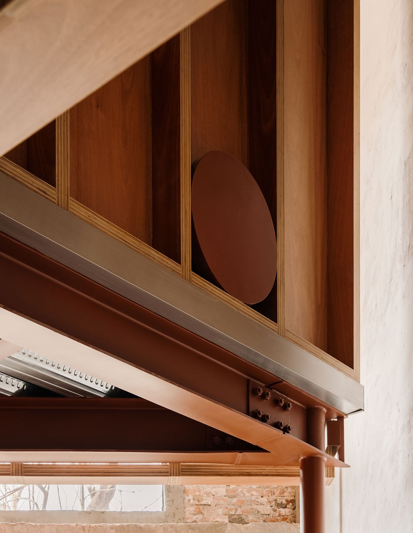
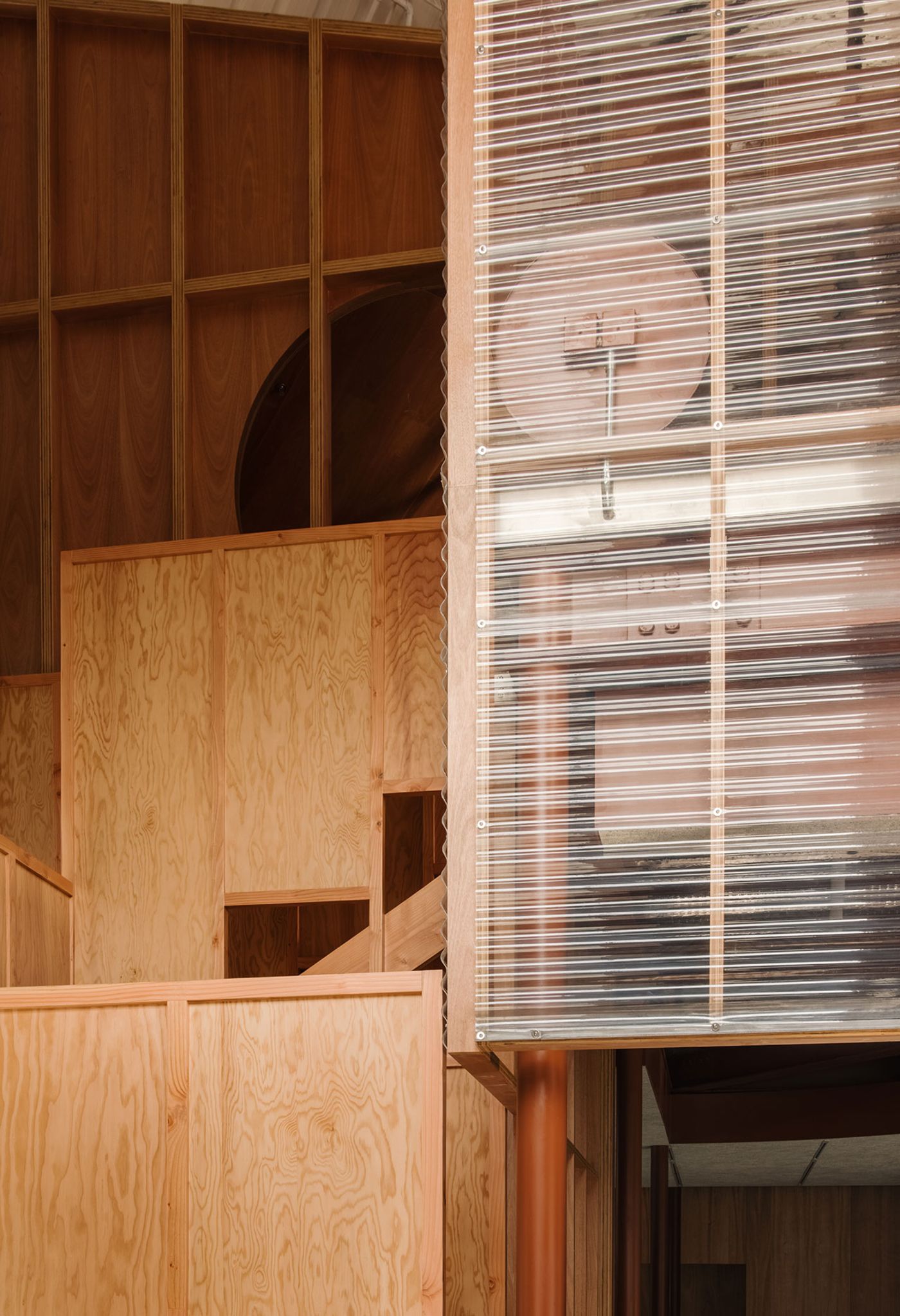
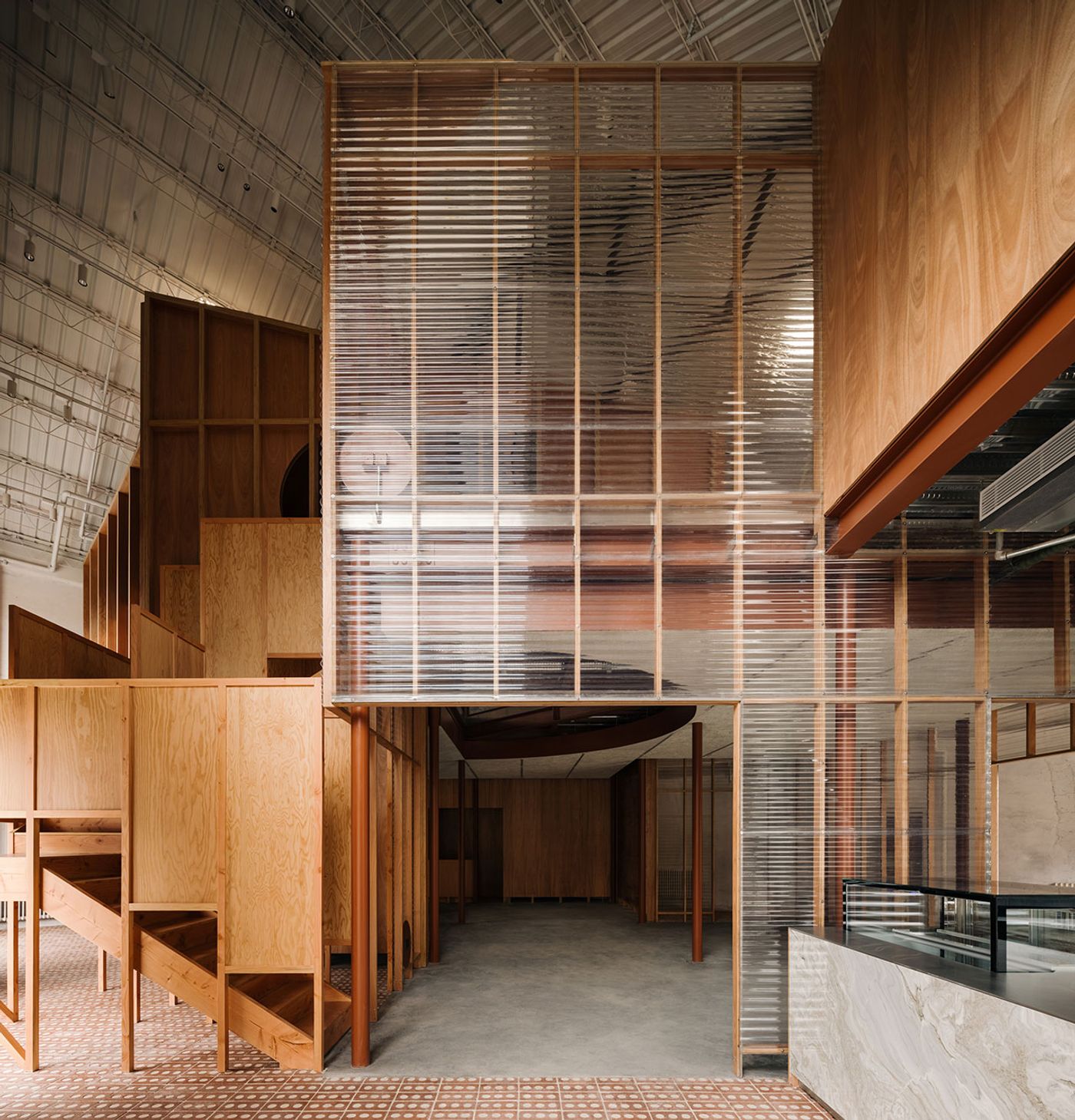
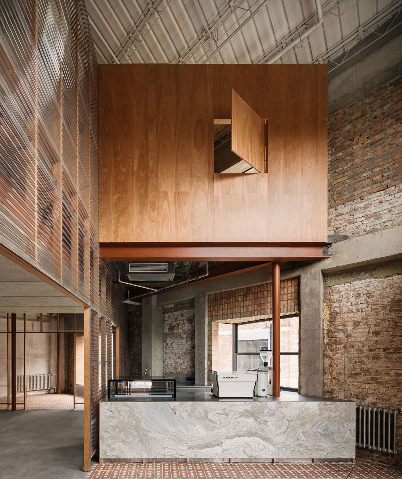
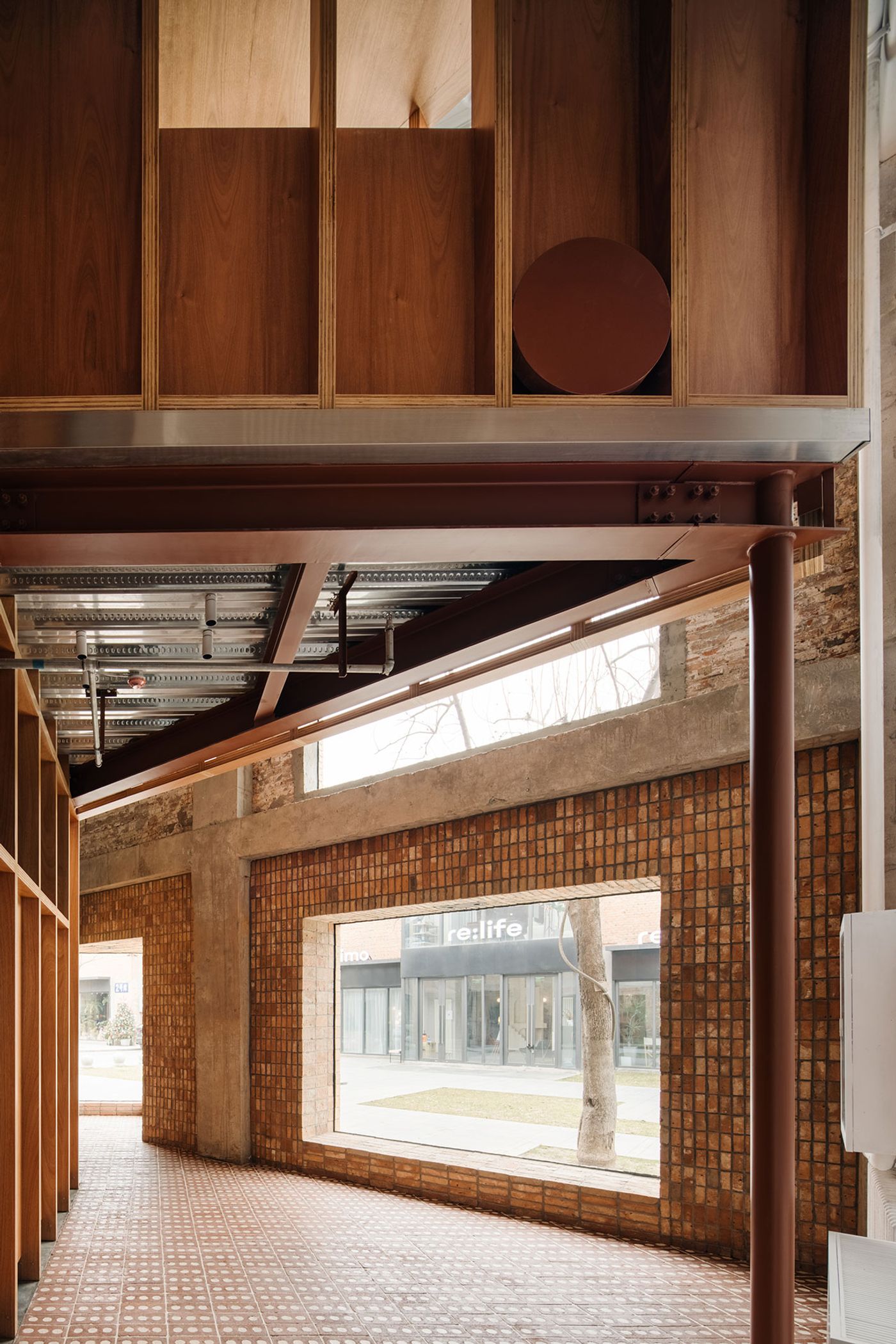
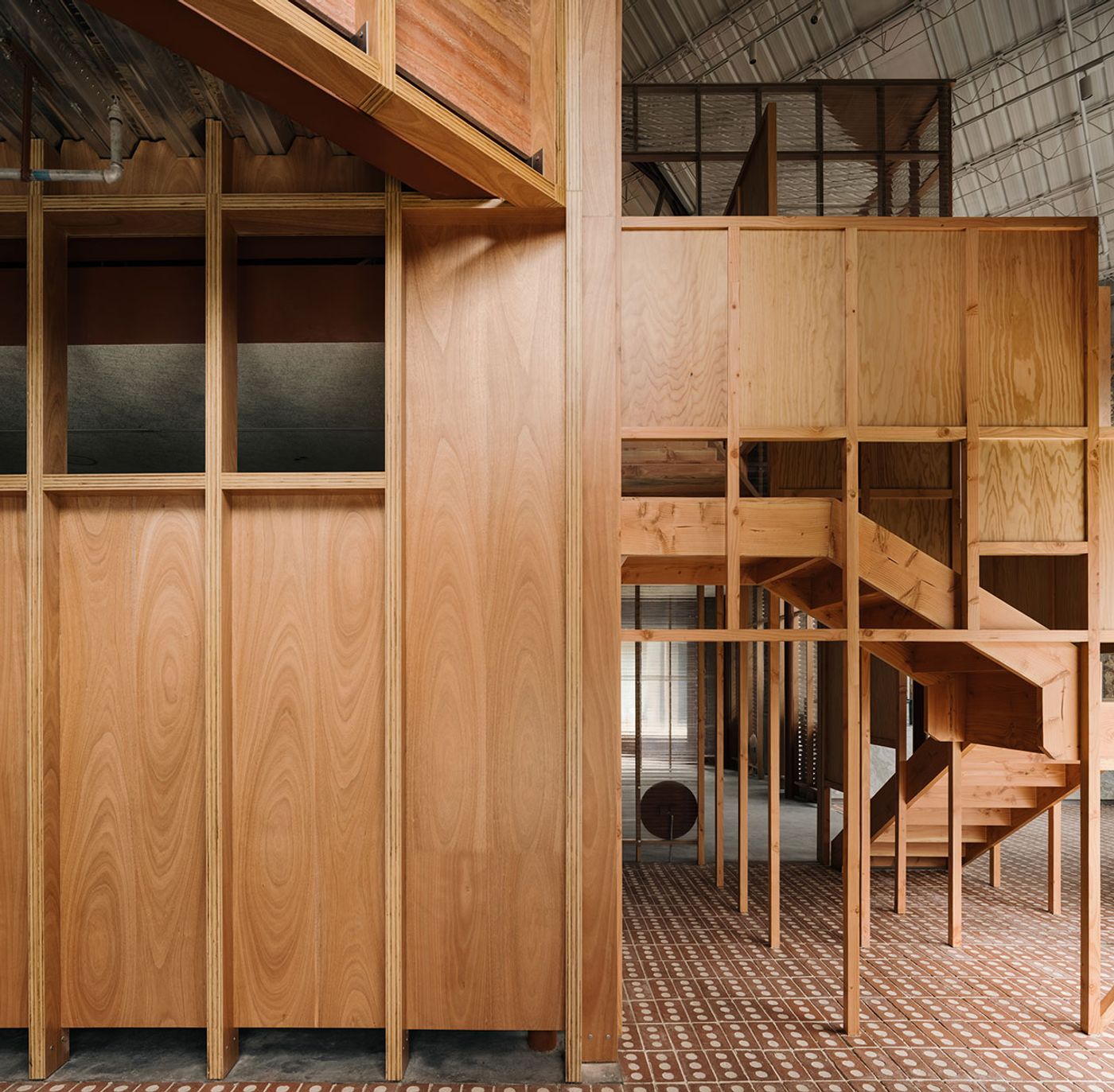
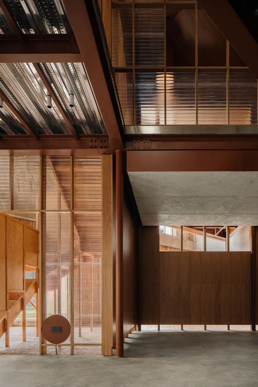
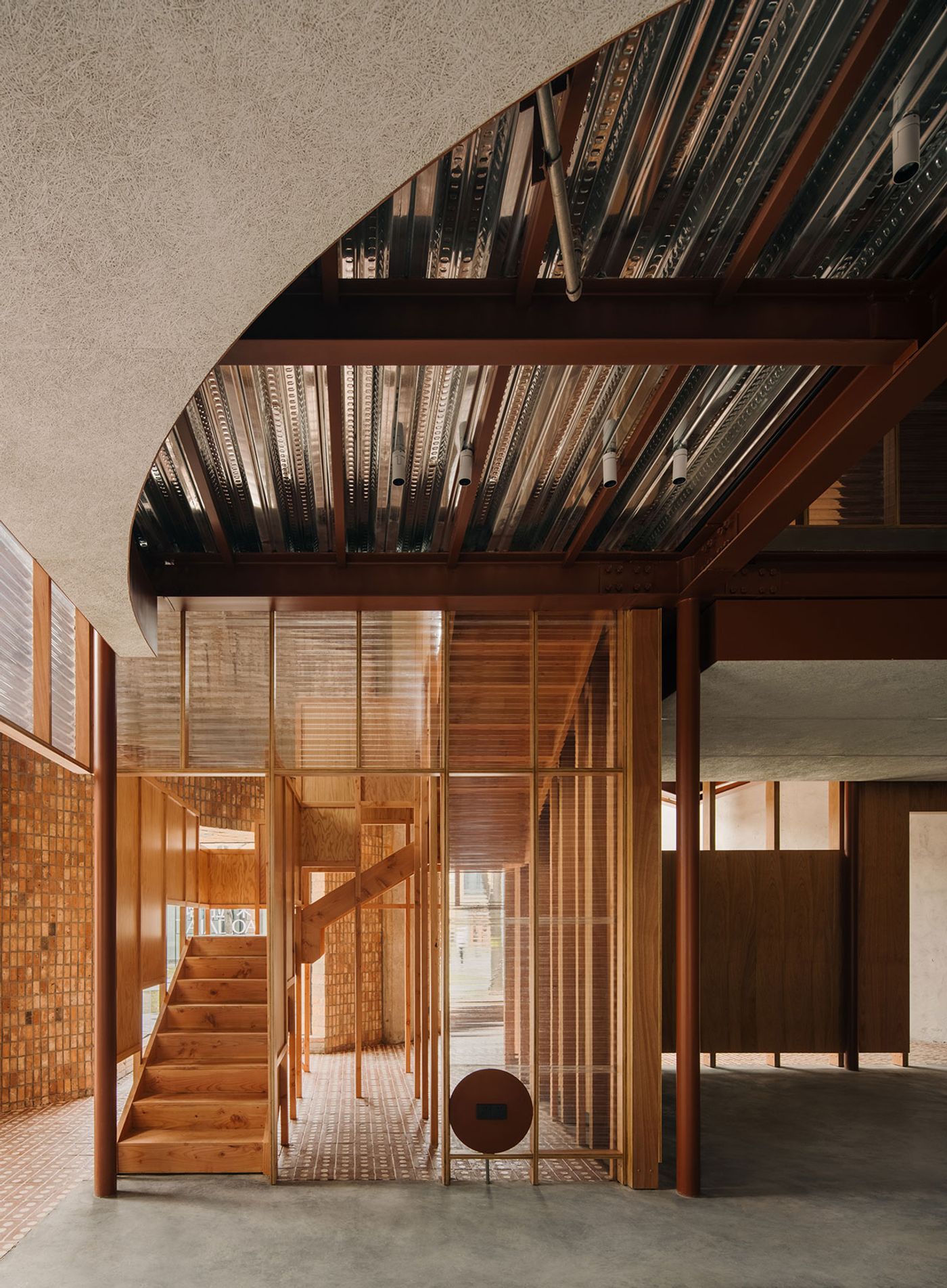
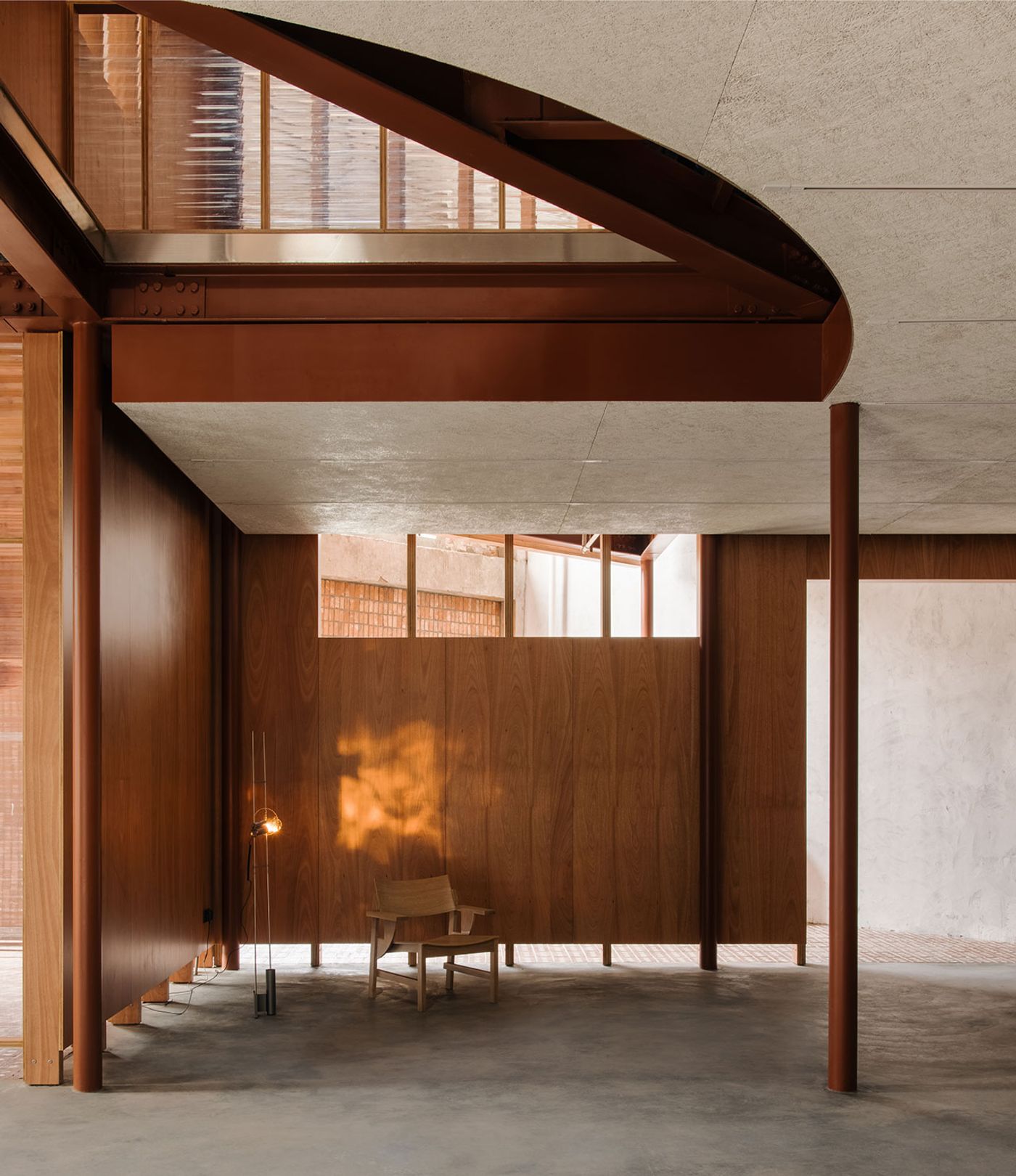
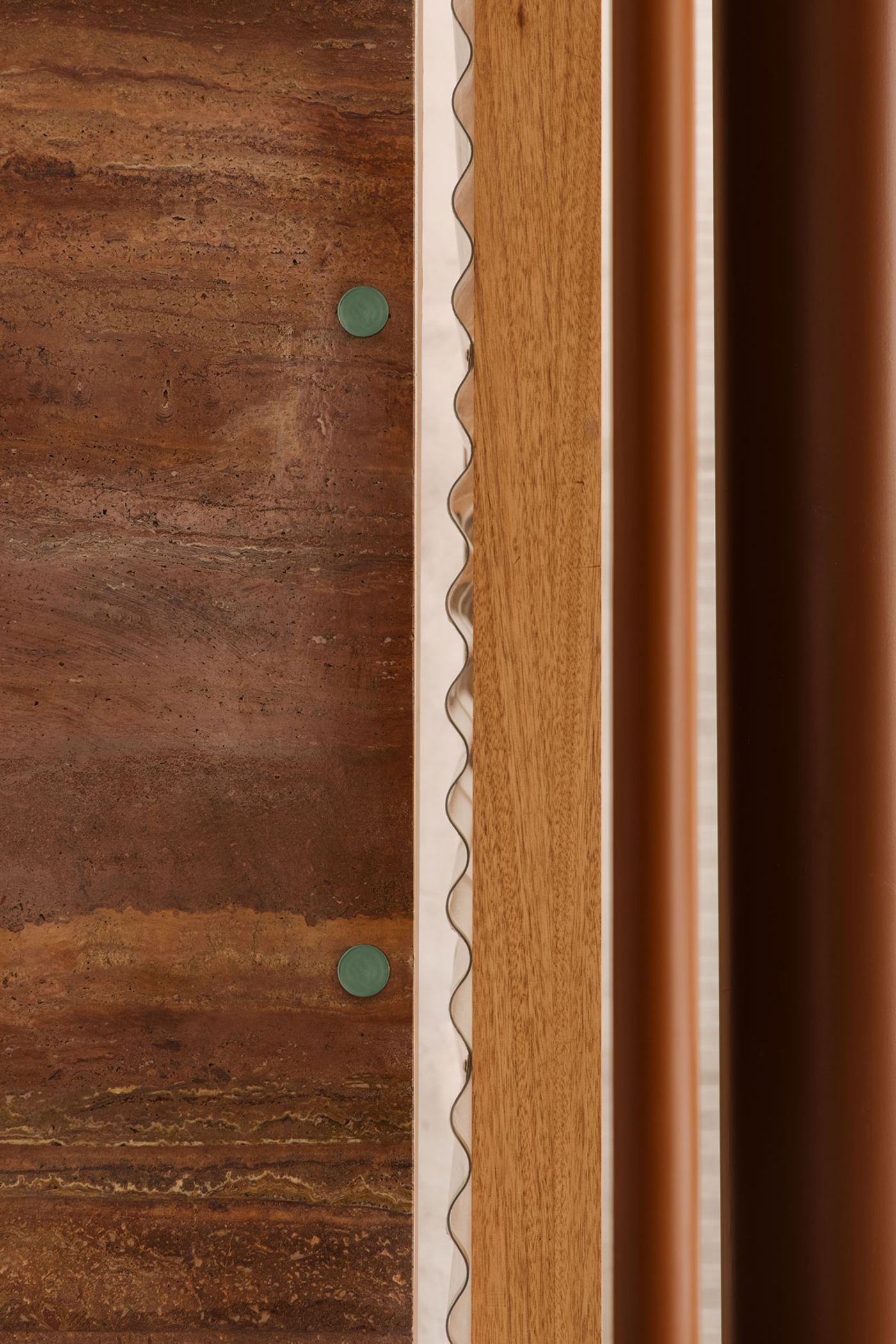
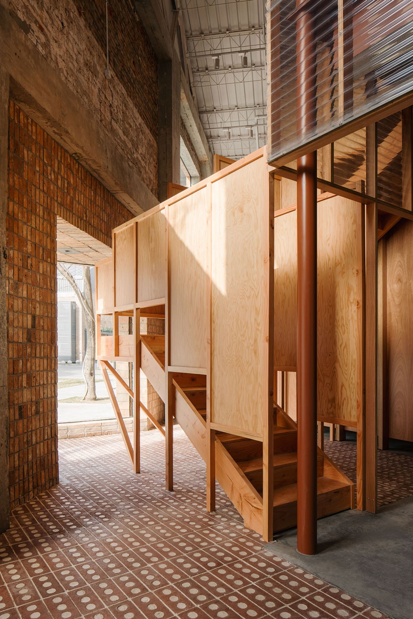
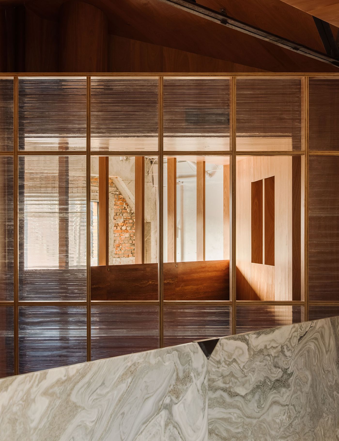
Built in the 1960s, the former warehouse complex features concrete framework, brick walls and pitched metallic roofs. The team drew inspiration from the existing building’s simple geometric language and industrial materiality, designing a steel framework consisting of two intersecting cubic volumes, clad in ash wood laminated boards, corrugated polycarbonate panels and fibre cement boards, all common industrial materials that reflect the brand’s focus on "affordable good design”.
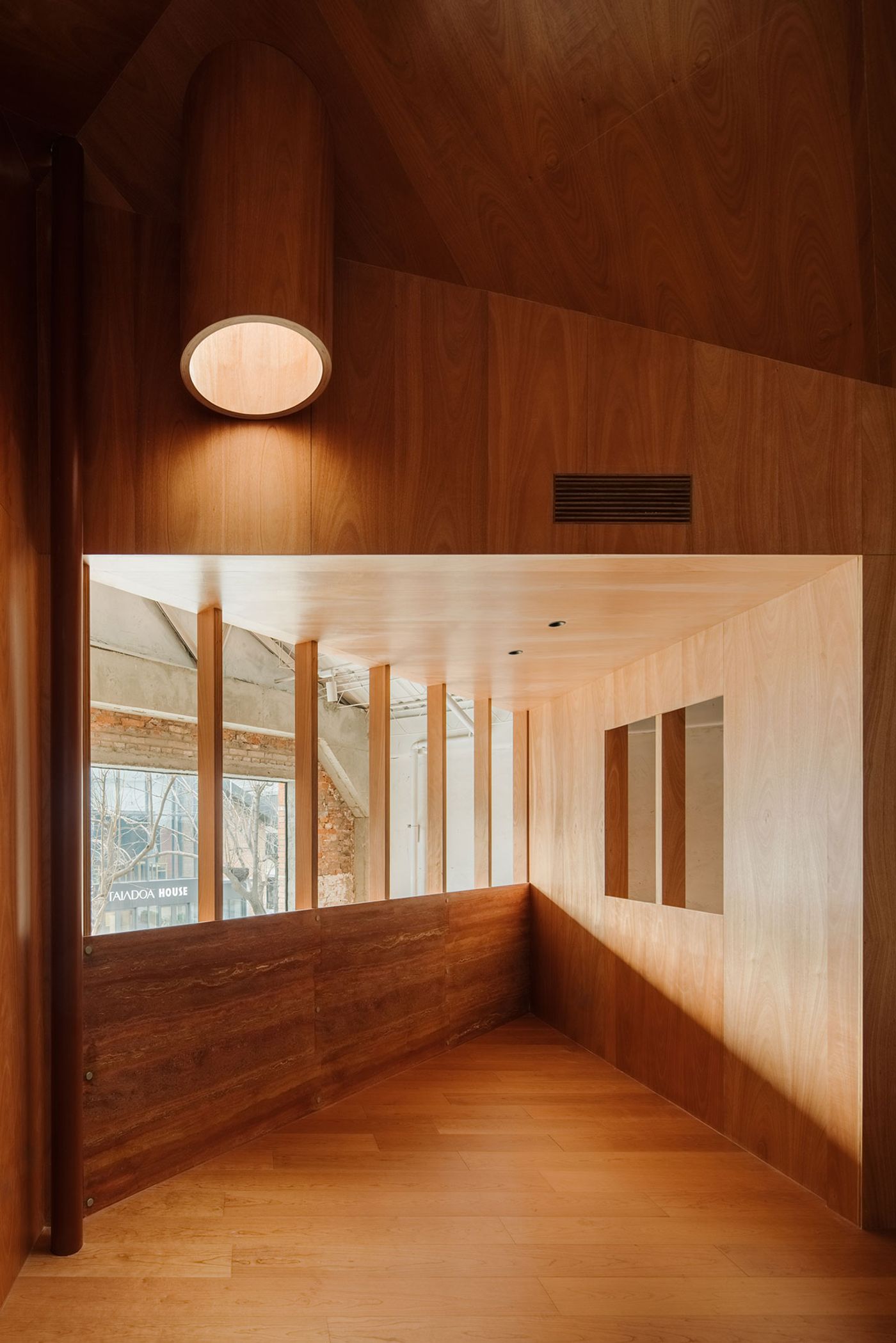
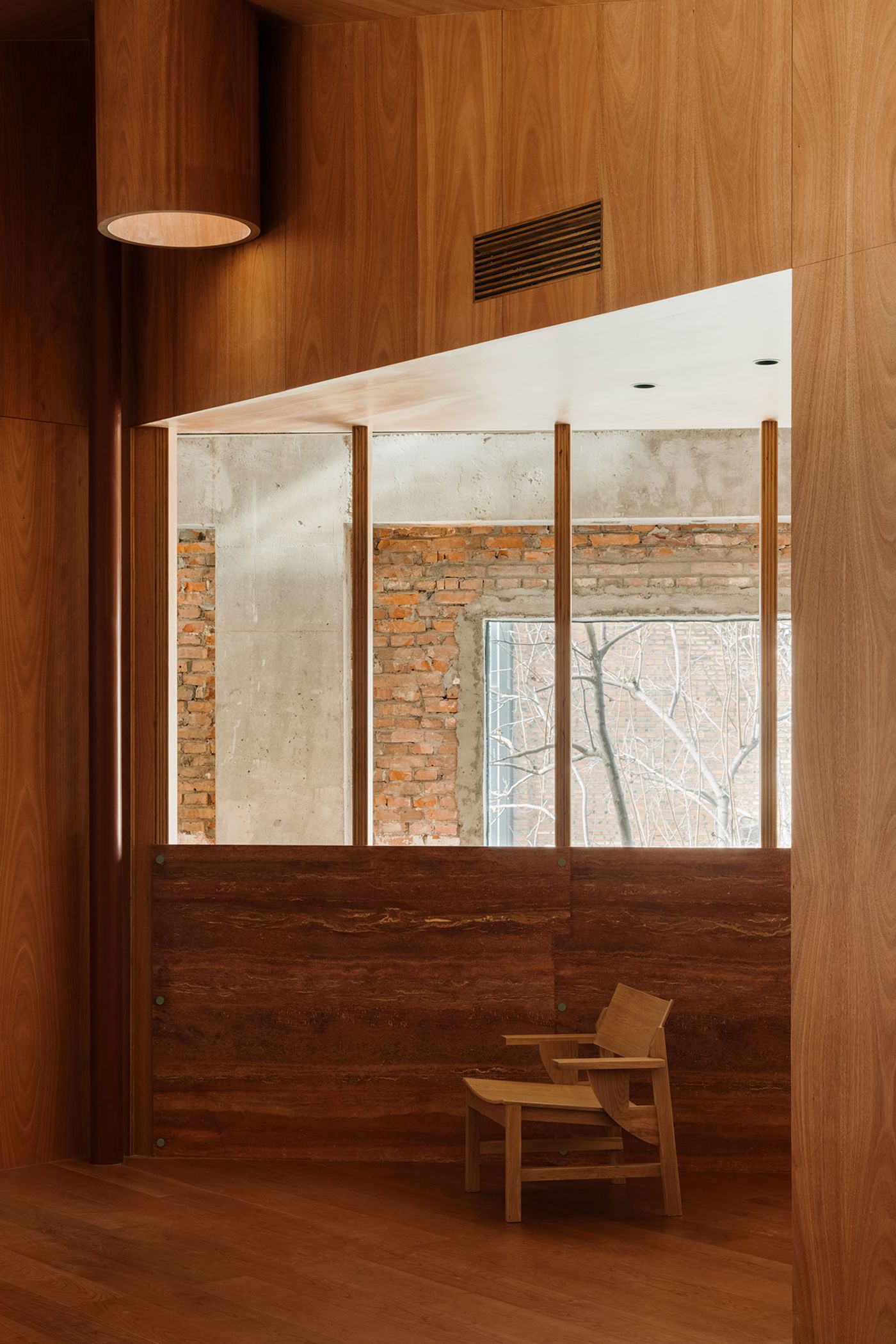
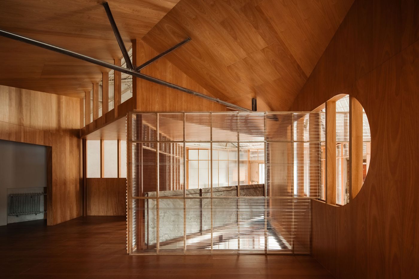
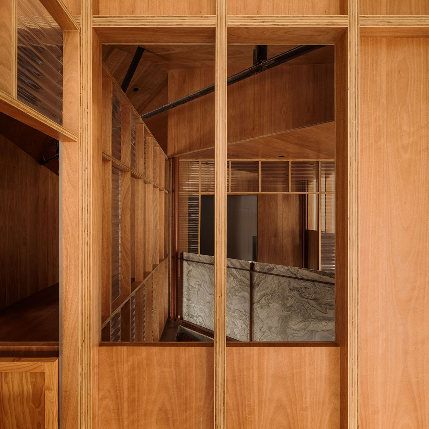
By simply rotating the ‘house-within-a-house’ structure by 45 degrees in relation to the building shell, they have cleverly introduced complexity, further enhanced by the introduction of various geometric openings, cut-outs and balconies. This is no mere architectural exercise in spatial geometry though, the complex configuration was thoughtfully designed with both the customer experience and flexibility in mind. Multiple sight lines across the showroom’s different areas on two levels, through openings and transparencies, makes moving through the space an intriguing journey full of surprises.
Photography © Wen Studio.
Photography © Wen Studio.
Photography © Wen Studio.
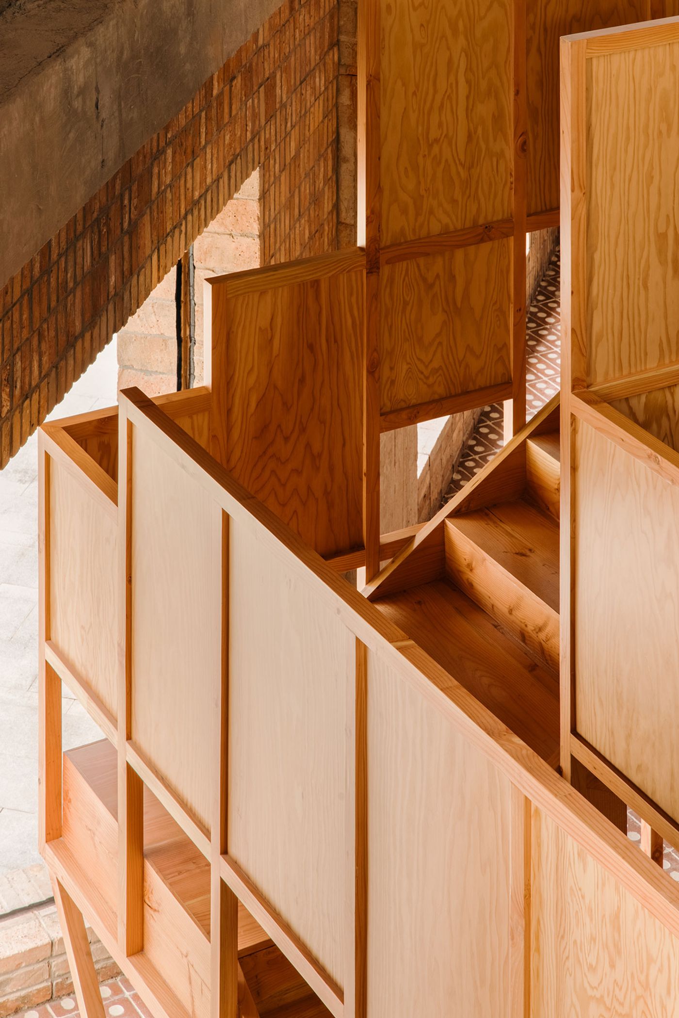
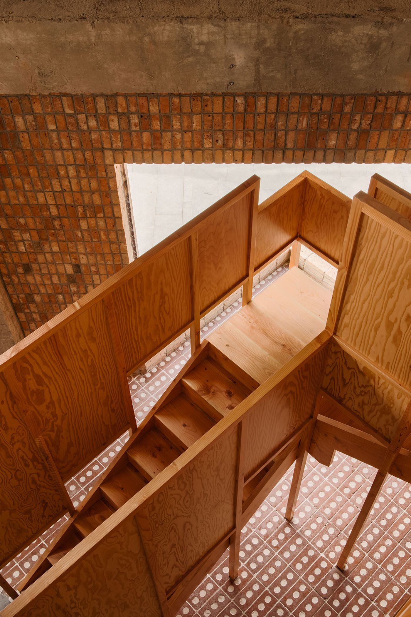
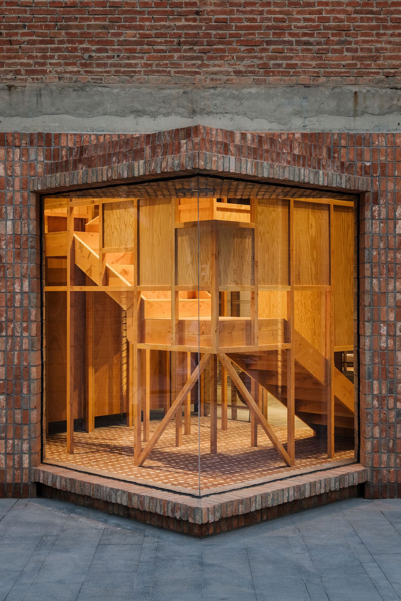
A triangular balcony jutting out of the new structure which almost touches the outer walls adds to the project’s wondrous sense of playfulness as do the interstitial, “semi-interior and semi-exterior” spaces in-between the old and new structures, and the angular timber staircase that would have pierced the façade had the designers not punctured a large opening where they fitted a prismatic glass protrusion. In combination with other façade openings, the latter allows plenty of natural light to enter the interior while transparent polycarbonate panels in the front of the structure makes sure light reaches the wood-clad areas at the back of the showroom.The showroom’s geometric complexity is balanced by its construction “earnestness”. Guided by the brand’s utilitarian principles, atelier tao+c has left most of the structural elements exposed, from I-beams to timber battens, joists and studs, as well as made sure that all the layers of materials are visible, including the seams and joints between them, in order to shed light on the design, assembly and construction process. This approach imbues the space with a sense of craftsmanship as well as ties together the new-built structure with the existing building which has been stripped down to its elemental building fabric.
Photography © Wen Studio.
Photography © Wen Studio.
Photography © Wen Studio.
Photography © Wen Studio.
Photography © Wen Studio.
Photography © Wen Studio.
Photography © Wen Studio.
Photography © Wen Studio.
