Architecture and Decor are Inextricably Intertwined in a Milanese Apartment by Marcante-Testa
Words by Eric David
Location
Milan, Italy
Architecture and Decor are Inextricably Intertwined in a Milanese Apartment by Marcante-Testa
Words by Eric David
Milan, Italy
Milan, Italy
Location
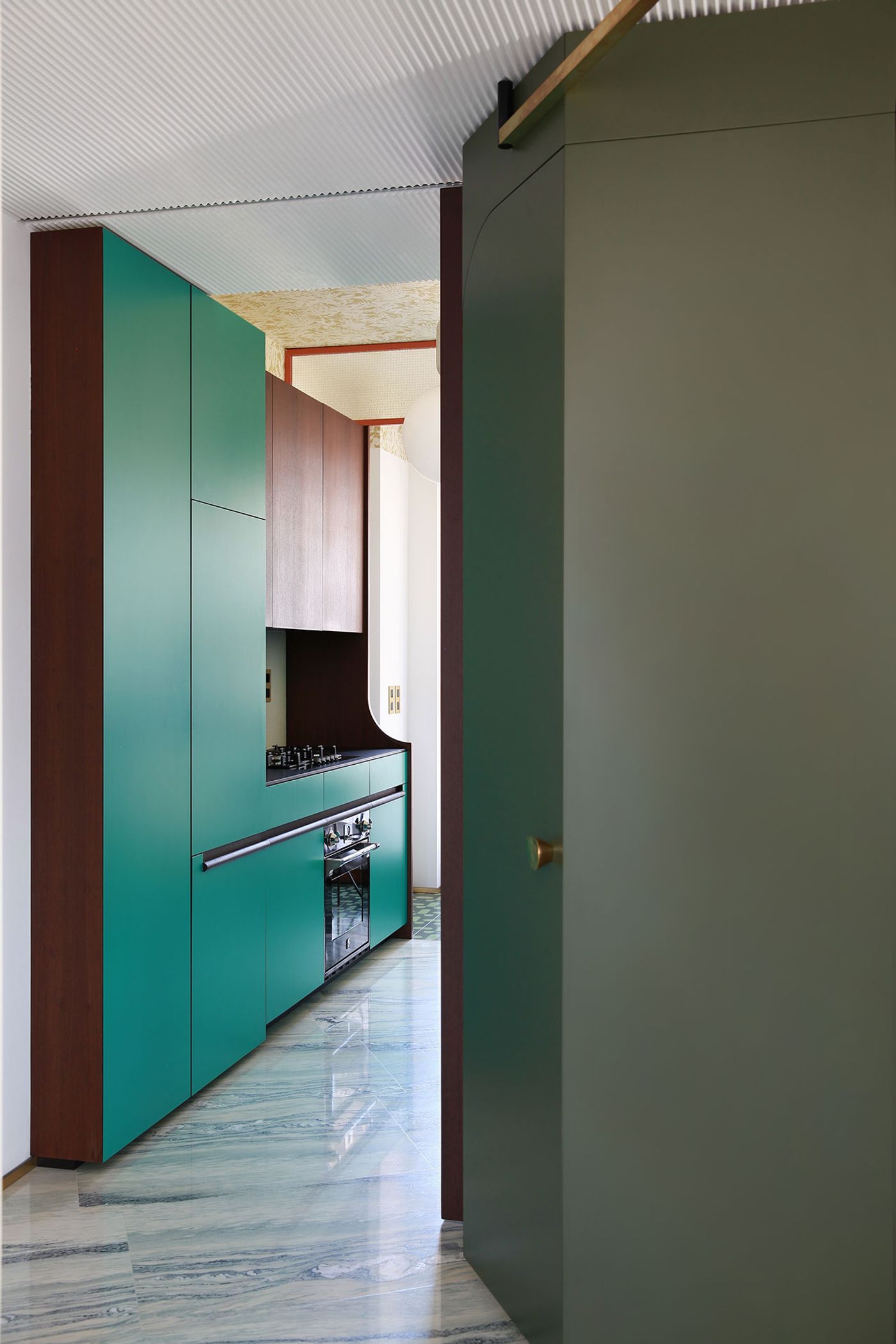
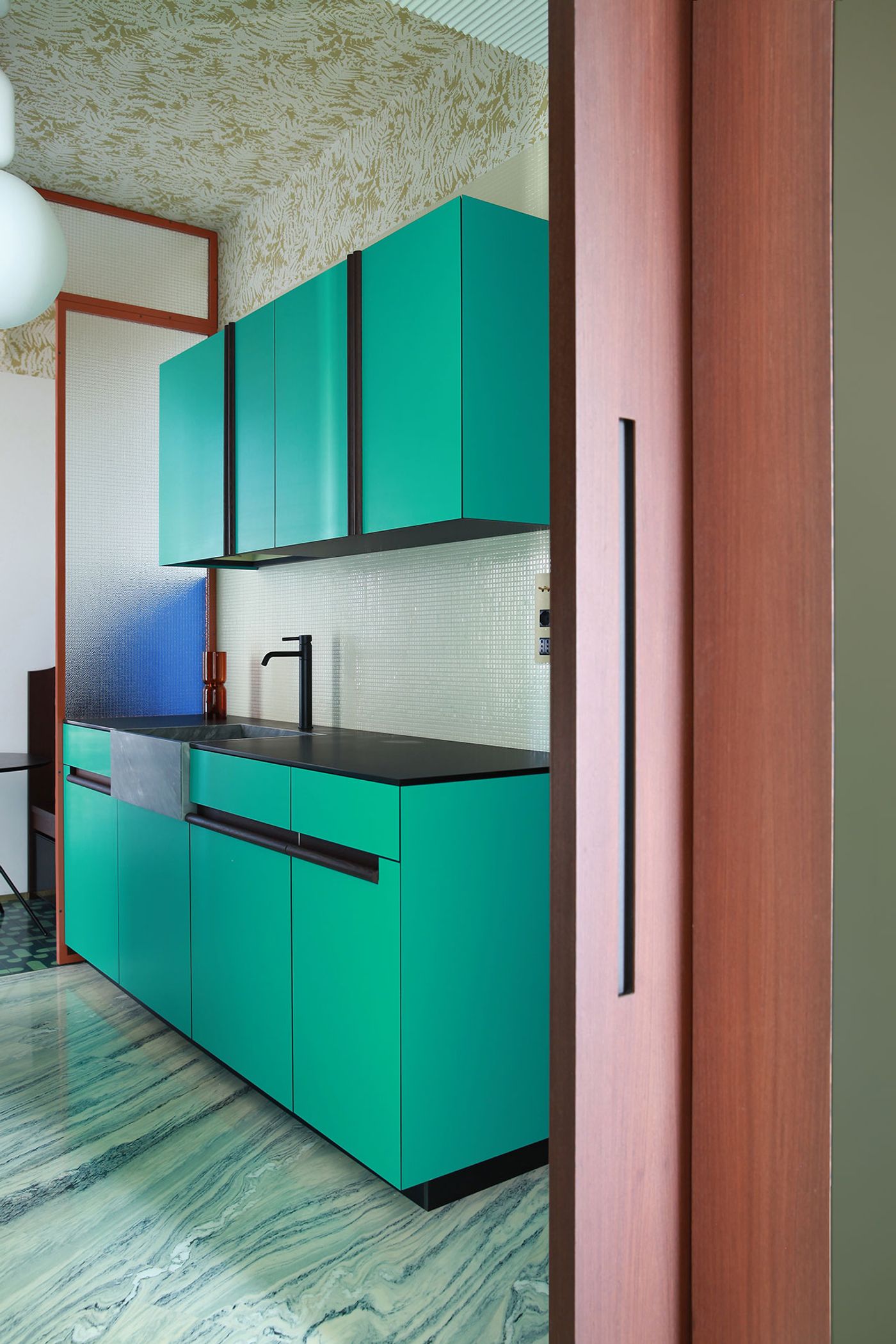
Milan is renowned for the its sophisticated interior design and stylish apartments but even amid such a refined context, this renovated apartment on Corso Sempione stands out in its trend-defying originality, decorative panache and refreshing glamour, courtesy of Turin-based design duo Marcante-Testa. Andrea Marcante and Adelaide Testa are known for boldly combining contradictory styles into thrilling interiors, guided by their impeccable taste and eye for detail, and fuelled by their ability to never take themselves too seriously, and Teorema Milanese, as the project is called, is no exception. Housed in a late 1960s residential block, the apartment is a typical bourgeois Milanese home but there’s nothing typical, conventional or expected in Marcante and Testa’s striking interior design. Creatively interweaving décor and architecture, retro and contemporary references, and luxury and everyday materials, Teorema Milanese both confounds and enchants with its audacious charm.

Photo by Carola Ripamonti.

Photo by Carola Ripamonti.

Photo by Carola Ripamonti.

Photo by Carola Ripamonti.
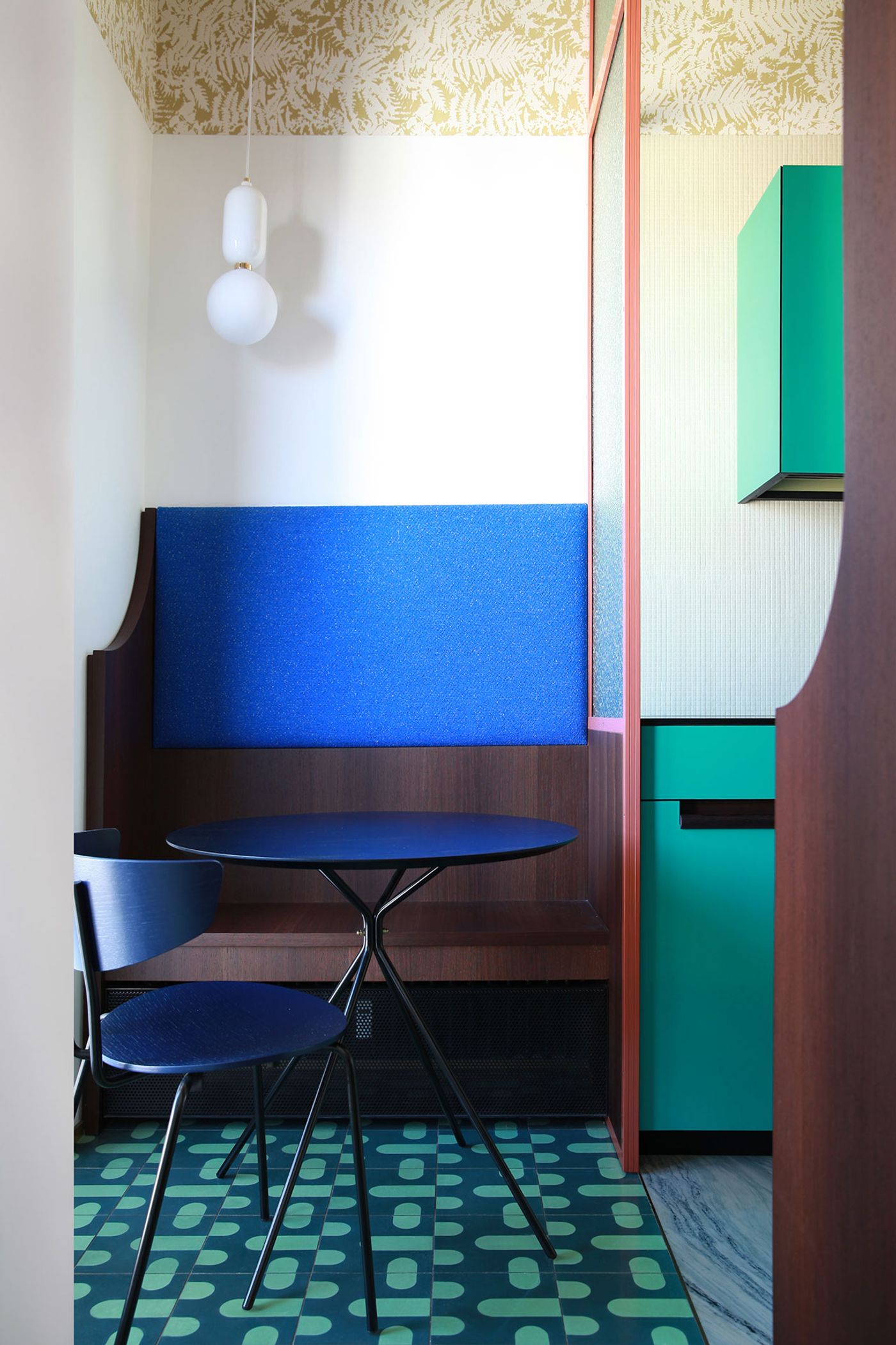
The designers have kept the apartment’s classic layout, a central corridor linking the various rooms, albeit in a deconstructed form, intact. Different marble flooring and custom-designed semi-transparent screens delineate different functional zones within the living area while ensuring visual connection between them. The result is a unified space made out of discretely defined areas, namely an entrance vestibule, a lounge and a dining area.
A refreshing aspect of Marcante and Testa’s interior design is their focus on the apartment’s ceilings, which according to them is the most neglected area in the field of interior design. Crowing the sitting area, a large restored circular ceiling rose alludes to the rich ornamentation of Milanese interiors of yesteryear, but at the same time, its deconstructed, modernist design harmoniously blends in with the contemporary sense of the overall interior design.

Photo by Carola Ripamonti.

Photo by Carola Ripamonti.

Photo by Carola Ripamonti.

Photo by Carola Ripamonti.

Photo by Carola Ripamonti.

Photo by Carola Ripamonti.
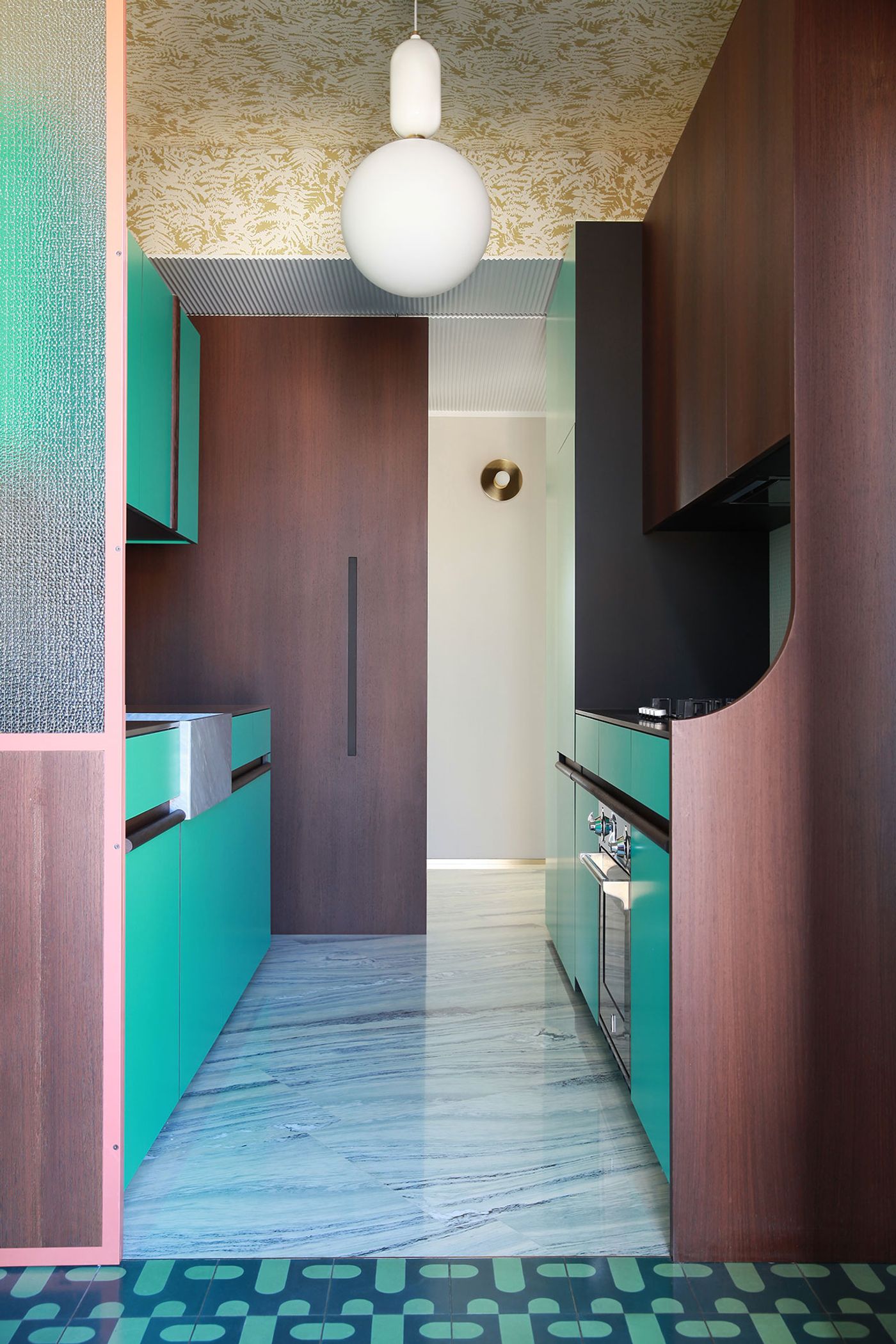
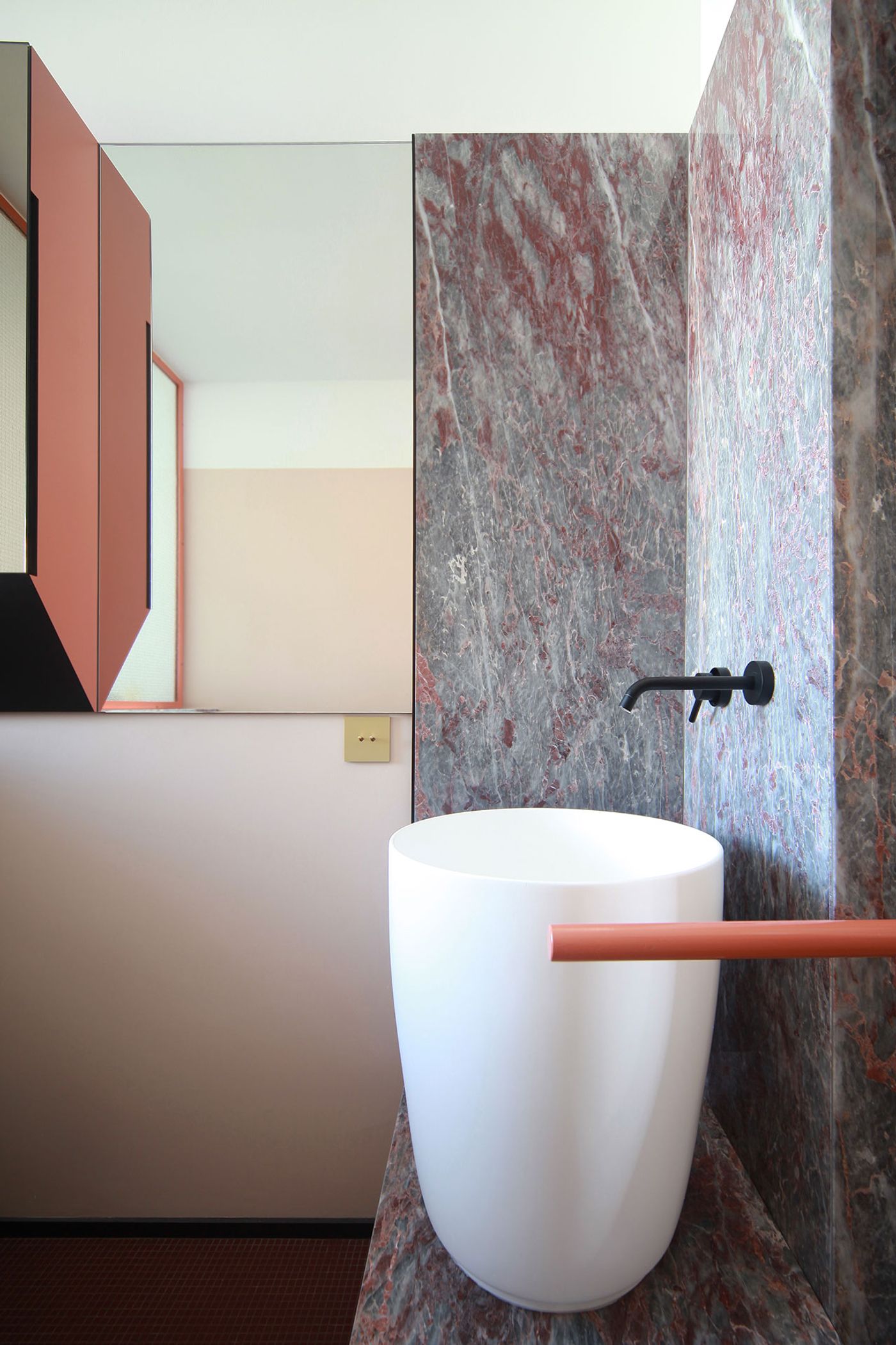
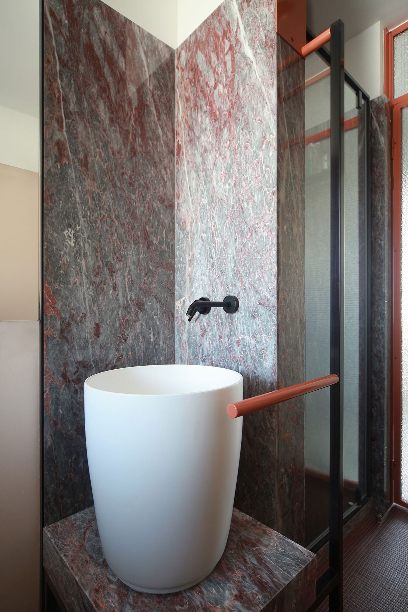
The sense of spatial continuity is enhanced by the extensive use of marble whose sumptuous lustre is not just limited to the floors. Uniting the entrance hall, the lounge and kitchen down the hallway, “Cipollino Tirreno”, a richly veined white and blue marble, extends from the floor to the walls and ceiling, boldly framing the views of the city in the sitting room. In the dining area, the intense dark green “Verde Alpi” marble carpets the floor, its electrifying veining hemmed in by discrete geometric patterns, while also adorning the walls in the form of wainscoting and even a shelf. Such industrious use of marble, which continues in the bathroom with the grey and red “Salomè” acting both as a luxurious backdrop and base for the washbasin, graphically encapsulates the architects’ goal to efface the distinction between decoration and architecture.
Perhaps the most indicative feature showcasing the architectural agency of the décor however is the bespoke brass and glass screen separating the dining area from the hallway that seems to have sprung up from the brass floor joints. Encompassing - within its geometric design - a discrete storage area, a mirror and a shelf, the screen is “anchored” by two brass arms that visually connect the apartment’s entrance, the kitchen and the living area.

Photo by Carola Ripamonti.

Photo by Carola Ripamonti.
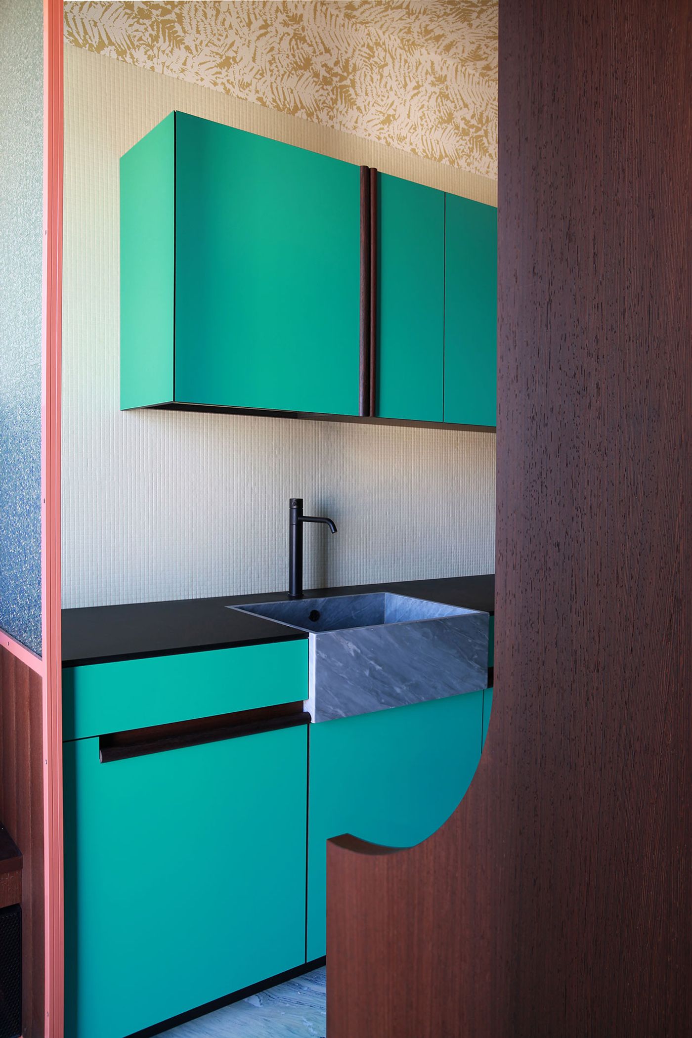
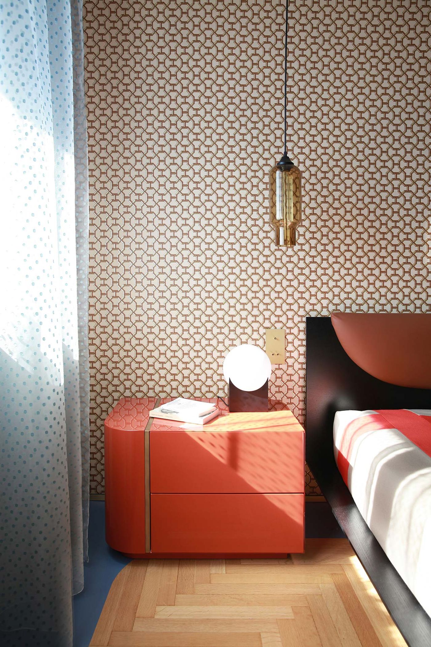
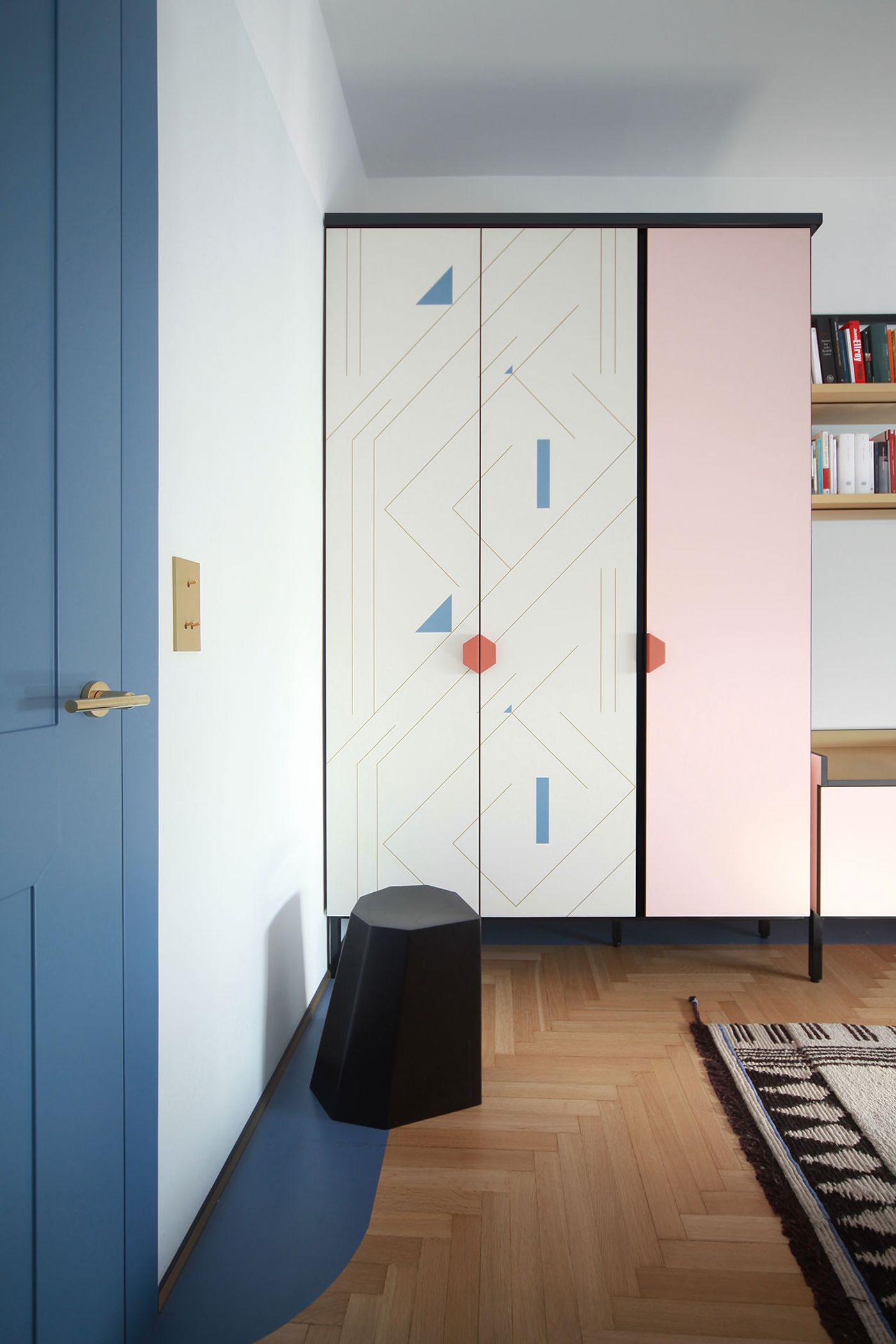
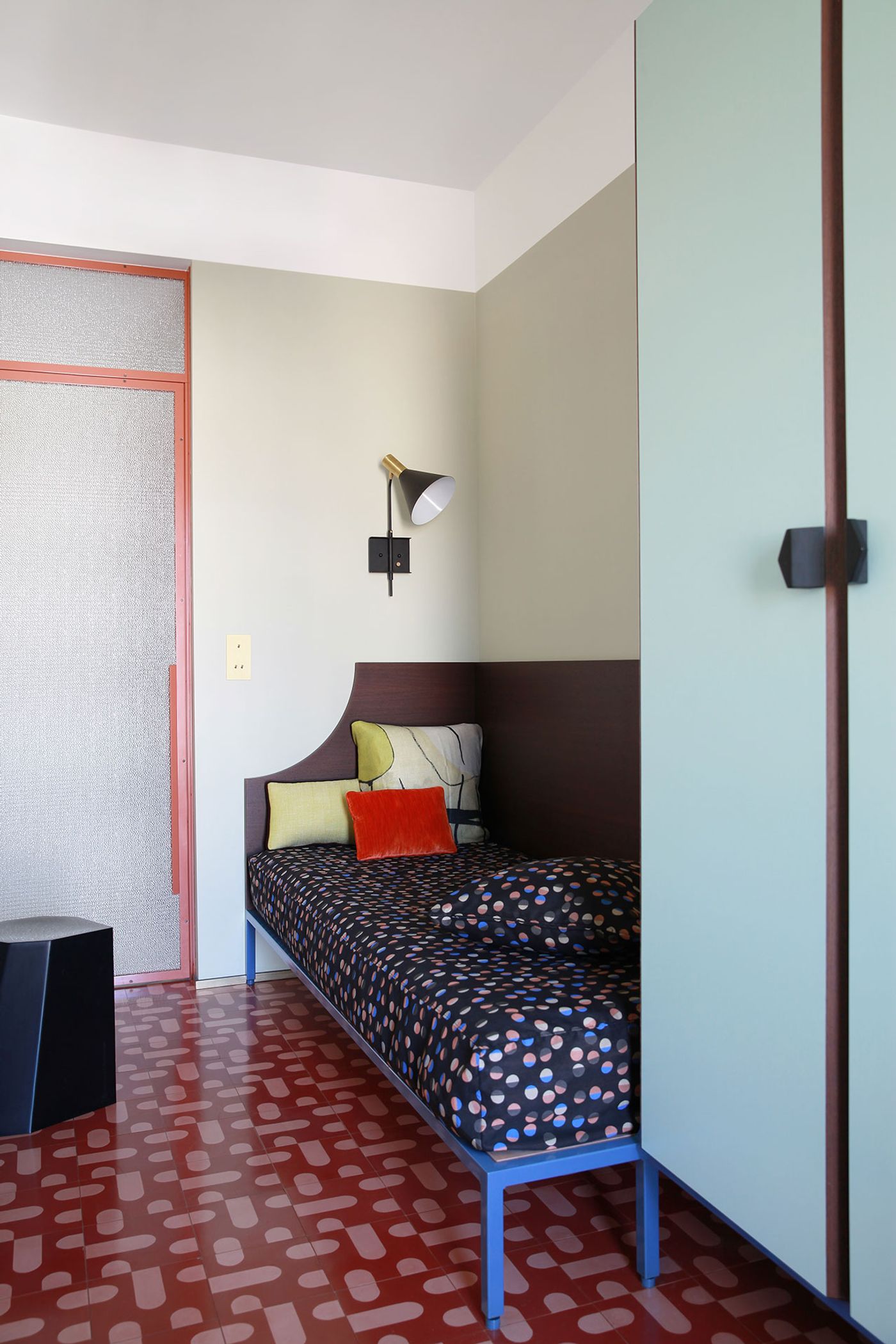
The luxurious material palette, which apart from marble and brass also includes rich upholstery and elegant wallpapers, is purposefully juxtaposed with “humble” materials like cement tiles, colourfully painted metallic structures, and laminate which is used for bespoke cupboards, storage cabinets and bath furnishings. Along with the original parquet flooring, which is whimsically adorned with opaque resin coatings, such “humble” materials allude to the building’s 1960s origins, as do an eclectic collection of light fittings and other decorative pieces. The 1960s vibe is complemented by a series of stylistic references, from Art Deco to the 1980s Memphis Group, filtered through a contemprary lens of sophisticated finesse.
The creative tension between luxurious and everyday materials is further echoed by the juxtaposition of colours and textures throughout the apartment, as well as the furniture selection which encompasses both 20th-century and contemporary pieces in a bold gesture that marries modernity with tradition, perefectly summing up the architects’ “Milanese theorem”.

Photo by Carola Ripamonti.

Photo by Carola Ripamonti.

Photo by Carola Ripamonti.

Photo by Carola Ripamonti.

Photo by Carola Ripamonti.

Photo by Carola Ripamonti.

Photo by Carola Ripamonti.

Photo by Carola Ripamonti.
