The Incredible Transformation of a Stately Apartment in Barcelona
Words by Eric David
Location
Barcelona, Spain
The Incredible Transformation of a Stately Apartment in Barcelona
Words by Eric David
Barcelona, Spain
Barcelona, Spain
Location
Faced with renovating a property of unwieldy proportions, Raúl Sánchez of Spanish practice RAS Arquitectura has resourcefully managed to transform this Barcelona stately apartment into a light-filled abode of modern elegance.
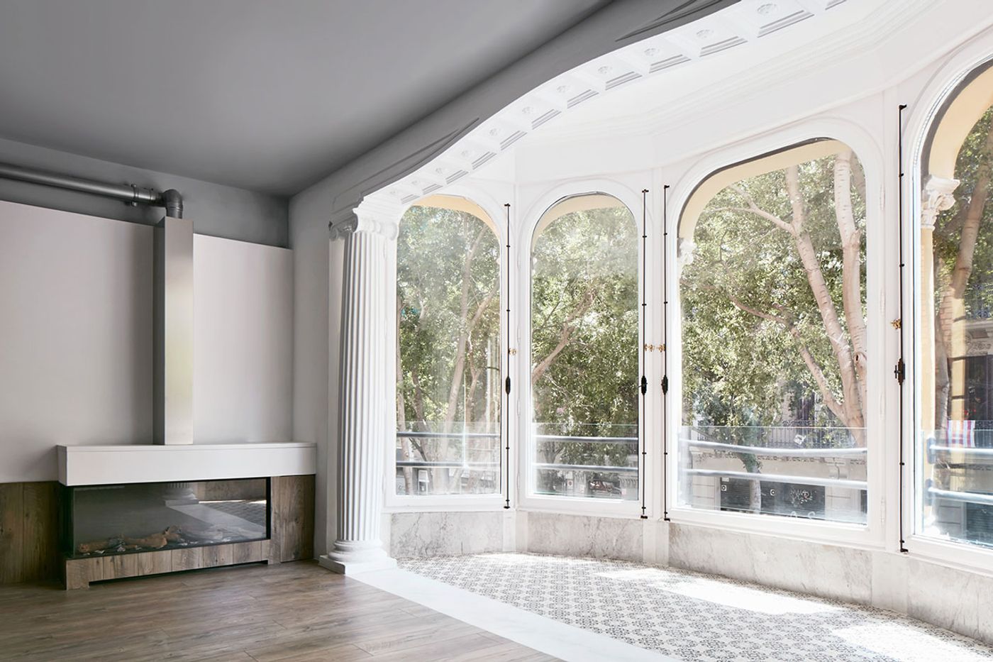
Photo by Jose Hevia.
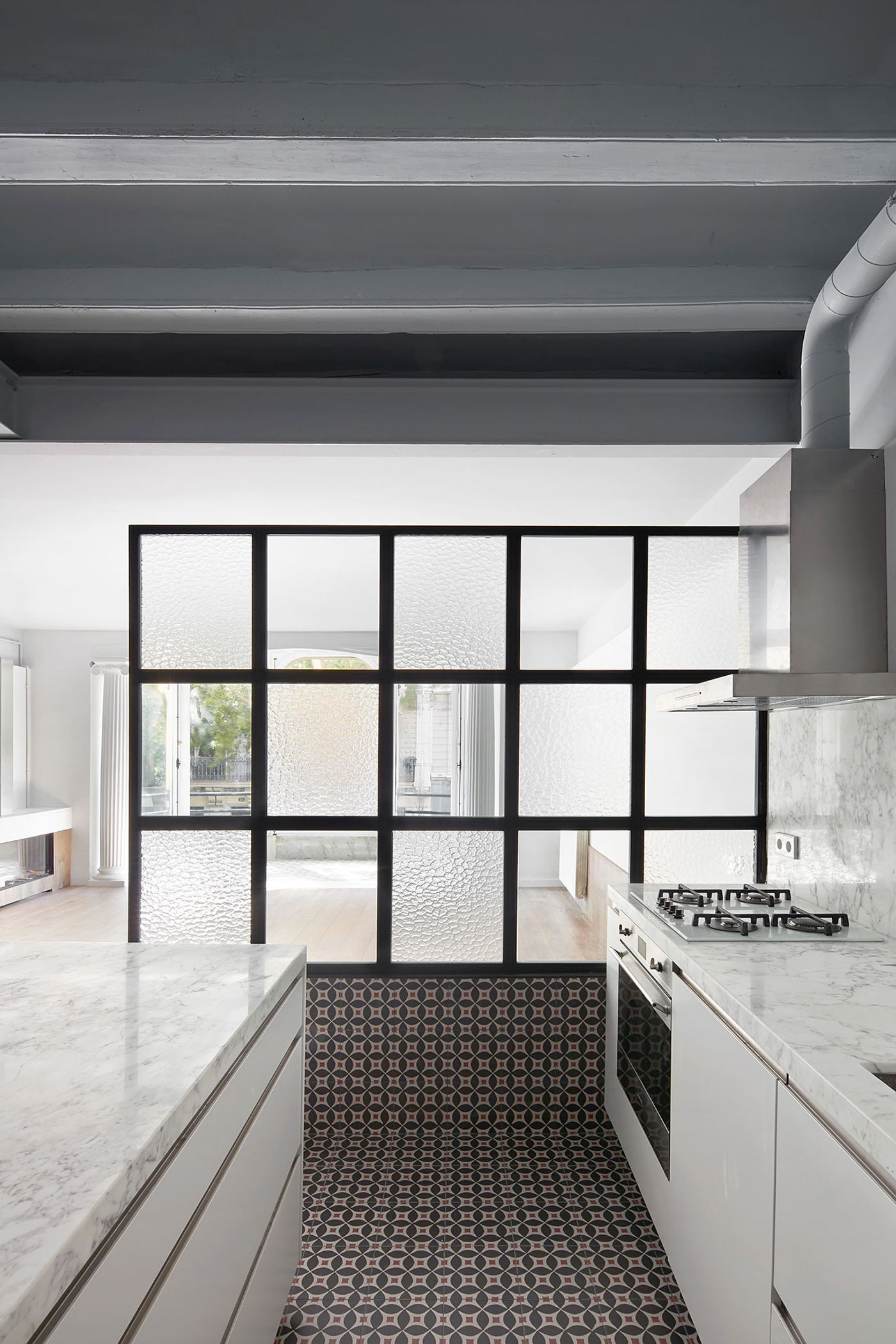
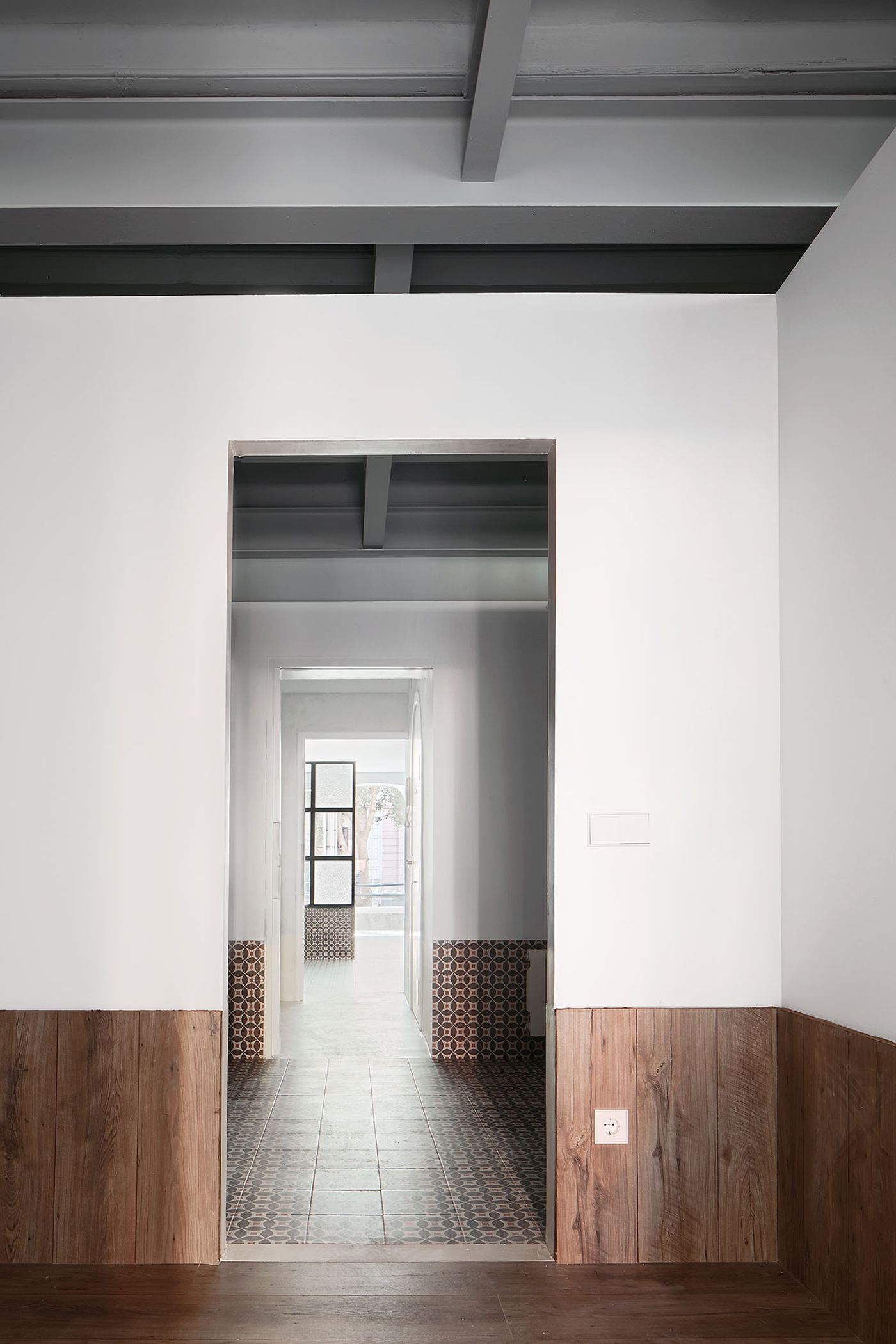
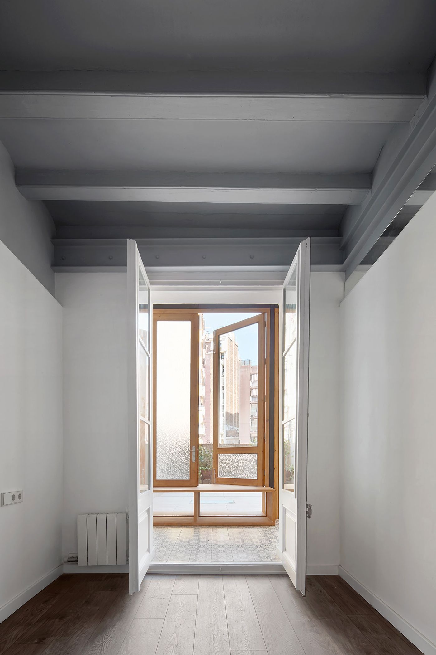
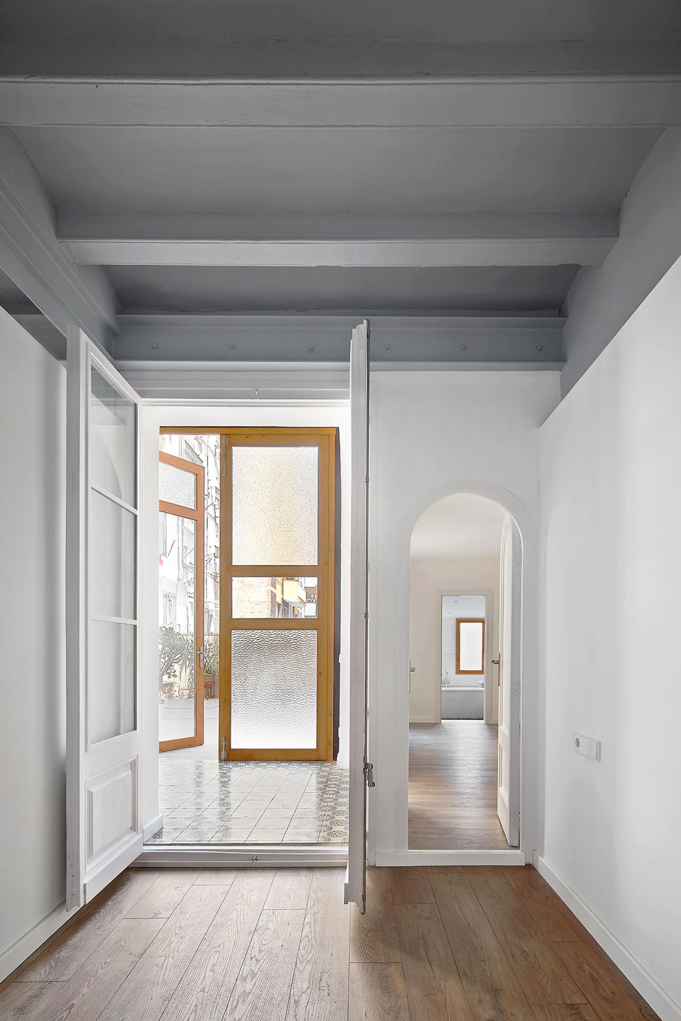
The key challenge Sánchez had to face in refurbishing this 140-square-meter apartment was its long and narrow floorplan. His solution was to eschew corridors, hallways and even doors for a sequential arrangement whereby the rooms, delimited by partitions that do not reach the ceiling, run into each other. This arrangement maximizes the size of the rooms, provides uninterrupted views across the apartment by aligning the openings between spaces, and most importantly, allows daylight from the bay window on the front and the courtyard on the back to diffuse throughout the entire apartment. The glazed partition between the living room and the kitchen further facilitates the light propagation, as does the fully-glazed gallery by the courtyard, wholly reconstructed out of wood and a playful mixture of clear and translucent panels of different sizes, the latter cleverly obscuring the unappealing views out the back.
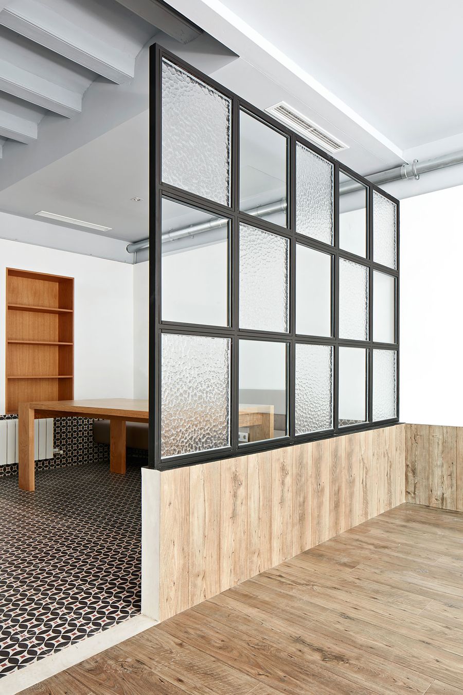
Photo by Jose Hevia.
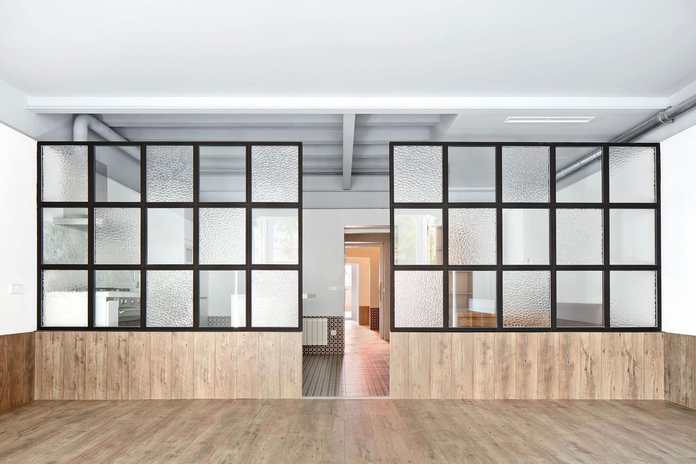
Photo by Jose Hevia.
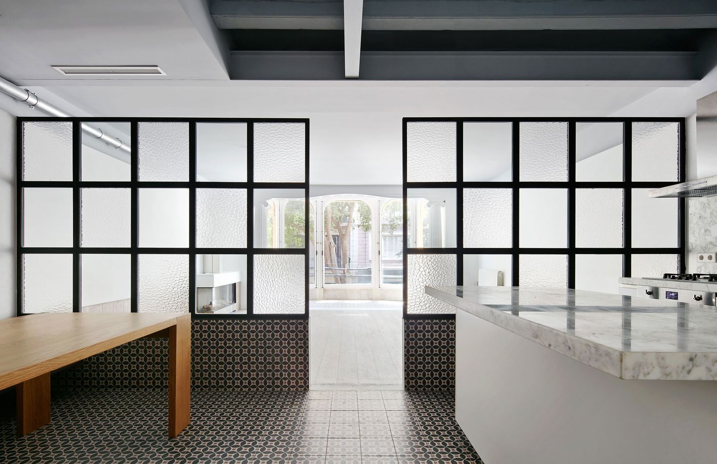
Photo by Jose Hevia.
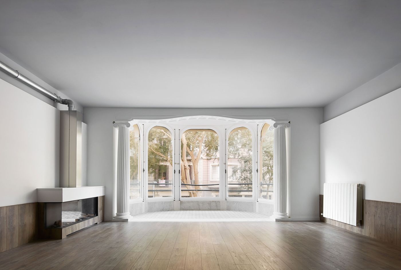
The two restored Ionic columns by the bow window are the only decorative elements in this clean-cut, minimal apartment.
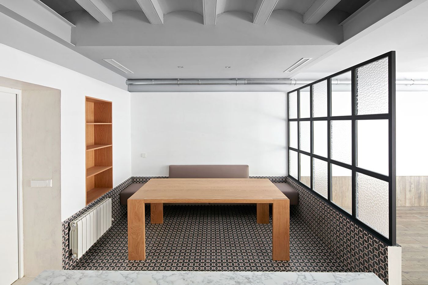
Photo by Jose Hevia.
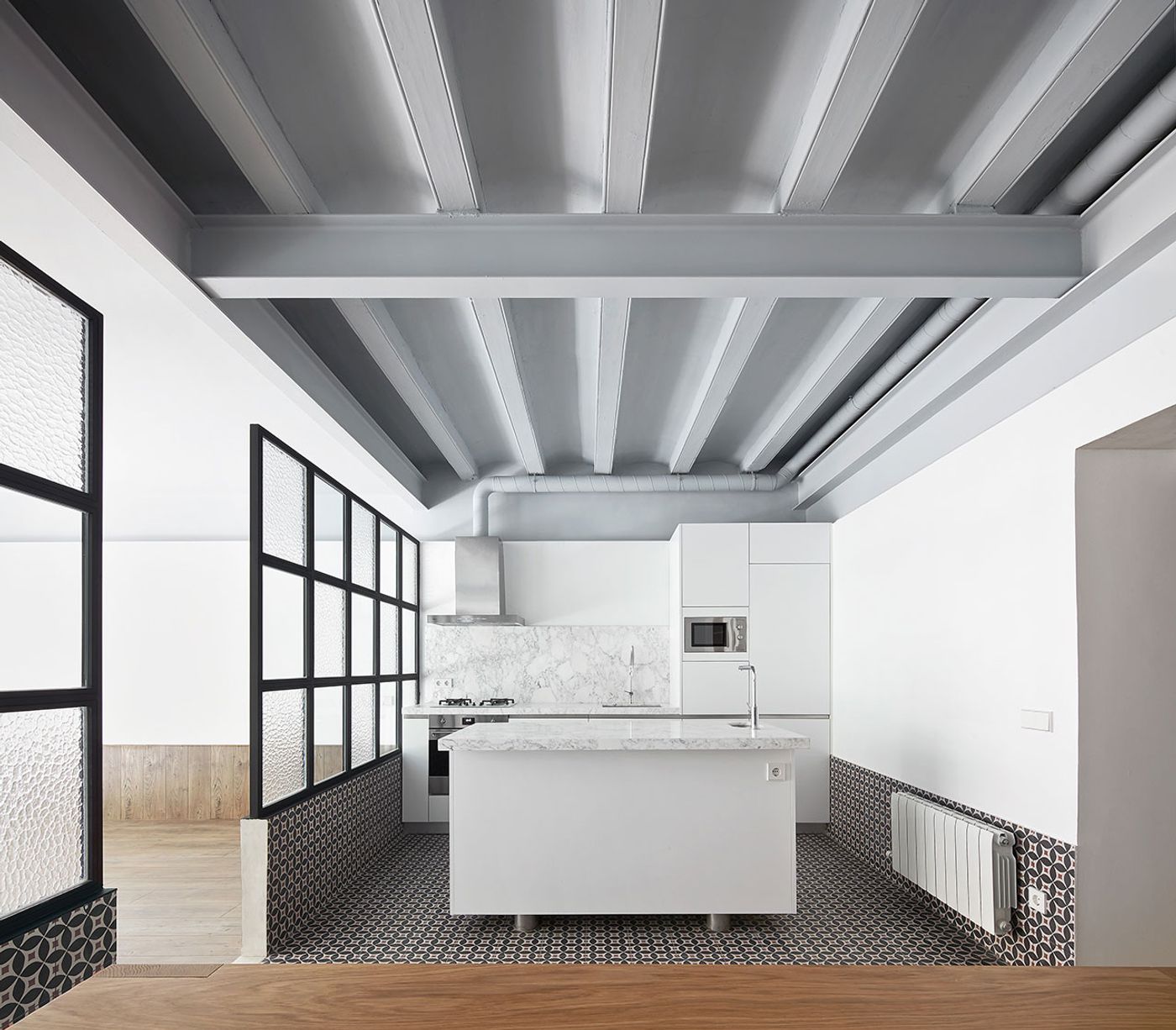
Photo by Jose Hevia.
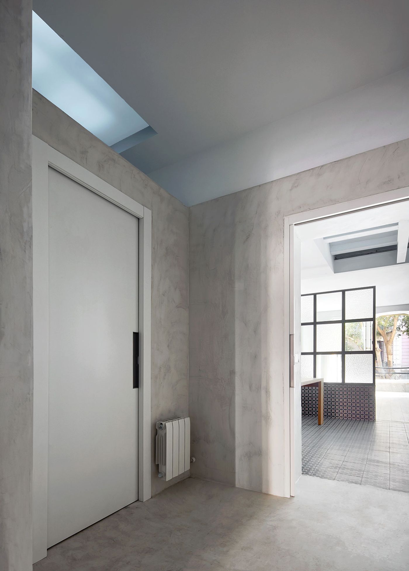
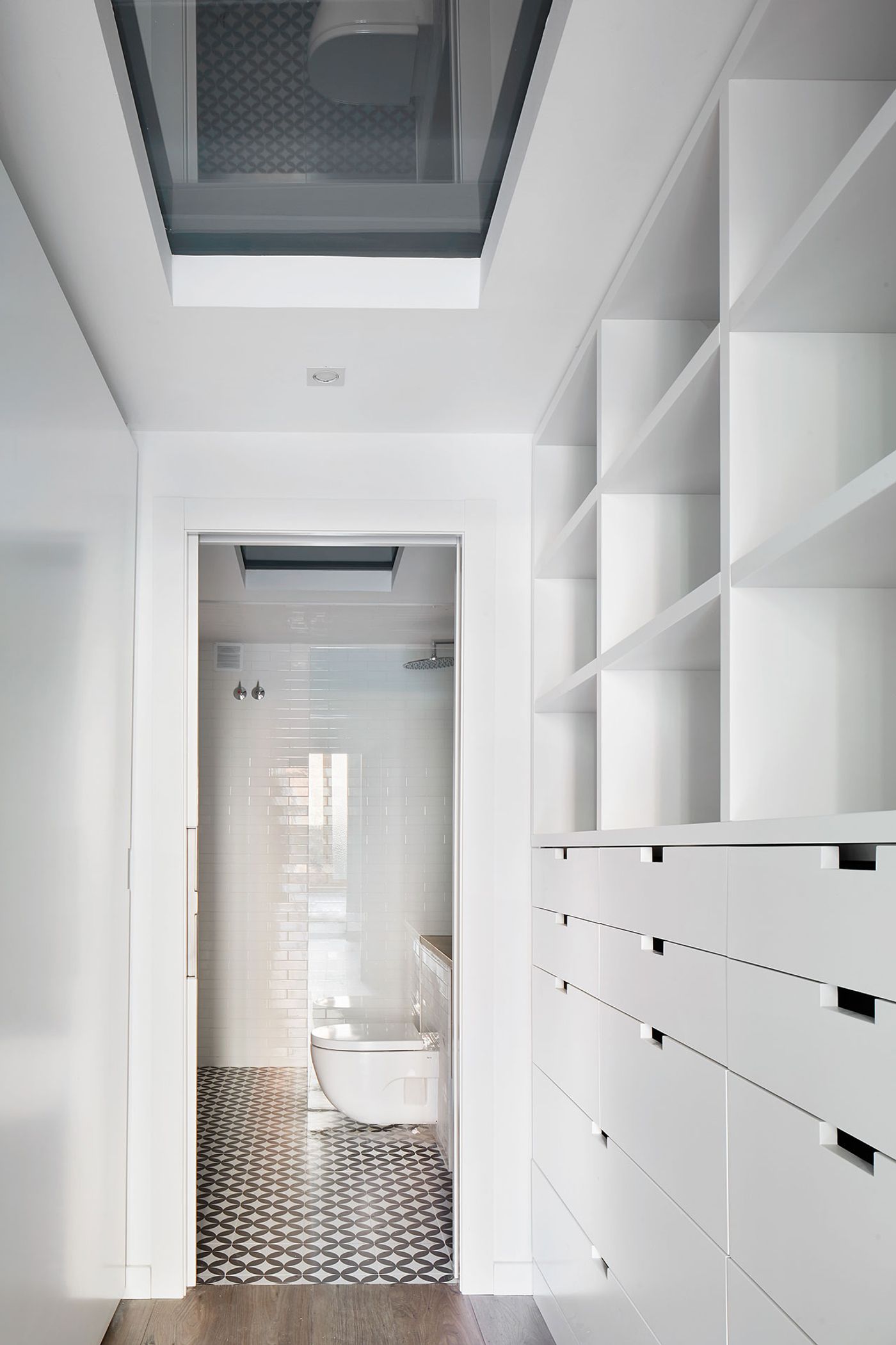
Another key design feature of the renovation is the subdivision of all spaces into three decorative zones: a top section painted grey that encompasses the original vaulted ceiling and structural elements running uninterrupted throughout the apartment, a middle section painted white that extends from a height of 60cm to the top of the partitions, and a contrasting zone below that is clad in either wood (living room, study and bedrooms) or patterned tiles (kitchen, bathrooms and buffer zones). Gluing the rooms together, Sánchez has used micro-cement to fill in the thresholds between them as well as for the walls of the entrance vestibule. The resulting aesthetic is one of clean-cut lines, stately minimalism—its only decorative flourishes are the two restored Ionic columns by the bow window—and elegant comfort.
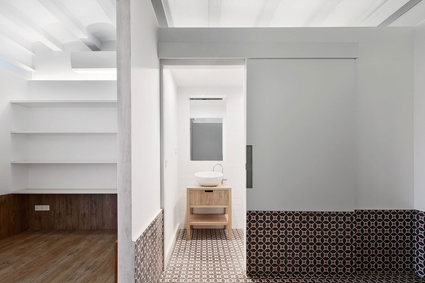
Photo by Jose Hevia.
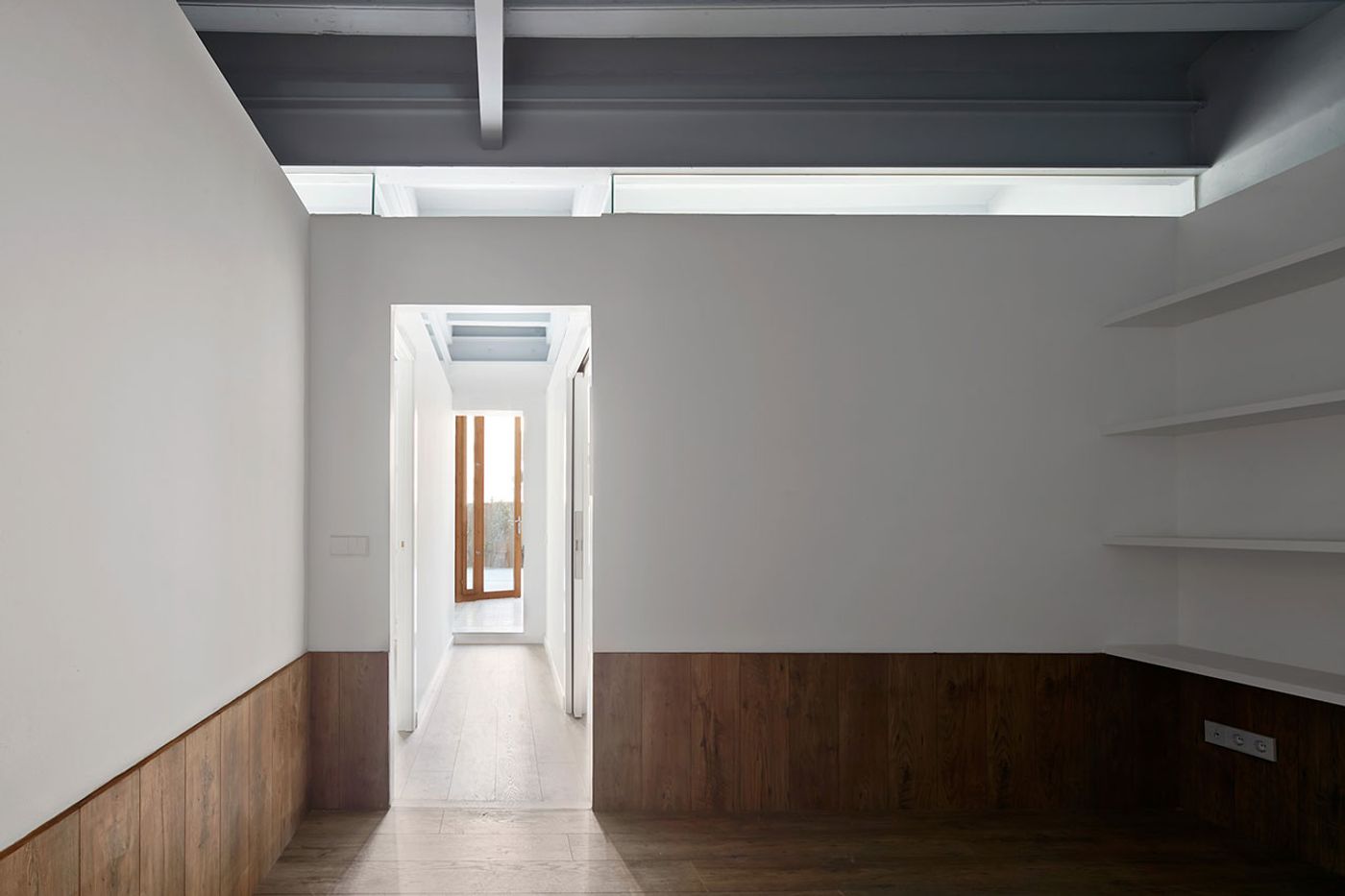
Photo by Jose Hevia.
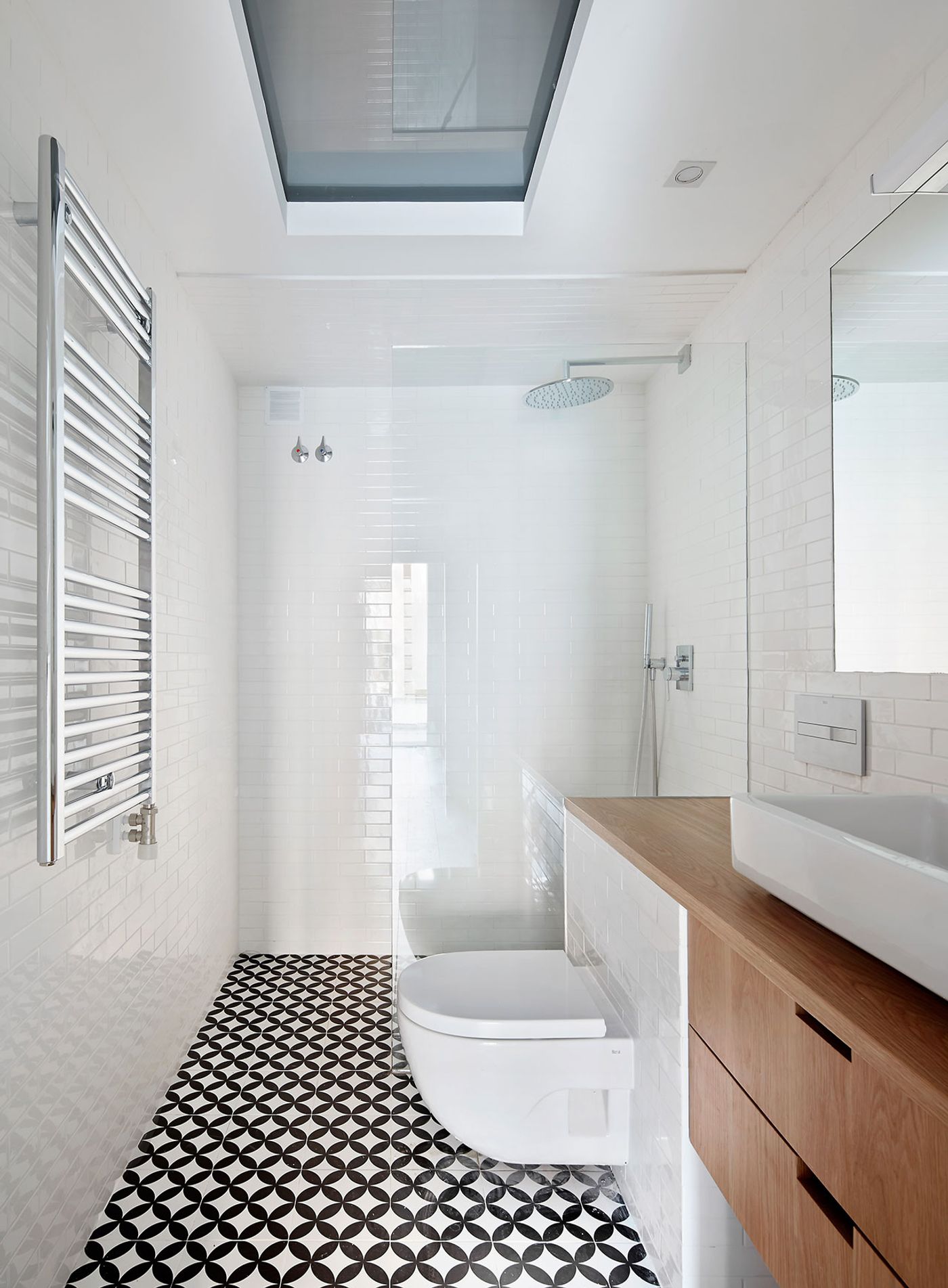
Photo by Jose Hevia.
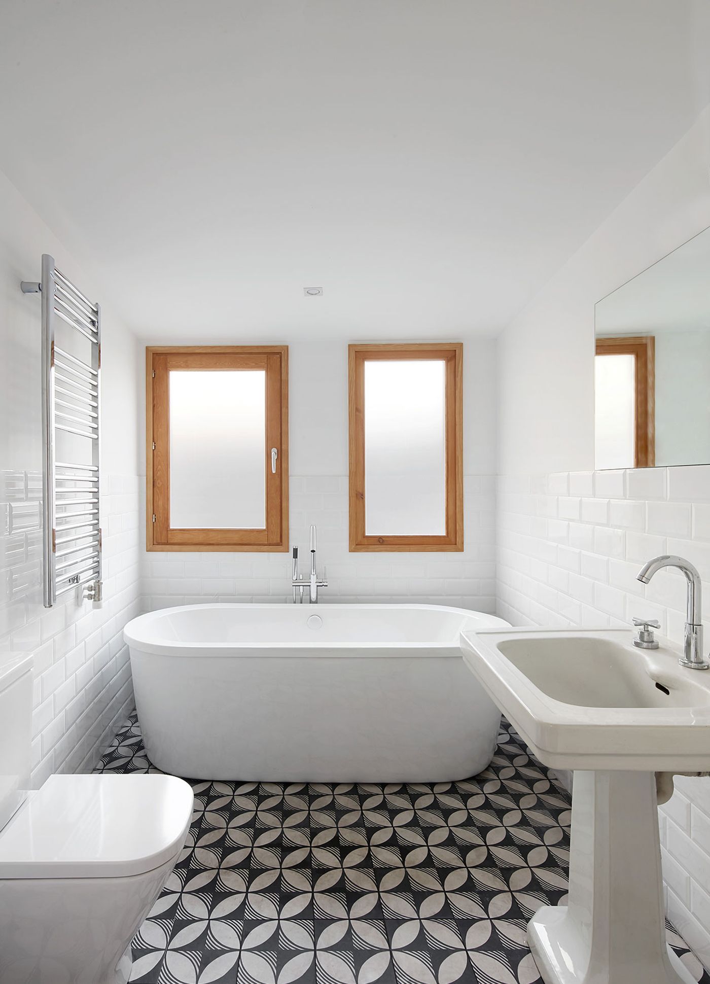
Photo by Jose Hevia.
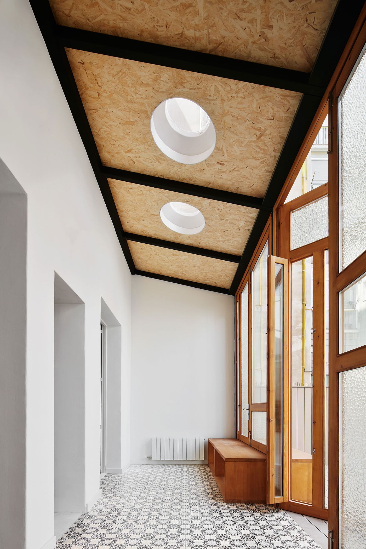
Photo by Jose Hevia.
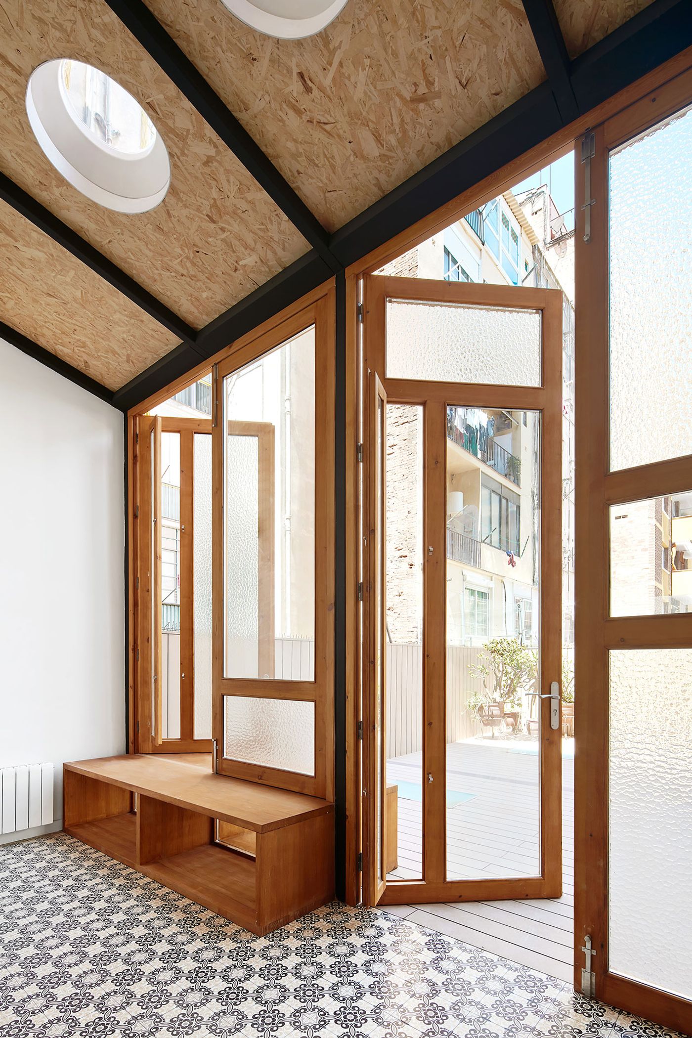
Photo by Jose Hevia.
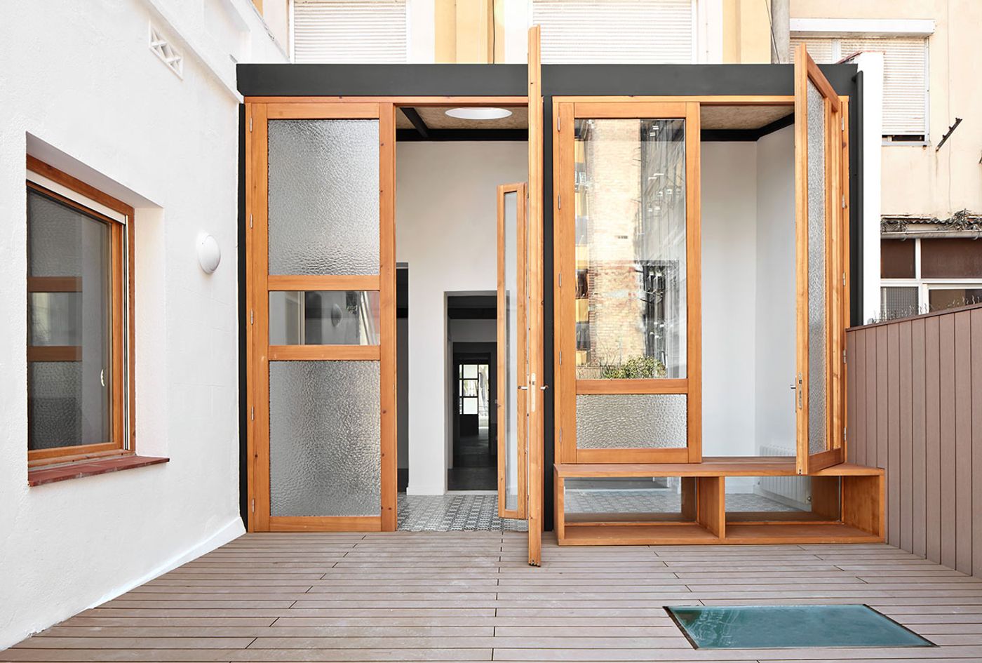
Photo by Jose Hevia.
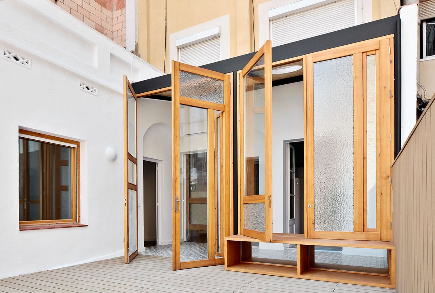
Photo by Jose Hevia.
