On the Menu: A Dynamic Approach to Greek Street Food at Souva in Seoul
Words by Sara Panagiotopoulou
Location
Seoul, South Korea
On the Menu: A Dynamic Approach to Greek Street Food at Souva in Seoul
Words by Sara Panagiotopoulou
Seoul, South Korea
Seoul, South Korea
Location
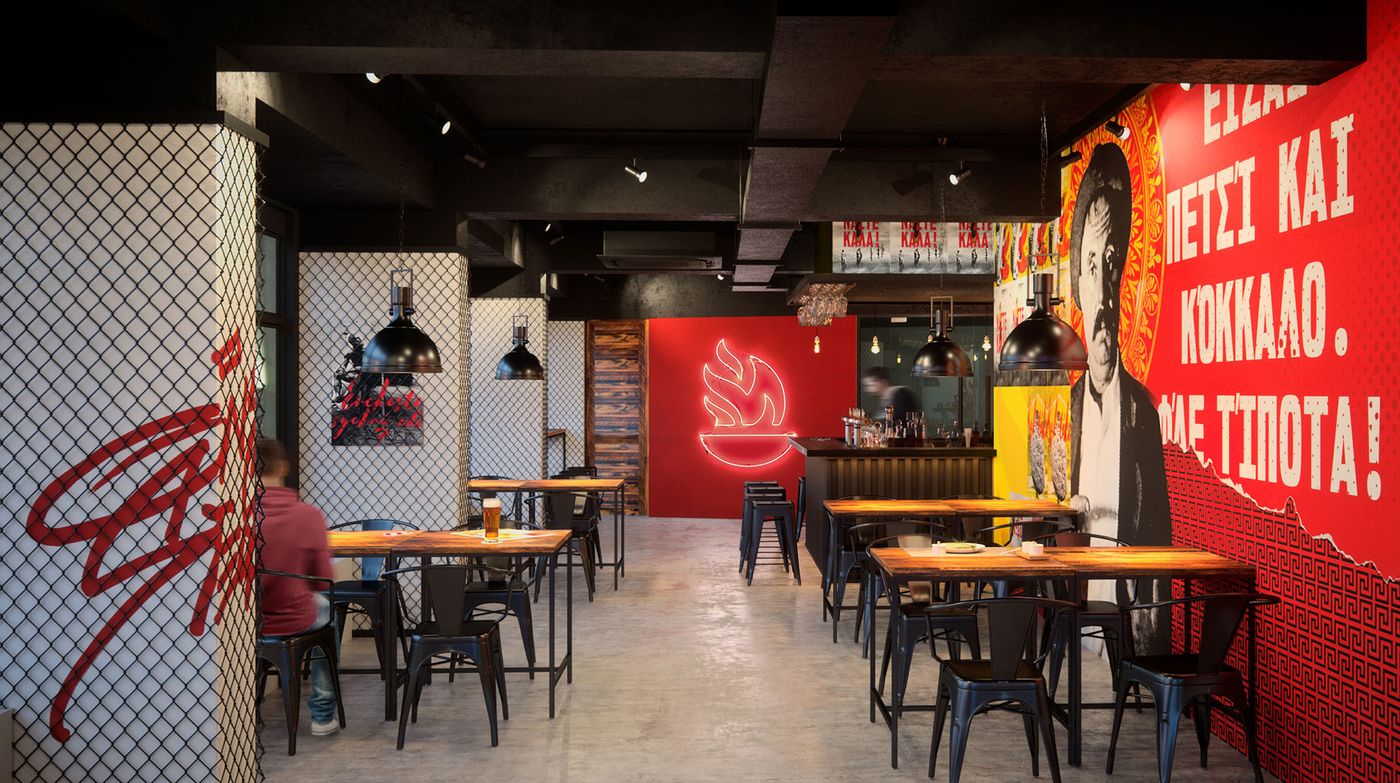
Souva, the fast service, Greek street food restaurant in Seoul, South Korea, serves up traditional fare in an untraditional setting. The owners had already decided upon the name - an inventive take on the unpretentious and popular grilled, Greek dish named "souvlaki" - as well as the restaurant's desired atmosphere and mood when they approached the design team of Brandon Archibald for the concept, branding and interior design. In short, the brief was to approach the project from a "democratic place with a modern look at the classic Greek kitchen" while steering clear of any clichés often associated with Greek style.
The bold result delivers on all that and more, infusing the simple fare with a "rough street spirit" and a definitive design directive that makes it anything but formulaic, seen in the absence of any poetic blue and white color scheme and island vibe but rather, a strong color character of fiery red, hot yellow and pitch black, namely, the colors of a grill's fire pit.
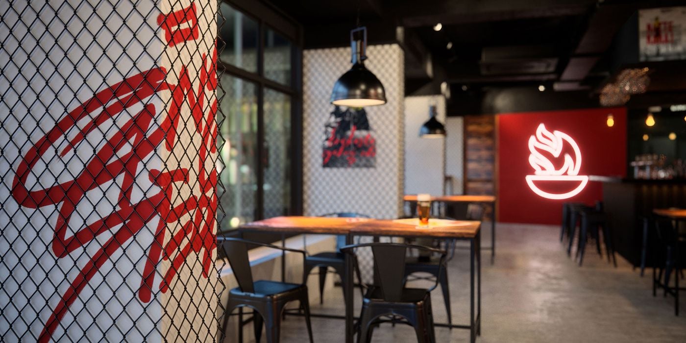
Photo © Brandon Archibald.
© Brandon Archibald.
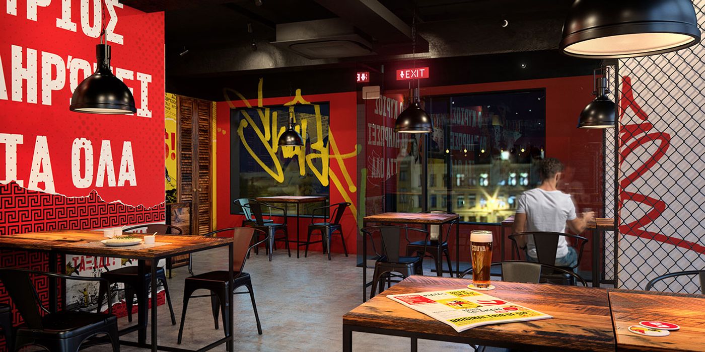
Photo © Brandon Archibald.
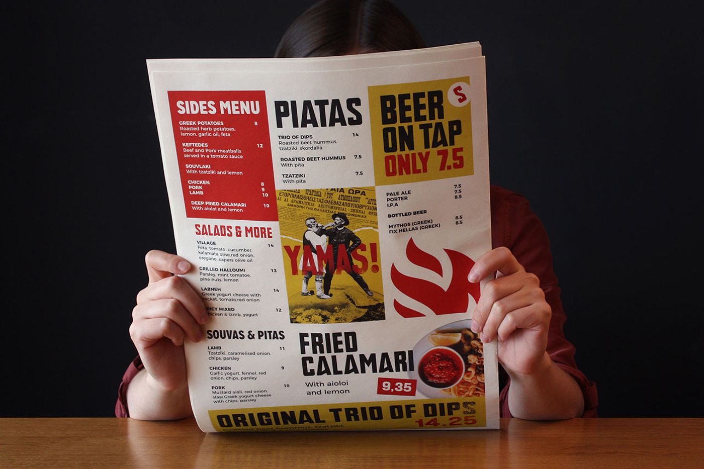
Photo © Brandon Archibald.
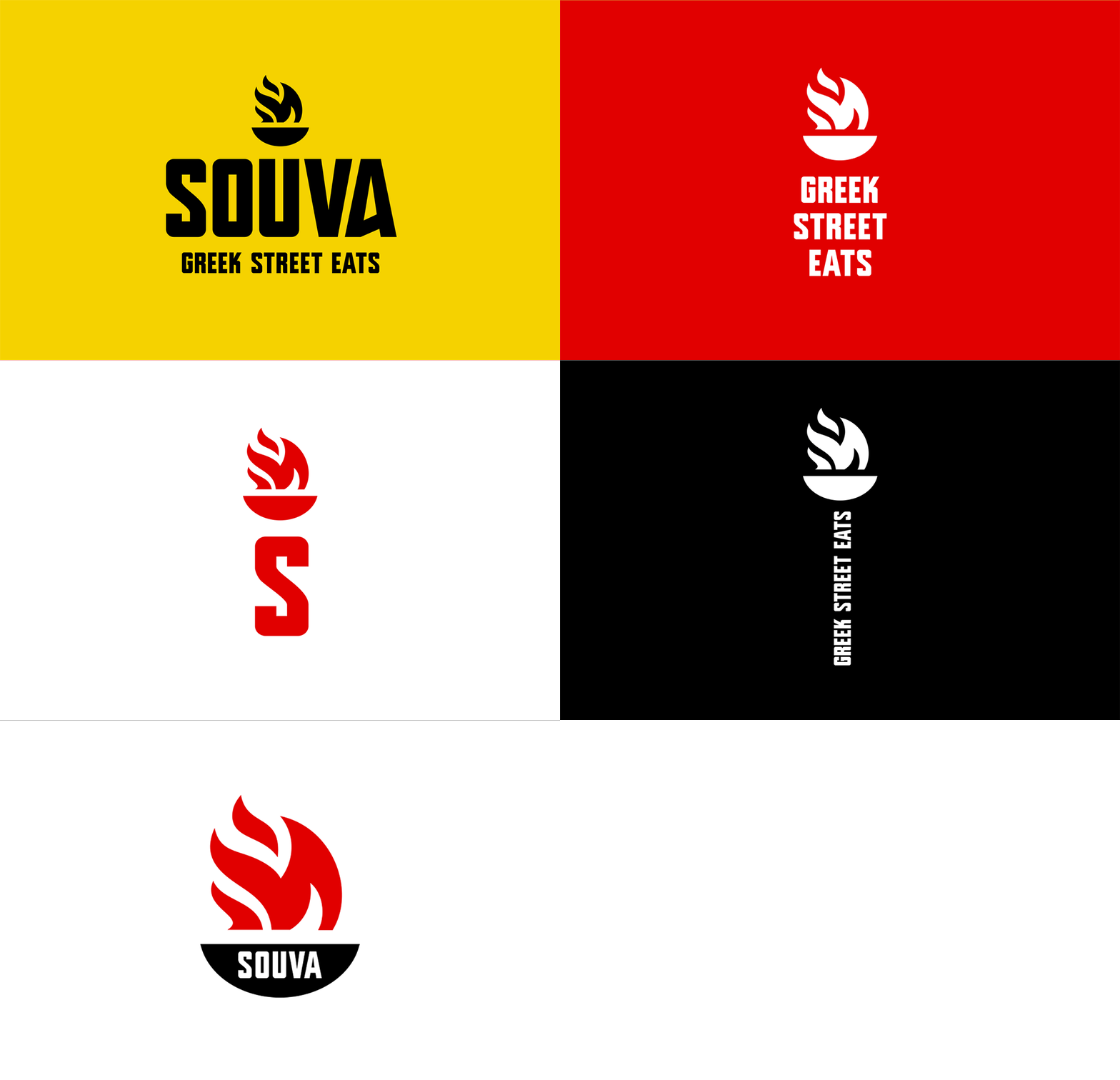
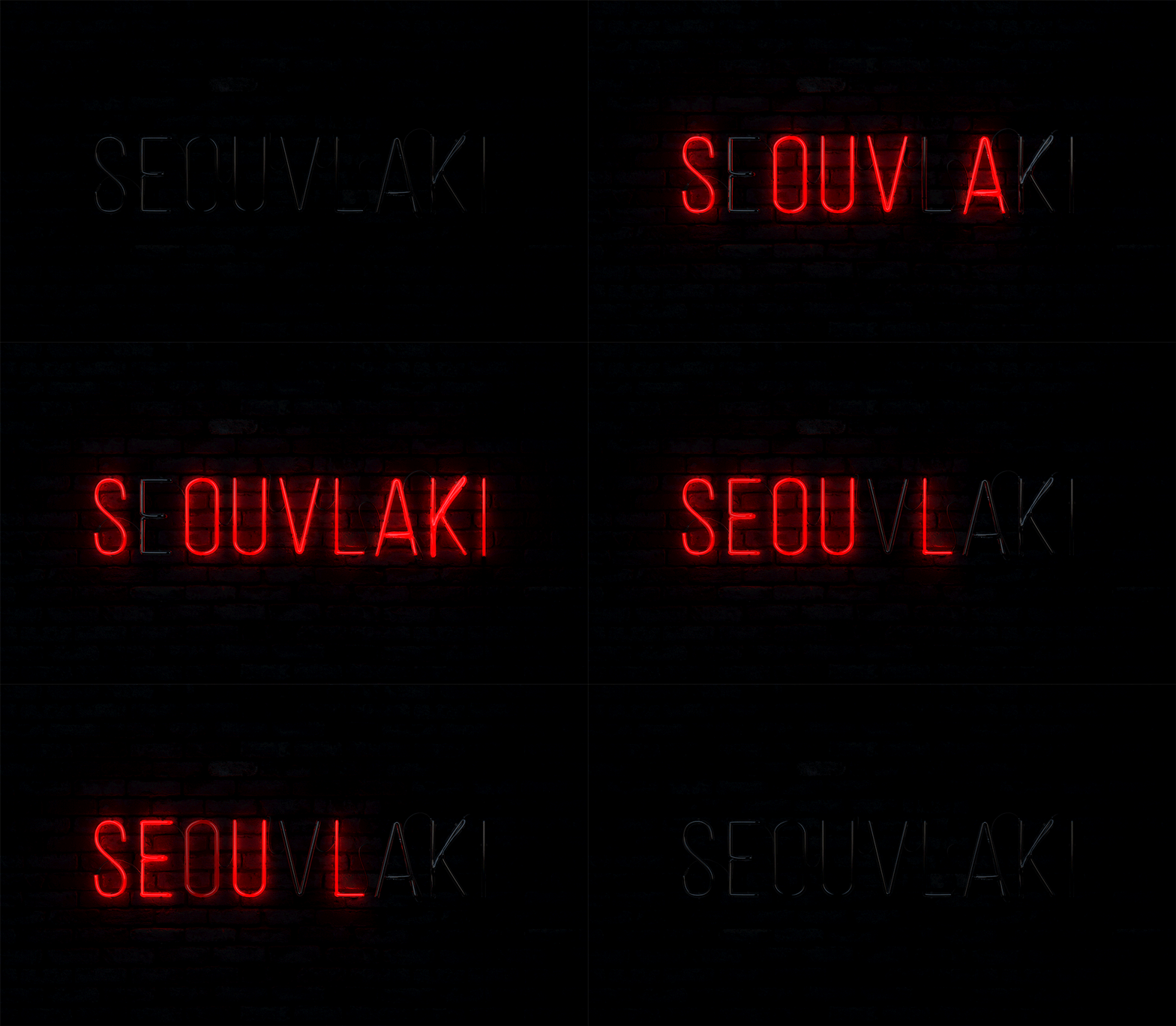
As such, a burning flame also serves as a vibrant symbol - the designers say that they were referencing the spirit of the Olympic flame - which has been used throughout the restaurant's design, infusing everything from the logo, to the food packaging, through to the red neon sign on the wall with a bold dynamism and hot temper. The logo itself is very minimal and to-the-point, for which the designers created a typography that features a slight Greek "character" to the lettering.
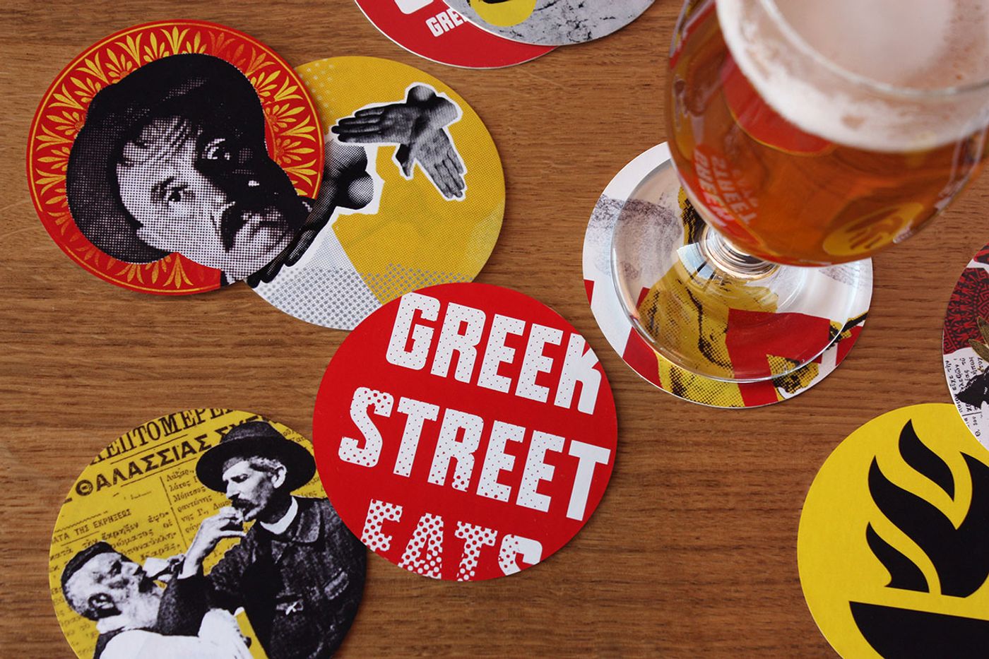
Photo © Brandon Archibald.

Photo © Brandon Archibald.
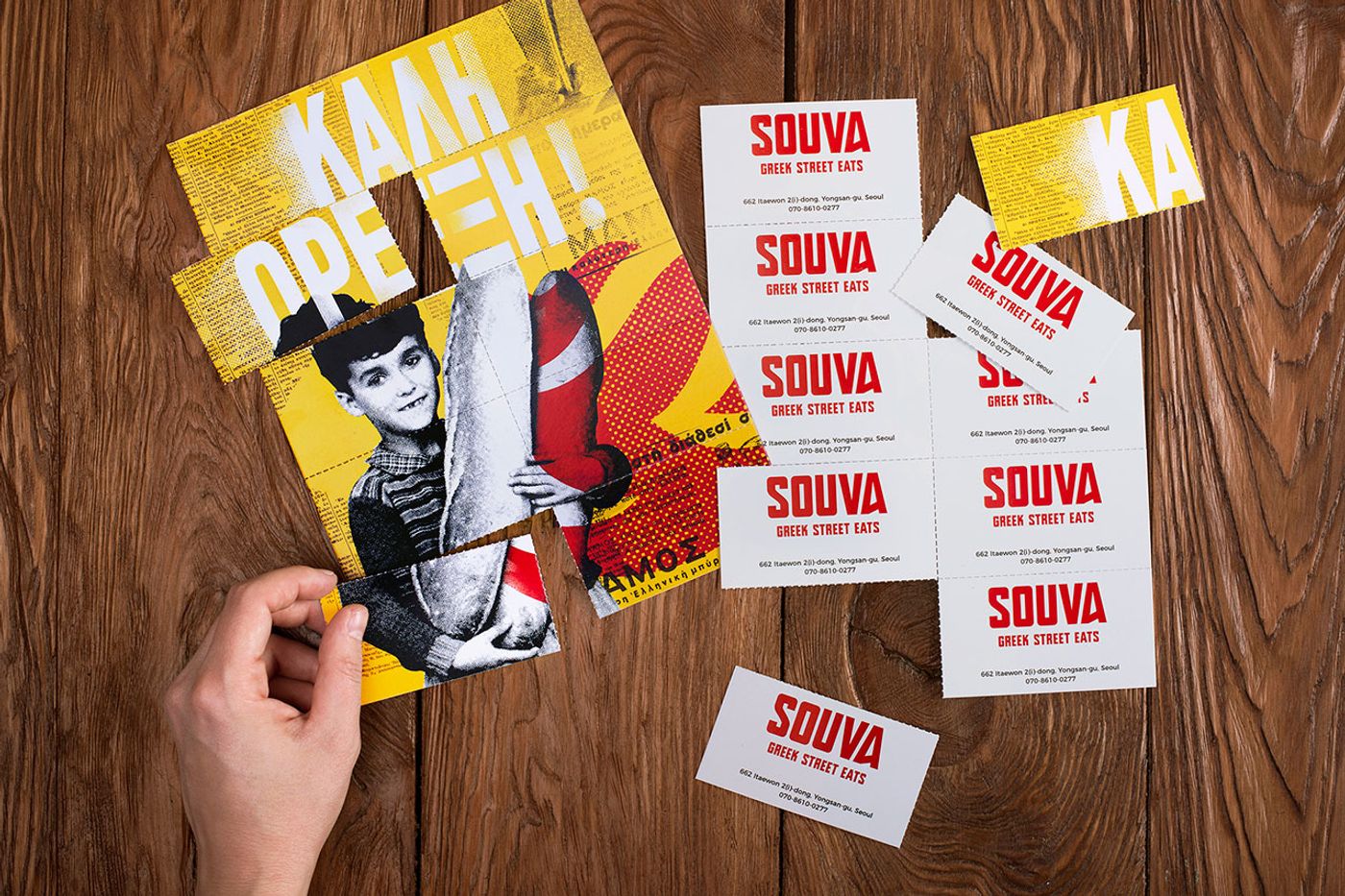
Photo © Brandon Archibald.
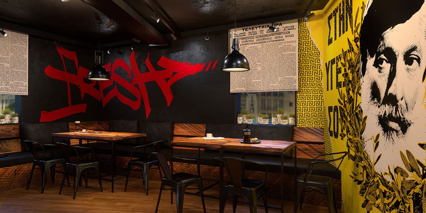
Photo © Brandon Archibald.
As far as the decor goes, the outside was brought in… but again, not in a nature-inspired way, but rather with an urban, "underground" spirit. This means uncomplicated, common materials that make up a city landscape, such as concrete, untreated wood, profiled metal sheeting and mesh. No fancy wallpapers sheath the walls here; instead, a collage of original posters featuring fun, Greek sayings - surrounding the concept of eating and/or enjoying ones meal, while and altered images taken from vintage advertisements, invite patrons to order a couple of the restaurant's signature dishes and pull up one of the black, wrought iron chairs.
"The place is not about fancy food, complicated recipes and expensive finishing materials," the designers say, citing that it was the international influence of not only the theme but of the proprietors and designers (the owner of this Greek restaurant in South Korea is Australian and it was designed by a Ukrainian design team) which culminated in a space that is fun, enticing and flavored with a zesty metropolitan temper.
© Brandon Archibald.
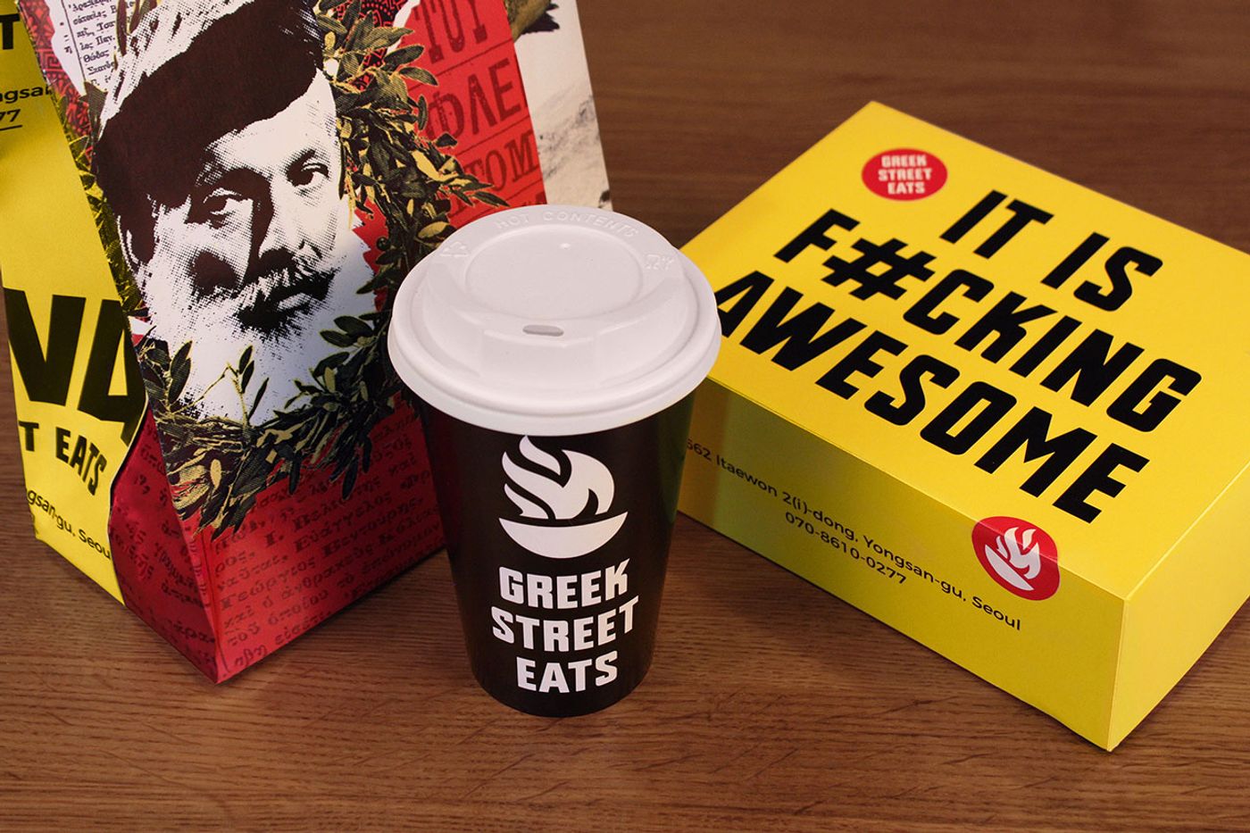
Photo © Brandon Archibald.
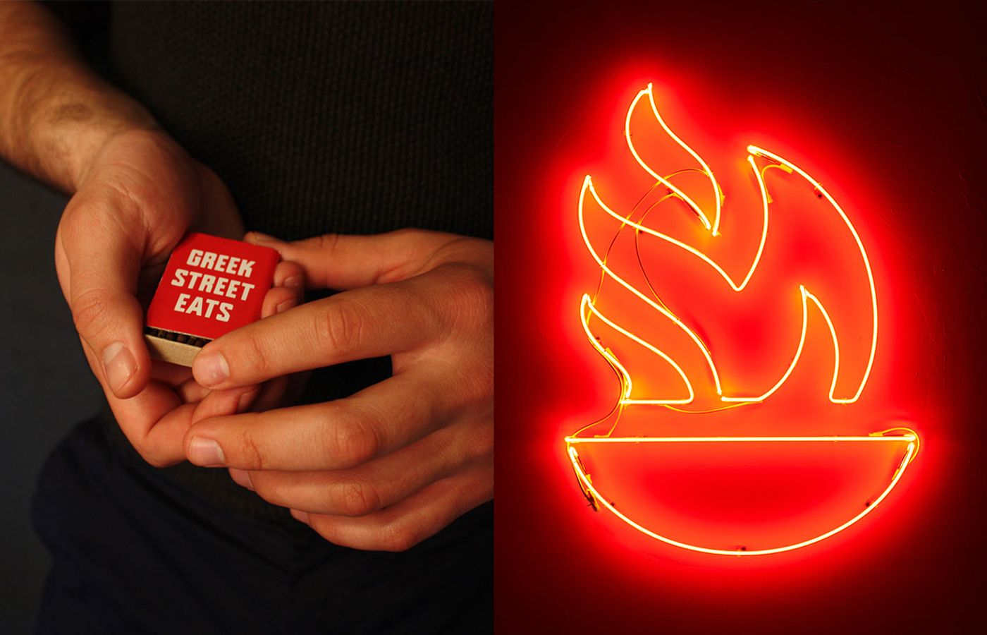
Photo © Brandon Archibald.
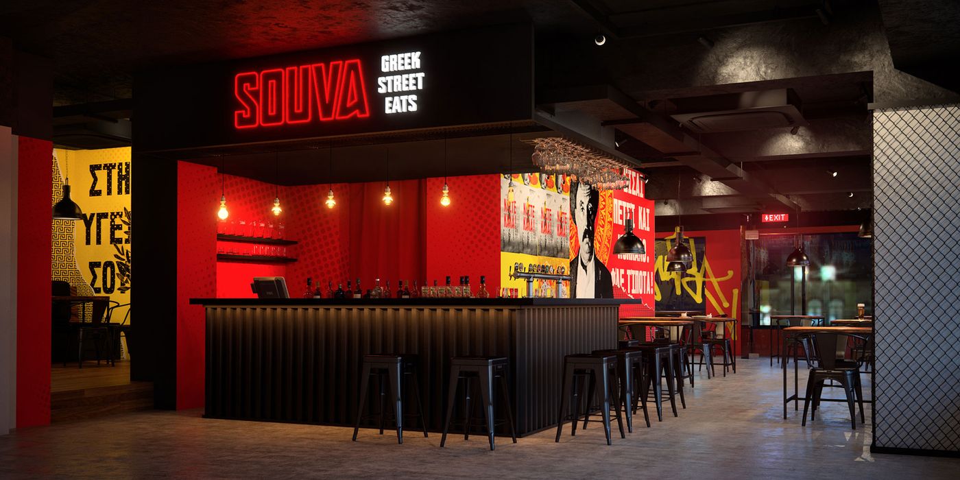
Photo © Brandon Archibald.
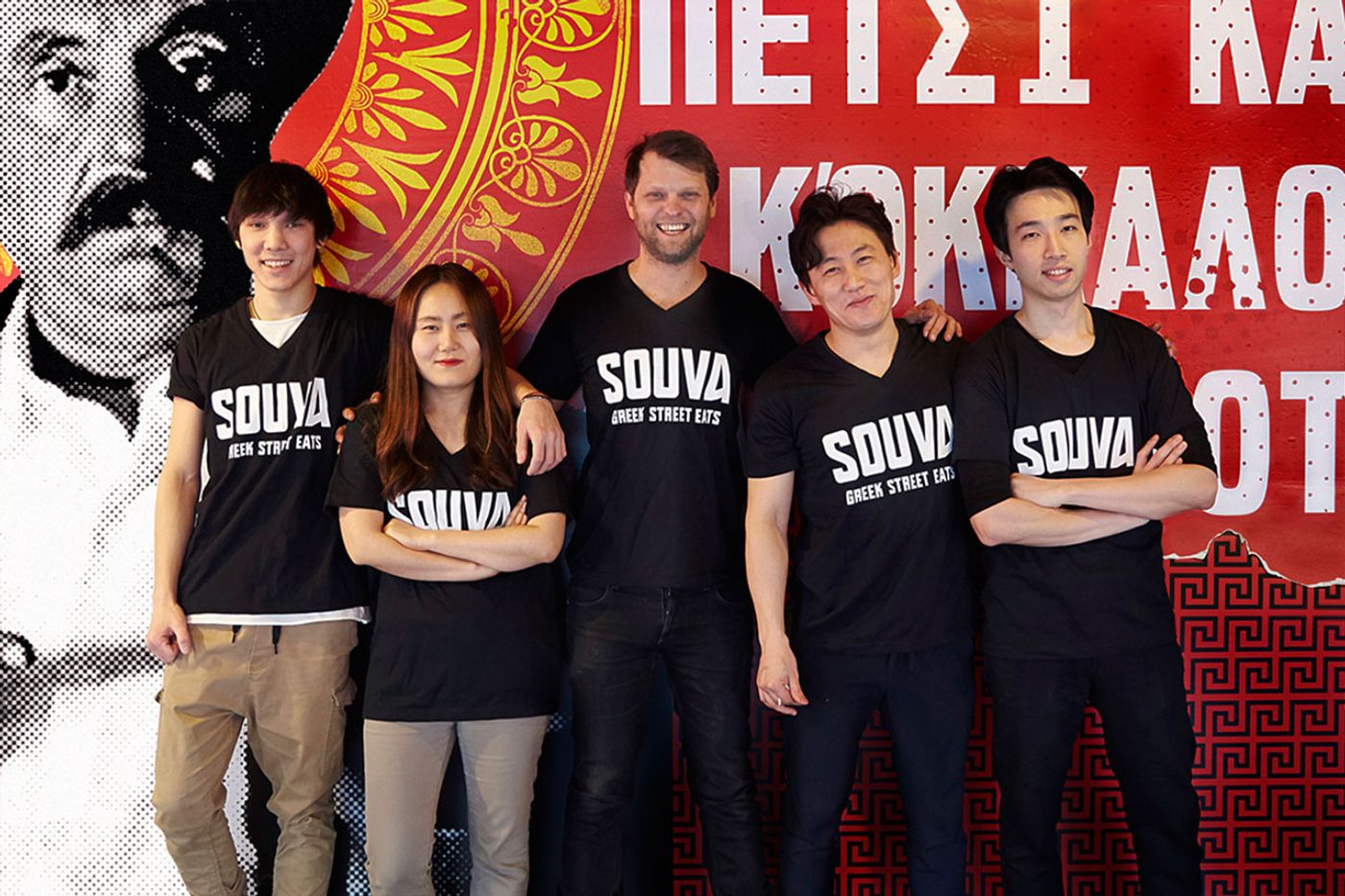
Photo © Brandon Archibald.
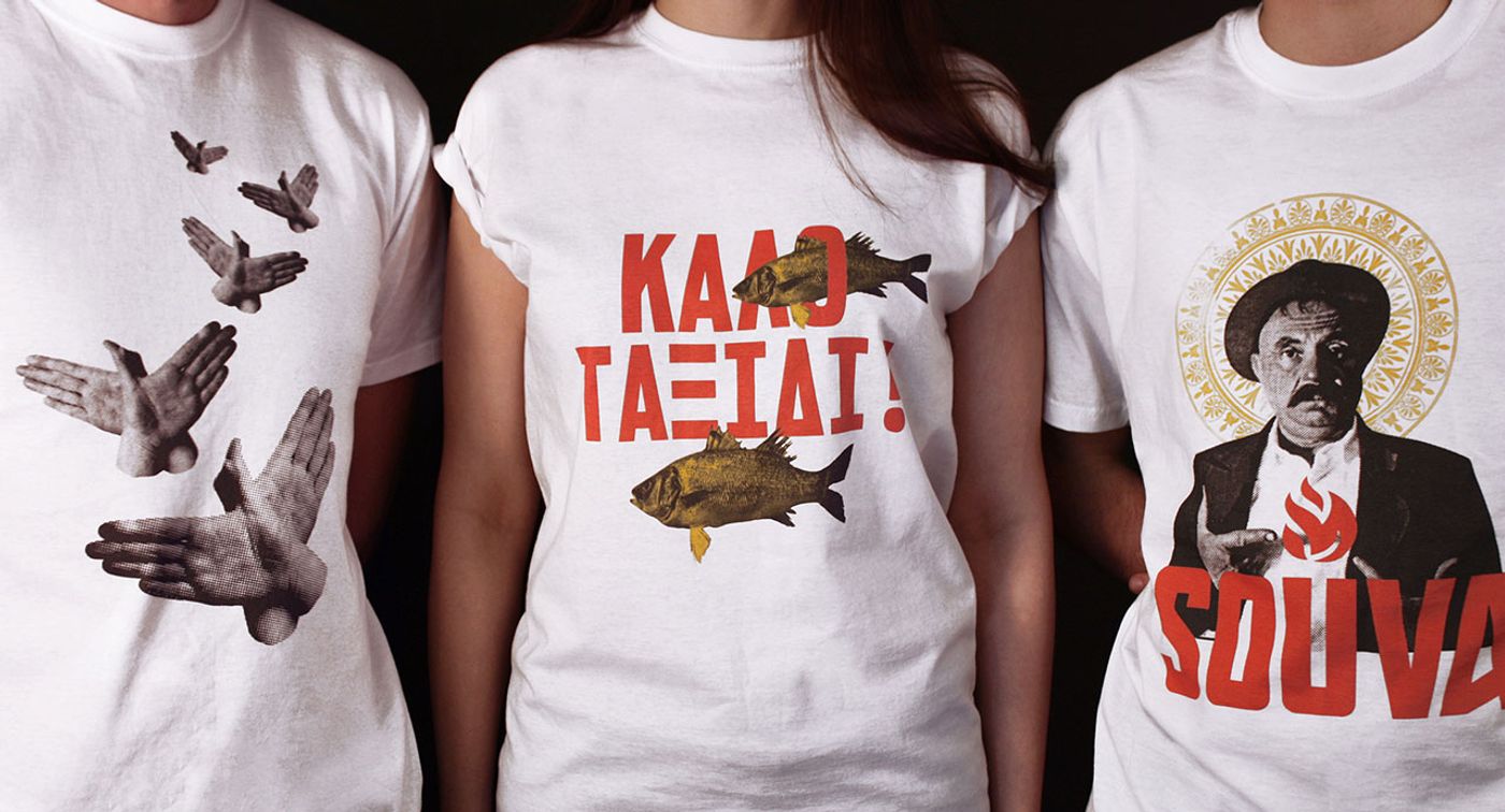
Photo © Brandon Archibald.
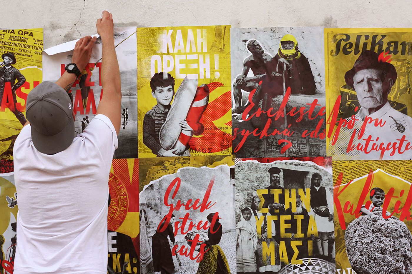
Photo © Brandon Archibald.