A Two-Level Apartment in Kiev Evocatively Highlights the Passage of Time
Words by Yatzer
Location
Kyiv, Ukraine
A Two-Level Apartment in Kiev Evocatively Highlights the Passage of Time
Words by Yatzer
Kyiv, Ukraine
Kyiv, Ukraine
Location
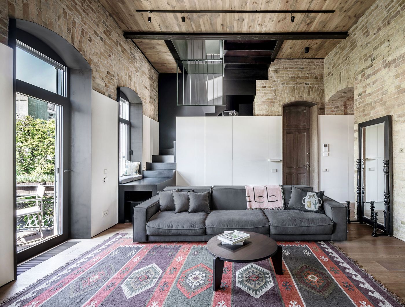
One of the main dilemmas that architects face when renovating old buildings, especially those that are not of great historical or architectural value, is how much, if any, of the original character to preserve and how much to efface in favour of their own design. For Kyiv-based architecture studio 2B.group, who were commissioned by a young single professional to refurbish a maisonette in a listed building in Kyiv, the answer to this dilemma was an astutely tuned balance between old and new, authenticity and originality, beautifully highlighting the passage of time through a minimalist aesthetic of ‘less is definitely more’.
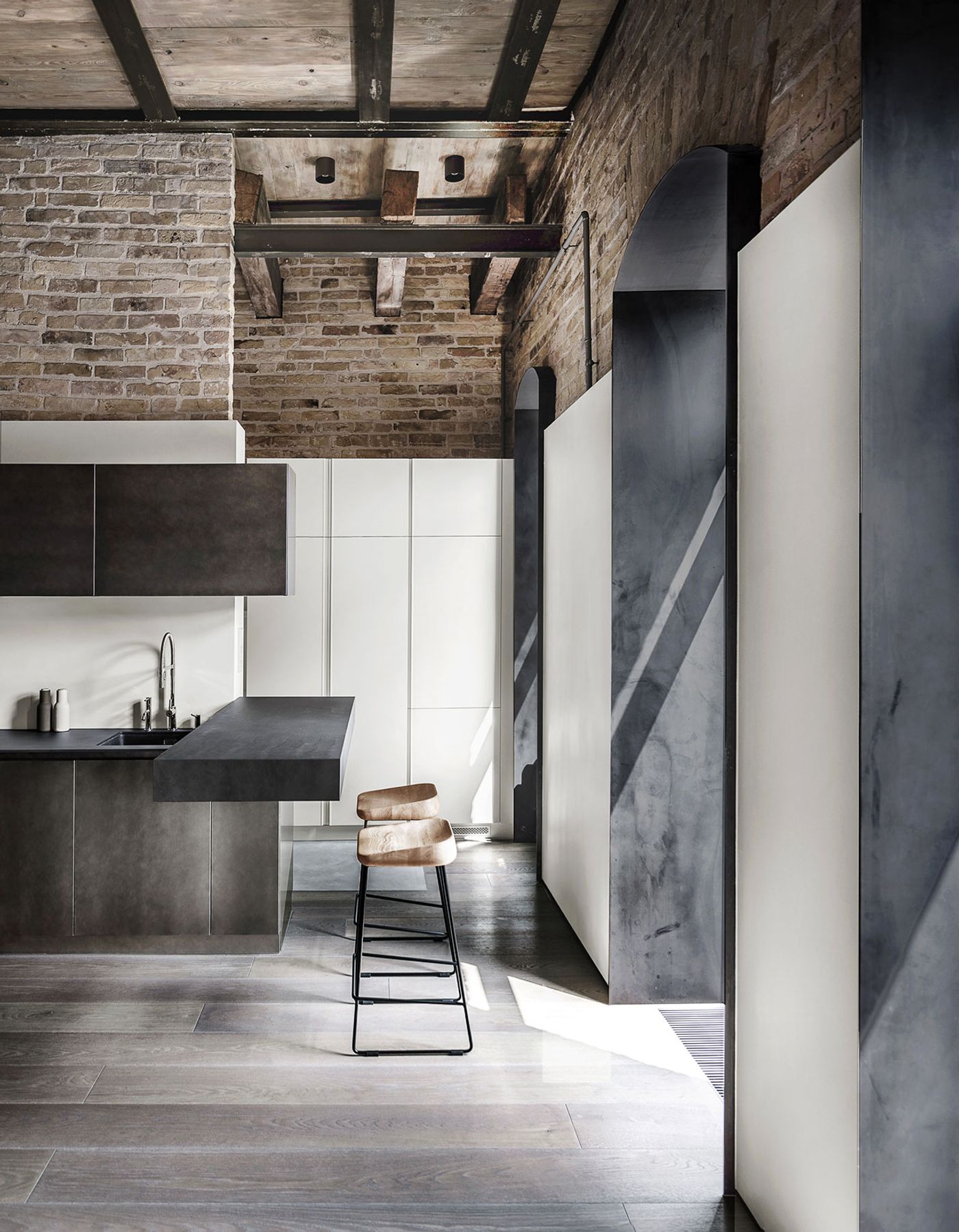
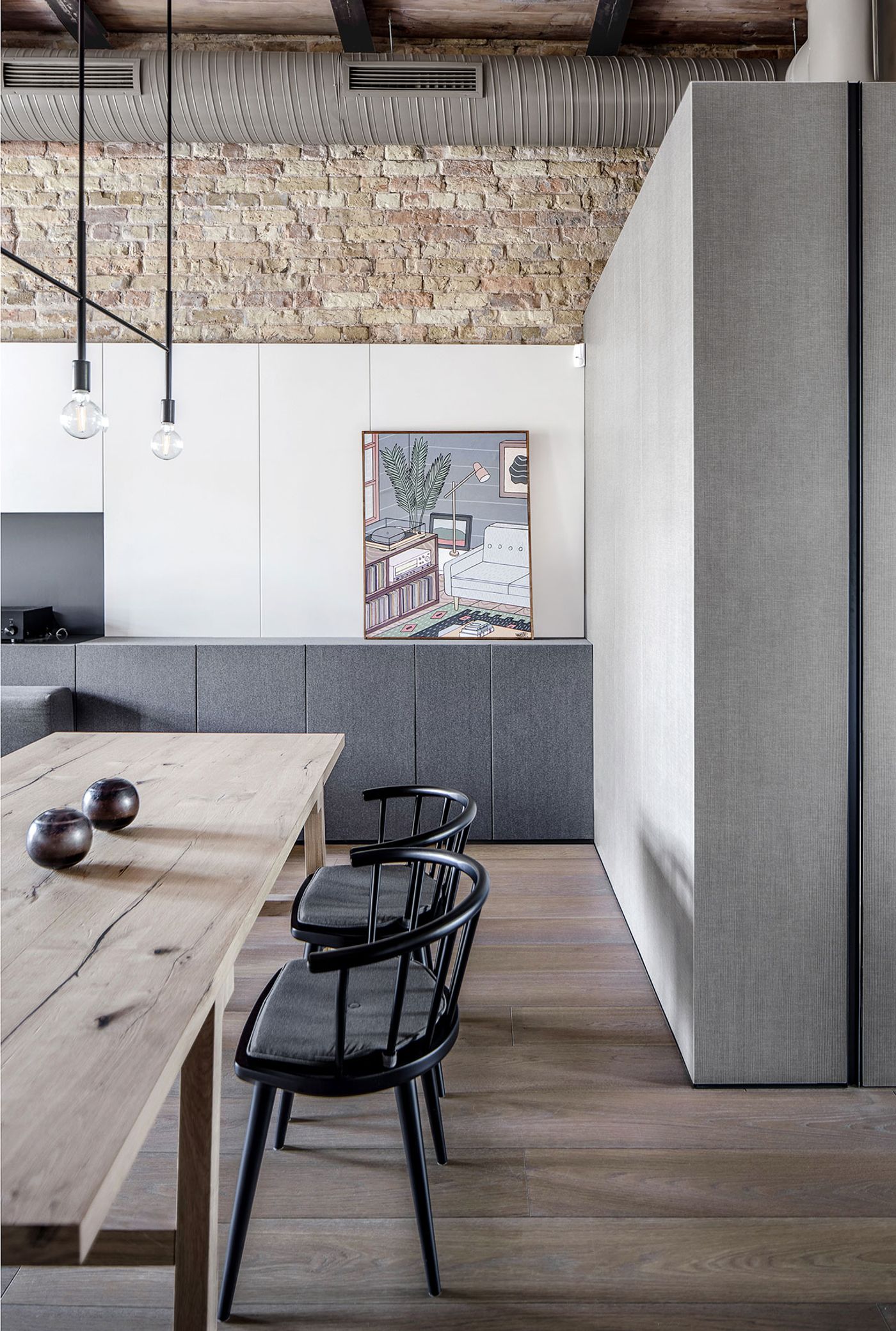
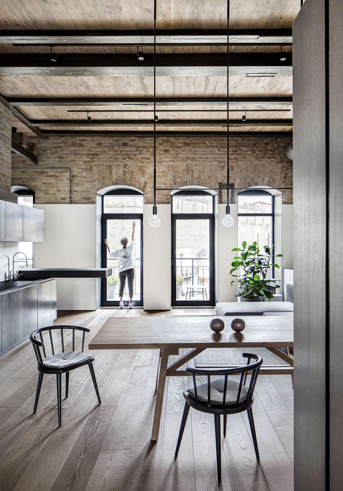
When working with historic buildings like in this case, 2B.group’s objective is to use the original building fabric as a canvas upon which new shapes and textures can be introduced. It was therefore very important to preserve and restore as many of the building's authentic features as possible, including the original brickwork hiding behind layers upon layers of plaster, the old timber ceiling joists, and the sloped walls in the attic.
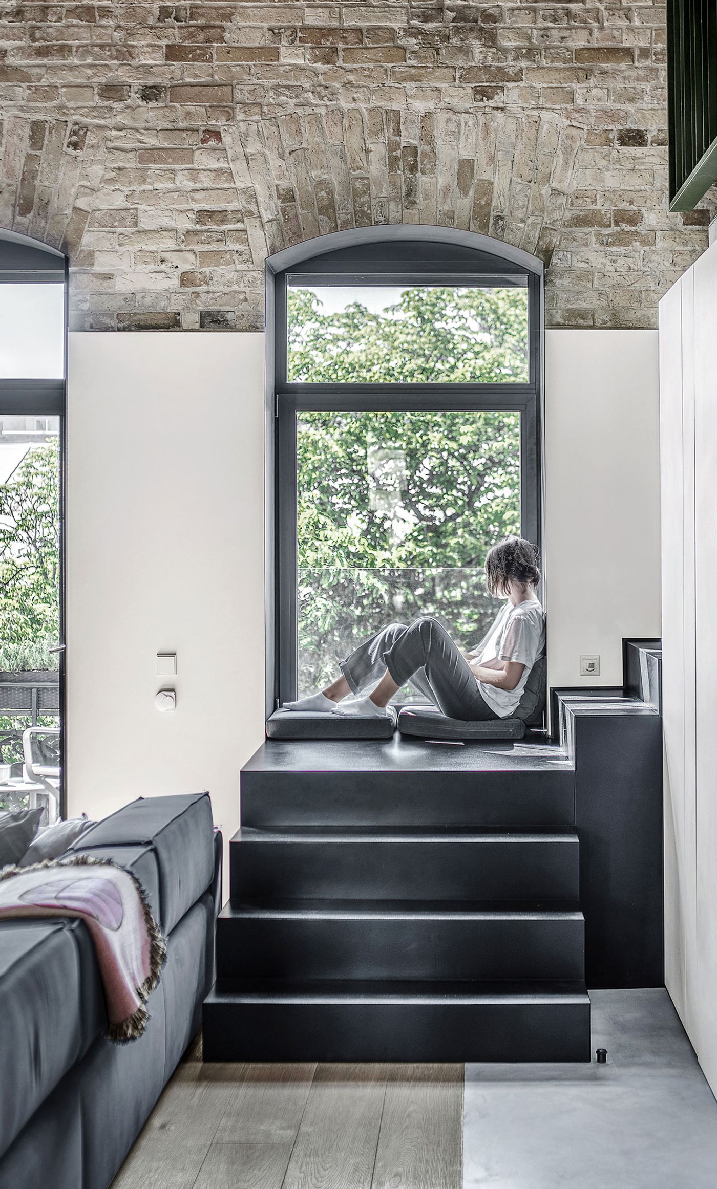
Photo © Andrey Bezuglov, Yevhenii Avramenko.
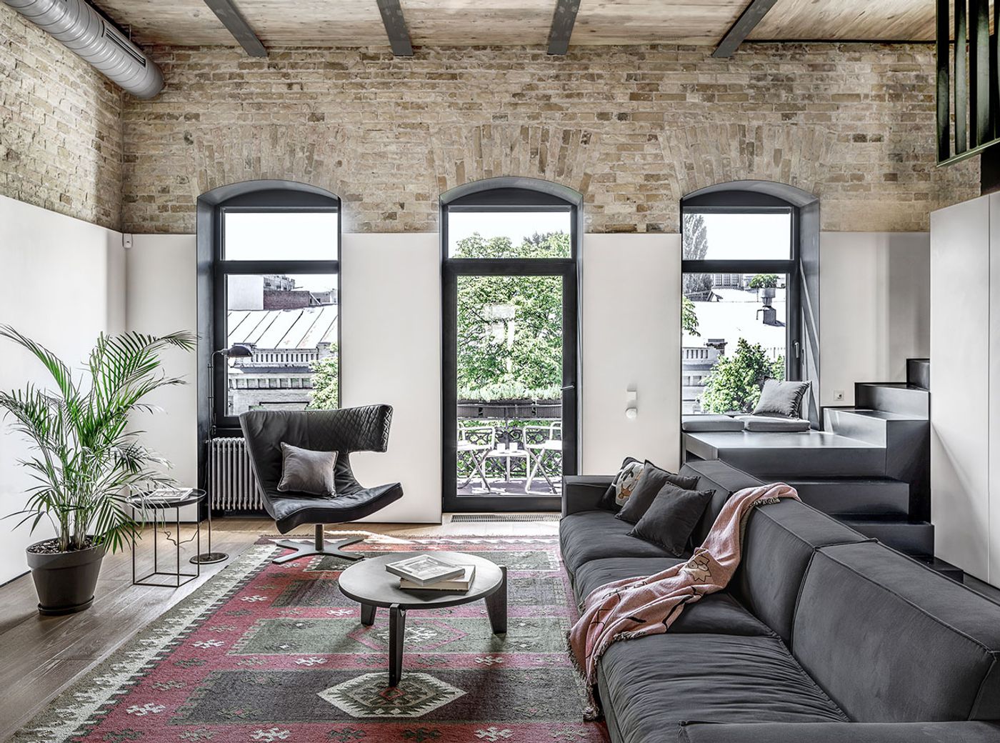
Photo © Andrey Bezuglov, Yevhenii Avramenko.
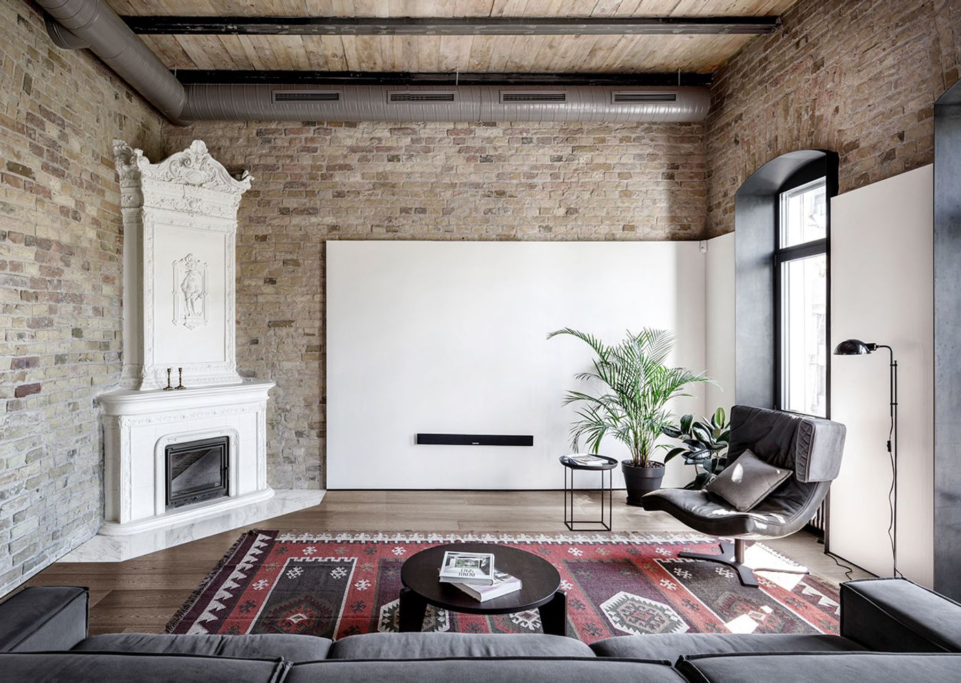
Photo © Andrey Bezuglov, Yevhenii Avramenko.
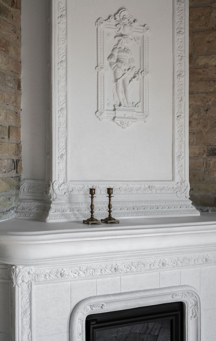
Photo © Andrey Bezuglov, Yevhenii Avramenko.
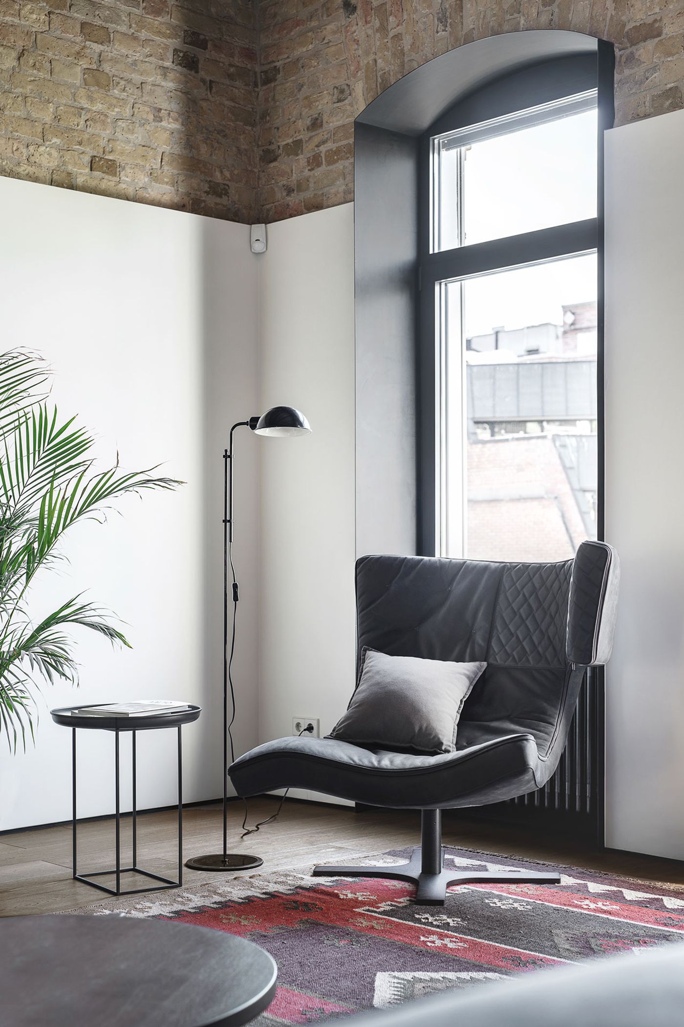
Photo © Andrey Bezuglov, Yevhenii Avramenko.
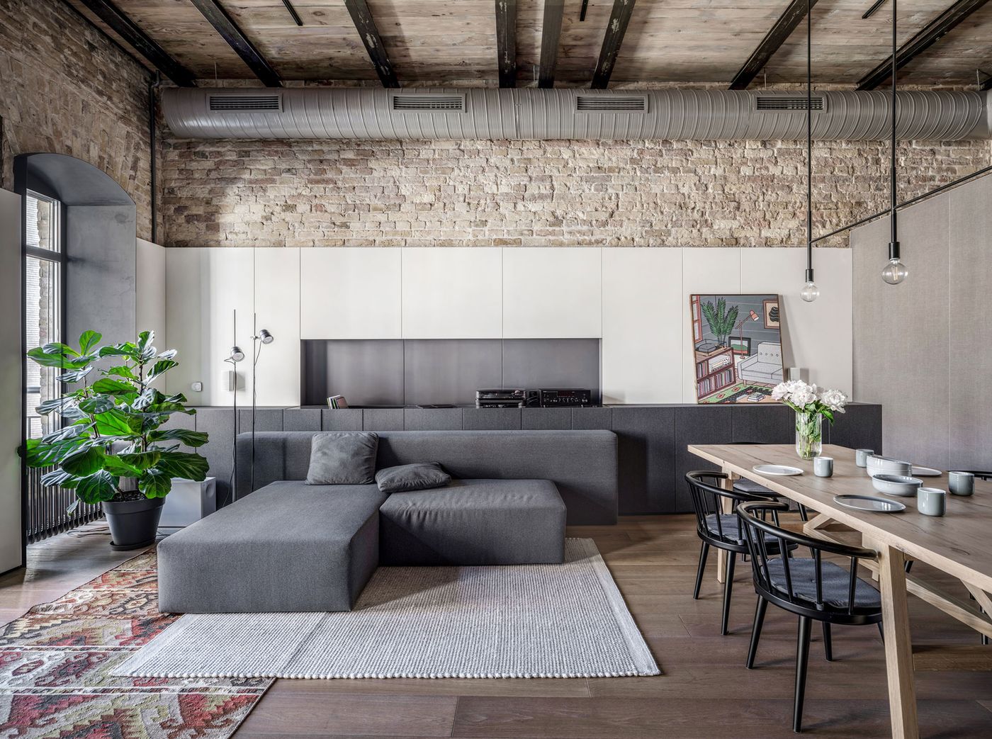
Photo © Andrey Bezuglov, Yevhenii Avramenko.
The painstaking restoration process involved cleaning and coating the timber joists with lacquer, the handpicked replacement of damaged or missing bricks—the most time consuming stage since they had to find bricks of the same age—and the meticulous refurbishment of the ornate fireplace whose decorative bas-reliefs stand out amidst the minimalist aesthetic of the renovated interiors.
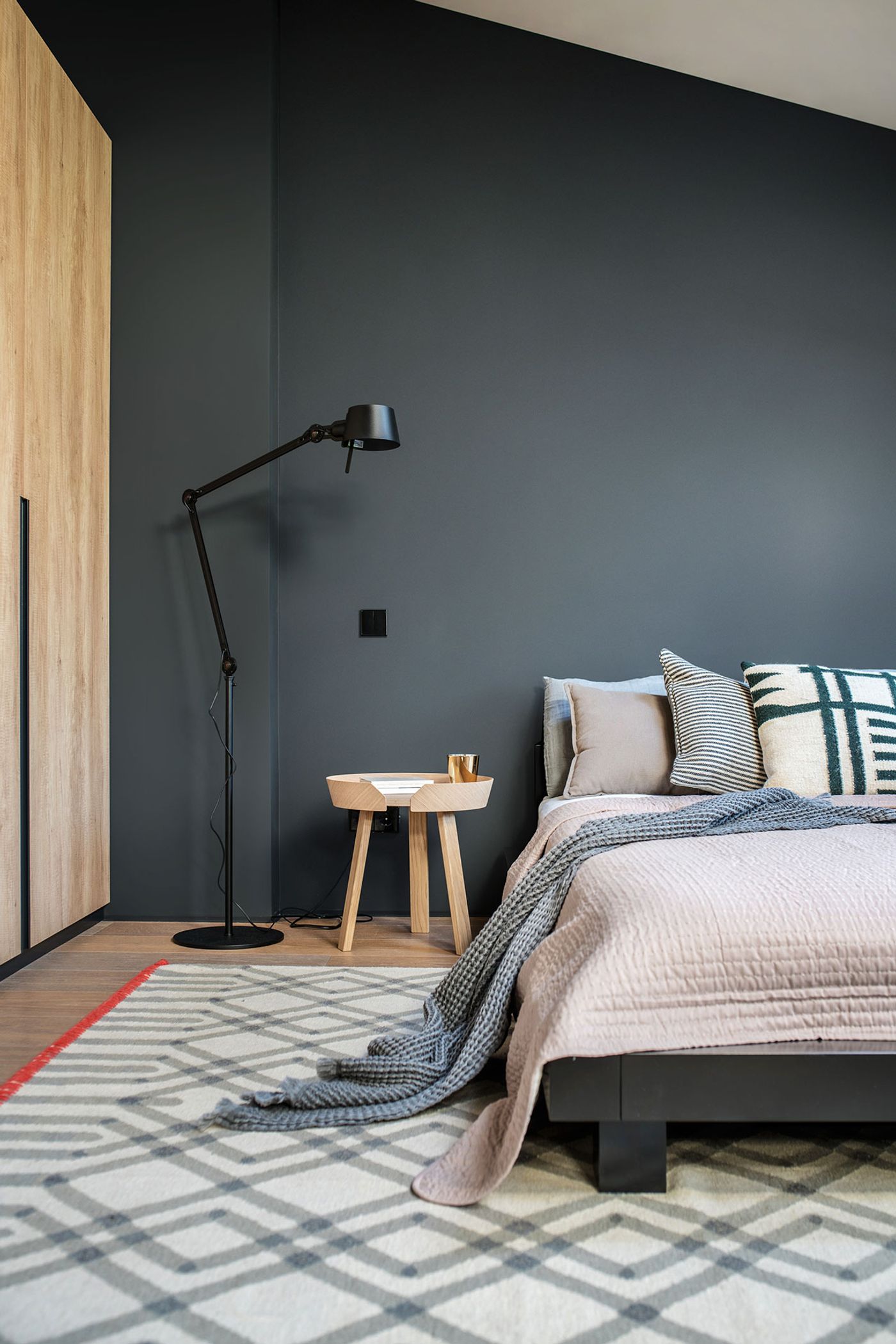
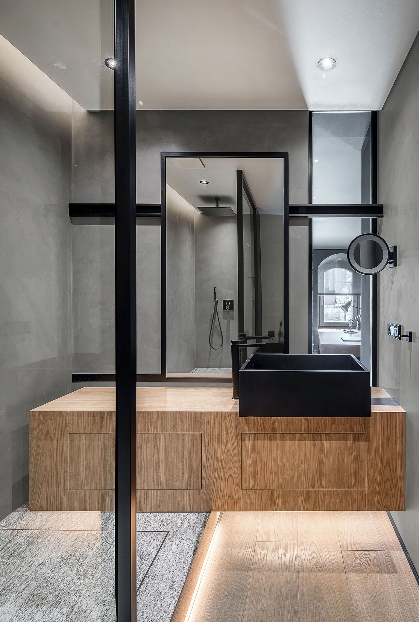
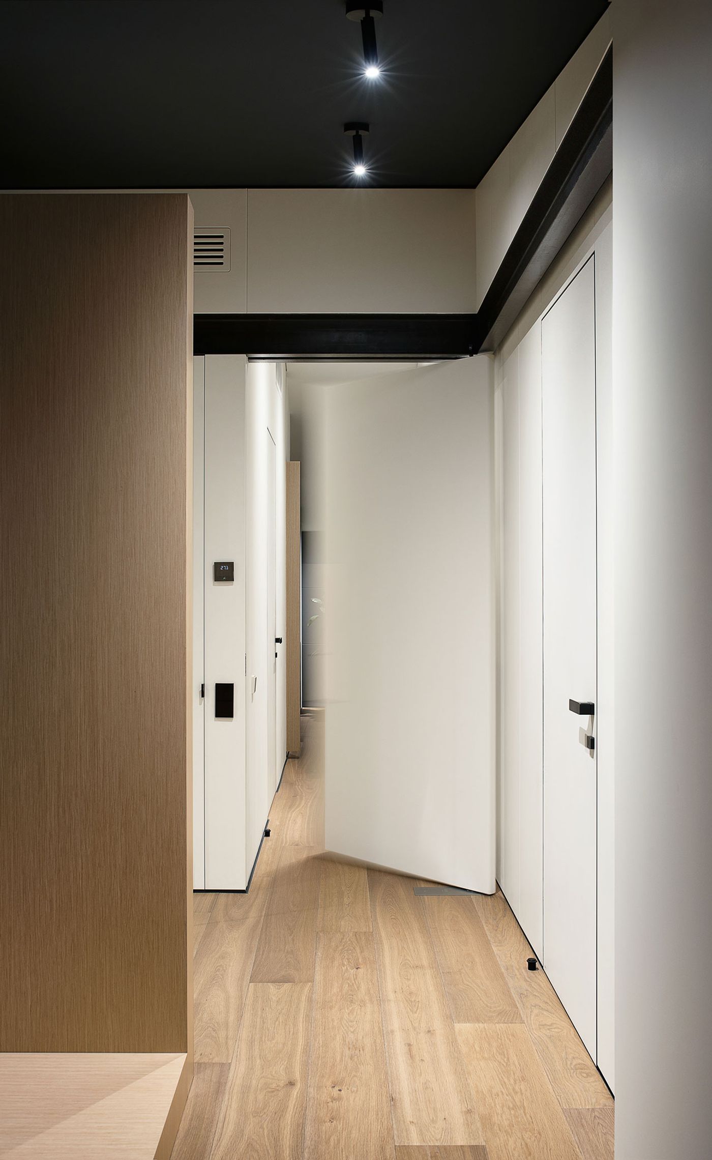
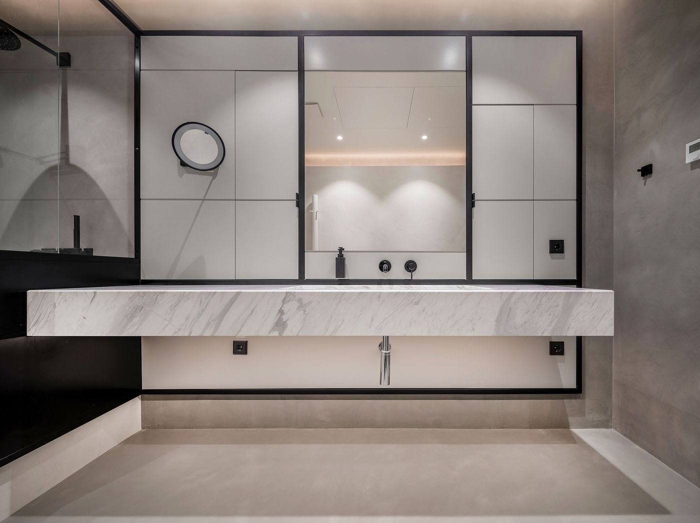
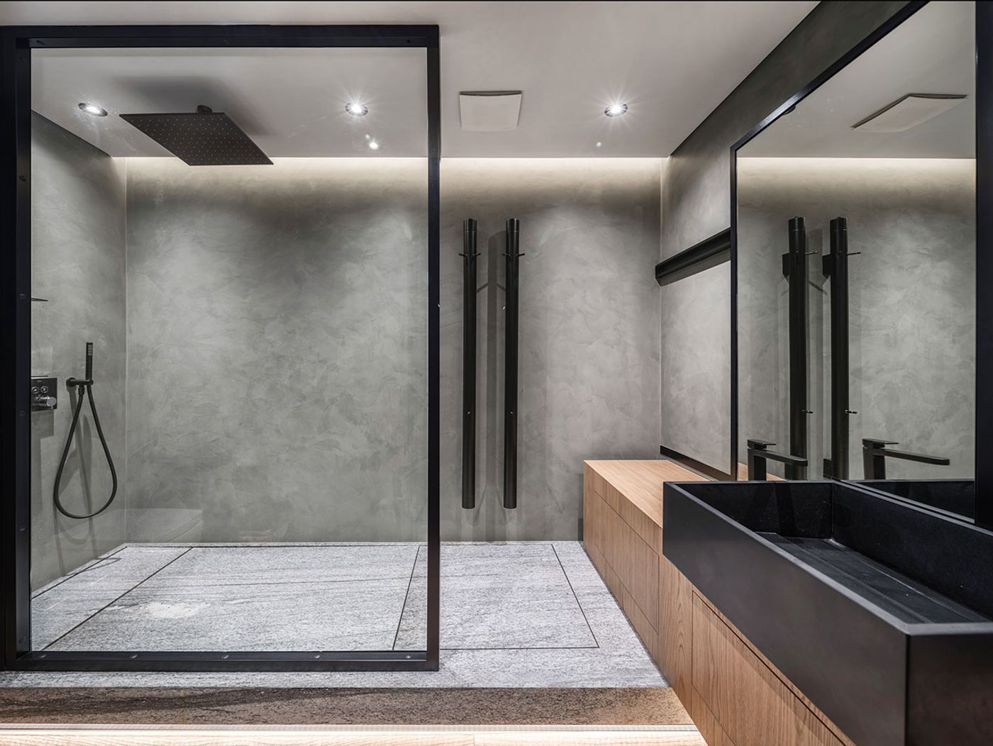
Eschewing the use of colour altogether, a muted palette of black, white and grey was chosen for all of the architectural interventions in order to harmoniously blend with the restored building fabric. For the lower level, which contains a living room and an open-plan kitchen-cum-dining area, white wall panelling unites and brightens up the two spaces without completely obstructing the original brickwork. Wall panelling was also used in the private quarters upstairs, albeit in a dark grey, but in this case its role was to straighten the attic’s sloping walls. Although predominantly dark in colour, the attic, which includes a master suite complete with bathroom, walk-in closet and office, and a guest bedroom, is brightly lit courtesy of numerous windows and skylights.
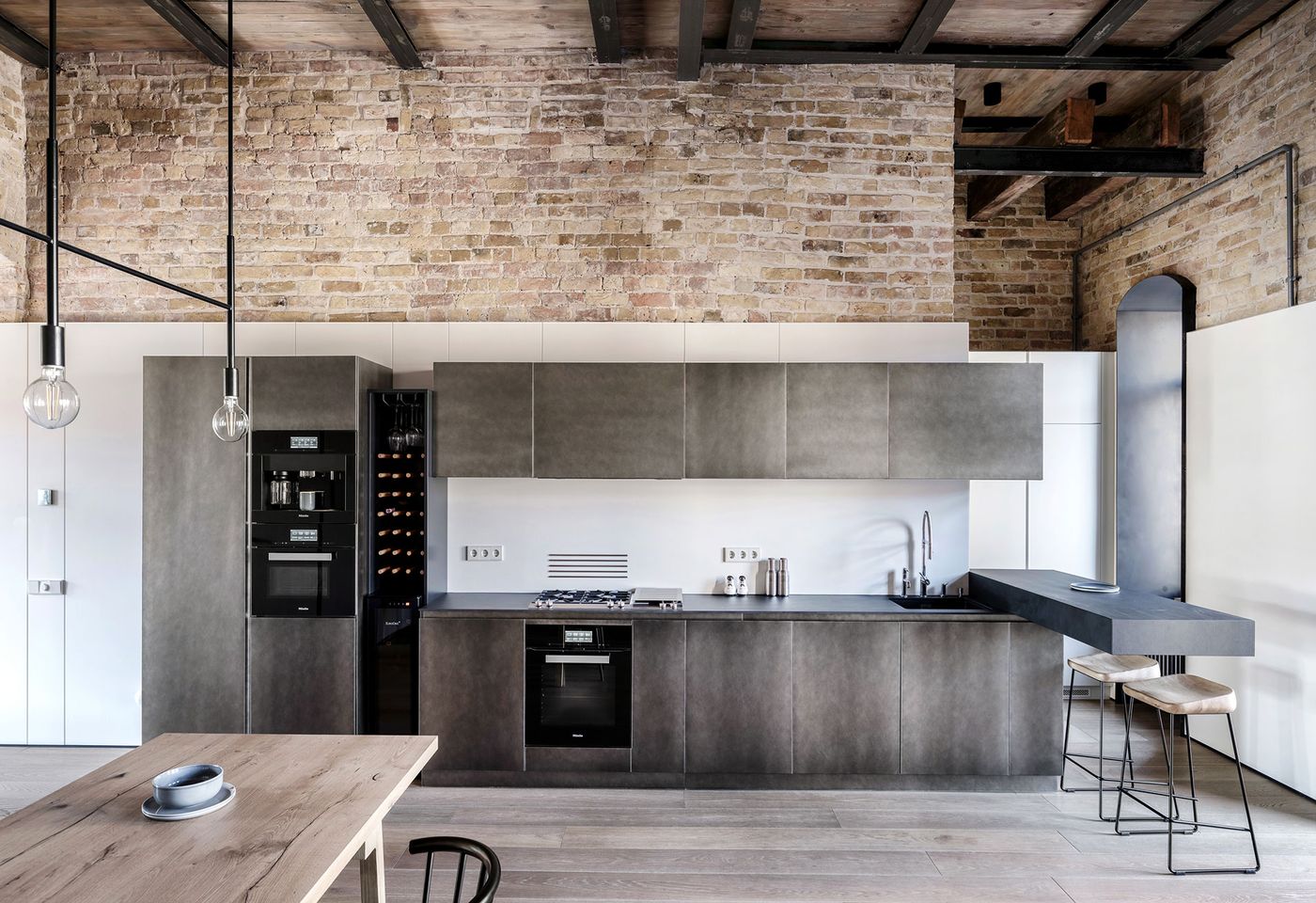
Photo © Andrey Bezuglov, Yevhenii Avramenko.

Photo © Andrey Bezuglov, Yevhenii Avramenko.
The attic’s dark tones are picked up by the metallic staircase—a bespoke, multi-faceted cuboid structure that was assembled on site—and the metallic frames and jambs of the downstairs windows, as well as several furniture pieces and light fittings throughout the living spaces. The application of this monochromatic sensibility ties together the two levels despite the fact that the attic has been treated as a modern loft whereas the lower floor proudly bears the building’s age-old character.
The minimalist décor of muted tones and clean lines belies the complexity of the architectural interventions such as the in-built window blinds hidden in the panelled walls in the attic, the staircase assembly, and the soundproofing of the guest bathroom between the living and dining areas. And it is this close attention to detail that ultimately makes this apartment not just a marvel to look at but also a comfortable space to live in.
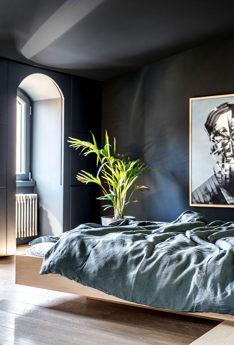
Photo © Andrey Bezuglov, Yevhenii Avramenko.

Photo © Andrey Bezuglov, Yevhenii Avramenko.
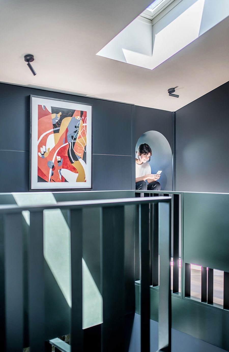
Photo © Andrey Bezuglov, Yevhenii Avramenko.
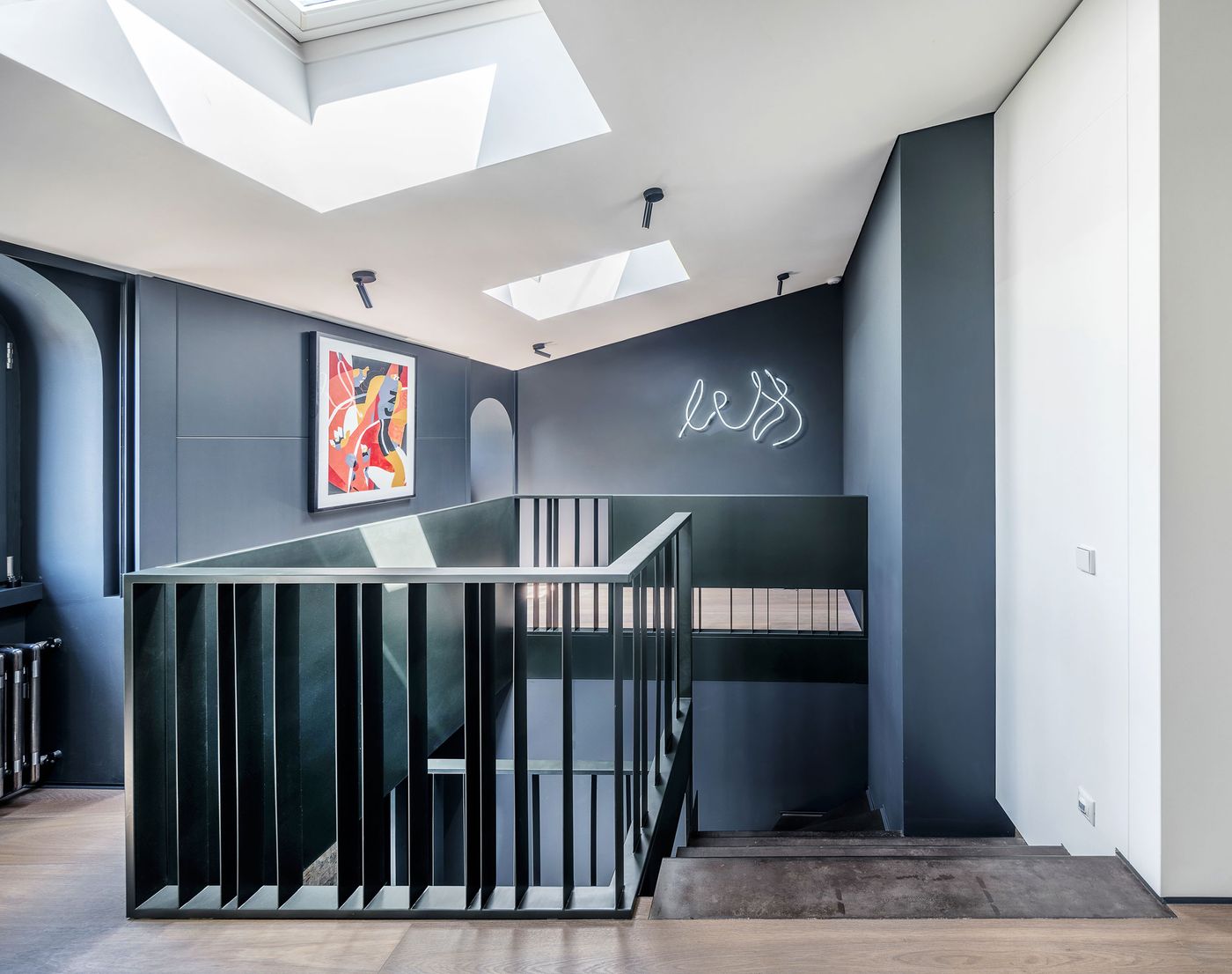
Photo © Andrey Bezuglov, Yevhenii Avramenko.
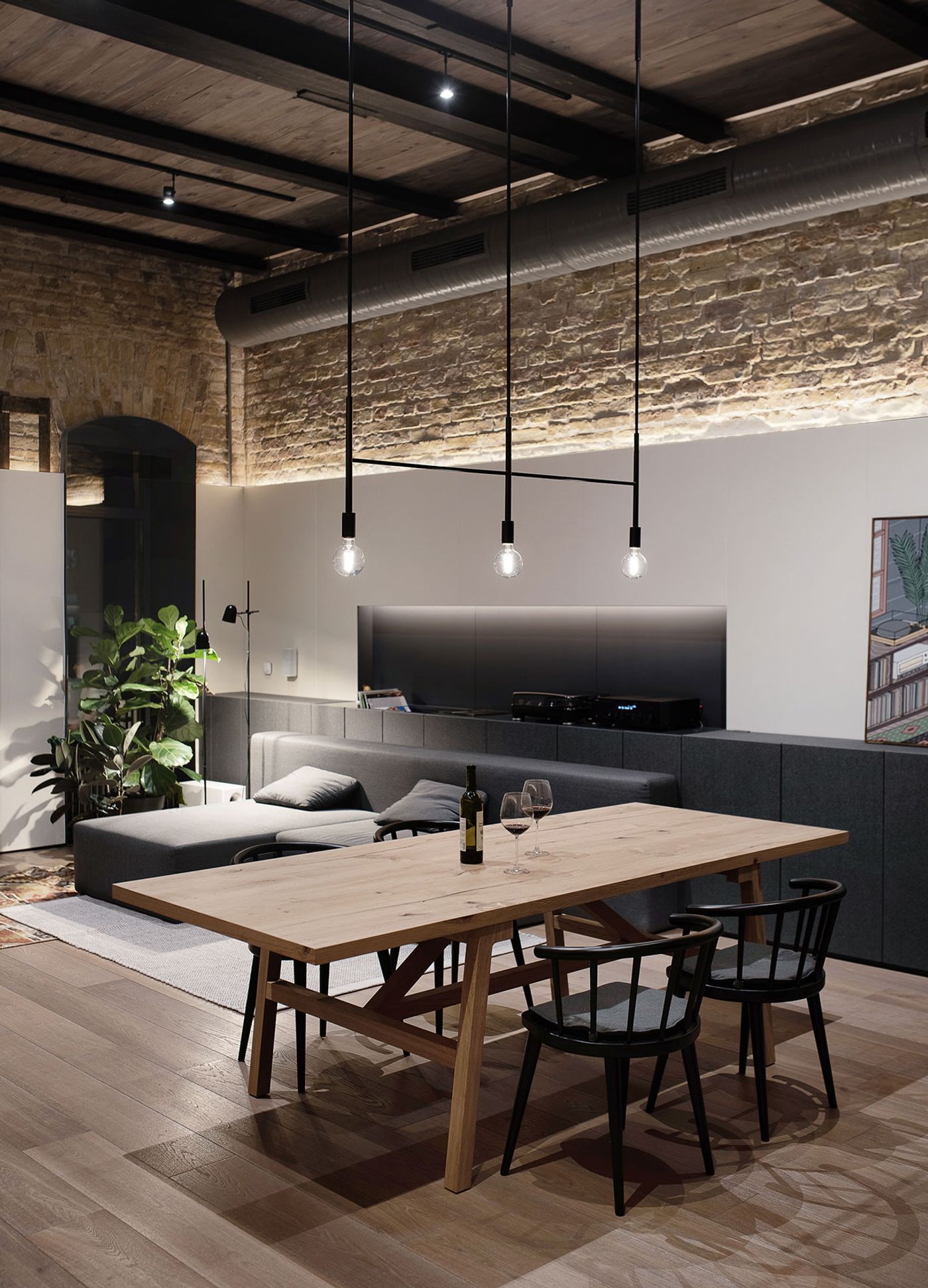
Photo © Andrey Bezuglov, Yevhenii Avramenko.
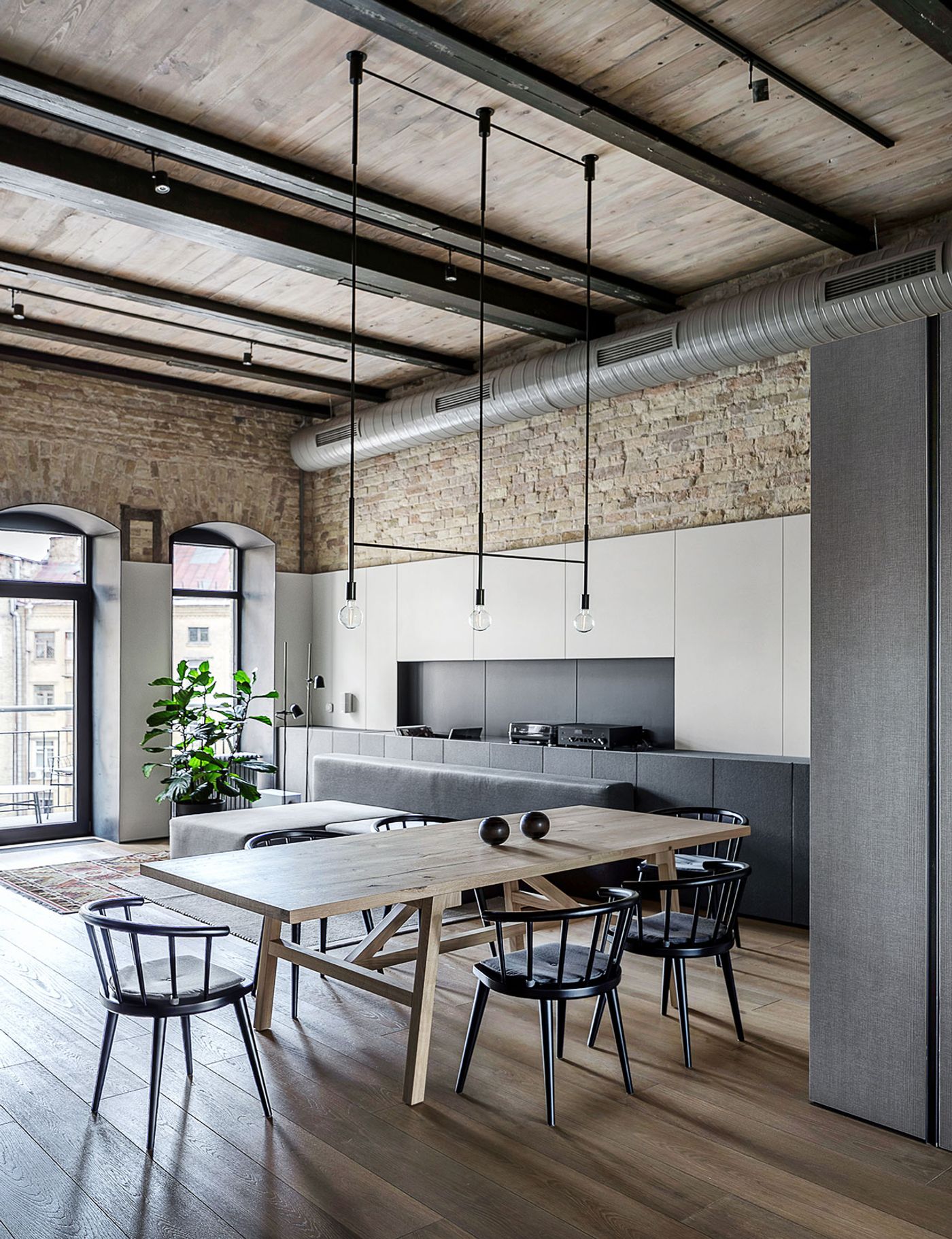
Photo © Andrey Bezuglov, Yevhenii Avramenko.
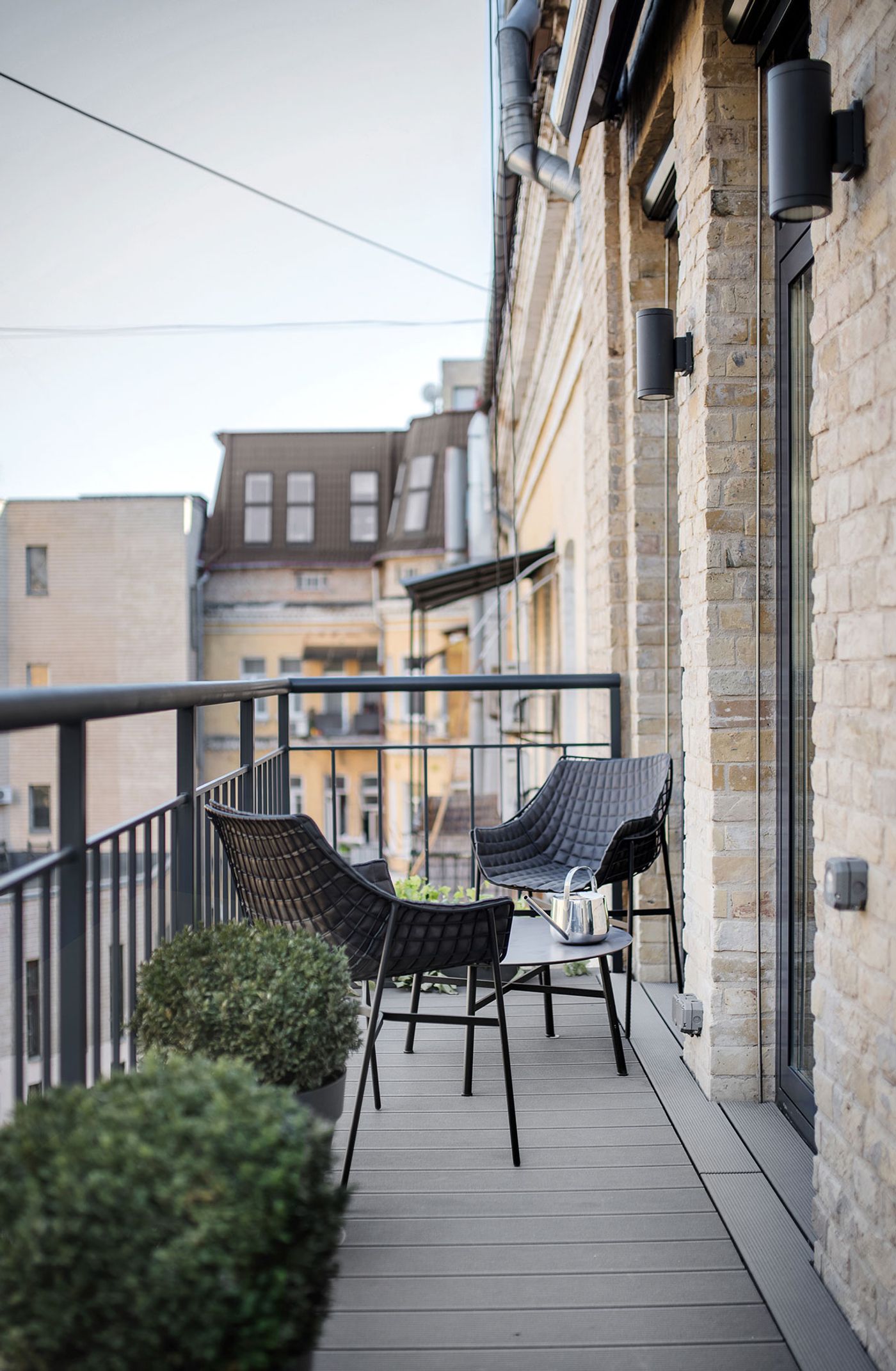
Photo © Andrey Bezuglov, Yevhenii Avramenko.
