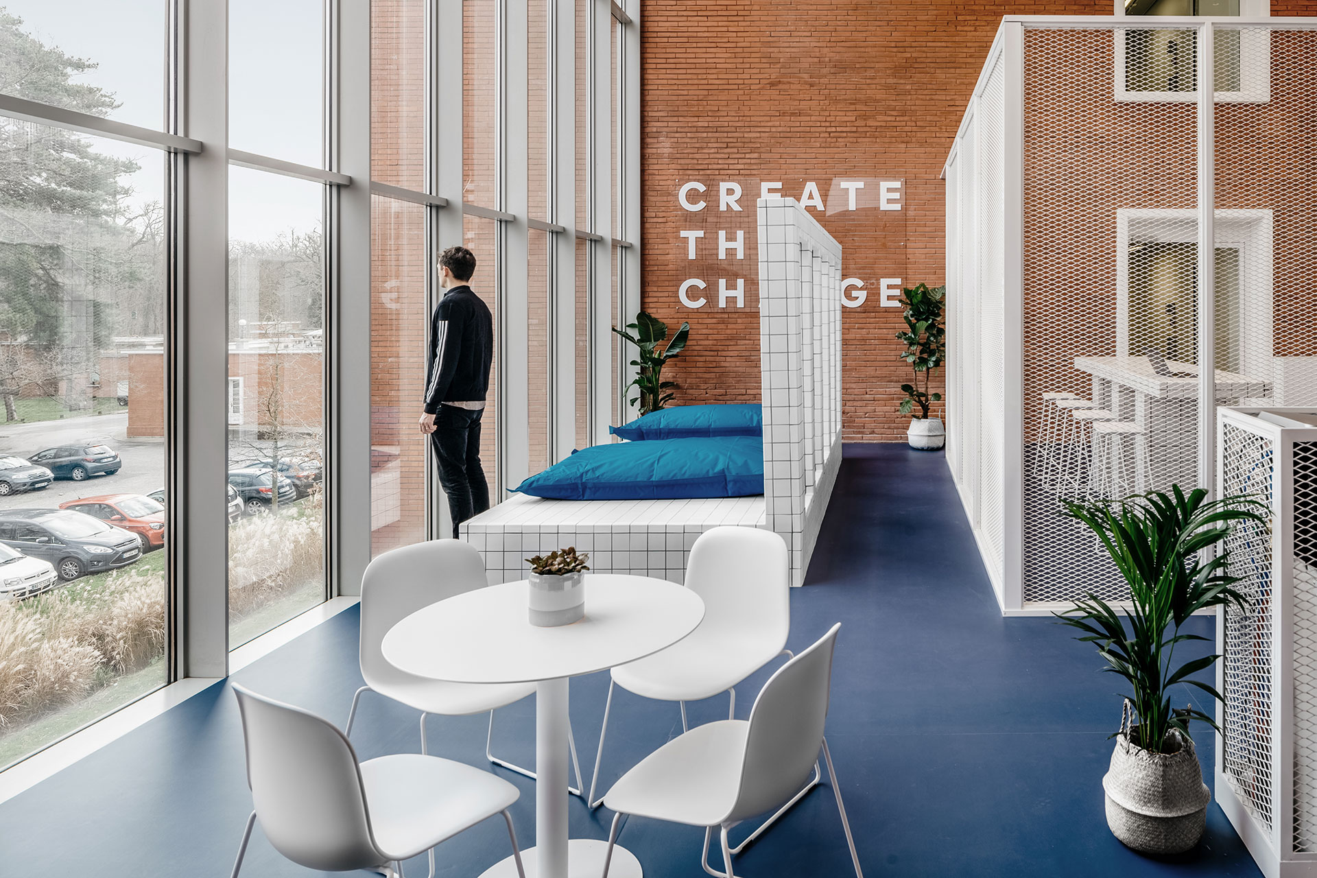
ADIDAS X INSEP by Ubalt Architectes and Ubi Bene.
Photography by Yohann Fontaine.
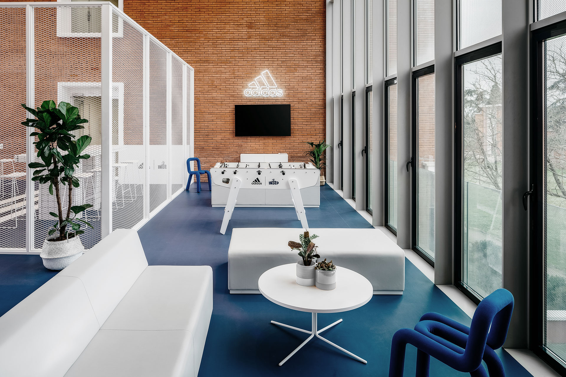
ADIDAS X INSEP by Ubalt Architectes and Ubi Bene.
Photography by Yohann Fontaine.
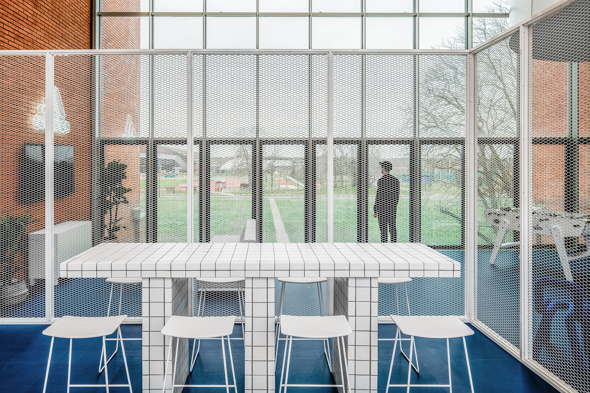
ADIDAS X INSEP by Ubalt Architectes and Ubi Bene.
Photography by Yohann Fontaine.
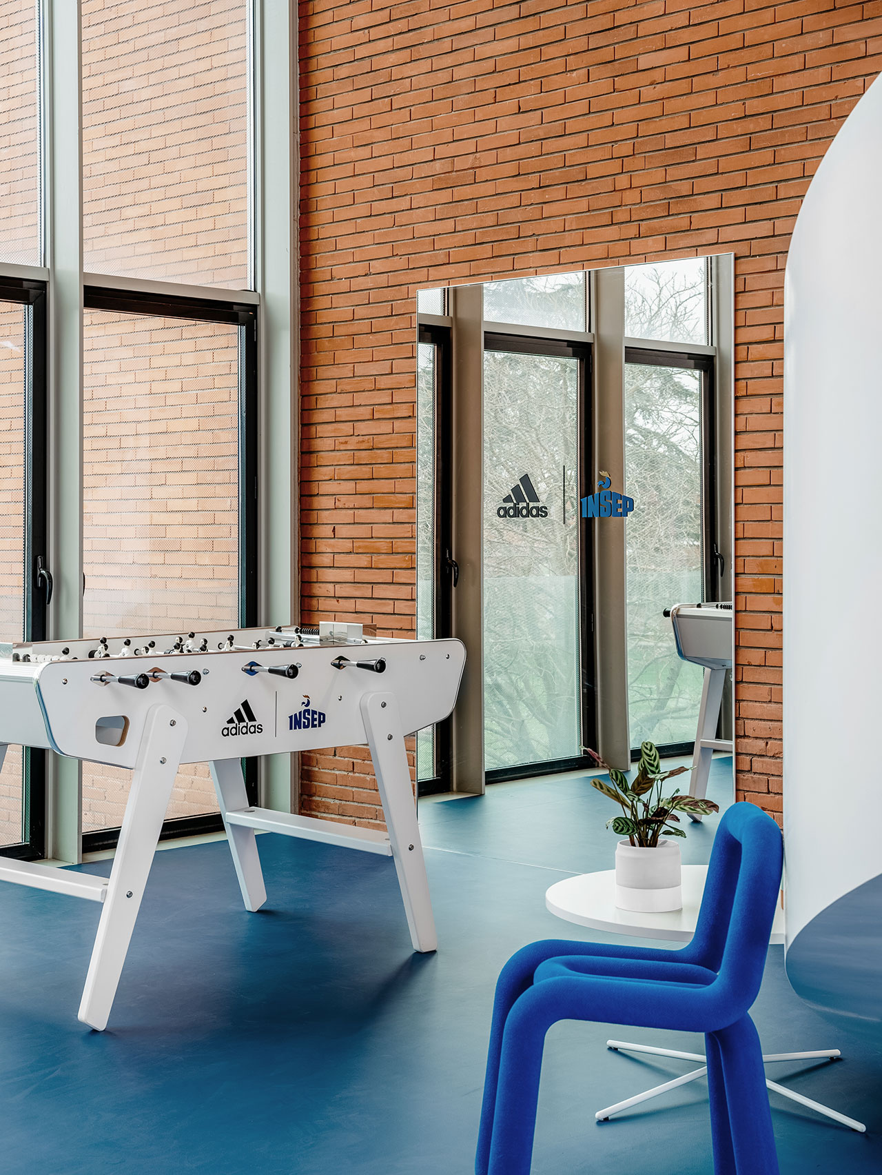
ADIDAS X INSEP by Ubalt Architectes and Ubi Bene.
Photography by Yohann Fontaine.
ADIDAS X INSEP by Ubalt Architectes and Ubi Bene.
Photography by Yohann Fontaine.

ADIDAS X INSEP by Ubalt Architectes and Ubi Bene.
Photography by Yohann Fontaine.
ADIDAS X INSEP by Ubalt Architectes and Ubi Bene.
Photography by Yohann Fontaine.
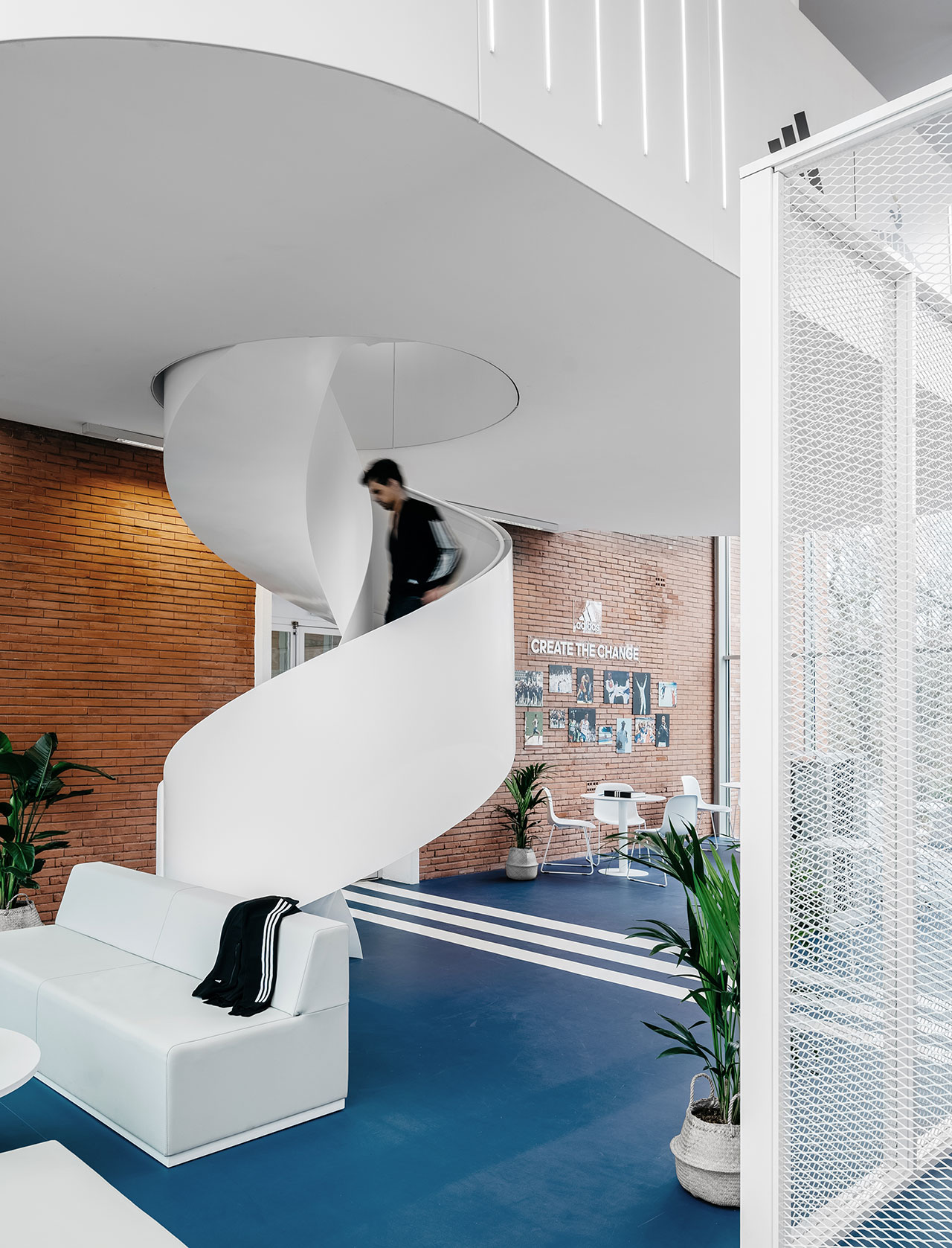
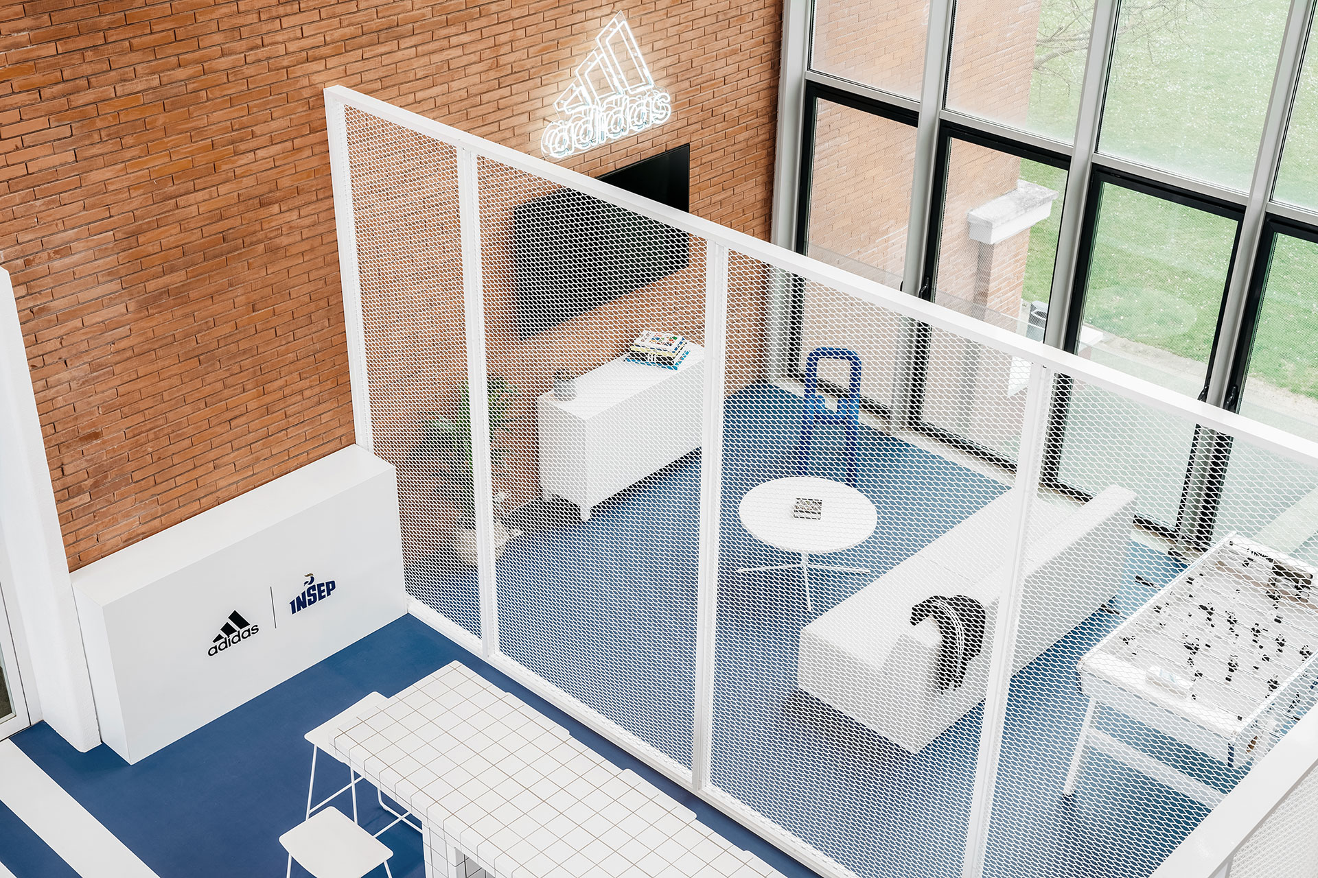
Characterized by the architects as a “large graphic playground”, the renovated lounge is a glass-enclosed space in-between two brick buildings where athletes come to unwind and socialize. Popping out against the blue floor and peripheral brickwork, a white-painted, cage-like volume divides the space into distinct areas without sacrificing the open-plan configuration. Here, athletes can play games, watch television, or relax in a solarium-like zone, as well as eat and work at the communal tables inside the metal structure.
The geometric language of the wire-grid central volume is picked up by the square-tiled tables and solarium podium, the glass façade frames and the three white lines stretching across the length of the space. The latter graphically underline the room’s additional use as a passageway as well as reference Adidas’ brand identity, while the corkscrew-like staircase offers the only distraction to the interior design’s rectilinear sensibility.
ADIDAS X INSEP by Ubalt Architectes and Ubi Bene.
Photography by Yohann Fontaine.
ADIDAS X INSEP by Ubalt Architectes and Ubi Bene.
Photography by Yohann Fontaine.

ADIDAS X INSEP by Ubalt Architectes and Ubi Bene.
Photography by Yohann Fontaine.
ADIDAS X INSEP by Ubalt Architectes and Ubi Bene.
Photography by Yohann Fontaine.

ADIDAS X INSEP by Ubalt Architectes and Ubi Bene.
Photography by Yohann Fontaine.
ADIDAS X INSEP by Ubalt Architectes and Ubi Bene.
Photography by Yohann Fontaine.
ADIDAS X INSEP by Ubalt Architectes and Ubi Bene.
Photography by Yohann Fontaine.
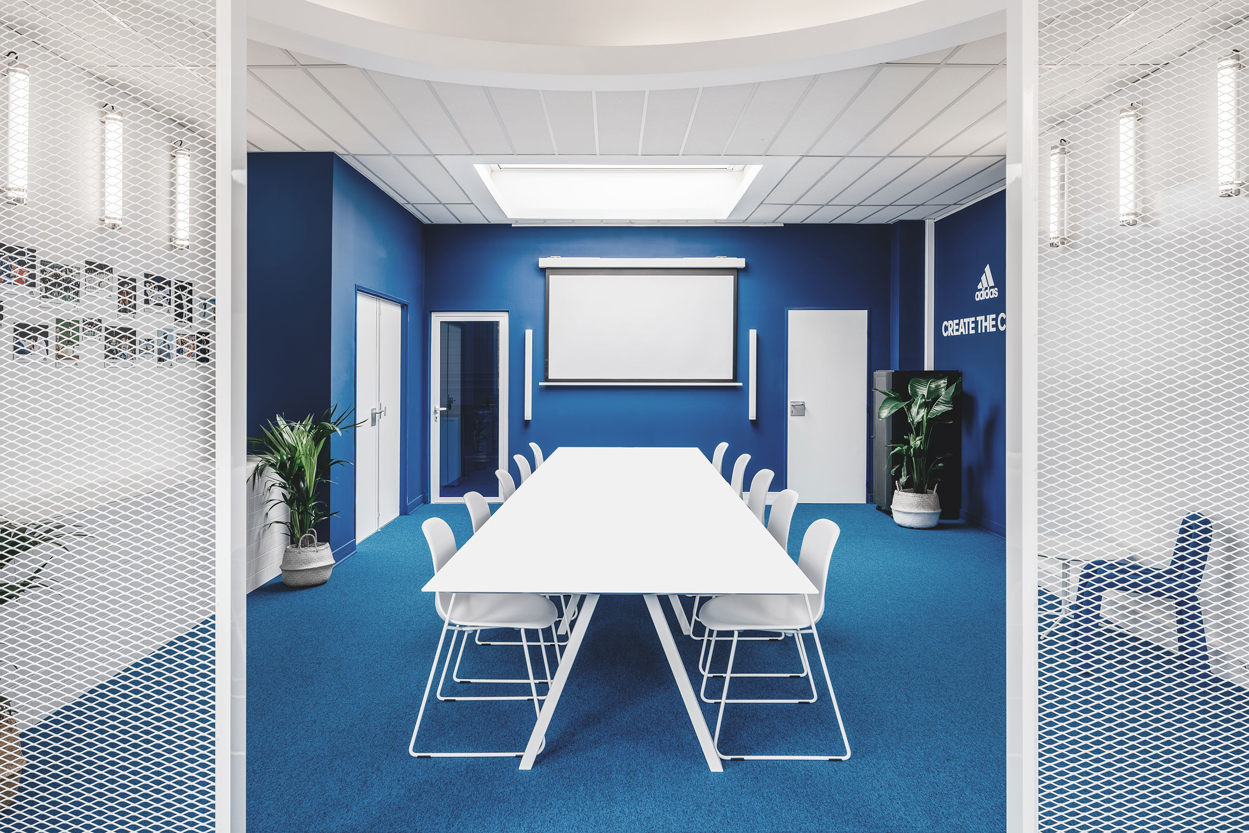
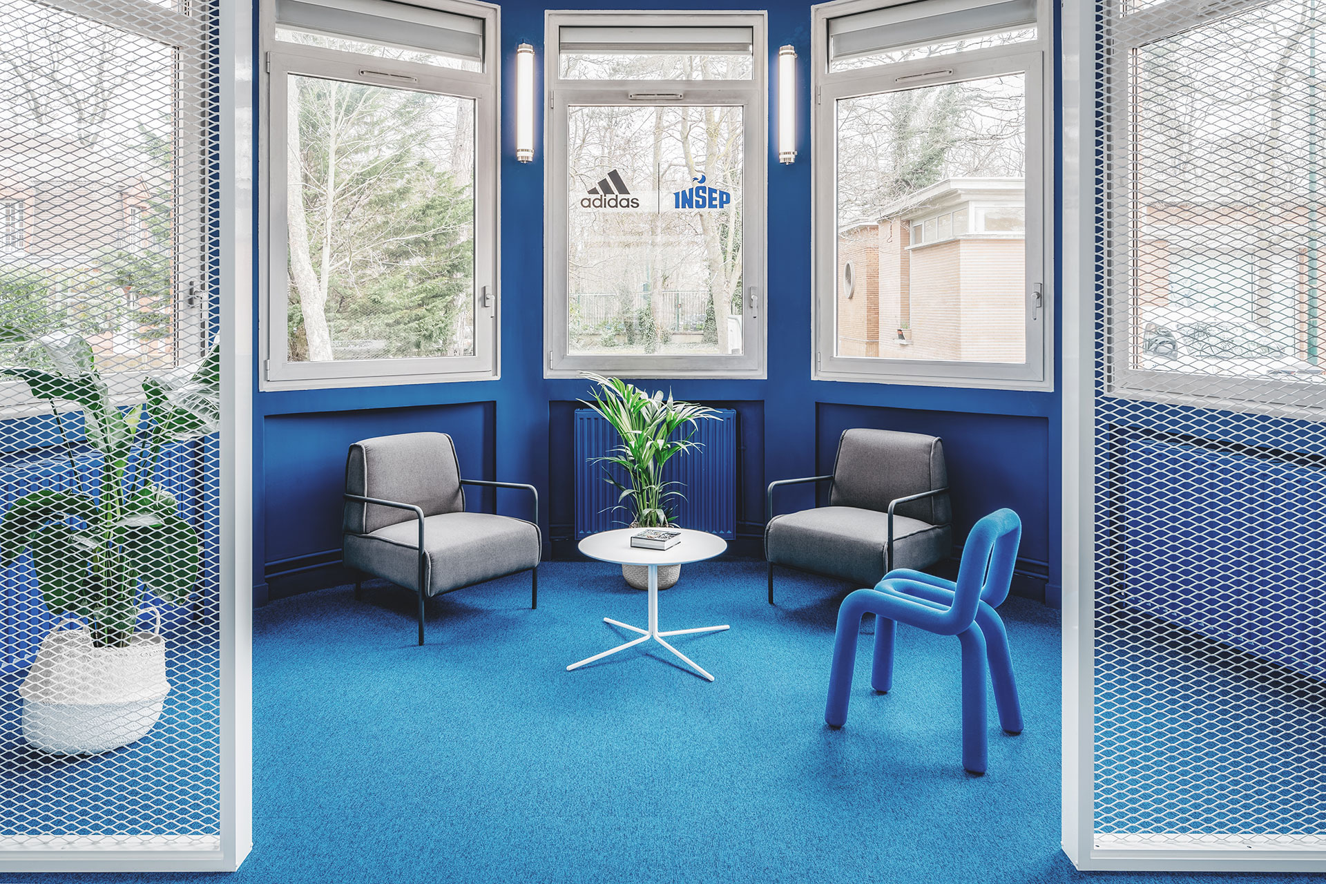
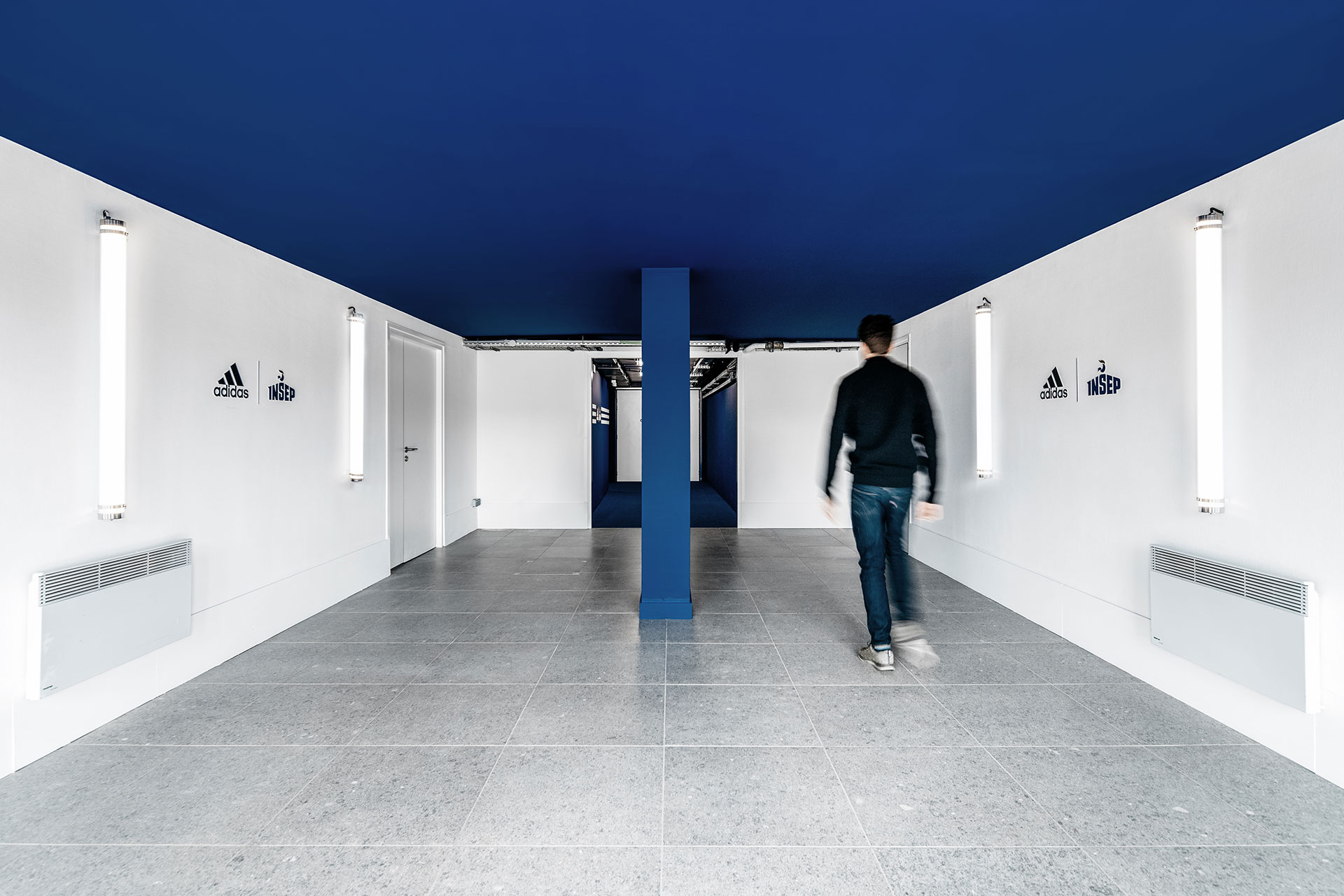
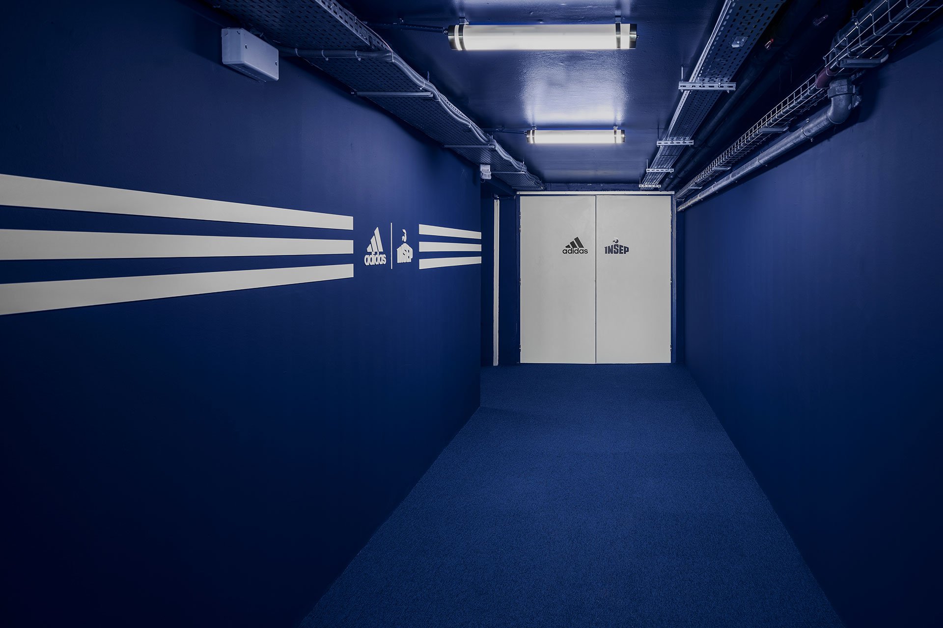
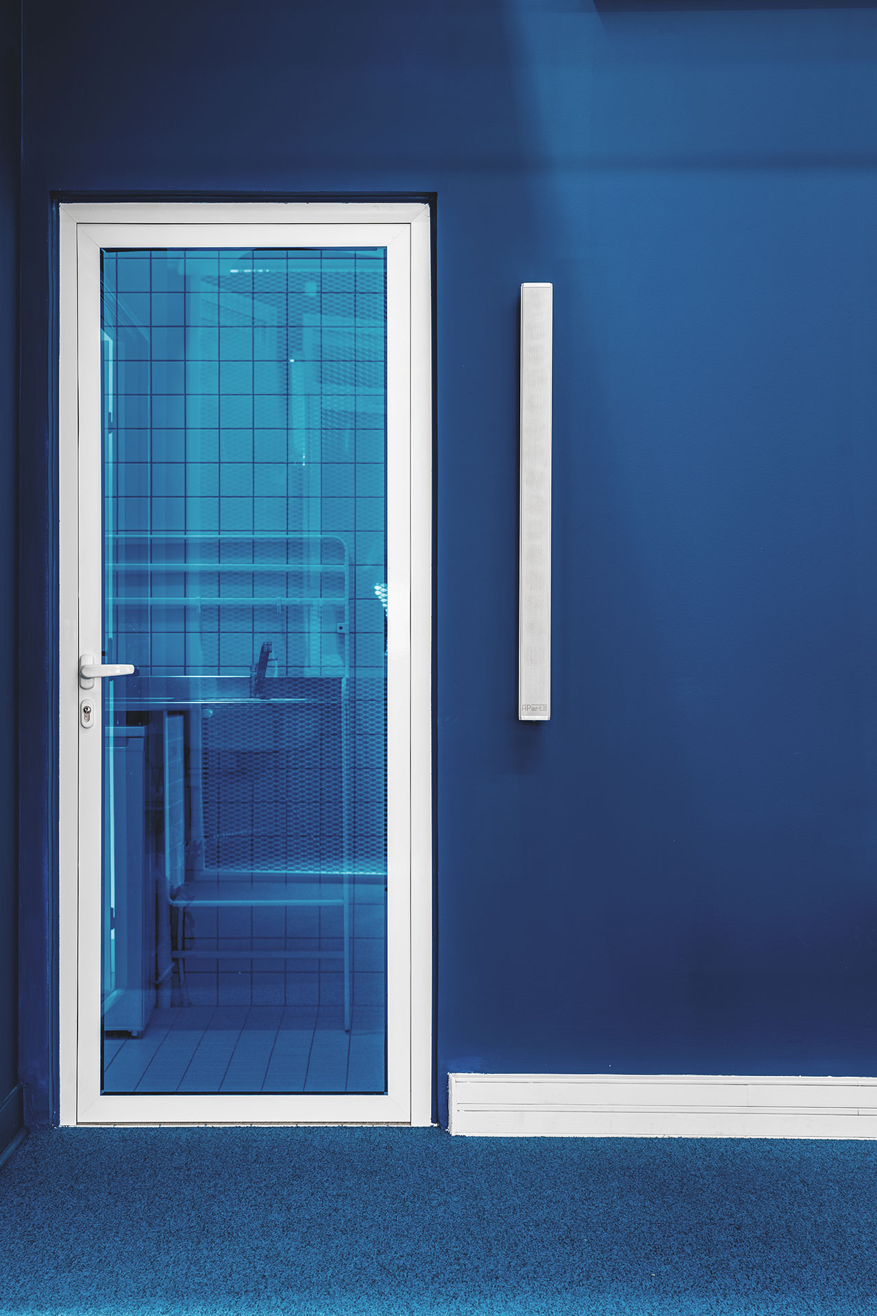
The blue-carpeted meeting room features sleek white furniture and wire-grid partitions that add to its minimalist sophistication. INSEP and Adidas’ brand colour also dominates in the design of the circulatory spaces, some of which are completely swathed in the blue hue, while the locker rooms embrace an all-white and grey palette.
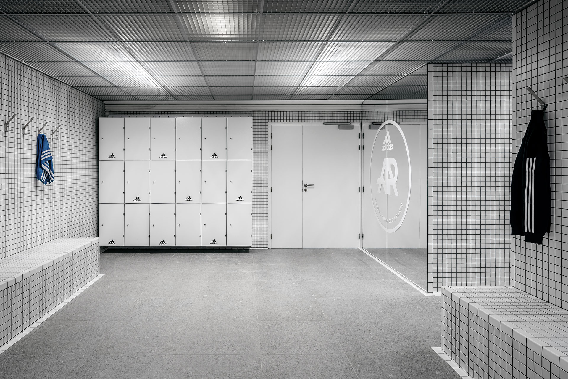
The use of 5x5cm square tiling for the locker room walls in combination with the similarly sized grid ceiling create an immersive and soothing space, ideal for athletes to concentrate in before practice or loosen up afterwards. In addition, the juxtaposition between the polished tiles and rough sandstone surfaces imbue the locker room with a subtle dynamism as do the few blue accents that playfully pop out against the monotone colour palette. Along with the graphical sensibility, this dynamic aspect of interior design is ultimately what makes all spaces coherent only further evoking both the institution and the sport brand’s identities.
ADIDAS X INSEP by Ubalt Architectes and Ubi Bene.
Photography by Yohann Fontaine.
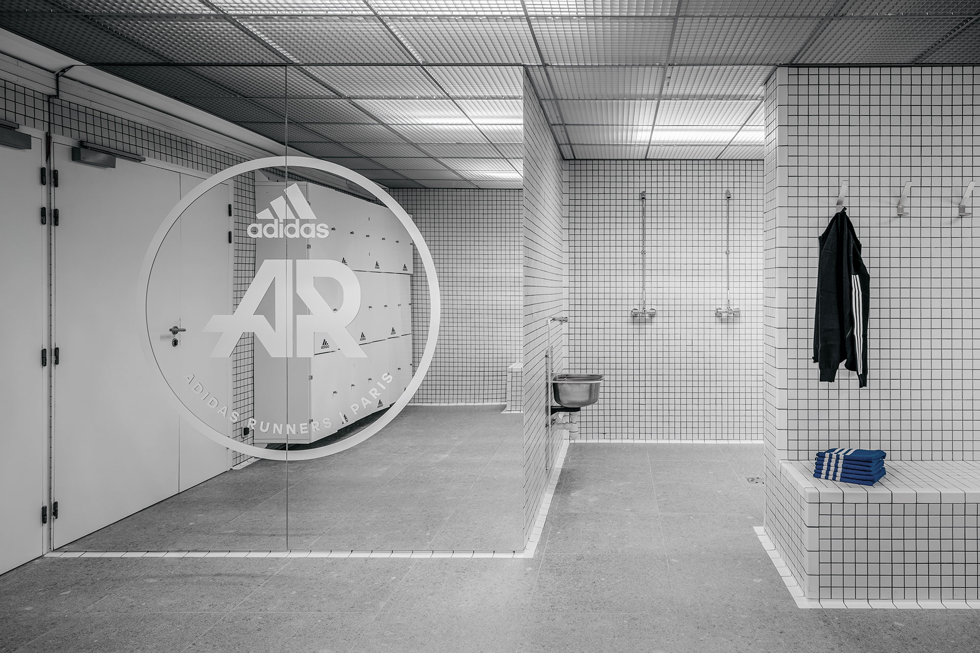
ADIDAS X INSEP by Ubalt Architectes and Ubi Bene.
Photography by Yohann Fontaine.

ADIDAS X INSEP by Ubalt Architectes and Ubi Bene.
Photography by Yohann Fontaine.
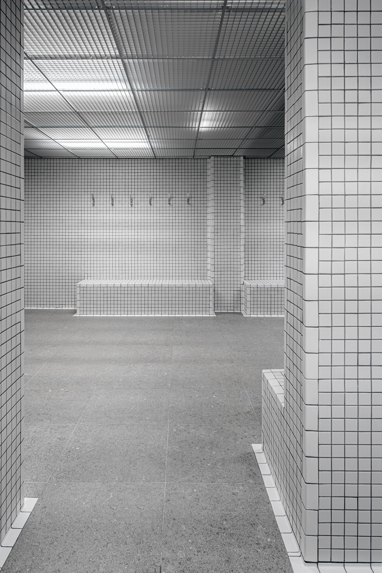
ADIDAS X INSEP by Ubalt Architectes and Ubi Bene.
Photography by Yohann Fontaine.

ADIDAS X INSEP by Ubalt Architectes and Ubi Bene.
Photography by Yohann Fontaine.
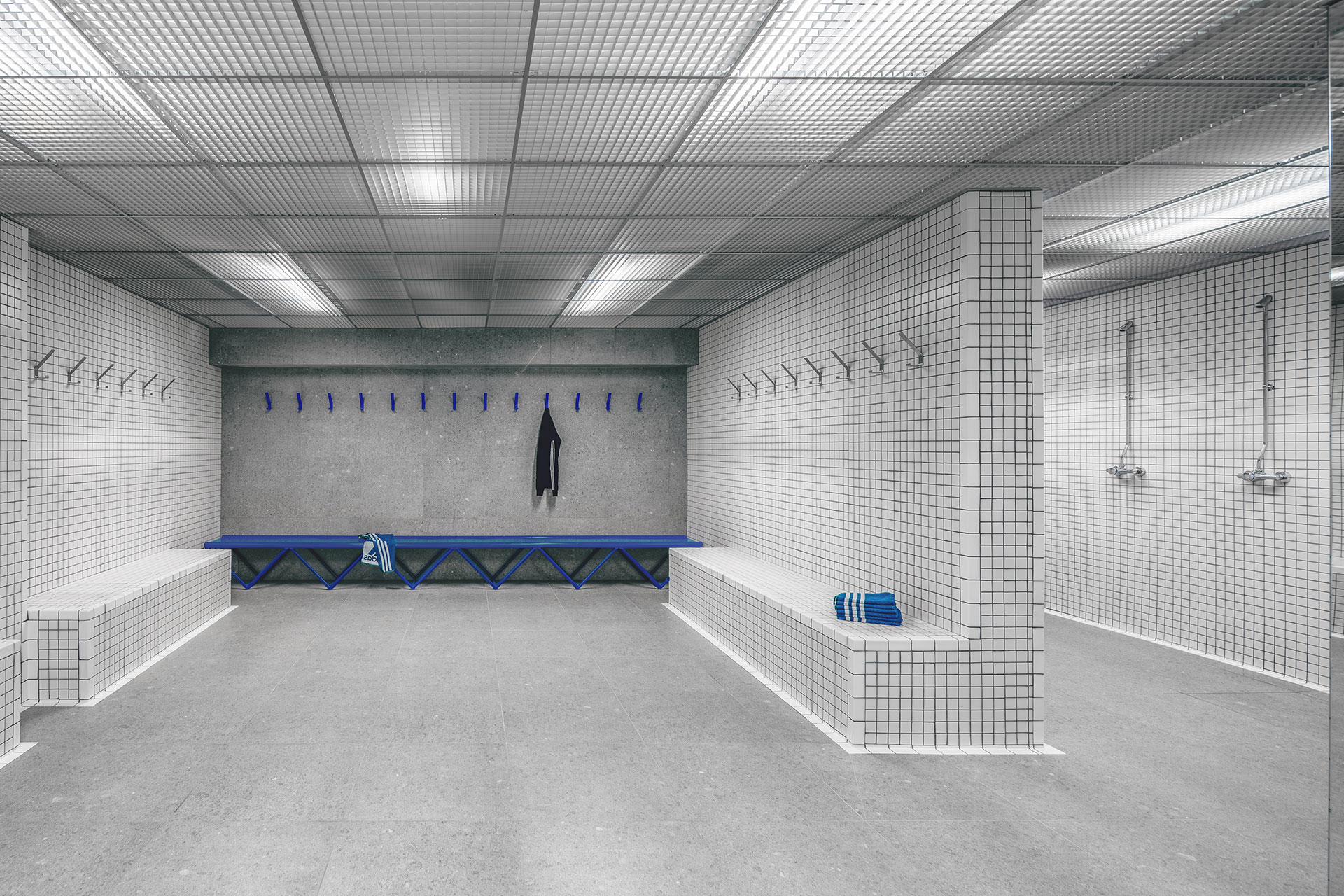
ADIDAS X INSEP by Ubalt Architectes and Ubi Bene.
Photography by Yohann Fontaine.
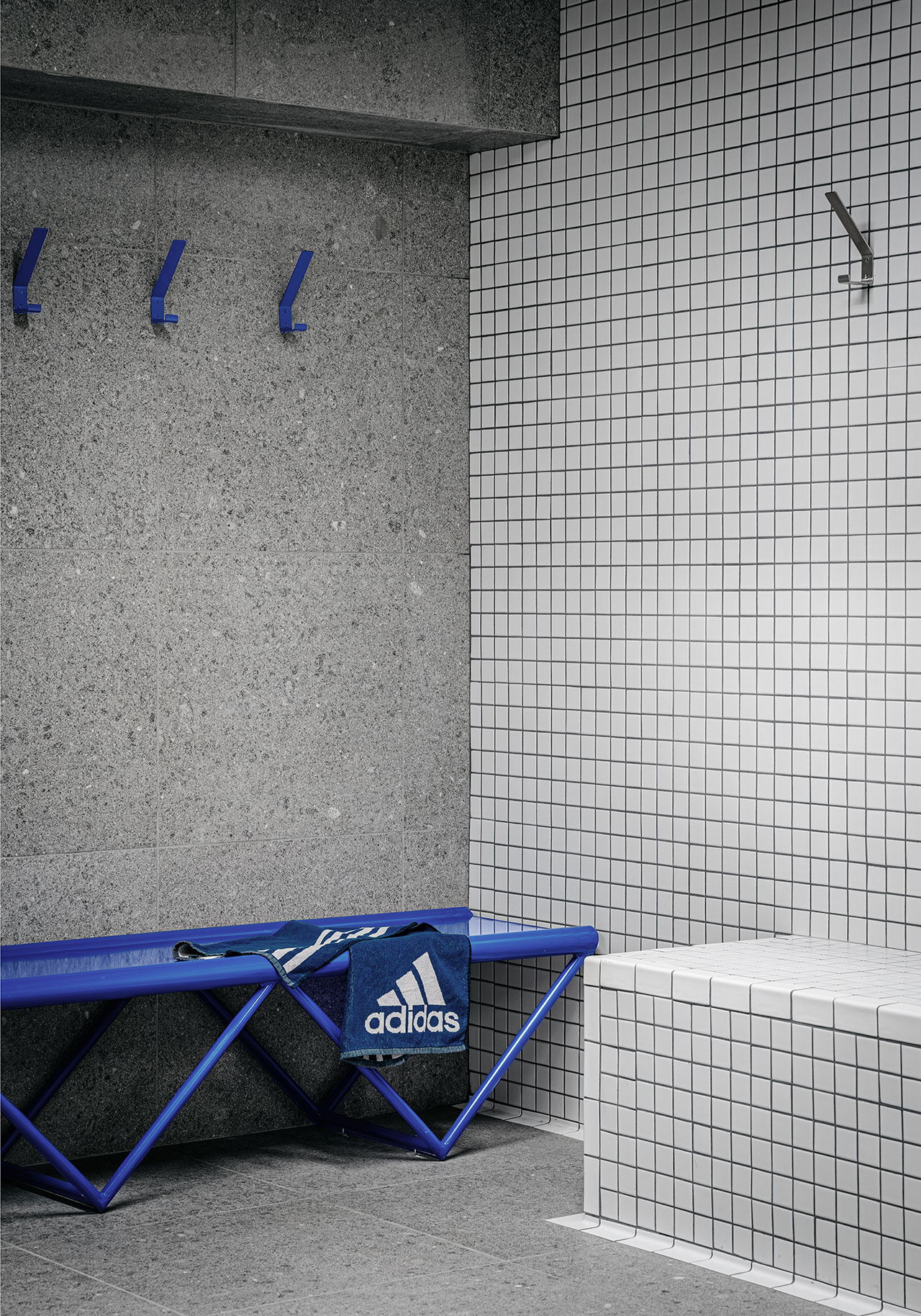
ADIDAS X INSEP by Ubalt Architectes and Ubi Bene.
Photography by Yohann Fontaine.


