Project Name
Centro Informação do Românico / Information Center of the RomanesquePosted in
Public facilitiesLocation
Architecture Practice
Spaceworkers Arquitectura/DesignArea (sqm)
100m2Client
Rota do RomânicoMore Info
principal architects: Henrique Marques, Rui Dinis
architects: Rui Rodrigues, Sérgio Rocha, Rui Miguel
finance director: Carla Duarte - cfo
engineer: simetria vertical, Lda
| Detailed Information | |||||
|---|---|---|---|---|---|
| Project Name | Centro Informação do Românico / Information Center of the Romanesque | Posted in | Public facilities | Location |
Portugal
|
| Architecture Practice | Spaceworkers Arquitectura/Design | Area (sqm) | 100m2 | Client | Rota do Românico |
| More Info | principal architects: Henrique Marques, Rui Dinis | ||||
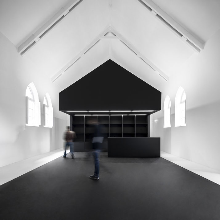
photo © Fernando Guerra, FG+SG Architectural Photography.
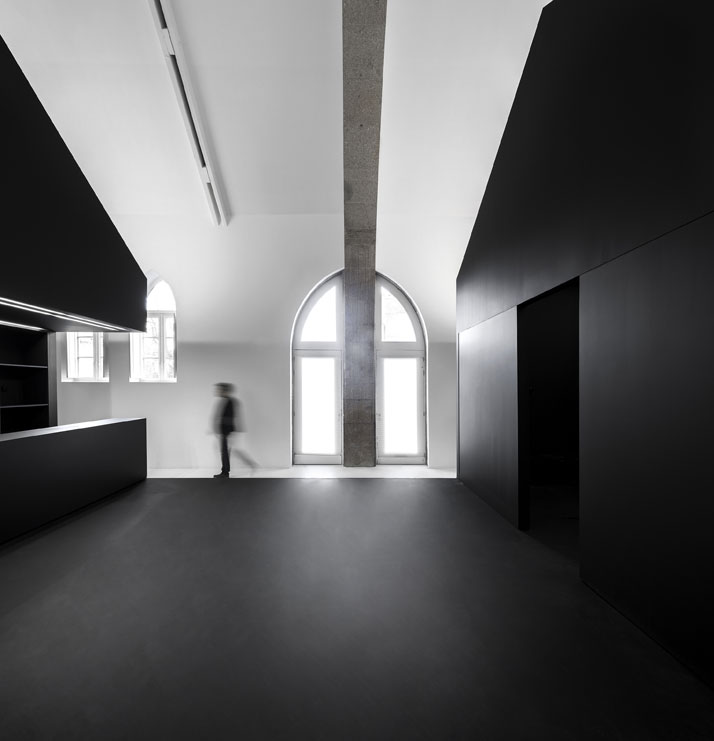
photo © Fernando Guerra, FG+SG Architectural Photography.
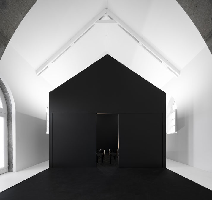
photo © Fernando Guerra, FG+SG Architectural Photography.
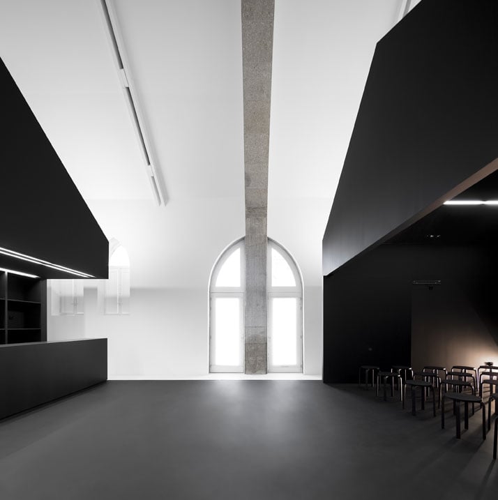
photo © Fernando Guerra, FG+SG Architectural Photography.
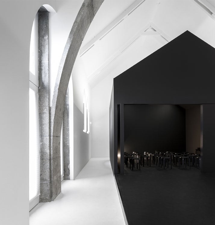
photo © Fernando Guerra, FG+SG Architectural Photography.
Functioning as an information centre for the Rota do Românico (a series of tourist trails dedicated to the area’s important Romanesque architectural heritage), the Centro Interpretação hosts exhibitions and educational activities using a former nineteenth-century primary school as its base – and in doing so, it arguably claims its place in the list of the most ingenious additions within a historic building.
Described by the architects at Spaceworkers as a ''house inside a house'', the project is essentially a house-shaped structure that nests inside the gymnasium hall of the former primary school. Instead of fundamentally transforming the existing space to its core, the architects opted for a rather mute approach based on the idea of radically intervening with the interior in a way that preserved the identity of the location as well as the architectural character of the existing building. With this in mind, the architects built a solid volume right in the centre of the building’s interior, leaving the rest of the space intact and completely devoid of walls or other vertical elements that would block visual perception. In this vein, the intervention takes the form of a standalone hub that vaguely mimics the shape and geometry of the original building, as if it were a smaller, stripped-down clone of it that somehow managed to land within the existing space.
Minimalistic to the max, the overall interior is stripped to bare necessities, yet it strangely feels far from empty. Upon entering, one is confronted with two monolithic black volumes that sit opposite one another, adjoined by a black floor surface that creates the impression of a continuous entity. On the one end, the larger of the two volumes is home to an informal auditorium, whilst across from it, at the other end, the second volume plays host to the centre’s reception and information desk. A third volume is subtracted in-between, resulting in a void that unmistakably separates the different functions of the space. Enhanced by the black colour of the volumes, their clean lines and their concealed openings, the intervention rises quietly inside the space without jarring the overall effect or stealing the show from the building’s original architectural features. Emulating the openness of a square within an enclosed space, its centralized position allows visitors to wander around it, all the while guiding them on their journey though the building’s interior. Borrowing from the visual language of a pop-up structure, its simplified design gives off a sense of temporality, while its open-plan layout renders it versatile enough to adapt to and sufficiently cater for the centre’s various functions and activities.
Bold yet equally understated, the intervention feels surprisingly at home inside a building which predates it by 200 years, managing to turn the existing space on its head without appearing, even for a moment, alien to its environs. It seems that, with this project, Spaceworkers may have found just the right dose of daring design and respect for architectural heritage to elevate the character of a historic building to sheer monochromatic bliss.
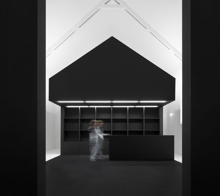
photo © Fernando Guerra, FG+SG Architectural Photography.
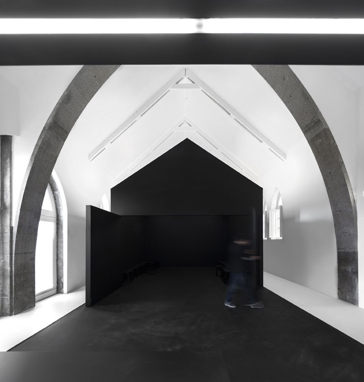
photo © Fernando Guerra, FG+SG Architectural Photography.
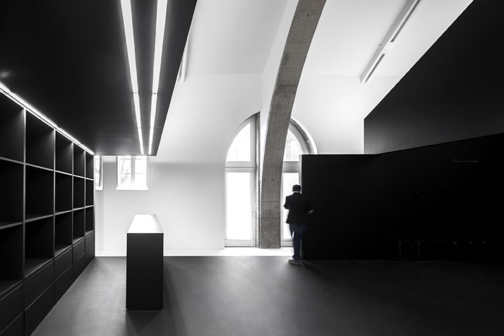
photo © Fernando Guerra, FG+SG Architectural Photography.
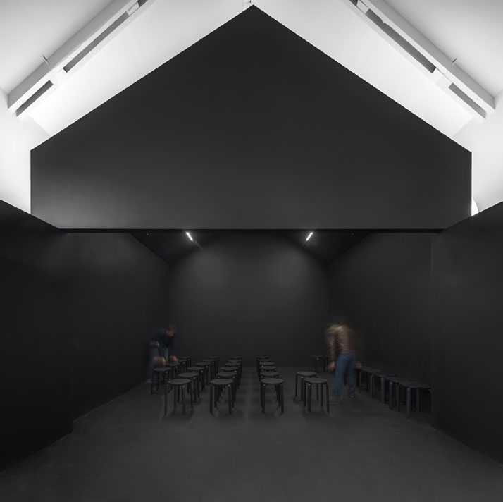
photo © Fernando Guerra, FG+SG Architectural Photography.
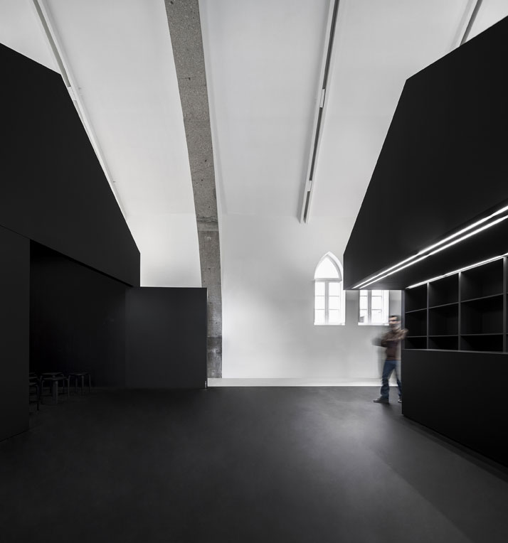
photo © Fernando Guerra, FG+SG Architectural Photography.
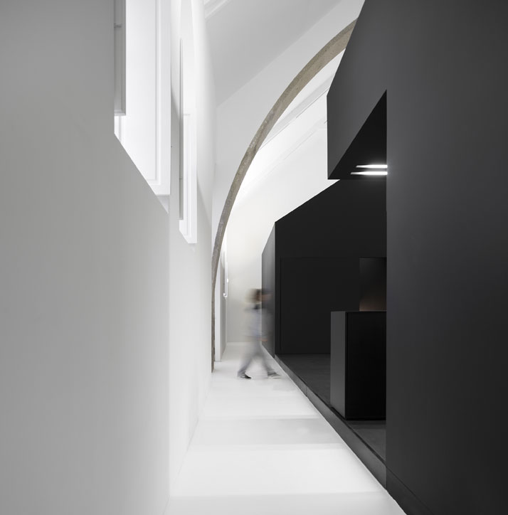
photo © Fernando Guerra, FG+SG Architectural Photography.
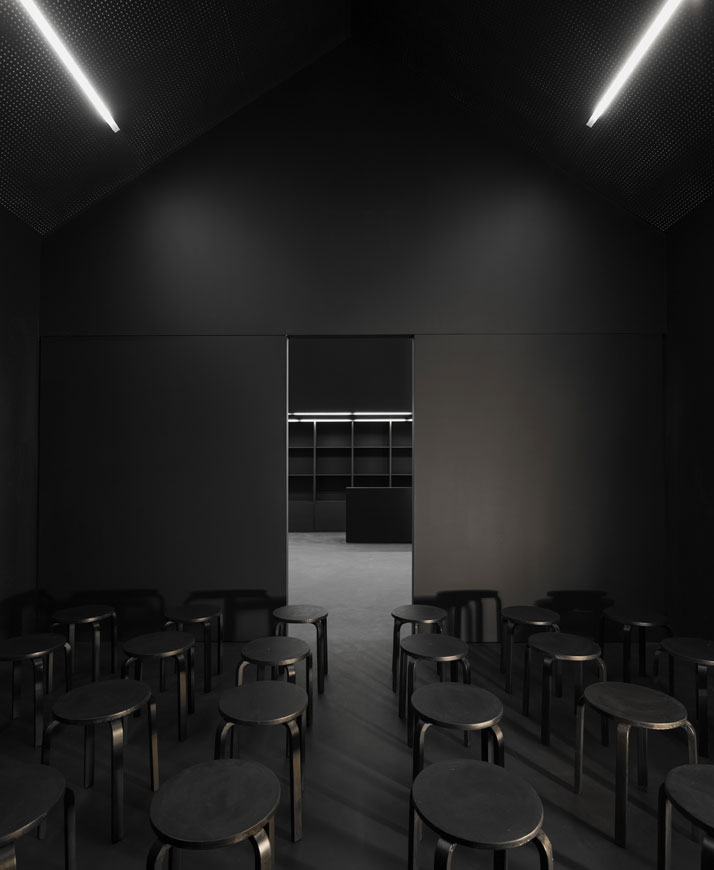
photo © Fernando Guerra, FG+SG Architectural Photography.


