MisterDesign's New Dutch Showroom Transforms a 1930s Car Factory
Words by Yatzer
Location
Den Bosch, Netherlands
MisterDesign's New Dutch Showroom Transforms a 1930s Car Factory
Words by Yatzer
Den Bosch, Netherlands
Den Bosch, Netherlands
Location
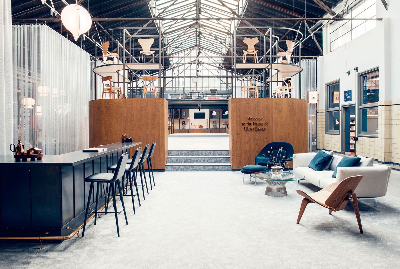
Located on the outskirts of Den Bosch, a Dutch town in the south of the country, MisterDesign’s new retail space takes over a former car factory: a bold gesture that embodies both the Dutch furniture retailer’s ambitious expansion plans and its drive to educate consumers about the craftsmanship behind the high-end products it carries. The conflicting themes of manufacturing and craftsmanship at the core of this venture became the focal point of Amsterdam-based Studio 34 South’s interior design which not only attempts to reconcile this historically contentious relationship but also position MisterDesign as a unique brand on its own.
Once a bustling artistic haven and centre of music during the Renaissance—Den Bosch was the home of master painter Hieronymus Bosch—by the beginning of the 20th century the town had lost its economic and cultural prominence before receiving a boost from the arrival of global manufacturing companies like Michelen and Remington. One of the most interesting factories set up during this booming period was Ford’s monumental 2,000 square metre facility. Built in the 1930s as a testament to Neue Sachlichkeit, or New Objectivity—an architectural movement at the heart of Bauhaus and the precursor of the International Style—the building sat vacant from 2006 until a few years ago when the local government set forth finding a new business to revitalize it. Enter MisterDesign, a local retailer carrying iconic brands such as Carl Hansen, Vitra, and Kartell, which was looking to expand from its two existing stores on the high street.
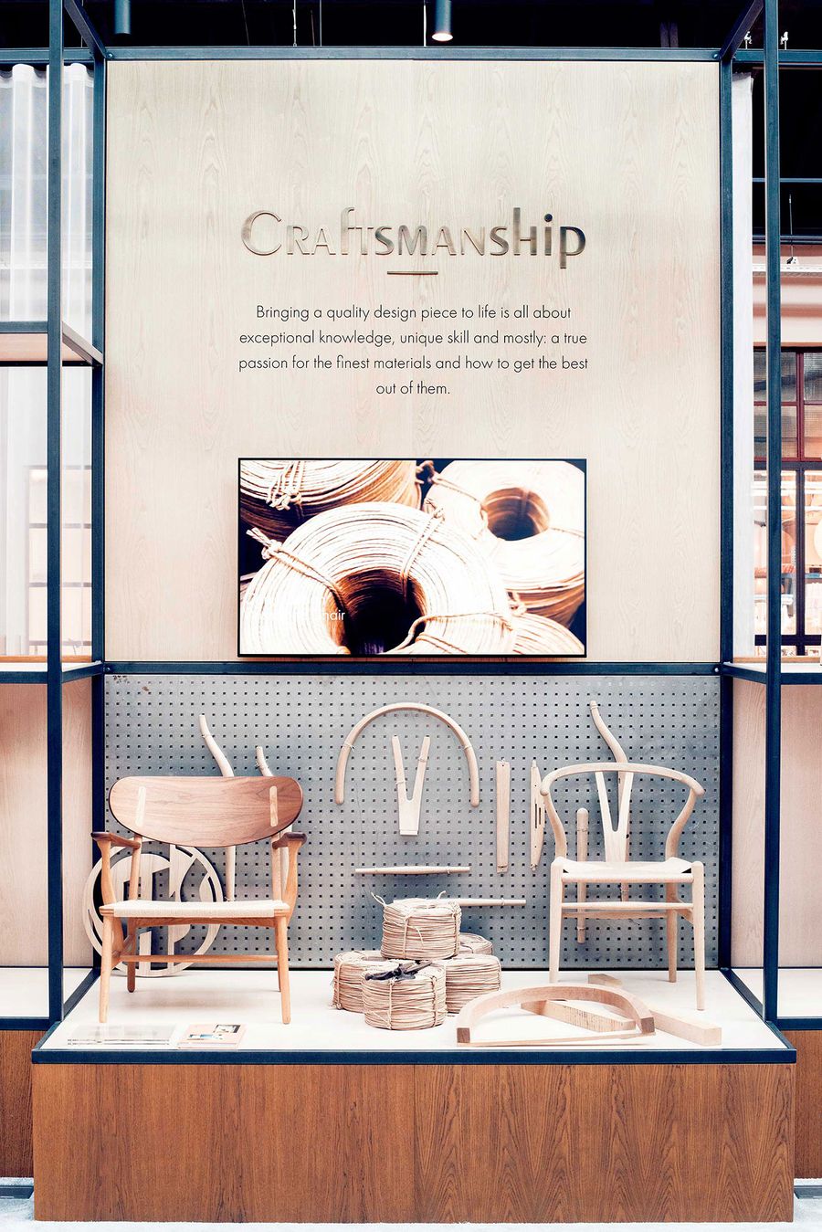
Photo by Nina van Ewijk.
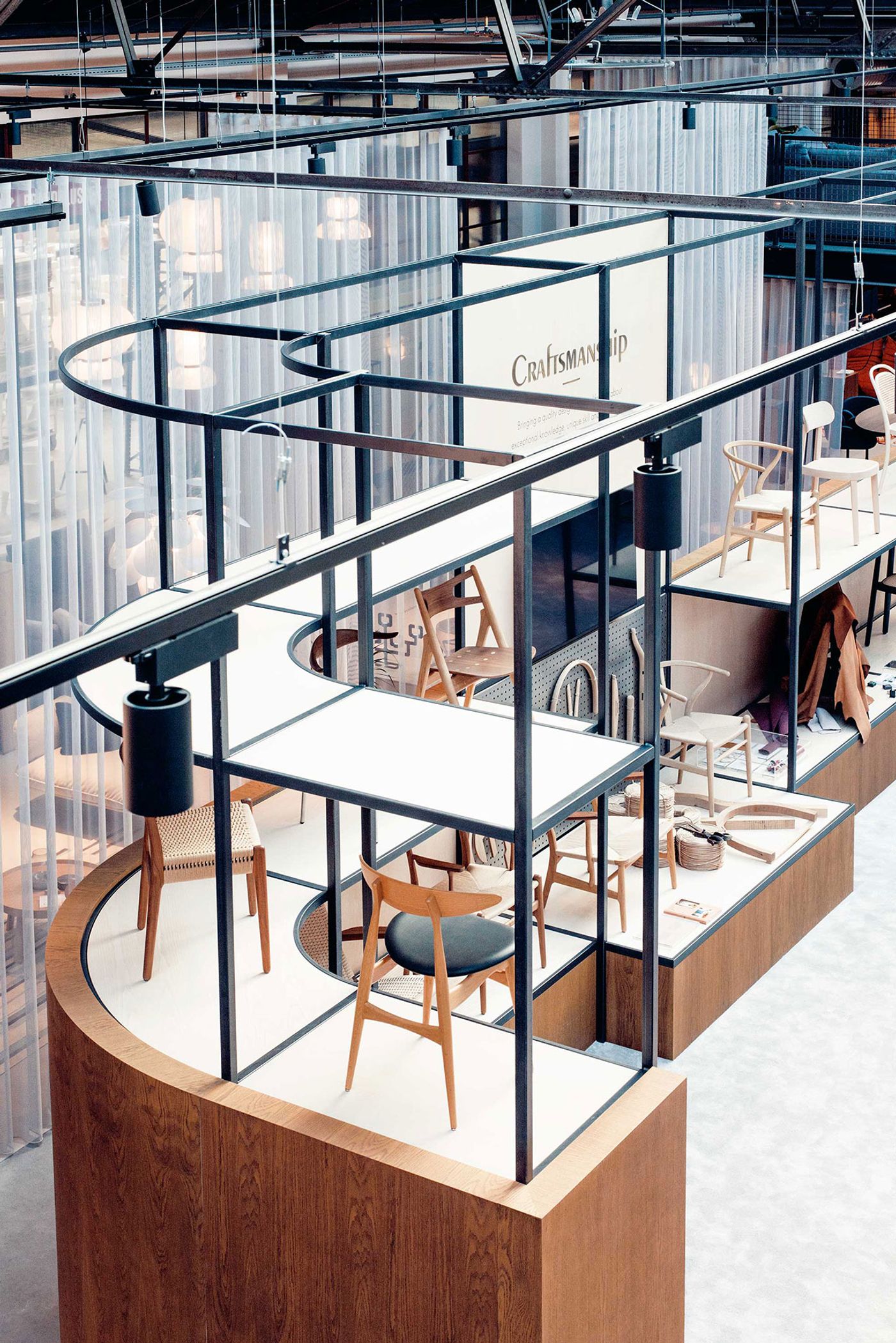
Photo by Nina van Ewijk.
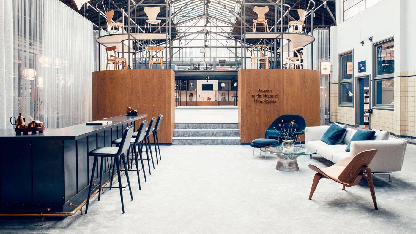
Photo by Nina van Ewijk.
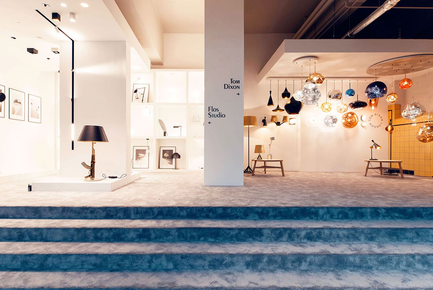
Photo by Nina van Ewijk.
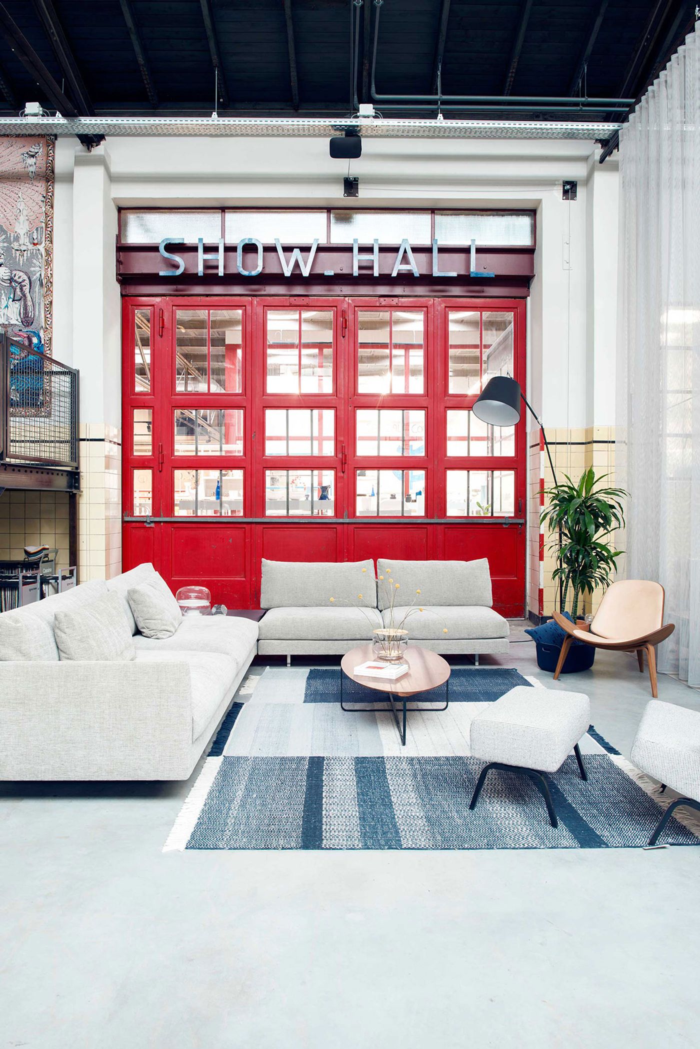
Photo by Nina van Ewijk.
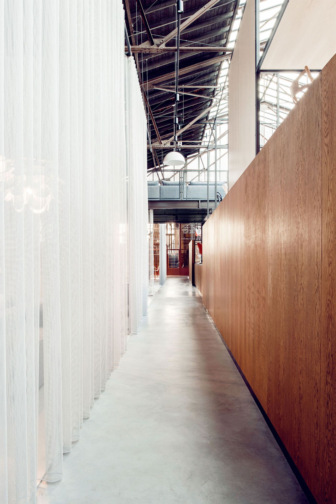
Photo by Nina van Ewijk.
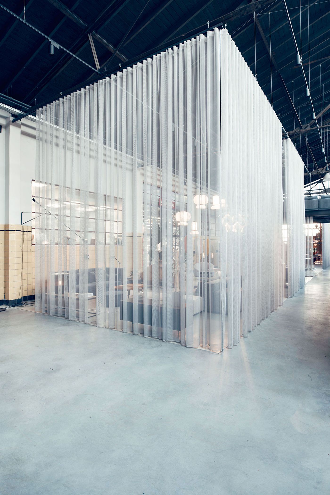
Photo by Nina van Ewijk.
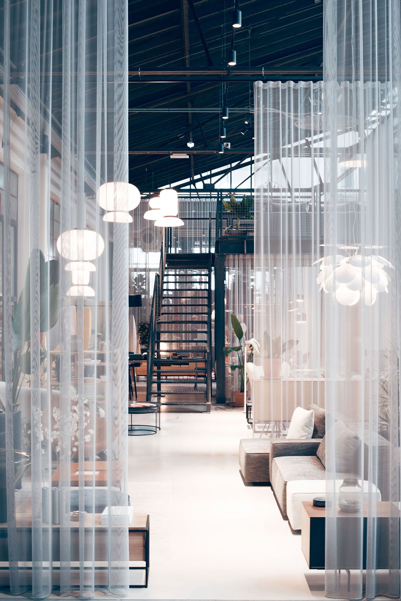
Photo by Nina van Ewijk.
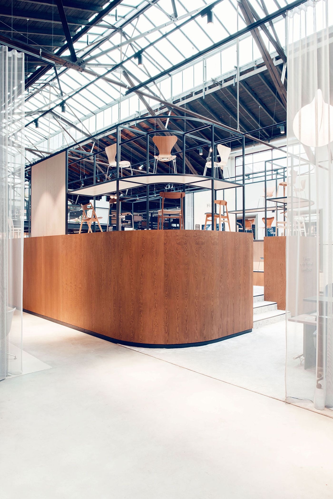
Photo by Nina van Ewijk.
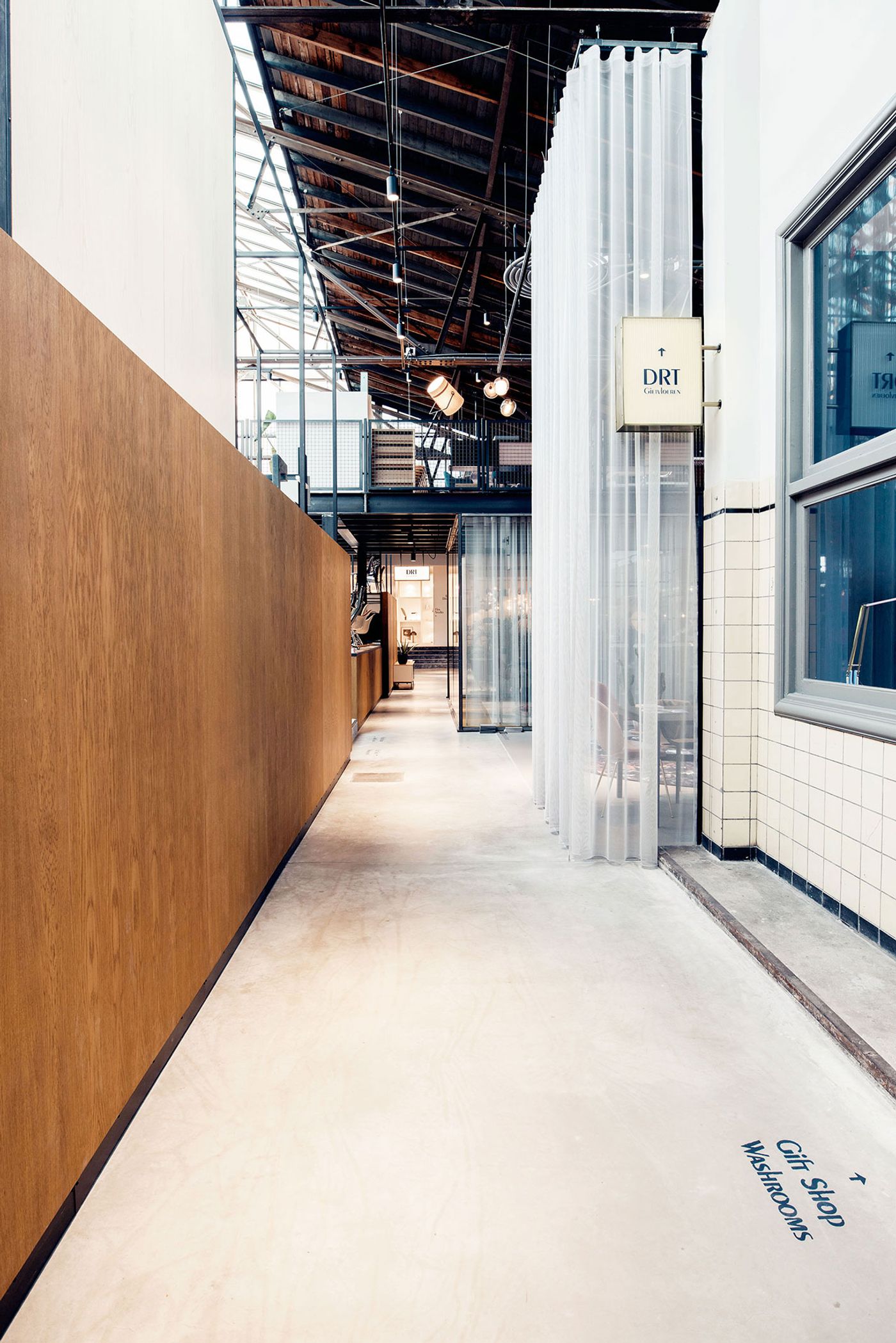
Photo by Nina van Ewijk.
The surrounding retail area is arranged into distinct display spaces that follow the building’s original grid. Separated by 6 metre high semi-sheer Kvadrat curtains, each space features an intimate furniture setting where visitors can see the pieces come to life in diverse everyday contexts and get a sense of how they fit into a real living environment. This configuration allows the store to both function as a public destination as well as offering more intimate moments. “In a world of fakes and inauthentic design”, as the designers explain, “we wanted to reconnect consumers with the innovation, context and thus the value of the original pieces”, all in all a laudable goal, elegantly executed.
Photo by Nina van Ewijk.
Photo by Nina van Ewijk.
Photo by Nina van Ewijk.
Photo by Nina van Ewijk.
Photo by Nina van Ewijk.