Michaelis Boyd Revamps a Georgian London home with Art-Inflected Playfulness
Words by Yatzer
Location
London, United Kingdom
Michaelis Boyd Revamps a Georgian London home with Art-Inflected Playfulness
Words by Yatzer
London, United Kingdom
London, United Kingdom
Location
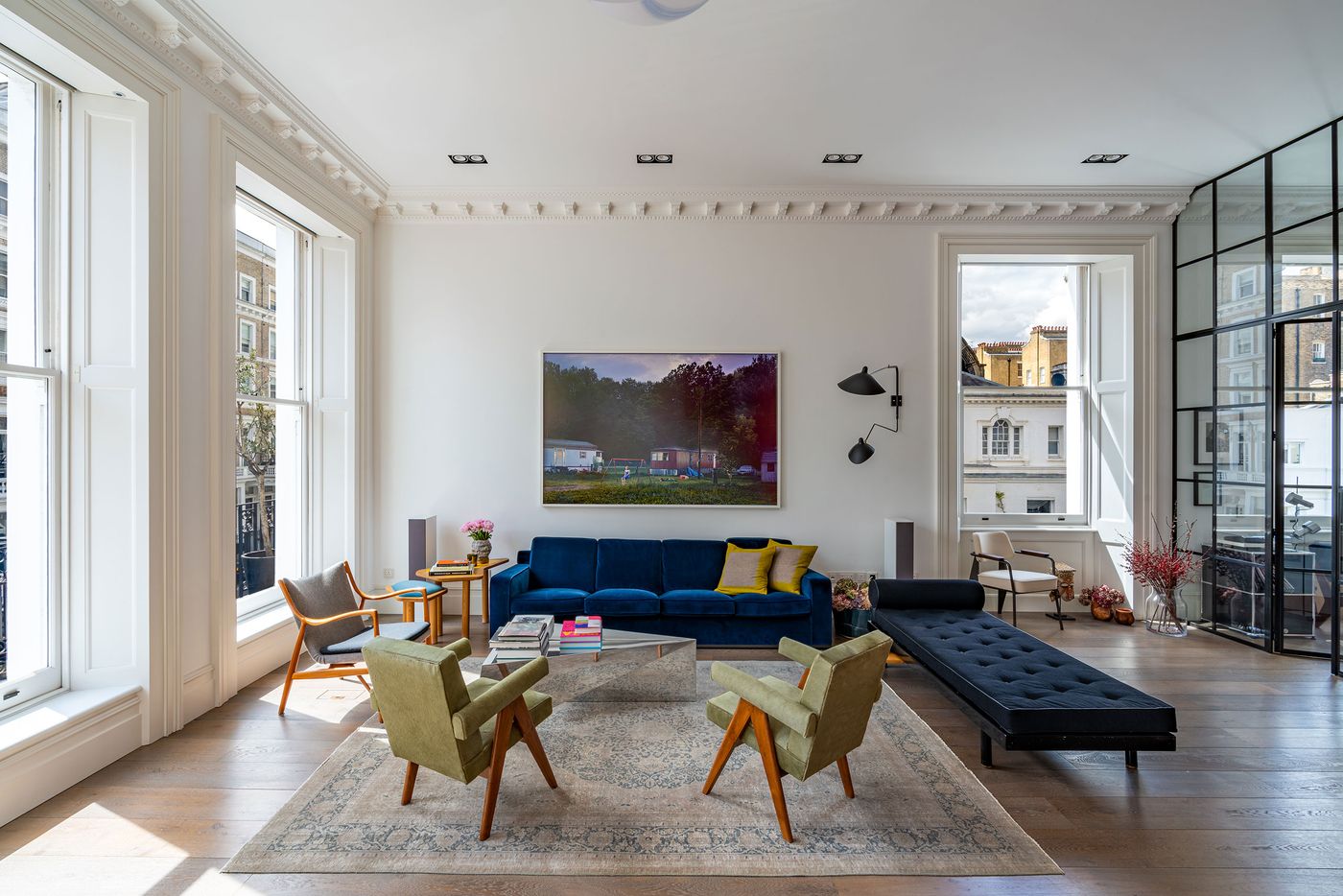
Situated at the end of a Georgian terrace in Kensington, London, this recently renovated three-storey home playfully marries the building’s ornate period features with a bold, art-inflected design language that reflects the creative personalities of its owners. Ten years after Michaelis Boyd combined two existing flats into a 4-bedroom maisonette, the London and New York-based architectural practice revisited the property to update the interiors in response to the owners’ contemporary tastes and extend its floor space with an additional third floor.
Photography by Gavriil Papadiotis.
The result is a series of light-filled spaces that marry the building’s architectural heritage with an eclectic sense of contemporary sophistication and irreverent quirkiness.
Photography by Gavriil Papadiotis.
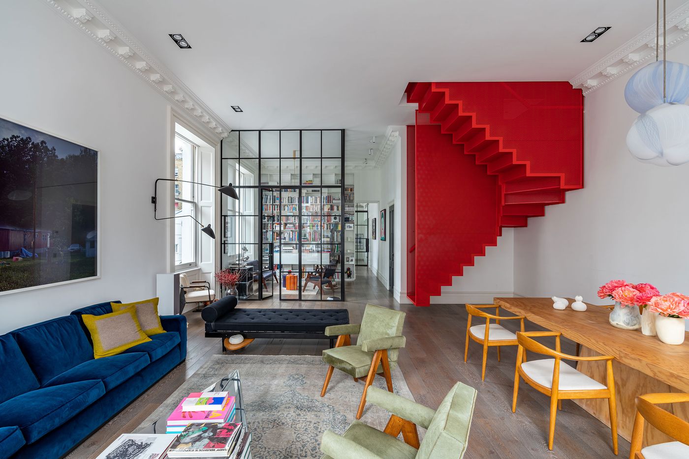
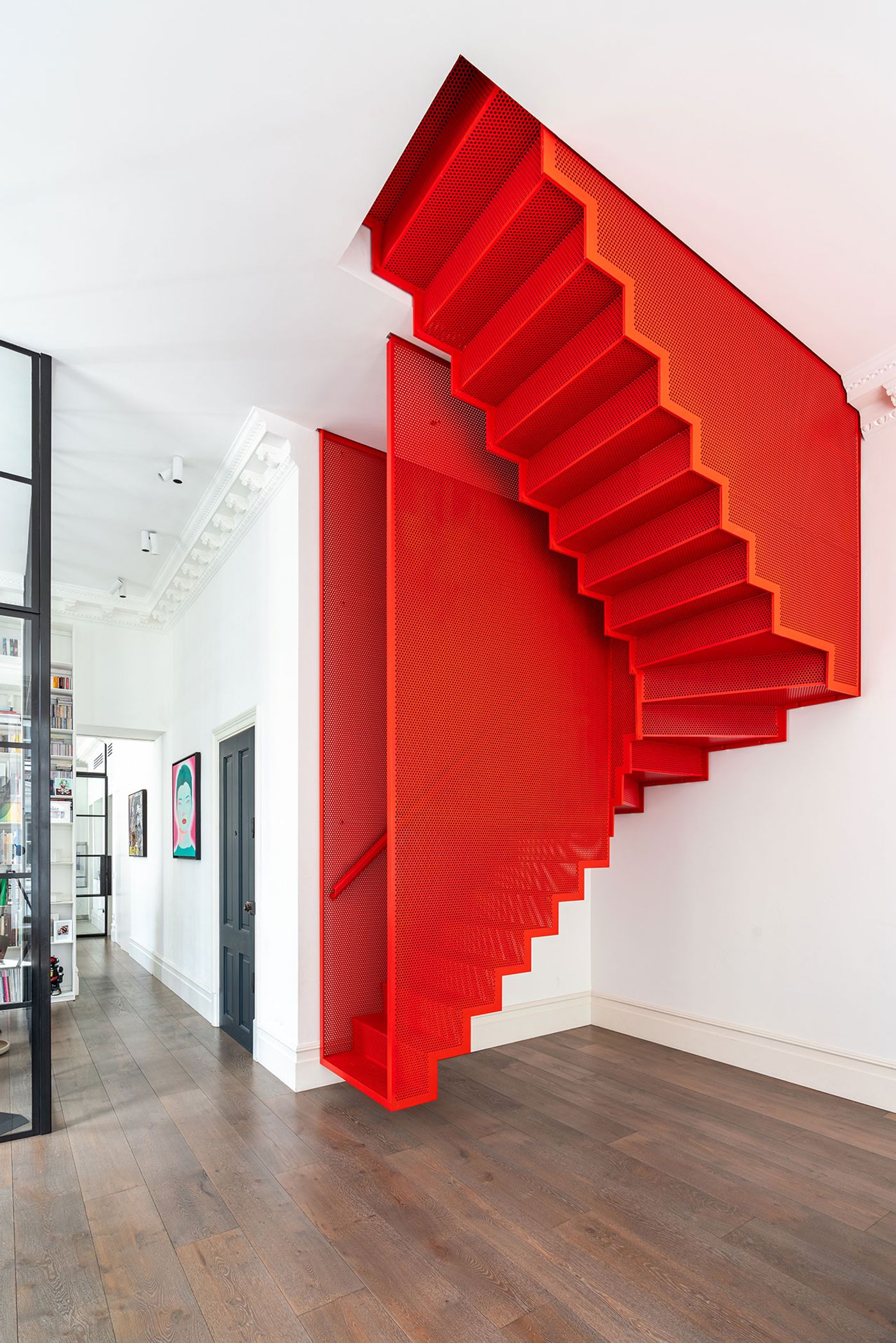
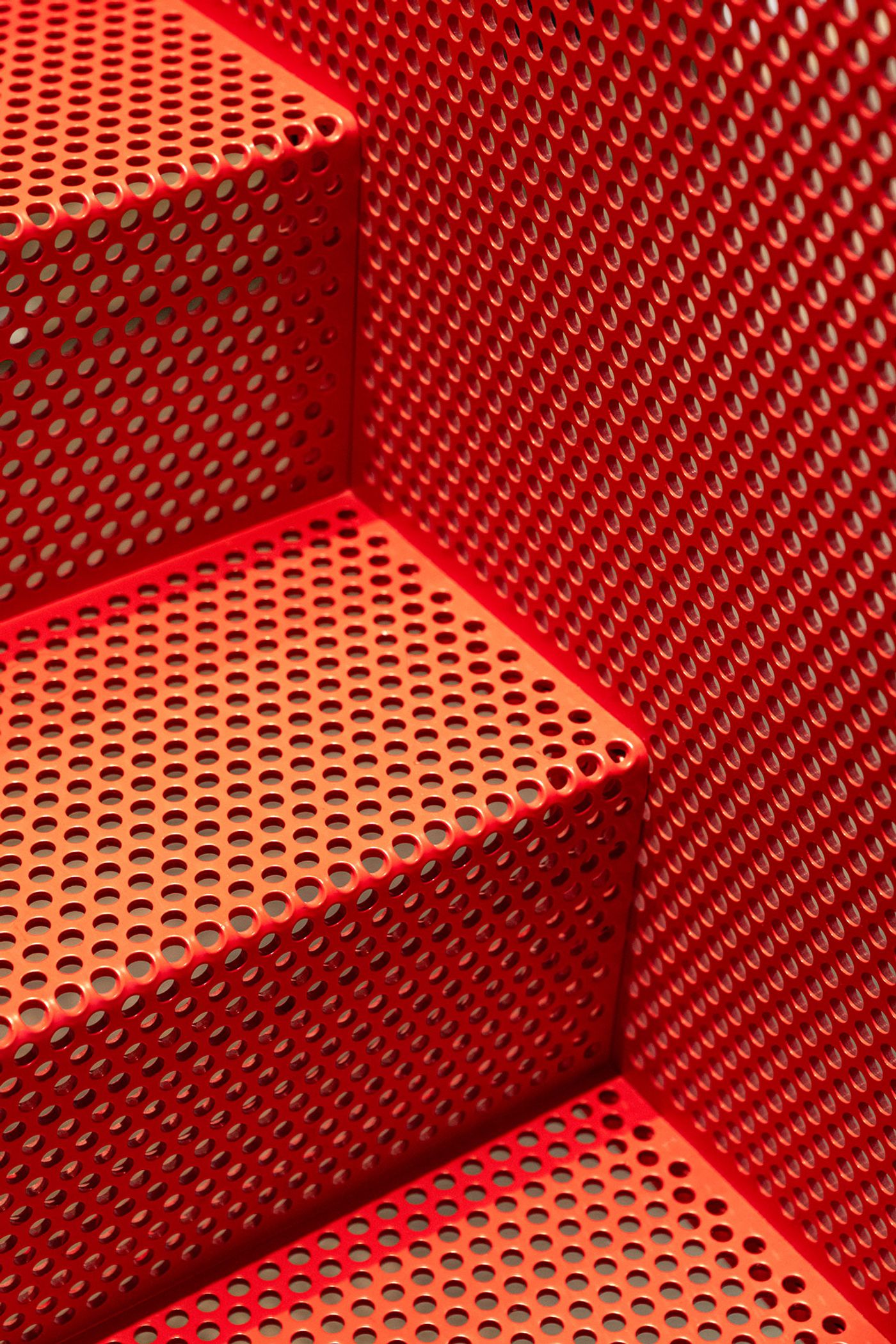
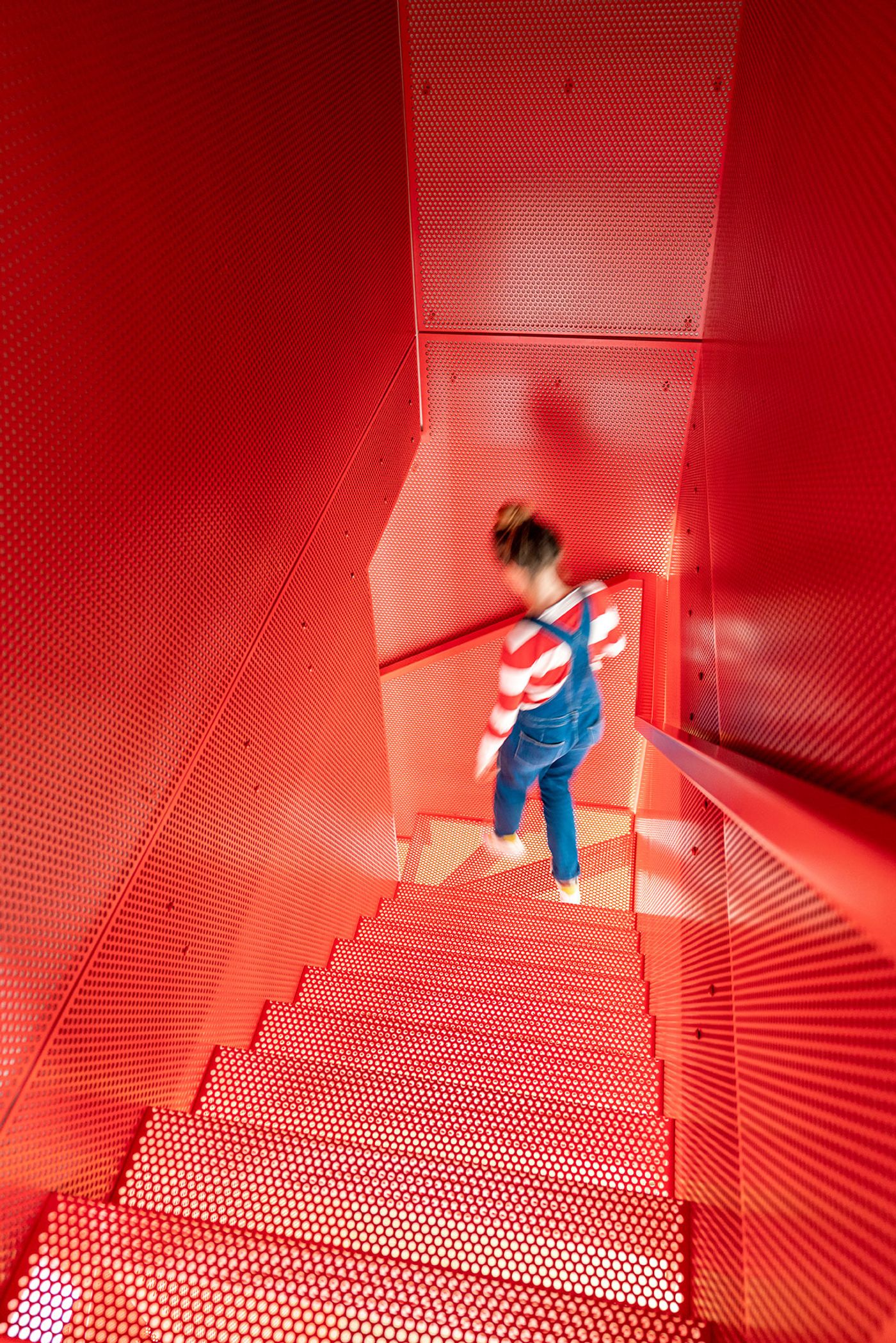
Spread across three floors, the house’s focal point, both conceptually and visually, is the bright red staircase connecting the living space on the first level with the private quarters on the second – an architectural showstopper whose vibrant hue and floating construction transform it from a functional element into a sculptural piece of art. The staircase, which was developed in collaboration with Diapo and Webb Yates Engineers, was inspired by Korean artist Doh Ho Suh’s Tate Modern installation Staircase-III which is part of a series of works based on the artist’s personal memories of architectural spaces, and in particular his parents' traditional Korean house in Seoul and his own Western-style apartment in Chelsea, New York, where Staircase-III hails from. The architects have cleverly substituted the artist’s use of red polyester fabric with perforated metal ensuring structural integrity while replicating the artwork’s ethereal qualities. The structure encapsulates the owners’ artistic interests – one of which is a Parisian art consultant and collector – as well as Michaelis Boyd’s design-led approach which focused on “finding solutions for the client to live with their art, rather than have it on display”.
Photography by Gavriil Papadiotis.
Photography by Gavriil Papadiotis.

Photography by Gavriil Papadiotis.
Photography by Gavriil Papadiotis.

Photography by Gavriil Papadiotis.
Photography by Gavriil Papadiotis.
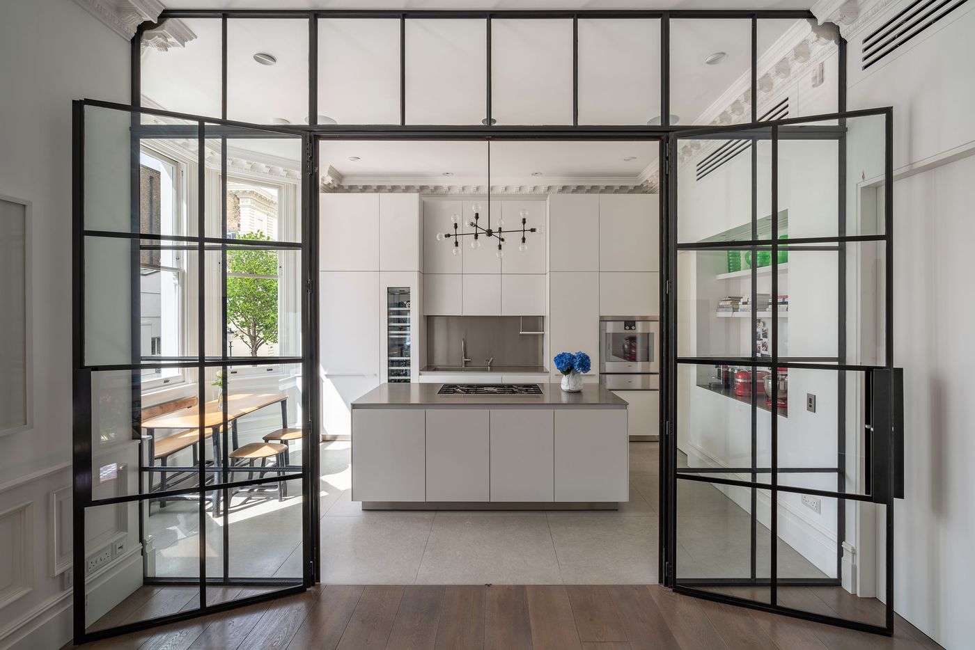
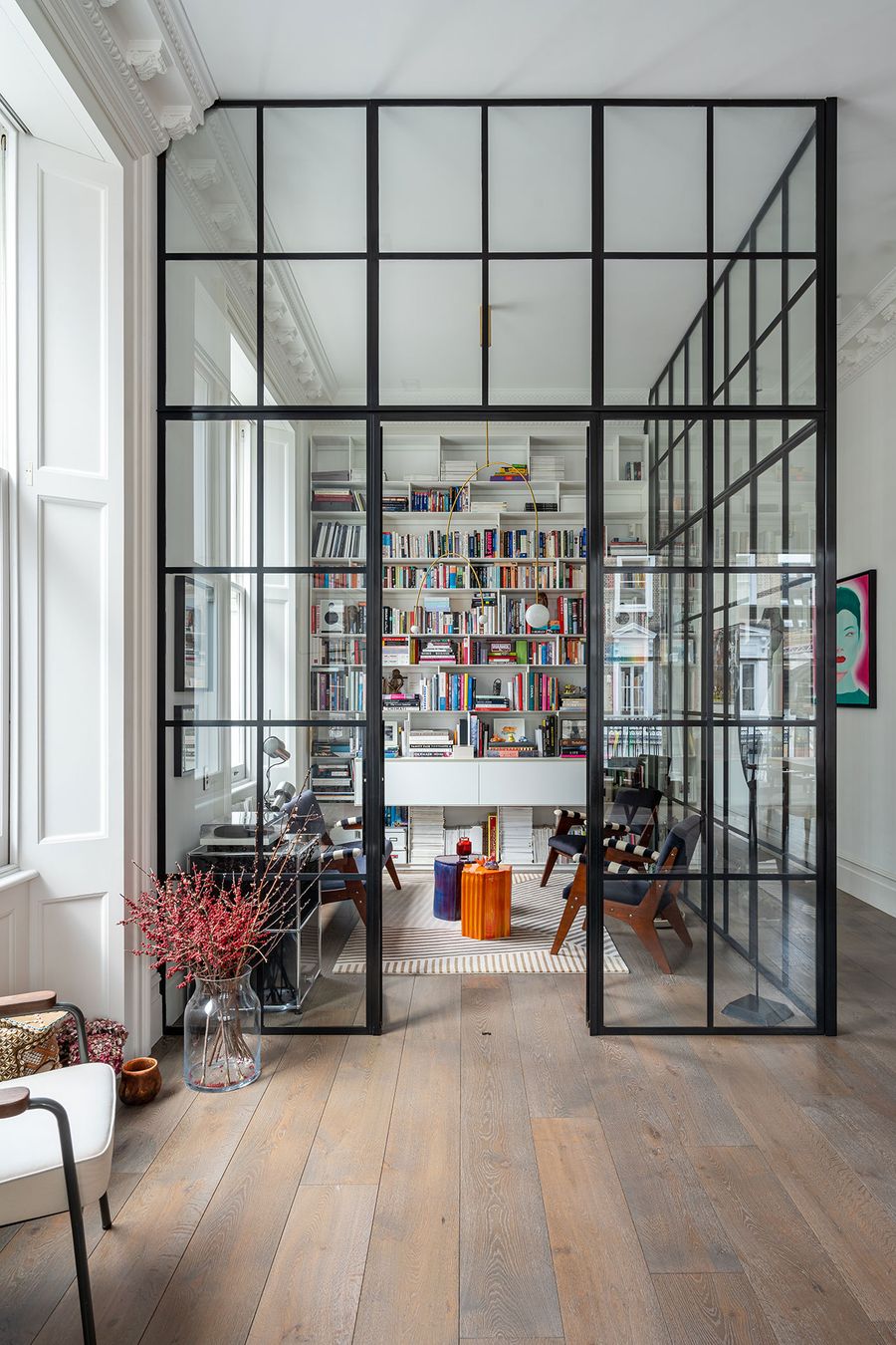
Standing out against the subdued colour palette of the interiors which mostly comprises white and natural wood hues, the floating red staircase is indicative of the importance of openness and lightness in Michaelis Boyd’s approach to the renovation. Spaces have been kept as open and bright as possible by tearing down internal walls and replacing them with steel-framed glass partitions and, where feasible, adding skylights. Case in point, the first floor open-plan living space where the study and kitchen are separated by Crittall glazed walls, delicately slicing through the ornate Georgian ceiling cornices highlighting the practice’s attention to detail. The dark-framed glass partitions not only enhance natural light and preserve sightlines but also allow the occupants to “read” volumes.
Photography by Gavriil Papadiotis.
Photography by Gavriil Papadiotis.
Photography by Gavriil Papadiotis.
Photography by Gavriil Papadiotis.
Photography by Gavriil Papadiotis.
Photography by Gavriil Papadiotis.
Photography by Gavriil Papadiotis.
Photography by Gavriil Papadiotis.
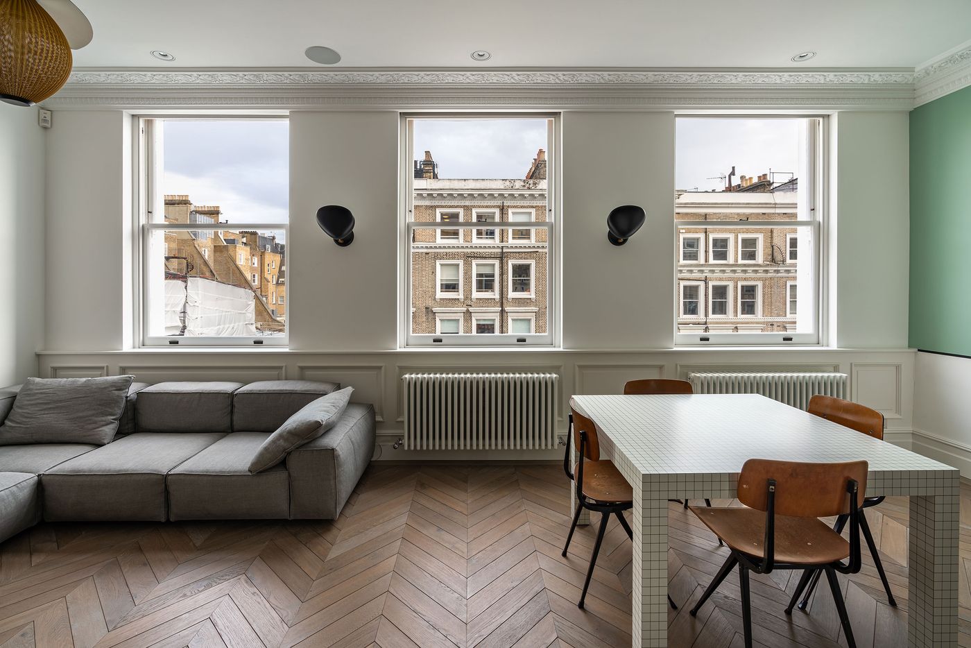
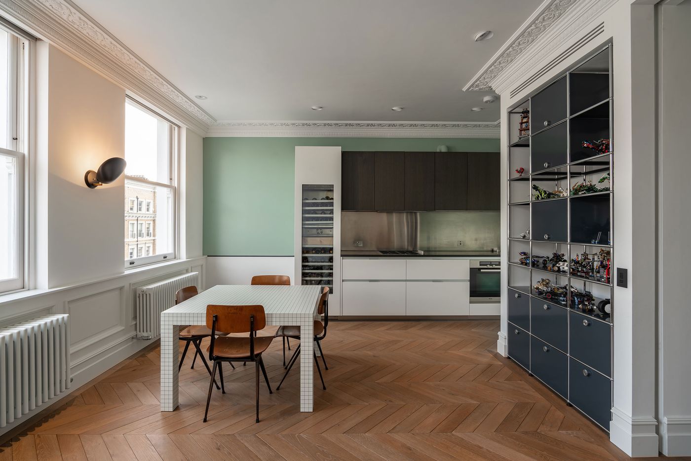
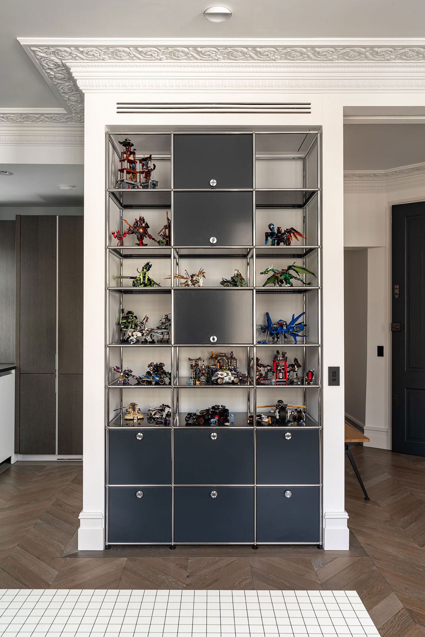
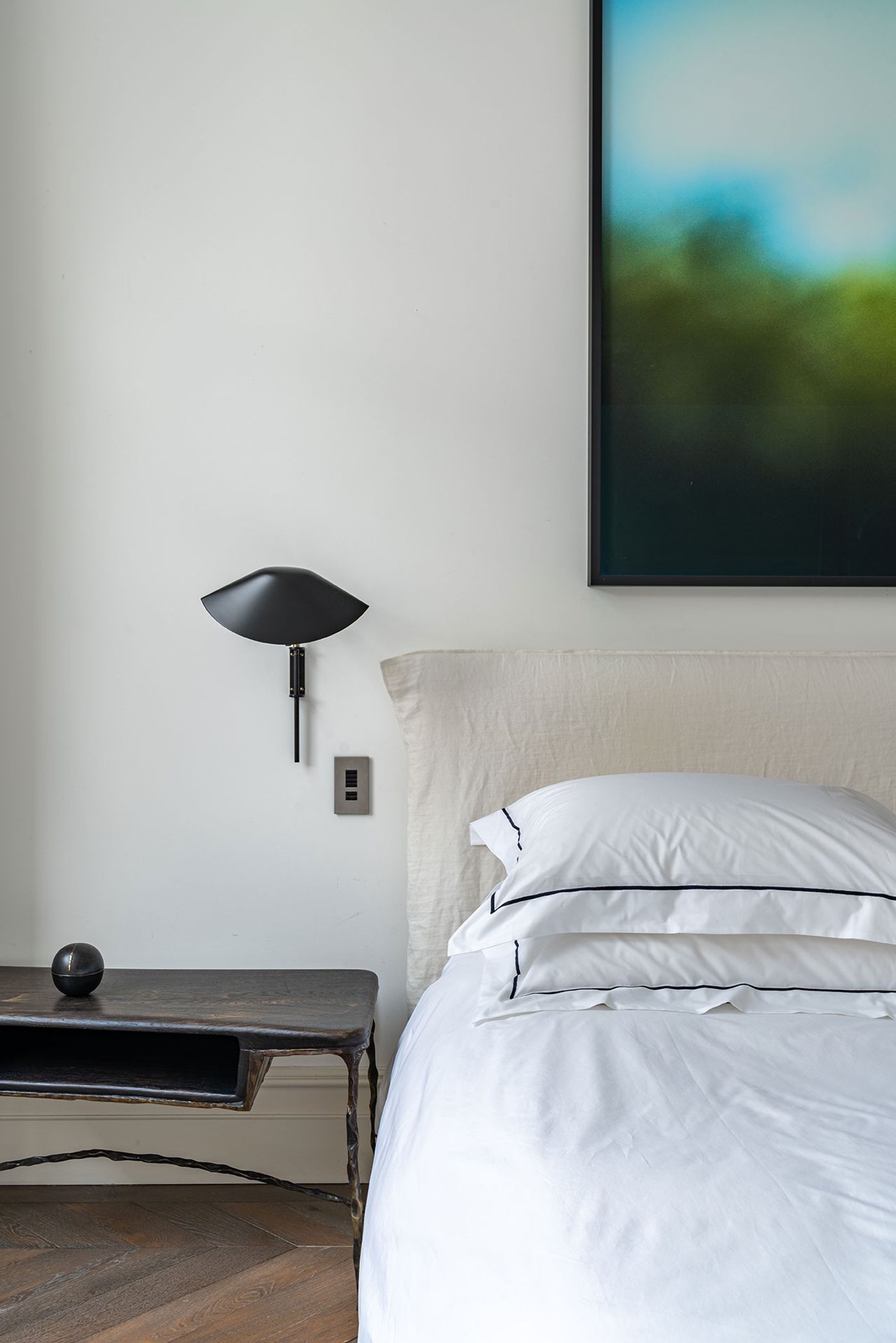
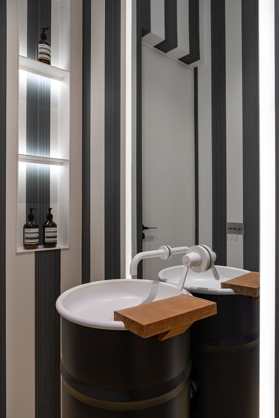
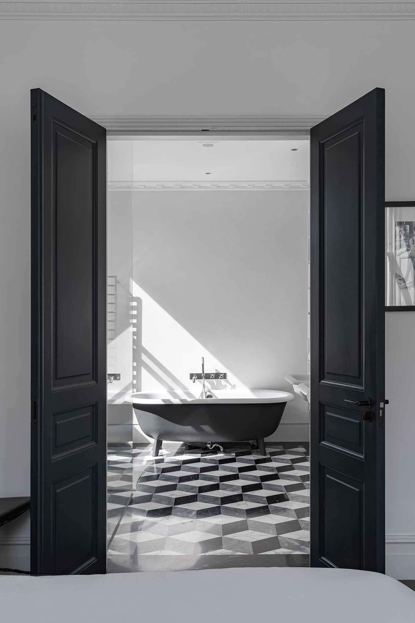
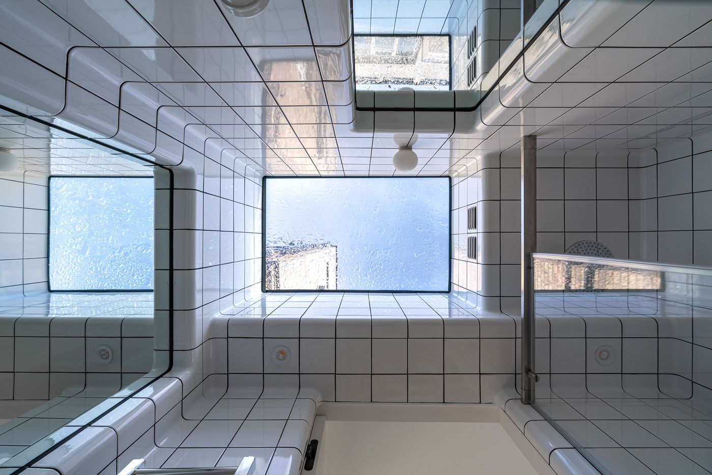
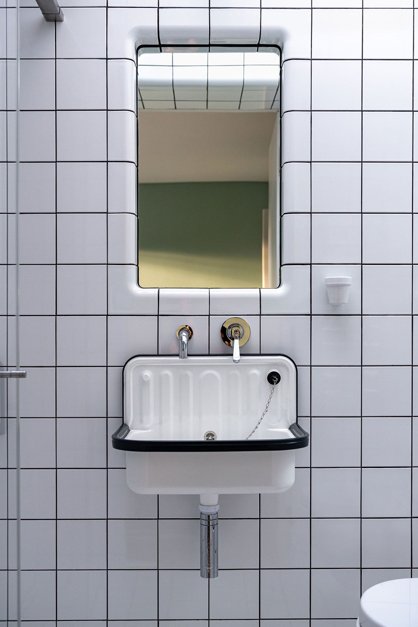
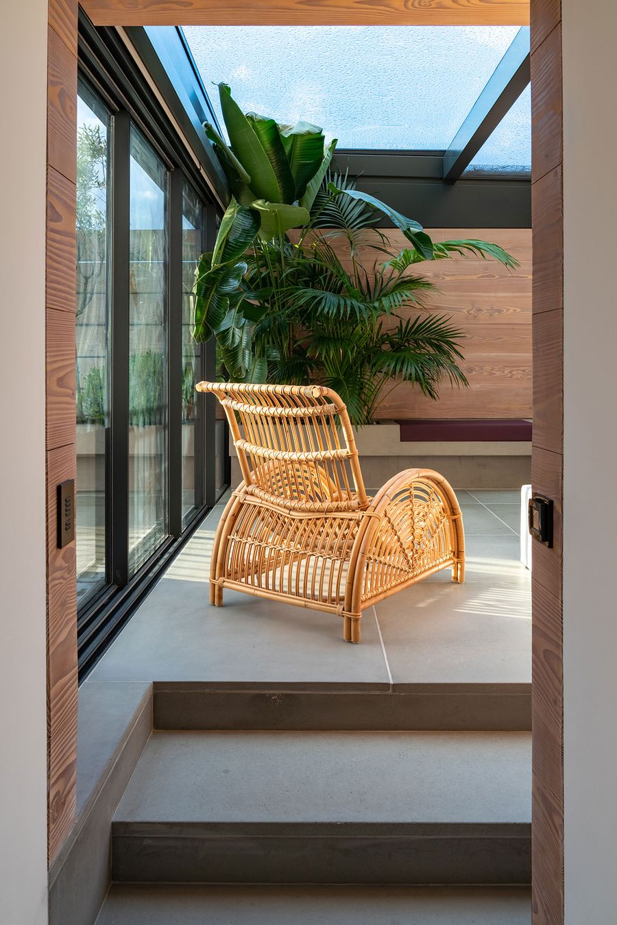
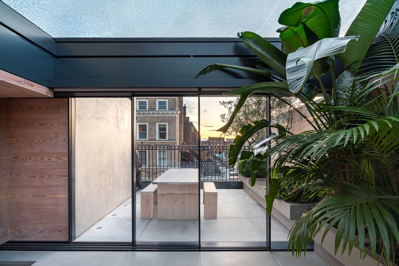
On the second floor, four bright and airy bedrooms and a corridor-like walk-in wardrobe are a paradigm of pared-down elegance with the geometric tiles and unexpected skylights in the bathrooms adding playful accents, as do the pistachio-hued wall section and dark grey built-in shelving showcasing the children’s toy collection on the third-floor family room, which includes a lounge, dining area and kitchen. On the same level, a minimally furnished sunroom packed with exotic plants and an adjoining terrace with beautiful views of Kensington make for an idyllic refuge. Throughout the house, period features such as ceiling plasterwork, wall panelling, and hardwood and parquet floors, are artfully juxtaposed with the owners’ mid-century furniture and contemporary art collections, as well as the crisp minimalism and quirky interventions of Michaelis Boyd’s interior design – the latter a reflection of the practice’s commitment to challenging expectations.
Photography by Gavriil Papadiotis.
Photography by Gavriil Papadiotis.