Renovating for the Future at the FlaHalo Office Manufactory by NARRATION
Words by Sara Panagiotopoulou
Location
Shenzhen, China
Renovating for the Future at the FlaHalo Office Manufactory by NARRATION
Words by Sara Panagiotopoulou
Shenzhen, China
Shenzhen, China
Location
The FlaHalo Office Manufactory Renovation in Shenzhen, China, wasn't an easy project for designer, Jingze LI of NARRATION to undertake, thanks to the multiple peculiarities of the space. And yet, this site which was built in 1986 for the Nanxing Glass Manufactory was brought up to date and transformed for his client in 2015, bridging the building's past usage with its future potential.
For starters, the 350 square meter space consists of a very long and narrow floor plan, resembling more of a wide corridor than a proper office. Nevertheless, the designer took what could be considered a design caveat and turned it into a design asset, organizing the entire office as a continuously flowing space wherein one designated room leads into another - sort of like an open-plan loft but elongated. This encourages a communication and collaborative spirit between the office workers, since getting from point A to point C requires them to pass through point B… as there is no other way around it.
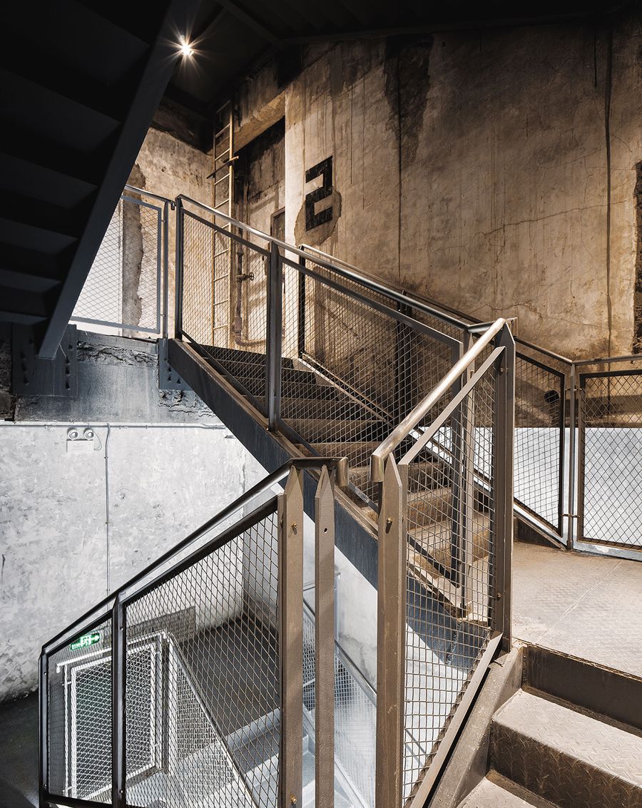
Photo by Kevin Ho.
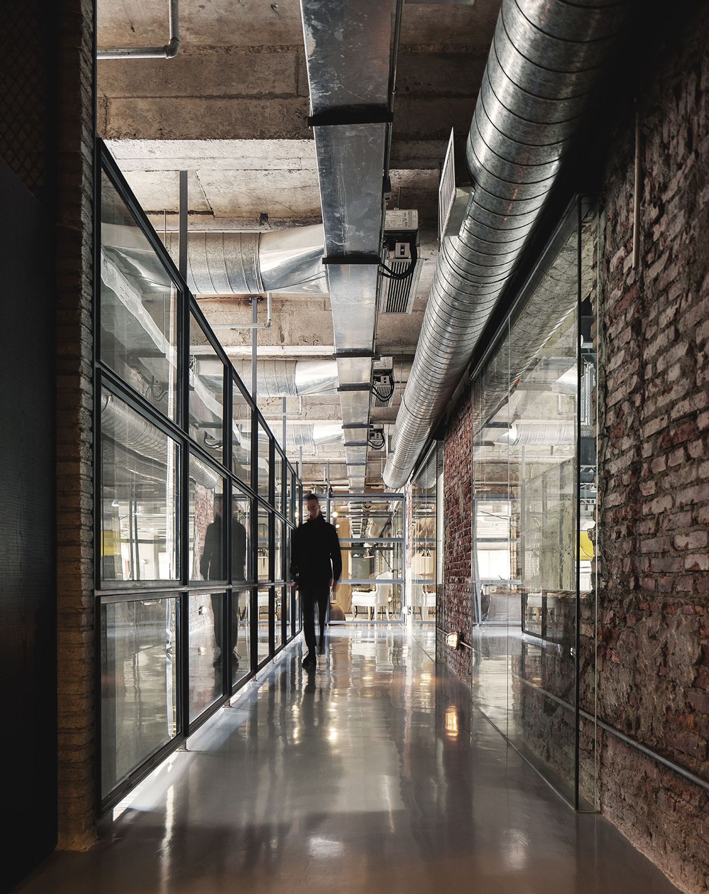
Photo by Kevin Ho.
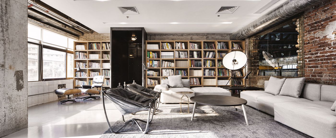
Photo by Kevin Ho.
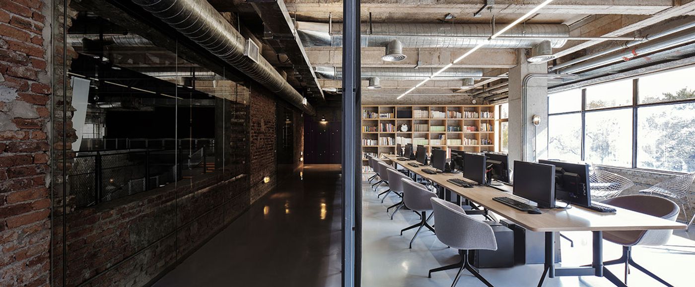
Photo by Kevin Ho.
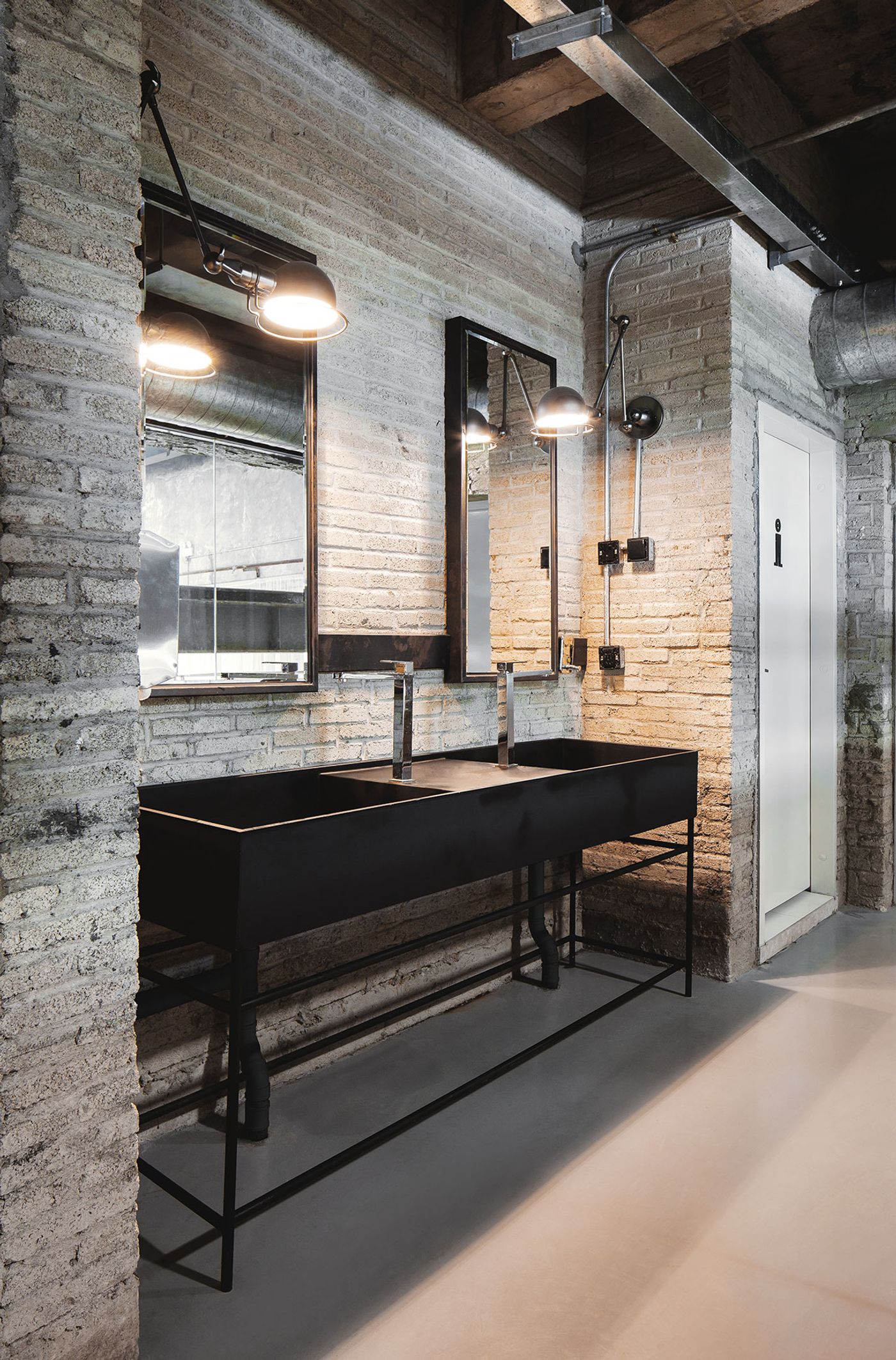
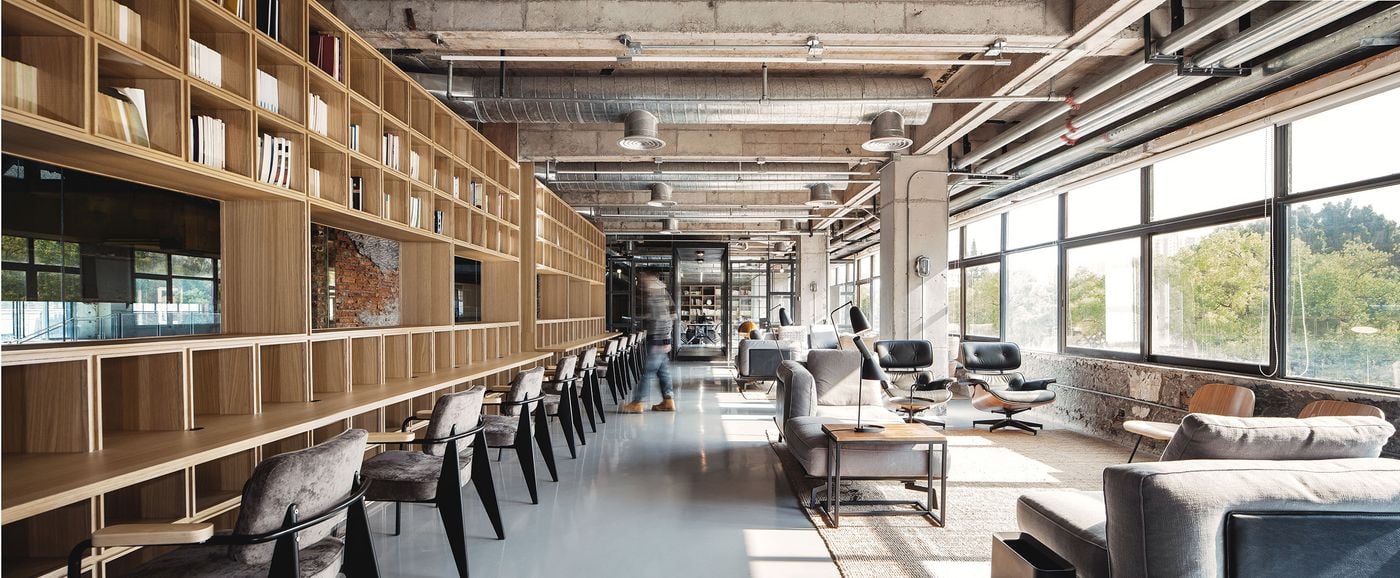
As far as the décor goes, the building's original, textural construction materials are highlighted and brought to the forefront seen in the exposed red brick walls and concrete ceilings as well as the pipes and beams running along them. Meanwhile, the floor has been covered in a shiny, light gray epoxy paint that adds an unexpected touch of subtle polish to the interiors. Glass also features prominently, not just on the bare window frames pointing but also as dividers between corridors and laid over "windows" in walls which frame peek-a-boo views of other sections of the building, such as the entrance area.
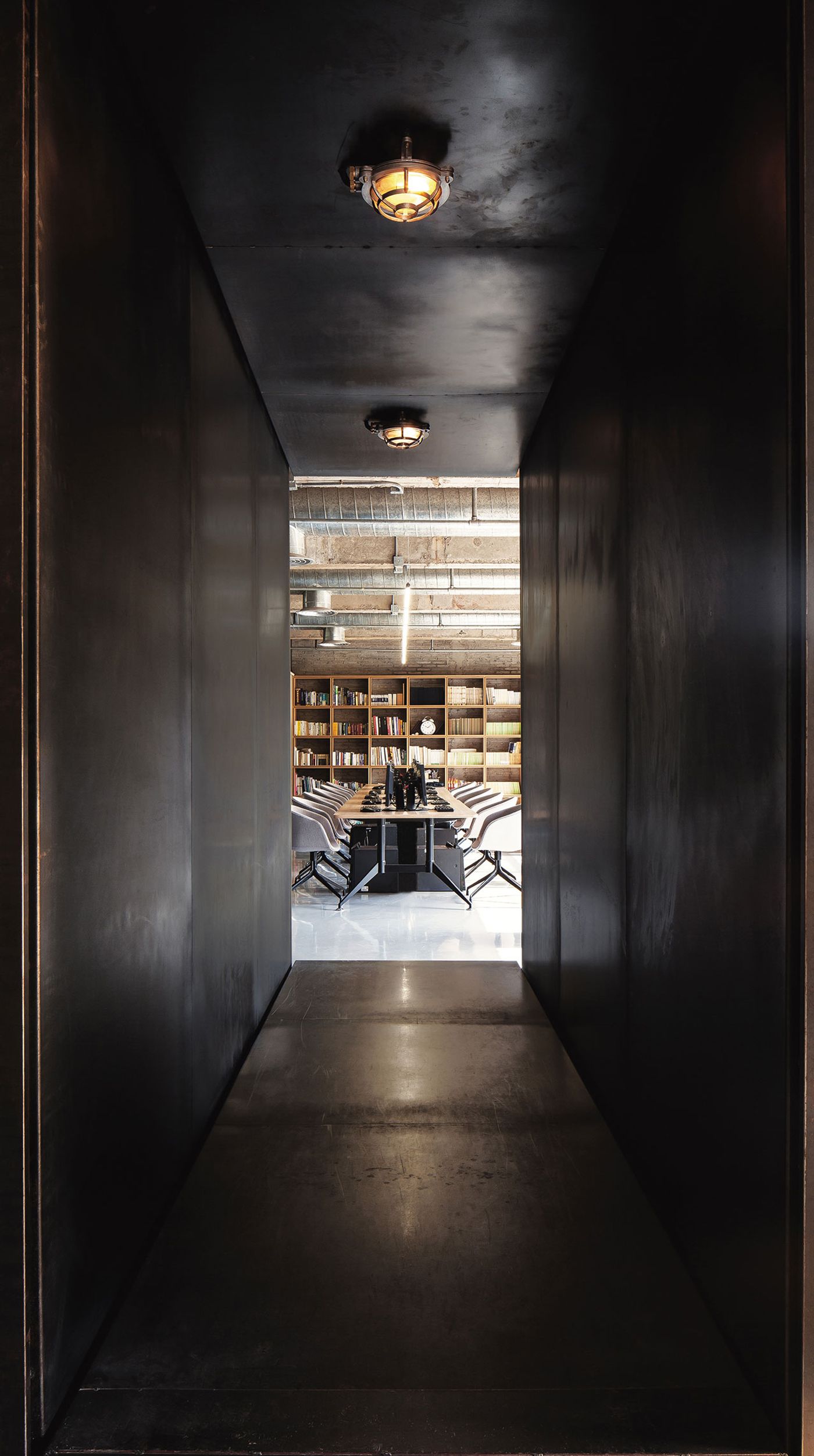
Photo by Kevin Ho.
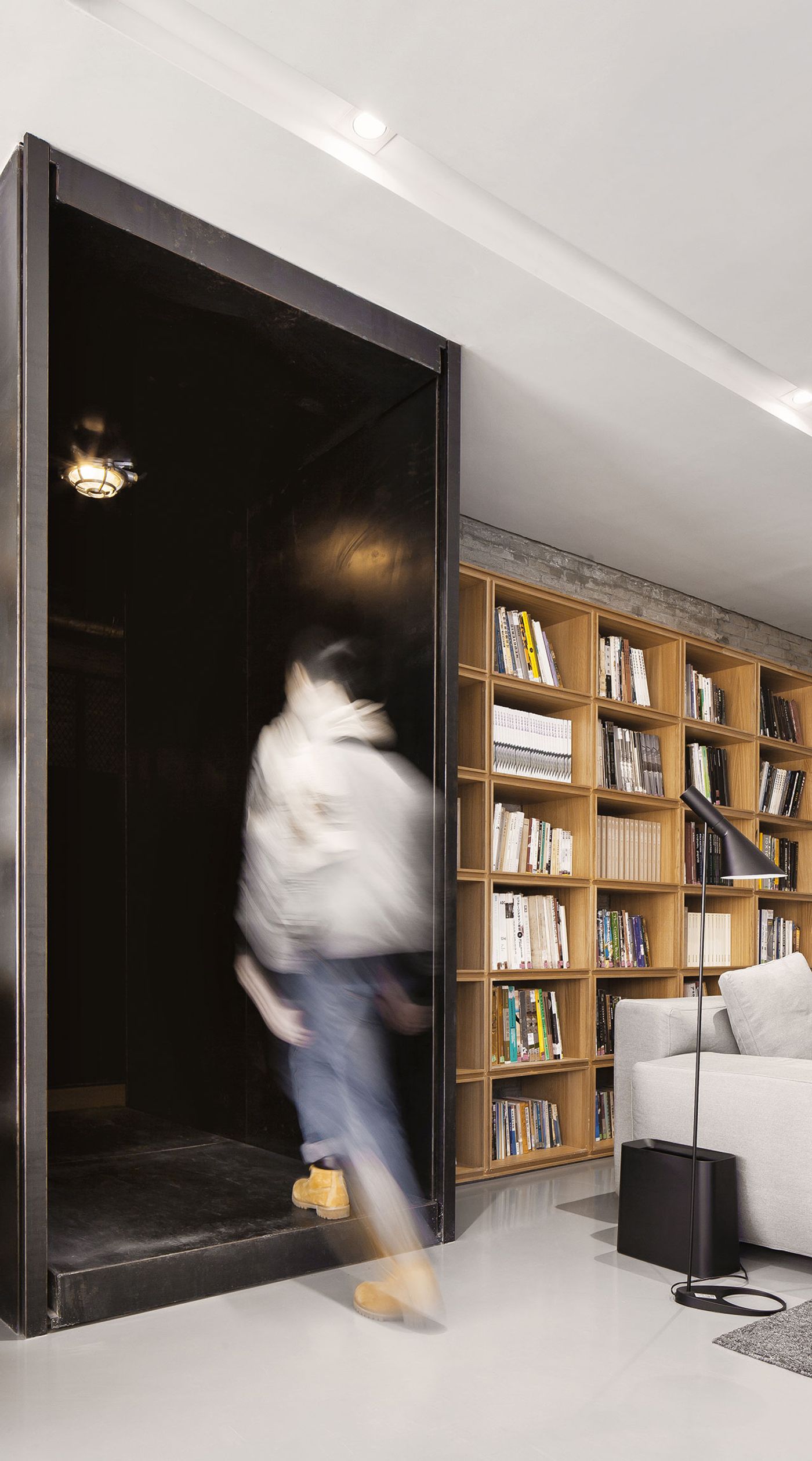
Photo by Kevin Ho.
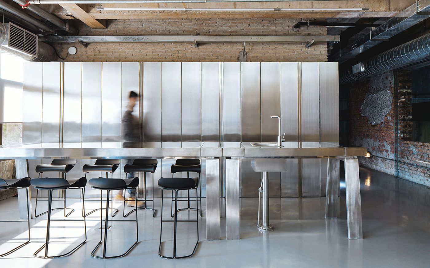
Photo by Kevin Ho.
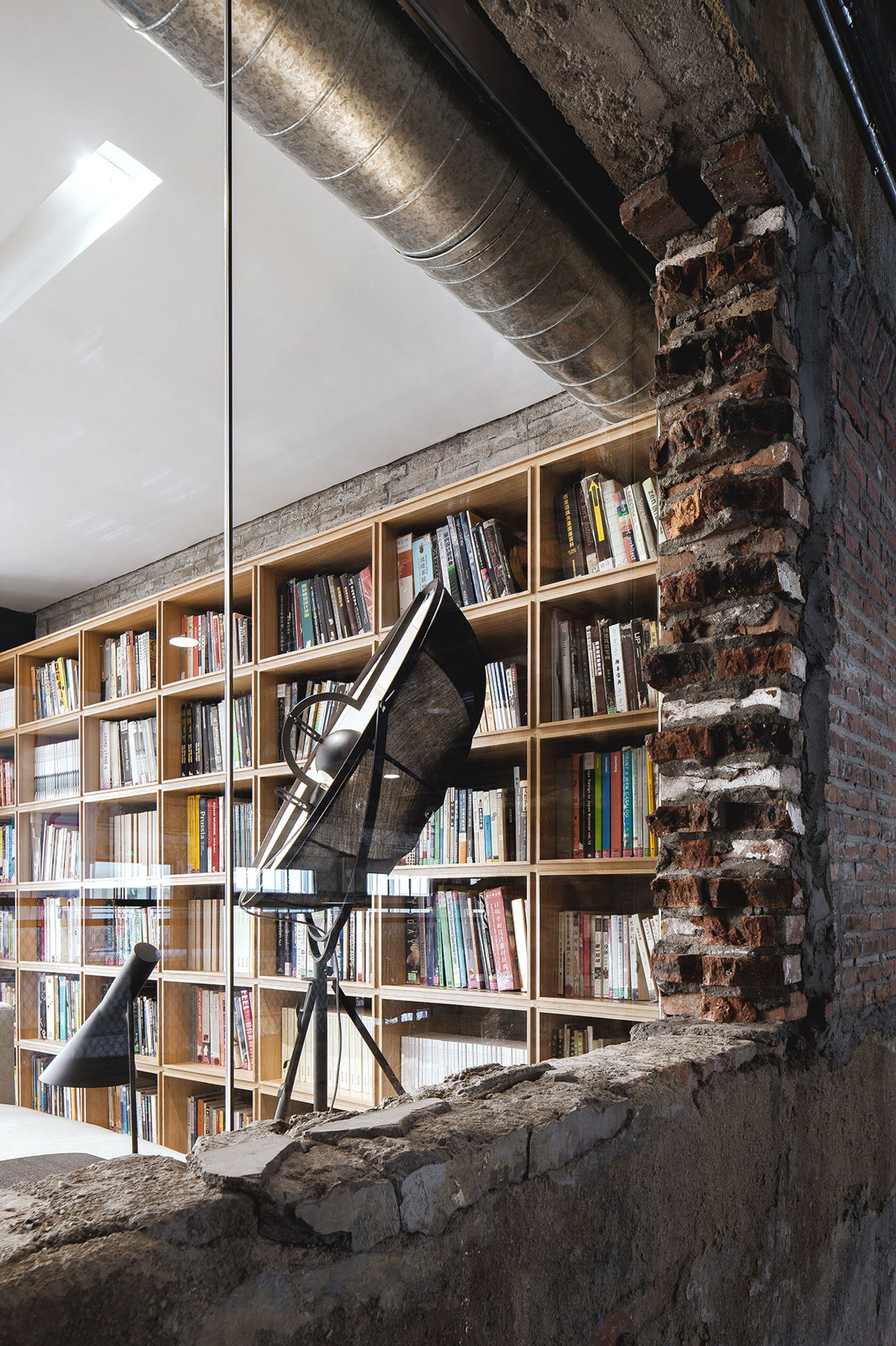
Photo by Kevin Ho.
Furniture is also used for delineating spaces, evidenced in the large, open bookshelf that forms the see-through "wall" between the main, conference room/office and the corridor, as well as another two large bookshelves between the main office and the two, slightly more private, meeting rooms. And within the meeting rooms, comfortable pieces of furniture - think large, sectional sofas and armchairs so enveloping they aren't easy to pull oneself out from - encourage office workers’ cooperation during break times as well as while they work.
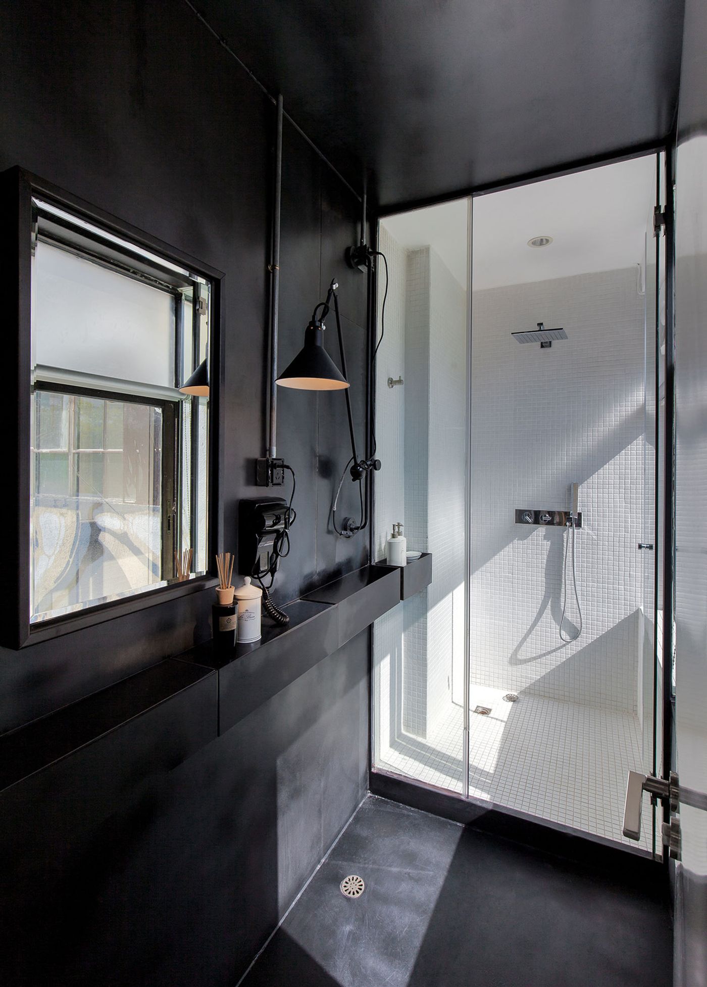
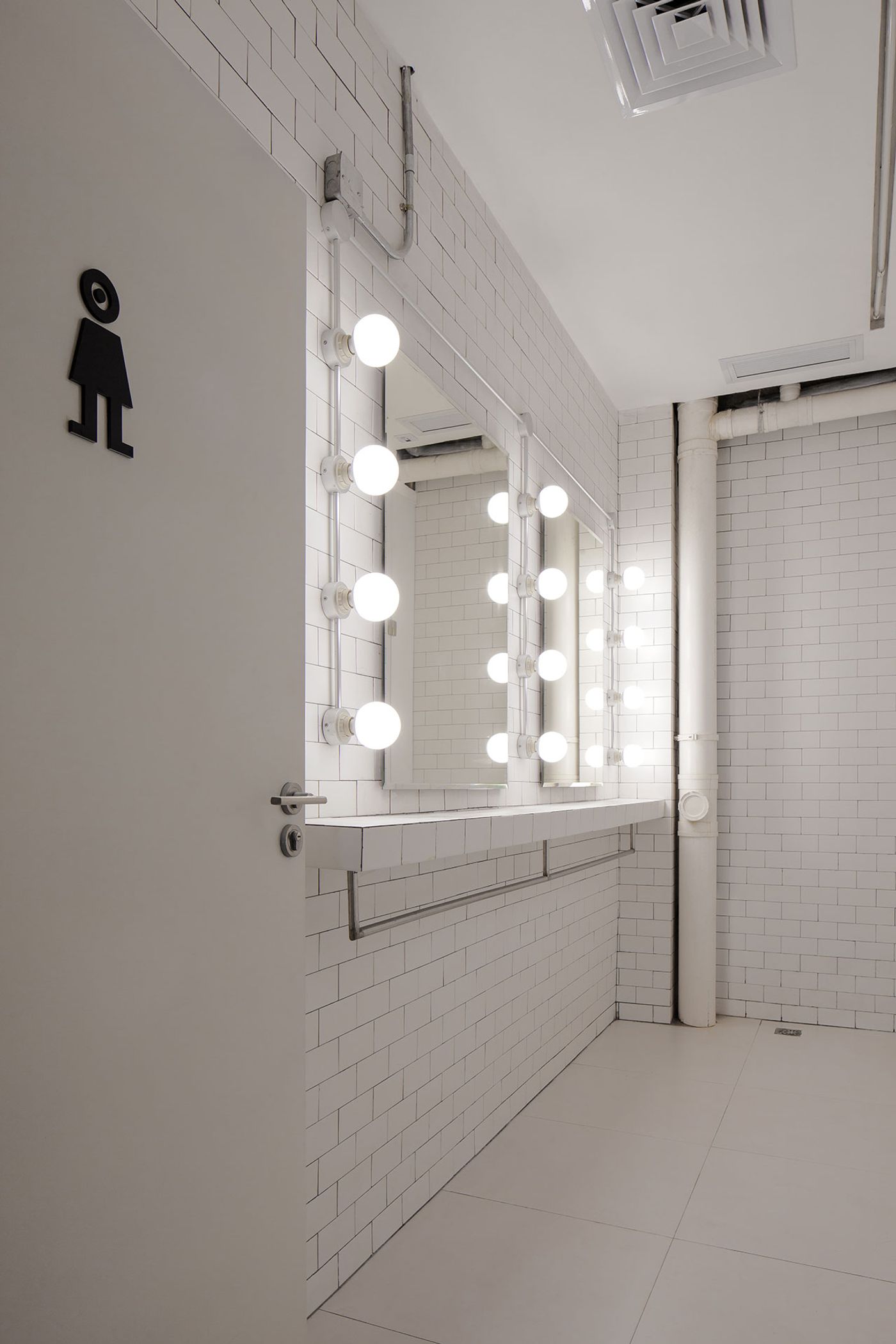
In fact, the only rooms in the entire office that have a stark and utilitarian feeling are the white-painted, brick walled and linoleum floored restrooms. With that being said, even in here there are quirky touches that add a sense of warmth, such as the "Hollywood" style dressing mirror surrounded by round light bulbs or the large, deep double sink.
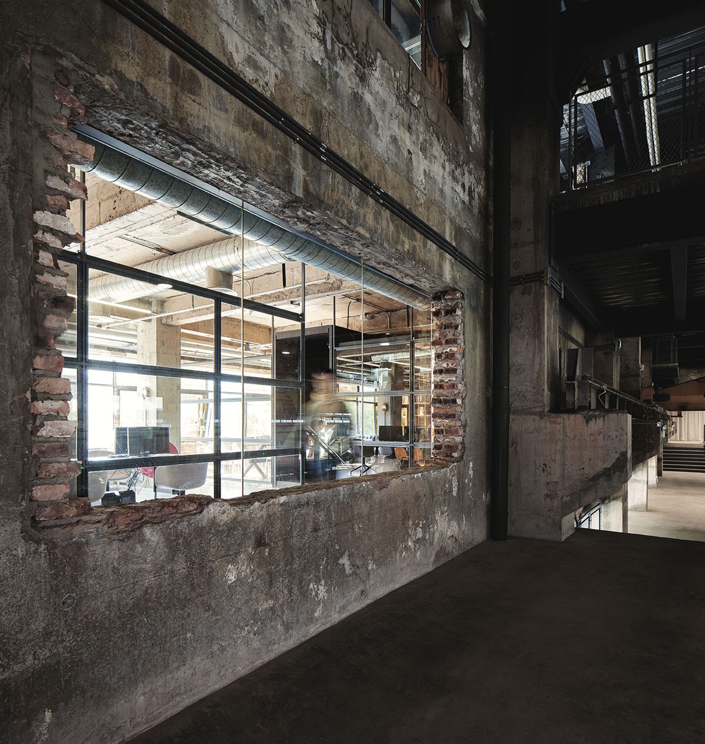
Photo by Kevin Ho.
In conclusion, the FlaHalo office space offers a unique example of how detailed, thoughtful design benefits all renovation spaces if struck by the ideal cord of form and function, in combination with a deep felt respect for the building's past while building on its potentials.
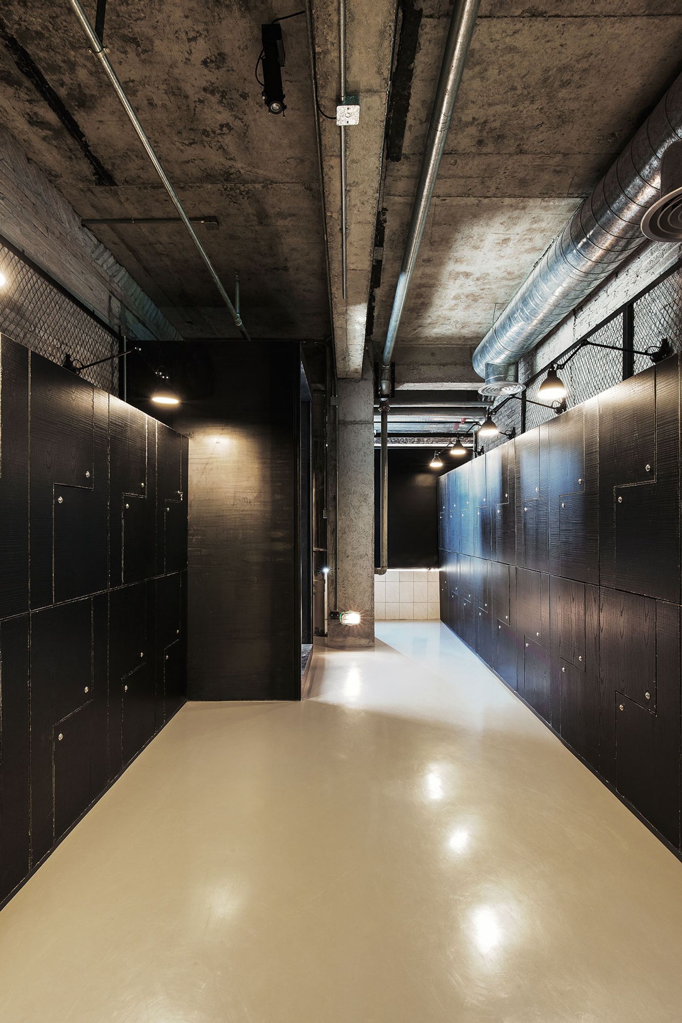
Photo by Kevin Ho.
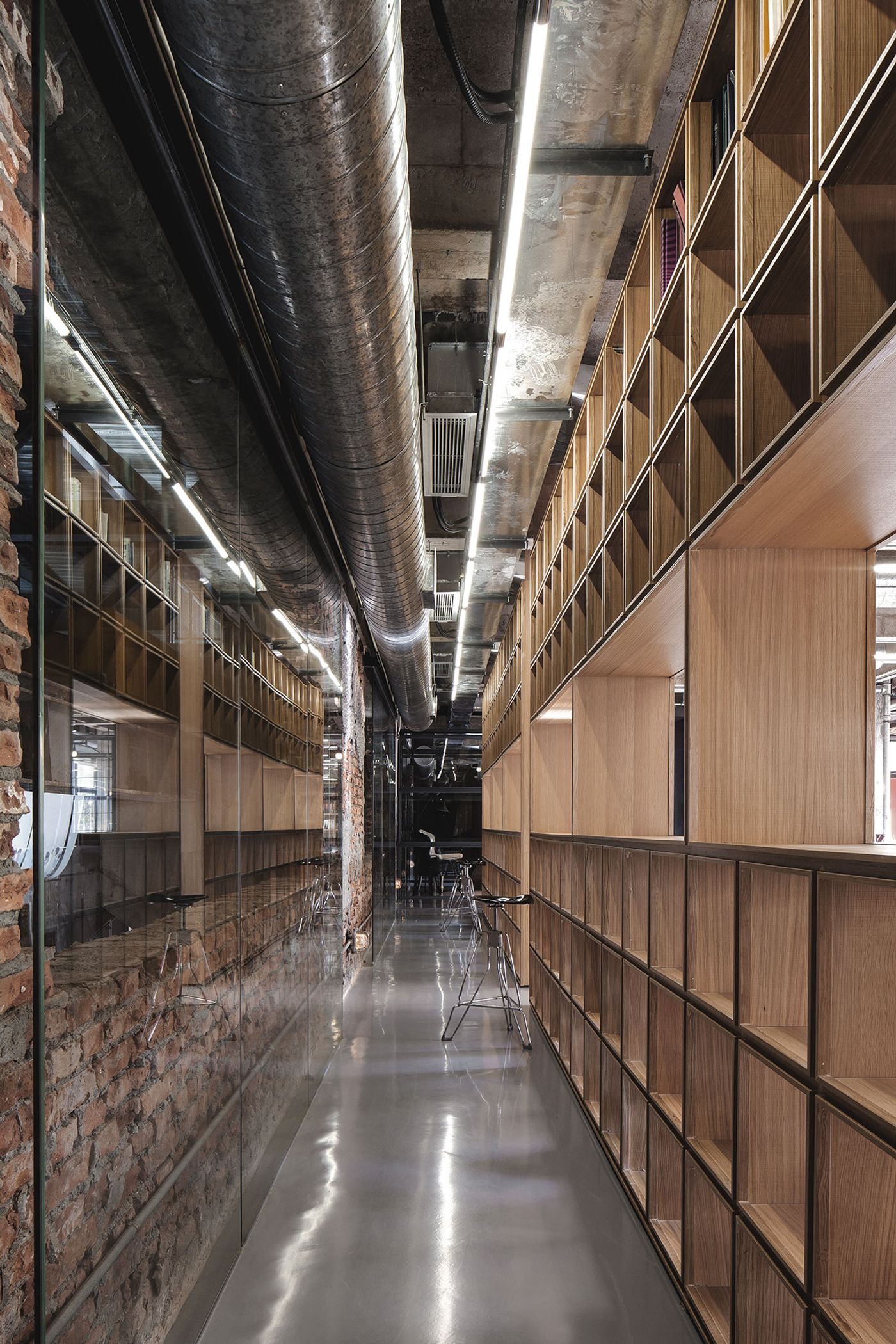
Photo by Kevin Ho.
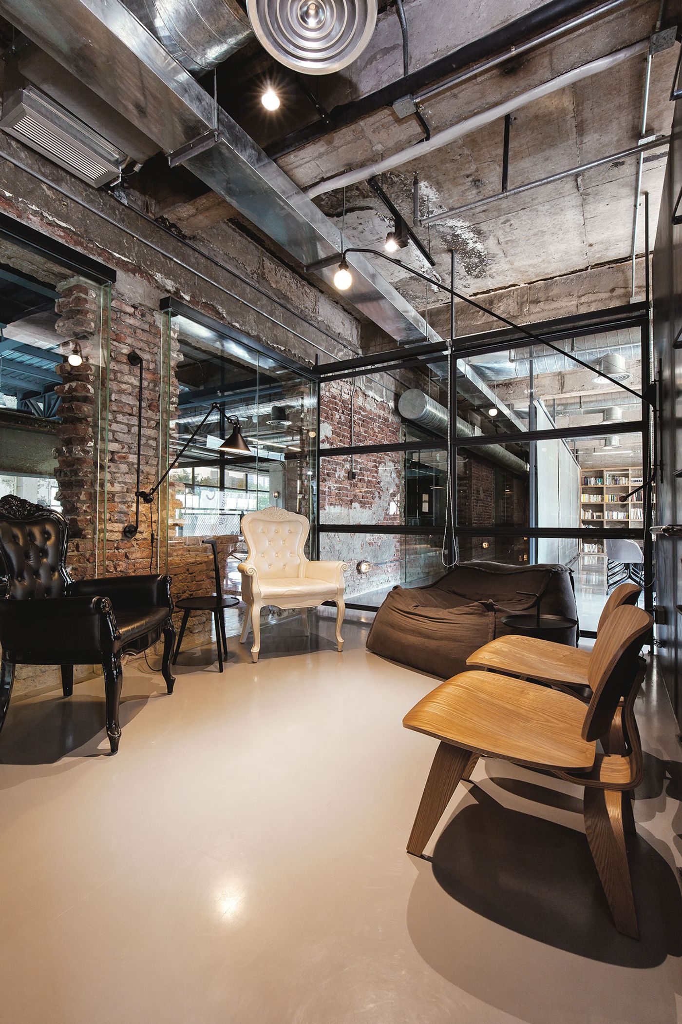
Photo by Kevin Ho.
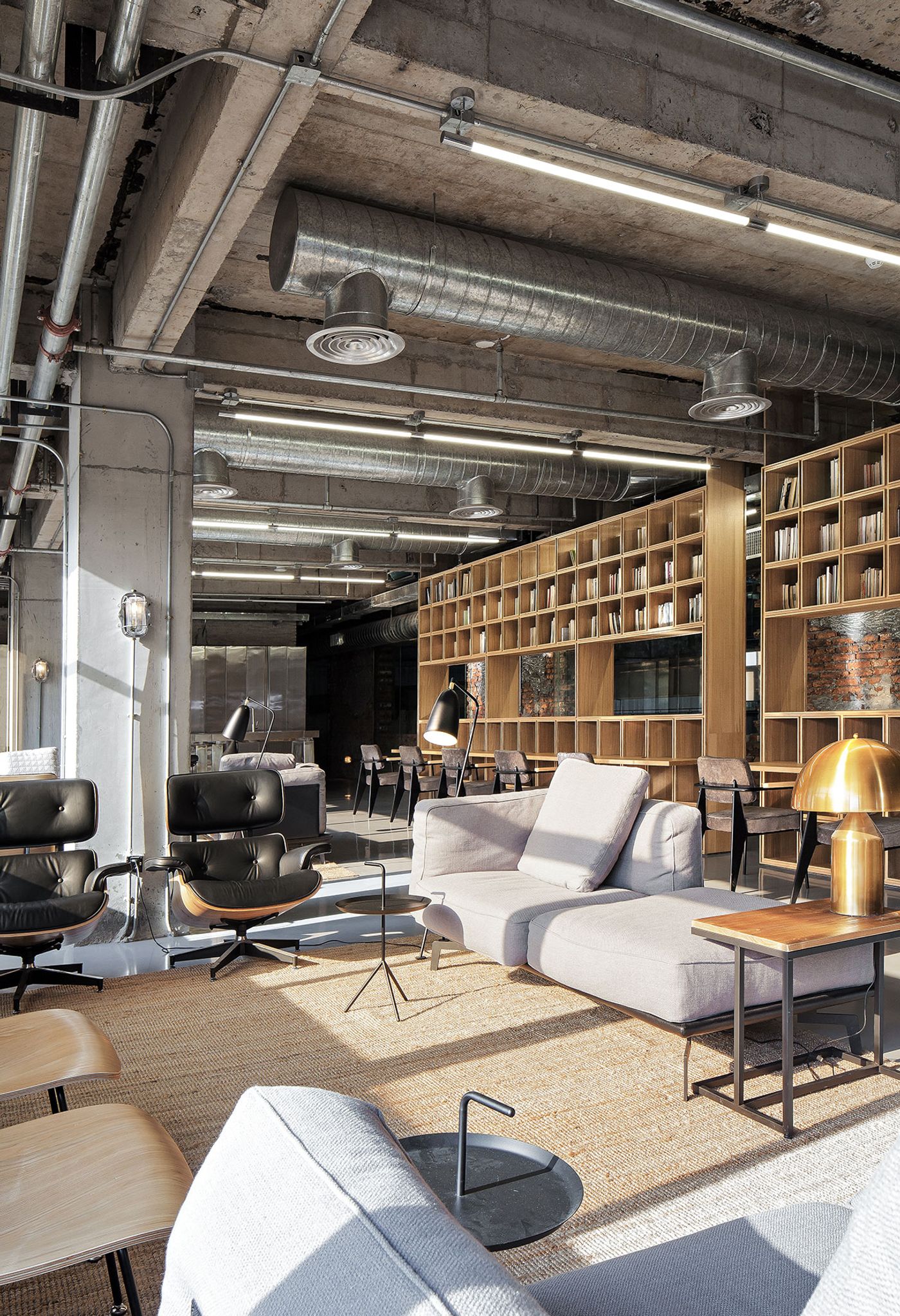
Photo by Kevin Ho.
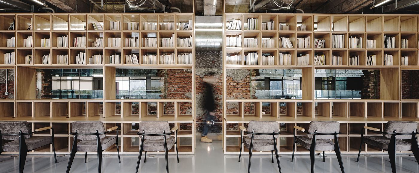
Photo by Kevin Ho.
