Minimalist Design Meets Sensory Richness in a Specialty Coffee Shop in Taiwan
Words by Yatzer
Location
Taipei, Taiwan
Minimalist Design Meets Sensory Richness in a Specialty Coffee Shop in Taiwan
Words by Yatzer
Taipei, Taiwan
Taipei, Taiwan
Location
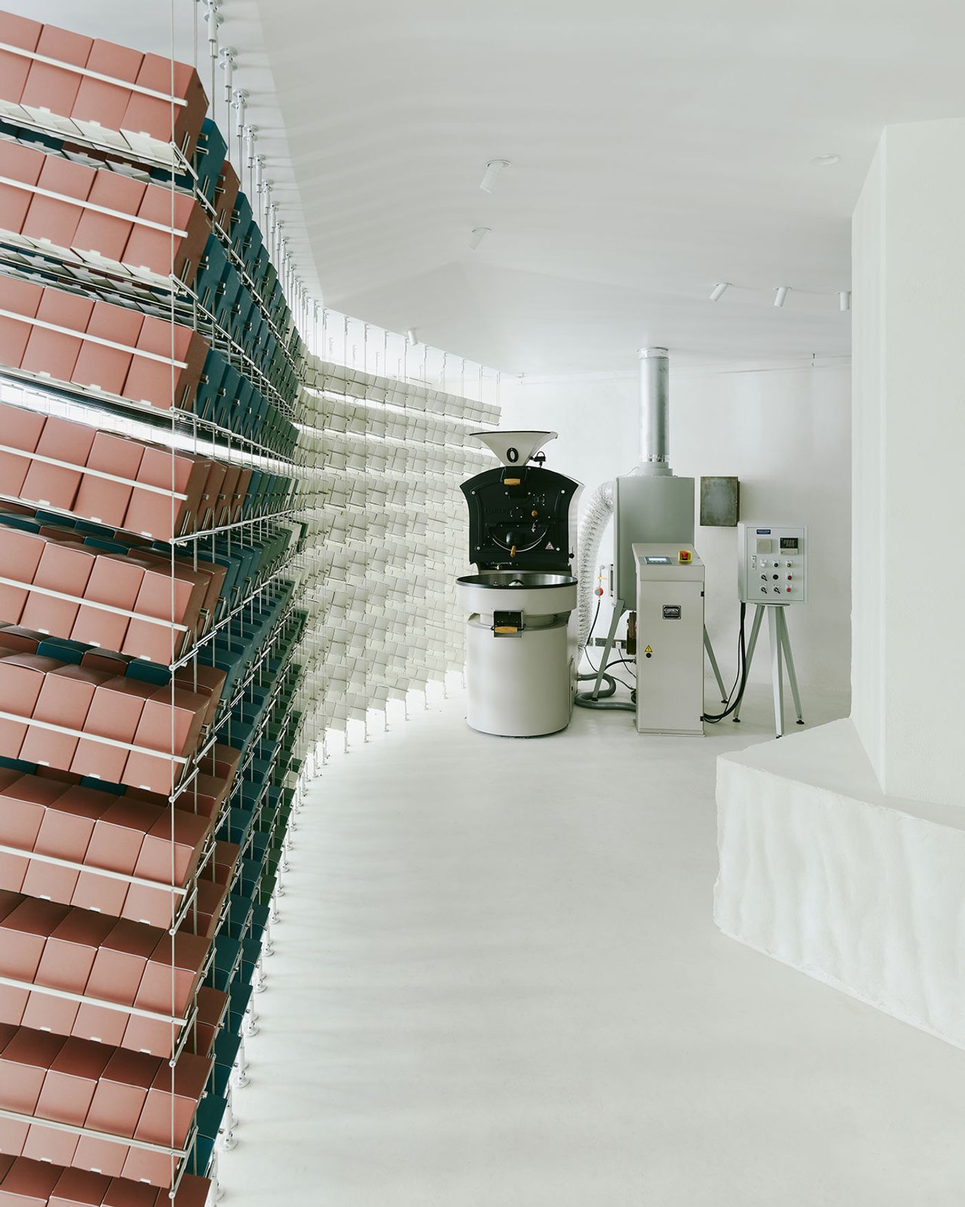
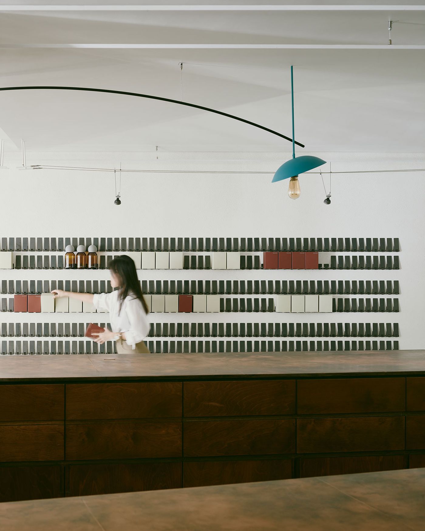
Taiwanese architecture & interiors studio Waterfrom Design is known for creating austere yet sensory-rich spaces of soulful minimalism. Its latest project, specialty coffee roasters (beanroom) in Taipei, provides yet more proof of the studio’s proficiency in minimalist design while demonstrating how it can successfully be applied in a retail environment. Underpinned by muted tones, natural textures and simple lines, the ascetic space provides a white canvas to showcase the store’s colour-coded packaging. Working closely with the proprietors, the design team developed dynamic display systems that make the products the focal point of both the interior design and the customer experience. Not only do the displays double as minimal art installations, they also visually evolve as the customers interact with them during the day.
Photography by Studio Millspace.
Photography by Studio Millspace.
Photography by Studio Millspace.
Photography by Studio Millspace.
Photography by Studio Millspace.
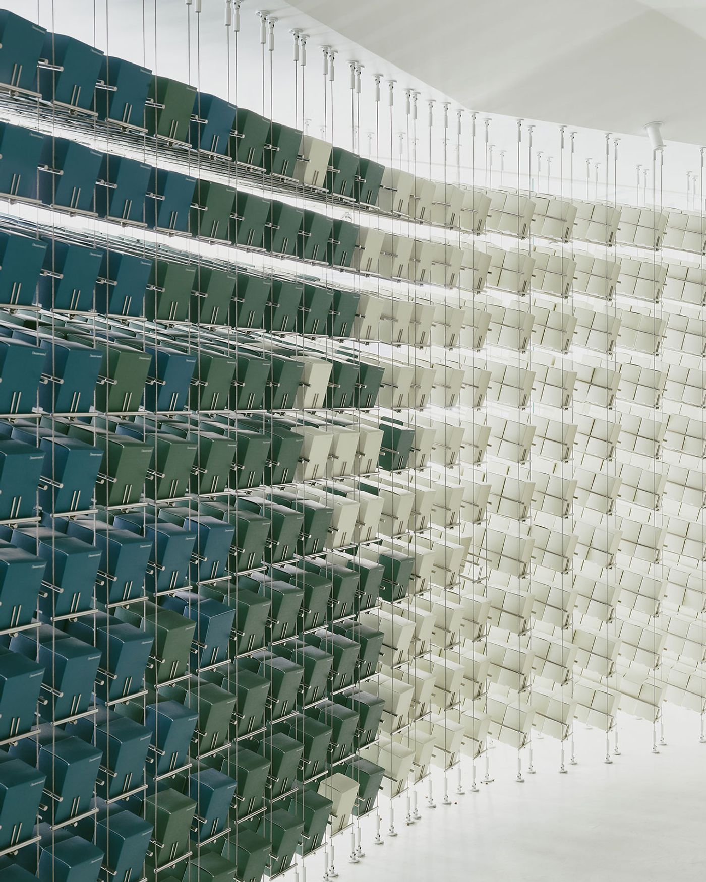
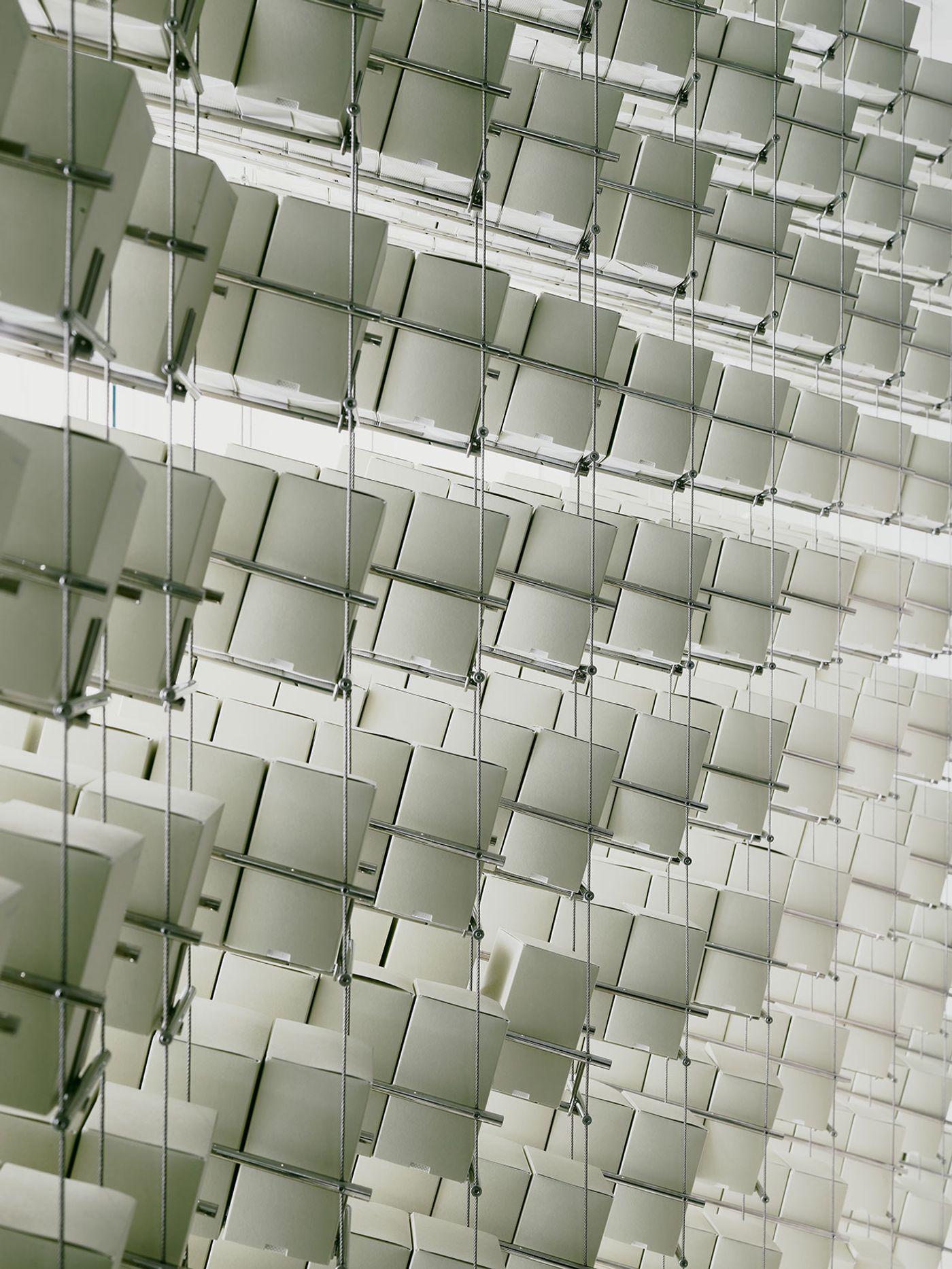
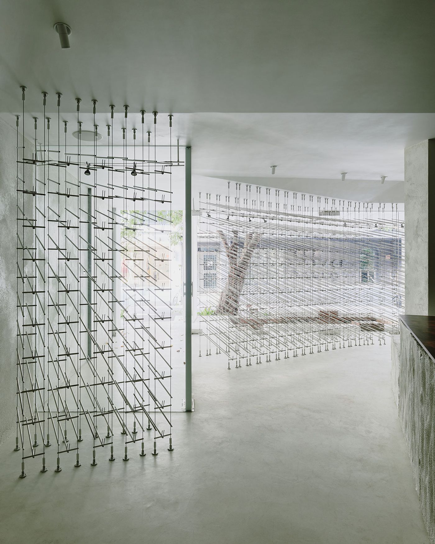
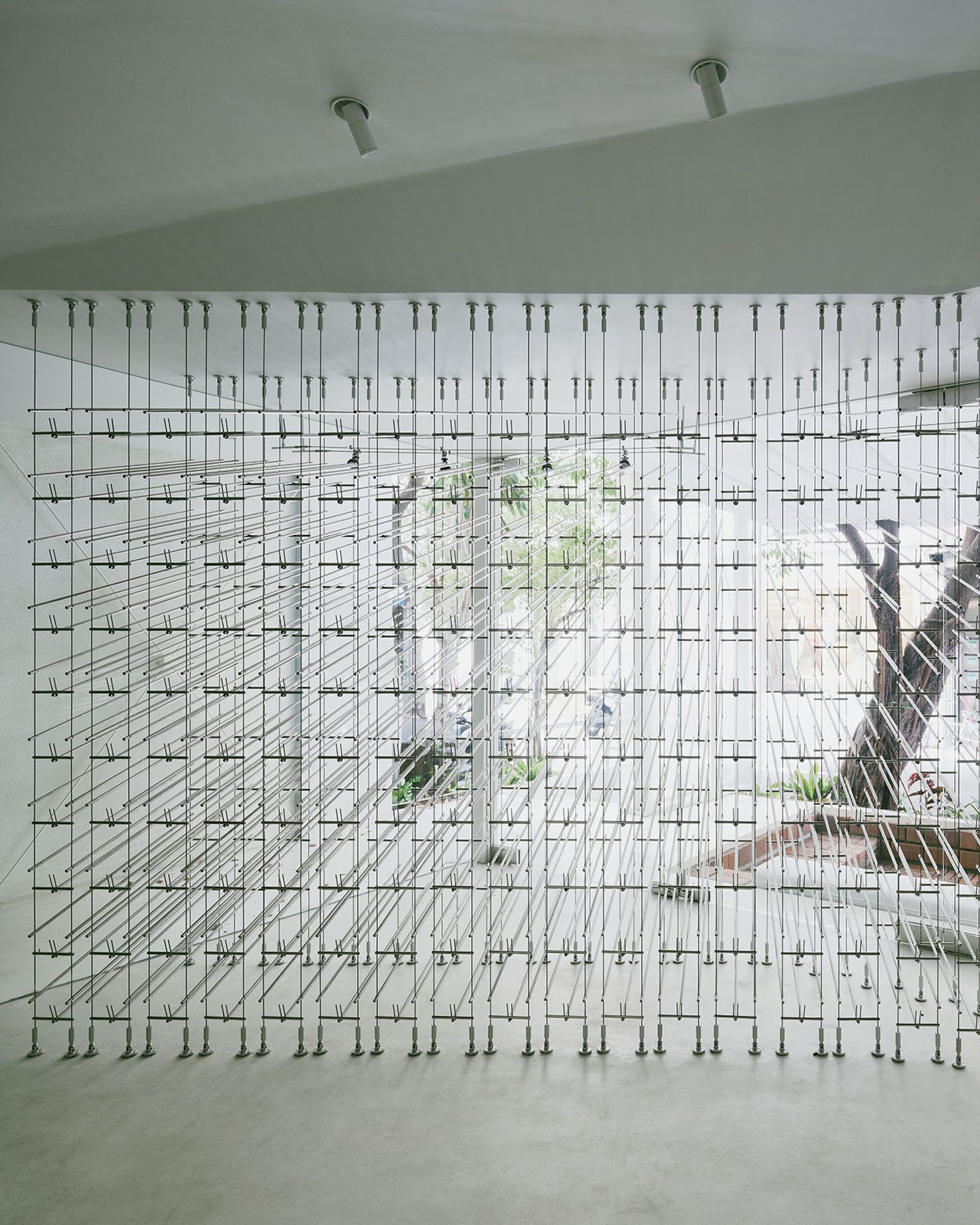
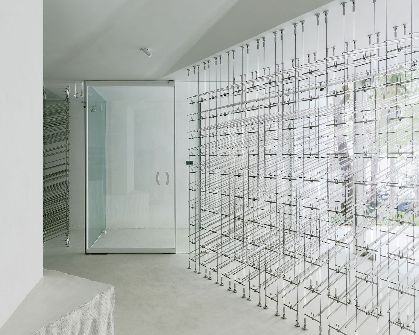
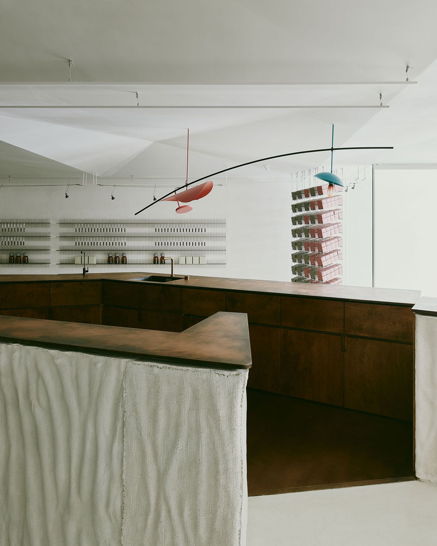
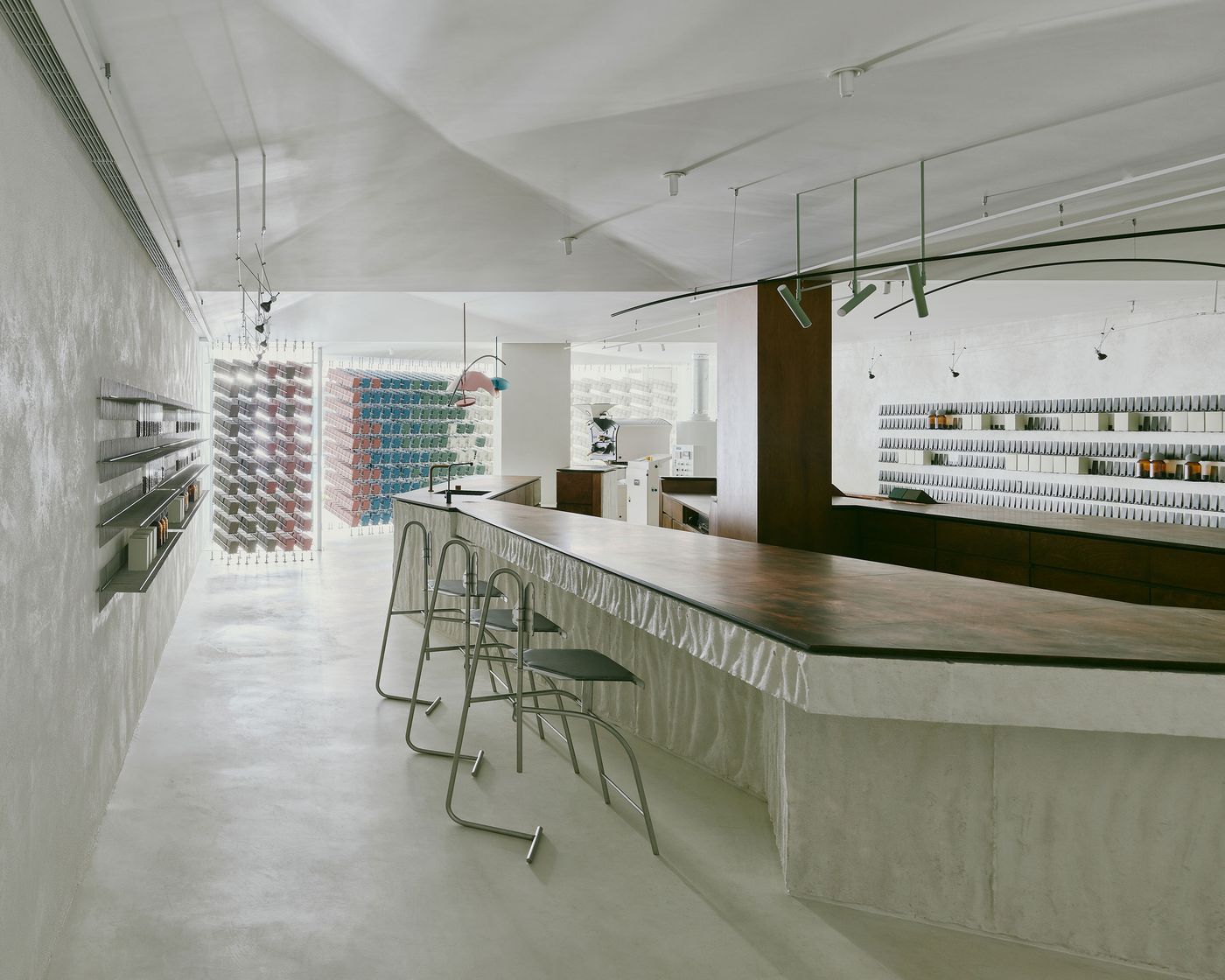
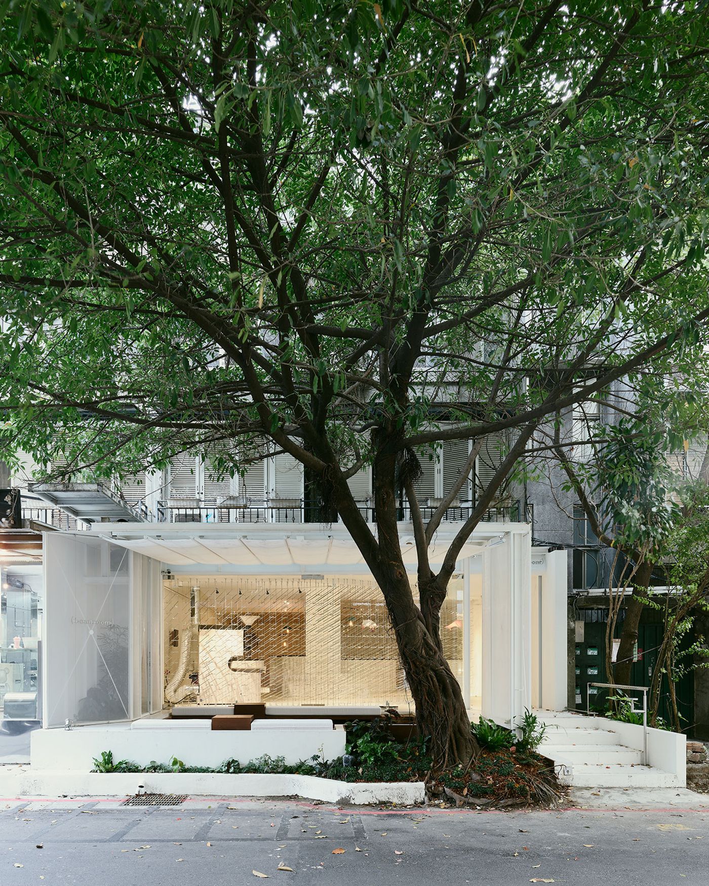
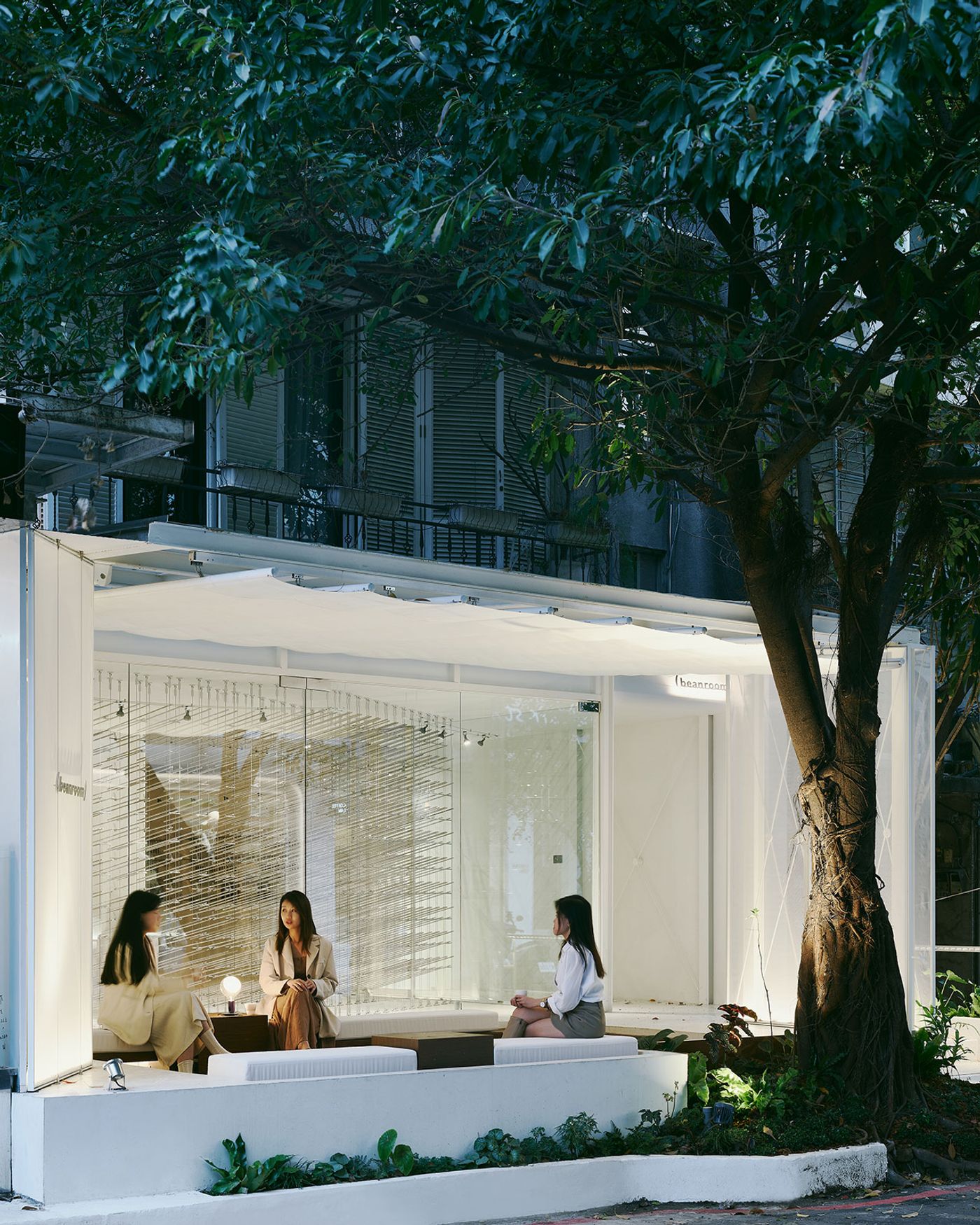
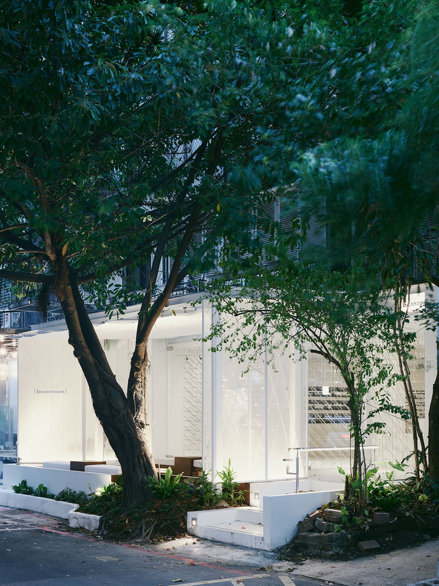
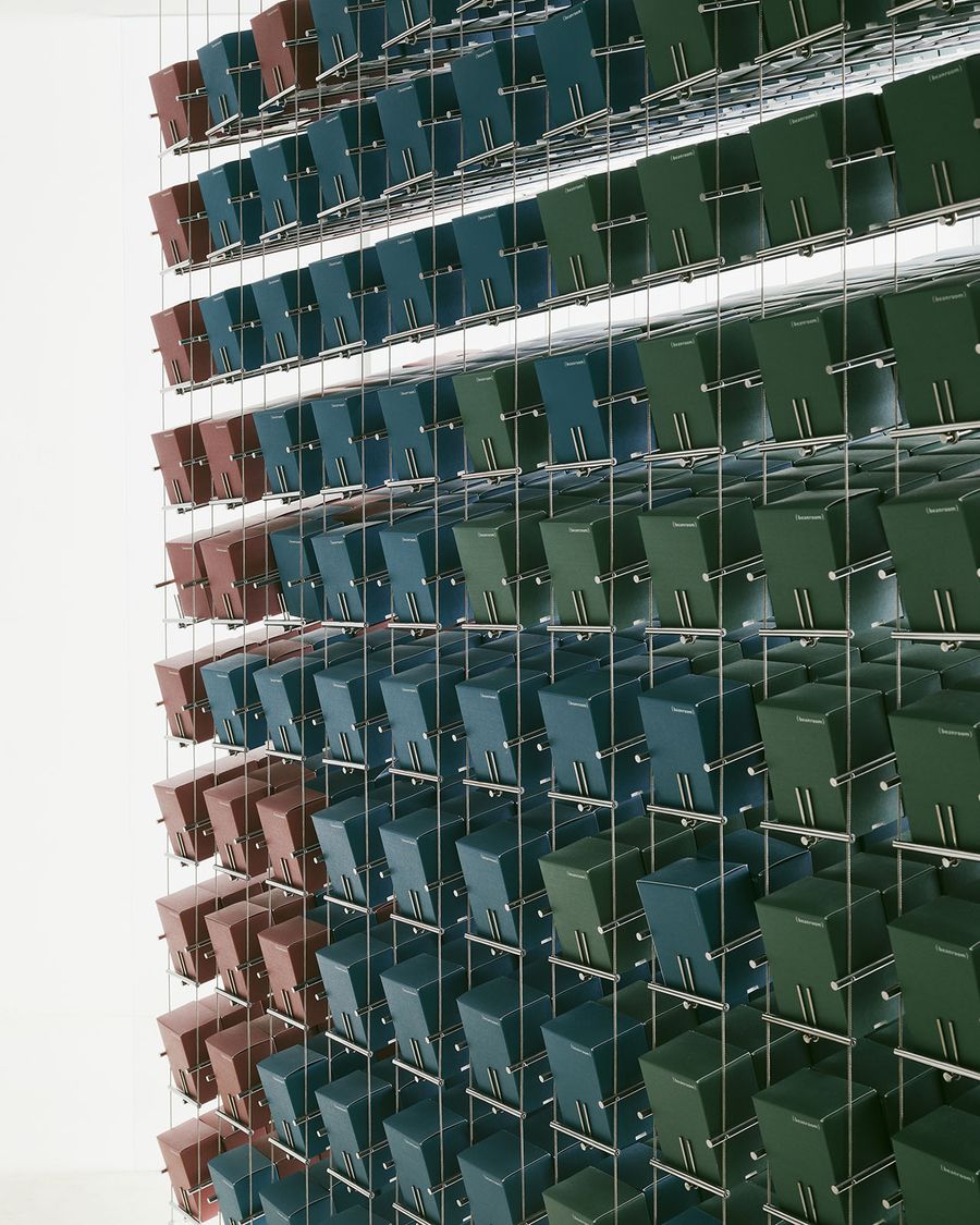
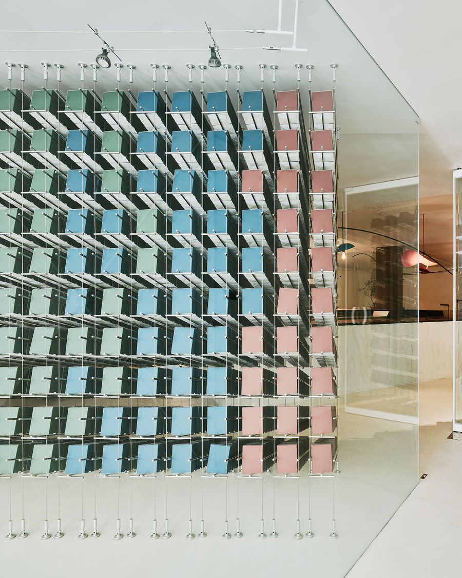
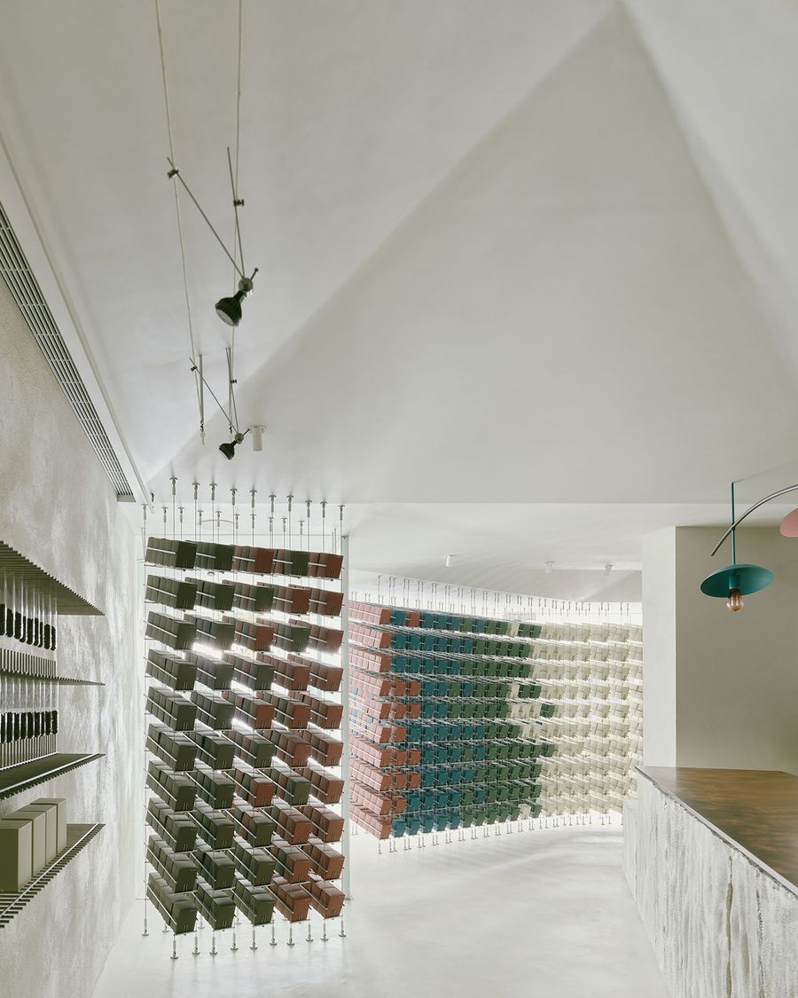
Set back four meters from the street to accommodate an outdoor sitting area under the shade of a towering six-meter-high banyan tree, the store’s façade is dominated by a kaleidoscopic window display that catches the attention of passers-by. Supported by floor-to-ceiling metal wires, the almost incorporeal, matrix-like structure features shelving where the roastery’s boxed coffee beans are displayed. Stacked according to colour, representing the coffee beans’ origin and flavour, the boxes form a colourful geometric tapestry. Slightly tilted inward towards the interior, when customers remove a product from the shelves, the remaining boxes slide forward, subtly changing the window display’s morphology. This dynamic display not only serves as an eye-catching focal point but also reflects customers’ preferences and the store's foot traffic while also functioning as a screen between the exterior and interior, playfully filtering natural light throughout the day.
Photography by Studio Millspace.
Photography by Studio Millspace.
Photography by Studio Millspace.

Photography by Studio Millspace.
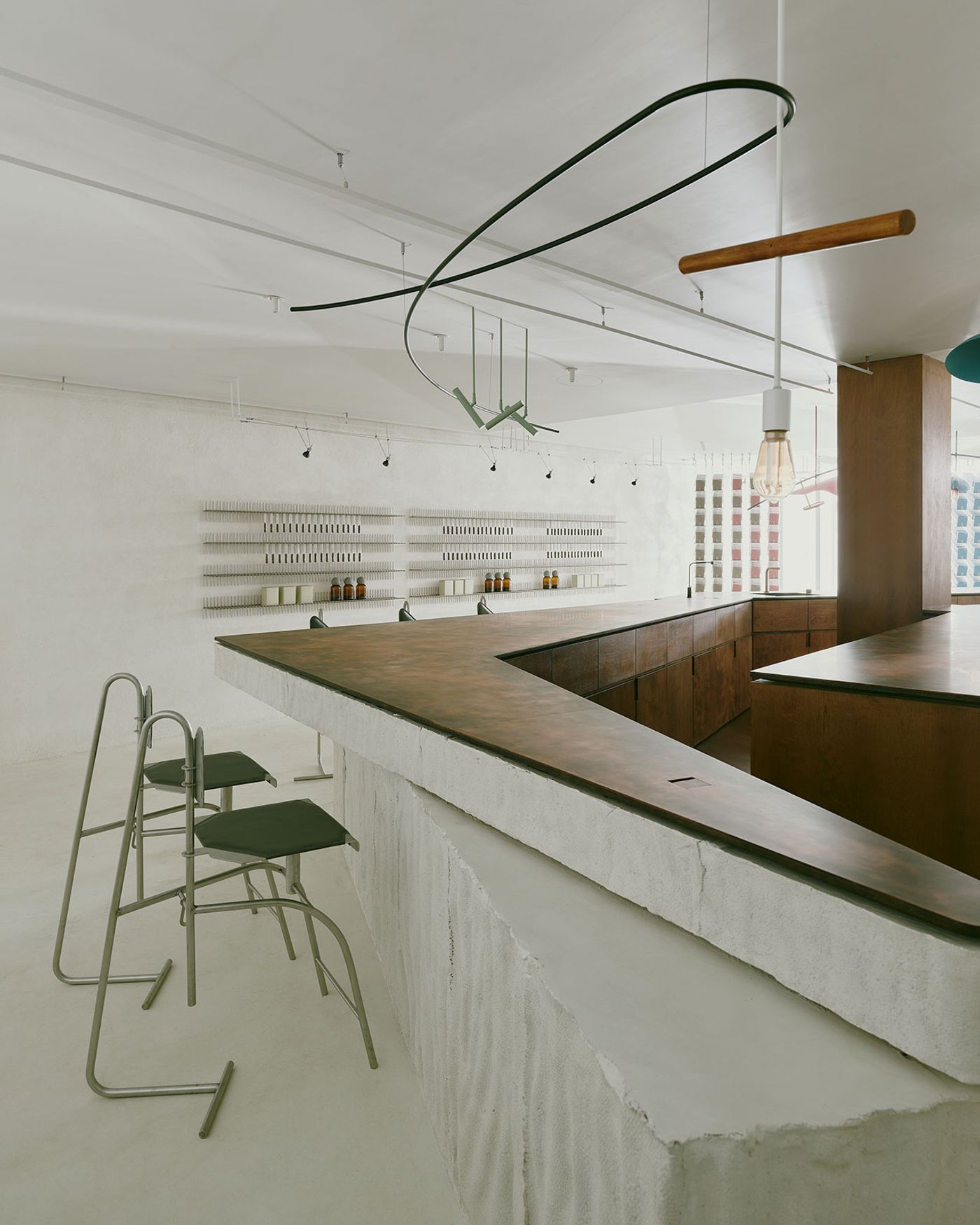
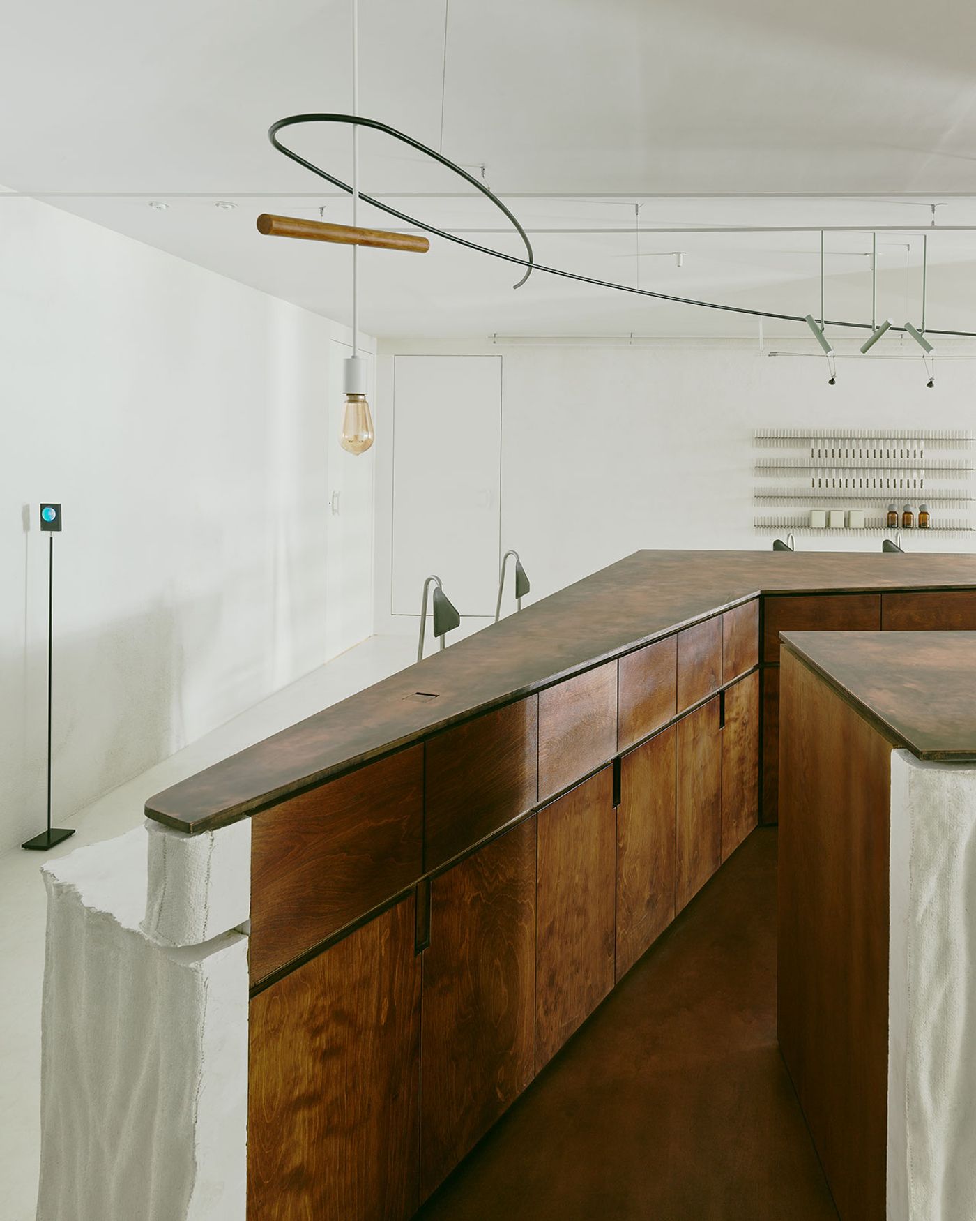
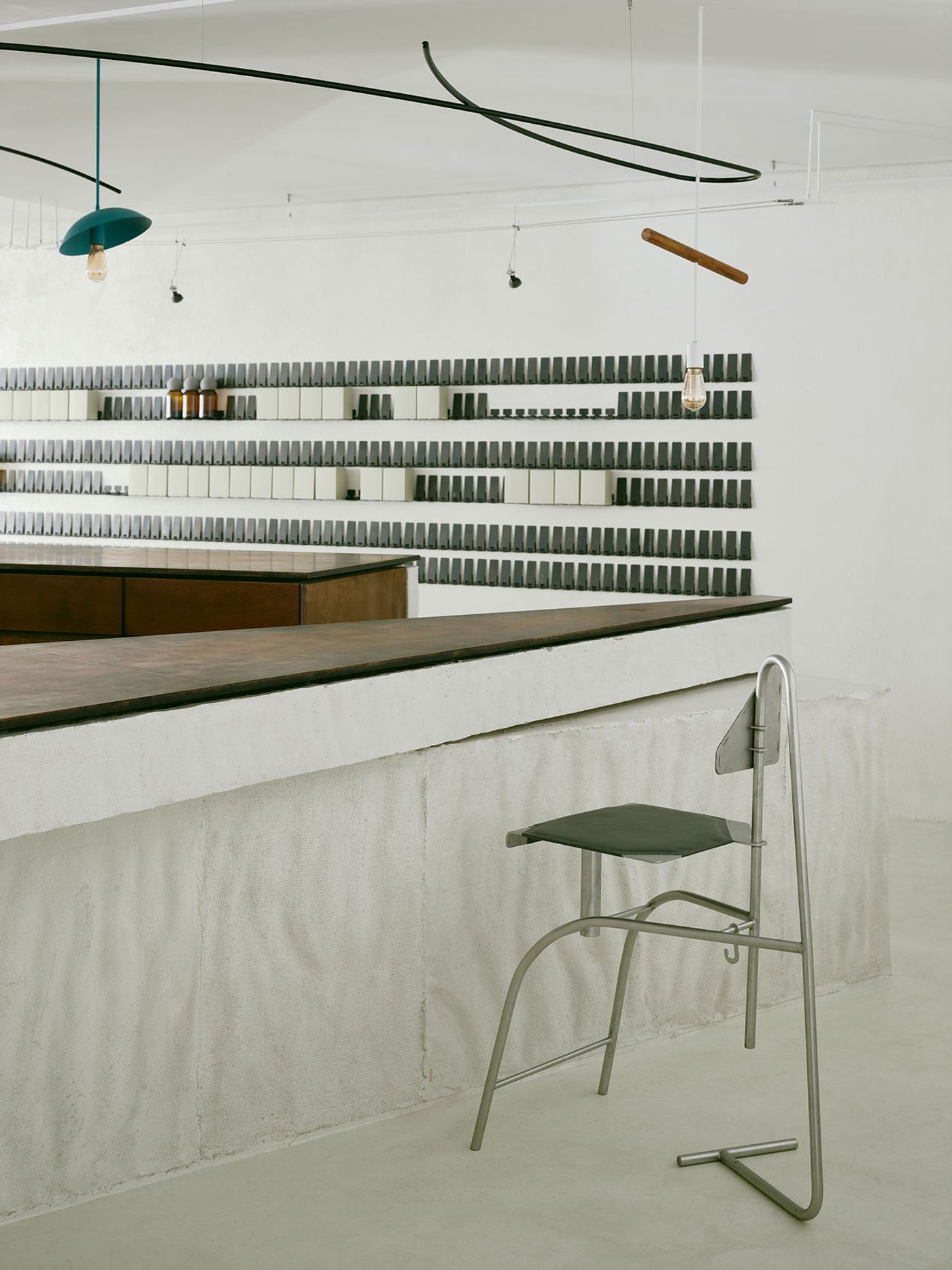
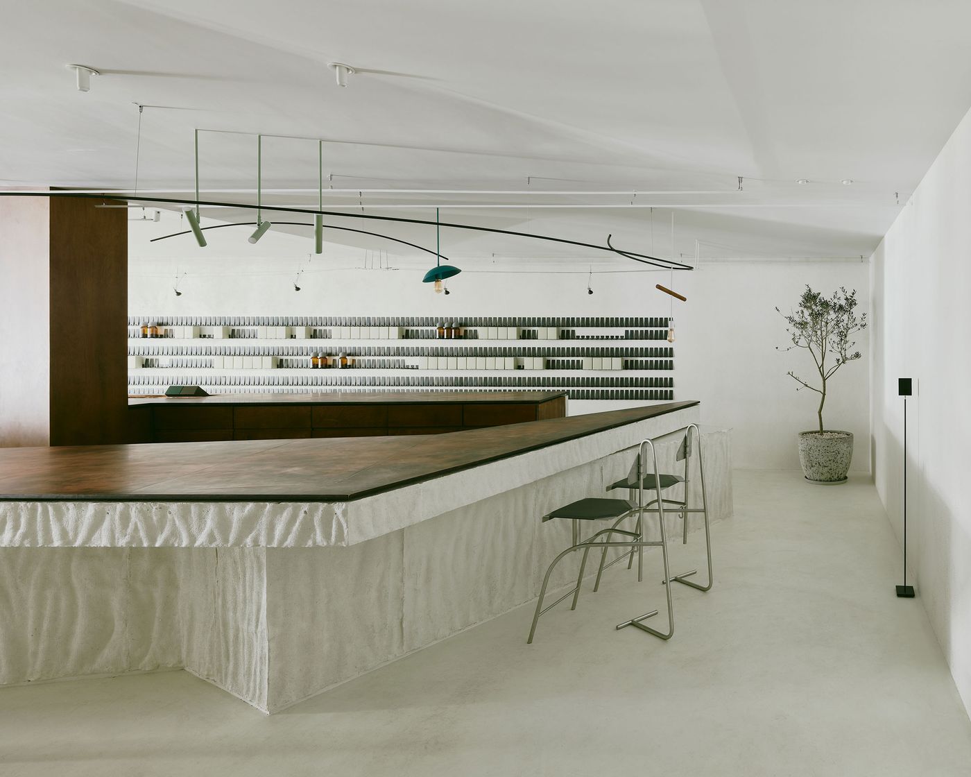
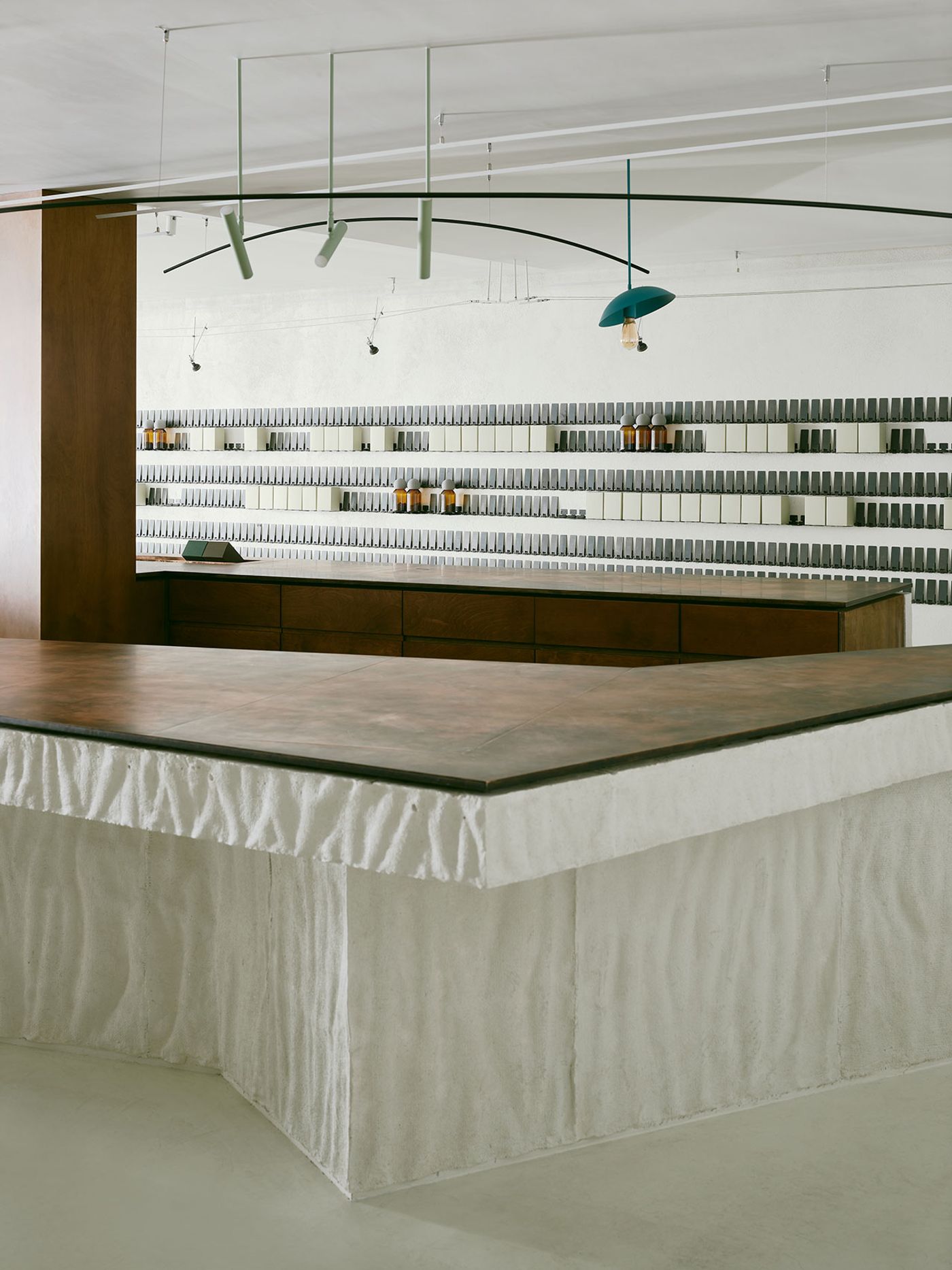
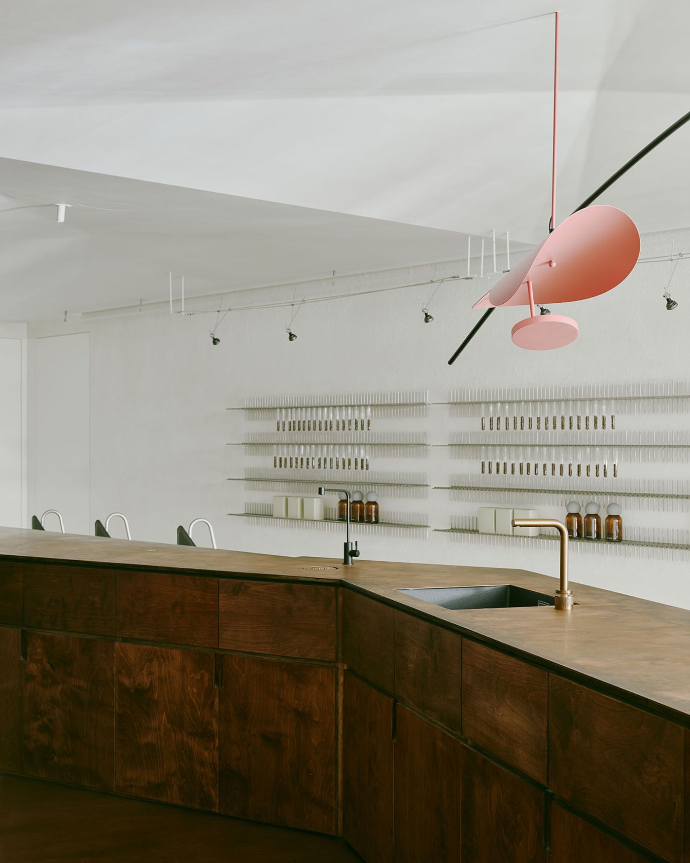
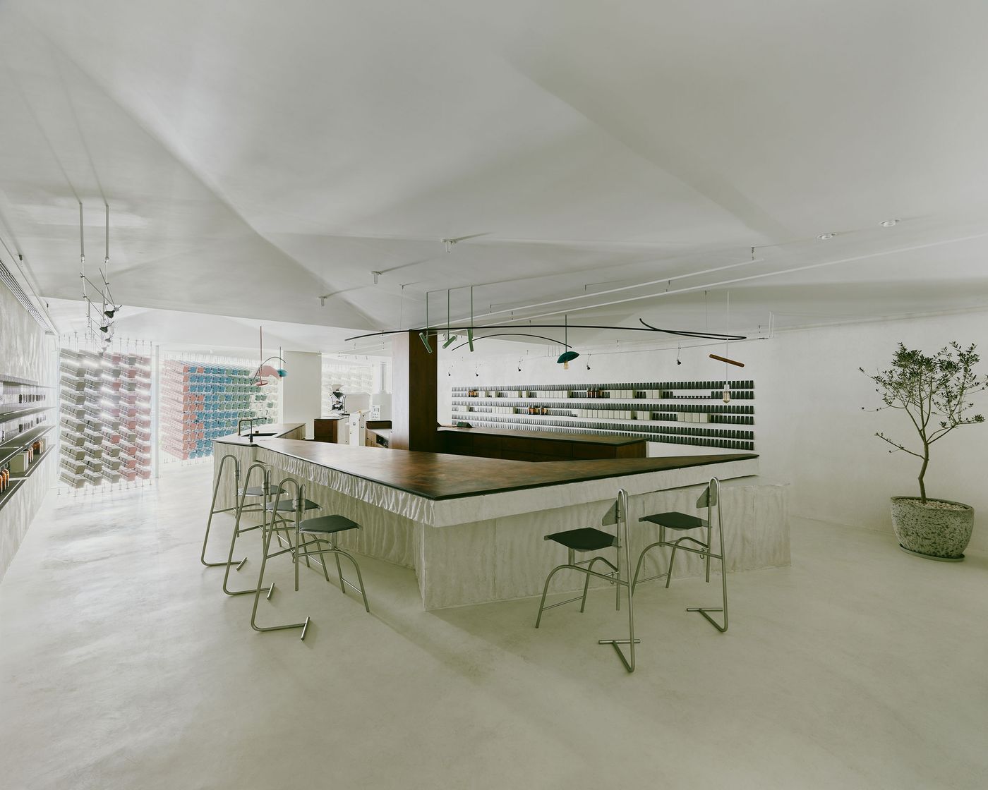
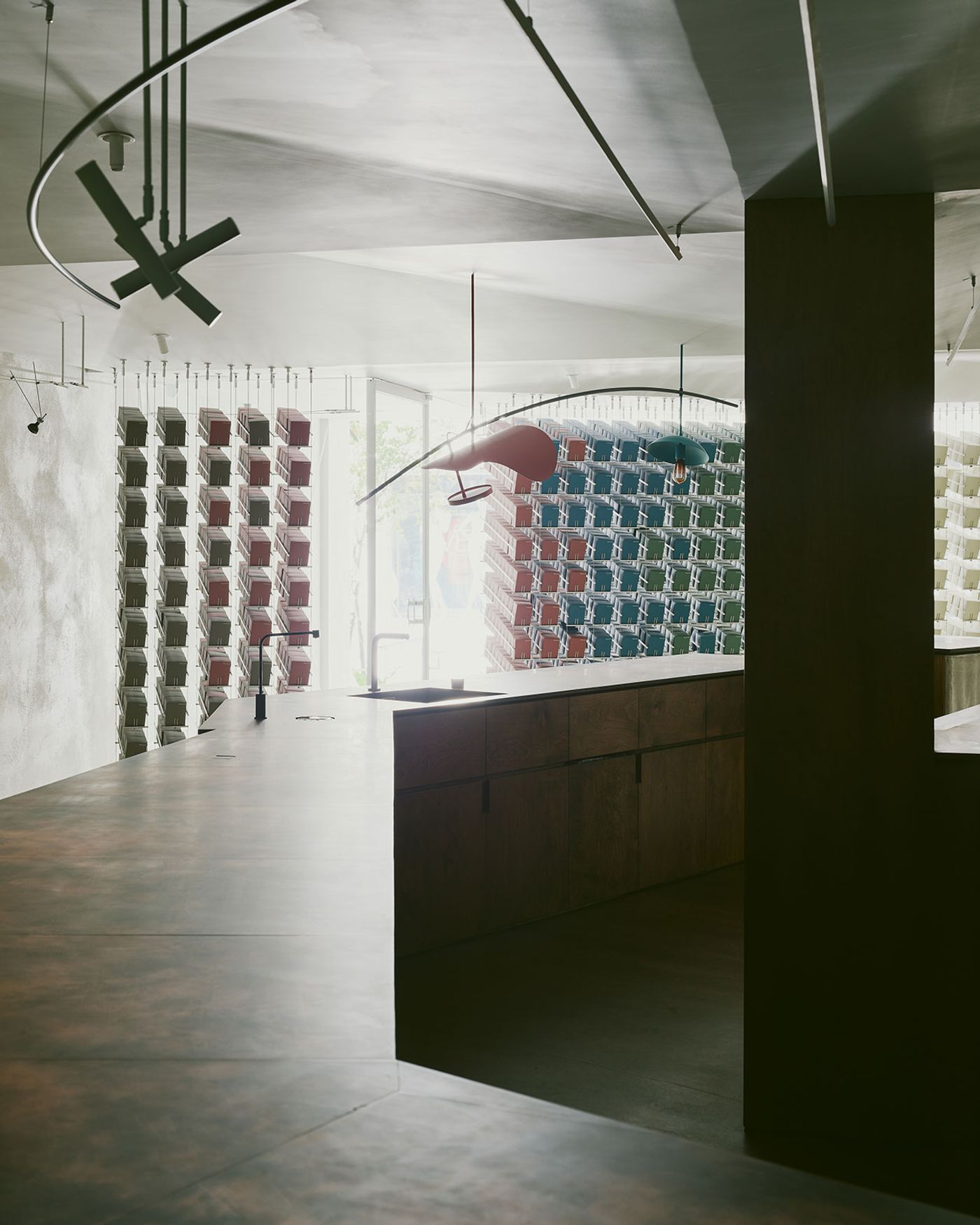
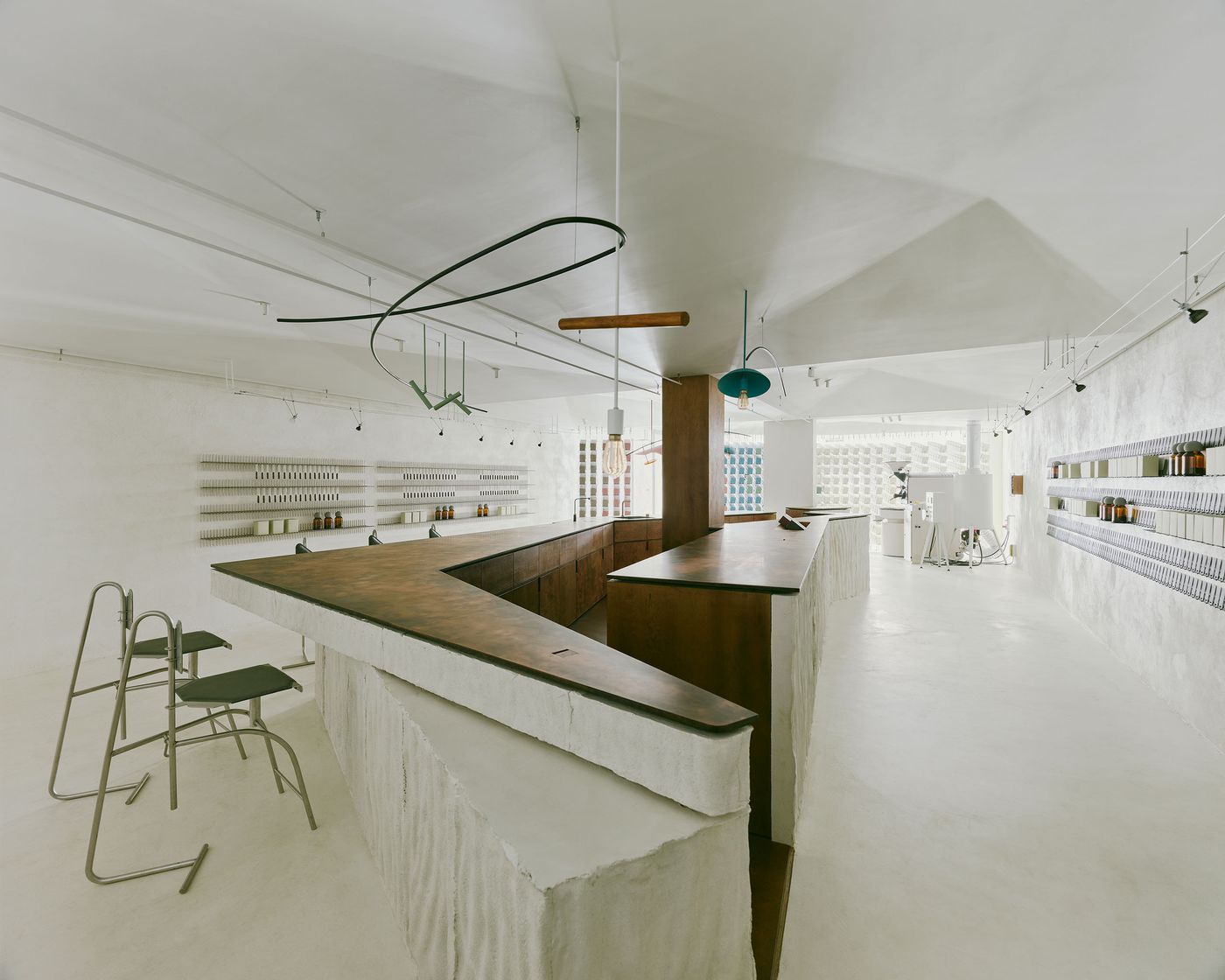
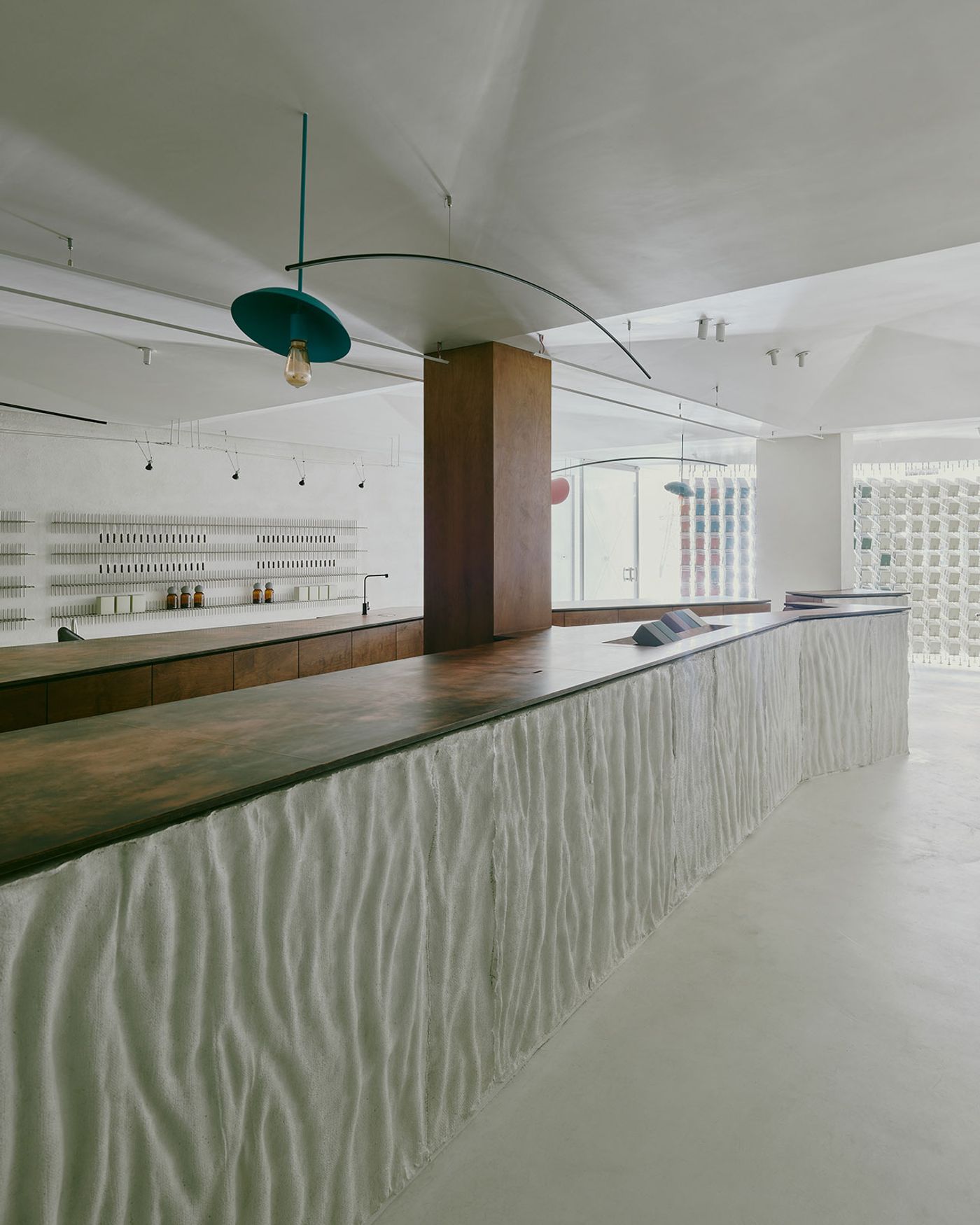
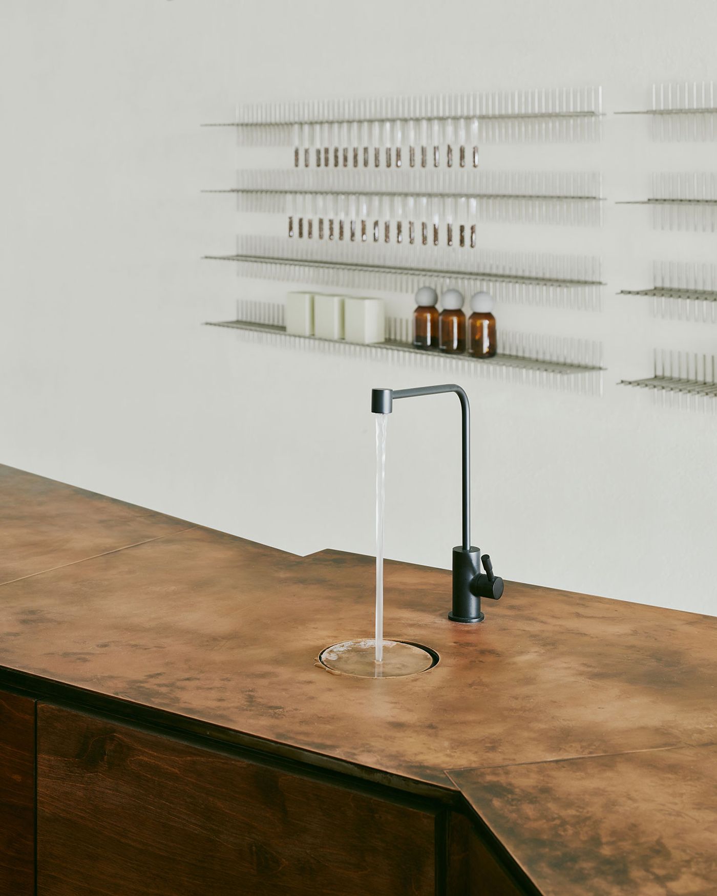
At the centre of the space, a sculptural configuration of interlocking counters conveniently brings together all the customer-facing services, namely the reception, cash register, gift wrapping station and tasting bar. Reflecting the window display’s geometry, the structure’s angular volume is juxtaposed with its undulating texture, rendered in white stucco, which the designers achieved by using burlap sacks in the casting process. Traditionally used in transporting raw coffee beans, the burlap sacks allude to the raw coffee beans, while the coloration of the copper countertop and birch wood cabinets recalls roasted coffee beans. The combination of materials also enhances the overall scheme’s textural richness and showcases Waterfrom Design's meticulous attention to detail.
Photography by Studio Millspace.
Photography by Studio Millspace.
Photography by Studio Millspace.
Photography by Studio Millspace.
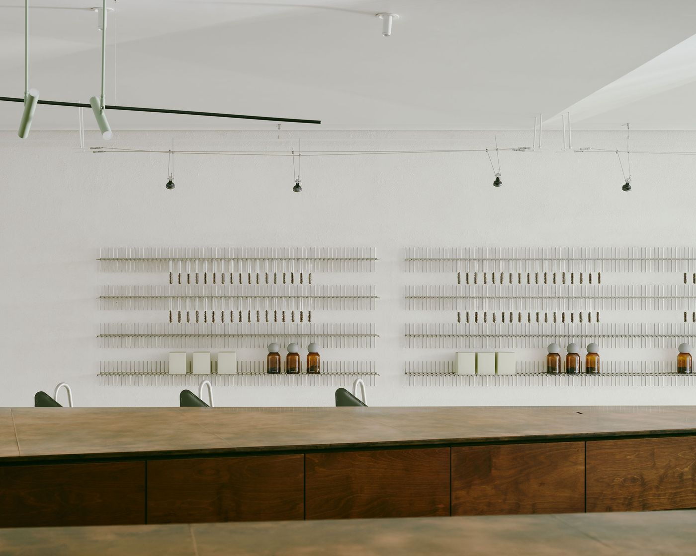
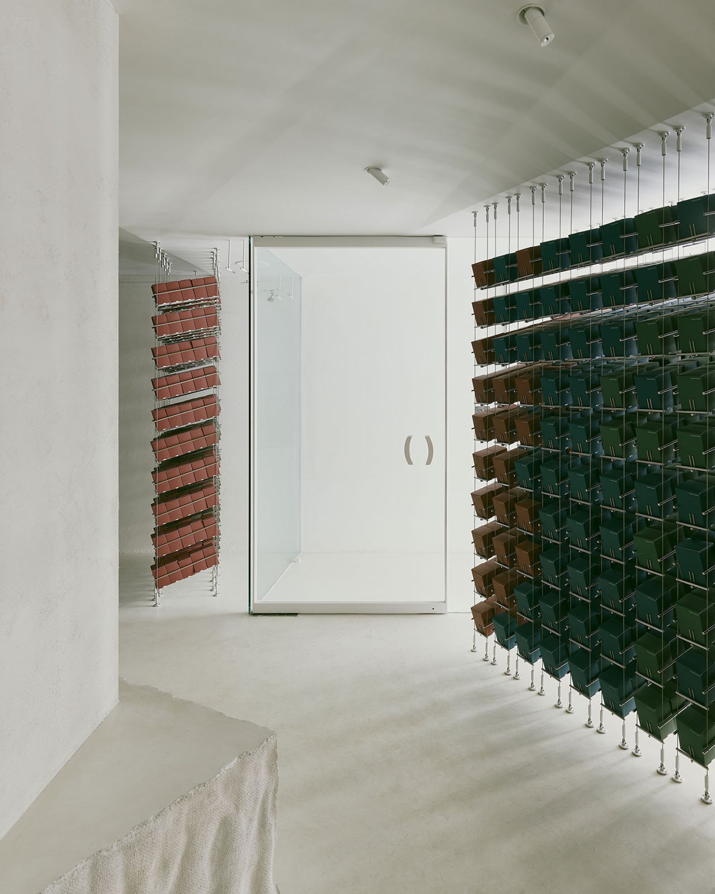
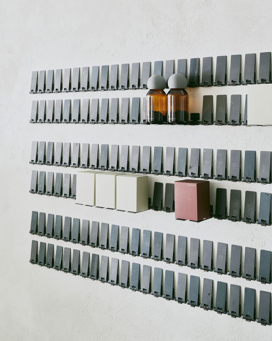
The window display’s grid-like design and ethereal construction are echoed in the additional product arrangements lining the store’s walls. More modest in size to avoid cluttering the space with unnecessary visual distractions, these setups feature almost imperceptible modular shelving systems that “disappear” when no products are displayed. Swathed in off-white tones from top to bottom, the monochromatic interior allows the displayed products, which apart from minimalist-designed boxes also include brown glass containers with spherical caps, to be prominently showcased.Masterfully blended functionality with aesthetic appeal, the space is both inviting and visually stimulating, standing as a testament to the studio’s thoughtful approach to retail design.
Photography by Studio Millspace.
Photography by Studio Millspace.
Photography by Studio Millspace.
