Ste.Marie Whimsically Reinvents the Humble Tapas Bar for Vancouver's Culinary Scene
Words by Eric David
Location
Vancouver, Canada
Ste.Marie Whimsically Reinvents the Humble Tapas Bar for Vancouver's Culinary Scene
Words by Eric David
Vancouver, Canada
Vancouver, Canada
Location
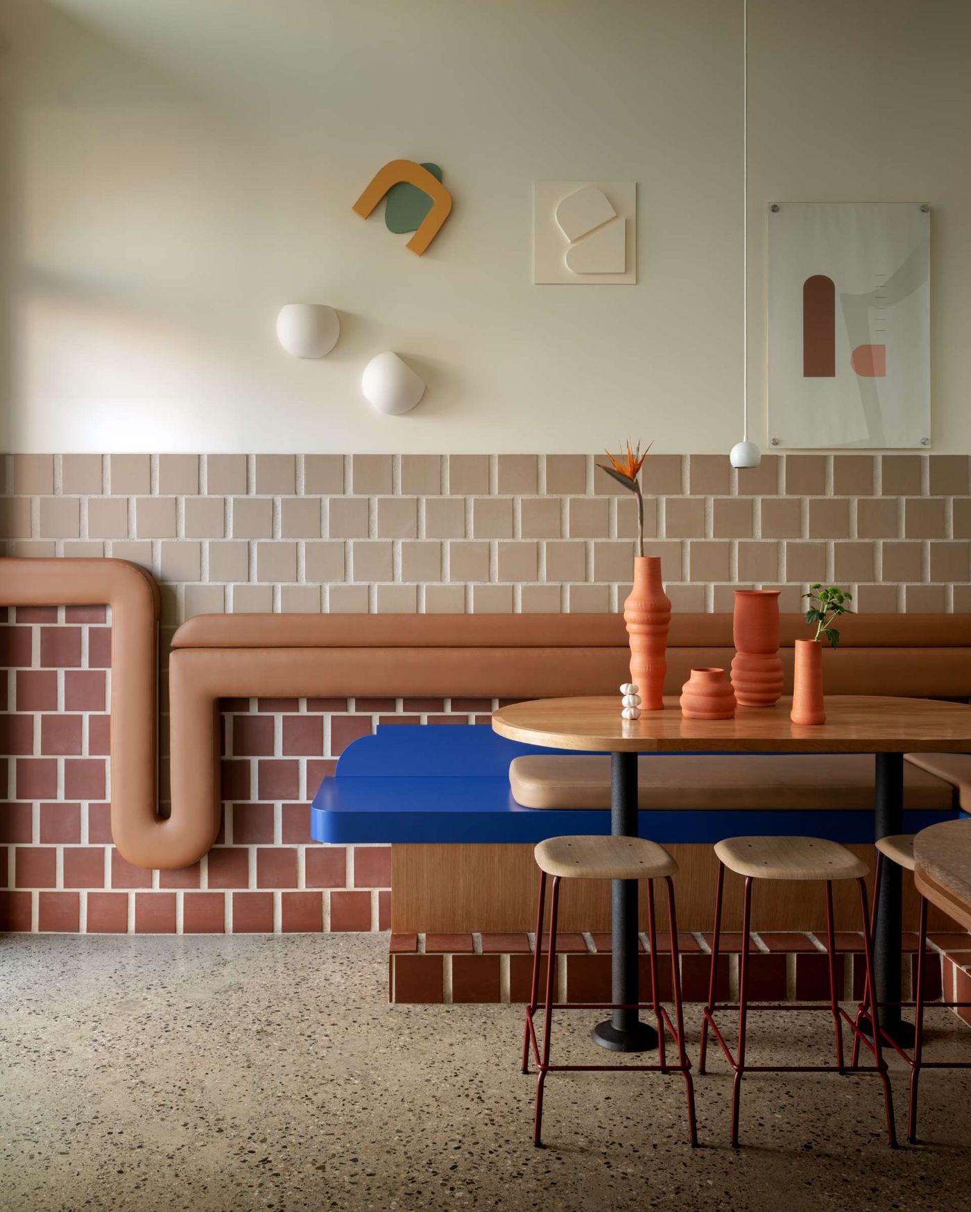
Canadian design studio Ste.Marie has a talent for transforming the traditional into the unexpected. After revamping a traditional alimentary, an Italian family-owned grocery shop and deli, into the whimsical Caffè La Tana, the studio has taken on the world famous Spanish tapas bars for their latest project in Vancouver, Como Taperia. Taking as their starting point the historic tapas bars in Barcelona’s Poble Sec and Madrid’s La Latina quarters, Ste.Marie re-imagined the classic, centuries-old, standing room-only venue as a relaxed, contemporary eatery where an artistic-minded, playfully-graphic aesthetic meets the quaint charm and un-fussy conviviality of age-old tapas bars.
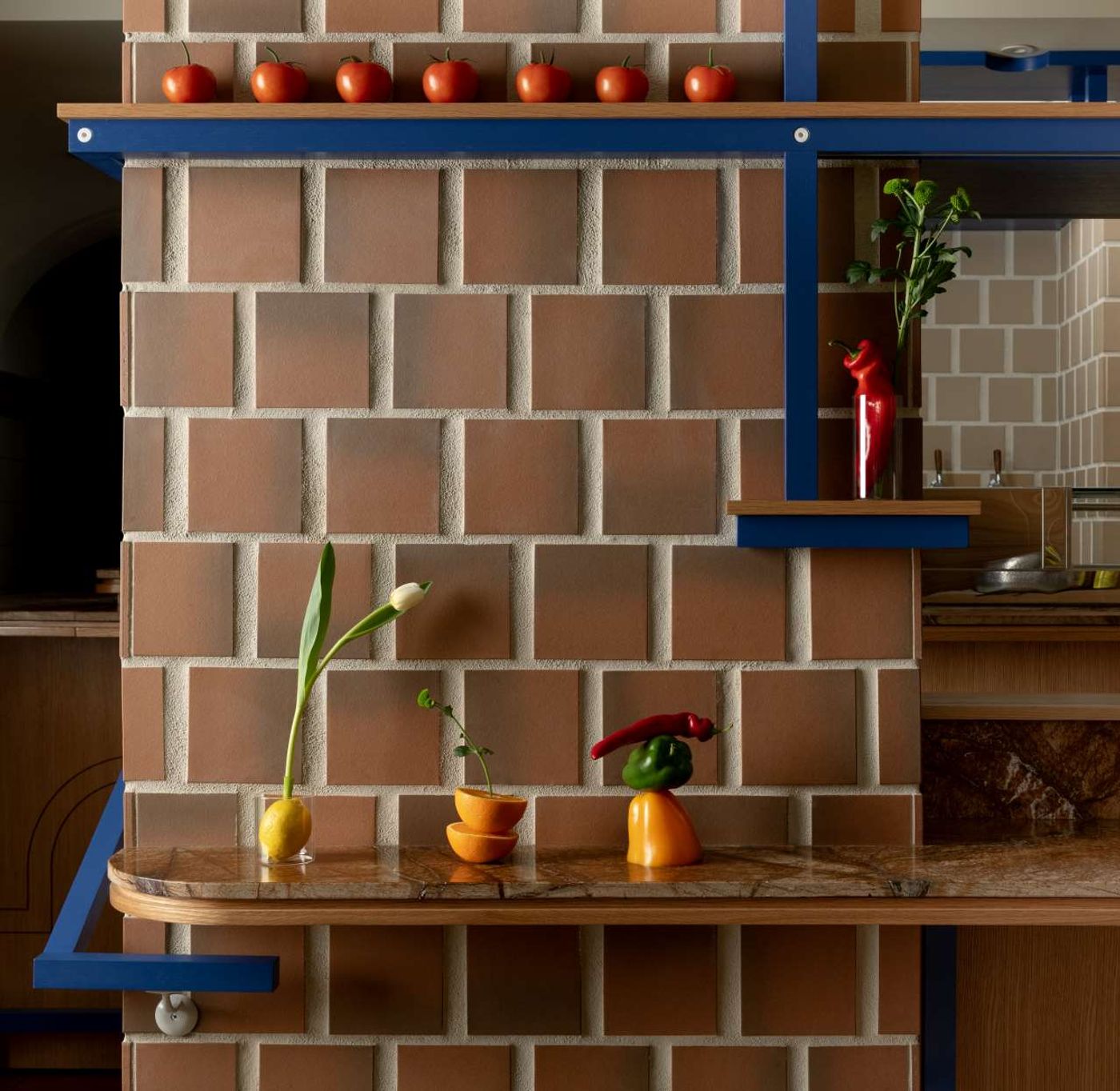
Photo by Conrad Brown. Styling by Kate Richard.
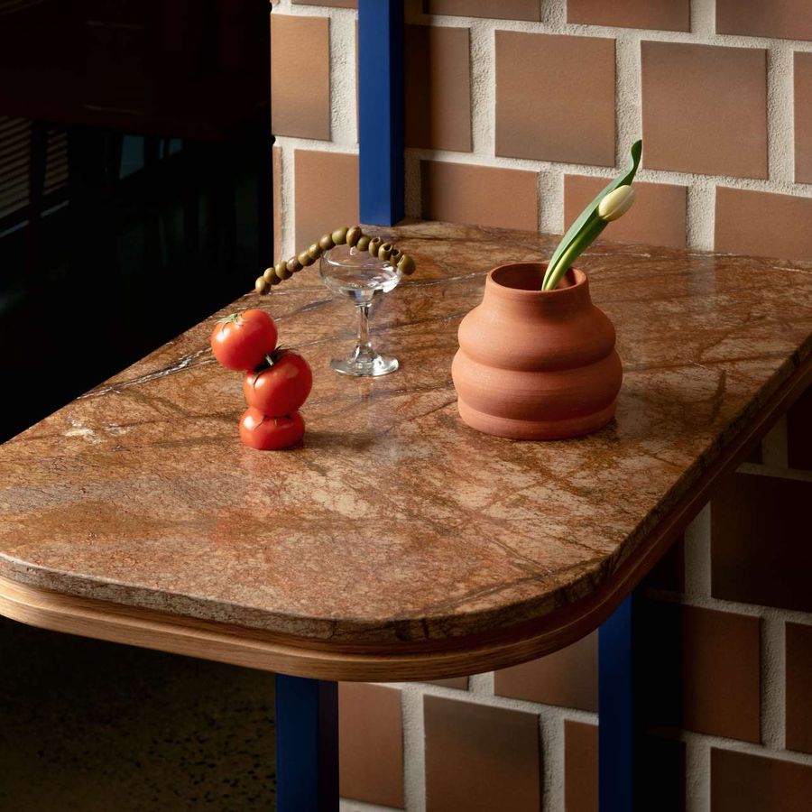
Photo by Conrad Brown. Styling by Kate Richard.
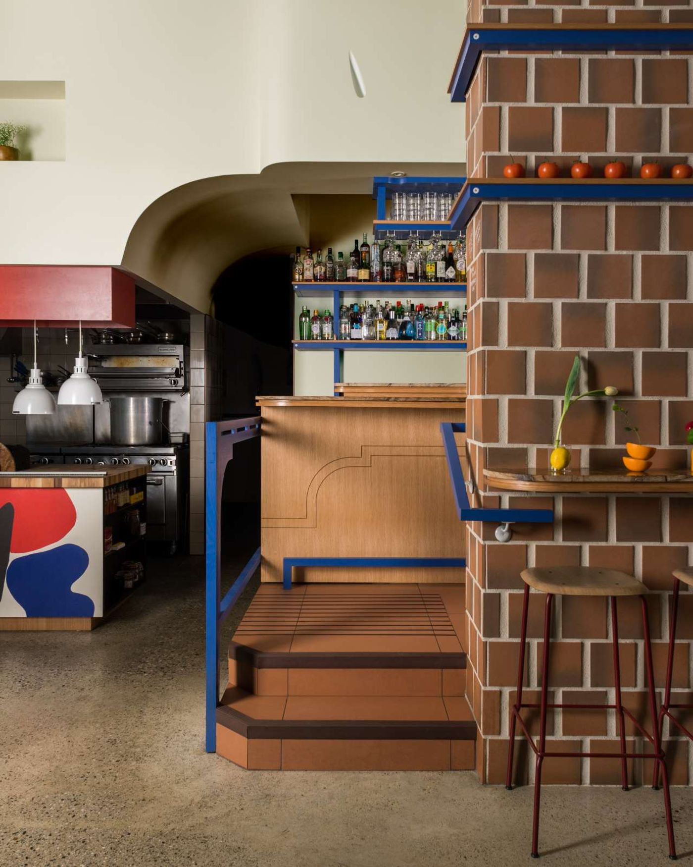
Photo by Conrad Brown. Styling by Kate Richard.
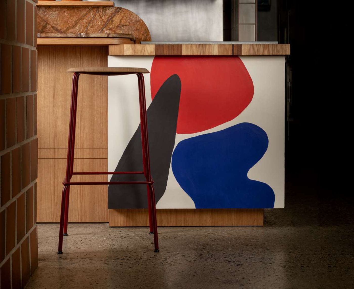
Photo by Conrad Brown. Styling by Kate Richard.
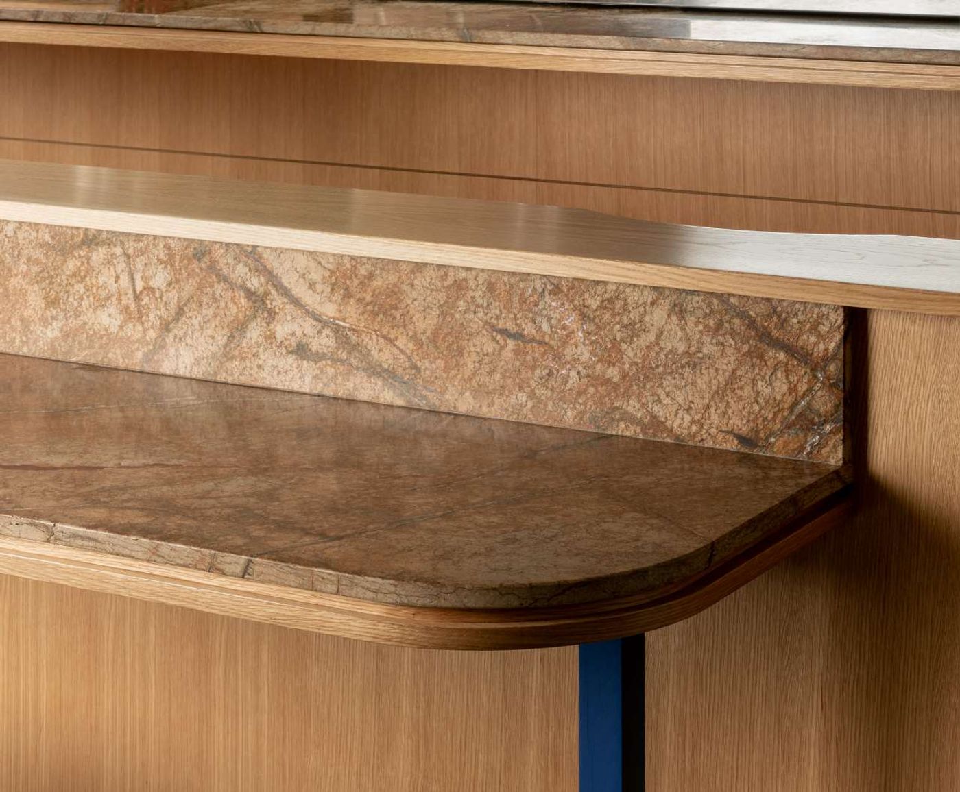
Photo by Conrad Brown. Styling by Kate Richard.
There’s no definitive account about the origins of tapas bars but the more fun version is certainly the one that purports that bartenders took advantage of the saucers placed on top of glasses of beer or sherry to keep the flies out. At some point the story goes that they must have realised that it would be a great idea to use the saucer as a plate to serve a little snack, perhaps in order to attract clients back, or maybe to keep them sober enough to stay for another drink. The bartenders’ unplanned, resourceful thinking intrigued the design team and convinced them to keep things simple and fun. As lead designer, Rachel Martinuk explains, “we employed this haphazard, relaxed approach throughout the design process, which liberated us to solve challenges with the same utilitarian, unfussy approach that we imagined the bar keepers of Barcelona, Madrid & Seville did”.
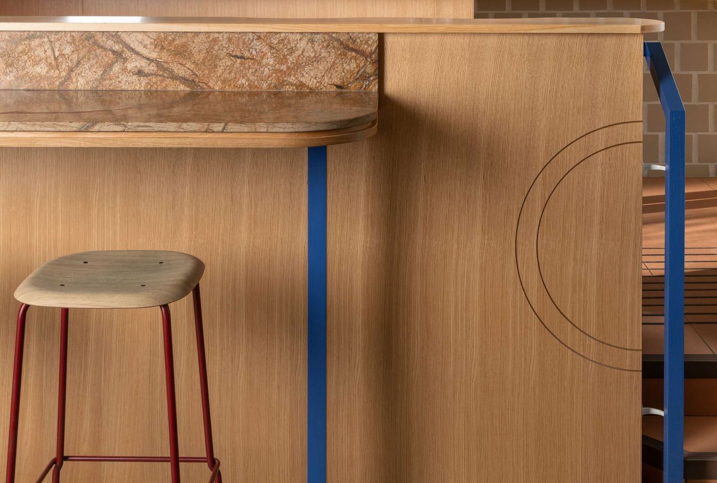
Photo by Conrad Brown. Styling by Kate Richard.

Photo by Conrad Brown. Styling by Kate Richard.
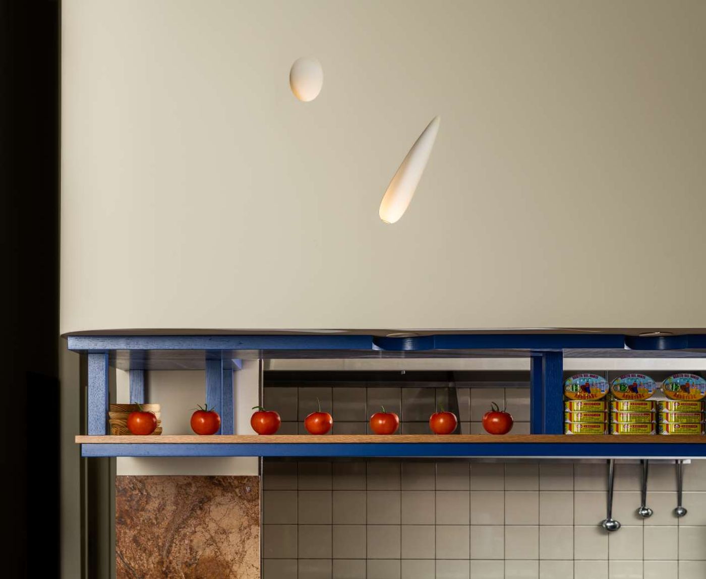
Photo by Conrad Brown. Styling by Kate Richard.
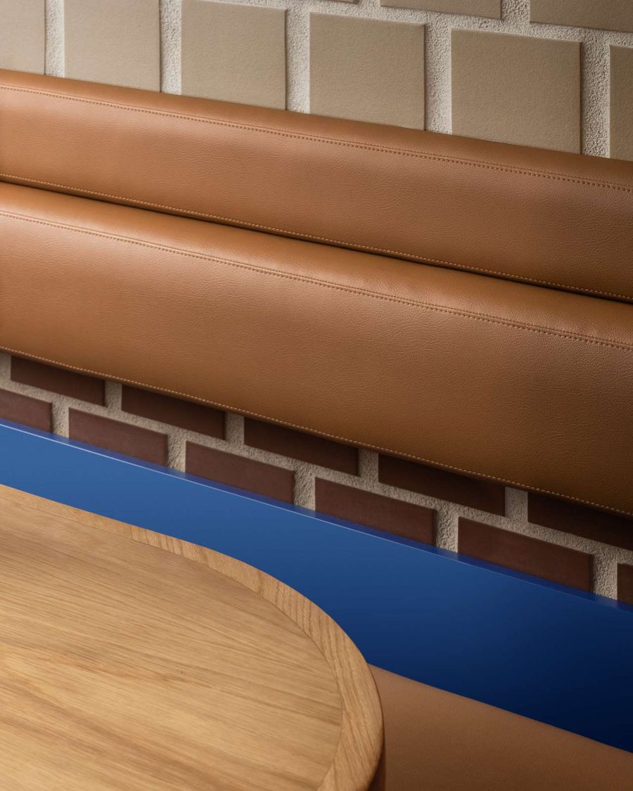
Photo by Conrad Brown. Styling by Kate Richard.

Photo by Conrad Brown. Styling by Kate Richard.
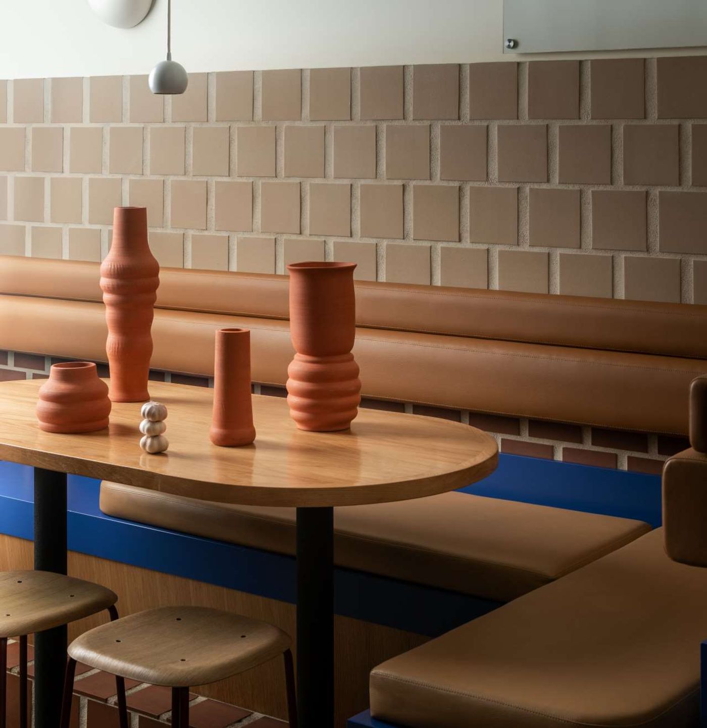
Photo by Conrad Brown. Styling by Kate Richard.
Como Taperia’s playful décor is dominated by large terracotta tiles playfully assembled on the walls to resemble brickwork, inspired by the three iconic brick chimneys in Jardins de les 3 Xemeneies in Barcelona’s Poble-sec (xemeneia means chimney in Catalan), which are all that remains from an early 20th century power station locally known as ‘La Canadiense’ as it was operated by a Canadian utility. You have to hand it to Ste.Marie: a Canadian tapas bar channelling a Spanish landmark built by Canadians, above all else it’s a witty concept that perfectly encapsulates the studio’s narrative-based approach.
The team was also inspired by another Catalan icon, artist Joan Miró, whose paintings are populated by biomorphic forms and vivid colours, both of which pop up in Como Taperia’s interior, most notably in the use of Miró’s characteristic blue that punctuates the space in bold, linear strokes. But more than colours or forms, the designers have taken a page from Miró’s artistic practice of combining spontaneity with meticulous planning in order to create a uniquely original venue that nevertheless conveys the camaraderie of traditional Spanish tapas bars.
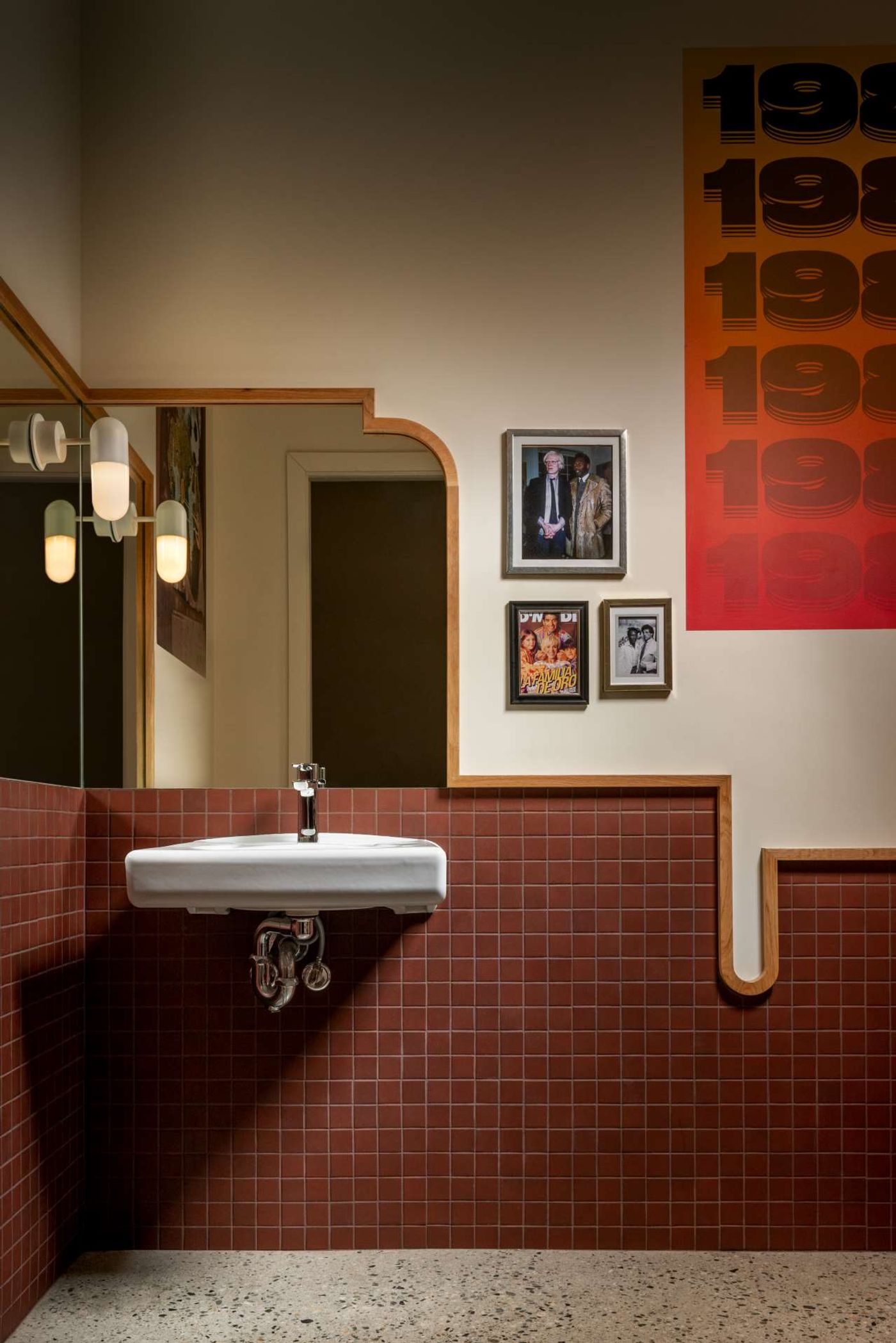
Photo by Conrad Brown. Styling by Kate Richard.
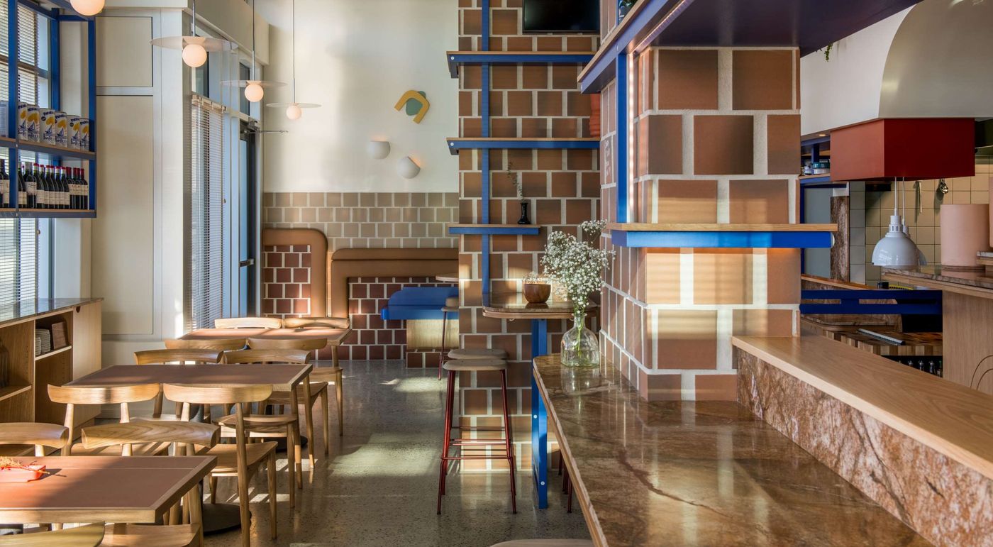
Photo by Conrad Brown. Styling by Kate Richard.
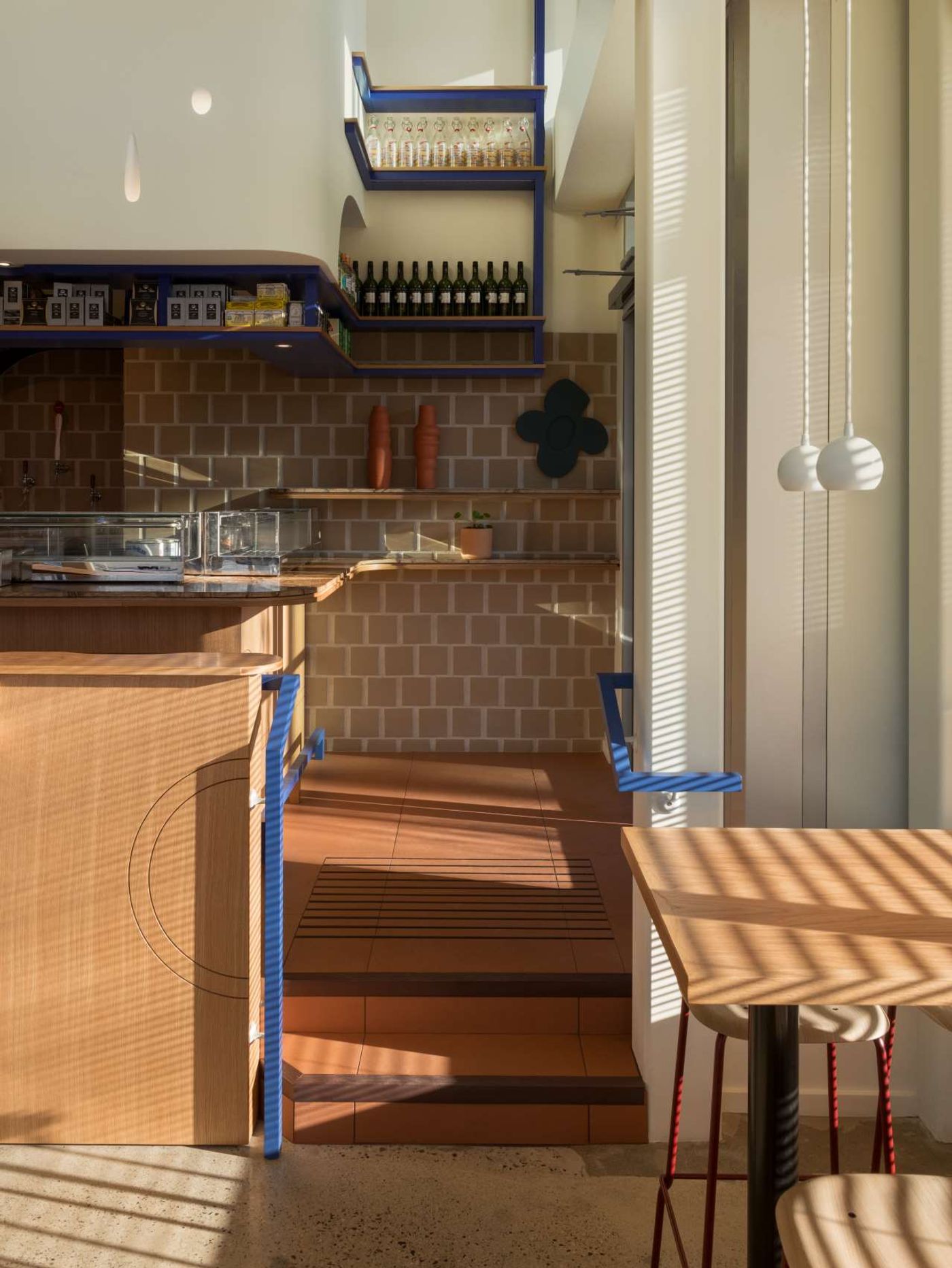
Photo by Conrad Brown. Styling by Kate Richard.
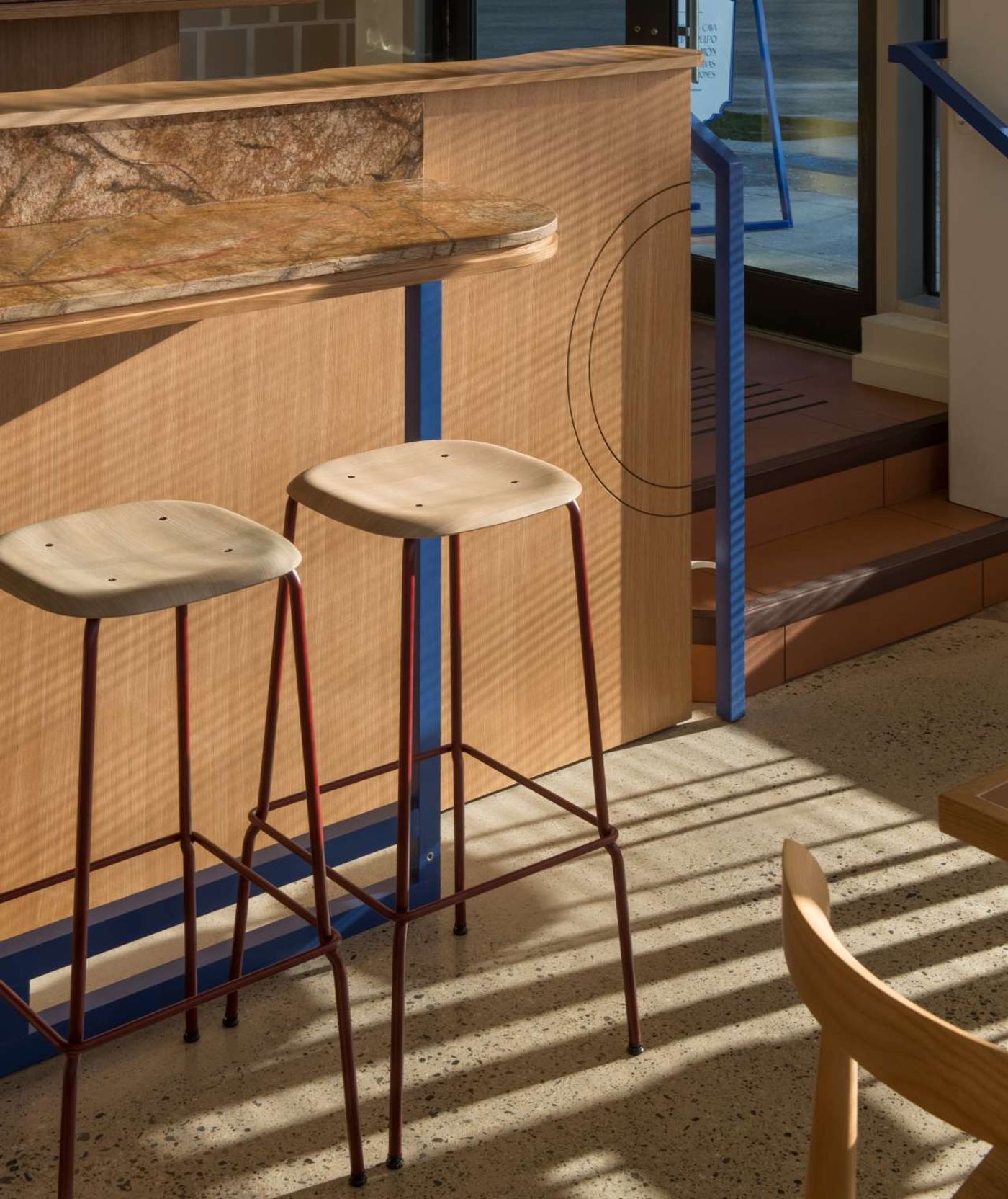
Photo by Conrad Brown. Styling by Kate Richard.
Photo by Conrad Brown. Styling by Kate Richard.